 Dev Design Library
Animated Heading Components
Dev Design Library indexes 14 Animated heading components from 13 open-source UI libraries, with the most coming from Arc Library, Nexvyn UI, uselayouts, Spectrum UI and Kokonut UI. Each one links to its page with the source code, a live preview where available, the library license and the install command. These are the heading components tagged as animated: motion on hover, on scroll or on load, usually built with CSS transitions or Framer Motion. Heading components belong to the Text group.
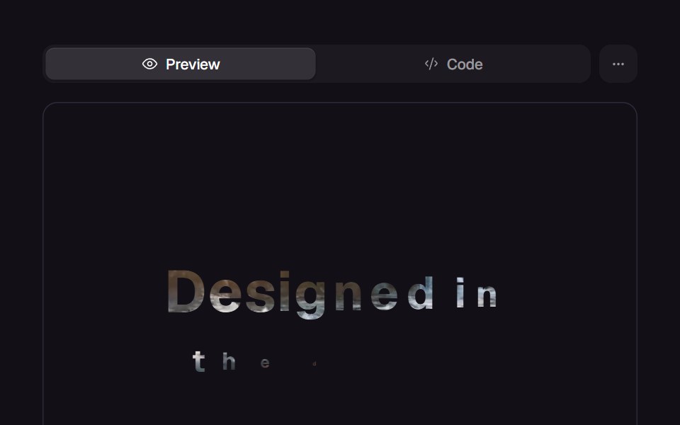 Masked HeadingReact Bits · ReactHeading revealed word by word through a clip-path mask that wipes across, with a stagger.
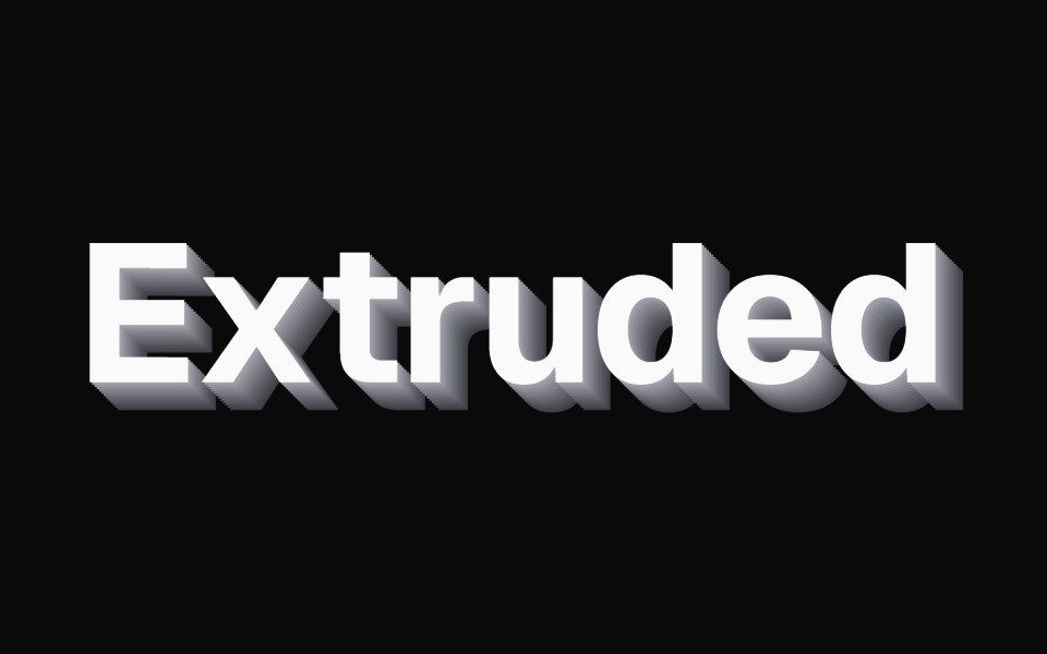 Extruded TextKokonut UI · ReactZinc 3D extruded text lit by your pointer, with letters that press in like keycaps.
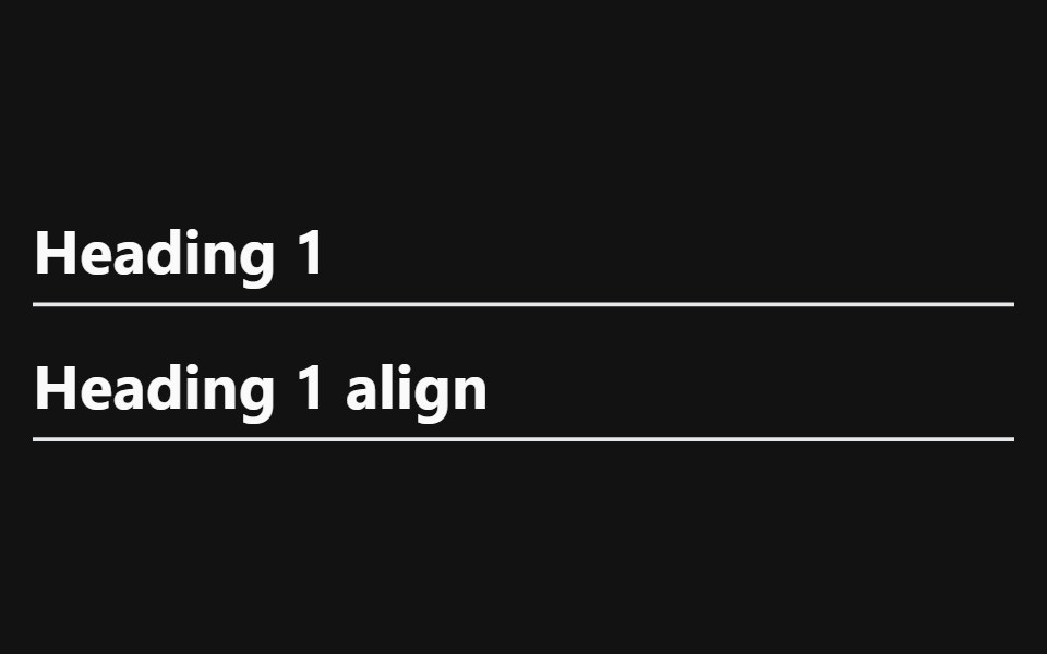 Heading With AnchorSpectrum UI · Reactcomponent for the Heading With Anchor
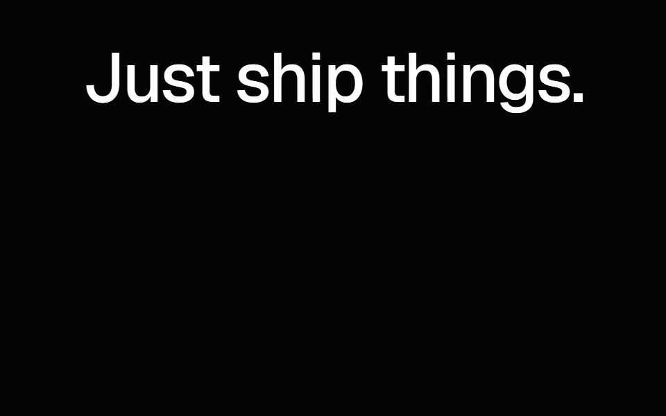 Gradient Wave TextSpell UI · ReactApple-style animated gradient text with wave effect.
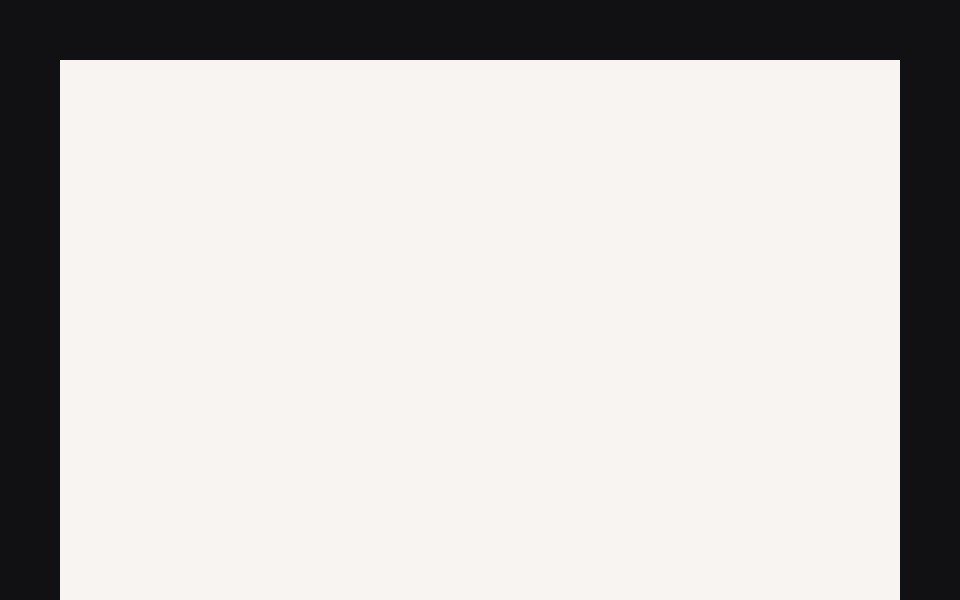 Perspective Text Scrolluselayouts · ReactA polished example interaction built with React and Motion.
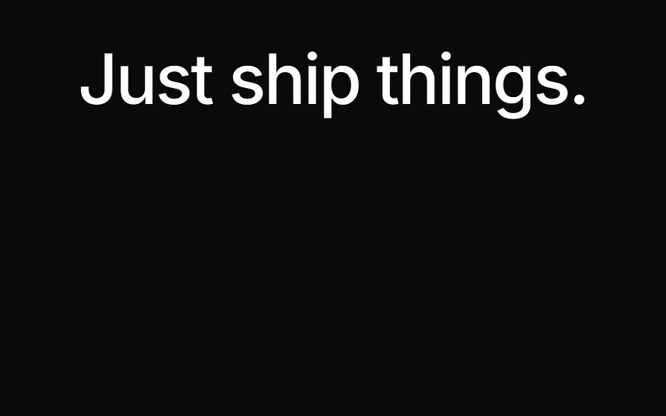 Spell Gradient Wave TextAnimations (Svelte) · Svelte
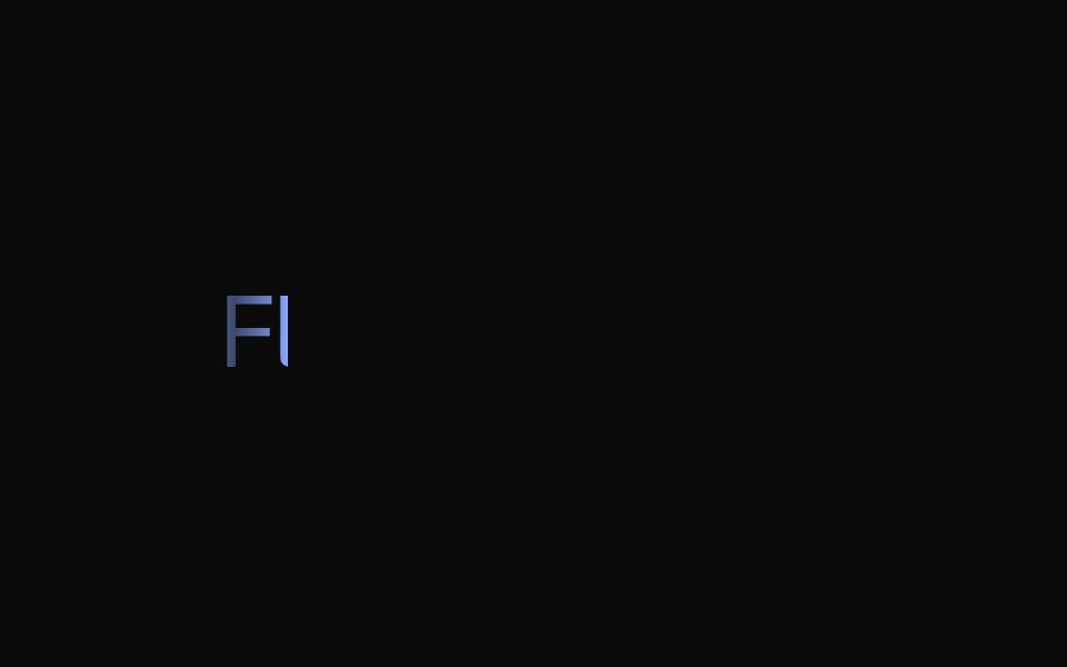 Dia TextNexvyn UI · ReactDiagonal clip-path reveal for bold display typography. Text sweeps into view with an angled edge as the component…
 In-view titleArc Library · ReactBring a section title in as it scrolls into view.
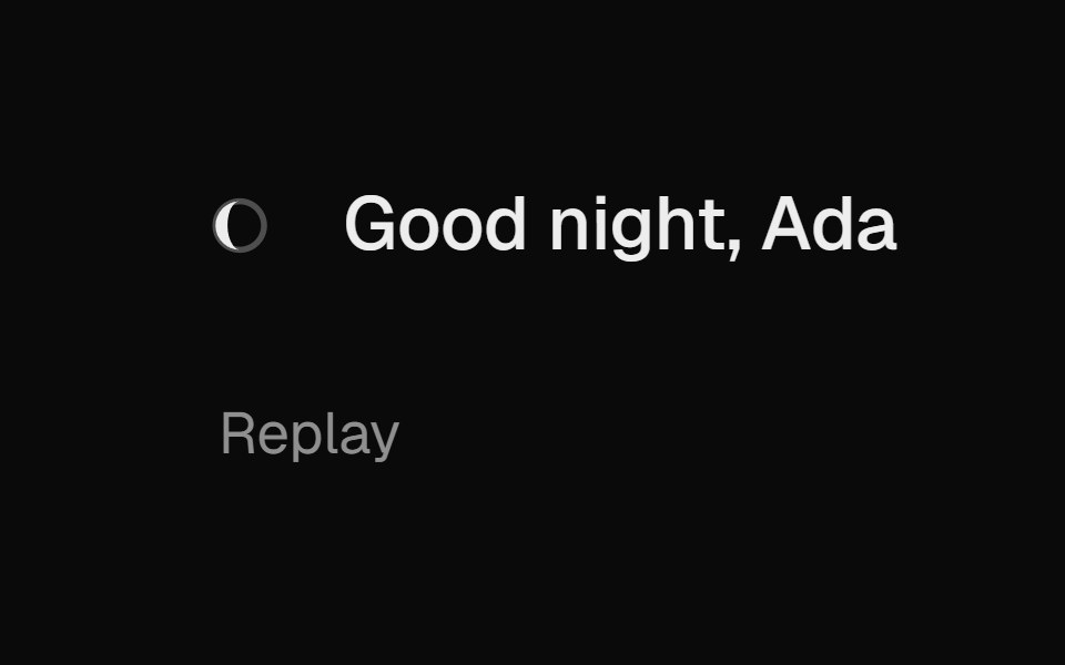 GreetingUI Lab · ReactGreets by time of day, with a sun or moon that rises into place along an arc.
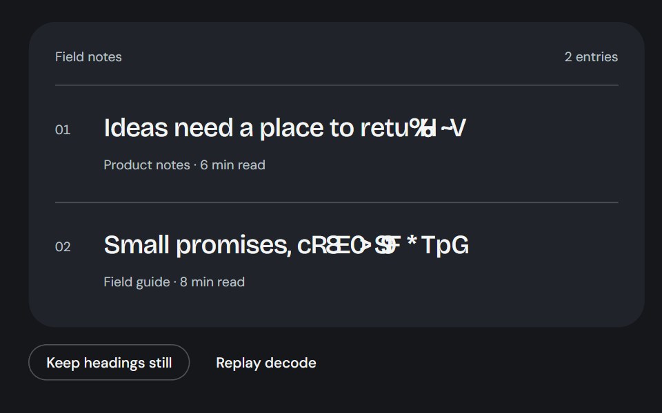 Article HeadingsCojeev UI · ReactSemantic article headings resolve through a brief, grapheme-safe noise frontier.
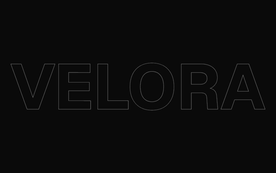 Text Hover EffectVelora UI · ReactGiant outlined word that draws in, then glows in brand colours under the pointer.
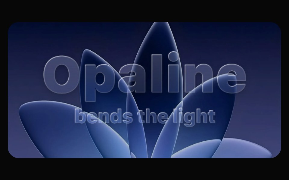 Glass TextOpaline · ReactHeadlines cast in liquid glass — every glyph is a bevelled lens with rim light and a travelling sheen.
 Text Hover EffectAceternity UI · React
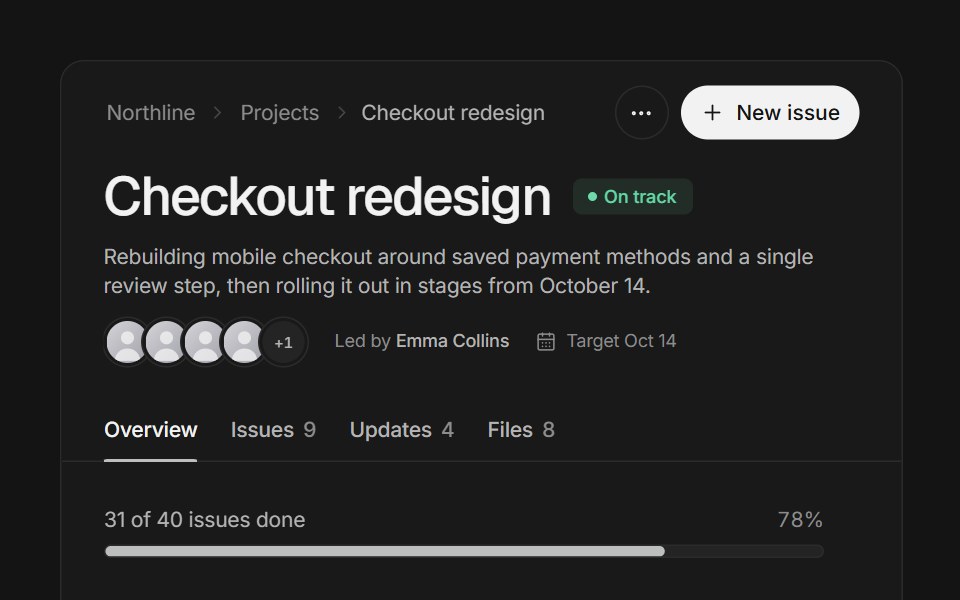 Page headerArc Library · ReactA project page header that folds into a compact bar as you scroll, with tabs whose counts roll.