 Dev Design Library
Animated Product Card Components
Dev Design Library indexes 7 Animated product card components from 4 open-source UI libraries, with the most coming from ReactFrame, Kokonut UI, Spectrum UI and Skecher UI. Each one links to its page with the source code, a live preview where available, the library license and the install command. These are the product card components tagged as animated: motion on hover, on scroll or on load, usually built with CSS transitions or Framer Motion. Product card components belong to the Commerce group.
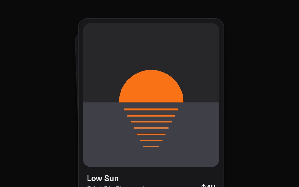 Throw DeckKokonut UI · ReactA pile of image cards you drag, flick off the top and send under the deck, with arrow keys and a details view.
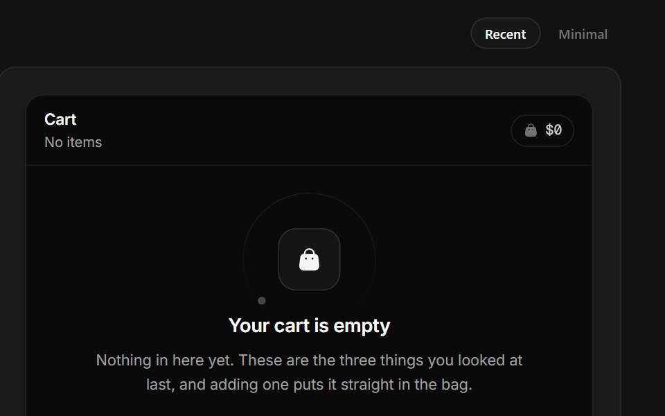 Empty CartSpectrum UI · ReactAn empty bag with three recently viewed products that add for real.
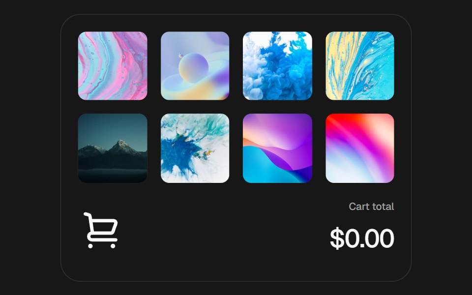 Add to CartSkecher UI · ReactAn interactive product grid with curved add-to-cart flights, a responsive cart stack, and an animated currency total.
 Eternal Glow CardReactFrame · ReactA hover-reveal product card with a blurred gradient overlay, staggered title/price/description reveal, a badge, and 5…
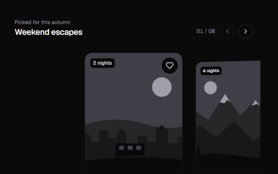 Momentum RailKokonut UI · ReactA card rail you flick with momentum, snapping on a spring, with scroll-driven cover-flow depth and parallax.
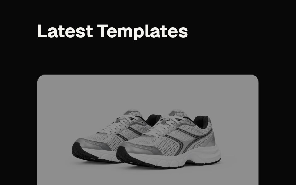 Product Grid SectionReactFrame · ReactA responsive product/portfolio grid section, heading, per-card image with hover zoom and reveal overlay…
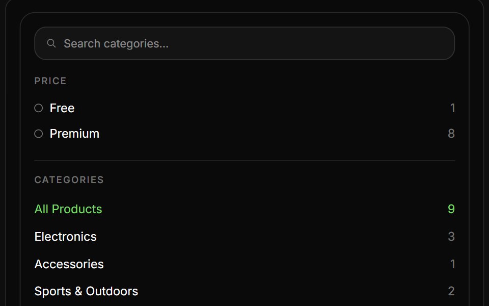 Product ListReactFrame · ReactAn eCommerce product listing block with a filter sidebar (live search, Free/Premium tiers, categories) and a…