 Dev Design Library
Context Usage Components
Dev Design Library indexes 9 context usage components from 8 open-source UI libraries, with the most coming from Halaska UI, Spectrum UI, Kokonut UI, AI Elements and Lobe UI. Each one links to its page with the source code, a live preview where available, the library license and the install command. Context usage components belong to the AI group.
 ContextAI Elements · ReactA compound component system for displaying AI model context window usage, token consumption, and cost estimation.
 Chat Token TagLobe UI · React
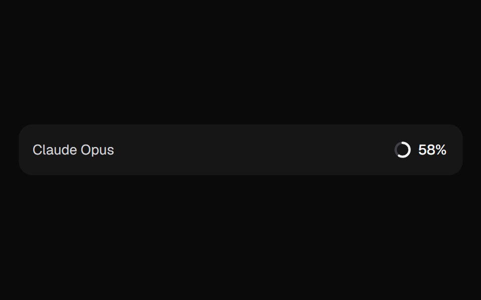 AI Context MeterKokonut UI · ReactHow full the context window is, as a ring in the prompt footer that opens a breakdown by source and compacts when it…
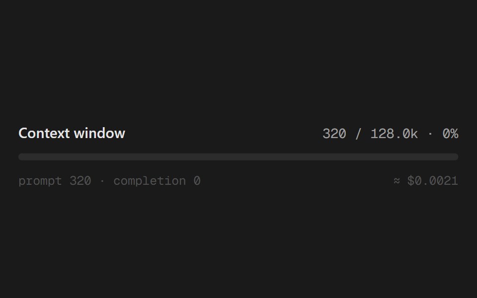 Usage MeterSpectrum UI · ReactA context-window meter with token counts and estimated cost.
 ContextAI Elements (Svelte) · SvelteA hover-card-based context window usage component with token, cost, and model usage breakdowns.
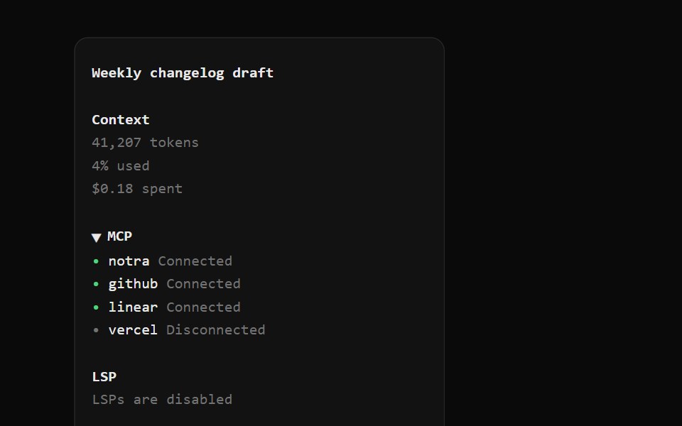 OpenCode SidebarNotra · ReactSession title, context usage, a collapsible MCP list, LSP state, cwd with branch and version.
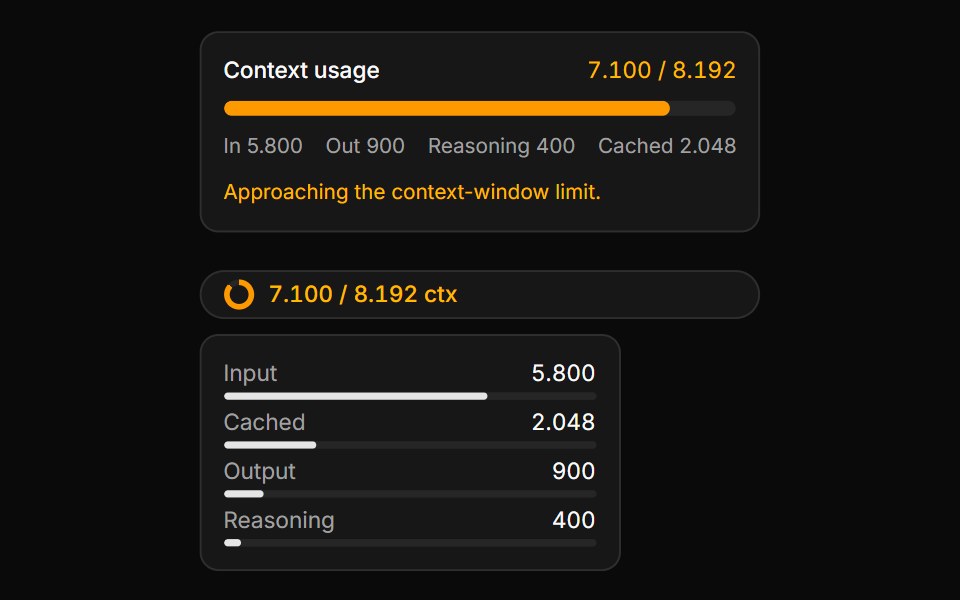 Context Usage MeterLocalMode · ReactA token / context-window budget meter (with composable Context/ContextTrigger/ContextContent/ContextInputUsage/ContextO…
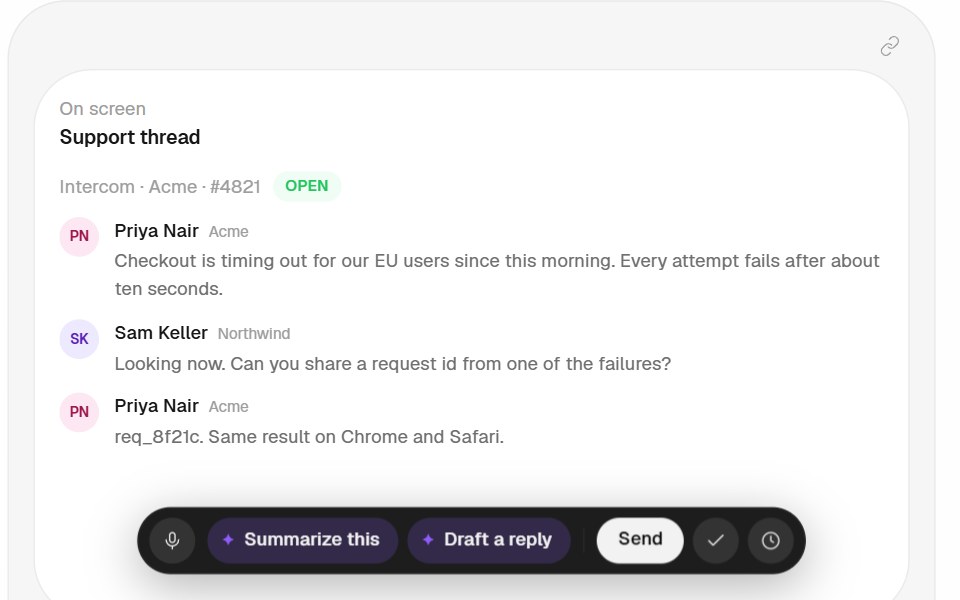 Context Bar PatternHalaska UI · React
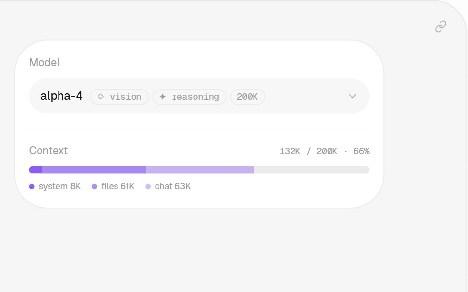 Model Context PatternHalaska UI · React
Libraries with context usage components
Related categories
- React Context Usage Components
- Tailwind CSS Context Usage Components
- AI Element Components
- Prompt Input Components
- AI Orb Components
- Conversation Components
- Attachment Components
- Thinking Indicator Components
- Voice Input Components
- Model Selector Components
- Tool Call Components
- Sources Components
- Streaming Text Components
- Reasoning Components
- AI Message Components
- Citation Components
- Suggestions Components
- Task Queue Components