 Dev Design Library
Pricing Card Components
Dev Design Library indexes 78 pricing card components from 17 open-source UI libraries, with the most coming from Oxbow UI, FLX UI, Watermelon UI, Spectrum UI and Tremor Blocks. Each one links to its page with the source code, a live preview where available, the library license and the install command. Pricing card components belong to the Commerce group.
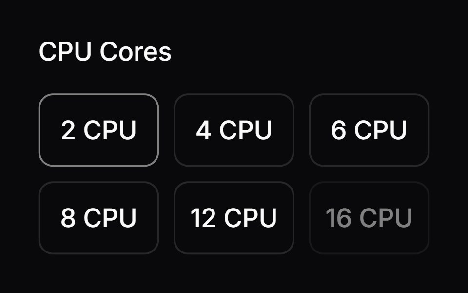 Comp 164Origin UI · React
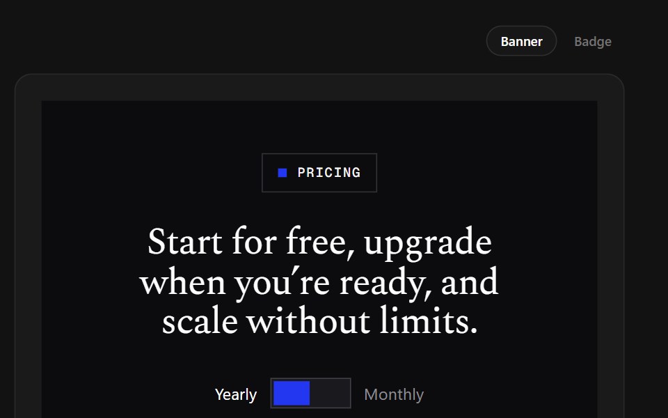 Banner TiersSpectrum UI · ReactA brutalist plan table whose featured column wears a blue banner on top.
 Pricing SectionVengeance UI · ReactThree-tier pricing with a sliding billing switch, rolling prices, and accent-lit cards
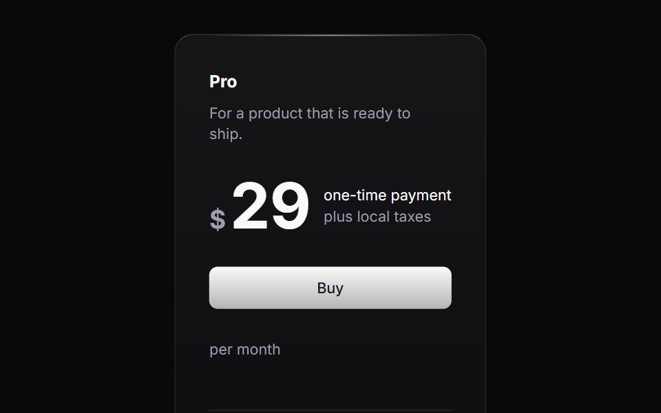 Pricing ColumnLaunch UI · React
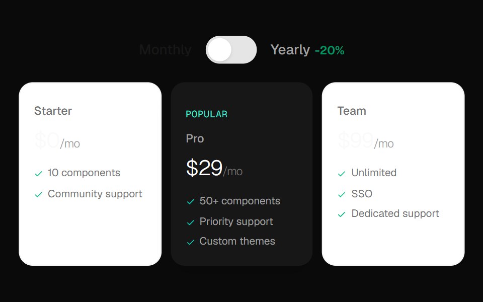 Toggle Pricing CardsOpenSourceUI · React
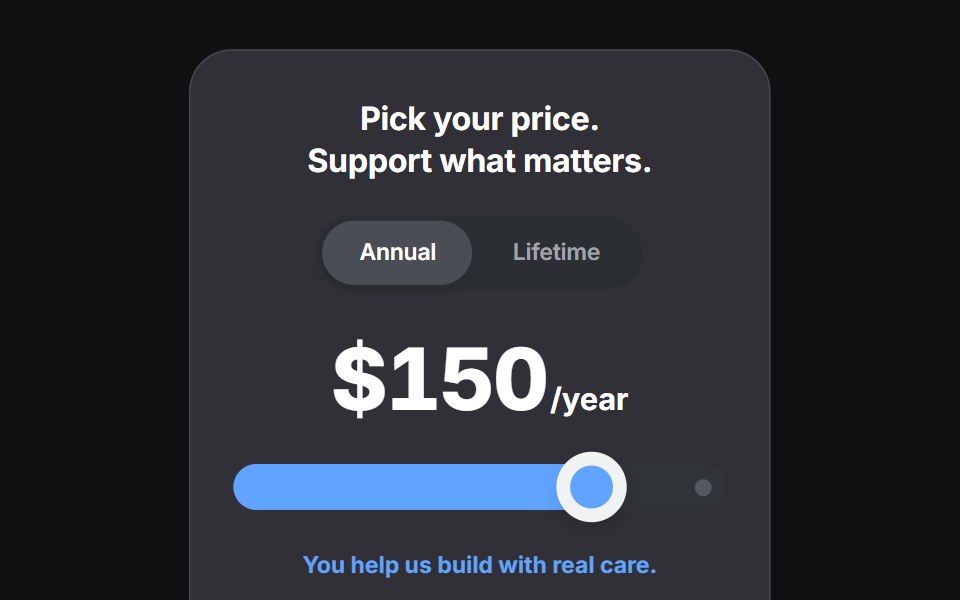 Paywalluselayouts · ReactA premium paywall component with a pick your price detent slider, animated numeric price transitions, and a segmented…
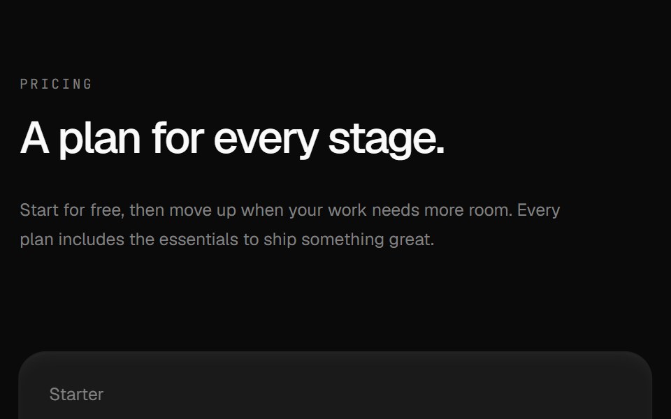 Pricing 01Componentry · ReactThree tactile pricing cards with revealed hover notes, clear feature lists, and a highlighted popular plan.
 Pricing Section 01Tremor Blocks · React
 Pricing Fivecnblocks · SveltePricing table with feature comparison
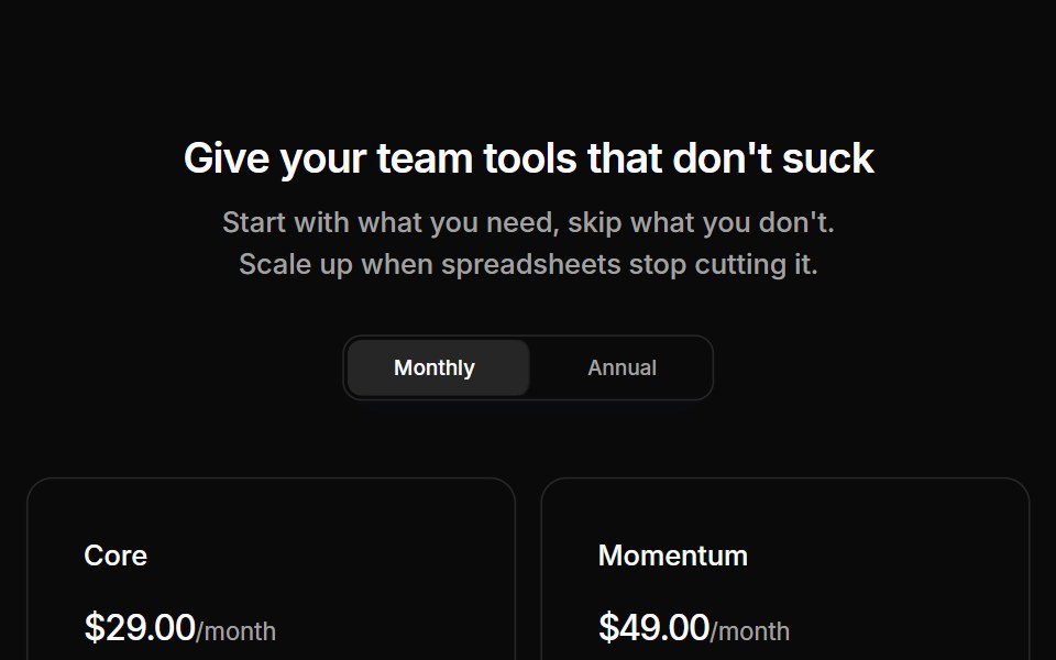 Pricing 01Oxbow UI · AstroPricing section with two tiers
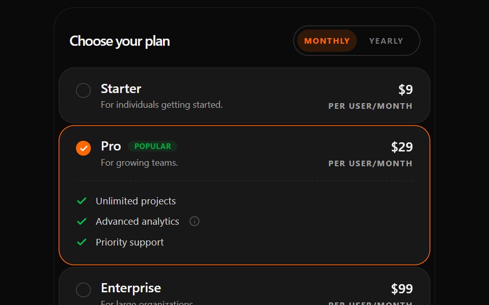 Changeable Pricing SectionWatermelon UI · React
 Pricing Foursv-efferd · SvelteAn animated pricing table with monthly-yearly toggles, live number transitions, and motion badges.
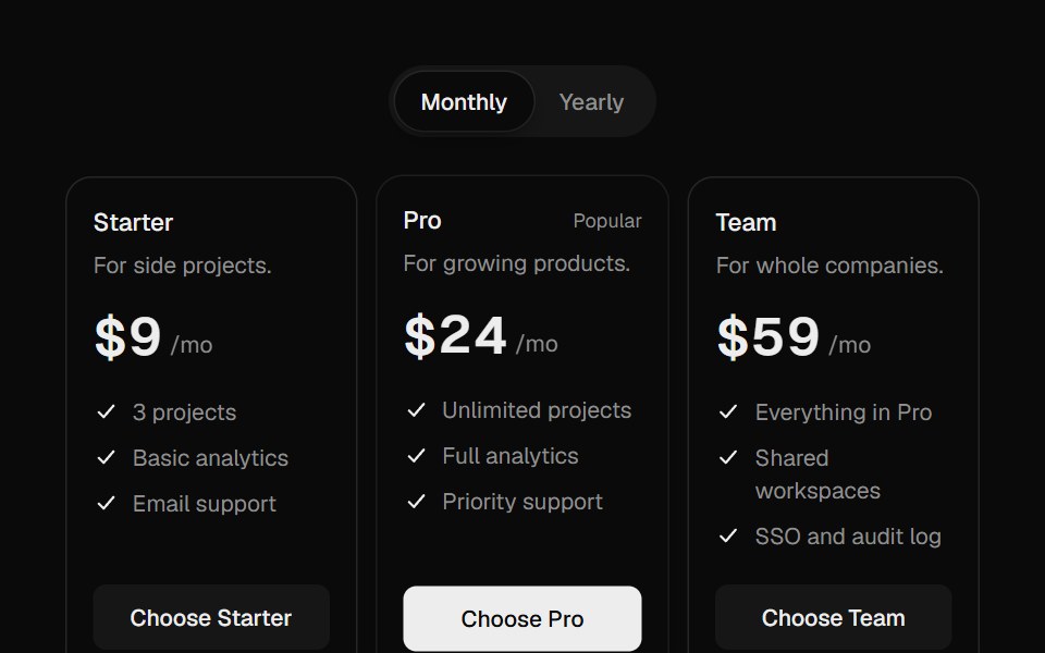 Pricing ToggleUI Lab · ReactEach digit rolls to its new price on its own, and new digits grow in.
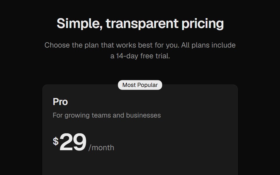 Pricing SectionROI UI · ReactA pricing section with three plan cards.
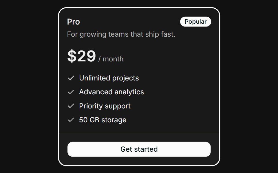 PricingFLX UI · ReactHighlighted plan with a Popular badge and feature checklist.
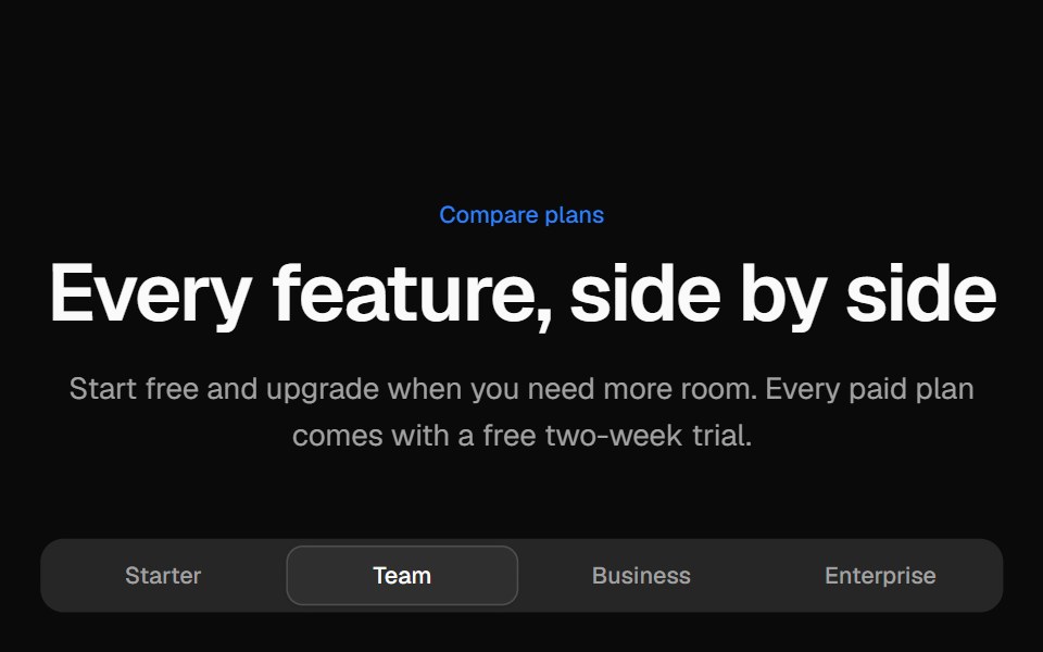 Pricing comparison tableVelora UI · ReactGrouped feature comparison table with a sticky plan header, and per-plan tabs on mobile.
 Pricing CardsD2Studio UI · ReactResponsive three-tier pricing cards with feature comparison and popular plan highlighting
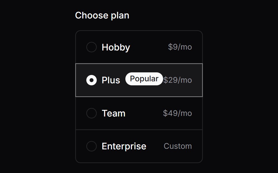 Comp 166Origin UI · React
 Blueprint TiersSpectrum UI · ReactA Swiss-style pricing table with crop marks, mono labels, and a royal-blue accent.
 Pricing TiersVengeance UI · ReactMonochrome three-tier pricing with a dark featured card, mono labels, and an enterprise row
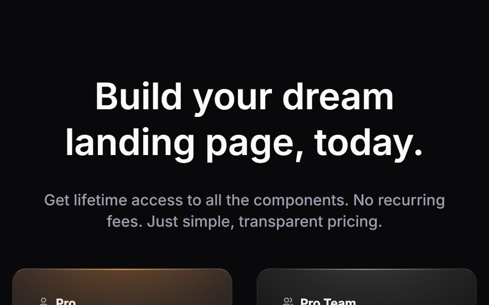 Pricing SectionLaunch UI · React
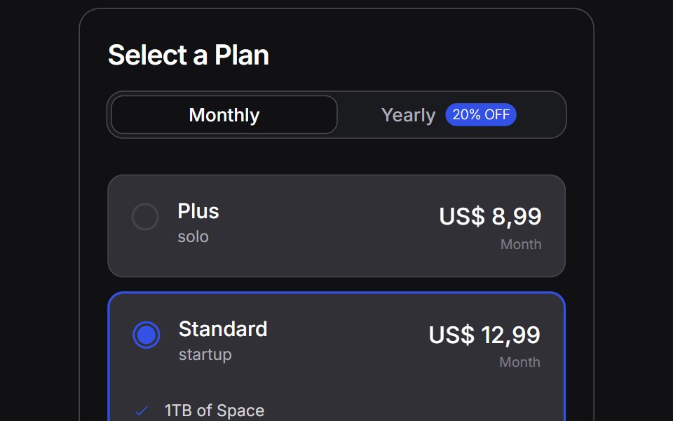 Pricing Carduselayouts · ReactA focused pricing card layout with clear hierarchy.
 Pricing 02Componentry · ReactA compact pricing table with separated plan summaries, detailed feature lists, and an animated billing-cycle switch.
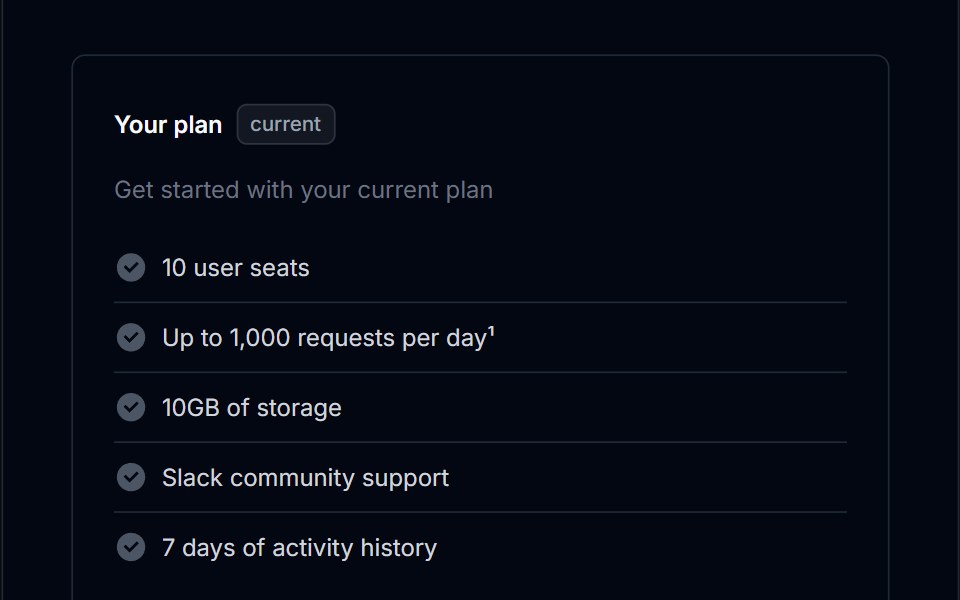 Pricing Section 02Tremor Blocks · React
 Pricing Fourcnblocks · SvelteFour-tier pricing with toggle switch
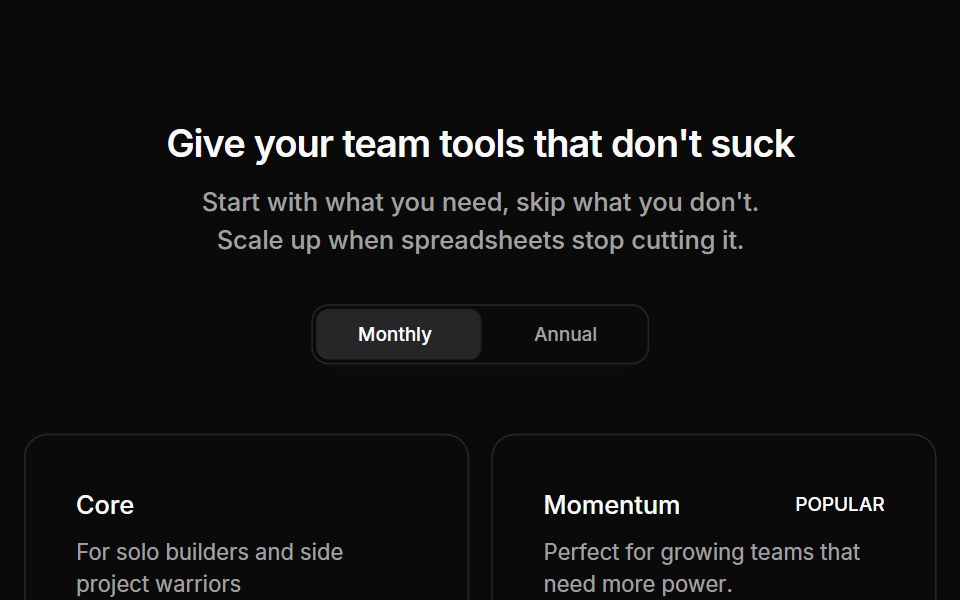 Pricing 03Oxbow UI · AstroPricing section with four tiers
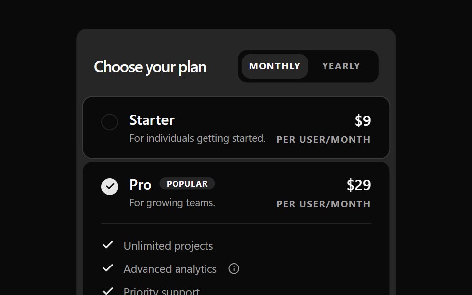 Changeable Pricing Section BaseWatermelon UI · React
 Pricing Onesv-efferd · SvelteA two-plan comparison with corner accents, compact savings callouts, and a stronger featured tier.
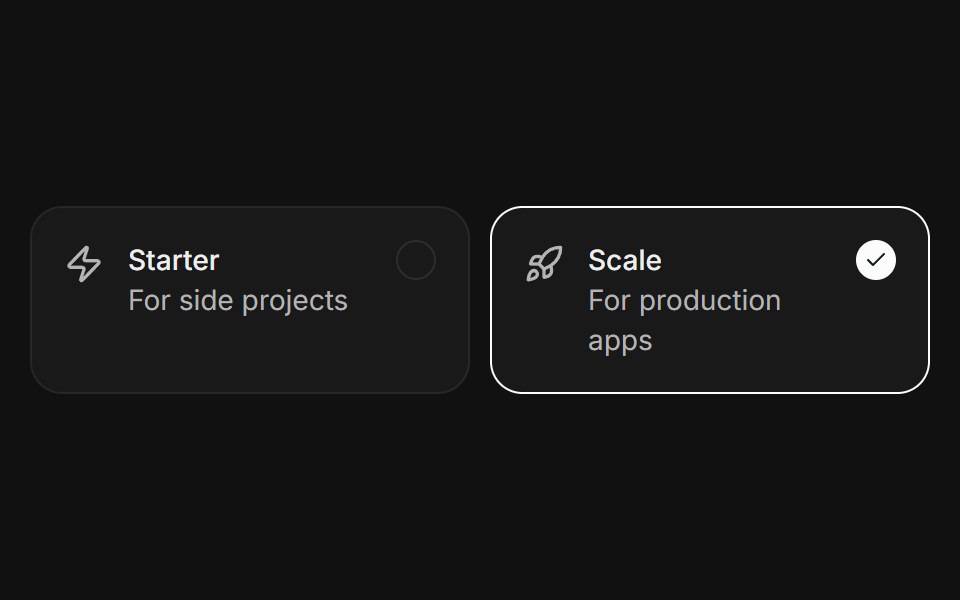 SelectableFLX UI · ReactClickable plan cards with a ring and check on the active one.
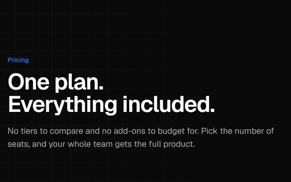 Single plan pricingVelora UI · ReactOne all-inclusive plan card beside a benefit list and short reassurance answers.
 Comp 170Origin UI · React
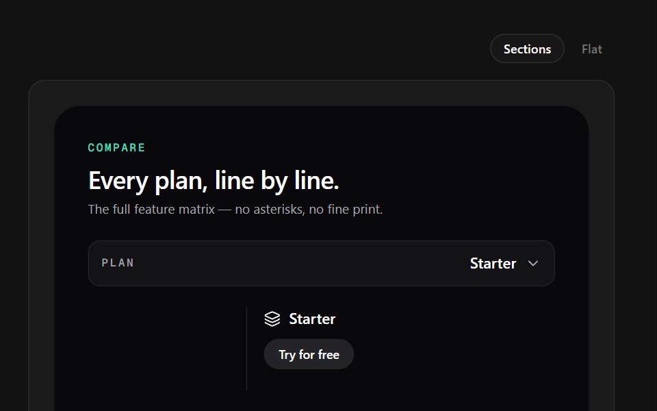 Dark MatrixSpectrum UI · ReactA dark comparison table with dashed rows, mint checks, and per-plan CTA pills.
 Pricing Section 03Tremor Blocks · React
 Pricing Onecnblocks · SvelteSimple three-tier pricing cards
 Pricing 04Oxbow UI · AstroSingle usage based pricing card
 Pricing 1Watermelon UI · React
 Pricing Threesv-efferd · SvelteA reusable three-tier pricing layout with icon-led cards and a highlighted middle plan.
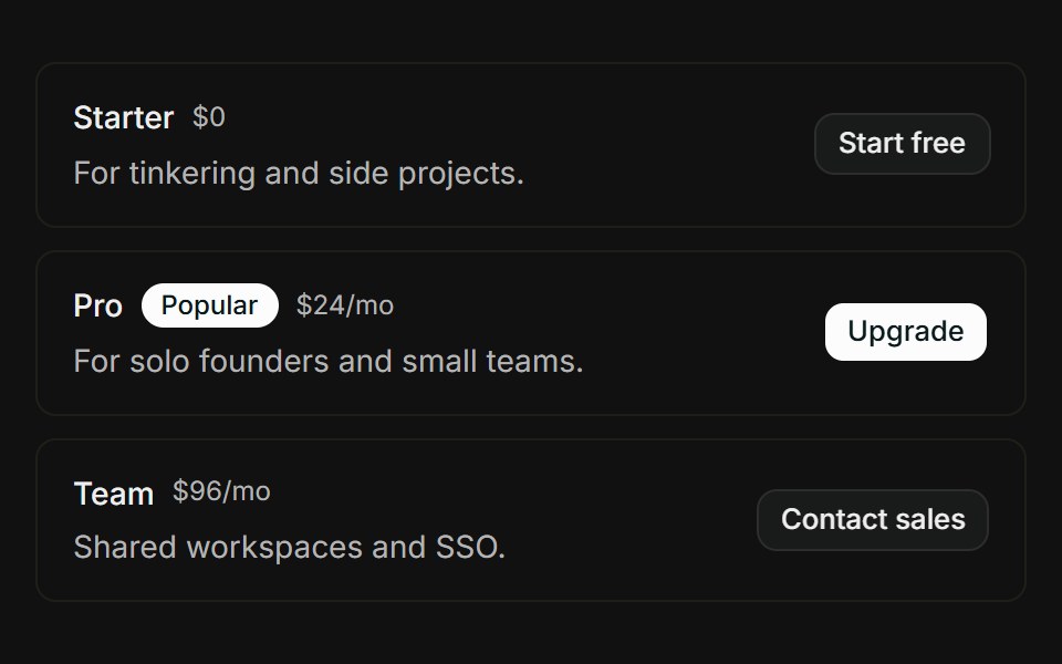 Pricing tiersFLX UI · ReactStacked tier rows with Popular badge, price, and CTA button.
 Three-tier pricingVelora UI · ReactThree plan cards with a monthly/yearly switch, a savings badge and a highlighted middle plan.
 Comp 259Origin UI · React
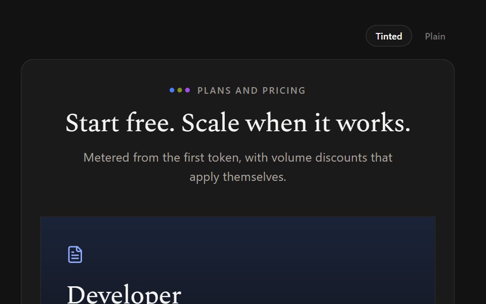 Gradient TiersSpectrum UI · ReactPastel gradient card headers with icons and color-coded inheritance labels.
 Pricing Section 04Tremor Blocks · React
 Pricing Threecnblocks · SveltePricing with highlighted popular plan
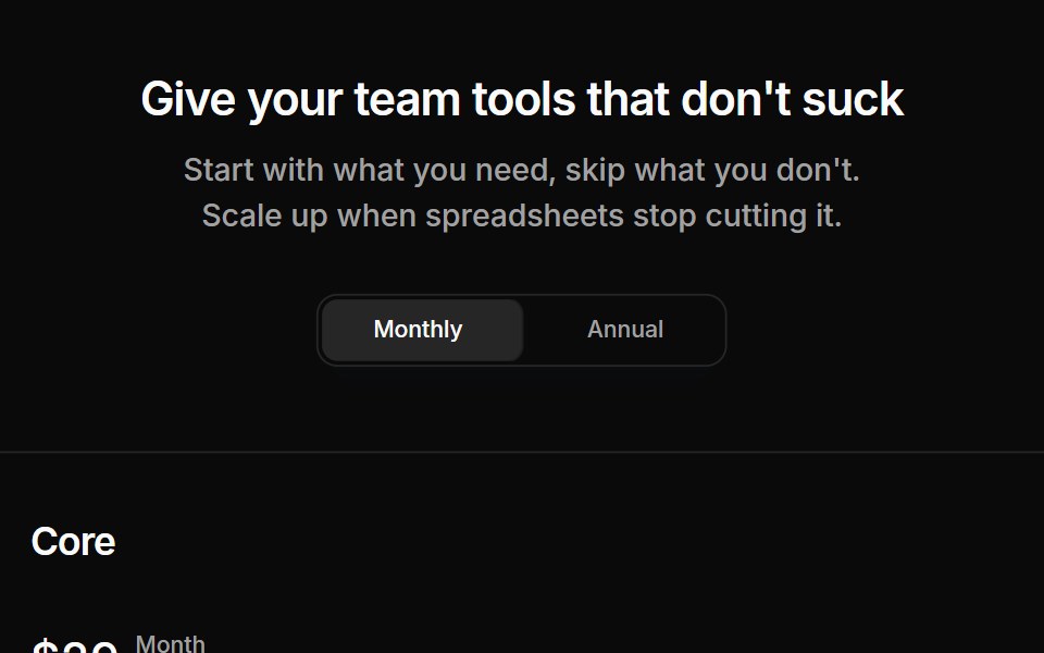 Pricing 06Oxbow UI · AstroPricing section with three tiers and table
 Pricing 2Watermelon UI · React
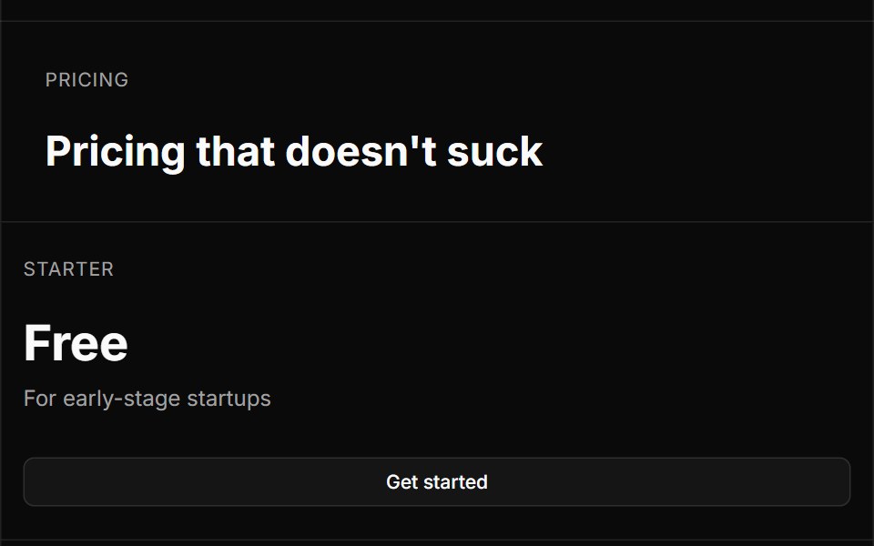 Pricing Twosv-efferd · SvelteA bordered editorial pricing grid with divider rails, concise plan summaries, and feature checklists.
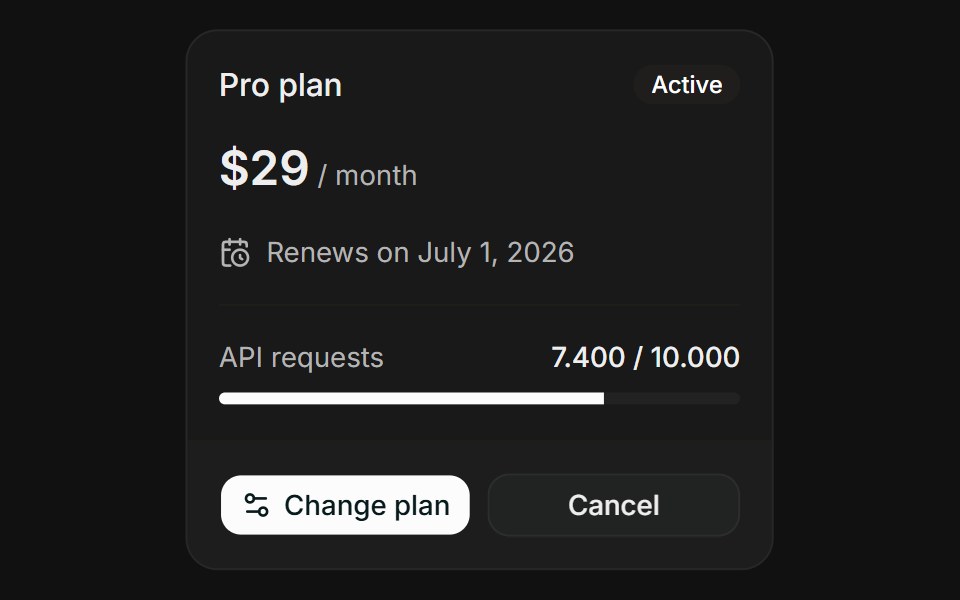 Plan OverviewFLX UI · ReactPlan Overview for Manage Subscription.
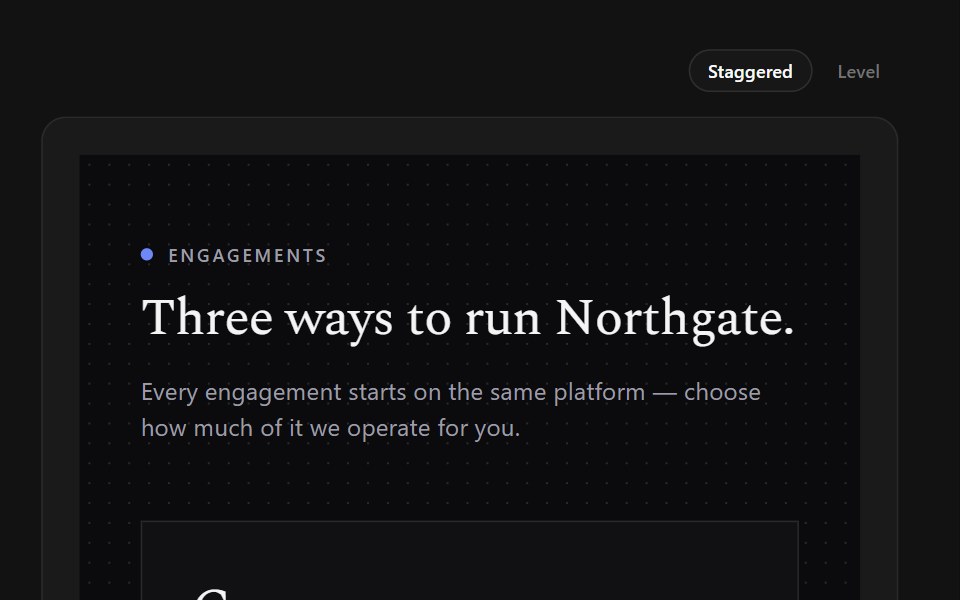 Offset TiersSpectrum UI · ReactStaggered serif panels on a dot grid, with one entry price and expert CTAs.
 Pricing Section 05Tremor Blocks · React
 Pricing Twocnblocks · SvelteTwo-column pricing with monthly/yearly toggle
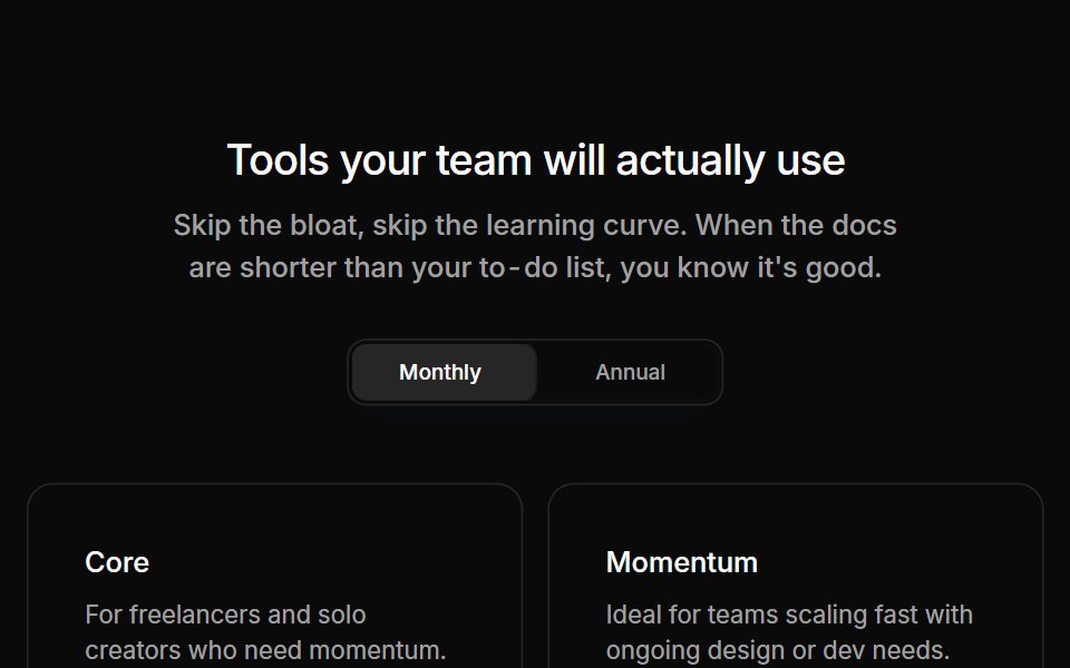 Pricing 07Oxbow UI · AstroPricing section with 2 tiers and 2 support tiers
 Pricing 3Watermelon UI · React
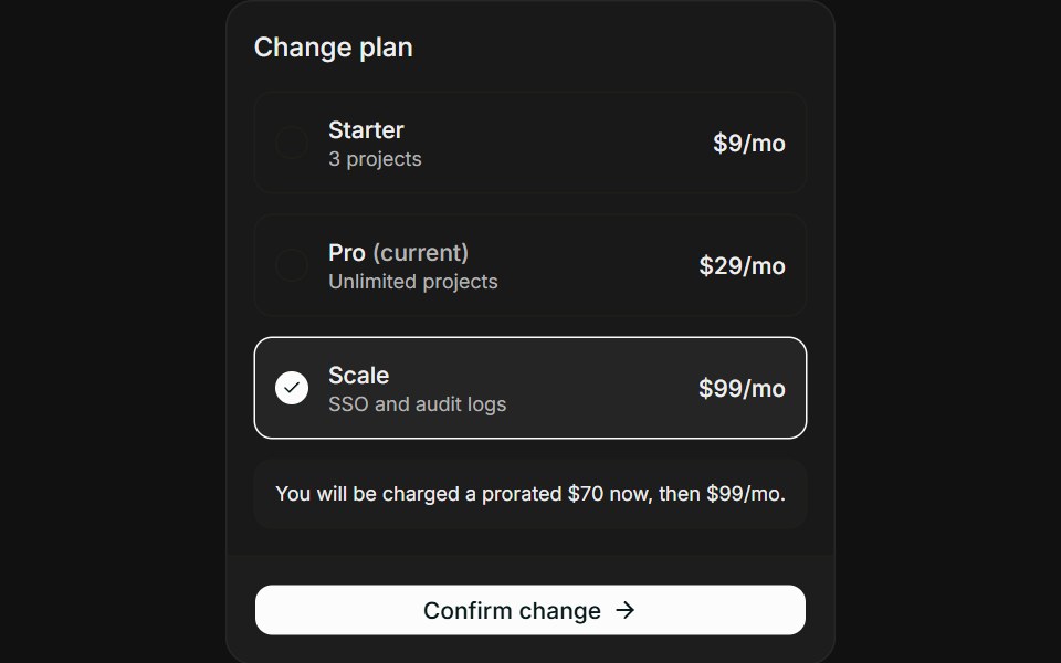 Change PlanFLX UI · ReactChange Plan for Manage Subscription.
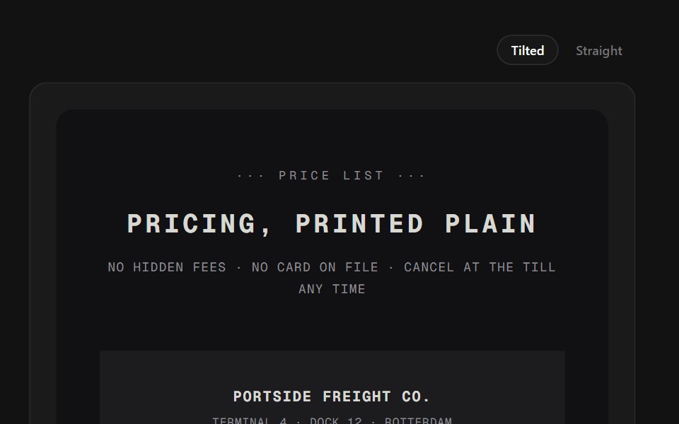 Receipt TiersSpectrum UI · ReactPlans printed as thermal receipts with torn edges, dotted leaders, and a rubber stamp.
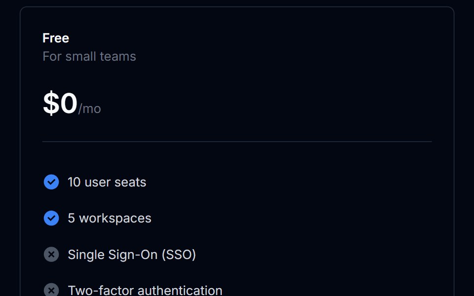 Pricing Section 06Tremor Blocks · React
 Pricing 08Oxbow UI · AstroPricing section with 4 tiers
 Pricing 4Watermelon UI · React
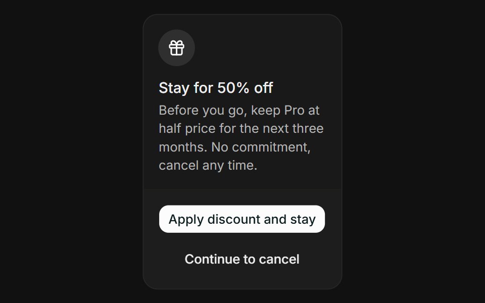 Cancel FlowFLX UI · ReactCancel Flow for Manage Subscription.
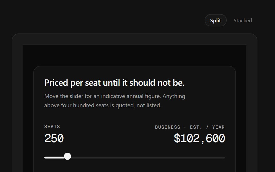 Sales CTA FooterSpectrum UI · ReactA seat slider that prices a tier live, beside the link grid.
 Pricing Section 07Tremor Blocks · React
 Pricing 10Oxbow UI · AstroPricing section with two columns comparison table
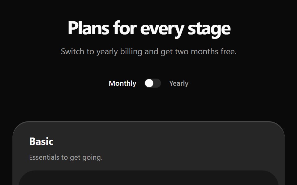 Pricing 5Watermelon UI · React
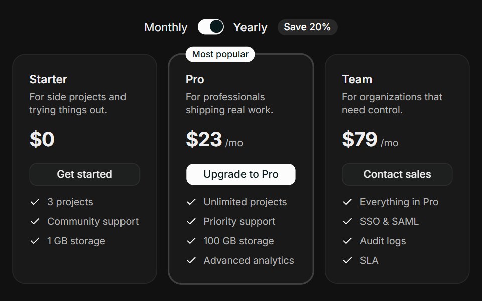 Tiered CardsFLX UI · ReactTiered Cards for Select a Plan.
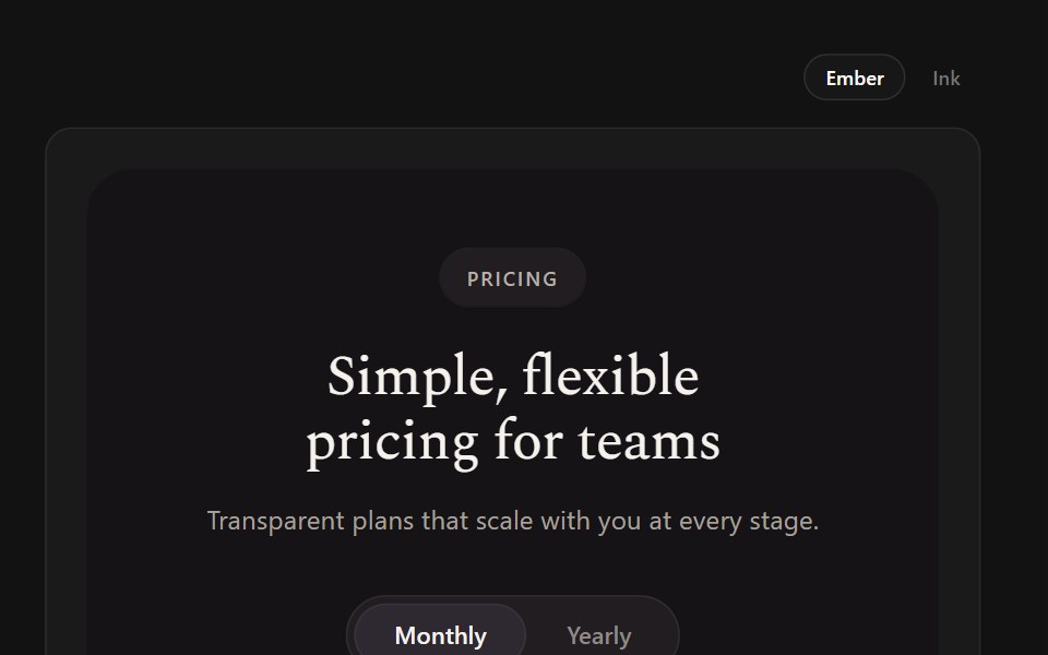 Serif TiersSpectrum UI · ReactCream serif cards with a black featured card lit by a crimson glow.
 Pricing Section 08Tremor Blocks · React
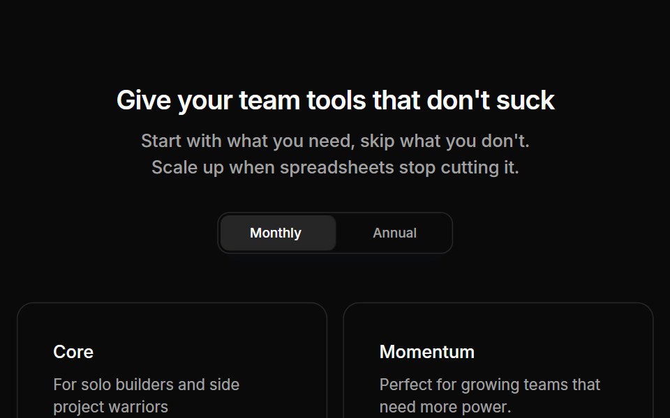 Pricing 02Oxbow UI · Astro
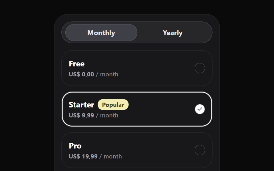 Pricing WidgetWatermelon UI · React
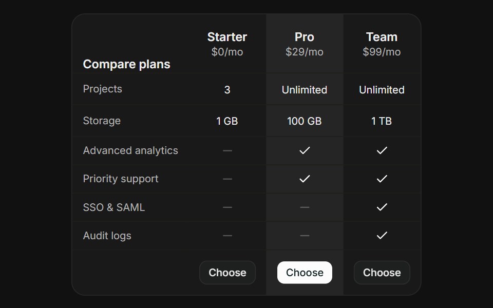 Comparison TableFLX UI · ReactComparison Table for Select a Plan.
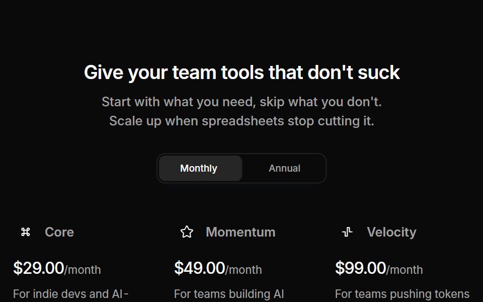 Pricing 05Oxbow UI · Astro
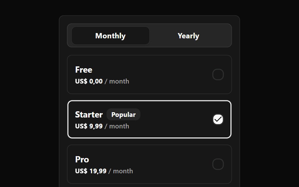 Pricing Widget BaseWatermelon UI · React
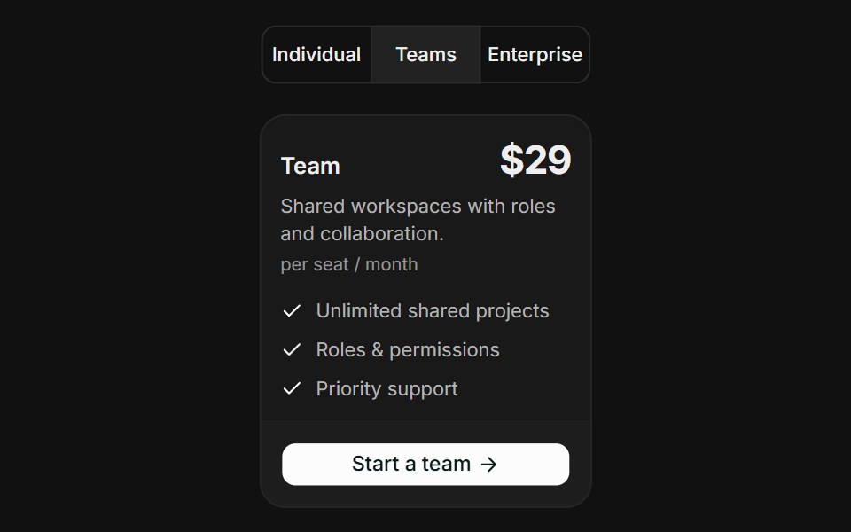 Audience SegmentsFLX UI · ReactAudience Segments for Select a Plan.
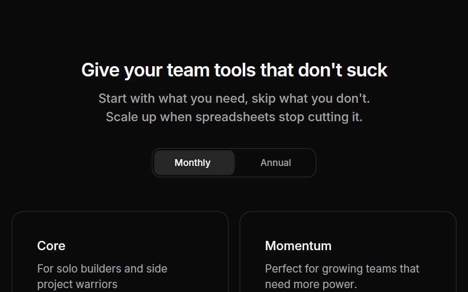 Pricing 09Oxbow UI · Astro
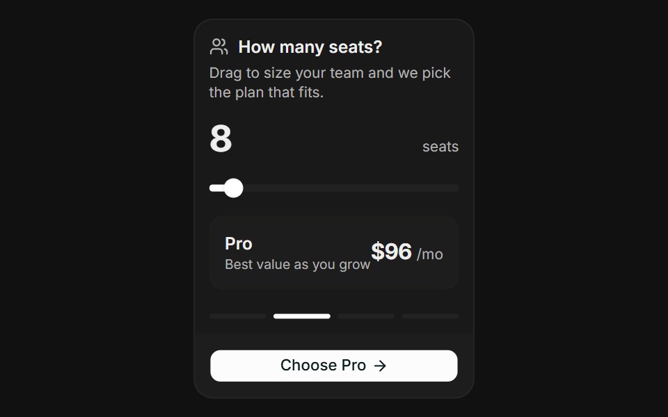 Usage SliderFLX UI · ReactUsage Slider for Select a Plan.
 Pricing 11Oxbow UI · Astro
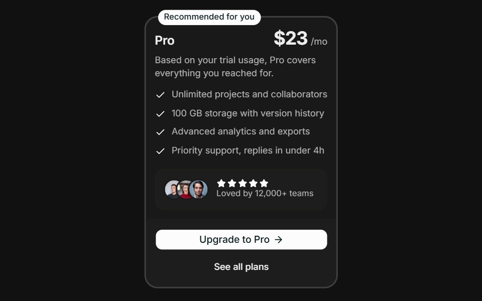 Spotlight RecommendationFLX UI · ReactSpotlight Recommendation for Select a Plan.
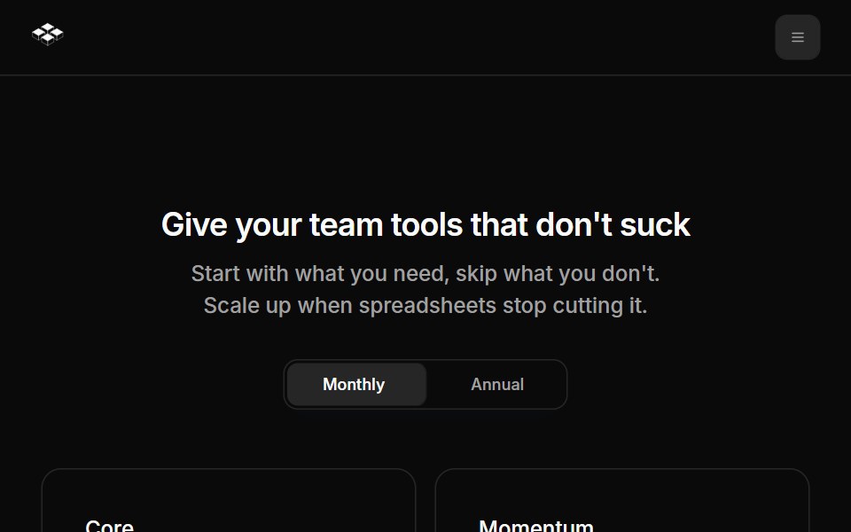 Pricing Pages 01Oxbow UI · Astro
 Pricing Pages 02Oxbow UI · Astro
 Pricing Pages 03Oxbow UI · Astro
Libraries with pricing card components
Related categories
- React Pricing Card Components
- Tailwind CSS Pricing Card Components
- Svelte Pricing Card Components
- Animated Pricing Card Components
- shadcn/ui Pricing Card Components
- Commerce Components
- Pricing Section Components
- Product Card Components
- Checkout Form Components
- Product Gallery Components
- Variant Picker Components
- Subscription Toggle Components
- Cart Components
- Coupon Components