 Dev Design Library
Profile Page Components
Dev Design Library indexes 6 profile page components from 3 open-source UI libraries, with the most coming from Shadcn Space, beUI and Cue Foundations. Each one links to its page with the source code, a live preview where available, the library license and the install command. Profile page components belong to the Pages group.
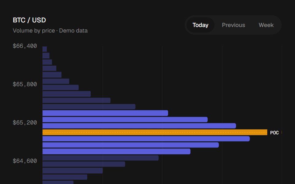 Volume ProfilebeUI · ReactAnimated volume by price, with point of control and value area highlights.
 Alert 14 - Logout with ProfileShadcn Space · ReactCompact logout dialog with the user's avatar, name, and email, plus an option to log out of all devices
 Grid Row Profile ExpanderCue Foundations · React
 Collapsible 04 - User ProfileShadcn Space · ReactA collapsible user profile with user information like last activity, online since and location and actions.
 Dialog 09 - Edit ProfileShadcn Space · ReactEdit profile dialog with photo upload preview, validated name and username fields, a bio counter, and a saving state.
 Dropdown Menu 01 - User ProfileShadcn Space · ReactA professional user profile dropdown with avatar, status indicator, and categorized links for profile, settings, and…