 Dev Design Library
React CTA Section Components
Dev Design Library indexes 19 React cta section components from 9 open-source UI libraries, with the most coming from Watermelon UI, Nexvyn UI, Velora UI, FLX UI and Shadcn Space. Each one links to its page with the source code, a live preview where available, the library license and the install command. Every library in this list targets React. Cta section components belong to the Sections group.
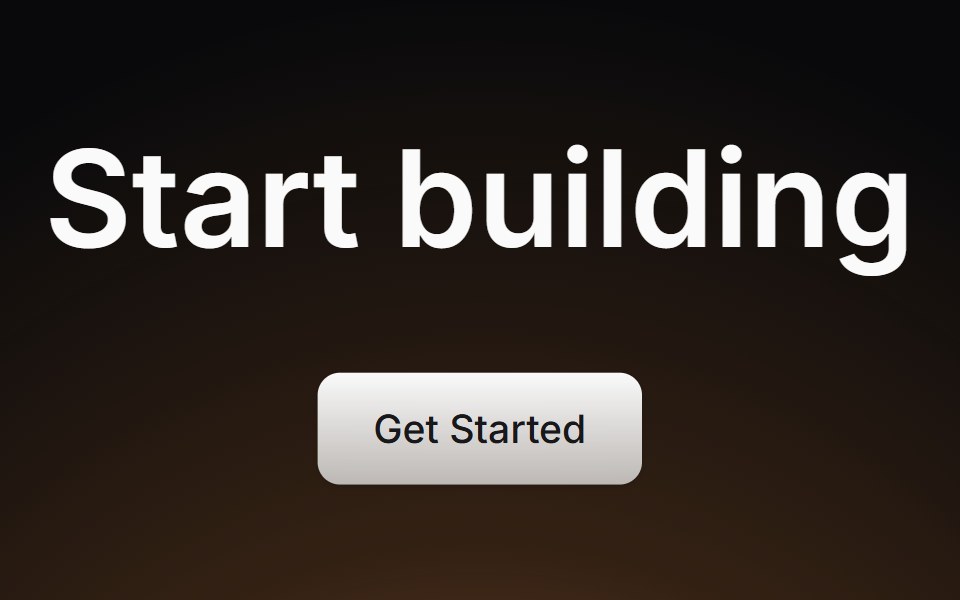 Cta SectionLaunch UI · React
 CTA 02 - Video Background CTAShadcn Space · ReactA high impact call-to-action section with autoplay background video, bold overlay headline, primary button, and…
 CTANexvyn UI · ReactCall to action primitives: Cta section, CtaAction links and the sliding CtaActionIcon.
 Cta 1Watermelon UI · React
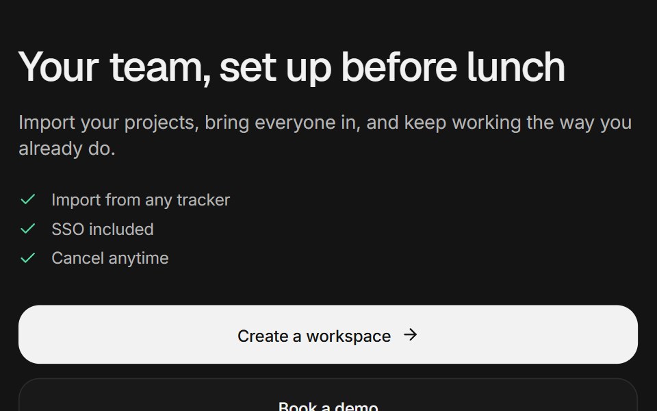 CTA sectionArc Library · ReactA call to action as a centered closing section, a split beside a setup card that completes itself, or a dismissible…
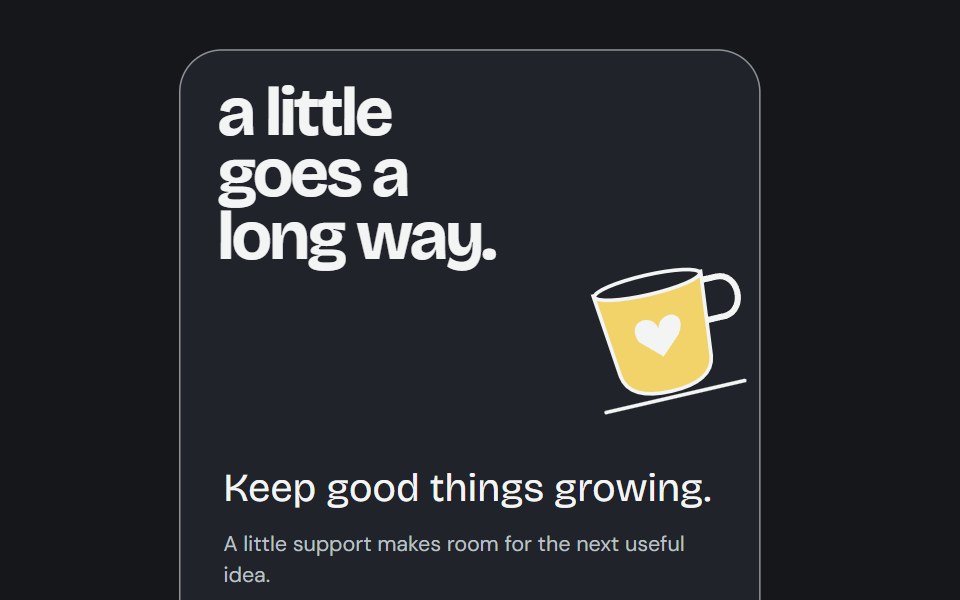 Buy Me CoffeeCojeev UI · ReactA support poster reveals an inviting cup illustration and a real caller destination.
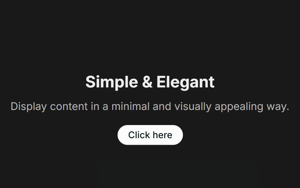 Call to Action 01FLX UI · ReactA centered text block with a title, description, and CTA.
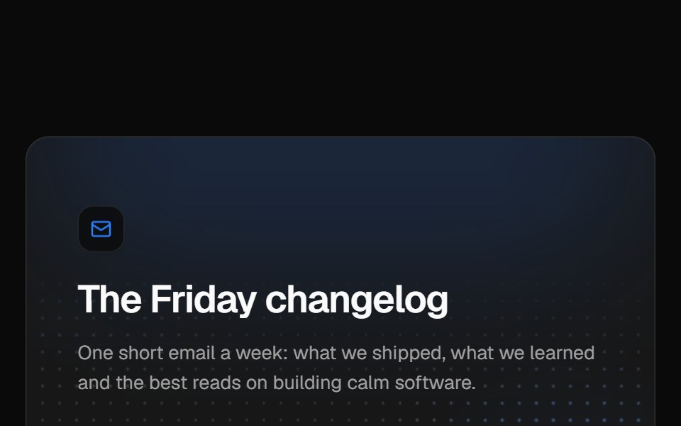 Newsletter sign-upVelora UI · ReactNewsletter card over a glowing dot grid with a labelled email field, subscriber avatars and a privacy note.
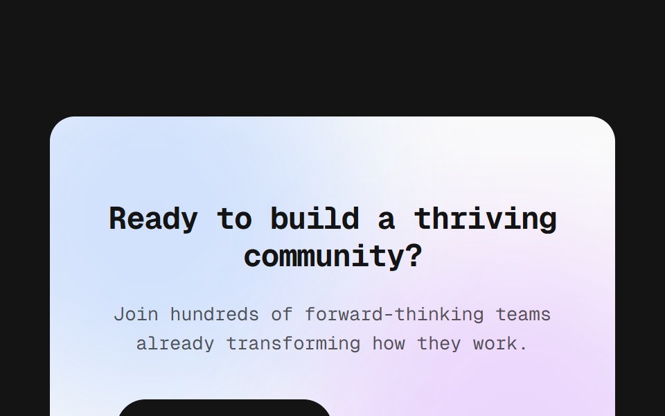 Panel CTAD2Studio UI · ReactOne inverted panel, centred copy and two actions, the plain one. Two blurred lobes bleed in from opposite corners and…
 Newsletter 01 - Newsletter Subscription CTAShadcn Space · ReactA minimal newsletter signup section with bold headline, social-proof subtext, and inline email form, ideal for…
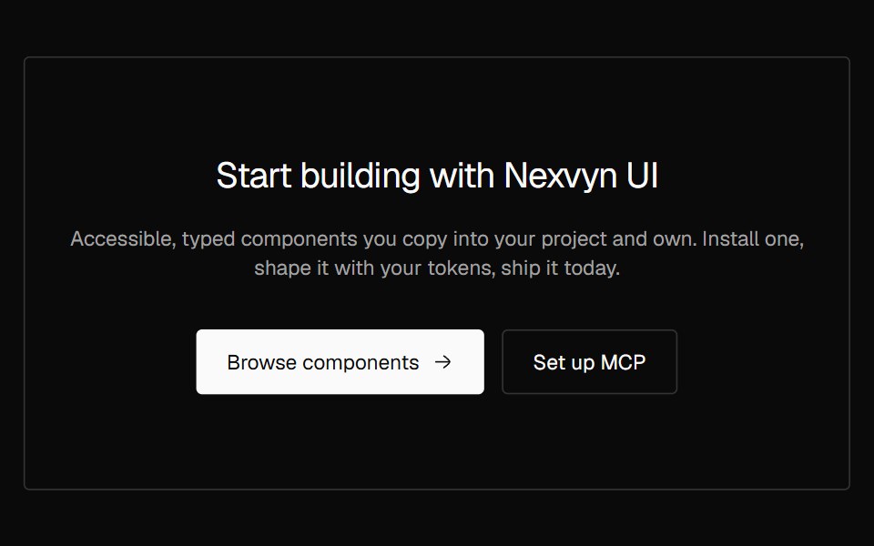 CTA CenteredNexvyn UI · ReactA centered call to action with eyebrow, heading, supporting text and two actions.
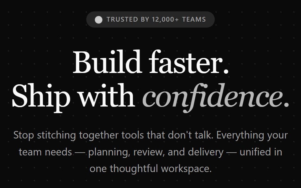 Cta 2Watermelon UI · React
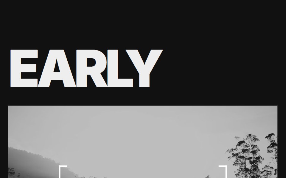 Call to Action 02FLX UI · ReactAn oversized two-word headline split around a full-bleed photo, with a bracketed call to action at its center.
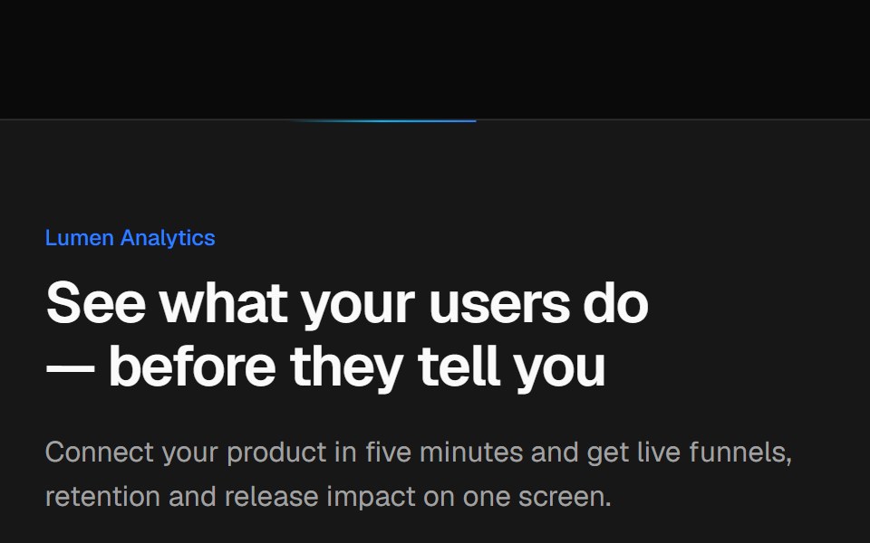 Split CTA with product visualVelora UI · ReactTwo-column CTA card with a benefit list and a dashboard mock-up, traced by an animated border beam.
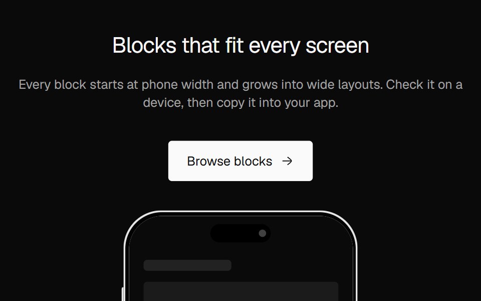 CTA SplitNexvyn UI · ReactA two column call to action with a phone showing your app screen.
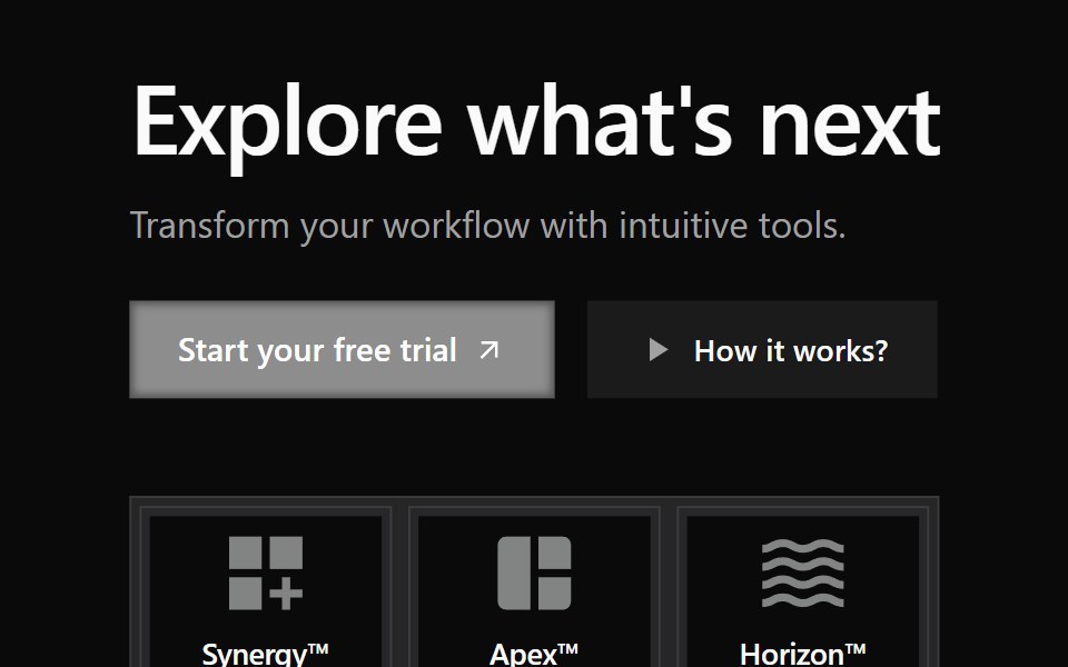 Cta 3Watermelon UI · React
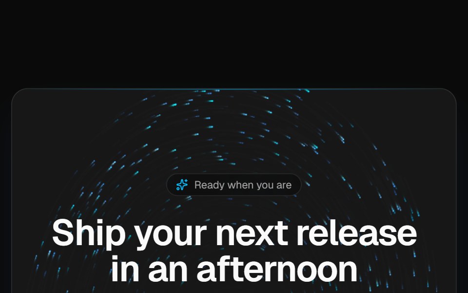 Vortex CTA bandVelora UI · ReactDark rounded call-to-action band over a brand-tinted particle vortex, with two actions and fine print.
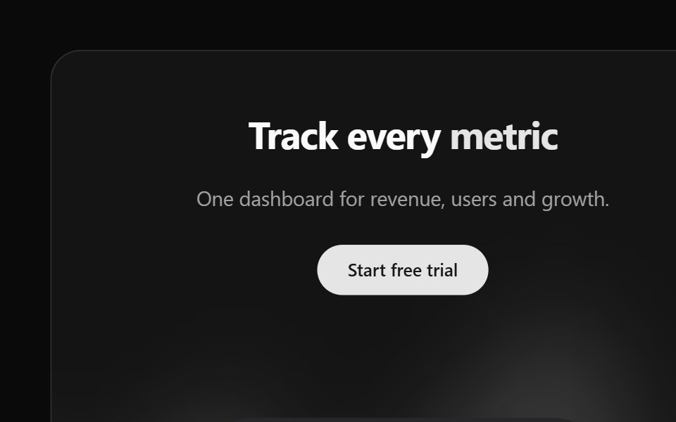 Cta 4Watermelon UI · React
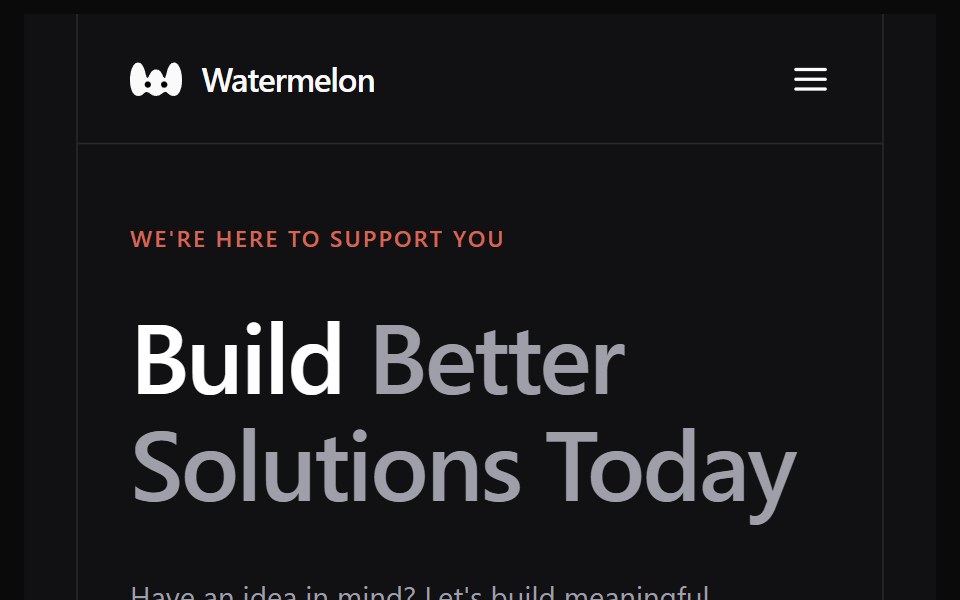 Cta 5Watermelon UI · React
Libraries with React cta section components
Related categories
- CTA Section Components
- Tailwind CSS CTA Section Components
- Svelte CTA Section Components
- Animated CTA Section Components
- shadcn/ui CTA Section Components
- React Section Components
- React Hero Components
- React Footer Components
- React Feature Section Components
- React Logo Cloud Components
- React FAQ Section Components
- React Testimonials Section Components
- React Integrations Section Components
- React Stats Section Components
- React Contact Section Components
- React Team Section Components
- React Newsletter Section Components
- React Gallery Section Components