 Dev Design Library
shadcn/ui Commerce Components
Dev Design Library indexes 39 shadcn/ui commerce components from 7 open-source UI libraries, with the most coming from FLX UI, Shadcn Space, Watermelon UI, Velora UI and Spectrum UI. Each one links to its page with the source code, a live preview where available, the library license and the install command. They follow the shadcn/ui conventions, so most install with the shadcn CLI and drop into a Tailwind project.
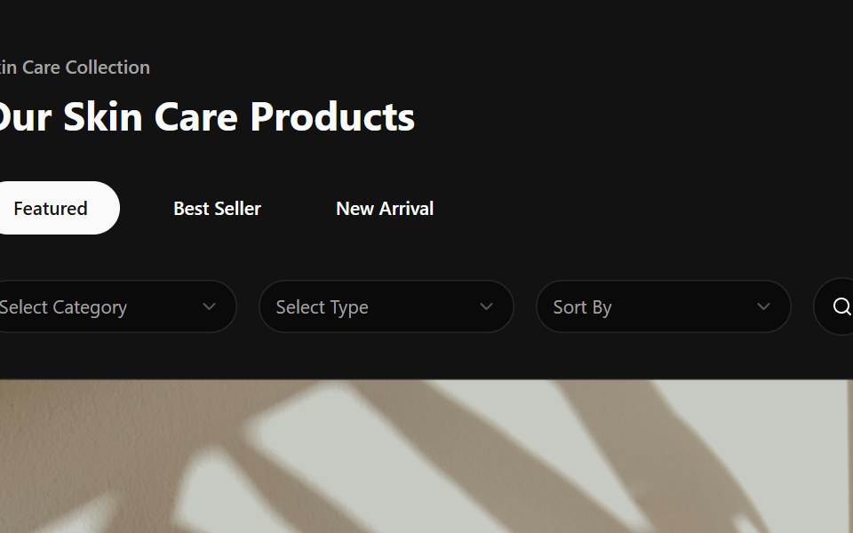 Product CardSpectrum UI · Reactcomponent for the Product Card
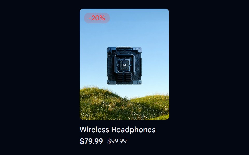 Aspect Ratio 06 - Product CardShadcn Space · ReactA product card using a 4:5 aspect ratio image with a discount badge and pricing details.
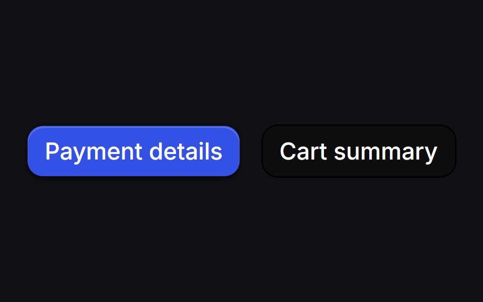 Drawer Buttonsuselayouts · ReactTwo buttons that open side drawers with a 3D fold. Payment comes from the right, cart from the left, and the fields…
 Pricing 1Watermelon UI · React
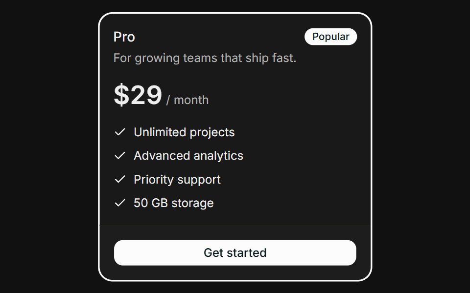 PricingFLX UI · ReactHighlighted plan with a Popular badge and feature checklist.
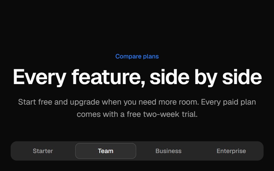 Pricing comparison tableVelora UI · ReactGrouped feature comparison table with a sticky plan header, and per-plan tabs on mobile.
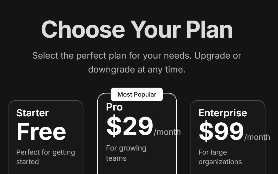 Pricing CardsD2Studio UI · ReactResponsive three-tier pricing cards with feature comparison and popular plan highlighting
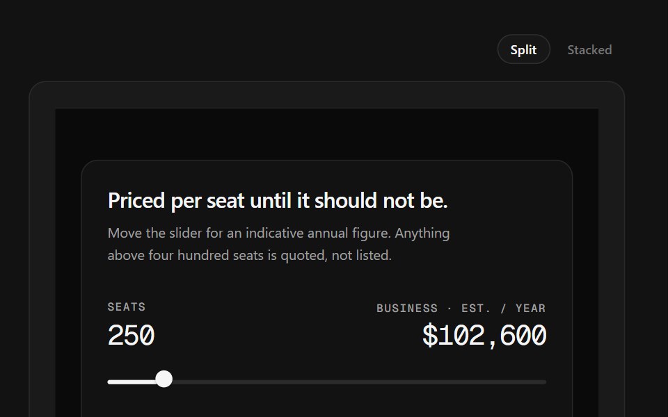 Sales CTA FooterSpectrum UI · ReactA seat slider that prices a tier live, beside the link grid.
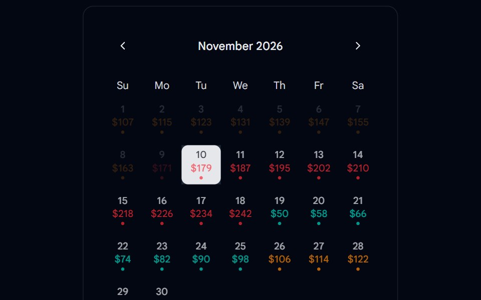 Calendar 15 - With PricingShadcn Space · ReactCalendar component
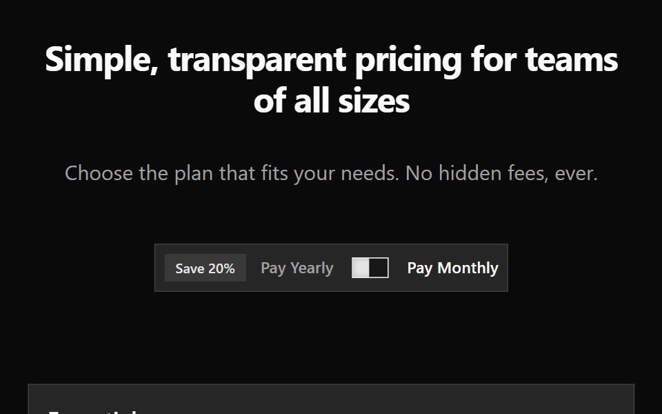 Pricing 2Watermelon UI · React
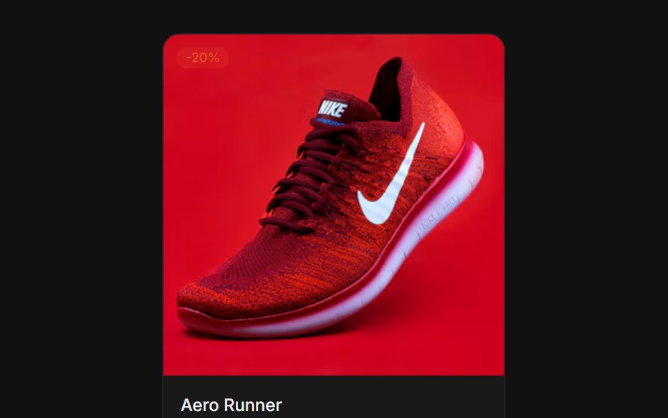 ProductFLX UI · ReactSquare image with a sale badge, price, and add-to-cart.
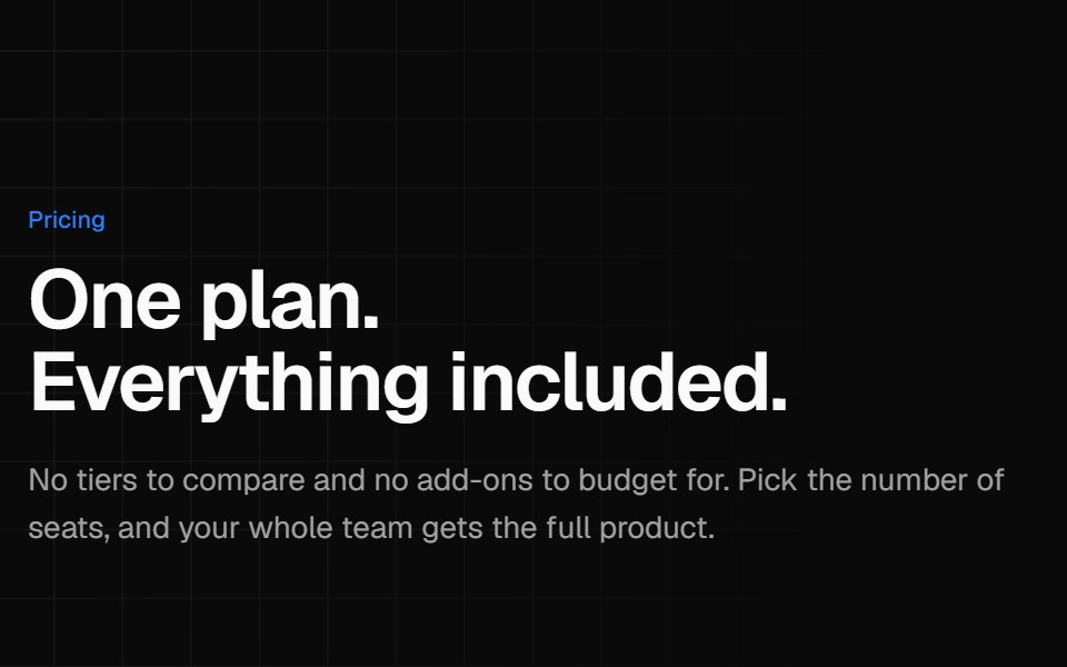 Single plan pricingVelora UI · ReactOne all-inclusive plan card beside a benefit list and short reassurance answers.
 Card-03 - Product CardShadcn Space · ReactCard component
 Pricing 3Watermelon UI · React
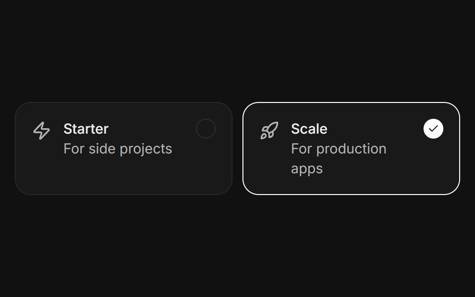 SelectableFLX UI · ReactClickable plan cards with a ring and check on the active one.
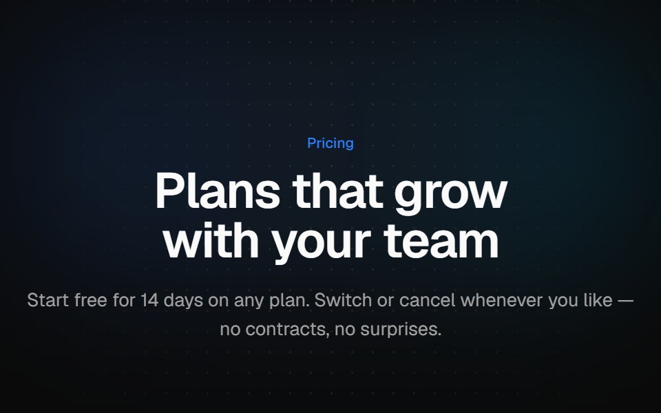 Three-tier pricingVelora UI · ReactThree plan cards with a monthly/yearly switch, a savings badge and a highlighted middle plan.
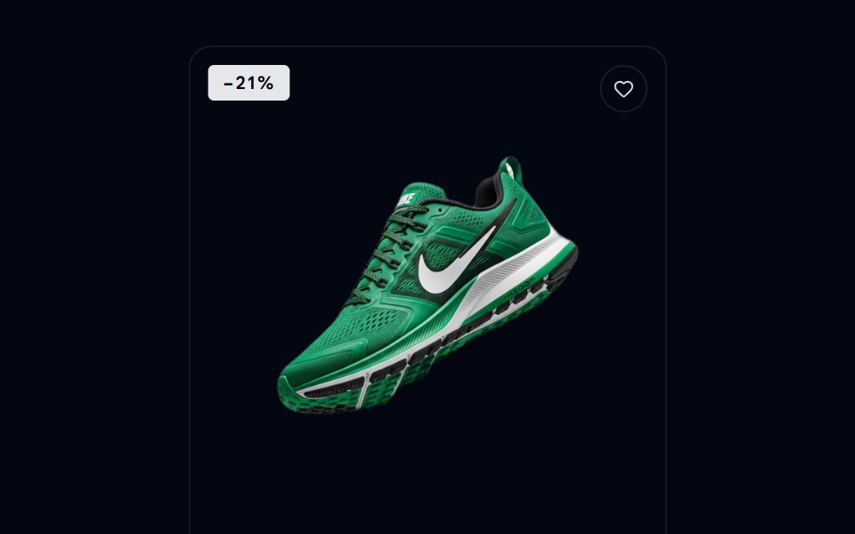 Card-14 - Ecommerce Product CardShadcn Space · ReactA clean editorial ecommerce product card with slide-up CTA, color swatches, sale badge, and wishlist.
 Pricing 4Watermelon UI · React
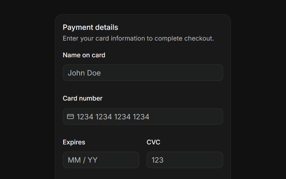 Payment formFLX UI · ReactName on card, card number with icon, expiry, CVC, and country select fields with a pay button.
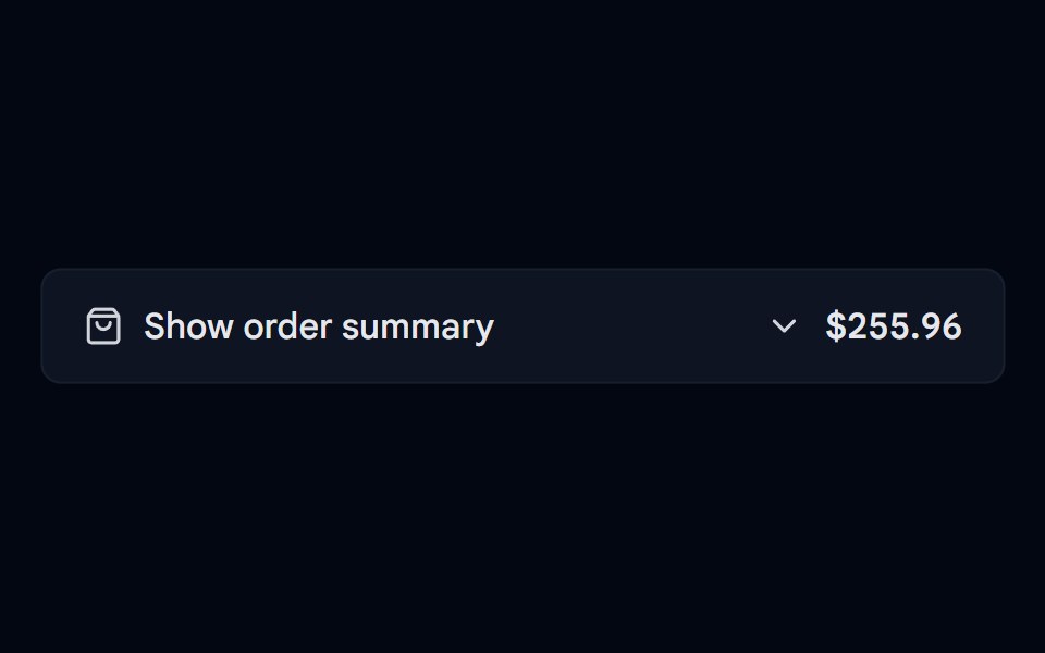 Collapsible 07 - Order SummaryShadcn Space · ReactMobile checkout order summary that shows the total in the trigger and expands to items with quantities, subtotal…
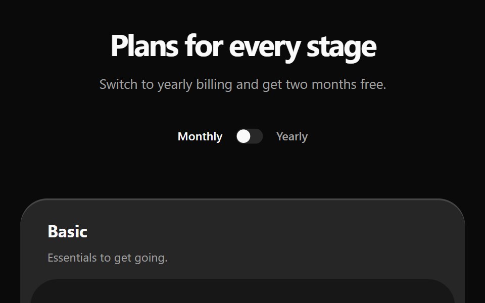 Pricing 5Watermelon UI · React
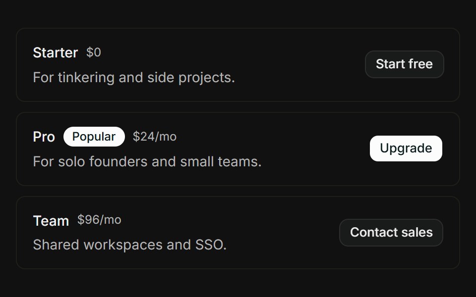 Pricing tiersFLX UI · ReactStacked tier rows with Popular badge, price, and CTA button.
 Drawer 02 - Shopping CartShadcn Space · ReactFloating right side drawer with a free shipping progress bar, editable cart items, product suggestions, and an order…
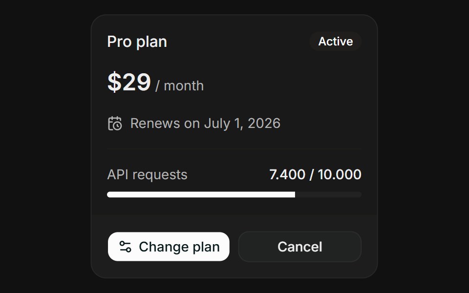 Plan OverviewFLX UI · ReactPlan Overview for Manage Subscription.
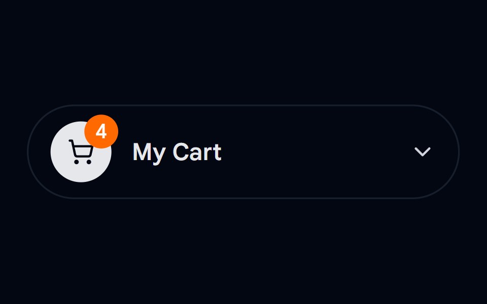 Dropdown Menu 04 - Shopping CartShadcn Space · ReactAn e-commerce cart dropdown that expands in place, with free-delivery progress, discounted prices, quantity controls…
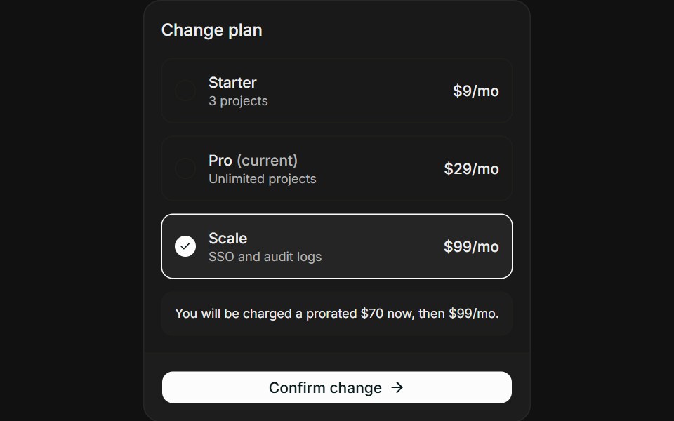 Change PlanFLX UI · ReactChange Plan for Manage Subscription.
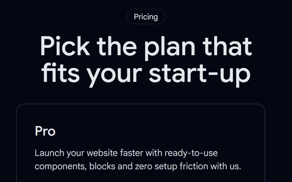 Pricing 02 - Scalable Pricing TableShadcn Space · ReactA three tier pricing layout with a highlighted recommended plan, feature checklists, and clear CTAs, perfect for any…
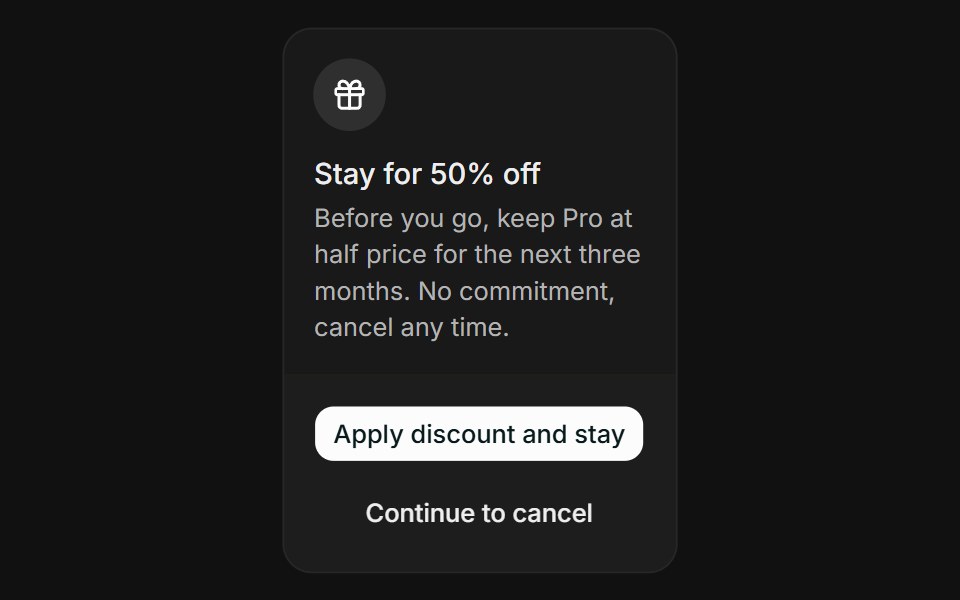 Cancel FlowFLX UI · ReactCancel Flow for Manage Subscription.
 Sheet 03 - Shopping CartShadcn Space · ReactDrawer with products list, quantity controls, and sticky footer with total and checkout button
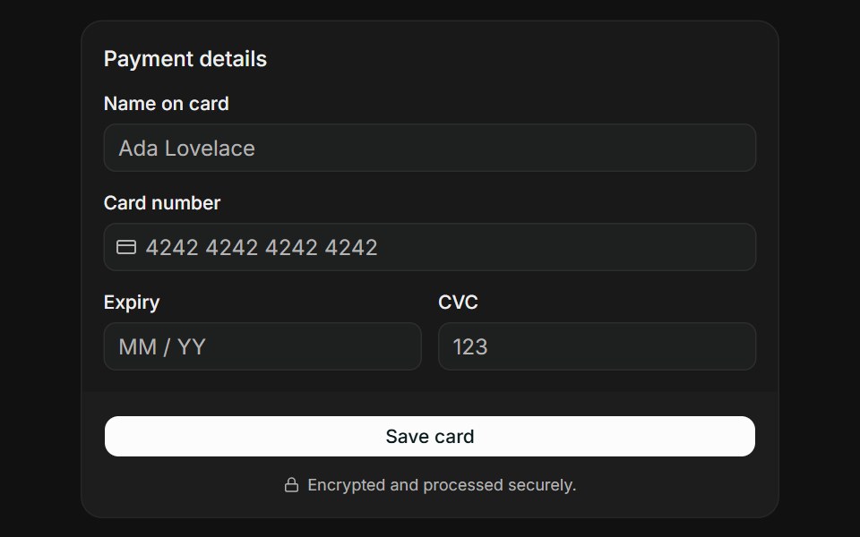 Card FormFLX UI · ReactCard Form for Payment.
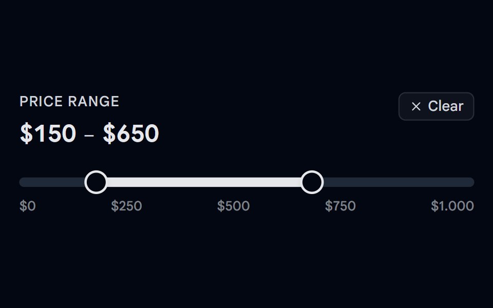 Slider 05 - Price Range FilterShadcn Space · ReactA dual-thumb price range filter slider with a hover ghost preview — hover outside the selected range to see a…
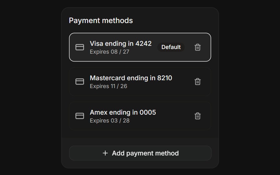 Saved MethodsFLX UI · ReactSaved Methods for Payment.
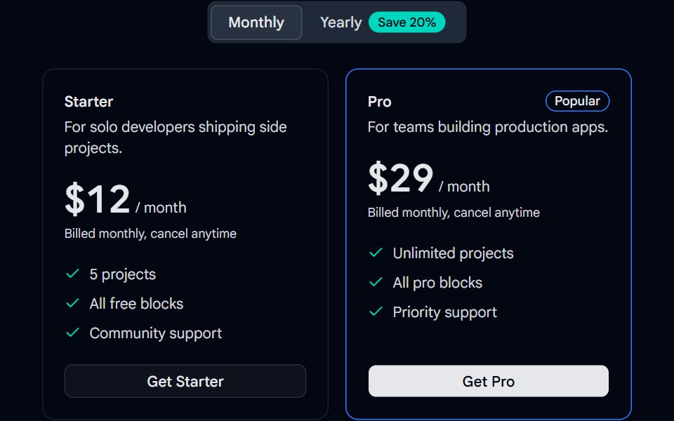 Tabs 13 - Billing ToggleShadcn Space · ReactMonthly and yearly billing tabs with a savings badge and animated pricing cards.
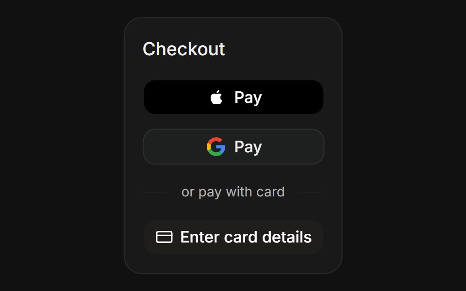 Express WalletsFLX UI · ReactExpress Wallets for Payment.
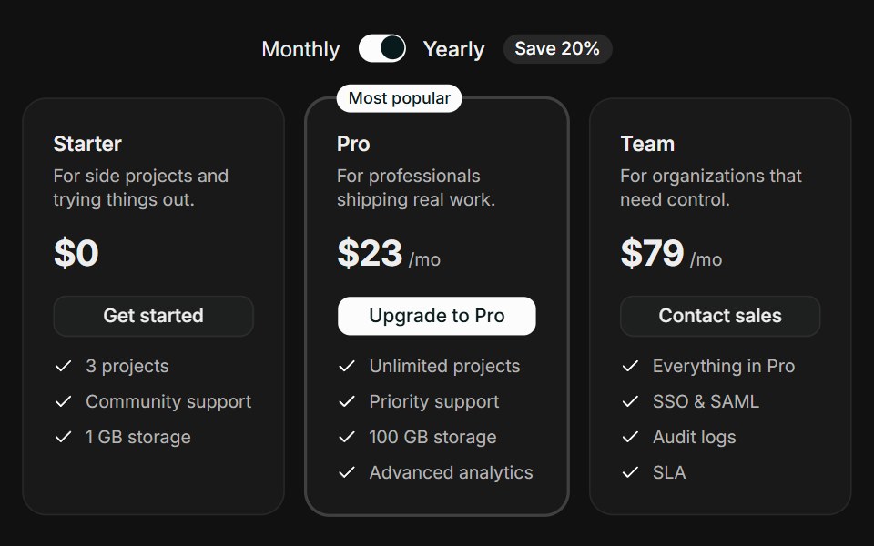 Tiered CardsFLX UI · ReactTiered Cards for Select a Plan.
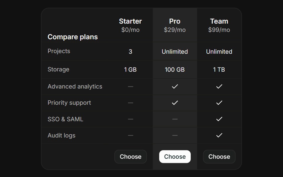 Comparison TableFLX UI · ReactComparison Table for Select a Plan.
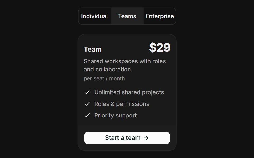 Audience SegmentsFLX UI · ReactAudience Segments for Select a Plan.
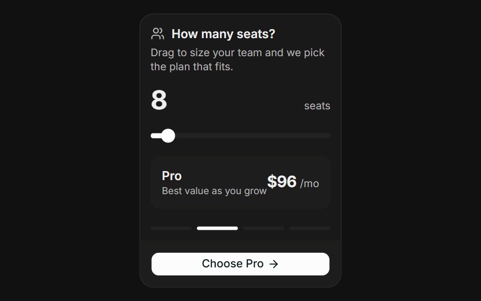 Usage SliderFLX UI · ReactUsage Slider for Select a Plan.
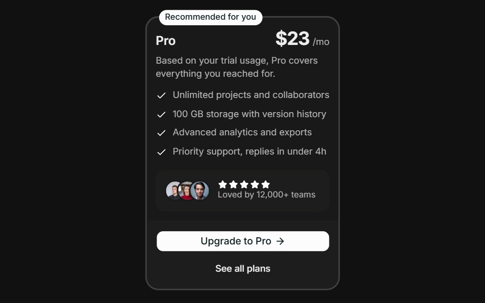 Spotlight RecommendationFLX UI · ReactSpotlight Recommendation for Select a Plan.