 Dev Design Library
shadcn/ui Marquee Components
Dev Design Library indexes 6 shadcn/ui marquee components from 4 open-source UI libraries, with the most coming from D2Studio UI, Velora UI, FLX UI and Shadcn Space. Each one links to its page with the source code, a live preview where available, the library license and the install command. They follow the shadcn/ui conventions, so most install with the shadcn CLI and drop into a Tailwind project. Marquee components belong to the Effects group.
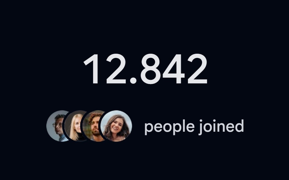 Number Ticker 06 - Social ProofShadcn Space · ReactA social proof counter with a counting member number and a stacked avatar cluster, perfect for signup counts…
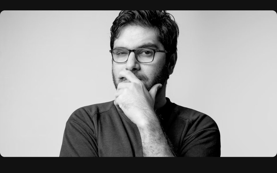 Carousel 01FLX UI · ReactAuto-scroll carousel that pauses on item hover and reveals title.
 Testimonial marqueeVelora UI · ReactTwo rows of review cards scrolling in opposite directions, with faded edges and pause on hover or focus.
 Hero 01D2Studio UI · ReactStartup mentorship landing hero with a headline, call to action and mentor avatar group.
 Hero Section 01D2Studio UI · ReactPremium landing page hero with a serif accent headline, badge and mentor avatar group.
 Hero Section 02D2Studio UI · ReactModern landing page hero section with badge, headline and avatar social proof.