 Dev Design Library
shadcn/ui Model Selector Components
Dev Design Library indexes 8 shadcn/ui model selector components from 4 open-source UI libraries, with the most coming from Notra, Spectrum UI, Kokonut UI and AI Elements (Svelte). Each one links to its page with the source code, a live preview where available, the library license and the install command. They follow the shadcn/ui conventions, so most install with the shadcn CLI and drop into a Tailwind project. Model selector components belong to the AI group.
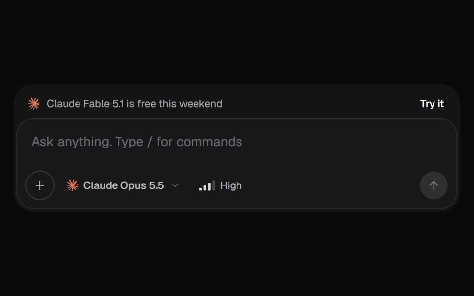 AI Input SelectorKokonut UI · ReactAI chat input with a model menu, a separate Effort control, file chips you can drop or paste, a / command menu, and…
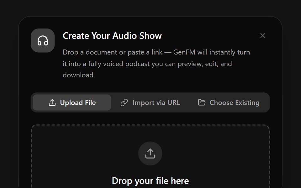 Input ModelSpectrum UI · Reactcomponent for the Input Model Demo
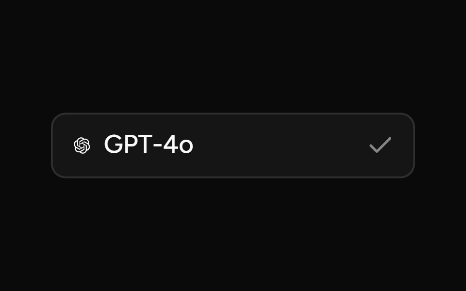 Model SelectorAI Elements (Svelte) · SvelteA searchable model selector dialog built on command and dialog primitives.
 ChatGPT Model SelectorNotra · ReactThe hover-to-open effort chip with Model and Effort submenus, built on shadcn DropdownMenu.
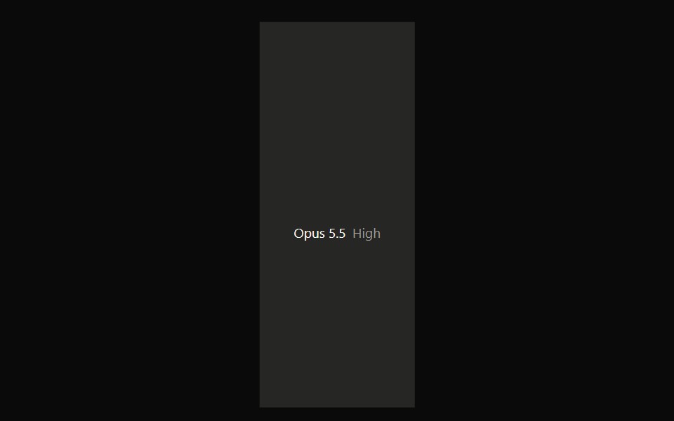 Claude Model SelectorNotra · ReactA hover-open model and effort picker built on shadcn DropdownMenu.
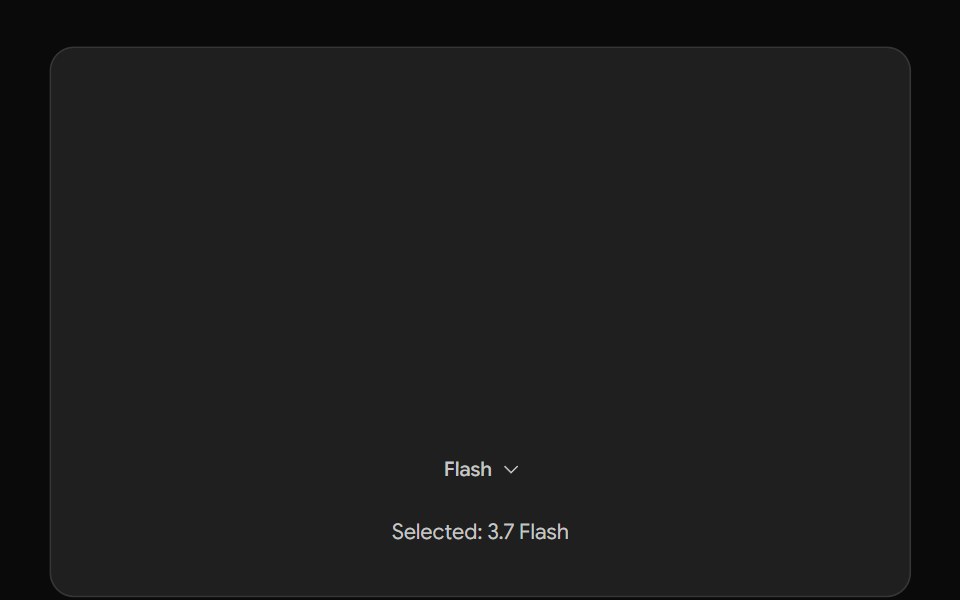 Gemini Model SelectorNotra · ReactThe Gemini model chip and menu built on shadcn DropdownMenu.
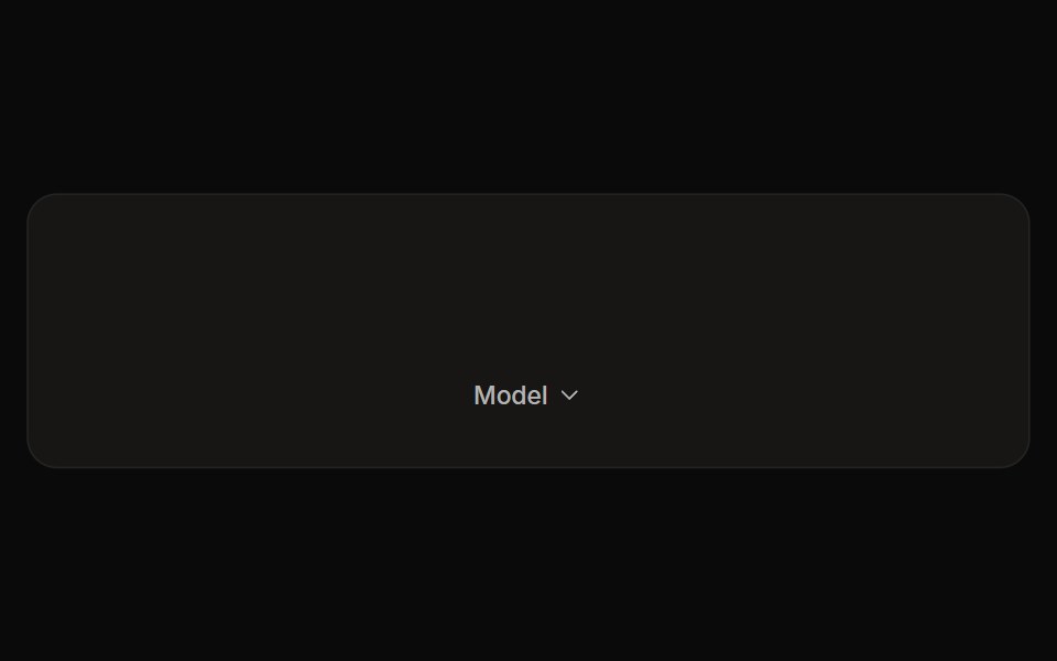 Perplexity Model SelectorNotra · ReactThe Model chip and its provider list with Max/New badges and locks, built on shadcn DropdownMenu.
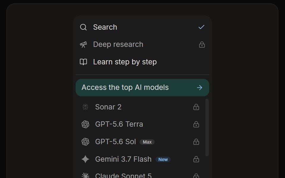 Perplexity Rewrite PanelNotra · ReactThe mode and model list with a Rewrite button.
Libraries with shadcn/ui model selector components
Related categories
- Model Selector Components
- React Model Selector Components
- Tailwind CSS Model Selector Components
- shadcn/ui AI Element Components
- shadcn/ui Prompt Input Components
- shadcn/ui AI Message Components
- shadcn/ui Citation Components
- shadcn/ui Conversation Components
- shadcn/ui Sources Components
- shadcn/ui Tool Call Components