 Dev Design Library
shadcn/ui Pattern Background Components
Dev Design Library indexes 6 shadcn/ui pattern background components from 2 open-source UI libraries, with the most coming from Velora UI and Cojeev UI. Each one links to its page with the source code, a live preview where available, the library license and the install command. They follow the shadcn/ui conventions, so most install with the shadcn CLI and drop into a Tailwind project. Pattern background components belong to the Backgrounds group.
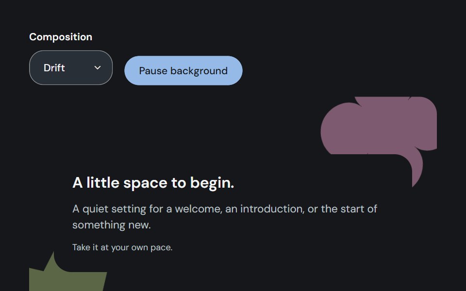 Ambient backgroundCojeev UI · ReactAdds a quiet animated composition around content, with decorative shapes kept behind a readable surface.
 Sign-up cardVelora UI · ReactCentered sign-up card over a grid and light beams, with live password rules, terms and social sign-up.
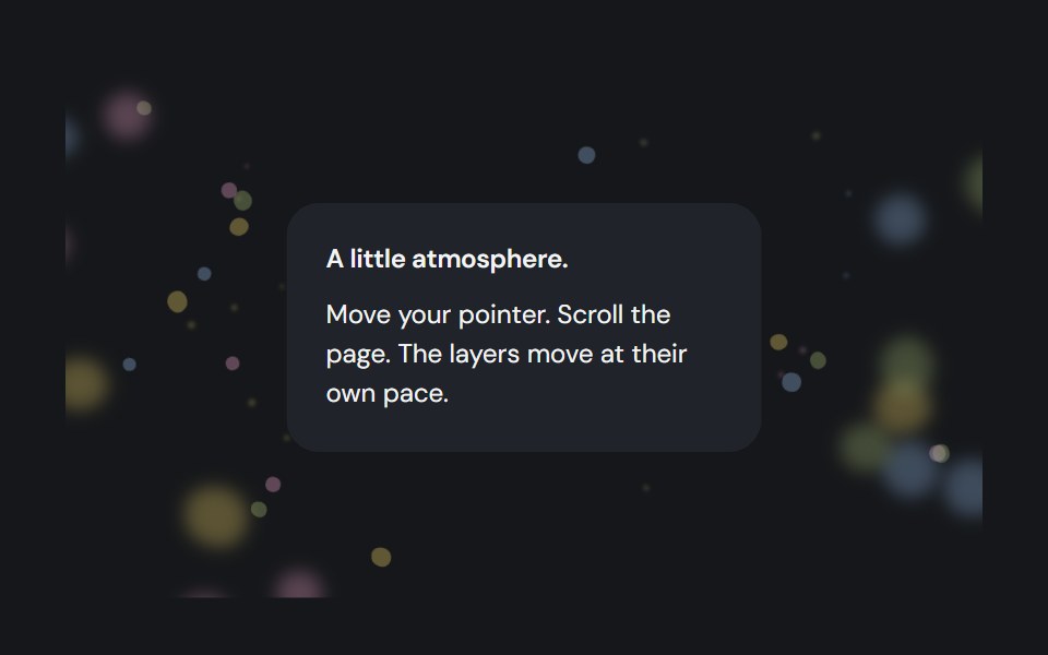 Depth backgroundCojeev UI · ReactLayered pollen, contours and orbital shapes with perspective, native-scroll depth and pointer response.
 Newsletter sign-upVelora UI · ReactNewsletter card over a glowing dot grid with a labelled email field, subscriber avatars and a privacy note.
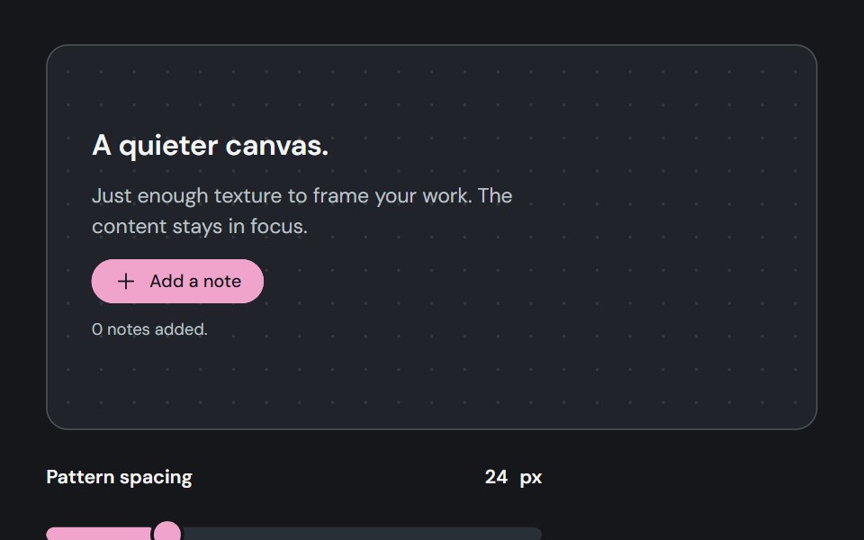 Pattern backgroundCojeev UI · ReactEight distinct, lightweight backgrounds behind content, with a plain option and adjustable spacing, color and strength.
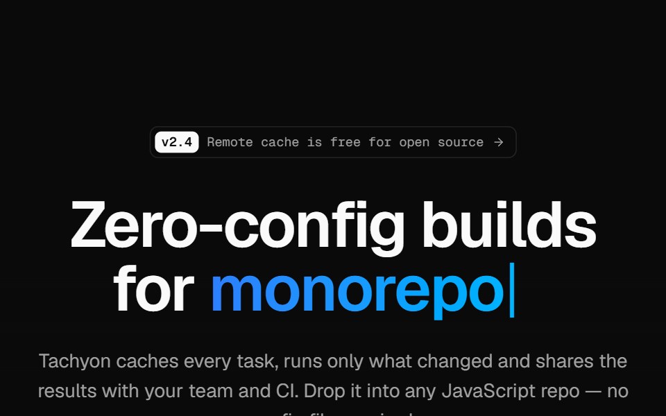 Developer tool heroVelora UI · ReactMinimal hero on a retro grid with a typed headline accent, an install terminal and two CTAs.