 Dev Design Library
Social Proof Widget Components
Dev Design Library indexes 13 social proof widget components from 8 open-source UI libraries, with the most coming from GreatUI, Magic UI, FLX UI, Kokonut UI and Spell UI. Each one links to its page with the source code, a live preview where available, the library license and the install command. Social proof widget components belong to the Widgets group.
 Client Tweet CardMagic UI · ReactA client-side version of the tweet card that displays a tweet with the author's name, handle, and profile picture.
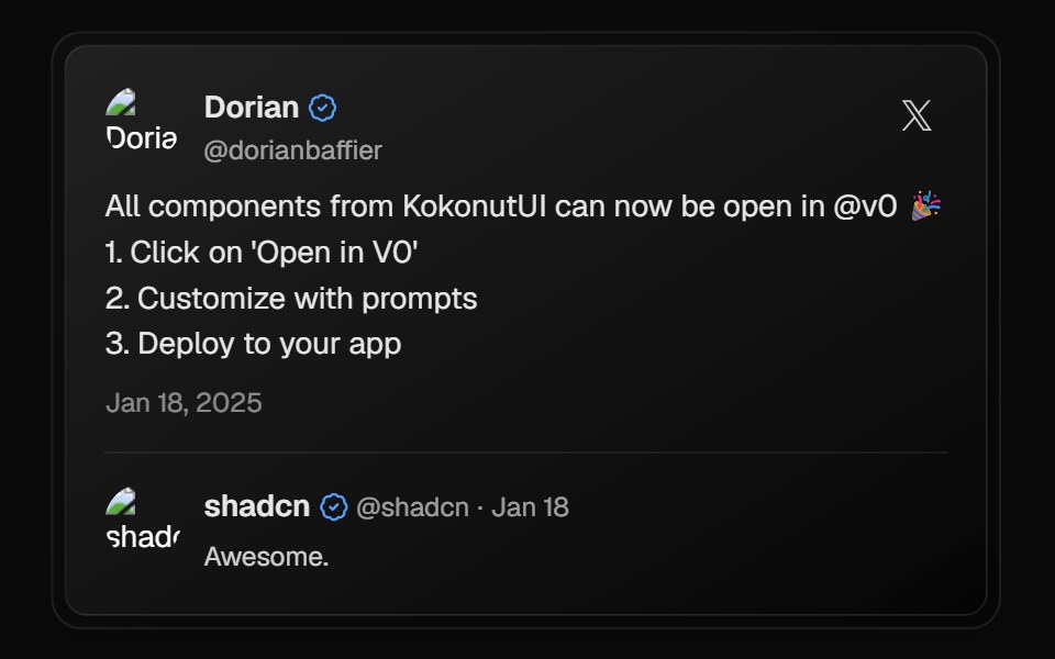 X CardKokonut UI · ReactX (Twitter) style post card with author details, verified badge, reply thread and hover gradient, built with React and…
 TweetSpell UI · ReactEmbed Twitter/X posts with custom styling.
 Social Proof AvatarsBadtz UI · ReactA component that displays user avatars with optional extra count and star ratings, ideal for showcasing social proof.
 Facebook CardGreatUI · React
 Hero 08FLX UI · ReactA split hero with a bold headline, avatar social proof, and two image cards with invertible overlay text and CTAs.
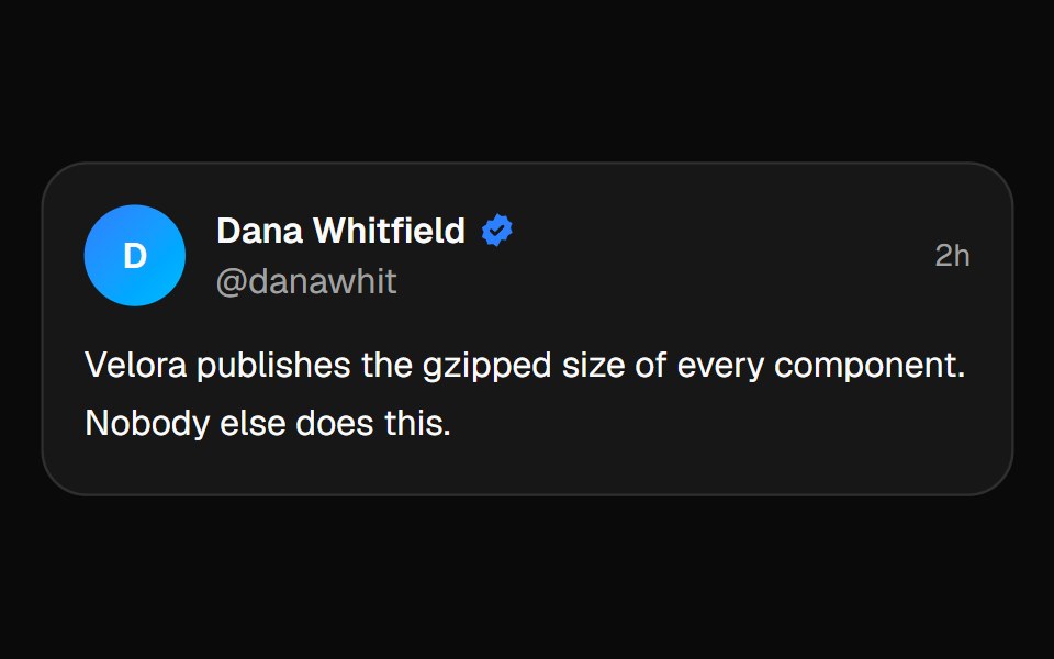 Tweet CardVelora UI · ReactStatic social-proof card — props, not an API call.
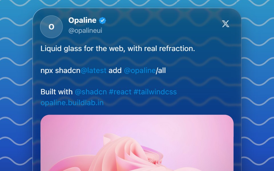 Glass Tweet CardOpaline · ReactA post from X on glass, loaded live with react-tweet by id, with a fallback when it can't be fetched.
 Tweet CardMagic UI · ReactA card that displays a tweet with the author's name, handle, and profile picture.
 Instagram CardGreatUI · React
 Hero 10FLX UI · ReactA centered hero with a highlighted headline, dual CTAs, social proof, and a fanned collage of three overlapping images.
 Linkedin CardGreatUI · React
 Twitter CardGreatUI · React