 Dev Design Library
Tailwind CSS Globe Components
Dev Design Library indexes 9 Tailwind CSS globe components from 5 open-source UI libraries, with the most coming from Velora UI, Cult UI, Aceternity UI, Magic UI and Animations (Svelte). Each one links to its page with the source code, a live preview where available, the library license and the install command. Every library in this list styles its components with Tailwind CSS utility classes. Globe components belong to the Maps group.
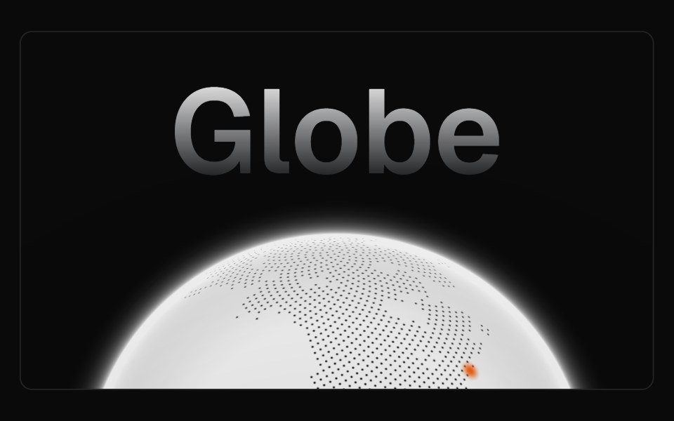 GlobeMagic UI · ReactAn autorotating, interactive, and highly performant globe made using WebGL.
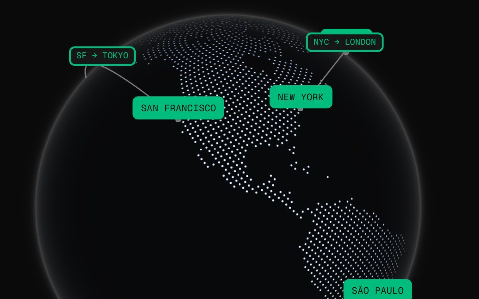 GlobeCult UI · ReactCOBE-powered 3D globe with showcase presets, markers, arcs, DOM overlays, and theme-aware styling
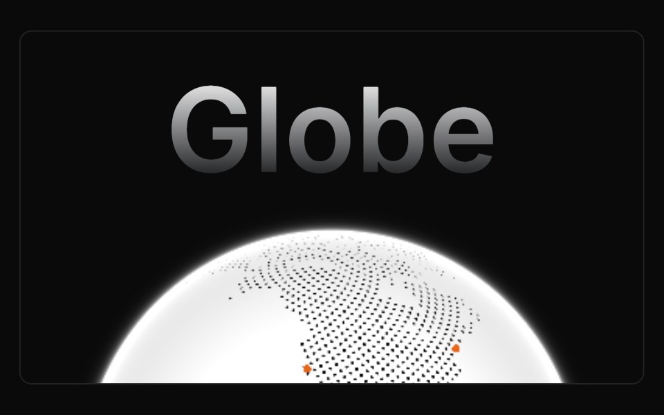 GlobeAnimations (Svelte) · SvelteAn autorotating, interactive, and highly performant globe made using WebGL.
 Bento feature gridVelora UI · ReactFive-card bento grid with live visuals: integration beams, orbiting icons, a chart, a tag marquee and a globe.
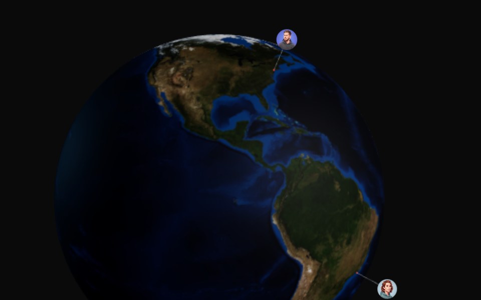 3d GlobeAceternity UI · React
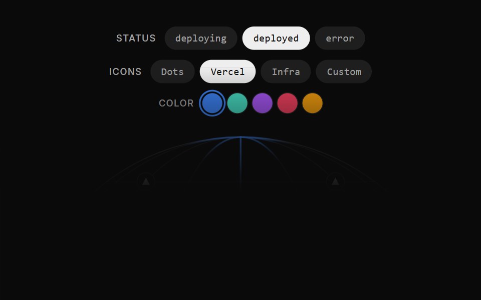 Illustration Globe VercelCult UI · ReactGlobe deployment illustration
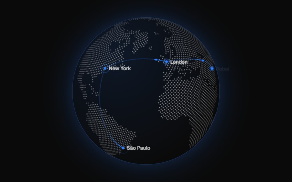 GlobeVelora UI · ReactDotted canvas globe with markers, great-circle arcs, drag and keyboard rotation.
 GlobeAceternity UI · React
 Globe split heroVelora UI · ReactSplit hero with copy, CTAs and live stats beside an interactive dotted globe with arcs.