 Dev Design Library
Tailwind CSS Pricing Section Components
Dev Design Library indexes 56 Tailwind CSS pricing section components from 15 open-source UI libraries, with the most coming from Oxbow UI, Watermelon UI, Tremor Blocks, Spectrum UI and cnblocks. Each one links to its page with the source code, a live preview where available, the library license and the install command. Every library in this list styles its components with Tailwind CSS utility classes. Pricing section components belong to the Commerce group.
 Banner TiersSpectrum UI · ReactA brutalist plan table whose featured column wears a blue banner on top.
 Pricing SectionVengeance UI · ReactThree-tier pricing with a sliding billing switch, rolling prices, and accent-lit cards
 Pricing SectionLaunch UI · React
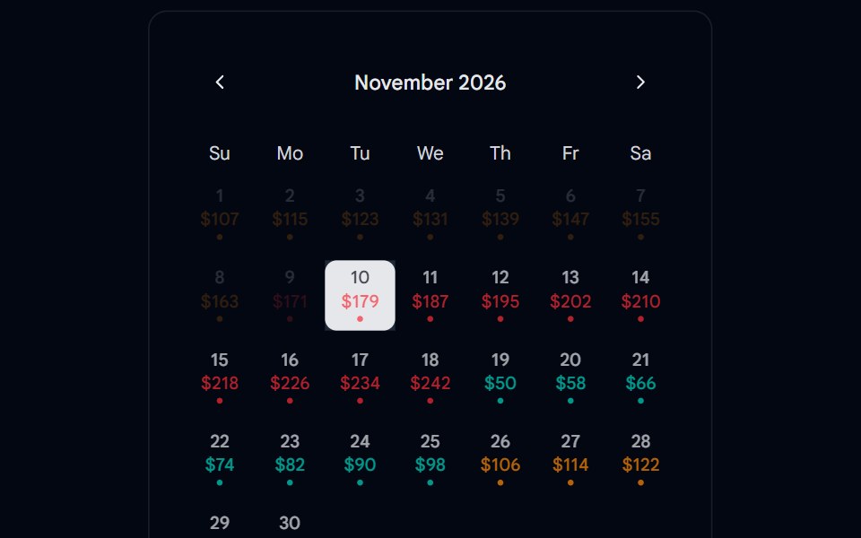 Calendar 15 - With PricingShadcn Space · ReactCalendar component
 LandingBoardUI · React
 Pricing 01Componentry · ReactThree tactile pricing cards with revealed hover notes, clear feature lists, and a highlighted popular plan.
 Pricing Section 01Tremor Blocks · React
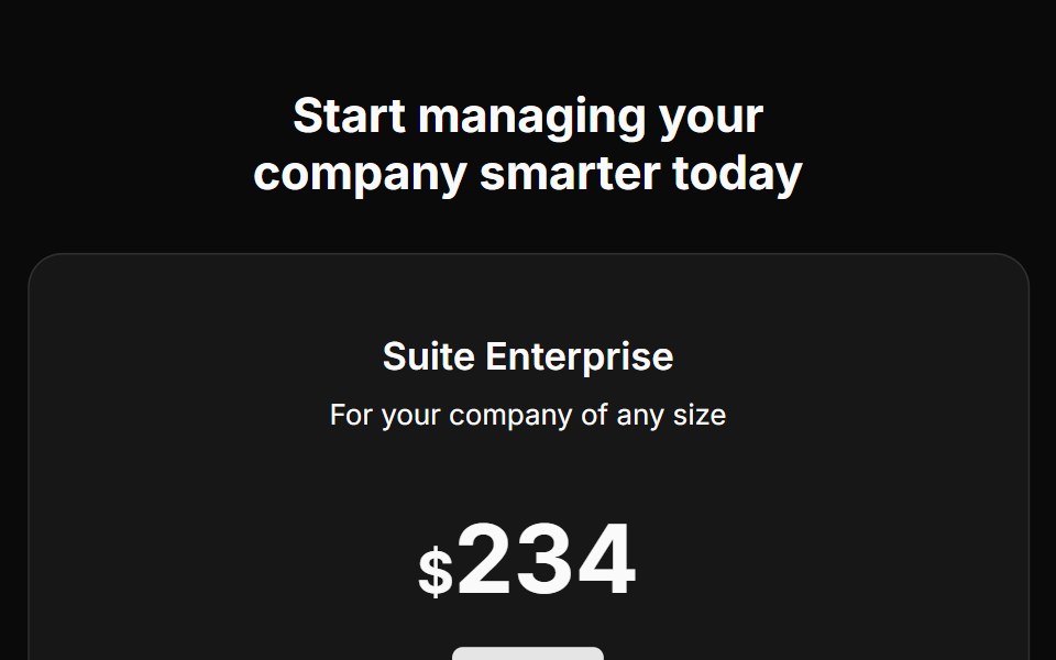 Pricing Fivecnblocks · SveltePricing table with feature comparison
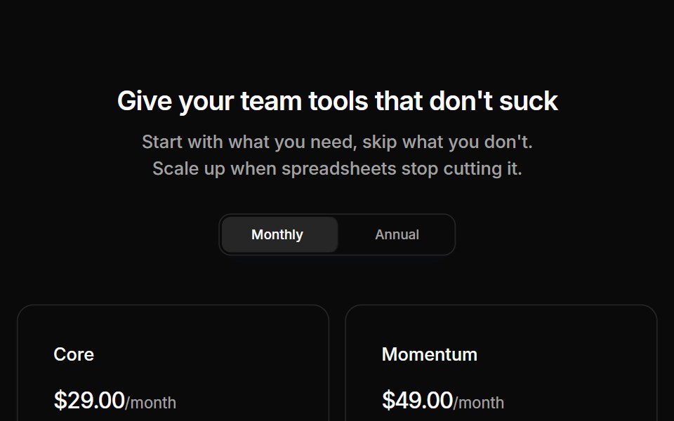 Pricing 01Oxbow UI · AstroPricing section with two tiers
 Template LandingShark UI · React
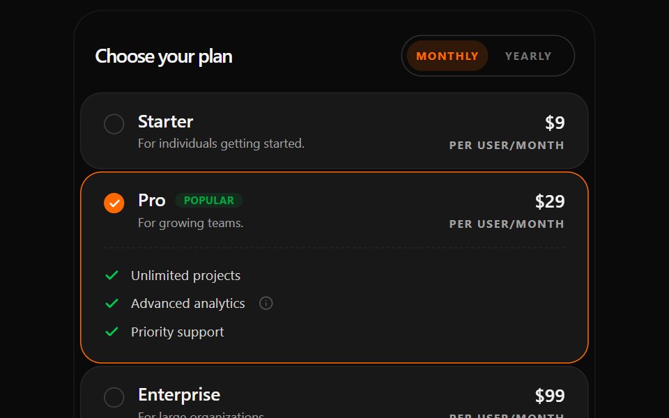 Changeable Pricing SectionWatermelon UI · React
 Pricing Foursv-efferd · SvelteAn animated pricing table with monthly-yearly toggles, live number transitions, and motion badges.
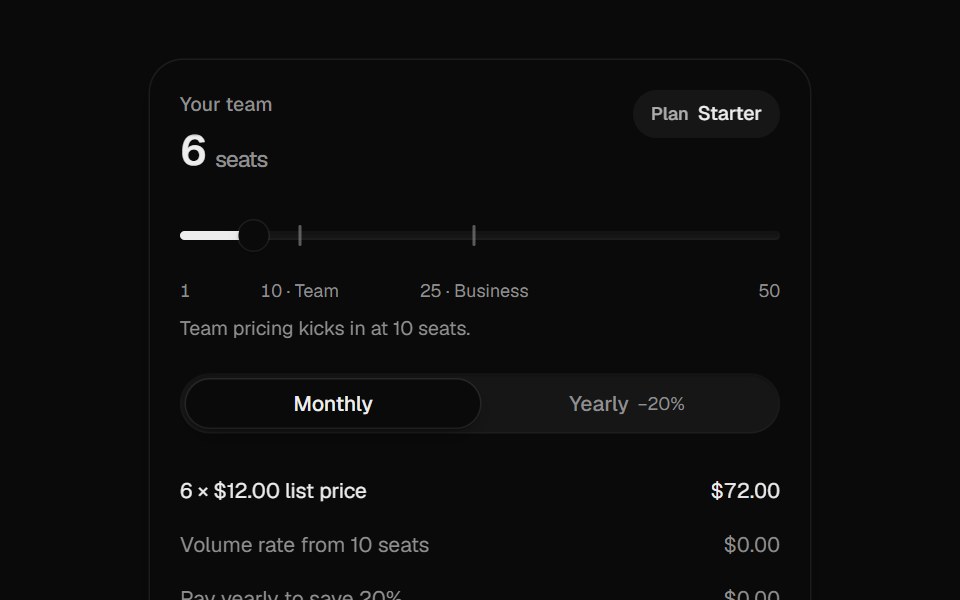 Pricing CalculatorUI Lab · ReactItemizes your bill like an invoice and upgrades the plan the moment your team crosses a seat threshold.
 Single plan pricingVelora UI · ReactOne all-inclusive plan card beside a benefit list and short reassurance answers.
 Pricing CardsD2Studio UI · ReactResponsive three-tier pricing cards with feature comparison and popular plan highlighting
 Blueprint TiersSpectrum UI · ReactA Swiss-style pricing table with crop marks, mono labels, and a royal-blue accent.
 Pricing TiersVengeance UI · ReactMonochrome three-tier pricing with a dark featured card, mono labels, and an enterprise row
 Pricing 02Componentry · ReactA compact pricing table with separated plan summaries, detailed feature lists, and an animated billing-cycle switch.
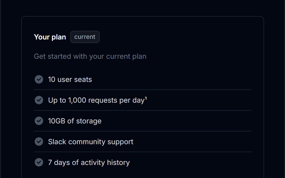 Pricing Section 02Tremor Blocks · React
 Pricing Fourcnblocks · SvelteFour-tier pricing with toggle switch
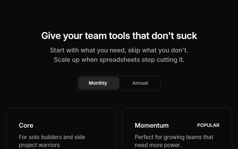 Pricing 03Oxbow UI · AstroPricing section with four tiers
 Changeable Pricing Section BaseWatermelon UI · React
 Pricing Onesv-efferd · SvelteA two-plan comparison with corner accents, compact savings callouts, and a stronger featured tier.
 Three-tier pricingVelora UI · ReactThree plan cards with a monthly/yearly switch, a savings badge and a highlighted middle plan.
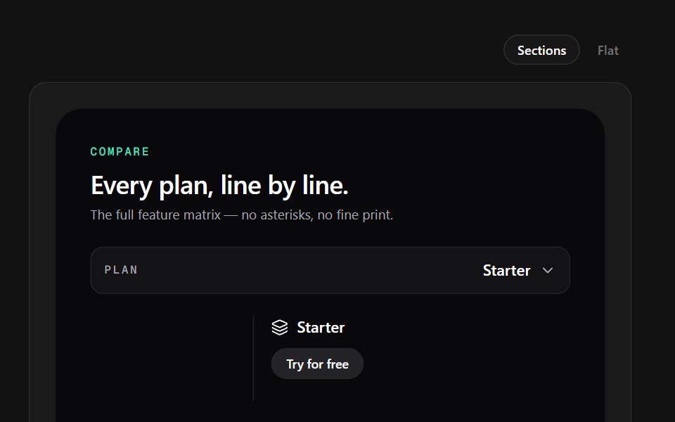 Dark MatrixSpectrum UI · ReactA dark comparison table with dashed rows, mint checks, and per-plan CTA pills.
 Pricing Section 03Tremor Blocks · React
 Pricing Onecnblocks · SvelteSimple three-tier pricing cards
 Pricing 04Oxbow UI · AstroSingle usage based pricing card
 Pricing 1Watermelon UI · React
 Pricing Threesv-efferd · SvelteA reusable three-tier pricing layout with icon-led cards and a highlighted middle plan.
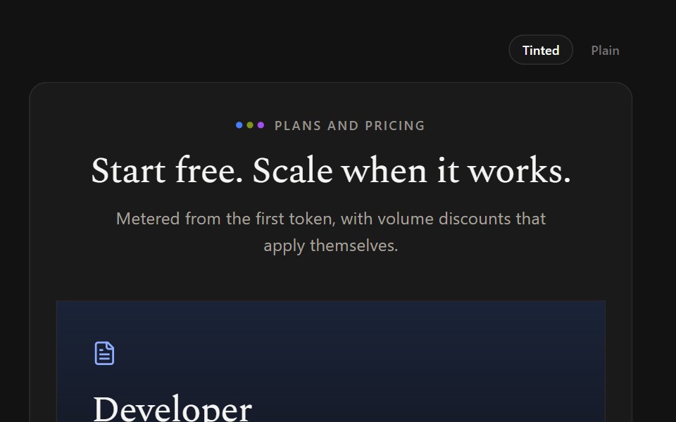 Gradient TiersSpectrum UI · ReactPastel gradient card headers with icons and color-coded inheritance labels.
 Pricing Section 04Tremor Blocks · React
 Pricing Threecnblocks · SveltePricing with highlighted popular plan
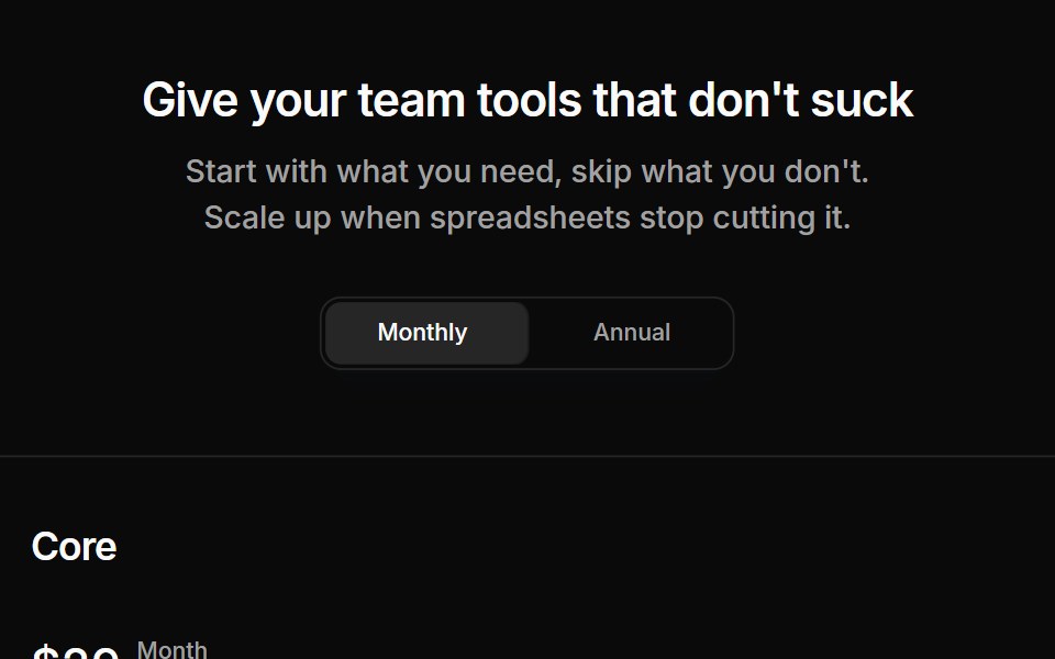 Pricing 06Oxbow UI · AstroPricing section with three tiers and table
 Pricing 2Watermelon UI · React
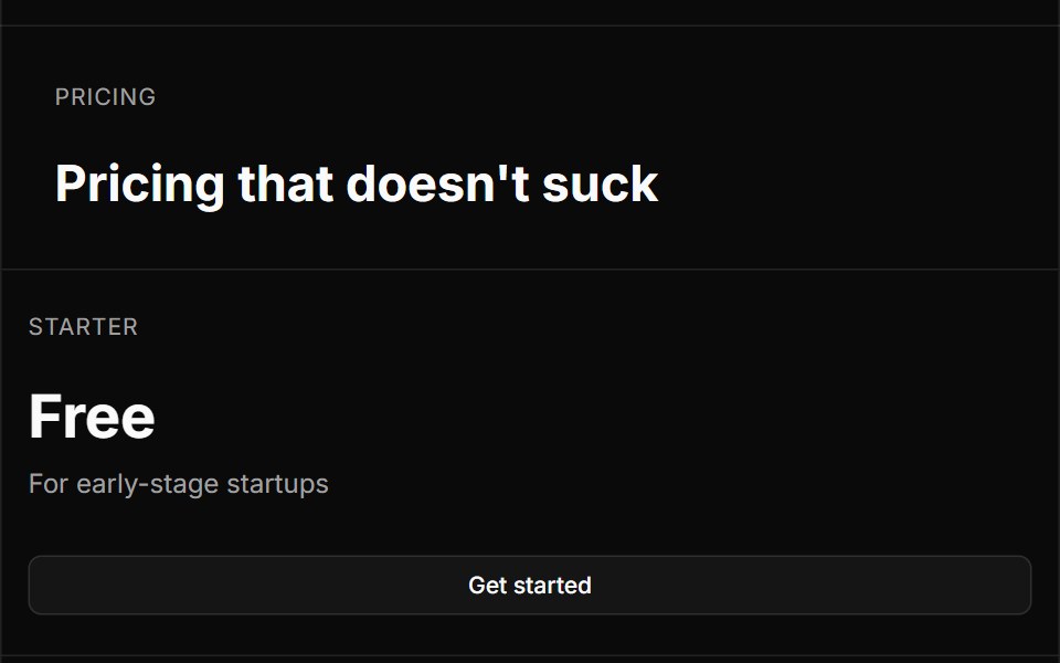 Pricing Twosv-efferd · SvelteA bordered editorial pricing grid with divider rails, concise plan summaries, and feature checklists.
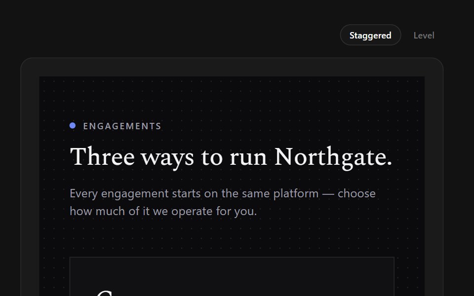 Offset TiersSpectrum UI · ReactStaggered serif panels on a dot grid, with one entry price and expert CTAs.
 Pricing Section 05Tremor Blocks · React
 Pricing Twocnblocks · SvelteTwo-column pricing with monthly/yearly toggle
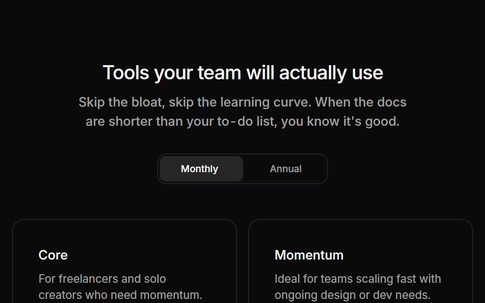 Pricing 07Oxbow UI · AstroPricing section with 2 tiers and 2 support tiers
 Pricing 3Watermelon UI · React
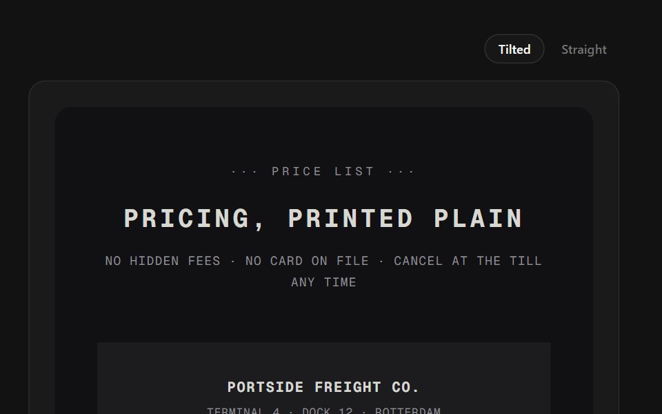 Receipt TiersSpectrum UI · ReactPlans printed as thermal receipts with torn edges, dotted leaders, and a rubber stamp.
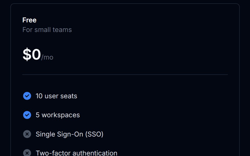 Pricing Section 06Tremor Blocks · React
 Pricing 08Oxbow UI · AstroPricing section with 4 tiers
 Pricing 4Watermelon UI · React
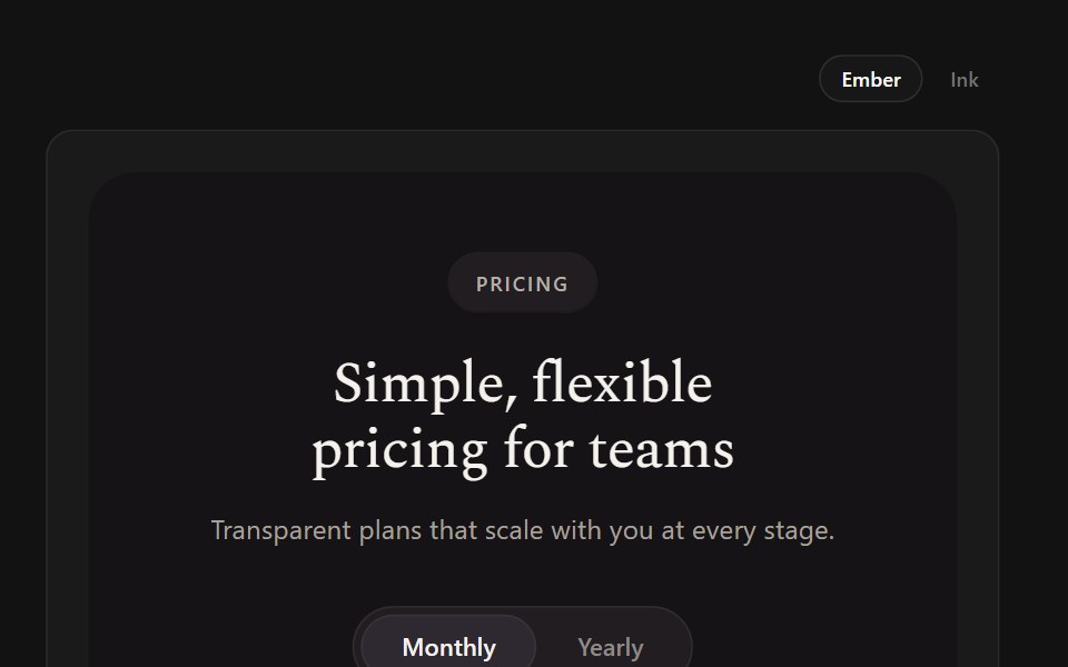 Serif TiersSpectrum UI · ReactCream serif cards with a black featured card lit by a crimson glow.
 Pricing Section 07Tremor Blocks · React
 Pricing 10Oxbow UI · AstroPricing section with two columns comparison table
 Pricing 5Watermelon UI · React
 Pricing Section 08Tremor Blocks · React
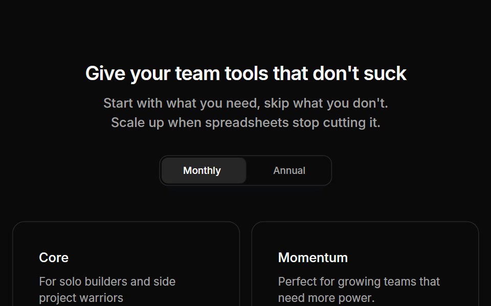 Pricing 02Oxbow UI · Astro
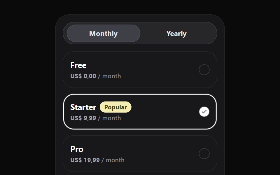 Pricing WidgetWatermelon UI · React
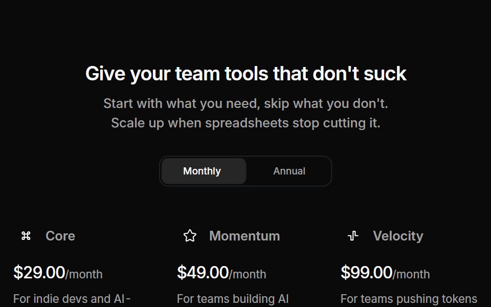 Pricing 05Oxbow UI · Astro
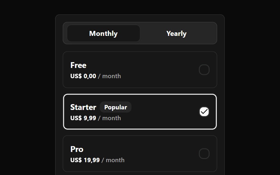 Pricing Widget BaseWatermelon UI · React
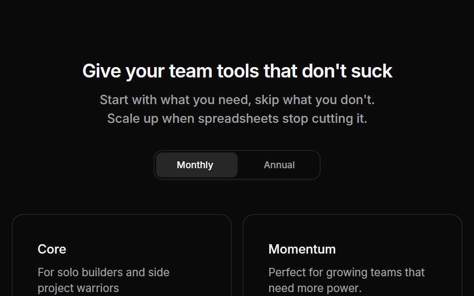 Pricing 09Oxbow UI · Astro
 Pricing 11Oxbow UI · Astro