Empty
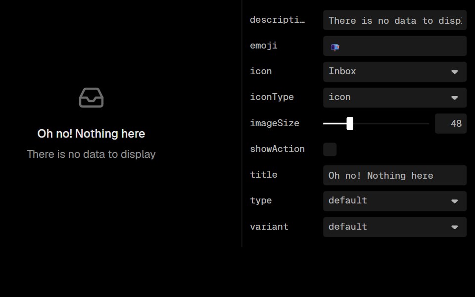
Empty component displays an empty state with customizable icon, emoji, image, title, description, and action buttons, in default and dashed variants. It's commonly used to indicate that there's no data or content to display.
- Library
- Lobe UI
- Framework
- React
- Type
- component
- License
- MIT
- Install
pnpm add @lobehub/ui- Files
src/Empty/Empty.tsxsrc/Empty/index.tssrc/Empty/stable.tssrc/Empty/style.tssrc/Empty/type.tssrc/Icon/index.tssrc/Text/index.tssrc/types/index.ts
- Source
- https://github.com/lobehub/lobe-ui