Toc
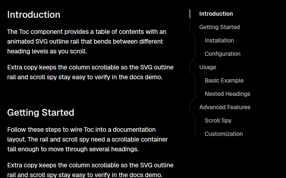
The Toc component is used to display a table of contents with clickable anchor links to different sections of a page. It can be customized with a specific height and width, and can be displayed differently on mobile devices. The component utilizes the Ant Design Anchor component to create the clickable anchor links.
- Library
- Lobe UI
- Framework
- React
- Type
- component
- License
- MIT
- Install
pnpm add @lobehub/ui- Files
src/Toc/index.tssrc/Toc/stable.tssrc/Toc/style.tssrc/Toc/Toc.tsxsrc/Toc/TocMobile.tsxsrc/Toc/tocPath.tssrc/Toc/toFlatTocItems.tssrc/Toc/type.ts
- Source
- https://github.com/lobehub/lobe-ui
Categories
- Navigation Components
- React Navigation Components
- Table Of Contents Components
- React Table Of Contents Components