 Dev Design Library
Animated Container Components
Dev Design Library indexes 9 Animated container components from 7 open-source UI libraries, with the most coming from Sona UI, React Bits, Aceternity UI, SpaceUI and Skecher UI. Each one links to its page with the source code, a live preview where available, the library license and the install command. These are the container components tagged as animated: motion on hover, on scroll or on load, usually built with CSS transitions or Framer Motion. Container components belong to the Layout group.
 Fluid GlassReact Bits · ReactGlassmorphism container with animated liquid distortion refraction.
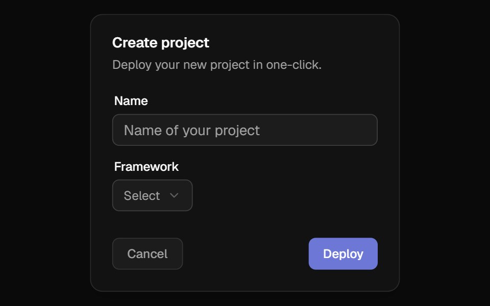 3D WrapperBadtz UI · ReactThis component transforms any content into an immersive, interactive 3D experience. It tracks cursor movements to…
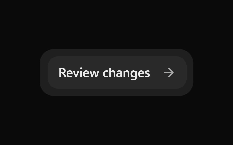 Morph SurfaceSona UI · ReactAn unstyled layout primitive that grows, shrinks, clips, and updates the content of one persistent consumer-styled…
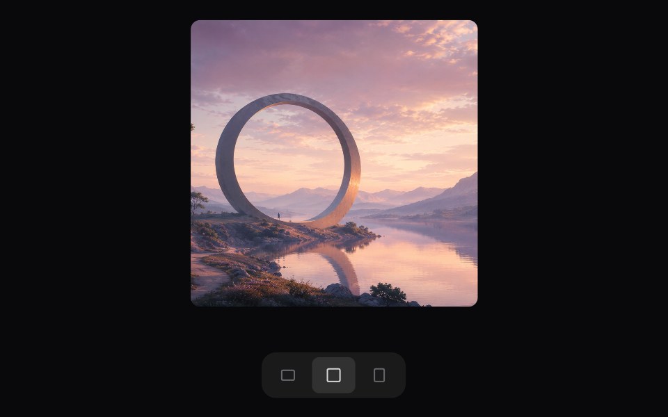 Morphing AreaSpaceUI · ReactAdaptive aspect ratio surface with constant-area morphing for any child element, card, or media.
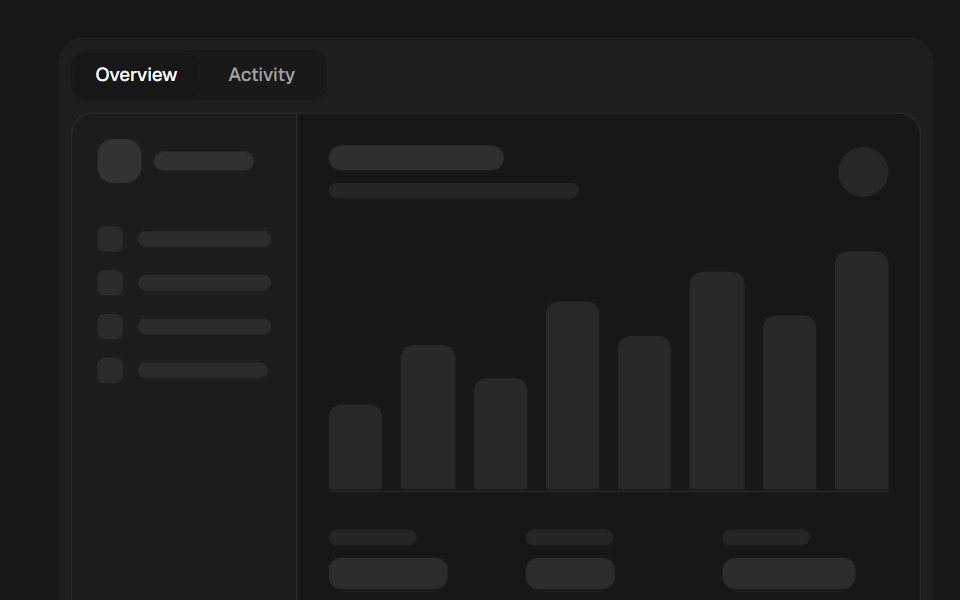 Sliding PanelSkecher UI · ReactA direction-aware panel transition with interruptible motion and reduced-motion fallbacks.
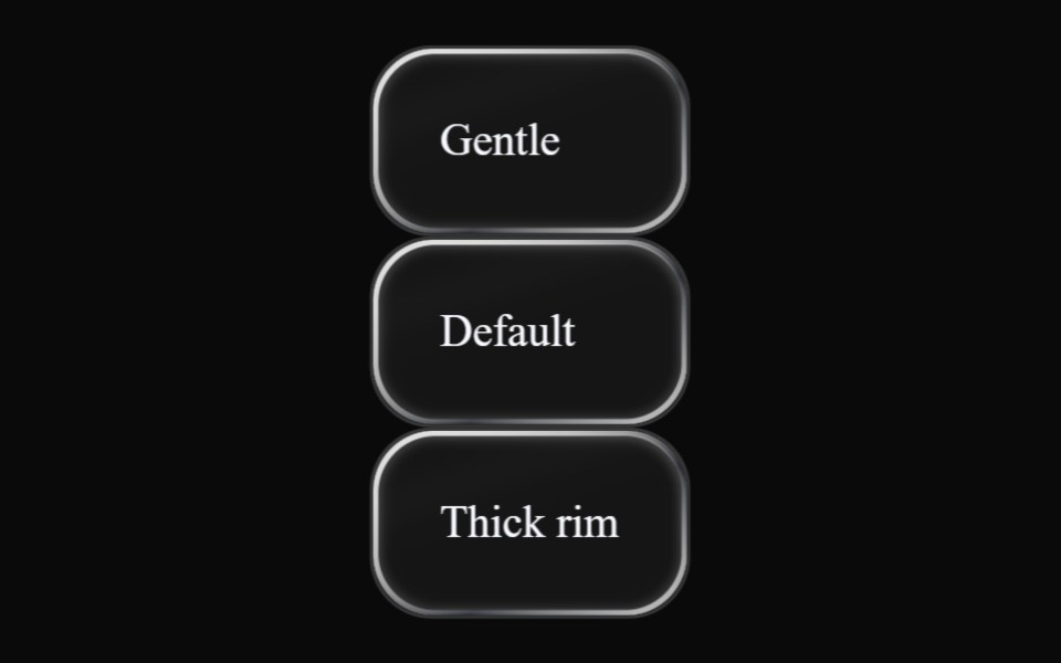 Liquid GlassLiquefy UI · ReactThe material on its own, with the optics exposed as props.
 Container Text FlipAceternity UI · ReactBoxed word inside a sentence that flips through a list of words, with the box resizing to fit each one.
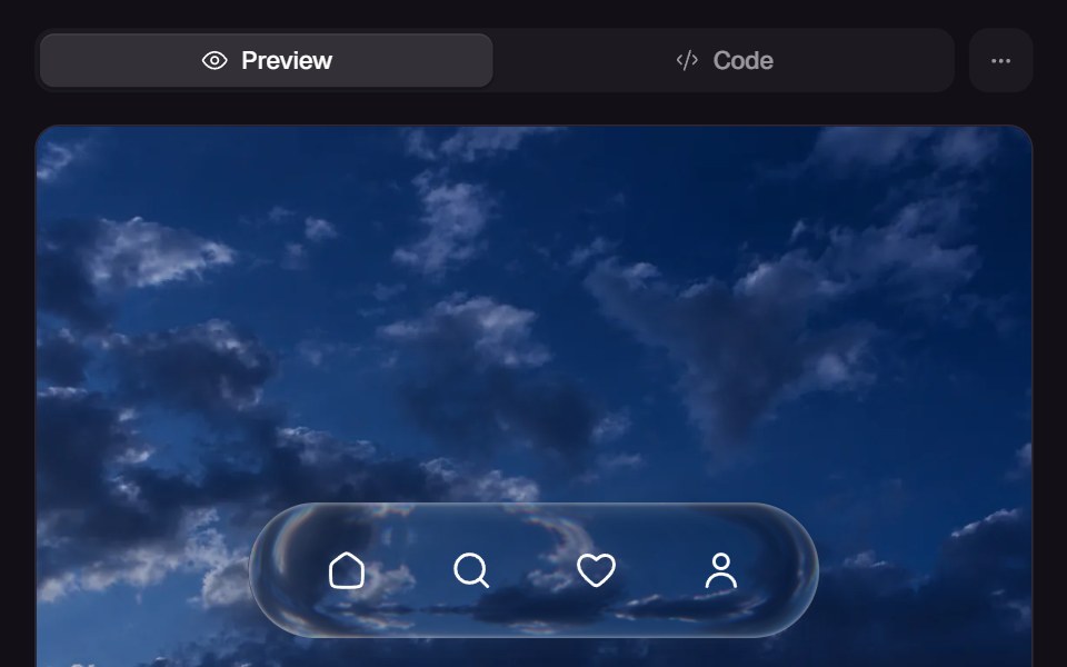 Glass SurfaceReact Bits · ReactAdvanced Apple-style glass surface with real-time distortion + lighting.
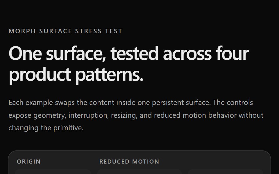 Prototype Morph SurfaceSona UI · ReactStress tests for the Morph Surface primitive. Página de testes de estresse do primitivo Morph Surface.