 Dev Design Library
Animated Stack Components
Dev Design Library indexes 30 Animated stack components from 15 open-source UI libraries, with the most coming from UI Lab, Amicro Micro Transitions, Kokonut UI, React Bits and Kinetics. Each one links to its page with the source code, a live preview where available, the library license and the install command. These are the stack components tagged as animated: motion on hover, on scroll or on load, usually built with CSS transitions or Framer Motion. Stack components belong to the Layout group.
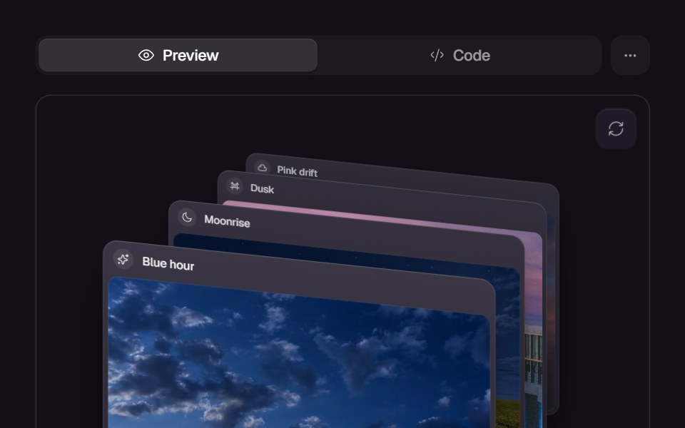 Card SwapReact Bits · ReactCards animate position swapping with smooth layout transitions.
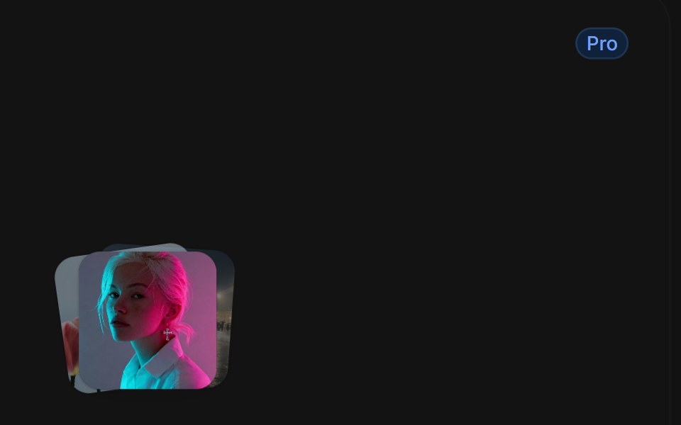 Card Stack Hovertransitions.dev · HTML/CSS
 Card Cascade StaggerAmicro Micro Transitions · ReactStack of cards that cascade into place one after another.
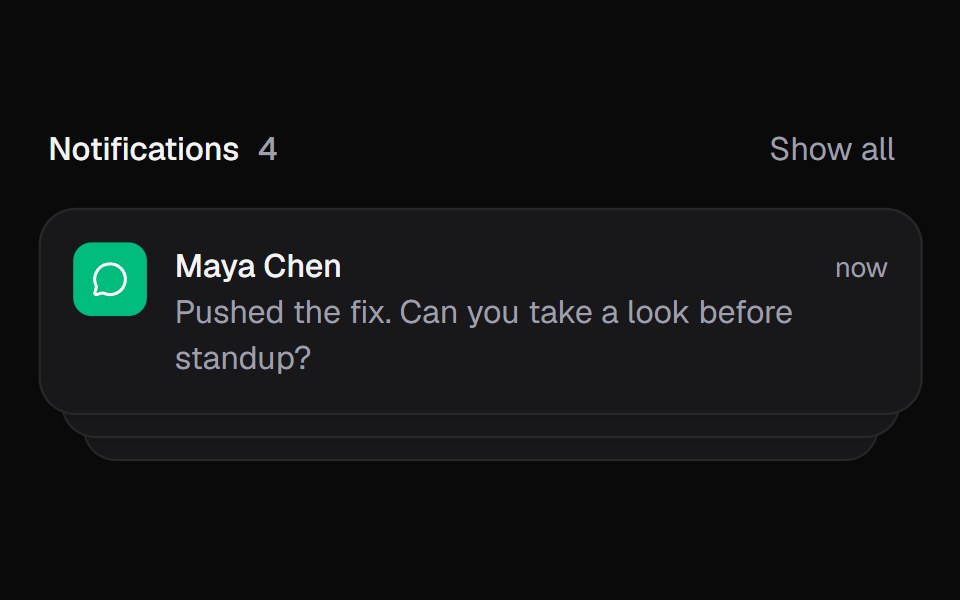 Notification StackKokonut UI · ReactStacked notifications that fan out on hover and swipe away, built with React and Tailwind CSS.
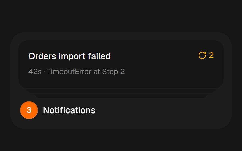 Notification StackbeUI · ReactCompact notification cards that spring from a stacked summary into a readable list on hover, focus or tap.
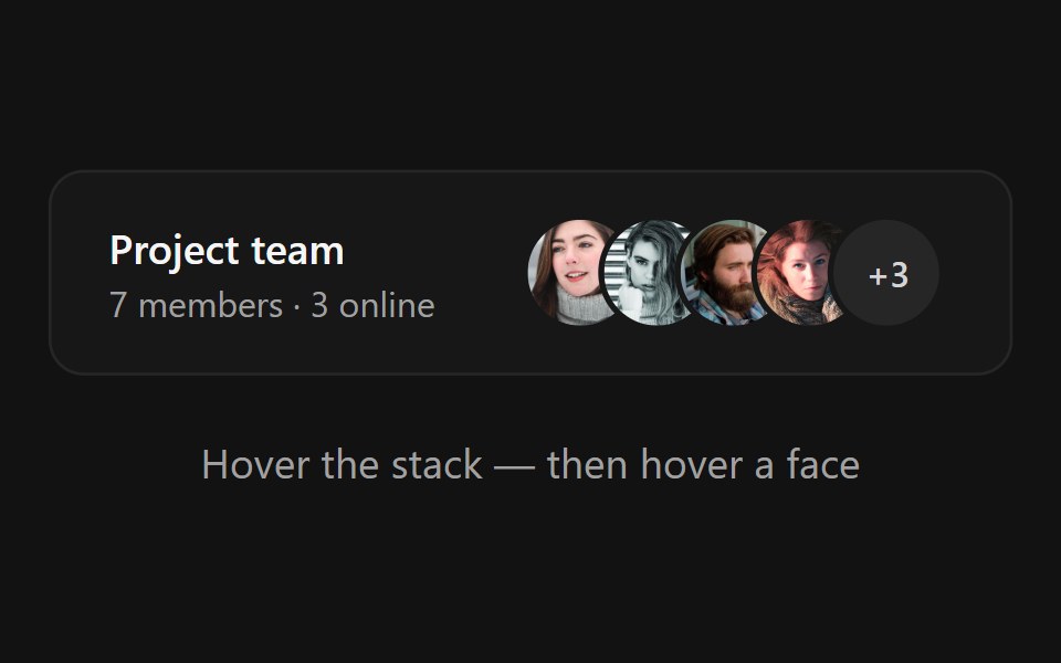 Avatar StackSpectrum UI · ReactAn overlapping avatar stack that fans apart on hover, springs name tooltips over each face and expands hidden members…
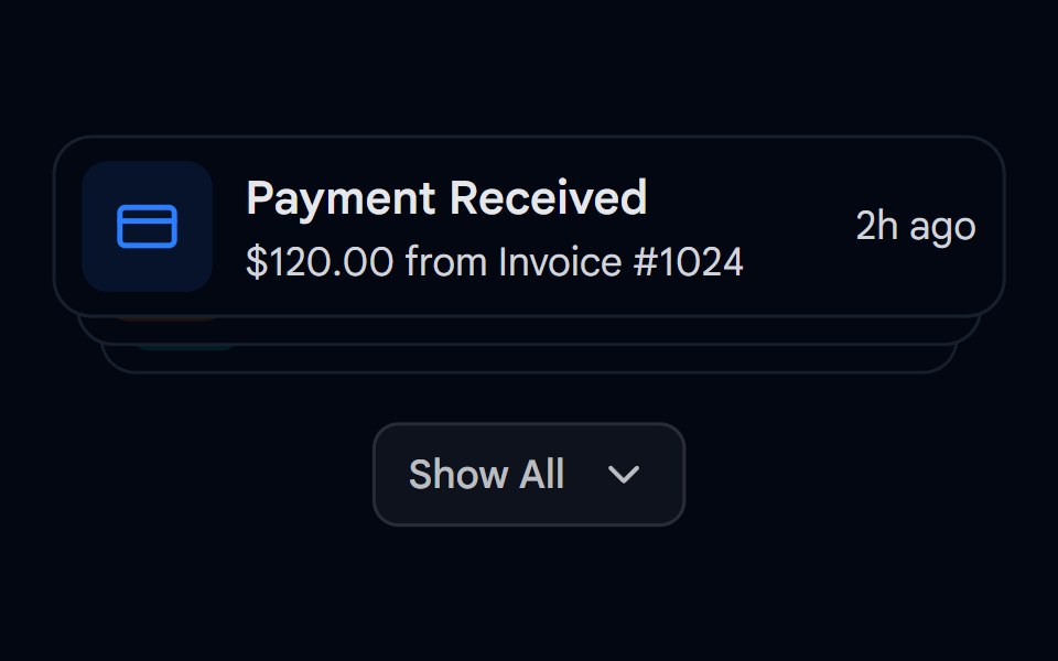 Animated List 03 - Expandable StackShadcn Space · ReactExpandable stack of cards showing notifications with dynamic spring layouts
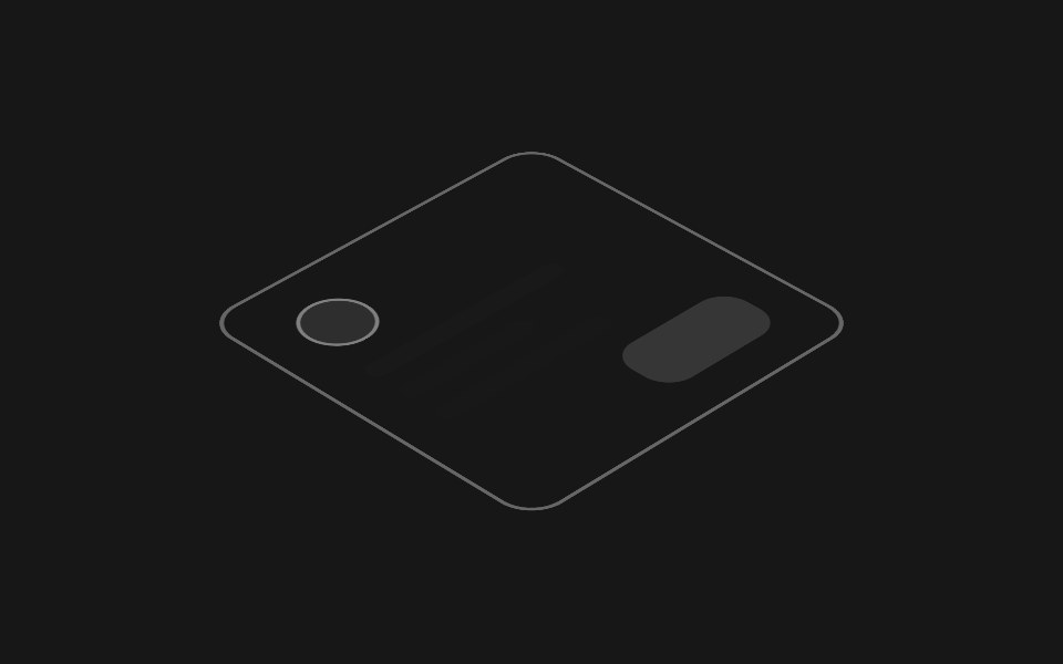 Hover Layer StackPixel Perfect · ReactAn isometric stack of UI layers that lifts apart on hover, exploding the interface into its depth layers.
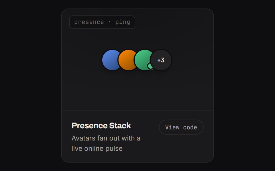 Presence StackKinetics · HTML/CSSAvatars fan out with a live online pulse
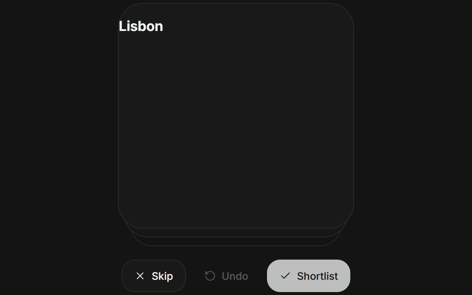 Card stackArc Library · ReactReview a deck one card at a time, with a throw and an undo.
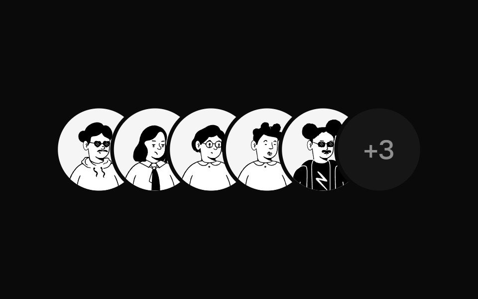 Avatar StackUI Lab · ReactFans open when you reach for it, with a name above each face.
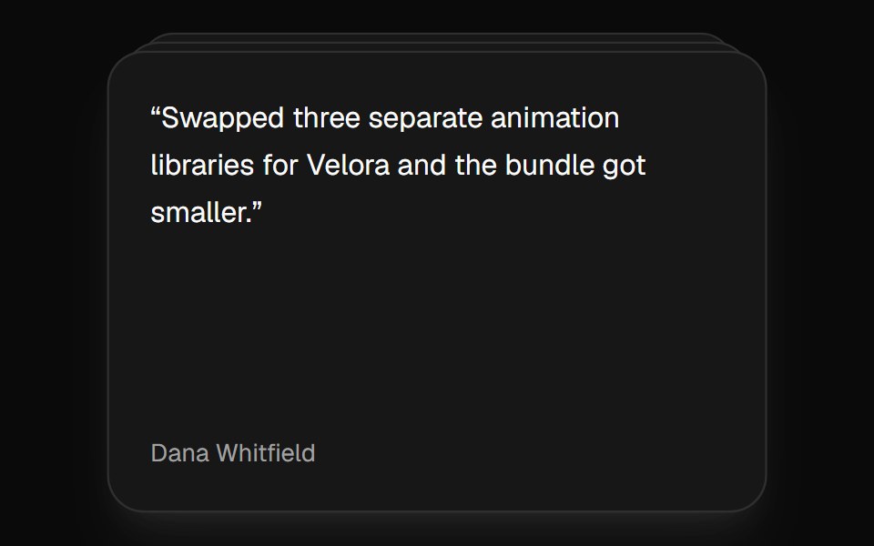 Card StackVelora UI · ReactDeck that shuffles the top card to the back on a timer.
 Morph StackSkecher UI · ReactA composable three-plate stack with spring-driven perspective and layered hover motion.
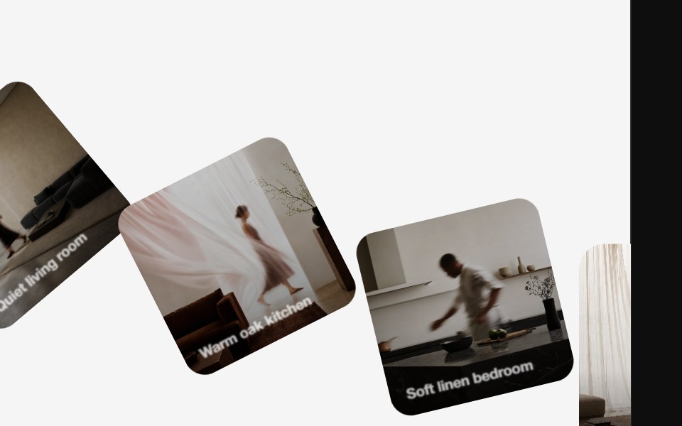 Diagonal CarouselReactFrame · ReactSquare cards fan out diagonally into a stacked deck, each inactive card rotates and offsets away from the active one…
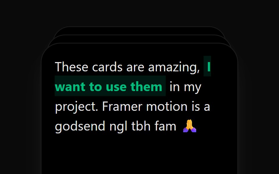 Card StackAceternity UI · React
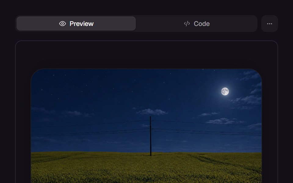 Scroll StackReact Bits · ReactOverlapping card stack reveals on scroll with depth layering.
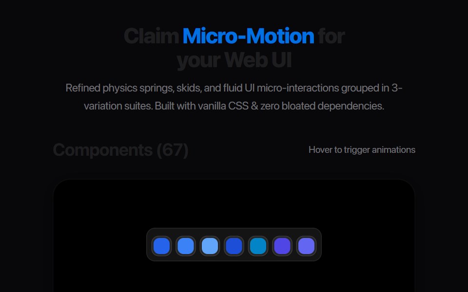 Smart Card DispenserAmicro Micro Transitions · ReactCredit card dispensing slot ejecting smart pass upwards on trigger.
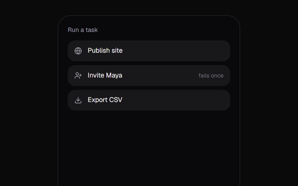 Promise ToastKokonut UI · React"A toast that follows a task: the ring spins while it works, closes into a check or a warning when it lands, and…
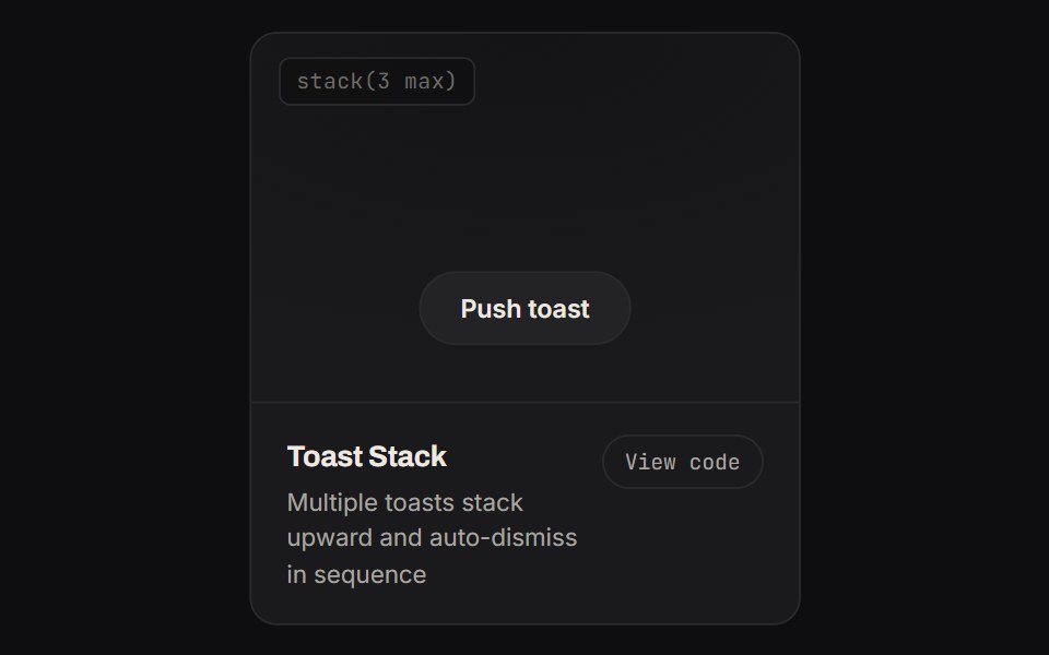 Toast StackKinetics · HTML/CSSMultiple toasts stack upward and auto-dismiss in sequence
 Newsletter signupArc Library · ReactAn email signup framed by a stack of past issues; subscribing drops the next issue, addressed to you, onto the front.
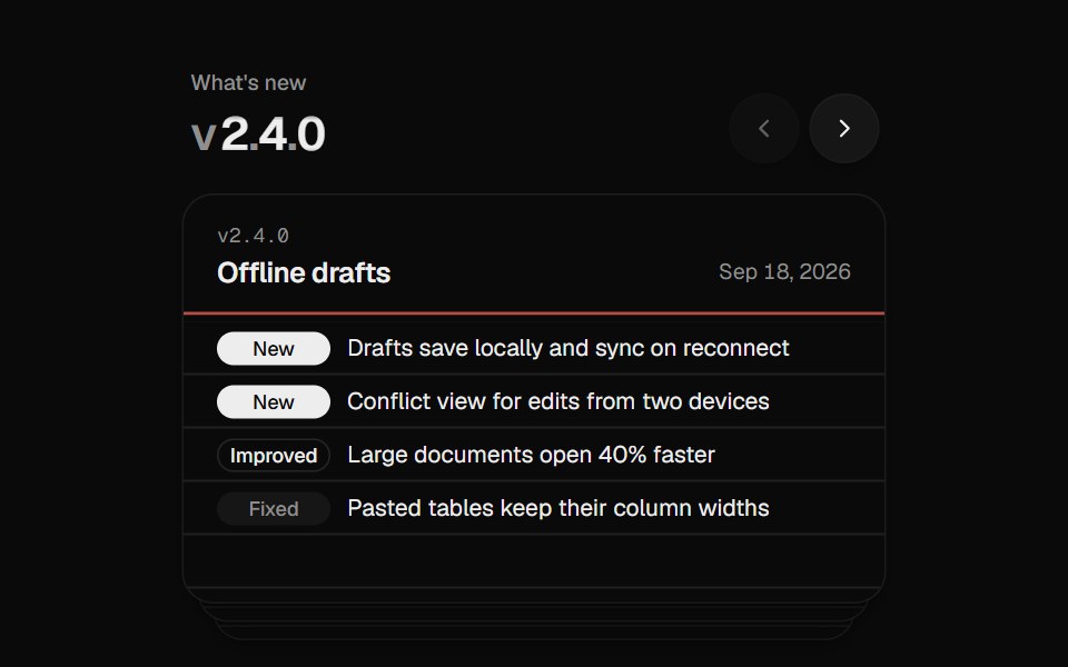 Changelog StackUI Lab · ReactFiles each release card behind the stack like a hand riffling index cards.
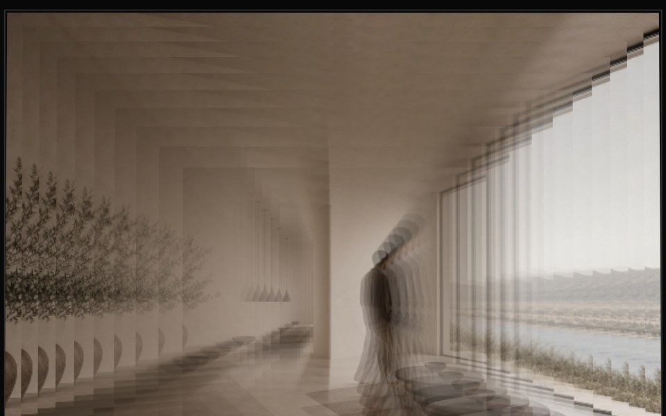 Image Deck 3DReactFrame · ReactA single image split into a stacked deck of shape-clipped layers (rectangle, circle, hexagon, star, blob and more)…
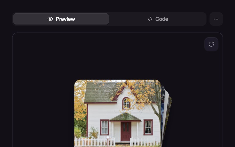 StackReact Bits · ReactLayered stack with swipe animations, autoplay and smooth transitions.
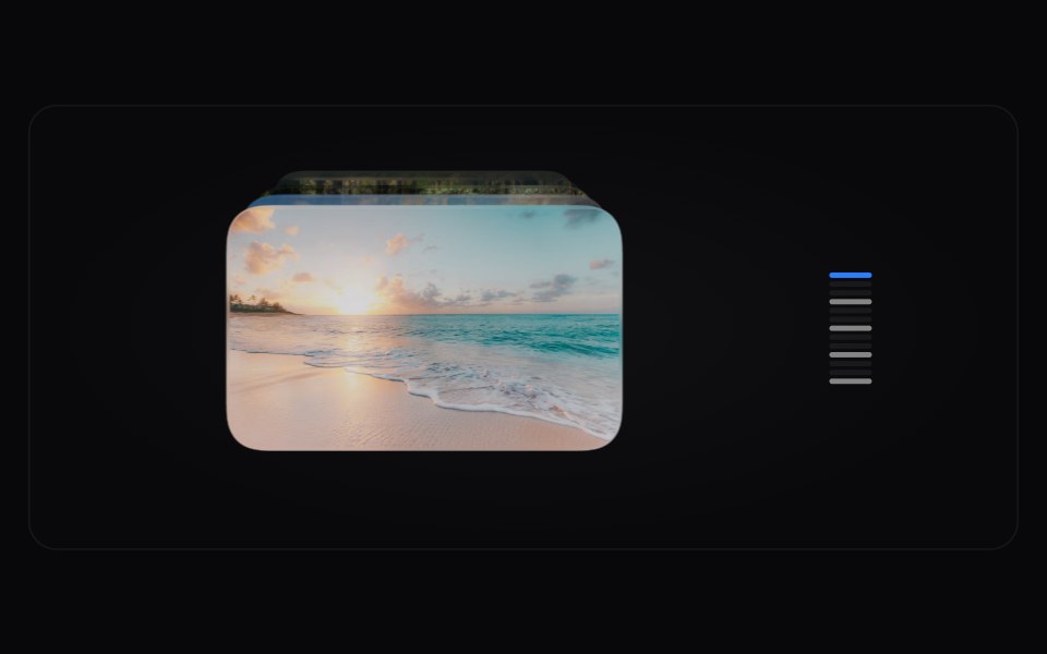 Card Time MachineAmicro Micro Transitions · React
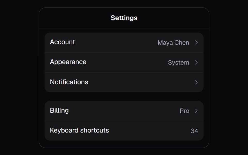 Stack PanelKokonut UI · ReactA panel that drills into pages like settings on a phone. The tapped row's label flies up into the title, and a swipe…
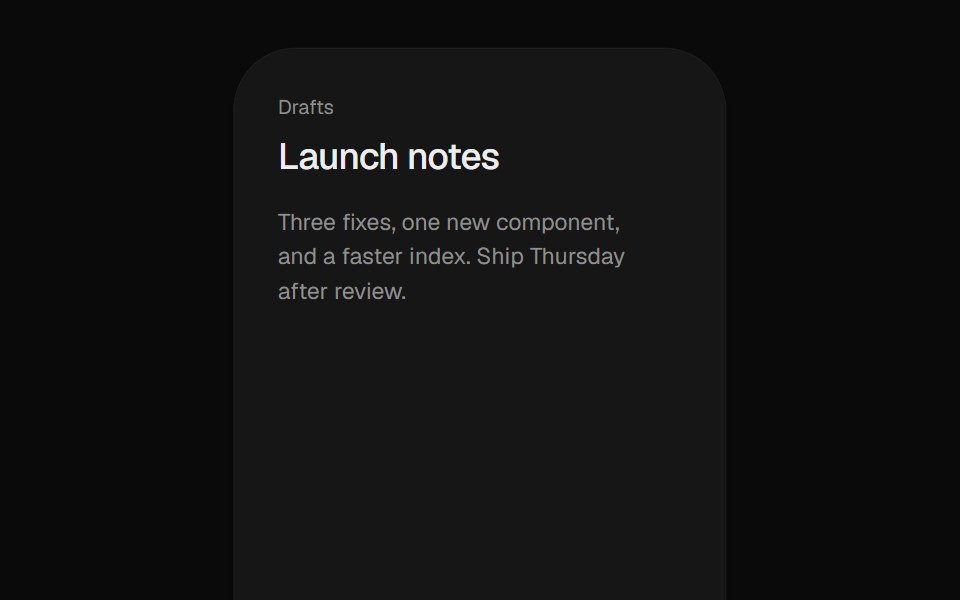 Stacked DrawerUI Lab · ReactStacks iOS sheets that push the page back and drag down to dismiss.
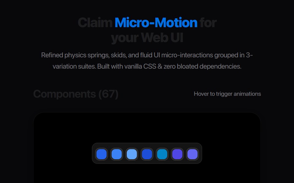 Card Deck CascadeAmicro Micro Transitions · React
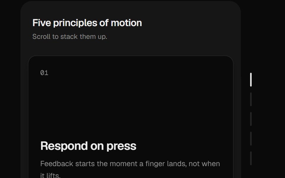 Sticky StackUI Lab · ReactCards pile up and sink back as you scroll.
 Toast StackUI Lab · ReactStacks with depth, fans out on hover, and each toast's edge drains as its timer.
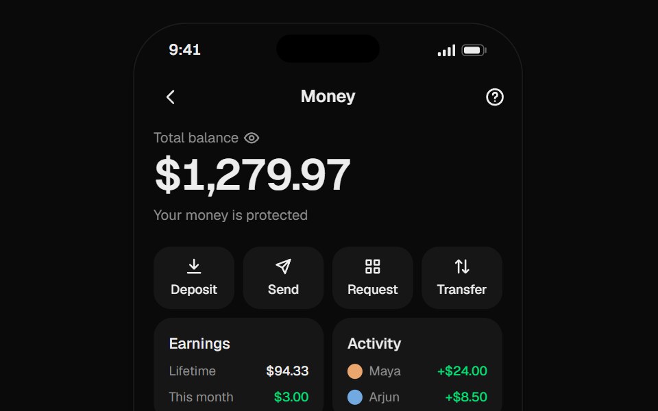 Wallet CardsUI Lab · React
Libraries with Animated stack components
Related categories
- Stack Components
- React Stack Components
- Tailwind CSS Stack Components
- Animated Layout Components
- Animated Grid Components
- Animated Bento Grid Components
- Animated Sticky Scroll Components
- Animated Container Components
- Animated Window Frame Components
- Animated Scroll Area Components
- Animated Split Pane Components