 Dev Design Library
Tailwind CSS Stack Components
Dev Design Library indexes 48 Tailwind CSS stack components from 18 open-source UI libraries, with the most coming from Amicro Micro Transitions, ReUI, UI Lab, Kokonut UI and beUI. Each one links to its page with the source code, a live preview where available, the library license and the install command. Every library in this list styles its components with Tailwind CSS utility classes. Stack components belong to the Layout group.
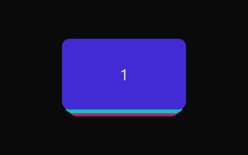 StackdaisyUI · CSS (Tailwind)
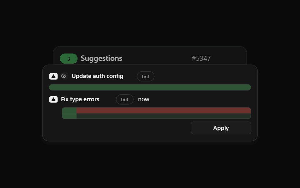 Agent Suggest Card StackCult UI · ReactStack of suggestion cards for AI agent responses
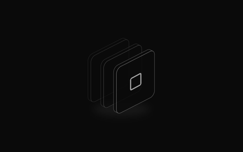 Isometric icon stackReUI · ReactLayered isometric icon
 Card Cascade StaggerAmicro Micro Transitions · ReactStack of cards that cascade into place one after another.
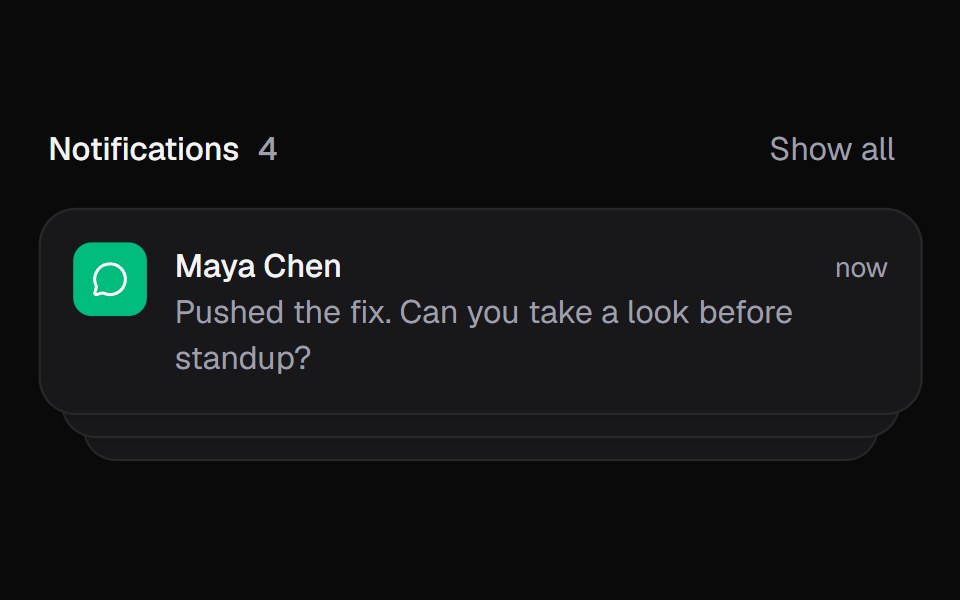 Notification StackKokonut UI · ReactStacked notifications that fan out on hover and swipe away, built with React and Tailwind CSS.
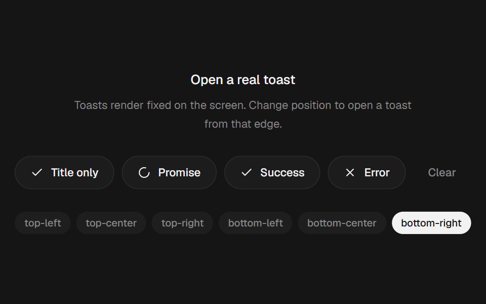 Animated Toast StackbeUI · ReactStacked toasts with status morphs, swipe dismissal, actions and layout-aware motion.
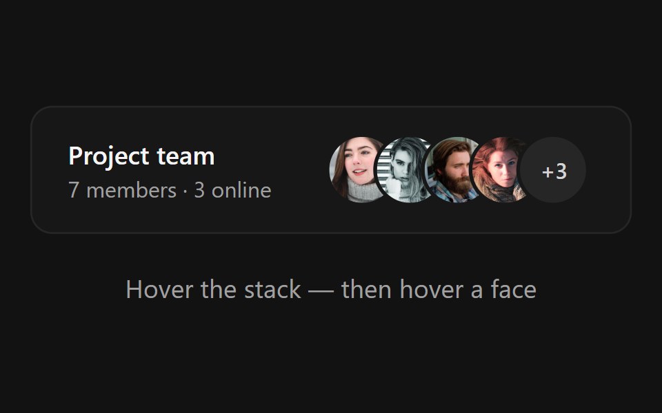 Avatar StackSpectrum UI · ReactAn overlapping avatar stack that fans apart on hover, springs name tooltips over each face and expands hidden members…
 Stacked LogosVengeance UI · React
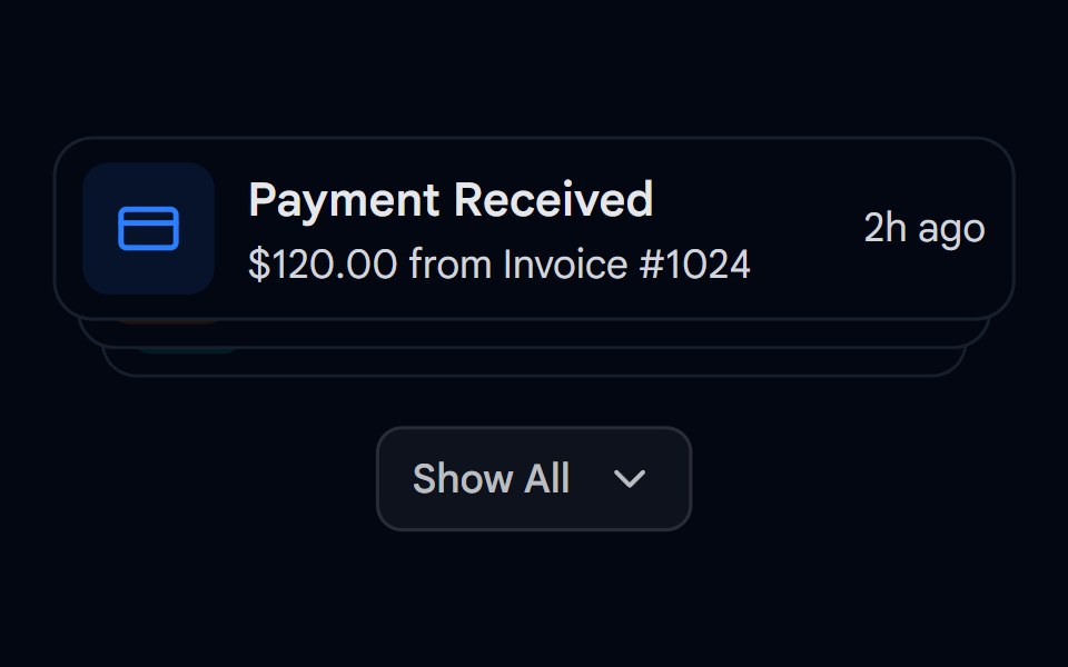 Animated List 03 - Expandable StackShadcn Space · ReactExpandable stack of cards showing notifications with dynamic spring layouts
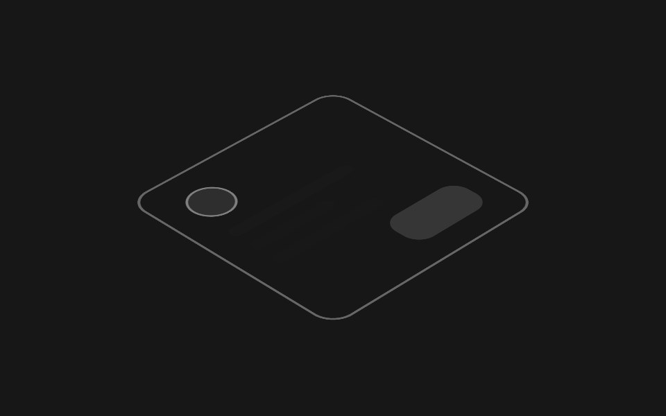 Hover Layer StackPixel Perfect · ReactAn isometric stack of UI layers that lifts apart on hover, exploding the interface into its depth layers.
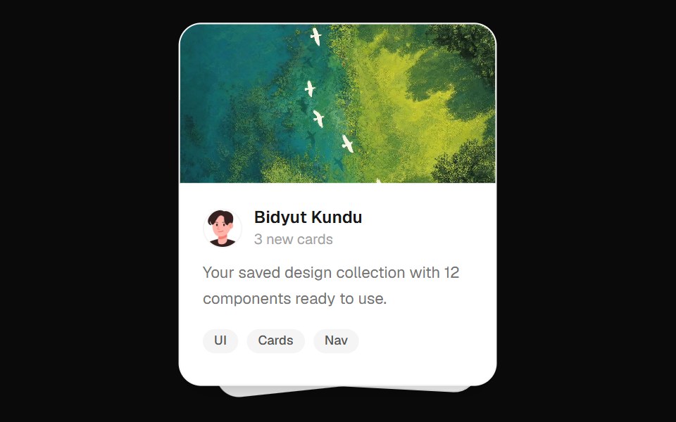 Stacked Cards EffectOpenSourceUI · React
 Dialog StackWatermelon UI · React
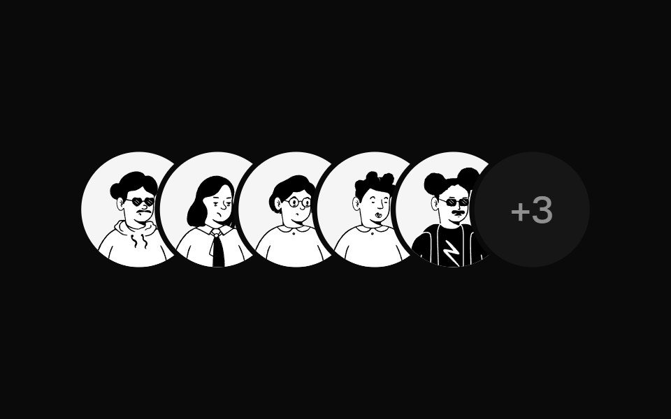 Avatar StackUI Lab · ReactFans open when you reach for it, with a name above each face.
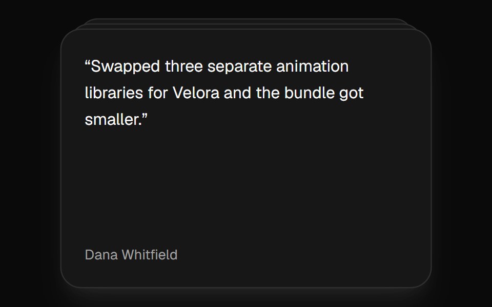 Card StackVelora UI · ReactDeck that shuffles the top card to the back on a timer.
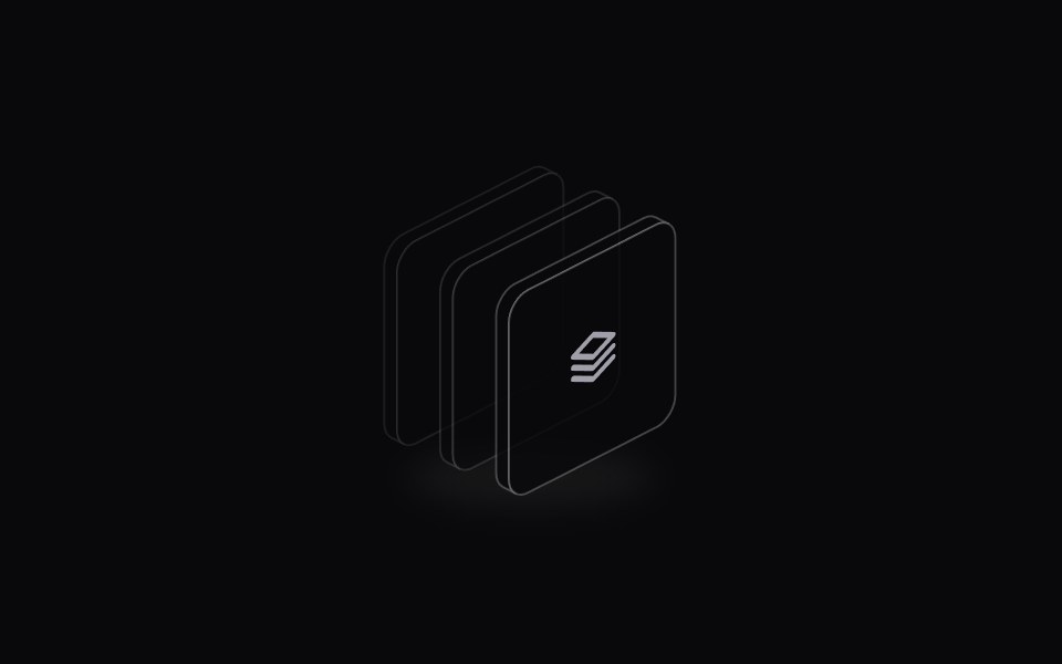 Icon StackSpaceUI · ReactDisplays an overlapping cluster of icons or avatars that expands smoothly when hovered to reveal every individual item.
 Morph StackSkecher UI · ReactA composable three-plate stack with spring-driven perspective and layered hover motion.
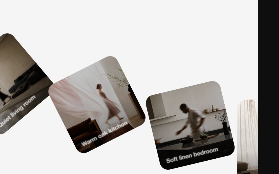 Diagonal CarouselReactFrame · ReactSquare cards fan out diagonally into a stacked deck, each inactive card rotates and offsets away from the active one…
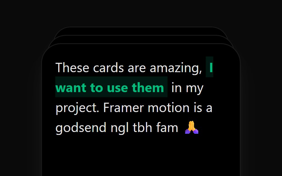 Card StackAceternity UI · React
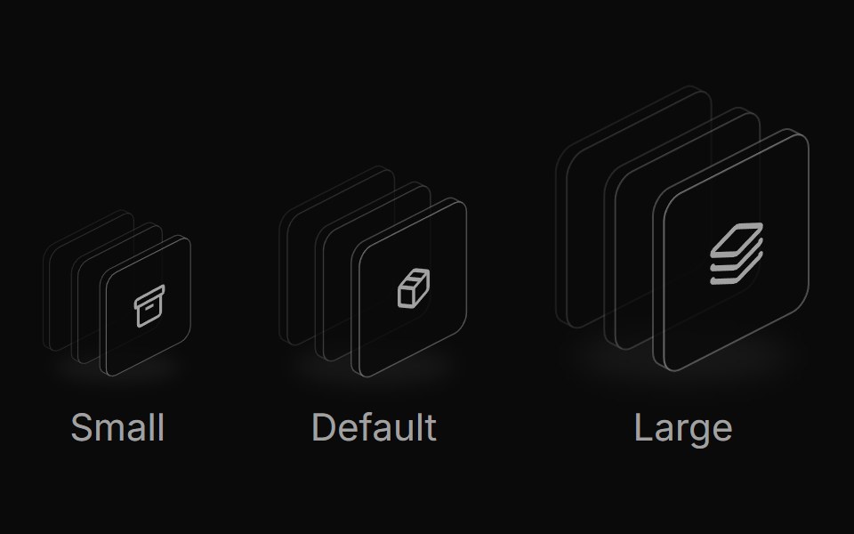 Icon stack sizesReUI · ReactResponsive icon stack sizes
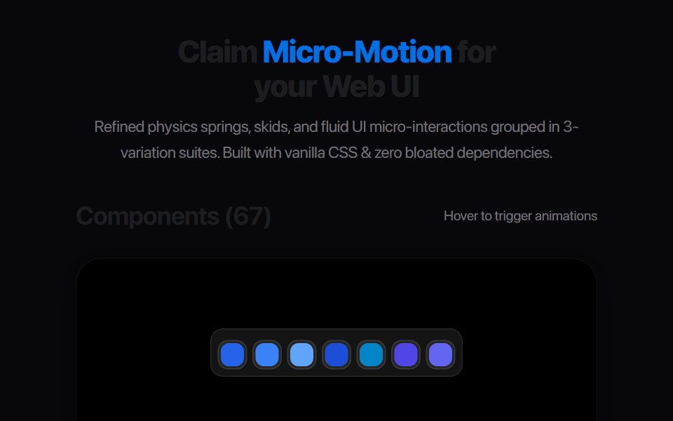 Card Stack PeelAmicro Micro Transitions · ReactLayered card index tab that peels down in 3D perspective to reveal underlay.
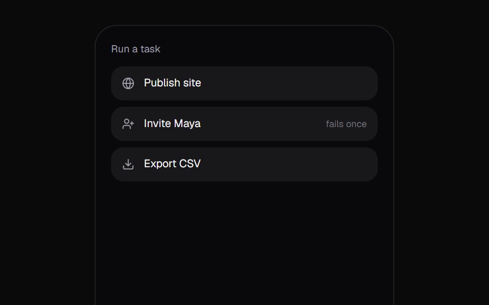 Promise ToastKokonut UI · React"A toast that follows a task: the ring spins while it works, closes into a check or a warning when it lands, and…
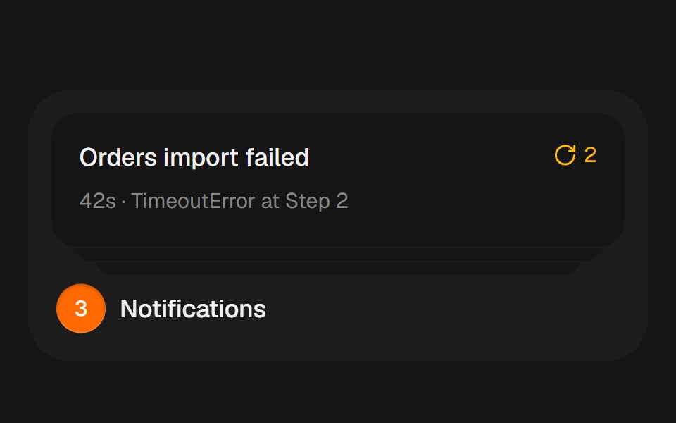 Notification StackbeUI · ReactCompact notification cards that spring from a stacked summary into a readable list on hover, focus or tap.
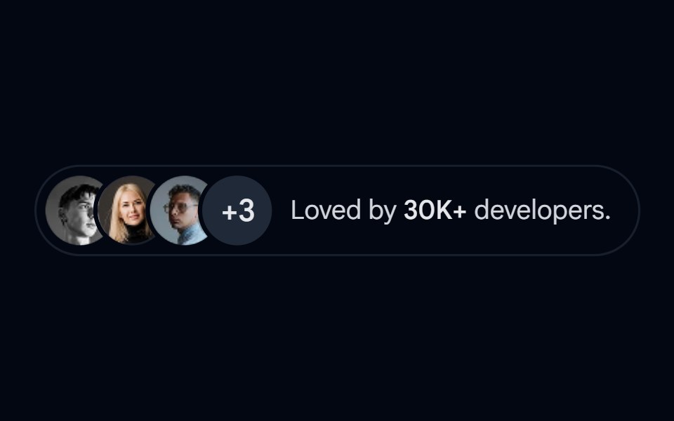 Avatar-08 - Avatar stackShadcn Space · ReactStacked avatar group with overflow count and popularity indicator
 Dialog Stack BaseWatermelon UI · React
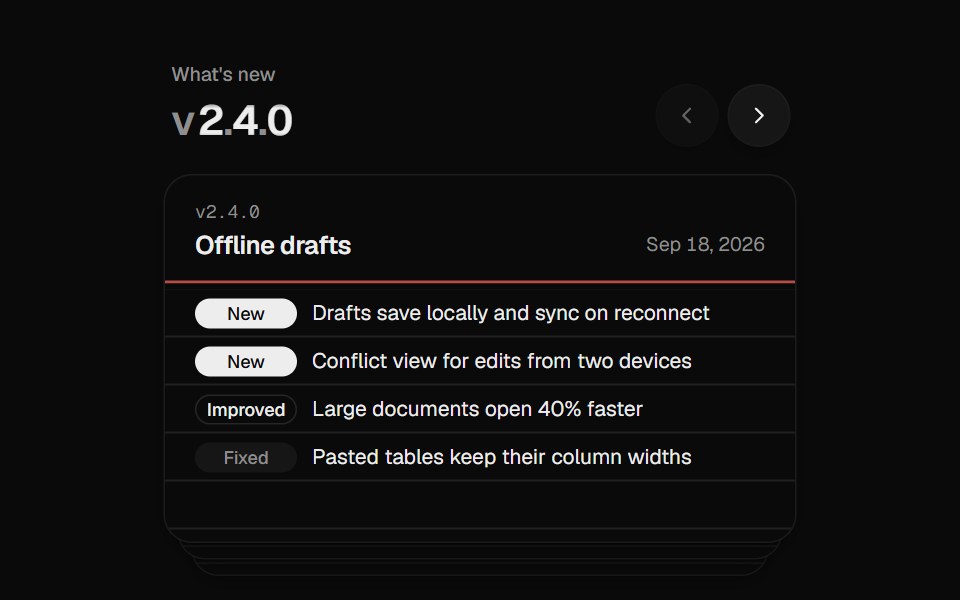 Changelog StackUI Lab · ReactFiles each release card behind the stack like a hand riffling index cards.
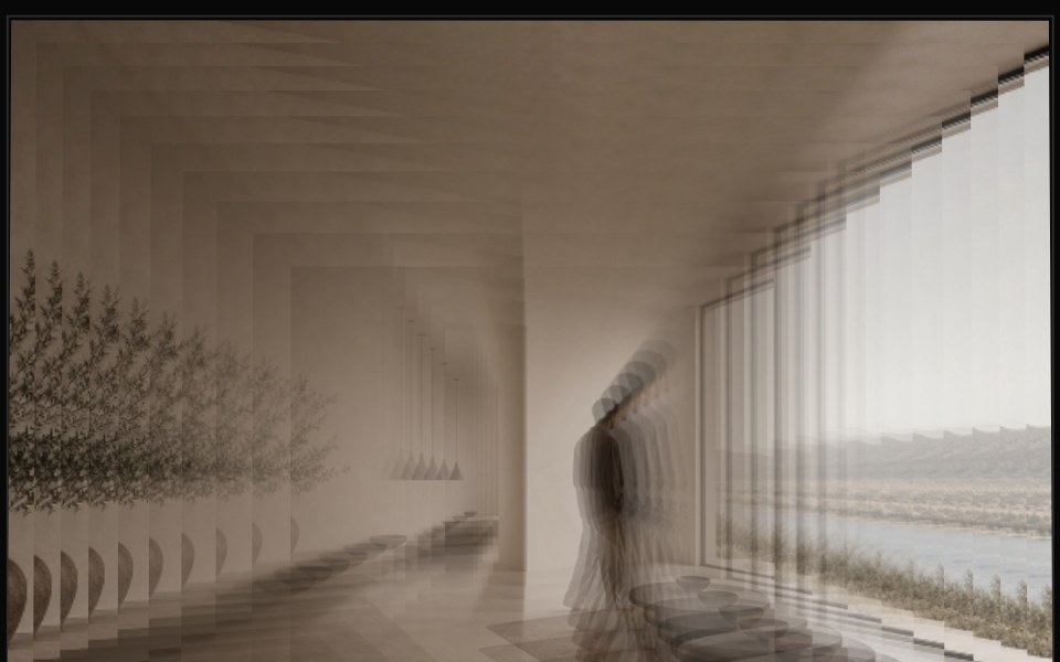 Image Deck 3DReactFrame · ReactA single image split into a stacked deck of shape-clipped layers (rectangle, circle, hexagon, star, blob and more)…
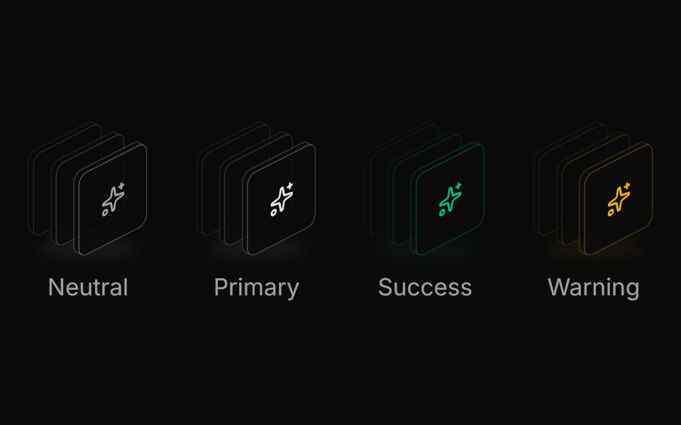 Icon stack colorsReUI · ReactSemantic icon stack colors
 Smart Card DispenserAmicro Micro Transitions · ReactCredit card dispensing slot ejecting smart pass upwards on trigger.
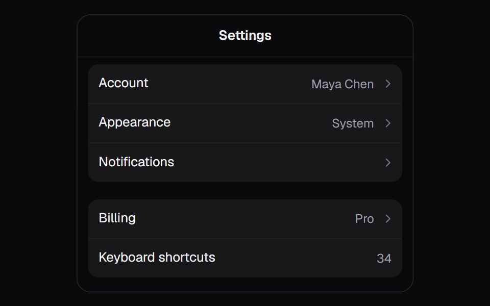 Stack PanelKokonut UI · ReactA panel that drills into pages like settings on a phone. The tapped row's label flies up into the title, and a swipe…
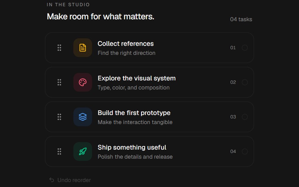 Sortable StackbeUI · ReactComposable sortable list with group, item, drag handle, content and undo parts, plus a shared state hook. Spring…
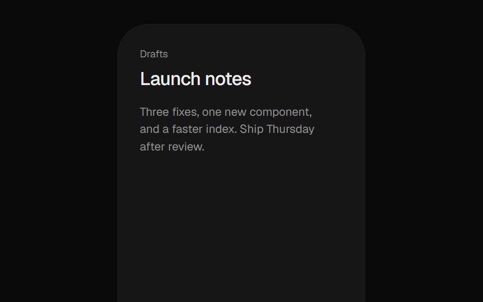 Stacked DrawerUI Lab · ReactStacks iOS sheets that push the page back and drag down to dismiss.
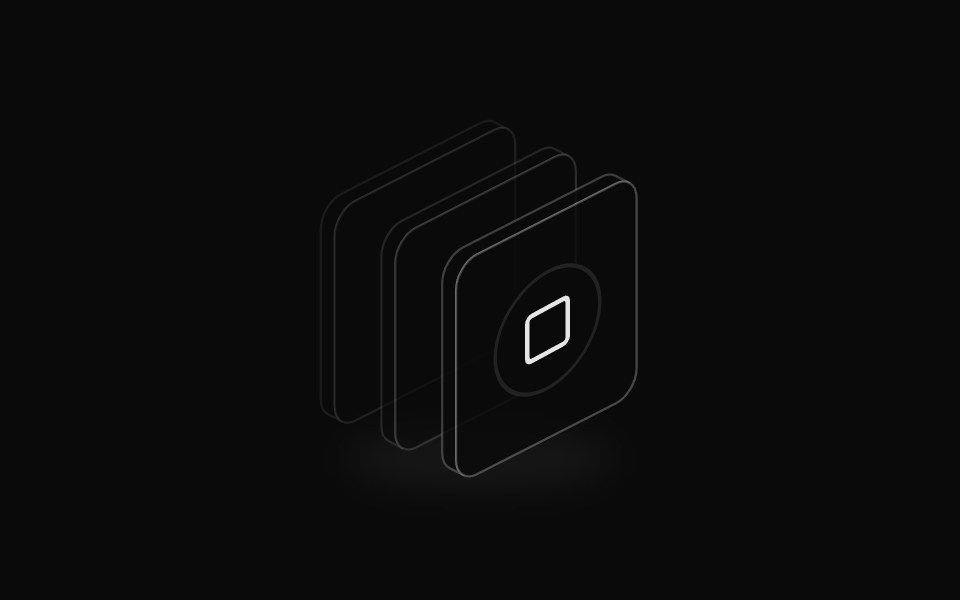 Icon badge stackReUI · ReactIcon stack with badge overlay
 Card Arc5Amicro Micro Transitions · React
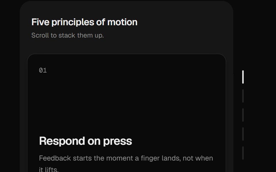 Sticky StackUI Lab · ReactCards pile up and sink back as you scroll.
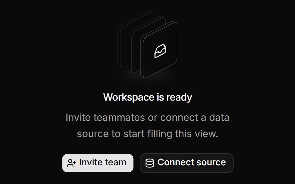 Empty state illustrationReUI · ReactShadcn empty state illustration
 Card Arc7Amicro Micro Transitions · React
 Toast StackUI Lab · ReactStacks with depth, fans out on hover, and each toast's edge drains as its timer.
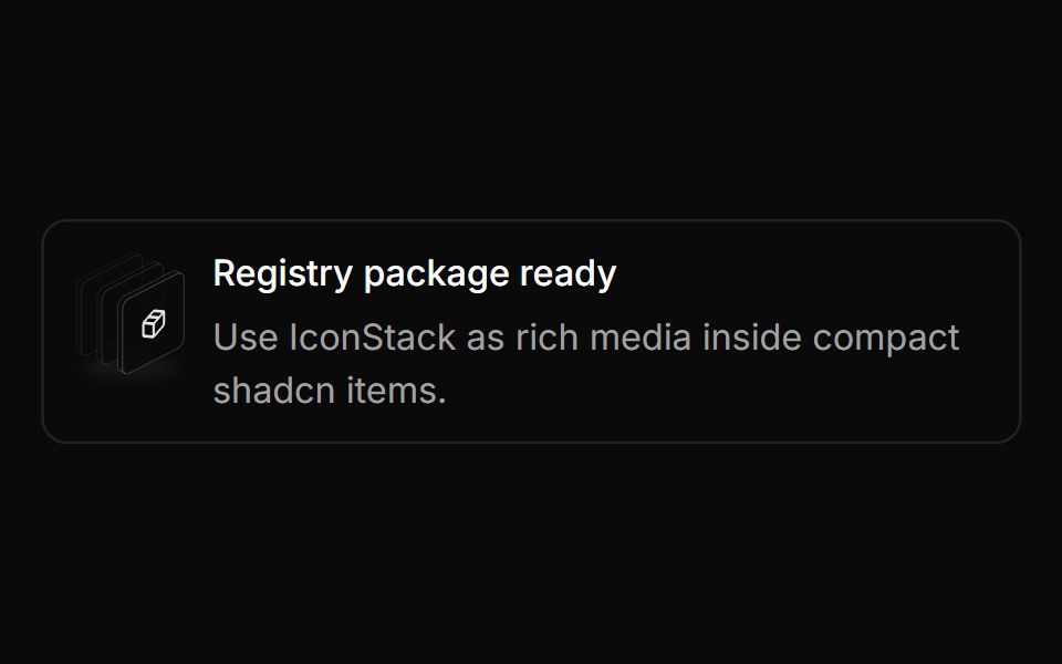 Item media stackReUI · ReactIcon stack in shadcn item
 Card Corner FanAmicro Micro Transitions · React
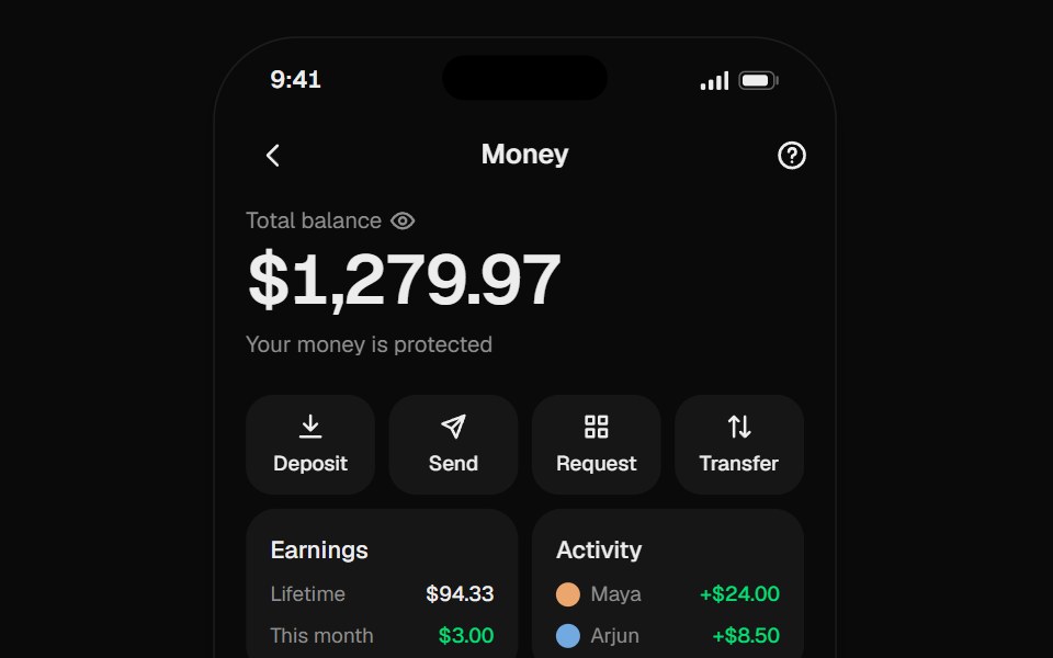 Wallet CardsUI Lab · React
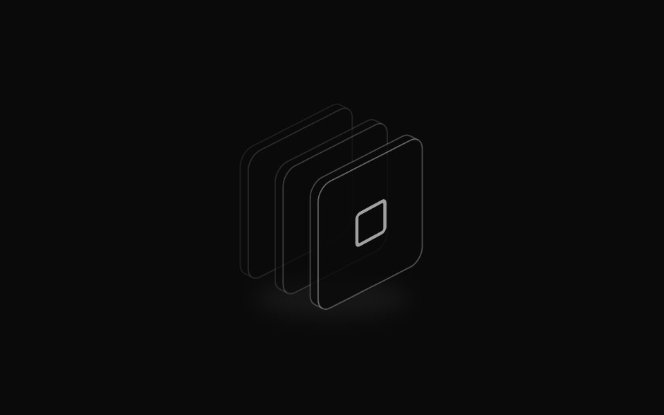 Icon StackReUI · ReactShadcn Icon Stack for isometric icons, layered icon illustrations, and empty-state visuals.
 Card Linear SpreadAmicro Micro Transitions · React
 Card Long Arc5Amicro Micro Transitions · React
 Card Scatter SpreadAmicro Micro Transitions · React
 Card Stamp ArcAmicro Micro Transitions · React
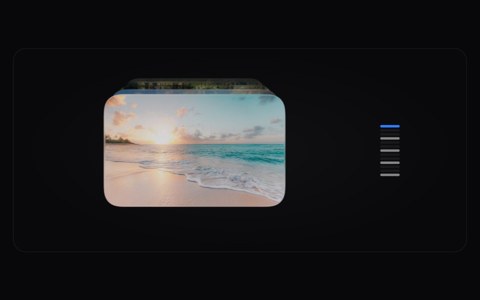 Card Time MachineAmicro Micro Transitions · React
 Card Wheel FanAmicro Micro Transitions · React
 Card Deck CascadeAmicro Micro Transitions · React
Libraries with Tailwind CSS stack components
Related categories
- Stack Components
- React Stack Components
- Animated Stack Components
- Tailwind CSS Layout Components
- Tailwind CSS Grid Components
- Tailwind CSS Bento Grid Components
- Tailwind CSS App Shell Components
- Tailwind CSS Separator Components
- Tailwind CSS Scroll Area Components
- Tailwind CSS Container Components
- Tailwind CSS Split Pane Components
- Tailwind CSS Window Frame Components
- Tailwind CSS Aspect Ratio Components
- Tailwind CSS Sticky Scroll Components
- Tailwind CSS Masonry Components