 Dev Design Library
Color Palette Components
Dev Design Library indexes 21 color palette components from 12 open-source UI libraries, with the most coming from React Spectrum, Lobe UI, Toolcraft, Intent UI and Cue Foundations. Each one links to its page with the source code, a live preview where available, the library license and the install command. Color palette components belong to the Utilities group.
 Color SwatchChakra UI · ReactUsed to preview a color
 Color SwatchReact Spectrum · ReactA ColorSwatch displays a preview of a selected color.
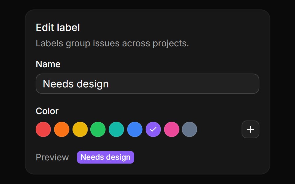 Preset swatchesReUI · ReactRound label colors to pick from, a plus that opens the full picker, and a live label preview.
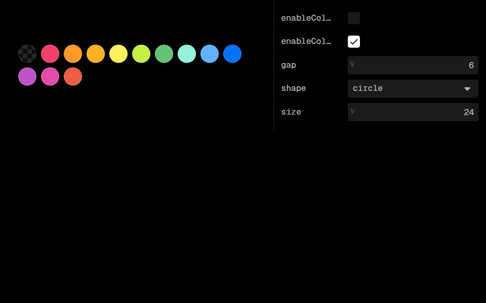 Color SwatchesLobe UI · ReactDisplays selectable color swatches with an optional picker for custom colors.
 color-swatchIntent UI · Reactcolor-swatch
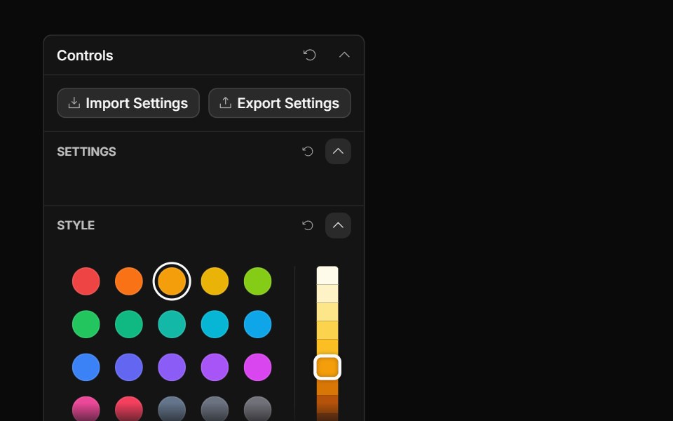 Palette ControlToolcraft · React
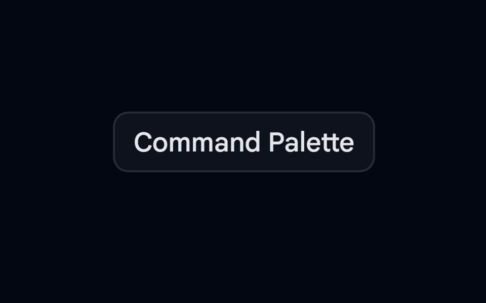 Command-03 - PaletteShadcn Space · ReactPalette command component with groups and separators
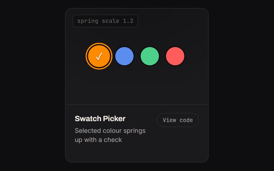 Swatch PickerKinetics · HTML/CSSSelected colour springs up with a check
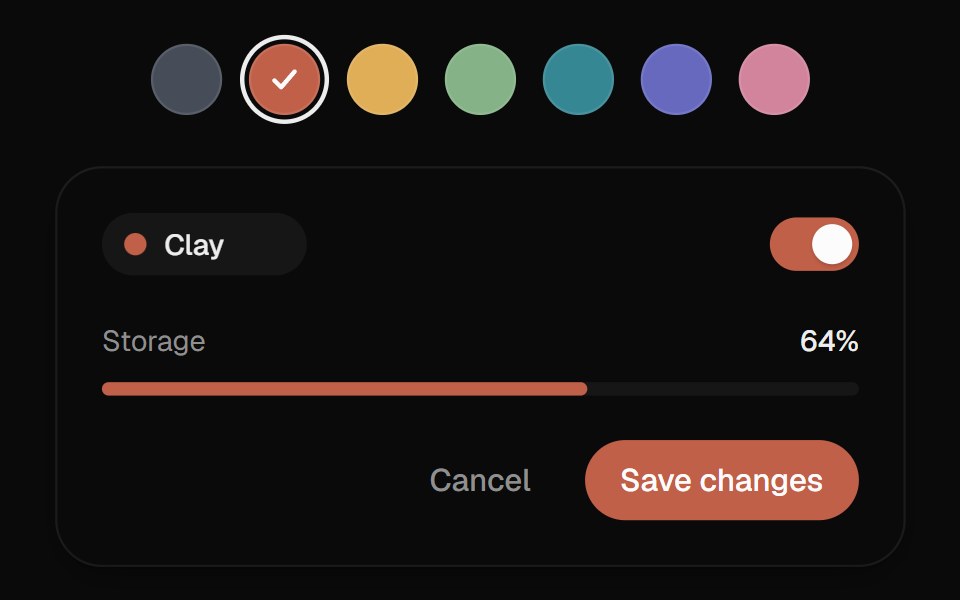 Color SwatchesUI Lab · ReactThe ring glides to the color you pick and the color floods the preview from that side.
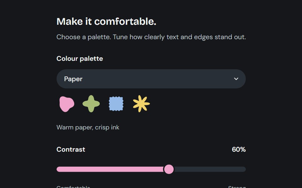 AppearanceCojeev UI · ReactChoose from six coordinated palettes and adjust reading contrast across the application.
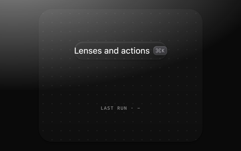 Command paletteMetal UI · React + SwiftUI⌘K: a 560 frost plate with a 44 field well, sections of 36 rows with matches marked, a raised selected row with a…
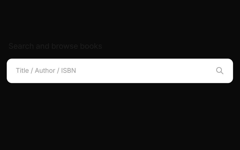 Expandable Book Search PaletteCue Foundations · React
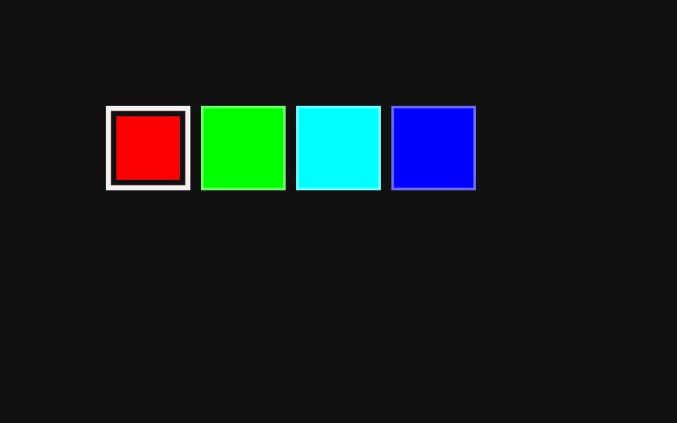 Color Swatch PickerReact Spectrum · ReactA ColorSwatchPicker displays a list of color swatches and allows a user to select one of them.
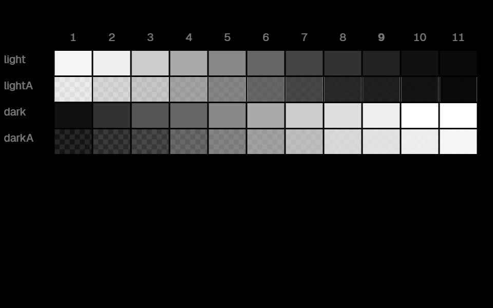 Color Color ScalesLobe UI · React
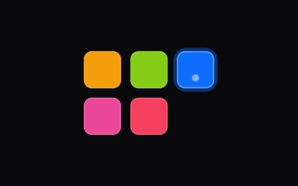 color-swatch-pickerIntent UI · Reactcolor-swatch-picker
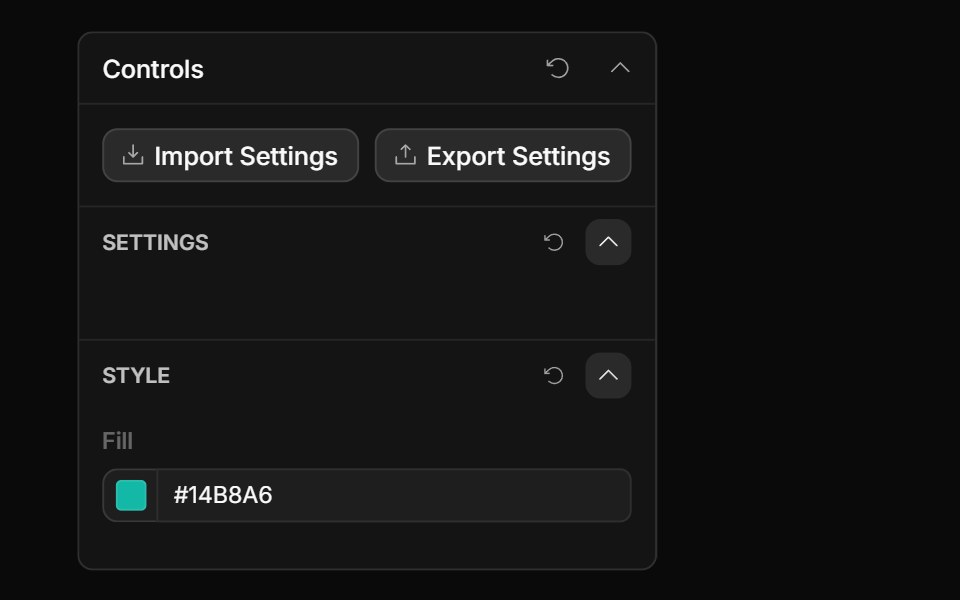 Style Guide Color PickerToolcraft · React
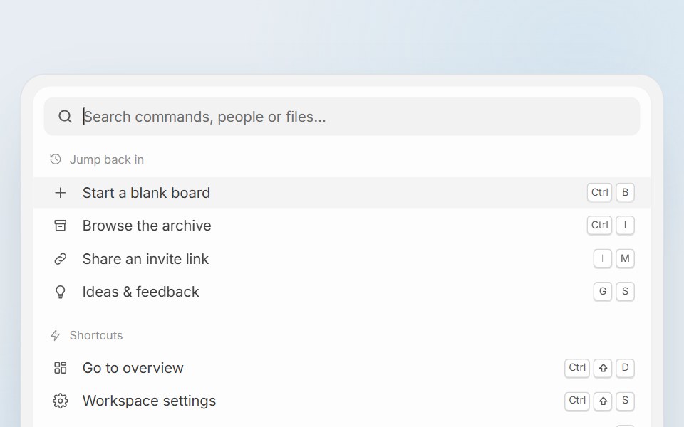 Pixel Perfect Command PaletteCue Foundations · React
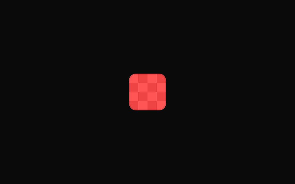 Tailwind Color SwatchReact Spectrum · React
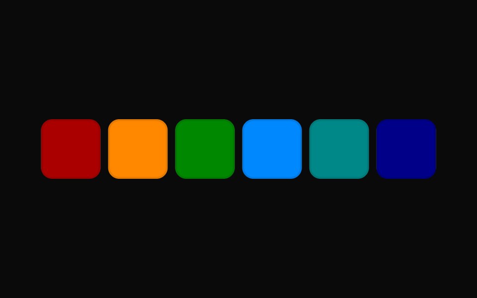 Tailwind Color Swatch PickerReact Spectrum · React
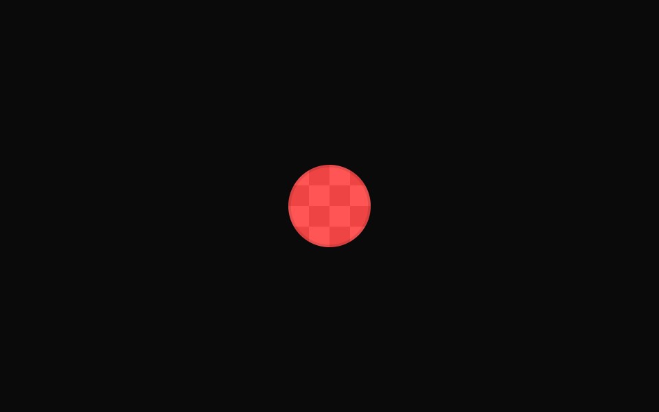 Vanilla Color SwatchReact Spectrum · React
 Vanilla Color Swatch PickerReact Spectrum · React