 Dev Design Library
Tailwind CSS Color Palette Components
Dev Design Library indexes 15 Tailwind CSS color palette components from 8 open-source UI libraries, with the most coming from React Spectrum, Toolcraft, Intent UI, ReUI and UI Lab. Each one links to its page with the source code, a live preview where available, the library license and the install command. Every library in this list styles its components with Tailwind CSS utility classes. Color palette components belong to the Utilities group.
 Color SwatchReact Spectrum · ReactA ColorSwatch displays a preview of a selected color.
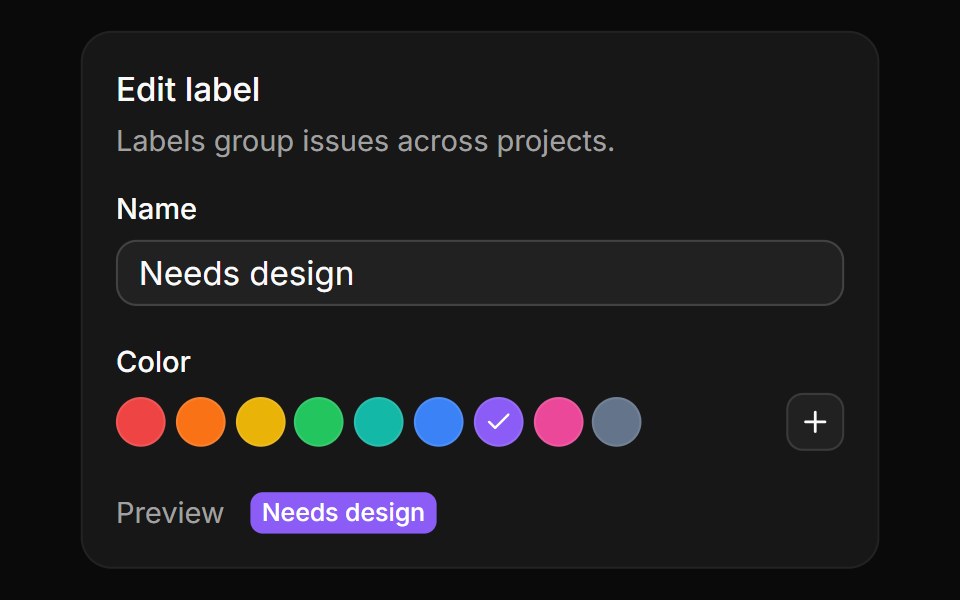 Preset swatchesReUI · ReactRound label colors to pick from, a plus that opens the full picker, and a live label preview.
 color-swatchIntent UI · Reactcolor-swatch
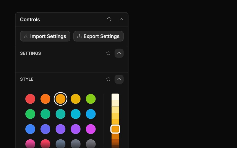 Palette ControlToolcraft · React
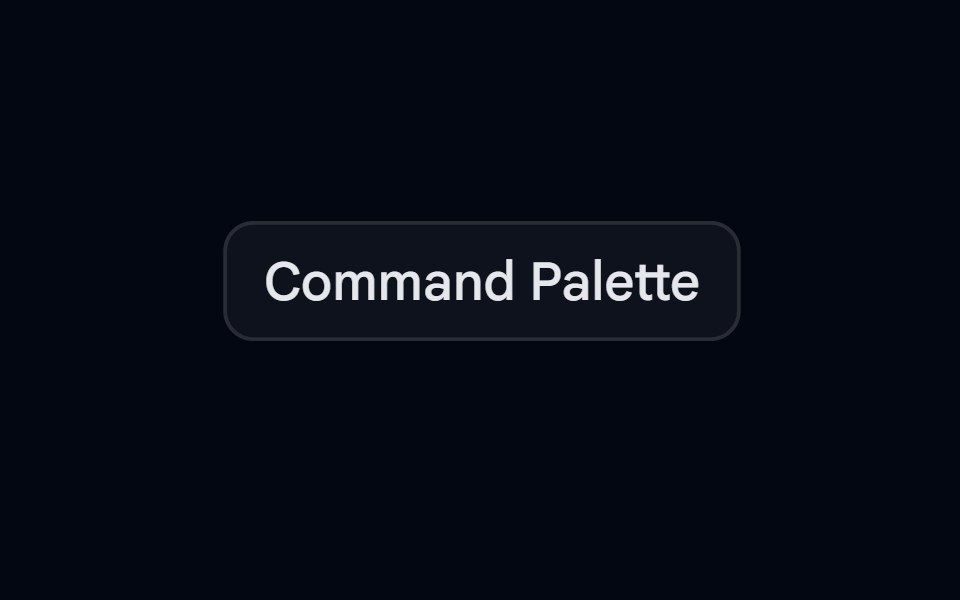 Command-03 - PaletteShadcn Space · ReactPalette command component with groups and separators
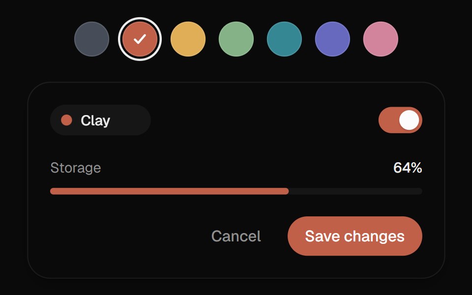 Color SwatchesUI Lab · ReactThe ring glides to the color you pick and the color floods the preview from that side.
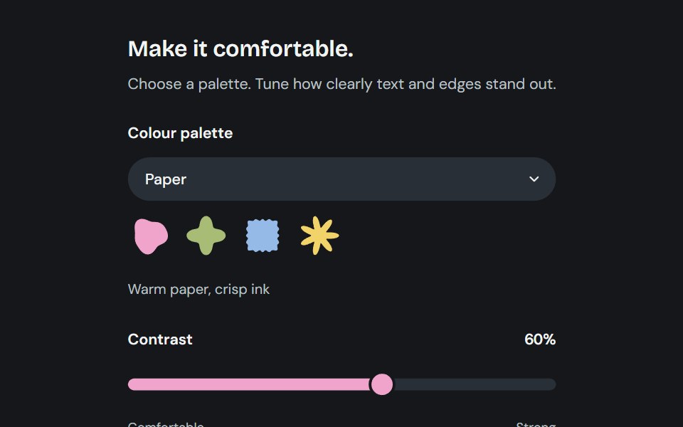 AppearanceCojeev UI · ReactChoose from six coordinated palettes and adjust reading contrast across the application.
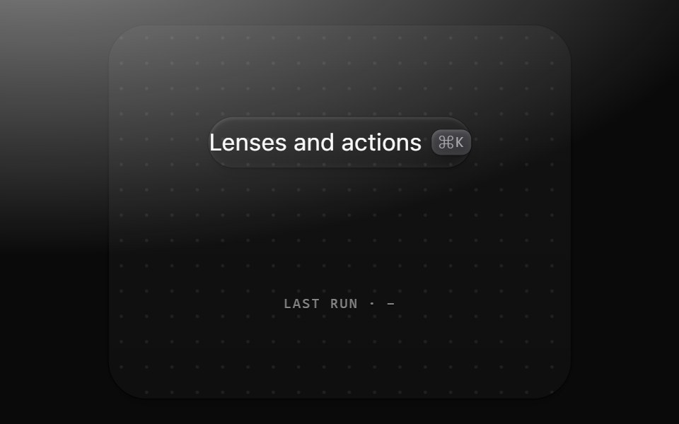 Command paletteMetal UI · React + SwiftUI⌘K: a 560 frost plate with a 44 field well, sections of 36 rows with matches marked, a raised selected row with a…
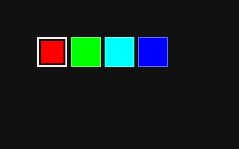 Color Swatch PickerReact Spectrum · ReactA ColorSwatchPicker displays a list of color swatches and allows a user to select one of them.
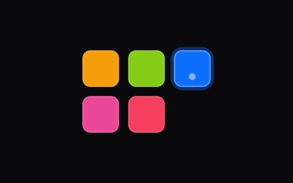 color-swatch-pickerIntent UI · Reactcolor-swatch-picker
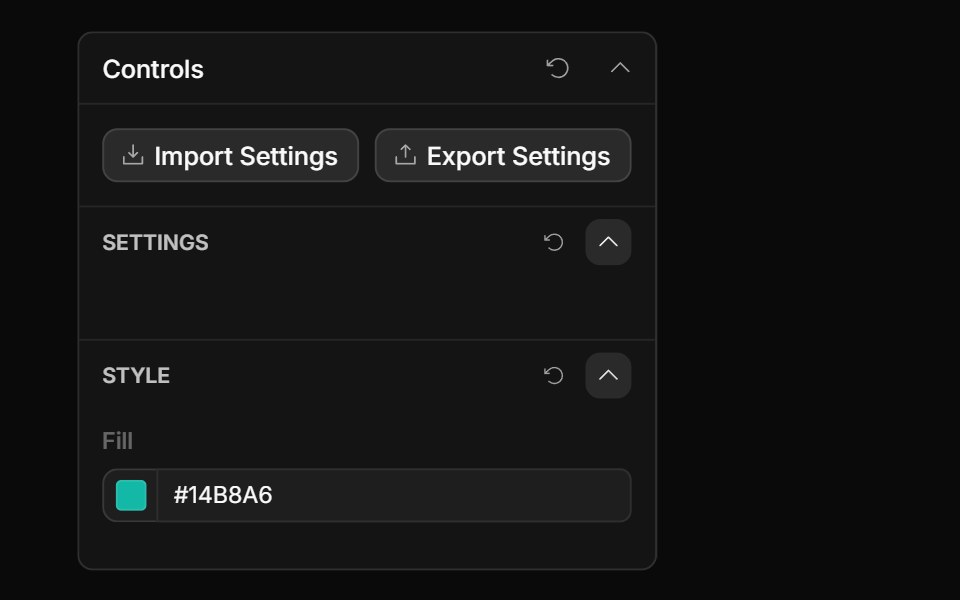 Style Guide Color PickerToolcraft · React
 Tailwind Color SwatchReact Spectrum · React
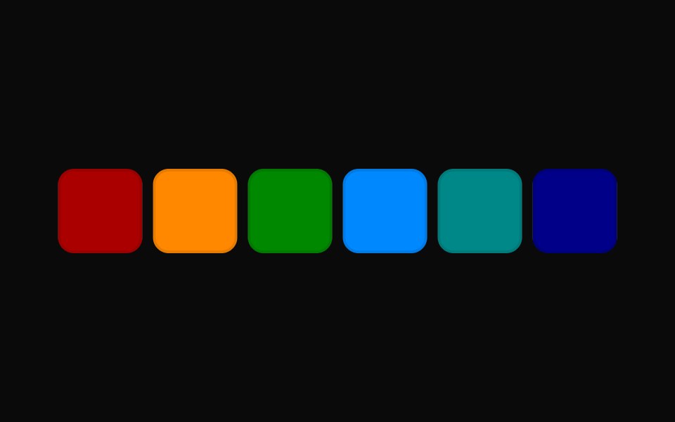 Tailwind Color Swatch PickerReact Spectrum · React
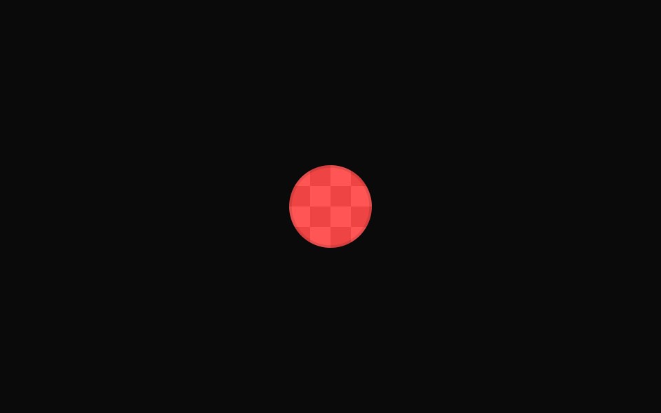 Vanilla Color SwatchReact Spectrum · React
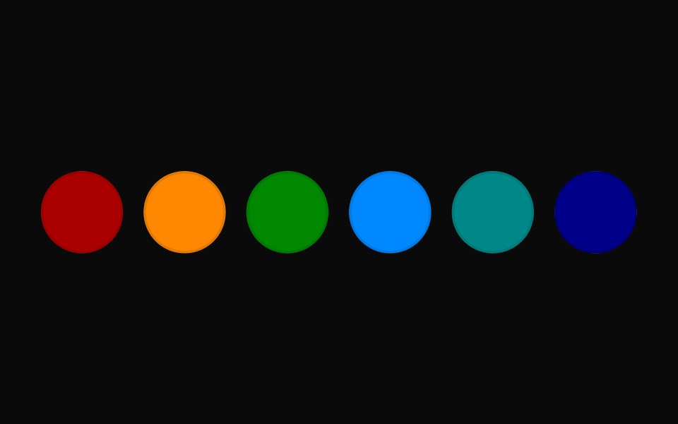 Vanilla Color Swatch PickerReact Spectrum · React