 Dev Design Library
Tailwind CSS Utility Components
Dev Design Library indexes 70 Tailwind CSS utility components from 28 open-source UI libraries, with the most coming from Amicro Micro Transitions, Shark UI, React Spectrum, ark-cn and beUI. Each one links to its page with the source code, a live preview where available, the library license and the install command. Every library in this list styles its components with Tailwind CSS utility classes.
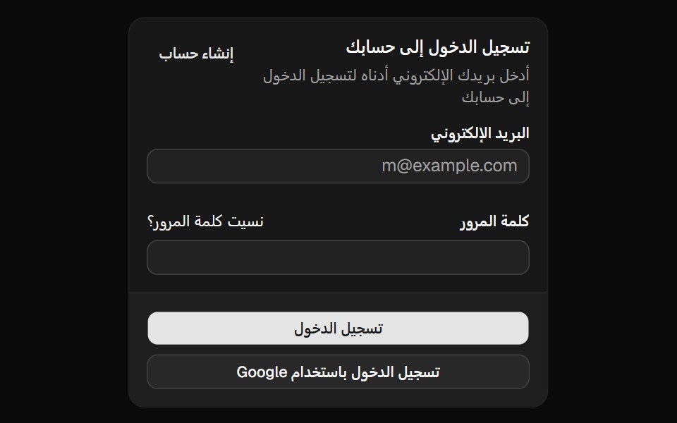 Directionshadcn/ui · ReactA provider component that sets the text direction for your application.
 Color SwatchReact Spectrum · ReactA ColorSwatch displays a preview of a selected color.
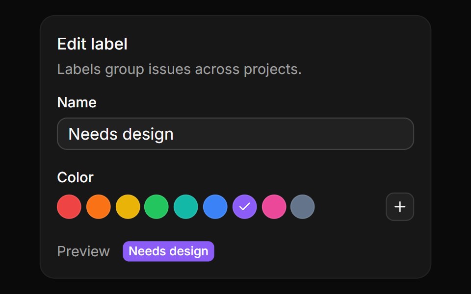 Preset swatchesReUI · ReactRound label colors to pick from, a plus that opens the full picker, and a live label preview.
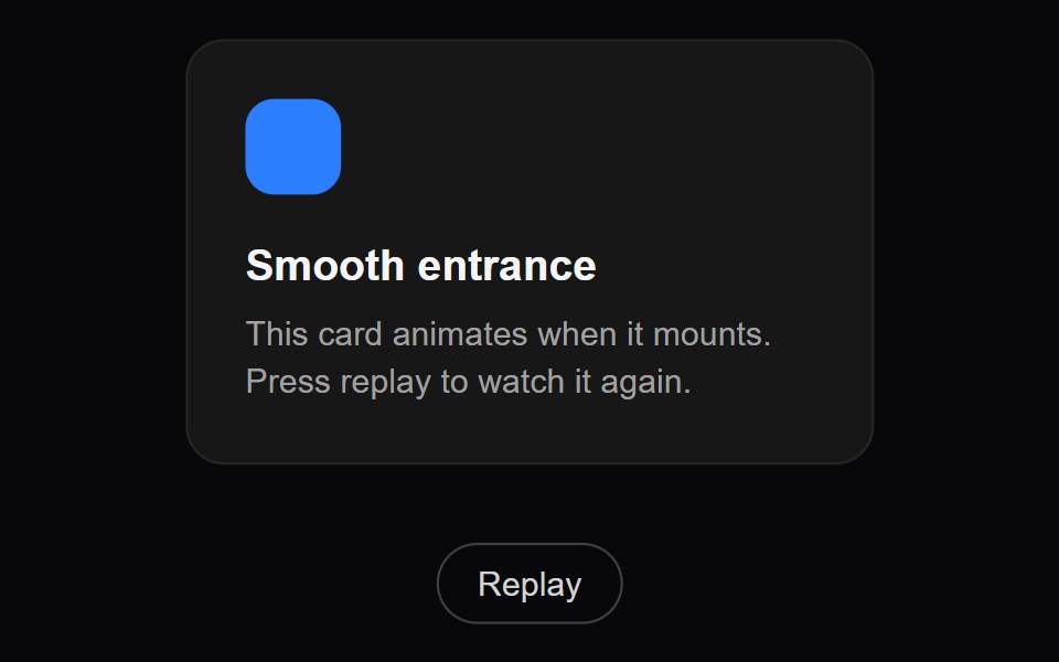 Fade DownAmicro Micro Transitions · ReactFade with downward translation.
 color-swatchIntent UI · Reactcolor-swatch
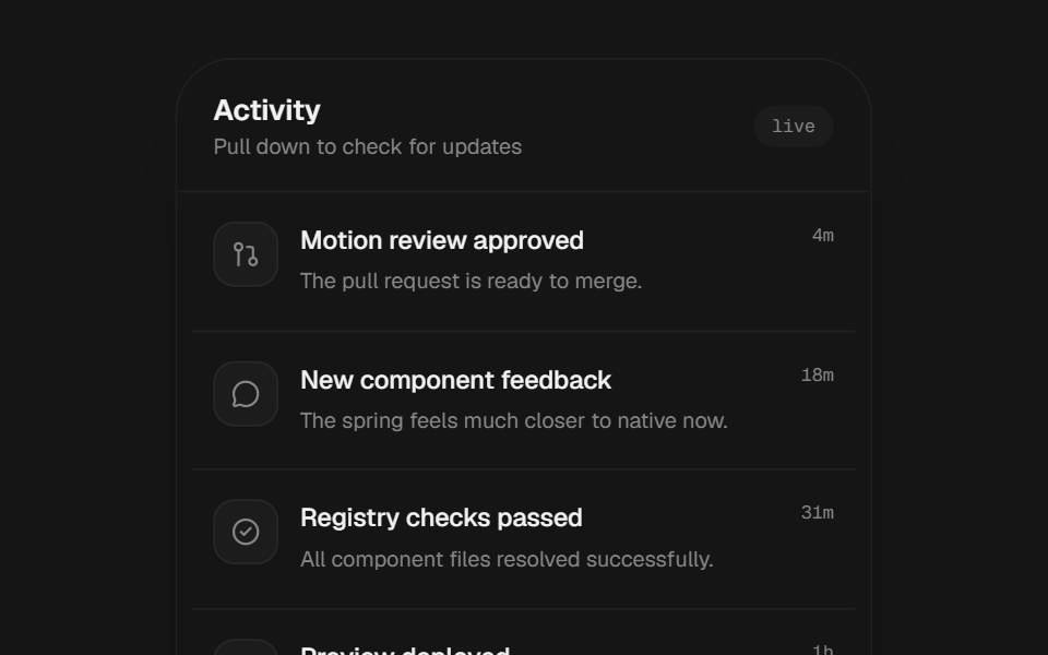 Pull To RefreshbeUI · ReactNative-feeling pull-to-refresh container with drag resistance, threshold feedback and async refresh handling.
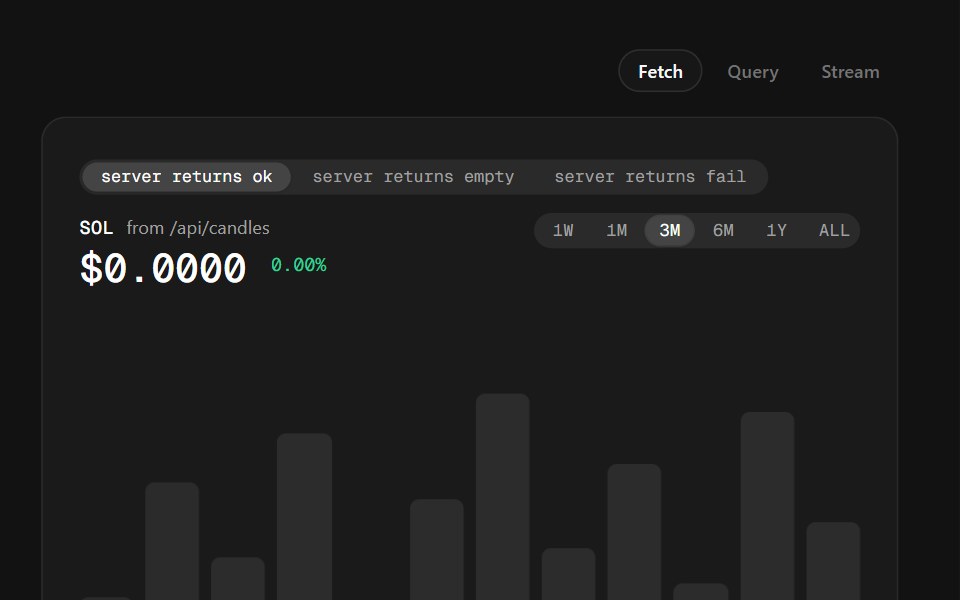 Connecting Real DataSpectrum UI · ReactWiring any chart to a real source: fetch in an effect, SWR or React Query, server components, and streaming — with…
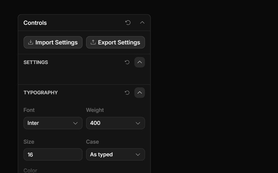 Font Picker ControlToolcraft · React
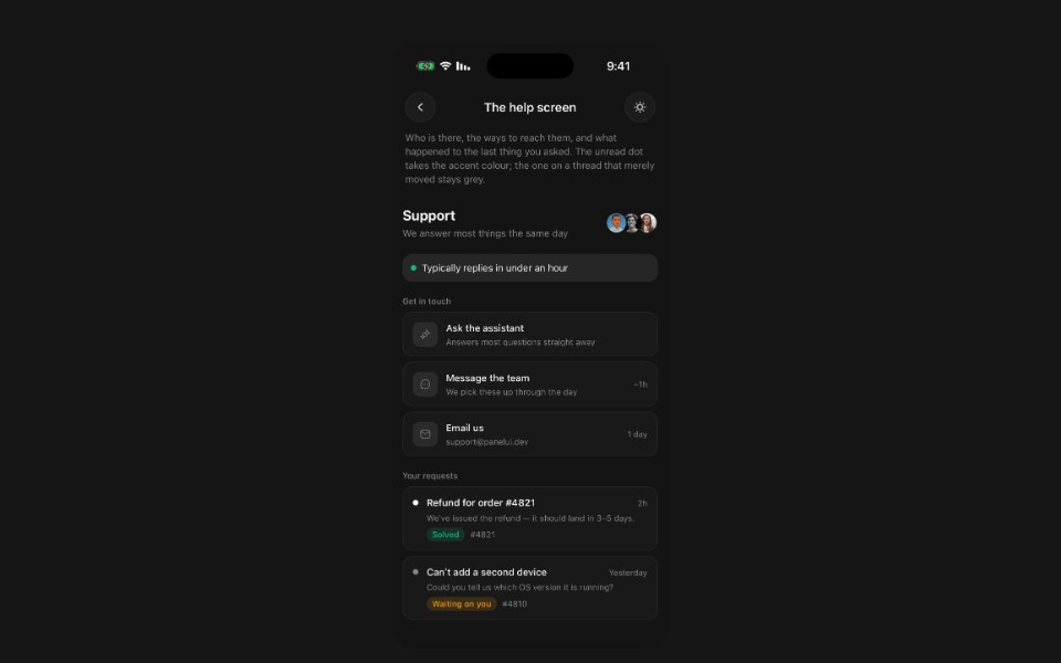 SupportPanel UI · React NativeThe screen a person arrives on when they need help.
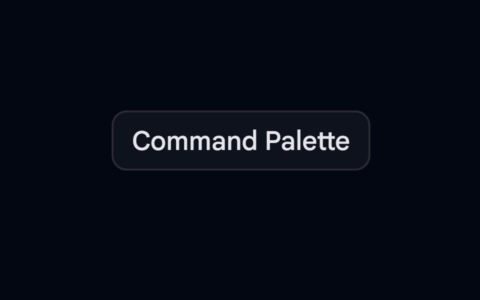 Command-03 - PaletteShadcn Space · ReactPalette command component with groups and separators
 Text Glitch PortalPixel Perfect · ReactRGB split plus scale blur then collapse into clean text.
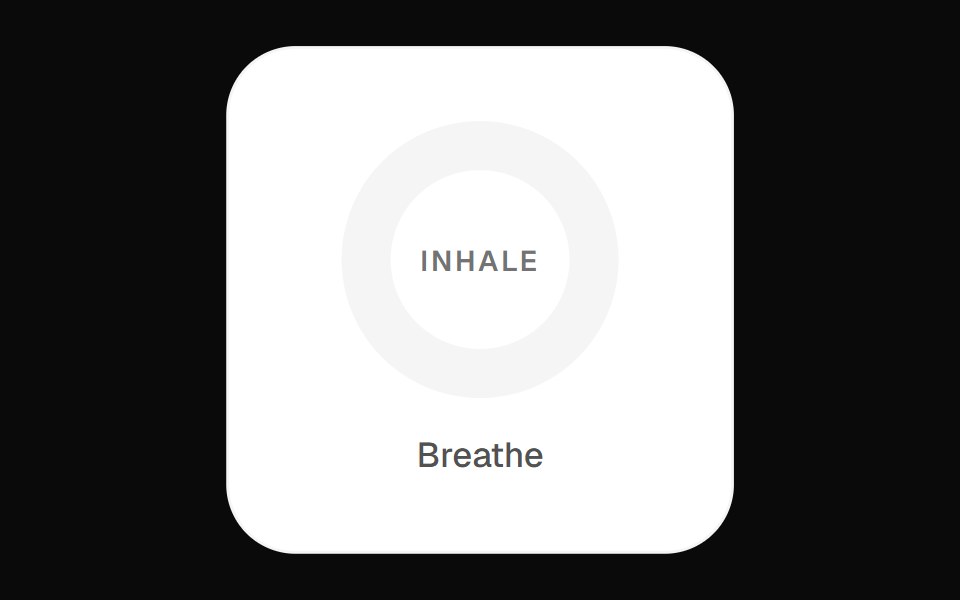 Focus Breath WidgetOpenSourceUI · React
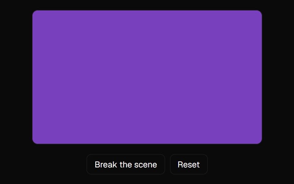 Webgl Error BoundaryComponentry · React
 Smooth ScrollObsidianUI · React
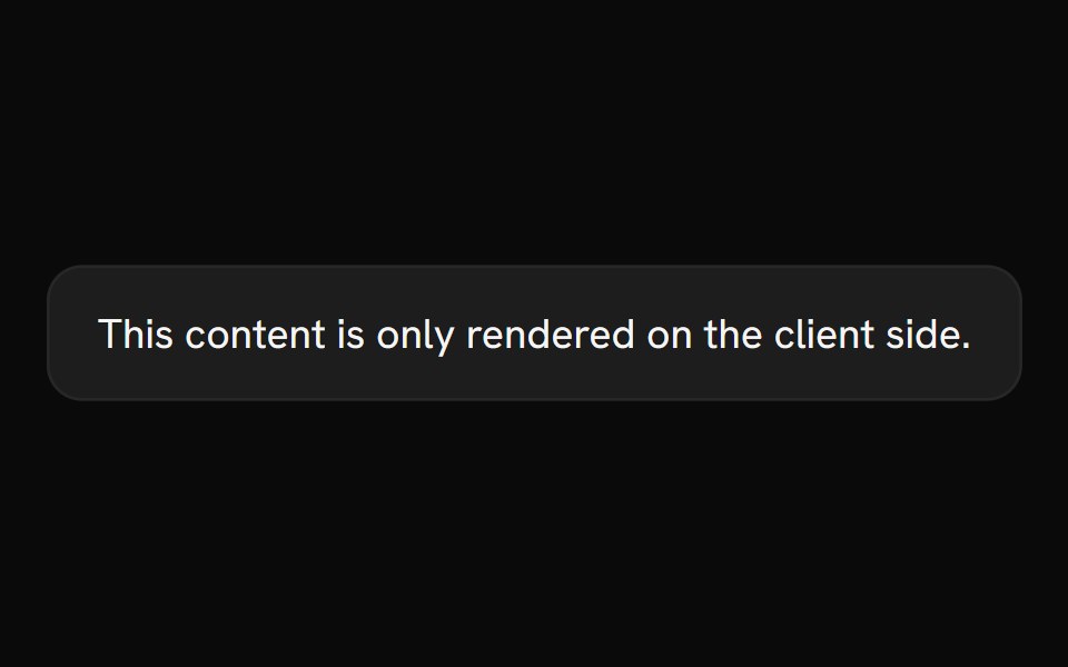 Client OnlyShark UI · ReactRender content only on the client side.
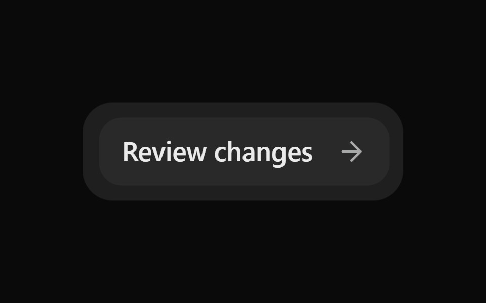 Morph SurfaceSona UI · ReactAn unstyled layout primitive that grows, shrinks, clips, and updates the content of one persistent consumer-styled…
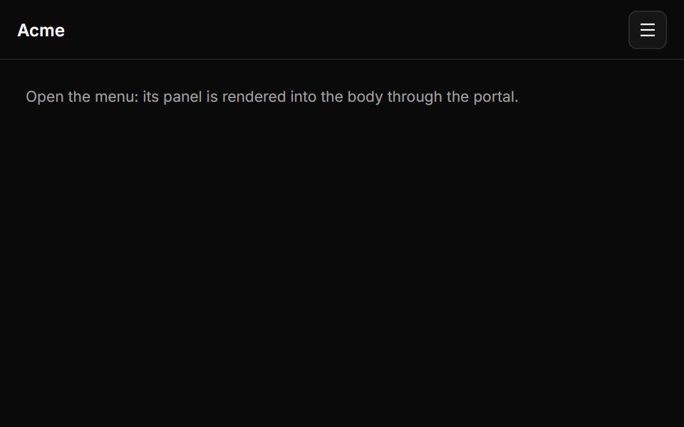 Portalsv-efferd · Svelte
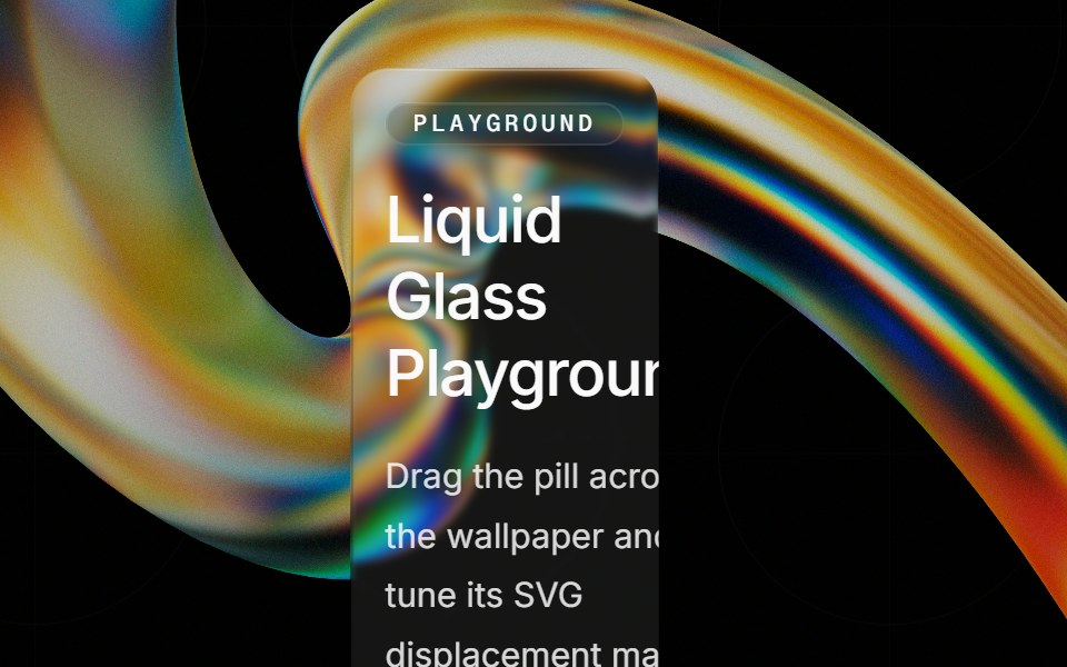 Liquid Glassglasscn · ReactLow-level refractive glass wrapper used by liquid-refract components.
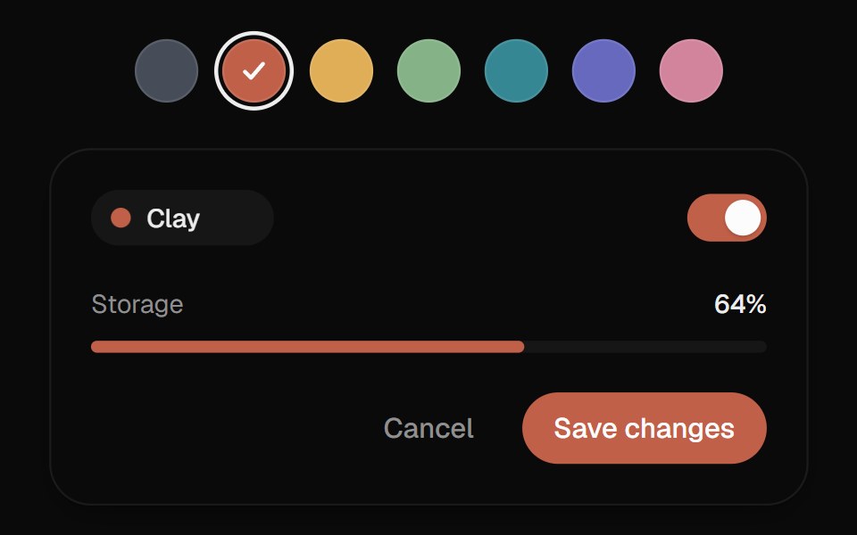 Color SwatchesUI Lab · ReactThe ring glides to the color you pick and the color floods the preview from that side.
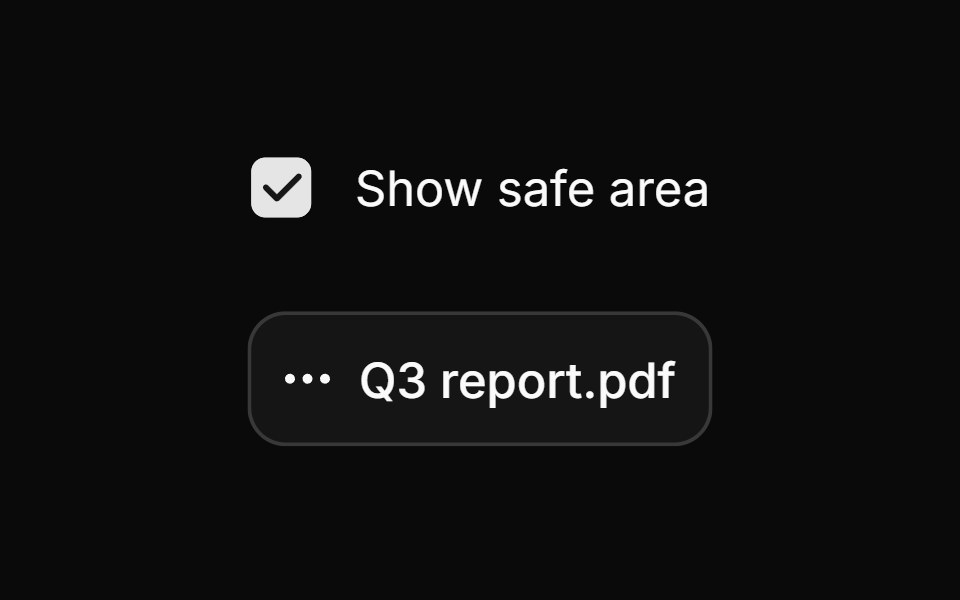 Safe areaHextaUI · ReactA pointer safe triangle that keeps submenus and flyouts open while the cursor travels diagonally toward them.
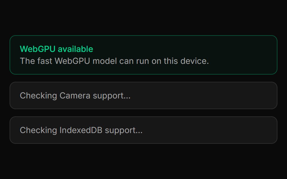 Capability GateLocalMode · ReactA true gate: renders its children only when the device meets a stated requirement (e.g. requires="webgpu"), otherwise…
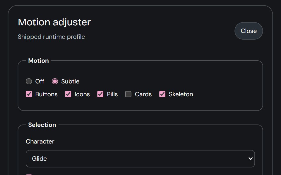 Motion AdjusterCojeev UI · ReactProvides live controls for the shared motion settings and editable body profiles used across the library.
 Preset ScopeFLX UI · ReactActivates a preset for a subtree by writing the data-preset attribute. Required by every preset.
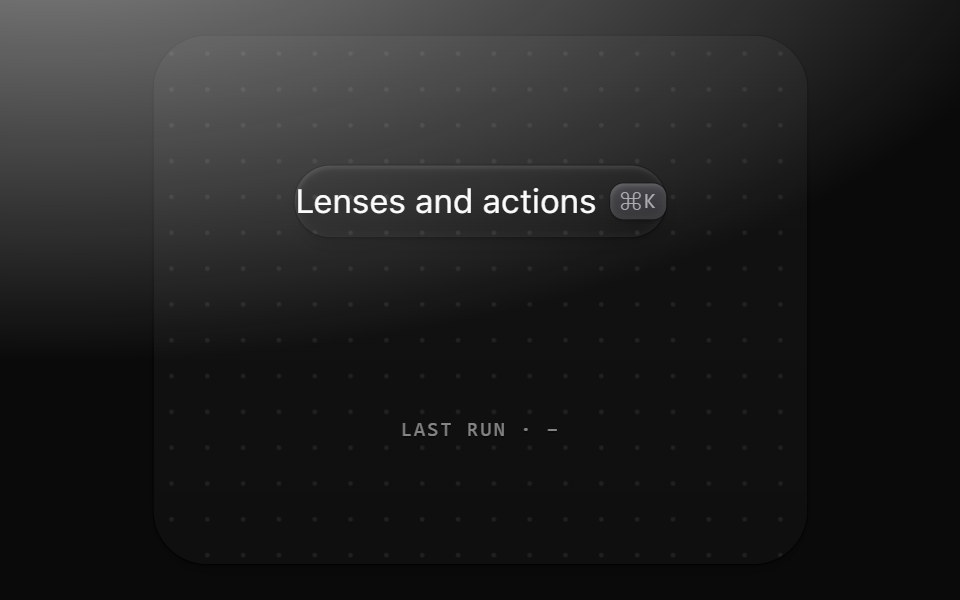 Command paletteMetal UI · React + SwiftUI⌘K: a 560 frost plate with a 44 field well, sections of 36 rows with matches marked, a raised selected row with a…
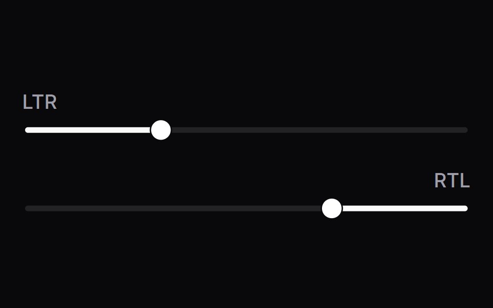 DirectionSpaceUI · ReactAccessible Direction primitive component for Space UI.
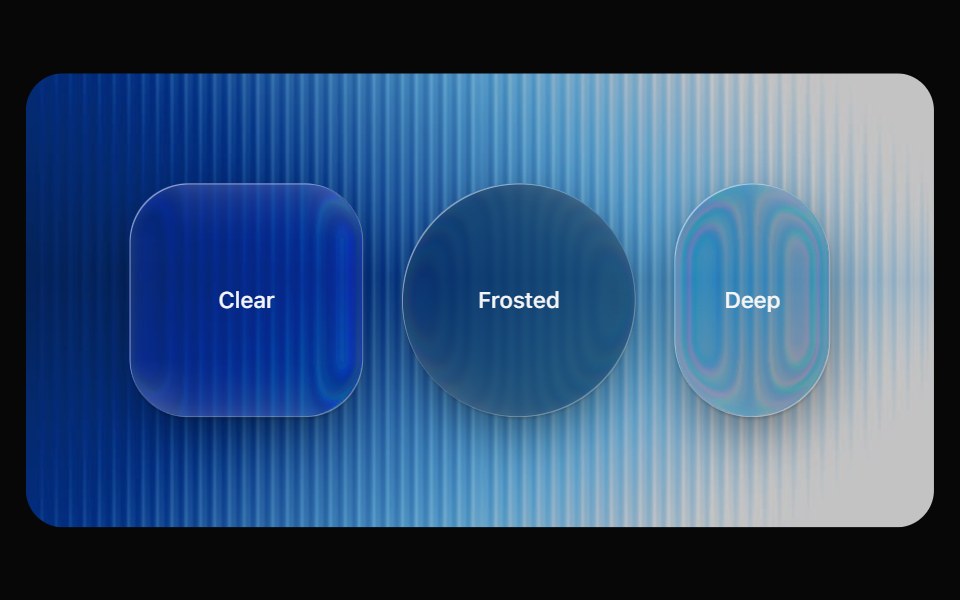 Liquid GlassOpaline · ReactThe primitive behind every glass component. Refracts the backdrop through an SVG displacement map, with a frosted…
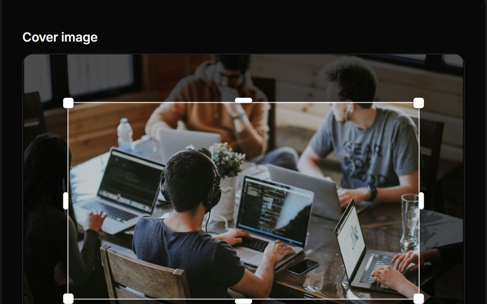 Image CropperReactFrame · ReactAn image cropper with a draggable, resizable crop box, aspect presets or a circle mask for avatars, keyboard nudging…
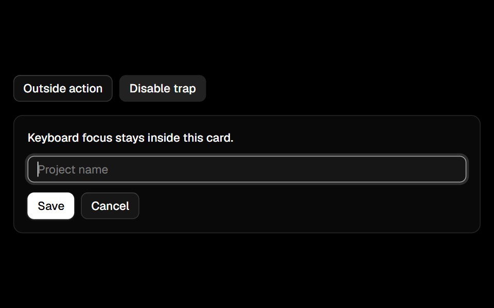 Focus Trapark-cn · ReactA shadcn-style focus trap utility built with Ark UI primitives.
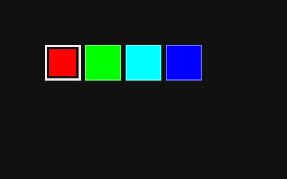 Color Swatch PickerReact Spectrum · ReactA ColorSwatchPicker displays a list of color swatches and allows a user to select one of them.
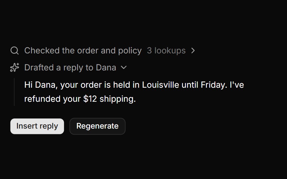 Support copilot draftReUI · ReactA drafted support reply with the order and policy lookups behind it, and Regenerate replaying them.
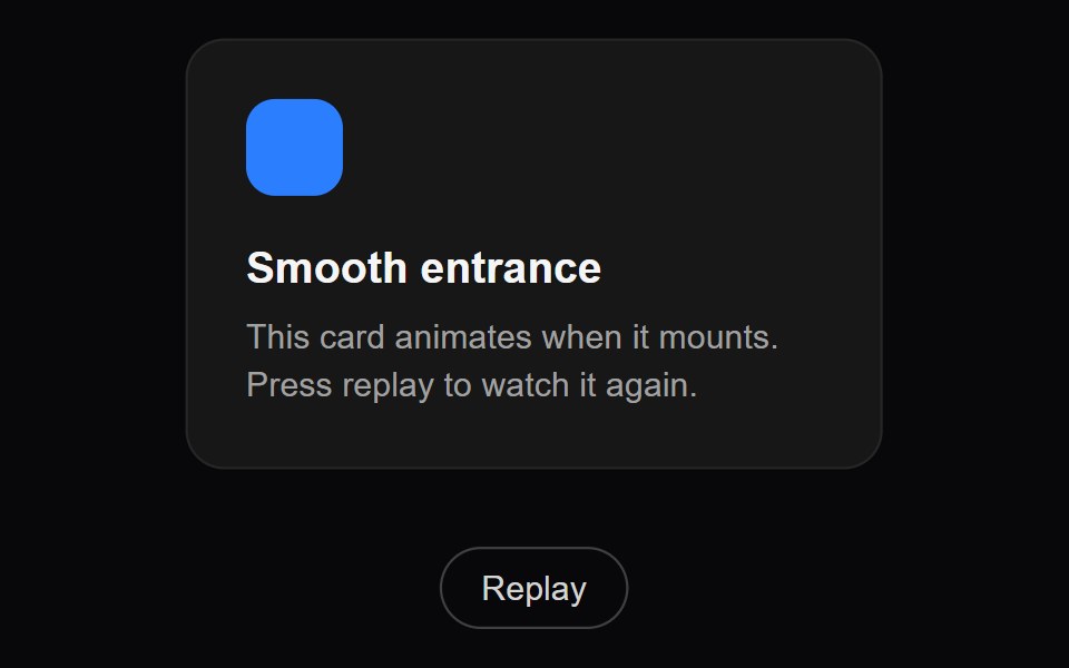 Fade InAmicro Micro Transitions · ReactBasic fade entrance animation.
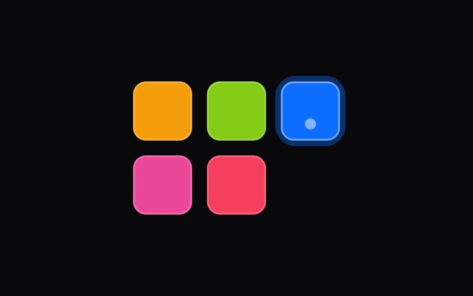 color-swatch-pickerIntent UI · Reactcolor-swatch-picker
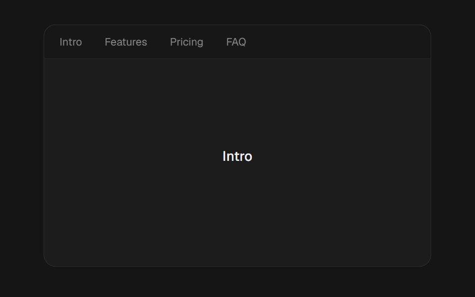 Scroll TobeUI · ReactButton that smooth-scrolls to a target (offset, selector or element) via the active SmoothScroll provider…
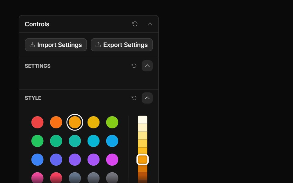 Palette ControlToolcraft · React
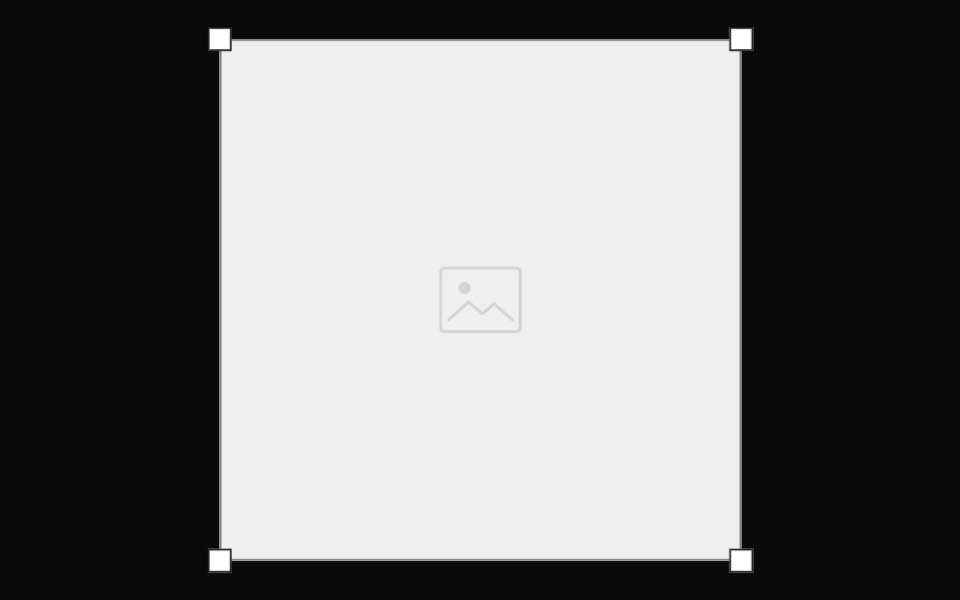 Transform Box FrameOpenSourceUI · React
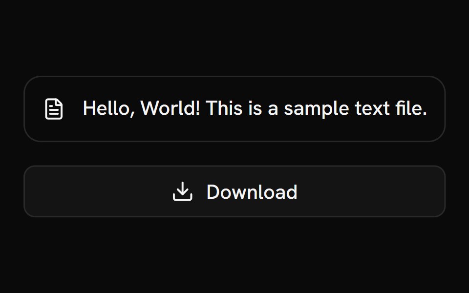 Download TriggerShark UI · ReactTrigger file downloads programmatically.
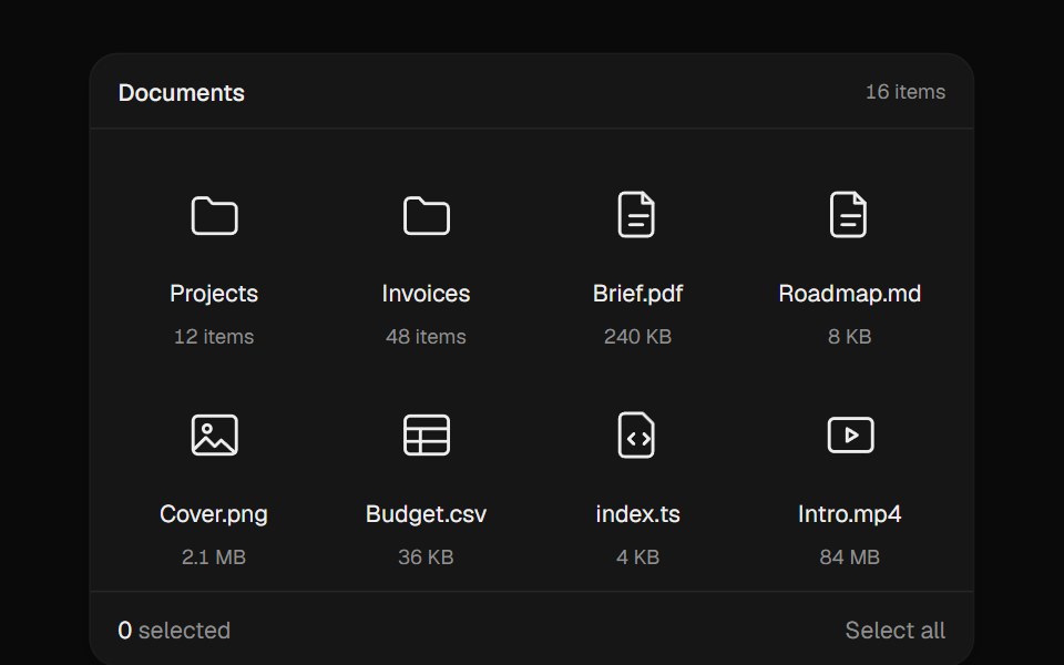 Drag SelectUI Lab · ReactDraw a box across files to select them, like the desktop.
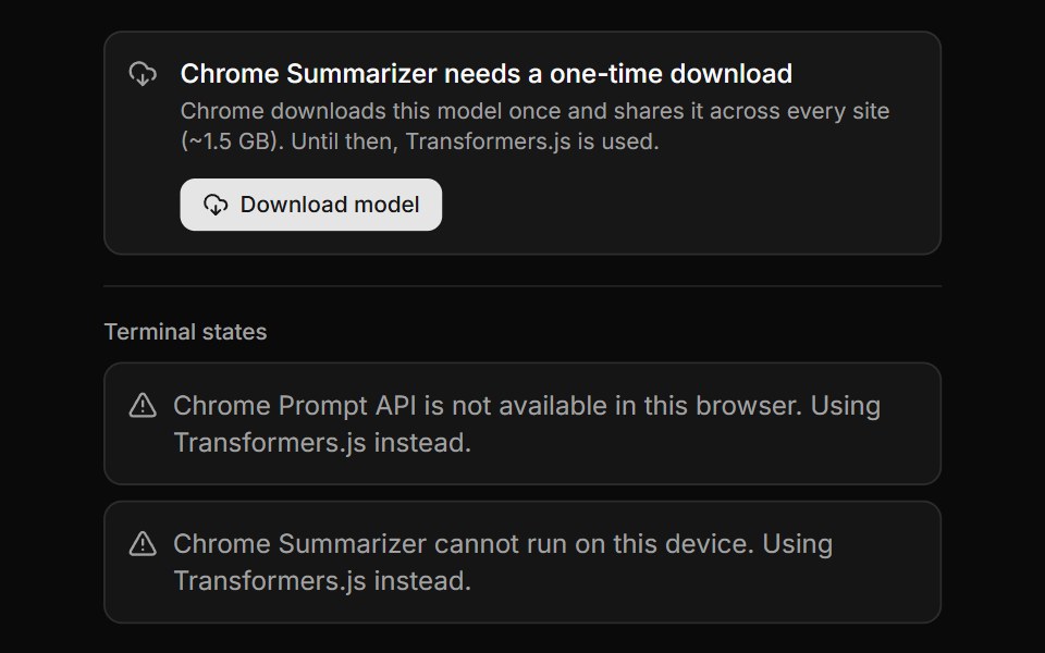 Chrome AI Download GateLocalMode · ReactThe gate a user sees when a Chrome Built-in AI capability exists but its on-device model has not been fetched yet…
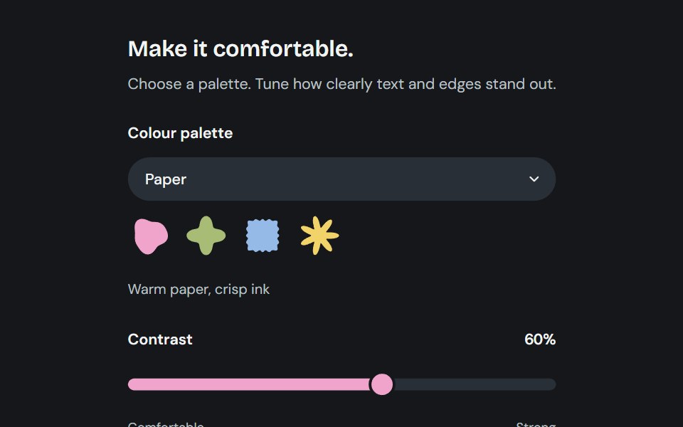 AppearanceCojeev UI · ReactChoose from six coordinated palettes and adjust reading contrast across the application.
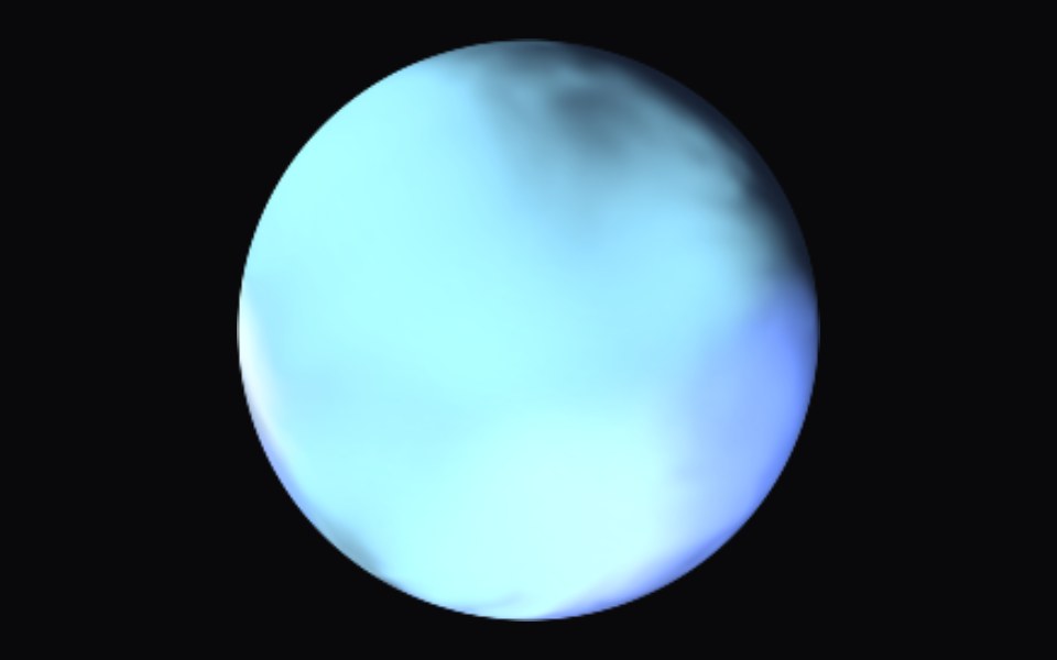 SmoothSpaceUI · ReactAudio-reactive fluid WebGL orb. Swap ambient, microphone, or file input, change the texture, and toggle grain.
 Formatark-cn · ReactShadcn-style format utilities (Byte, Time, RelativeTime) built with Ark UI primitives.
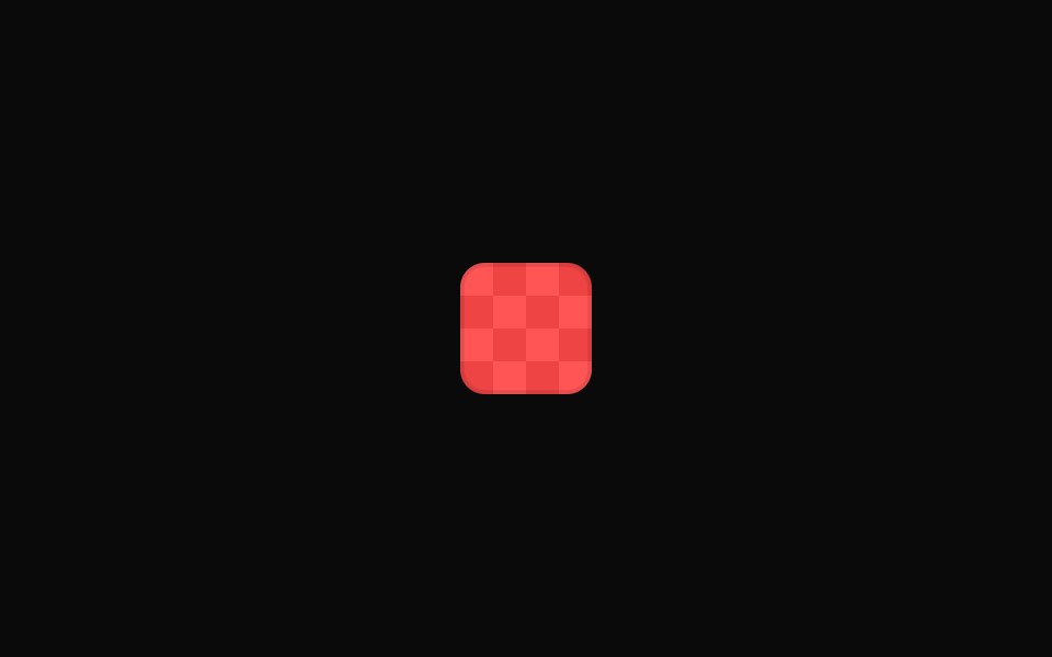 Tailwind Color SwatchReact Spectrum · React
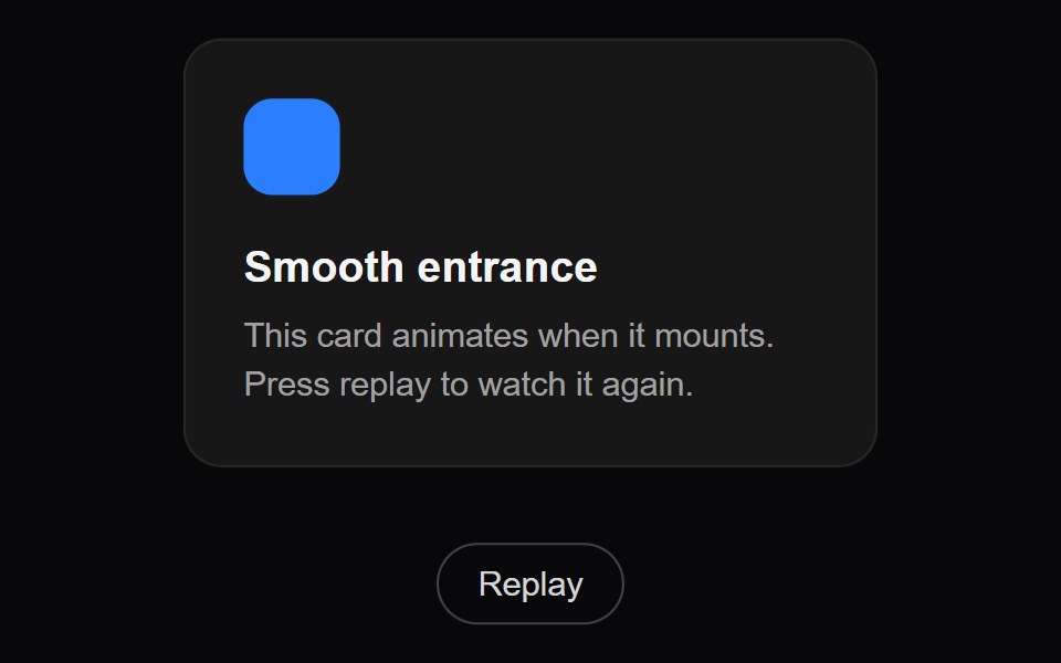 Fade UpAmicro Micro Transitions · ReactFade with upward translation.
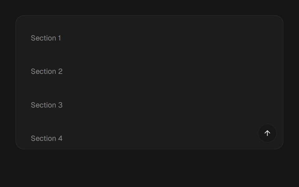 Smooth ScrollbeUI · ReactSmooth-scroll provider over Lenis with a useSmoothScroll hook exposing scroll offset, progress and velocity…
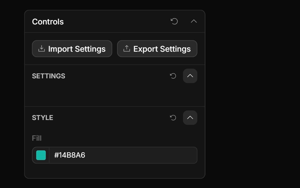 Style Guide Color PickerToolcraft · React
 Transform Plus FrameOpenSourceUI · React
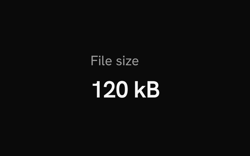 FormatShark UI · ReactFormat numbers, bytes, and time with Intl API.
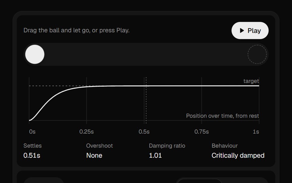 Spring PlaygroundUI Lab · ReactTune a spring and watch its overshoot and settle, plotted live.
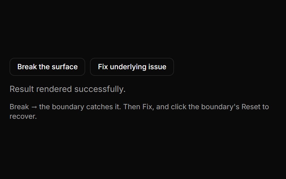 Mode Error BoundaryLocalMode · ReactA React error boundary that isolates a render failure in its subtree: it catches the error, renders a compact…
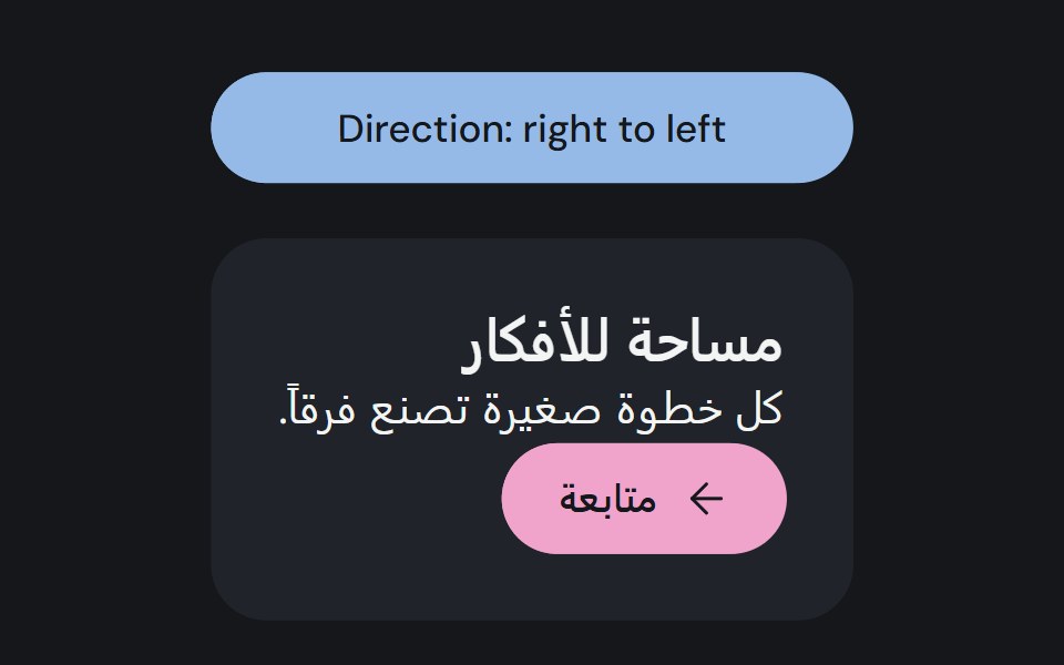 DirectionCojeev UI · ReactSets a text direction for a subtree and shares it with direction-aware primitives.
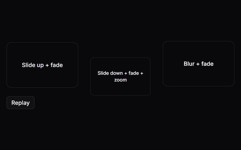 Motion EffectSpaceUI · React
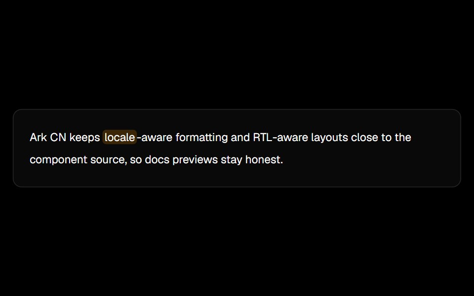 Highlightark-cn · ReactA shadcn-style text highlight utility built with Ark UI primitives.
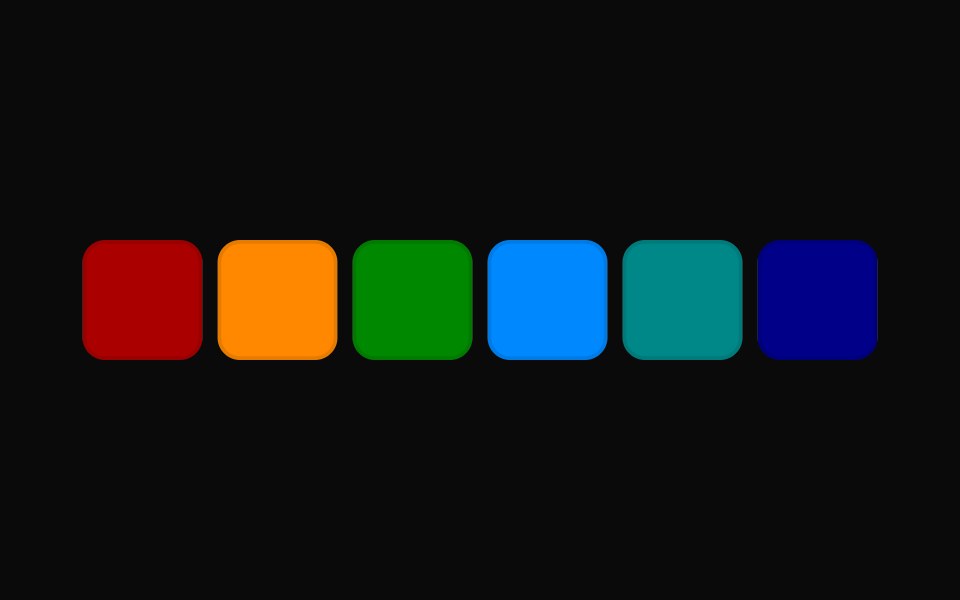 Tailwind Color Swatch PickerReact Spectrum · React
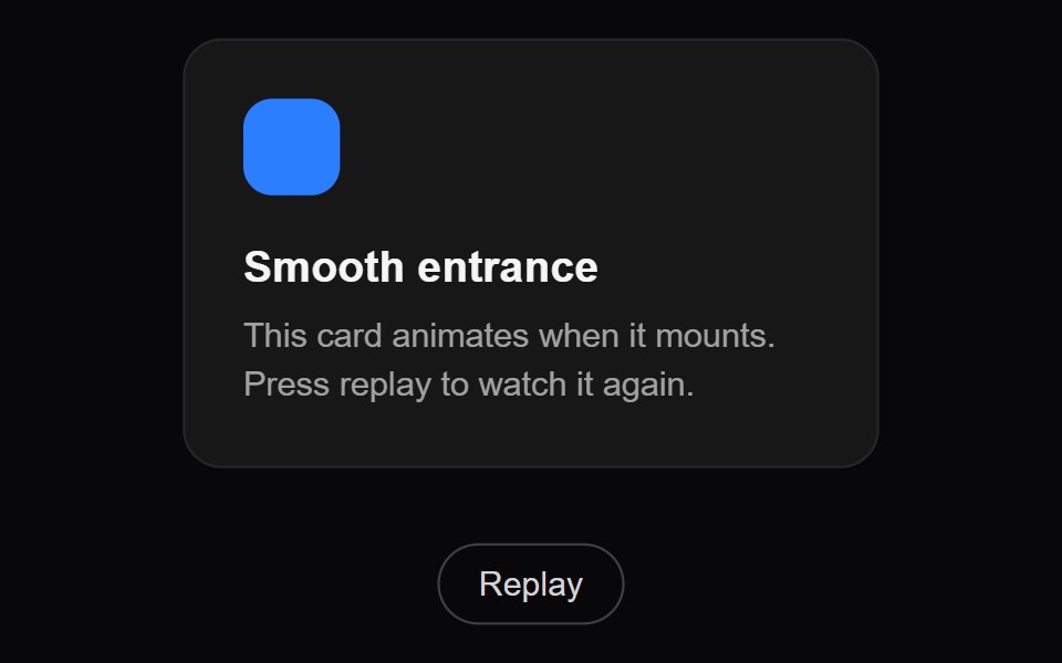 Scale InAmicro Micro Transitions · ReactScale transition from small to actual size.
 Popover PositionbeUI · React
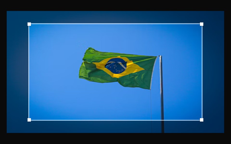 Image CropperShark UI · ReactCrop and transform images.
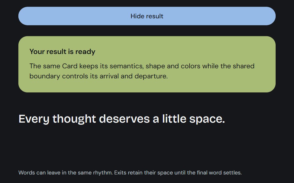 PresenceCojeev UI · ReactMotionPresence keeps keyed children mounted for their exits. MotionSurface adds coordinated lifecycle states to an…
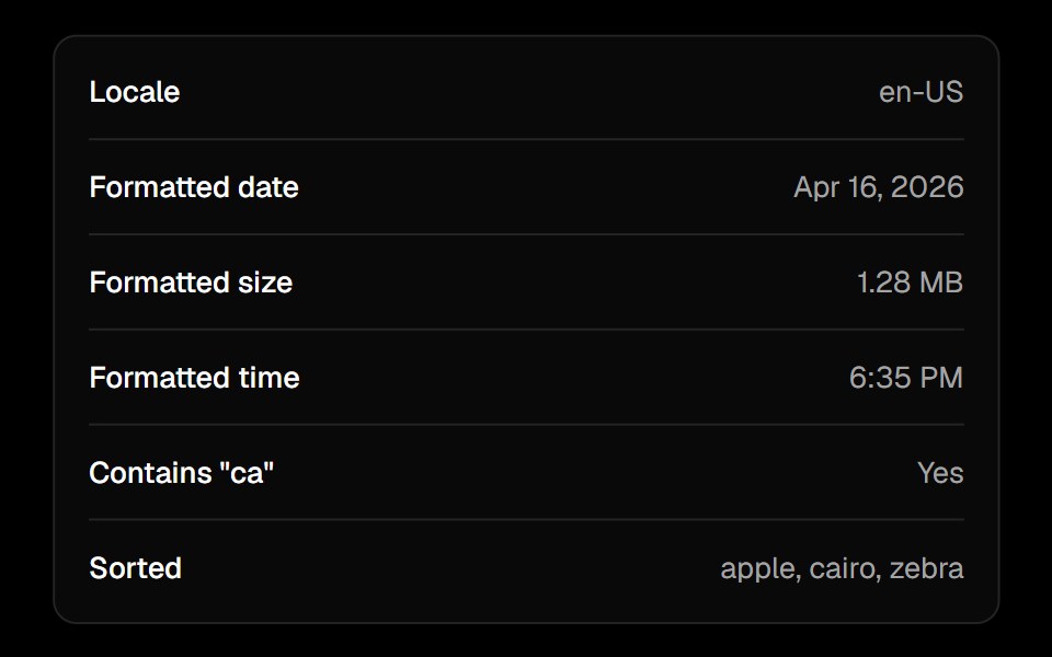 Locale Providerark-cn · ReactA shadcn-style locale provider utility built with Ark UI primitives.
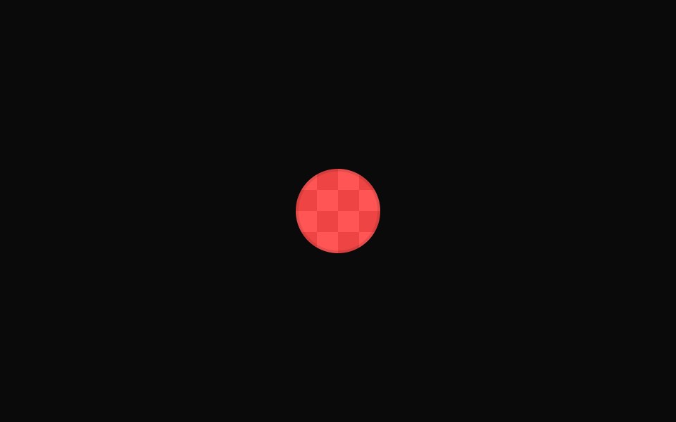 Vanilla Color SwatchReact Spectrum · React
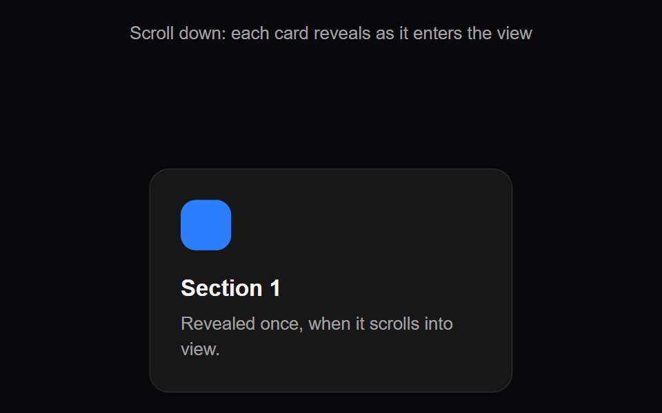 Scroll RevealAmicro Micro Transitions · ReactReveal content block as it scrolls into viewport.
 PresenceShark UI · ReactAnimate components on mount and unmount.
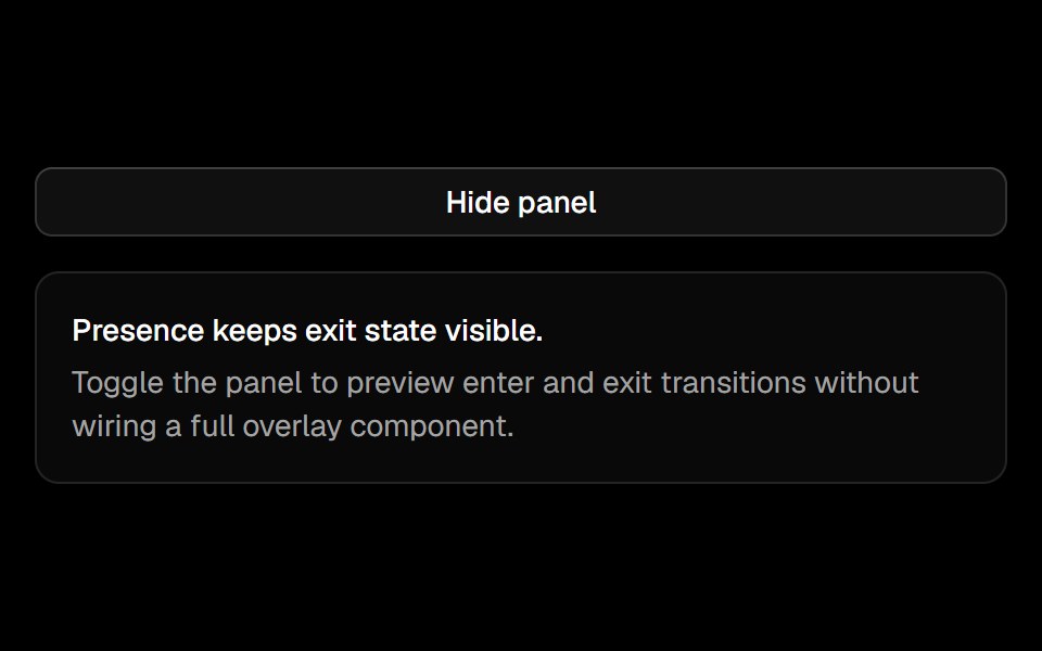 Presenceark-cn · ReactA shadcn-style presence utility built with Ark UI primitives.
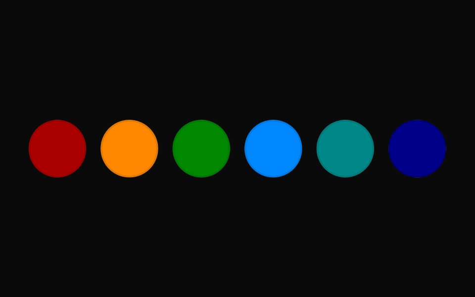 Vanilla Color Swatch PickerReact Spectrum · React
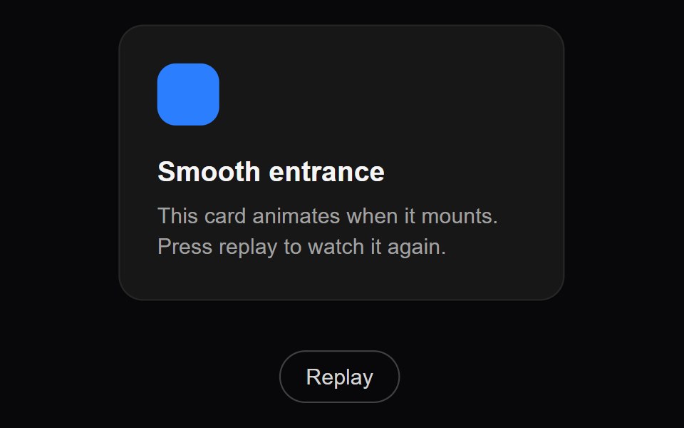 Slide LeftAmicro Micro Transitions · ReactSlide in from right to left.
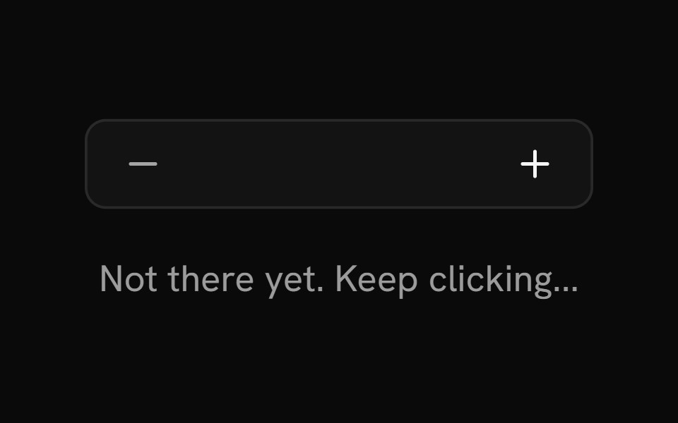 ShowShark UI · ReactConditionally render content based on a boolean value.
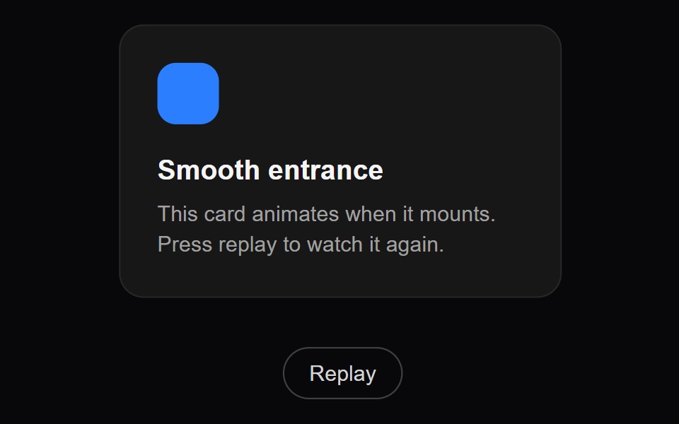 Slide RightAmicro Micro Transitions · ReactSlide in from left to right.
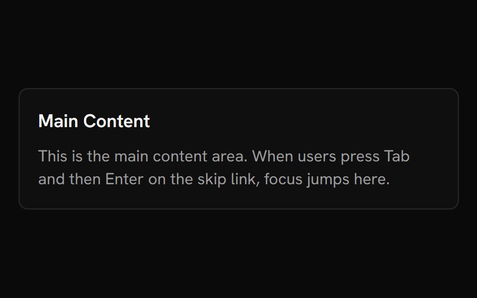 Skip NavShark UI · ReactLets keyboard users skip to main content.
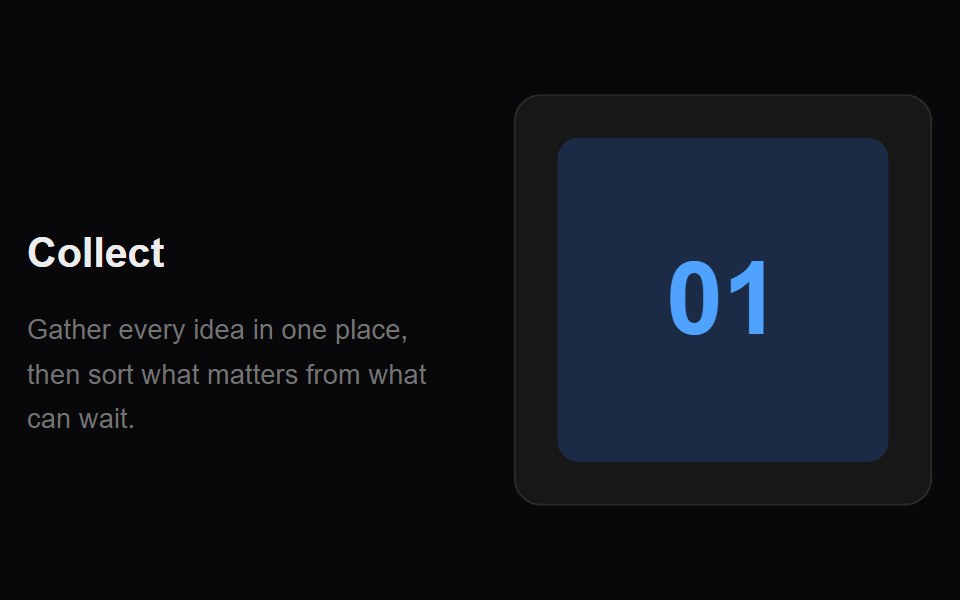 Sticky RevealAmicro Micro Transitions · ReactApple-style scroll-linked side sticky content reveal.
 LocaleShark UI · React
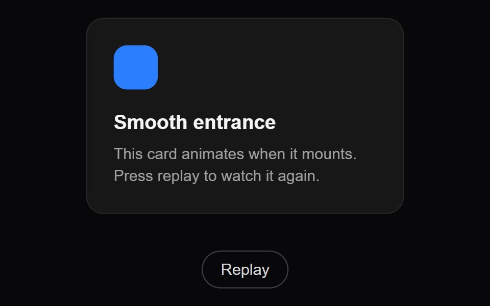 Zoom InAmicro Micro Transitions · ReactScale transition combined with deep blur/depth effect.