 Dev Design Library
Radio Components
Dev Design Library indexes 142 radio components from 56 open-source UI libraries, with the most coming from Origin UI, ReUI, Watermelon UI, Oxbow UI and FLX UI. Each one links to its page with the source code, a live preview where available, the library license and the install command. Radio components belong to the Inputs group.
Showing 120 of 142, a mix from every library. Open a library to see all of its components.
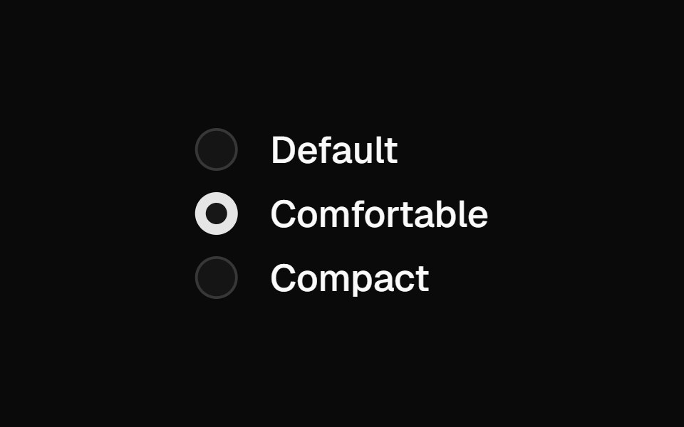 Radio Groupshadcn/ui · ReactA set of checkable buttons—known as radio buttons—where no more than one of the buttons can be checked at a time.
 RadioMUI / Material UI · React
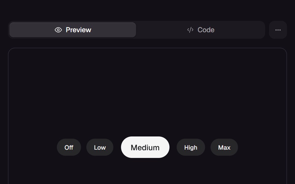 Jelly RadioReact Bits · ReactRadio group of labelled chips where the chosen one swells wide-then-tall on two springs and barges its neighbours…
 RadiodaisyUI · CSS (Tailwind)
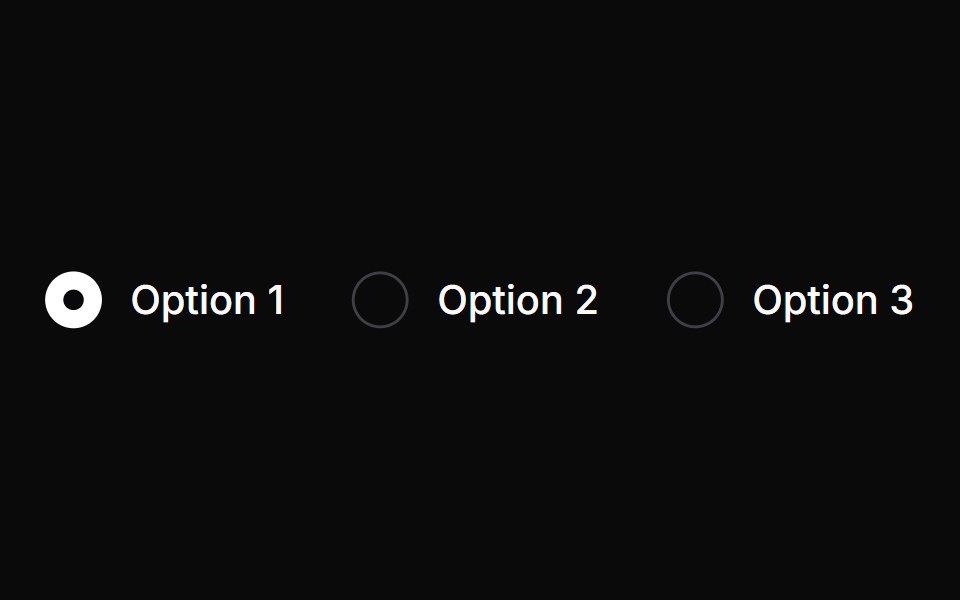 RadioChakra UI · ReactUsed to select one option from several options
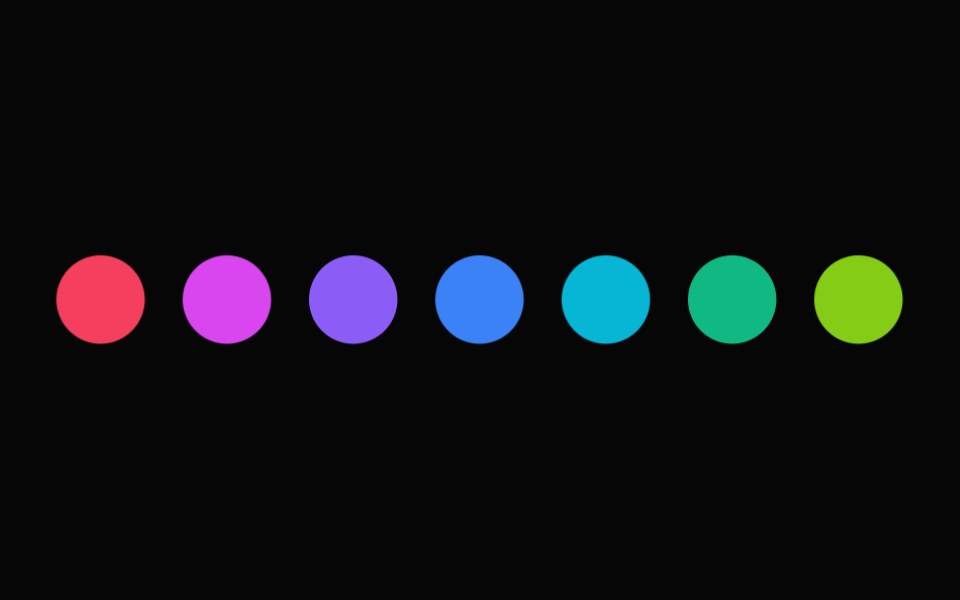 Color Swatch PickerHeroUI · ReactA list of color swatches that allows users to select a color from a predefined palette.
 RadioHeadless UI · React
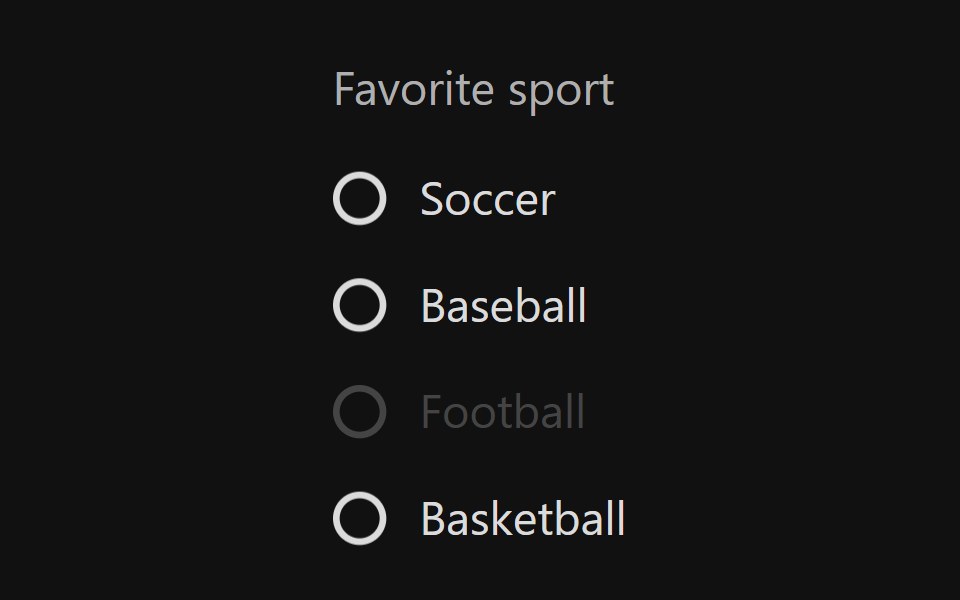 Radio GroupReact Spectrum · ReactRadio groups allow users to select a single option from a list of mutually exclusive options. All possible options are…
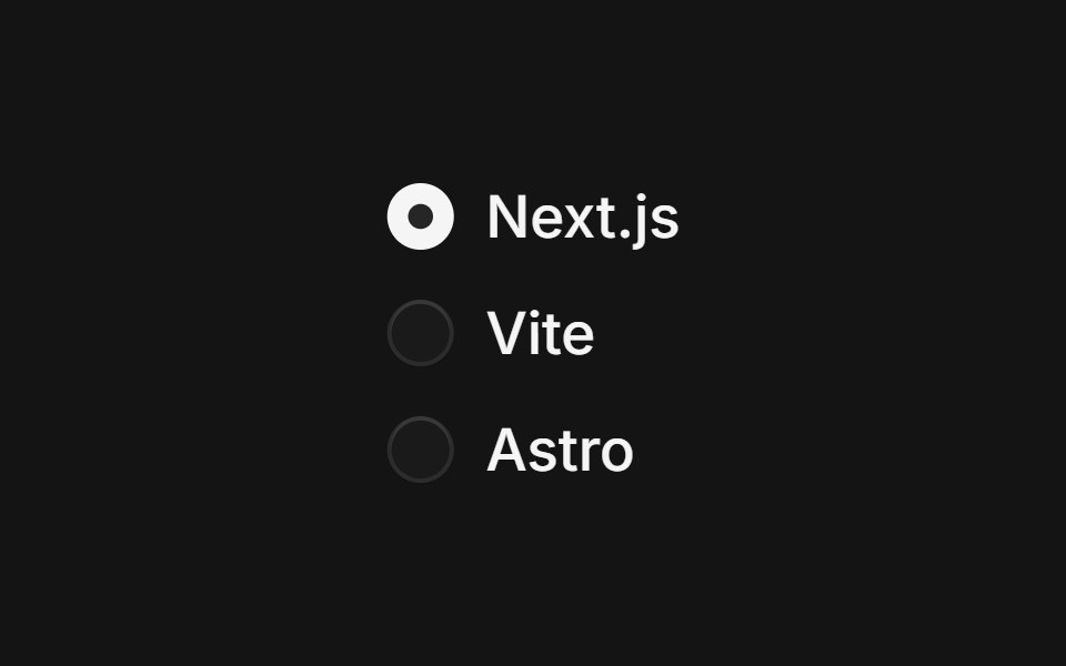 Radio Groupcoss ui · ReactA set of checkable buttons where no more than one of the buttons can be checked at a time.
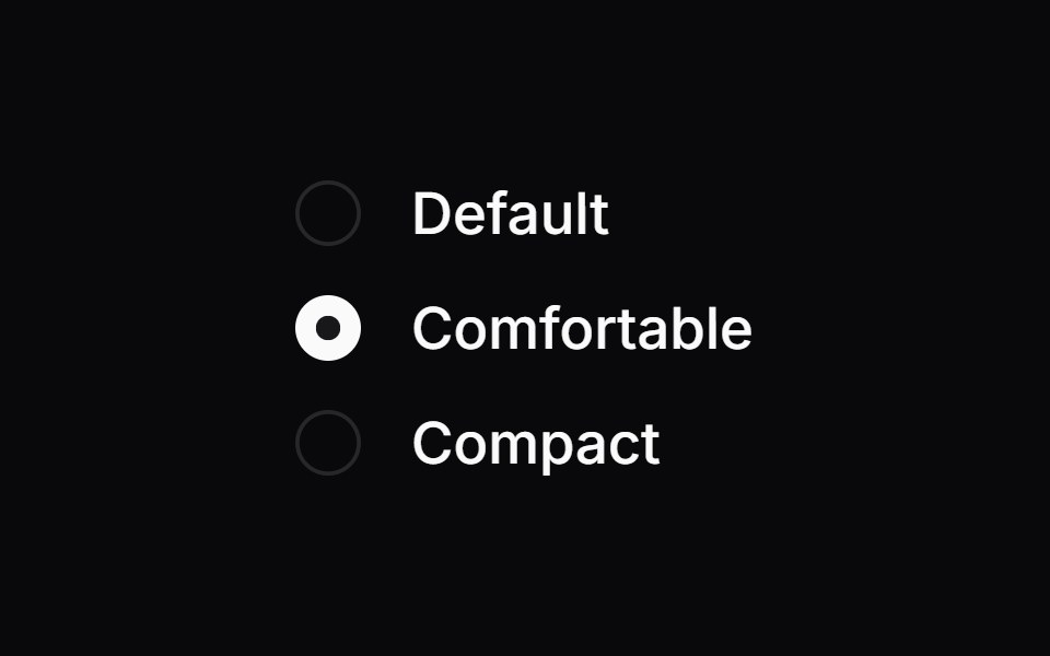 Radio GroupOrigin UI · ReactA set of checkable buttons where no more than one of the buttons can be checked at a time.
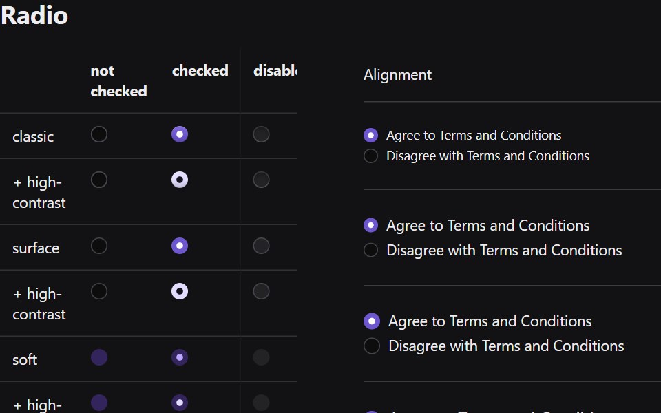 RadioRadix Themes · React
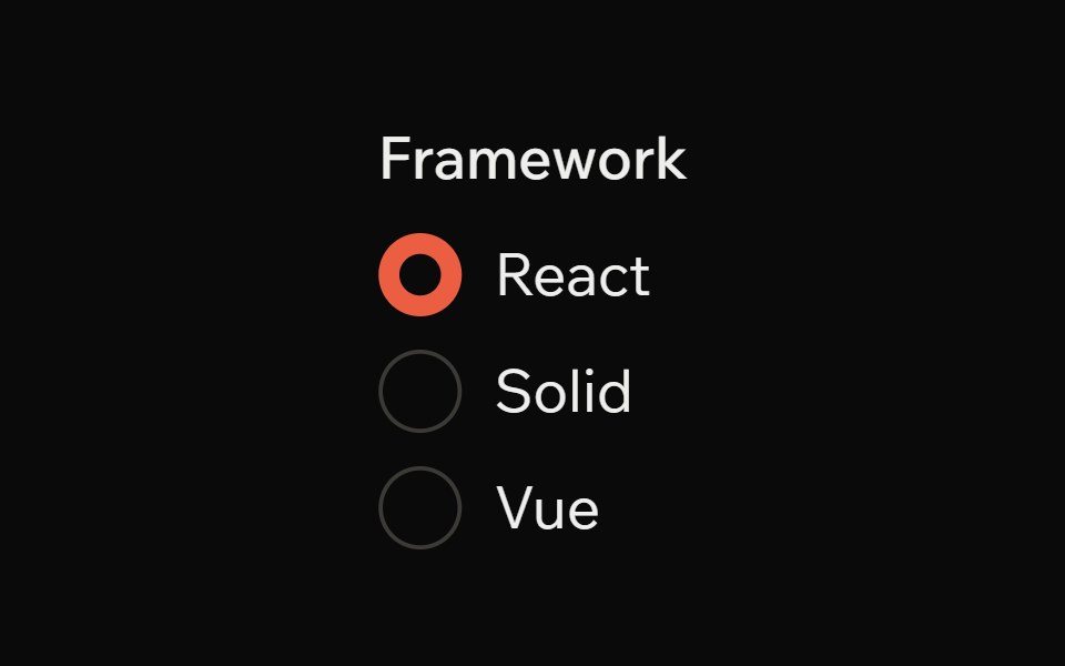 Radio GroupArk UI · ReactAllows single selection from multiple options.
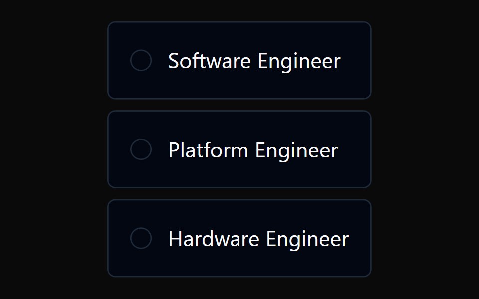 Radio Card GroupTremor · React
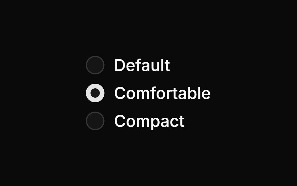 Basic radio groupReUI · ReactBasic radio group
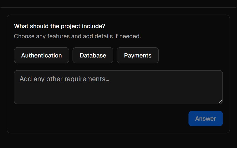 QuestionAI Elements · ReactA composable prompt for collecting choices, freeform text, or both from a user.
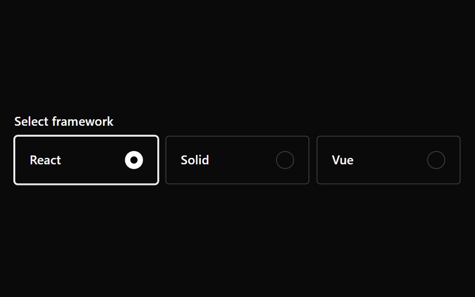 Radio Card GroupPark UI · ReactA form input component for selecting one option from a set of cards.
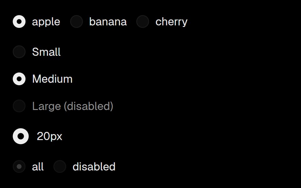 RadioLobe UI · React
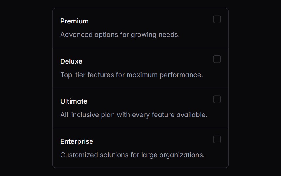 choice-boxIntent UI · Reactchoice-box
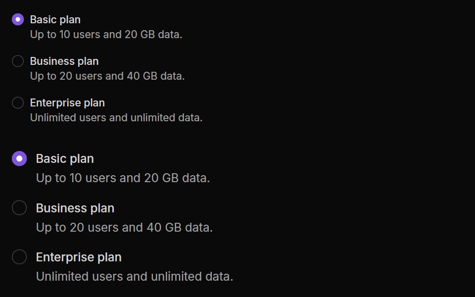 Radio ButtonsUntitled UI React · React
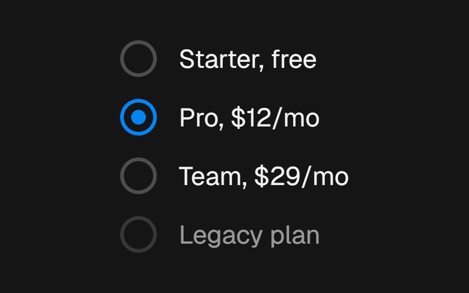 RadiobeUI · ReactSingle-select choice control with a gliding layoutId indicator dot and spring press feedback.
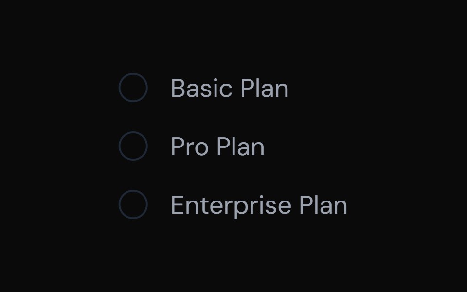 Radio InputTailGrids · ReactA radio button component with label and multiple states.
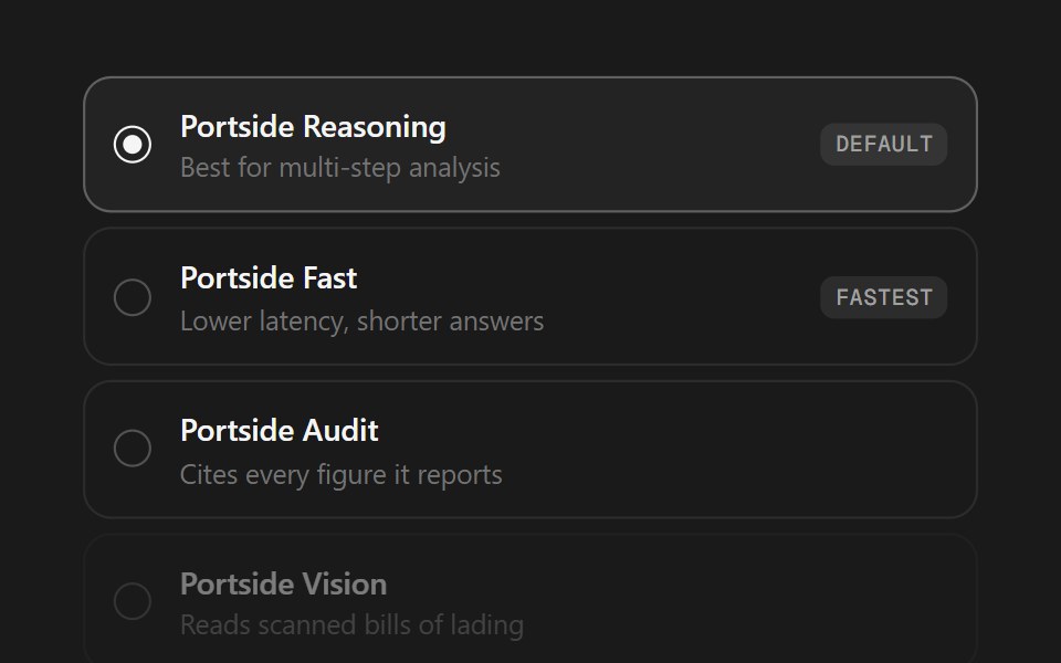 Model SelectorSpectrum UI · ReactA model picker as a radio list or segmented control, with badges and disabled states.
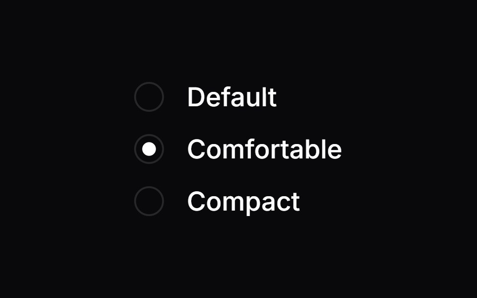 Radio GroupVengeance UI · React
 Ask User QuestionsFluid Functionalism · ReactStepped question flow with numbered options, keyboard shortcuts (1–9), single or multi-select, inline 'other' text…
 Radio GroupToolcraft · React
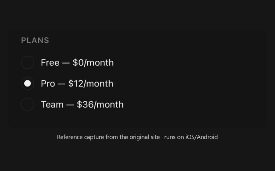 Radio GroupPanel UI · React NativeSingle-select list of options.
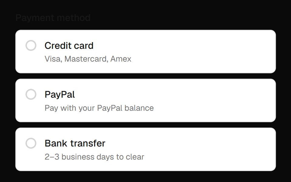 Radio Group Field InputOpenSourceUI · React
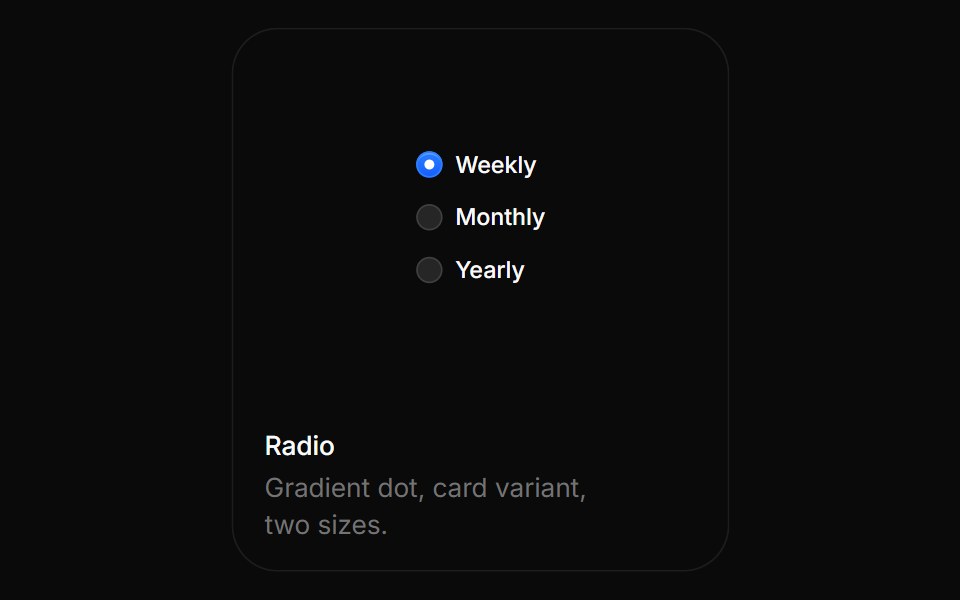 RadioBoardUI · ReactGradient dot, card variant, two sizes.
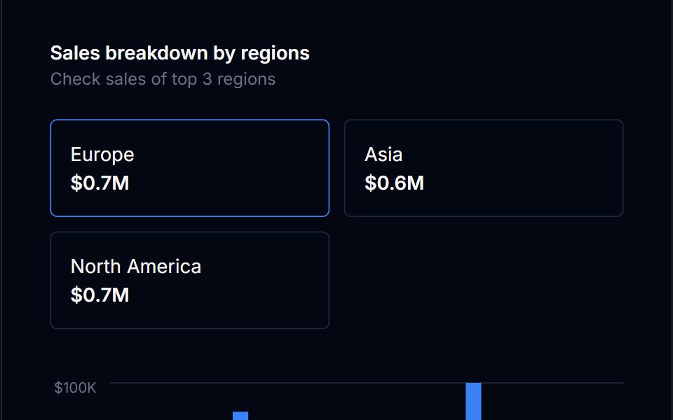 Radio Card GroupTremor Blocks · React
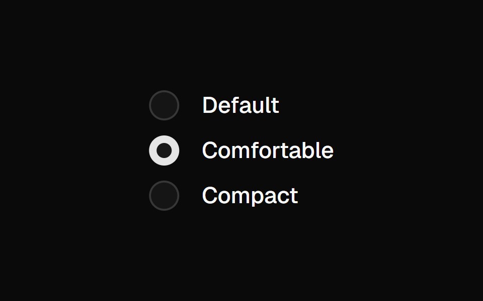 Radio GroupShadcn Dashboard · React
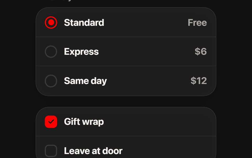 Choice GroupSwiftPieces · SwiftUIRadio and checkbox rows on a glass card: one red drop flows from ring to ring, and checked boxes flood red with a…
 Radio GroupObsidianUI · React
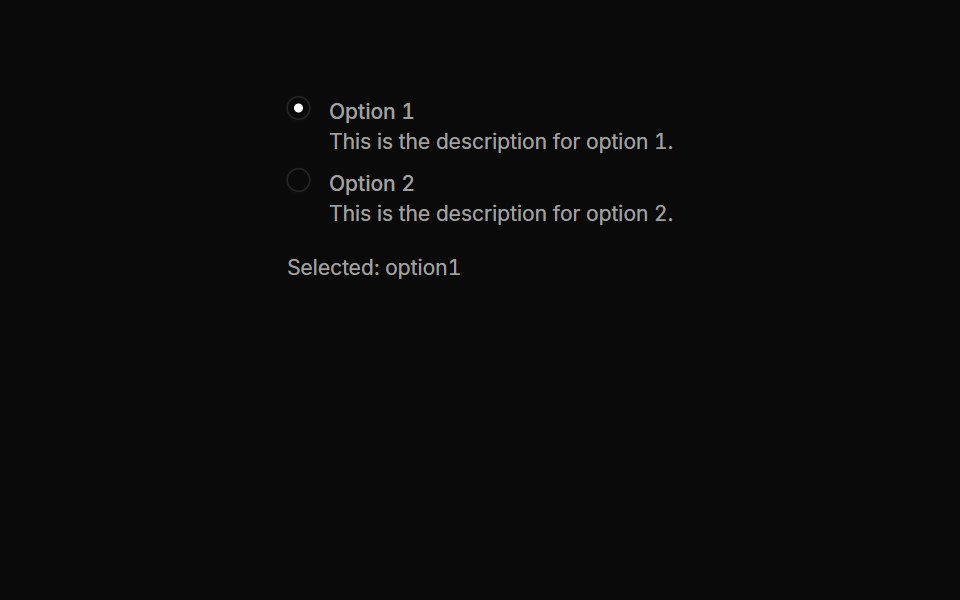 Radiogroups 02Oxbow UI · AstroRadio Button Group with Descriptions
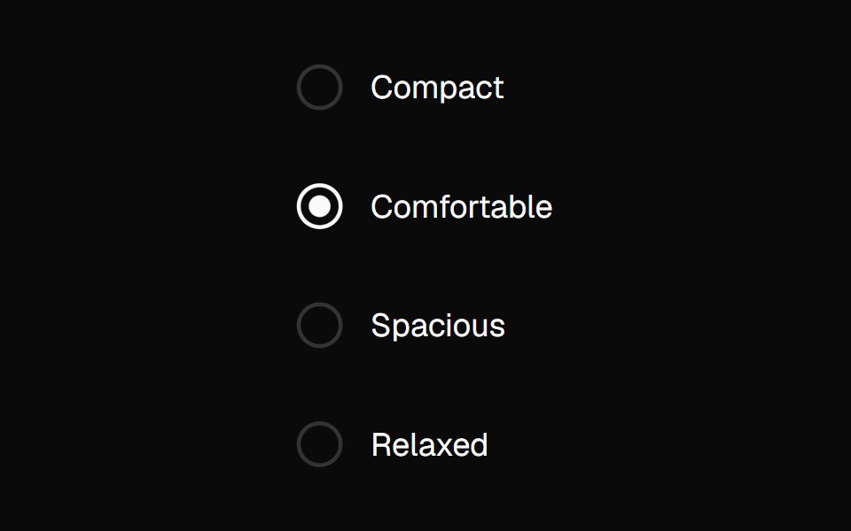 Radio GroupNexvyn UI · ReactA radio group with roving tabindex and a dot morph selection indicator.
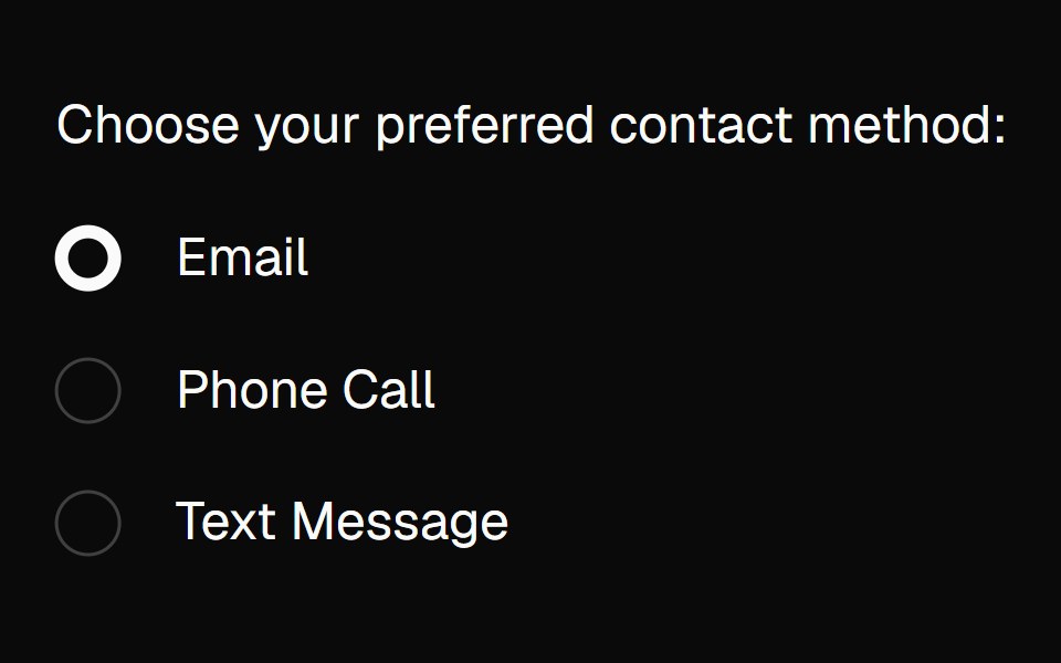 radio-groupBaseLayer · ReactA radio group allows a user to select a single option from a list of mutually exclusive options.
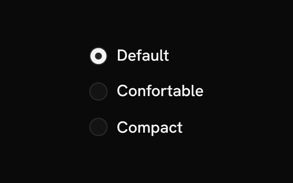 Radio GroupShark UI · ReactAllows single selection from multiple options.
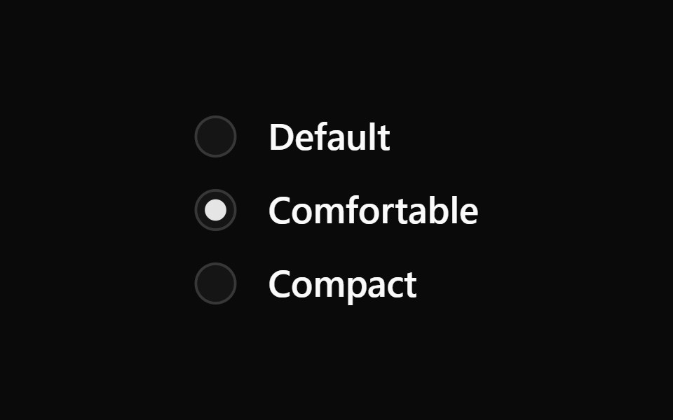 Radio GroupWatermelon UI · React
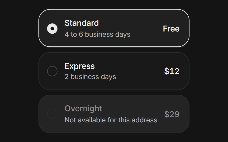 Radio cardsArc Library · ReactSelectable option cards with a sliding selection ring, price and description slots, and radio keyboard behavior.
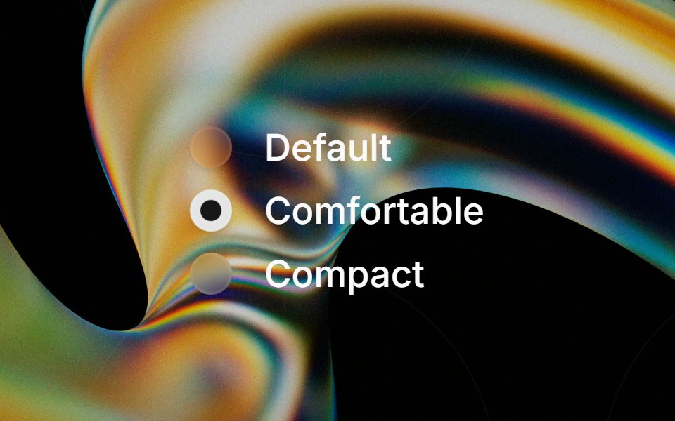 Glass Radio Groupglasscn · ReactGlass Radio Group with five variants: clear, frosted, subtle, liquid, and liquid-refract
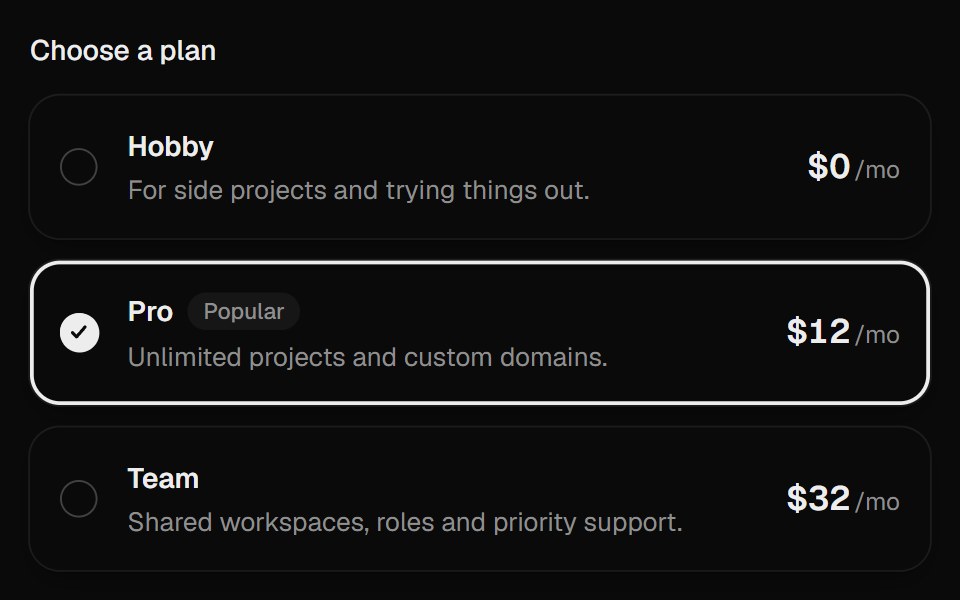 Radio CardsUI Lab · ReactThe selection ring glides to the plan you pick.
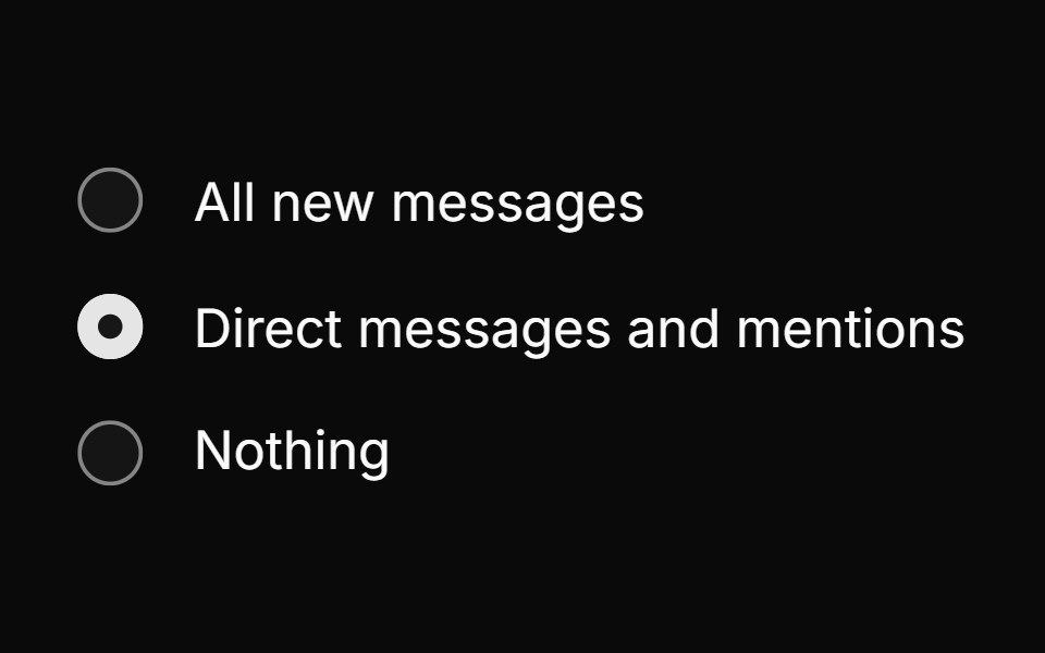 Radio groupHextaUI · ReactPick one option from a set, with a dot that hands off between choices and cards whose selection ring slides to the new…
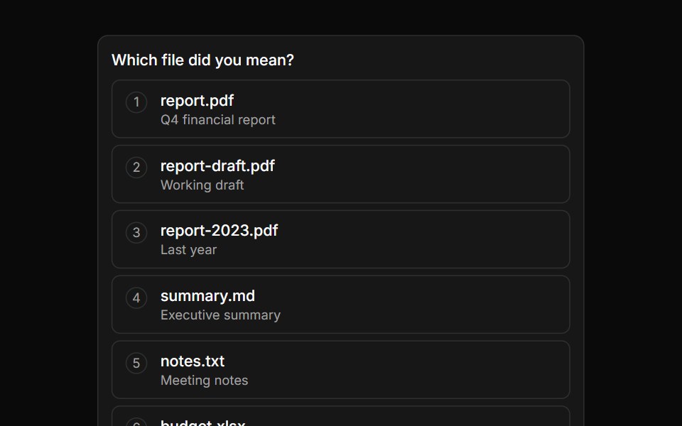 Option ListLocalMode · ReactAn inline multi-choice selection list (shows 5–7 options then paginates) for human-in-the-loop agent inquiries…
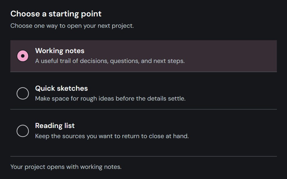 Radio groupCojeev UI · ReactLets users select one option from a labeled set of mutually exclusive choices.
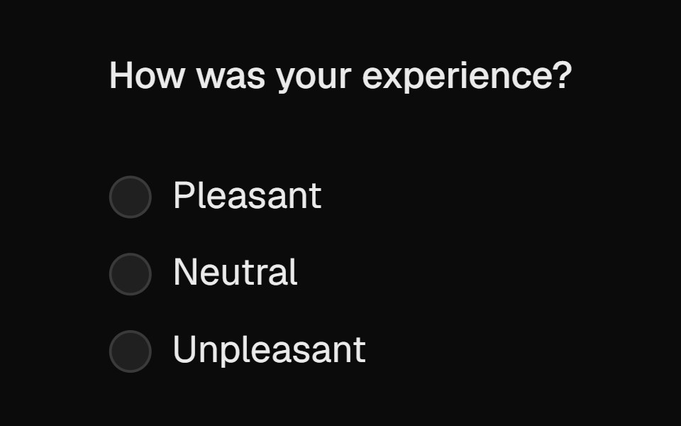 RadioROI UI · ReactA customizable radio button component for selecting one option from a group.
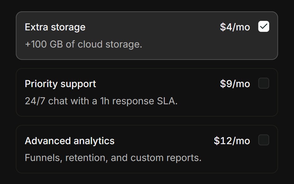 Choice cardsFLX UI · ReactBordered add-on cards that highlight when checked.
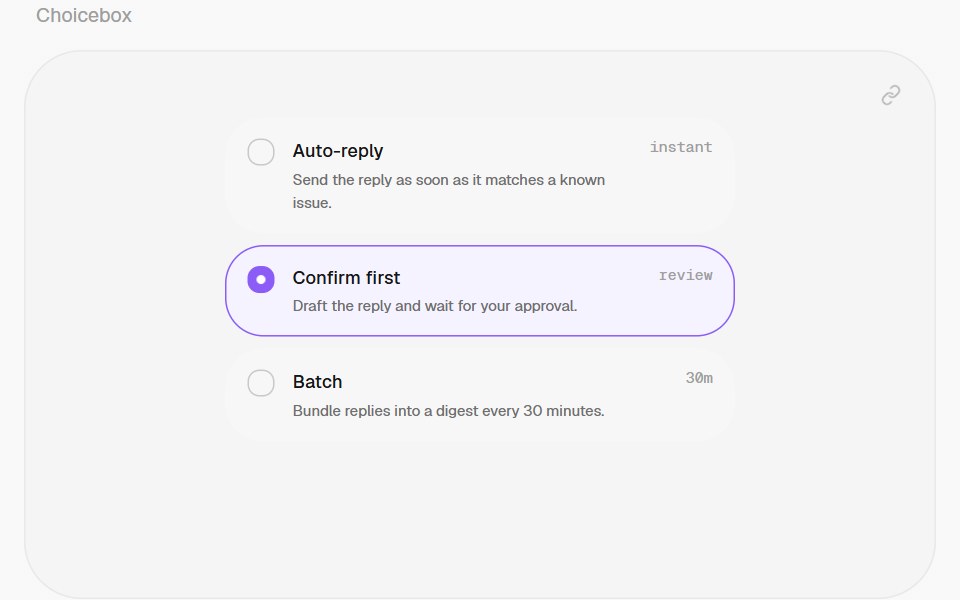 ChoiceboxHalaska UI · React
 With Radio Groupsv-particles · Svelte
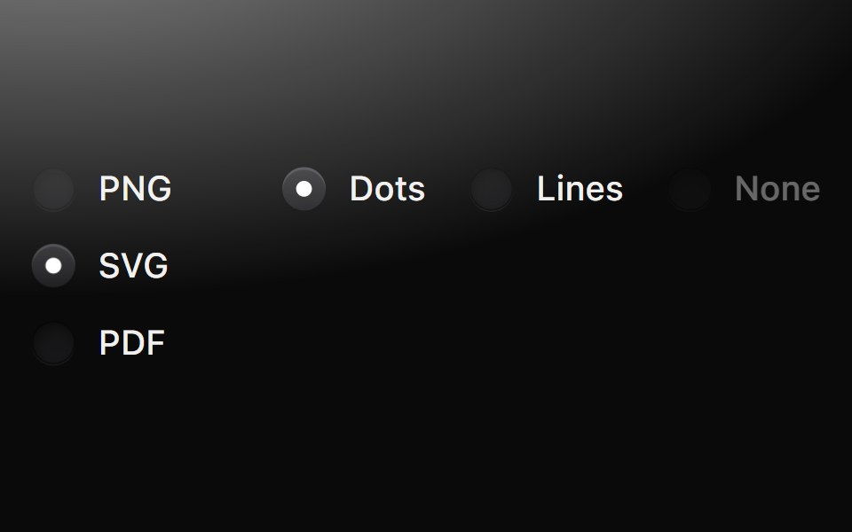 Radio groupMetal UI · React + SwiftUIOne choice from a short list: round wells beside their labels; pressing darkens the well, releasing latches a pip in…
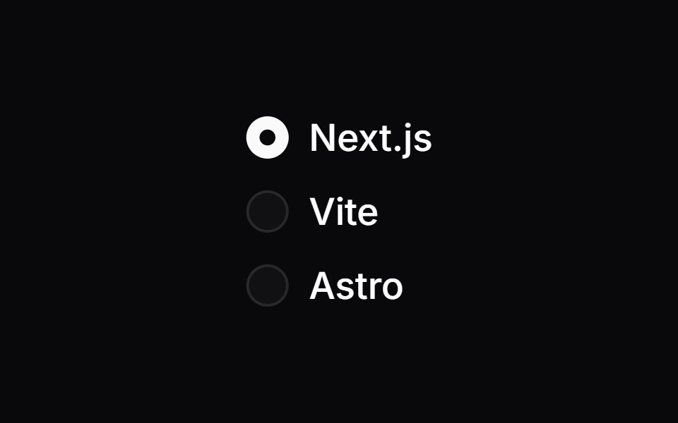 Radio GroupSpaceUI · ReactPresents a list of options where users can select only one choice at a time, making mutually exclusive decisions clear.
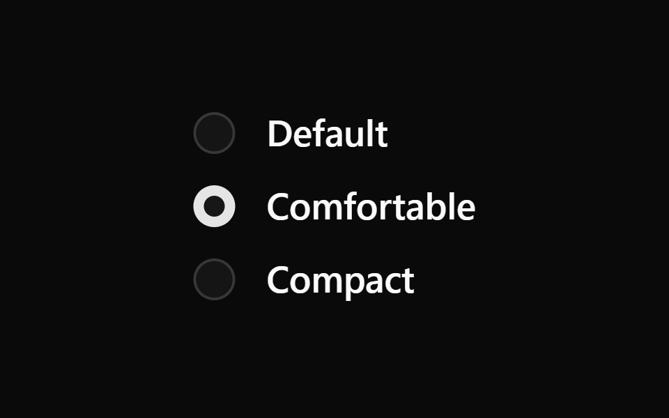 Aria Radio GroupReScript shadcn · ReScript
 Radio GroupOUI · ReactReact aria components Radio Group with shadcn characteristics.
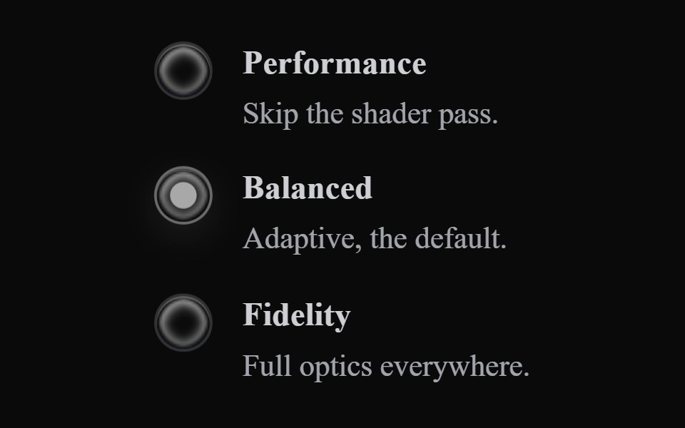 Liquid RadioLiquefy UI · ReactRadio buttons in liquid glass style.
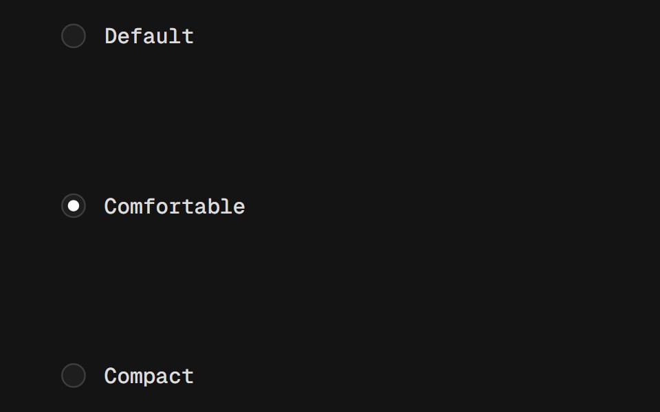 Radio GroupD2Studio UI · ReactA set of checkable buttons, known as radio buttons, where no more than one can be checked at a time.
 Radio GroupFibo · ReactPicks exactly one option from a short list.
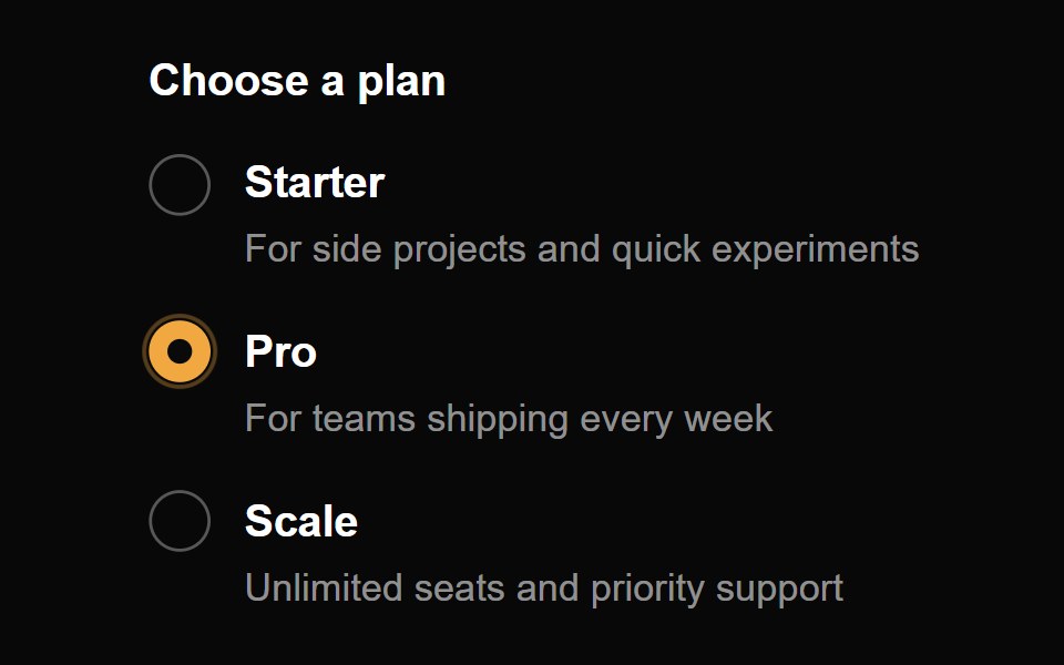 Radio ButtonReactFrame · ReactAn accessible, animated radio group with a springy dot, a ripple on select, focus ring, optional descriptions and a…
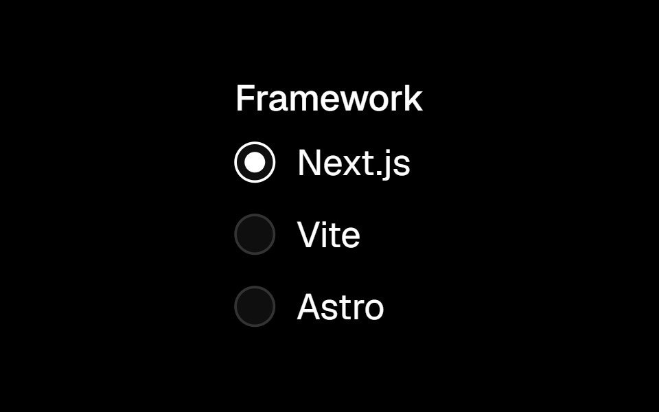 Radio Groupark-cn · ReactA shadcn-style radio group component built with Ark UI primitives.
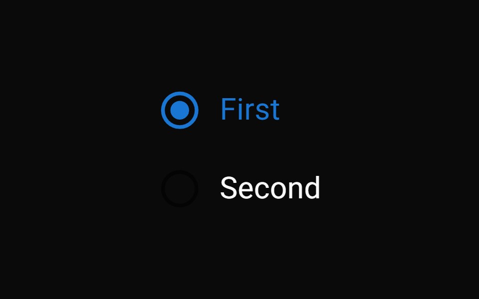 Radio GroupMUI / Material UI · React
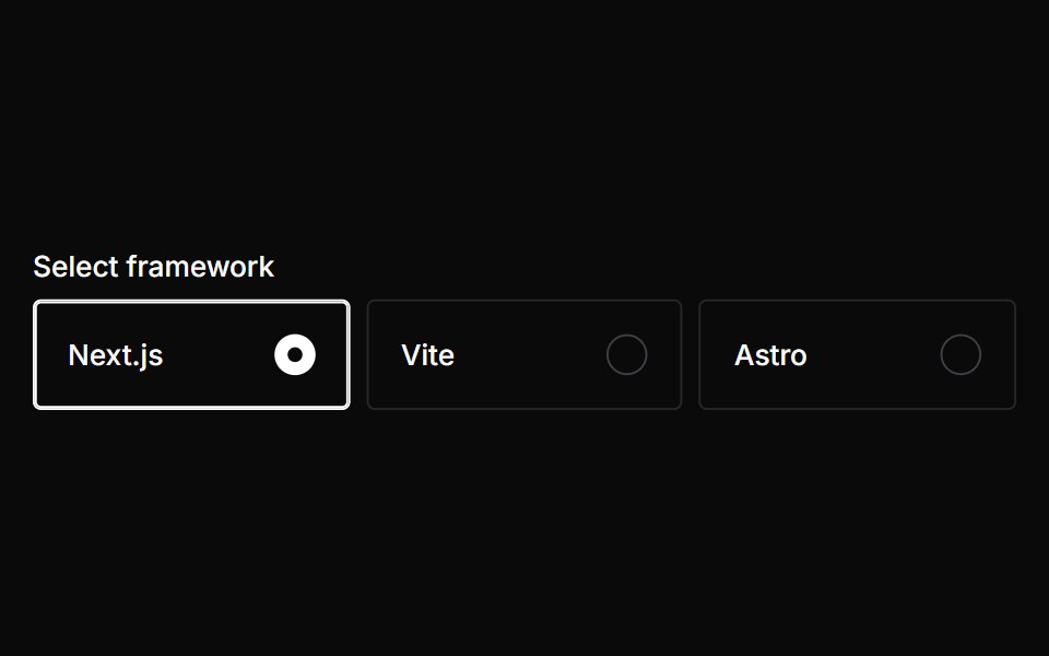 Radio CardChakra UI · ReactUsed to select an option from list
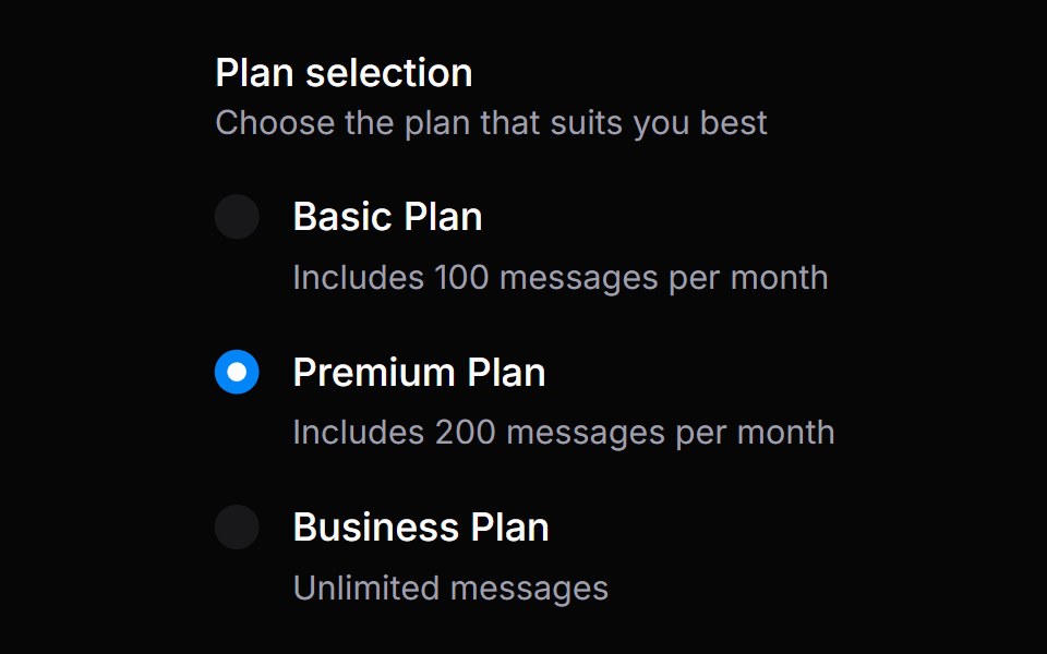 Radio GroupHeroUI · ReactA set of radio buttons where only one option can be selected at a time.
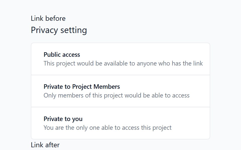 Radio GroupHeadless UI · React
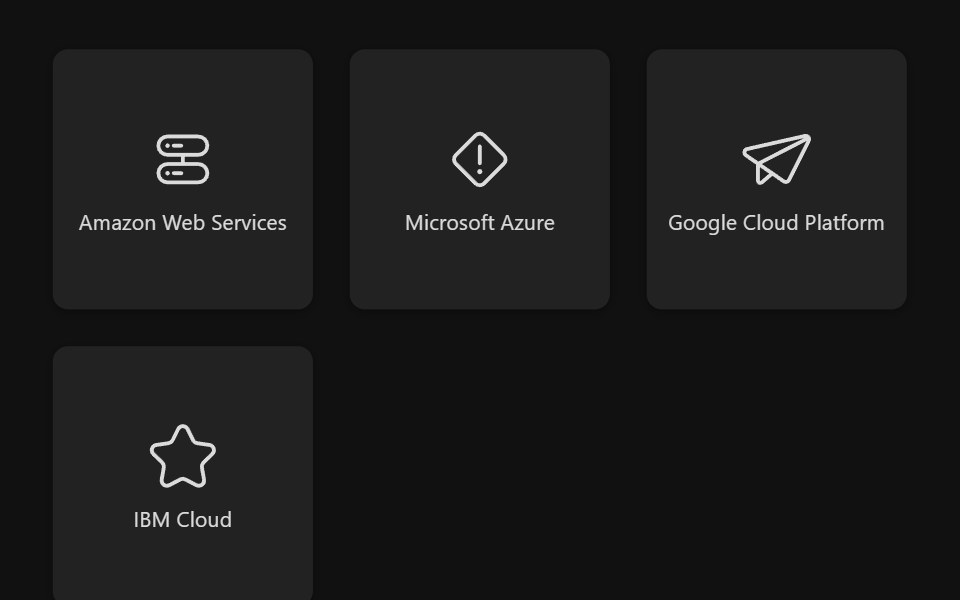 Select Box GroupReact Spectrum · ReactSelectBoxGroup allows users to select one or more options from a list.
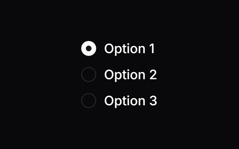 Comp 152Origin UI · React
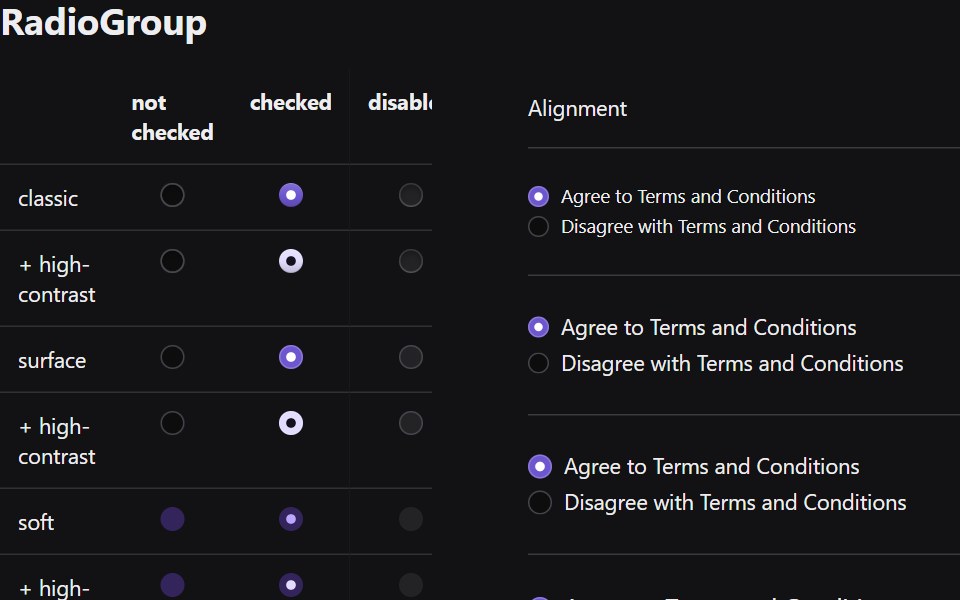 Radio GroupRadix Themes · React
 Radio GroupTremor · React
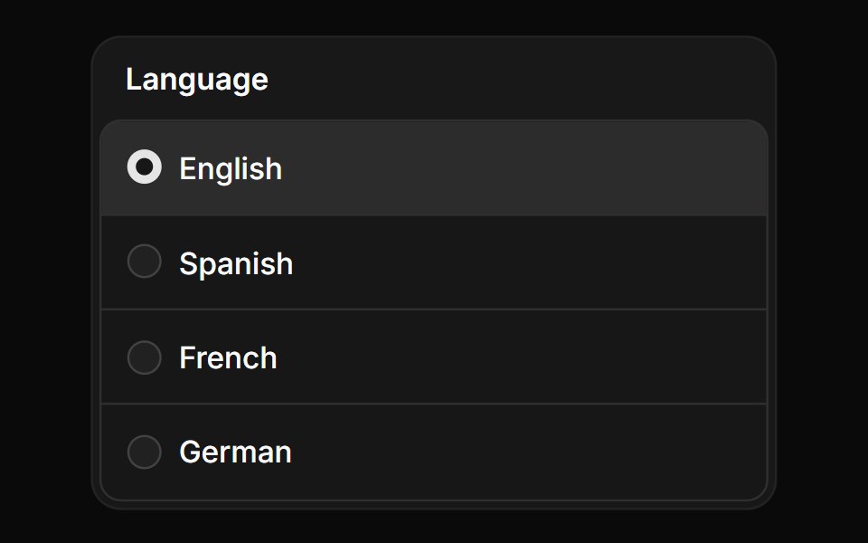 Radio group in frameReUI · ReactRadio group in frame
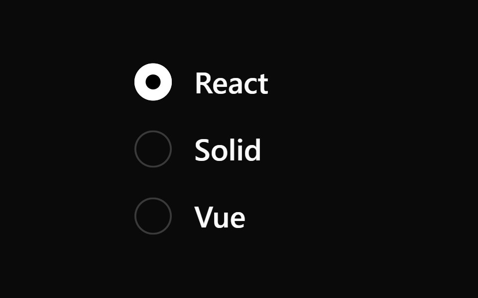 Radio GroupPark UI · ReactA form input component for selecting one option from a set of choices.
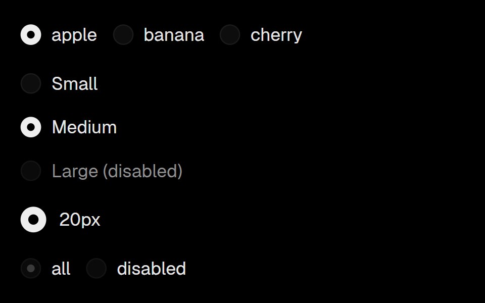 Base Ui RadioLobe UI · React
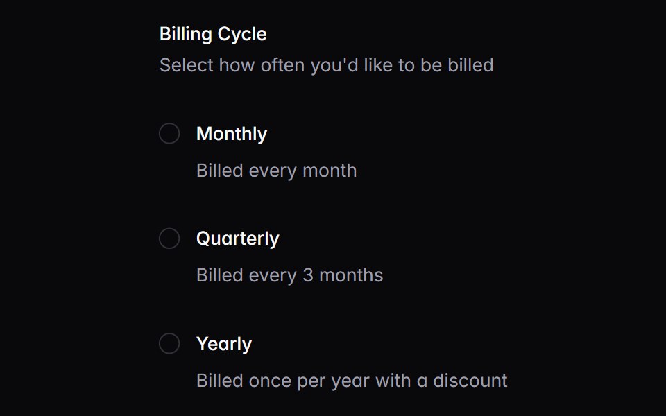 radioIntent UI · Reactradio
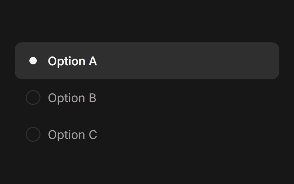 Radio GroupFluid Functionalism · ReactAnimated radio group with fluid hover, spring-animated selection dot, and optional Radix UI integration. Supports both…
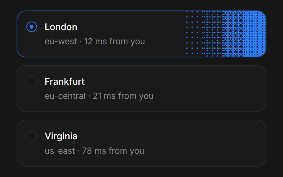 Web Radio GroupPanel UI · React NativeRadio groups with descriptions and disabled options.
 Radio GroupTremor Blocks · React
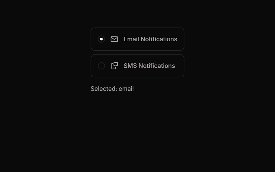 Radiogroups 03Oxbow UI · AstroRadio Buttons with Icons
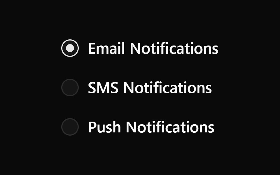 Radiogroup 1Watermelon UI · React
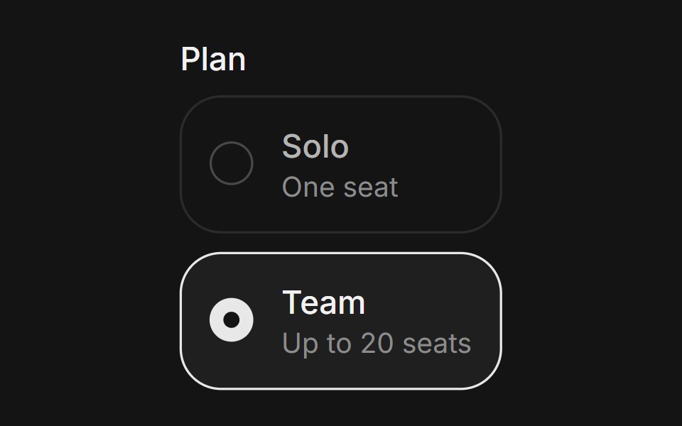 Radio groupArc Library · ReactChoose one option from a visible set.
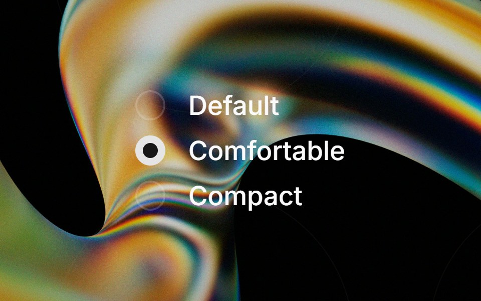 Radio Groupglasscn · React
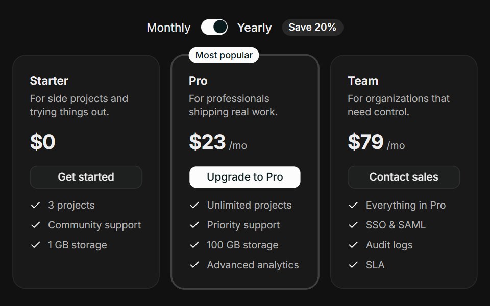 Tiered CardsFLX UI · ReactTiered Cards for Select a Plan.
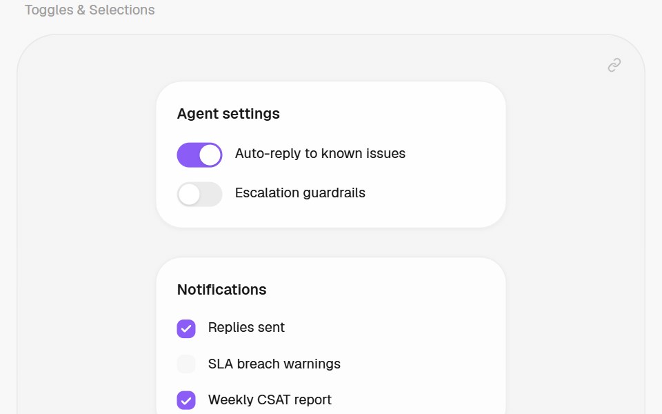 RadioHalaska UI · React
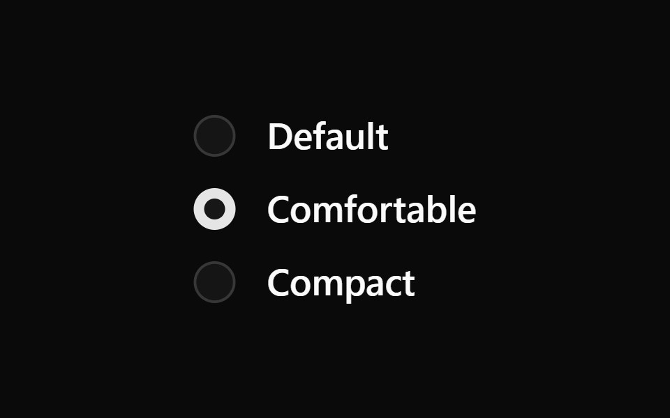 Base Radio GroupReScript shadcn · ReScript
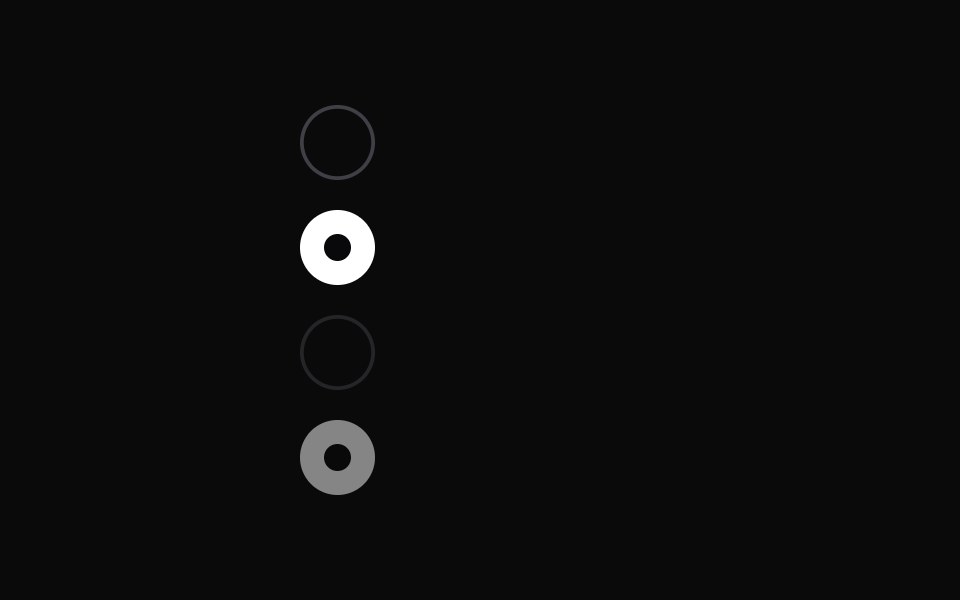 RadiomarkChakra UI · ReactA visual indicator used to show selected and unselected radio states
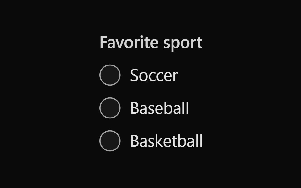 Tailwind Radio GroupReact Spectrum · React
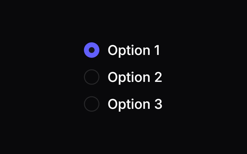 Comp 153Origin UI · React
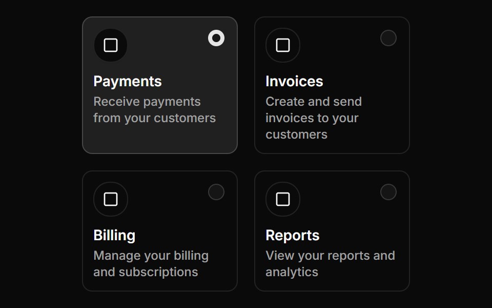 Radio group with grid layoutReUI · ReactRadio group with grid layout
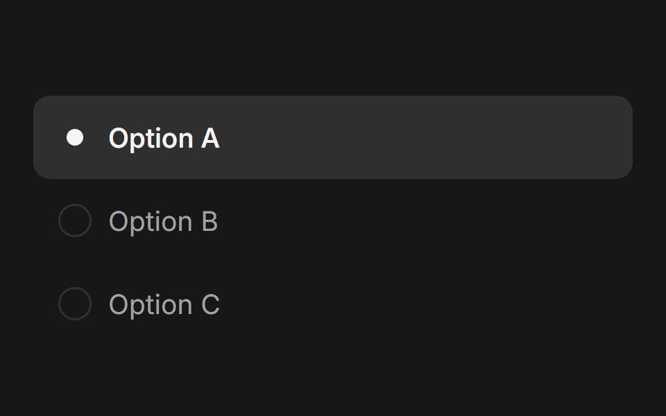 Radio Group (Base UI)Fluid Functionalism · ReactAnimated radio group with fluid hover, spring-animated selection dot. Base UI flavor.
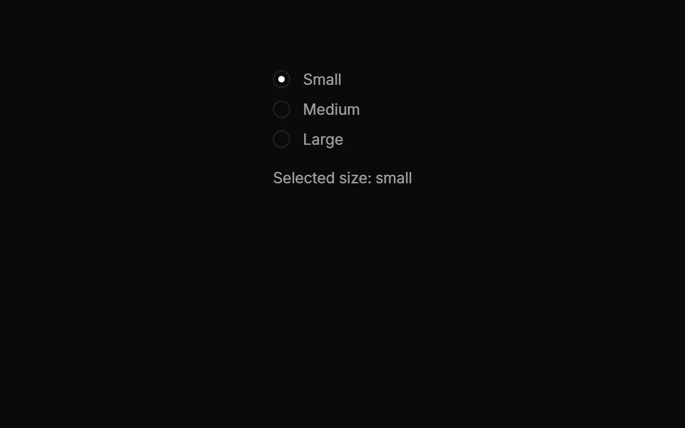 Radiogroups 04Oxbow UI · AstroInline Radio Button Group
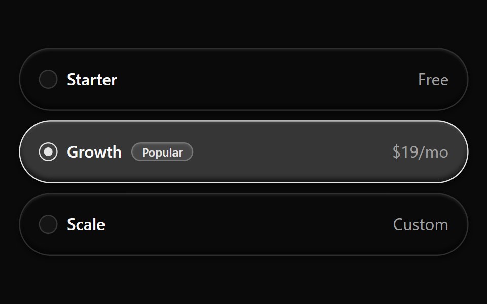 Radiogroup 10Watermelon UI · React
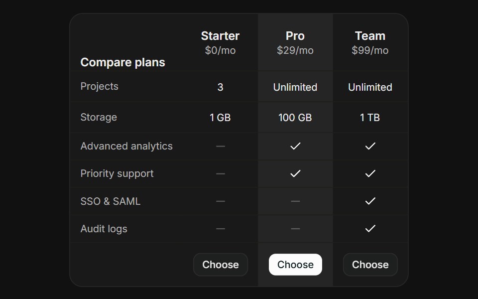 Comparison TableFLX UI · ReactComparison Table for Select a Plan.
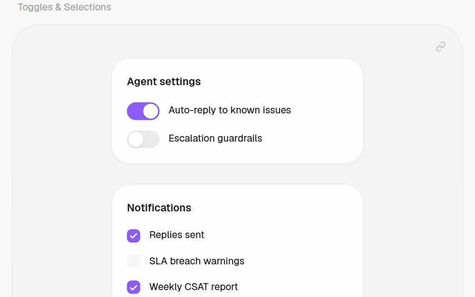 Radio GroupHalaska UI · React
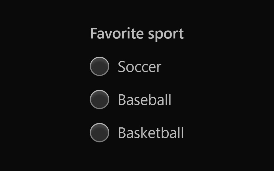 Vanilla Radio GroupReact Spectrum · React
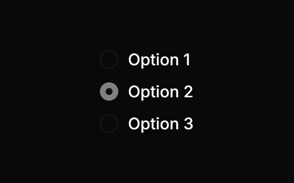 Comp 154Origin UI · React
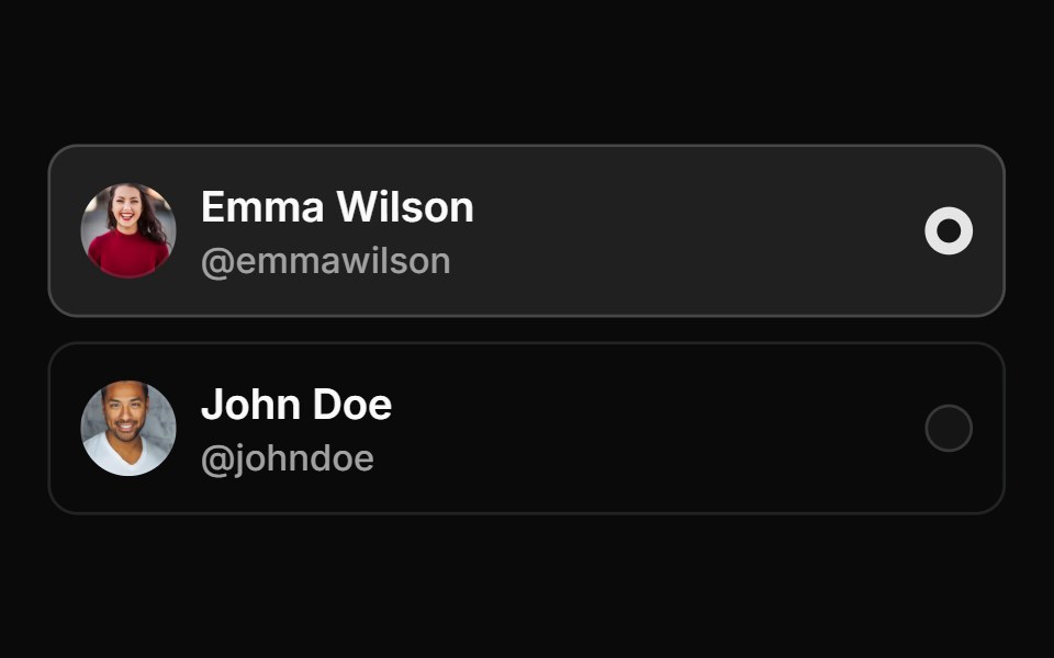 Avatar based card radio groupReUI · ReactAvatar based card radio group
 Radiogroups 05Oxbow UI · AstroRadio Group with Toggle Details
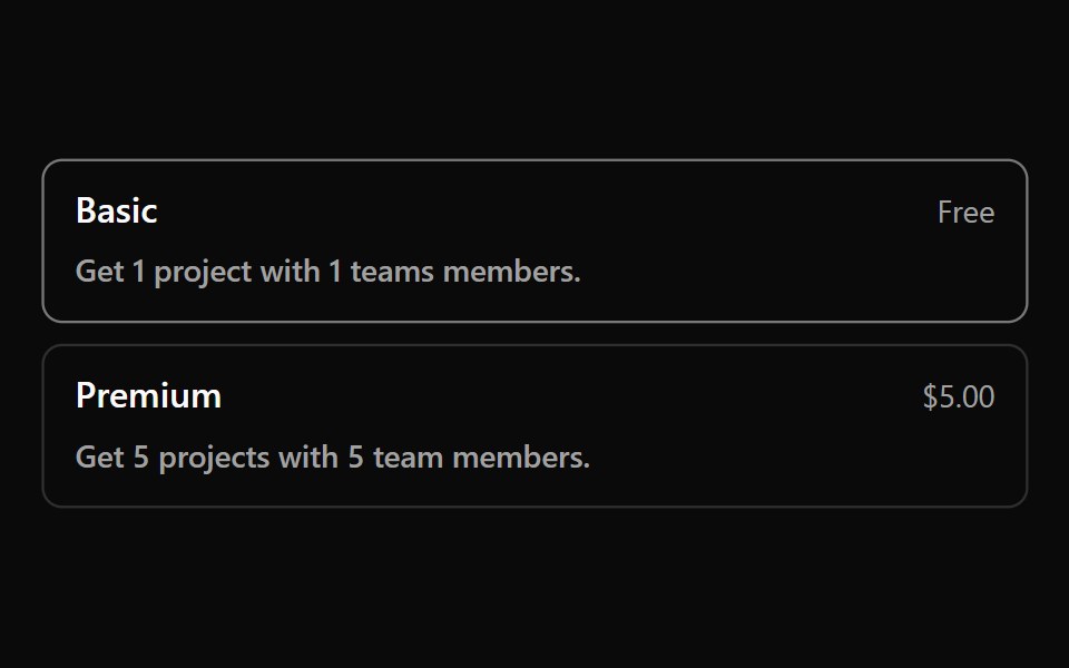 Radiogroup 11Watermelon UI · React
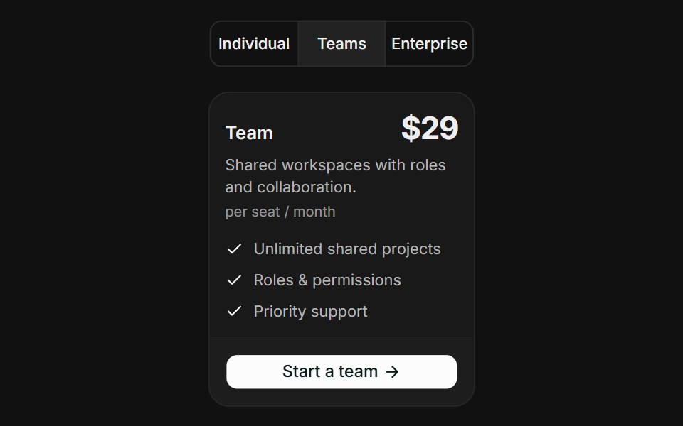 Audience SegmentsFLX UI · ReactAudience Segments for Select a Plan.
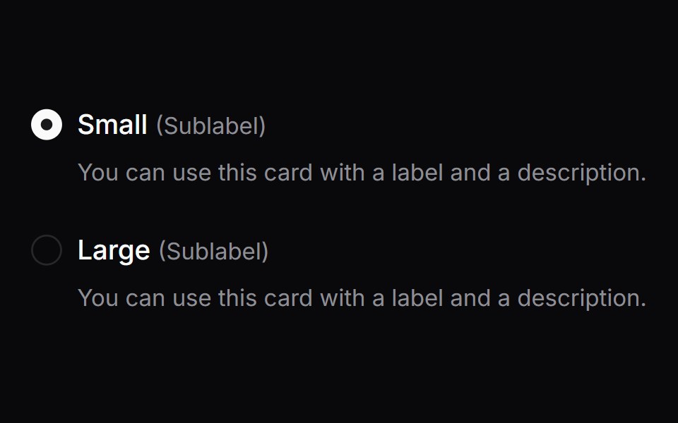 Comp 155Origin UI · React
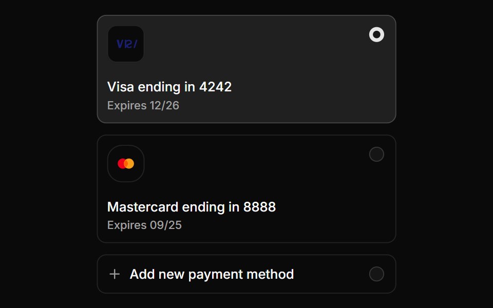 Payment method radio cardsReUI · ReactPayment method radio cards
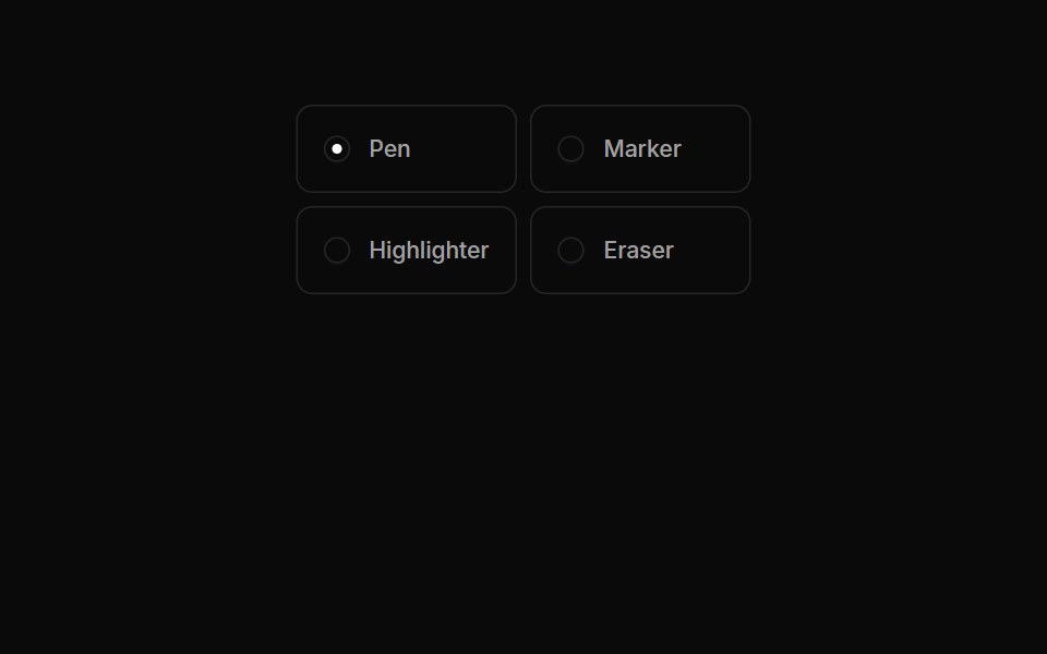 Radiogroups 06Oxbow UI · AstroRadio Button Group with Tool Selection
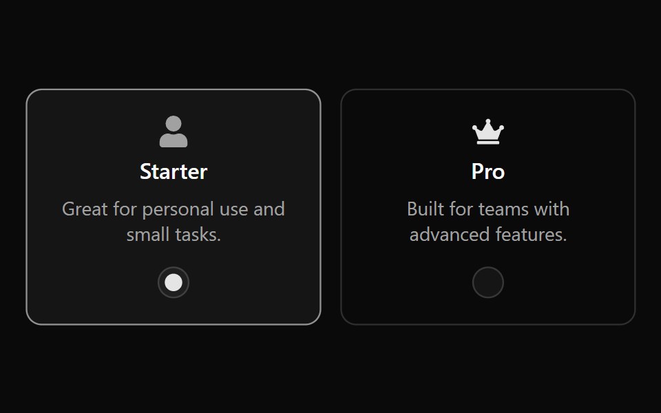 Radiogroup 12Watermelon UI · React
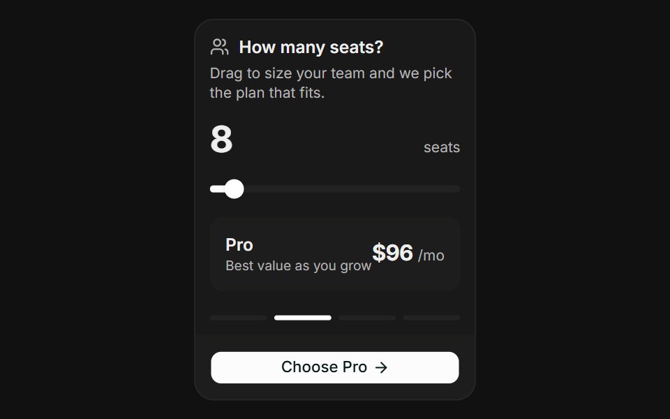 Usage SliderFLX UI · ReactUsage Slider for Select a Plan.
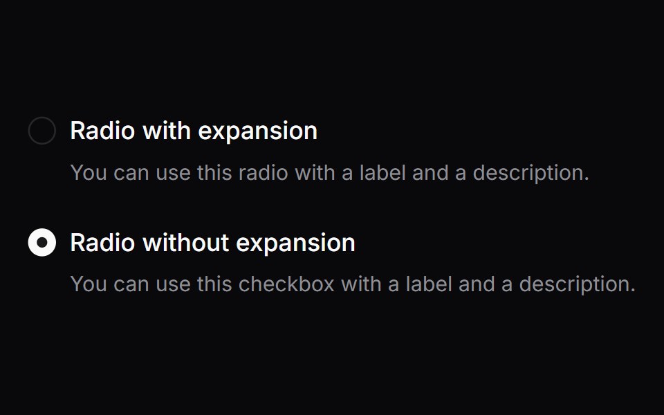 Comp 156Origin UI · React
 Radio group with tooltip infoReUI · ReactRadio group with tooltip info
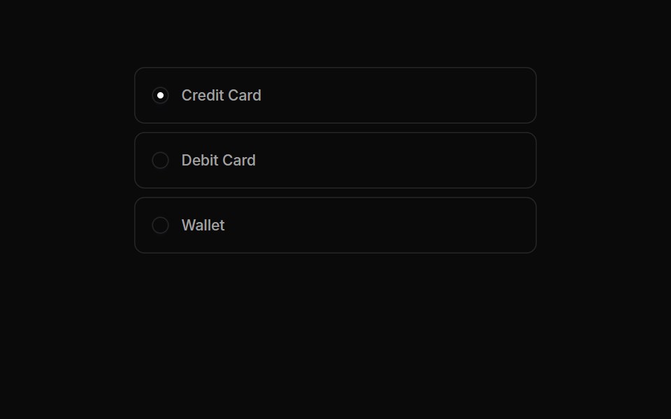 Radiogroups 07Oxbow UI · AstroRadio Button Group for Payment Methods
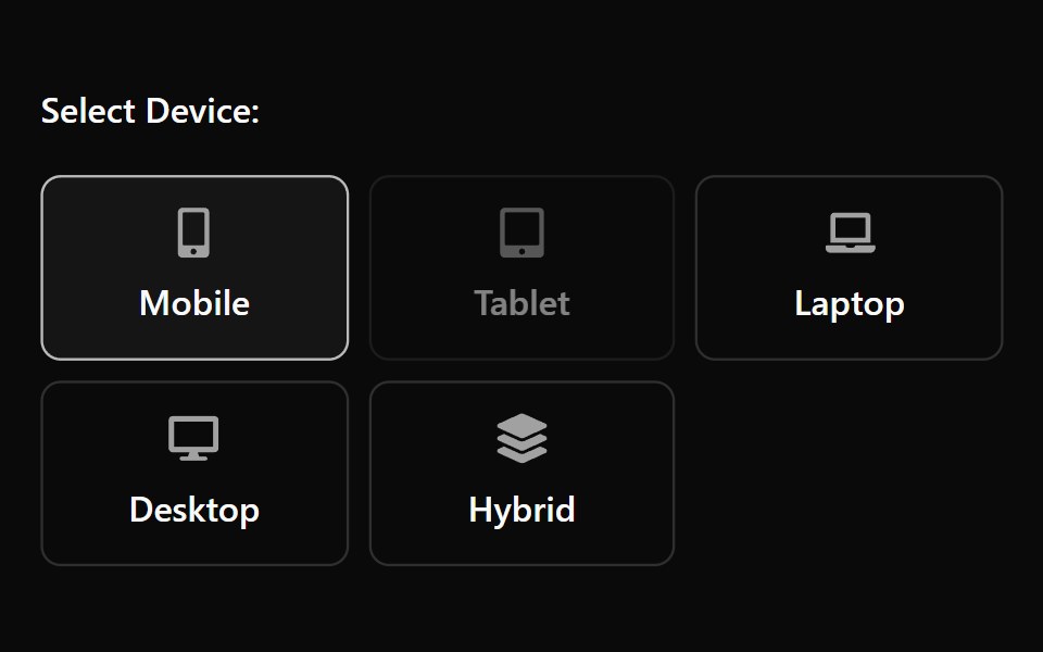 Radiogroup 13Watermelon UI · React
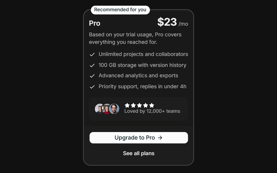 Spotlight RecommendationFLX UI · ReactSpotlight Recommendation for Select a Plan.
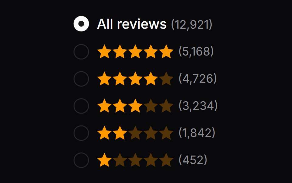 Comp 157Origin UI · React
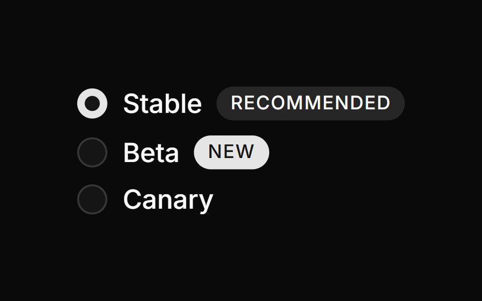 Radio group with badgesReUI · ReactRadio group with badges
 Radiogroups 08Oxbow UI · AstroRadio Group for Server Location
 Radiogroup 2Watermelon UI · React
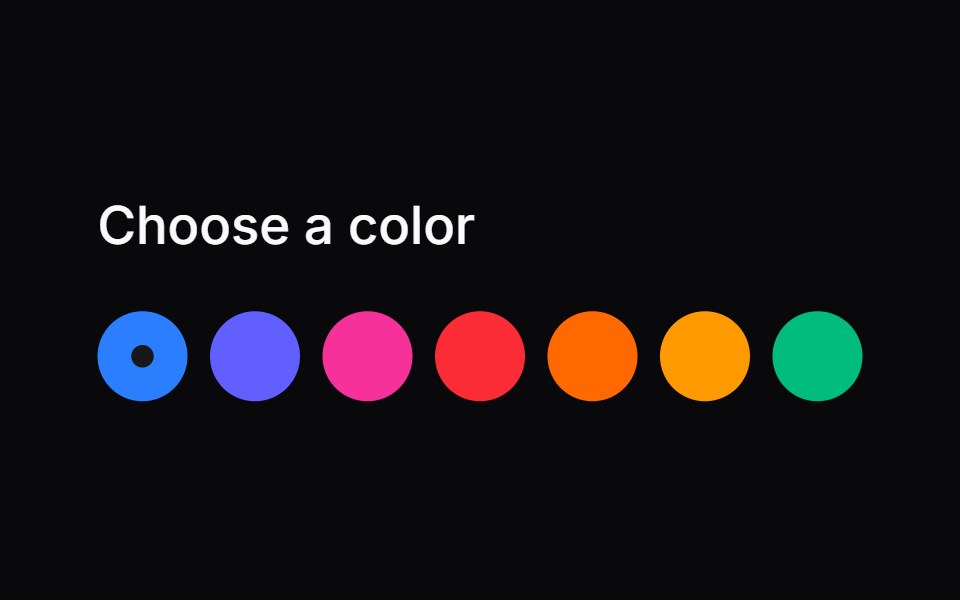 Comp 158Origin UI · React
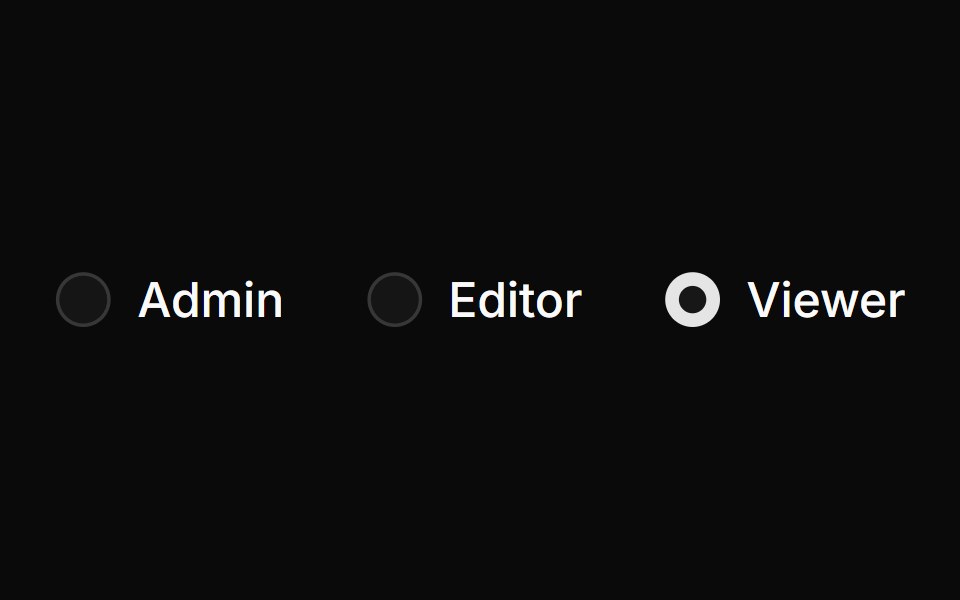 Inline horizontal radio groupReUI · ReactInline horizontal radio group
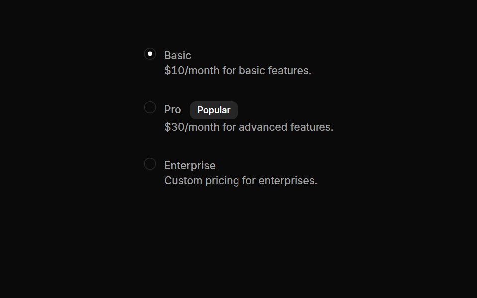 Radiogroups 09Oxbow UI · AstroRadio Group for Plan Selection
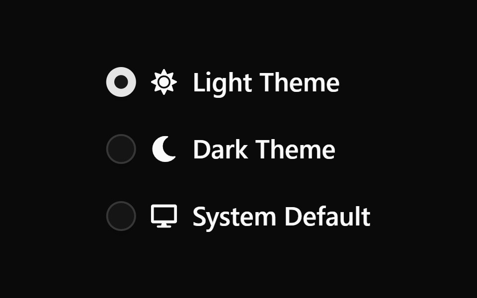 Radiogroup 3Watermelon UI · React
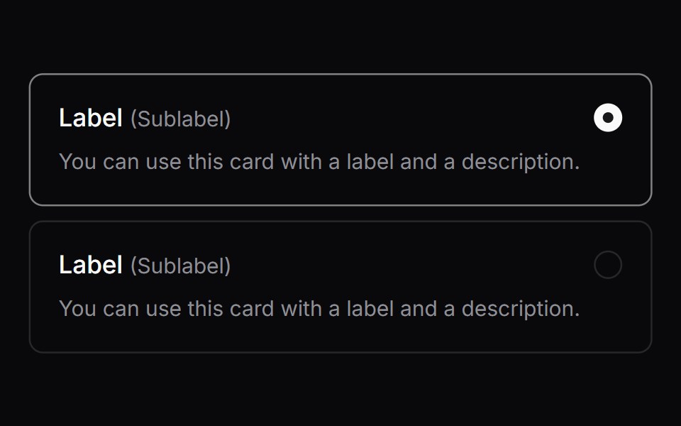 Comp 159Origin UI · React
 Pricing plan radio cardsReUI · ReactPricing plan radio cards
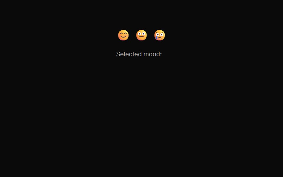 Radiogroups 10Oxbow UI · AstroRadio Button Group for Mood Rating
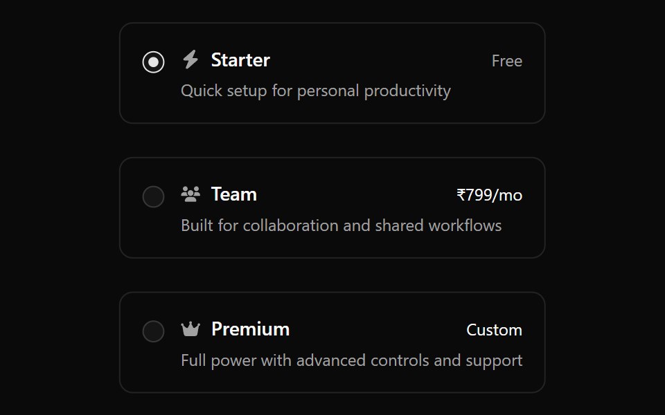 Radiogroup 4Watermelon UI · React
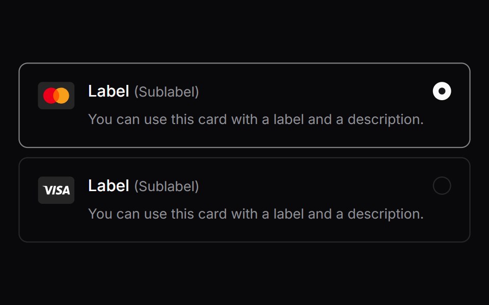 Comp 160Origin UI · React
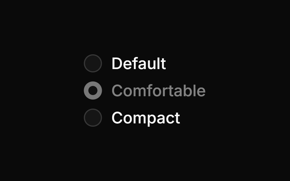 Disabled radio groupReUI · ReactDisabled radio group
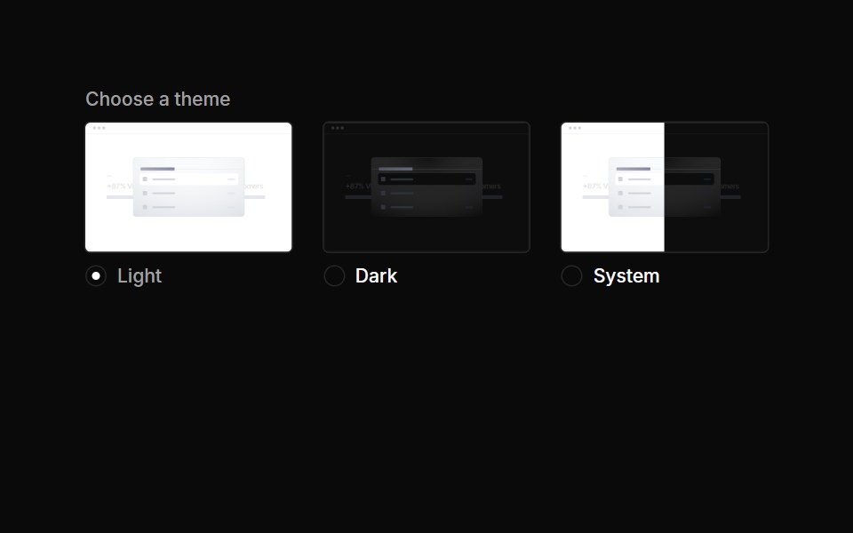 Radiogroups 11Oxbow UI · AstroRadio Group for Theme Selection
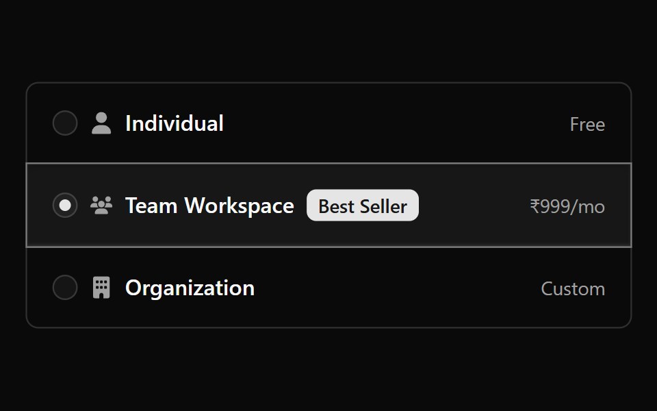 Radiogroup 5Watermelon UI · React
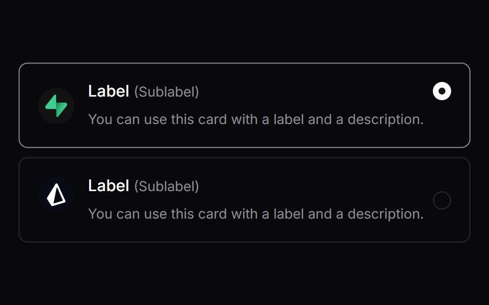 Comp 161Origin UI · React
Libraries with radio components
Related categories
- React Radio Components
- Tailwind CSS Radio Components
- Animated Radio Components
- shadcn/ui Radio Components
- Input Components
- Text Input Components
- Select Components
- Form Field Components
- Form Components
- Textarea Components
- Switch Components
- Checkbox Components
- Slider Components
- Combobox Components
- File Upload Components
- Search Input Components
- Date Picker Components
- Login Form Components
- Color Picker Components
- OTP Input Components