 Dev Design Library
Tailwind CSS Radio Components
Dev Design Library indexes 117 Tailwind CSS radio components from 42 open-source UI libraries, with the most coming from Origin UI, ReUI, Watermelon UI, Oxbow UI and FLX UI. Each one links to its page with the source code, a live preview where available, the library license and the install command. Every library in this list styles its components with Tailwind CSS utility classes. Radio components belong to the Inputs group.
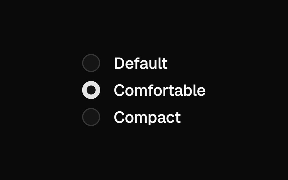 Radio Groupshadcn/ui · ReactA set of checkable buttons—known as radio buttons—where no more than one of the buttons can be checked at a time.
 RadiodaisyUI · CSS (Tailwind)
 Color Swatch PickerHeroUI · ReactA list of color swatches that allows users to select a color from a predefined palette.
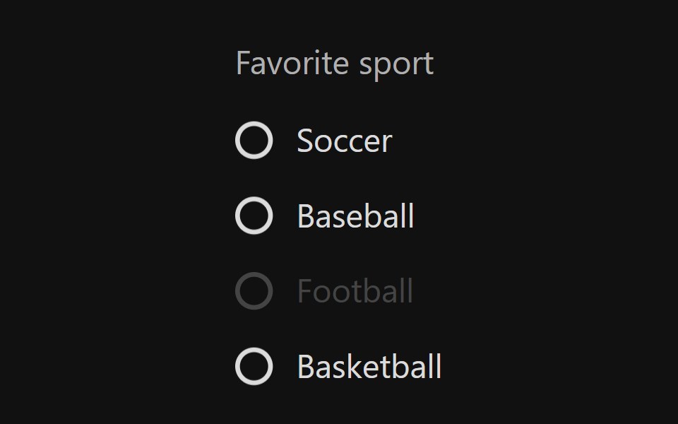 Radio GroupReact Spectrum · ReactRadio groups allow users to select a single option from a list of mutually exclusive options. All possible options are…
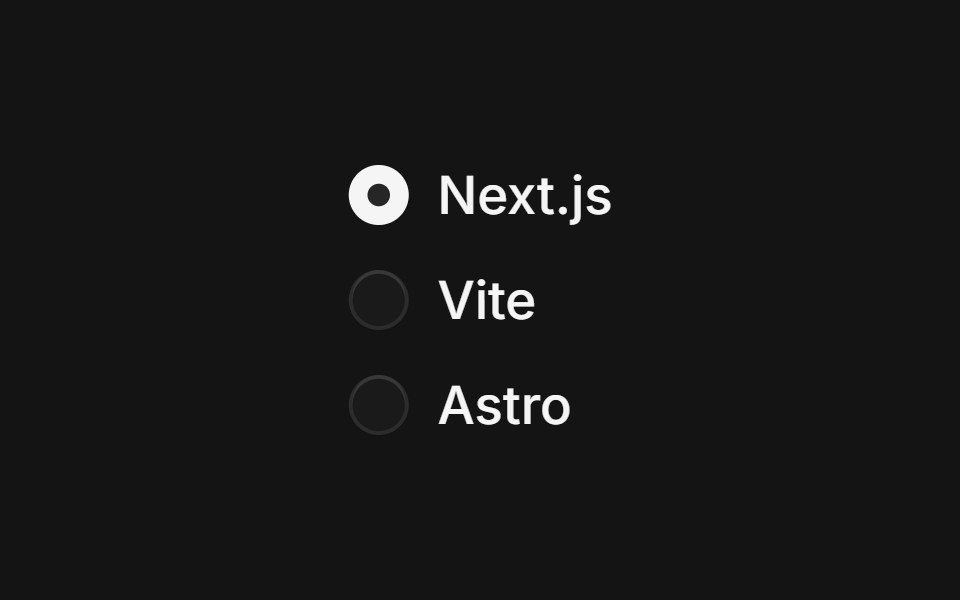 Radio Groupcoss ui · ReactA set of checkable buttons where no more than one of the buttons can be checked at a time.
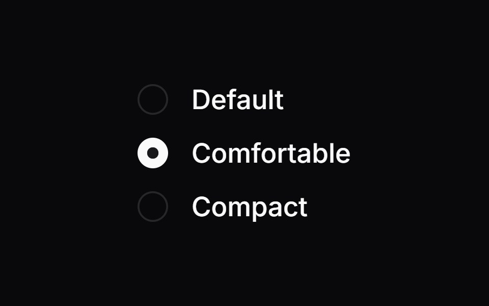 Radio GroupOrigin UI · ReactA set of checkable buttons where no more than one of the buttons can be checked at a time.
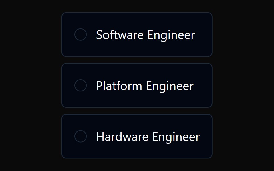 Radio Card GroupTremor · React
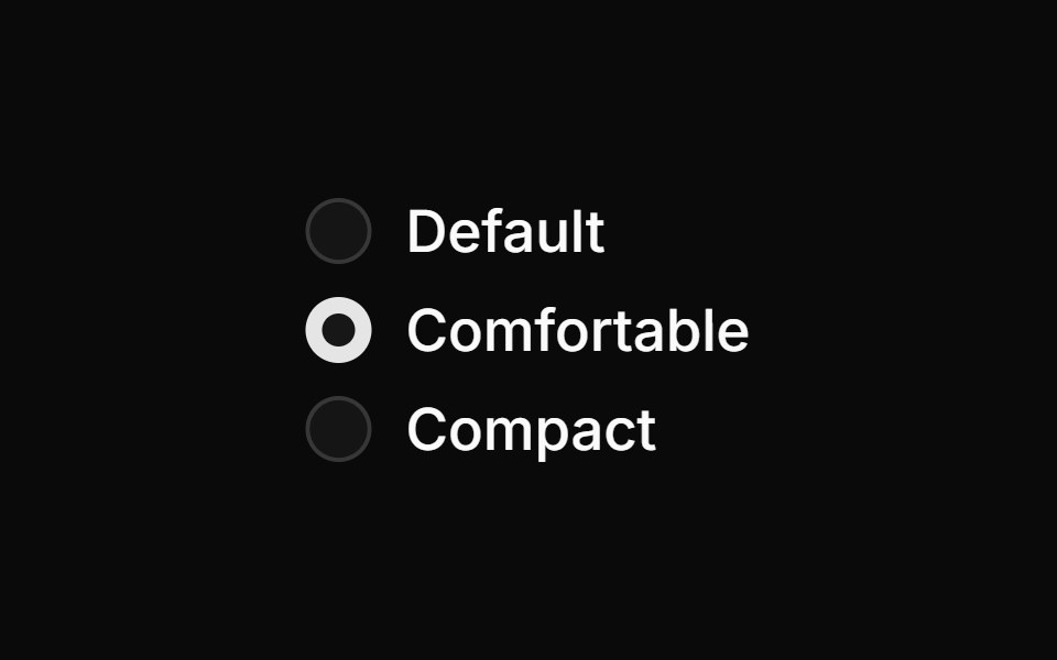 Basic radio groupReUI · ReactBasic radio group
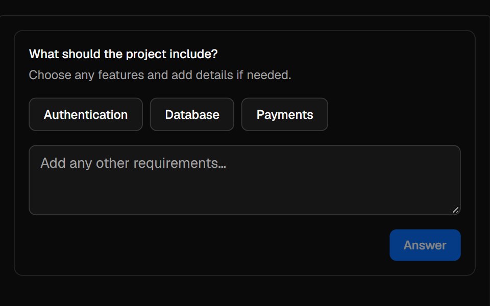 QuestionAI Elements · ReactA composable prompt for collecting choices, freeform text, or both from a user.
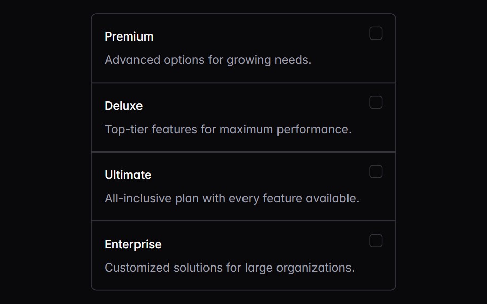 choice-boxIntent UI · Reactchoice-box
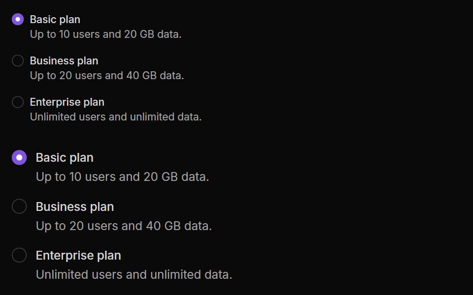 Radio ButtonsUntitled UI React · React
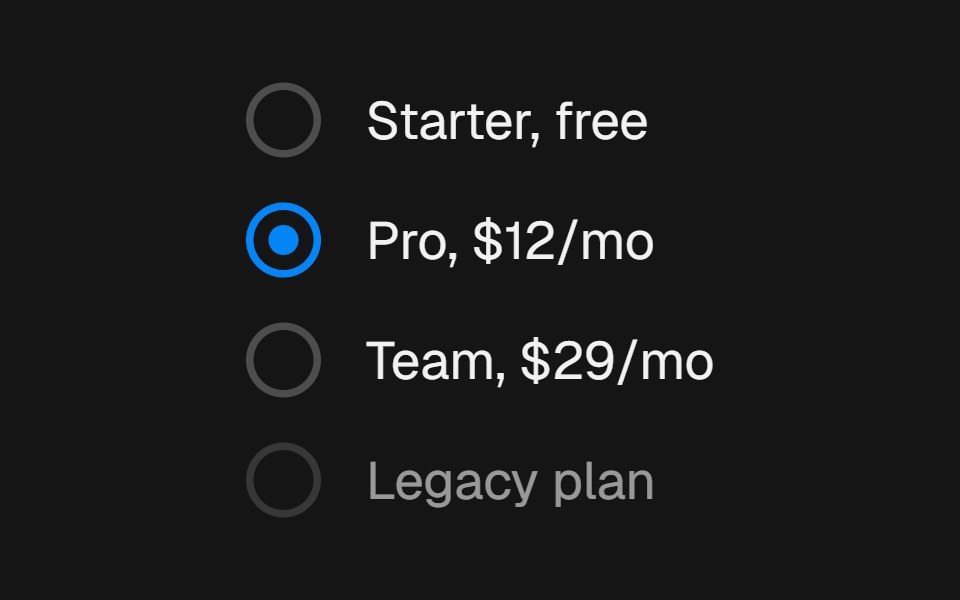 RadiobeUI · ReactSingle-select choice control with a gliding layoutId indicator dot and spring press feedback.
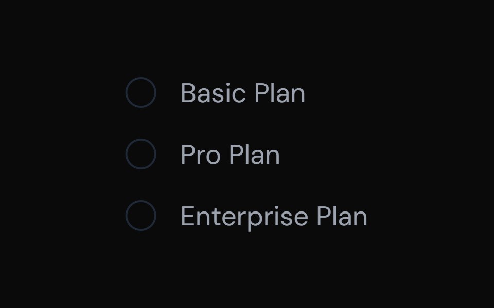 Radio InputTailGrids · ReactA radio button component with label and multiple states.
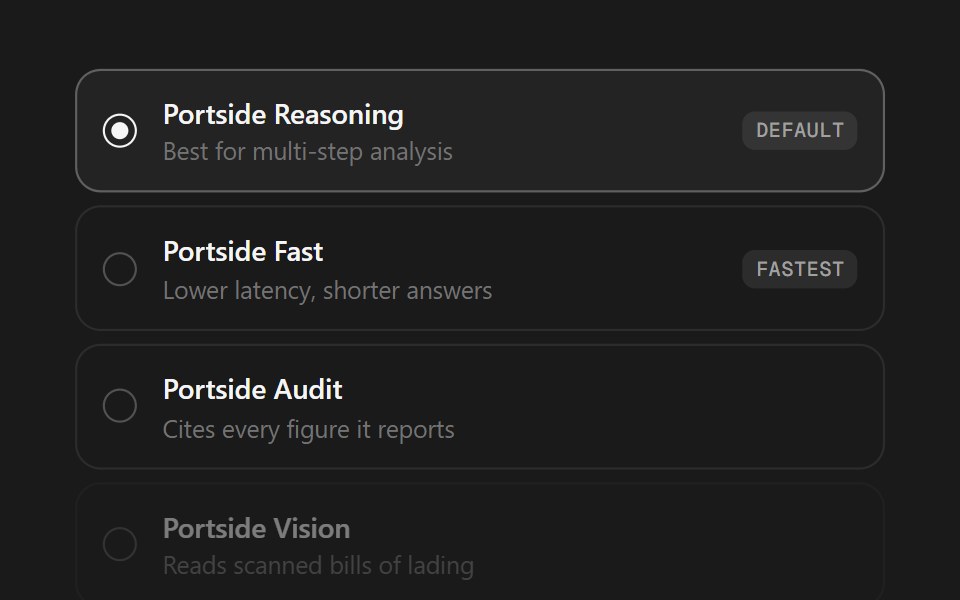 Model SelectorSpectrum UI · ReactA model picker as a radio list or segmented control, with badges and disabled states.
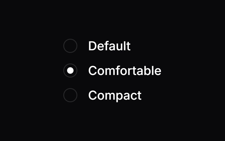 Radio GroupVengeance UI · React
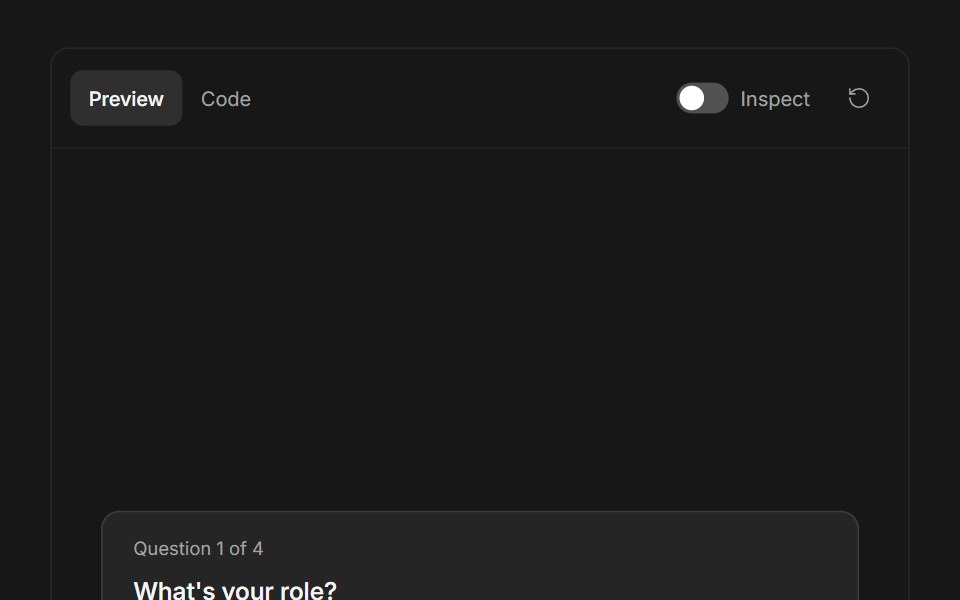 Ask User QuestionsFluid Functionalism · ReactStepped question flow with numbered options, keyboard shortcuts (1–9), single or multi-select, inline 'other' text…
 Radio GroupToolcraft · React
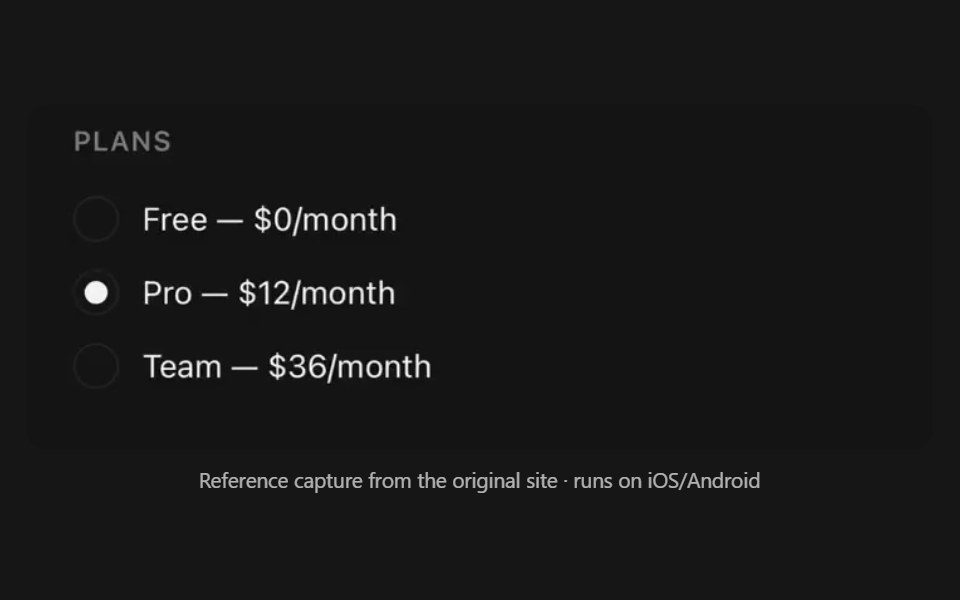 Radio GroupPanel UI · React NativeSingle-select list of options.
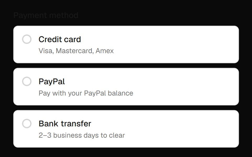 Radio Group Field InputOpenSourceUI · React
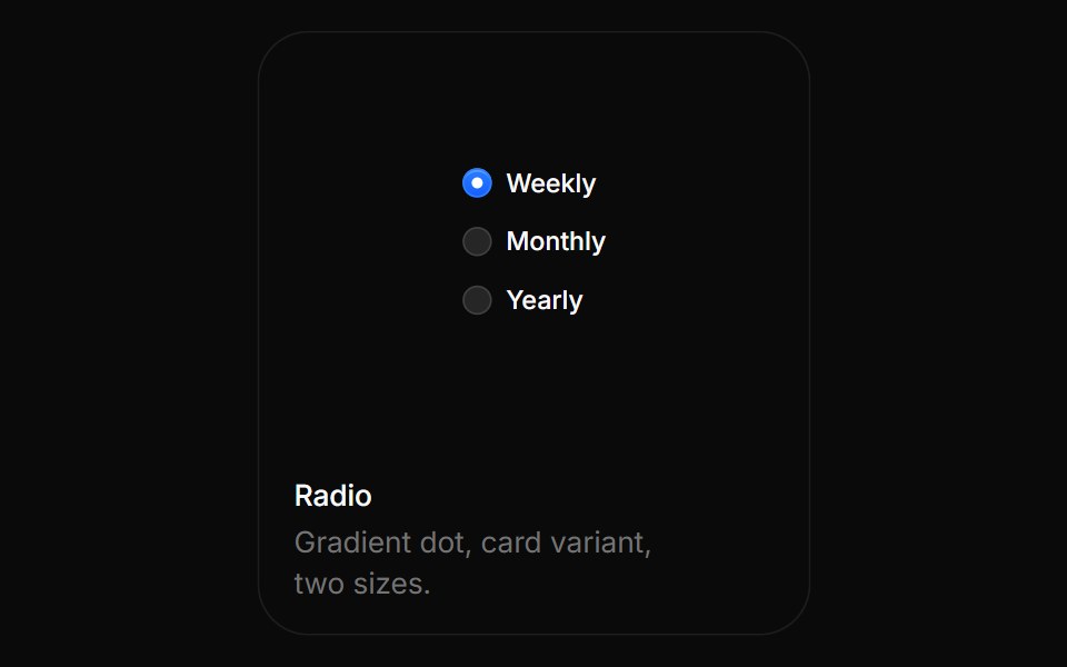 RadioBoardUI · ReactGradient dot, card variant, two sizes.
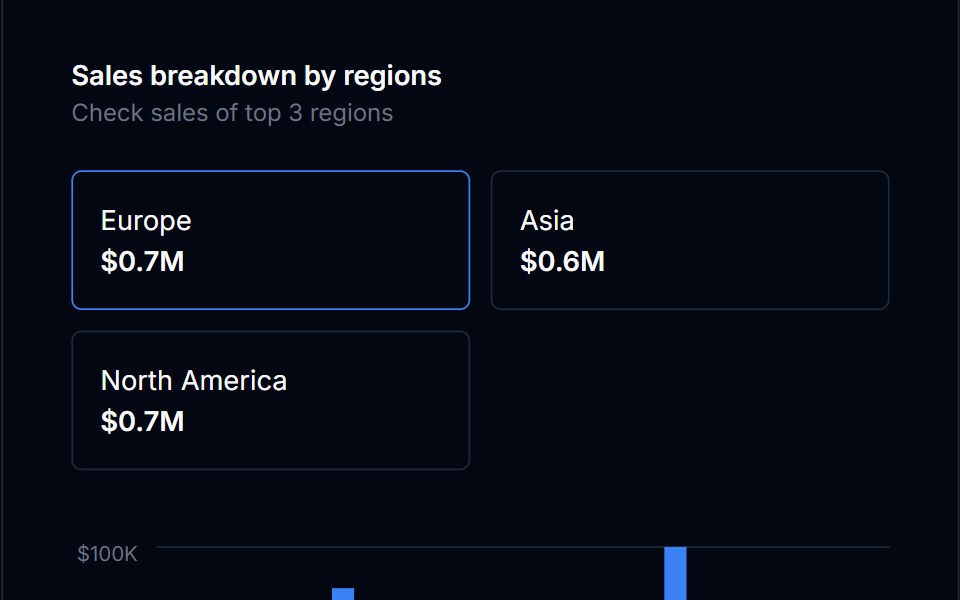 Radio Card GroupTremor Blocks · React
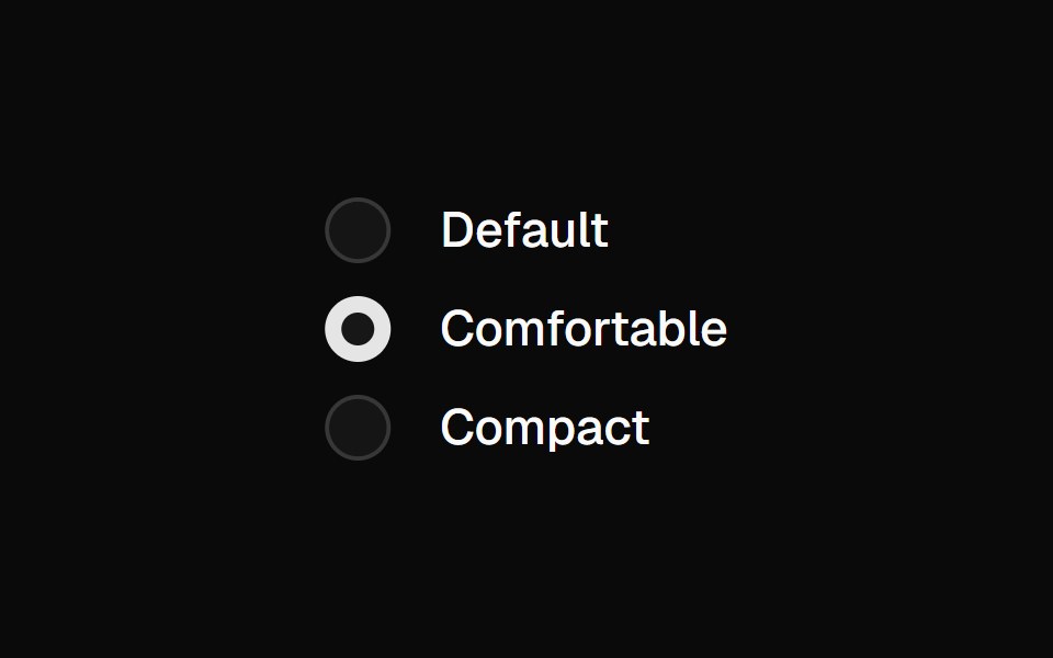 Radio GroupShadcn Dashboard · React
 Radio GroupObsidianUI · React
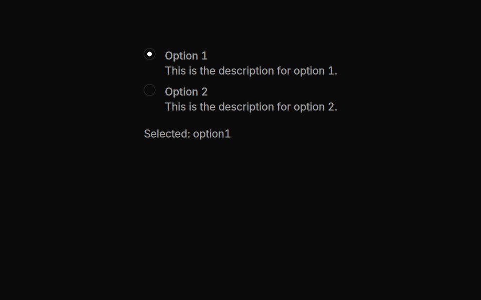 Radiogroups 02Oxbow UI · AstroRadio Button Group with Descriptions
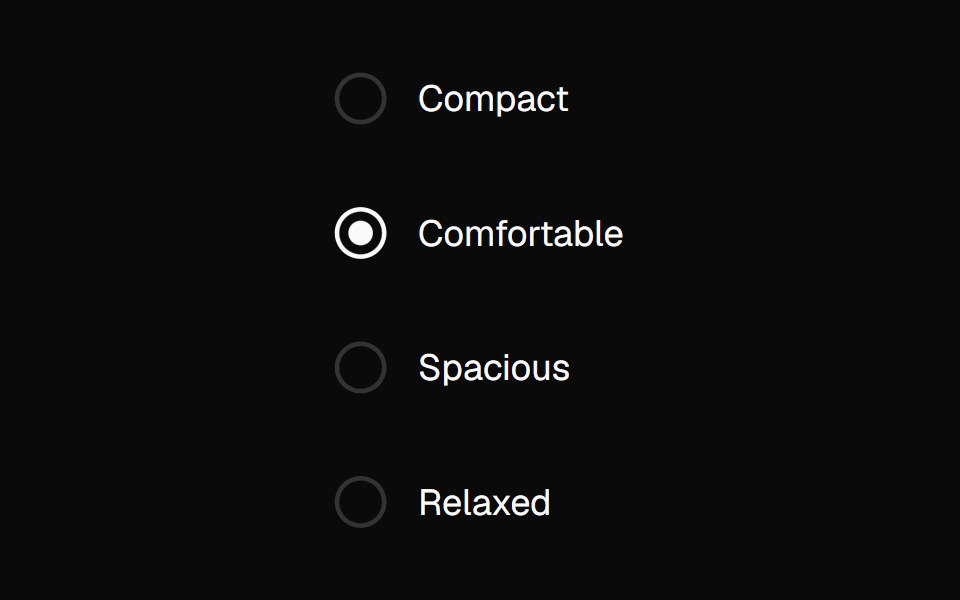 Radio GroupNexvyn UI · ReactA radio group with roving tabindex and a dot morph selection indicator.
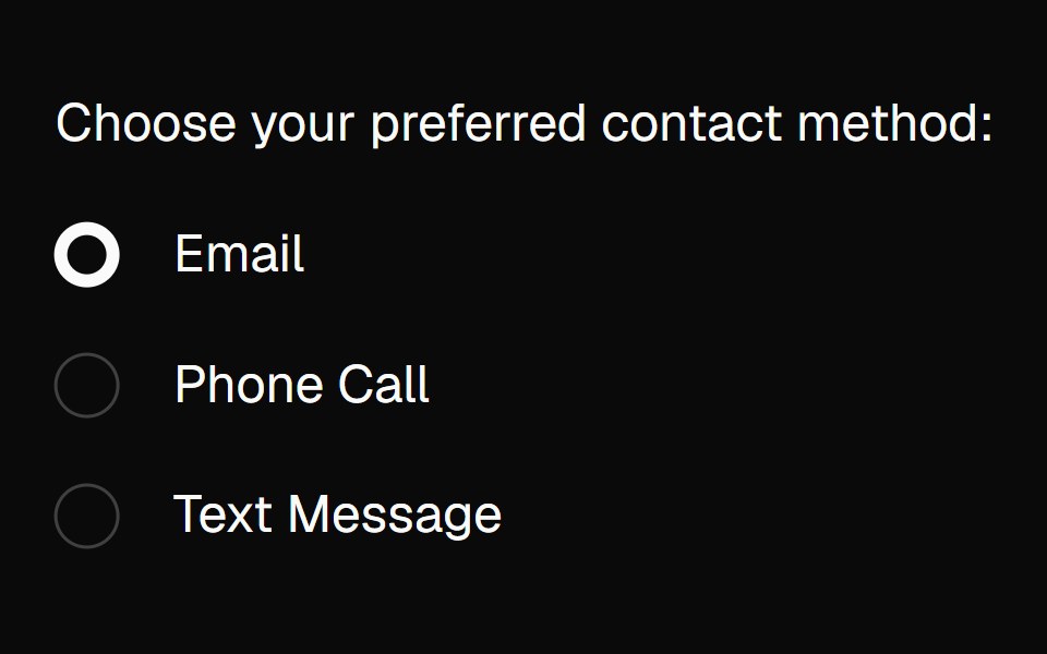 radio-groupBaseLayer · ReactA radio group allows a user to select a single option from a list of mutually exclusive options.
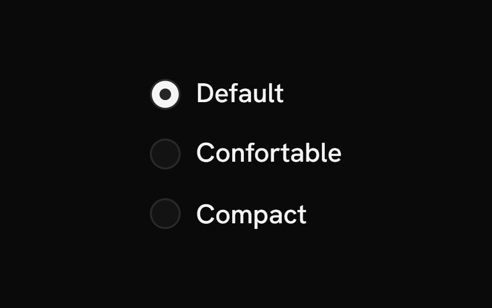 Radio GroupShark UI · ReactAllows single selection from multiple options.
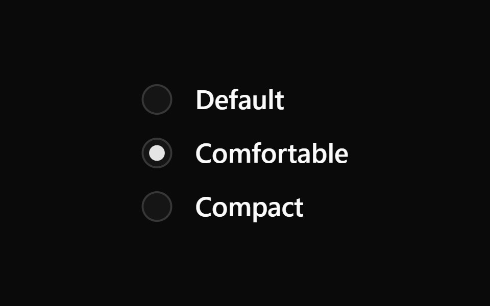 Radio GroupWatermelon UI · React
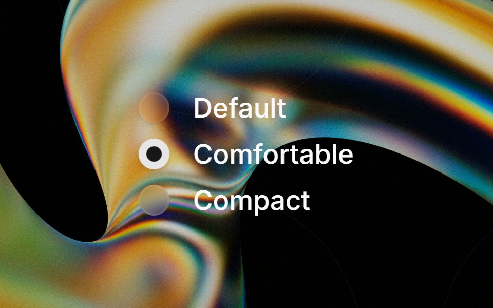 Glass Radio Groupglasscn · ReactGlass Radio Group with five variants: clear, frosted, subtle, liquid, and liquid-refract
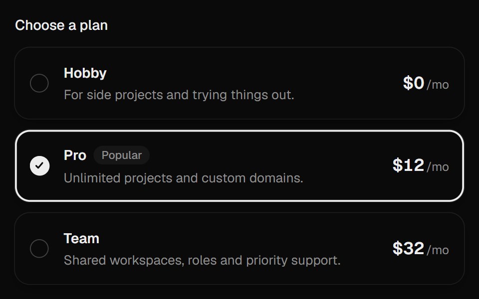 Radio CardsUI Lab · ReactThe selection ring glides to the plan you pick.
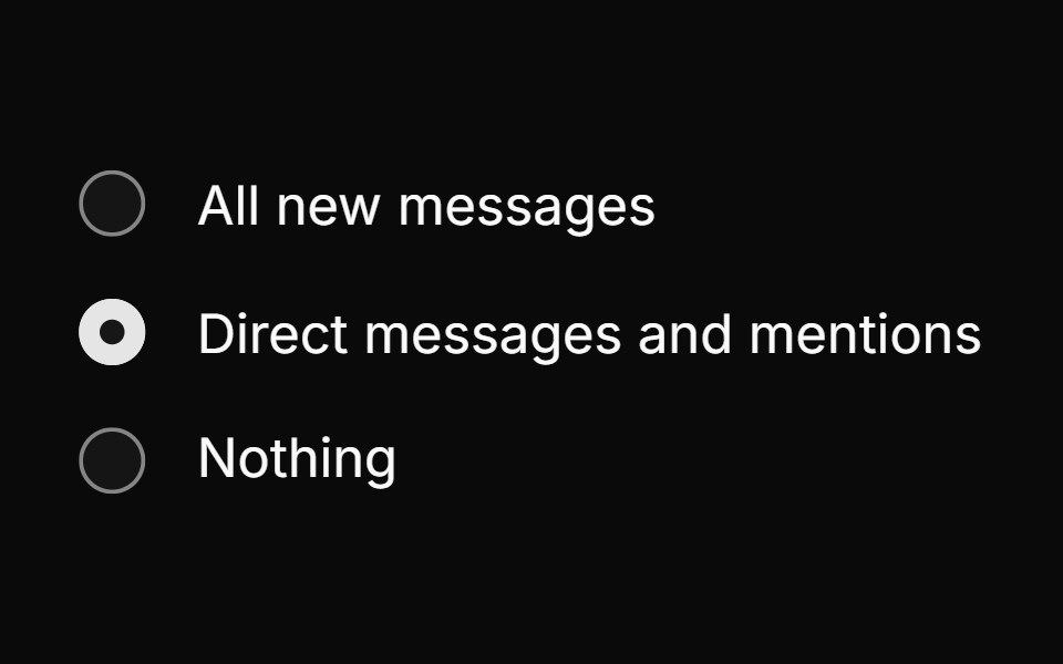 Radio groupHextaUI · ReactPick one option from a set, with a dot that hands off between choices and cards whose selection ring slides to the new…
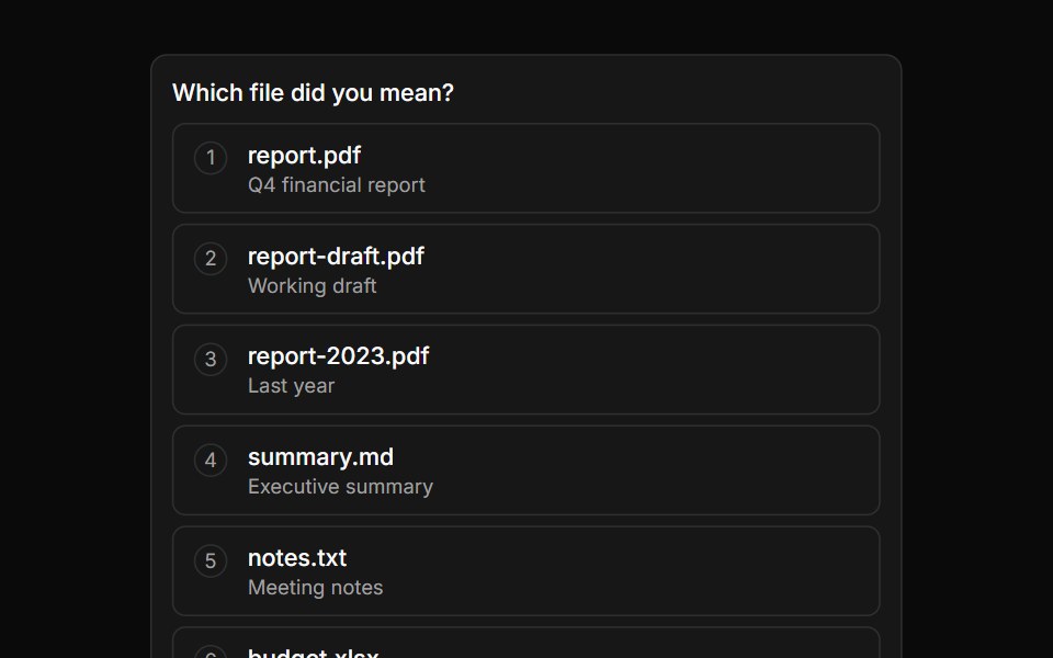 Option ListLocalMode · ReactAn inline multi-choice selection list (shows 5–7 options then paginates) for human-in-the-loop agent inquiries…
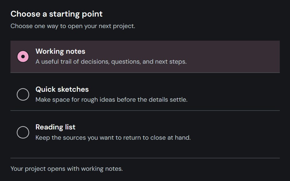 Radio groupCojeev UI · ReactLets users select one option from a labeled set of mutually exclusive choices.
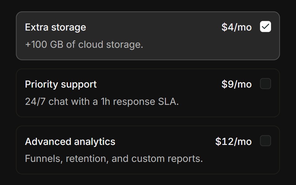 Choice cardsFLX UI · ReactBordered add-on cards that highlight when checked.
 With Radio Groupsv-particles · Svelte
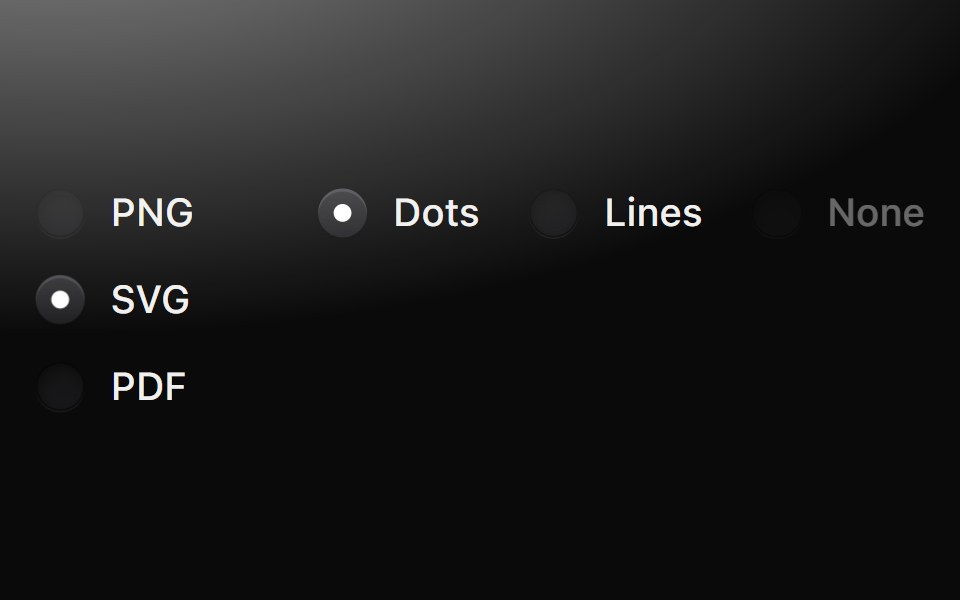 Radio groupMetal UI · React + SwiftUIOne choice from a short list: round wells beside their labels; pressing darkens the well, releasing latches a pip in…
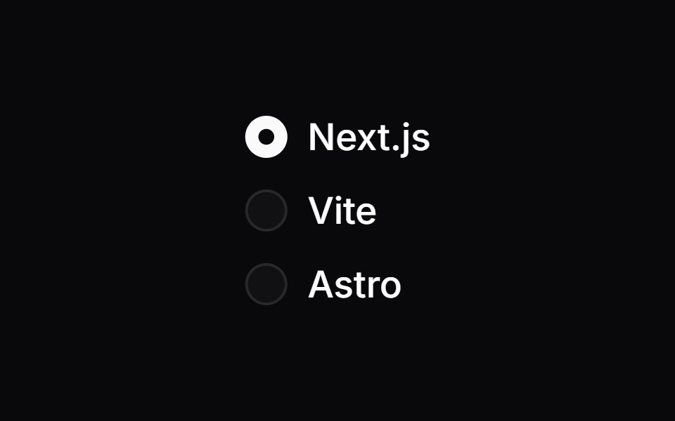 Radio GroupSpaceUI · ReactPresents a list of options where users can select only one choice at a time, making mutually exclusive decisions clear.
 Radio GroupOUI · ReactReact aria components Radio Group with shadcn characteristics.
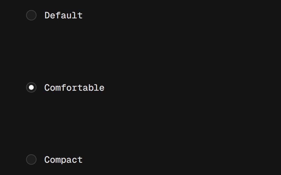 Radio GroupD2Studio UI · ReactA set of checkable buttons, known as radio buttons, where no more than one can be checked at a time.
 Radio GroupFibo · ReactPicks exactly one option from a short list.
 Radio ButtonReactFrame · ReactAn accessible, animated radio group with a springy dot, a ripple on select, focus ring, optional descriptions and a…
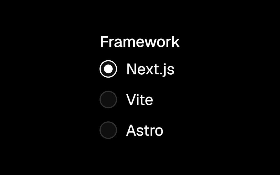 Radio Groupark-cn · ReactA shadcn-style radio group component built with Ark UI primitives.
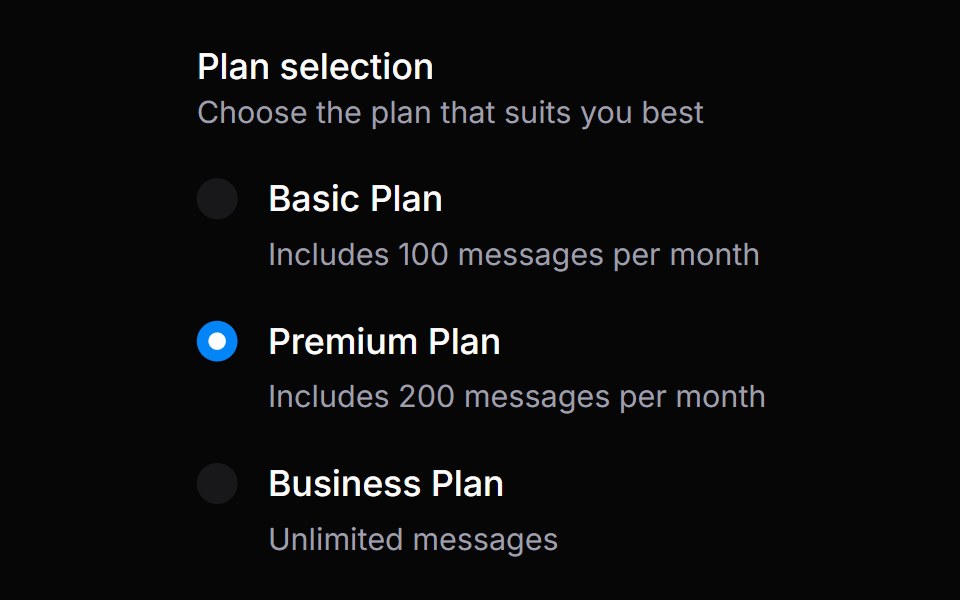 Radio GroupHeroUI · ReactA set of radio buttons where only one option can be selected at a time.
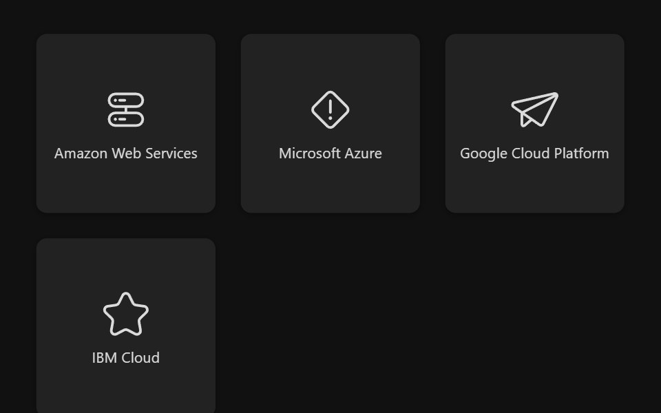 Select Box GroupReact Spectrum · ReactSelectBoxGroup allows users to select one or more options from a list.
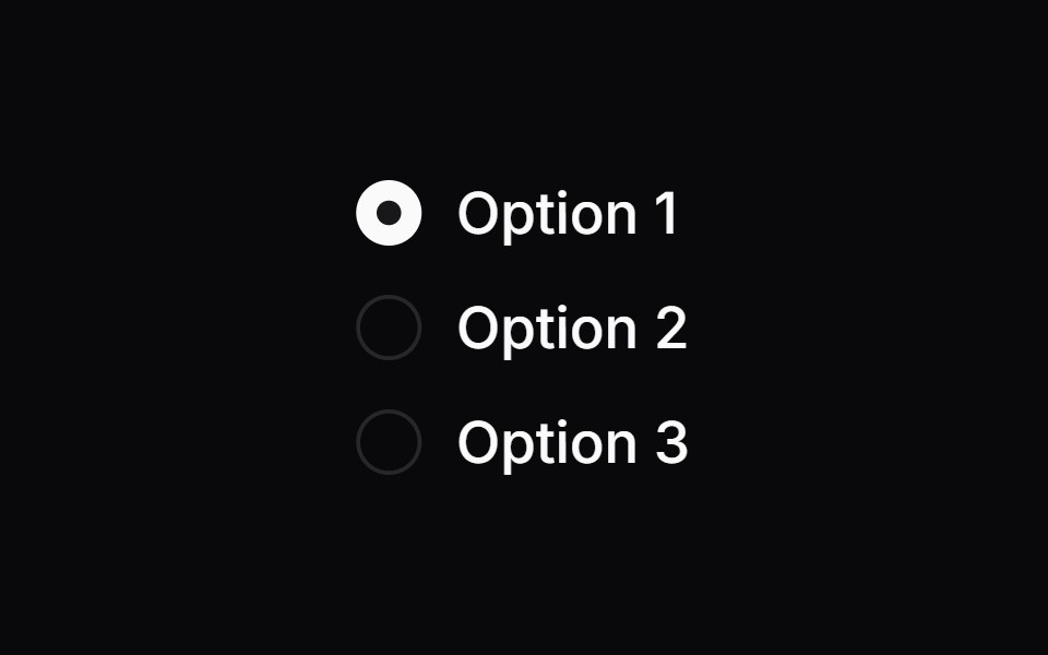 Comp 152Origin UI · React
 Radio GroupTremor · React
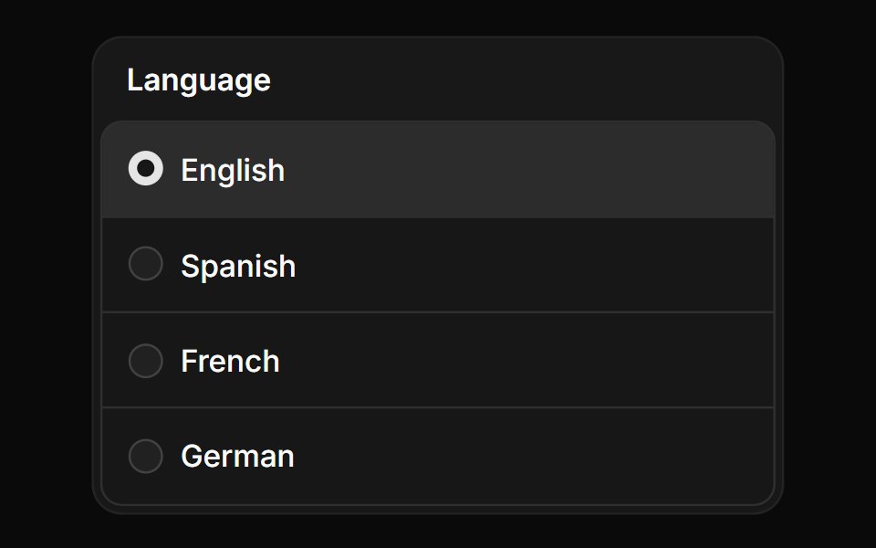 Radio group in frameReUI · ReactRadio group in frame
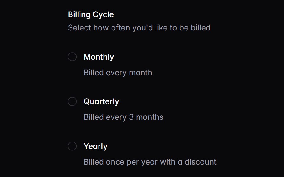 radioIntent UI · Reactradio
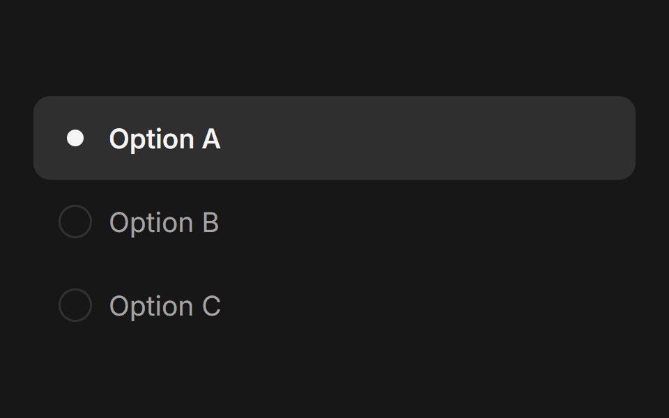 Radio GroupFluid Functionalism · ReactAnimated radio group with fluid hover, spring-animated selection dot, and optional Radix UI integration. Supports both…
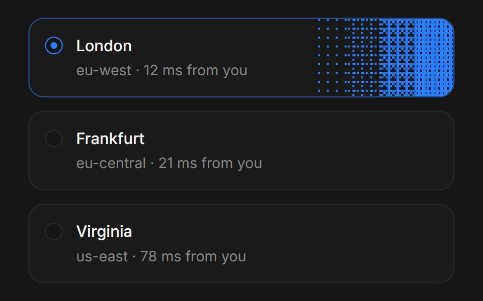 Web Radio GroupPanel UI · React NativeRadio groups with descriptions and disabled options.
 Radio GroupTremor Blocks · React
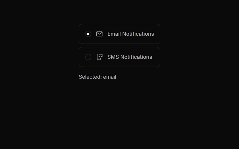 Radiogroups 03Oxbow UI · AstroRadio Buttons with Icons
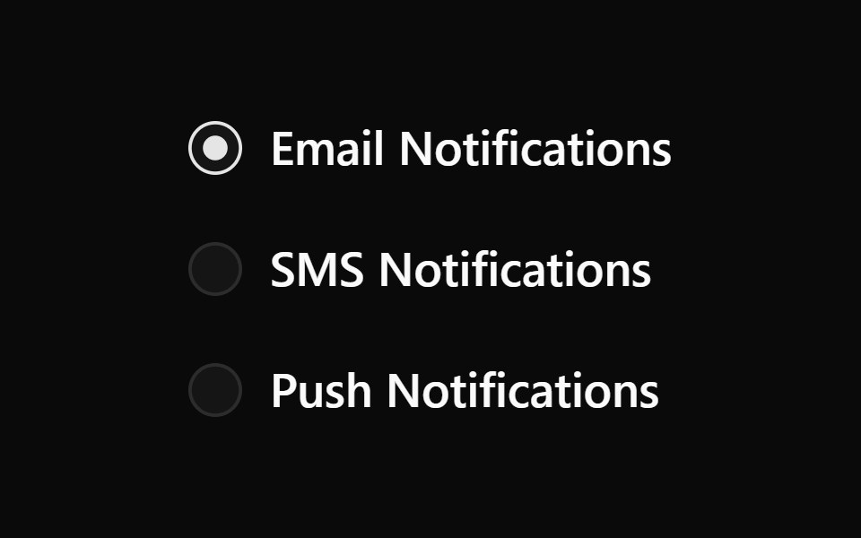 Radiogroup 1Watermelon UI · React
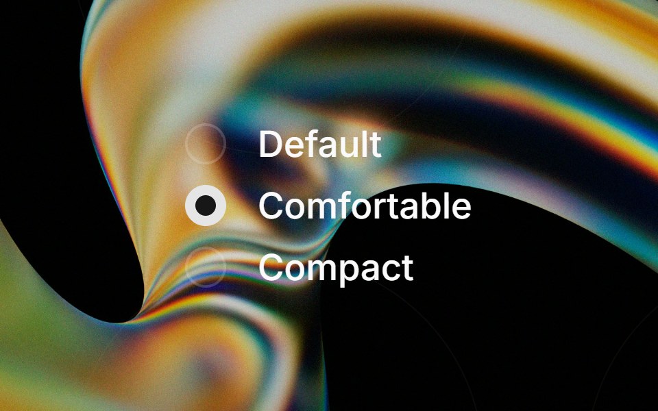 Radio Groupglasscn · React
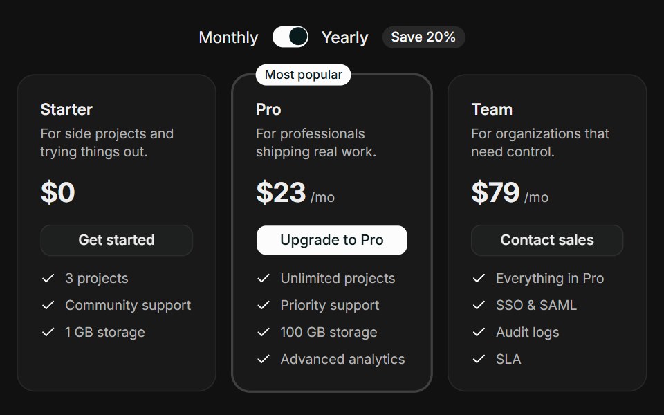 Tiered CardsFLX UI · ReactTiered Cards for Select a Plan.
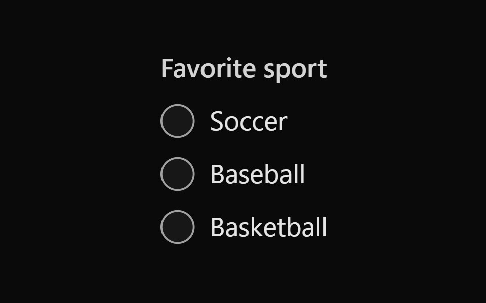 Tailwind Radio GroupReact Spectrum · React
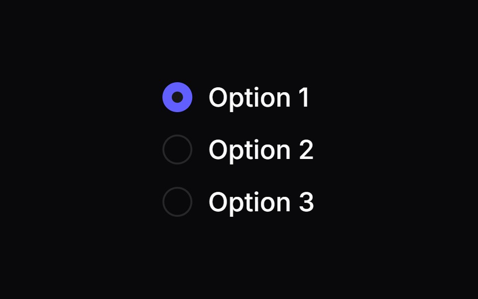 Comp 153Origin UI · React
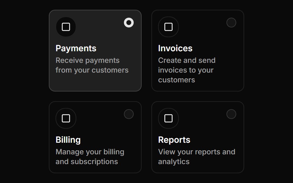 Radio group with grid layoutReUI · ReactRadio group with grid layout
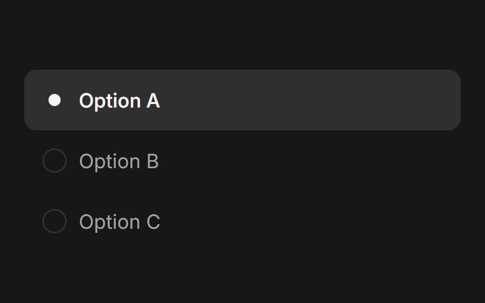 Radio Group (Base UI)Fluid Functionalism · ReactAnimated radio group with fluid hover, spring-animated selection dot. Base UI flavor.
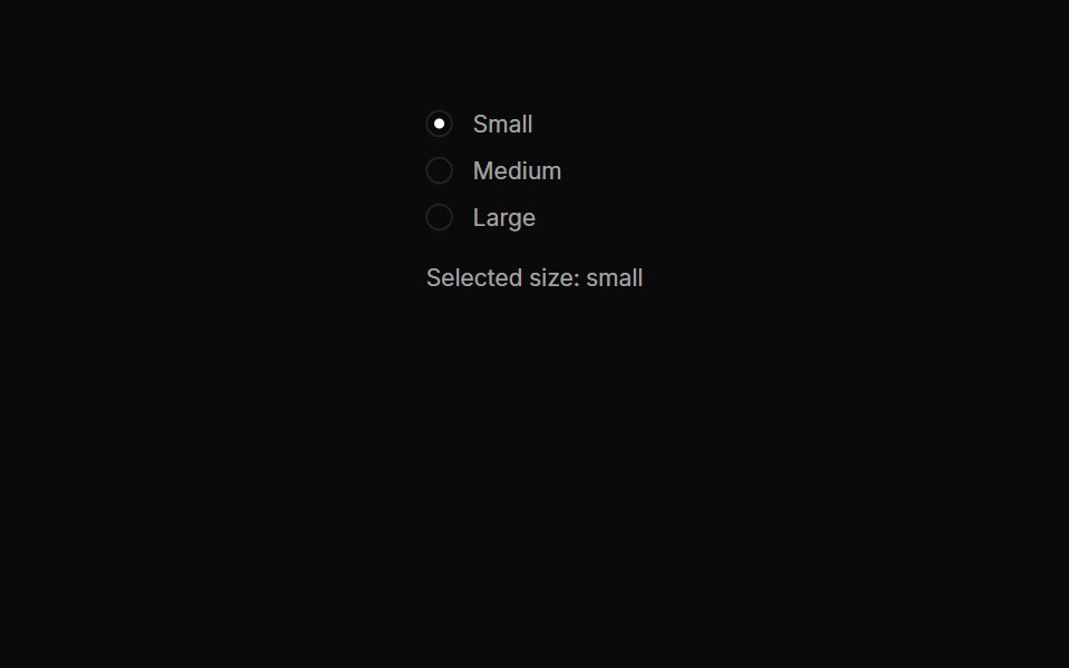 Radiogroups 04Oxbow UI · AstroInline Radio Button Group
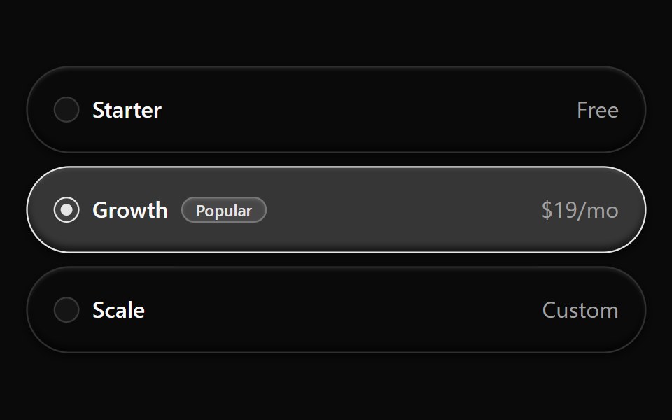 Radiogroup 10Watermelon UI · React
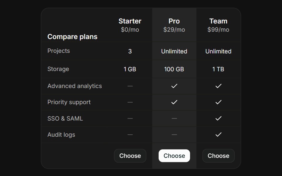 Comparison TableFLX UI · ReactComparison Table for Select a Plan.
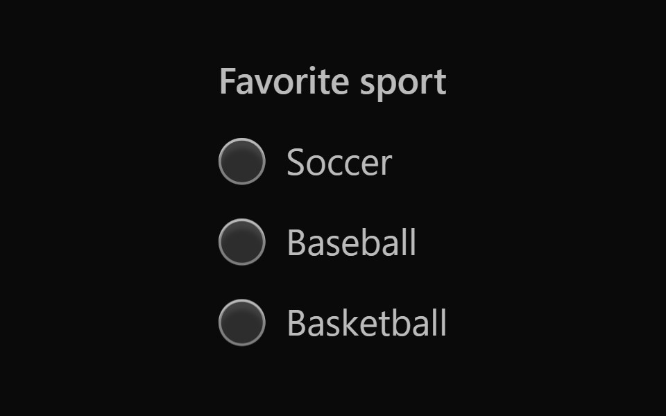 Vanilla Radio GroupReact Spectrum · React
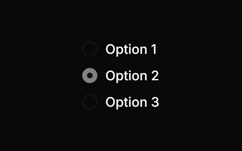 Comp 154Origin UI · React
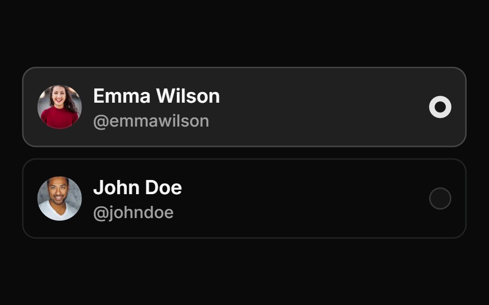 Avatar based card radio groupReUI · ReactAvatar based card radio group
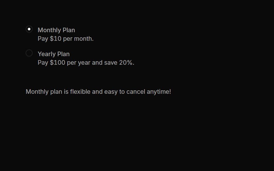 Radiogroups 05Oxbow UI · AstroRadio Group with Toggle Details
 Radiogroup 11Watermelon UI · React
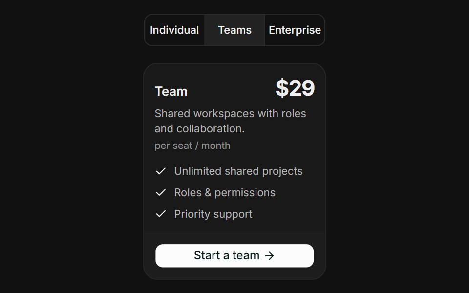 Audience SegmentsFLX UI · ReactAudience Segments for Select a Plan.
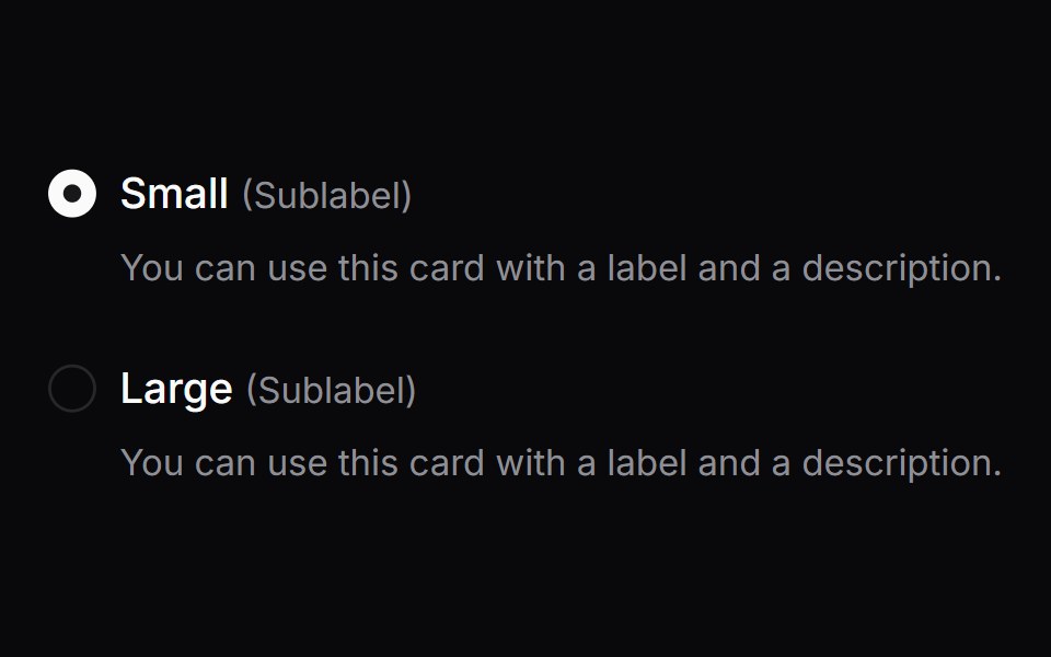 Comp 155Origin UI · React
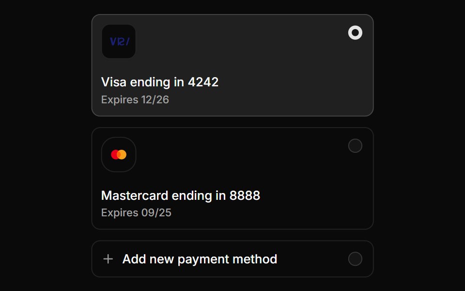 Payment method radio cardsReUI · ReactPayment method radio cards
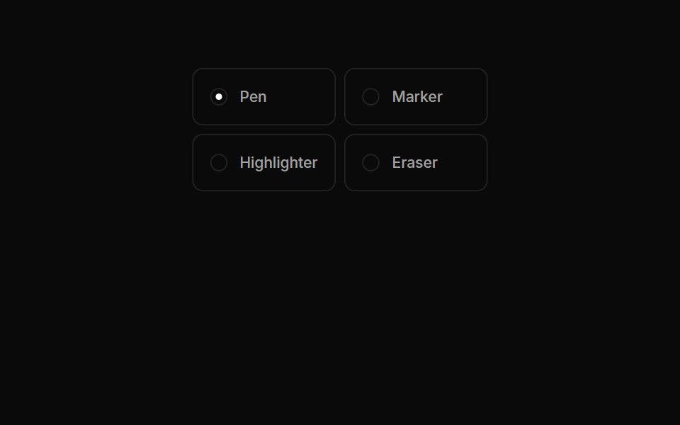 Radiogroups 06Oxbow UI · AstroRadio Button Group with Tool Selection
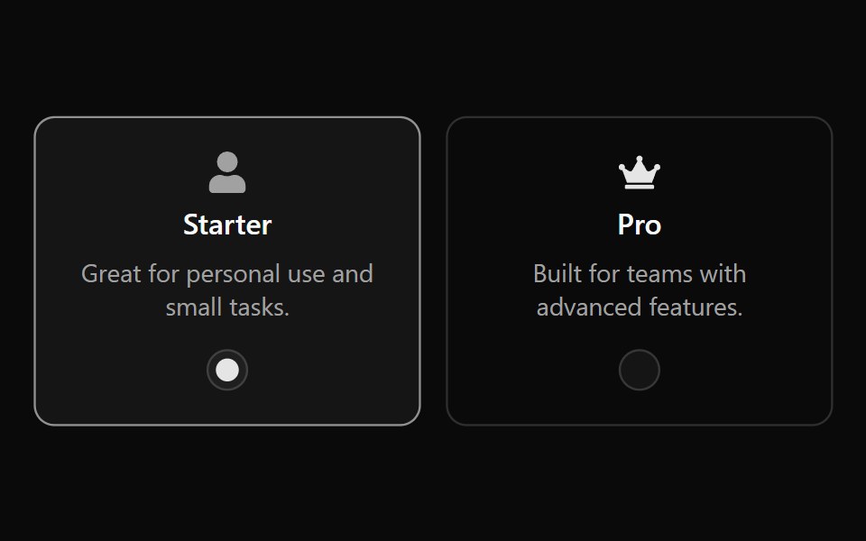 Radiogroup 12Watermelon UI · React
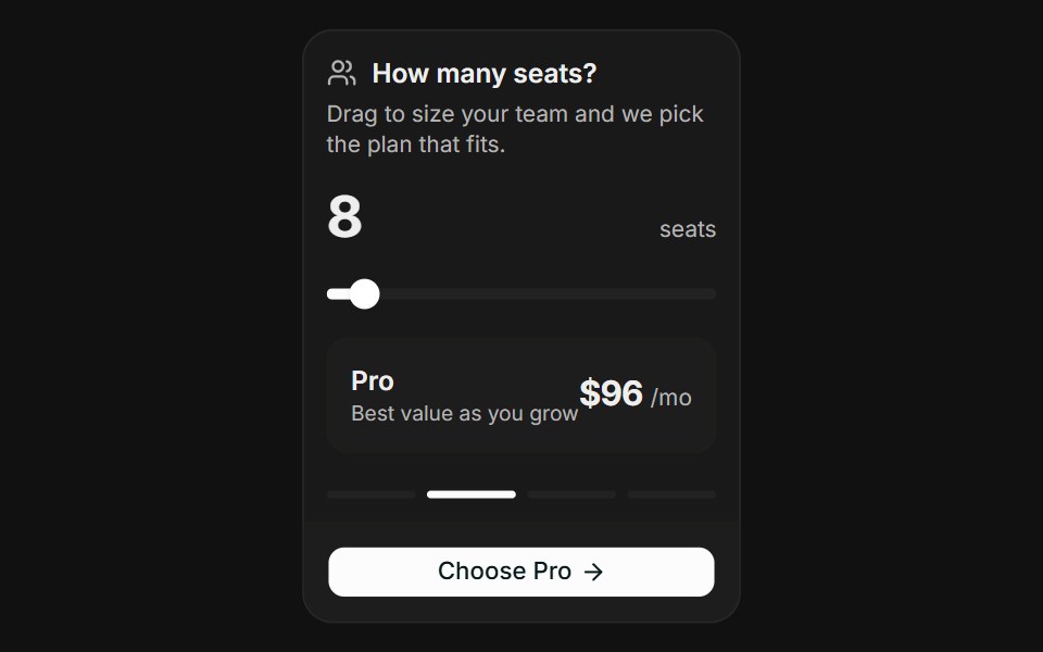 Usage SliderFLX UI · ReactUsage Slider for Select a Plan.
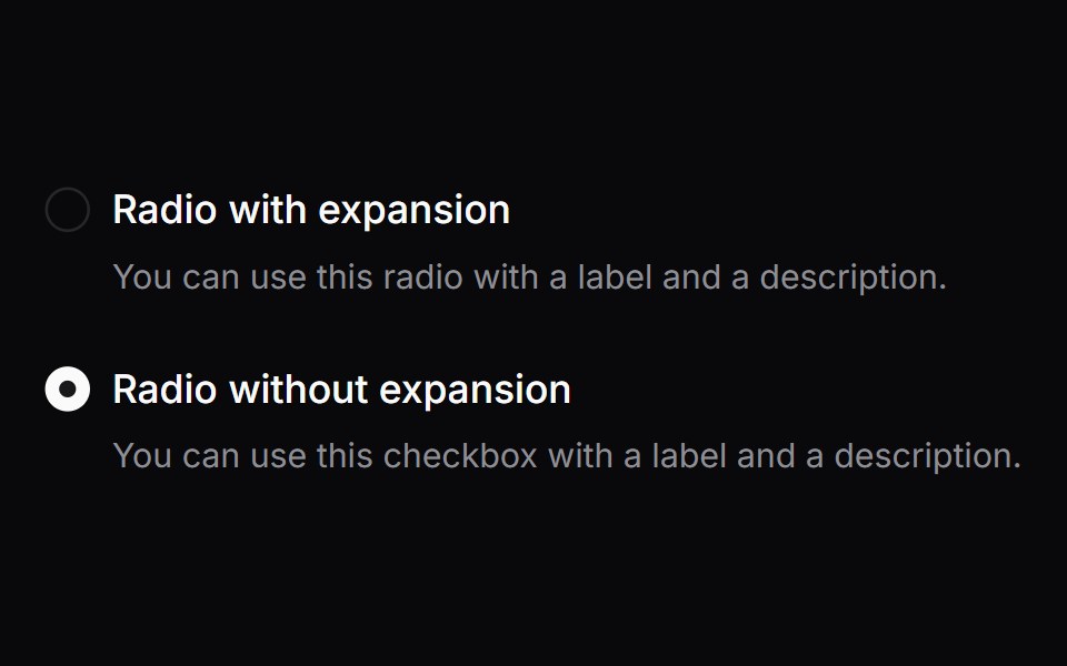 Comp 156Origin UI · React
 Radio group with tooltip infoReUI · ReactRadio group with tooltip info
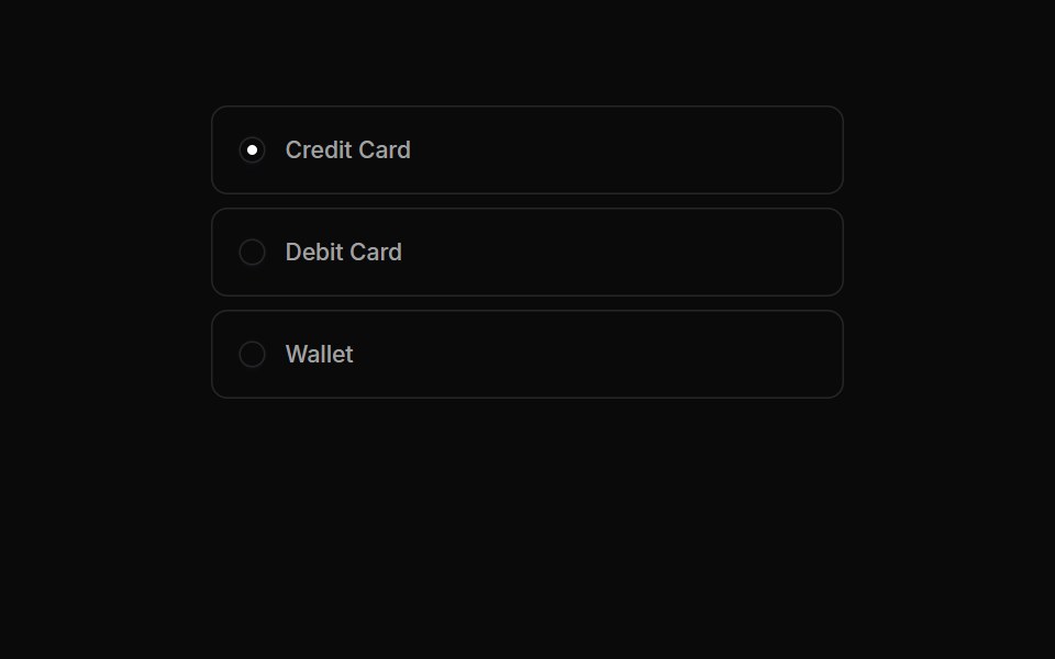 Radiogroups 07Oxbow UI · AstroRadio Button Group for Payment Methods
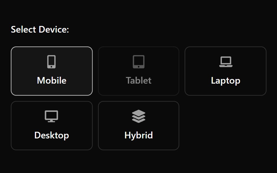 Radiogroup 13Watermelon UI · React
 Spotlight RecommendationFLX UI · ReactSpotlight Recommendation for Select a Plan.
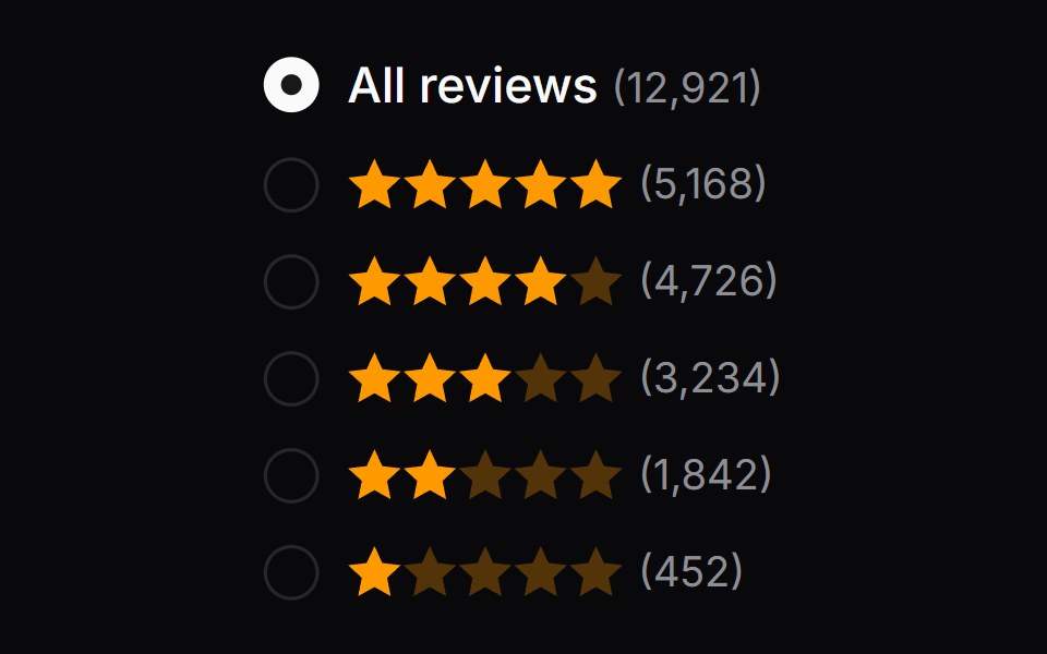 Comp 157Origin UI · React
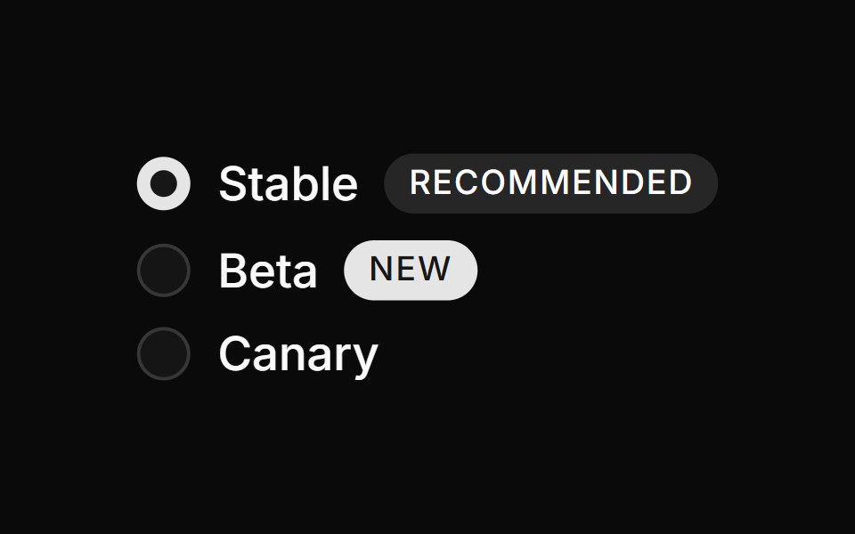 Radio group with badgesReUI · ReactRadio group with badges
 Radiogroups 08Oxbow UI · AstroRadio Group for Server Location
 Radiogroup 2Watermelon UI · React
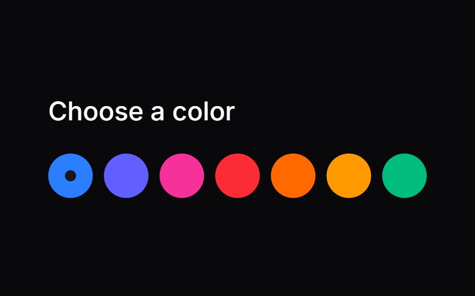 Comp 158Origin UI · React
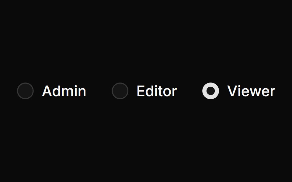 Inline horizontal radio groupReUI · ReactInline horizontal radio group
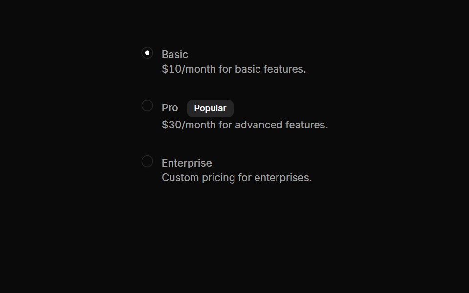 Radiogroups 09Oxbow UI · AstroRadio Group for Plan Selection
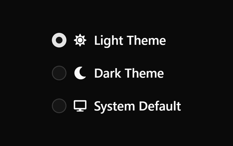 Radiogroup 3Watermelon UI · React
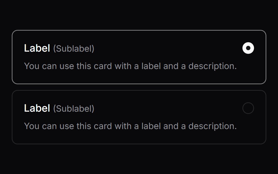 Comp 159Origin UI · React
 Pricing plan radio cardsReUI · ReactPricing plan radio cards
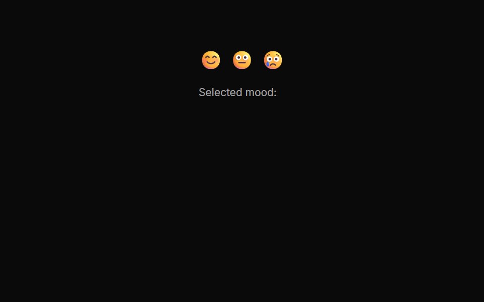 Radiogroups 10Oxbow UI · AstroRadio Button Group for Mood Rating
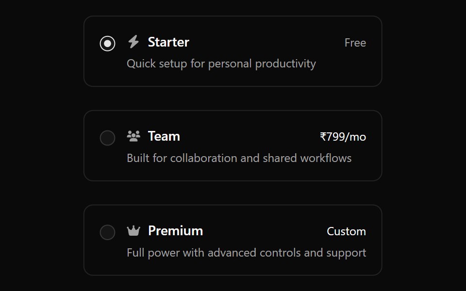 Radiogroup 4Watermelon UI · React
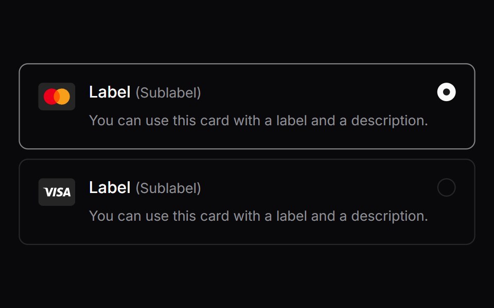 Comp 160Origin UI · React
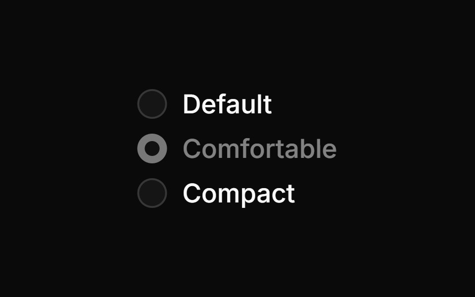 Disabled radio groupReUI · ReactDisabled radio group
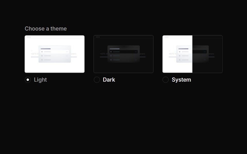 Radiogroups 11Oxbow UI · AstroRadio Group for Theme Selection
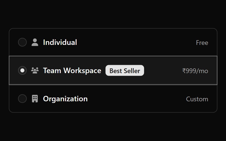 Radiogroup 5Watermelon UI · React
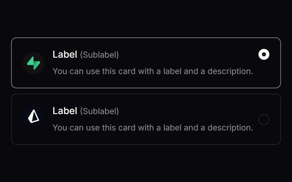 Comp 161Origin UI · React
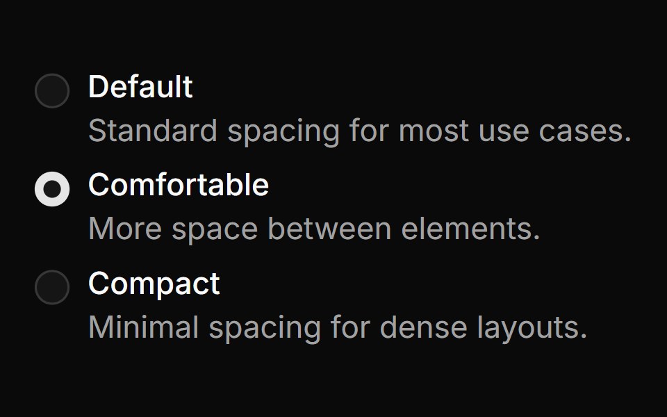 Radio with descriptionReUI · ReactRadio with description
 Radiogroups 01Oxbow UI · Astro
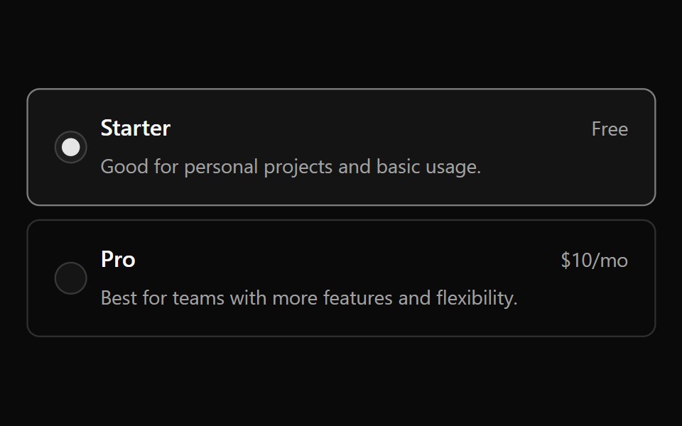 Radiogroup 6Watermelon UI · React
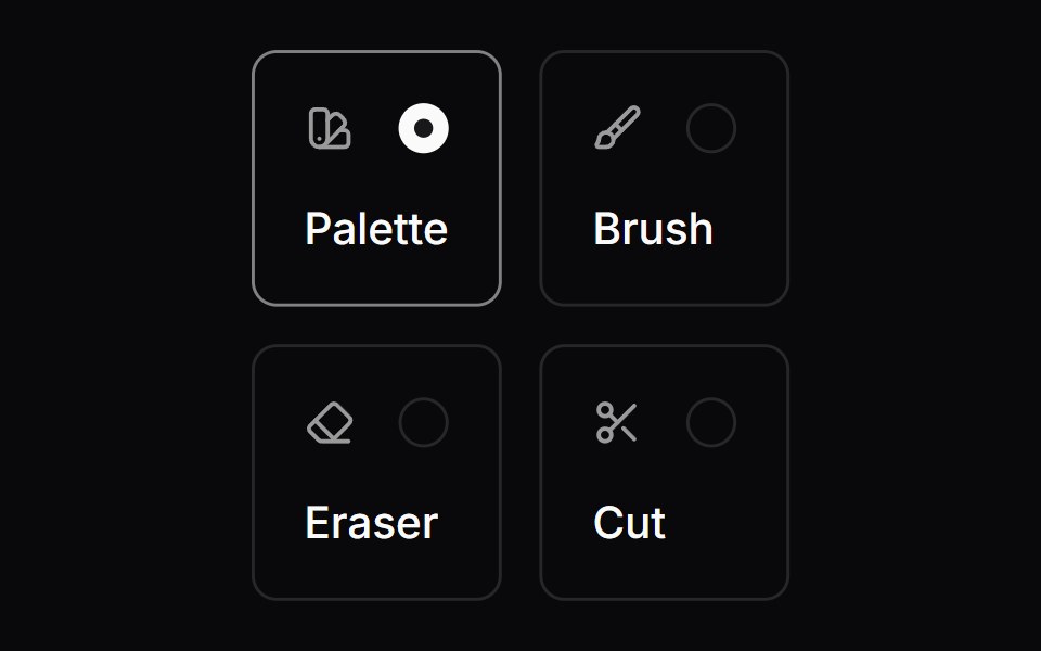 Comp 162Origin UI · React
 Invalid radio groupReUI · ReactInvalid radio group
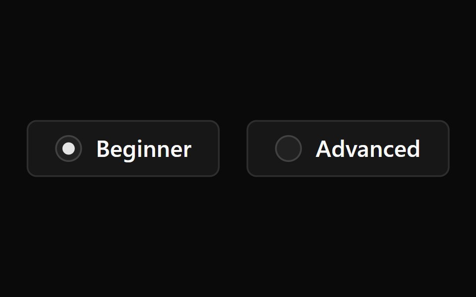 Radiogroup 7Watermelon UI · React
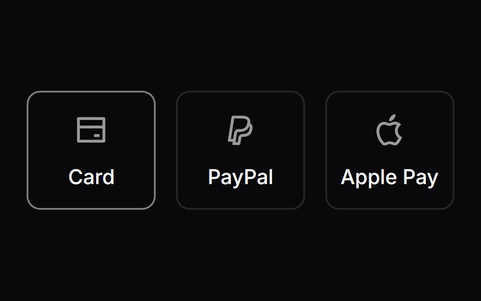 Comp 163Origin UI · React
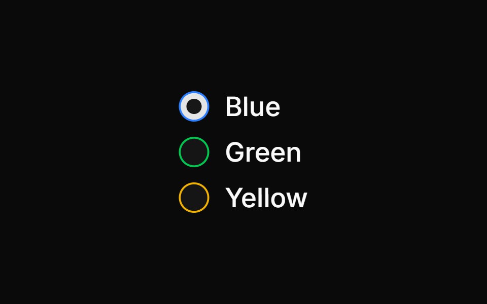 Colored radio groupReUI · ReactColored radio group
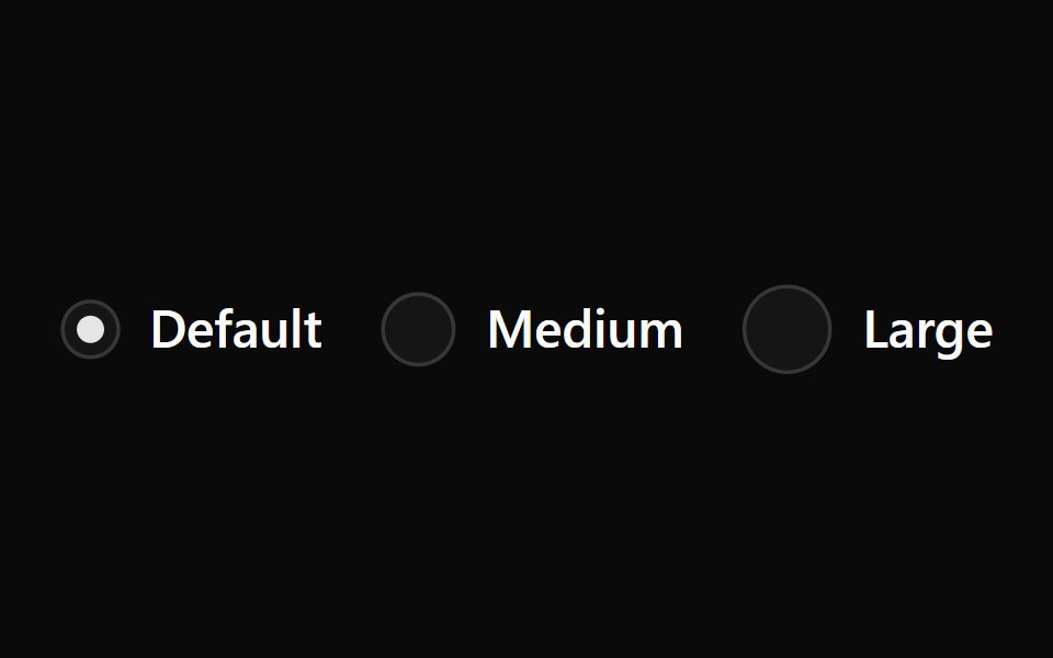 Radiogroup 8Watermelon UI · React
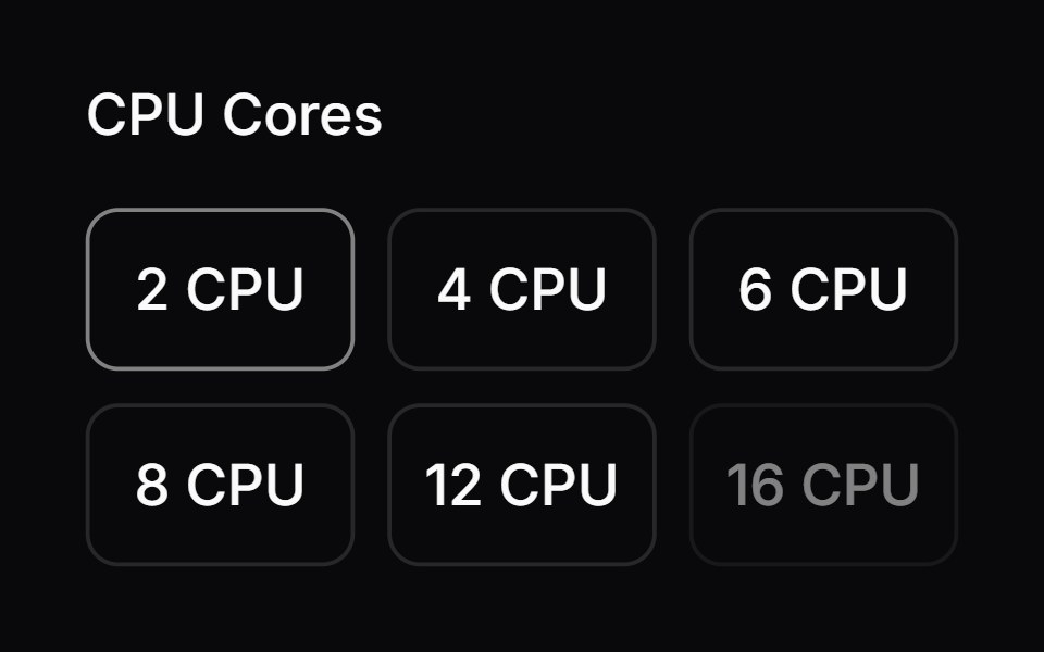 Comp 164Origin UI · React
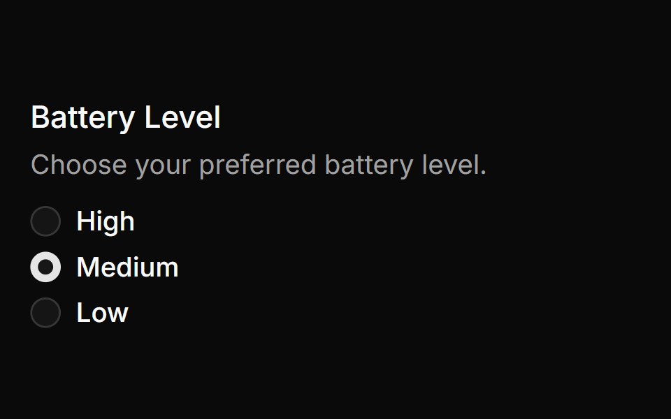 Radio group with legend and descriptionReUI · ReactRadio group with legend and description
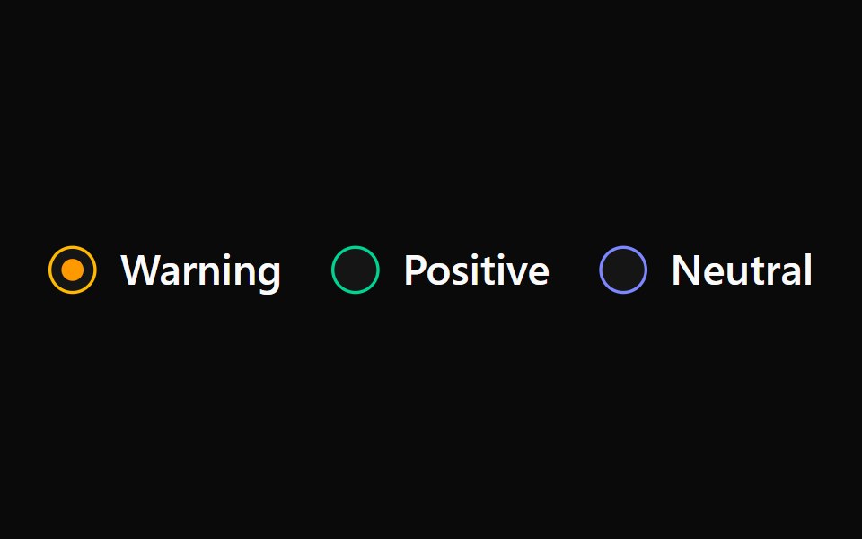 Radiogroup 9Watermelon UI · React
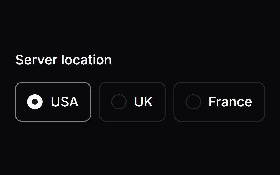 Comp 165Origin UI · React
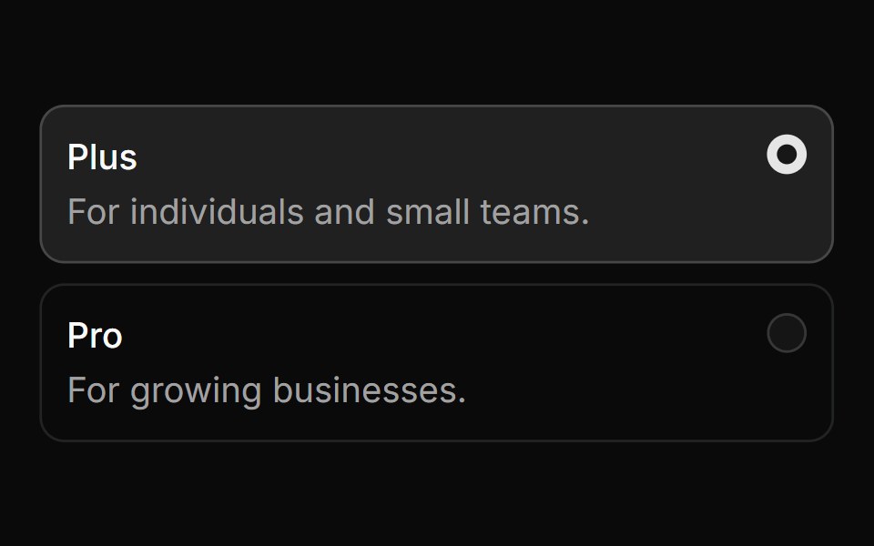 Card radio group with descriptionsReUI · ReactCard radio group with descriptions
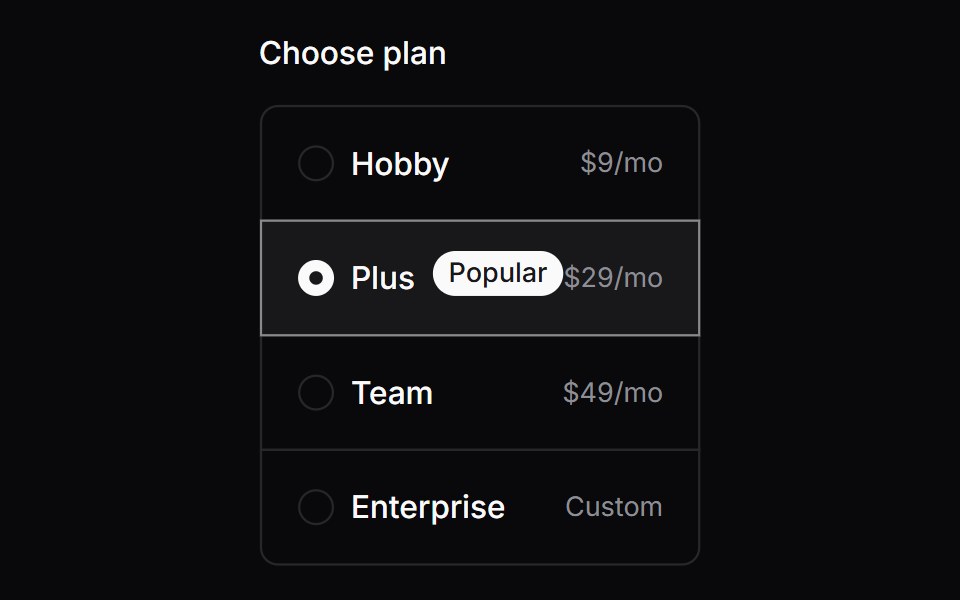 Comp 166Origin UI · React
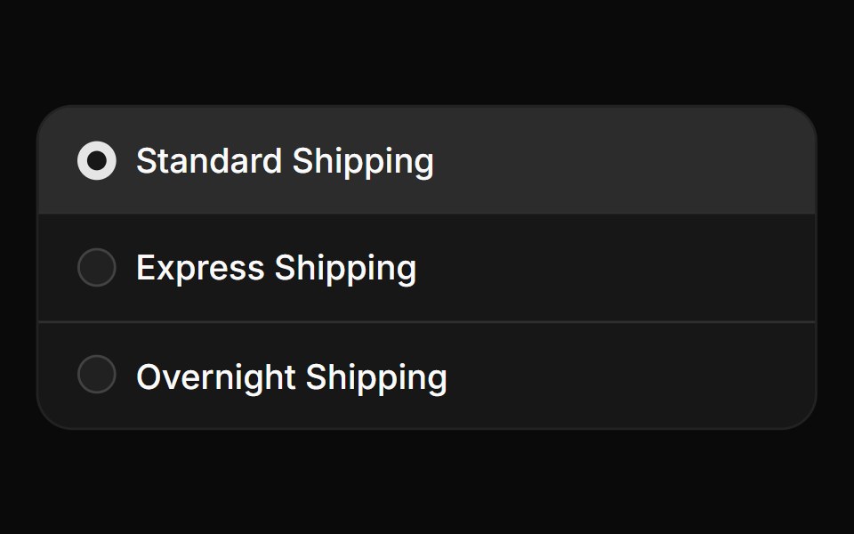 Radio group in card with separatorsReUI · ReactRadio group in card with separators
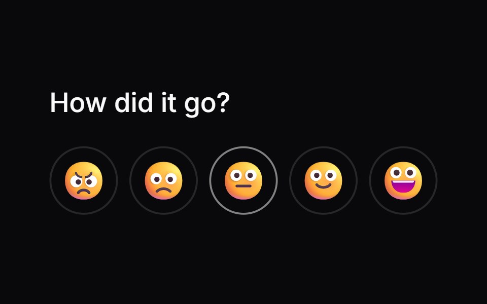 Comp 167Origin UI · React
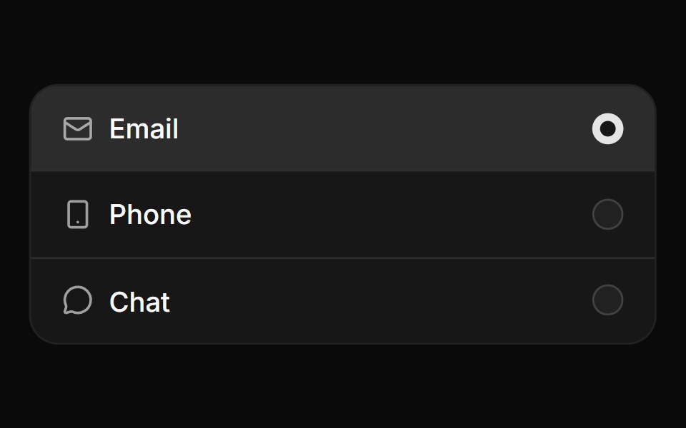 Radio group in card with iconsReUI · ReactRadio group in card with icons
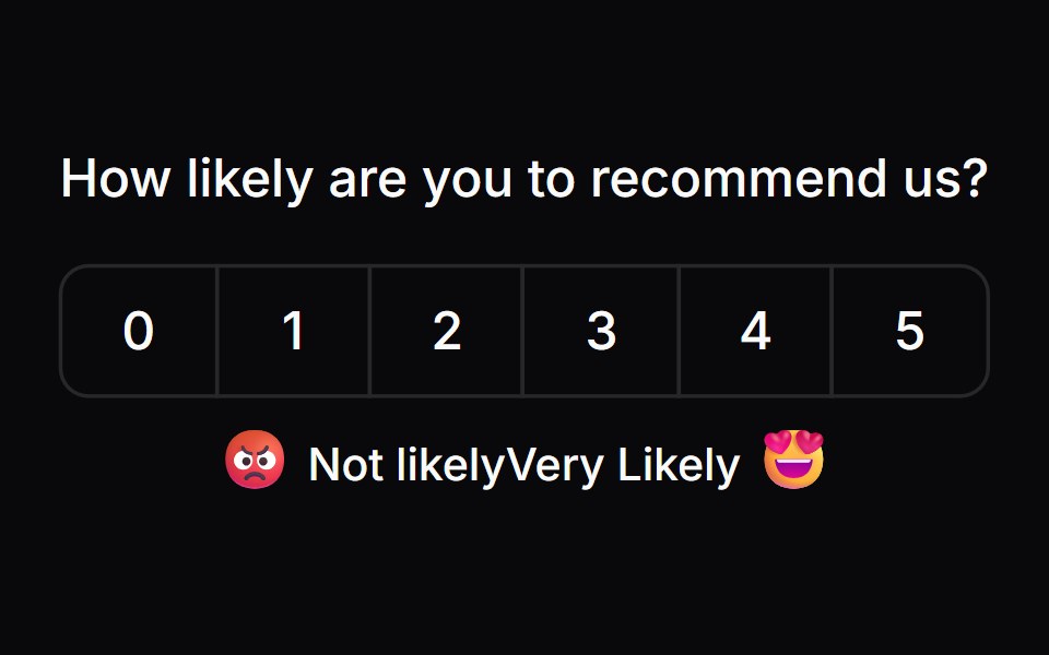 Comp 168Origin UI · React
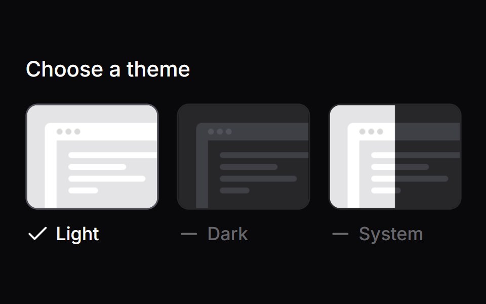 Comp 169Origin UI · React
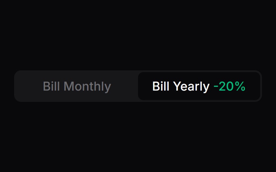 Comp 170Origin UI · React
 Comp 171Origin UI · React
Libraries with Tailwind CSS radio components
Related categories
- Radio Components
- React Radio Components
- Animated Radio Components
- shadcn/ui Radio Components
- Tailwind CSS Input Components
- Tailwind CSS Text Input Components
- Tailwind CSS Select Components
- Tailwind CSS Form Field Components
- Tailwind CSS Form Components
- Tailwind CSS Textarea Components
- Tailwind CSS Checkbox Components
- Tailwind CSS Switch Components
- Tailwind CSS Slider Components
- Tailwind CSS Combobox Components
- Tailwind CSS File Upload Components
- Tailwind CSS Search Input Components
- Tailwind CSS Date Picker Components
- Tailwind CSS Login Form Components
- Tailwind CSS Color Picker Components
- Tailwind CSS OTP Input Components