 Dev Design Library
Tailwind CSS Input Components
Dev Design Library indexes 2,583 Tailwind CSS input components from 72 open-source UI libraries, with the most coming from ReUI, Origin UI, Watermelon UI, FLX UI and Shadcn Space. Each one links to its page with the source code, a live preview where available, the library license and the install command. Every library in this list styles its components with Tailwind CSS utility classes.
Showing 120 of 2,583, a mix from every library. Open a library to see all of its components.
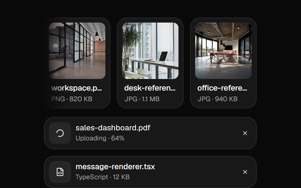 Attachmentshadcn/ui · ReactDisplays a file or image attachment with media, metadata, upload state, and actions.
 CheckboxdaisyUI · CSS (Tailwind)
 AutocompleteHeroUI · ReactAn autocomplete combines a select with filtering, allowing users to search and select from a list of options
 CheckboxReact Spectrum · ReactCheckboxes allow users to select multiple items from a list of individual items, or to mark one individual item as…
 Autocompletecoss ui · ReactAn input that suggests options as you type.
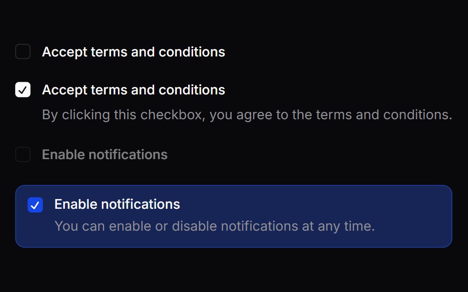 CheckboxOrigin UI · ReactA control allowing the user to toggle between checked and not checked.
 DropdownPreline UI · JavaScript (HTML + Tailwind)
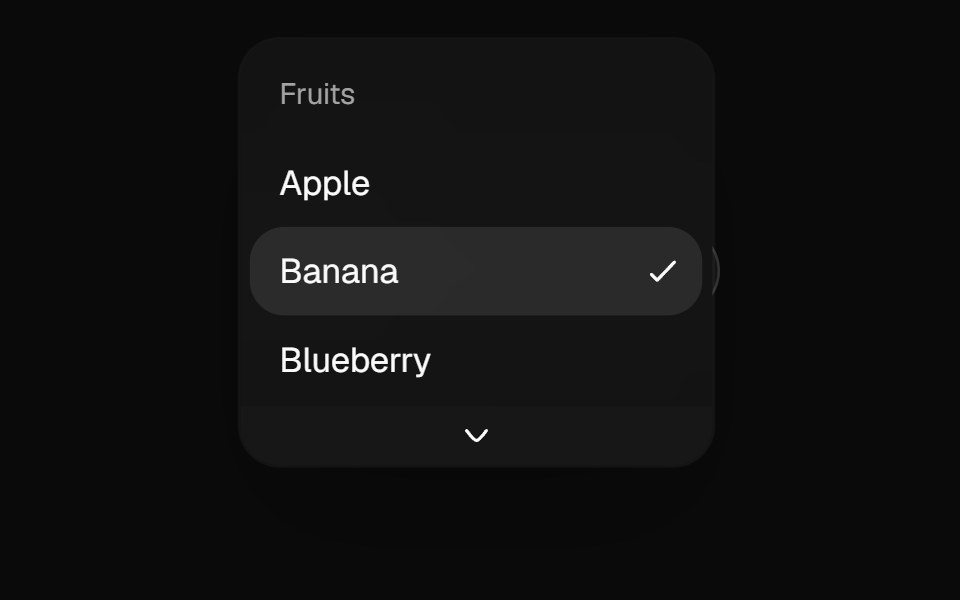 Base SelectCult UI · ReactBase UI select primitives used by Halo Select
 CheckboxTremor · React
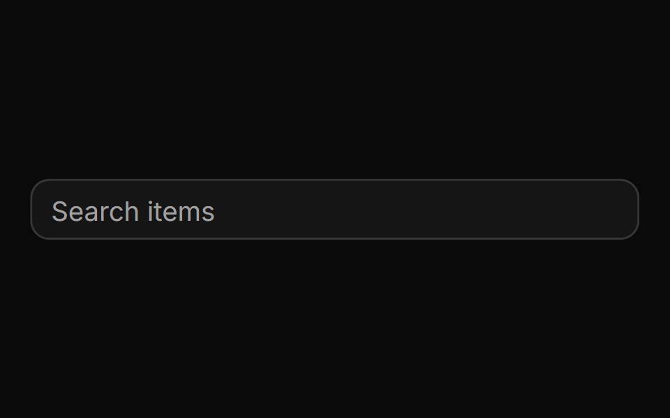 AutocompleteReUI · ReactAn input that suggests options as you type.
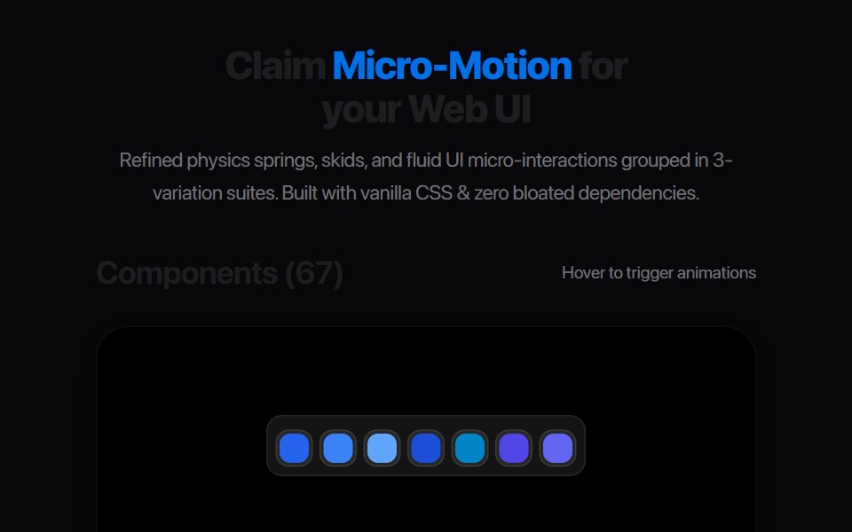 Ab Segmented TabsAmicro Micro Transitions · ReactSegmented control where active letter (A or B) slides into a solid pill.
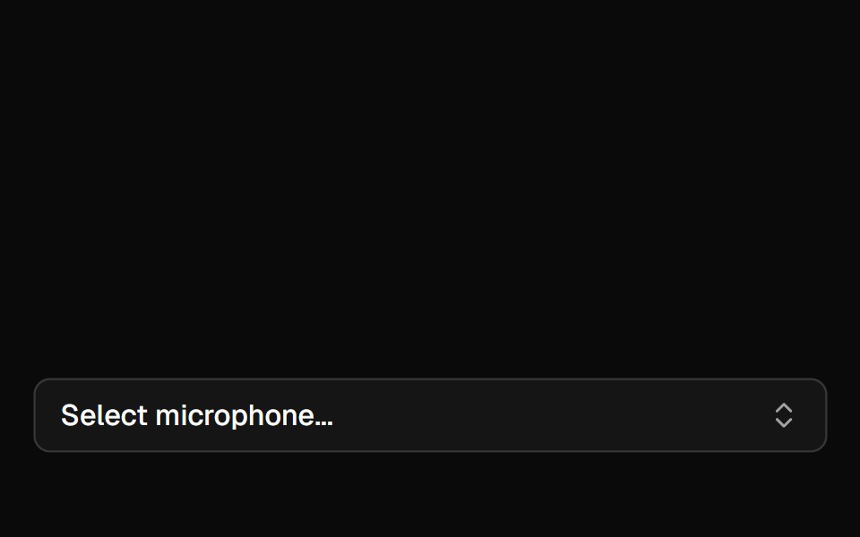 Mic SelectorAI Elements · ReactA composable dropdown component for selecting audio input devices with permission handling and device change detection.
 Command PaletteKokonut UI · React⌘K command palette with nested pages, fuzzy matching and in-row progress for running actions.
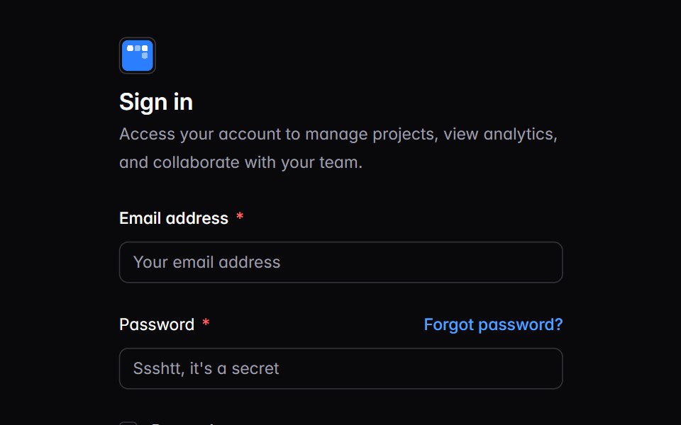 auth-01Intent UI · Reactauth-01
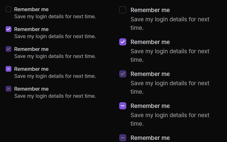 CheckboxUntitled UI React · React
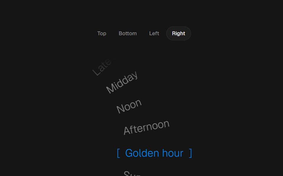 Arc PickerbeUI · ReactRadial text picker with top, bottom, left or right curves, smooth wheel movement and live selection on each scroll…
 CheckboxTailGrids · ReactA checkbox component with label and multiple states.
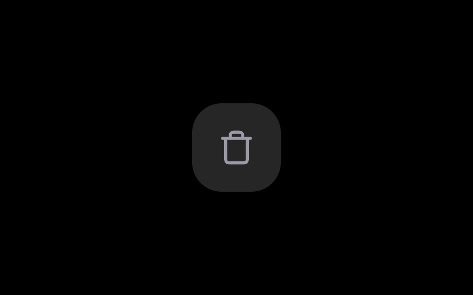 Delete ButtonRare UI · ReactA delete button that asks for confirmation in place, no dialog needed.
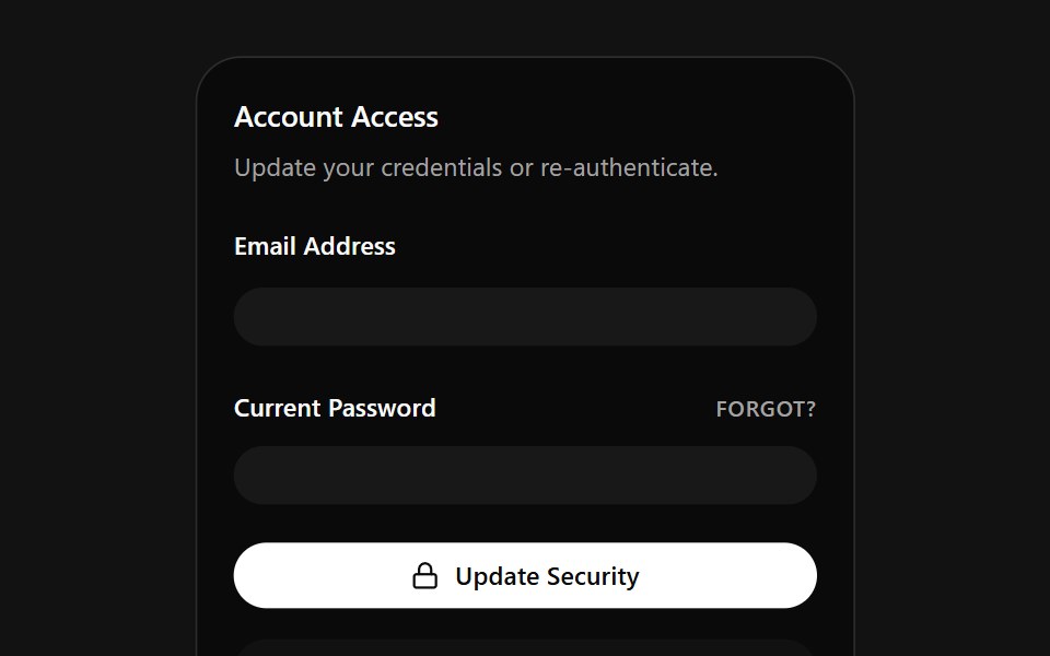 Account Access CardSpectrum UI · ReactA credentials card that auto-fills email and password on a loop, with a danger zone.
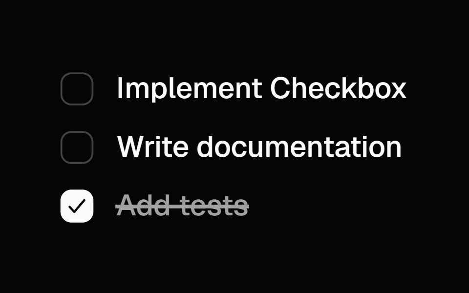 Animated CheckboxSpell UI · ReactAnimated checkbox with spring transitions and strike-through text effect.
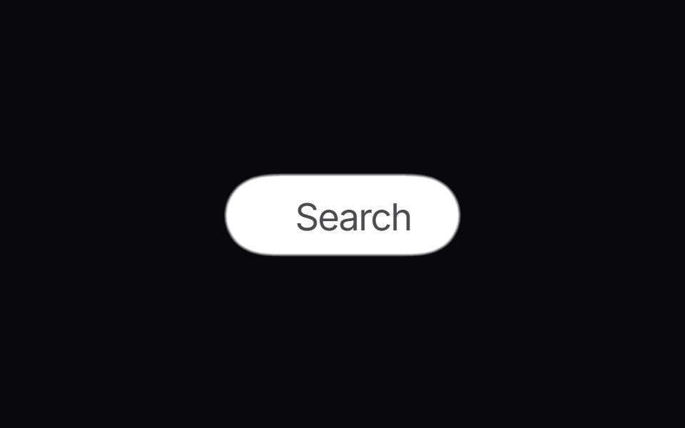 Gooey SearchVengeance UI · ReactMorphing gooey blob search button with animated results
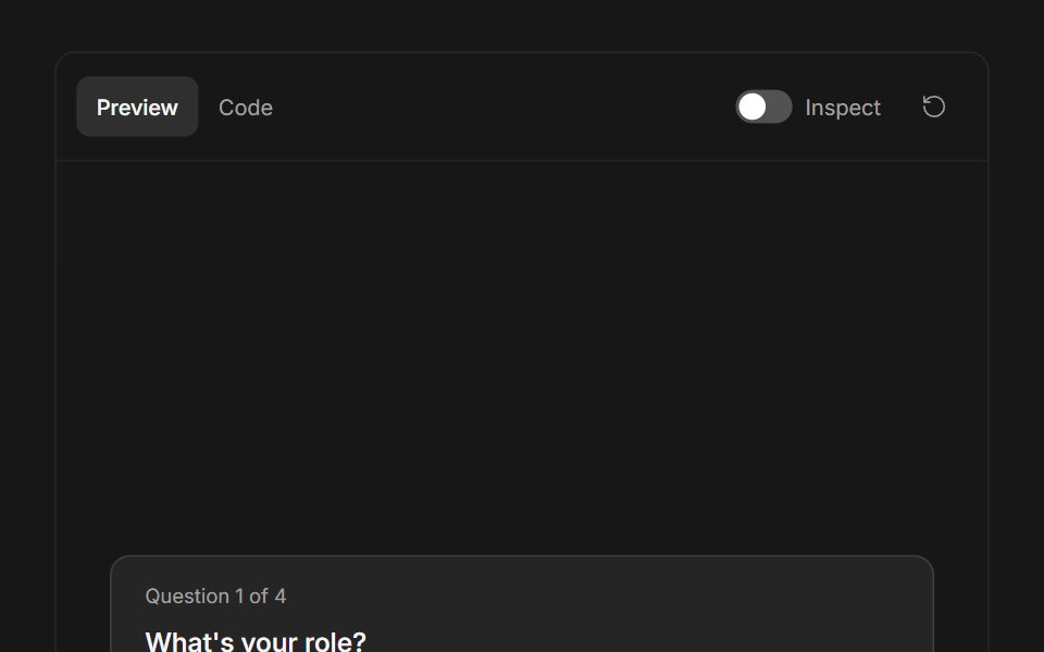 Ask User QuestionsFluid Functionalism · ReactStepped question flow with numbered options, keyboard shortcuts (1–9), single or multi-select, inline 'other' text…
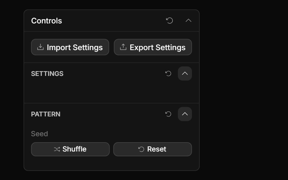 Actions ControlToolcraft · React
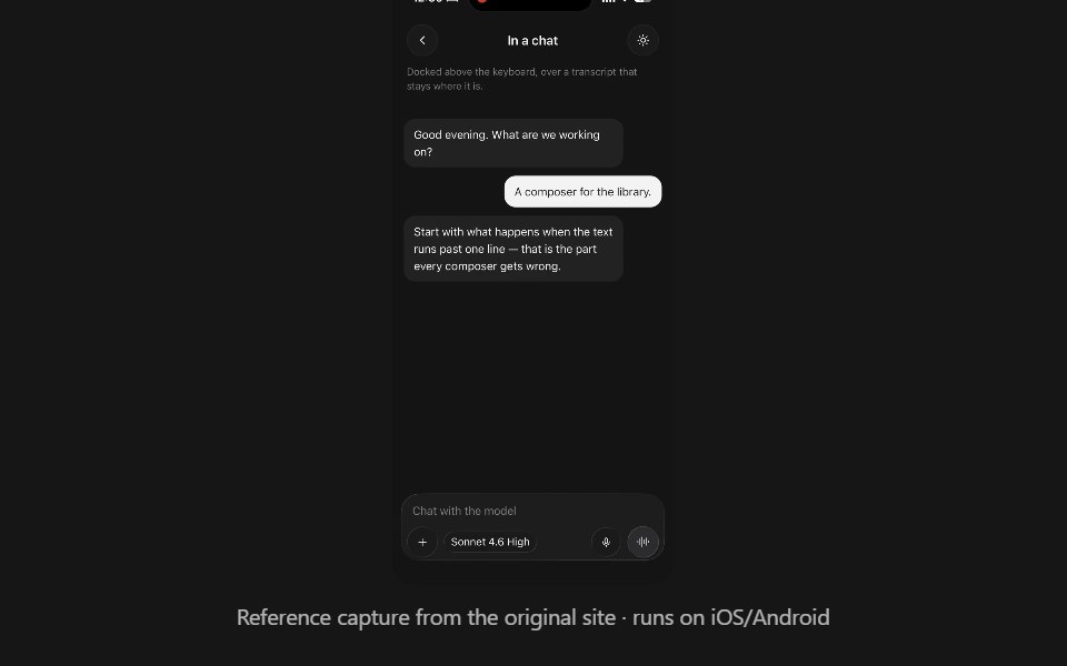 Ai InputPanel UI · React NativeA prompt composer: a field that grows to five lines, a row of controls, and the sheet they open.
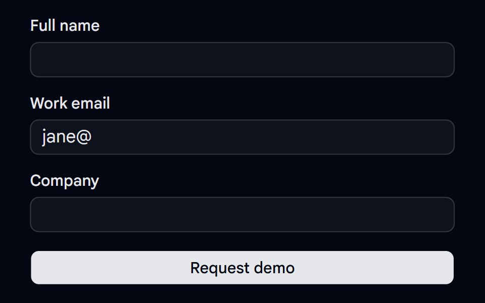 Alert 18 - Form Error SummaryShadcn Space · ReactForm error summary alert that lists every invalid field with links that focus it, receives focus on submit, and clears…
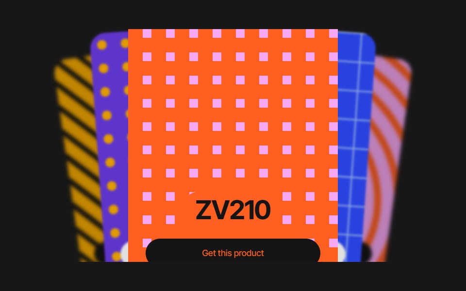 Cards SliderPixel Perfect · ReactCards Slider — an infinite deck of product cards. The active card sits
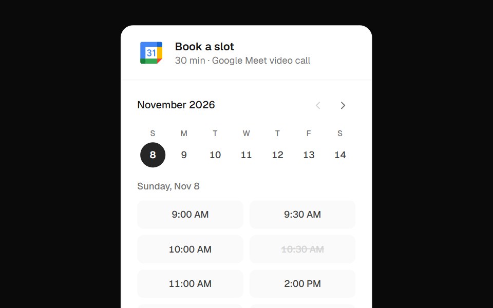 Booking Slot CalendarOpenSourceUI · React
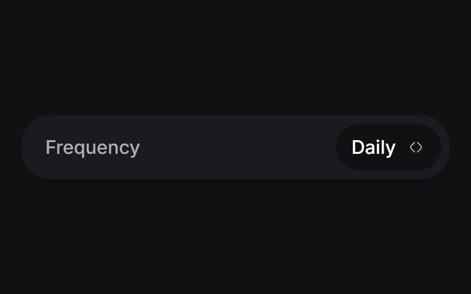 Day Pickeruselayouts · ReactA custom day picker component with smooth animations.
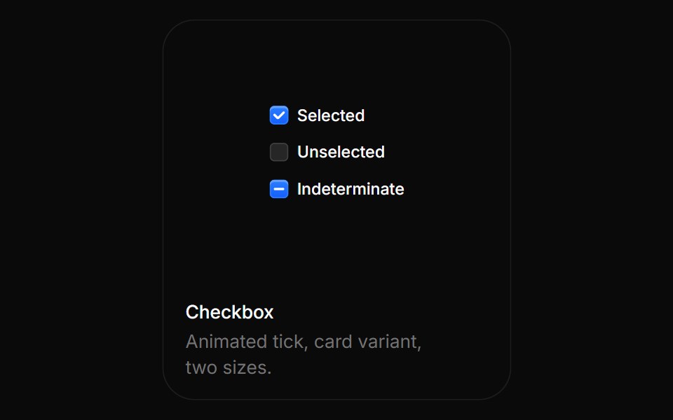 CheckboxBoardUI · ReactAnimated tick, card variant, two sizes.
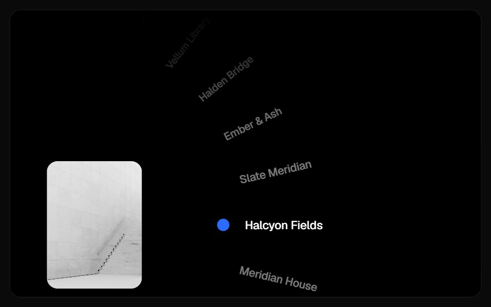 Wheel CarouselComponentry · ReactA cinematic rotating-wheel picker with inertial drag, curved fading labels, and crossfading project imagery.
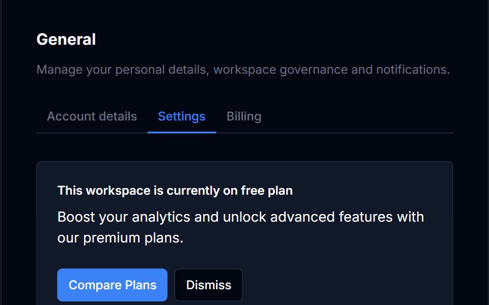 CheckboxTremor Blocks · React
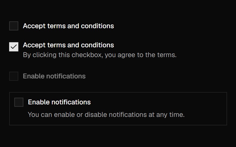 CheckboxShadcn Dashboard · React
 Contact Onecnblocks · SvelteContact form with input fields and submit button
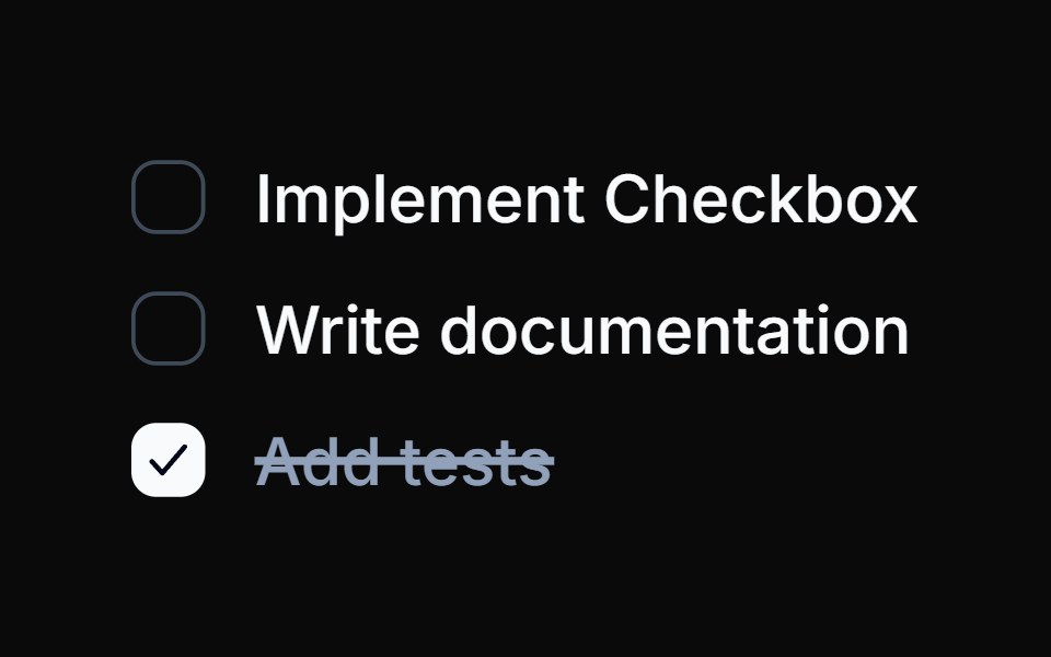 Spell Animated CheckboxAnimations (Svelte) · Svelte
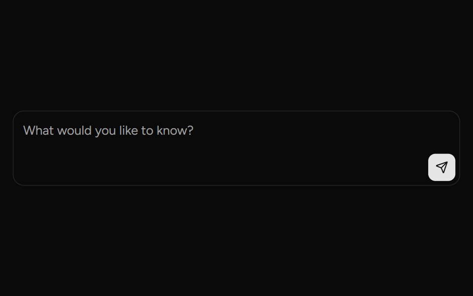 Prompt InputAI Elements (Svelte) · SvelteA composable prompt input surface with attachments, action menus, and provider-driven text handling.
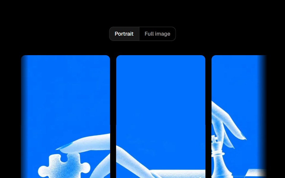 Parallax SliderObsidianUI · ReactA full-width image slider where each slide moves with a parallax offset, driven by drag, arrows or keys.
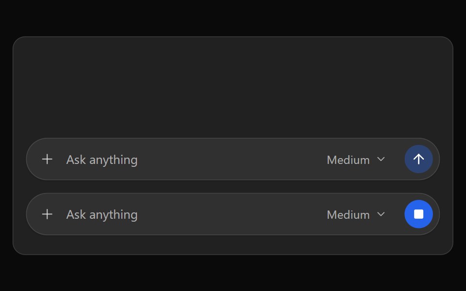 ChatGPT ComposerNotra · ReactThe pill-shaped Ask anything input with model picker and send button.
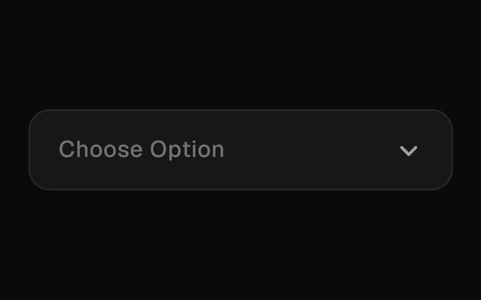 Animated SelectGreatUI · React
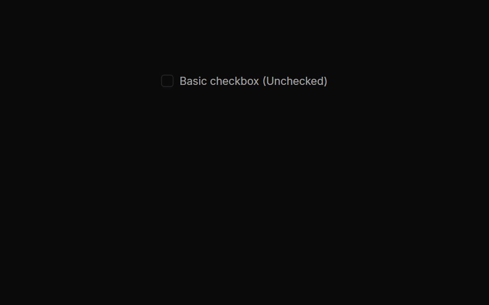 Checkboxes 01Oxbow UI · AstroBasic Checkbox with State Tracking
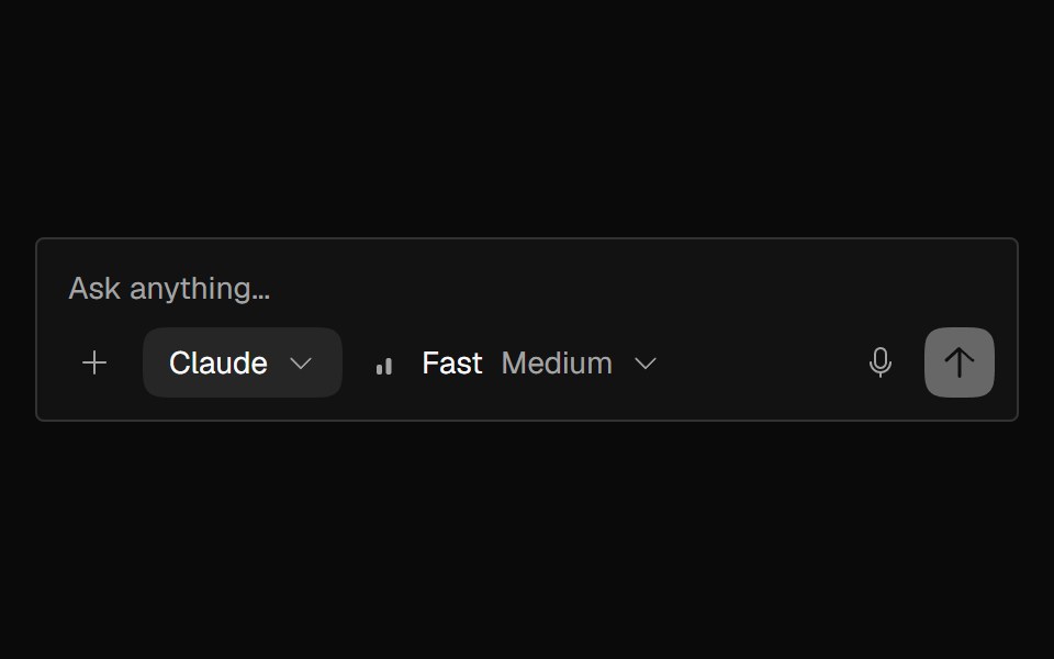 AI InputNexvyn UI · ReactAI composer textarea with auto-grow, send/stop button morph, attachment slots, and Enter-to-send.
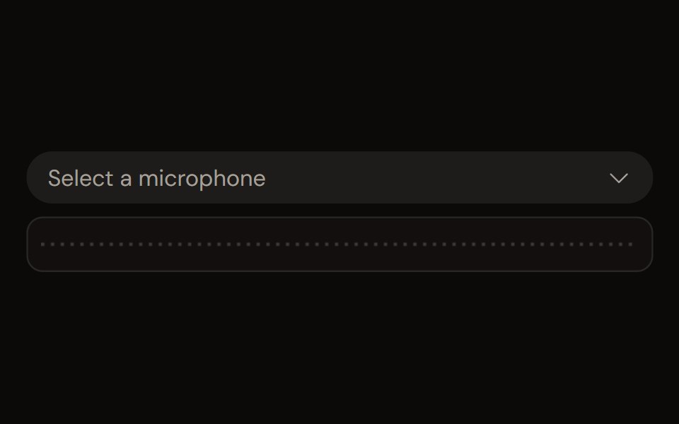 Audio Device Selectaudiocn · ReactA microphone, speaker or source picker with loading, permission, None and disconnected-device states, and a slot for a…
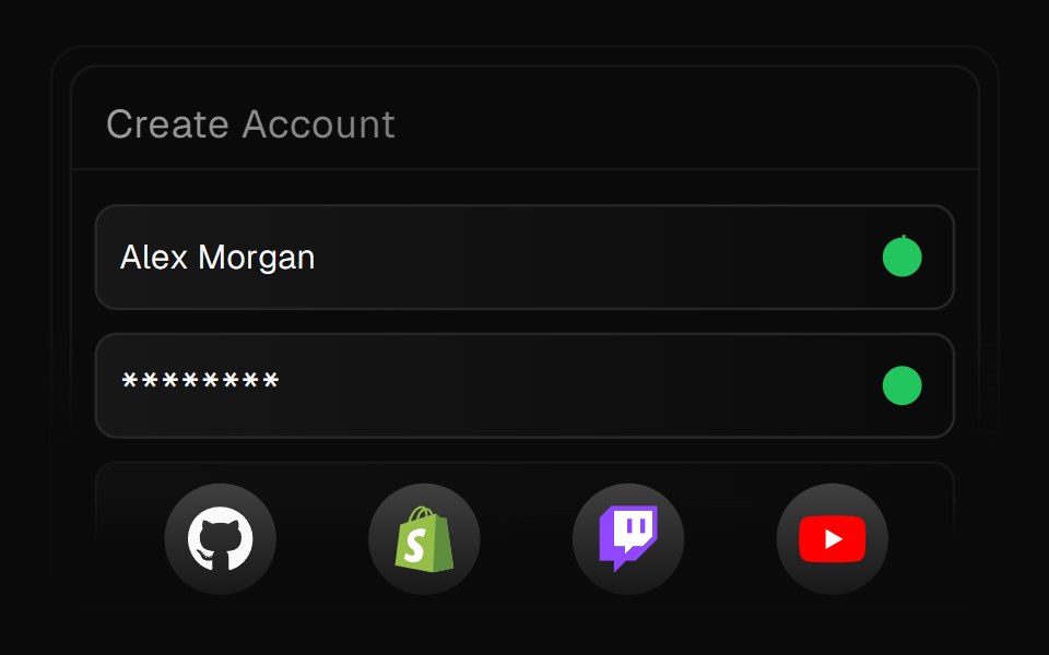 Animated FormForge UI · ReactAnimated form mimicking account creation with progressive name/password animation and completion checkmarks.
 checkboxBaseLayer · ReactA checkbox allows a user to select multiple items from a list of individual items, or to mark one individual item as…
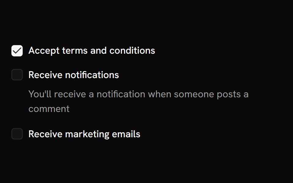 CheckboxShark UI · ReactControl for multiple selections in a set.
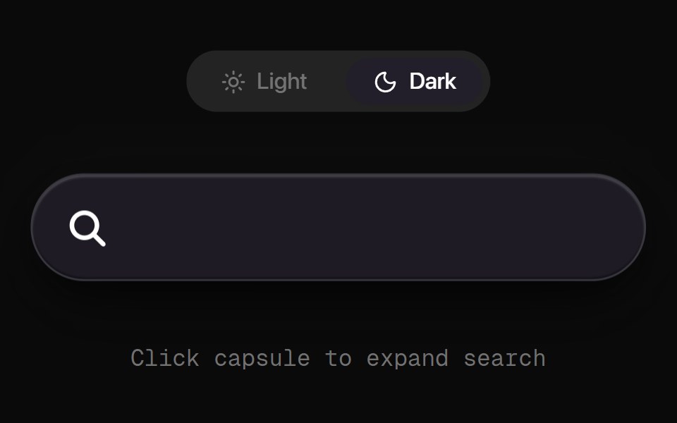 Morph Search CapsuleRewamp UI · ReactSleek, tactile search pill capsule with click ripple physics and a buttery-smooth fluid SVG morph transition between…
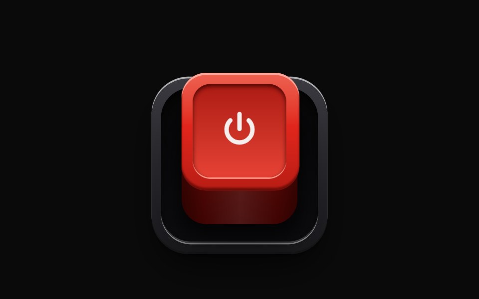 RealisticSwitchEvil Buttons · ReactA latching push switch, a raised box that sinks into its socket when pressed, stays down and glows while on, and…
 Gooey Color Picker23rd.dev · ReactA floating color picker with a circular hue wheel, alpha slider, hex field, and motion-powered open/close.
 Animated CheckboxSona UI · ReactAn accessible Base UI checkbox with a drawn checkmark and a restrained animated state change.
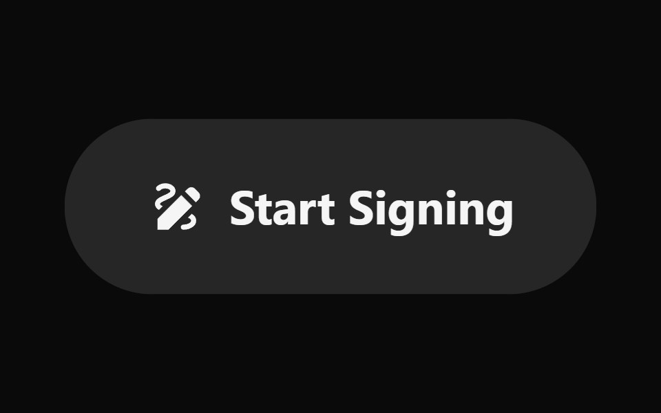 Draw SignatureWatermelon UI · ReactSignature pad to draw a signature with the mouse or finger.
 Auth Fivesv-efferd · SvelteA split-screen auth experience with animated background paths and broader provider options.
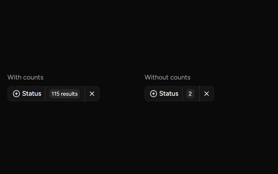 Data Table Faceted Filtersv-table · SvelteA searchable multi-select filter with live counts for categorical table columns.
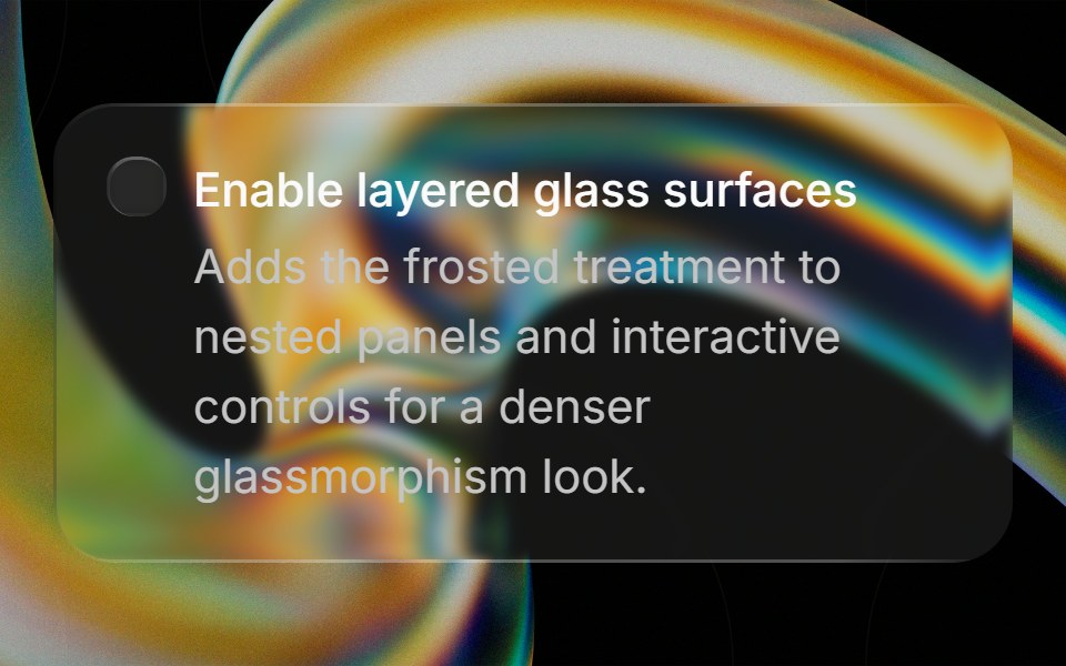 Glass Checkboxglasscn · ReactGlass Checkbox with five variants: clear, frosted, subtle, liquid, and liquid-refract
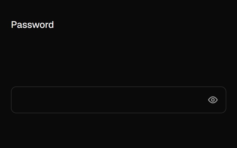 Caps Lock WarningUI Lab · ReactA small caps lock key with its light on slides into the field when caps is on.
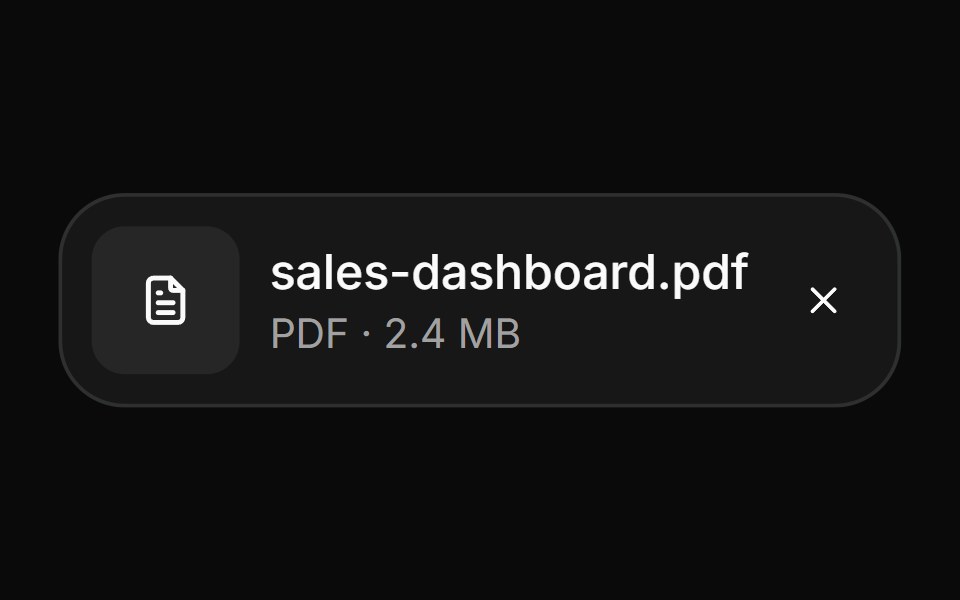 AttachmentHextaUI · ReactFile and image cards for uploads, with progress, states, actions, a full-card trigger and names that keep their…
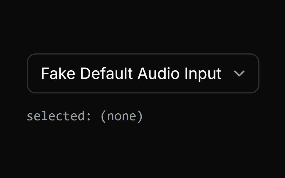 Mic SelectorLocalMode · ReactA microphone input-device picker with permission handling and live device enumeration — fully offline, using only…
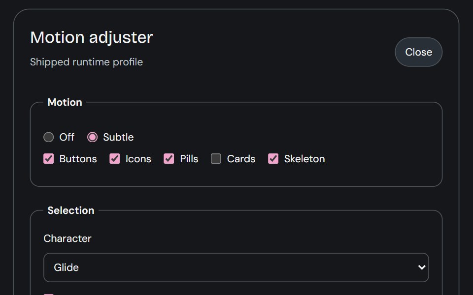 Motion AdjusterCojeev UI · ReactProvides live controls for the shared motion settings and editable body profiles used across the library.
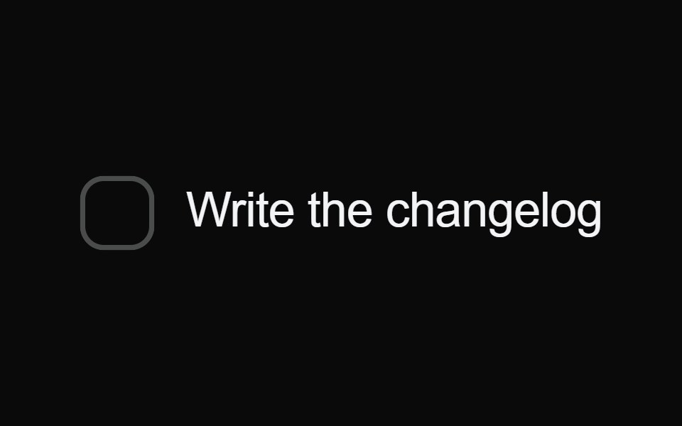 Bounce CheckboxMicroKit · ReactA checkbox whose fill springs out past the box with a little swell, draws its tick, then strikes the label through and…
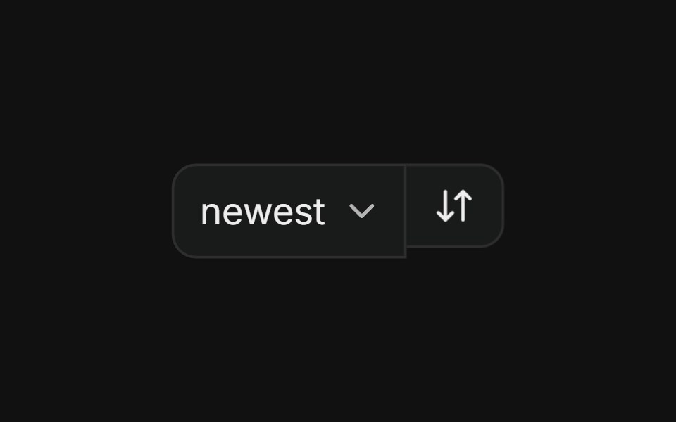 With selectFLX UI · ReactSort dropdown paired with a direction-toggle icon button in a merged-border row.
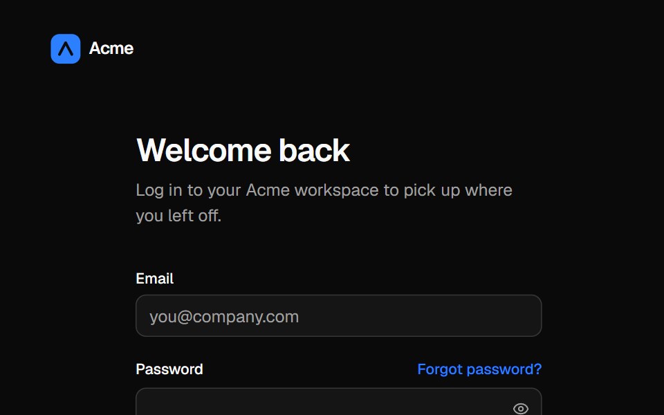 Split login pageVelora UI · ReactLogin form with password reveal, remember-me and social sign-in beside an aurora testimonial panel.
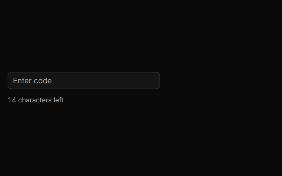 Characters Remaining Countsv-particles · SvelteText input that shows how many characters are still left before the limit.
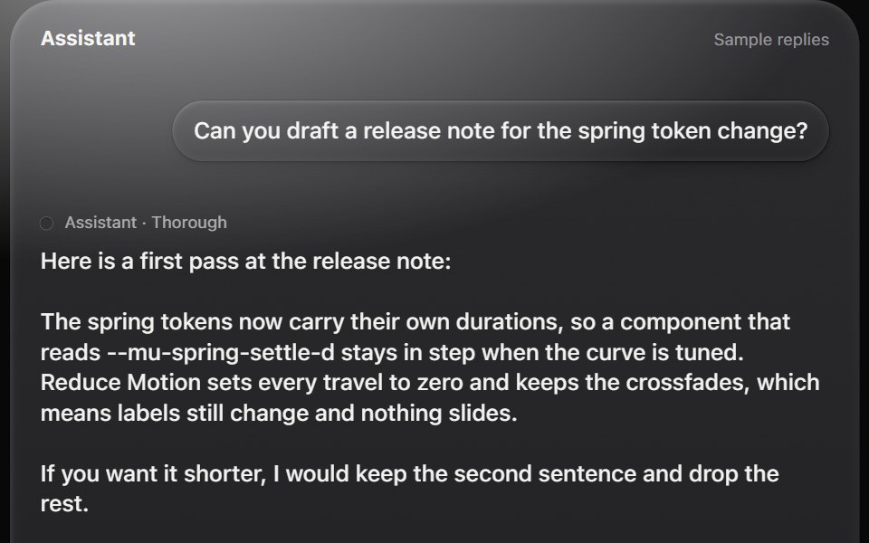 AI composerMetal UI · React + SwiftUIA chat block: a composer that grows, attachments, a model choice, and replies that stream in word by word with stop…
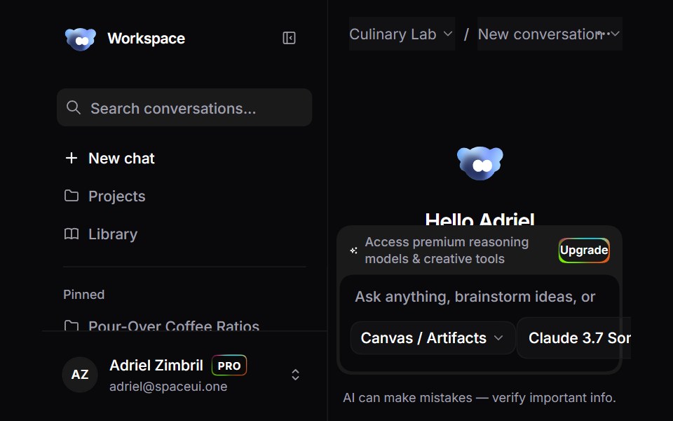 Ai Chat WorkspaceSpaceUI · ReactFull-featured AI Studio chat workspace template featuring conversational threads, multi-model selection, real-time…
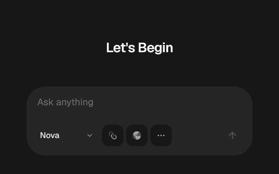 AI Chat BoxSkecher UI · ReactA polished AI prompt composer with model controls, attachments, and animated interaction states.
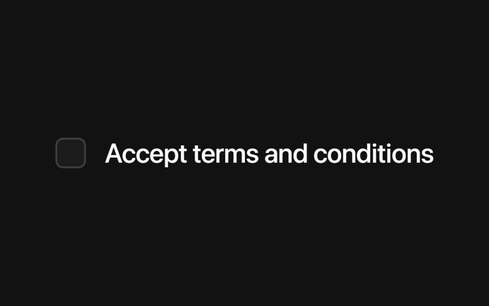 Base CheckboxSora UI · ReactAn accessible, stylable checkbox built on Base UI with a Motion-friendly animated indicator.
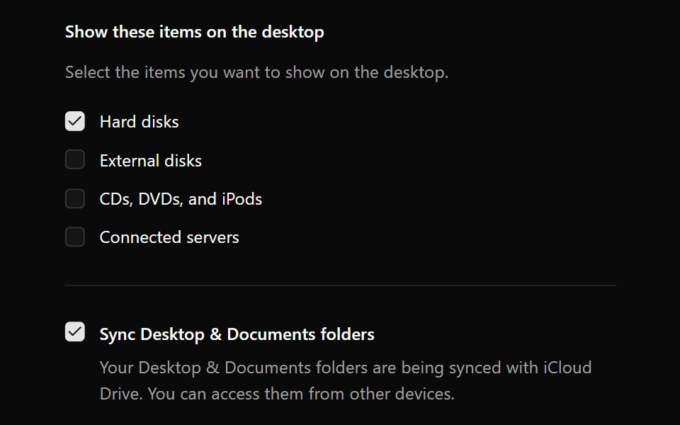 CheckboxOUI · ReactReact aria components Checkbox with shadcn characteristics.
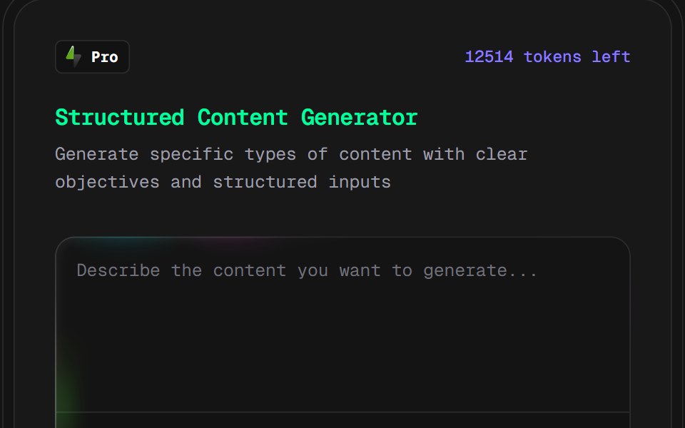 AI Content Creator CardD2Studio UI · ReactPro version content creation card
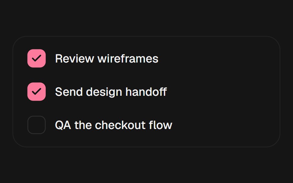 CheckboxEaseUI · ReactCheckbox on a real checkbox input, with a check mark that pops in rather than just appearing.
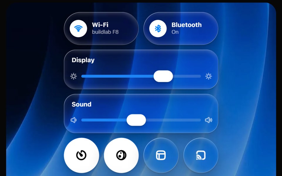 Glass Control CenterOpaline · ReactmacOS-style Control Center kit — glass modules, toggles, light-filled sliders and buttons.
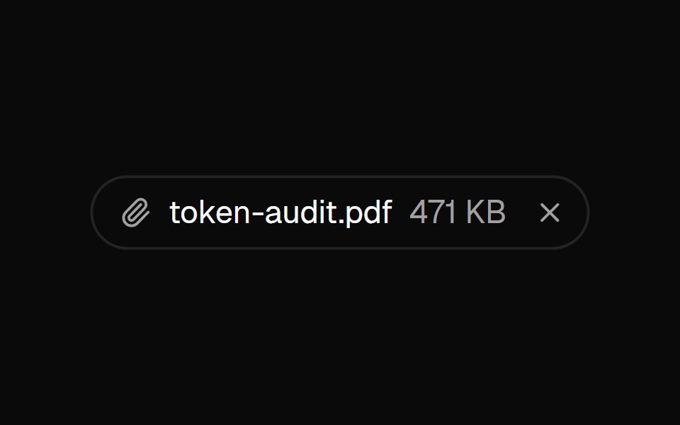 AttachmentFibo · ReactOne added file as a chip or an image thumbnail, with its upload status and buttons to remove or retry.
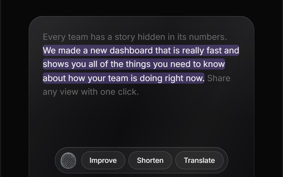 AI Edit ReviewReactFrame · ReactAn AI text editor that rewrites a selected passage, streams a word-level diff review with accept/reject actions, and…
 File UploadAceternity UI · React
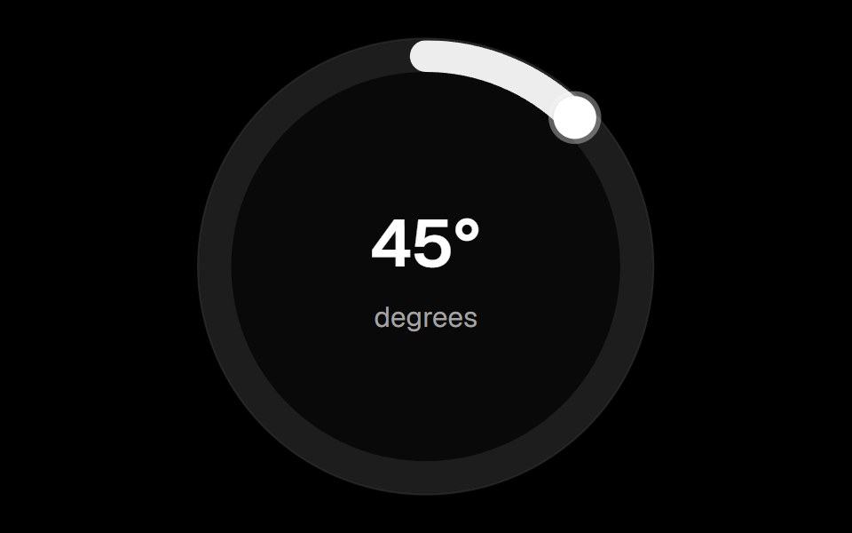 Angle Sliderark-cn · ReactA shadcn-style angle slider component built with Ark UI primitives.
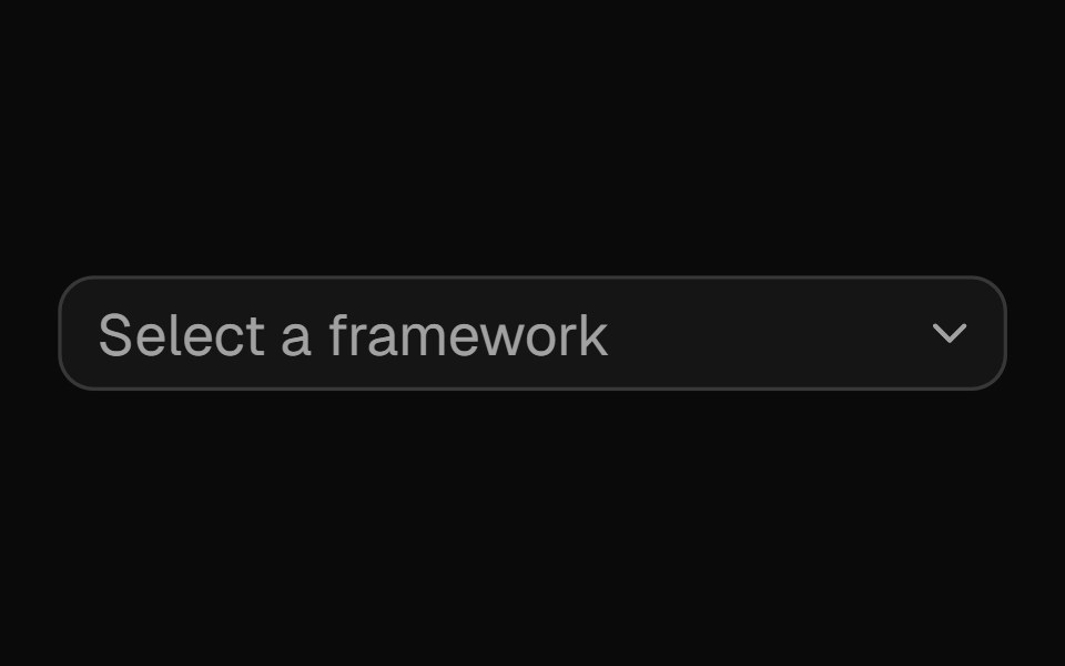 Comboboxshadcn/ui · ReactAutocomplete input with a list of suggestions.
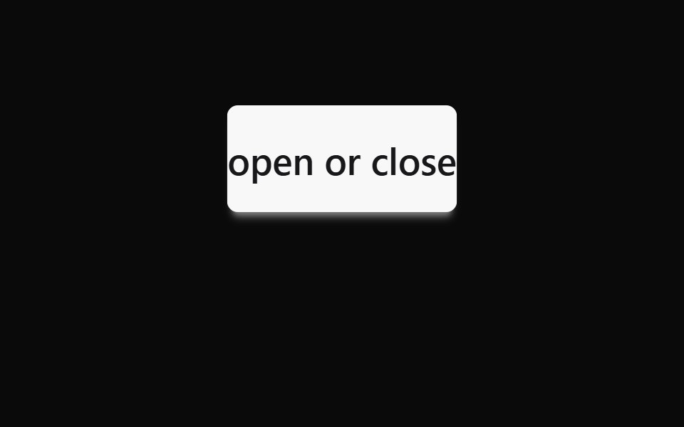 DropdowndaisyUI · CSS (Tailwind)
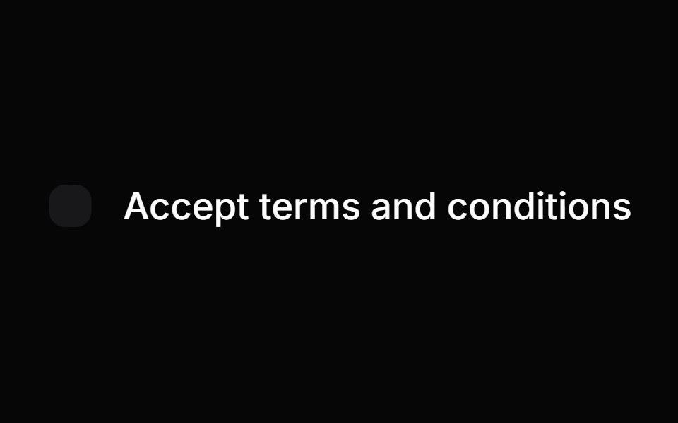 CheckboxHeroUI · ReactA selectable control that allows users to toggle between checked and unchecked states.
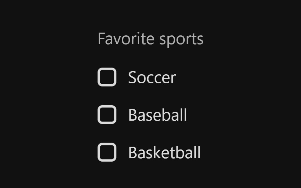 Checkbox GroupReact Spectrum · ReactA CheckboxGroup allows users to select one or more items from a list of choices.
 Checkboxcoss ui · ReactA control allowing the user to toggle between checked and not checked.
 InputOrigin UI · ReactA native input element.
 File UploadPreline UI · JavaScript (HTML + Tailwind)
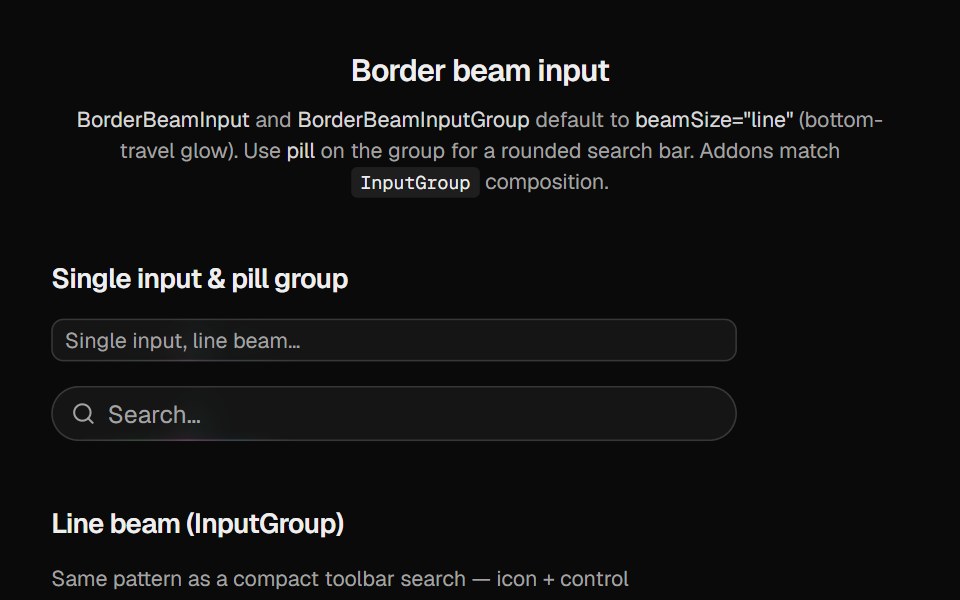 Border Beam InputCult UI · Reactborder-beam on Base UI input and input-group primitives with line or full border glow
 Date PickerTremor · React
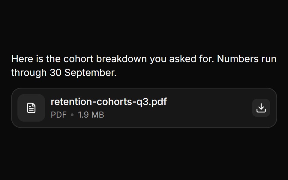 Single file attachment in an assistant replyReUI · ReactSingle file attachment in an assistant reply
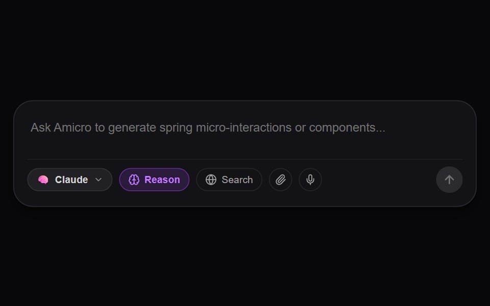 AI Prompt Input StudioAmicro Micro Transitions · ReactDynamic auto-expanding AI textarea with model switcher, live voice dictation wave pulse, web search & deep thinking…
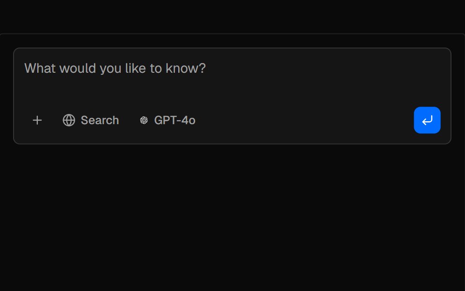 Prompt InputAI Elements · ReactAllows a user to send a message with file attachments to a large language model. It includes a textarea, file upload…
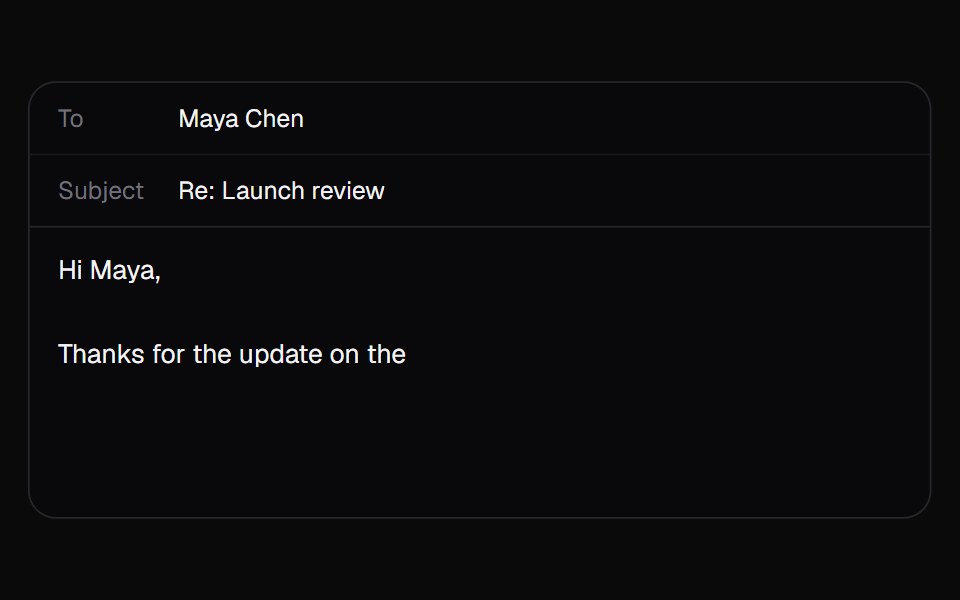 AI AutocompleteKokonut UI · ReactA text box that suggests how your sentence ends in grey after the caret. Tab takes it all, the right arrow takes one…
 auth-02Intent UI · Reactauth-02
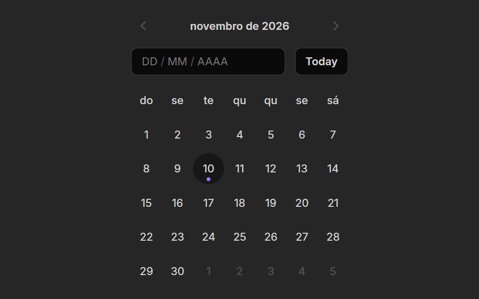 Date PickerUntitled UI React · React
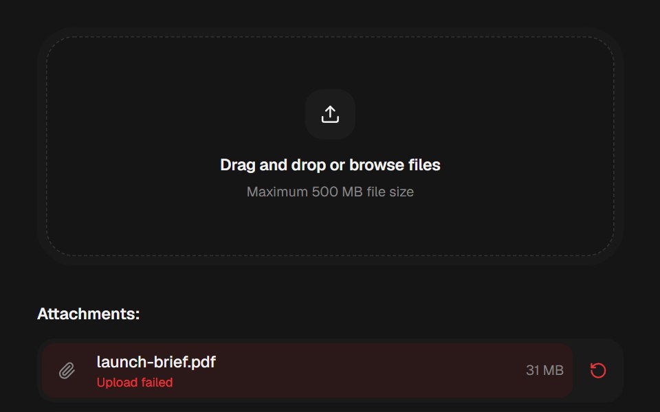 Attachment UploadbeUI · ReactA mixed attachment workspace with a dropzone, staggered file and image rows, animated upload, success, failure, retry…
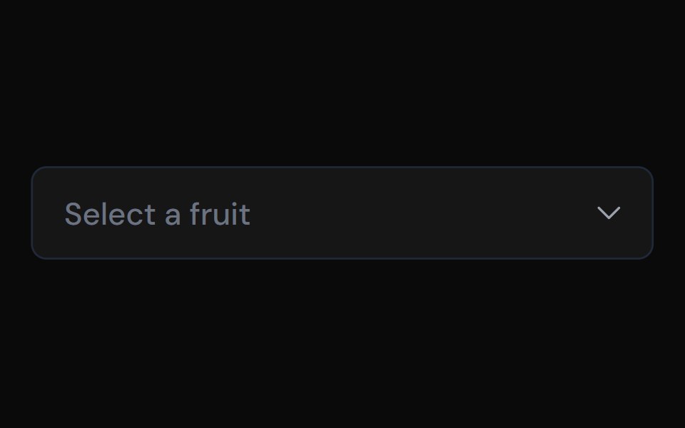 ComboboxTailGrids · ReactA combobox component with multiple variants.
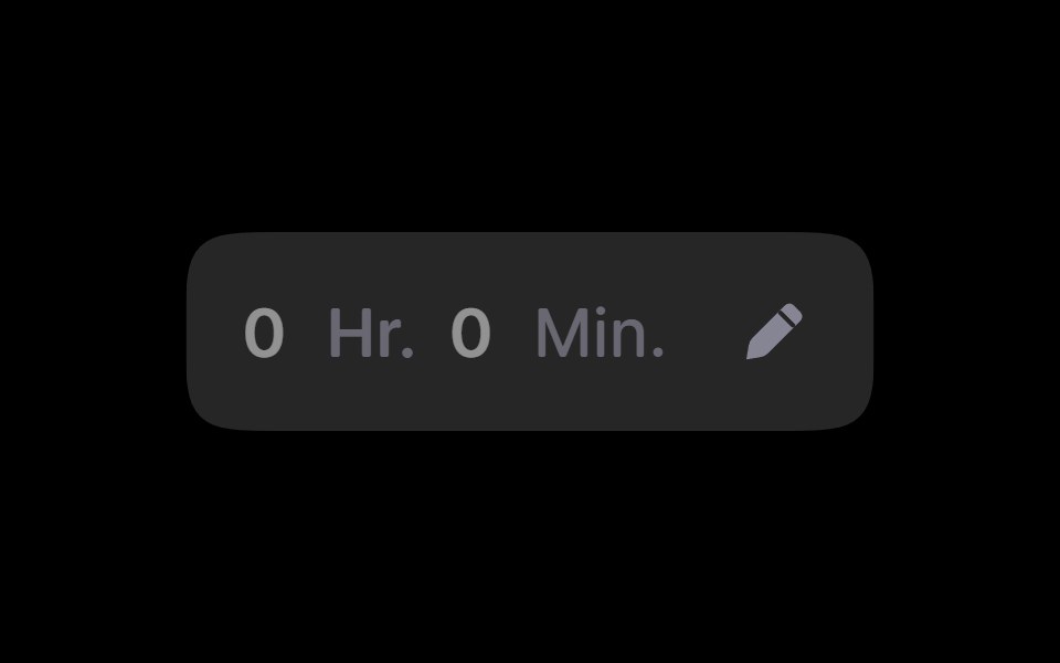 Duration PickerRare UI · ReactA gooey, spring-animated picker for entering a duration in hours and minutes.
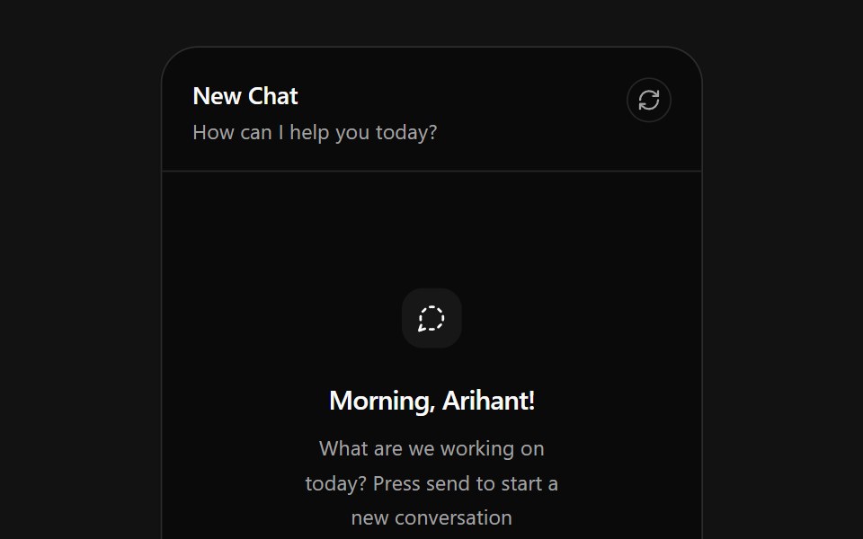 AI Chat CardSpectrum UI · ReactAn AI chat card that types prompts into its composer, with send, attach and reset actions.
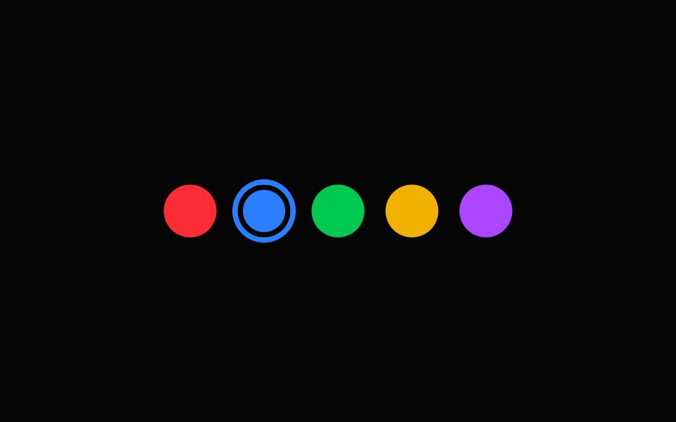 Color SelectorSpell UI · ReactInteractive color picker component.
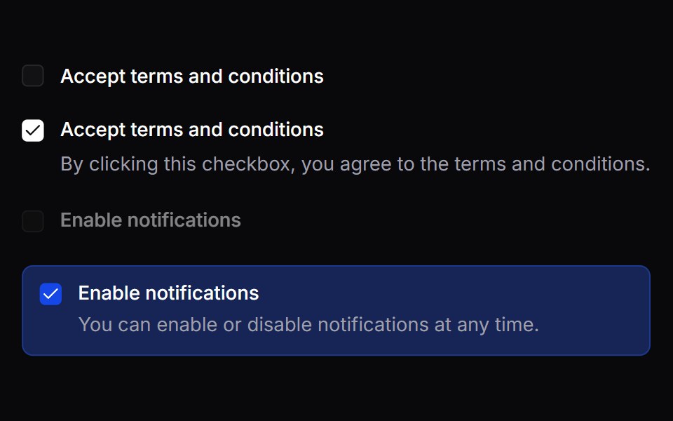 CheckboxVengeance UI · React
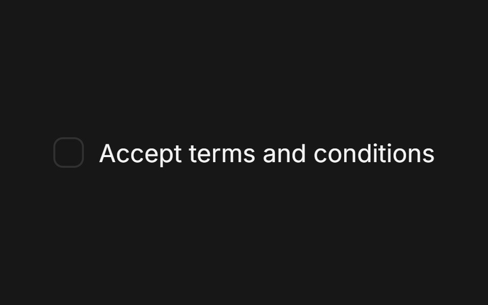 CheckboxFluid Functionalism · ReactA single checkbox: a hairline square that darkens on hover and a check that draws itself. Pairs with Field. Radix…
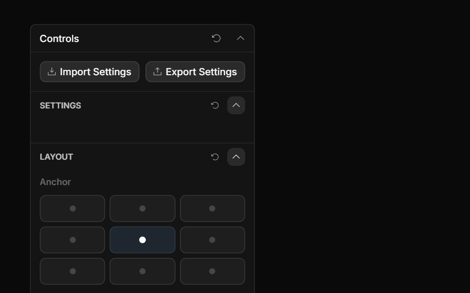 Anchor Grid ControlToolcraft · React
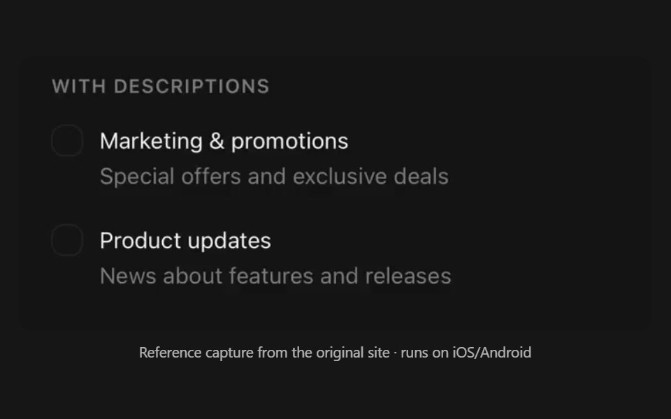 CheckboxPanel UI · React NativeAnimated checkbox, as a row or a selectable card.
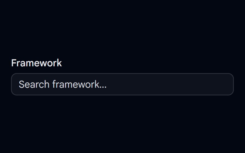 Autocomplete-01 - DefaultShadcn Space · ReactDefault autocomplete component
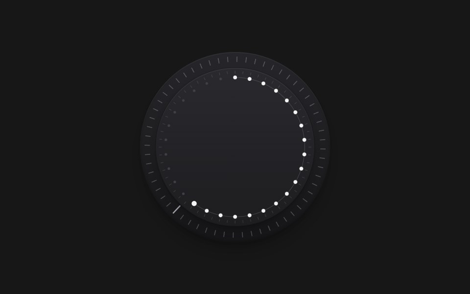 Dial Knob MotionPixel Perfect · ReactTactile rotary knob with layered bevel discs, two tick rings, and an amber dot-arc indicator. Drag or scroll to change…
 Checkbox Field InputOpenSourceUI · React
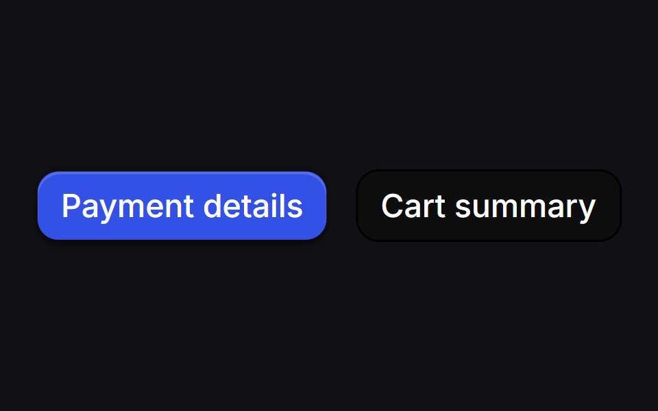 Drawer Buttonsuselayouts · ReactTwo buttons that open side drawers with a 3D fold. Payment comes from the right, cart from the left, and the fields…
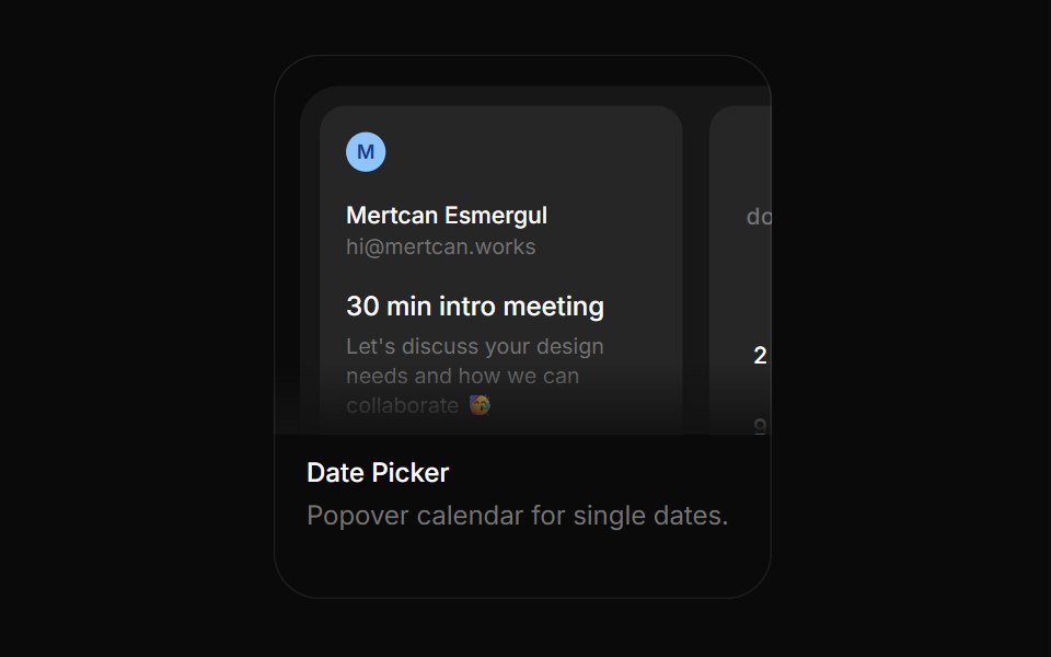 Date PickerBoardUI · ReactPopover calendar for single dates.
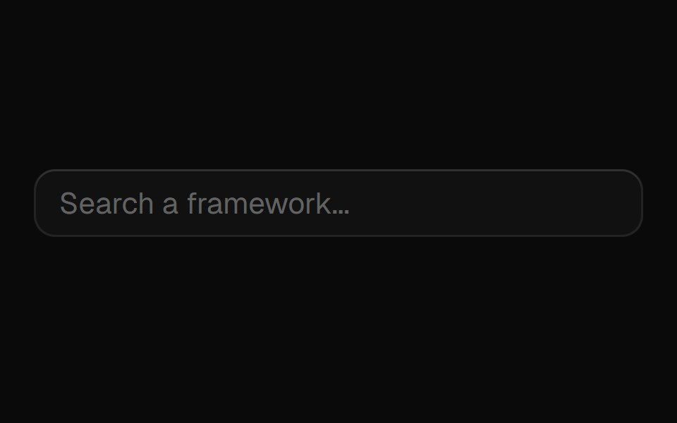 AutocompleteComponentry · React
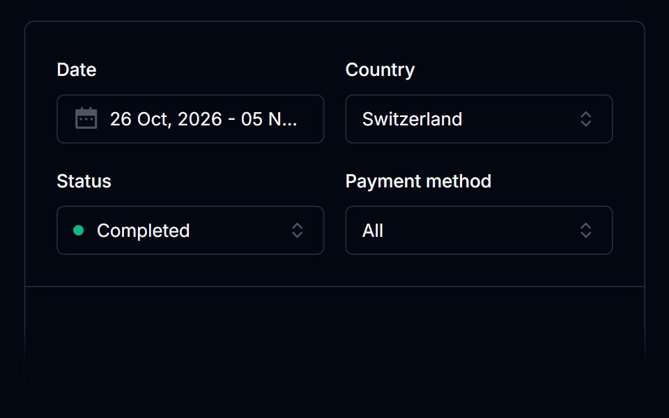 Date PickerTremor Blocks · React
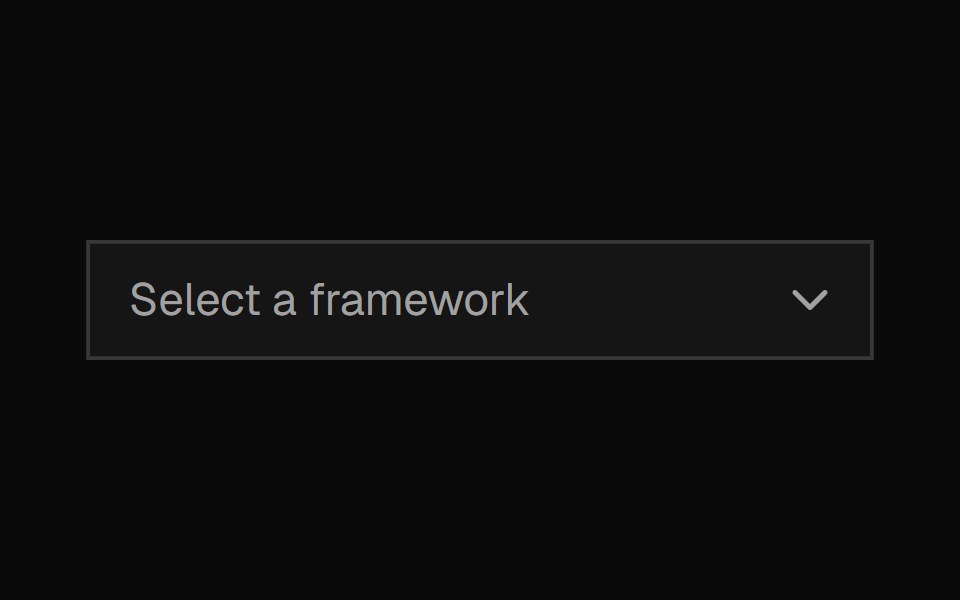 ComboboxShadcn Dashboard · React
 Contact Twocnblocks · SvelteTwo-column contact section with form and info
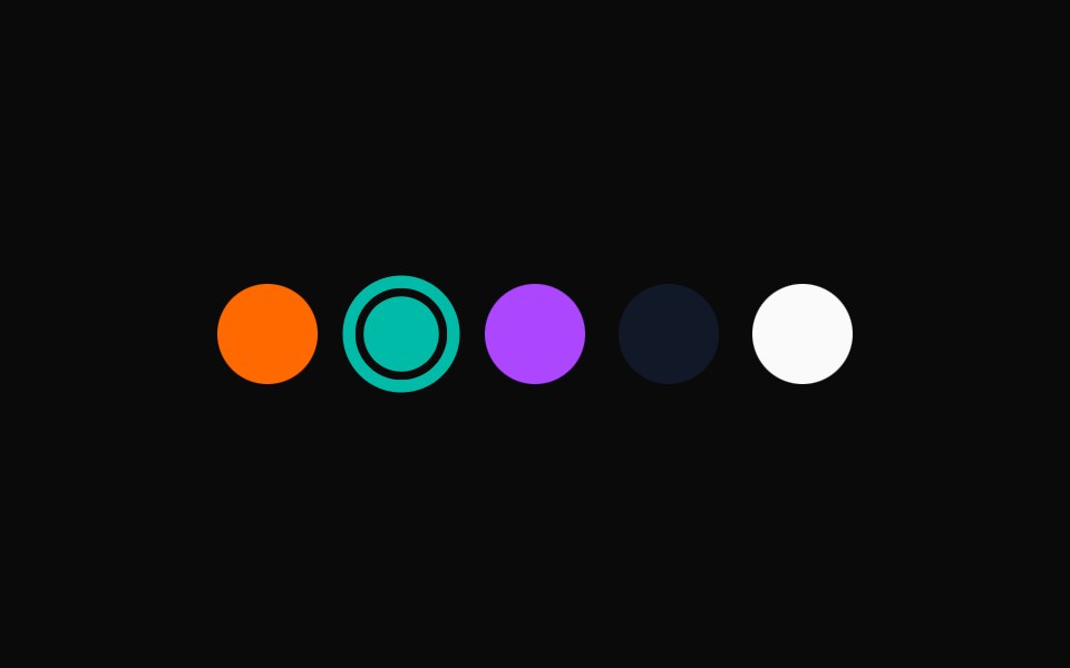 Spell Color SelectorAnimations (Svelte) · Svelte
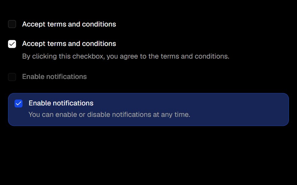 CheckboxObsidianUI · React
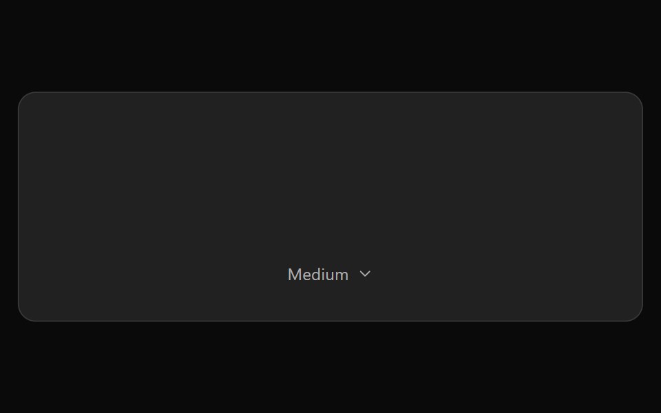 ChatGPT Model SelectorNotra · ReactThe hover-to-open effort chip with Model and Effort submenus, built on shadcn DropdownMenu.
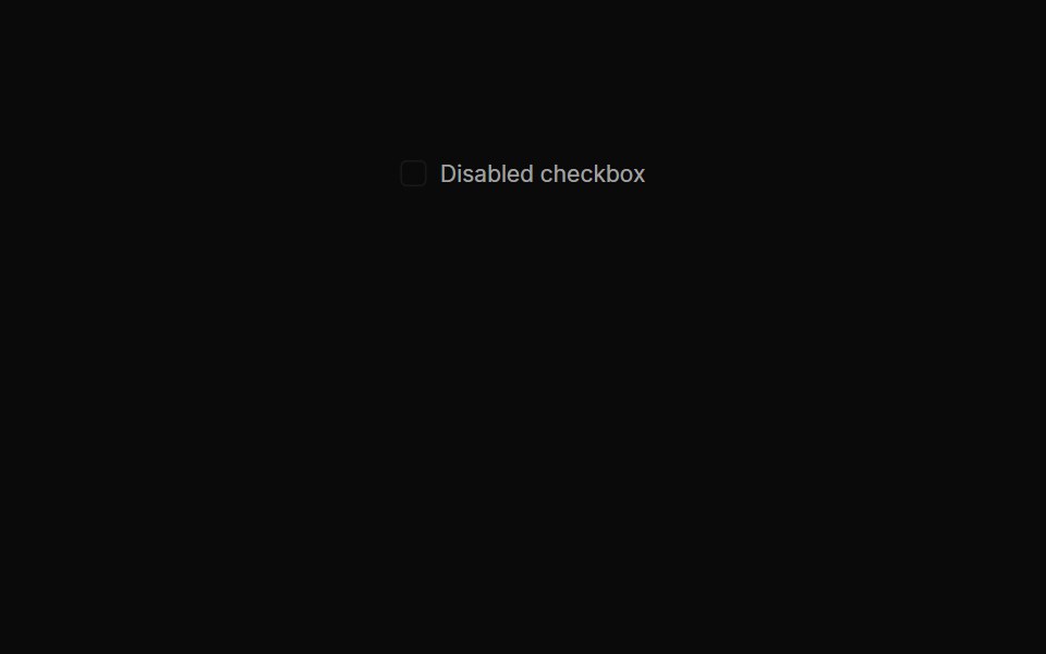 Checkboxes 02Oxbow UI · AstroCheckbox with Disabled State
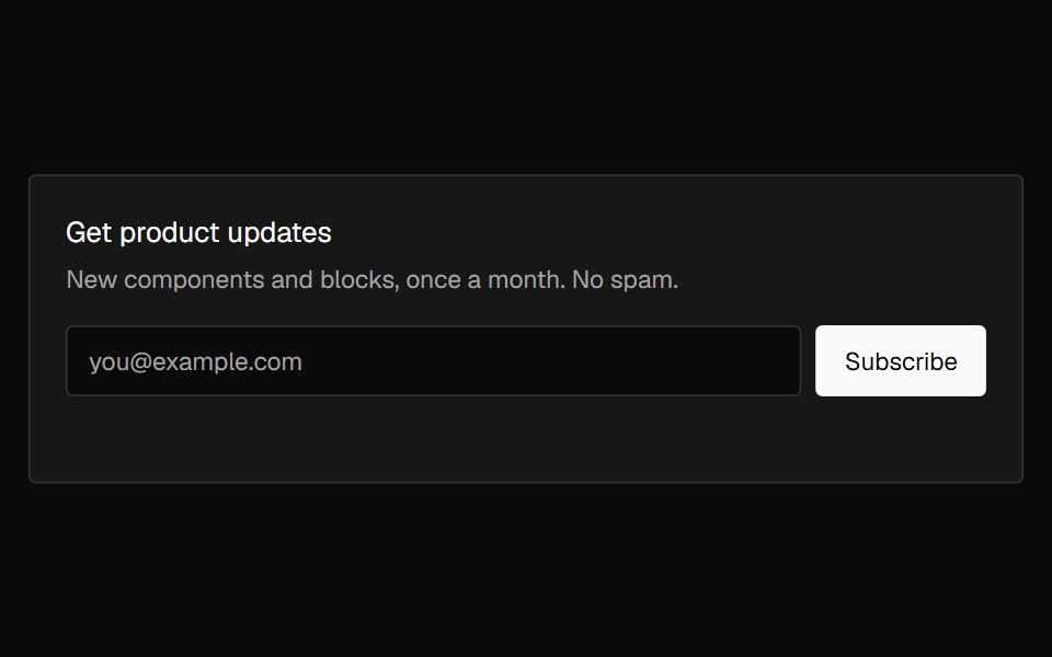 Banner SubscribeNexvyn UI · ReactAn email signup banner with inline validation that crossfades into a confirmation on success.
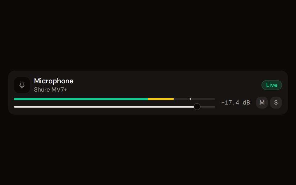 Channel Stripaudiocn · ReactOne channel of a mixer: header, status, meter, fader, value, controls and a notice, as a row or a console strip. The…
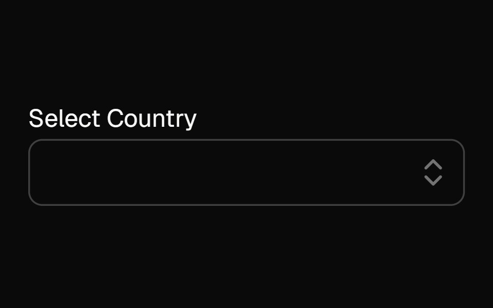 comboboxBaseLayer · ReactA combo box combines a text input with a listbox, allowing users to filter a list of options to items matching a query.
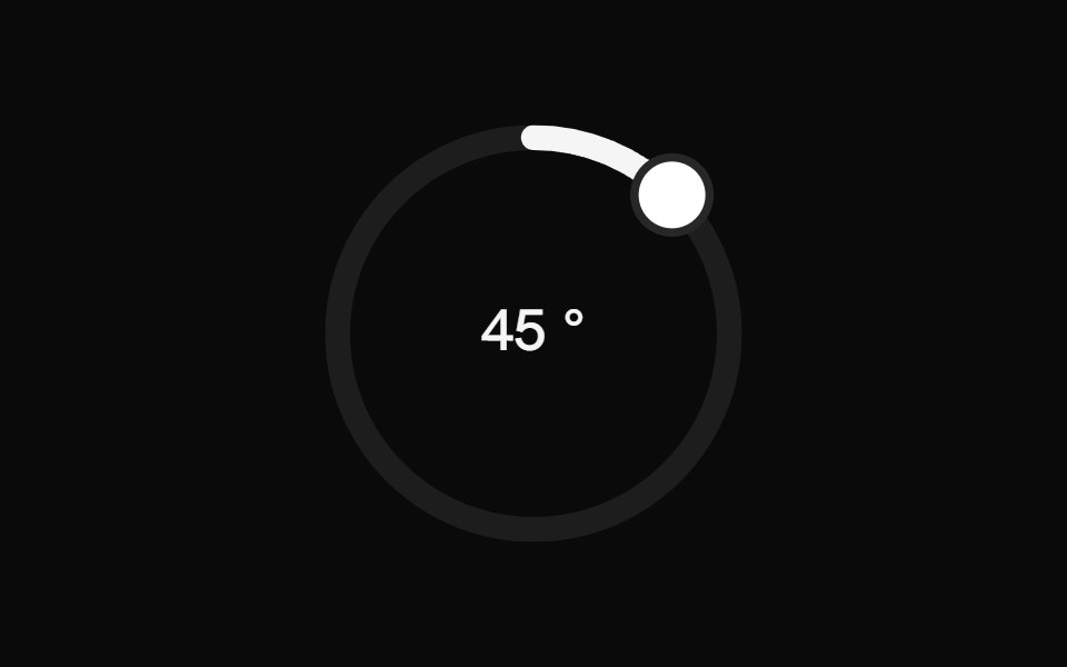 Circular SliderShark UI · ReactCircular slider for selecting values.
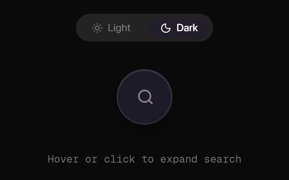 Animated Search DemoRewamp UI · React
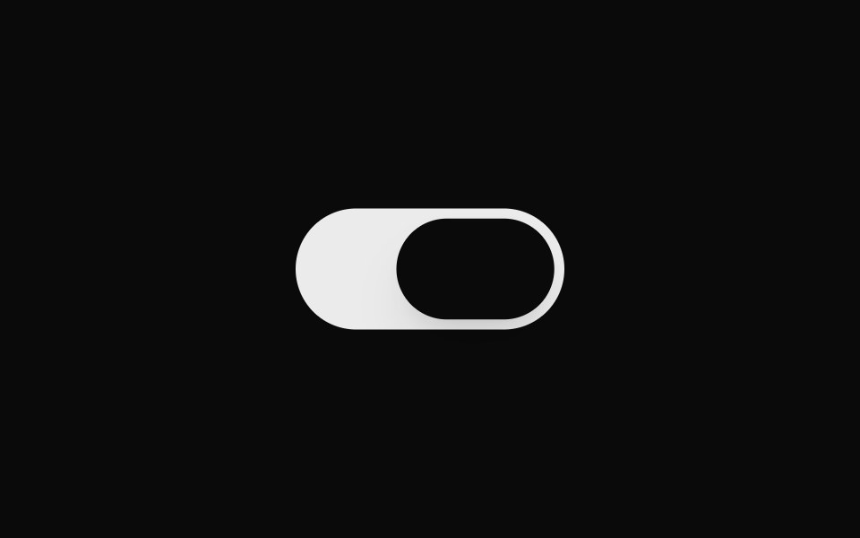 Animated SwitchSona UI · ReactAn interactive iOS-style squish switch built on Base UI Switch primitives, with interruptible press feedback and a…
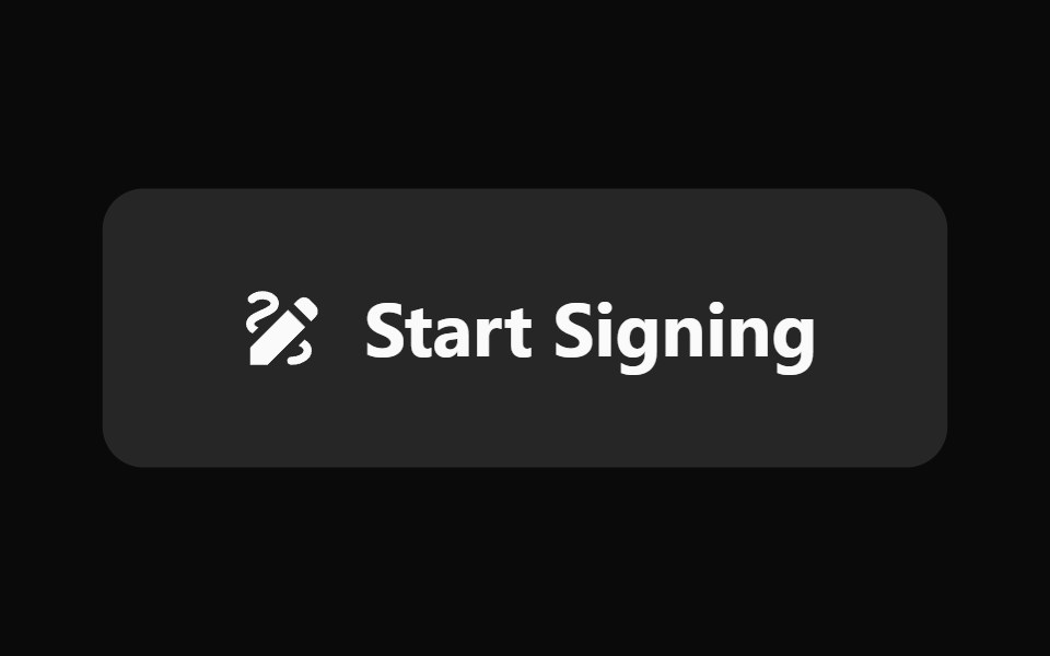 Draw Signature BaseWatermelon UI · ReactSignature pad to draw a signature with the mouse or finger.
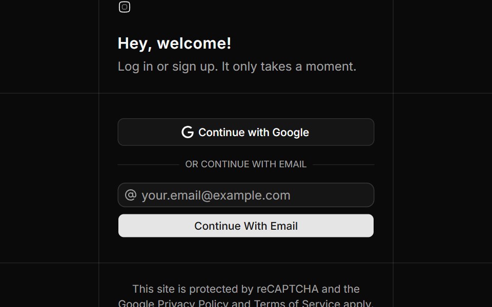 Auth Foursv-efferd · SvelteA bordered auth layout with divider rails and a gentle email-first continuation flow.
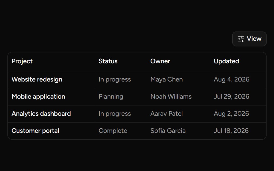 Data Table Viewsv-table · SvelteA checkbox dropdown for toggling table column visibility.
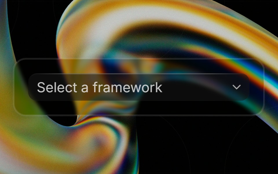 Glass Comboboxglasscn · ReactGlass Combobox with five variants: clear, frosted, subtle, liquid, and liquid-refract
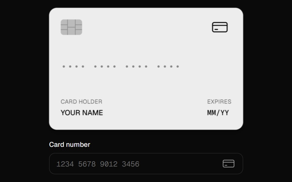 Card InputUI Lab · ReactFormats as you type, spots the card brand, and flips to show the CVC.
Libraries with Tailwind CSS input components
Related categories
- Input Components
- React Input Components
- Svelte Input Components
- React Native Input Components
- Animated Input Components
- shadcn/ui Input Components
- Tailwind CSS Text Input Components
- Tailwind CSS Select Components
- Tailwind CSS Form Field Components
- Tailwind CSS Form Components
- Tailwind CSS Textarea Components
- Tailwind CSS Checkbox Components
- Tailwind CSS Switch Components
- Tailwind CSS Slider Components
- Tailwind CSS Radio Components
- Tailwind CSS Combobox Components
- Tailwind CSS File Upload Components
- Tailwind CSS Search Input Components
- Tailwind CSS Date Picker Components
- Tailwind CSS Login Form Components
- Tailwind CSS Color Picker Components
- Tailwind CSS OTP Input Components