 Dev Design Library
shadcn/ui Input Components
Dev Design Library indexes 647 shadcn/ui input components from 27 open-source UI libraries, with the most coming from Watermelon UI, FLX UI, Shadcn Space, sv-particles and Fluid Functionalism. Each one links to its page with the source code, a live preview where available, the library license and the install command. They follow the shadcn/ui conventions, so most install with the shadcn CLI and drop into a Tailwind project.
Showing 120 of 647, a mix from every library. Open a library to see all of its components.
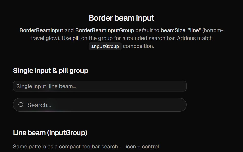 Border Beam InputCult UI · Reactborder-beam on Base UI input and input-group primitives with line or full border glow
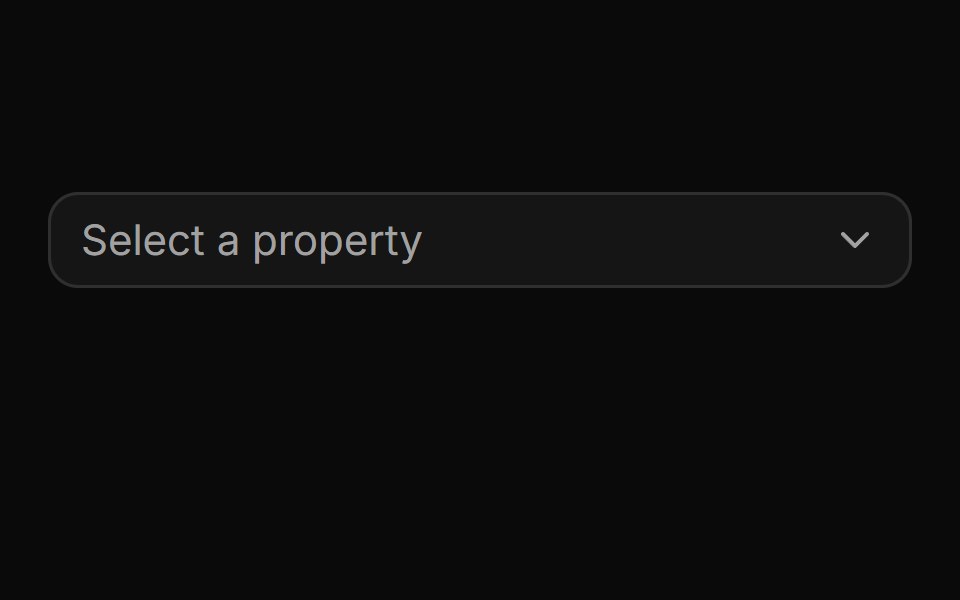 Pinned footer with a side-anchored import flyout.ReUI · ReactPinned footer with a side-anchored import flyout.
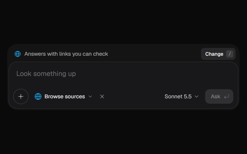 AI Input SearchKokonut UI · ReactAI composer with a Tools menu (browse, investigate, draft, run code, reason), a model picker and a live trace that…
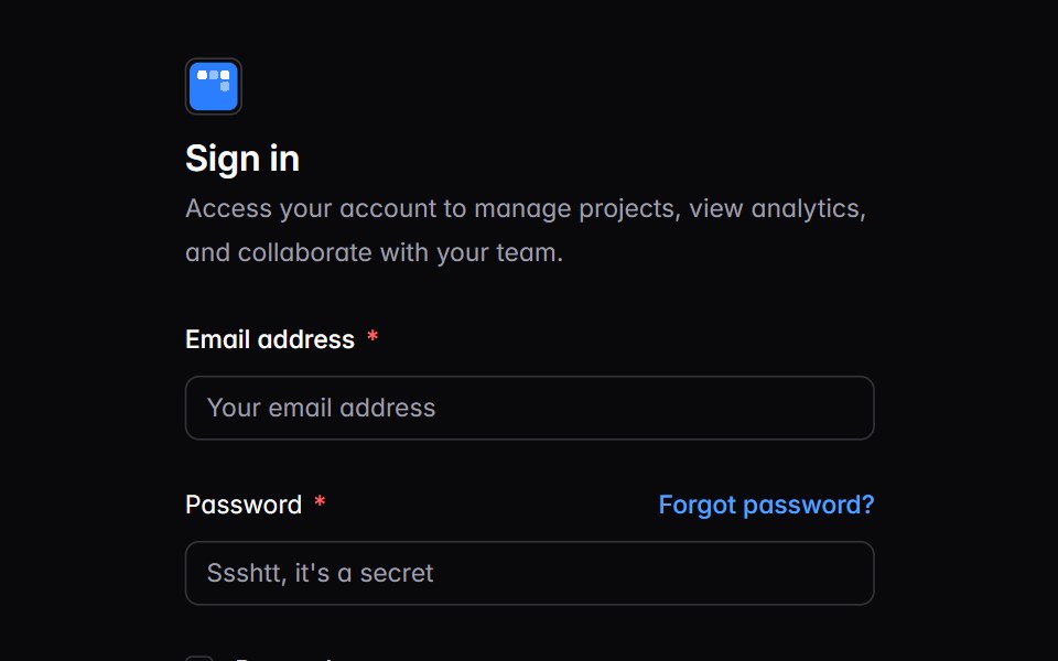 auth-01Intent UI · Reactauth-01
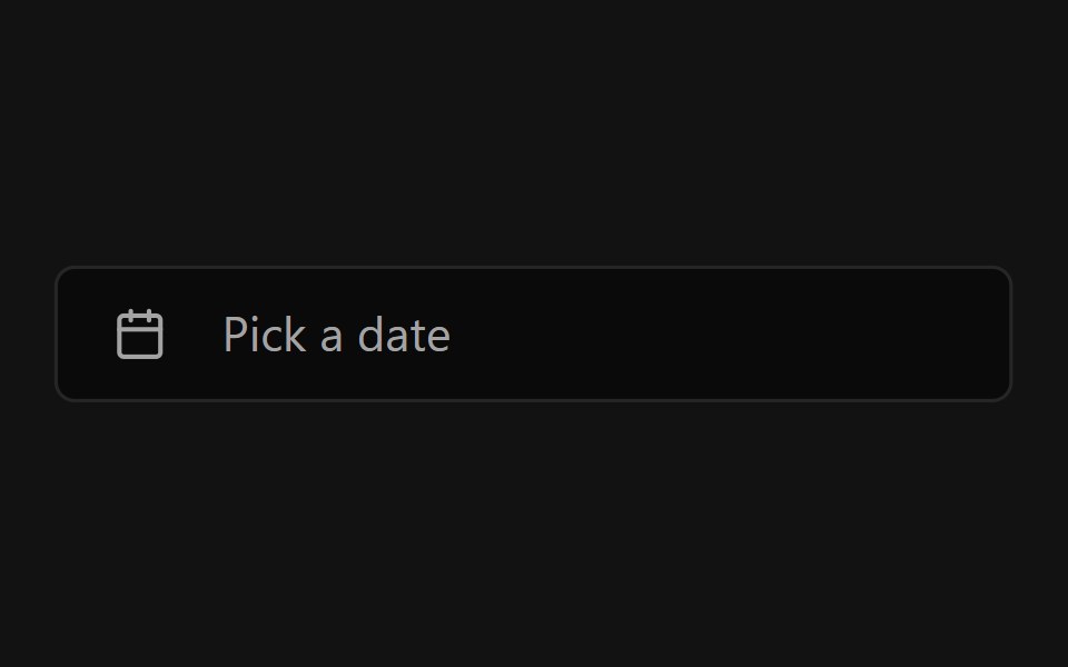 Datetime PickerSpectrum UI · ReactA date and time picker built on shadcn/ui with no extra dependencies.
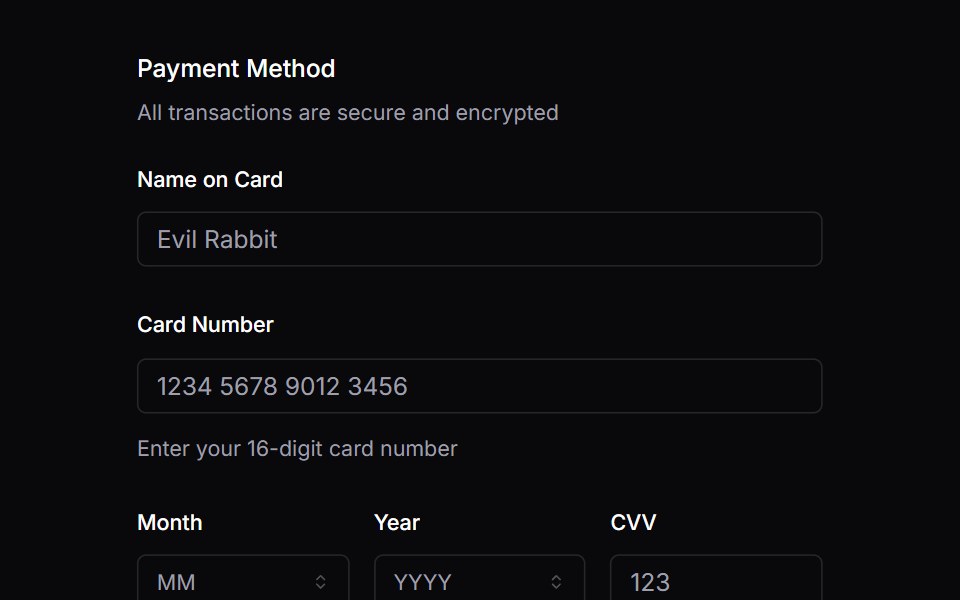 FieldVengeance UI · React
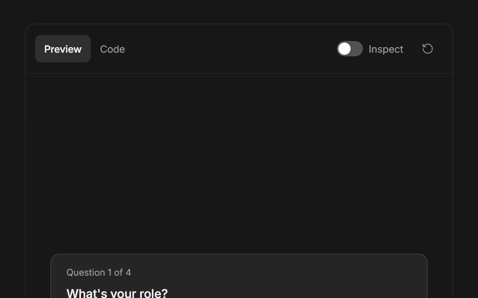 Ask User QuestionsFluid Functionalism · ReactStepped question flow with numbered options, keyboard shortcuts (1–9), single or multi-select, inline 'other' text…
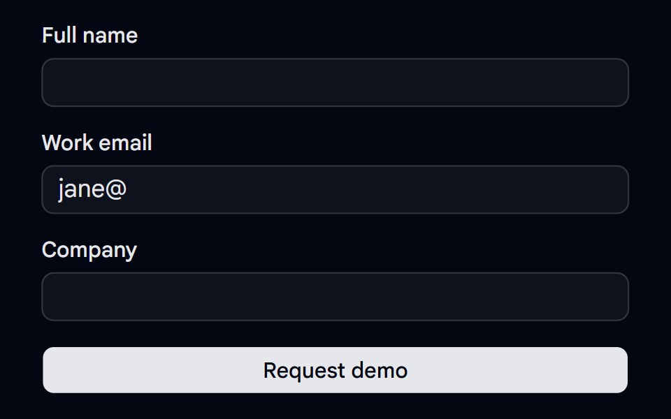 Alert 18 - Form Error SummaryShadcn Space · ReactForm error summary alert that lists every invalid field with links that focus it, receives focus on submit, and clears…
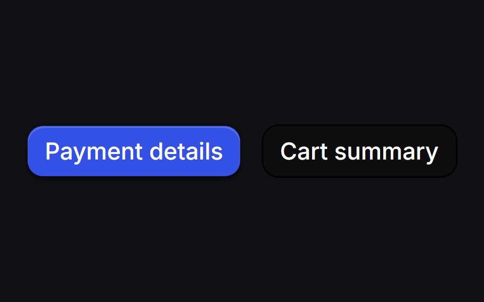 Drawer Buttonsuselayouts · ReactTwo buttons that open side drawers with a 3D fold. Payment comes from the right, cart from the left, and the fields…
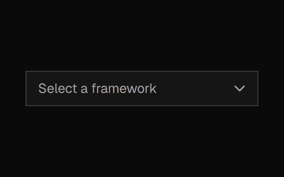 ComboboxShadcn Dashboard · React
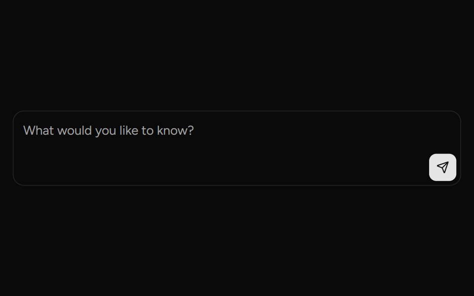 Prompt InputAI Elements (Svelte) · SvelteA composable prompt input surface with attachments, action menus, and provider-driven text handling.
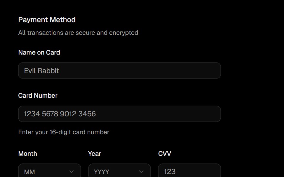 FieldObsidianUI · React
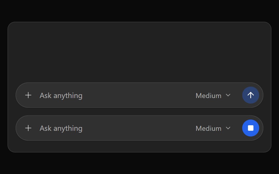 ChatGPT ComposerNotra · ReactThe pill-shaped Ask anything input with model picker and send button.
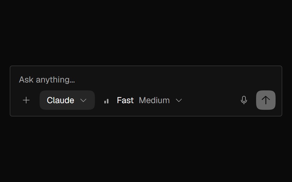 AI InputNexvyn UI · ReactAI composer textarea with auto-grow, send/stop button morph, attachment slots, and Enter-to-send.
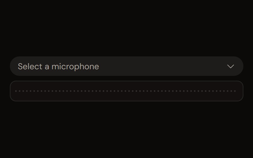 Audio Device Selectaudiocn · ReactA microphone, speaker or source picker with loading, permission, None and disconnected-device states, and a slot for a…
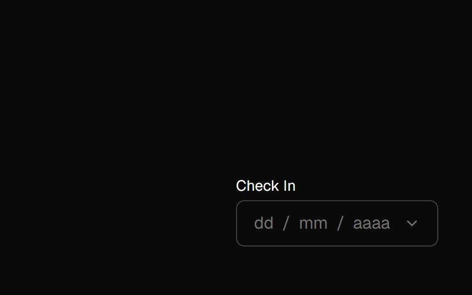 date-pickerBaseLayer · ReactA date picker combines one or more DateFields with a calendar popover, allowing users to enter or select a single…
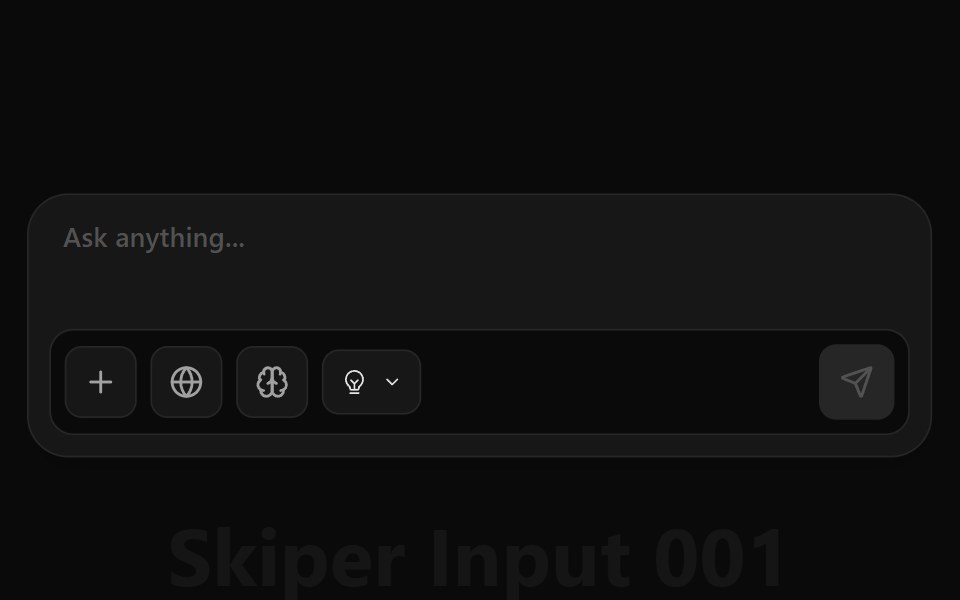 Ai Input 001Watermelon UI · React
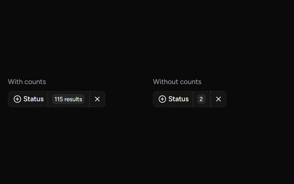 Data Table Faceted Filtersv-table · SvelteA searchable multi-select filter with live counts for categorical table columns.
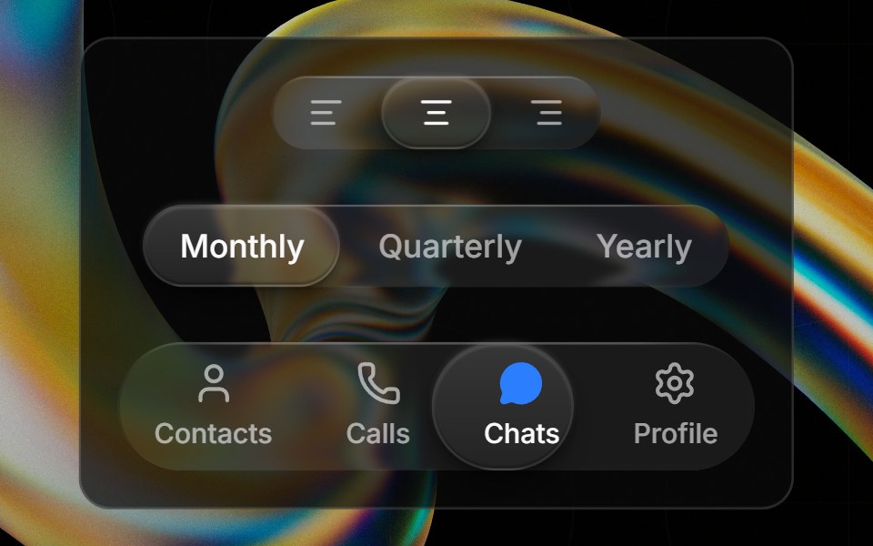 Glass Toggle Groupglasscn · ReactA segmented control with a sliding glass puck indicator supporting icons, text, or any React content.
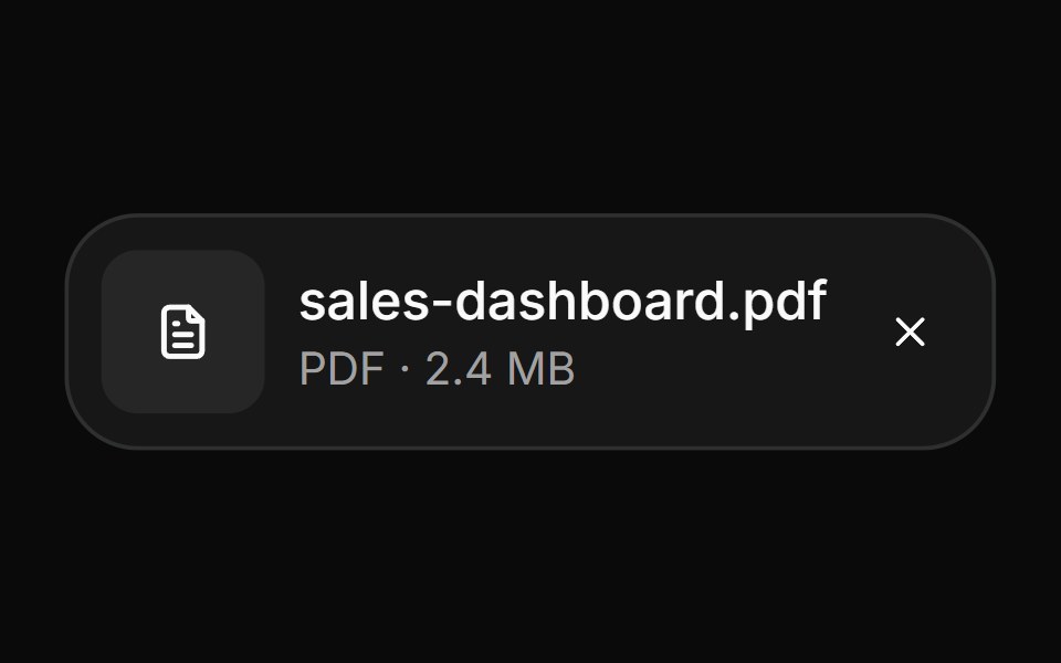 AttachmentHextaUI · ReactFile and image cards for uploads, with progress, states, actions, a full-card trigger and names that keep their…
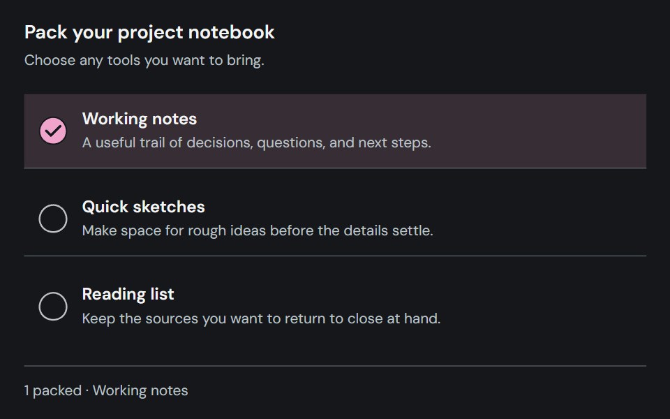 CheckboxCojeev UI · ReactCaptures an independent checked, unchecked, or indeterminate choice.
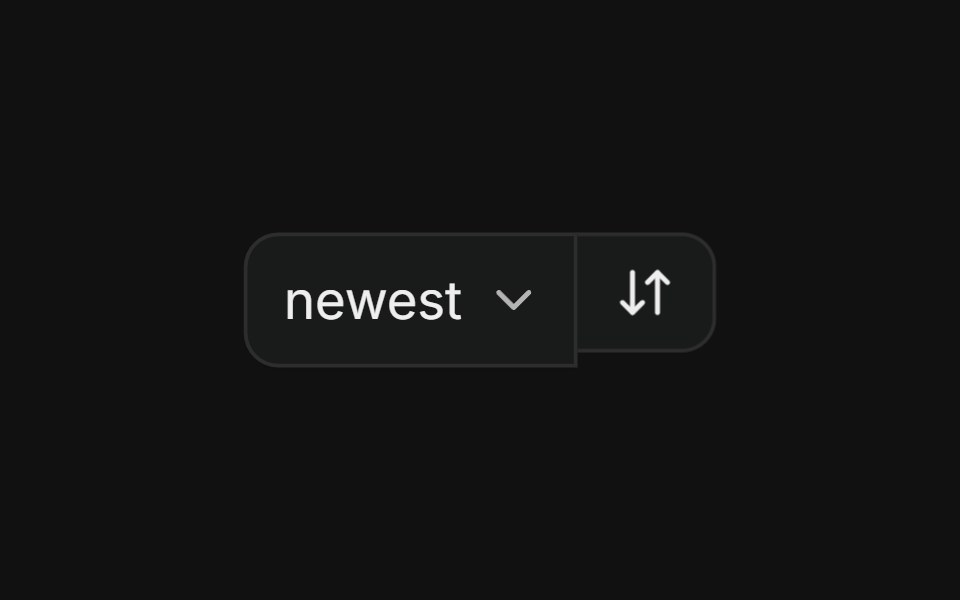 With selectFLX UI · ReactSort dropdown paired with a direction-toggle icon button in a merged-border row.
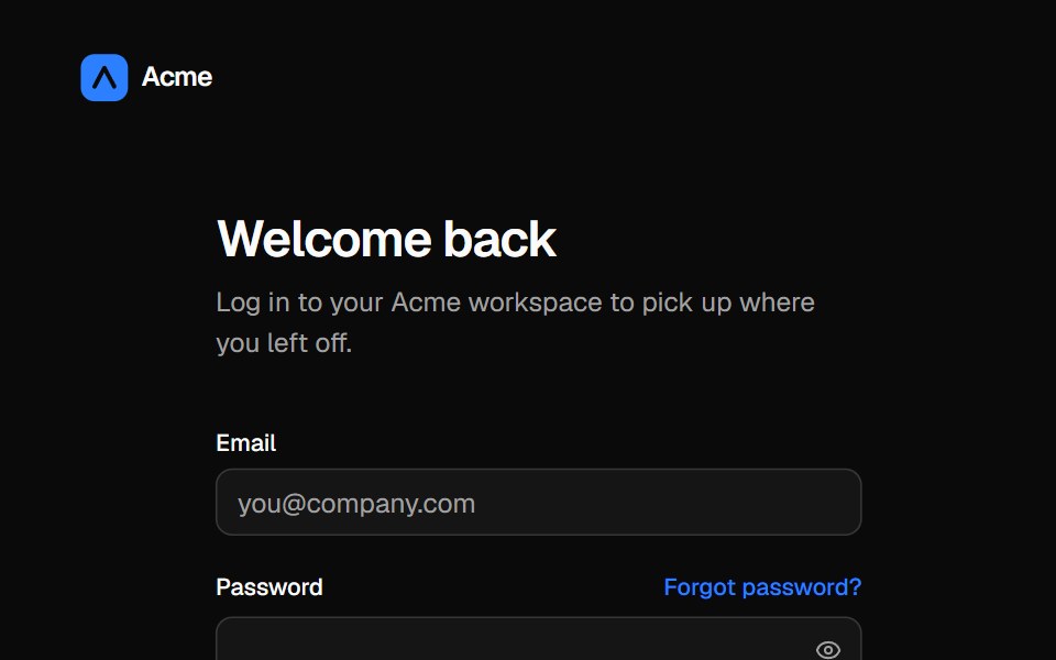 Split login pageVelora UI · ReactLogin form with password reveal, remember-me and social sign-in beside an aurora testimonial panel.
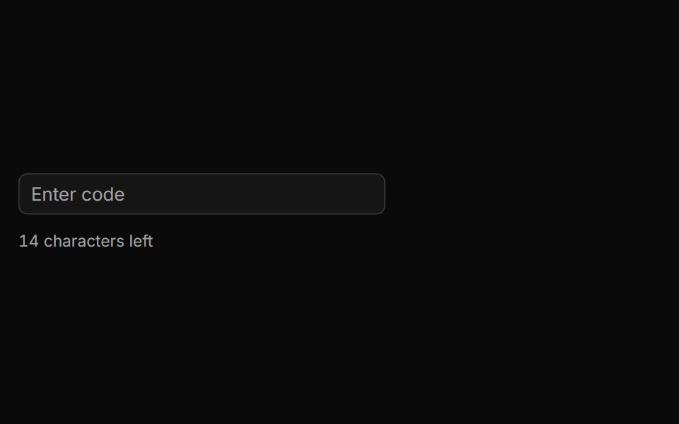 Characters Remaining Countsv-particles · SvelteText input that shows how many characters are still left before the limit.
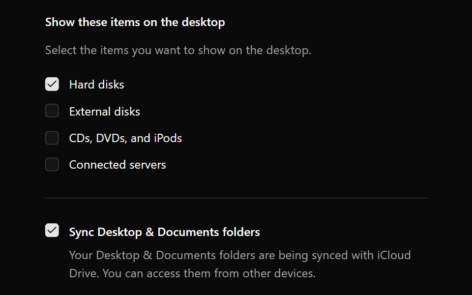 CheckboxOUI · ReactReact aria components Checkbox with shadcn characteristics.
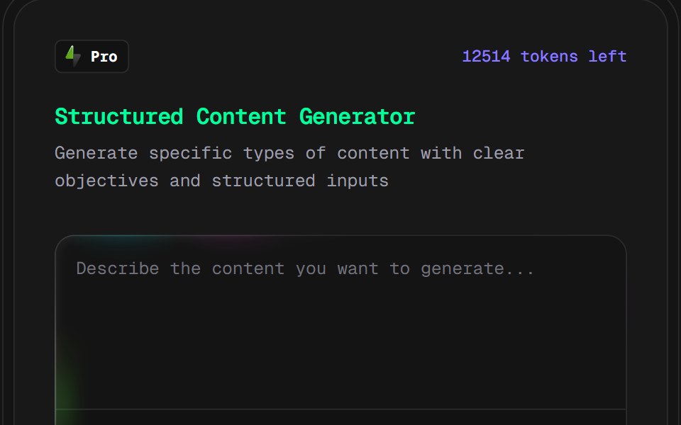 AI Content Creator CardD2Studio UI · ReactPro version content creation card
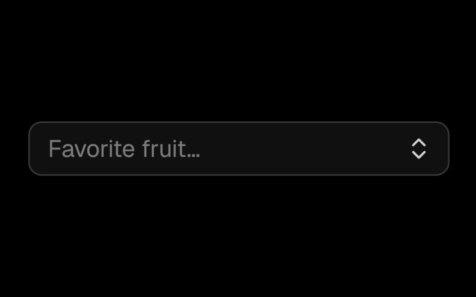 Comboboxark-cn · ReactA shadcn-style combobox component built with Ark UI primitives.
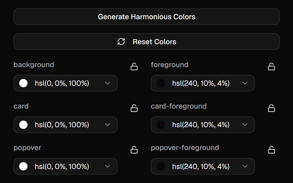 Color PickerCult UI · ReactInteractive color picker component with HSL support and preset colors
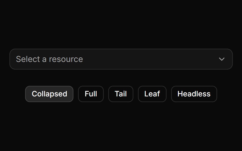 Trigger path formatting and collapsing.ReUI · ReactTrigger path formatting and collapsing.
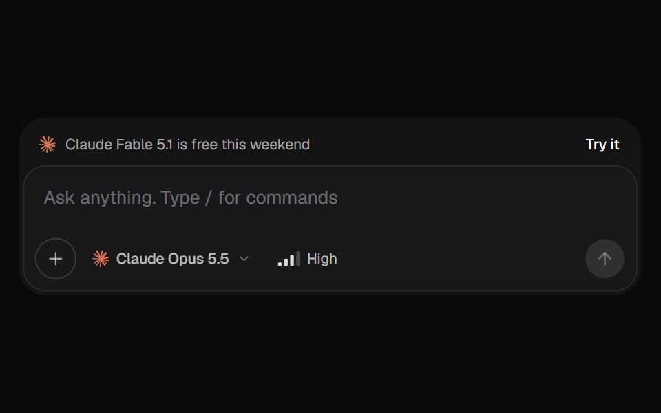 AI Input SelectorKokonut UI · ReactAI chat input with a model menu, a separate Effort control, file chips you can drop or paste, a / command menu, and…
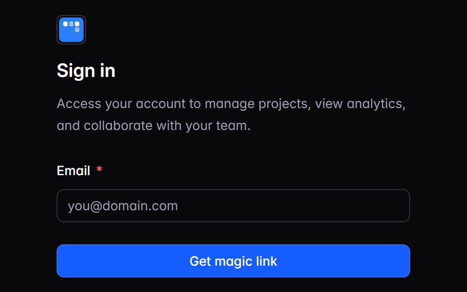 auth-02Intent UI · Reactauth-02
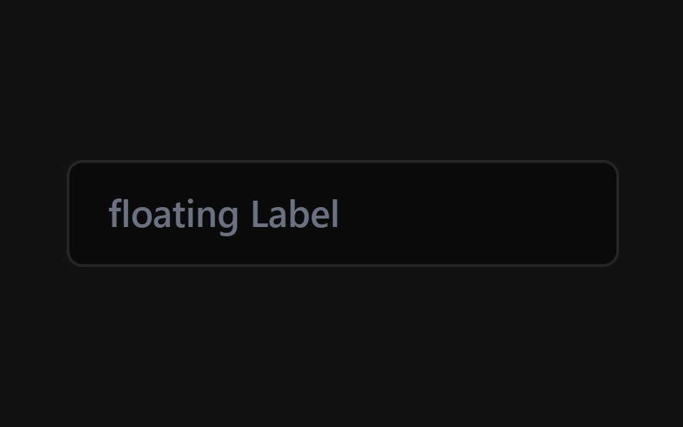 Floating Label InputSpectrum UI · Reactcomponent for the Floating Label Input
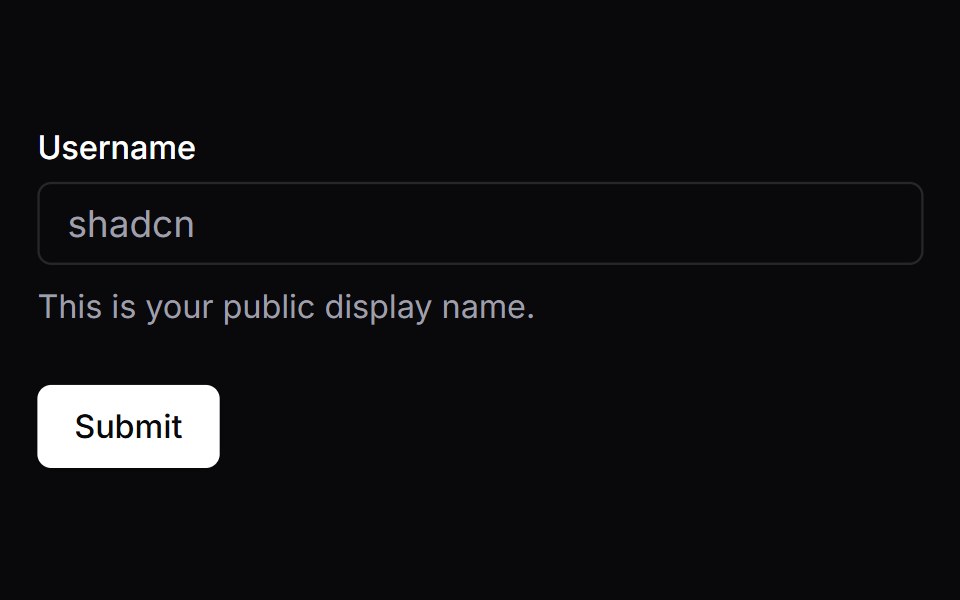 FormVengeance UI · React
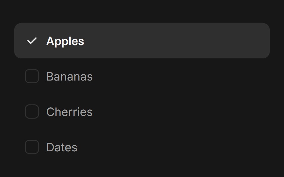 Checkbox GroupFluid Functionalism · ReactAnimated checkbox group with fluid hover, contiguous selection merging, and spring-animated check marks. Built on…
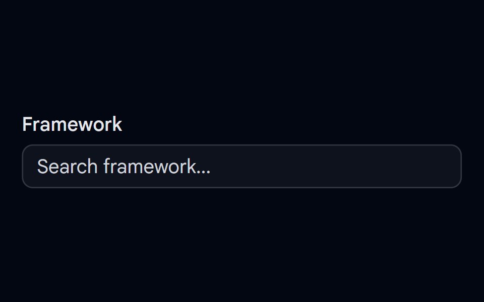 Autocomplete-01 - DefaultShadcn Space · ReactDefault autocomplete component
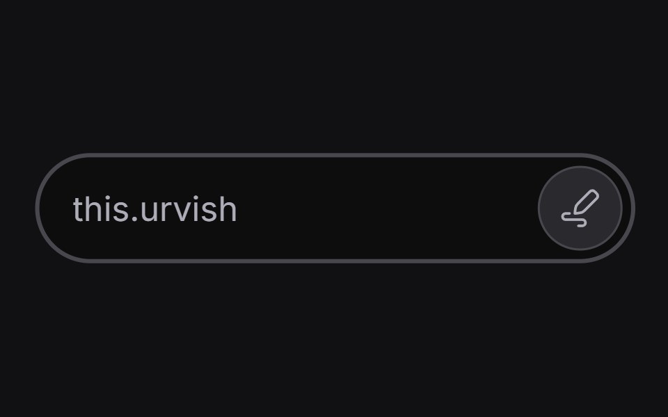 Inline Edituselayouts · ReactAn input that switches between read and edit modes.
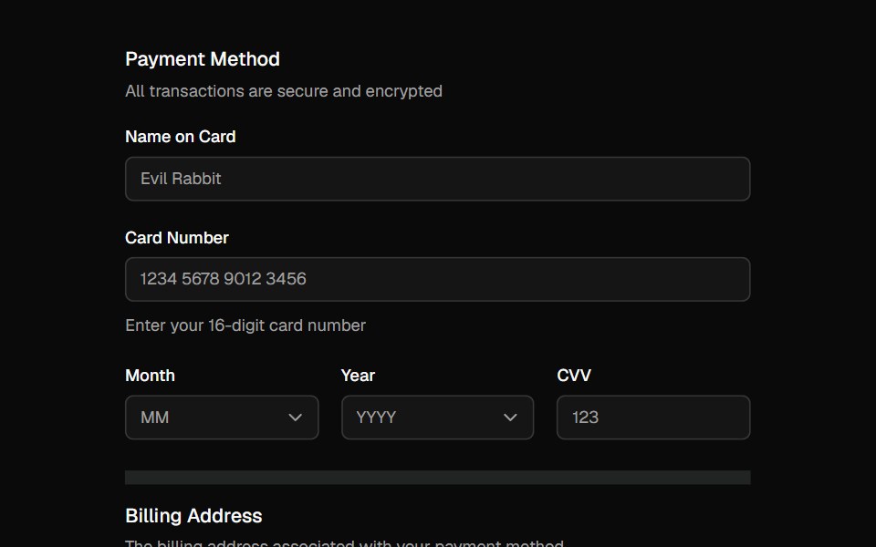 FieldShadcn Dashboard · React
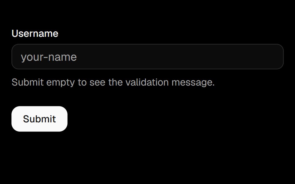 FormObsidianUI · React
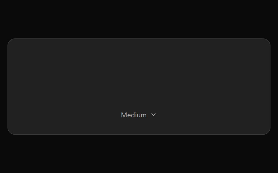 ChatGPT Model SelectorNotra · ReactThe hover-to-open effort chip with Model and Effort submenus, built on shadcn DropdownMenu.
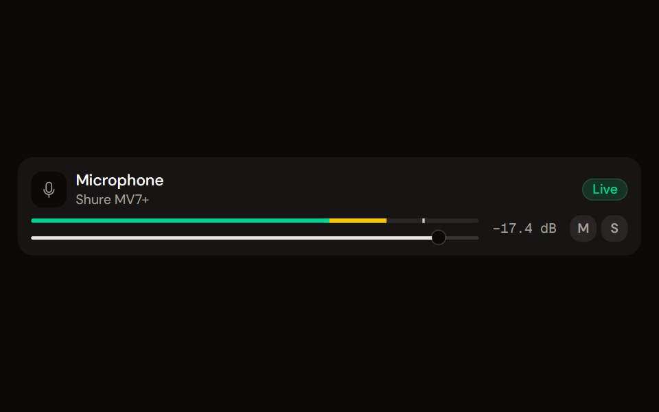 Channel Stripaudiocn · ReactOne channel of a mixer: header, status, meter, fader, value, controls and a notice, as a row or a console strip. The…
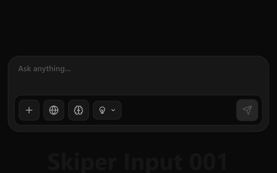 Ai Input 002Watermelon UI · React
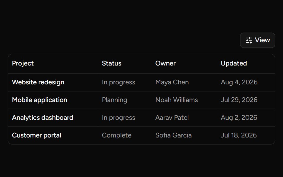 Data Table Viewsv-table · SvelteA checkbox dropdown for toggling table column visibility.
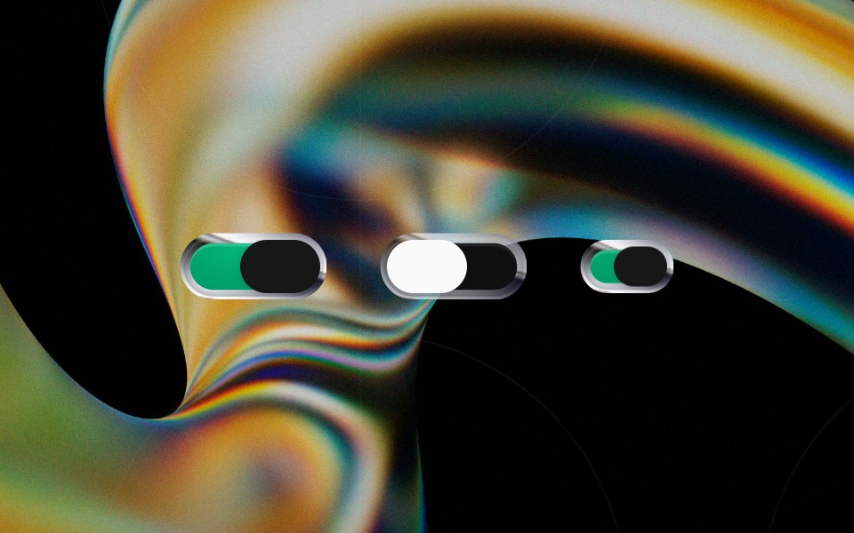 Liquid Switchglasscn · ReactA liquid-glass switch wrapper built on top of the default switch component.
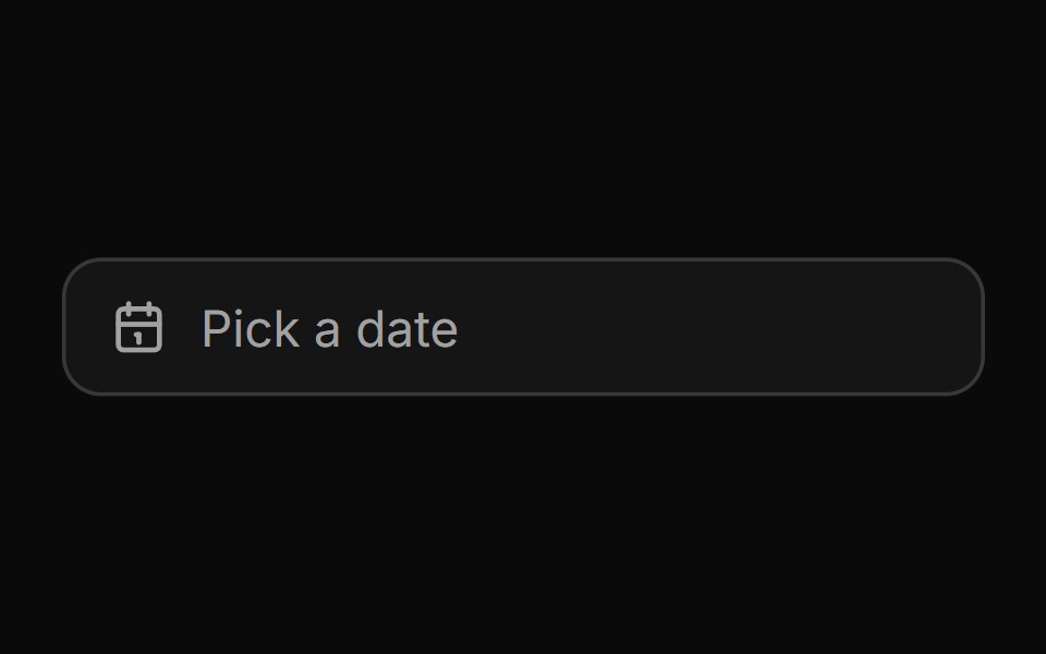 Date pickerHextaUI · ReactA button that opens a calendar in a popover, or a bottom sheet on phones, for single dates and ranges.
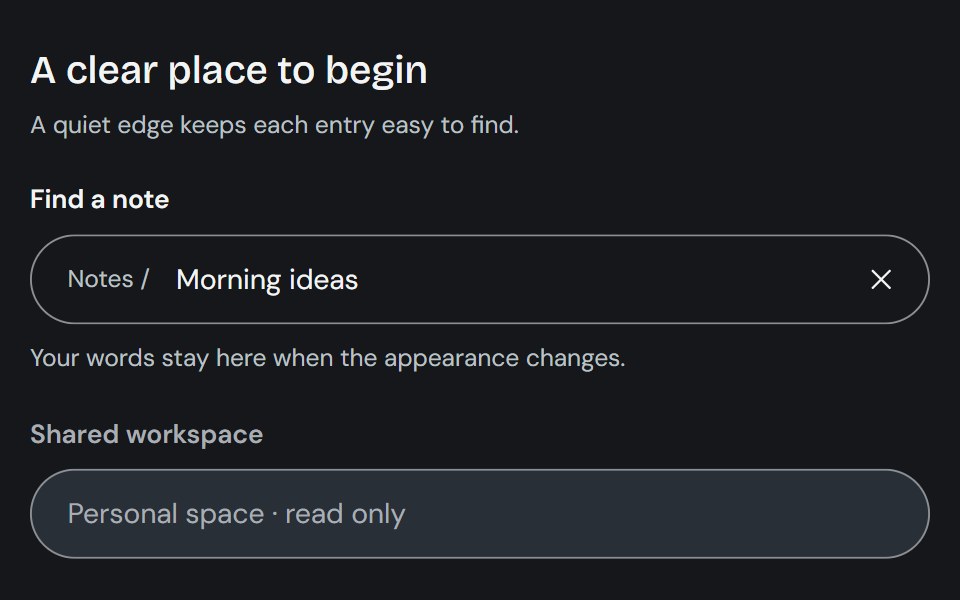 InputCojeev UI · ReactCollects a single-line value through a native input with optional composed affixes and clearing controls.
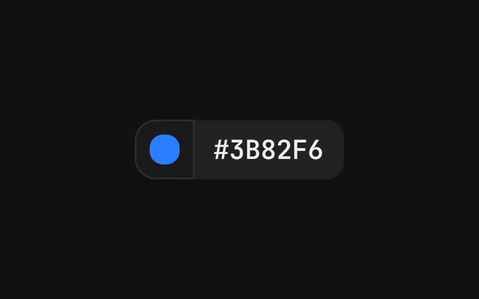 With popover swatchFLX UI · ReactColor swatch button that opens a grid of color swatches, paired with a hex value label in a merged-border row.
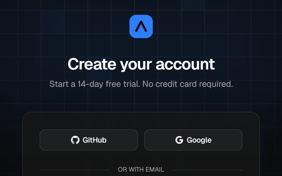 Sign-up cardVelora UI · ReactCentered sign-up card over a grid and light beams, with live password rules, terms and social sign-up.
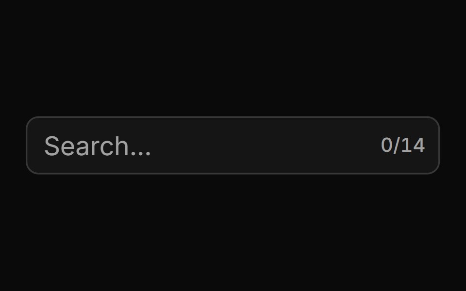 With Character Countsv-particles · SvelteForm field that shows the number of characters typed out of the maximum.
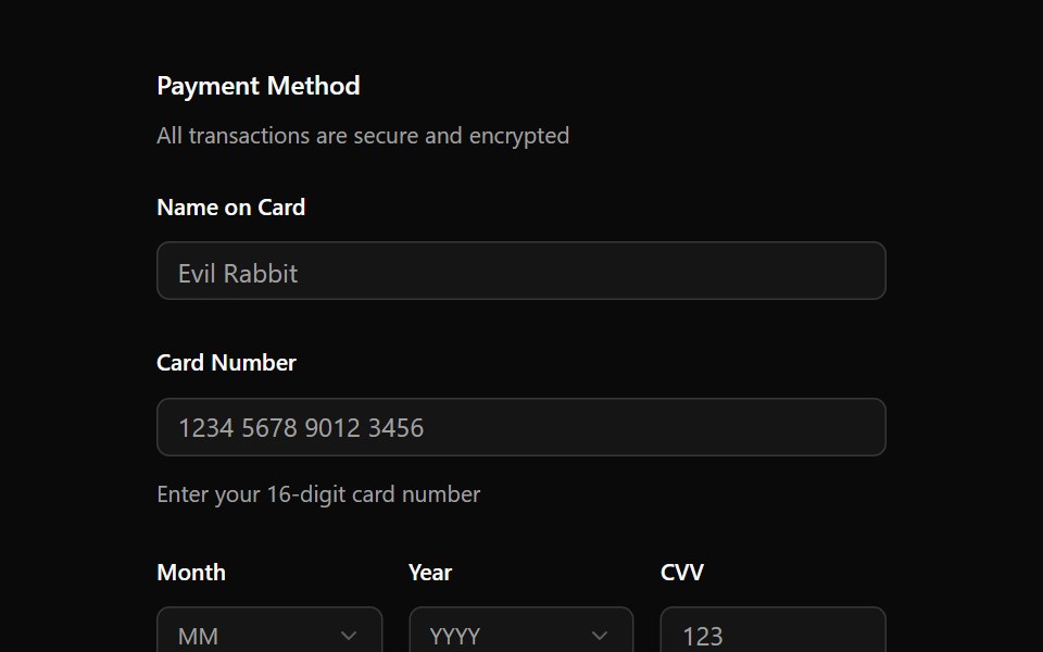 FieldOUI · ReactShadcn Field with react aria components characteristics.
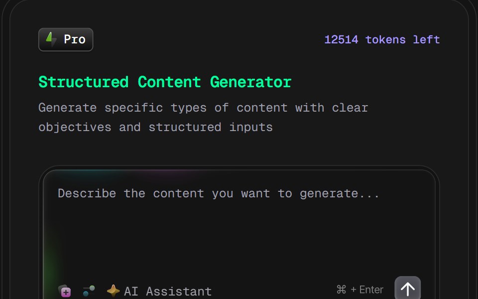 AI Content Creator Card v2D2Studio UI · ReactGlassmorphic AI content generator card with content type and tone pickers and a prompt field.
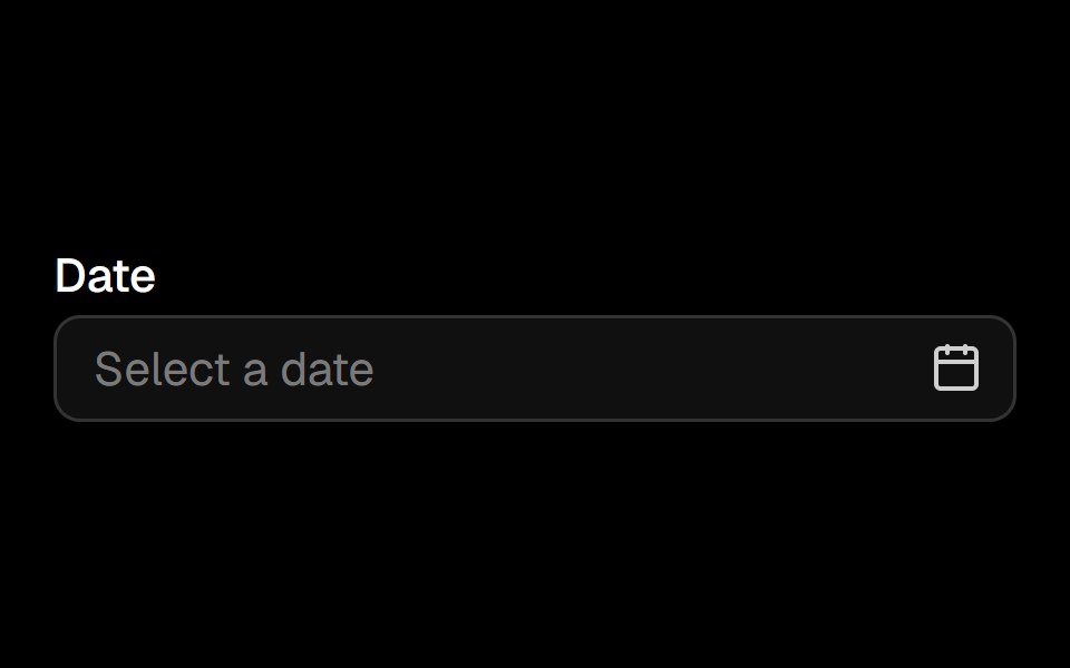 Date Pickerark-cn · ReactA shadcn-style date picker component built with Ark UI primitives.
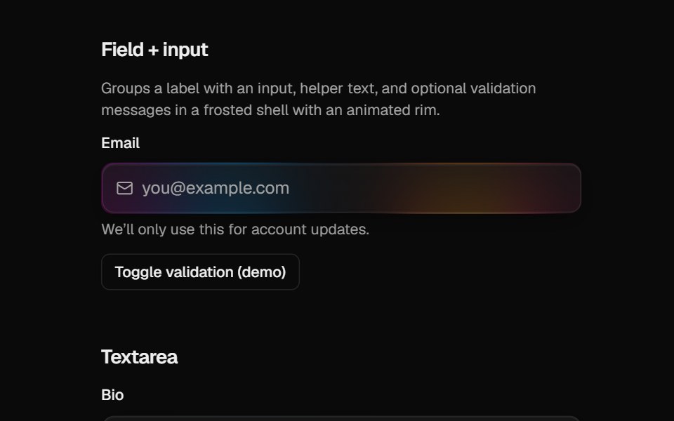 Halo FieldCult UI · ReactForm field layout (label, description, error) for HaloInput and HaloTextarea
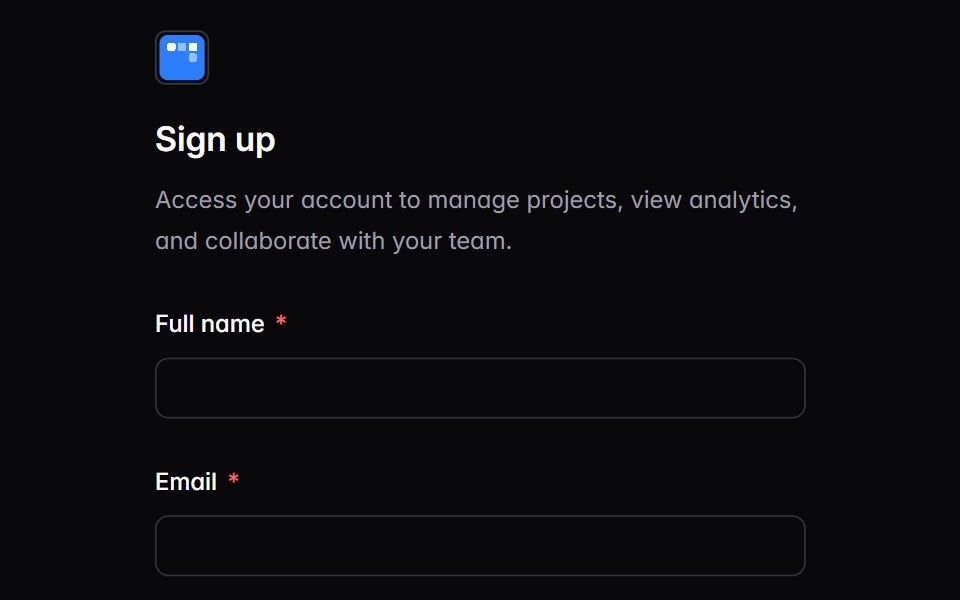 auth-03Intent UI · Reactauth-03
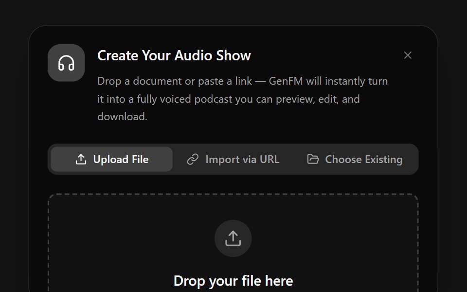 Input ModelSpectrum UI · Reactcomponent for the Input Model Demo
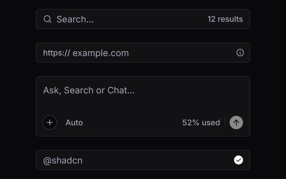 Input GroupVengeance UI · React
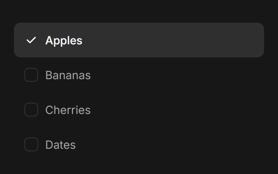 Checkbox Group (Base UI)Fluid Functionalism · ReactAnimated checkbox group with fluid hover, contiguous selection merging, and spring-animated check marks. Base UI flavor.
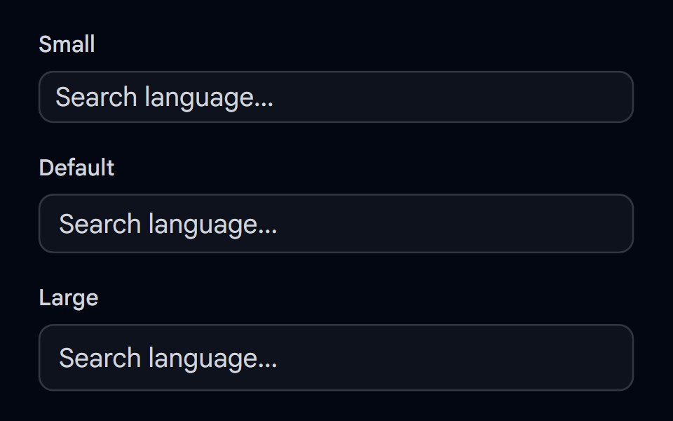 Autocomplete-02 - Size variantsShadcn Space · ReactAutocomplete component with different size variants
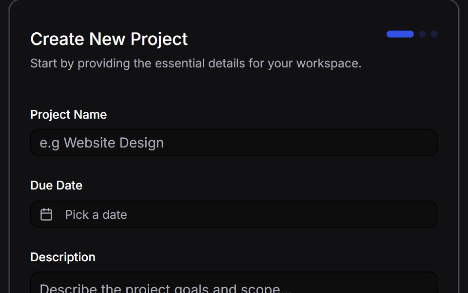 Multi Step Formuselayouts · ReactA dynamic, animated multi-step form with validation.
 Input GroupShadcn Dashboard · React
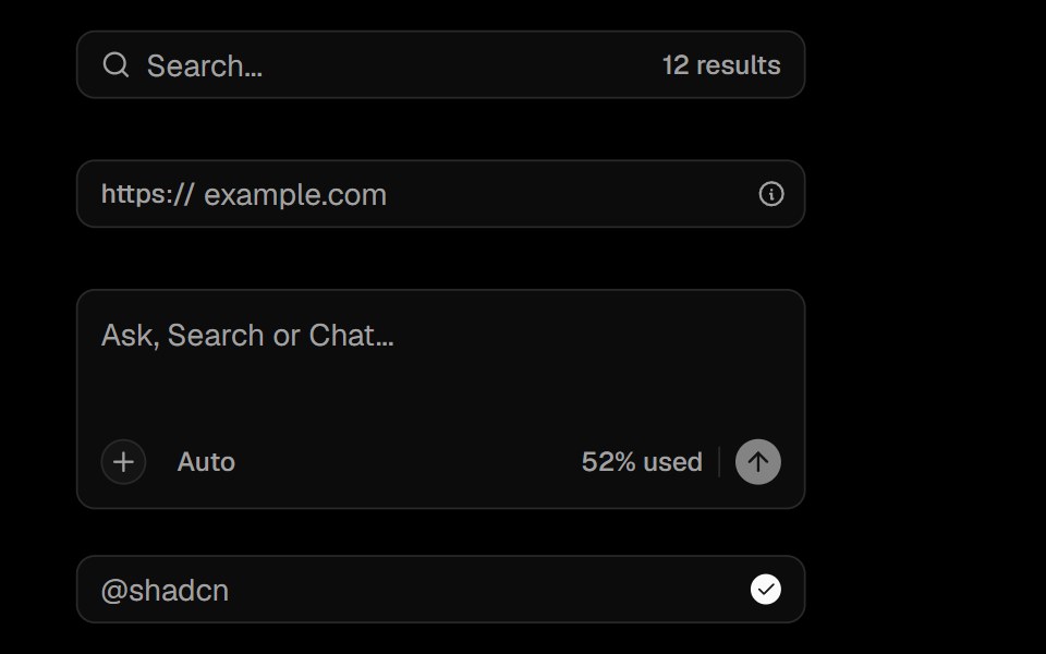 Input GroupObsidianUI · React
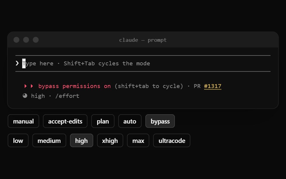 Claude Code PromptNotra · ReactThe input between two rules with the permission mode, PR link and effort below.
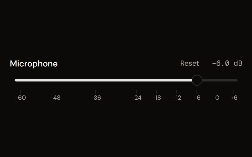 Faderaudiocn · ReactA volume fader in decibels: linear or console taper, detents, a scale, reset, an editable value, silence at the…
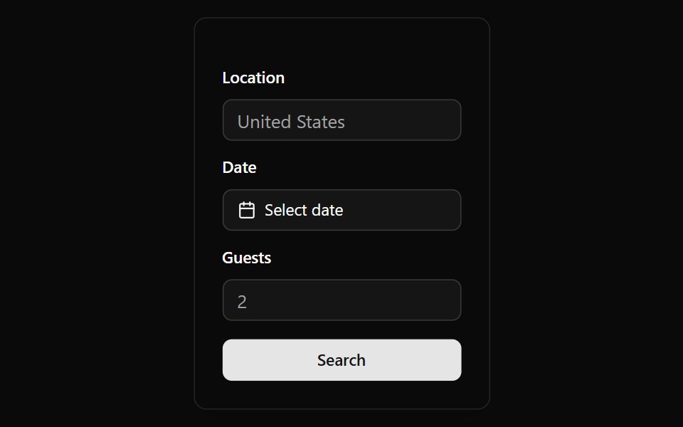 Alphine Booking FormWatermelon UI · React
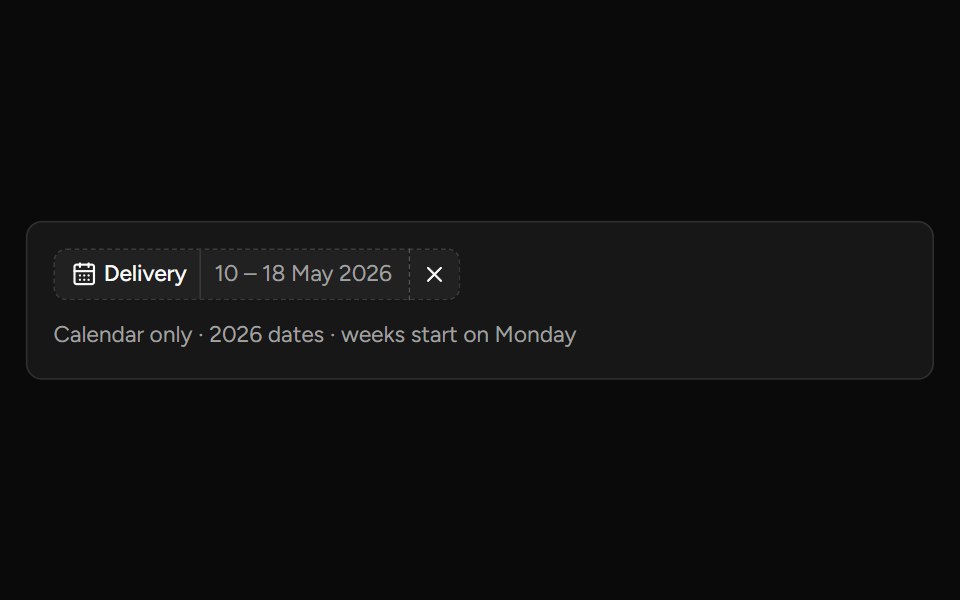 Date Range Filtersv-table · SvelteA responsive date-range picker with presets and explicit apply behavior.
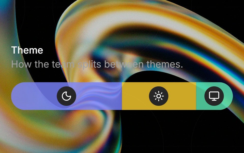 Preferenceglasscn · ReactA weighted preference bar with icon badges, hover tinting, and tooltip descriptions.
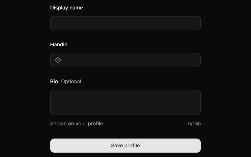 FieldHextaUI · ReactLabels, descriptions and errors wired to their control, with validation states and layouts for forms.
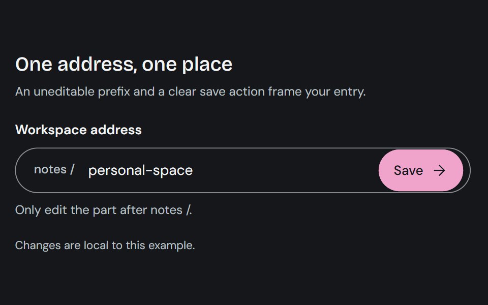 Input GroupCojeev UI · ReactCombines a text control with adjacent prefixes, suffixes, or actions in one input surface.
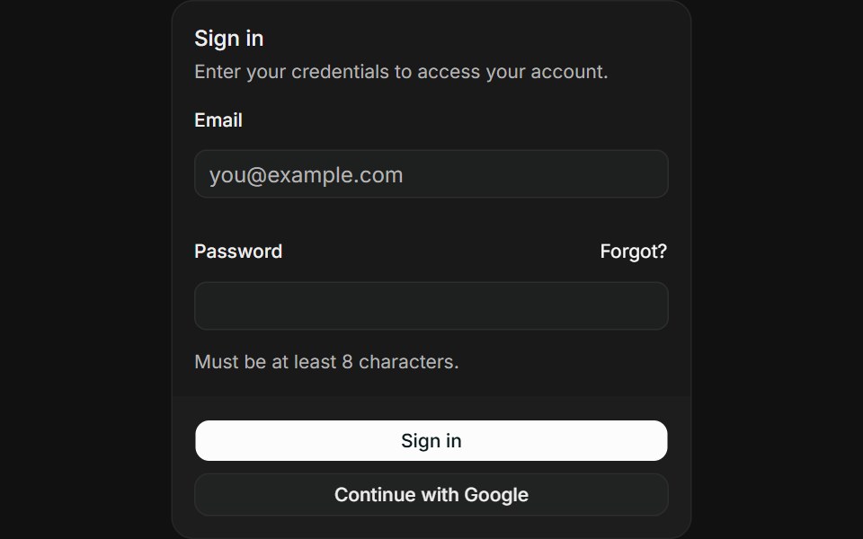 Login formFLX UI · ReactEmail and password fields with sign-in and OAuth buttons.
 Newsletter sign-upVelora UI · ReactNewsletter card over a glowing dot grid with a labelled email field, subscriber avatars and a privacy note.
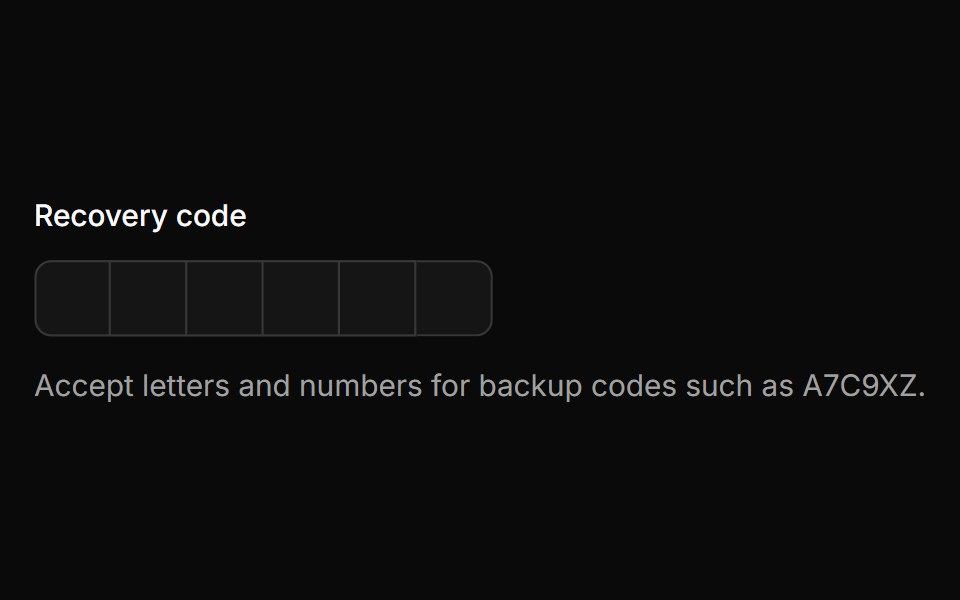 Alpha Numericsv-particles · Svelte
 Radio GroupOUI · ReactReact aria components Radio Group with shadcn characteristics.
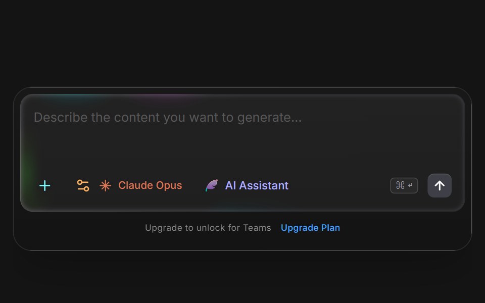 Siri Prompt InputD2Studio UI · ReactTabbed AI prompt input with assistant, blog and pro modes plus file upload.
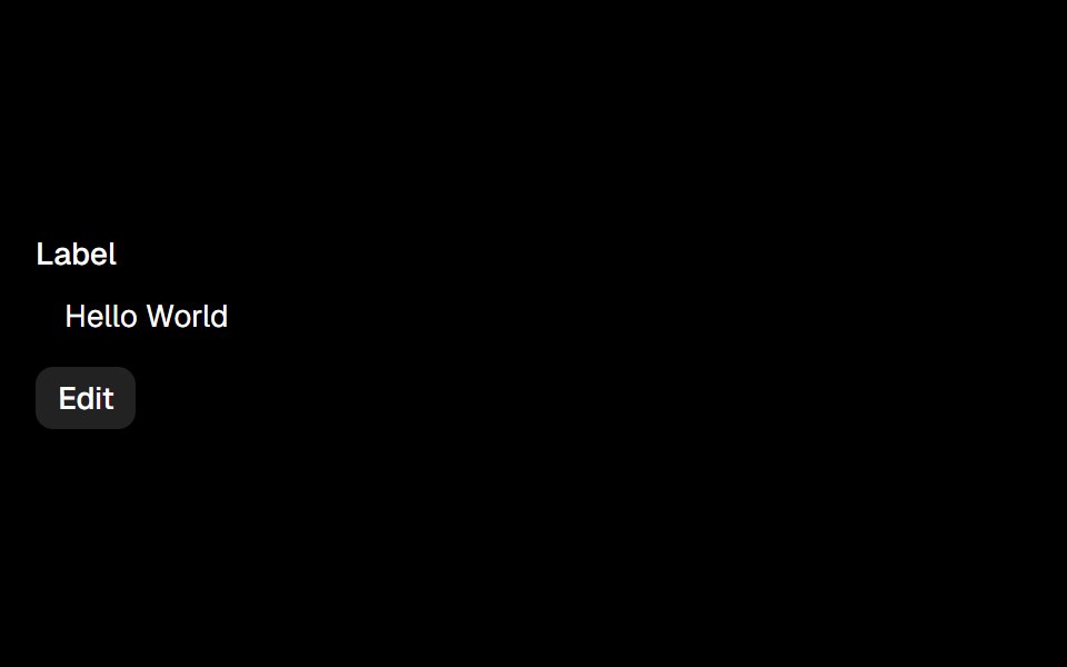 Editableark-cn · ReactA shadcn-style editable component built with Ark UI primitives.
 checkboxIntent UI · Reactcheckbox
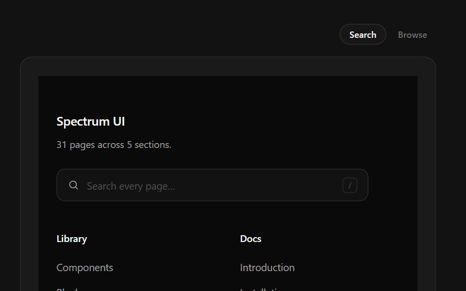 Link Search FooterSpectrum UI · ReactType-to-filter across every footer link, with arrow-key navigation.
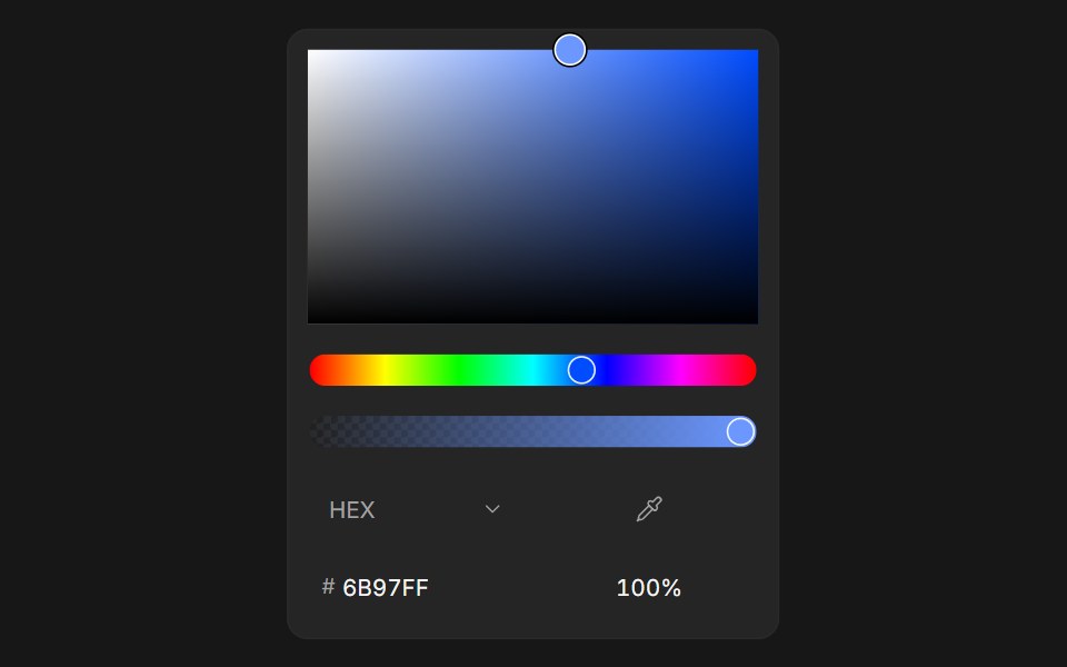 Color PickerFluid Functionalism · ReactColor picker with HEX, RGB, HSL, and OKLCH formats, alpha channel, optional swatches, and a popover trigger. Built on…
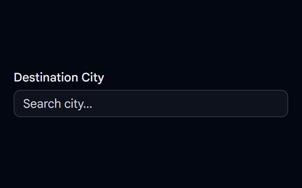 Autocomplete-03 - Vanish AnimationShadcn Space · ReactAutocomplete with vanish animation
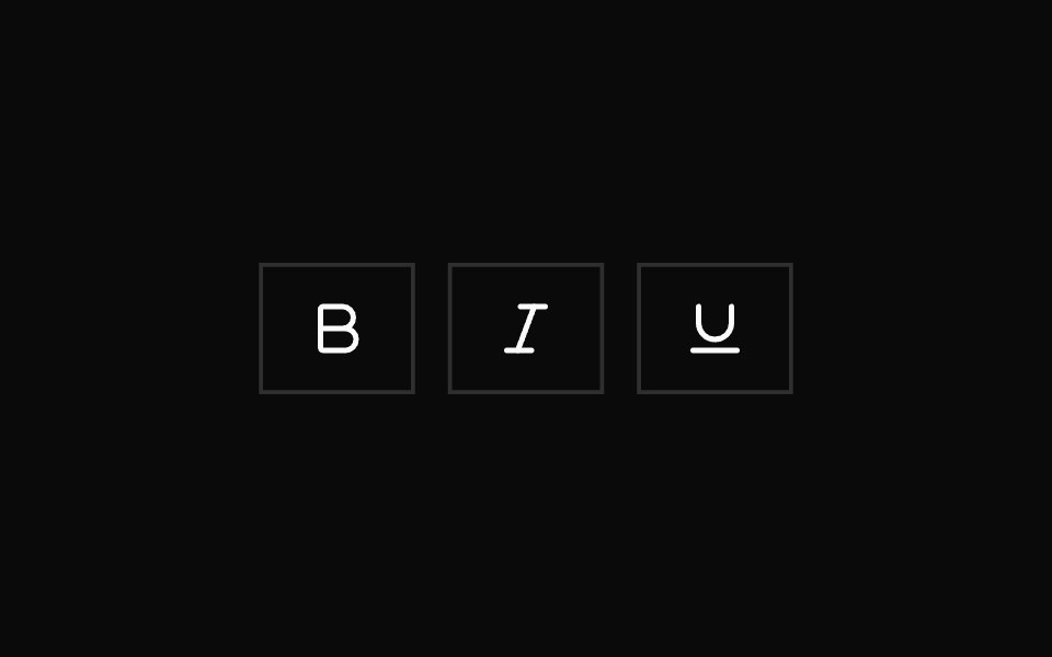 Toggle GroupShadcn Dashboard · React
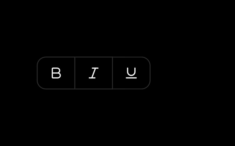 Toggle GroupObsidianUI · React
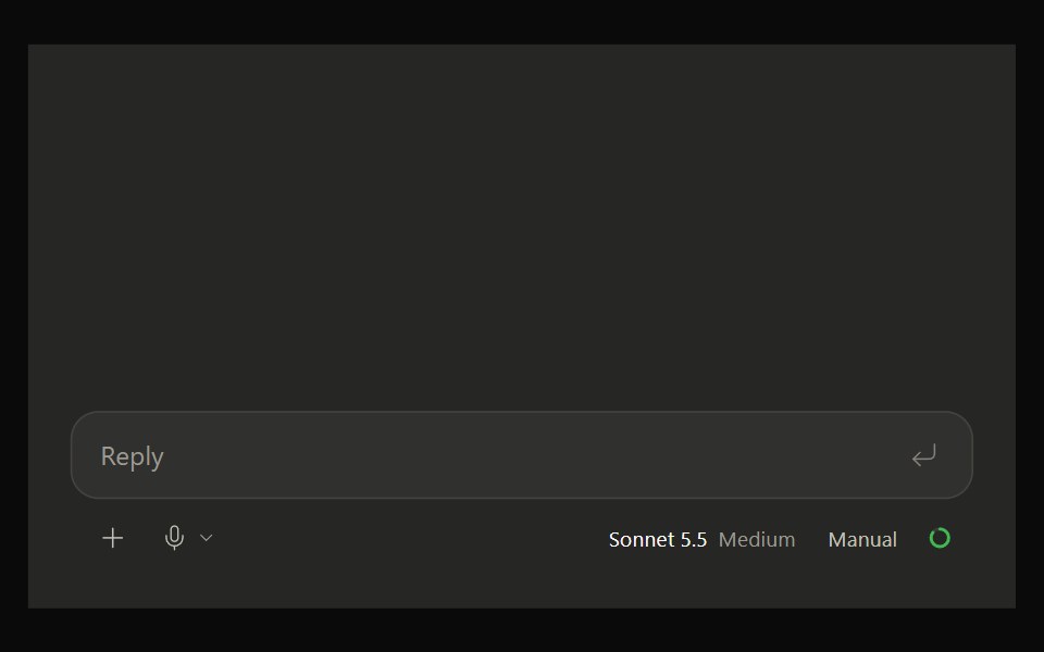 Claude ComposerNotra · ReactThe claude.ai message box with model picker, dictation and a morphing send button, built on shadcn Button and…
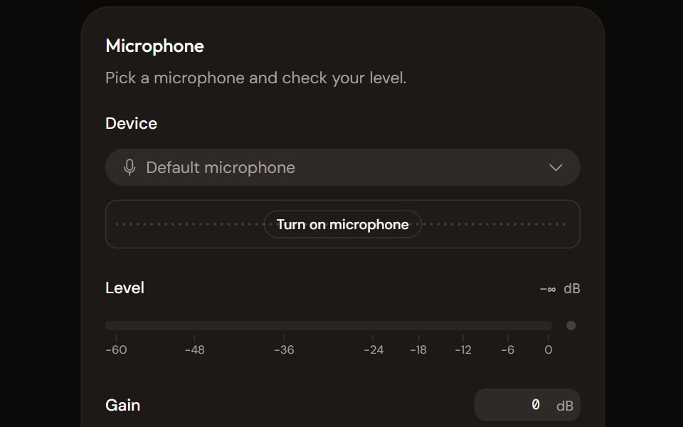 Microphone Setupaudiocn · ReactChoose and check a microphone: device select with a live preview, a level meter, gain, mute and a level check that…
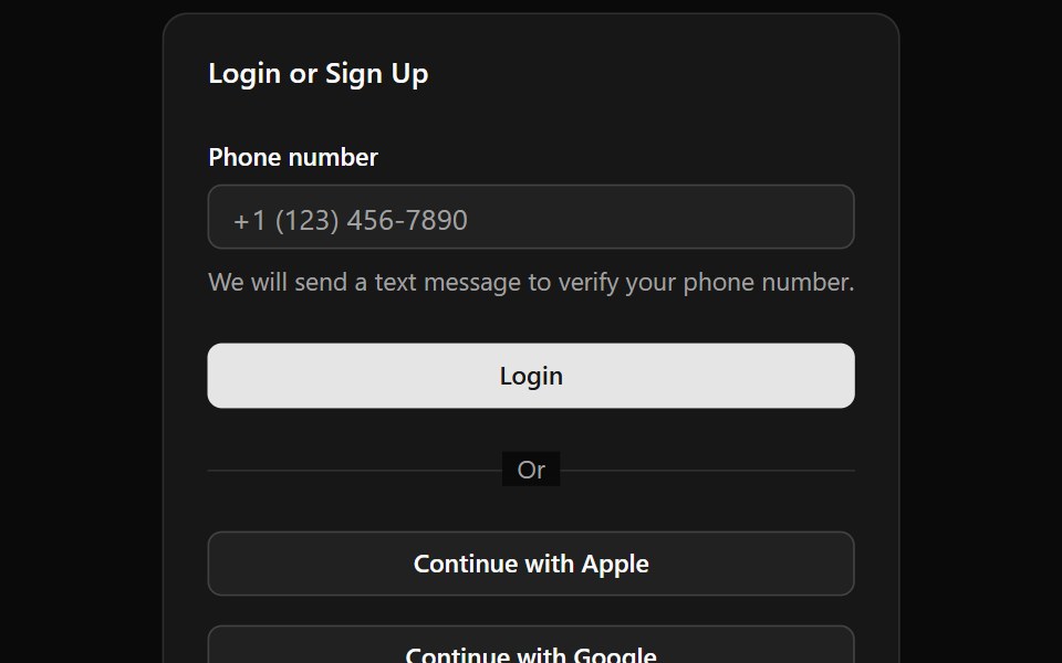 Alphine Login FormWatermelon UI · React
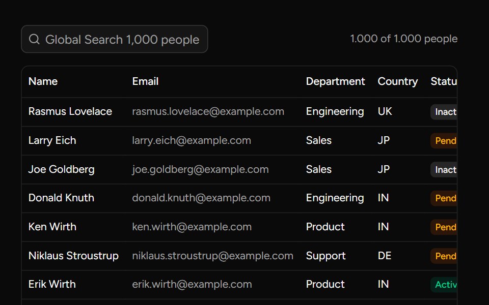 Debounce Inputsv-table · SvelteA search input with an optional delay for value changes.
 Comboboxglasscn · React
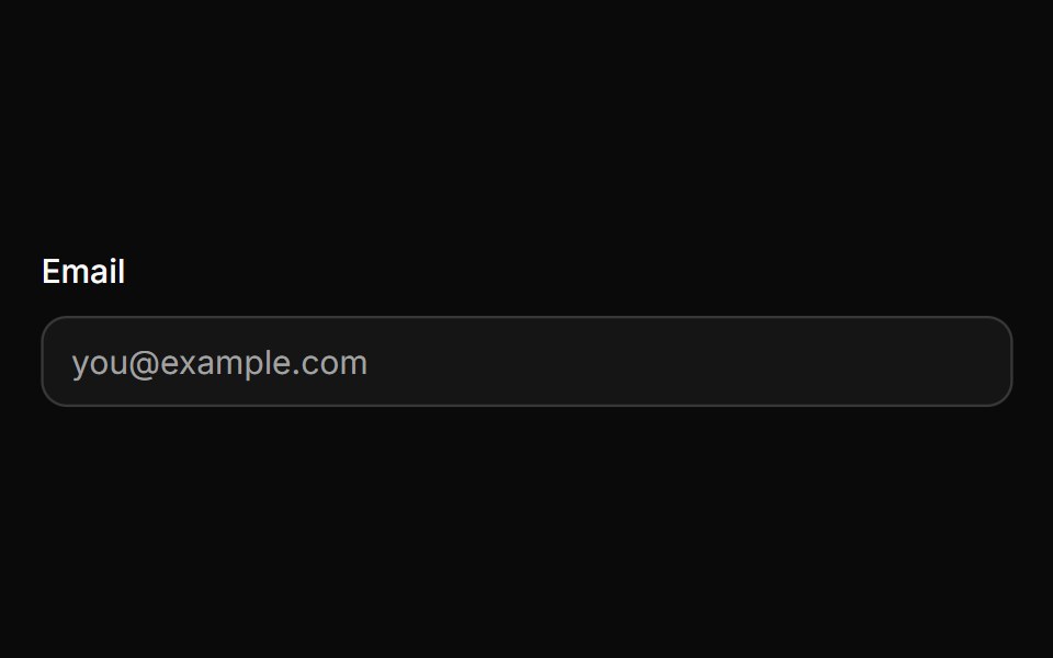 InputHextaUI · ReactA text input with three sizes, invalid and read-only states, native validation styling and a 16px touch font so phones…
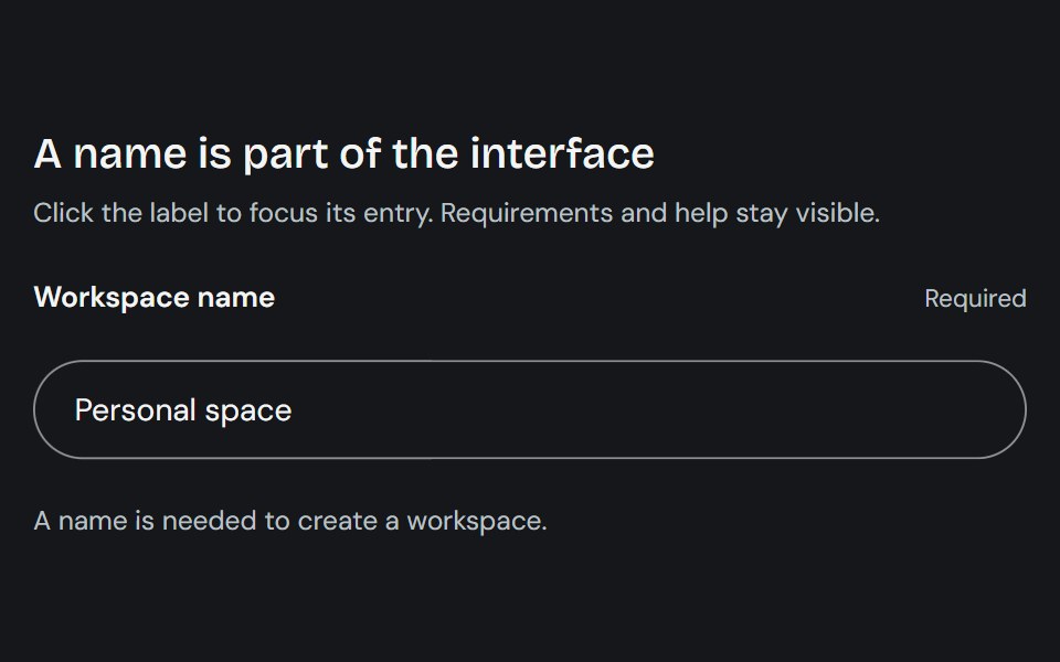 LabelCojeev UI · ReactProvides a native form label plus compact stat-label primitives for named values.
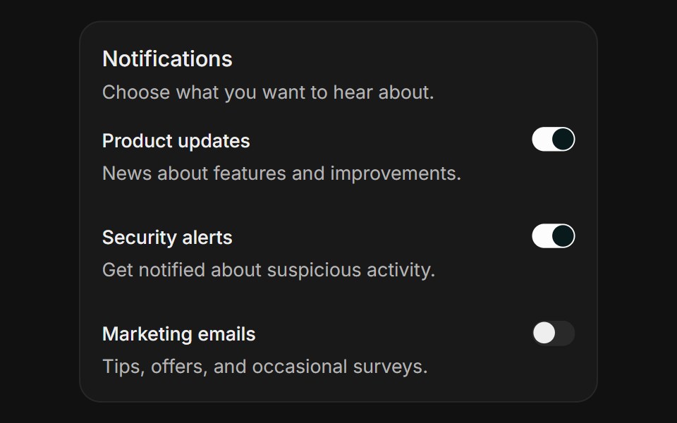 Notification settingsFLX UI · ReactHorizontal field rows each toggled with a switch.
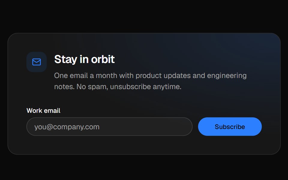 Newsletter footerVelora UI · ReactFooter with a newsletter sign-up row, link columns and a live “All systems normal” status badge.
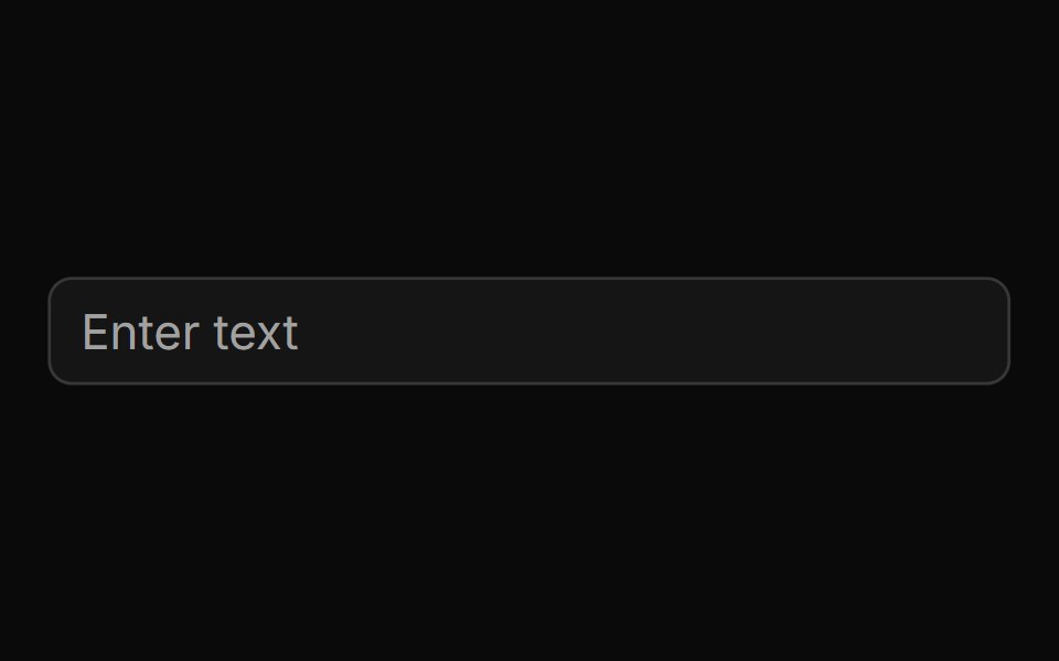 Basic Inputsv-particles · Svelte
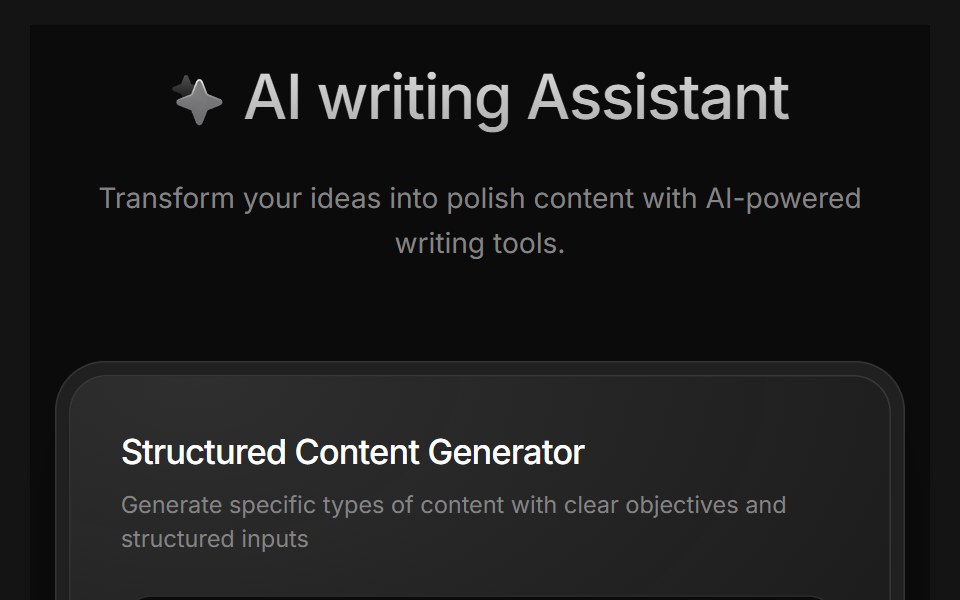 AI Writing AssistantD2Studio UI · ReactAI writing assistant panel with assistant, blog and pro modes and a prompt field.
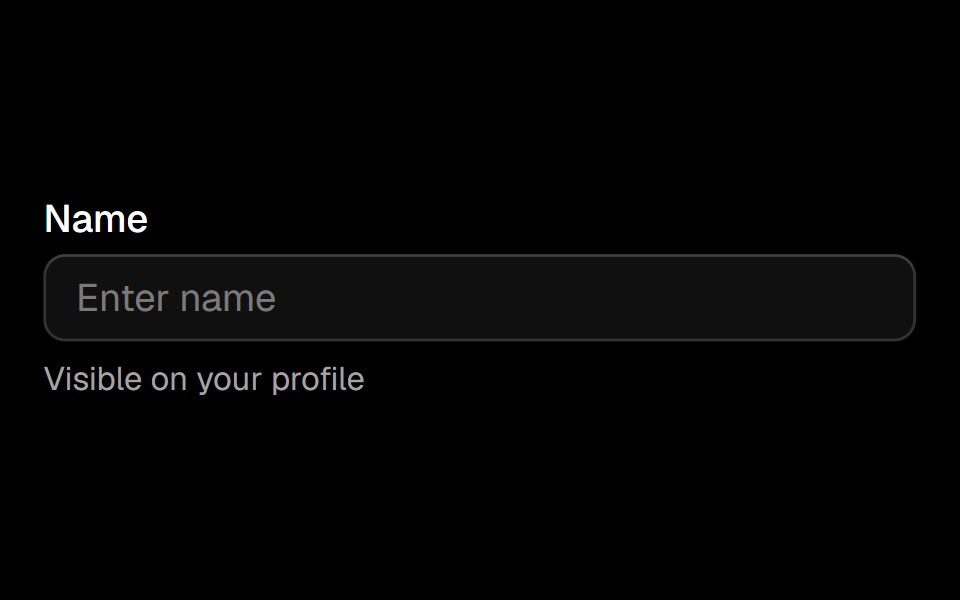 Fieldark-cn · ReactA shadcn-style field component built with Ark UI primitives.
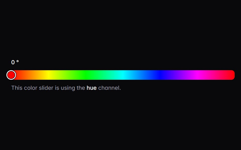 color-sliderIntent UI · Reactcolor-slider
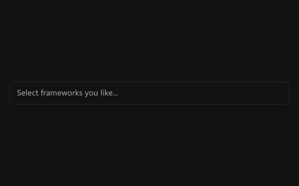 Multiple SelectorSpectrum UI · ReactA multi-select input with async search, grouping, and creatable options.
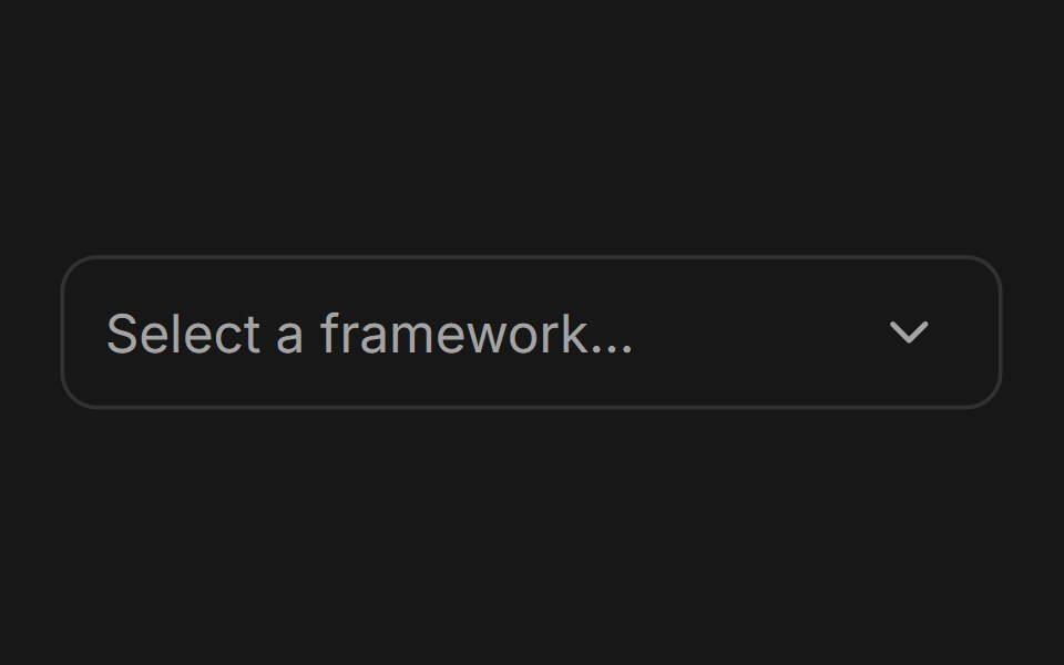 ComboboxFluid Functionalism · ReactType-to-filter combobox with single or multiple (chips, merged selection backgrounds) selection: a text field that…
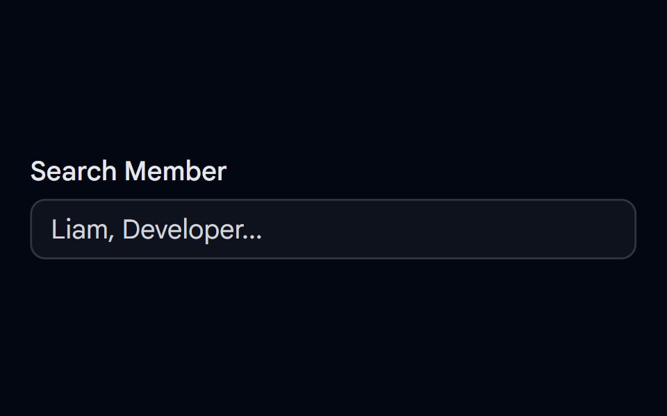 Autocomplete-04 - Team Member SearchShadcn Space · ReactAutocomplete with grouped team members, avatars, status dots, and spring-animated list items
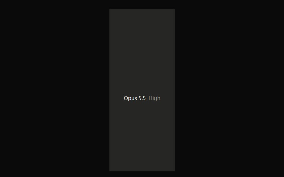 Claude Model SelectorNotra · ReactA hover-open model and effort picker built on shadcn DropdownMenu.
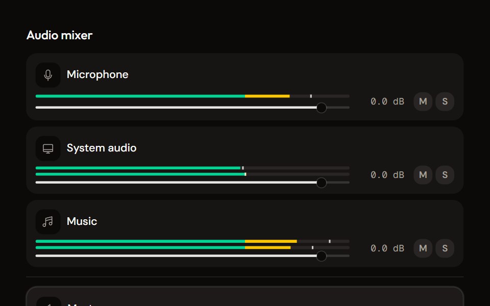 Mixeraudiocn · ReactThe container for channel strips: shared meter settings, keyboard navigation between strips, a master area and an…
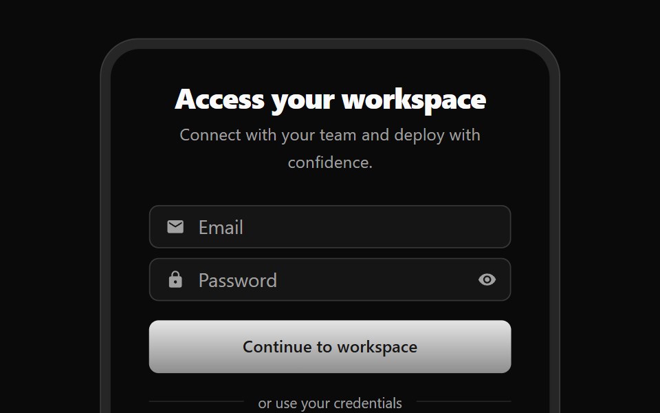 Auth 01Watermelon UI · React
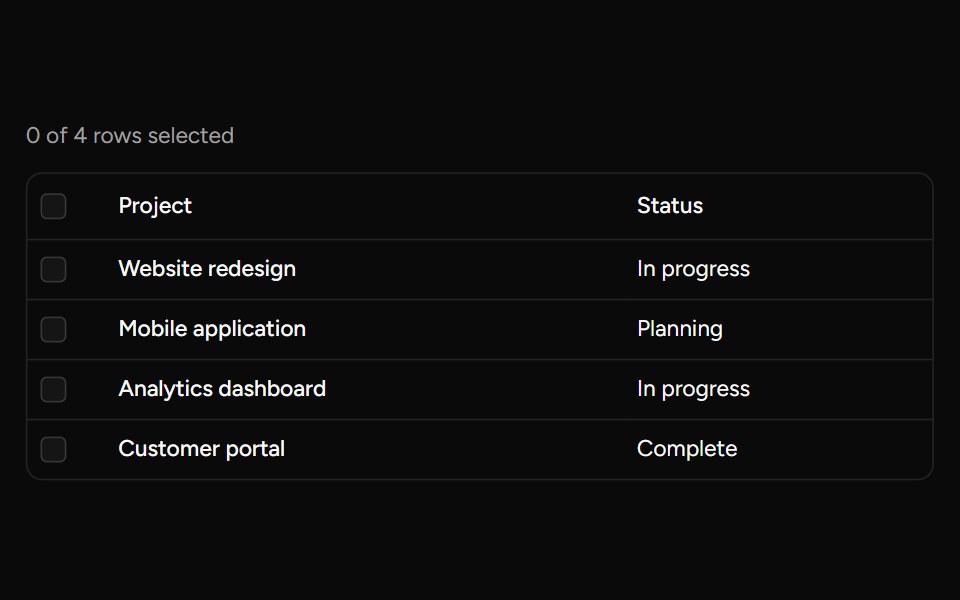 Header Checkboxsv-table · SvelteA select-all checkbox with support for an indeterminate state.
 Input Groupglasscn · React
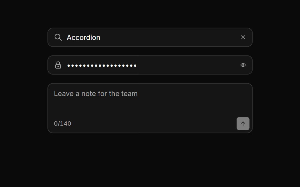 Input groupHextaUI · ReactAn input with icons, text, buttons or a keyboard hint attached, sharing one border and focus ring.
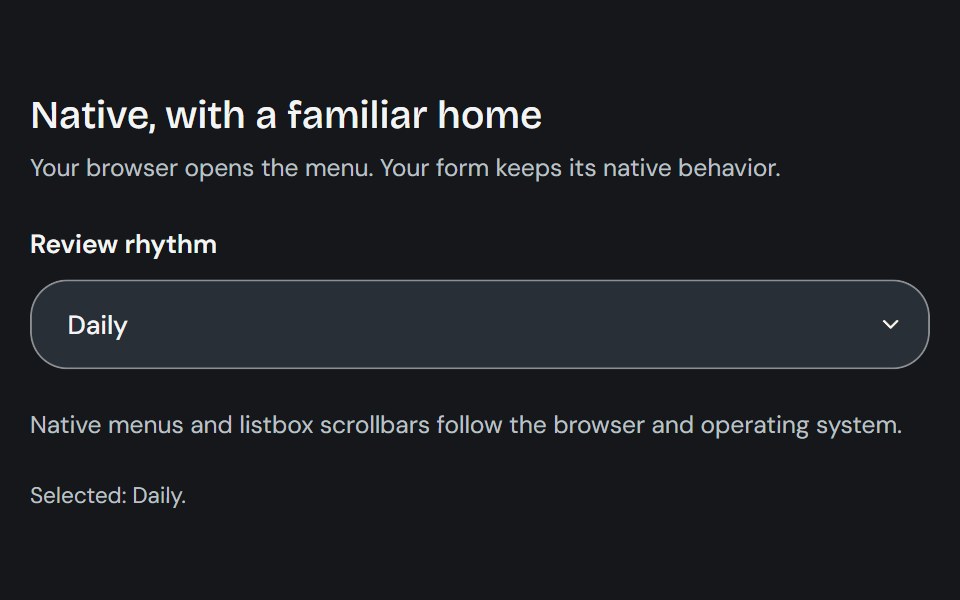 Native SelectCojeev UI · ReactUses the browser’s native select control to choose from a compact list of options.
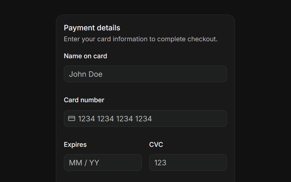 Payment formFLX UI · ReactName on card, card number with icon, expiry, CVC, and country select fields with a pay button.
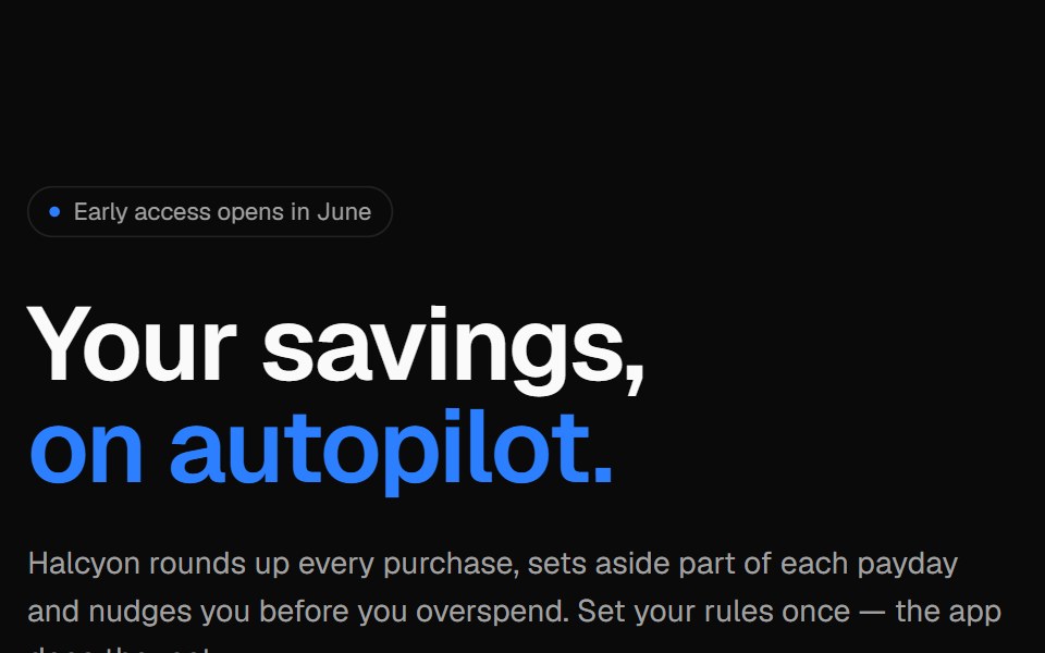 Phone split heroVelora UI · ReactApp launch hero with an email capture on the left and an app screen in an iPhone frame.
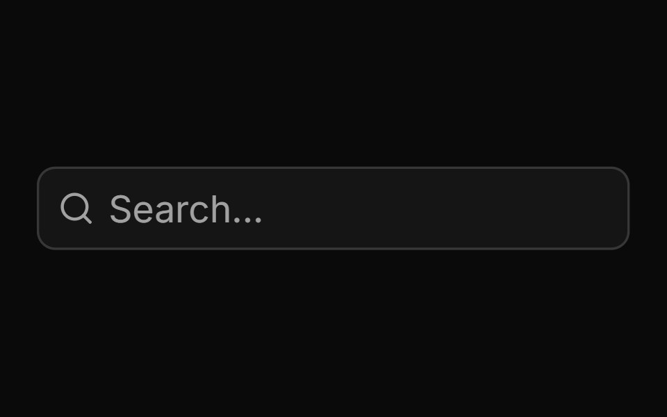 Basic Input Groupsv-particles · Svelte
 Bento 01D2Studio UI · ReactBento grid for an education program platform with admin overview, faculty view and a program form.
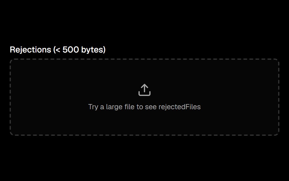 File Uploadark-cn · ReactA shadcn-style file upload component built with Ark UI primitives.
 combo-boxIntent UI · Reactcombo-box
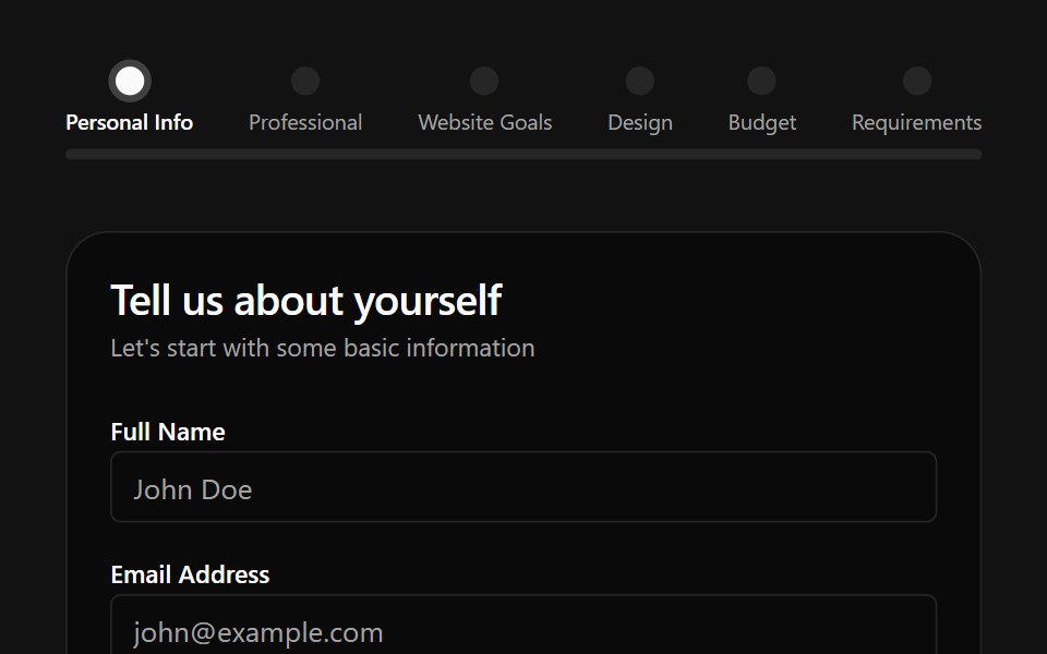 Multiple Step Form DemoSpectrum UI · Reactcomponent for the Multiple Step Form Demo
 ComboboxFluid Functionalism · ReactType-to-filter combobox with single or multiple (chips, merged selection backgrounds) selection: a text field that…
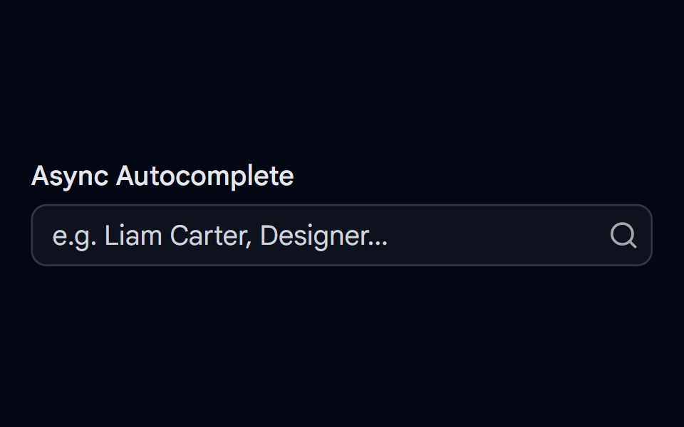 Autocomplete-05 - Async SearchShadcn Space · ReactAutocomplete with debounced async search, loading spinner, error handling, avatars, and spring-animated results
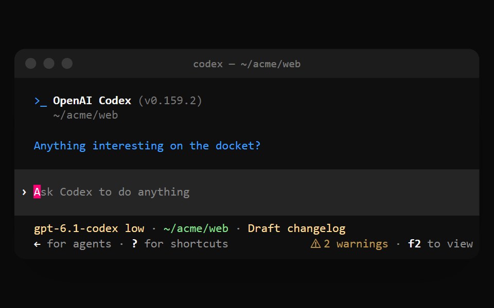 Codex ComposerNotra · ReactThe prompt band with a block cursor, the model and directory status line and shortcut hints.
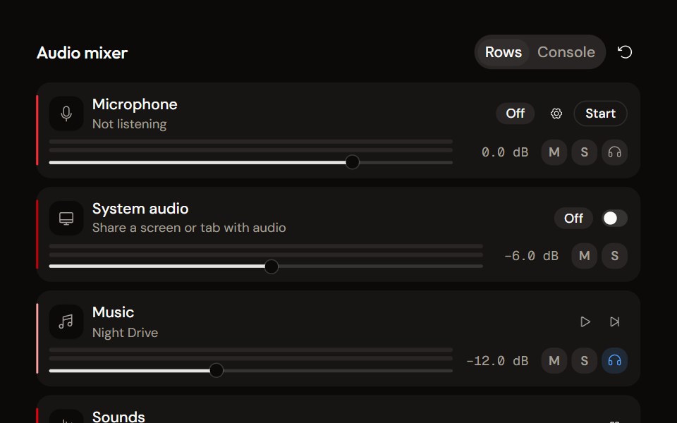 System Audio Mixeraudiocn · ReactThe complete mixer: microphone, system audio, music and sound pads with meters, faders, mute, solo, monitor and…
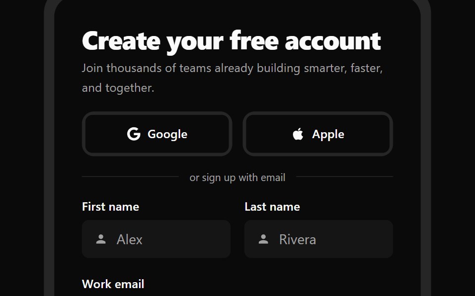 Auth 02Watermelon UI · React
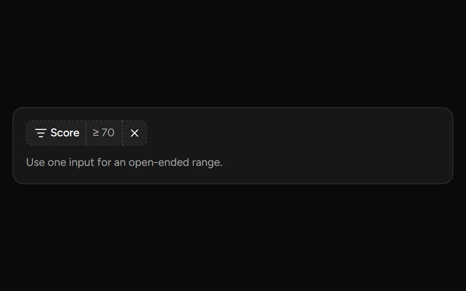 Number Range Filtersv-table · SvelteA number range picker with exact inputs, an optional slider, and explicit apply behavior.
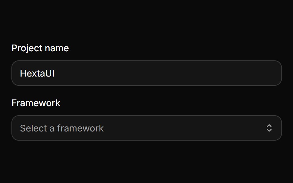 Native selectHextaUI · ReactThe browser's own select, styled to match Input, with a quiet placeholder, Field support and the OS picker on every…
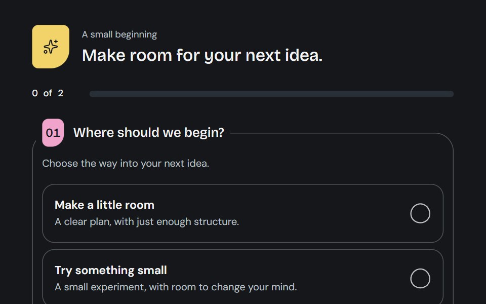 QuestionnaireCojeev UI · ReactA little guided brief: open questions, a focused journey or a two-column worksheet with living choice marks and honest…
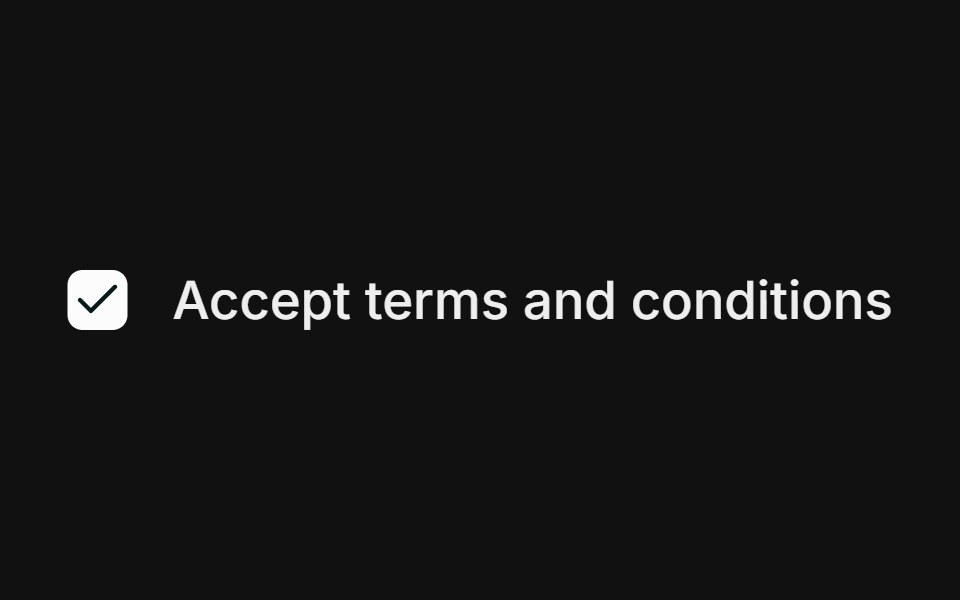 BasicFLX UI · ReactSingle checkbox with a label.
 Mega menu navbarVelora UI · ReactTop bar with a keyboard-accessible Product mega menu, search, sign-in and a slide-over mobile menu.
 Basic Otpsv-particles · Svelte
Libraries with shadcn/ui input components
Related categories
- Input Components
- React Input Components
- Tailwind CSS Input Components
- Svelte Input Components
- React Native Input Components
- Animated Input Components
- shadcn/ui Form Components
- shadcn/ui Select Components
- shadcn/ui Text Input Components
- shadcn/ui Form Field Components
- shadcn/ui Switch Components
- shadcn/ui Textarea Components
- shadcn/ui Checkbox Components
- shadcn/ui OTP Input Components
- shadcn/ui Combobox Components
- shadcn/ui Date Picker Components
- shadcn/ui Radio Components
- shadcn/ui Login Form Components
- shadcn/ui Search Input Components
- shadcn/ui File Upload Components
- shadcn/ui Slider Components
- shadcn/ui Signup Form Components