 Dev Design Library
Animated Input Components
Dev Design Library indexes 490 Animated input components from 57 open-source UI libraries, with the most coming from UI Lab, Arc Library, Shadcn Space, ReactFrame and Spectrum UI. Each one links to its page with the source code, a live preview where available, the library license and the install command. These are the input components tagged as animated: motion on hover, on scroll or on load, usually built with CSS transitions or Framer Motion.
Showing 120 of 490, a mix from every library. Open a library to see all of its components.
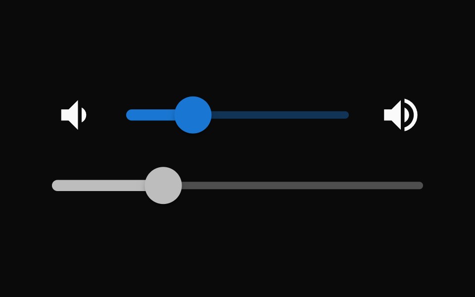 SliderMUI / Material UI · React
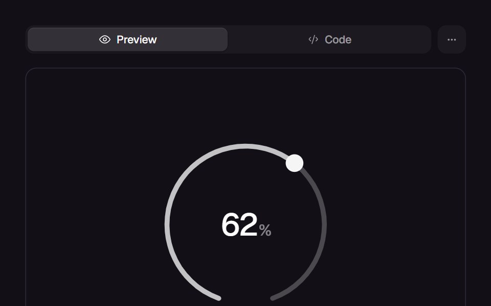 Comet DialReact Bits · ReactTick-ring dial you flick by angle: the reading launches on a spring and a velocity-driven comet streaks behind the lit…
 DropdowndaisyUI · CSS (Tailwind)
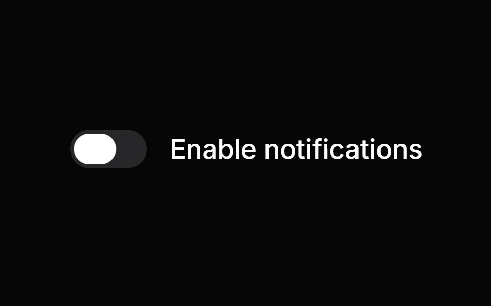 SwitchHeroUI · ReactA toggle control that allows users to switch between on and off states.
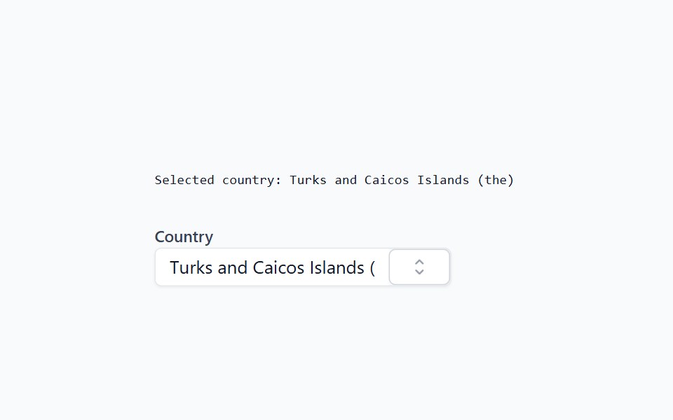 ComboboxHeadless UI · React
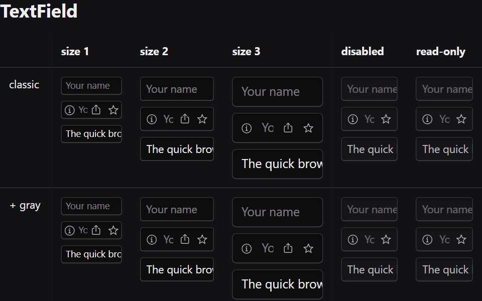 Text FieldRadix Themes · React
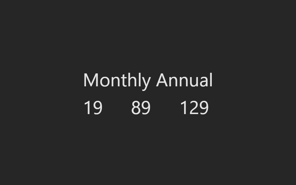 Toggle CountPreline UI · JavaScript (HTML + Tailwind)
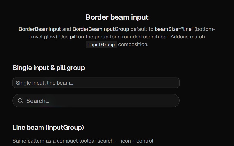 Border Beam InputCult UI · Reactborder-beam on Base UI input and input-group primitives with line or full border glow
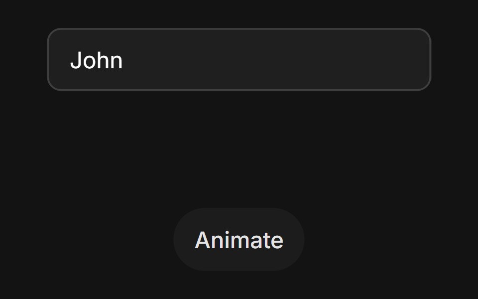 Error State Shaketransitions.dev · HTML/CSSInput that shakes sideways when the value is invalid.
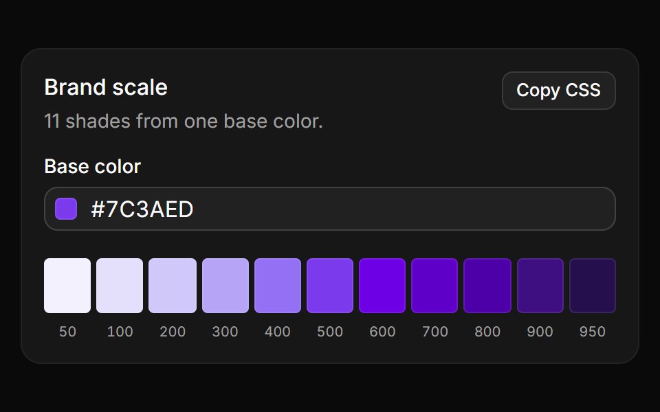 Brand scaleReUI · React11 shades from 50 to 950 generated in OKLCH from one base color, copied as CSS variables.
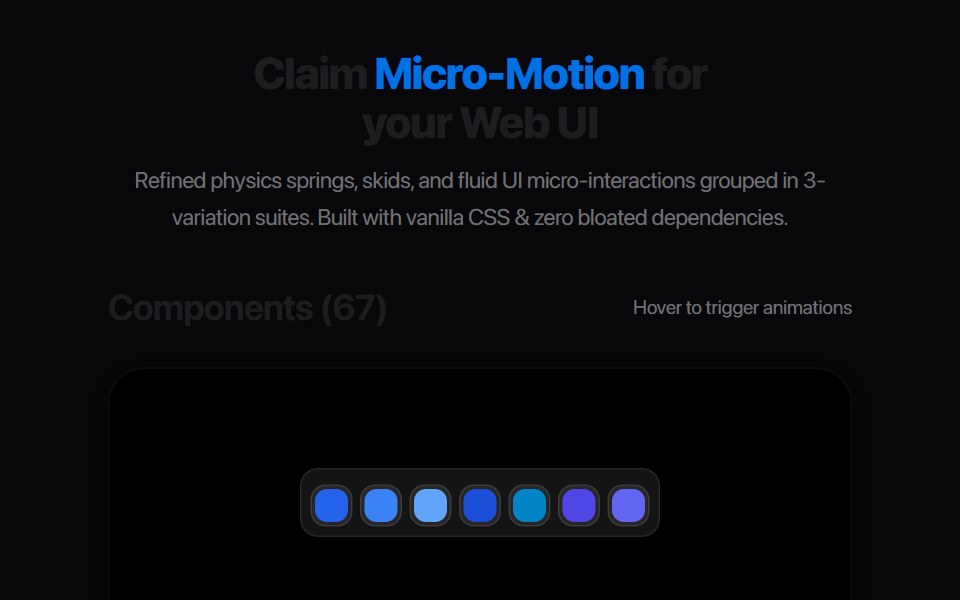 Ab Segmented TabsAmicro Micro Transitions · ReactSegmented control where active letter (A or B) slides into a solid pill.
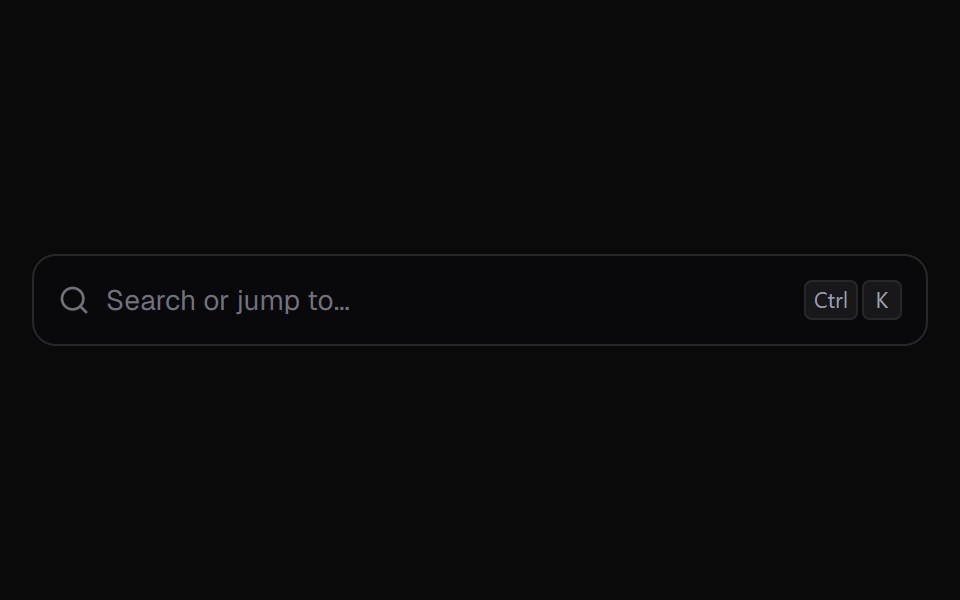 Command PaletteKokonut UI · React⌘K command palette with nested pages, fuzzy matching and in-row progress for running actions.
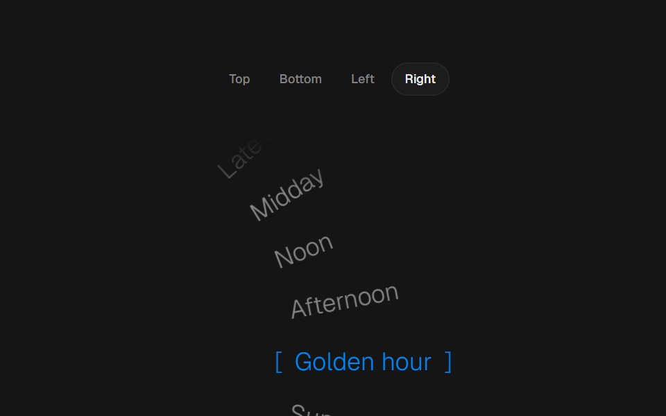 Arc PickerbeUI · ReactRadial text picker with top, bottom, left or right curves, smooth wheel movement and live selection on each scroll…
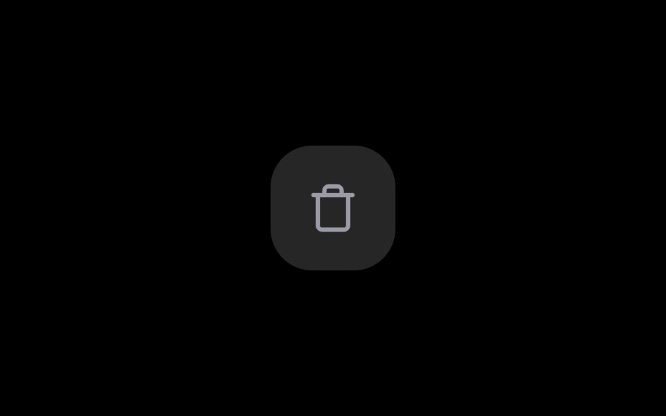 Delete ButtonRare UI · ReactA delete button that asks for confirmation in place, no dialog needed.
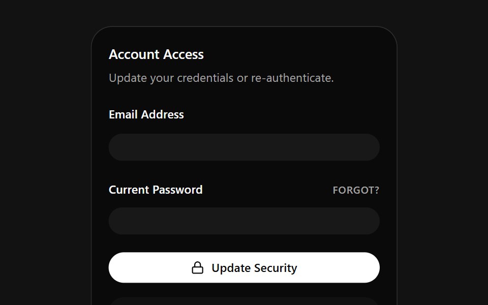 Account Access CardSpectrum UI · ReactA credentials card that auto-fills email and password on a loop, with a danger zone.
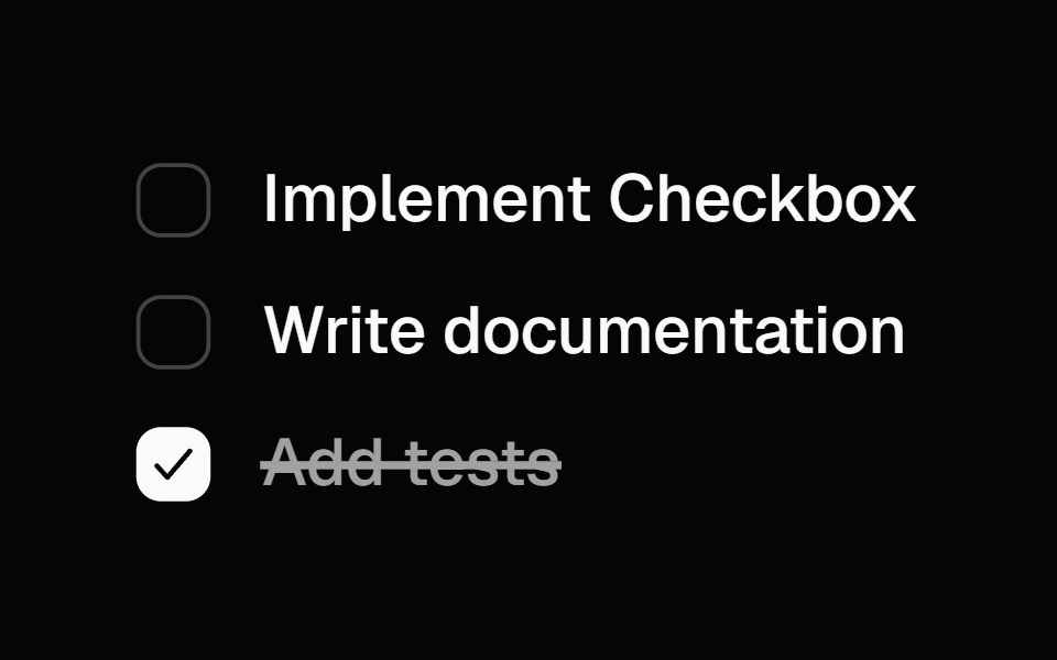 Animated CheckboxSpell UI · ReactAnimated checkbox with spring transitions and strike-through text effect.
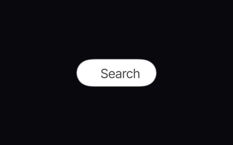 Gooey SearchVengeance UI · ReactMorphing gooey blob search button with animated results
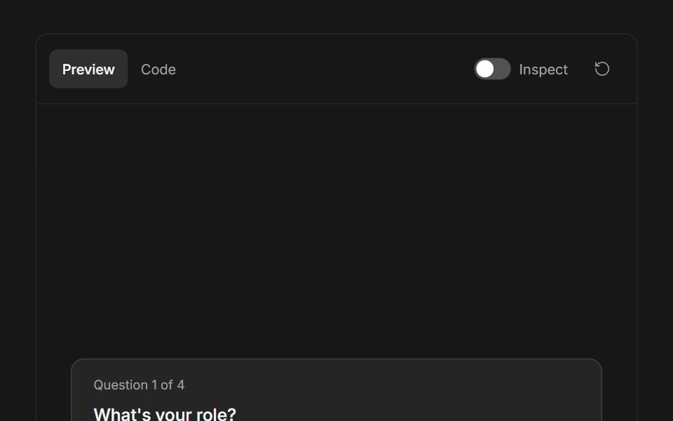 Ask User QuestionsFluid Functionalism · ReactStepped question flow with numbered options, keyboard shortcuts (1–9), single or multi-select, inline 'other' text…
 Expand Theme ToggleTheme Toggles · ReactAn animated theme toggle with an expanding sun-and-moon transition.
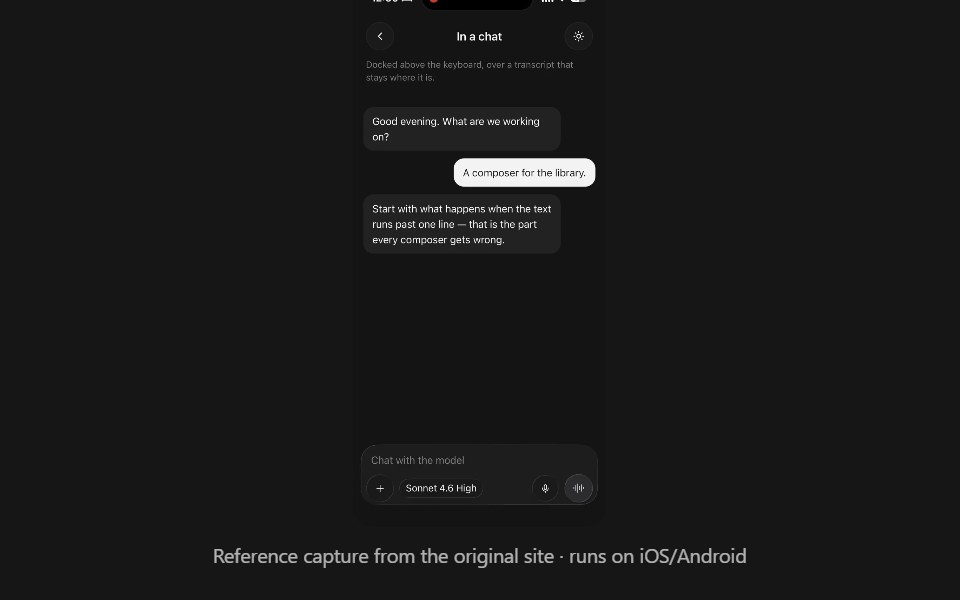 Ai InputPanel UI · React NativeA prompt composer: a field that grows to five lines, a row of controls, and the sheet they open.
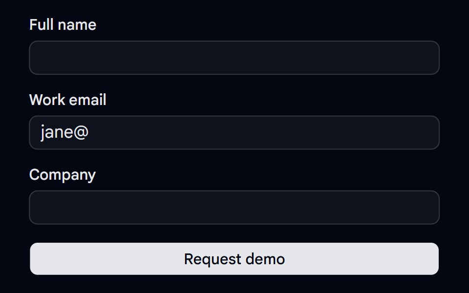 Alert 18 - Form Error SummaryShadcn Space · ReactForm error summary alert that lists every invalid field with links that focus it, receives focus on submit, and clears…
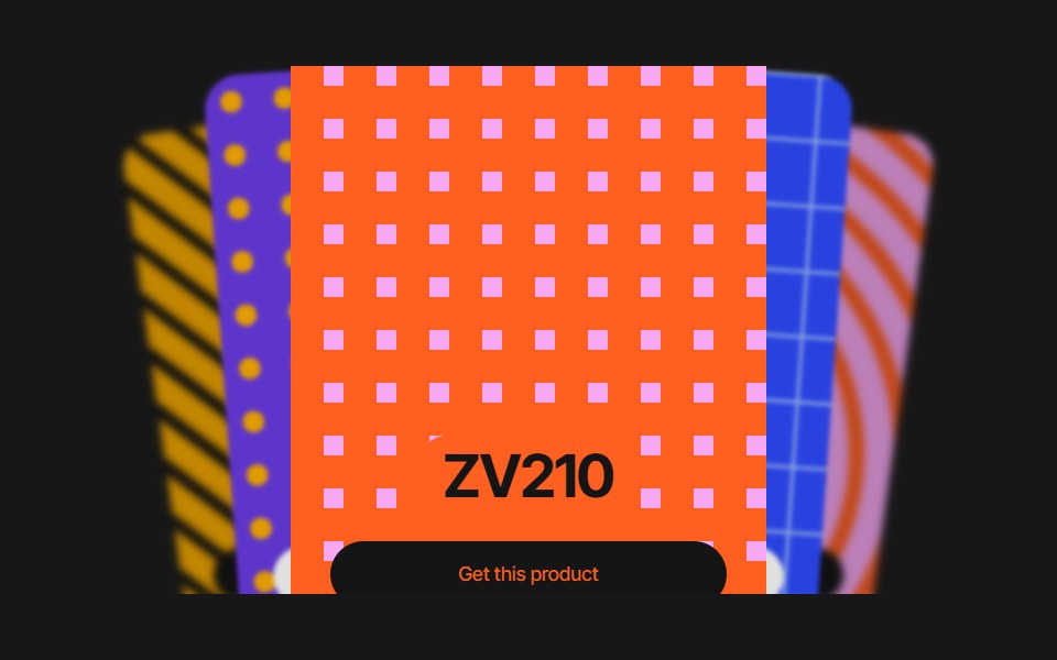 Cards SliderPixel Perfect · ReactCards Slider — an infinite deck of product cards. The active card sits
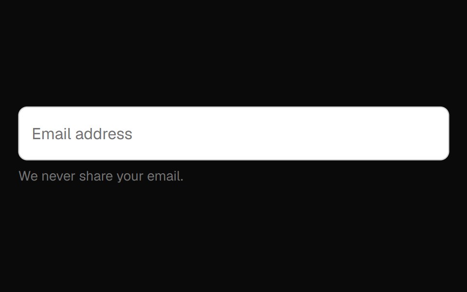 Floating Label Field InputOpenSourceUI · React
 Day Pickeruselayouts · ReactA custom day picker component with smooth animations.
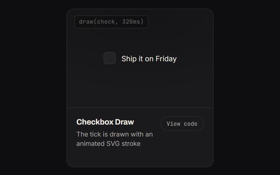 Checkbox DrawKinetics · HTML/CSSThe tick is drawn with an animated SVG stroke
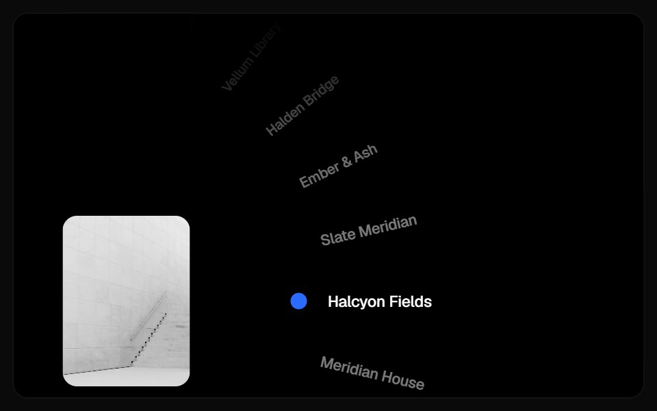 Wheel CarouselComponentry · ReactA cinematic rotating-wheel picker with inertial drag, curved fading labels, and crossfading project imagery.
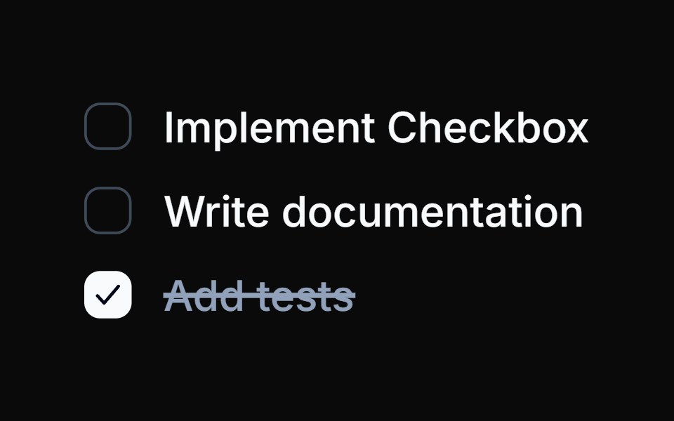 Spell Animated CheckboxAnimations (Svelte) · Svelte
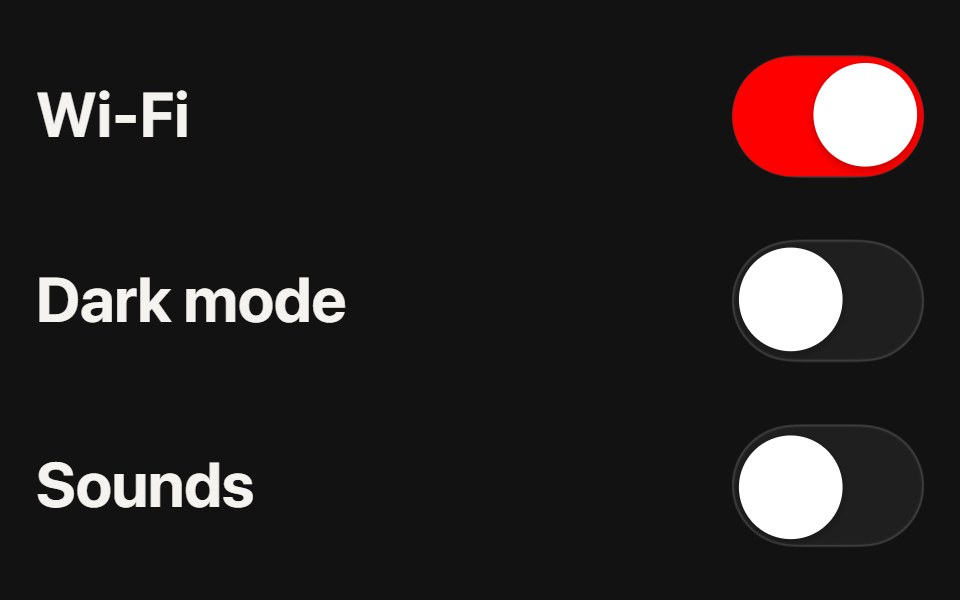 Liquid SwitchSwiftPieces · SwiftUIA toggle whose red fill pours across a glass track as the thumb crosses, swelling under the finger, with a drag that…
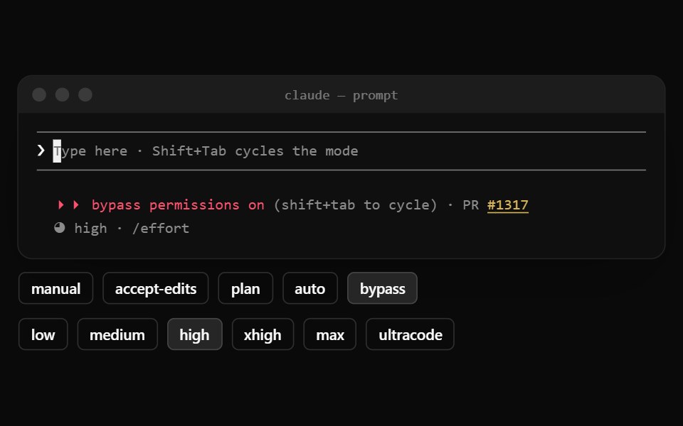 Claude Code PromptNotra · ReactThe input between two rules with the permission mode, PR link and effort below.
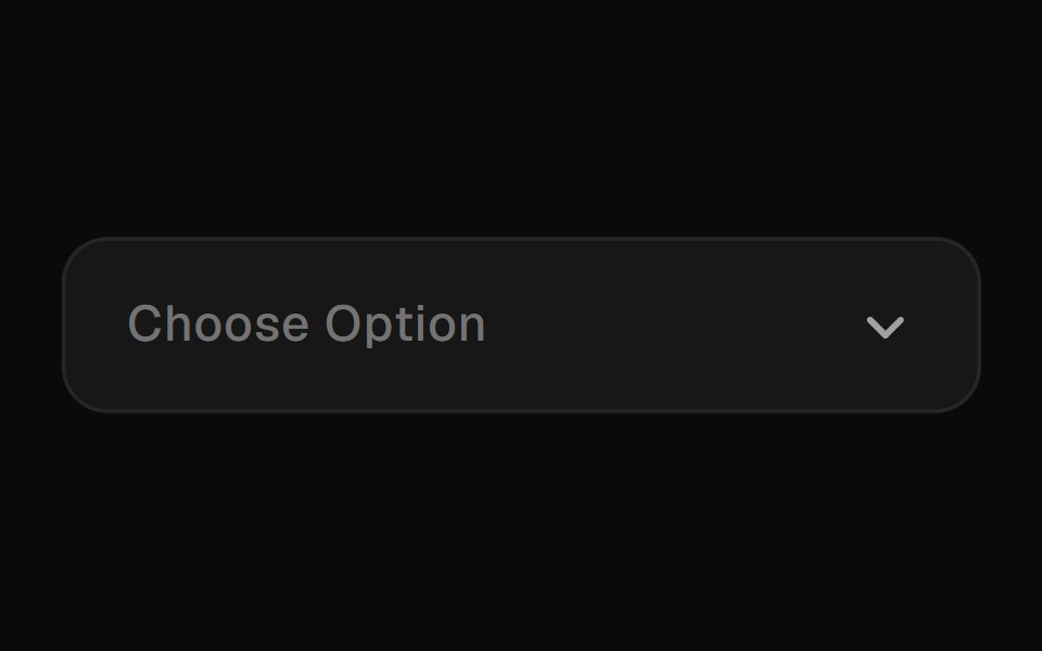 Animated SelectGreatUI · React
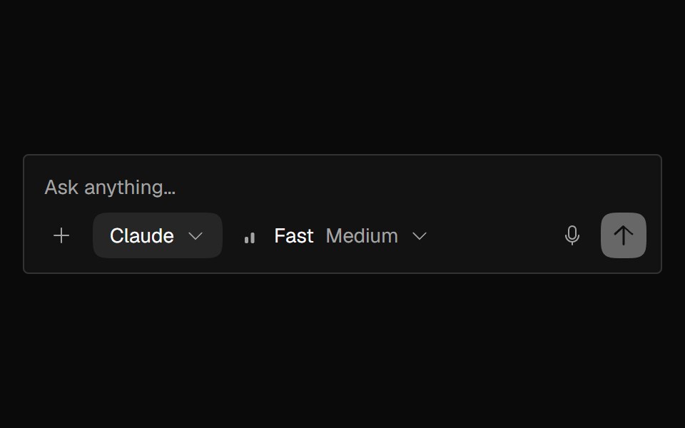 AI InputNexvyn UI · ReactAI composer textarea with auto-grow, send/stop button morph, attachment slots, and Enter-to-send.
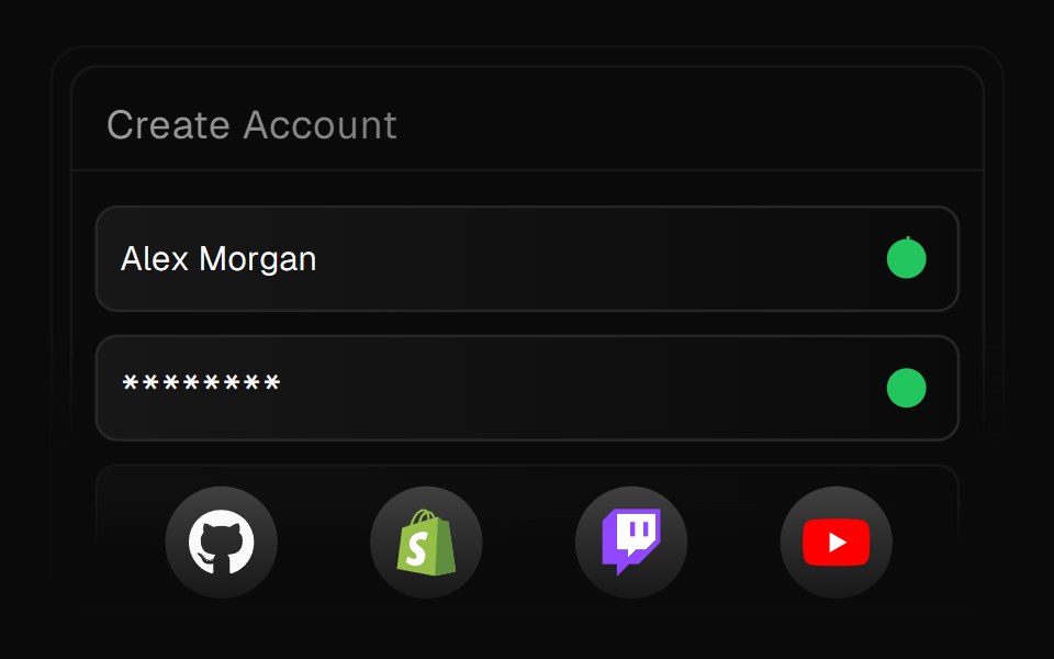 Animated FormForge UI · ReactAnimated form mimicking account creation with progressive name/password animation and completion checkmarks.
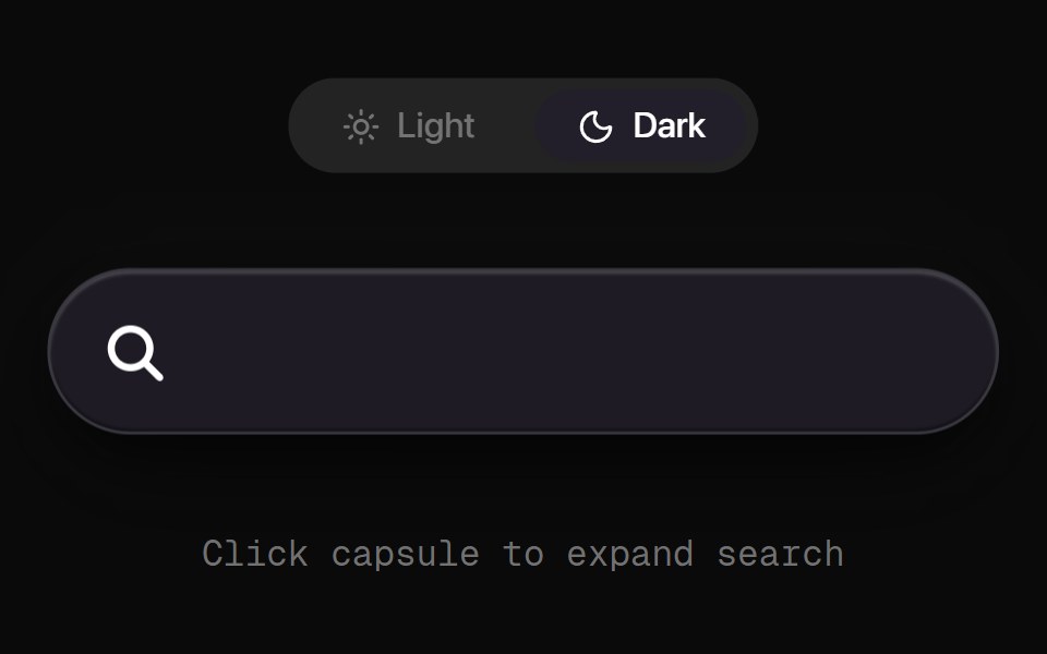 Morph Search CapsuleRewamp UI · ReactSleek, tactile search pill capsule with click ripple physics and a buttery-smooth fluid SVG morph transition between…
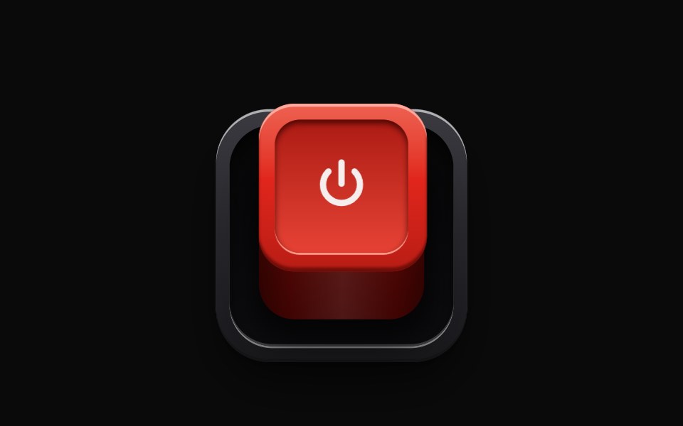 RealisticSwitchEvil Buttons · ReactA latching push switch, a raised box that sinks into its socket when pressed, stays down and glows while on, and…
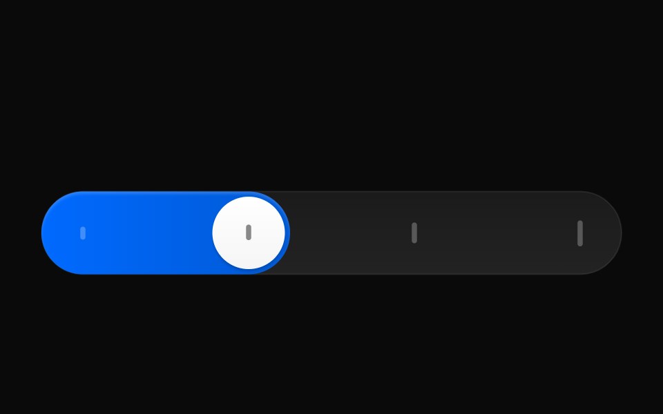 Reasoning EffortAI CSS · React
 Gooey Color Picker23rd.dev · ReactA floating color picker with a circular hue wheel, alpha slider, hex field, and motion-powered open/close.
 Animated CheckboxSona UI · ReactAn accessible Base UI checkbox with a drawn checkmark and a restrained animated state change.
 Accordion MultiselectWatermelon UI · React
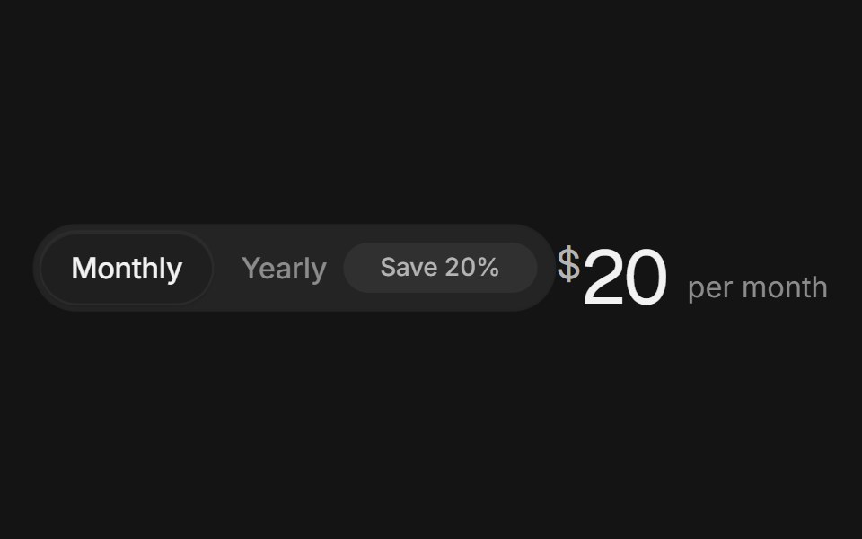 Billing toggleArc Library · ReactA monthly and yearly switch with a savings badge and prices that roll to the new amount.
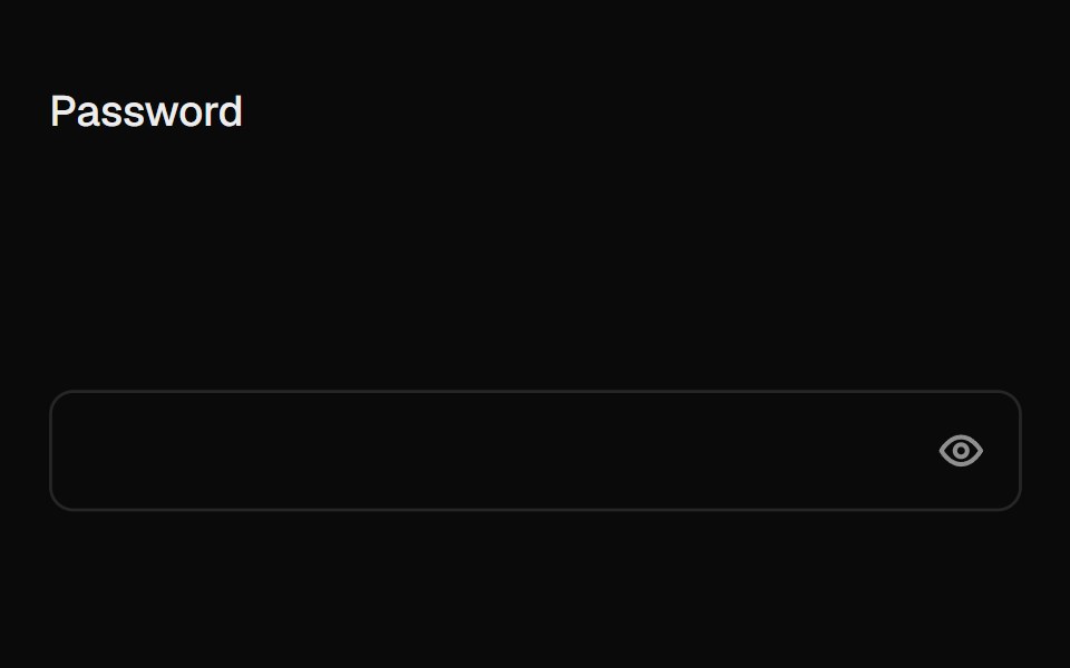 Caps Lock WarningUI Lab · ReactA small caps lock key with its light on slides into the field when caps is on.
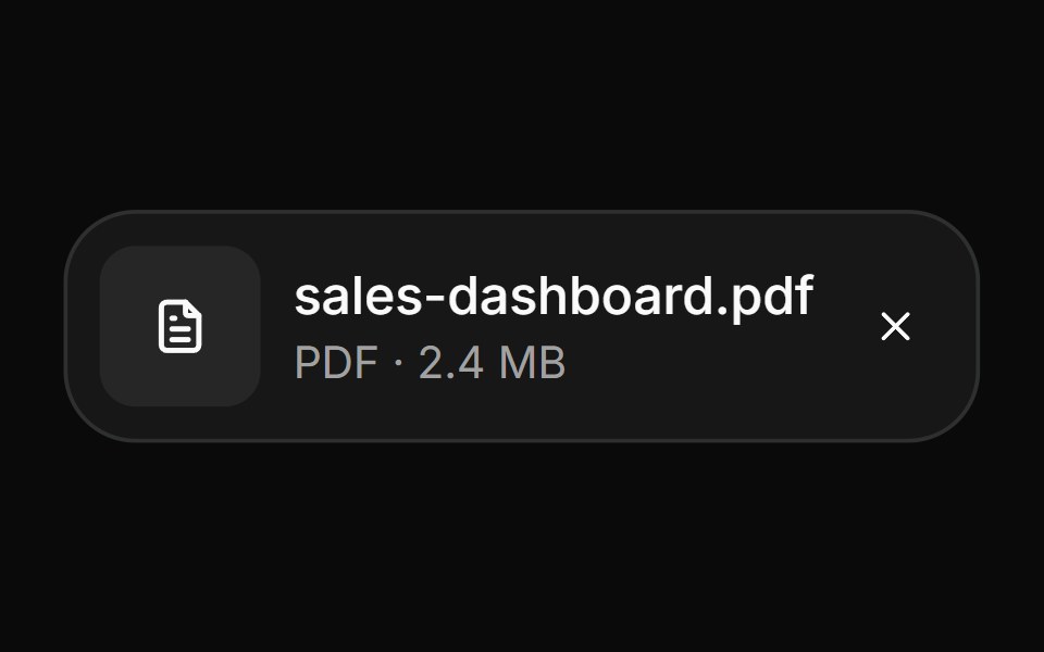 AttachmentHextaUI · ReactFile and image cards for uploads, with progress, states, actions, a full-card trigger and names that keep their…
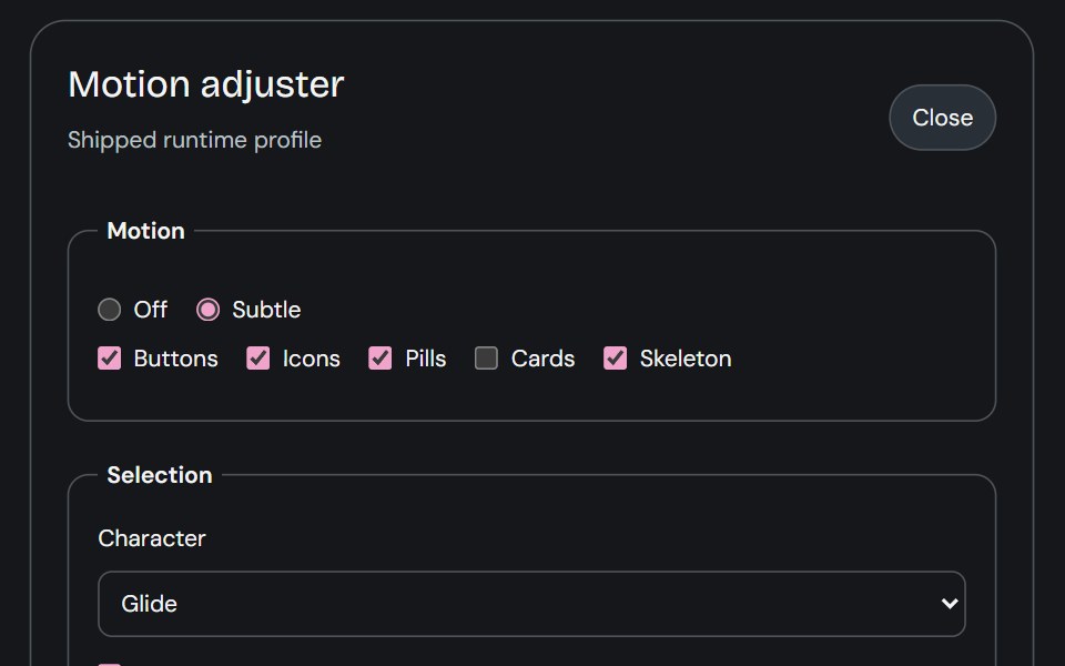 Motion AdjusterCojeev UI · ReactProvides live controls for the shared motion settings and editable body profiles used across the library.
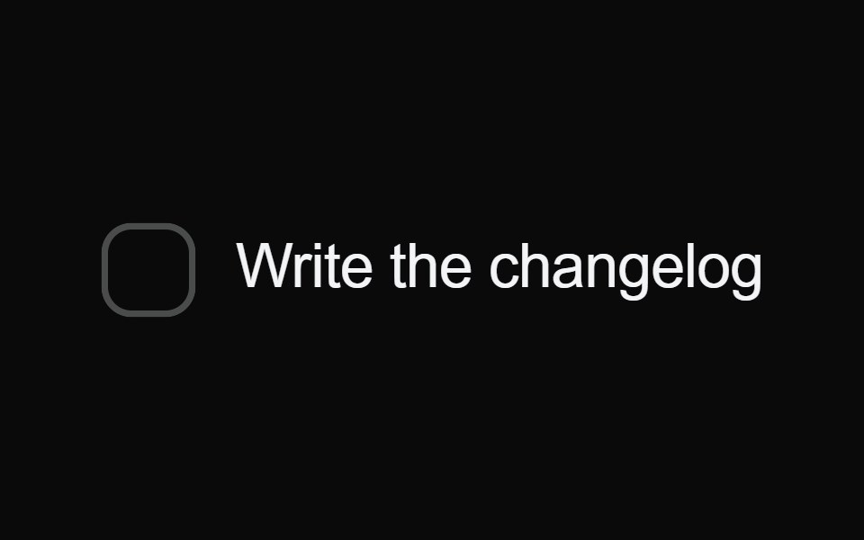 Bounce CheckboxMicroKit · ReactA checkbox whose fill springs out past the box with a little swell, draws its tick, then strikes the label through and…
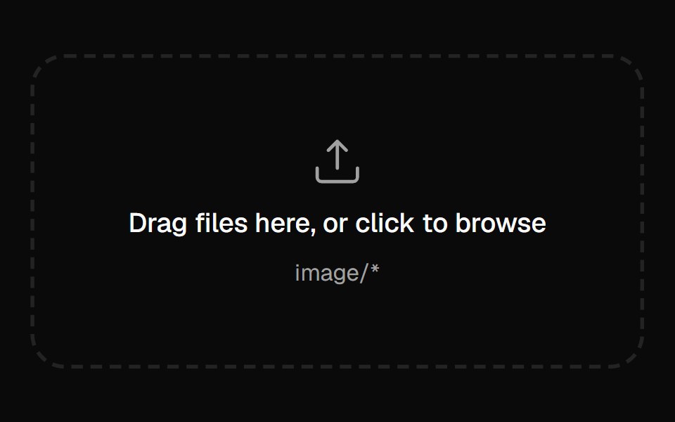 File DropVelora UI · ReactUpload zone that lifts and glows while a file is over it.
 End Loading Spinnersv-particles · Svelte
 Contact FormPin UI · React
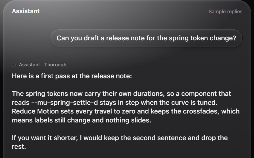 AI composerMetal UI · React + SwiftUIA chat block: a composer that grows, attachments, a model choice, and replies that stream in word by word with stop…
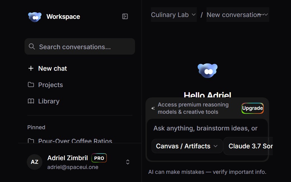 Ai Chat WorkspaceSpaceUI · ReactFull-featured AI Studio chat workspace template featuring conversational threads, multi-model selection, real-time…
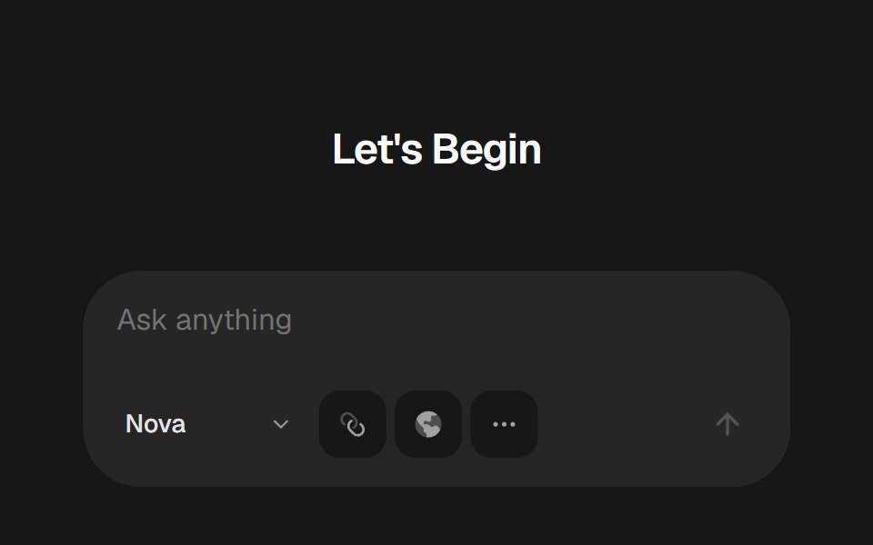 AI Chat BoxSkecher UI · ReactA polished AI prompt composer with model controls, attachments, and animated interaction states.
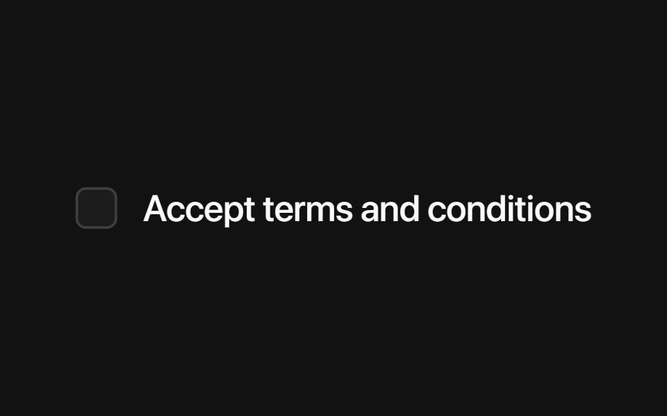 Base CheckboxSora UI · ReactAn accessible, stylable checkbox built on Base UI with a Motion-friendly animated indicator.
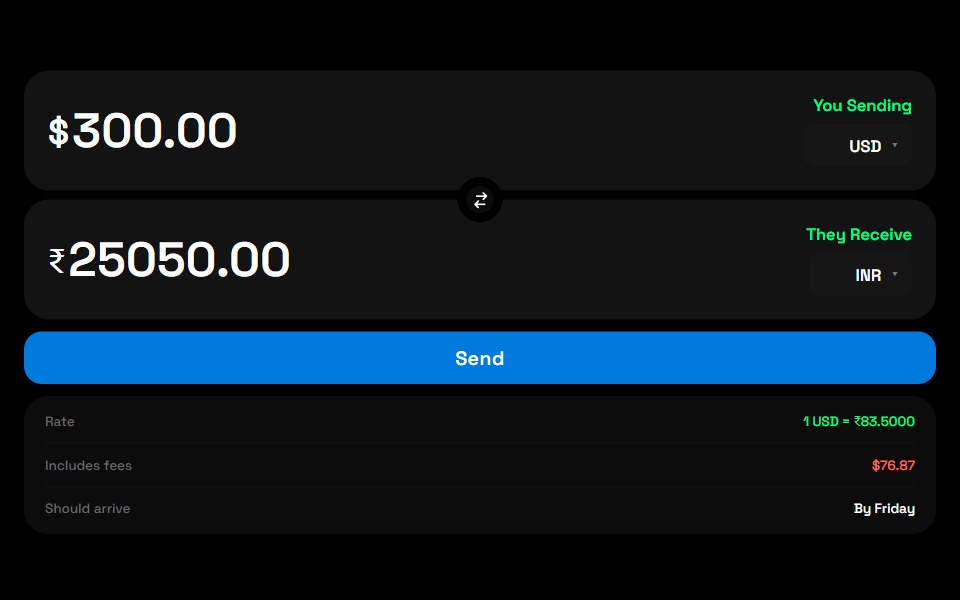 Currency SwitchZAYX · React Native
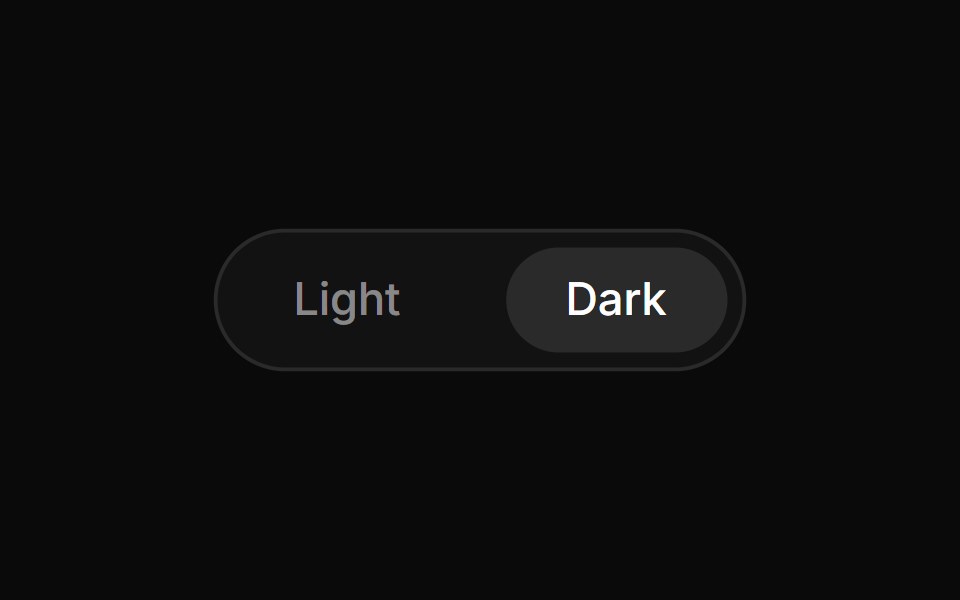 Theme ToggleCue Foundations · React
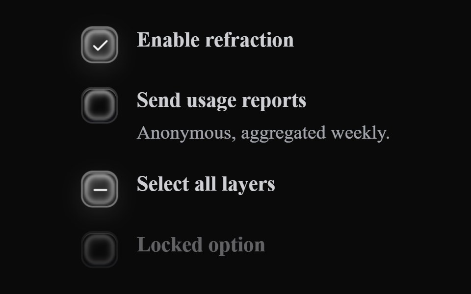 Liquid CheckboxLiquefy UI · ReactCheckbox in liquid glass style.
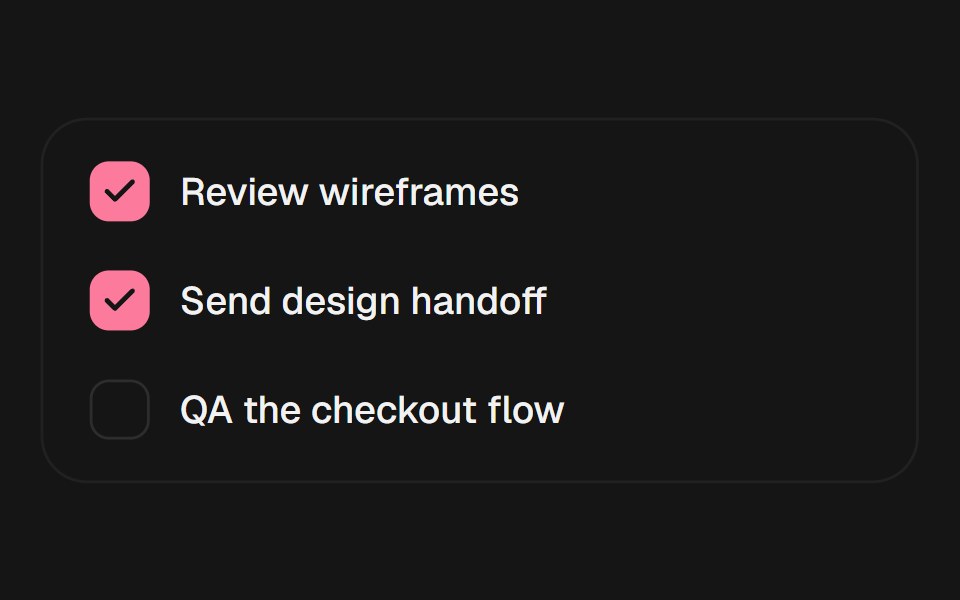 CheckboxEaseUI · ReactCheckbox on a real checkbox input, with a check mark that pops in rather than just appearing.
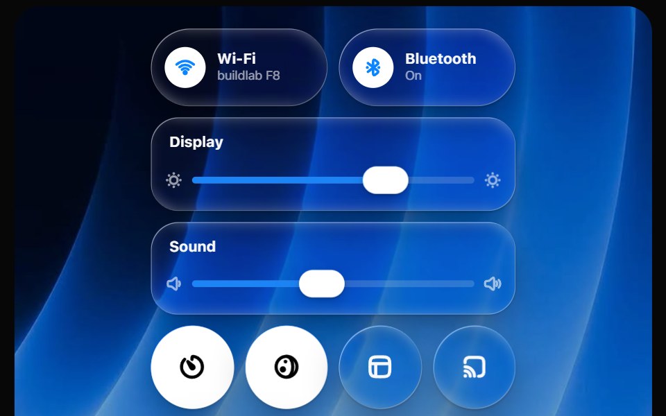 Glass Control CenterOpaline · ReactmacOS-style Control Center kit — glass modules, toggles, light-filled sliders and buttons.
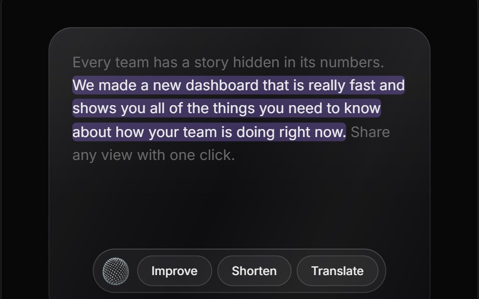 AI Edit ReviewReactFrame · ReactAn AI text editor that rewrites a selected passage, streams a word-level diff review with accept/reject actions, and…
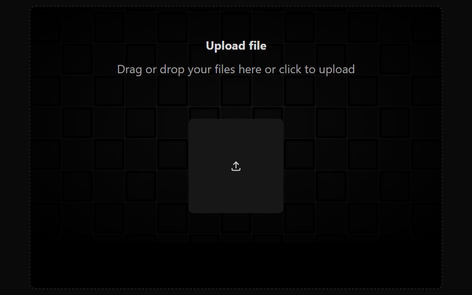 File UploadAceternity UI · React
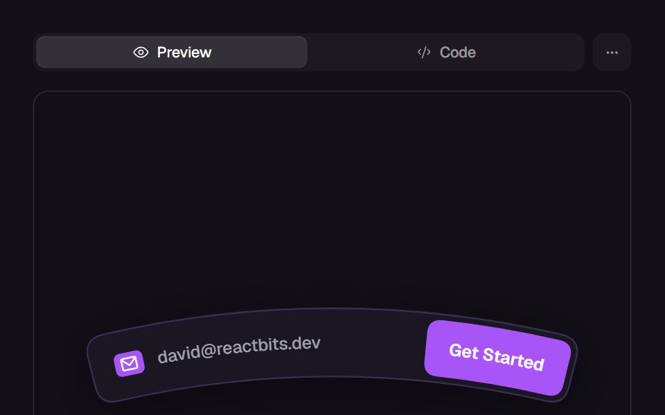 Curved InputReact Bits · ReactArc-bent input bar with text, caret and submit button all following the curve.
 RadiodaisyUI · CSS (Tailwind)
- ComboboxPreline UI · JavaScript (HTML + Tailwind)
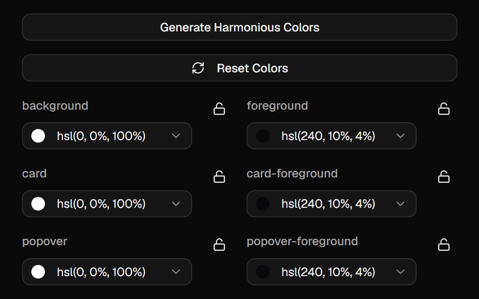 Color PickerCult UI · ReactInteractive color picker component with HSL support and preset colors
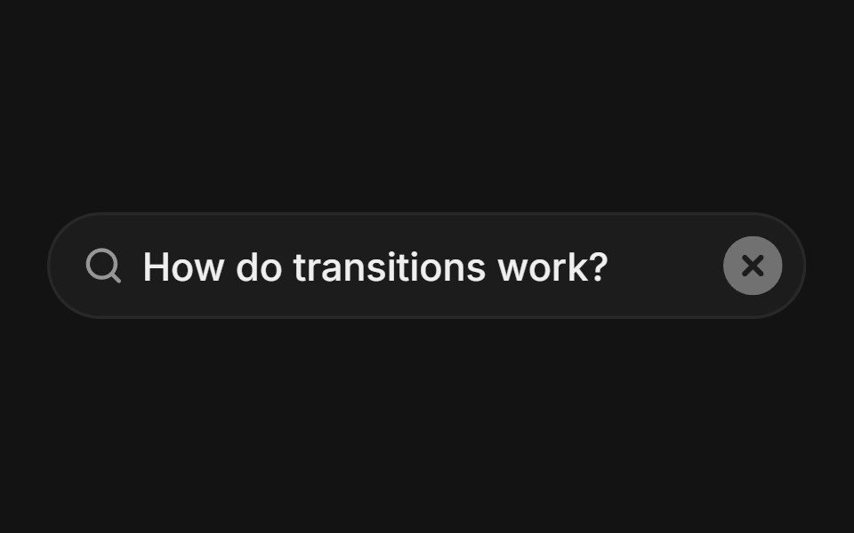 Input Clear With Dissolvetransitions.dev · HTML/CSSInput whose text dissolves away when the clear button is pressed.
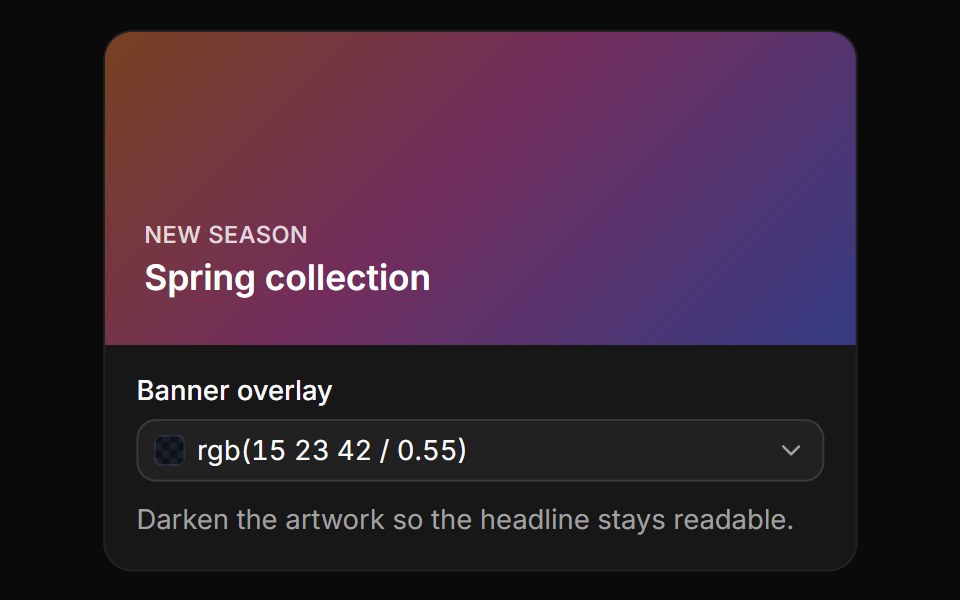 OpacityReUI · ReactA banner overlay with an opacity slider and field, written as rgb() with alpha.
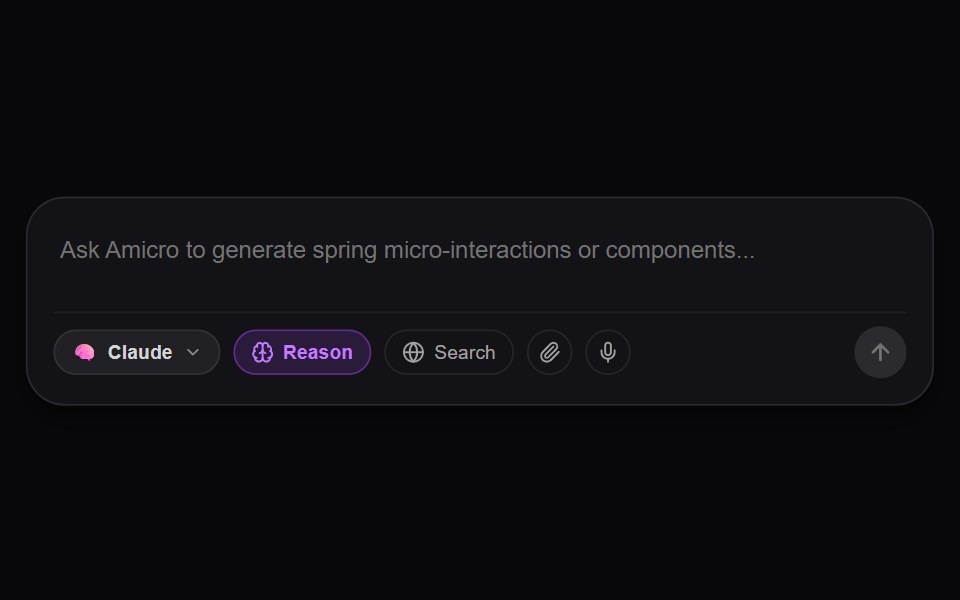 AI Prompt Input StudioAmicro Micro Transitions · ReactDynamic auto-expanding AI textarea with model switcher, live voice dictation wave pulse, web search & deep thinking…
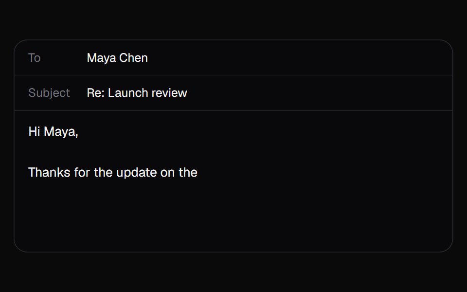 AI AutocompleteKokonut UI · ReactA text box that suggests how your sentence ends in grey after the caret. Tab takes it all, the right arrow takes one…
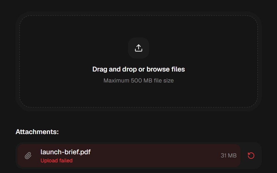 Attachment UploadbeUI · ReactA mixed attachment workspace with a dropzone, staggered file and image rows, animated upload, success, failure, retry…
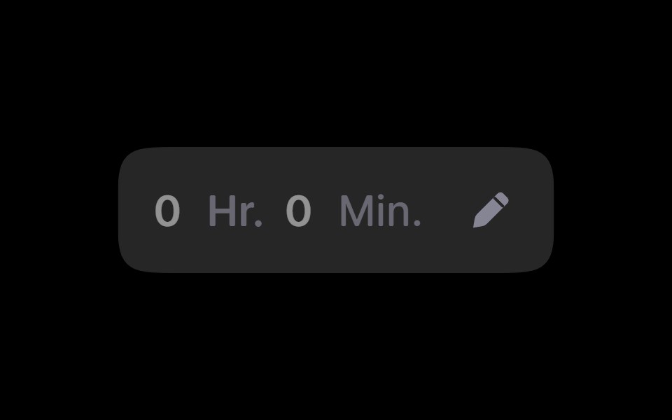 Duration PickerRare UI · ReactA gooey, spring-animated picker for entering a duration in hours and minutes.
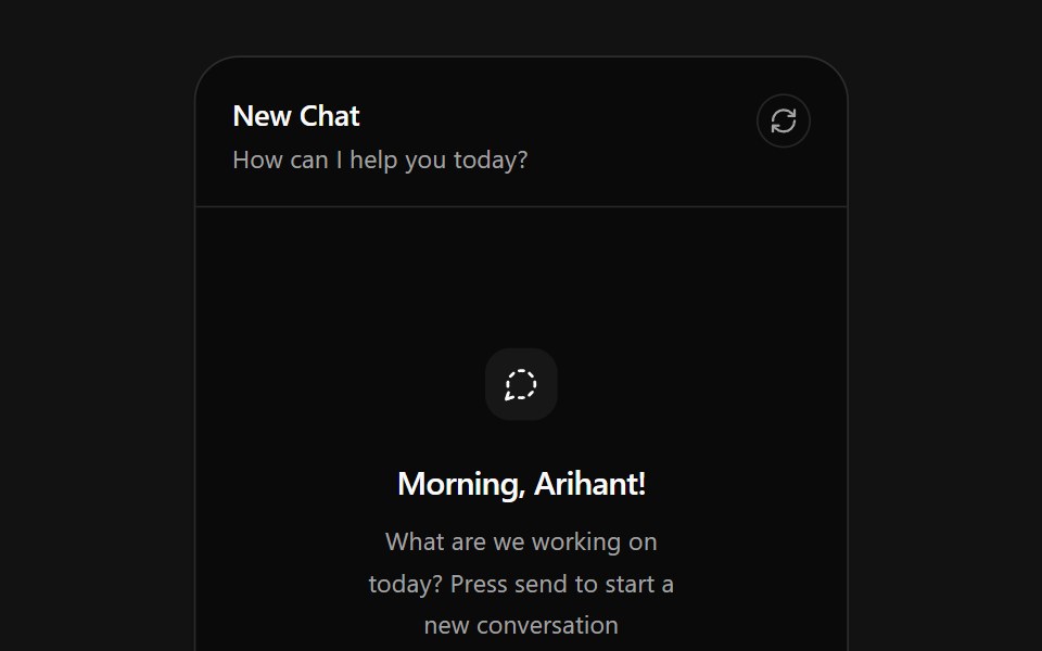 AI Chat CardSpectrum UI · ReactAn AI chat card that types prompts into its composer, with send, attach and reset actions.
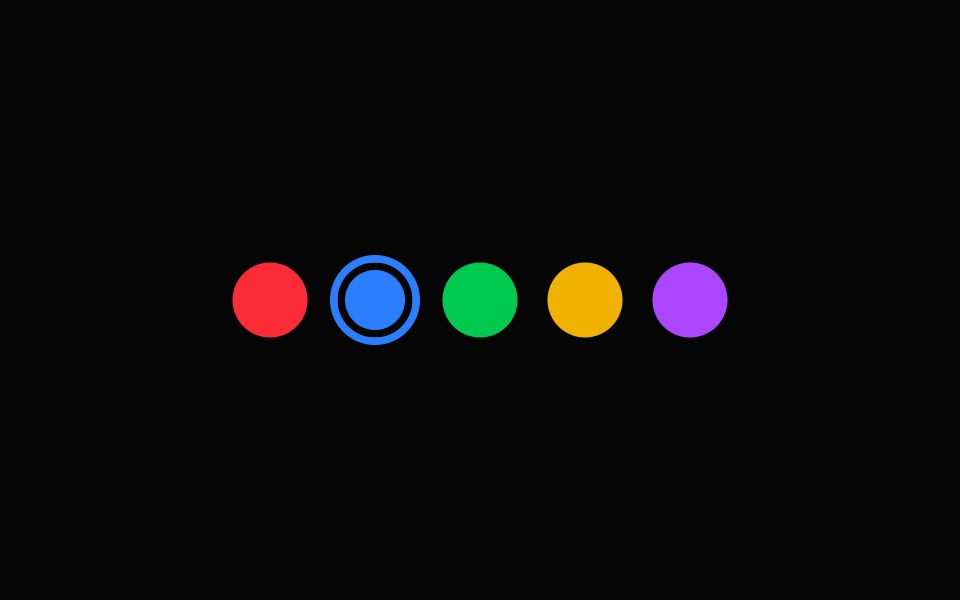 Color SelectorSpell UI · ReactInteractive color picker component.
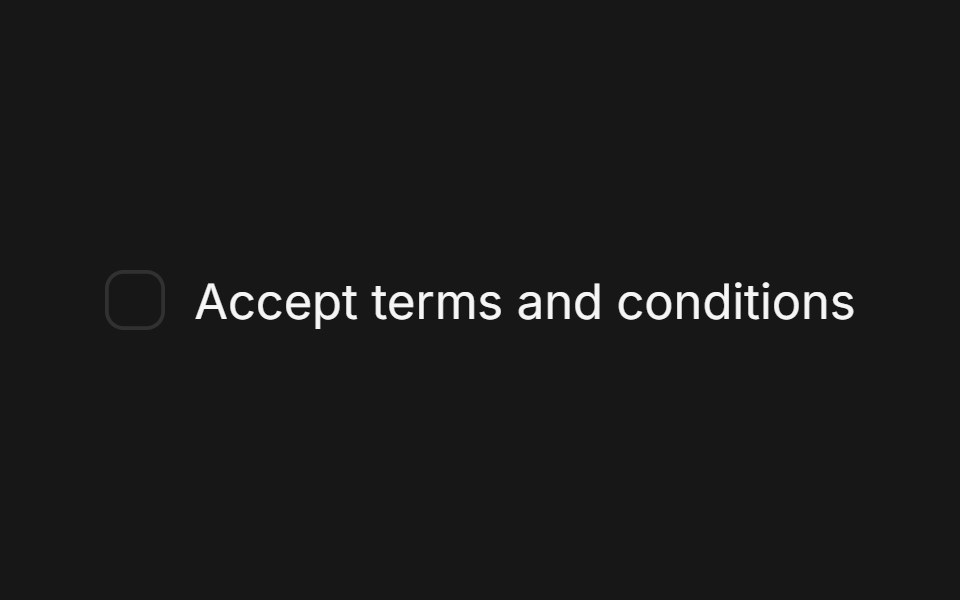 CheckboxFluid Functionalism · ReactA single checkbox: a hairline square that darkens on hover and a check that draws itself. Pairs with Field. Radix…
 Lightbulb Theme ToggleTheme Toggles · ReactAn animated theme toggle inspired by a lightbulb.
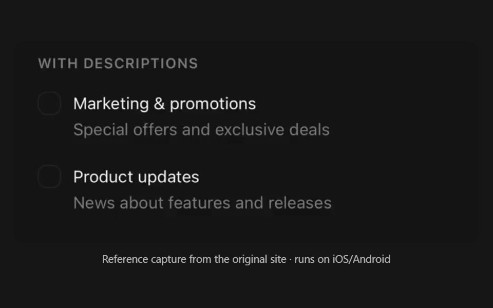 CheckboxPanel UI · React NativeAnimated checkbox, as a row or a selectable card.
 Autocomplete-03 - Vanish AnimationShadcn Space · ReactAutocomplete with vanish animation
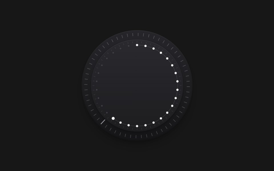 Dial Knob MotionPixel Perfect · ReactTactile rotary knob with layered bevel discs, two tick rings, and an amber dot-arc indicator. Drag or scroll to change…
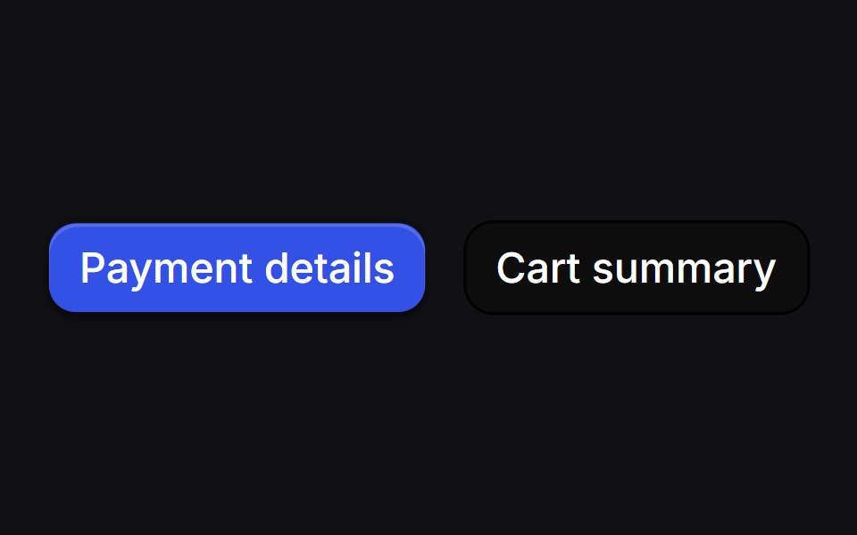 Drawer Buttonsuselayouts · ReactTwo buttons that open side drawers with a 3D fold. Payment comes from the right, cart from the left, and the fields…
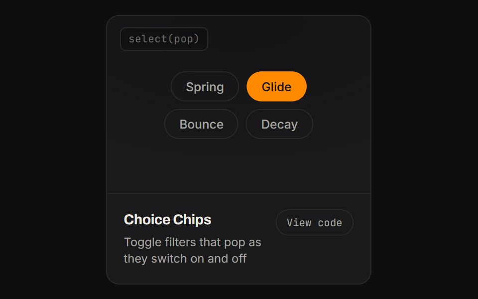 Choice ChipsKinetics · HTML/CSSToggle filters that pop as they switch on and off
 Spell Color SelectorAnimations (Svelte) · Svelte
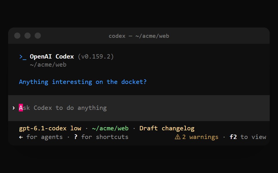 Codex ComposerNotra · ReactThe prompt band with a block cursor, the model and directory status line and shortcut hints.
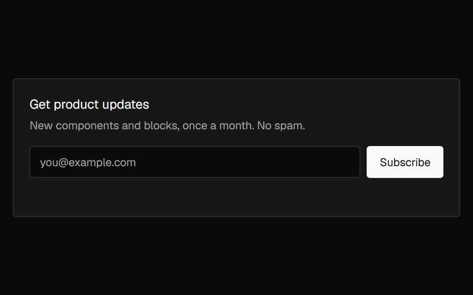 Banner SubscribeNexvyn UI · ReactAn email signup banner with inline validation that crossfades into a confirmation on success.
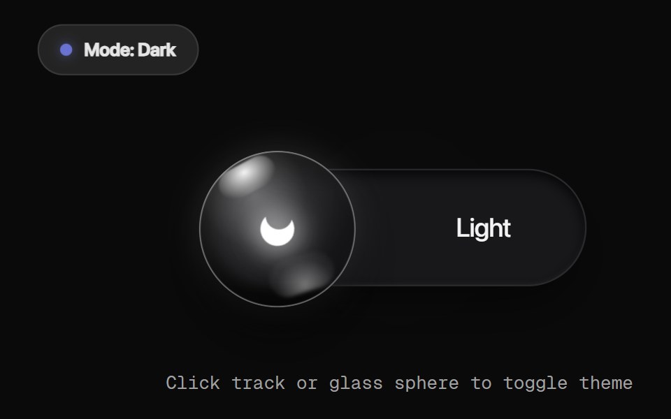 Glass Orb ToggleRewamp UI · React
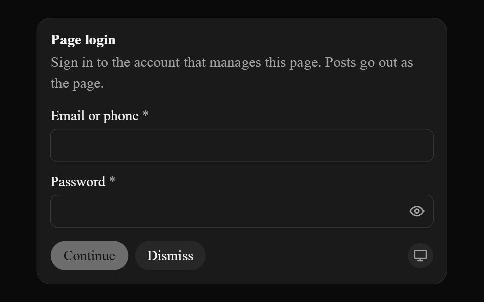 Secure InputAI CSS · React
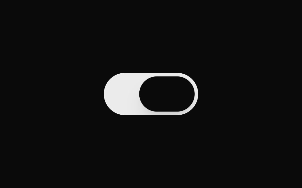 Animated SwitchSona UI · ReactAn interactive iOS-style squish switch built on Base UI Switch primitives, with interruptible press feedback and a…
 Carousel SliderWatermelon UI · React
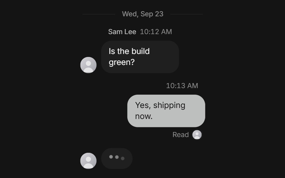 Chat threadArc Library · ReactA chat thread with grouped messages, reactions, read receipts, typing, and a composer with attachments.
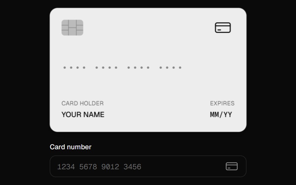 Card InputUI Lab · ReactFormats as you type, spots the card brand, and flips to show the CVC.
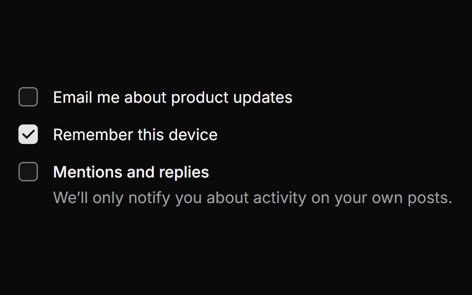 CheckboxHextaUI · ReactA checkbox whose check draws in, with indeterminate parents, groups and labels that share its hover.
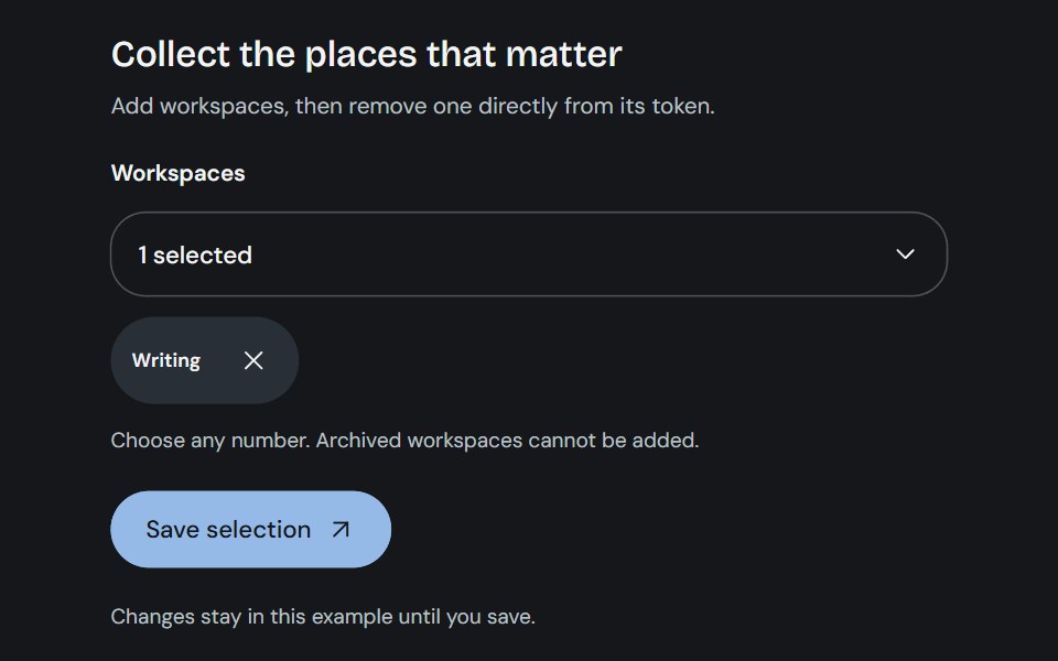 Multi-selectCojeev UI · ReactSearchable multiple choices with removable selections, form values and clear validation.
 Focus FieldMicroKit · ReactAn input with a clean animated focus treatment.
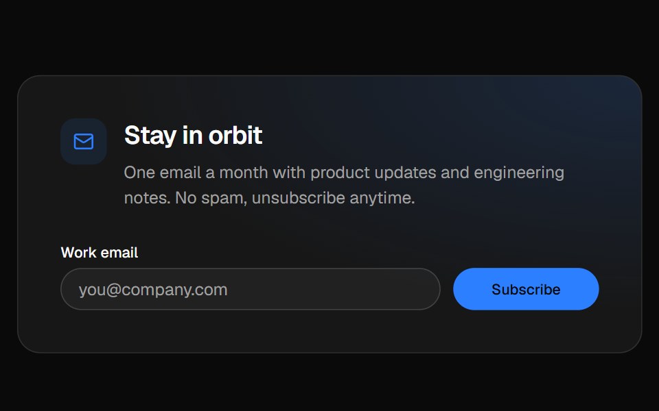 Newsletter footerVelora UI · ReactFooter with a newsletter sign-up row, link columns and a live “All systems normal” status badge.
 Loading Spinnersv-particles · Svelte
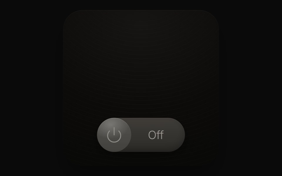 Lamp SwitchPin UI · React
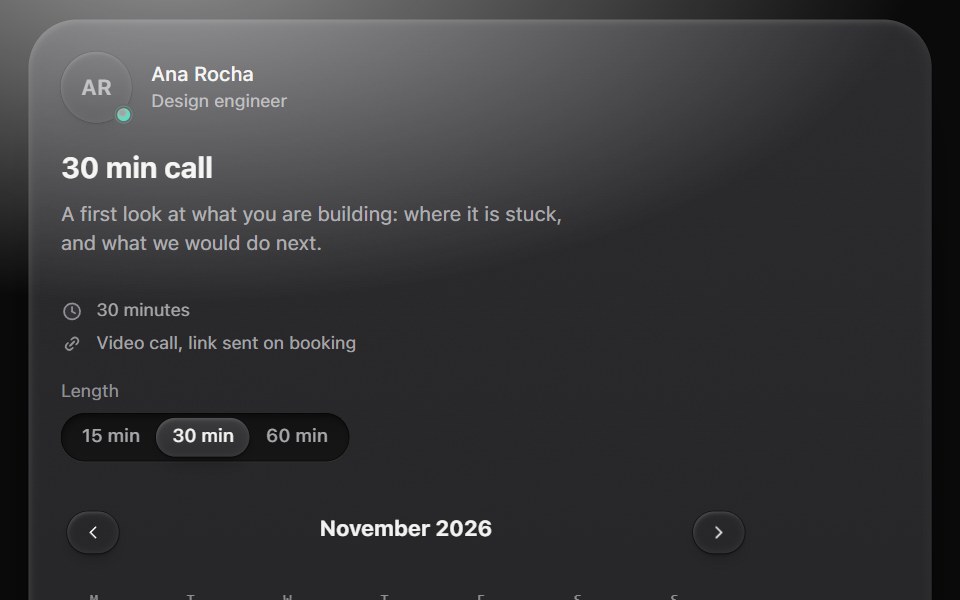 Availability pickerMetal UI · React + SwiftUIA booking block: a host, a call length, a calendar of the next six weeks, the day's free times re-labelled by time…
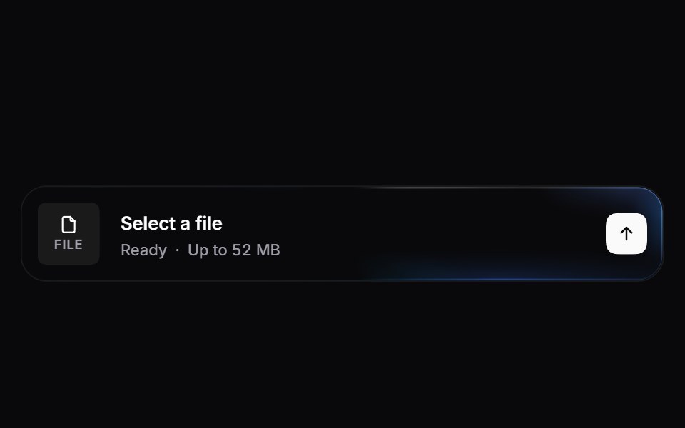 Gradient File UploadSpaceUI · ReactA refined upload surface with an animated glowing beam border, dynamic radial feedback, file extension badges, and…
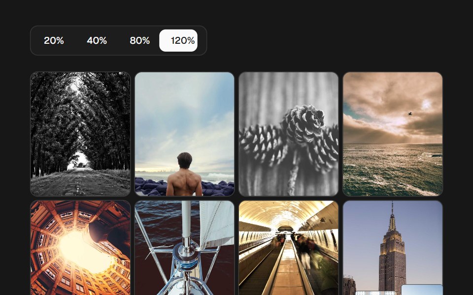 Image Density GridSkecher UI · ReactA percentage-controlled image grid with animated density changes, soft focus, and optional controls.
 InputSora UI · ReactA shadcn/ui-compatible input with a smooth Motion-powered caret.
 Payment ReminderZAYX · React Native
 Liquid Date PickerLiquefy UI · ReactDate picker with a calendar in liquid glass style.
 File UploadEaseUI · ReactDropzone that also opens the native file picker, with a list below it that pops each file in and collapses smoothly on…
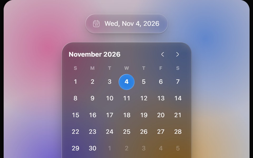 Glass Date PickerOpaline · ReactGlass calendar with a gliding day bubble, and a capsule date picker.
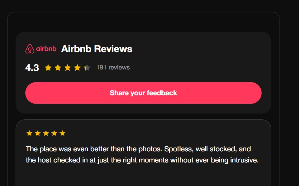 Airbnb ReviewsReactFrame · ReactA guest-review carousel with the Airbnb Bélo mark, aggregate rating header and CTA, above a draggable autoplaying grid…
 Gooey InputAceternity UI · React
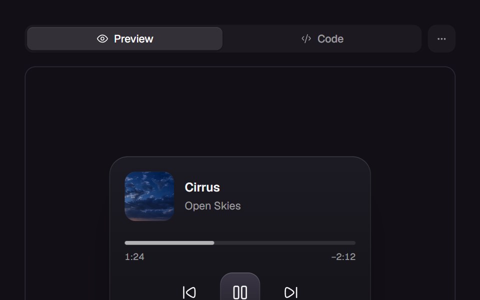 Elastic SliderReact Bits · ReactSlider handle stretches elastically then snaps with spring physics.
 RatingdaisyUI · CSS (Tailwind)
- DatepickerPreline UI · JavaScript (HTML + Tailwind)
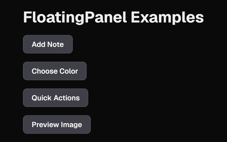 Floating PanelCult UI · ReactFloating panel component with backdrop blur and position-aware animations
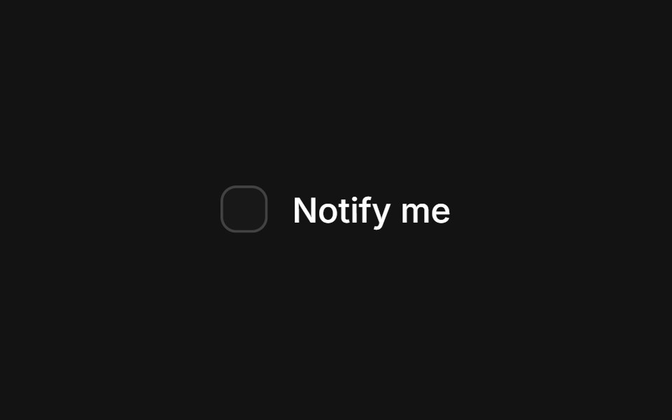 Checkbox Checktransitions.dev · HTML/CSS
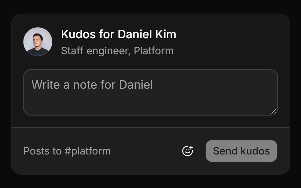 Workplace-safe setReUI · ReactA kudos card whose picker hides a blocklist and newer emoji, then posts the note to #platform.
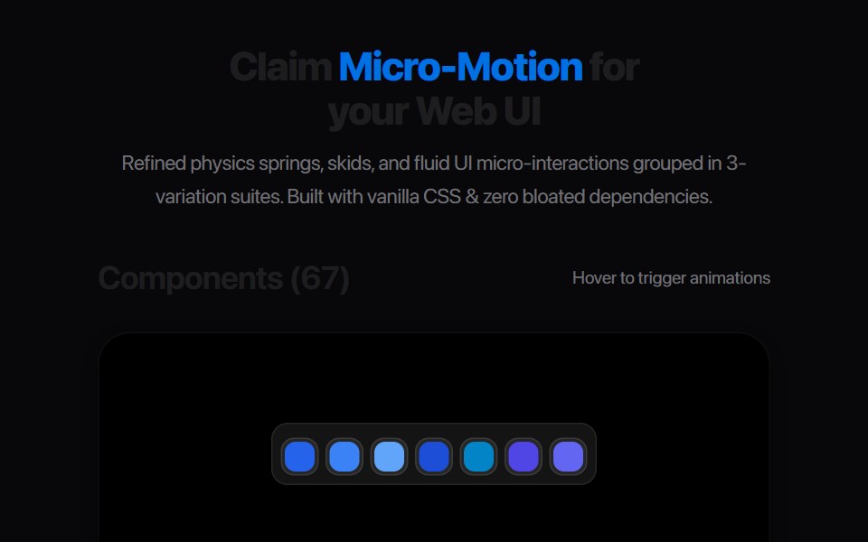 Date Position SelectorAmicro Micro Transitions · ReactThree consecutive day numbers (24th, 25th, 26th) with sliding highlight pill.
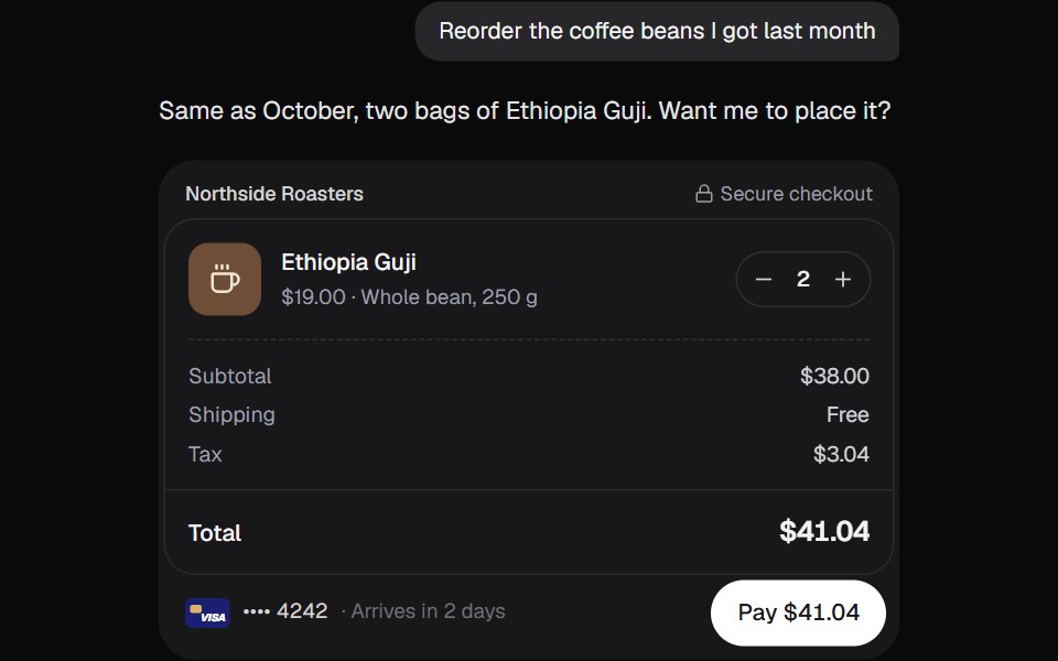 AI CheckoutKokonut UI · ReactAn order the assistant puts together, paid without leaving the chat. The button fills while the charge runs, then the…
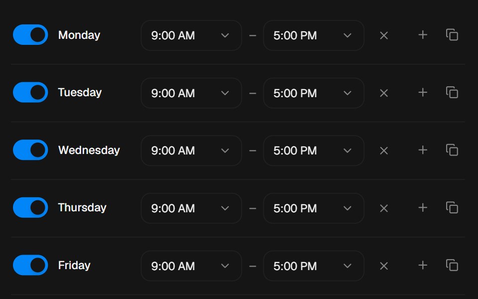 Availability SchedulerbeUI · ReactWeekly availability editor where each day springs between available and unavailable, time ranges add and remove with…
 Emoji ReactionRare UI · ReactA tapback-style reaction button that opens a bar of Apple emoji and sends copies of your pick floating up out of it.
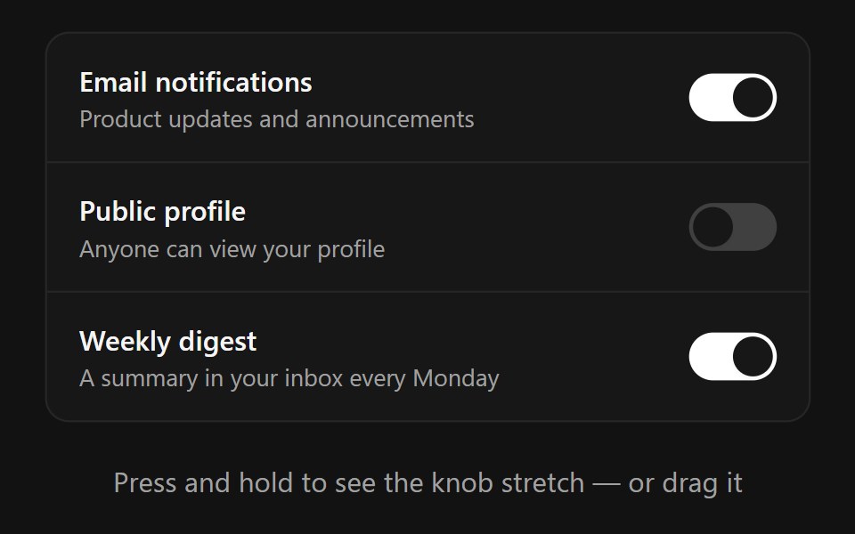 Animated SwitchSpectrum UI · ReactAn iOS-quality animated toggle switch with a press-to-stretch knob, drag-to-toggle with flick support, and optional…
 Exploding InputSpell UI · ReactInput component that spawns particle effects when typing.
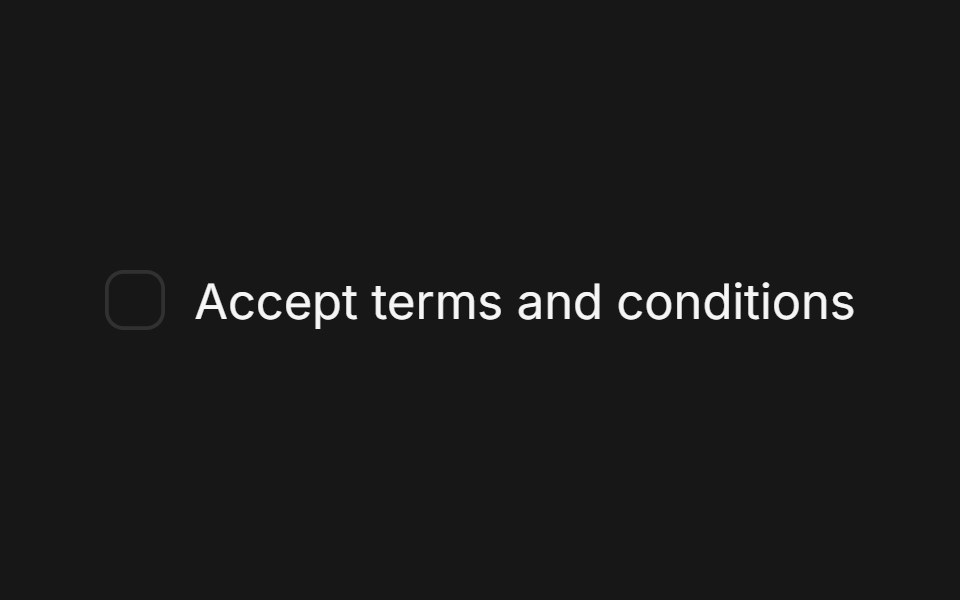 Checkbox (Base UI)Fluid Functionalism · ReactA single checkbox: a hairline square that darkens on hover and a check that draws itself. Pairs with Field. Base UI…
 Spin Theme ToggleTheme Toggles · ReactAn animated theme toggle with a spinning sun-and-moon transition.
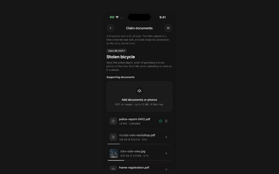 File UploadPanel UI · React NativePick files and photos, check them, and run their uploads.
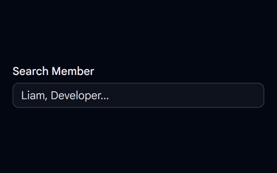 Autocomplete-04 - Team Member SearchShadcn Space · ReactAutocomplete with grouped team members, avatars, status dots, and spring-animated list items
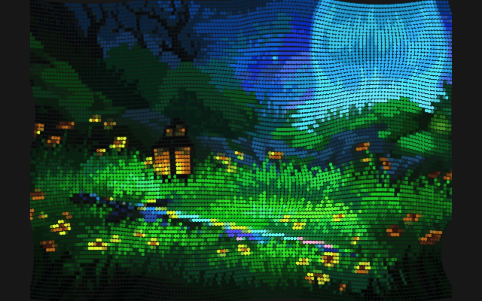 Flow FieldPixel Perfect · ReactParticles stream along curl-noise currents that reform the image.
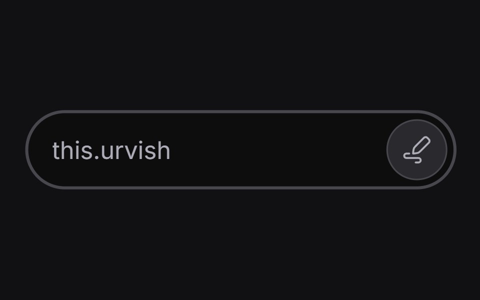 Inline Edituselayouts · ReactAn input that switches between read and edit modes.
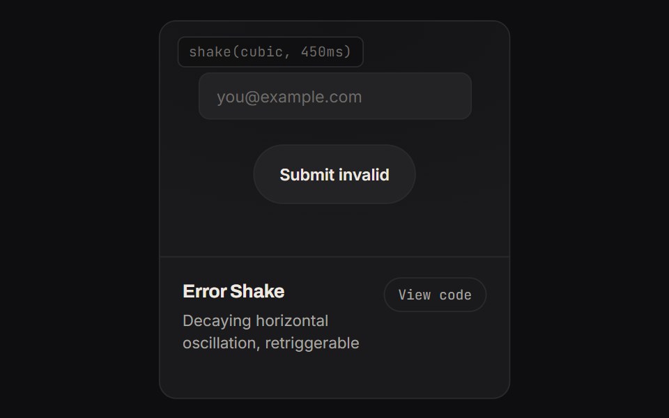 Error ShakeKinetics · HTML/CSSDecaying horizontal oscillation, retriggerable
Libraries with Animated input components
Related categories
- Input Components
- React Input Components
- Tailwind CSS Input Components
- Svelte Input Components
- React Native Input Components
- shadcn/ui Input Components
- Animated Text Input Components
- Animated Select Components
- Animated Slider Components
- Animated Switch Components
- Animated Form Components
- Animated Textarea Components
- Animated Search Input Components
- Animated Checkbox Components
- Animated Segmented Control Components
- Animated Form Field Components
- Animated Rating Components
- Animated File Upload Components
- Animated Range Slider Components
- Animated Wheel Picker Components
- Animated Knob Components
- Animated Color Picker Components