 Dev Design Library
Animated Slider Components
Dev Design Library indexes 47 Animated slider components from 24 open-source UI libraries, with the most coming from beUI, UI Lab, Arc Library, React Bits and Shadcn Space. Each one links to its page with the source code, a live preview where available, the library license and the install command. These are the slider components tagged as animated: motion on hover, on scroll or on load, usually built with CSS transitions or Framer Motion. Slider components belong to the Inputs group.
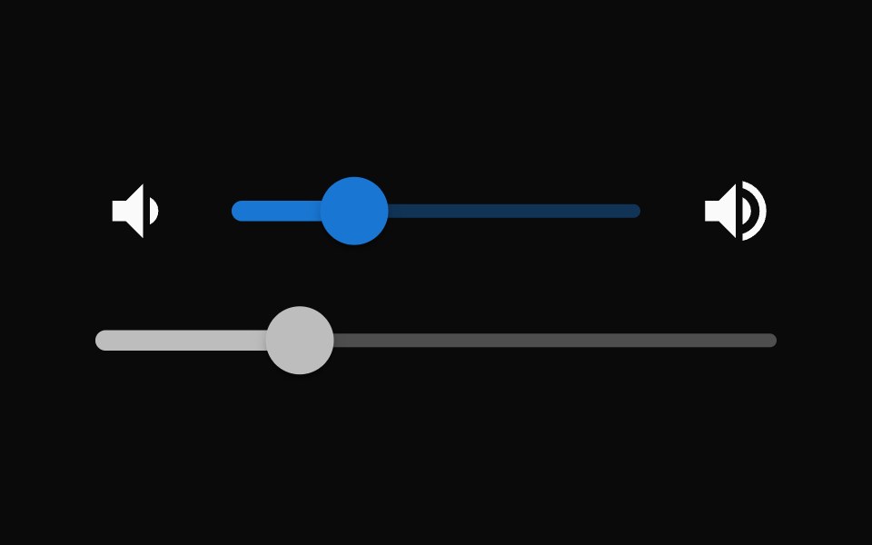 SliderMUI / Material UI · React
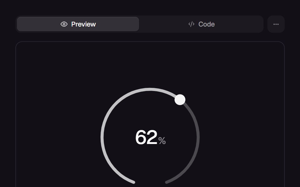 Comet DialReact Bits · ReactTick-ring dial you flick by angle: the reading launches on a spring and a velocity-driven comet streaks behind the lit…
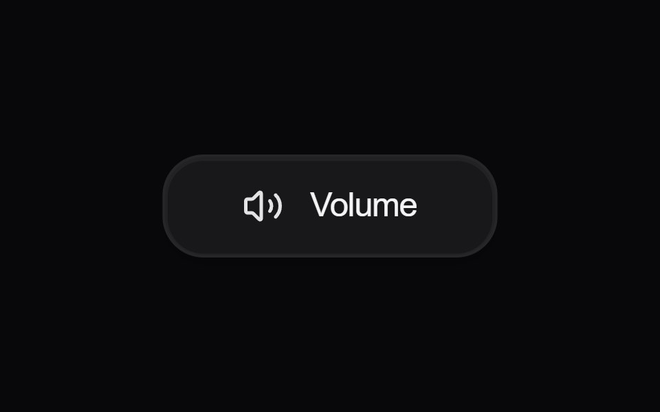 Button VolumeAmicro Micro Transitions · React
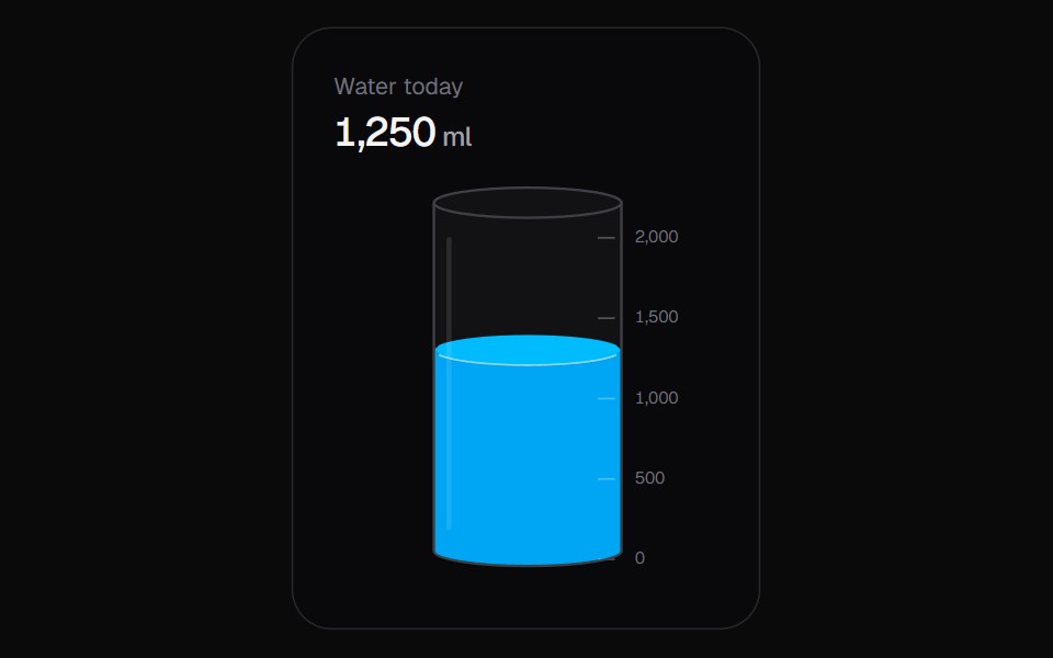 Liquid SliderKokonut UI · ReactA vertical slider you fill like a glass, with a sloshing surface and rising bubbles.
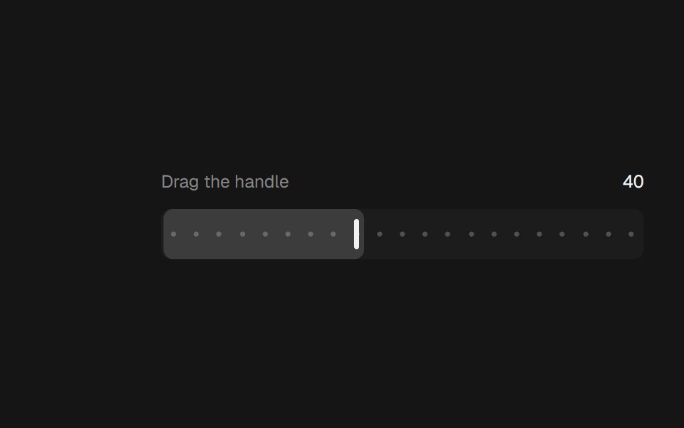 Range SliderbeUI · ReactA bar thumb that glides between steps.
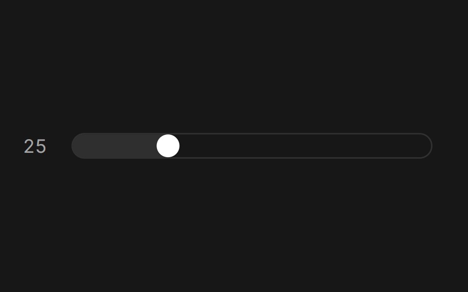 SliderFluid Functionalism · ReactAnimated slider with spring-snapped thumb, step dots, range mode, and click-to-edit value display. Built on Radix UI…
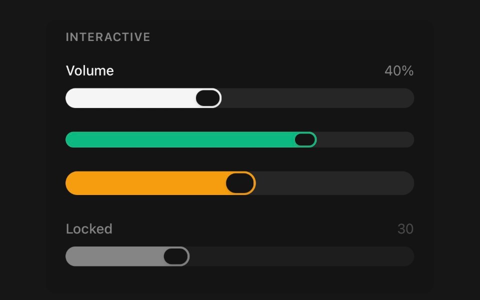 SliderPanel UI · React NativePick a value, or a span, by dragging a thumb along a track.
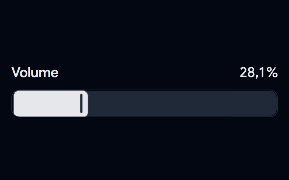 Slider 04 - Modern VolumeShadcn Space · ReactA sleek volume slider featuring a bold track design, custom vertical thumb, and smooth percentage transitions with…
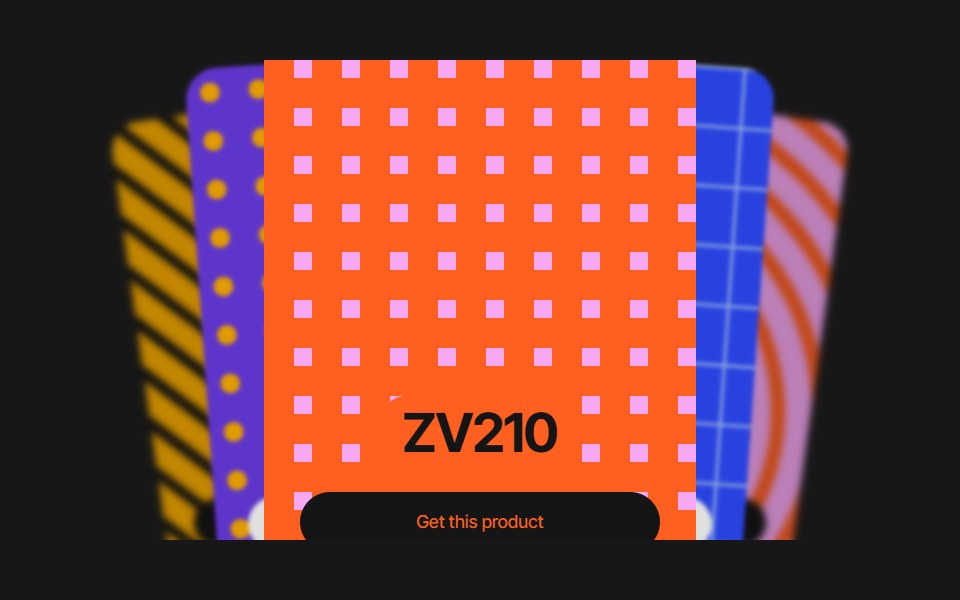 Cards SliderPixel Perfect · ReactCards Slider — an infinite deck of product cards. The active card sits
 Paywalluselayouts · ReactA premium paywall component with a pick your price detent slider, animated numeric price transitions, and a segmented…
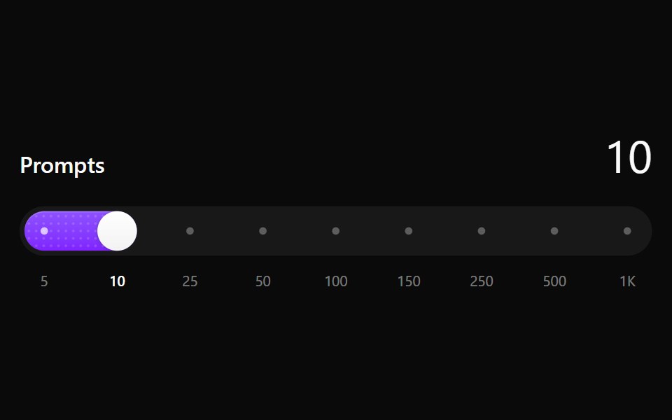 Step SliderNotra · ReactA slider that snaps to a fixed set of values, with a dotted fill that sweeps on every step. Built on the Base UI Slider.
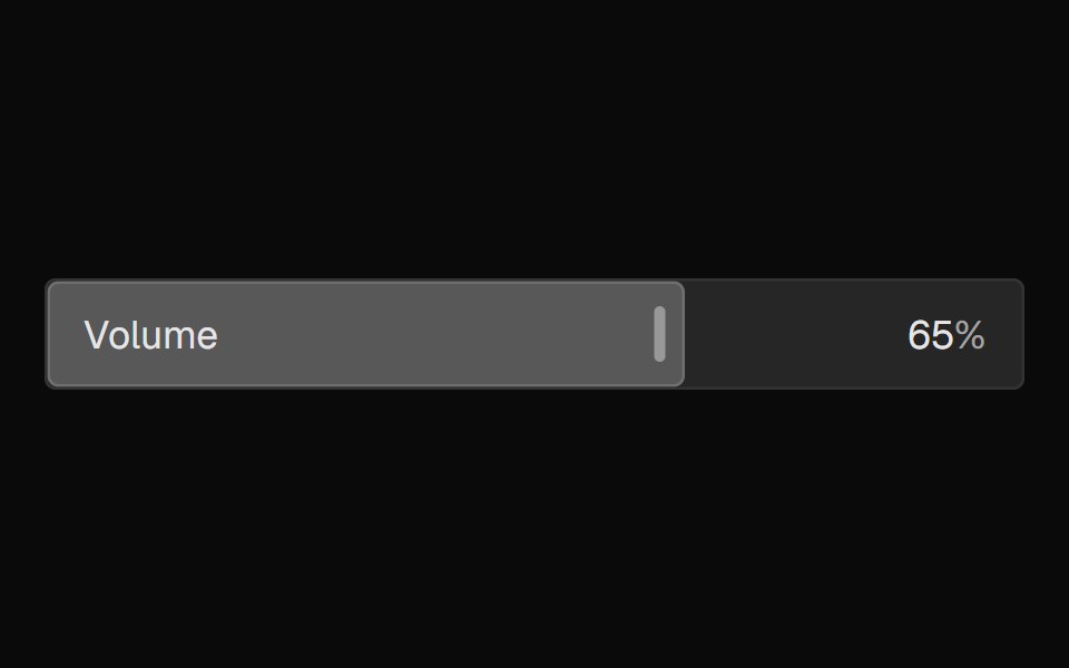 FaderNexvyn UI · ReactA mixing-console-style parameter fader where the control IS the display, with continuous and detent value grammars…
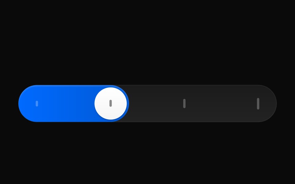 Reasoning EffortAI CSS · React
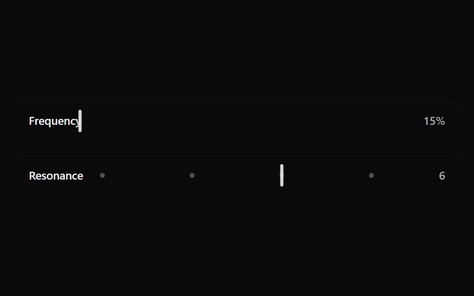 Fluid SliderSona UI · ReactA labeled Base UI range control with direct surface selection, a dedicated draggable indicator, and restrained…
 Carousel SliderWatermelon UI · React
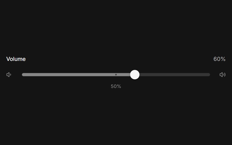 Elastic sliderArc Library · ReactA slider that stretches like rubber past its ends, with a swaying value tag and detents the thumb clicks into.
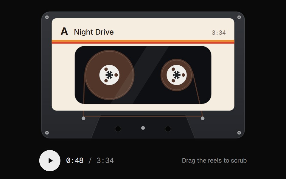 Cassette ScrubberUI Lab · ReactScrub audio by dragging the tape, with reels that spin like the real thing.
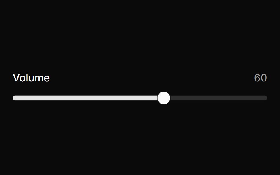 SliderHextaUI · ReactPick a value or a range by dragging, tapping the track or using the keys, with jumps that glide and an optional value…
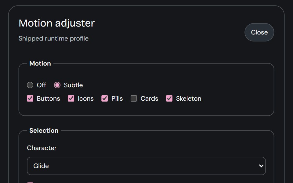 Motion AdjusterCojeev UI · ReactProvides live controls for the shared motion settings and editable body profiles used across the library.
 Scrub Number FieldMicroKit · ReactA number field you drag to scrub and click to type, with a ruler that tracks the gesture.
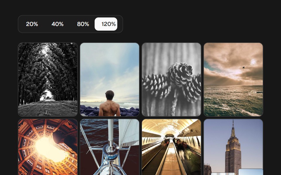 Image Density GridSkecher UI · ReactA percentage-controlled image grid with animated density changes, soft focus, and optional controls.
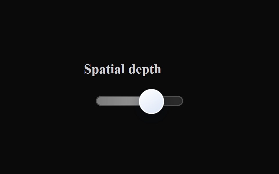 Liquid SliderLiquefy UI · ReactSlider in liquid glass style. Controle deslizante em estilo vidro líquido.
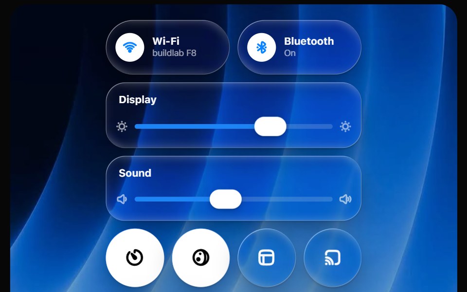 Glass Control CenterOpaline · ReactmacOS-style Control Center kit — glass modules, toggles, light-filled sliders and buttons.
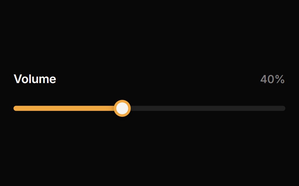 SliderReactFrame · ReactAn accessible single or range slider with a draggable thumb, a value tooltip, optional step marks, keyboard control…
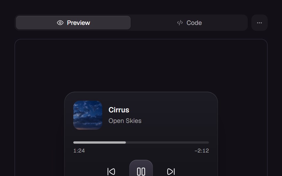 Elastic SliderReact Bits · ReactSlider handle stretches elastically then snaps with spring physics.
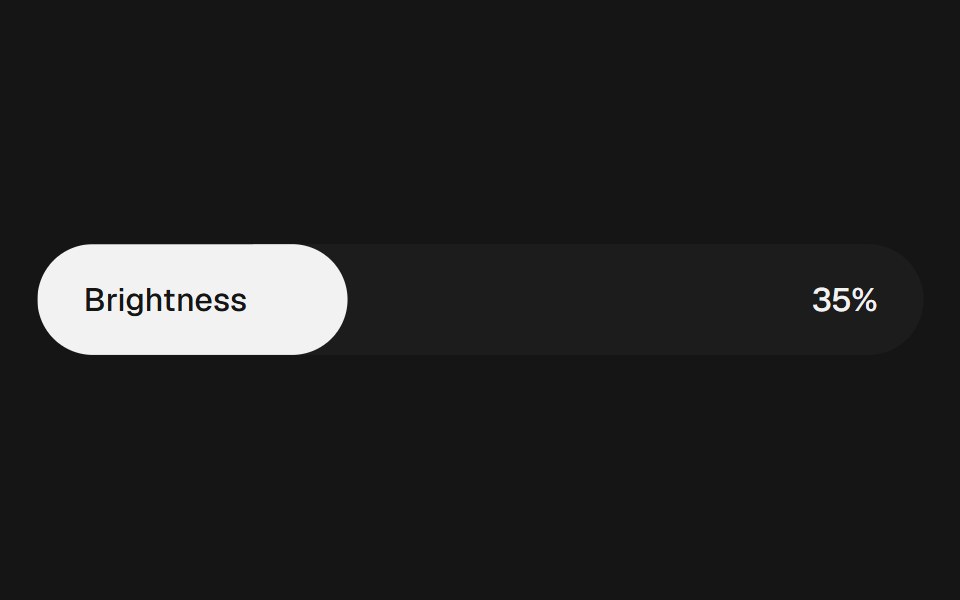 Range Slider FluidbeUI · ReactRange slider with two thumbs and a fluid, springy fill between them.
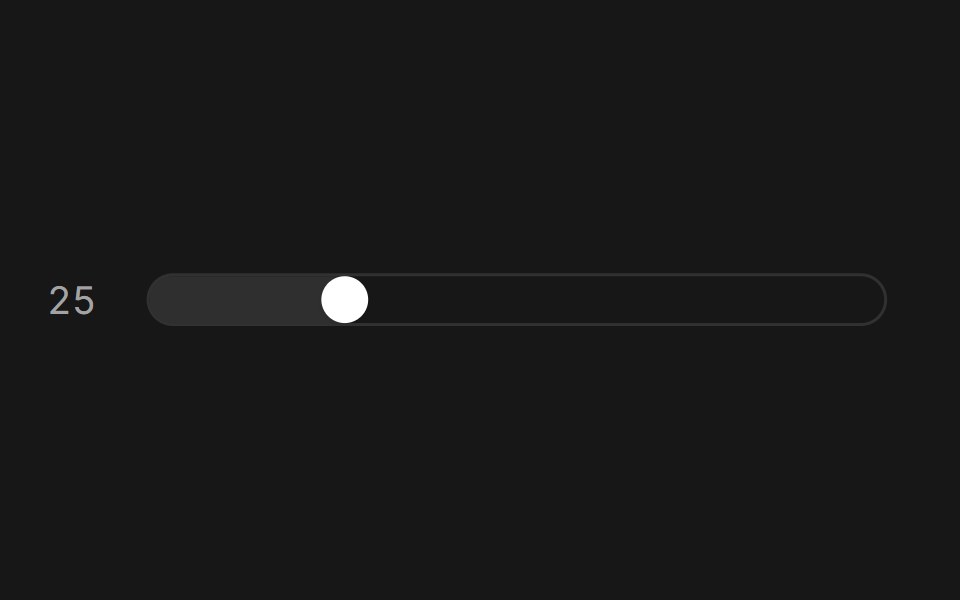 Slider (Base UI)Fluid Functionalism · ReactAnimated slider with spring-snapped thumb, step dots, range mode, and click-to-edit value display. Base UI flavor.
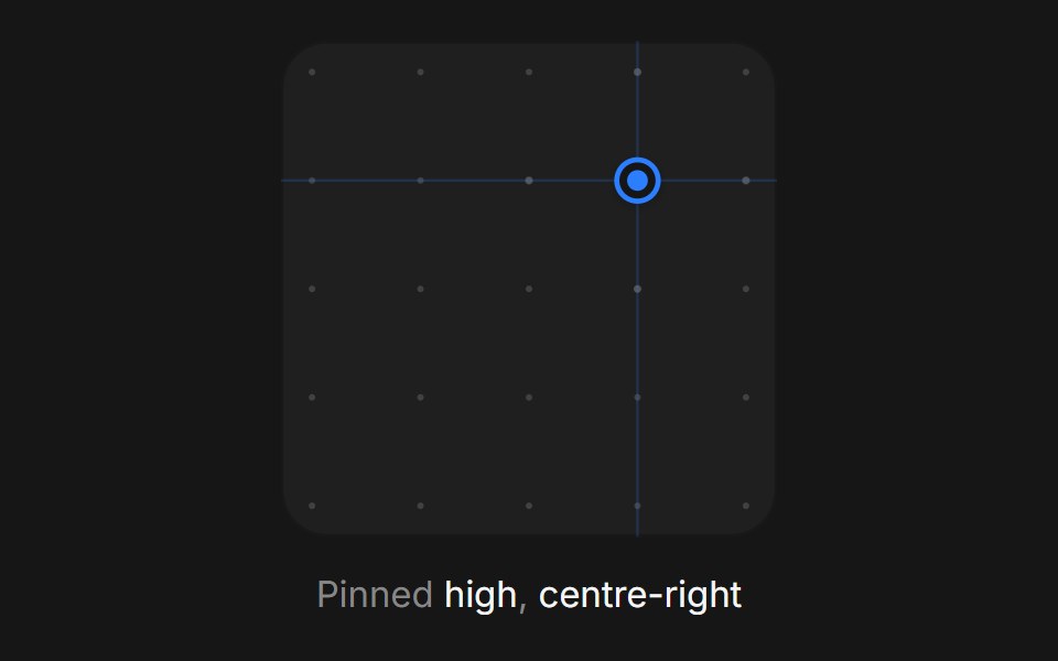 Web Xy PadPanel UI · React NativeA two-axis pad for setting a pair of values at once, such as light position.
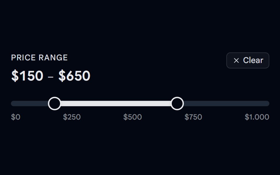 Slider 05 - Price Range FilterShadcn Space · ReactA dual-thumb price range filter slider with a hover ghost preview — hover outside the selected range to see a…
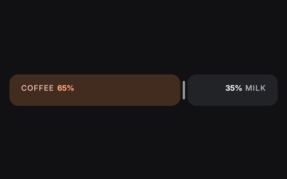 Slideruselayouts · ReactA dual-sided ratio slider animated with spring physics and drag interactions.
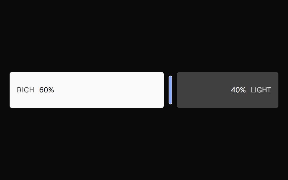 Ratio SliderNexvyn UI · ReactA split ratio slider with two color bars, a draggable divider, and responsive labels that collapse when space is tight.
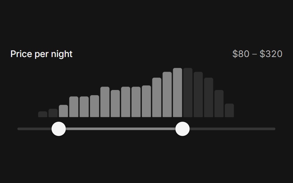 Range histogram sliderArc Library · ReactA price range over a live histogram of the data, lighting the bars inside the range and settling on bar edges.
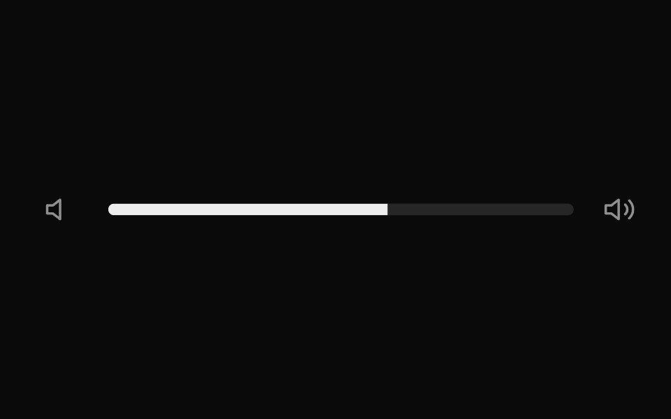 Elastic SliderUI Lab · ReactStretches like rubber when you drag past the end, then springs back.
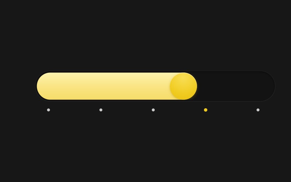 Spring SliderSkecher UI · ReactA pill-track slider with a spring-driven fill and thumb, tick markers, and a tooltip that blurs in and out.
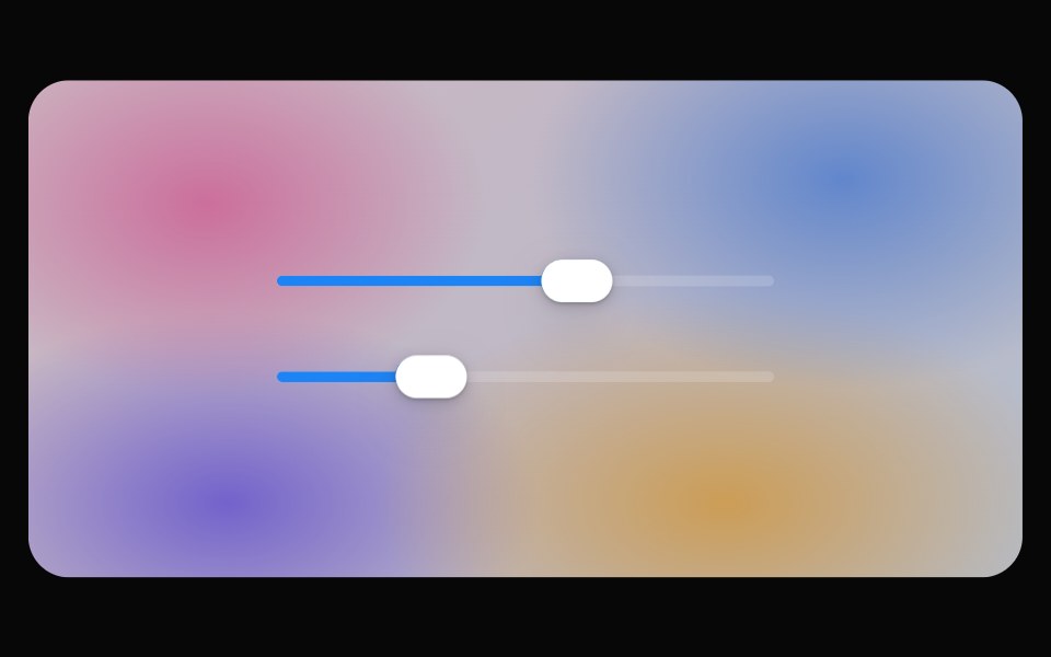 Glass SliderOpaline · ReactSlider whose thumb becomes a refracting lens while dragging.
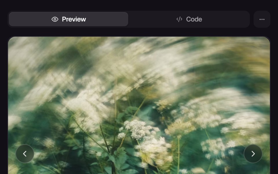 Morph SliderReact Bits · ReactWebGL slider that melts between images with a displacement transition.
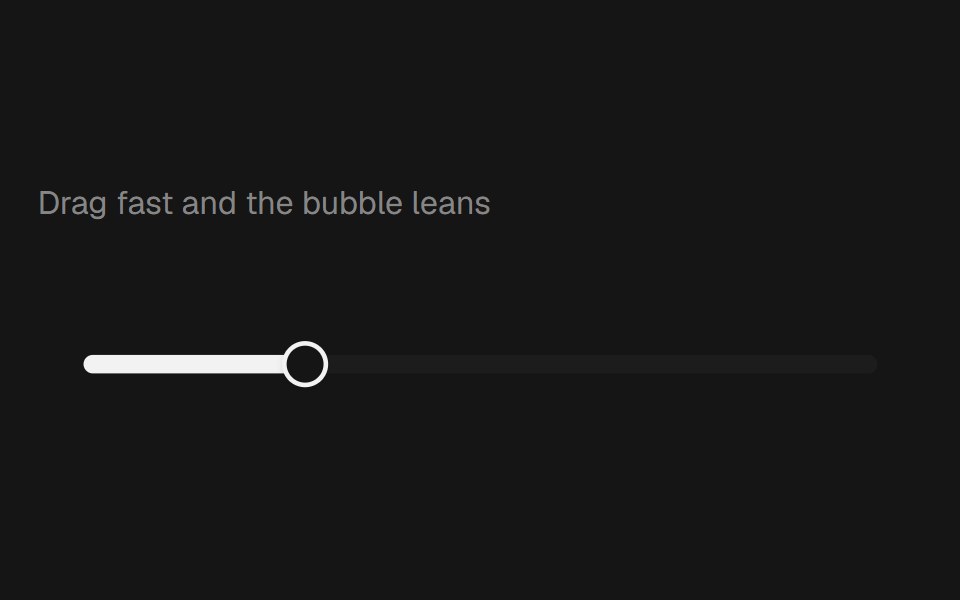 Range Slider BubblebeUI · React
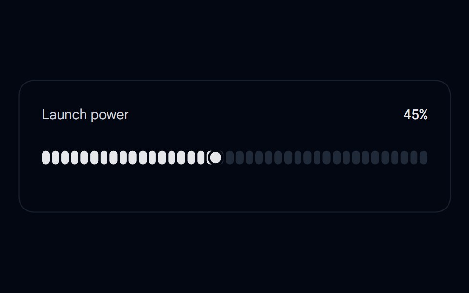 Slider 06 - Slingshot Launch PowerShadcn Space · ReactA slingshot-style slider: grab the thumb and pull it off the track like a catapult, see the mirrored target reticle…
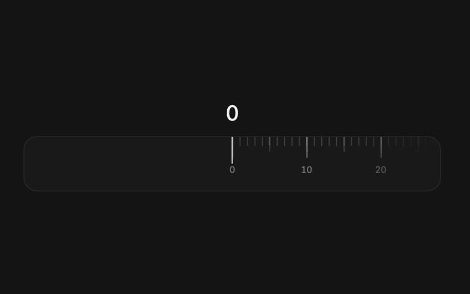 Ruler sliderArc Library · ReactA tape of ticks that slides under a fixed needle, with momentum, snapping, and a rolling readout.
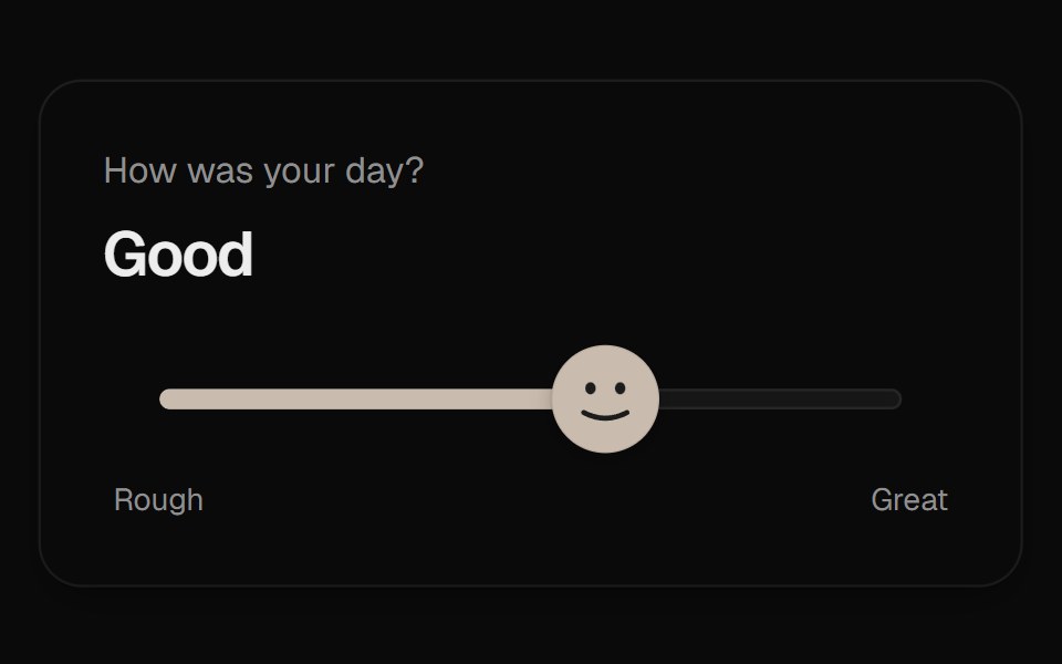 Mood SliderUI Lab · ReactThe thumb is a face that frowns, grins and leans into the drag as you rate your day.
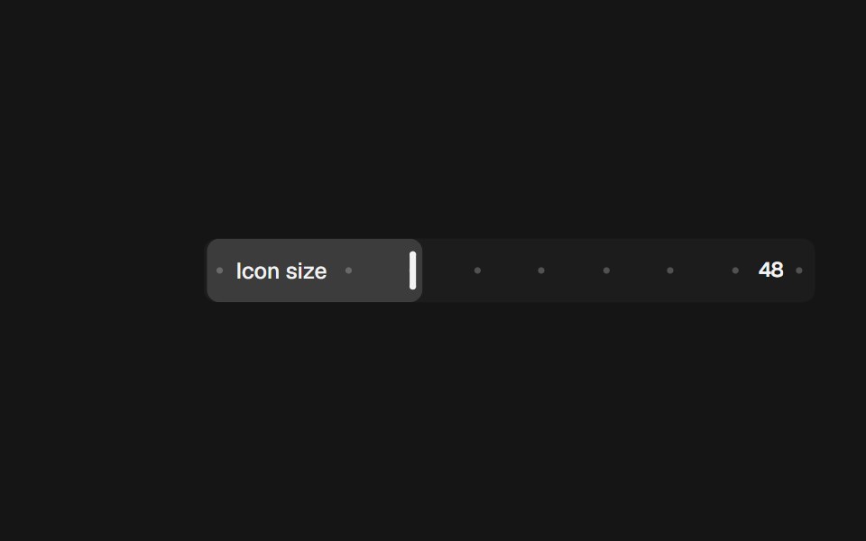 Range Slider InlinebeUI · React
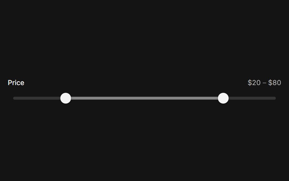 SliderArc Library · ReactPick a value or a range on a track that follows your finger.
 Pricing CalculatorUI Lab · ReactItemizes your bill like an invoice and upgrades the plan the moment your team crosses a seat threshold.
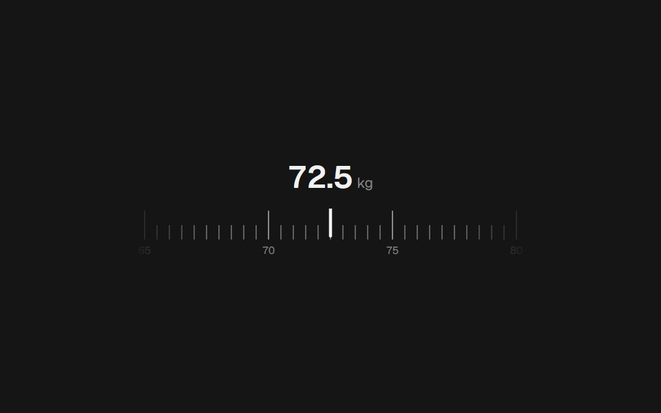 Range Slider RulerbeUI · React
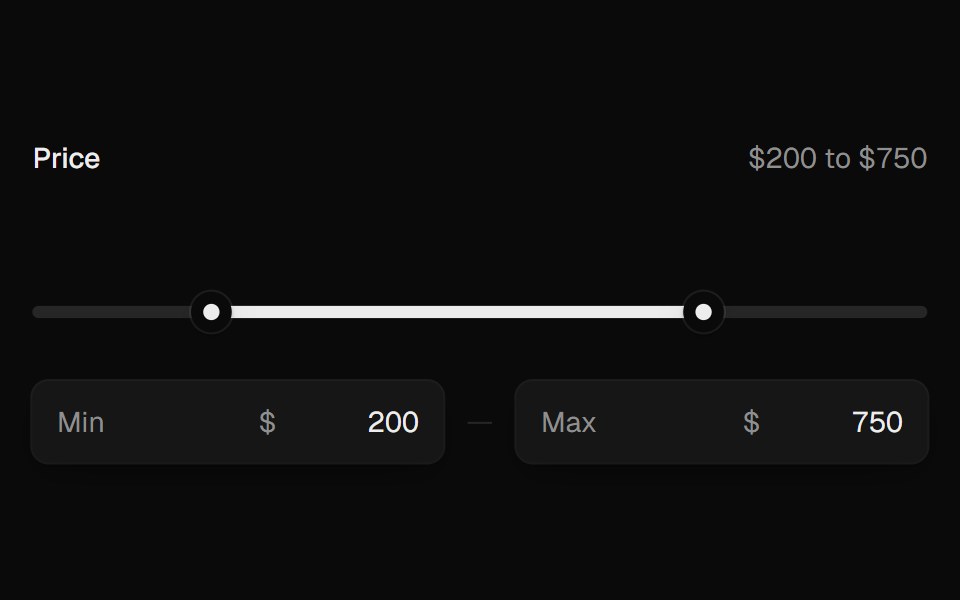 Range SliderUI Lab · ReactTwo thumbs that glide, stop at each other, and show their value as you drag.
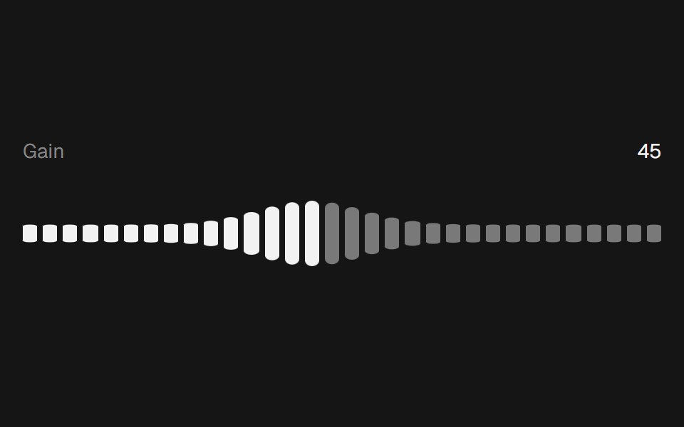 Range Slider WavebeUI · React
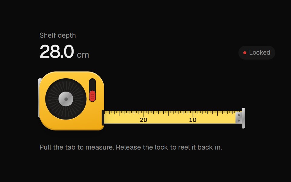 Tape MeasureUI Lab · ReactPull the blade out to measure; release the lock and it reels itself back in.
Libraries with Animated slider components
Related categories
- Slider Components
- React Slider Components
- Tailwind CSS Slider Components
- shadcn/ui Slider Components
- Animated Input Components
- Animated Text Input Components
- Animated Select Components
- Animated Switch Components
- Animated Form Components
- Animated Textarea Components
- Animated Search Input Components
- Animated Checkbox Components
- Animated Segmented Control Components
- Animated Form Field Components
- Animated Rating Components
- Animated File Upload Components
- Animated Range Slider Components
- Animated Wheel Picker Components
- Animated Knob Components
- Animated Color Picker Components