Ratio Slider
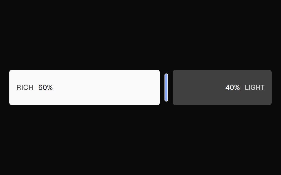
A split ratio slider with two color bars, a draggable divider, and responsive labels that collapse when space is tight.
- Library
- Nexvyn UI
- Framework
- React
- Type
- ui
- License
- CC-BY-NC-4.0+Commons-Clause+MIT
- Dependencies
- motion
- Install
npx shadcn@latest add @nexvyn/ratio-slider- Files
components/ui/ratio-slider.tsxlib/sound.tslib/motion-tokens.tslib/utils.ts
- Source
- https://github.com/Nexvyn/Nexvyn-ui
Categories
- Input Components
- React Input Components
- Tailwind CSS Input Components
- Animated Input Components
- Range Slider Components
- React Range Slider Components
- Tailwind CSS Range Slider Components
- Animated Range Slider Components
- Slider Components
- React Slider Components
- Tailwind CSS Slider Components
- Animated Slider Components