 Dev Design Library
Range Slider Components
Dev Design Library indexes 42 range slider components from 25 open-source UI libraries, with the most coming from Watermelon UI, beUI, Origin UI, Toolcraft and Fluid Functionalism. Each one links to its page with the source code, a live preview where available, the library license and the install command. Range slider components belong to the Inputs group.
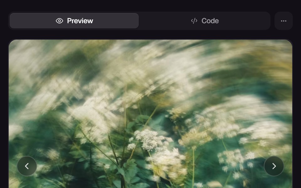 Morph SliderReact Bits · ReactWebGL slider that melts between images with a displacement transition.
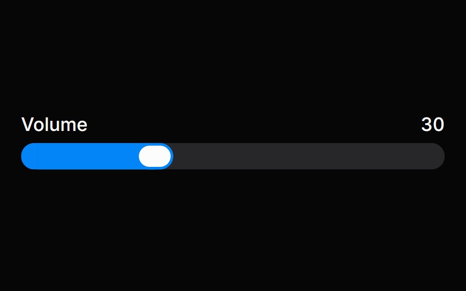 SliderHeroUI · ReactA draggable input for selecting a value or range within a bounded interval.
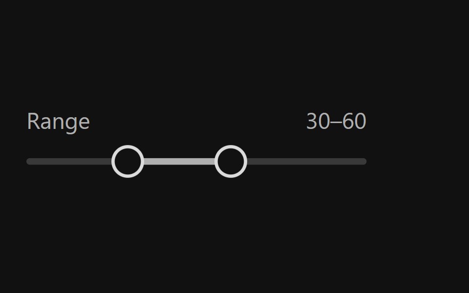 Range SliderReact Spectrum · ReactRangeSliders allow users to quickly select a subset range. They should be used when the upper and lower bounds to the…
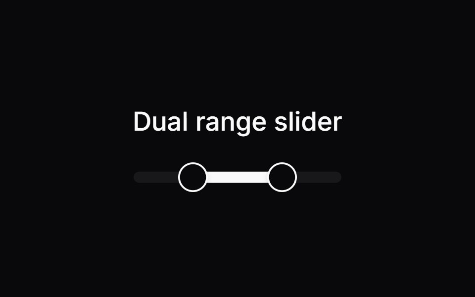 Comp 250Origin UI · React
- Range SliderPreline UI · JavaScript (HTML + Tailwind)
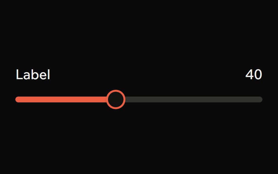 SliderArk UI · ReactA control element that allows for a range of selections.
 SliderPark UI · ReactA form input component for selecting values from a continuous range.
 SliderUntitled UI React · React
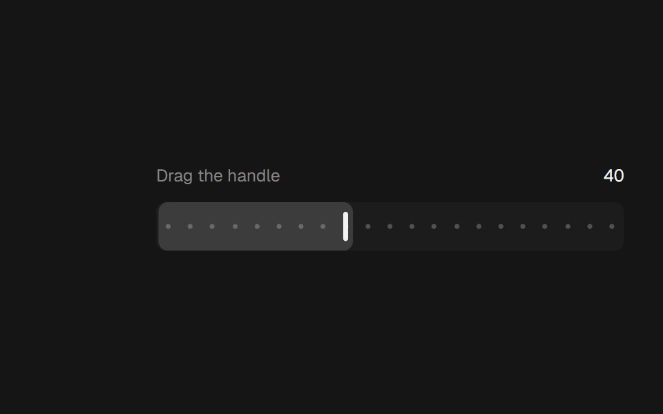 Range SliderbeUI · ReactA bar thumb that glides between steps.
 Dual Range Slider DependenciesSpectrum UI · Reactcomponent for the Dual Range Slider Dependencies
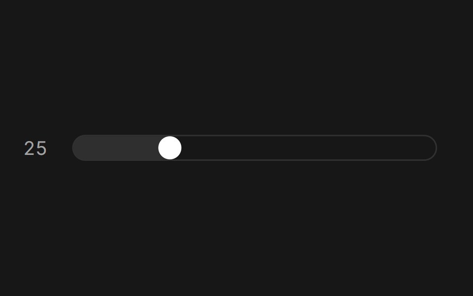 SliderFluid Functionalism · ReactAnimated slider with spring-snapped thumb, step dots, range mode, and click-to-edit value display. Built on Radix UI…
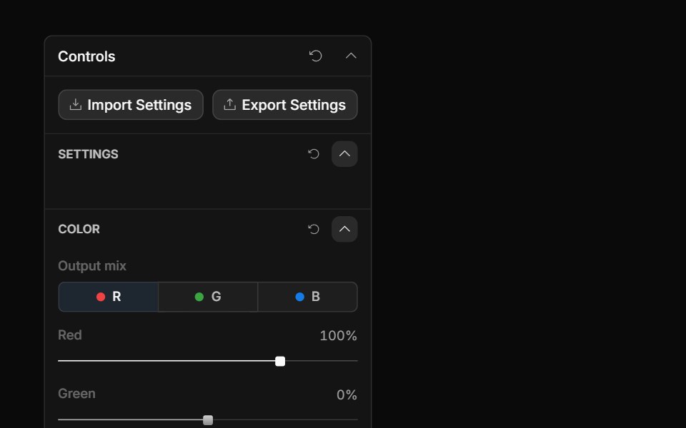 Channel Mixer ControlToolcraft · React
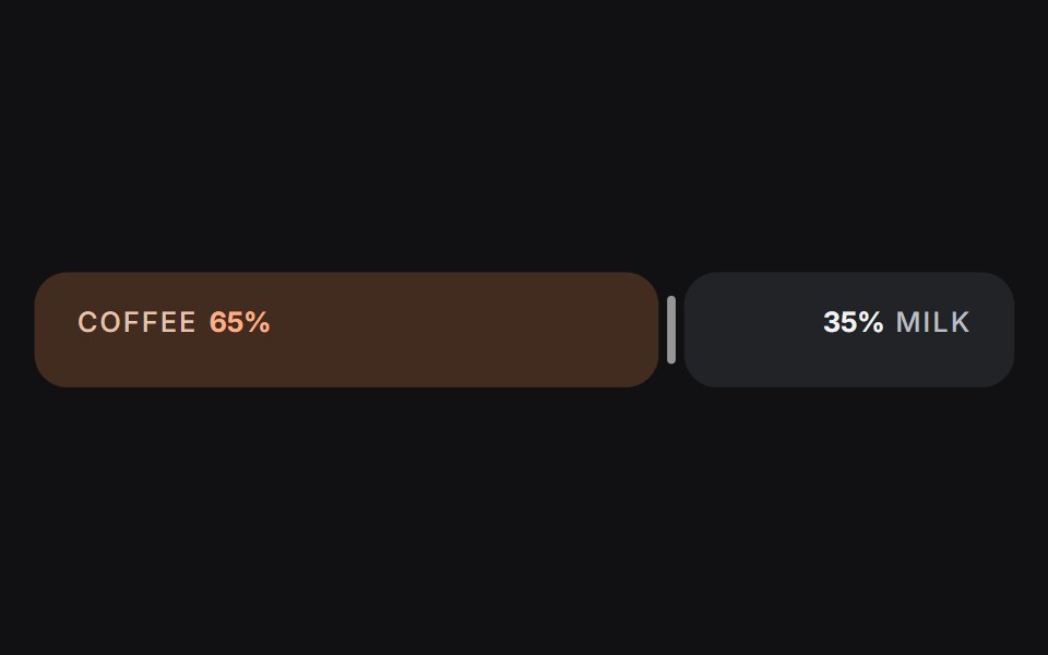 Slideruselayouts · ReactA dual-sided ratio slider animated with spring physics and drag interactions.
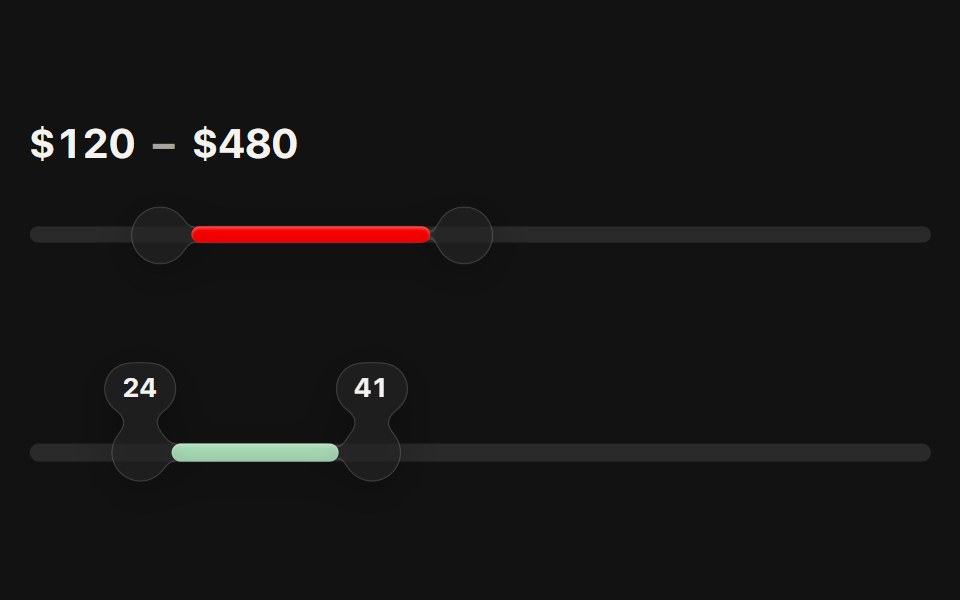 Range SliderSwiftPieces · SwiftUIA dual-thumb slider: glass bubble thumbs joined by a tinted span, readout chips that merge as they meet, and steps…
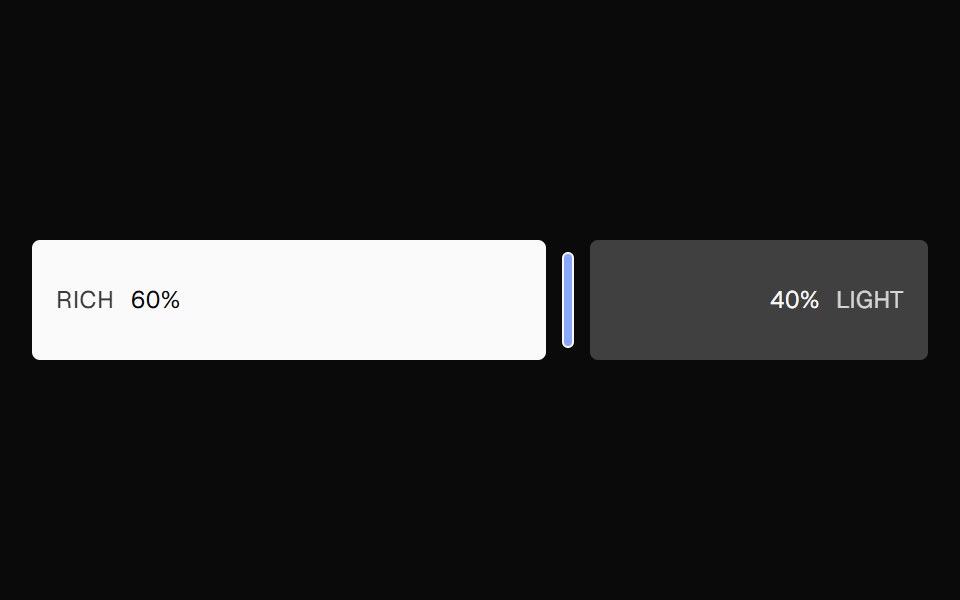 Ratio SliderNexvyn UI · ReactA split ratio slider with two color bars, a draggable divider, and responsive labels that collapse when space is tight.
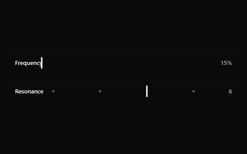 Fluid SliderSona UI · ReactA labeled Base UI range control with direct surface selection, a dedicated draggable indicator, and restrained…
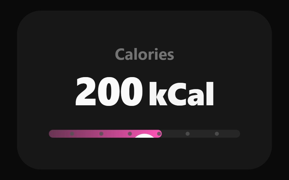 Adaptive SliderWatermelon UI · React
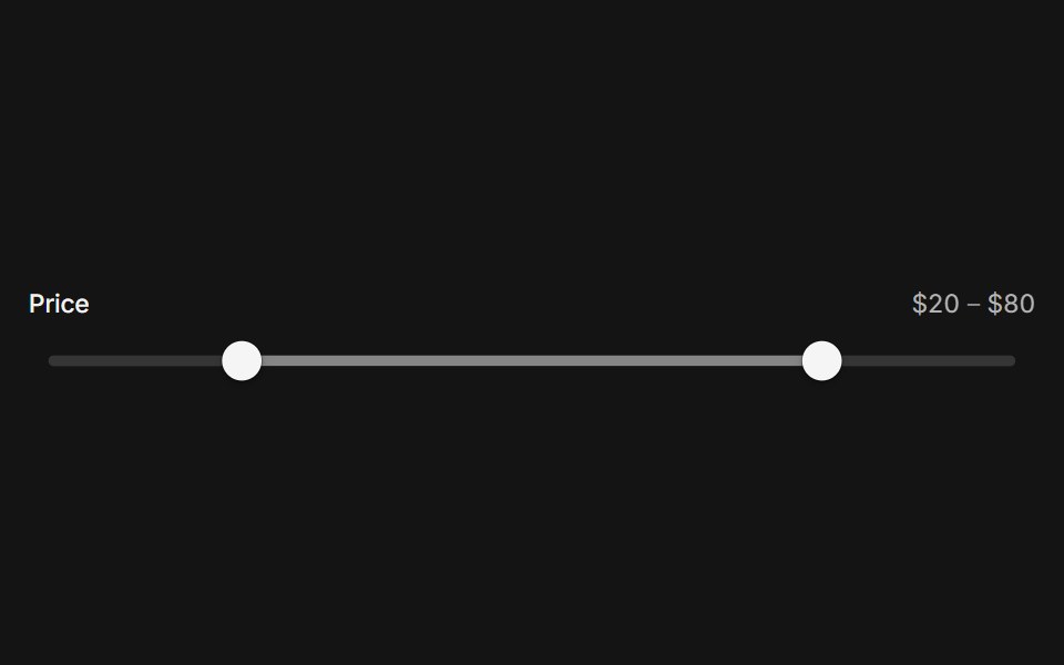 SliderArc Library · ReactPick a value or a range on a track that follows your finger.
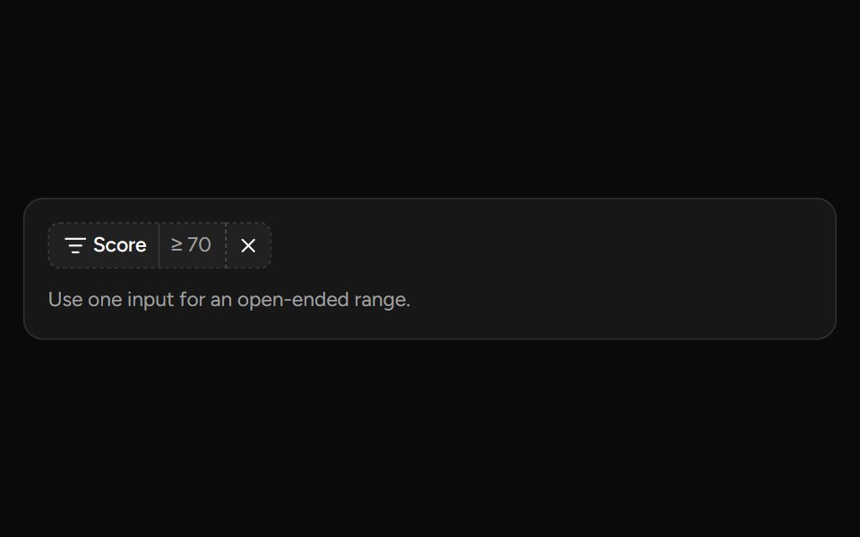 Number Range Filtersv-table · SvelteA number range picker with exact inputs, an optional slider, and explicit apply behavior.
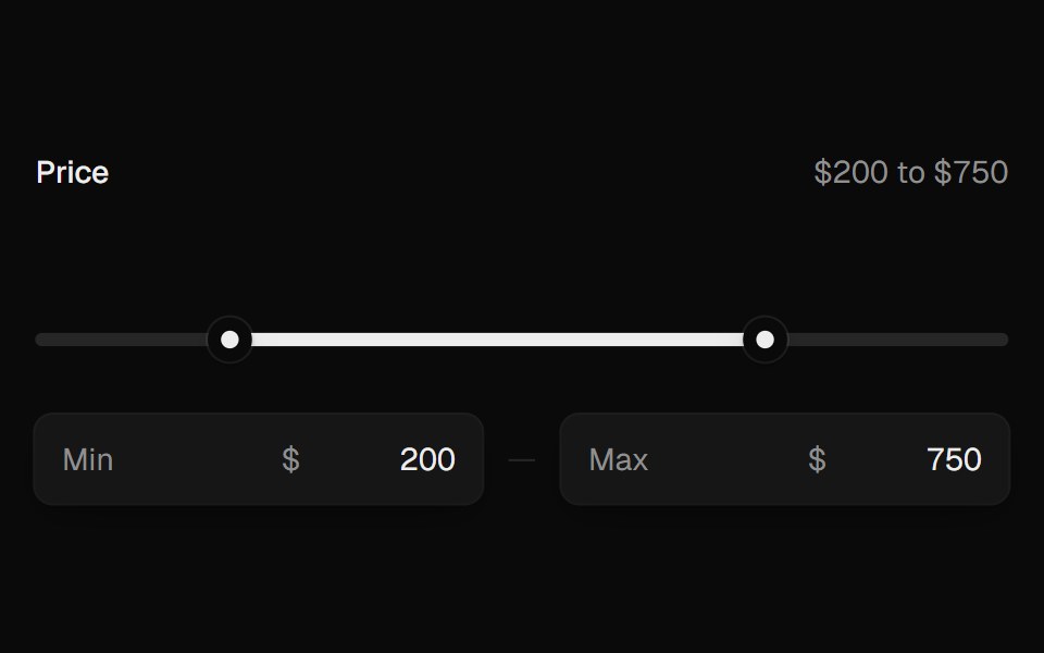 Range SliderUI Lab · ReactTwo thumbs that glide, stop at each other, and show their value as you drag.
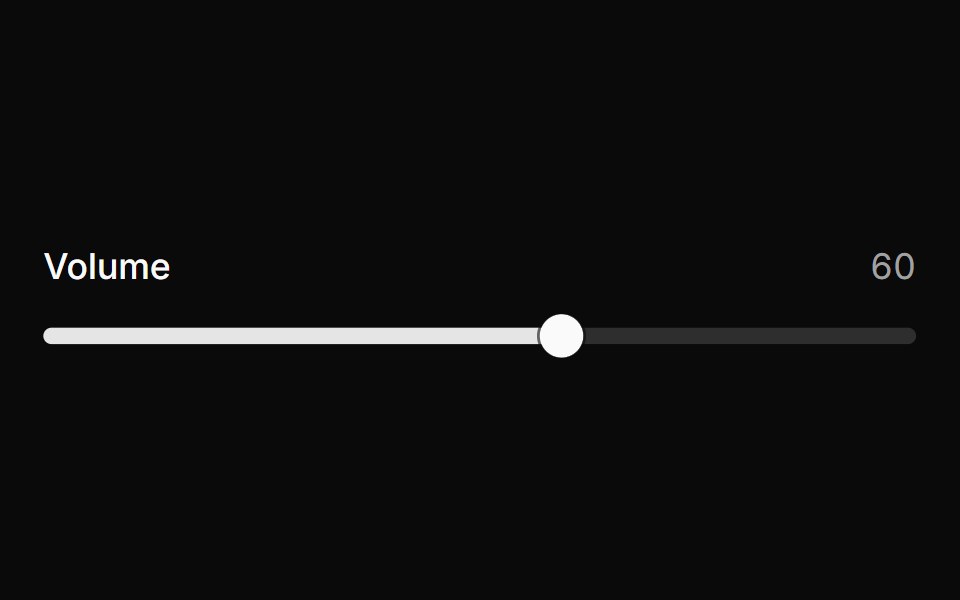 SliderHextaUI · ReactPick a value or a range by dragging, tapping the track or using the keys, with jumps that glide and an optional value…
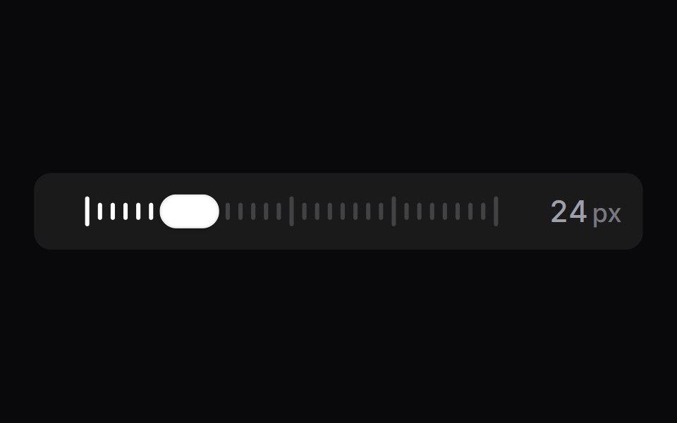 Tick SliderSpaceUI · ReactA scrubber drawn as a row of tick marks, backed by a real range input.
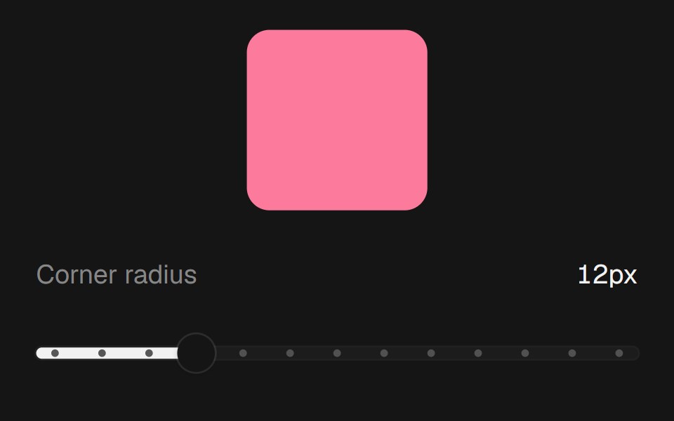 Range SliderEaseUI · ReactNative range input with a filled track and tick dots, so keyboard and screen reader support come built in.
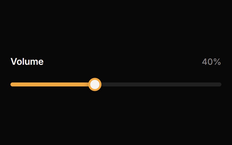 SliderReactFrame · ReactAn accessible single or range slider with a draggable thumb, a value tooltip, optional step marks, keyboard control…
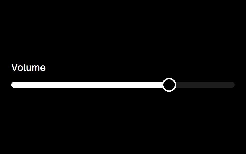 Sliderark-cn · ReactA shadcn-style slider component built with Ark UI primitives.
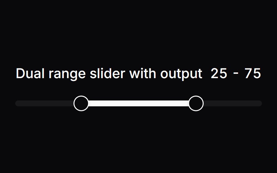 Comp 251Origin UI · React
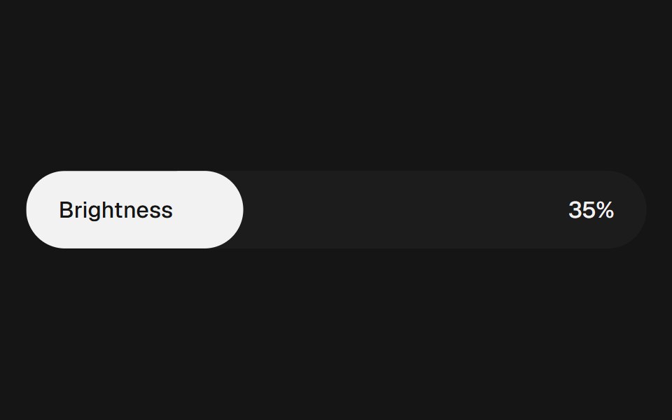 Range Slider FluidbeUI · ReactRange slider with two thumbs and a fluid, springy fill between them.
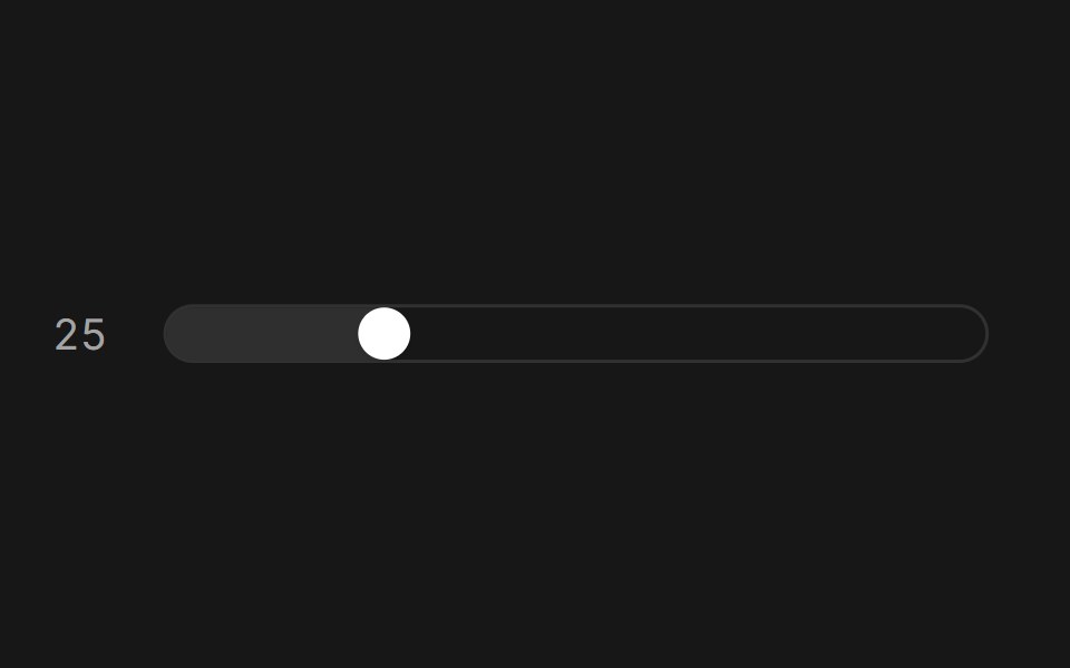 Slider (Base UI)Fluid Functionalism · ReactAnimated slider with spring-snapped thumb, step dots, range mode, and click-to-edit value display. Base UI flavor.
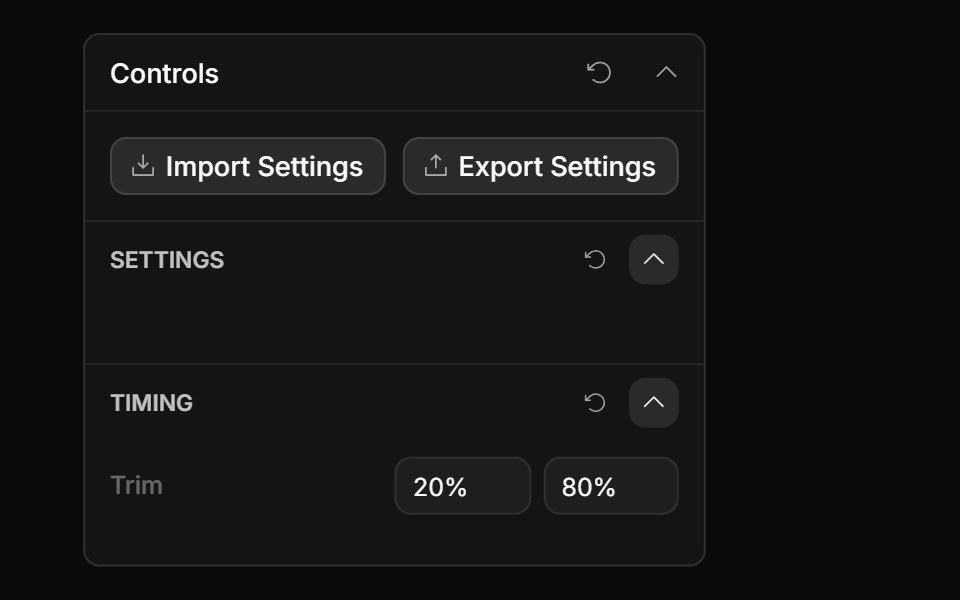 Range Input ControlToolcraft · React
 Adaptive Slider BaseWatermelon UI · React
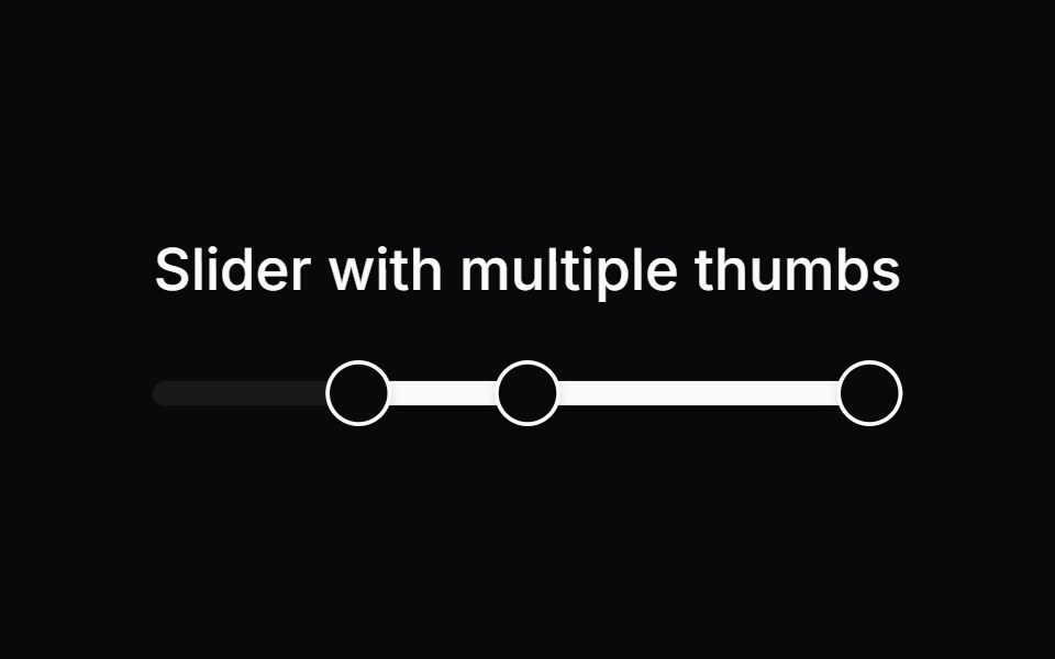 Comp 253Origin UI · React
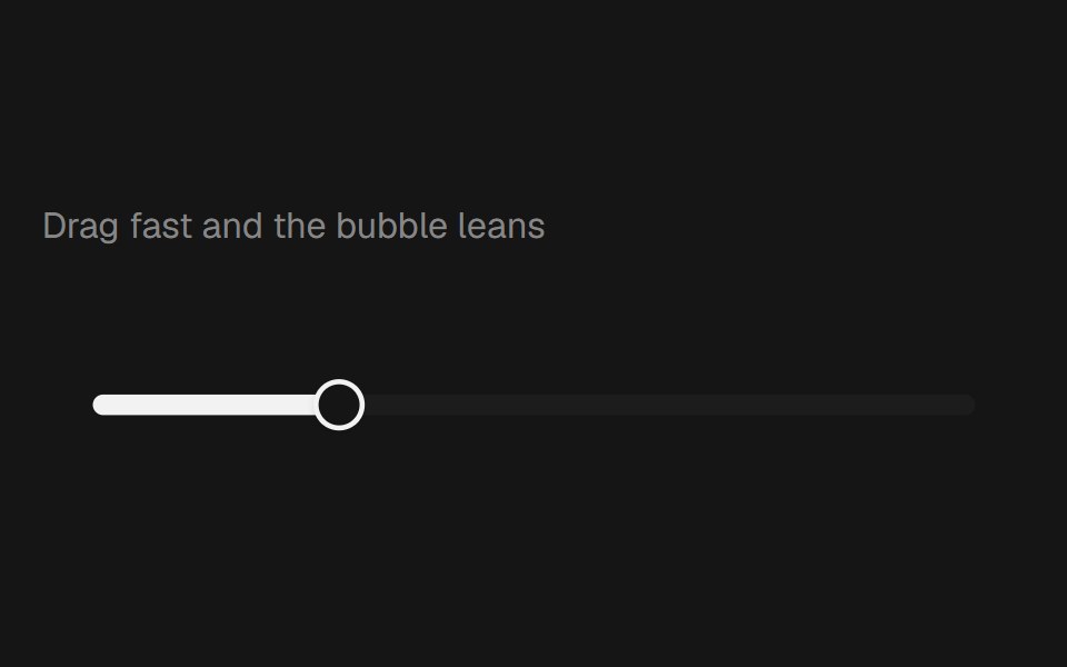 Range Slider BubblebeUI · React
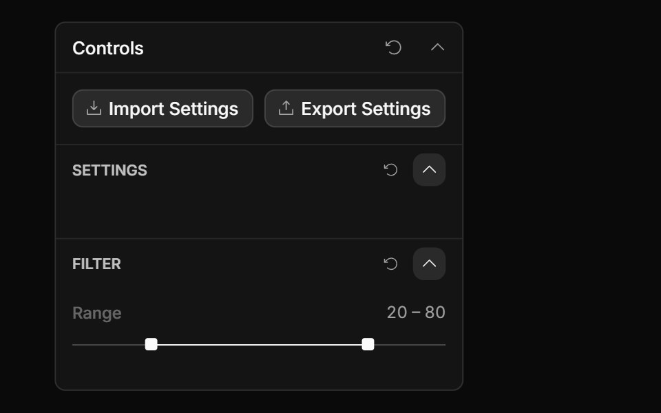 Range Slider ControlToolcraft · React
 Carousel SliderWatermelon UI · React
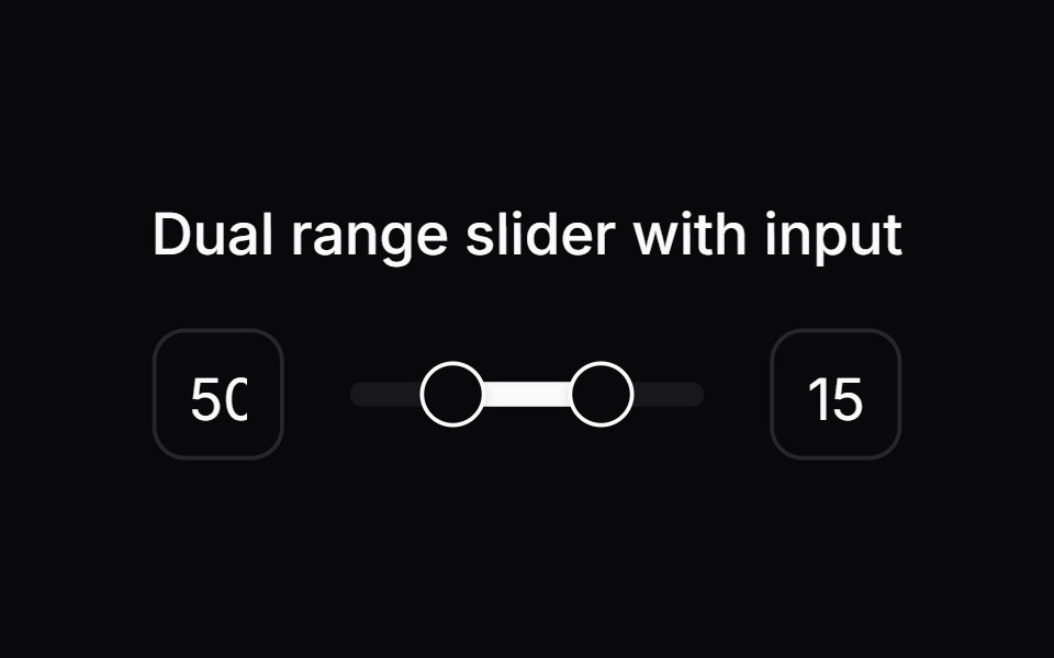 Comp 258Origin UI · React
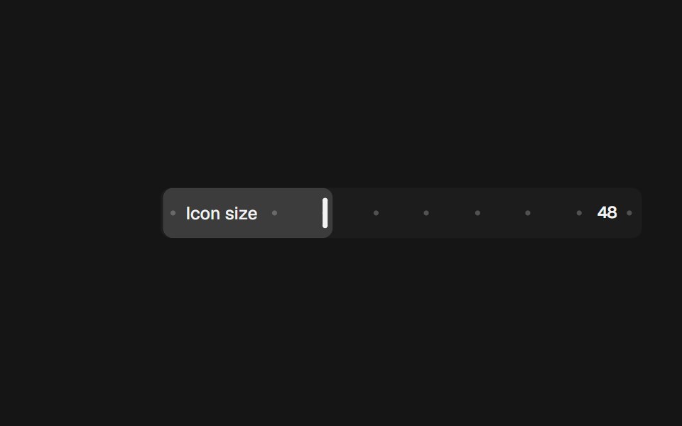 Range Slider InlinebeUI · React
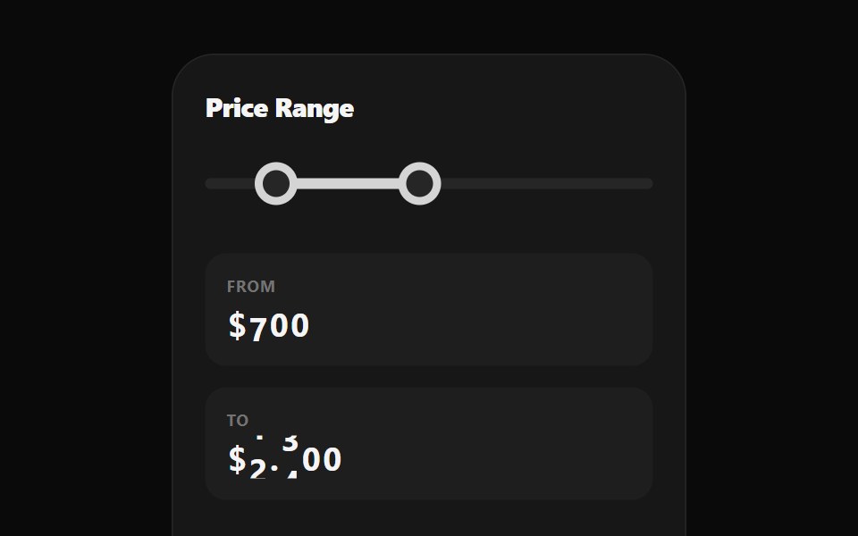 Range Selection SliderWatermelon UI · React
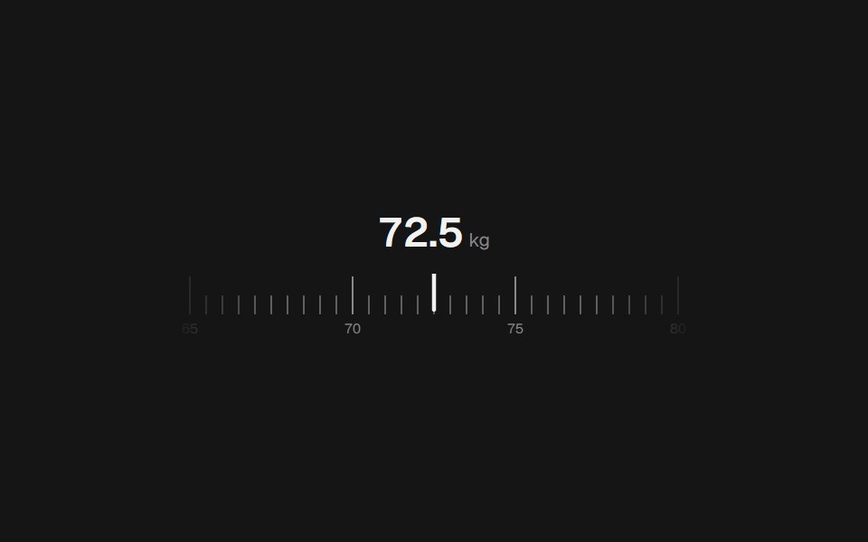 Range Slider RulerbeUI · React
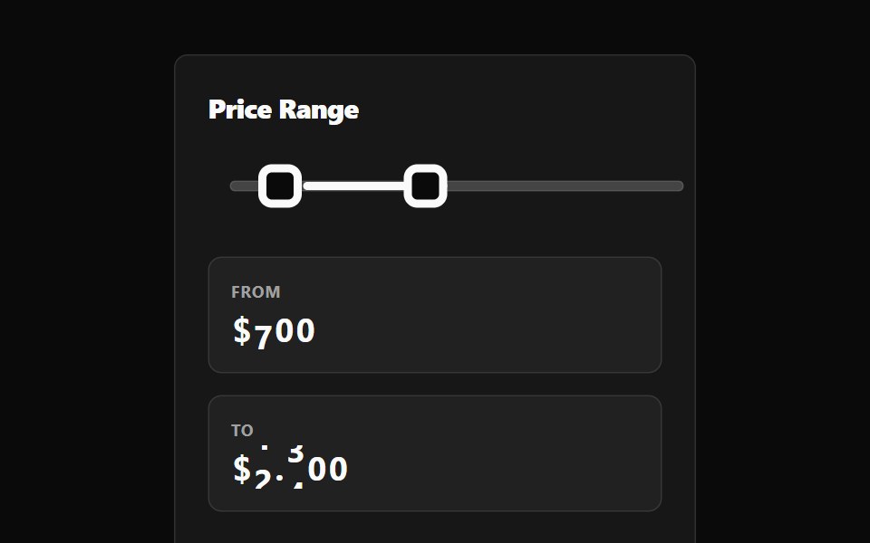 Range Selection Slider BaseWatermelon UI · React
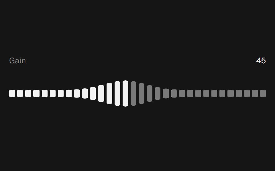 Range Slider WavebeUI · React
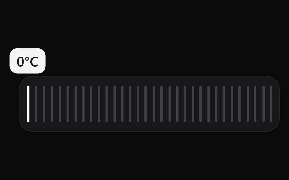 Scrub SliderWatermelon UI · React
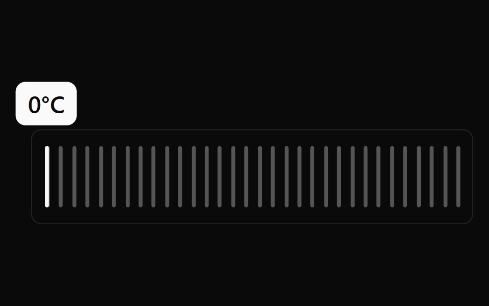 Scrub Slider BaseWatermelon UI · React
Libraries with range slider components
Related categories
- React Range Slider Components
- Tailwind CSS Range Slider Components
- Animated Range Slider Components
- Input Components
- Text Input Components
- Select Components
- Form Field Components
- Form Components
- Textarea Components
- Switch Components
- Checkbox Components
- Slider Components
- Radio Components
- Combobox Components
- File Upload Components
- Search Input Components
- Date Picker Components
- Login Form Components
- Color Picker Components