 Dev Design Library
Tailwind CSS Range Slider Components
Dev Design Library indexes 37 Tailwind CSS range slider components from 20 open-source UI libraries, with the most coming from Watermelon UI, beUI, Origin UI, Toolcraft and Fluid Functionalism. Each one links to its page with the source code, a live preview where available, the library license and the install command. Every library in this list styles its components with Tailwind CSS utility classes. Range slider components belong to the Inputs group.
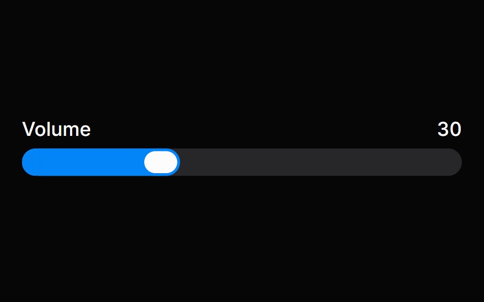 SliderHeroUI · ReactA draggable input for selecting a value or range within a bounded interval.
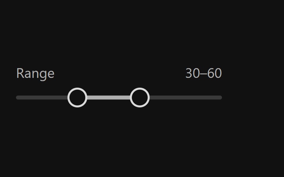 Range SliderReact Spectrum · ReactRangeSliders allow users to quickly select a subset range. They should be used when the upper and lower bounds to the…
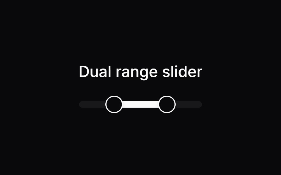 Comp 250Origin UI · React
- Range SliderPreline UI · JavaScript (HTML + Tailwind)
 SliderUntitled UI React · React
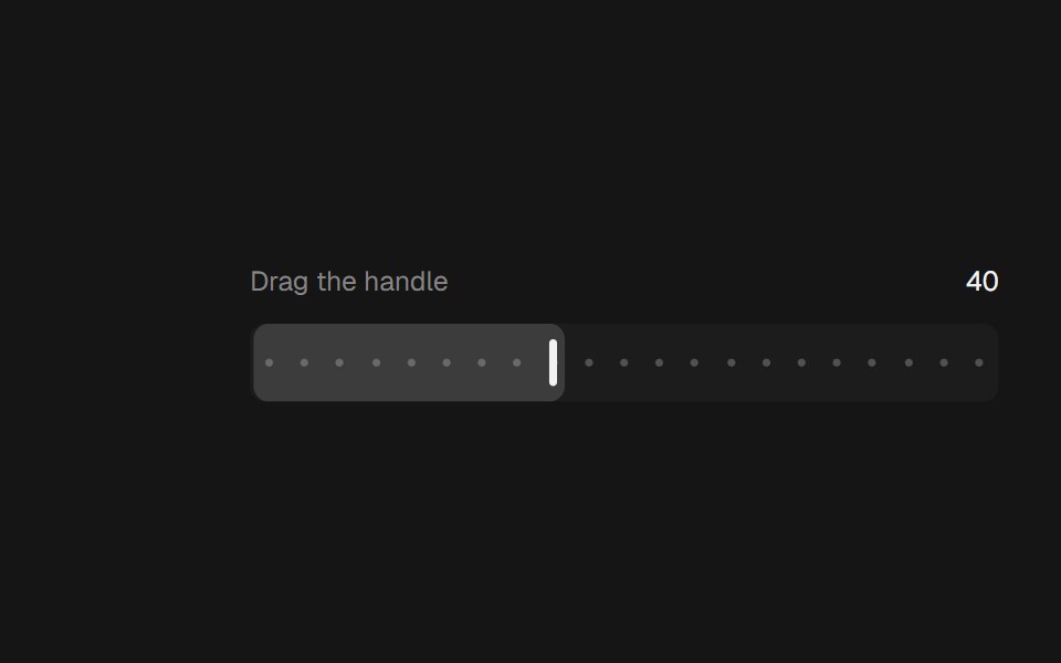 Range SliderbeUI · ReactA bar thumb that glides between steps.
 Dual Range Slider DependenciesSpectrum UI · Reactcomponent for the Dual Range Slider Dependencies
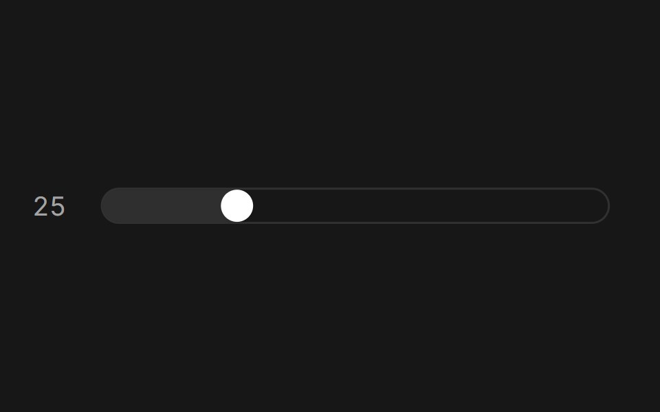 SliderFluid Functionalism · ReactAnimated slider with spring-snapped thumb, step dots, range mode, and click-to-edit value display. Built on Radix UI…
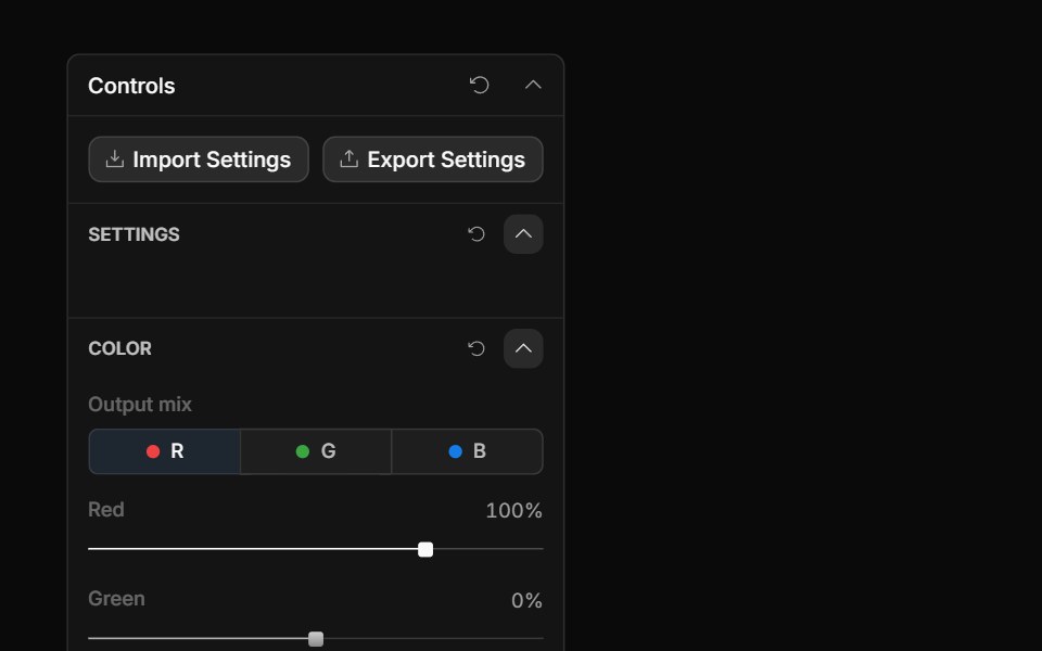 Channel Mixer ControlToolcraft · React
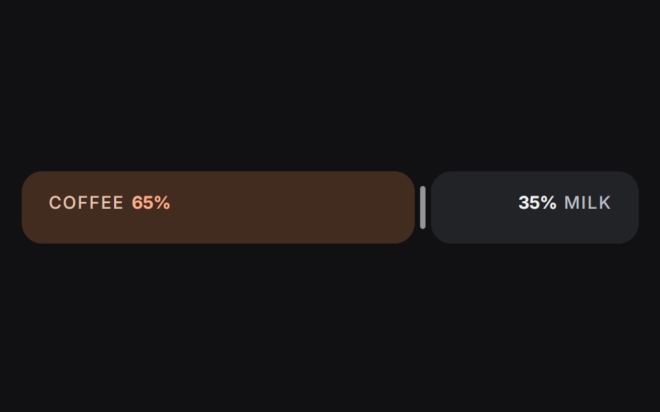 Slideruselayouts · ReactA dual-sided ratio slider animated with spring physics and drag interactions.
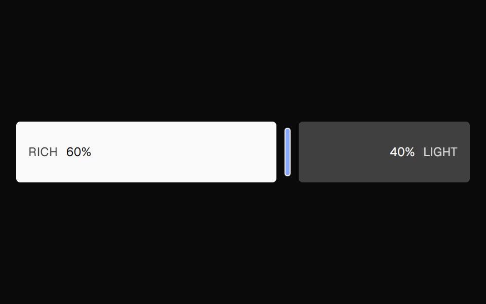 Ratio SliderNexvyn UI · ReactA split ratio slider with two color bars, a draggable divider, and responsive labels that collapse when space is tight.
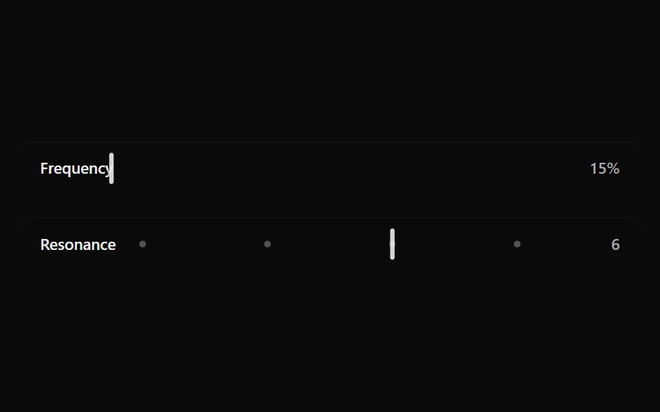 Fluid SliderSona UI · ReactA labeled Base UI range control with direct surface selection, a dedicated draggable indicator, and restrained…
 Adaptive SliderWatermelon UI · React
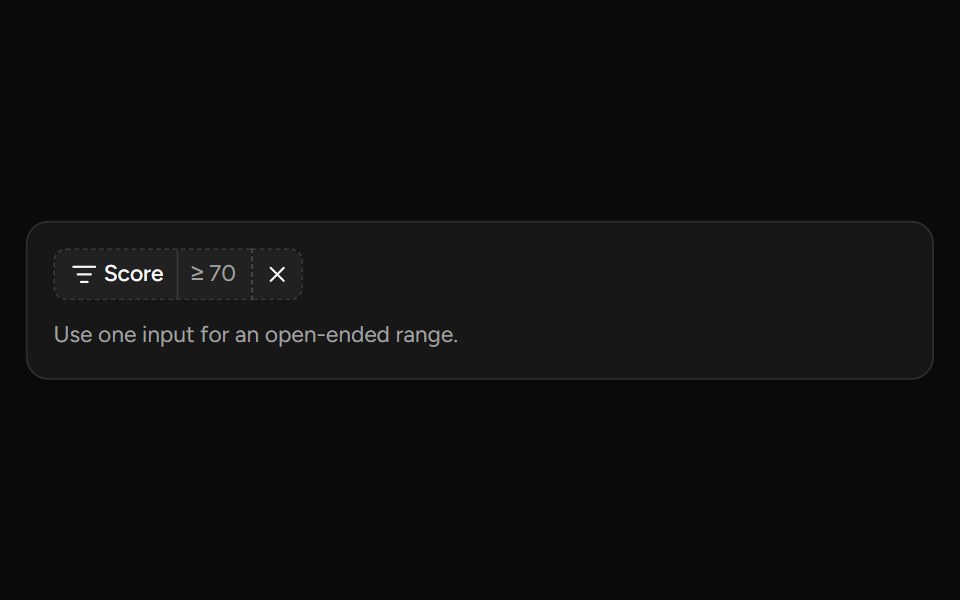 Number Range Filtersv-table · SvelteA number range picker with exact inputs, an optional slider, and explicit apply behavior.
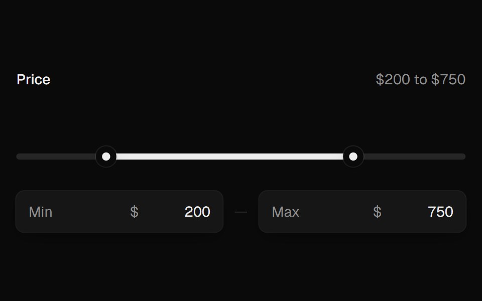 Range SliderUI Lab · ReactTwo thumbs that glide, stop at each other, and show their value as you drag.
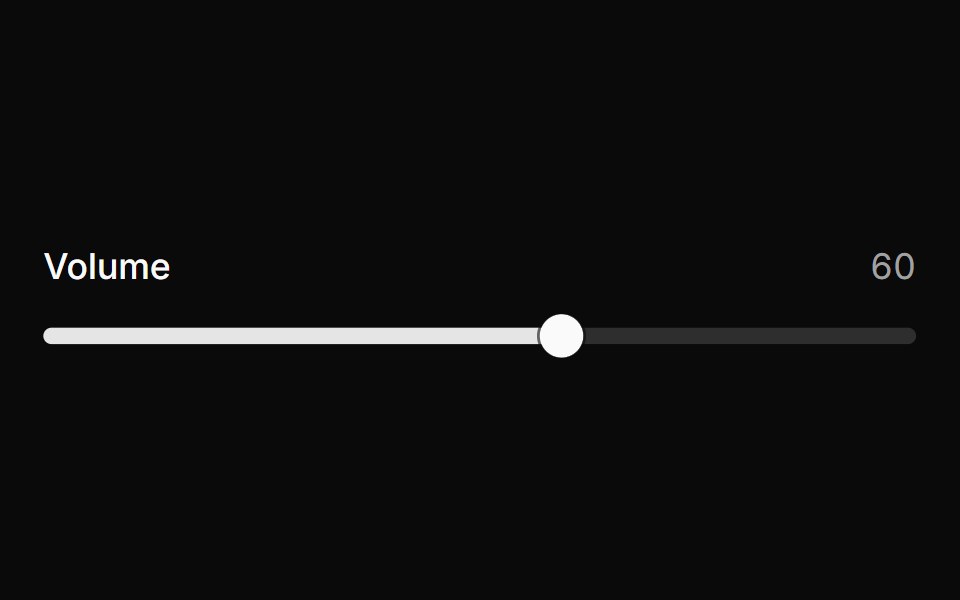 SliderHextaUI · ReactPick a value or a range by dragging, tapping the track or using the keys, with jumps that glide and an optional value…
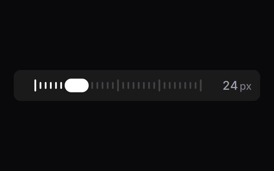 Tick SliderSpaceUI · ReactA scrubber drawn as a row of tick marks, backed by a real range input.
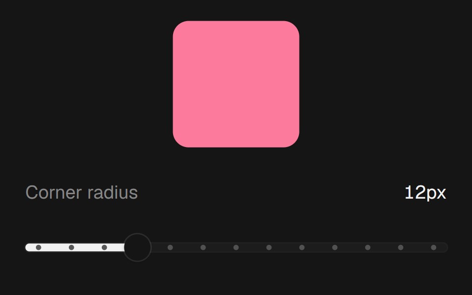 Range SliderEaseUI · ReactNative range input with a filled track and tick dots, so keyboard and screen reader support come built in.
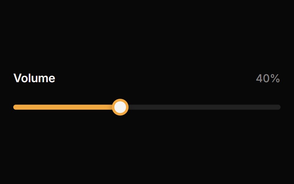 SliderReactFrame · ReactAn accessible single or range slider with a draggable thumb, a value tooltip, optional step marks, keyboard control…
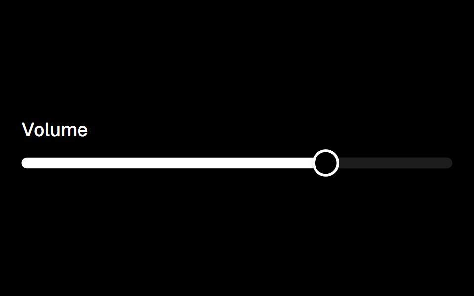 Sliderark-cn · ReactA shadcn-style slider component built with Ark UI primitives.
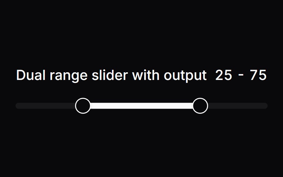 Comp 251Origin UI · React
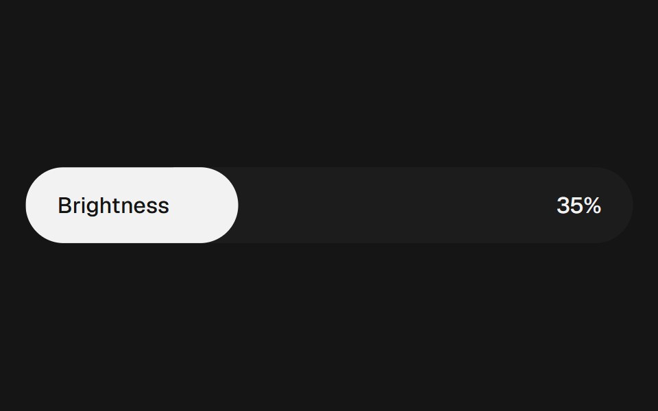 Range Slider FluidbeUI · ReactRange slider with two thumbs and a fluid, springy fill between them.
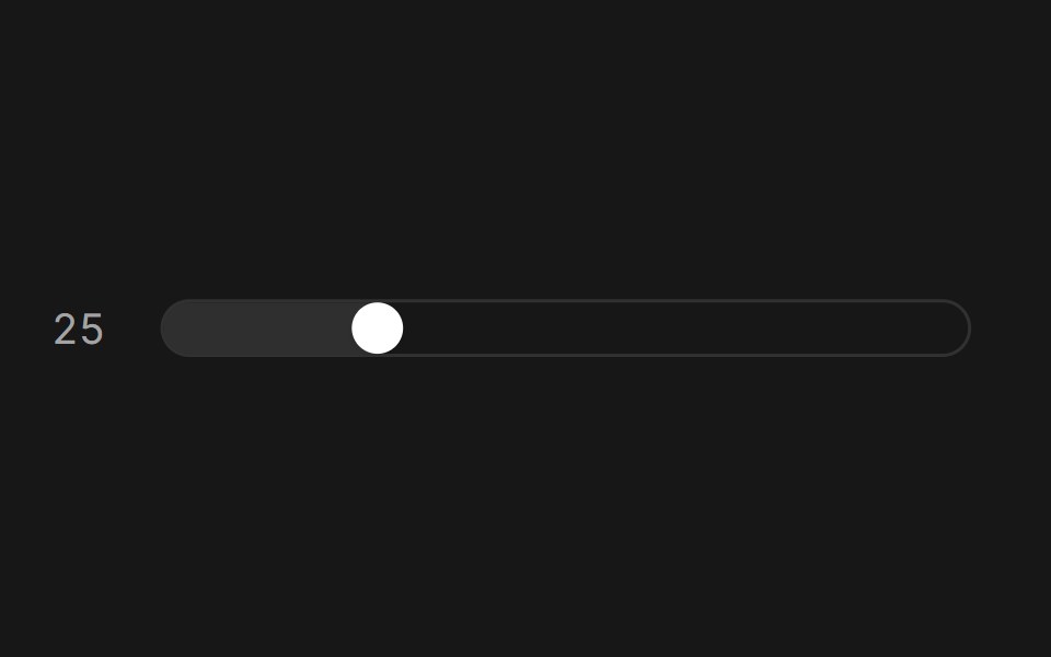 Slider (Base UI)Fluid Functionalism · ReactAnimated slider with spring-snapped thumb, step dots, range mode, and click-to-edit value display. Base UI flavor.
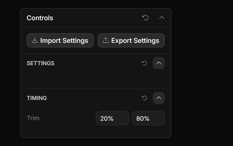 Range Input ControlToolcraft · React
 Adaptive Slider BaseWatermelon UI · React
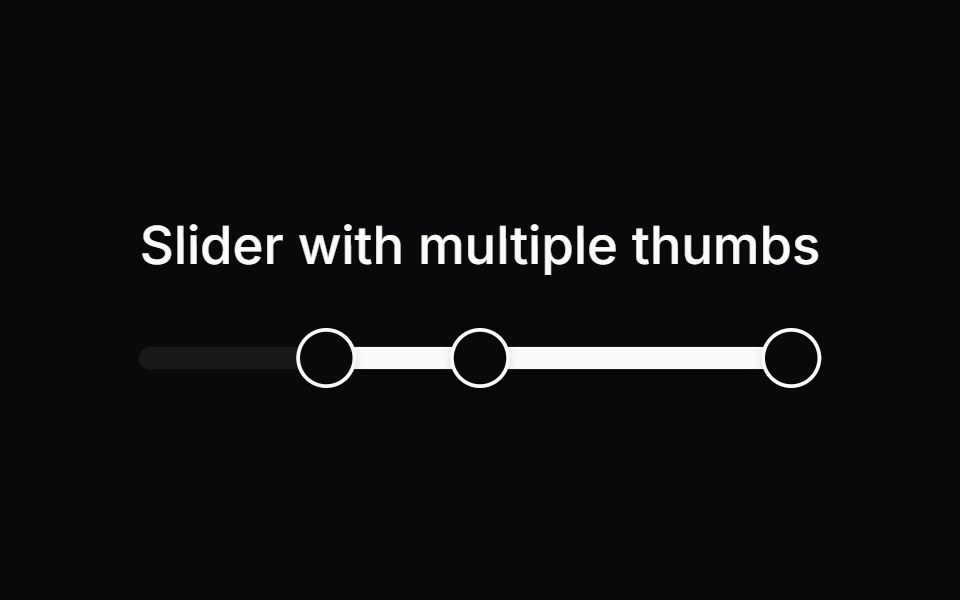 Comp 253Origin UI · React
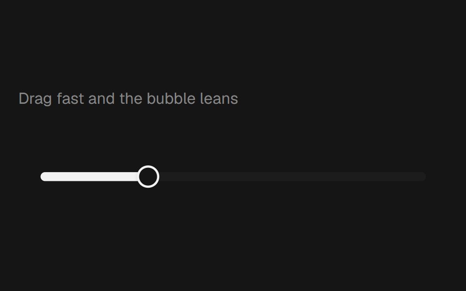 Range Slider BubblebeUI · React
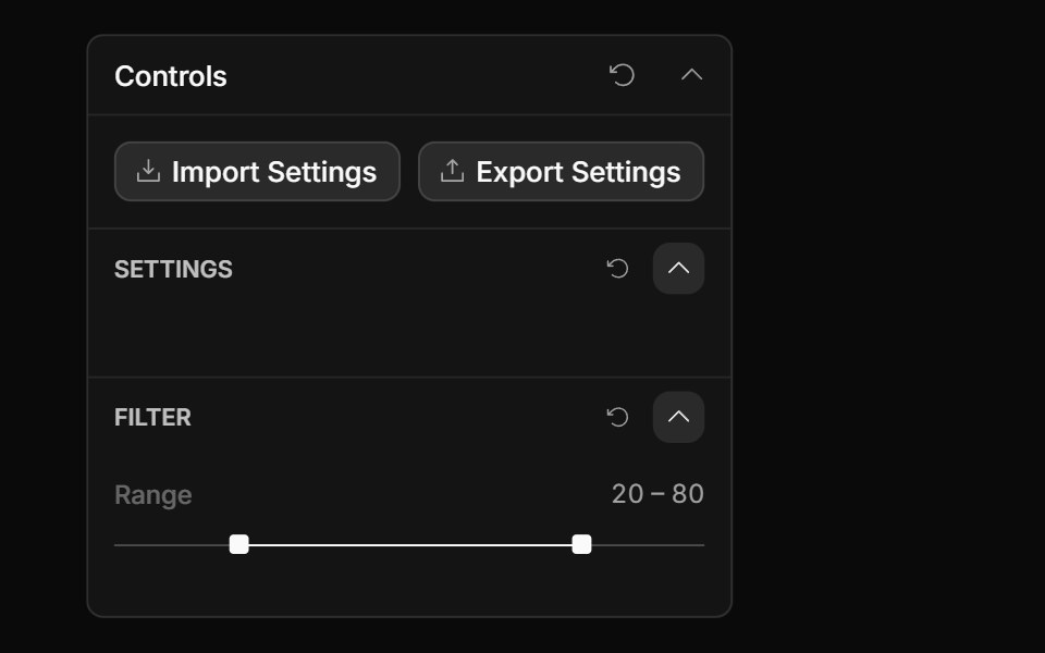 Range Slider ControlToolcraft · React
 Carousel SliderWatermelon UI · React
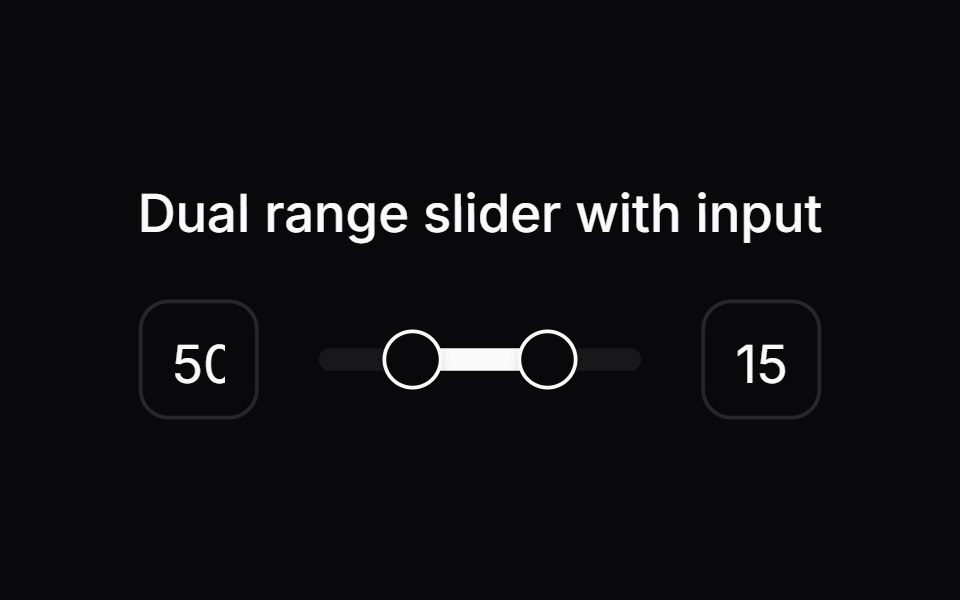 Comp 258Origin UI · React
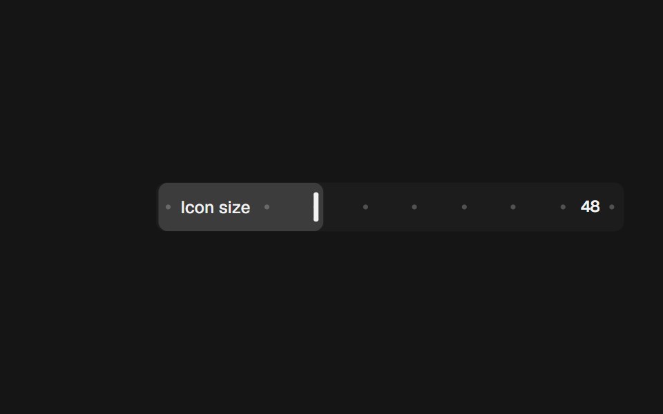 Range Slider InlinebeUI · React
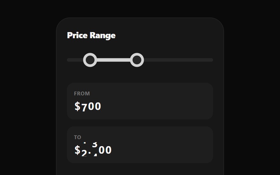 Range Selection SliderWatermelon UI · React
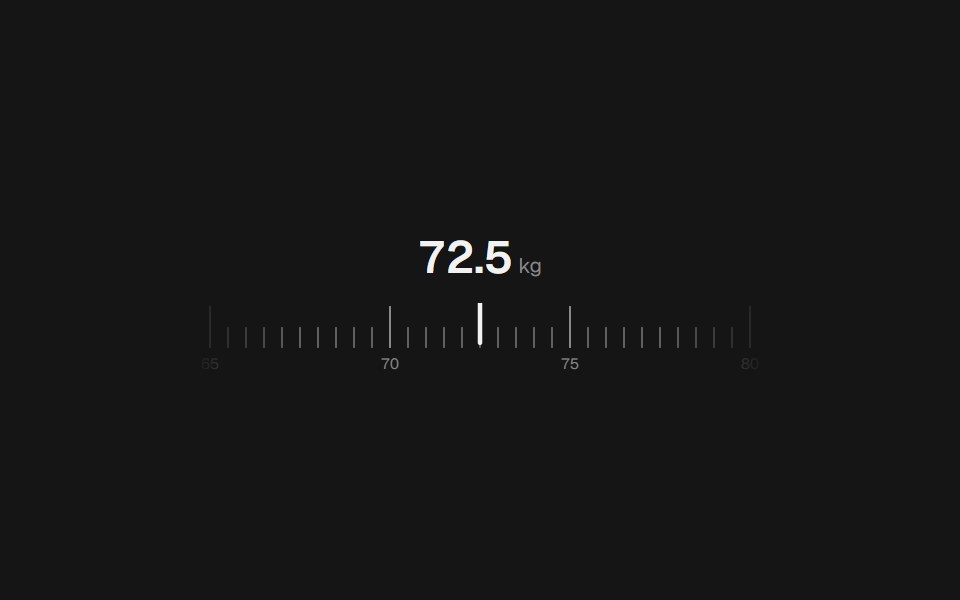 Range Slider RulerbeUI · React
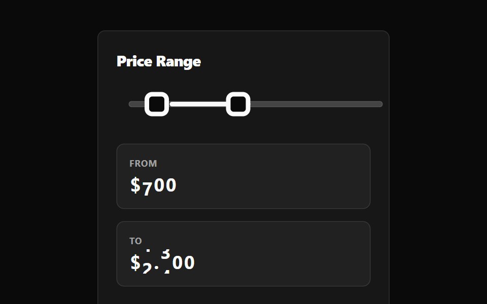 Range Selection Slider BaseWatermelon UI · React
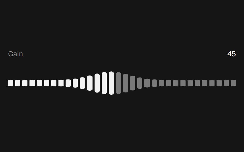 Range Slider WavebeUI · React
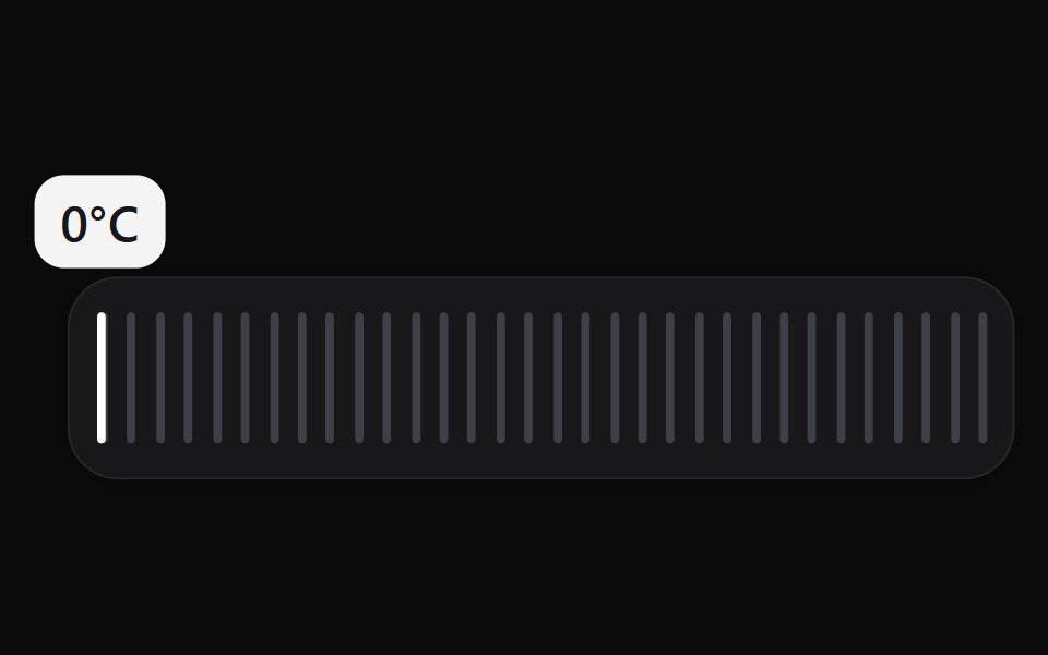 Scrub SliderWatermelon UI · React
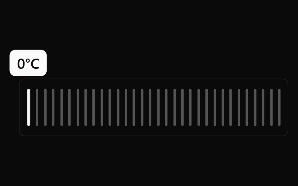 Scrub Slider BaseWatermelon UI · React
Libraries with Tailwind CSS range slider components
Related categories
- Range Slider Components
- React Range Slider Components
- Animated Range Slider Components
- Tailwind CSS Input Components
- Tailwind CSS Text Input Components
- Tailwind CSS Select Components
- Tailwind CSS Form Field Components
- Tailwind CSS Form Components
- Tailwind CSS Textarea Components
- Tailwind CSS Checkbox Components
- Tailwind CSS Switch Components
- Tailwind CSS Slider Components
- Tailwind CSS Radio Components
- Tailwind CSS Combobox Components
- Tailwind CSS File Upload Components
- Tailwind CSS Search Input Components
- Tailwind CSS Date Picker Components
- Tailwind CSS Login Form Components
- Tailwind CSS Color Picker Components