 Dev Design Library
Tailwind CSS Combobox Components
Dev Design Library indexes 106 Tailwind CSS combobox components from 33 open-source UI libraries, with the most coming from ReUI, Watermelon UI, Origin UI, Shadcn Space and React Spectrum. Each one links to its page with the source code, a live preview where available, the library license and the install command. Every library in this list styles its components with Tailwind CSS utility classes. Combobox components belong to the Inputs group.
 Comboboxshadcn/ui · ReactAutocomplete input with a list of suggestions.
 AutocompleteHeroUI · ReactAn autocomplete combines a select with filtering, allowing users to search and select from a list of options
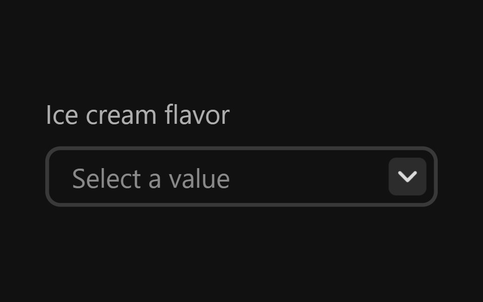 Combo BoxReact Spectrum · ReactComboBoxes combine a text entry with a picker menu, allowing users to filter longer lists to only the selections…
 Autocompletecoss ui · ReactAn input that suggests options as you type.
 Comp 229Origin UI · React
- ComboboxPreline UI · JavaScript (HTML + Tailwind)
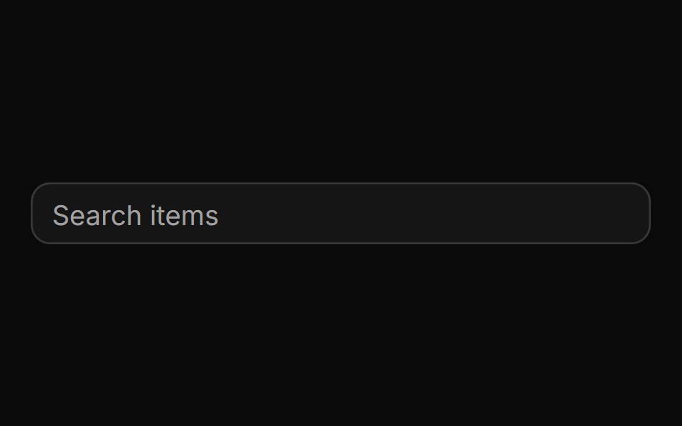 AutocompleteReUI · ReactAn input that suggests options as you type.
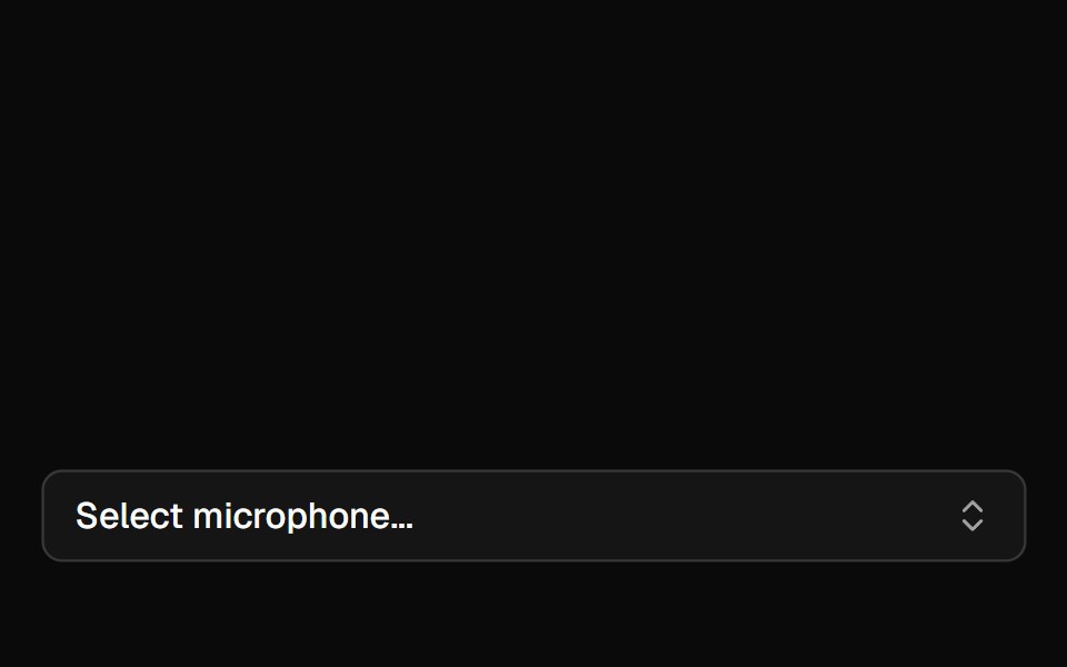 Mic SelectorAI Elements · ReactA composable dropdown component for selecting audio input devices with permission handling and device change detection.
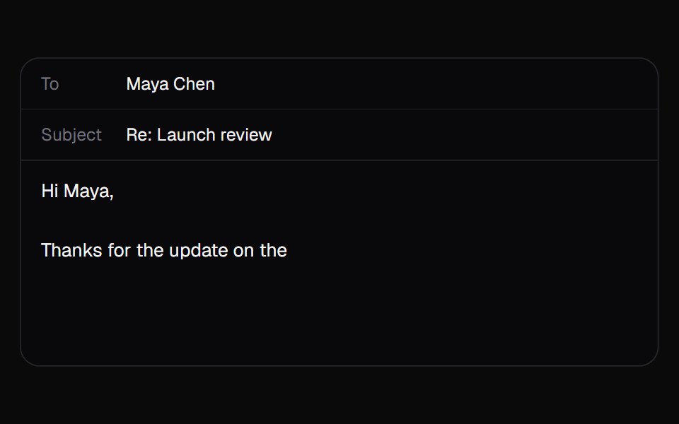 AI AutocompleteKokonut UI · ReactA text box that suggests how your sentence ends in grey after the caret. Tab takes it all, the right arrow takes one…
 combo-boxIntent UI · Reactcombo-box
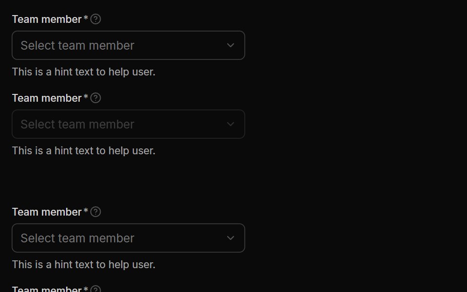 SelectUntitled UI React · React
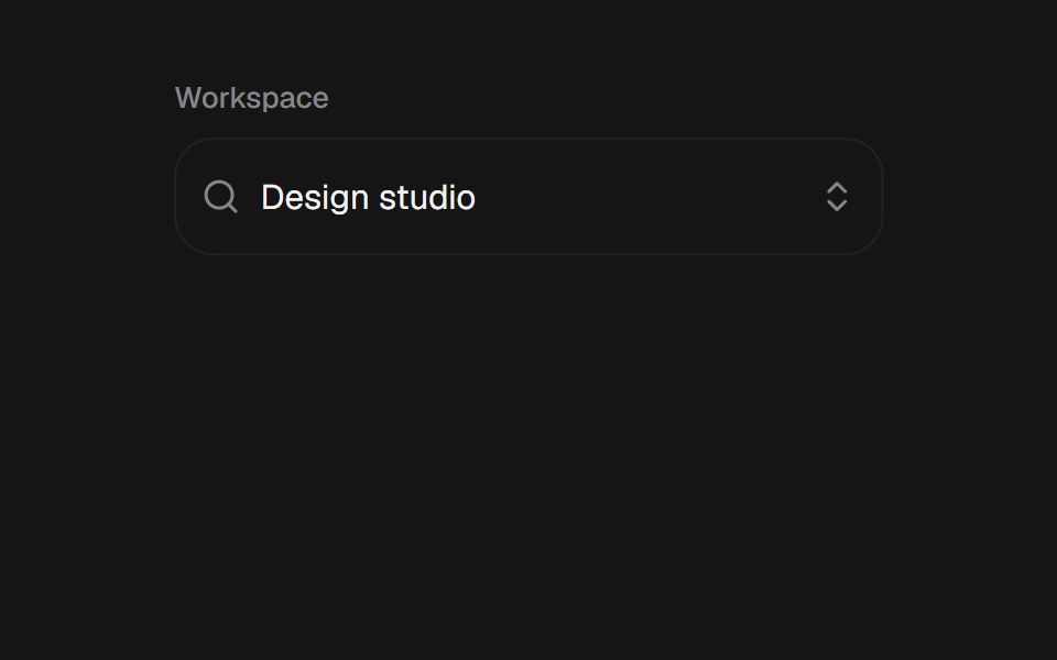 ComboboxbeUI · ReactSearchable combobox with a morphing portal, grouped filtering, keyboard navigation, and controlled or uncontrolled…
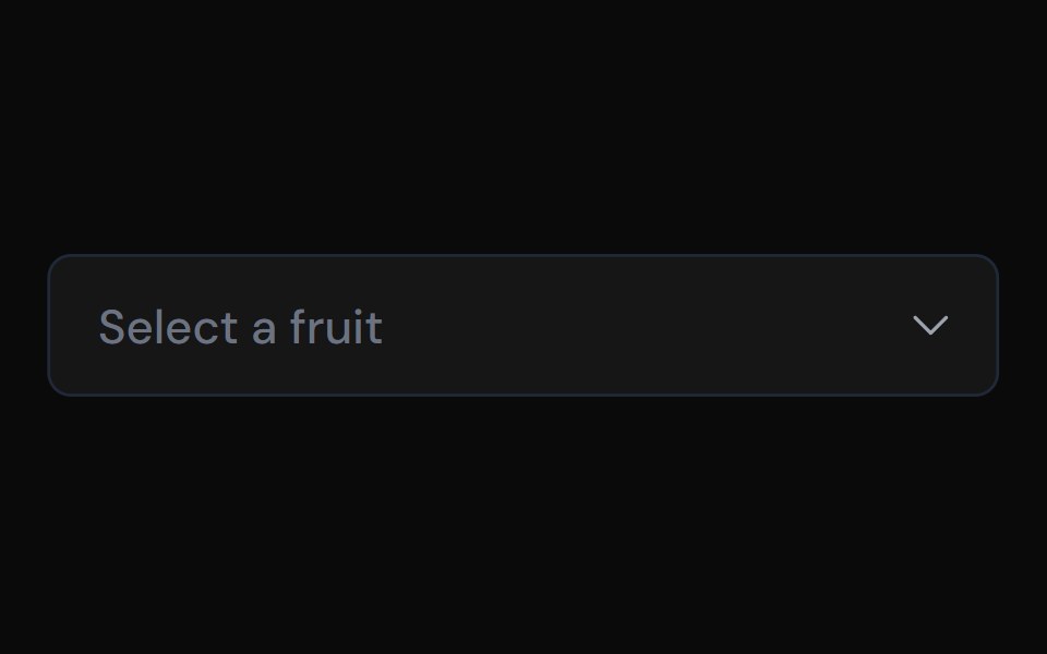 ComboboxTailGrids · ReactA combobox component with multiple variants.
 ComboboxFluid Functionalism · ReactType-to-filter combobox with single or multiple (chips, merged selection backgrounds) selection: a text field that…
 ComboboxToolcraft · React
 Web ComboboxPanel UI · React NativeA searchable combobox with single and multiple selection and tag chips.
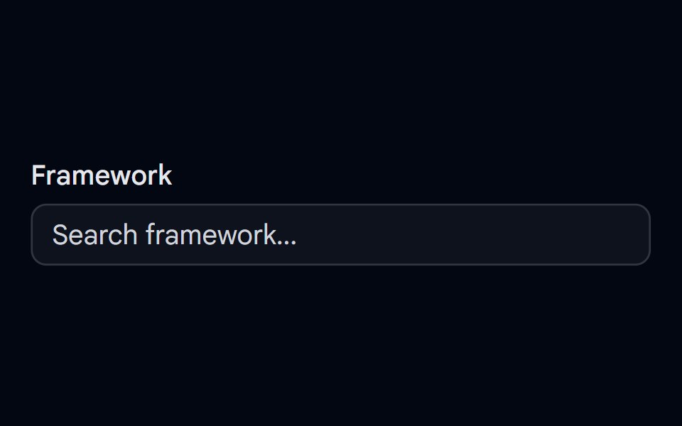 Autocomplete-01 - DefaultShadcn Space · ReactDefault autocomplete component
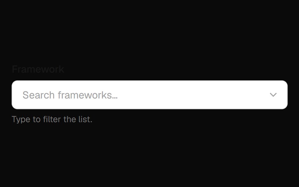 Combobox Field InputOpenSourceUI · React
 AutocompleteComponentry · React
 ComboboxShadcn Dashboard · React
 comboboxBaseLayer · ReactA combo box combines a text input with a listbox, allowing users to filter a list of options to items matching a query.
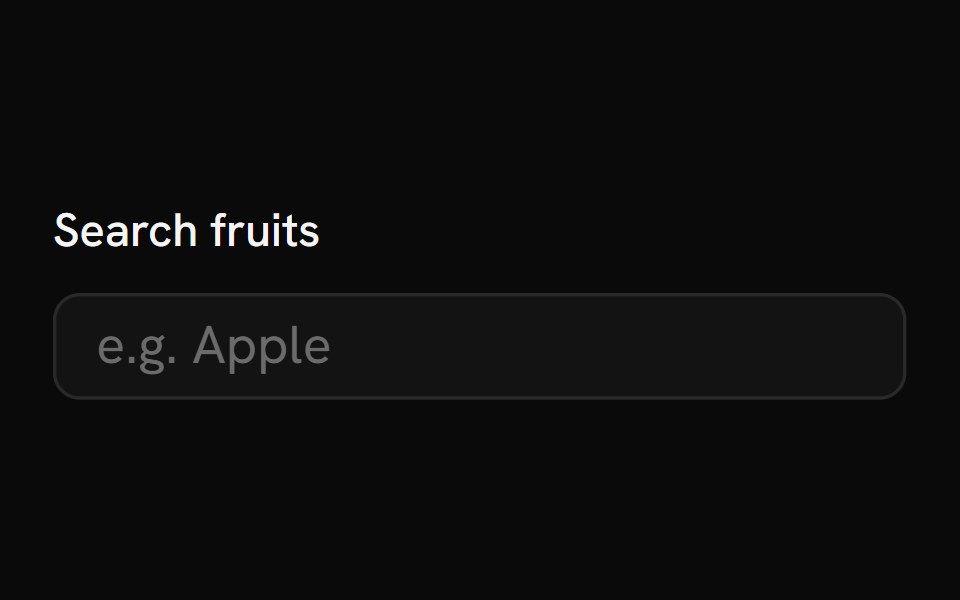 AutocompleteShark UI · React
 Combobox 1Watermelon UI · React
 Glass Comboboxglasscn · ReactGlass Combobox with five variants: clear, frosted, subtle, liquid, and liquid-refract
 ComboboxUI Lab · ReactThe person you pick flies out of the list and into the field.
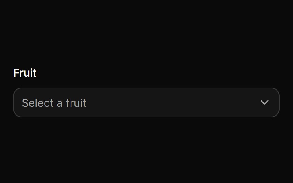 ComboboxHextaUI · ReactA filterable select with chips, groups and async results, in a popup that resizes as you type.
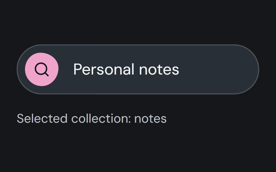 ComboboxCojeev UI · ReactFilters a list of options through text input and stores one selected value.
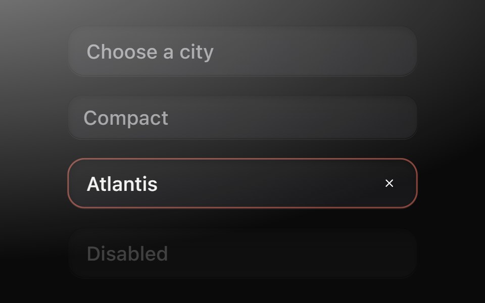 ComboboxMetal UI · React + SwiftUIType to find one of many: a field well that opens the menu's frosted plate; rows filter at once while the plate's…
 AutocompleteSpaceUI · ReactDisplays matching suggestions as users type into an input field, helping them find items quickly and reducing typing…
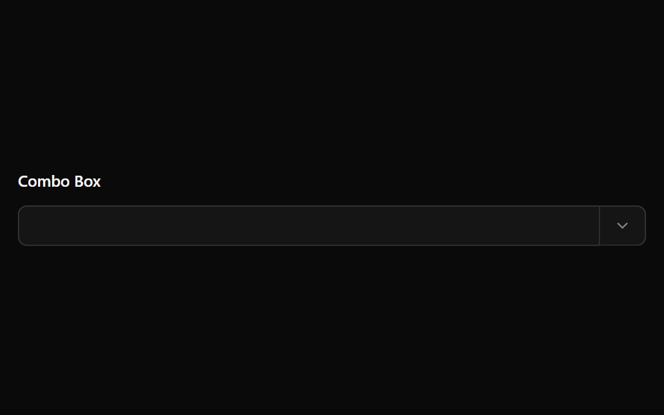 Combo BoxOUI · ReactReact aria components Combo Box with shadcn characteristics.
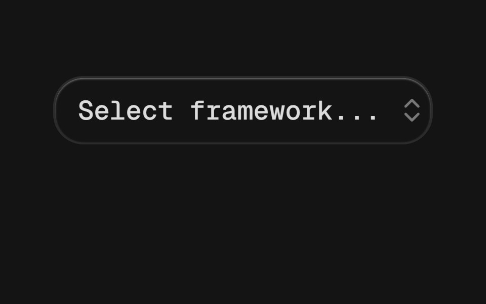 ComboboxD2Studio UI · ReactAutocomplete input and command palette with a list of suggestions.
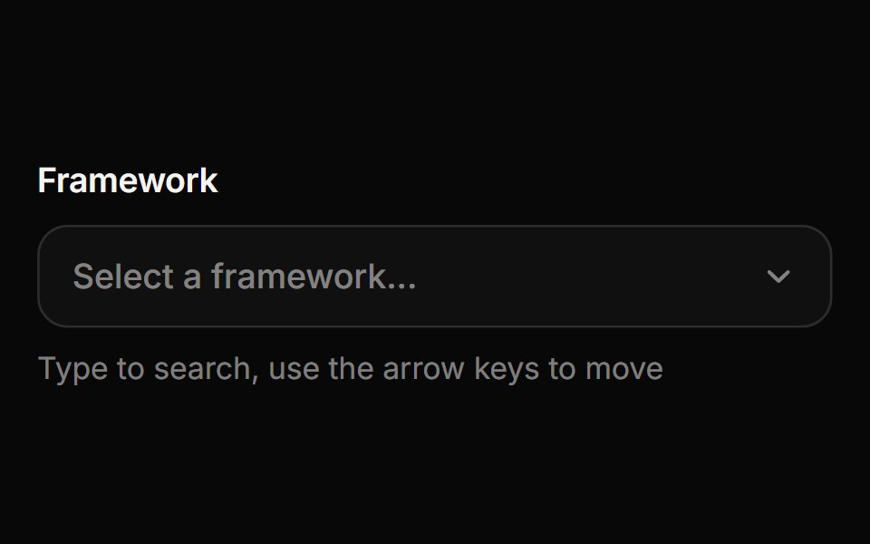 ComboboxReactFrame · ReactA searchable select where you type to filter options, with match highlighting, option descriptions, disabled options…
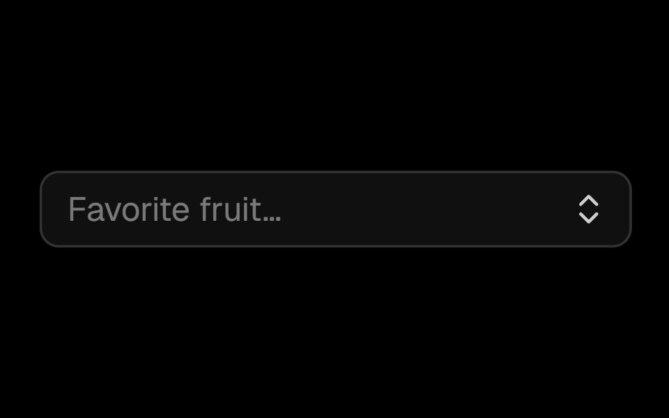 Comboboxark-cn · ReactA shadcn-style combobox component built with Ark UI primitives.
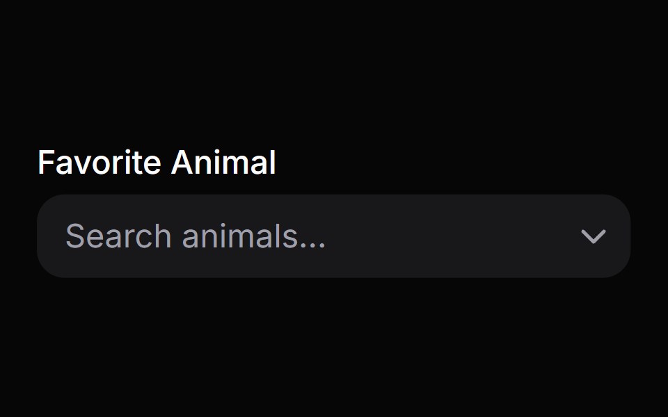 Combo BoxHeroUI · ReactA combo box combines a text input with a listbox, allowing users to filter a list of options to items matching a query
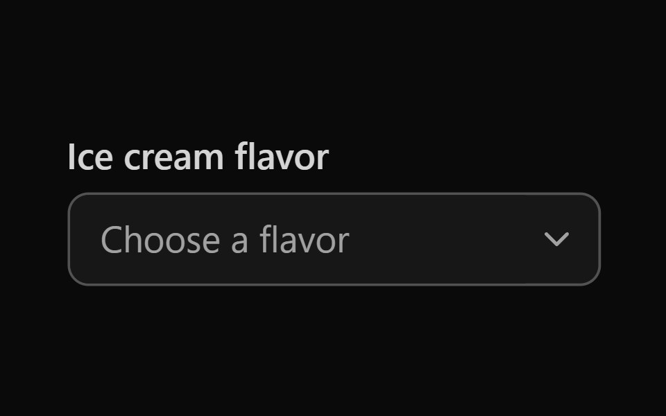 Tailwind Combo BoxReact Spectrum · React
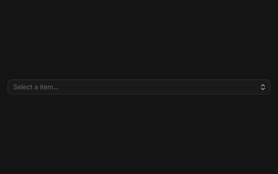 Comboboxcoss ui · ReactAn input combined with a list of predefined items to select.
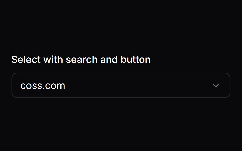 Comp 230Origin UI · React
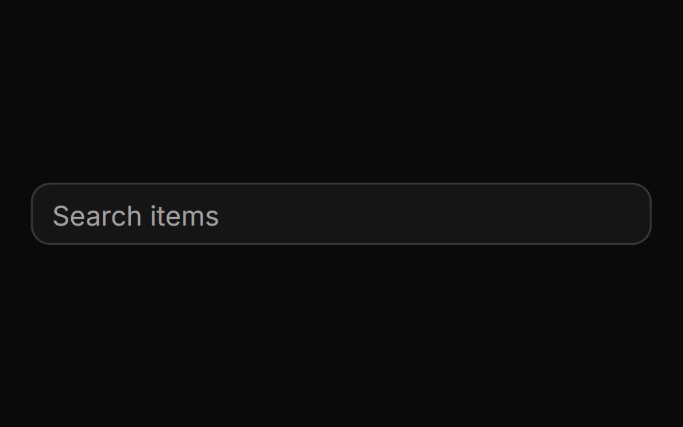 Basic autocomplete controlReUI · ReactBasic autocomplete control
 Voice SelectorAI Elements · ReactA composable dialog component for selecting AI voices with metadata display and search functionality.
 ComboboxFluid Functionalism · ReactType-to-filter combobox with single or multiple (chips, merged selection backgrounds) selection: a text field that…
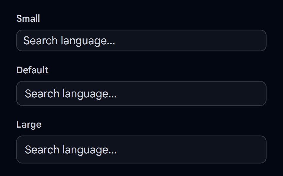 Autocomplete-02 - Size variantsShadcn Space · ReactAutocomplete component with different size variants
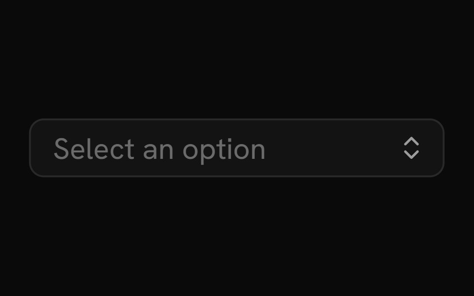 ComboboxShark UI · React
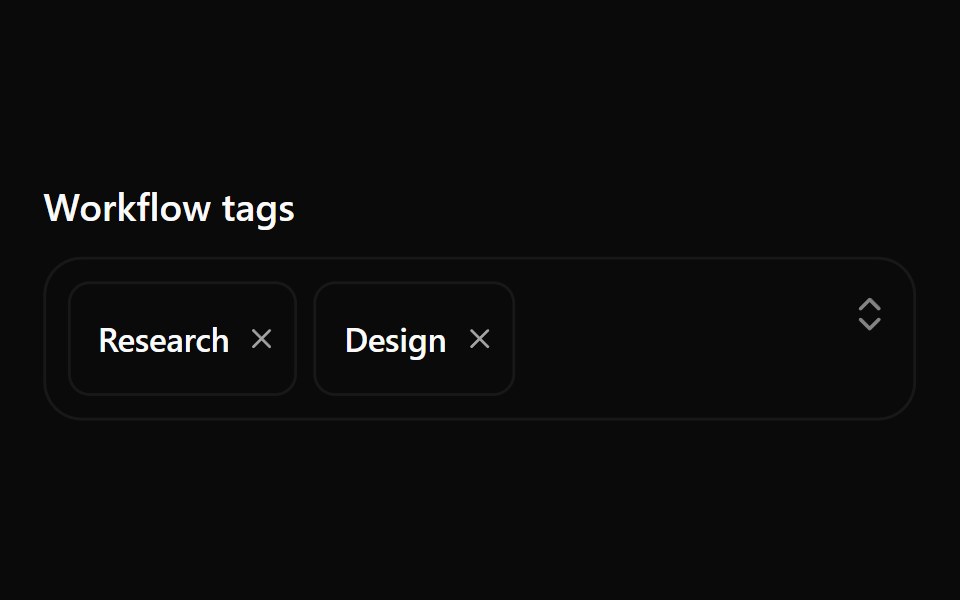 Combobox 10Watermelon UI · React
 Comboboxglasscn · React
 ComboboxSpaceUI · ReactCombines a text search input with a dropdown menu, allowing users to filter and select options from large lists easily.
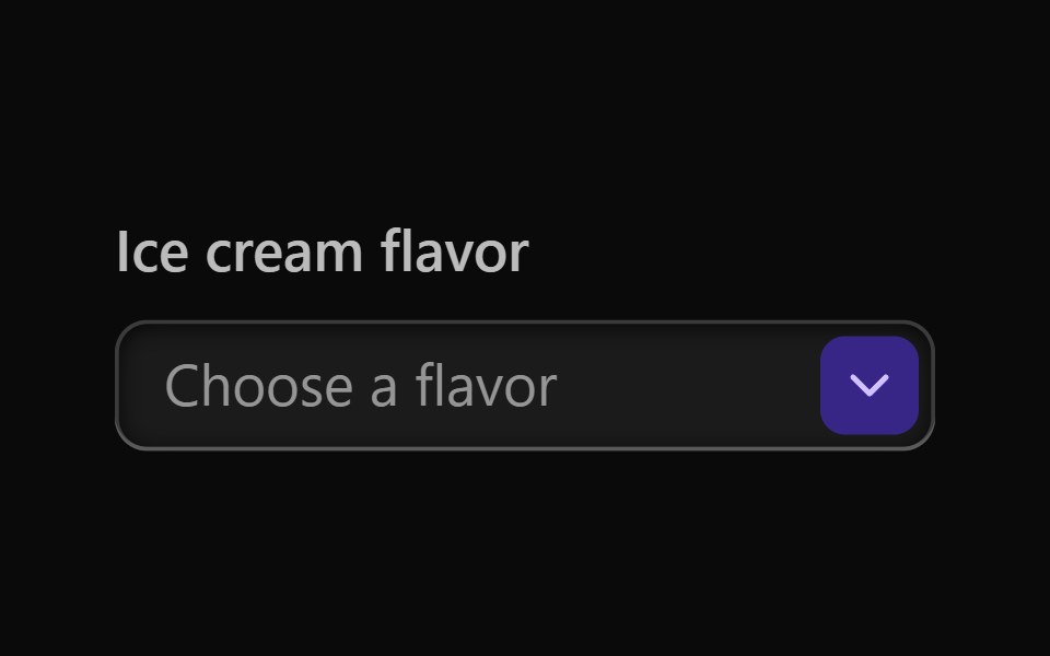 Vanilla Combo BoxReact Spectrum · React
 Comp 231Origin UI · React
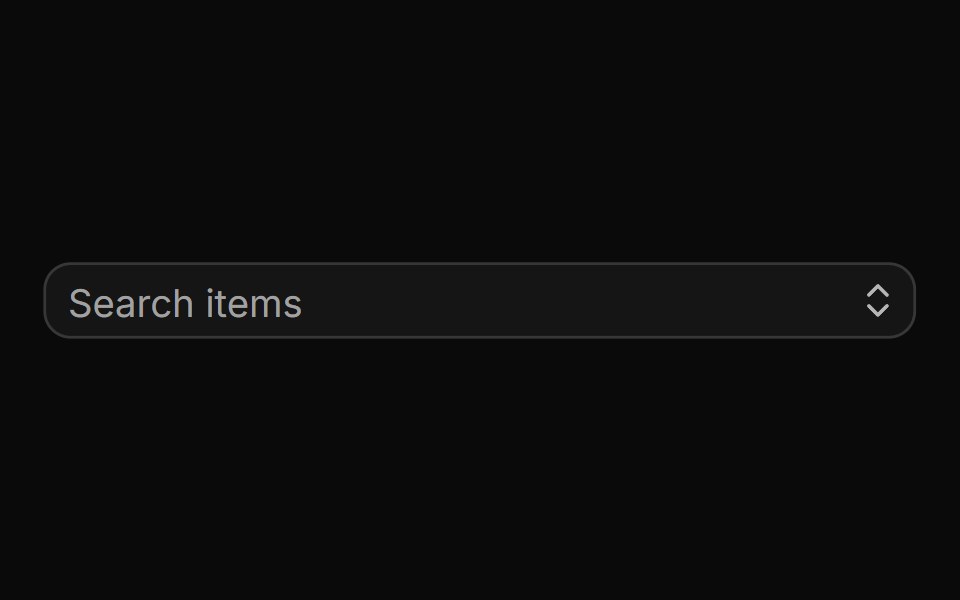 Small autocompleteReUI · ReactSmall autocomplete
 Autocomplete-03 - Vanish AnimationShadcn Space · ReactAutocomplete with vanish animation
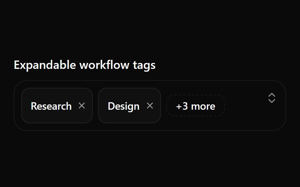 Combobox 11Watermelon UI · React
 Comp 232Origin UI · React
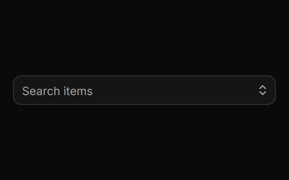 Large autocompleteReUI · ReactLarge autocomplete
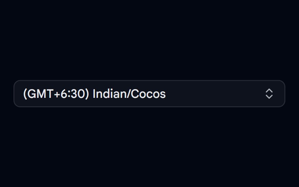 Combobox 04 - TimezoneShadcn Space · ReactCombobox component
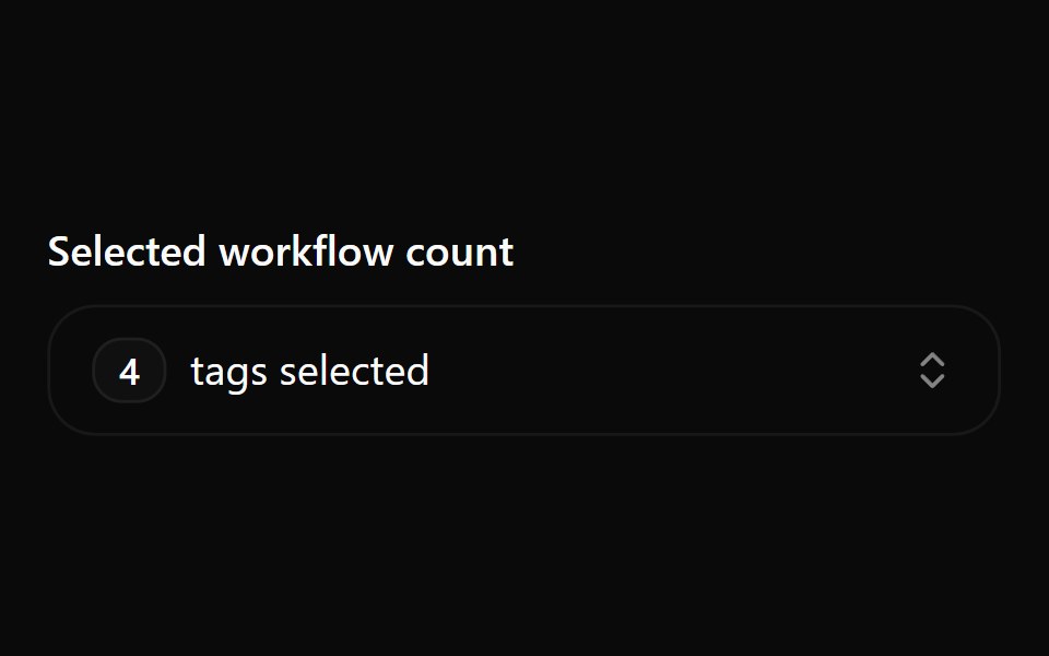 Combobox 12Watermelon UI · React
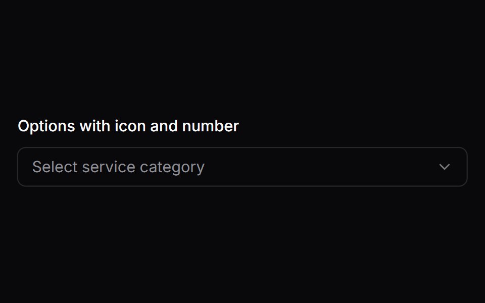 Comp 233Origin UI · React
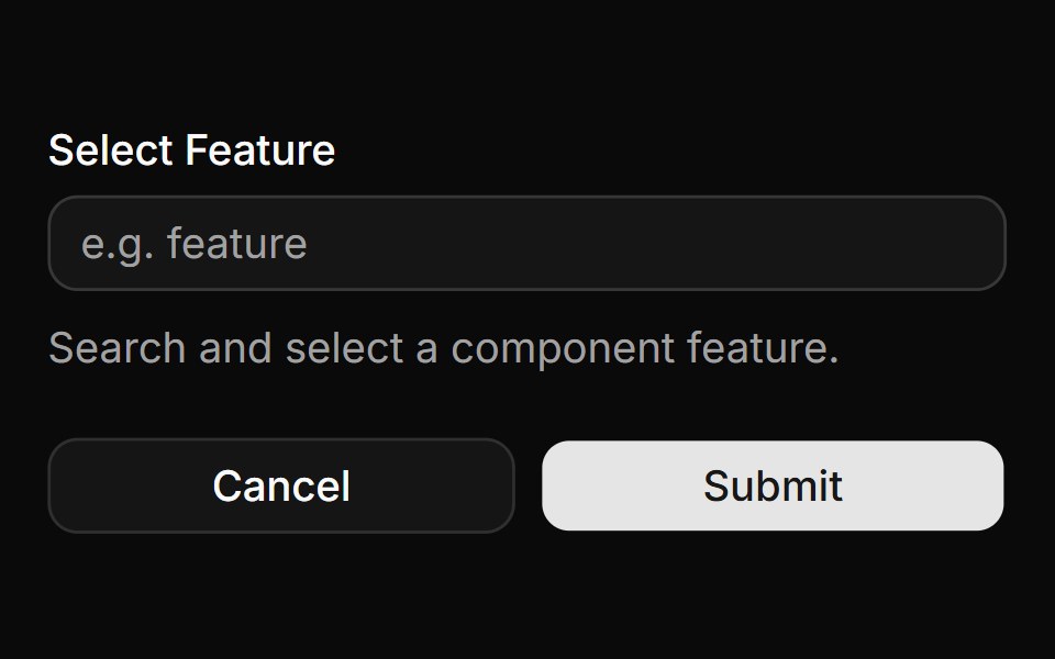 Form integrationReUI · ReactForm integration
 Combobox 05 - UsersShadcn Space · ReactCombobox component
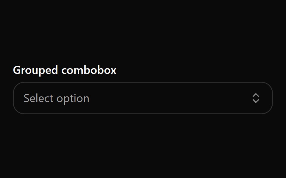 Combobox 2Watermelon UI · React
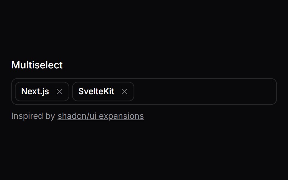 Comp 234Origin UI · React
 Disabled stateReUI · ReactDisabled state
 Combobox 06 - With FlagShadcn Space · ReactCombobox component
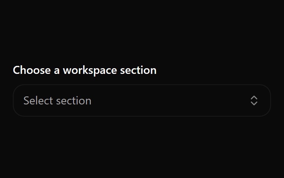 Combobox 3Watermelon UI · React
 Comp 235Origin UI · React
 Auto highlight option as you typeReUI · ReactAuto highlight option as you type
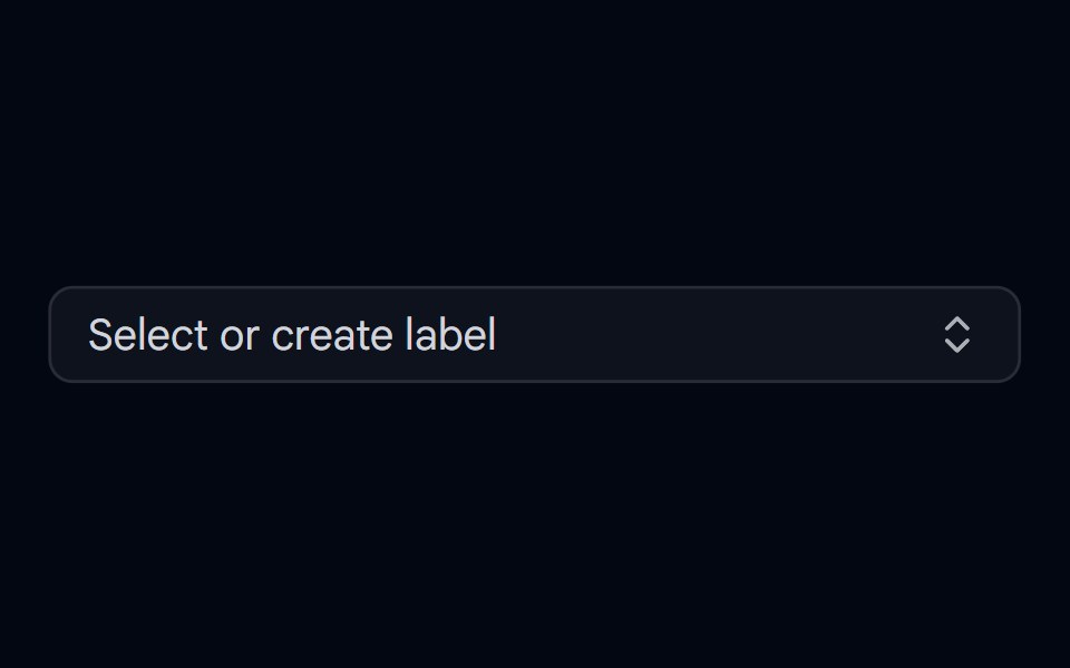 Combobox 07 - CreatableShadcn Space · ReactCombobox with inline item creation — type a new value and select 'Create' to add it on the fly
 Combobox 4Watermelon UI · React
 Comp 333Origin UI · React
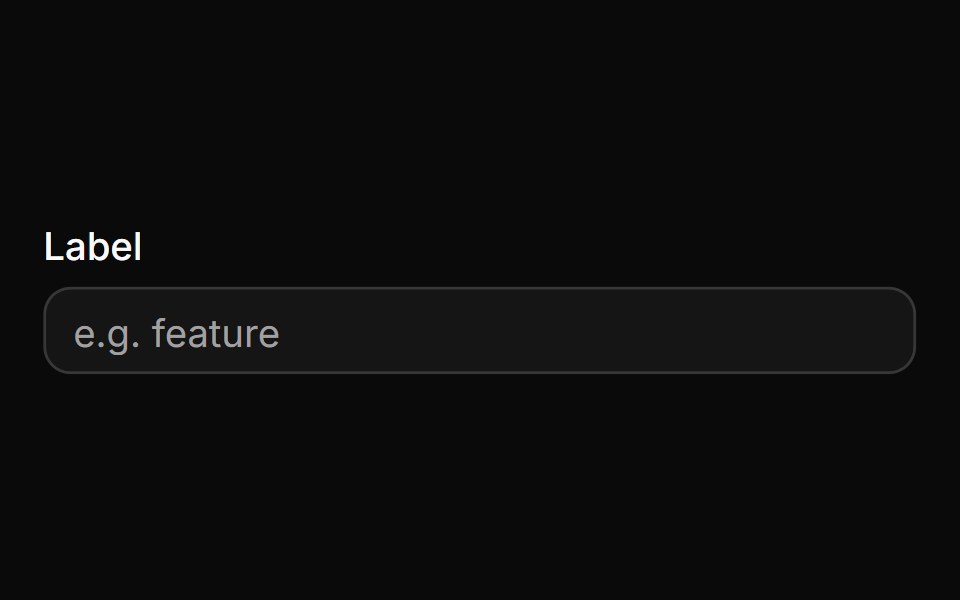 Control with labelReUI · ReactControl with label
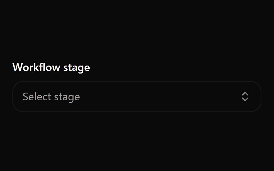 Combobox 5Watermelon UI · React
 With clear buttonReUI · ReactWith clear button
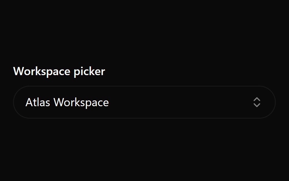 Combobox 6Watermelon UI · React
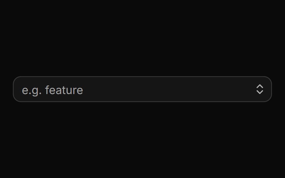 With trigger buttonReUI · ReactWith trigger button
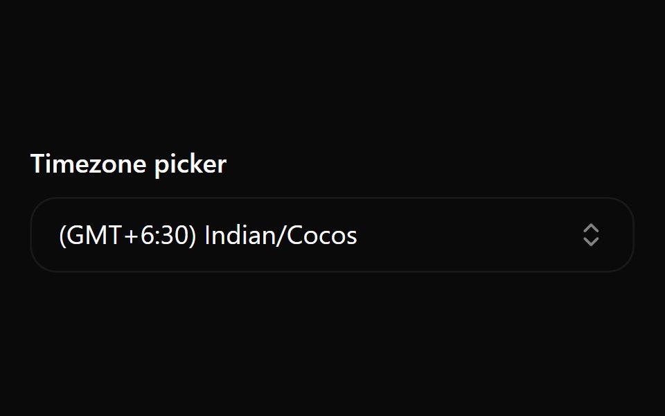 Combobox 7Watermelon UI · React
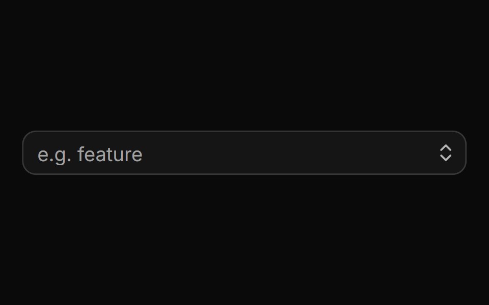 With clear and trigger buttonsReUI · ReactWith clear and trigger buttons
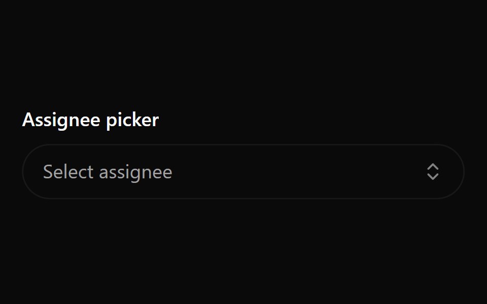 Combobox 8Watermelon UI · React
 With groups and labelsReUI · ReactWith groups and labels
 Combobox 9Watermelon UI · React
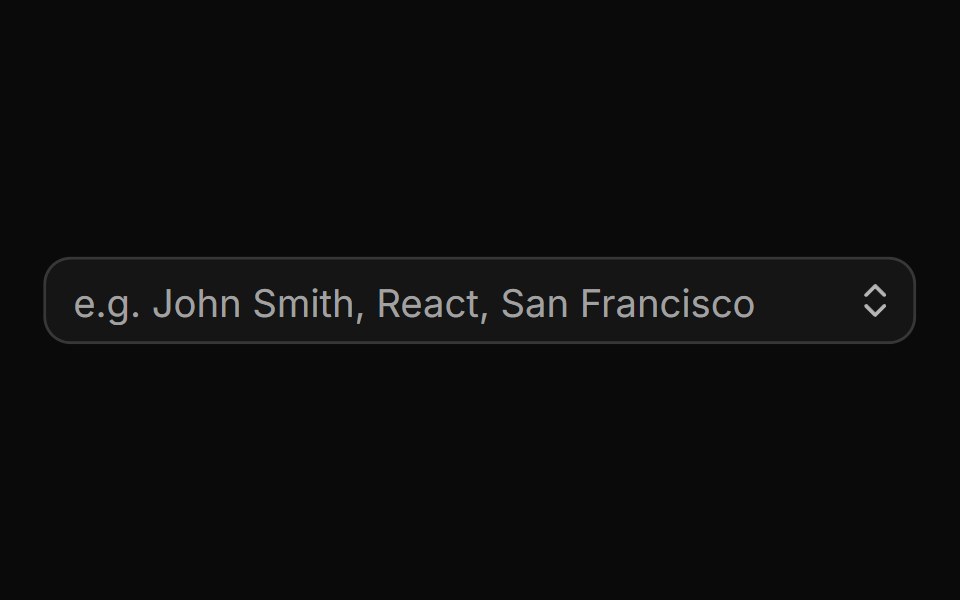 With search resultsReUI · ReactWith search results
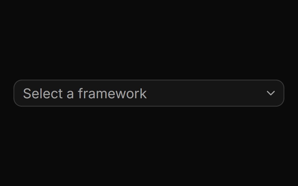 A basic combobox with a list of optionsReUI · ReactA basic combobox with a list of options
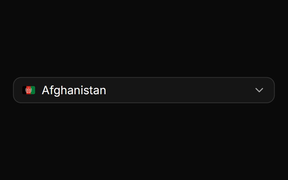 A combobox rendered inside a popupReUI · ReactA combobox rendered inside a popup
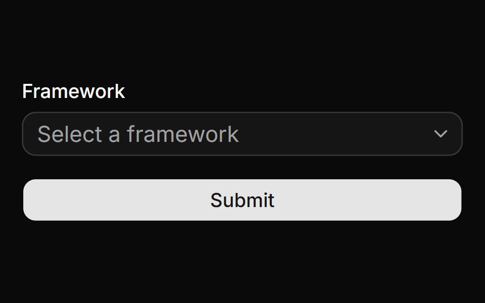 A combobox used within a formReUI · ReactA combobox used within a form
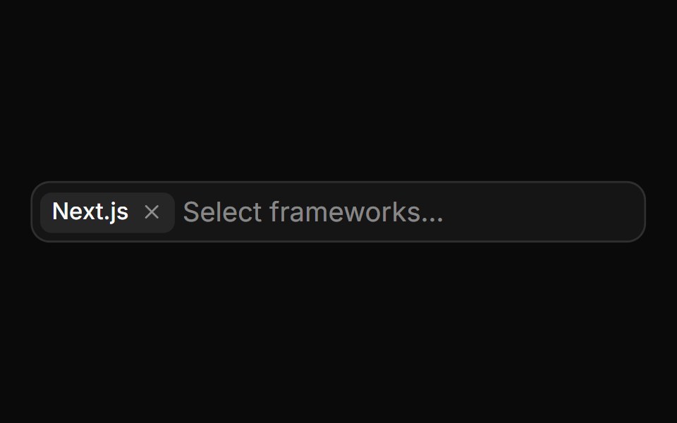 A multi-select comboboxReUI · ReactA multi-select combobox
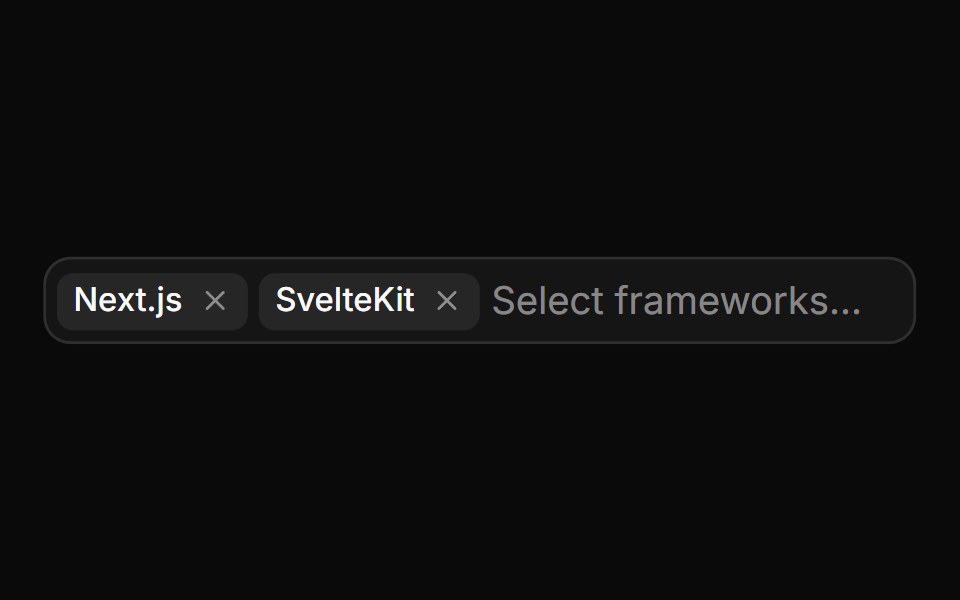 A disabled multi-select comboboxReUI · ReactA disabled multi-select combobox
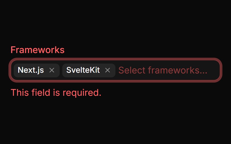 A multi-select combobox in an invalid stateReUI · ReactA multi-select combobox in an invalid state
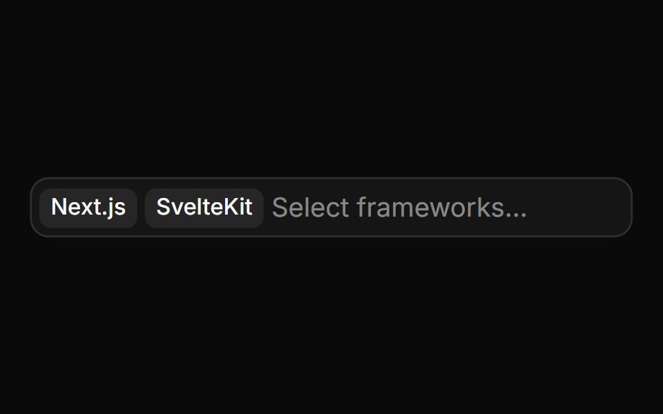 A multi-select with chips that cannot be removedReUI · ReactA multi-select with chips that cannot be removed
 A combobox with custom item renderingReUI · ReactA combobox with custom item rendering
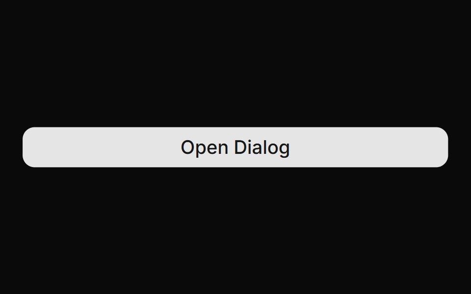 A combobox used within a dialogReUI · ReactA combobox used within a dialog
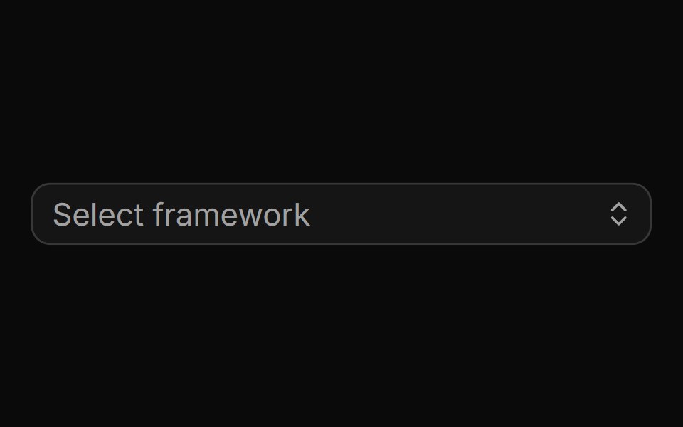 A combobox with a custom trigger iconReUI · ReactA combobox with a custom trigger icon
 A multi-select combobox with user tagsReUI · ReactA multi-select combobox with user tags
 A disabled comboboxReUI · ReactA disabled combobox
 Invisible combobox with member tagsReUI · ReactInvisible combobox with member tags
 A status change comboboxReUI · ReactA status change combobox
 A priority change comboboxReUI · ReactA priority change combobox
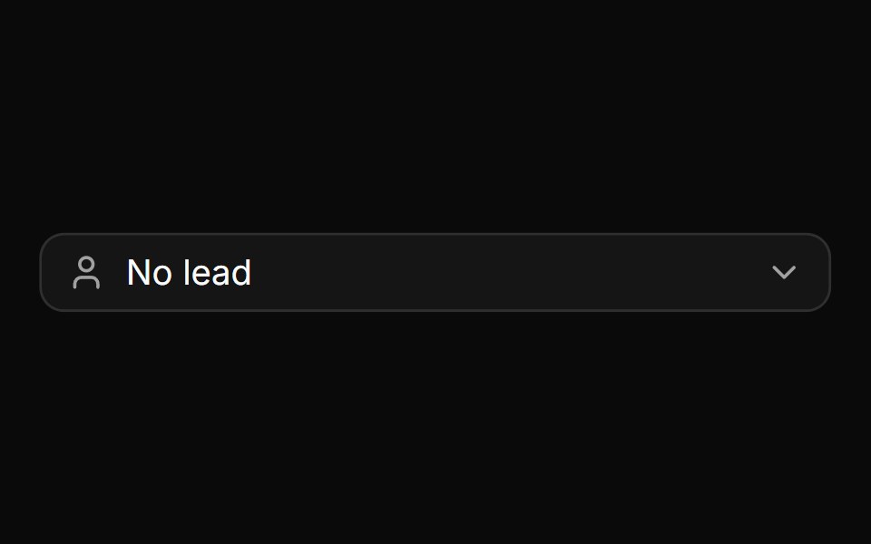 A lead selection comboboxReUI · ReactA lead selection combobox
 A multi-member selection comboboxReUI · ReactA multi-member selection combobox
 A date selection combobox with an optional custom picker dialogReUI · ReactA date selection combobox with an optional custom picker dialog
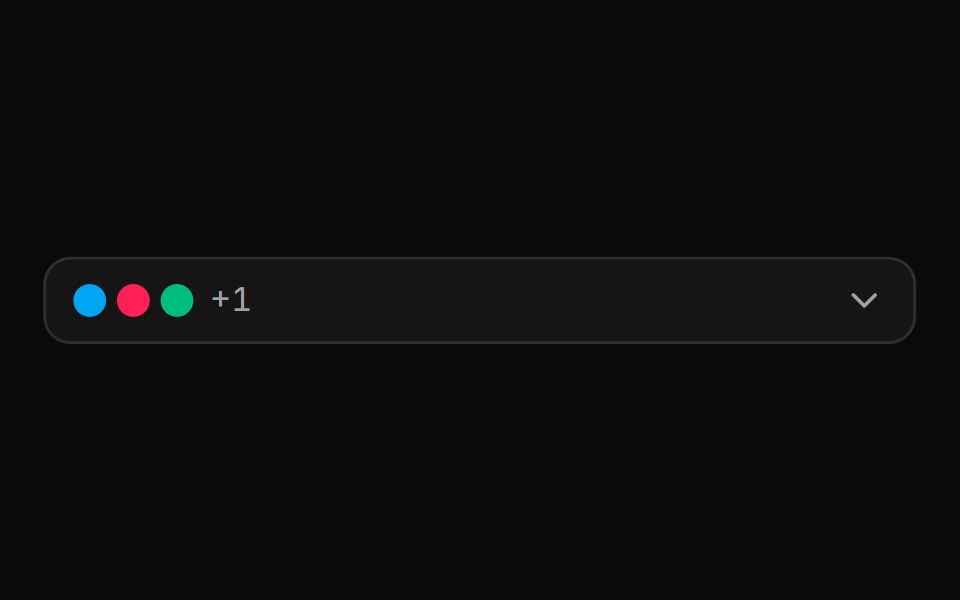 A multi-label selection combobox with a no-label modeReUI · ReactA multi-label selection combobox with a no-label mode
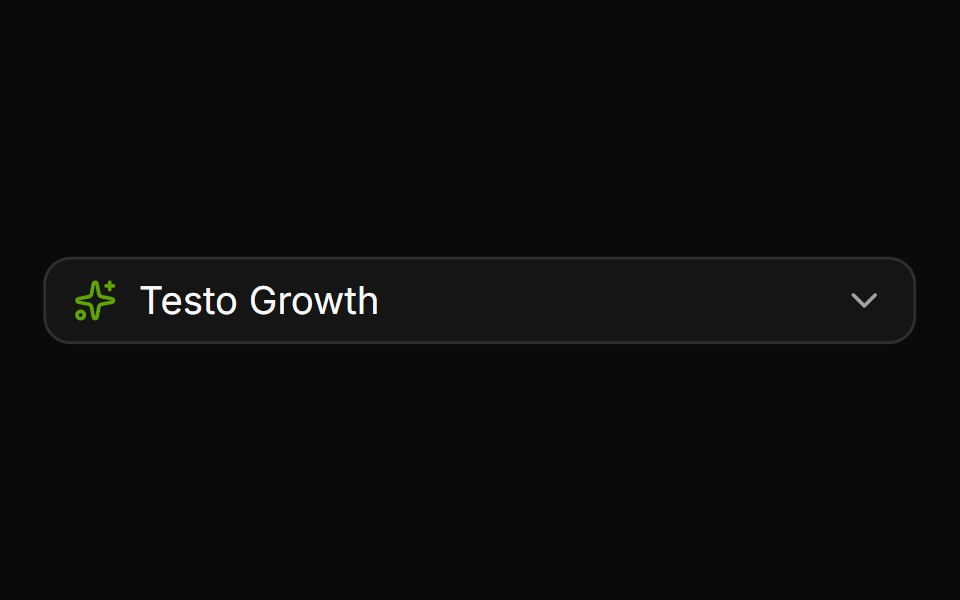 A team selection comboboxReUI · ReactA team selection combobox
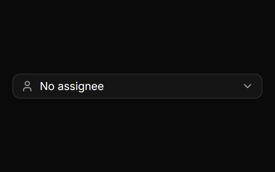 An assignee selection comboboxReUI · ReactAn assignee selection combobox
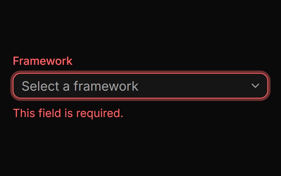 A combobox in an invalid stateReUI · ReactA combobox in an invalid state
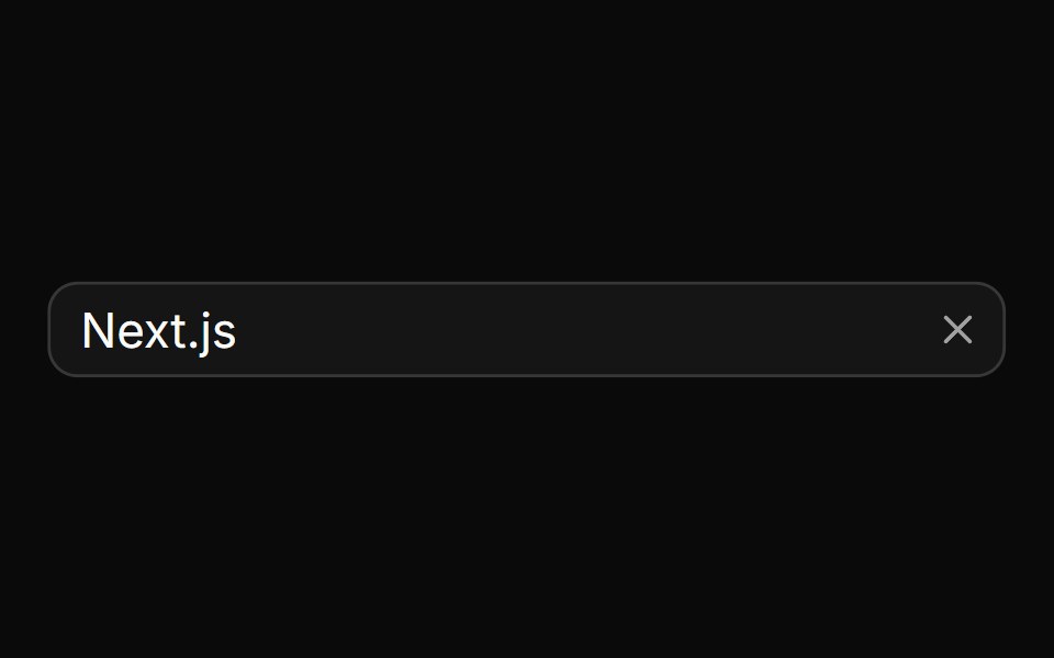 A combobox with a clear buttonReUI · ReactA combobox with a clear button
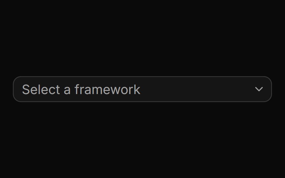 A combobox with auto-highlight enabledReUI · ReactA combobox with auto-highlight enabled
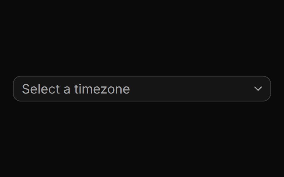 A combobox with grouped optionsReUI · ReactA combobox with grouped options
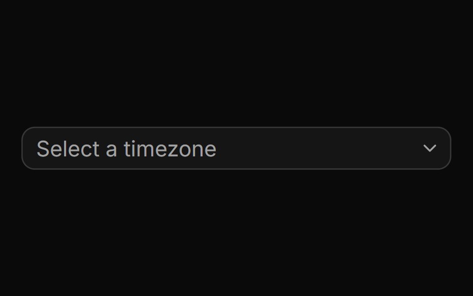 A combobox with grouped options and separatorsReUI · ReactA combobox with grouped options and separators
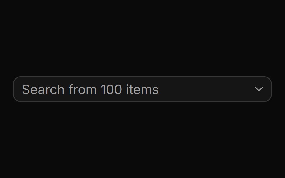 A combobox with a large list of optionsReUI · ReactA combobox with a large list of options
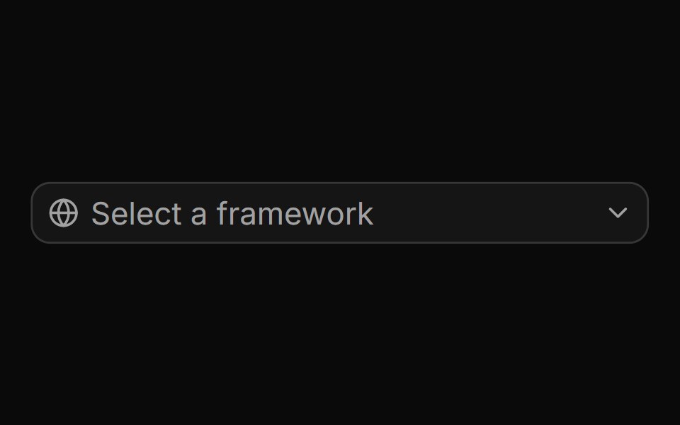 A combobox with an icon addonReUI · ReactA combobox with an icon addon
Libraries with Tailwind CSS combobox components
Related categories
- Combobox Components
- React Combobox Components
- Animated Combobox Components
- shadcn/ui Combobox Components
- Tailwind CSS Input Components
- Tailwind CSS Text Input Components
- Tailwind CSS Select Components
- Tailwind CSS Form Field Components
- Tailwind CSS Form Components
- Tailwind CSS Textarea Components
- Tailwind CSS Checkbox Components
- Tailwind CSS Switch Components
- Tailwind CSS Slider Components
- Tailwind CSS Radio Components
- Tailwind CSS File Upload Components
- Tailwind CSS Search Input Components
- Tailwind CSS Date Picker Components
- Tailwind CSS Login Form Components
- Tailwind CSS Color Picker Components
- Tailwind CSS OTP Input Components