 Dev Design Library
React Combobox Components
Dev Design Library indexes 120 React combobox components from 42 open-source UI libraries, with the most coming from ReUI, Watermelon UI, Origin UI, Shadcn Space and React Spectrum. Each one links to its page with the source code, a live preview where available, the library license and the install command. Every library in this list targets React. Combobox components belong to the Inputs group.
 Comboboxshadcn/ui · ReactAutocomplete input with a list of suggestions.
 AutocompleteMUI / Material UI · React
 ComboboxChakra UI · ReactA versatile input component that combines a text input with a listbox, allowing users to filter a list of options and…
 AutocompleteHeroUI · ReactAn autocomplete combines a select with filtering, allowing users to search and select from a list of options
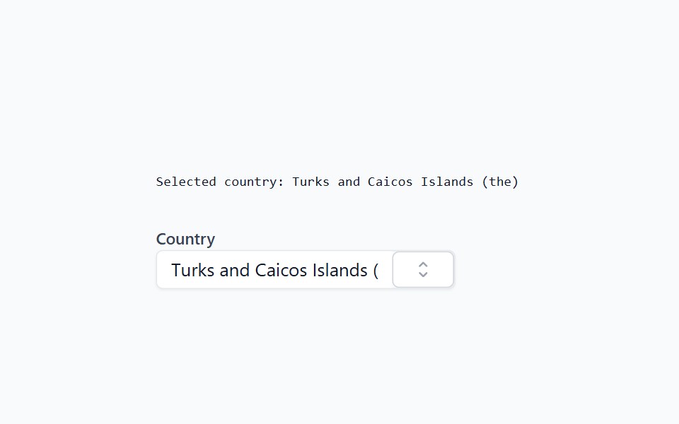 ComboboxHeadless UI · React
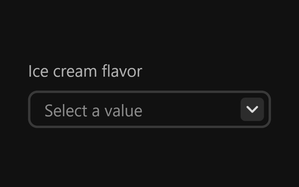 Combo BoxReact Spectrum · ReactComboBoxes combine a text entry with a picker menu, allowing users to filter longer lists to only the selections…
 Autocompletecoss ui · ReactAn input that suggests options as you type.
 Comp 229Origin UI · React
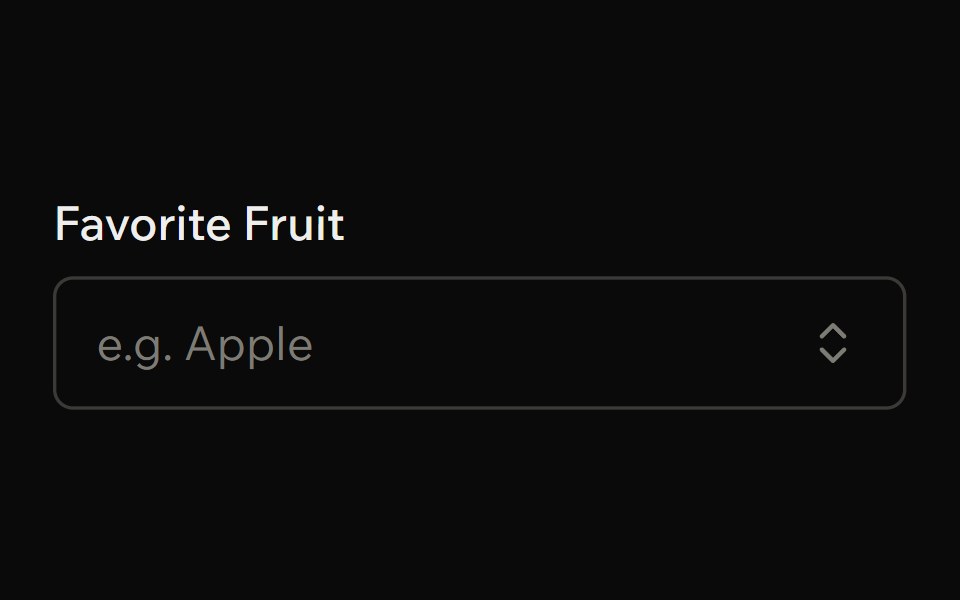 ComboboxArk UI · ReactA single input field that combines the functionality of a select and input.
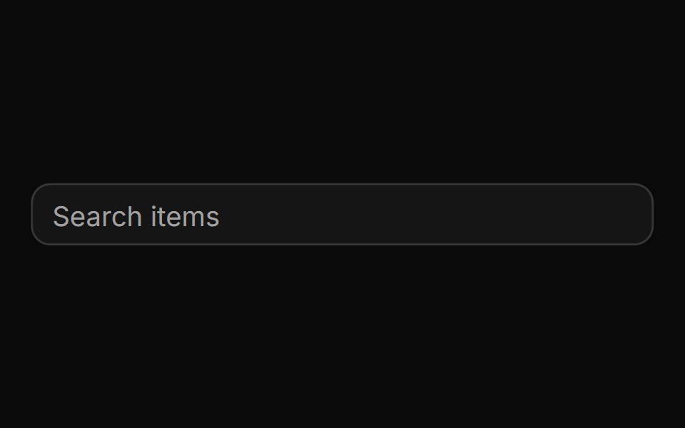 AutocompleteReUI · ReactAn input that suggests options as you type.
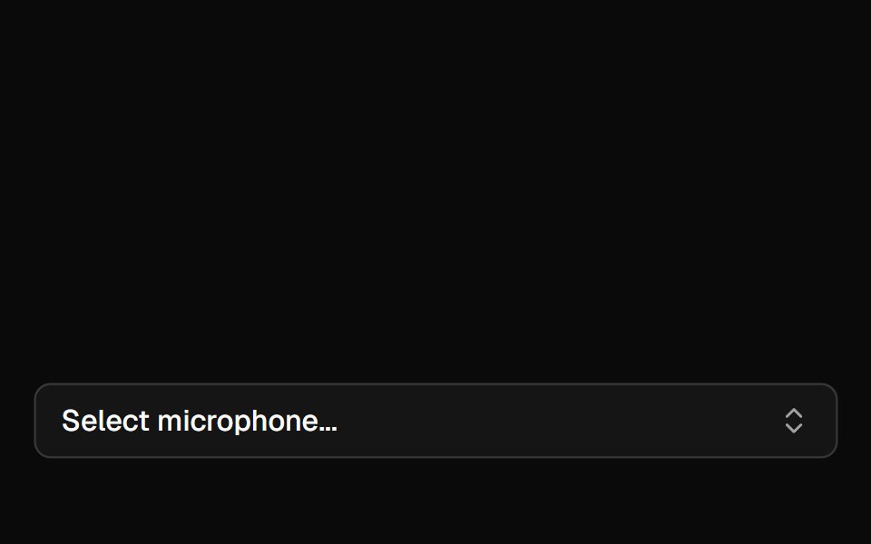 Mic SelectorAI Elements · ReactA composable dropdown component for selecting audio input devices with permission handling and device change detection.
 ComboboxPark UI · ReactA searchable dropdown component combining input and selection features.
 Auto CompleteLobe UI · ReactProvides a dropdown of suggestions as the user types, extending Ant Design AutoComplete with additional styling options.
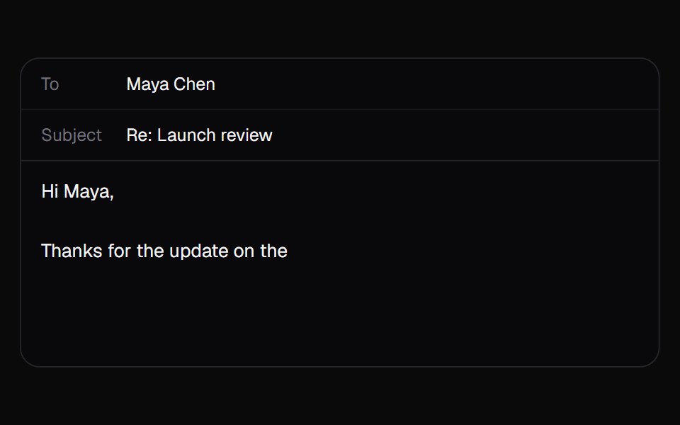 AI AutocompleteKokonut UI · ReactA text box that suggests how your sentence ends in grey after the caret. Tab takes it all, the right arrow takes one…
 combo-boxIntent UI · Reactcombo-box
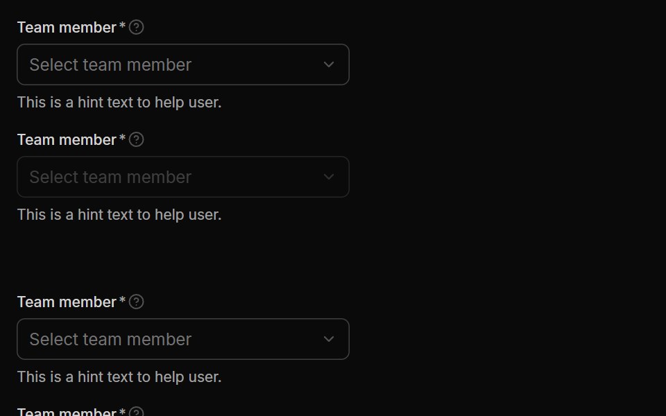 SelectUntitled UI React · React
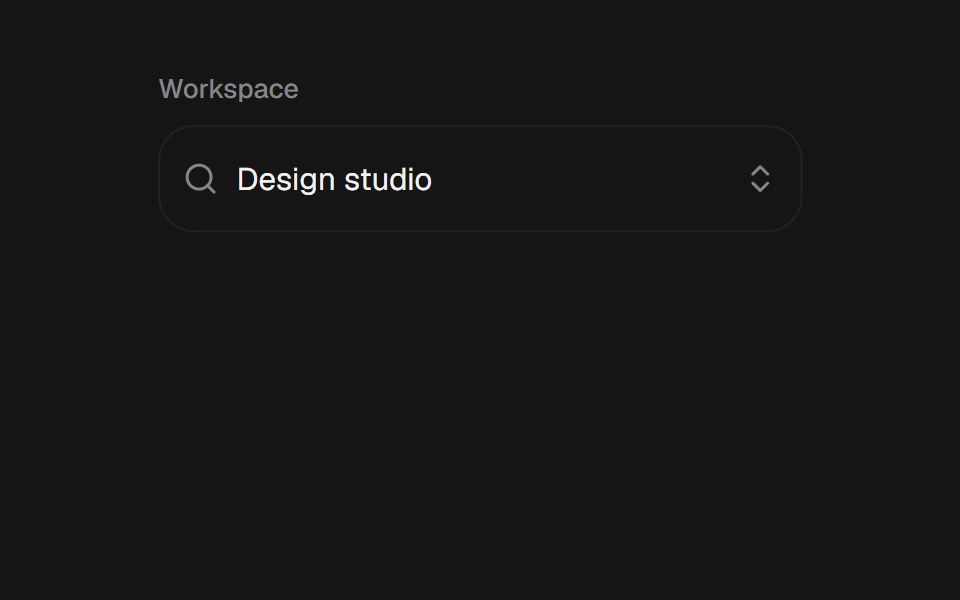 ComboboxbeUI · ReactSearchable combobox with a morphing portal, grouped filtering, keyboard navigation, and controlled or uncontrolled…
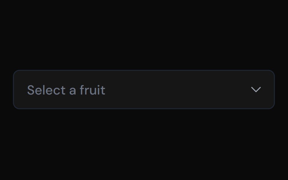 ComboboxTailGrids · ReactA combobox component with multiple variants.
 ComboboxFluid Functionalism · ReactType-to-filter combobox with single or multiple (chips, merged selection backgrounds) selection: a text field that…
 ComboboxToolcraft · React
 Web ComboboxPanel UI · React NativeA searchable combobox with single and multiple selection and tag chips.
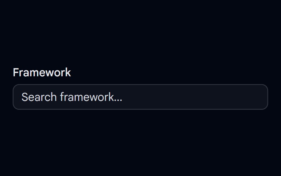 Autocomplete-01 - DefaultShadcn Space · ReactDefault autocomplete component
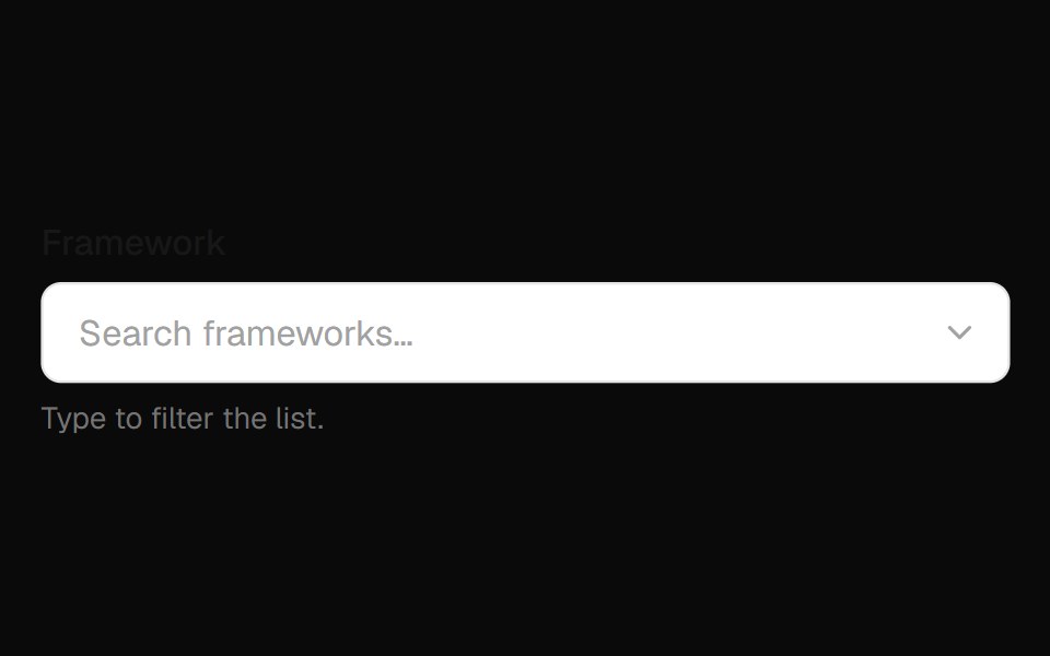 Combobox Field InputOpenSourceUI · React
 AutocompleteComponentry · React
 ComboboxShadcn Dashboard · React
 comboboxBaseLayer · ReactA combo box combines a text input with a listbox, allowing users to filter a list of options to items matching a query.
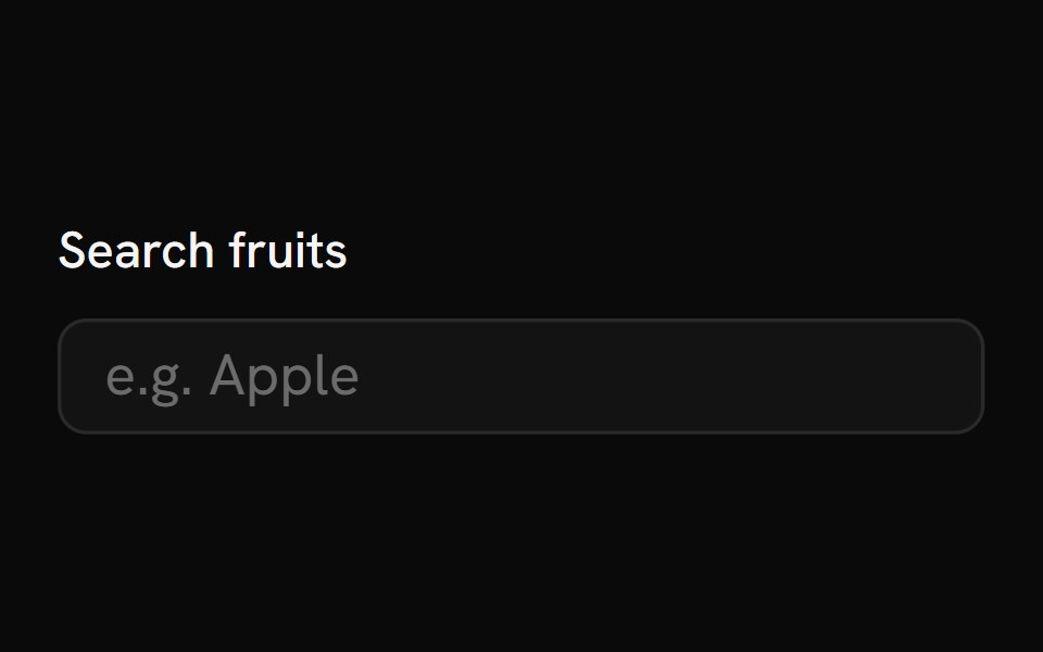 AutocompleteShark UI · React
 Combobox 1Watermelon UI · React
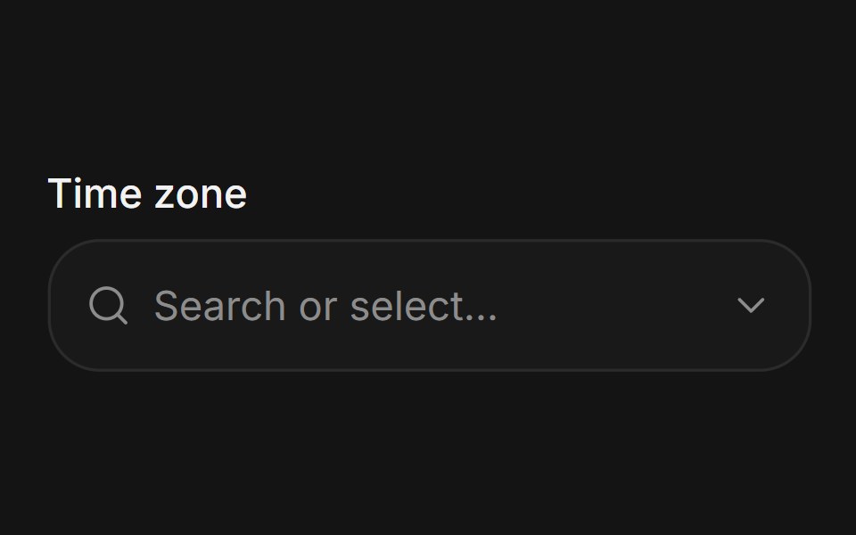 ComboboxArc Library · ReactSearch and select from a list without leaving the field.
 Glass Comboboxglasscn · ReactGlass Combobox with five variants: clear, frosted, subtle, liquid, and liquid-refract
 ComboboxUI Lab · ReactThe person you pick flies out of the list and into the field.
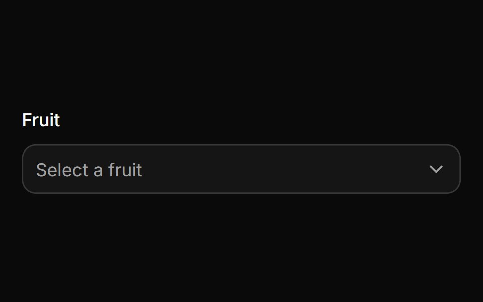 ComboboxHextaUI · ReactA filterable select with chips, groups and async results, in a popup that resizes as you type.
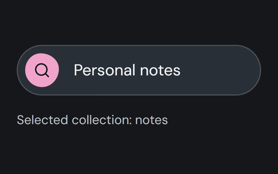 ComboboxCojeev UI · ReactFilters a list of options through text input and stores one selected value.
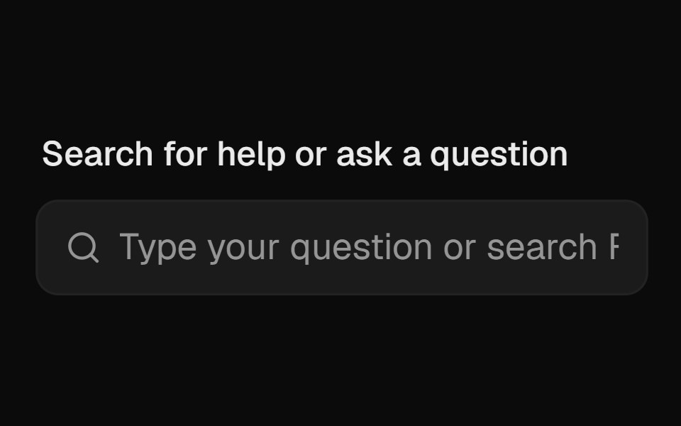 AutocompleteROI UI · ReactAn input that suggests options as you type.
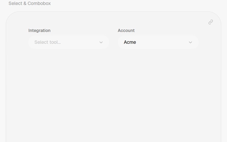 ComboboxHalaska UI · React
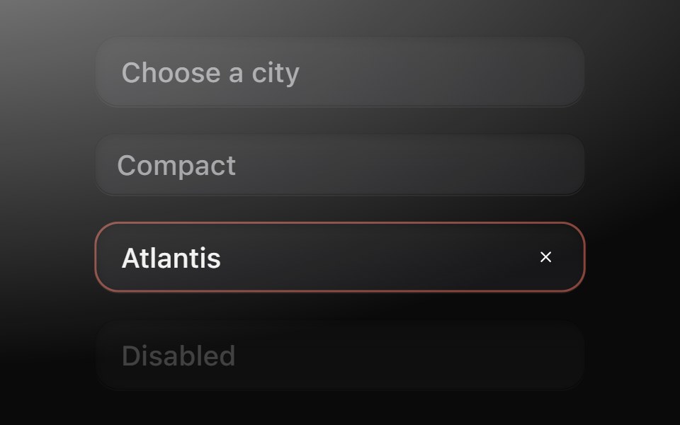 ComboboxMetal UI · React + SwiftUIType to find one of many: a field well that opens the menu's frosted plate; rows filter at once while the plate's…
 AutocompleteSpaceUI · ReactDisplays matching suggestions as users type into an input field, helping them find items quickly and reducing typing…
 Aria ComboboxReScript shadcn · ReScript
 Combo BoxOUI · ReactReact aria components Combo Box with shadcn characteristics.
 ComboboxD2Studio UI · ReactAutocomplete input and command palette with a list of suggestions.
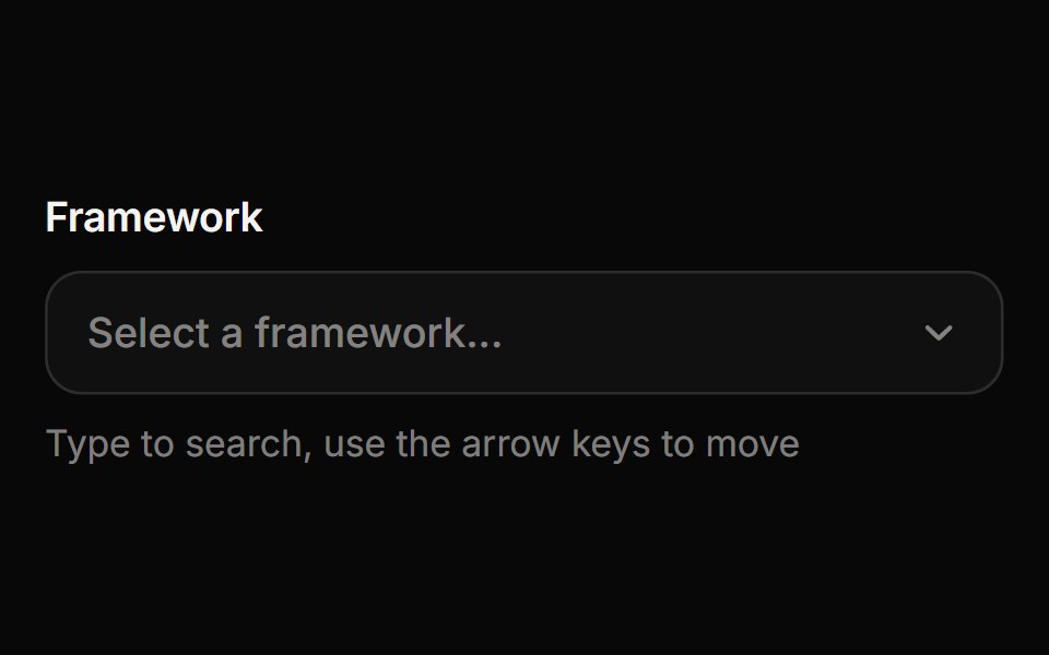 ComboboxReactFrame · ReactA searchable select where you type to filter options, with match highlighting, option descriptions, disabled options…
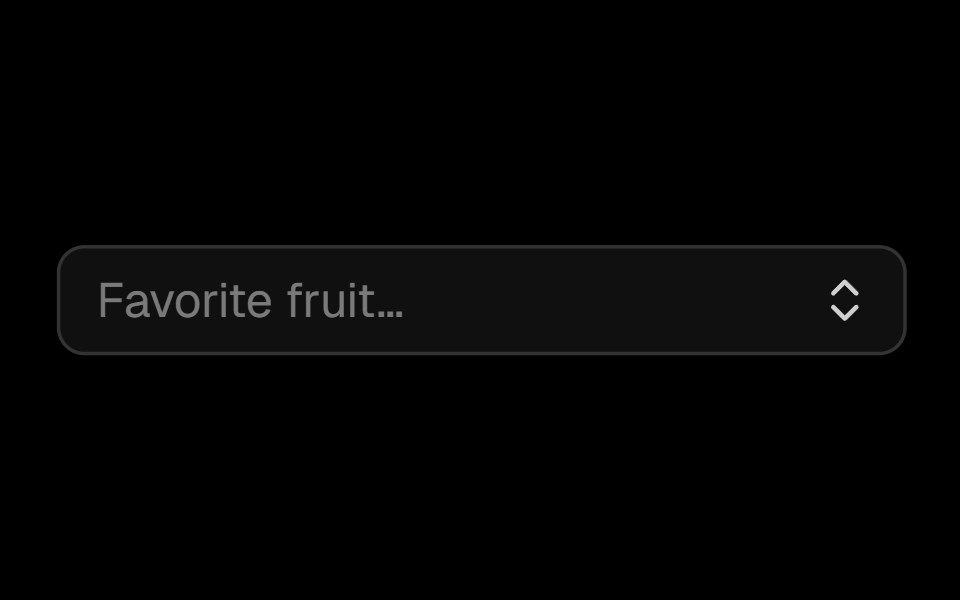 Comboboxark-cn · ReactA shadcn-style combobox component built with Ark UI primitives.
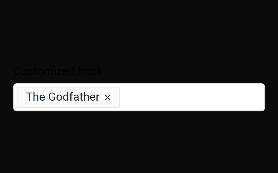 Use AutocompleteMUI / Material UI · React
 CommandChakra UI · ReactUsed to build searchable command menus, search dialogs, and pickers.
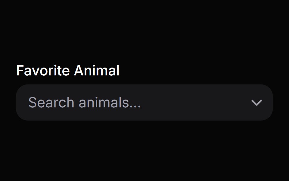 Combo BoxHeroUI · ReactA combo box combines a text input with a listbox, allowing users to filter a list of options to items matching a query
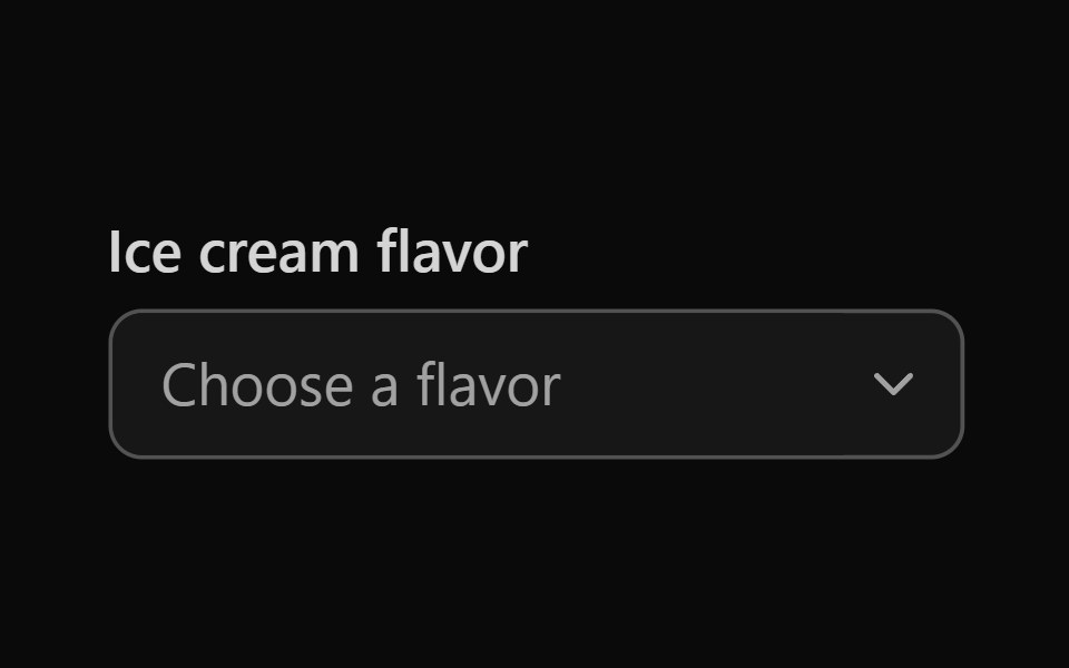 Tailwind Combo BoxReact Spectrum · React
 Comboboxcoss ui · ReactAn input combined with a list of predefined items to select.
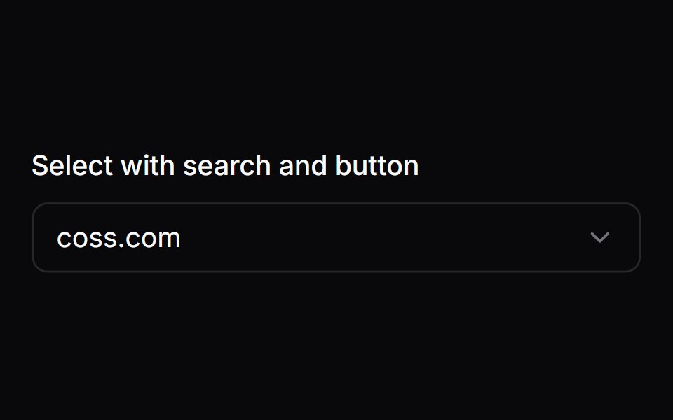 Comp 230Origin UI · React
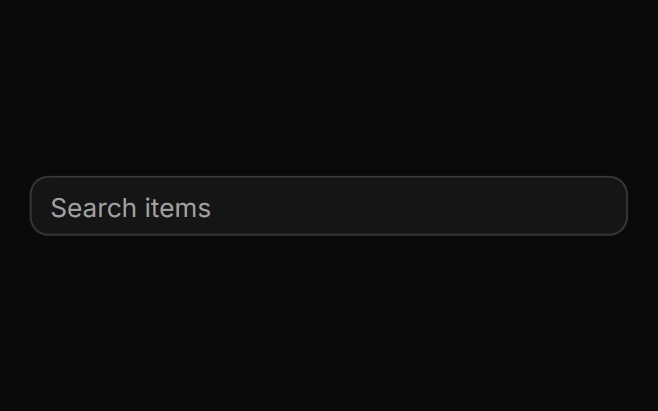 Basic autocomplete controlReUI · ReactBasic autocomplete control
 Voice SelectorAI Elements · ReactA composable dialog component for selecting AI voices with metadata display and search functionality.
 Base Ui Auto CompleteLobe UI · React
 ComboboxFluid Functionalism · ReactType-to-filter combobox with single or multiple (chips, merged selection backgrounds) selection: a text field that…
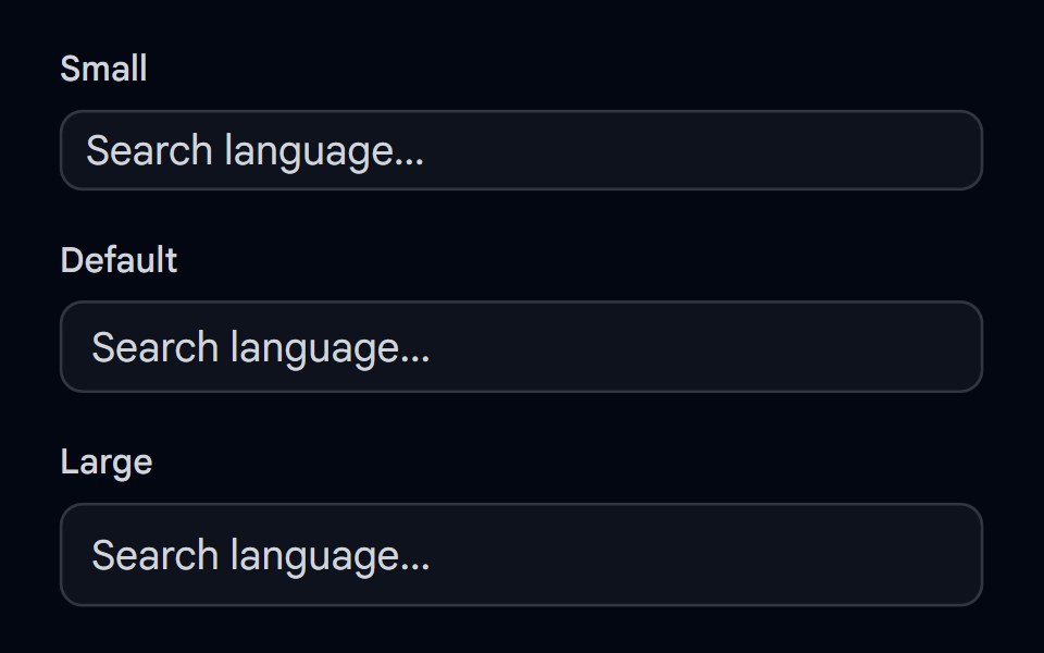 Autocomplete-02 - Size variantsShadcn Space · ReactAutocomplete component with different size variants
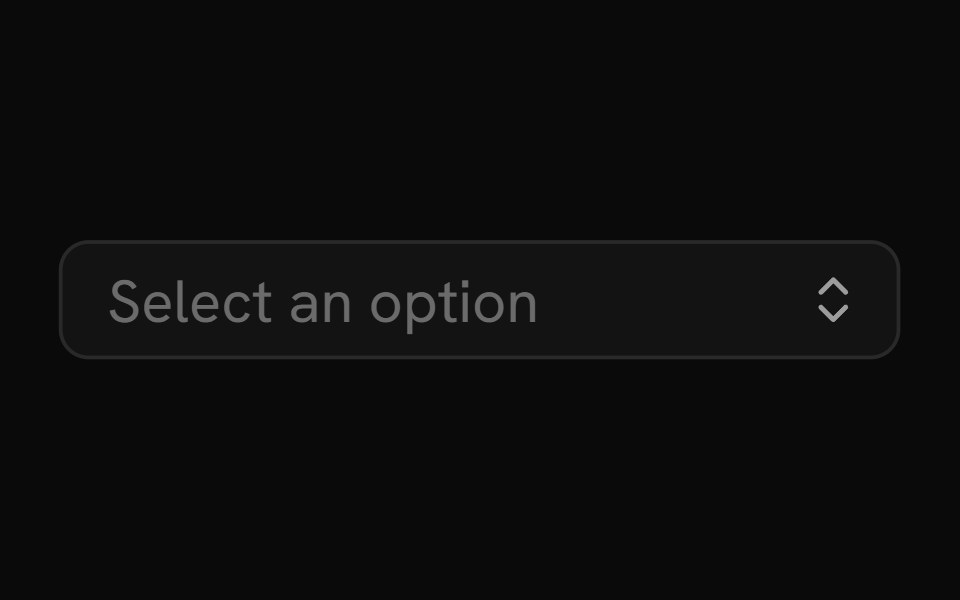 ComboboxShark UI · React
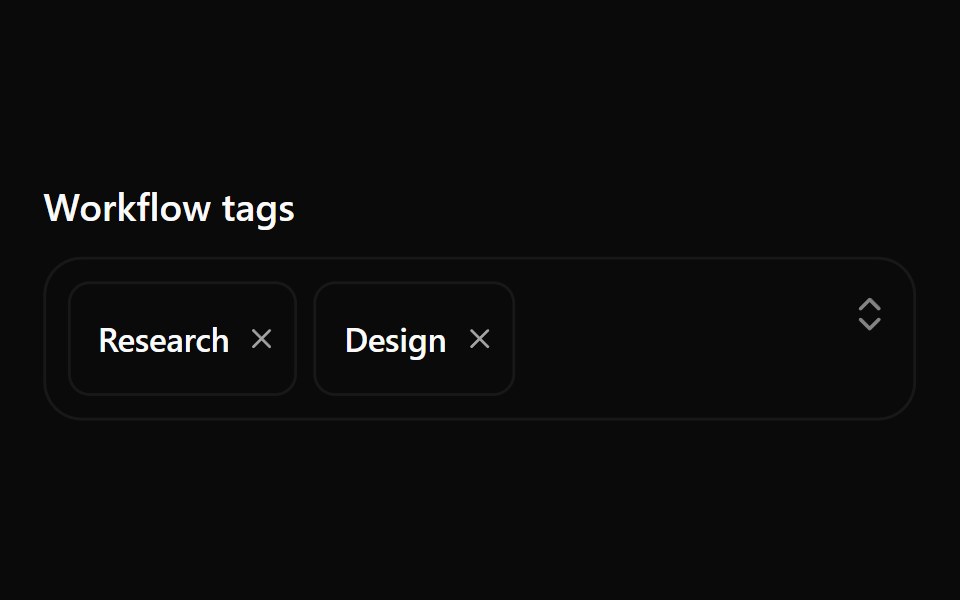 Combobox 10Watermelon UI · React
 Comboboxglasscn · React
 ComboboxROI UI · ReactA searchable select component.
 ComboboxSpaceUI · ReactCombines a text search input with a dropdown menu, allowing users to filter and select options from large lists easily.
 Base ComboboxReScript shadcn · ReScript
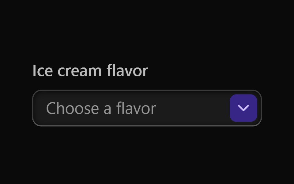 Vanilla Combo BoxReact Spectrum · React
 Comp 231Origin UI · React
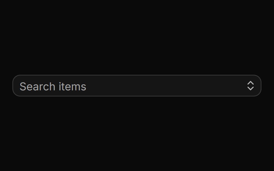 Small autocompleteReUI · ReactSmall autocomplete
 Autocomplete-03 - Vanish AnimationShadcn Space · ReactAutocomplete with vanish animation
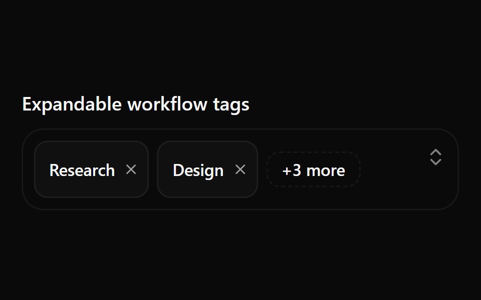 Combobox 11Watermelon UI · React
 Comp 232Origin UI · React
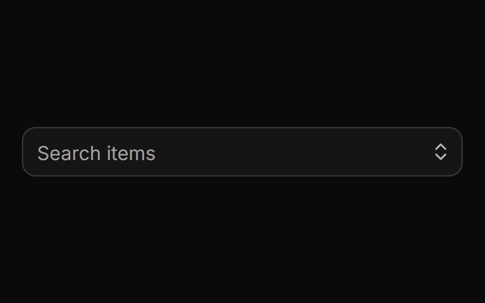 Large autocompleteReUI · ReactLarge autocomplete
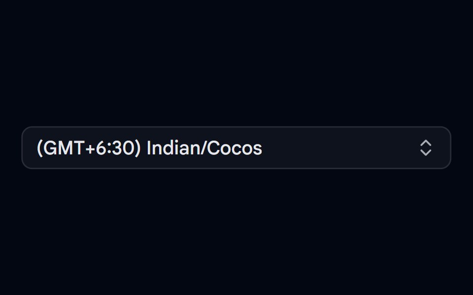 Combobox 04 - TimezoneShadcn Space · ReactCombobox component
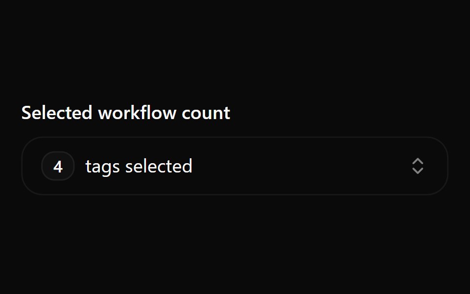 Combobox 12Watermelon UI · React
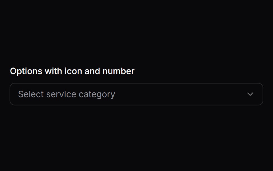 Comp 233Origin UI · React
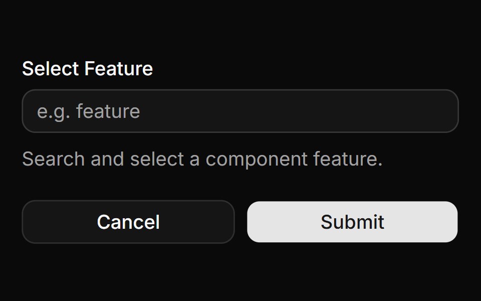 Form integrationReUI · ReactForm integration
 Combobox 05 - UsersShadcn Space · ReactCombobox component
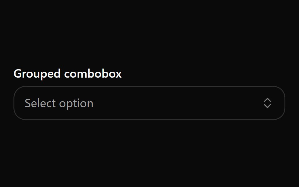 Combobox 2Watermelon UI · React
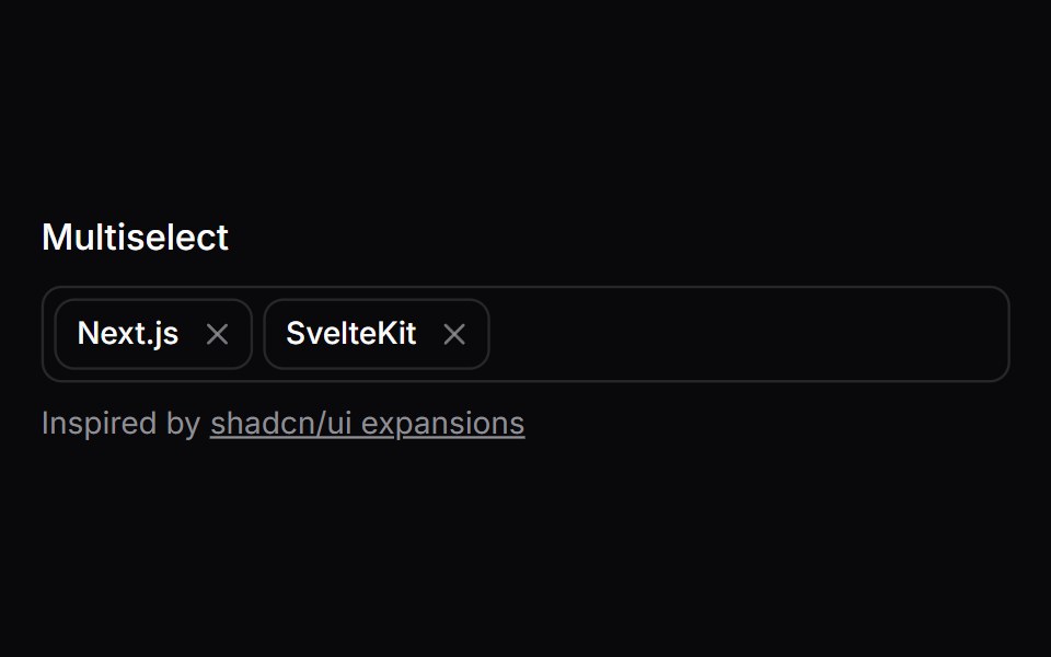 Comp 234Origin UI · React
 Disabled stateReUI · ReactDisabled state
 Combobox 06 - With FlagShadcn Space · ReactCombobox component
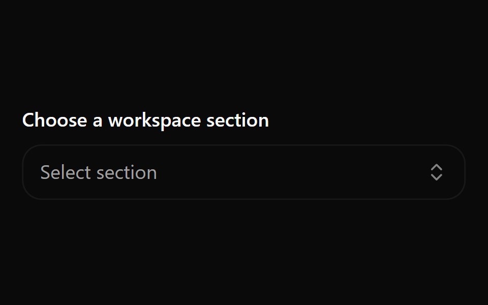 Combobox 3Watermelon UI · React
 Comp 235Origin UI · React
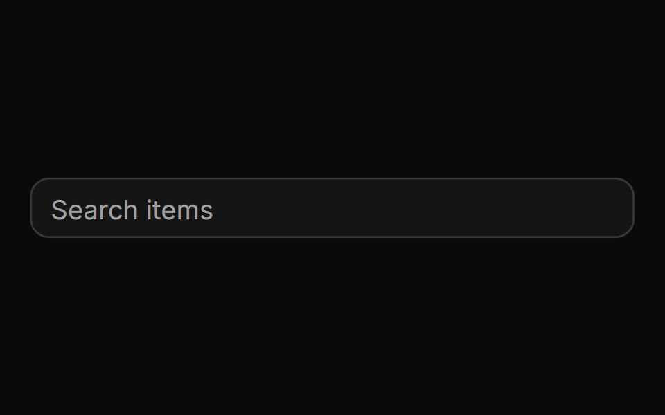 Auto highlight option as you typeReUI · ReactAuto highlight option as you type
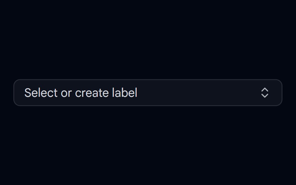 Combobox 07 - CreatableShadcn Space · ReactCombobox with inline item creation — type a new value and select 'Create' to add it on the fly
 Combobox 4Watermelon UI · React
 Comp 333Origin UI · React
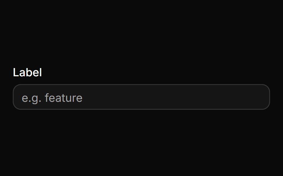 Control with labelReUI · ReactControl with label
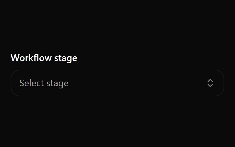 Combobox 5Watermelon UI · React
 With clear buttonReUI · ReactWith clear button
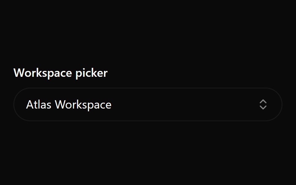 Combobox 6Watermelon UI · React
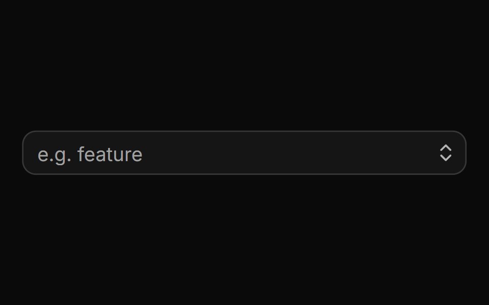 With trigger buttonReUI · ReactWith trigger button
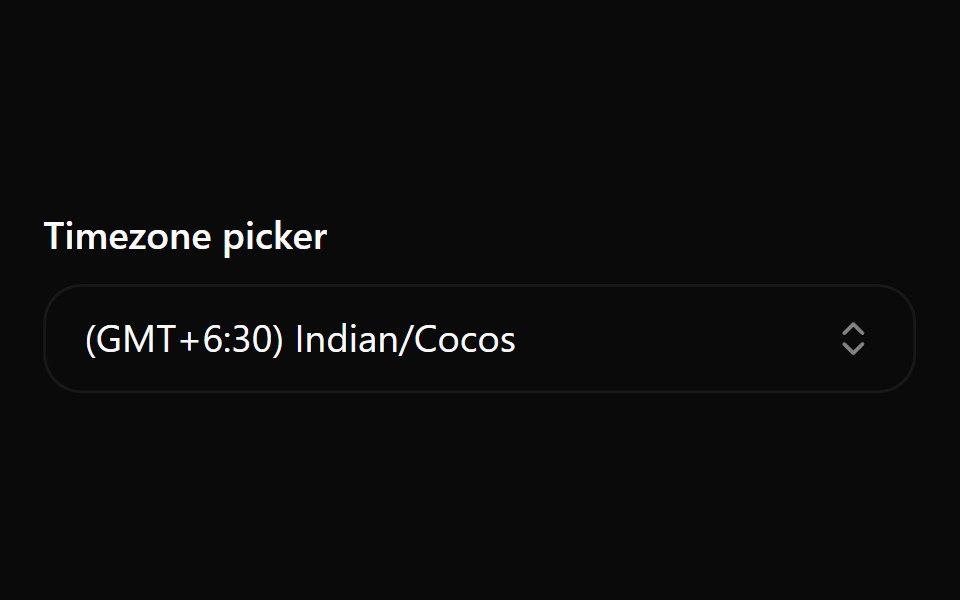 Combobox 7Watermelon UI · React
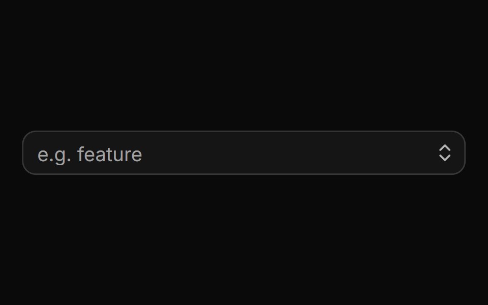 With clear and trigger buttonsReUI · ReactWith clear and trigger buttons
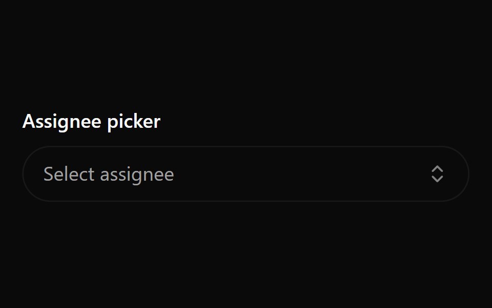 Combobox 8Watermelon UI · React
 With groups and labelsReUI · ReactWith groups and labels
 Combobox 9Watermelon UI · React
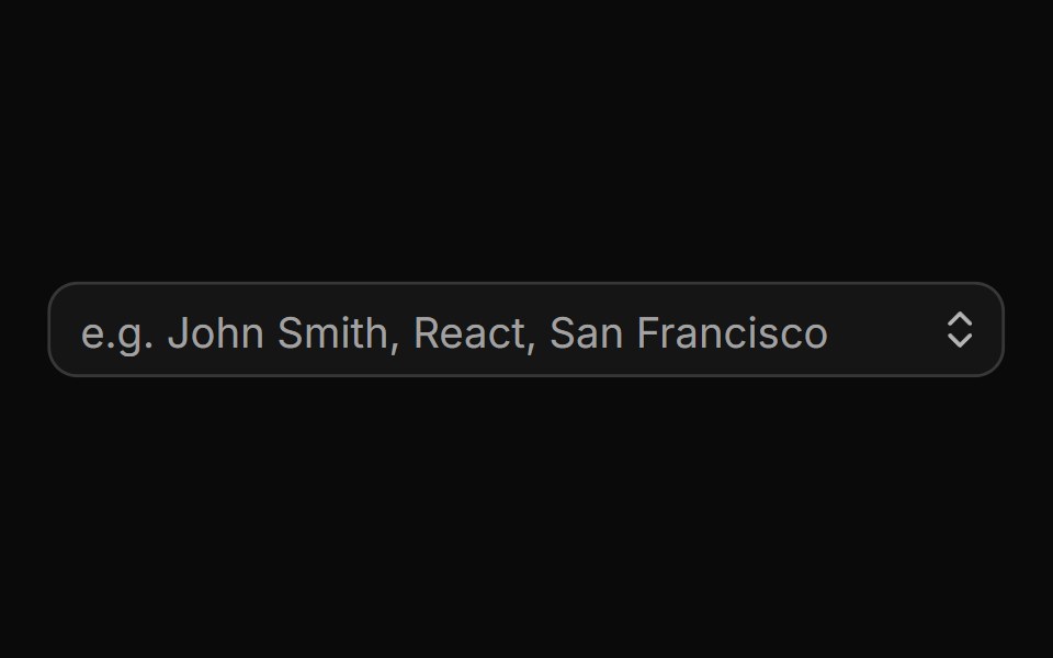 With search resultsReUI · ReactWith search results
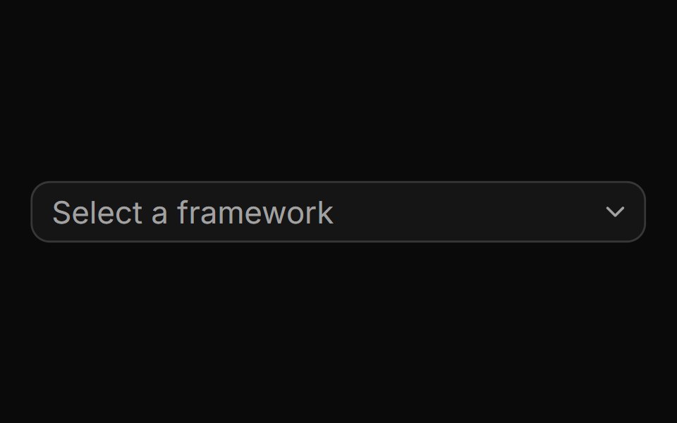 A basic combobox with a list of optionsReUI · ReactA basic combobox with a list of options
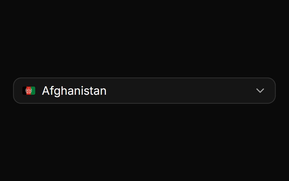 A combobox rendered inside a popupReUI · ReactA combobox rendered inside a popup
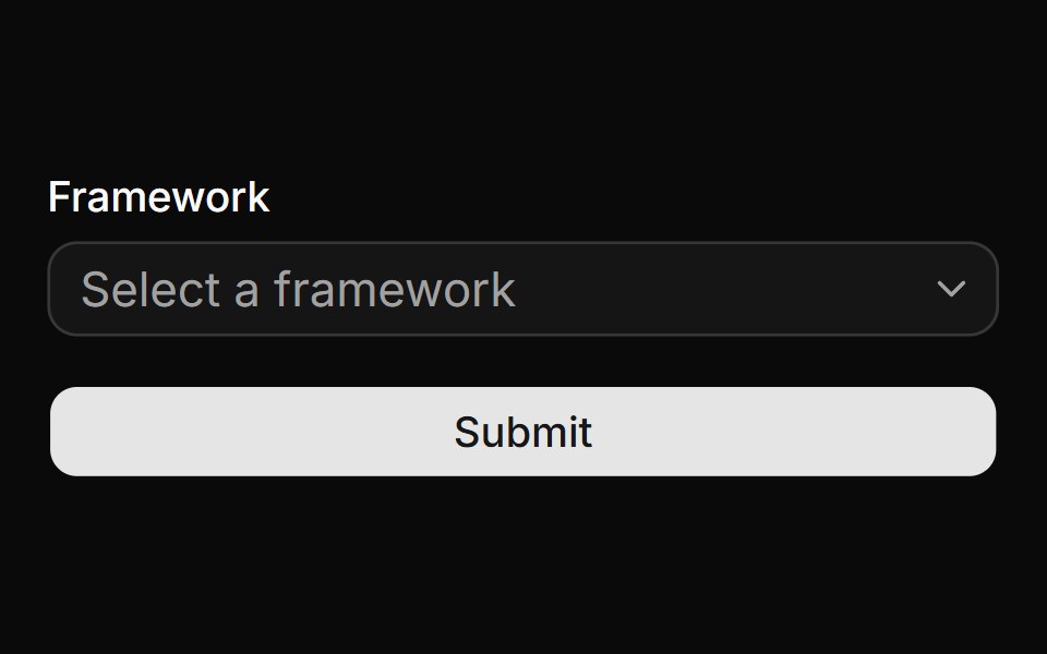 A combobox used within a formReUI · ReactA combobox used within a form
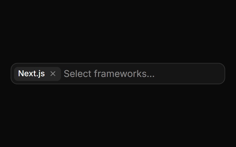 A multi-select comboboxReUI · ReactA multi-select combobox
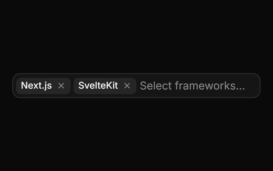 A disabled multi-select comboboxReUI · ReactA disabled multi-select combobox
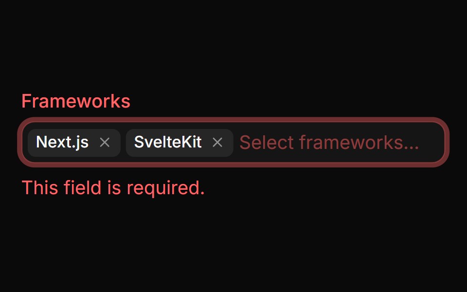 A multi-select combobox in an invalid stateReUI · ReactA multi-select combobox in an invalid state
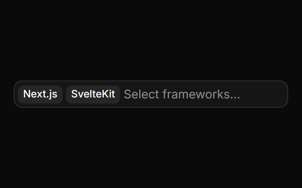 A multi-select with chips that cannot be removedReUI · ReactA multi-select with chips that cannot be removed
 A combobox with custom item renderingReUI · ReactA combobox with custom item rendering
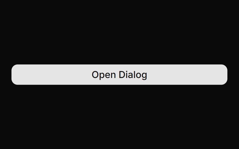 A combobox used within a dialogReUI · ReactA combobox used within a dialog
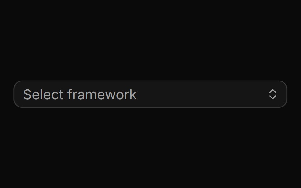 A combobox with a custom trigger iconReUI · ReactA combobox with a custom trigger icon
 A multi-select combobox with user tagsReUI · ReactA multi-select combobox with user tags
 A disabled comboboxReUI · ReactA disabled combobox
 Invisible combobox with member tagsReUI · ReactInvisible combobox with member tags
 A status change comboboxReUI · ReactA status change combobox
 A priority change comboboxReUI · ReactA priority change combobox
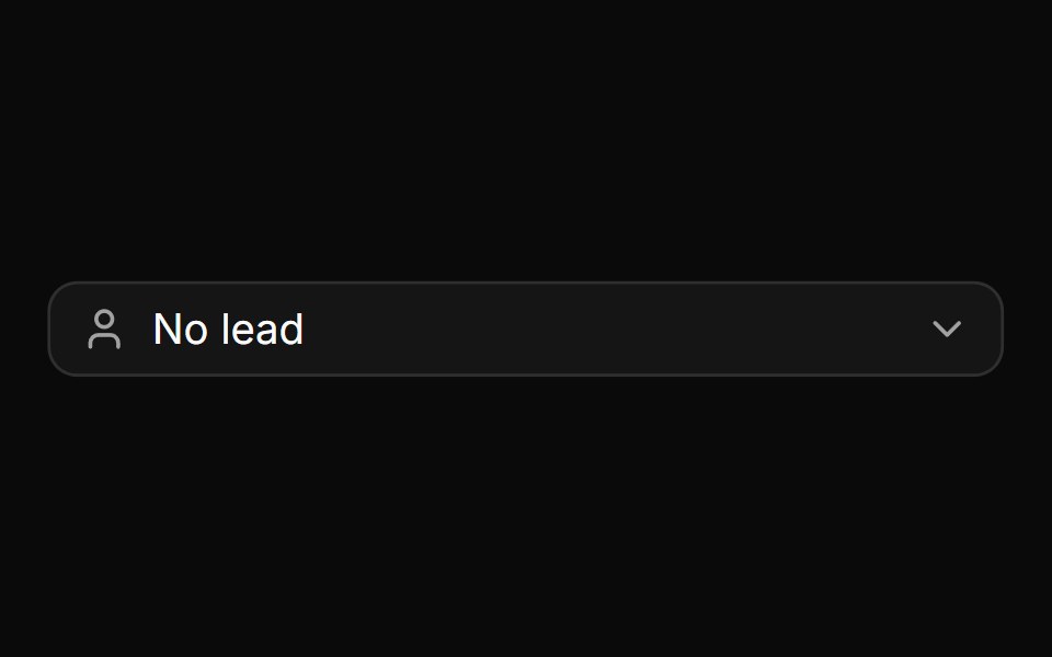 A lead selection comboboxReUI · ReactA lead selection combobox
 A multi-member selection comboboxReUI · ReactA multi-member selection combobox
 A date selection combobox with an optional custom picker dialogReUI · ReactA date selection combobox with an optional custom picker dialog
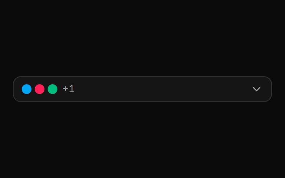 A multi-label selection combobox with a no-label modeReUI · ReactA multi-label selection combobox with a no-label mode
 A team selection comboboxReUI · ReactA team selection combobox
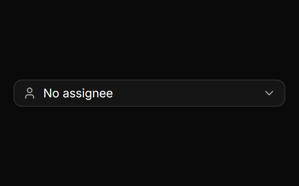 An assignee selection comboboxReUI · ReactAn assignee selection combobox
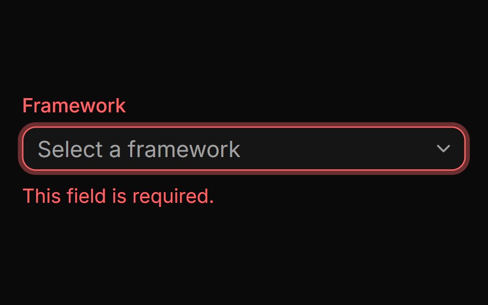 A combobox in an invalid stateReUI · ReactA combobox in an invalid state
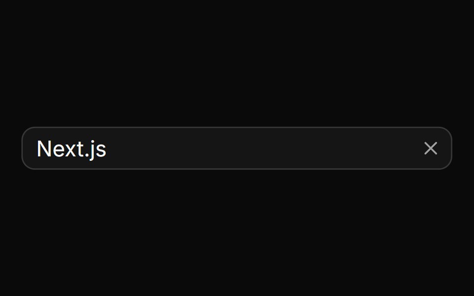 A combobox with a clear buttonReUI · ReactA combobox with a clear button
 A combobox with auto-highlight enabledReUI · ReactA combobox with auto-highlight enabled
 A combobox with grouped optionsReUI · ReactA combobox with grouped options
 A combobox with grouped options and separatorsReUI · ReactA combobox with grouped options and separators
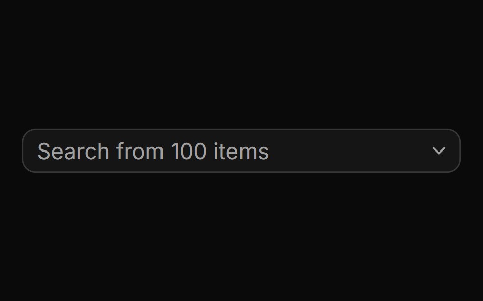 A combobox with a large list of optionsReUI · ReactA combobox with a large list of options
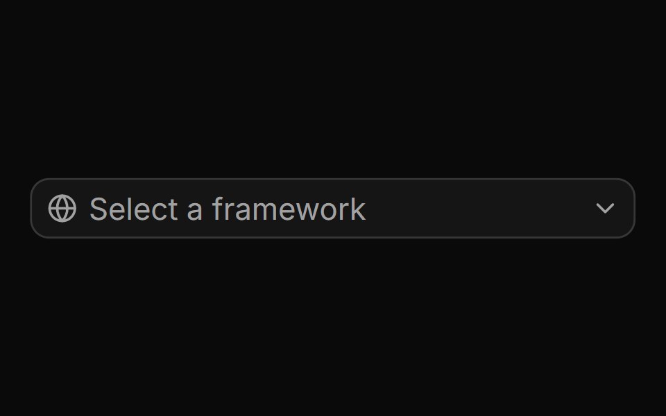 A combobox with an icon addonReUI · ReactA combobox with an icon addon
Libraries with React combobox components
Related categories
- Combobox Components
- Tailwind CSS Combobox Components
- Animated Combobox Components
- shadcn/ui Combobox Components
- React Input Components
- React Select Components
- React Text Input Components
- React Form Field Components
- React Form Components
- React Switch Components
- React Textarea Components
- React Checkbox Components
- React Slider Components
- React Radio Components
- React File Upload Components
- React Date Picker Components
- React Search Input Components
- React Color Picker Components
- React Login Form Components
- React OTP Input Components