 Dev Design Library
React Form Field Components
Dev Design Library indexes 397 React form field components from 51 open-source UI libraries, with the most coming from ReUI, Origin UI, FLX UI, Toolcraft and OpenSourceUI. Each one links to its page with the source code, a live preview where available, the library license and the install command. Every library in this list targets React. Form field components belong to the Inputs group.
Showing 120 of 397, a mix from every library. Open a library to see all of its components.
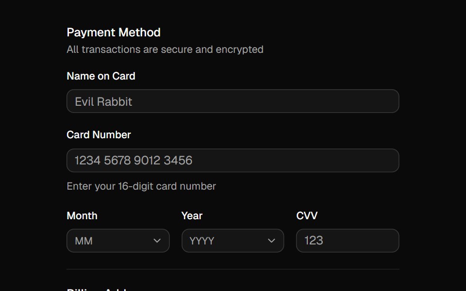 Fieldshadcn/ui · ReactCombine labels, controls, and help text to compose accessible form fields and grouped inputs.
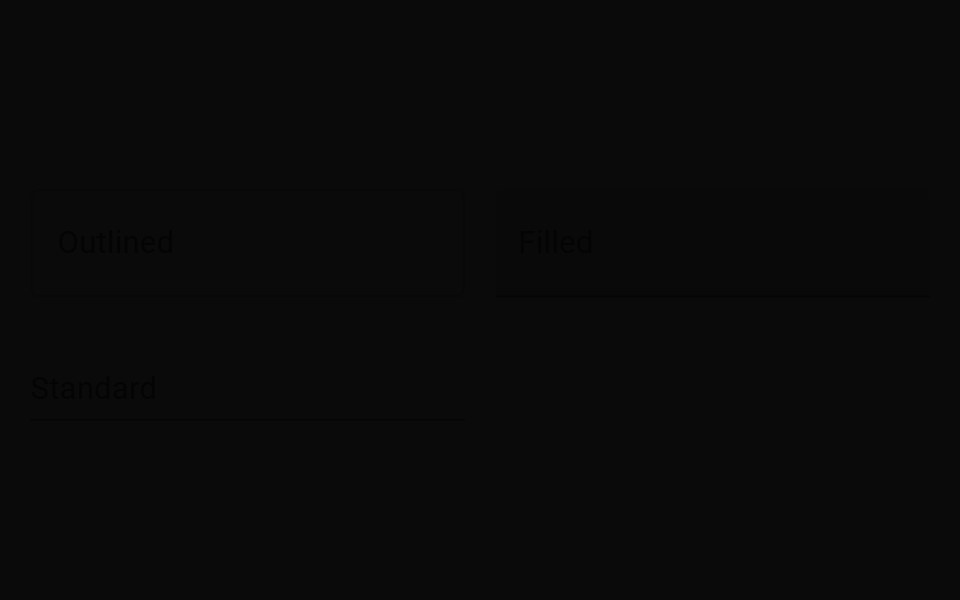 Text FieldMUI / Material UI · React
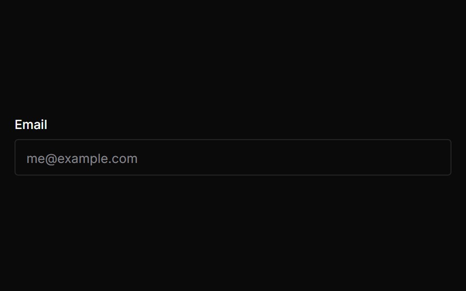 FieldChakra UI · ReactUsed to add labels, help text, and error messages to form fields.
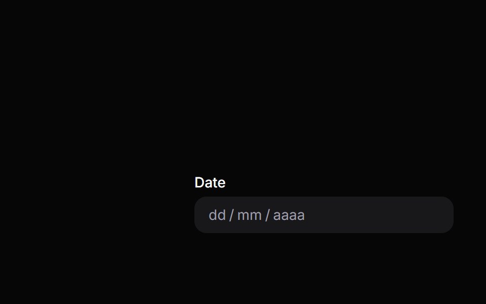 Date FieldHeroUI · ReactDate input field with labels, descriptions, and validation built on React Aria DateField
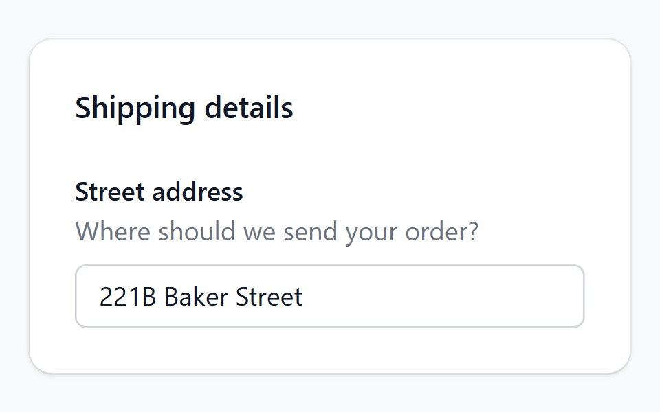 FieldHeadless UI · React
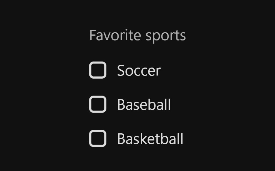 Checkbox GroupReact Spectrum · ReactA CheckboxGroup allows users to select one or more items from a list of choices.
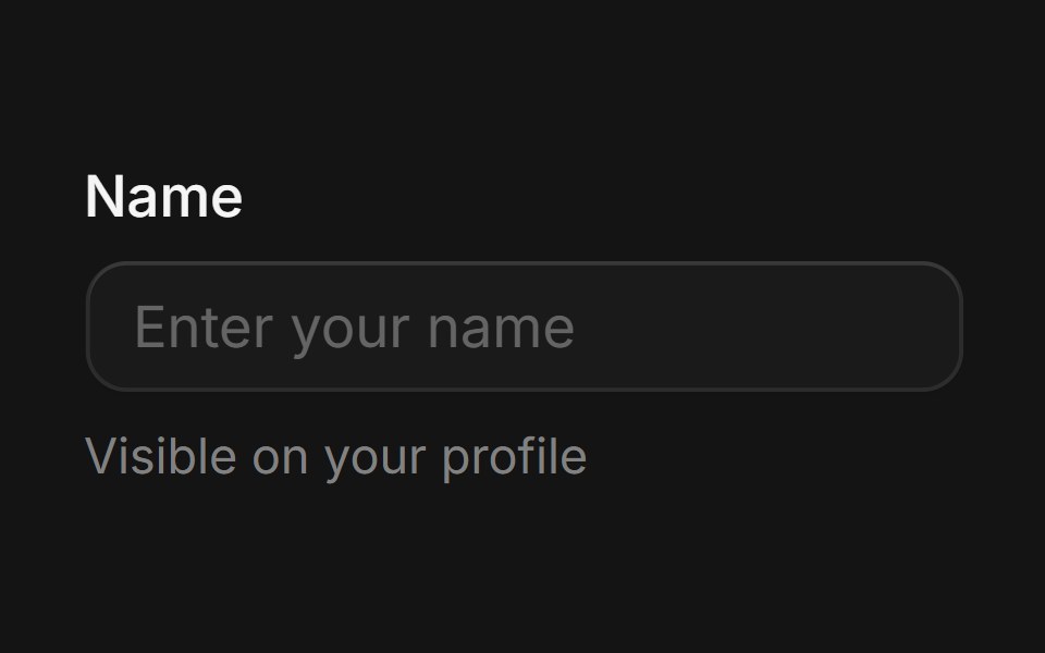 Fieldcoss ui · ReactA component that provides labelling and validation for form controls.
 LabelOrigin UI · ReactRenders an accessible label associated with controls.
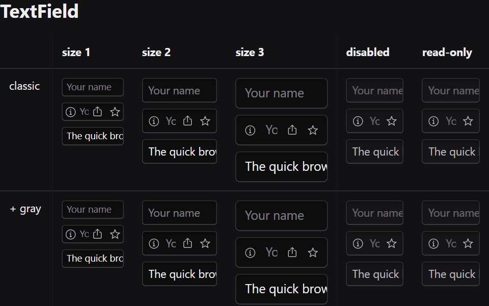 Text FieldRadix Themes · React
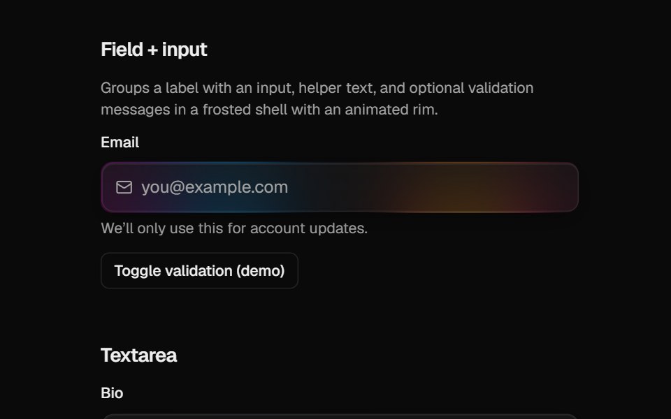 Halo FieldCult UI · ReactForm field layout (label, description, error) for HaloInput and HaloTextarea
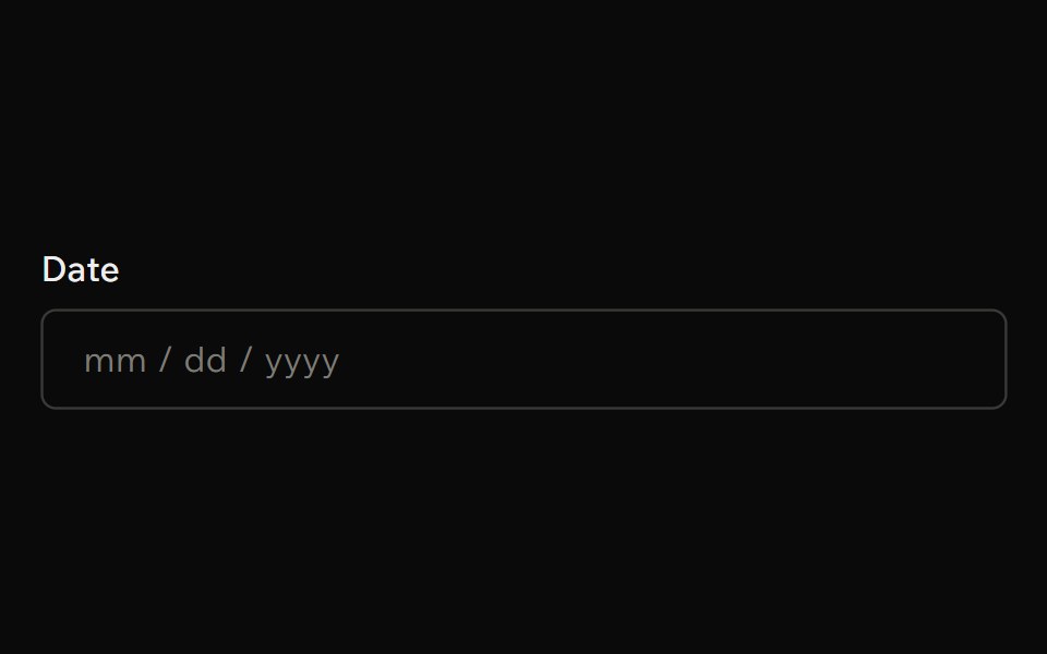 Date InputArk UI · ReactA segment-based date input that allows users to enter dates by navigating individual date parts.
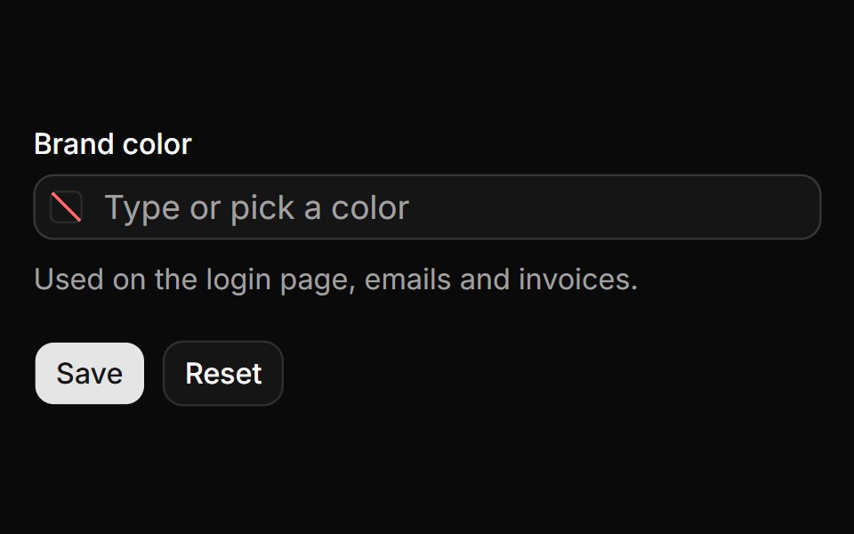 Form field with validationReUI · ReactNative form field with a required check, an error, reset and the submitted value.
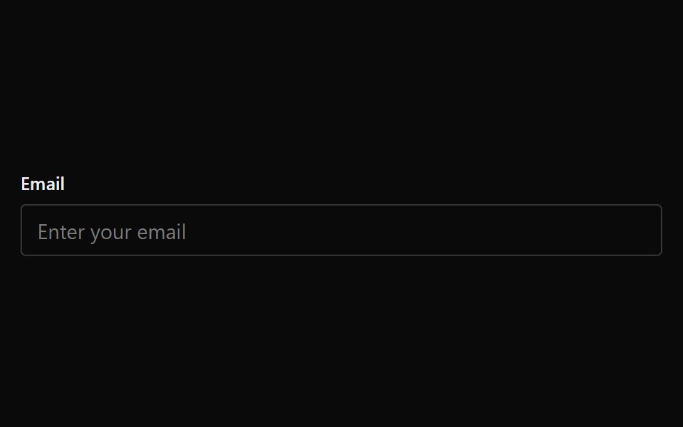 FieldPark UI · ReactA wrapper component for form inputs with labels and error messages.
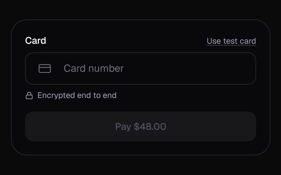 Card FieldKokonut UI · ReactA one-row card input for checkout. The number groups the way the brand prints it, then slides to its last four to make…
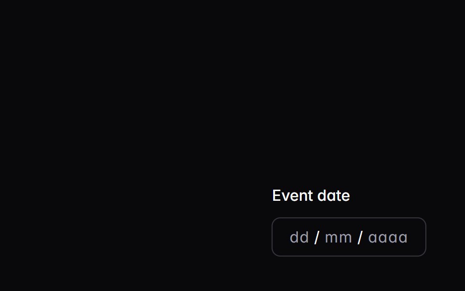 date-fieldIntent UI · Reactdate-field
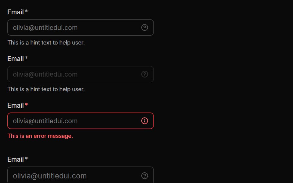 InputUntitled UI React · React
 Date FieldTailGrids · ReactA React date field component that lets users input a date.
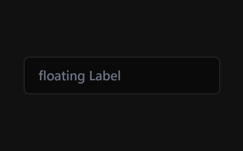 Floating Label InputSpectrum UI · Reactcomponent for the Floating Label Input
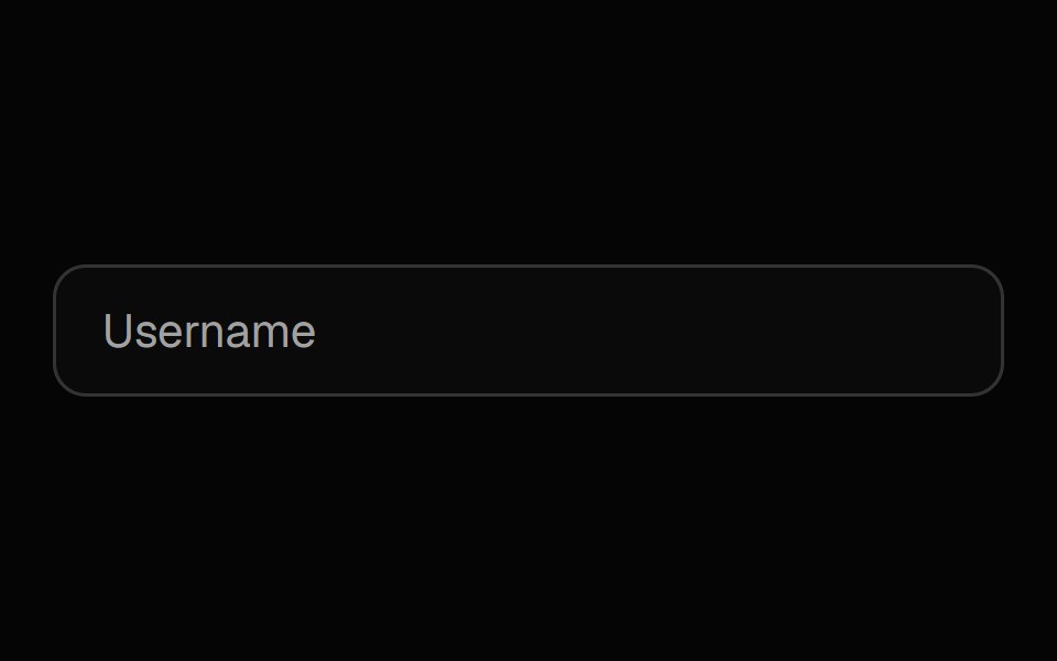 Label InputSpell UI · ReactInput field with floating label and password visibility toggle.
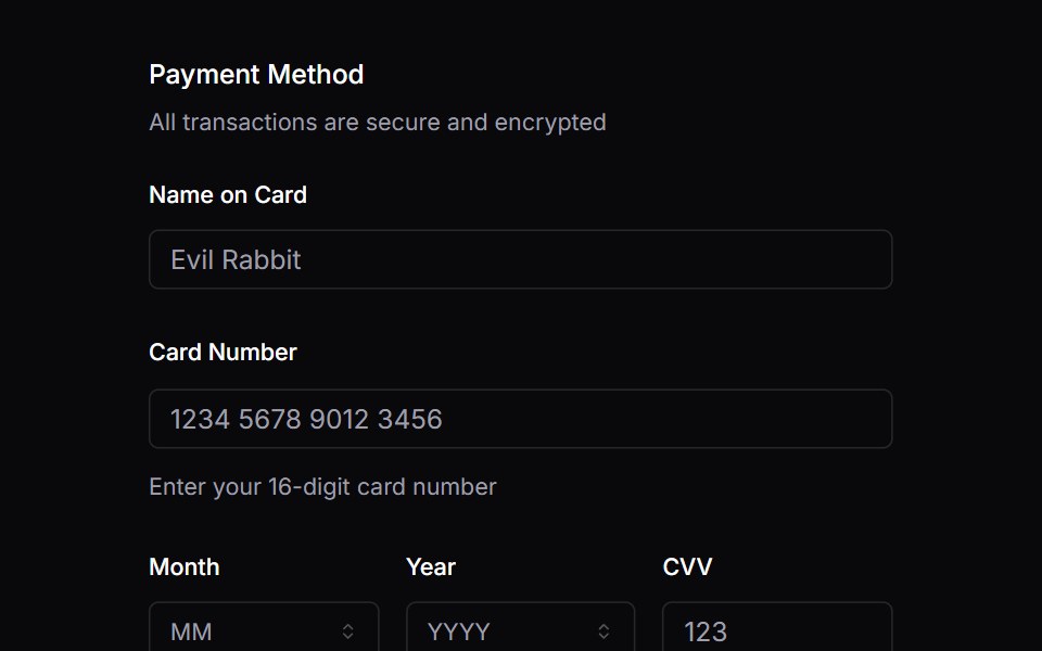 FieldVengeance UI · React
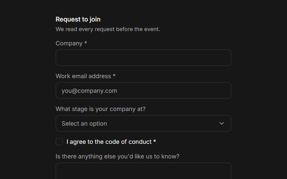 FieldFluid Functionalism · ReactCompose a label, a control, helper text, and a validation message into one accessible field: fieldsets, legends…
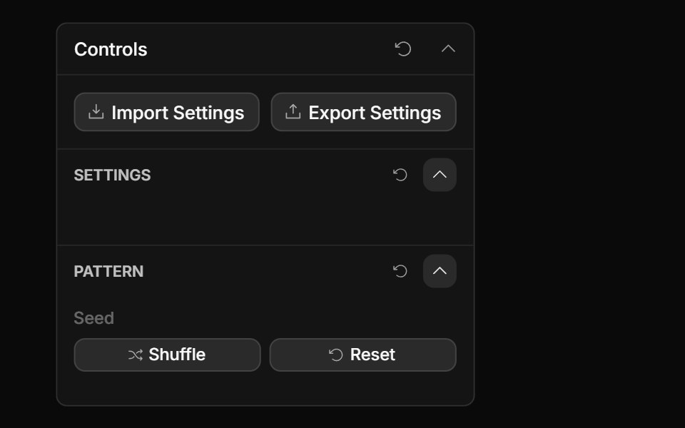 Actions ControlToolcraft · React
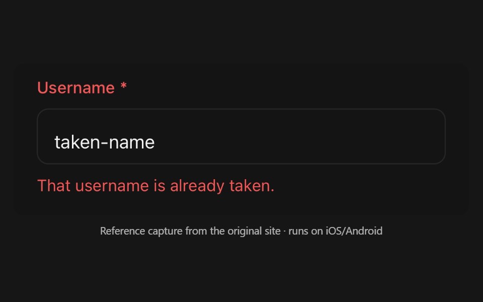 FieldPanel UI · React NativeLayout and validation-state kit a form control composes into.
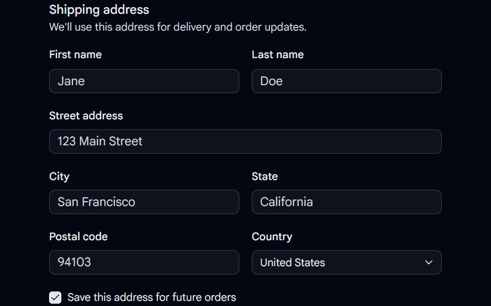 Field 04 - Shipping AddressShadcn Space · ReactA shipping address fieldset built with the Field primitive, combining responsive field orientation, inputs, a select…
 Flow FieldPixel Perfect · ReactParticles stream along curl-noise currents that reform the image.
 Checkbox Field InputOpenSourceUI · React
 LabelTremor Blocks · React
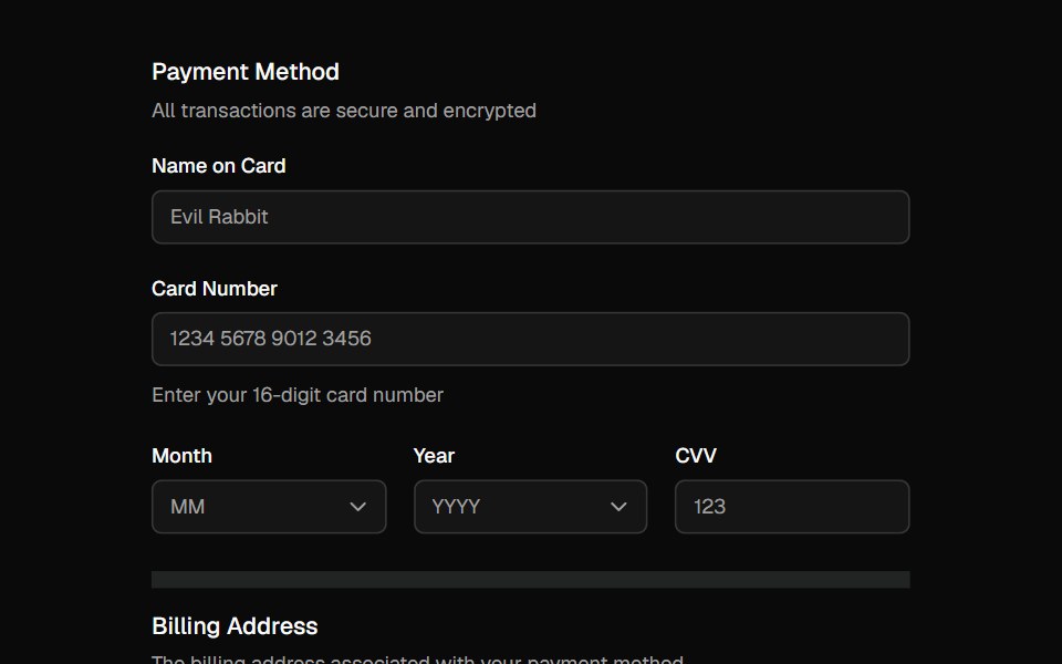 FieldShadcn Dashboard · React
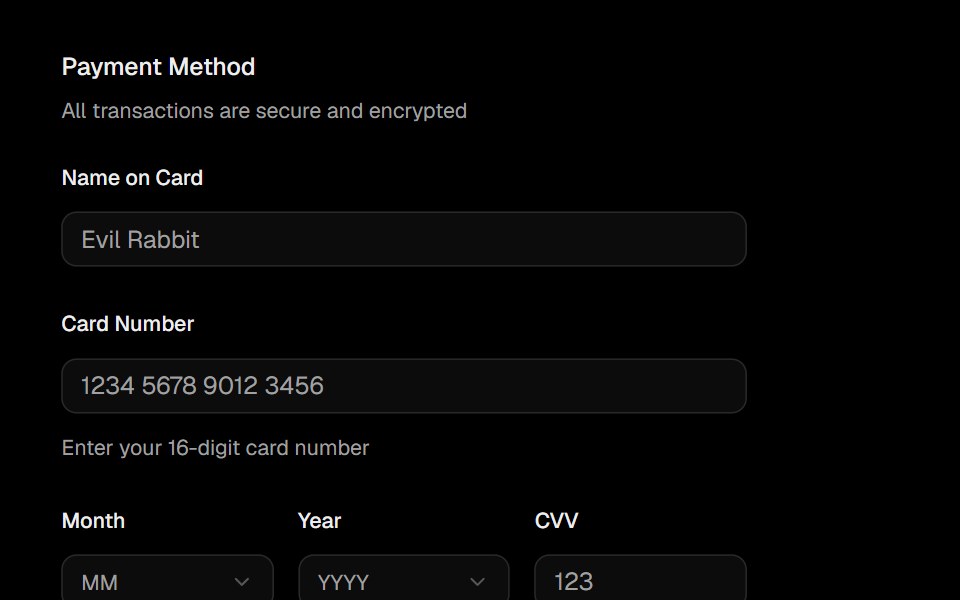 FieldObsidianUI · React
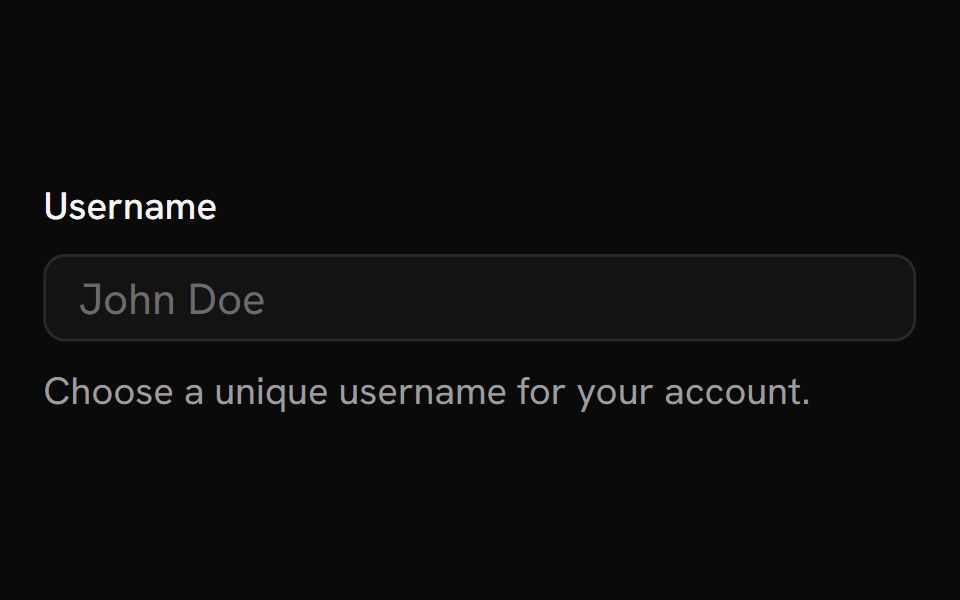 FieldShark UI · ReactContainer for inputs, labels, and helper text.
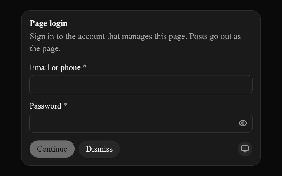 Secure InputAI CSS · React
 Floating InputWatermelon UI · React
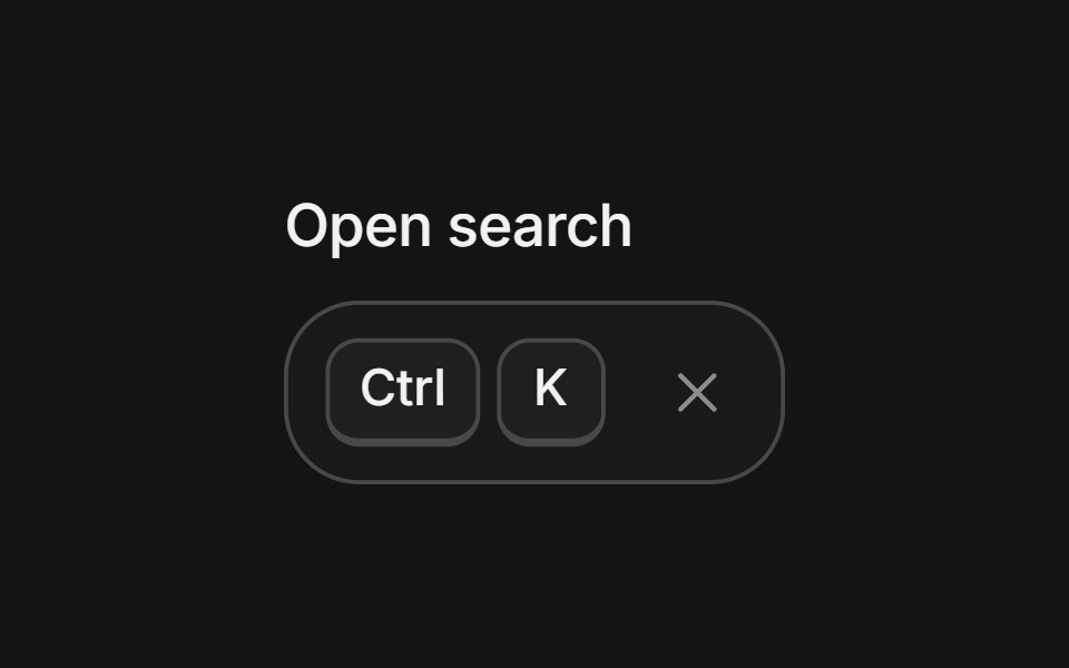 Shortcut recorderArc Library · ReactRecord key combinations into key caps, with conflict warnings, Kbd, and a searchable cheatsheet.
 Input Groupglasscn · React
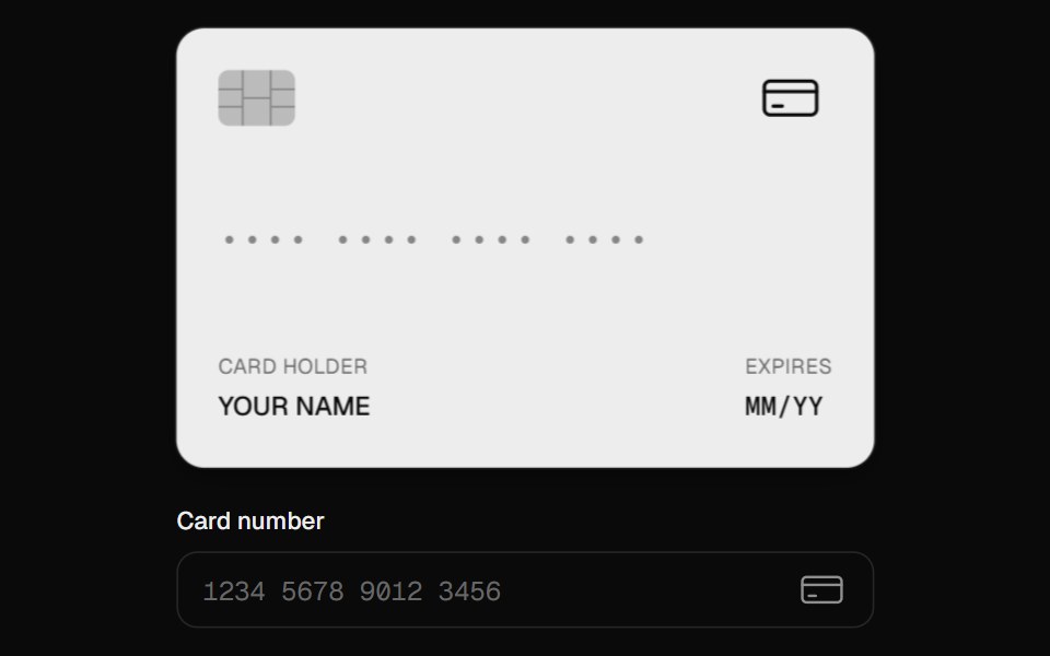 Card InputUI Lab · ReactFormats as you type, spots the card brand, and flips to show the CVC.
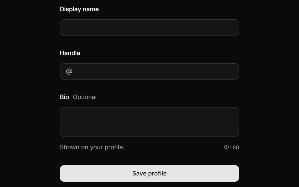 FieldHextaUI · ReactLabels, descriptions and errors wired to their control, with validation states and layouts for forms.
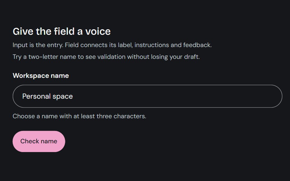 FieldCojeev UI · ReactConnects a form control with its label, description, and validation message.
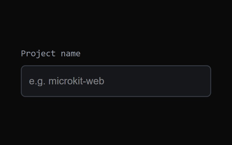 Focus FieldMicroKit · ReactAn input with a clean animated focus treatment.
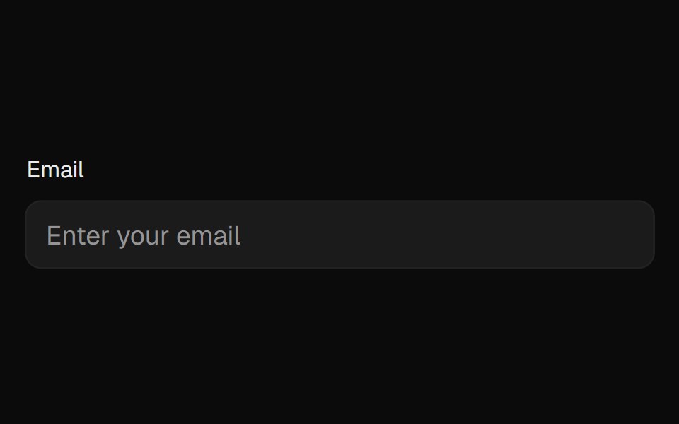 FieldROI UI · ReactA form field component with label and validation.
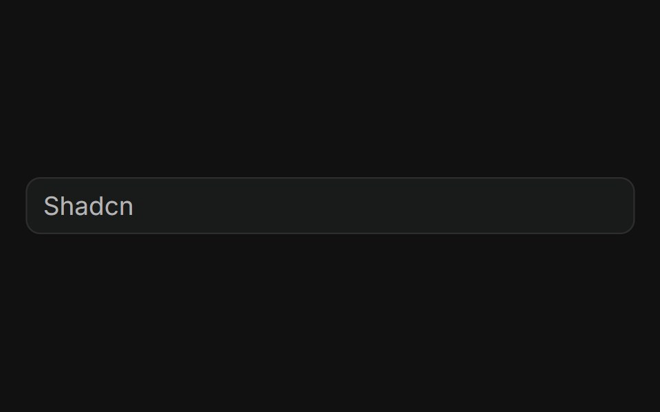 BasicFLX UI · ReactPlain text input with a placeholder, no addons.
 Input GroupHalaska UI · React
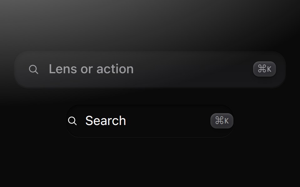 FieldMetal UI · React + SwiftUIText input in a well with a leading glyph and trailing keycaps; SearchField, a button in a well that opens search.
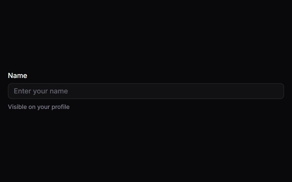 FieldSpaceUI · ReactWraps input fields with clear text labels, helpful hints, and error messages to make filling out forms straightforward…
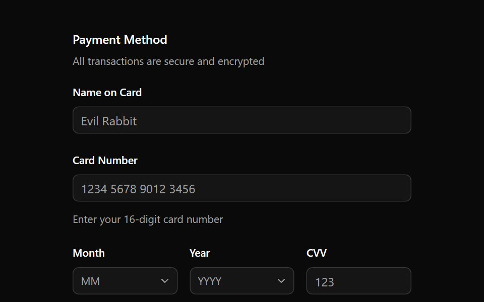 Aria FieldReScript shadcn · ReScript
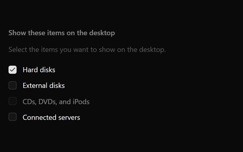 Checkbox GroupOUI · ReactReact aria components Checkbox Group with shadcn characteristics.
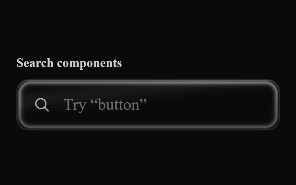 Liquid Text FieldLiquefy UI · ReactText input field in liquid glass style.
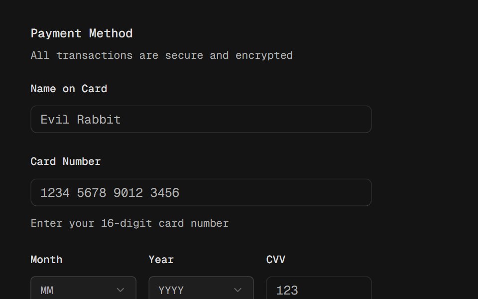 FieldD2Studio UI · ReactCombine labels, controls, and help text to compose accessible form fields and grouped inputs.
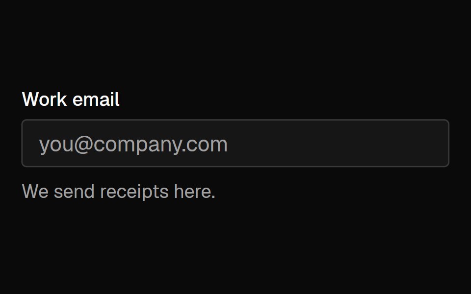 FieldFibo · ReactA label, description and error wired to one form control, with a group that sets the size of a whole form.
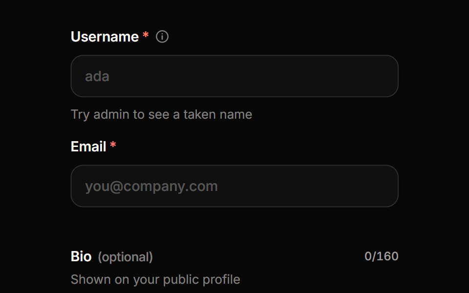 Form FieldReactFrame · ReactA form field wrapper with label, description, required or optional marker, info tooltip, character counter and…
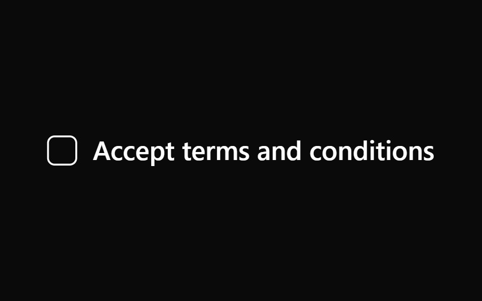 LabelAceternity UI · React
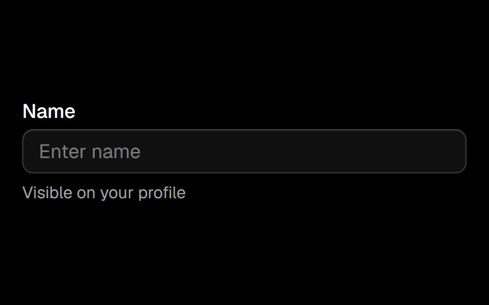 Fieldark-cn · ReactA shadcn-style field component built with Ark UI primitives.
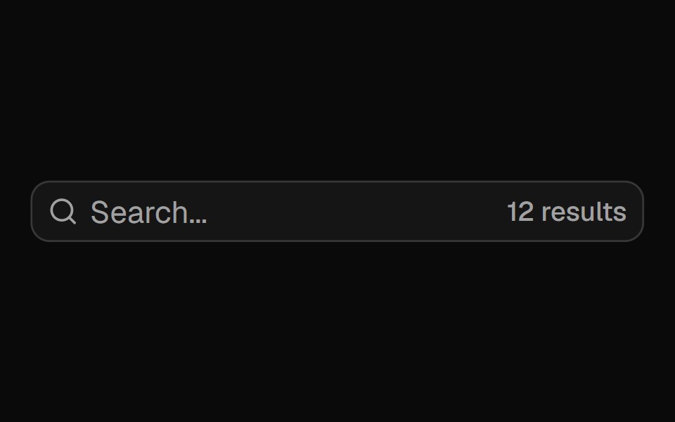 Input Groupshadcn/ui · ReactAdd addons, buttons, and helper content to inputs.
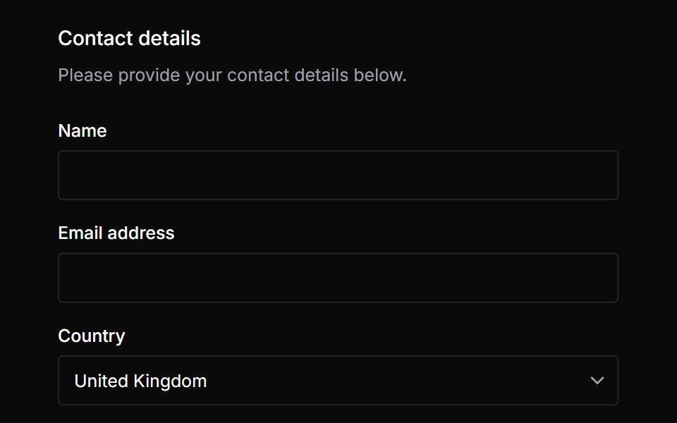 FieldsetChakra UI · ReactA set of form controls optionally grouped under a common name.
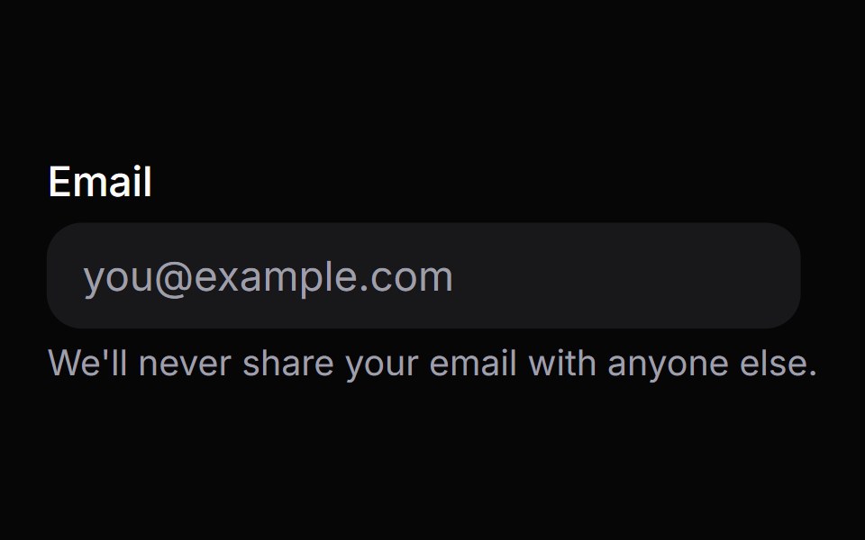 DescriptionHeroUI · ReactText component for providing accessible descriptions and helper text for form fields and other UI elements.
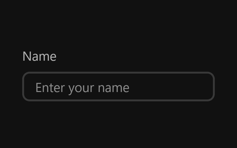 Text FieldReact Spectrum · ReactTextFields are text inputs that allow users to input custom text entries with a keyboard. Various decorations can be…
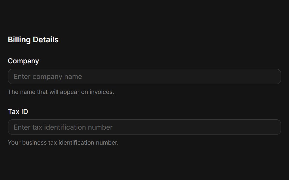 Fieldsetcoss ui · ReactA native fieldset element with a legend.
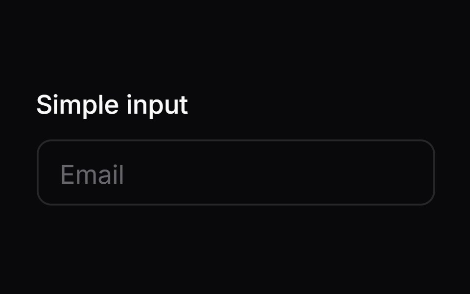 Comp 01Origin UI · React
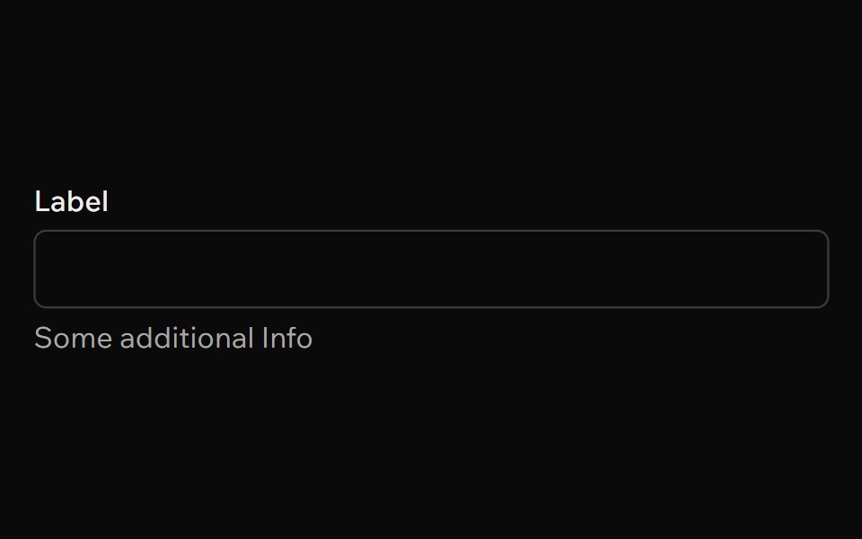 FieldArk UI · ReactProvides a flexible container for form inputs, labels, and helper text.
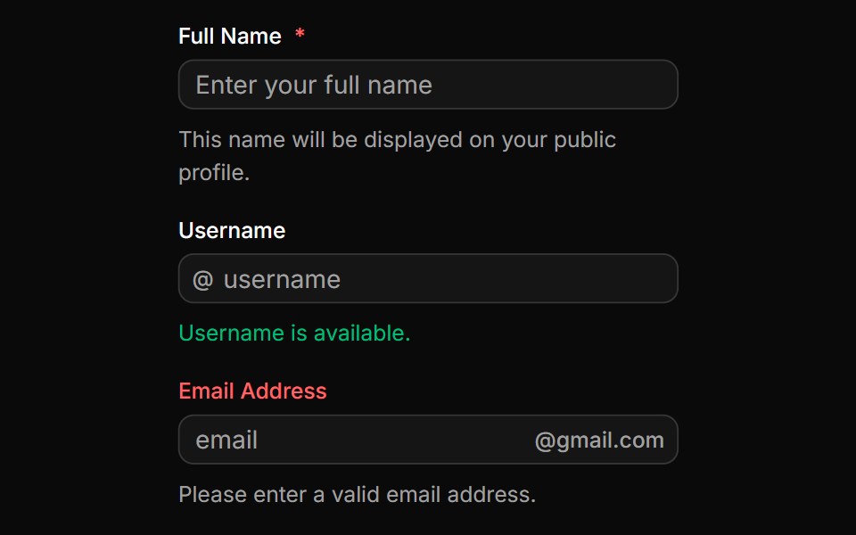 Fields with input groupsReUI · ReactFields with input groups
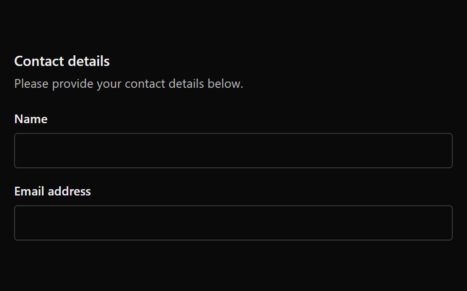 FieldsetPark UI · ReactA grouping component for organizing related form fields.
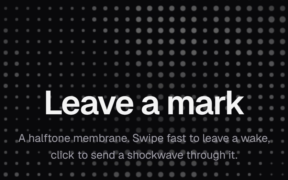 Dot FieldKokonut UI · ReactA halftone dot membrane that ripples behind a swipe and rings out from a click, built with React and Canvas.
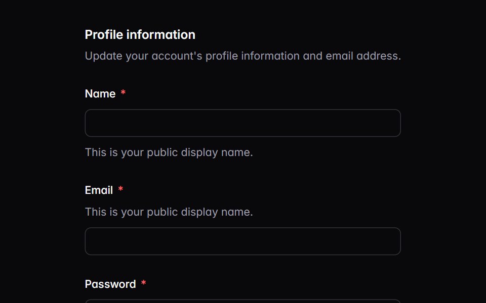 fieldIntent UI · Reactfield
 DescriptionTailGrids · ReactA description component that provides additional context or instructions for form fields.
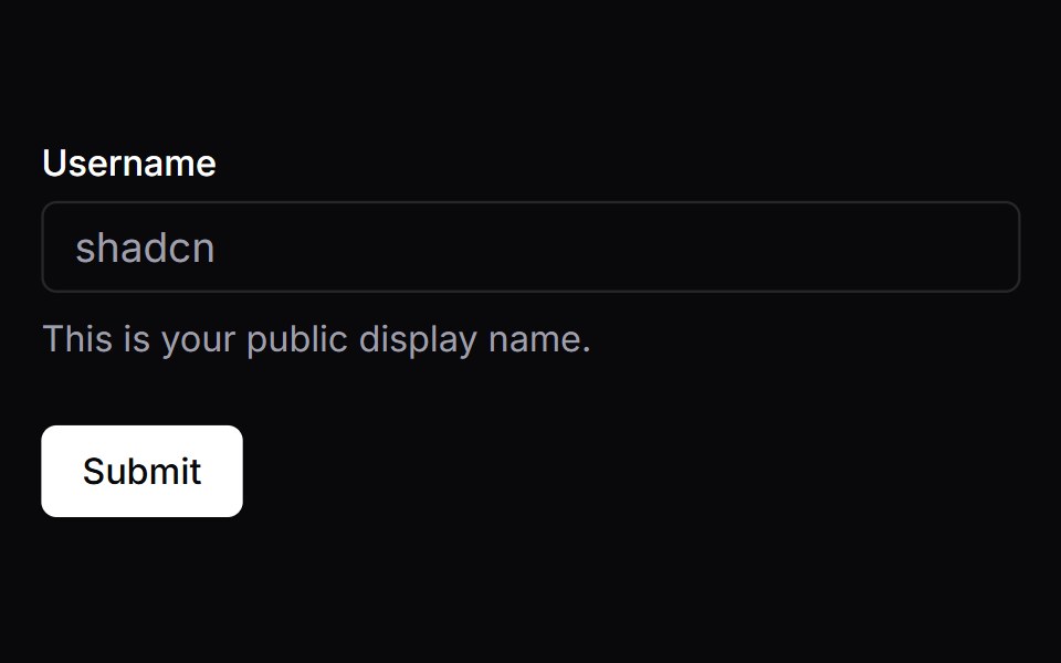 FormVengeance UI · React
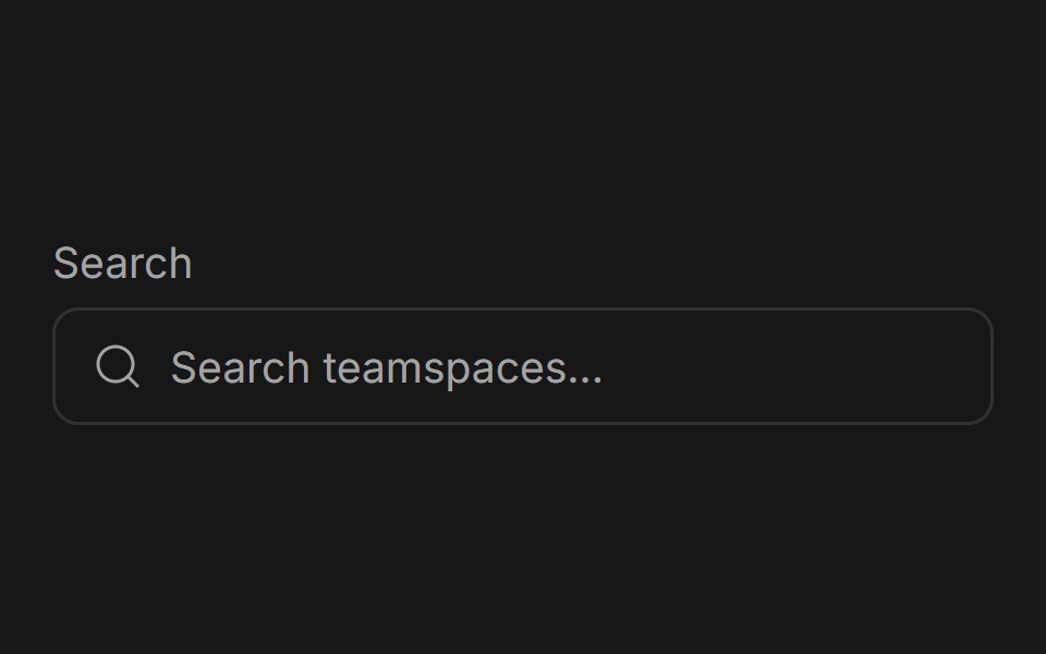 Input GroupFluid Functionalism · ReactGrouped input fields with fluid hover highlighting, animated label transitions, optional icons, and error states.
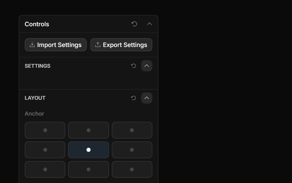 Anchor Grid ControlToolcraft · React
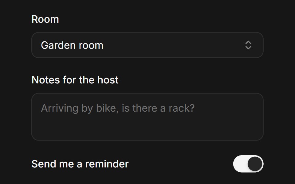 Web FieldPanel UI · React NativeForm fields with label, control, helper text and validation message.
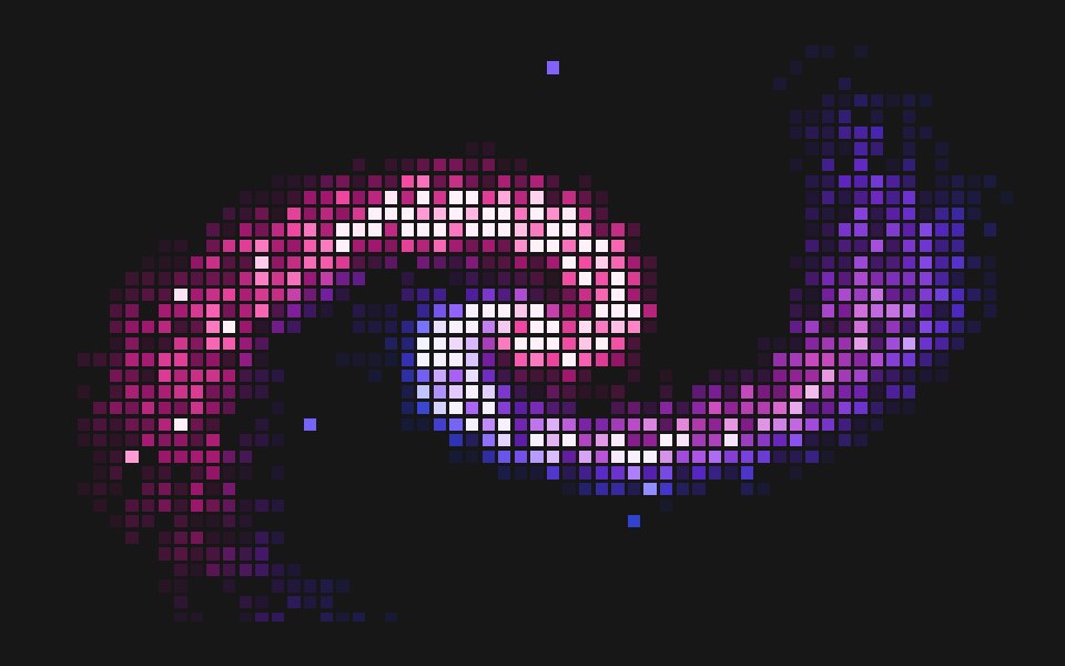 Pixel Displace FieldPixel Perfect · ReactA pixelated spiral of grid-locked squares that scatter away from the cursor and spring back.
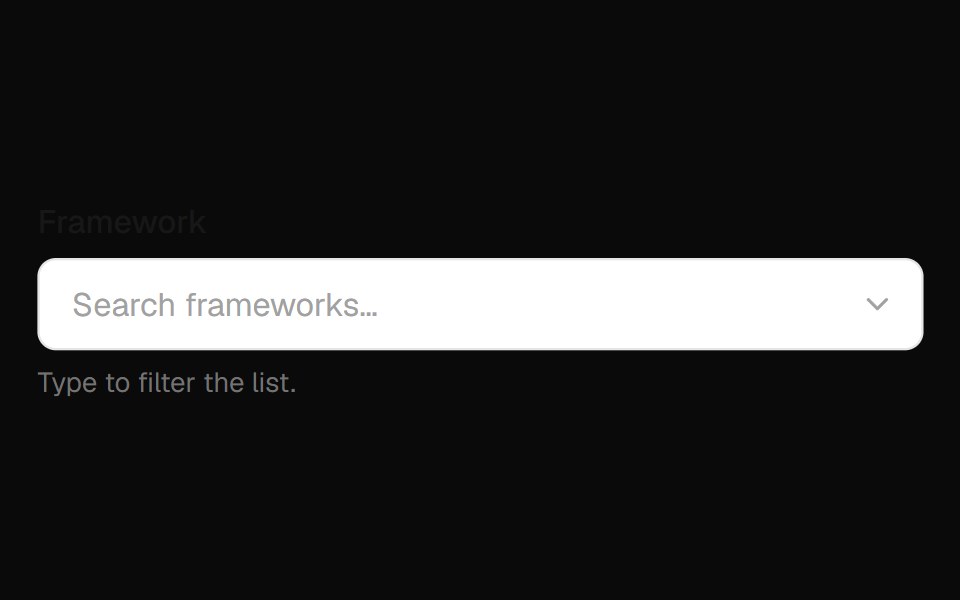 Combobox Field InputOpenSourceUI · React
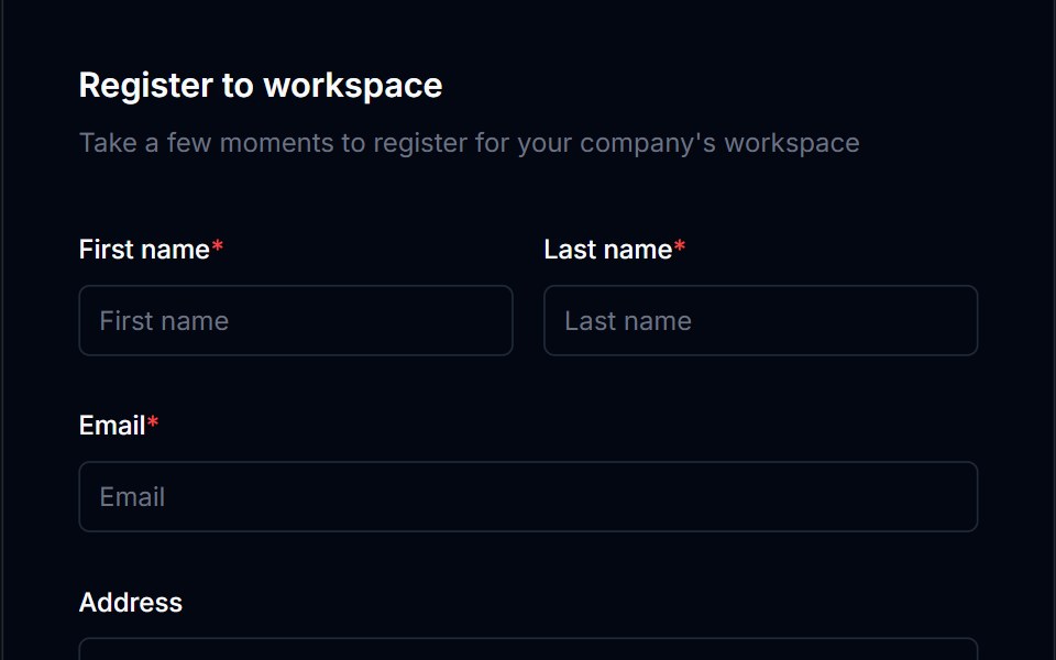 Form Layout 01Tremor Blocks · React
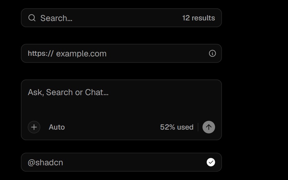 Input GroupObsidianUI · React
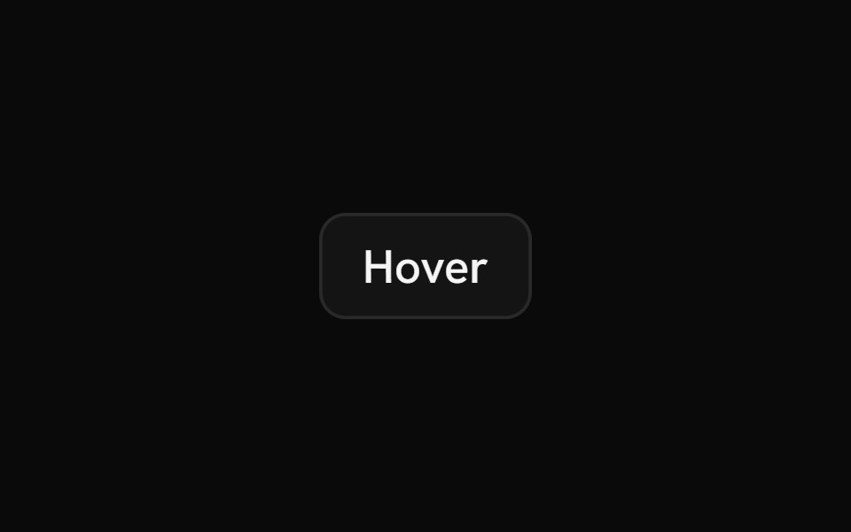 HintShark UI · ReactMinimal tooltip for showing information.
 Floating Input BaseWatermelon UI · React
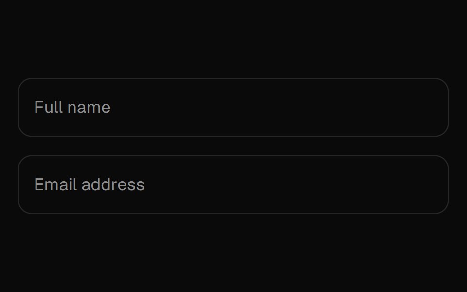 Floating LabelUI Lab · ReactThe label peels up letter by letter, and never covers what you wrote.
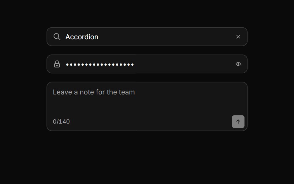 Input groupHextaUI · ReactAn input with icons, text, buttons or a keyboard hint attached, sharing one border and focus ring.
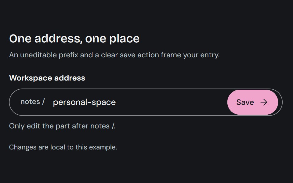 Input GroupCojeev UI · ReactCombines a text control with adjacent prefixes, suffixes, or actions in one input surface.
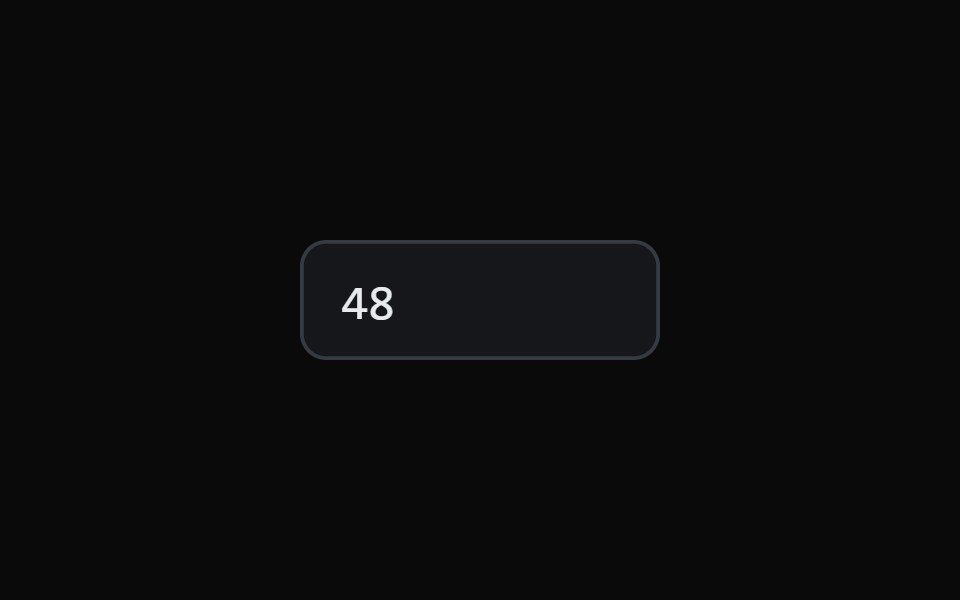 Scrub Number FieldMicroKit · ReactA number field you drag to scrub and click to type, with a ruler that tracks the gesture.
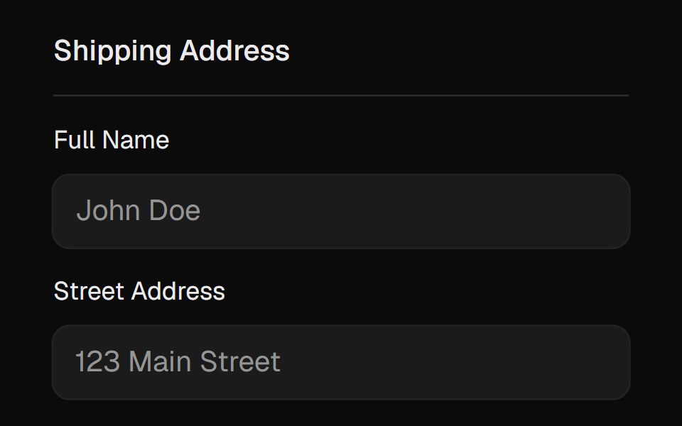 FieldsetROI UI · ReactA native fieldset element with an easily stylable legend.
 With AddonFLX UI · ReactInput with trailing search icon addon.
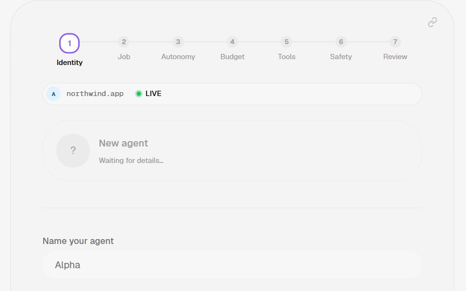 LabelHalaska UI · React
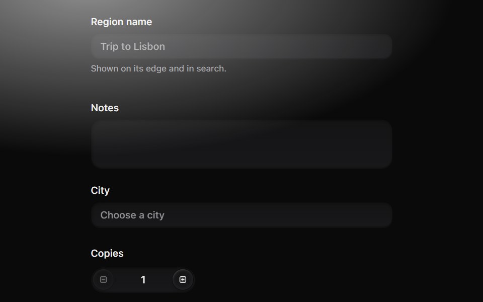 Form fieldMetal UI · React + SwiftUIA control with its words: label, description and an error that grows open from under the control on the settle spring…
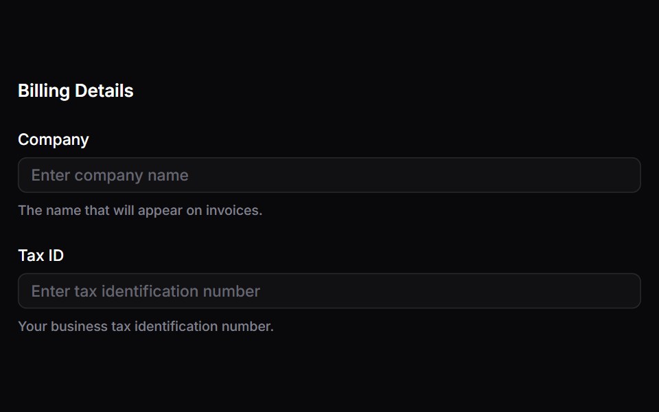 FieldsetSpaceUI · ReactGroups related form controls together under a descriptive header, making long or complex forms easier to read and…
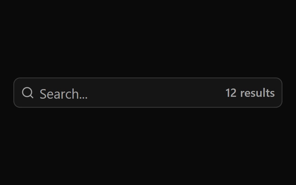 Aria Input GroupReScript shadcn · ReScript
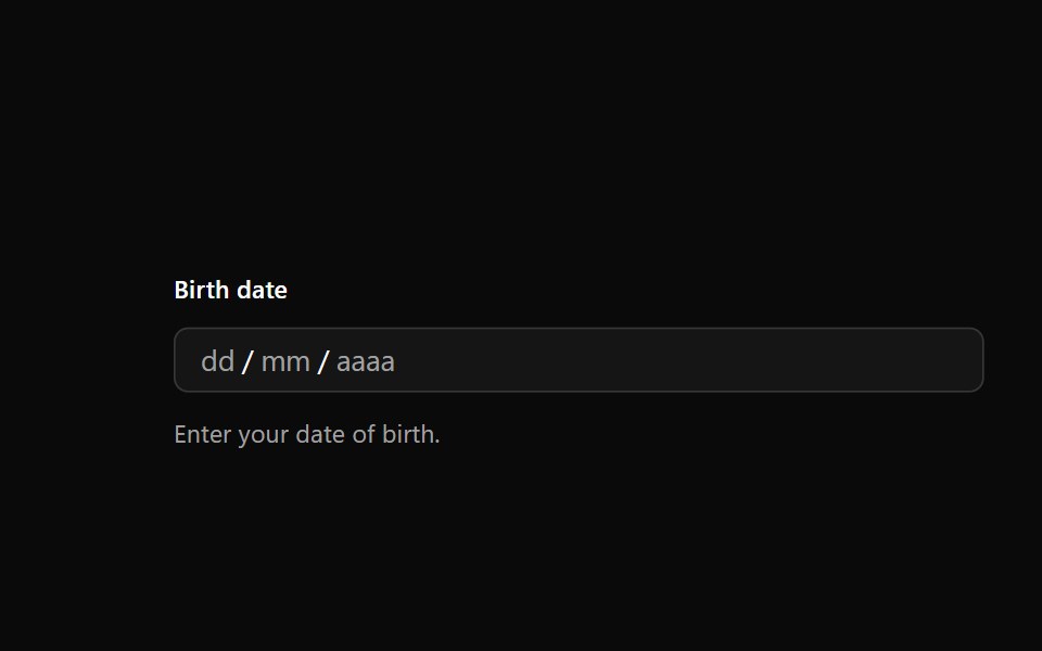 Date FieldOUI · ReactReact aria components DateField with shadcn characteristics.
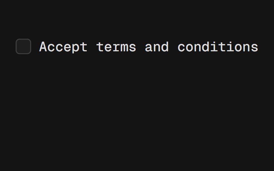 LabelD2Studio UI · ReactRenders an accessible label associated with controls.
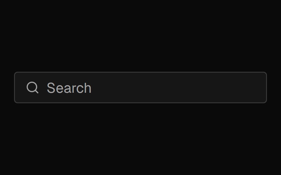 Input GroupFibo · ReactAn input with an icon, text or button beside it, drawn as one field.
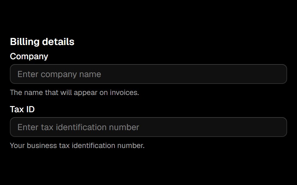 Fieldsetark-cn · ReactA shadcn-style fieldset component built with Ark UI primitives.
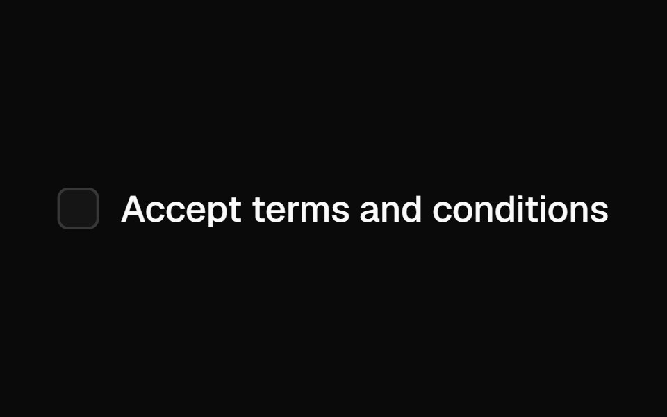 Labelshadcn/ui · ReactRenders an accessible label associated with controls.
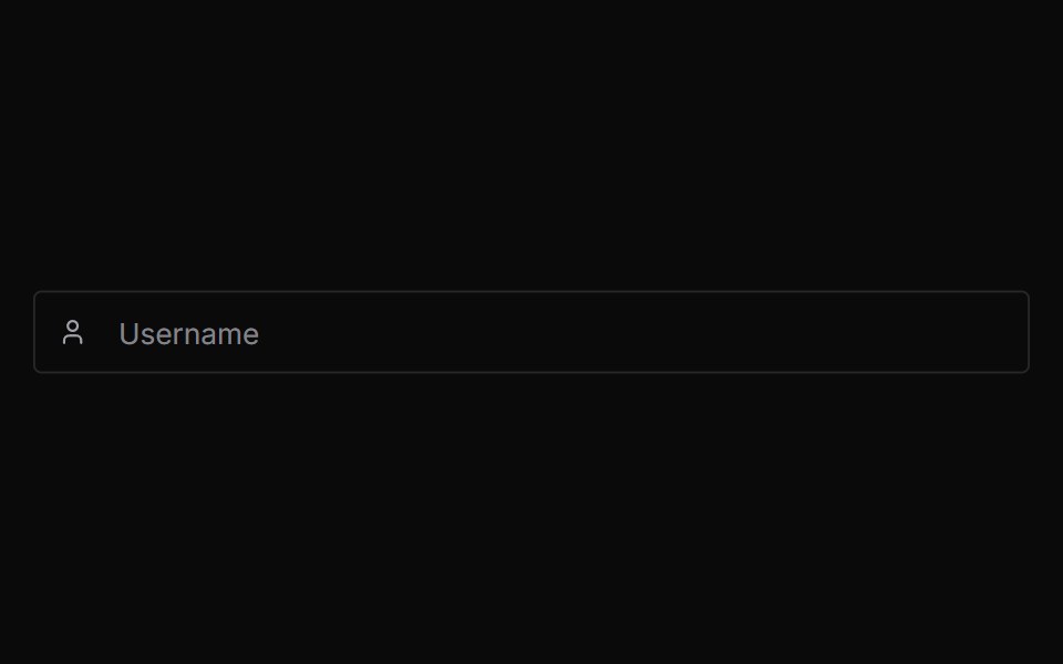 Input GroupChakra UI · React
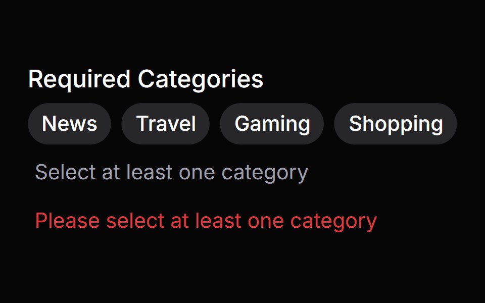 Error MessageHeroUI · ReactA low-level error message component for displaying errors
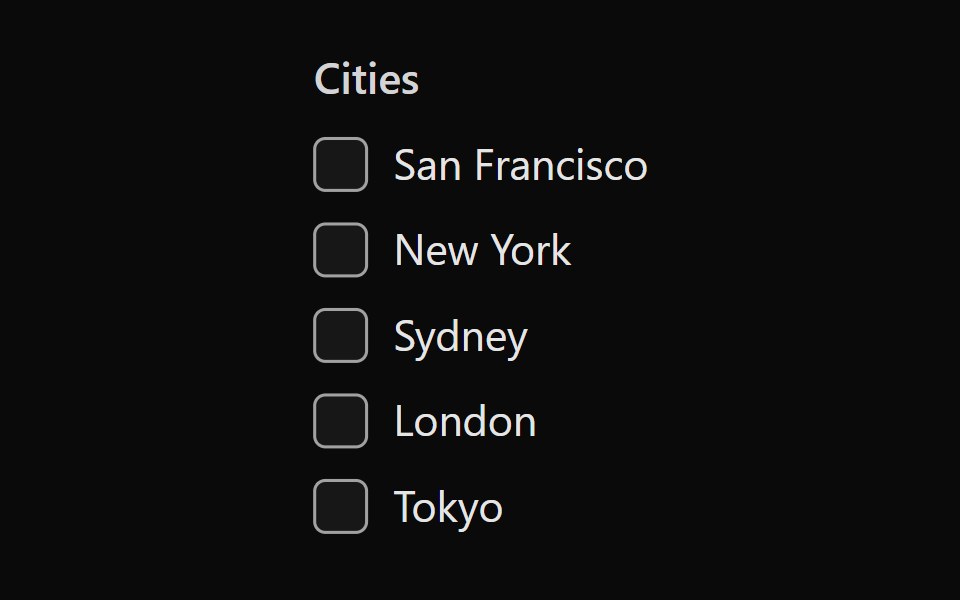 Tailwind Checkbox GroupReact Spectrum · React
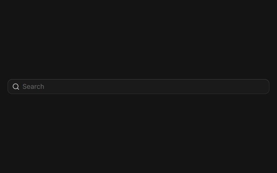 Input Groupcoss ui · ReactA flexible component for grouping inputs with addons, buttons, and other elements.
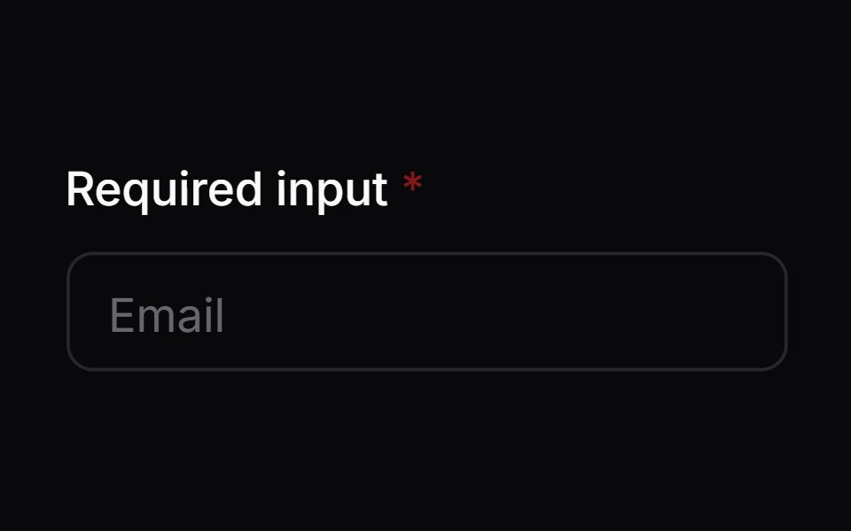 Comp 02Origin UI · React
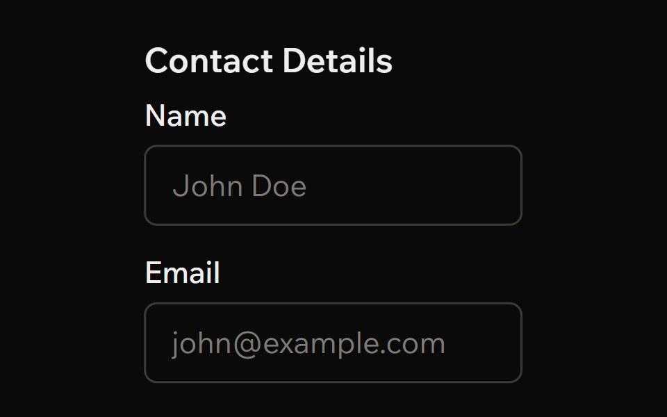 FieldsetArk UI · ReactA set of form controls optionally grouped under a common name.
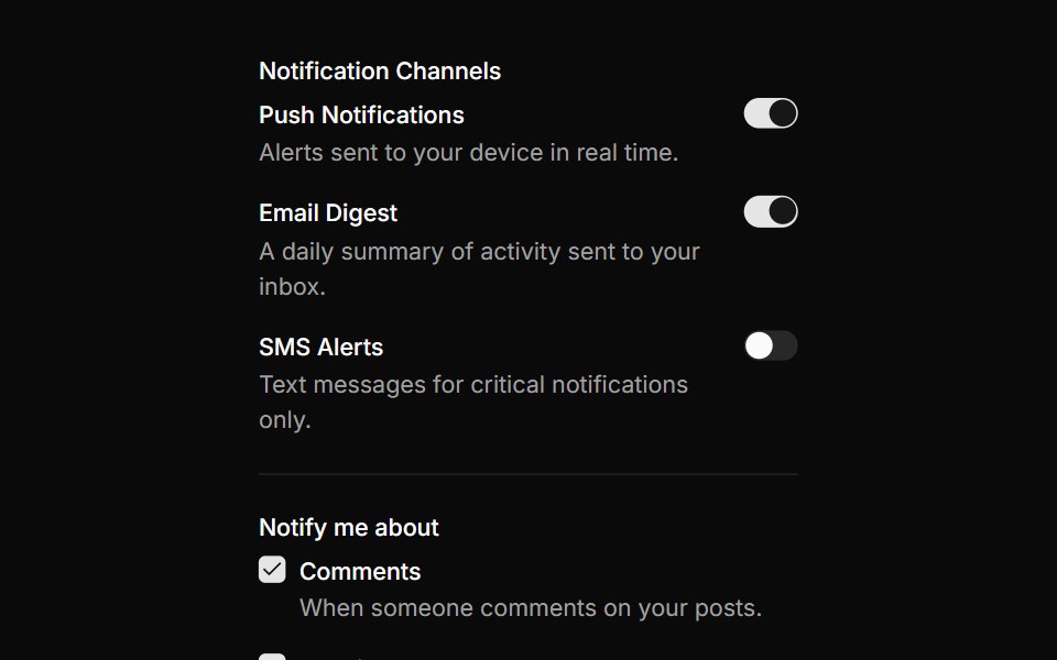 Notification preferences formReUI · ReactNotification preferences form
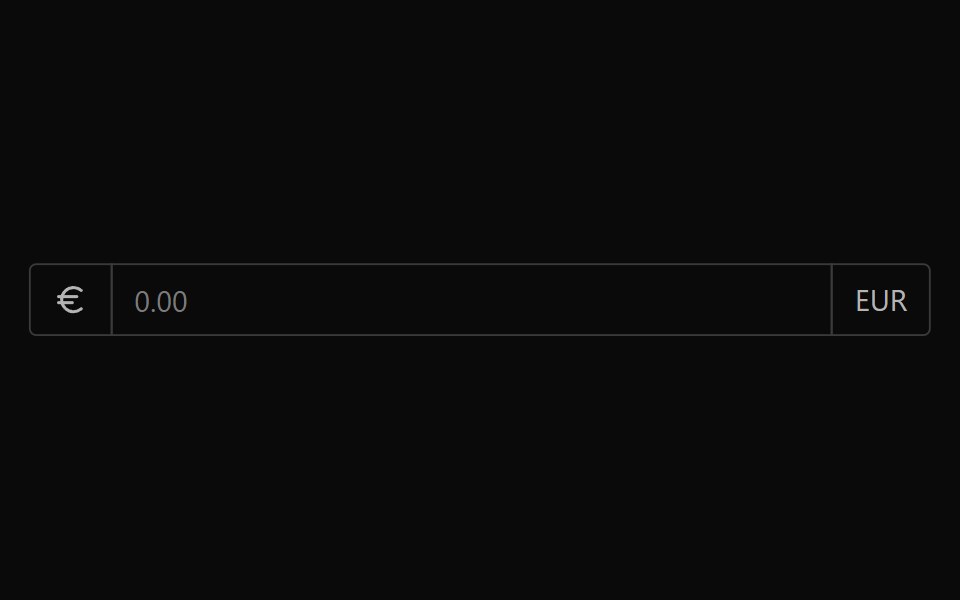 Input AddonPark UI · ReactA component for adding prefix or suffix content to input fields.
 tag-fieldIntent UI · Reacttag-field
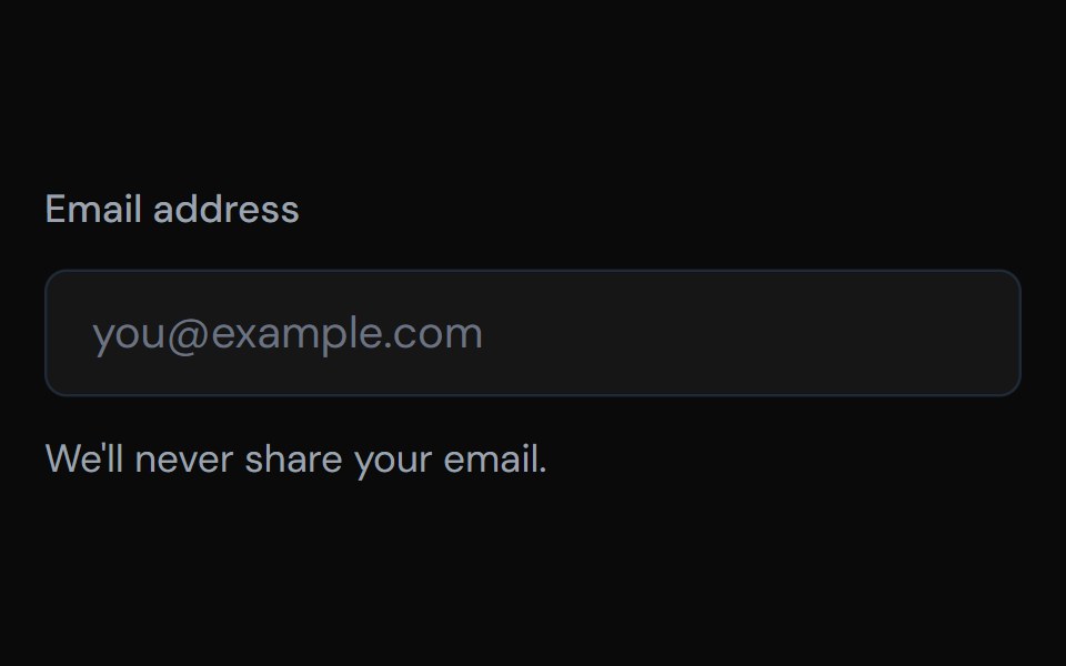 FieldTailGrids · ReactA collection of components for building accessible and flexible form fields.
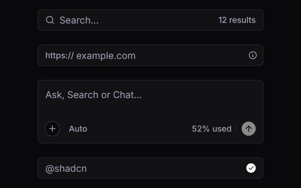 Input GroupVengeance UI · React
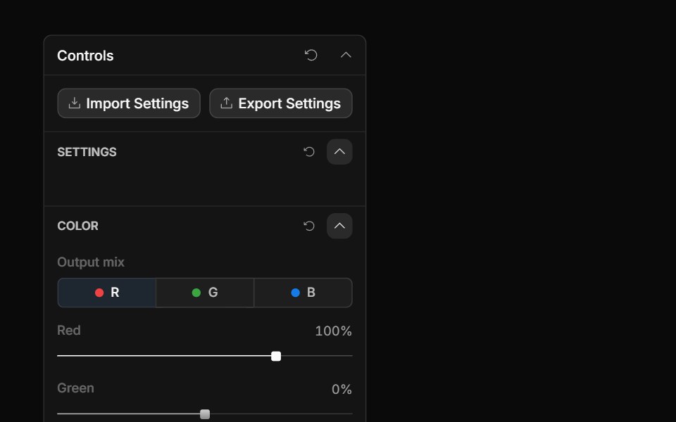 Channel Mixer ControlToolcraft · React
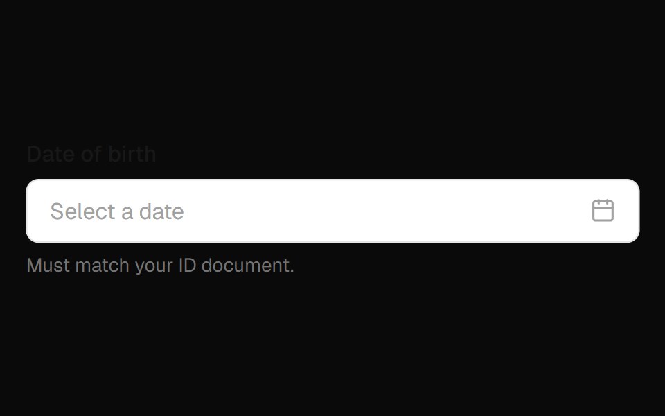 Date Field InputOpenSourceUI · React
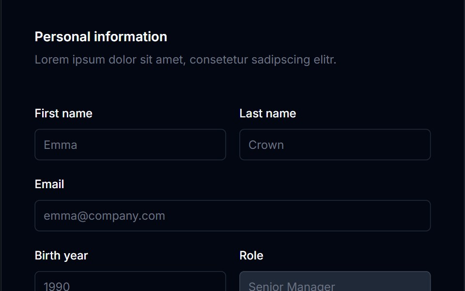 Form Layout 02Tremor Blocks · React
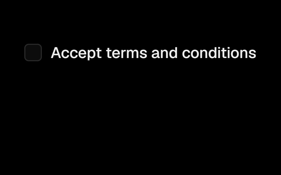 LabelObsidianUI · React
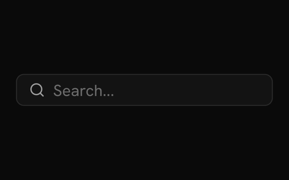 Input GroupShark UI · ReactGroup input elements together.
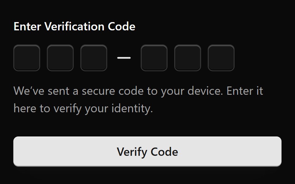 Form 1Watermelon UI · React
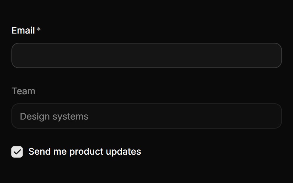 LabelHextaUI · ReactA label that follows its control, dimming when it's disabled and marking it required or optional on its own.
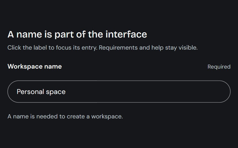 LabelCojeev UI · ReactProvides a native form label plus compact stat-label primitives for named values.
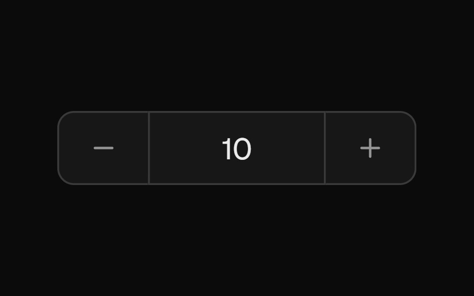 Number FieldROI UI · ReactA numeric input element with increment/decrement buttons and a scrub area.
 DisabledFLX UI · ReactText input rendered in a disabled, non-interactive state.
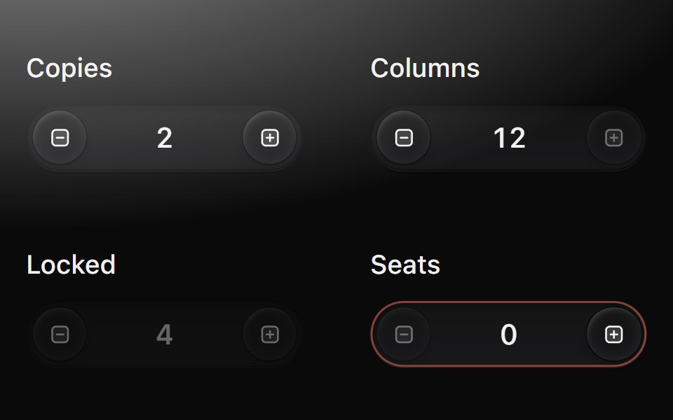 Number fieldMetal UI · React + SwiftUIA number you step, scrub or type: keycaps at each end of a pill well; each step turns the value one drum step (plus…
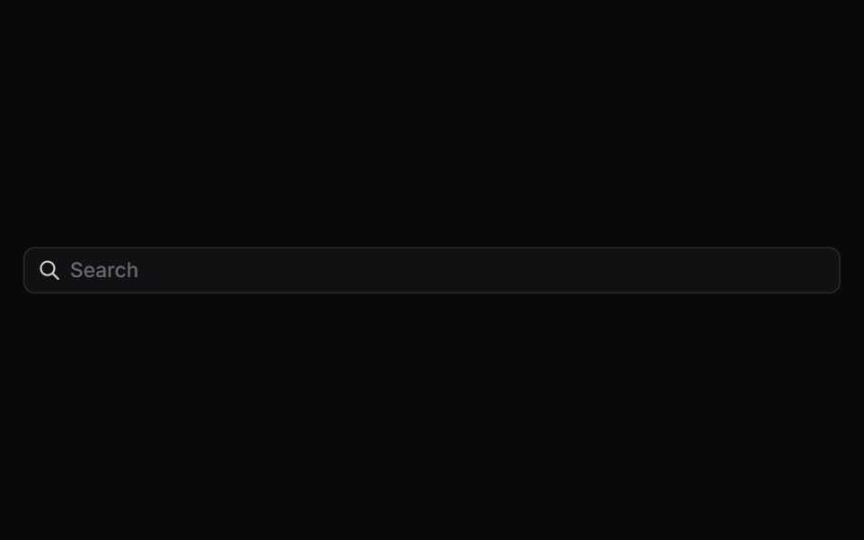 Input GroupSpaceUI · ReactAttaches icons, prefix text, buttons, or dropdowns directly to an input field, creating compact, all-in-one form…
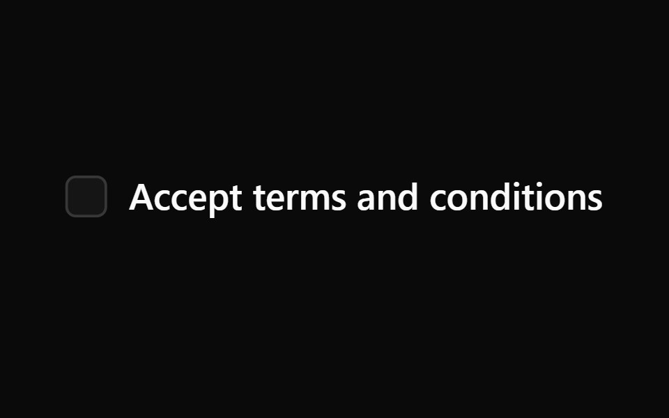 Aria LabelReScript shadcn · ReScript
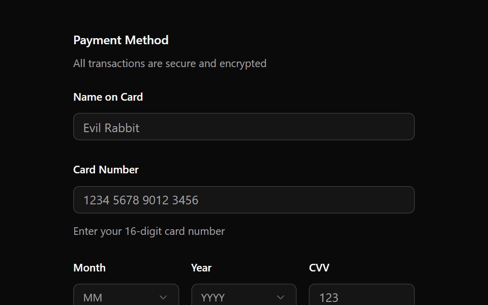 FieldOUI · ReactShadcn Field with react aria components characteristics.
 LabelFibo · ReactNames a form control and widens its hit area.
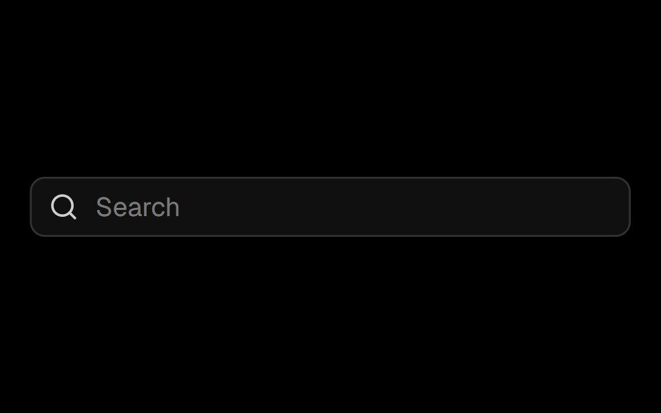 Input Groupark-cn · ReactA shadcn-style input group component built with Ark UI primitives.
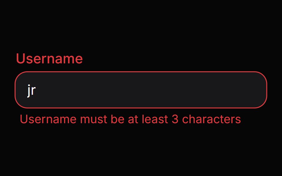 Field ErrorHeroUI · ReactDisplays validation error message content with smooth animations.
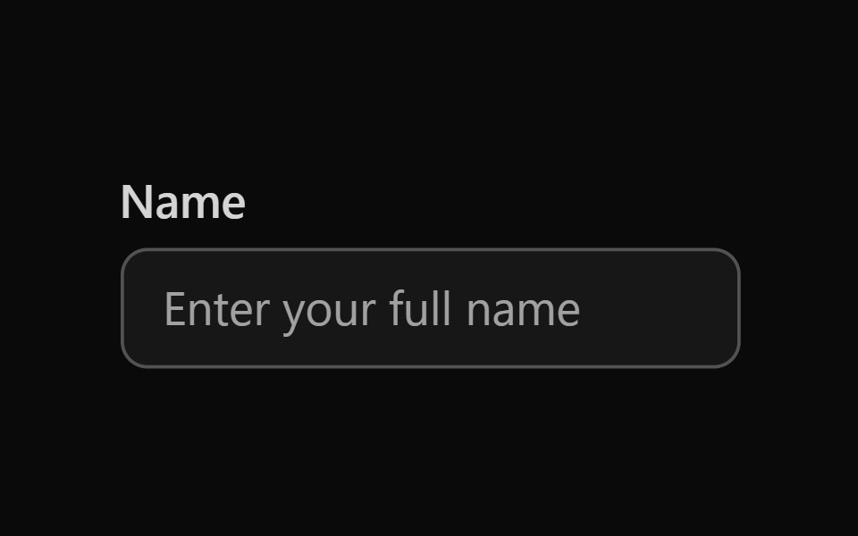 Tailwind Text FieldReact Spectrum · React
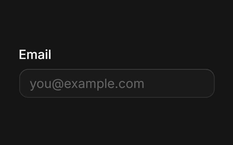 Labelcoss ui · ReactRenders an accessible label associated with controls.
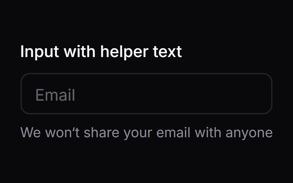 Comp 03Origin UI · React
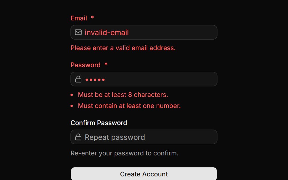 Form with validation errorsReUI · ReactForm with validation errors
Libraries with React form field components
Related categories
- Form Field Components
- Tailwind CSS Form Field Components
- Svelte Form Field Components
- Animated Form Field Components
- shadcn/ui Form Field Components
- React Input Components
- React Select Components
- React Text Input Components
- React Form Components
- React Switch Components
- React Textarea Components
- React Checkbox Components
- React Slider Components
- React Radio Components
- React Combobox Components
- React File Upload Components
- React Date Picker Components
- React Search Input Components
- React Color Picker Components
- React Login Form Components
- React OTP Input Components