 Dev Design Library
React Checkbox Components
Dev Design Library indexes 173 React checkbox components from 57 open-source UI libraries, with the most coming from Origin UI, ReUI, Watermelon UI, Tremor Blocks and FLX UI. Each one links to its page with the source code, a live preview where available, the library license and the install command. Every library in this list targets React. Checkbox components belong to the Inputs group.
Showing 120 of 173, a mix from every library. Open a library to see all of its components.
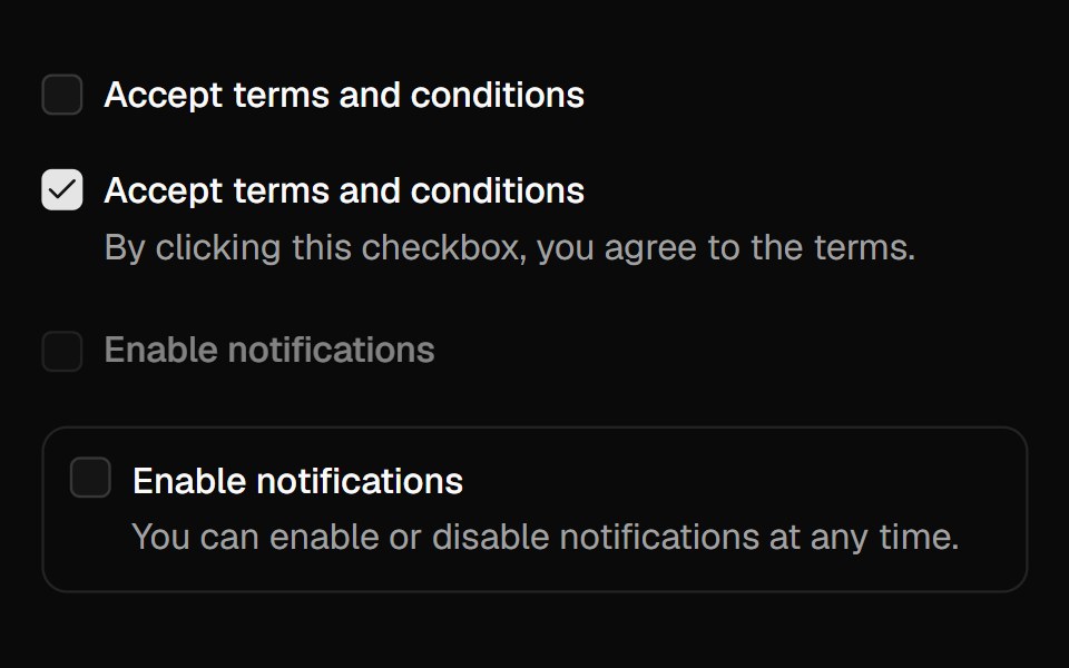 Checkboxshadcn/ui · React
 CheckboxMUI / Material UI · React
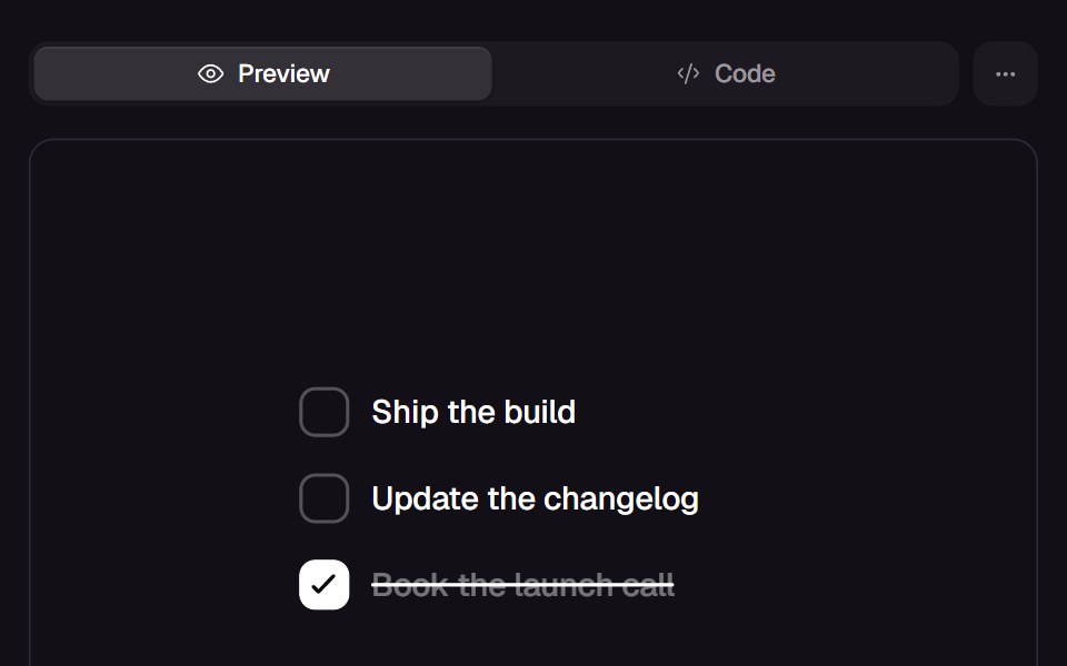 Spring CheckReact Bits · ReactCheckbox row where a single spring fills the box, draws the tick, strikes the label and dims the words in one press.
 CheckboxChakra UI · ReactUsed in forms when a user needs to select multiple values from several options
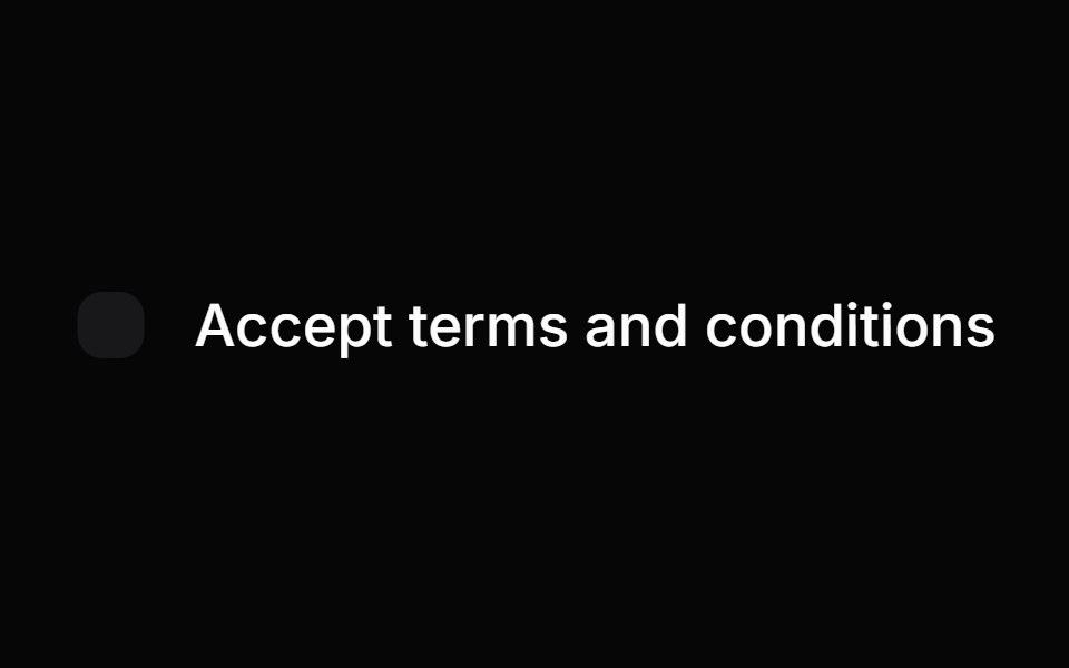 CheckboxHeroUI · ReactA selectable control that allows users to toggle between checked and unchecked states.
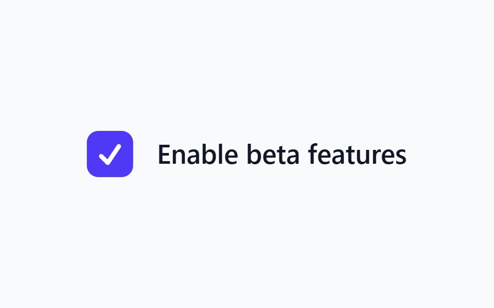 CheckboxHeadless UI · React
 CheckboxReact Spectrum · ReactCheckboxes allow users to select multiple items from a list of individual items, or to mark one individual item as…
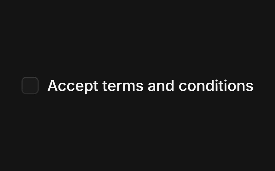 Checkboxcoss ui · ReactA control allowing the user to toggle between checked and not checked.
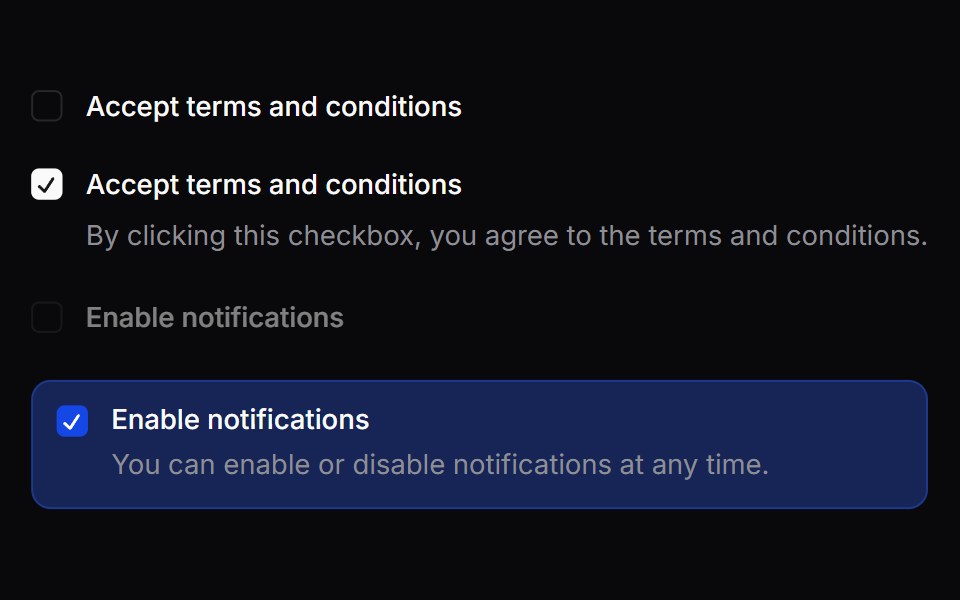 CheckboxOrigin UI · ReactA control allowing the user to toggle between checked and not checked.
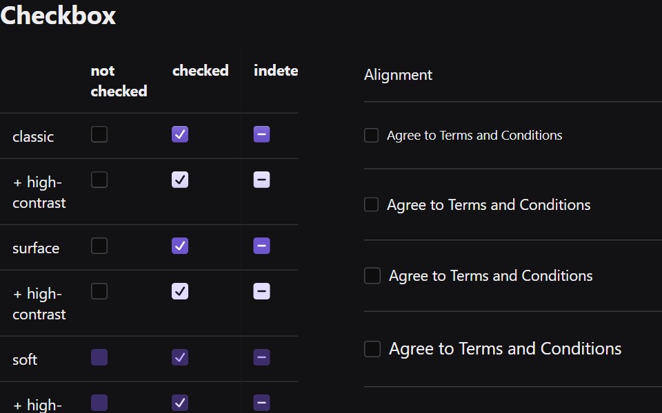 CheckboxRadix Themes · React
 CheckboxArk UI · ReactA control element that allows for multiple selections within a set.
 CheckboxTremor · React
 Basic checkbox with labelReUI · ReactBasic checkbox with label
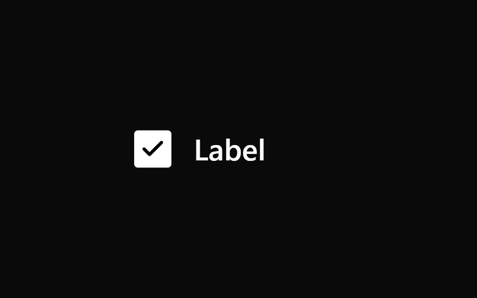 CheckboxPark UI · ReactA form input component for toggling between checked and unchecked states.
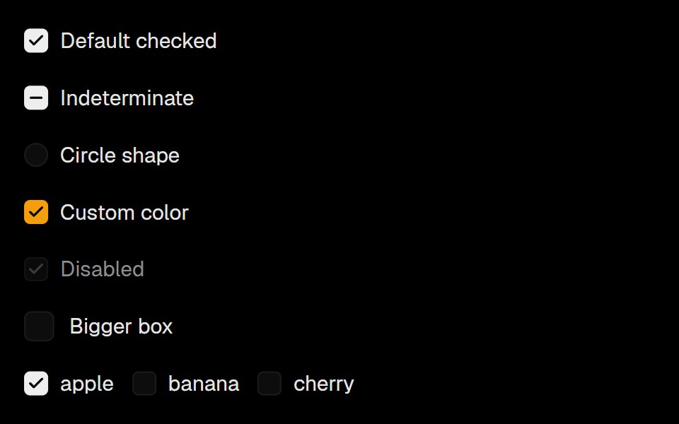 CheckboxLobe UI · ReactBase UI-powered Checkbox and CheckboxGroup with lobe visual style.
 checkboxIntent UI · Reactcheckbox
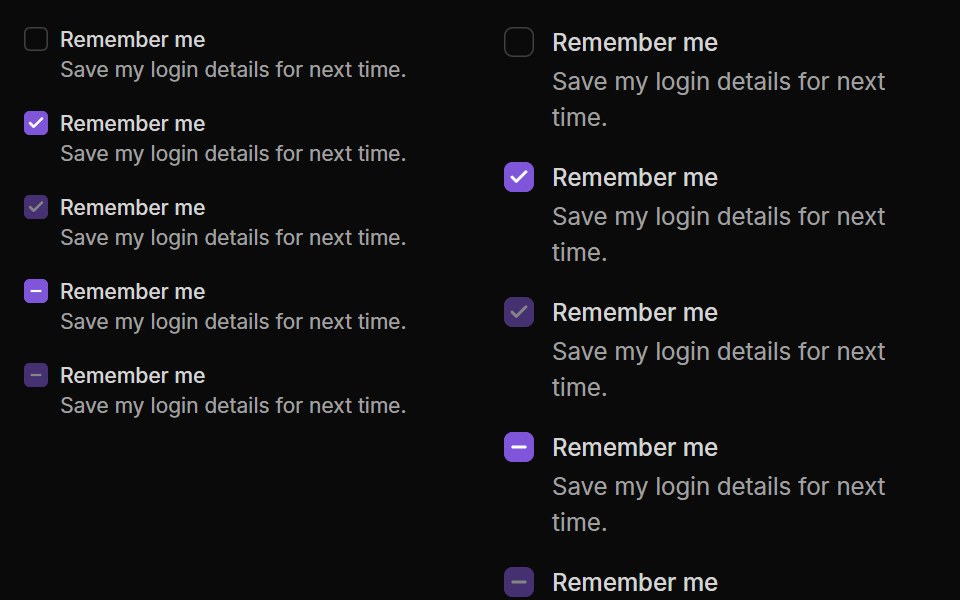 CheckboxUntitled UI React · React
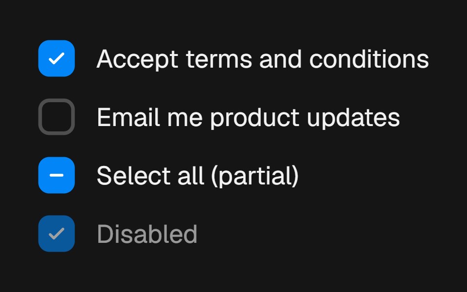 CheckboxbeUI · ReactForm choice control with a draw-on checkmark, spring press feedback and indeterminate state support.
 CheckboxTailGrids · ReactA checkbox component with label and multiple states.
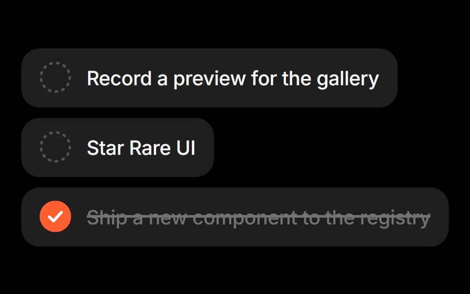 Task ListRare UI · ReactA checklist that strikes out completed tasks and moves them to the bottom of the list.
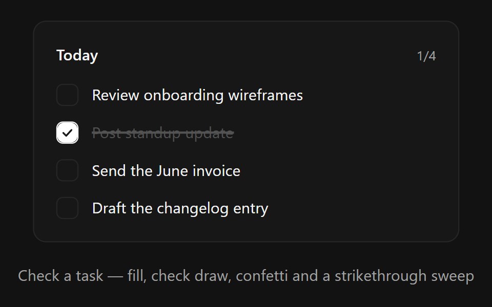 Task CheckboxSpectrum UI · ReactA satisfying todo checkbox row with spring fill, drawn-in check, confetti burst and animated strikethrough
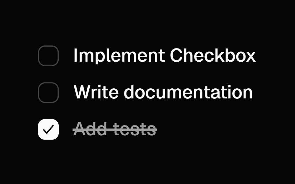 Animated CheckboxSpell UI · ReactAnimated checkbox with spring transitions and strike-through text effect.
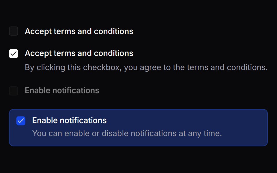 CheckboxVengeance UI · React
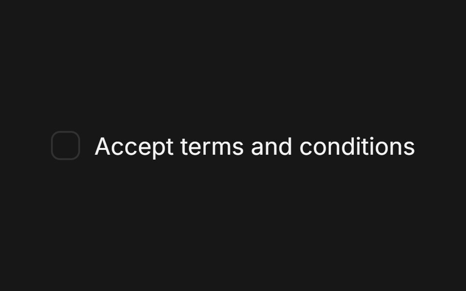 CheckboxFluid Functionalism · ReactA single checkbox: a hairline square that darkens on hover and a check that draws itself. Pairs with Field. Radix…
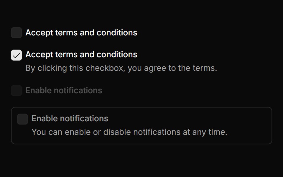 CheckboxToolcraft · React
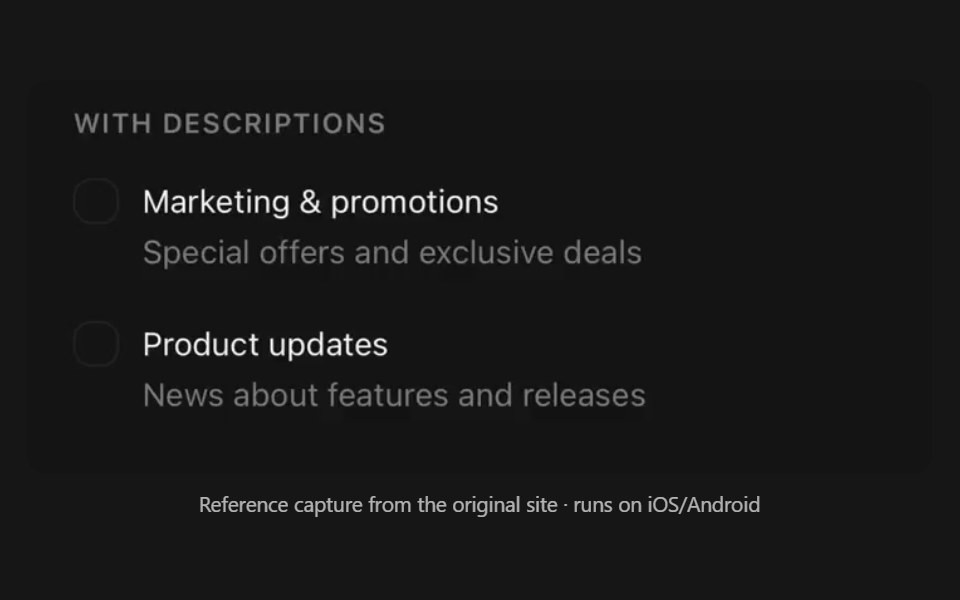 CheckboxPanel UI · React NativeAnimated checkbox, as a row or a selectable card.
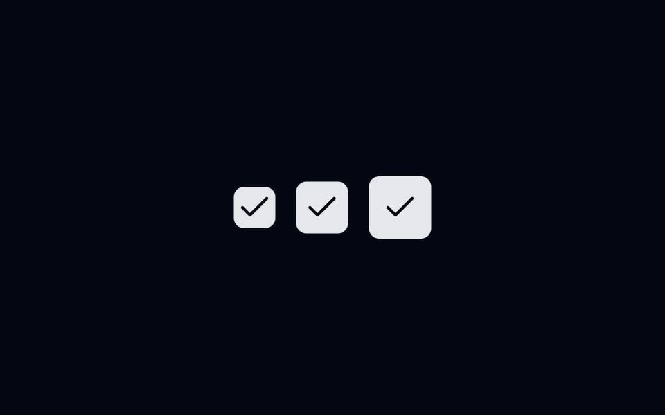 Checkbox-01 - Checkbox with sizesShadcn Space · ReactCheckbox component
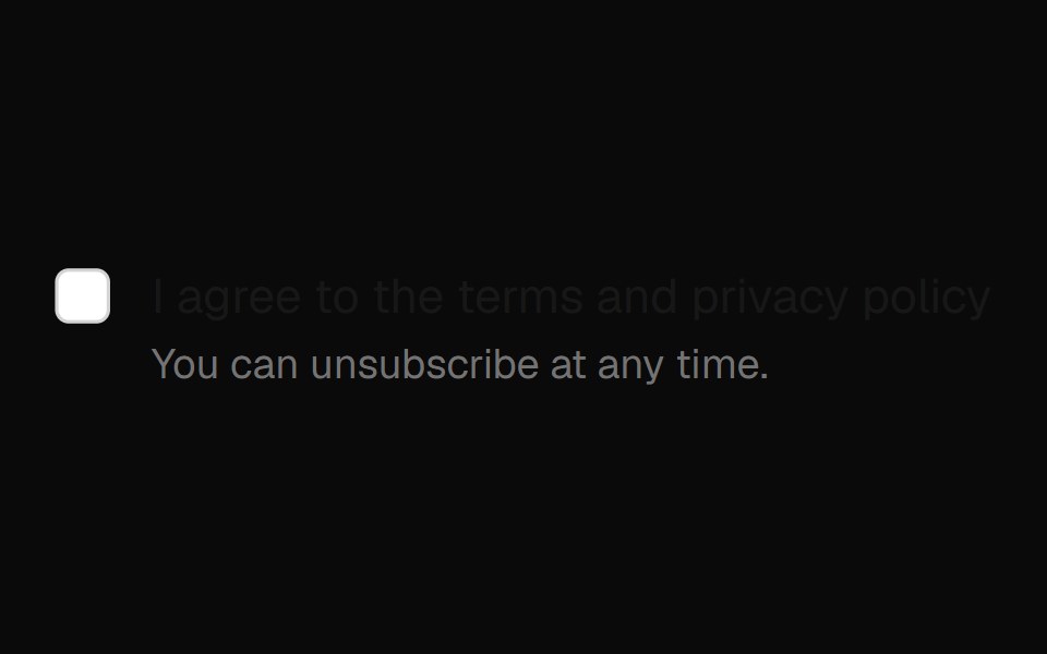 Checkbox Field InputOpenSourceUI · React
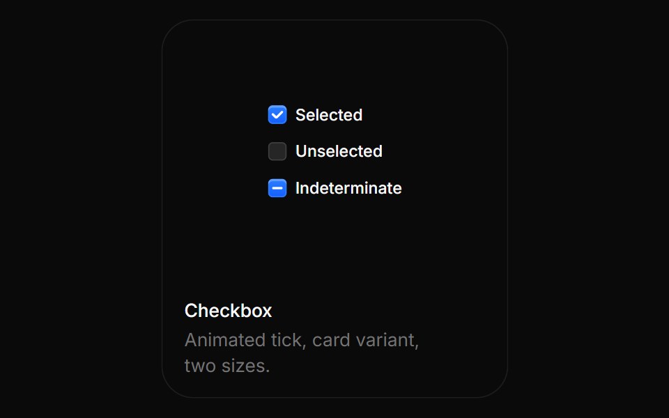 CheckboxBoardUI · ReactAnimated tick, card variant, two sizes.
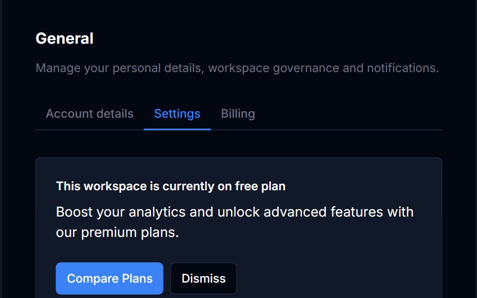 CheckboxTremor Blocks · React
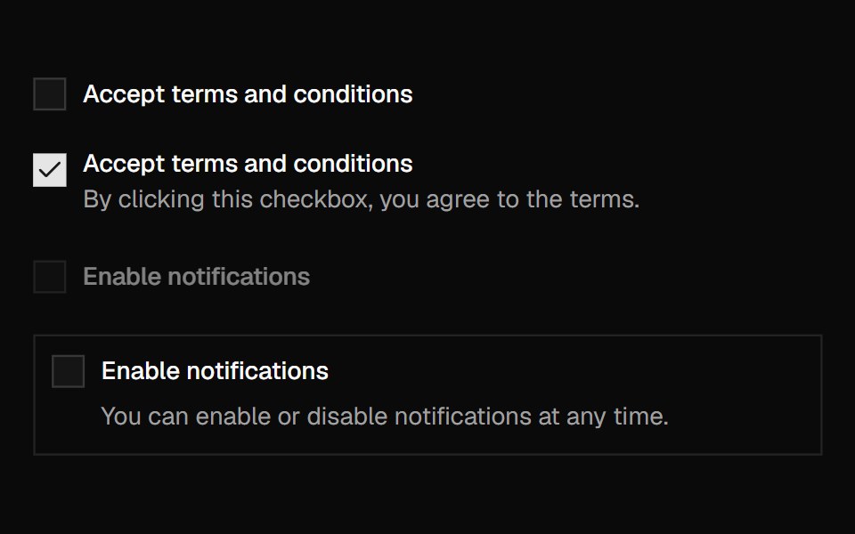 CheckboxShadcn Dashboard · React
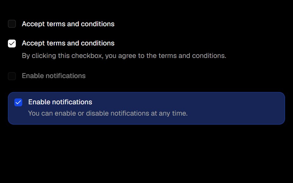 CheckboxObsidianUI · React
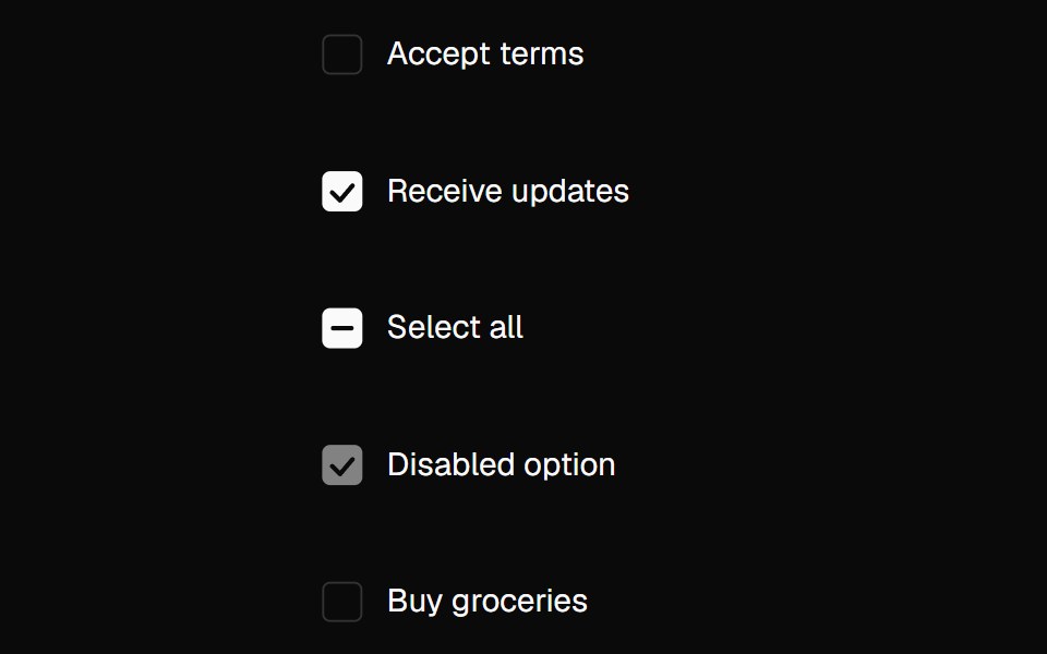 CheckboxNexvyn UI · ReactA checkbox with drawn check animation, indeterminate state, and hidden native input for forms.
 checkboxBaseLayer · ReactA checkbox allows a user to select multiple items from a list of individual items, or to mark one individual item as…
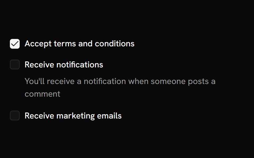 CheckboxShark UI · ReactControl for multiple selections in a set.
 Animated CheckboxSona UI · ReactAn accessible Base UI checkbox with a drawn checkmark and a restrained animated state change.
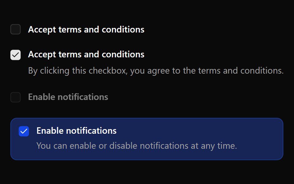 CheckboxWatermelon UI · React
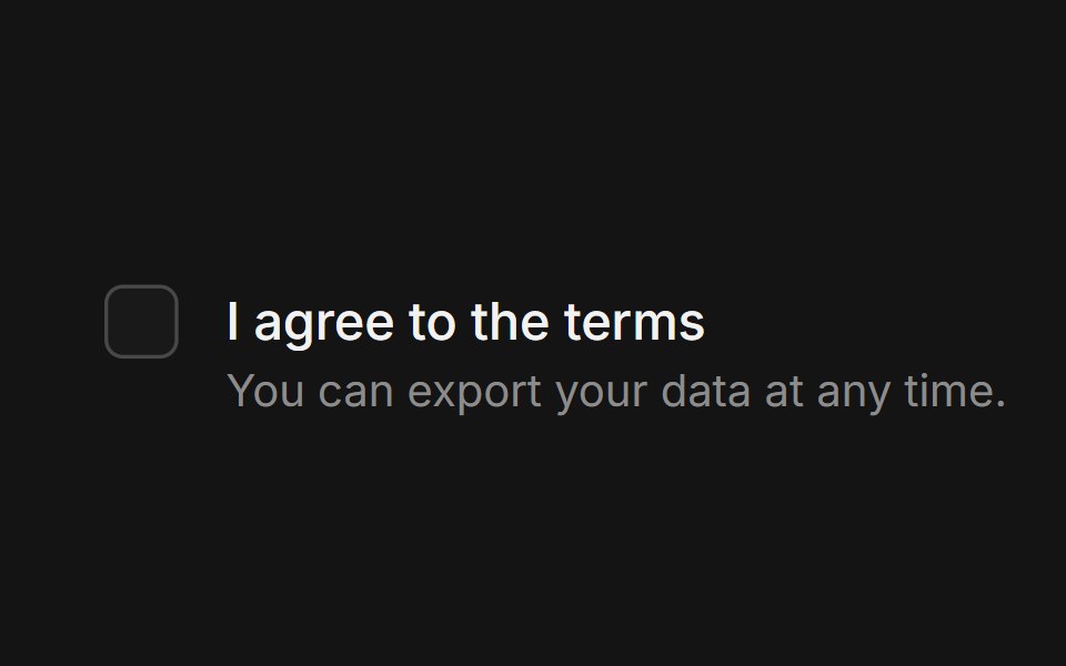 CheckboxArc Library · ReactA binary choice with a precise, legible state.
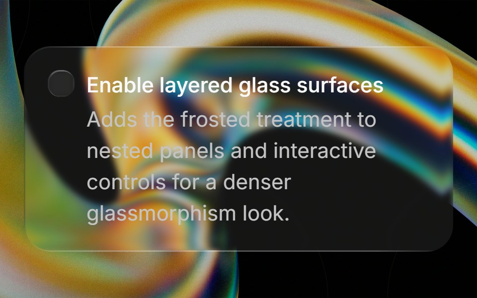 Glass Checkboxglasscn · ReactGlass Checkbox with five variants: clear, frosted, subtle, liquid, and liquid-refract
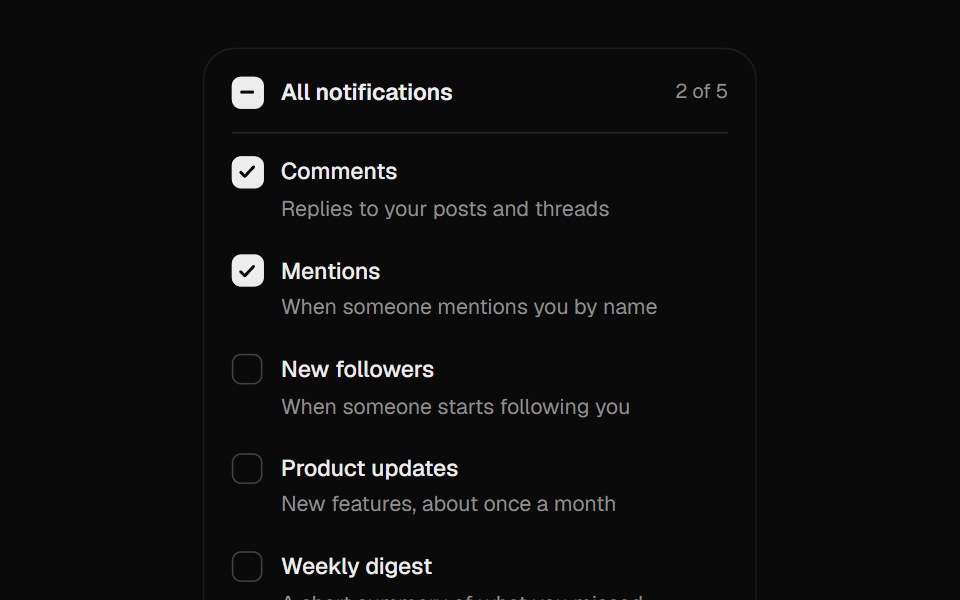 Checkbox GroupUI Lab · ReactCheck marks draw themselves in, and Shift-click fills a range.
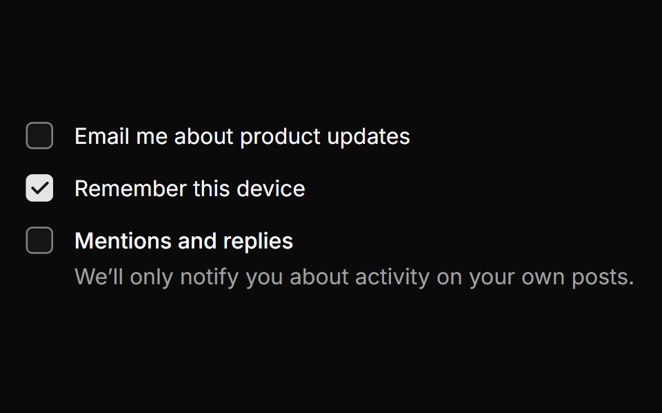 CheckboxHextaUI · ReactA checkbox whose check draws in, with indeterminate parents, groups and labels that share its hover.
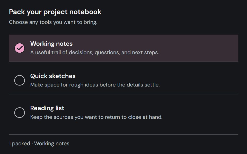 CheckboxCojeev UI · ReactCaptures an independent checked, unchecked, or indeterminate choice.
 Bounce CheckboxMicroKit · ReactA checkbox whose fill springs out past the box with a little swell, draws its tick, then strikes the label through and…
 CheckboxROI UI · ReactA control that allows users to select one or more options from a set.
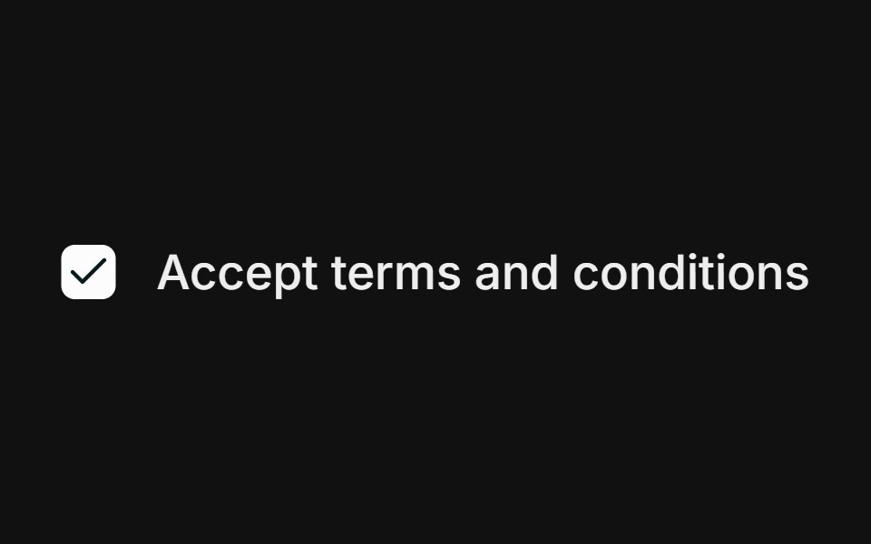 BasicFLX UI · ReactSingle checkbox with a label.
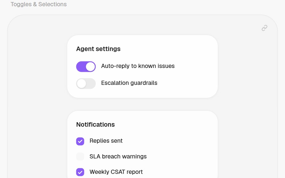 CheckboxHalaska UI · React
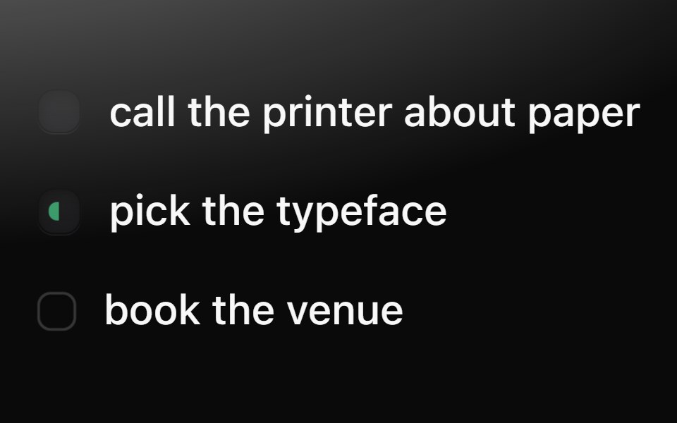 CheckboxMetal UI · React + SwiftUIThe dimple checkbox: a recessed well that turns into a dark pressed key with a drawn tick; doing (half green) and…
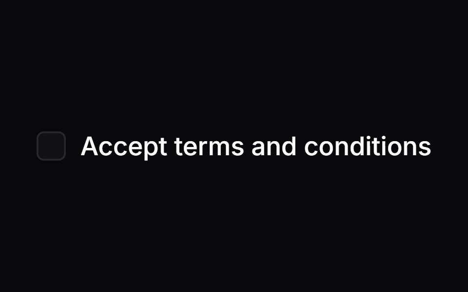 CheckboxSpaceUI · ReactAllows users to turn a single option on or off, or select multiple items from a list with clear checkmarks and partial…
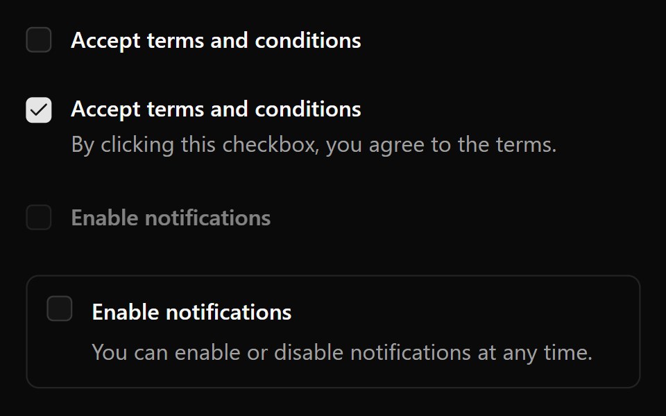 Aria CheckboxReScript shadcn · ReScript
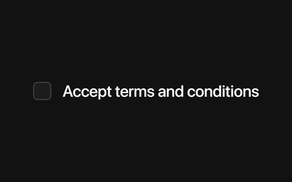 Base CheckboxSora UI · ReactAn accessible, stylable checkbox built on Base UI with a Motion-friendly animated indicator.
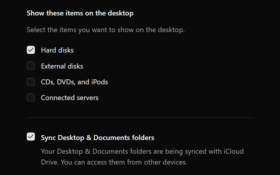 CheckboxOUI · ReactReact aria components Checkbox with shadcn characteristics.
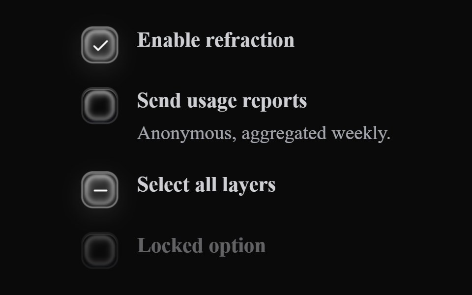 Liquid CheckboxLiquefy UI · ReactCheckbox in liquid glass style.
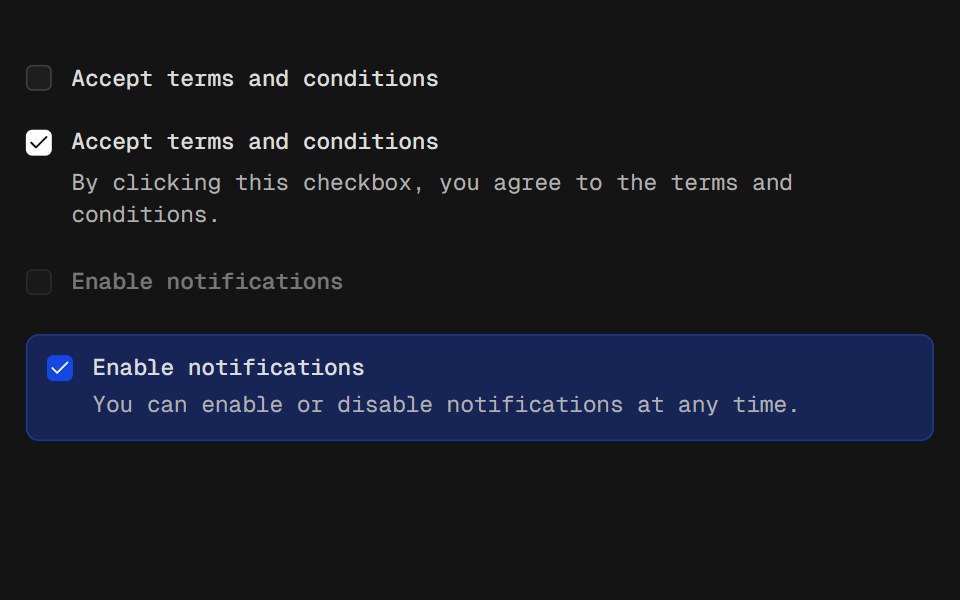 CheckboxD2Studio UI · ReactA control that allows the user to toggle between checked and not checked.
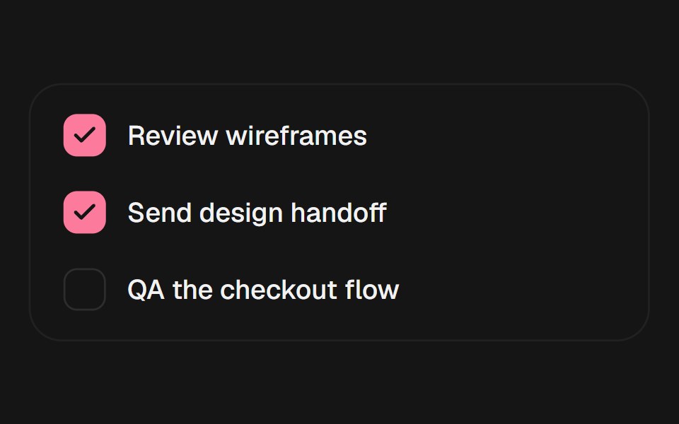 CheckboxEaseUI · ReactCheckbox on a real checkbox input, with a check mark that pops in rather than just appearing.
 CheckboxFibo · ReactTurns a single option on or off, or picks many from a list.
 Animated CheckboxReactFrame · ReactAn accessible checkbox with an animated draw-in checkmark, focus ring, and optional label, helper text, required…
 Checkboxark-cn · ReactA shadcn-style checkbox component built with Ark UI primitives.
 Checkbox CardChakra UI · ReactUsed to select or deselect options displayed within cards.
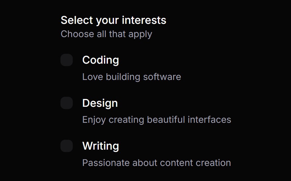 Checkbox GroupHeroUI · ReactA checkbox group component for managing multiple checkbox selections
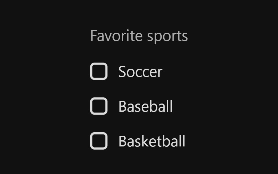 Checkbox GroupReact Spectrum · ReactA CheckboxGroup allows users to select one or more items from a list of choices.
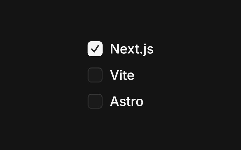 Checkbox Groupcoss ui · ReactProvides shared state to a series of checkboxes.
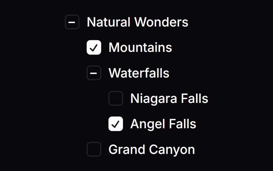 Checkbox TreeOrigin UI · React
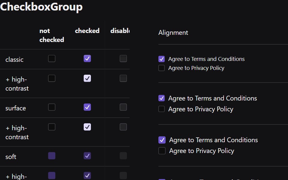 Checkbox GroupRadix Themes · React
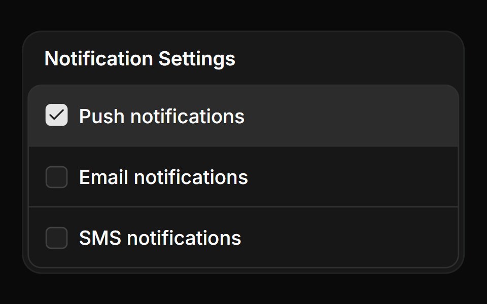 Checkbox group in a frameReUI · ReactCheckbox group in a frame
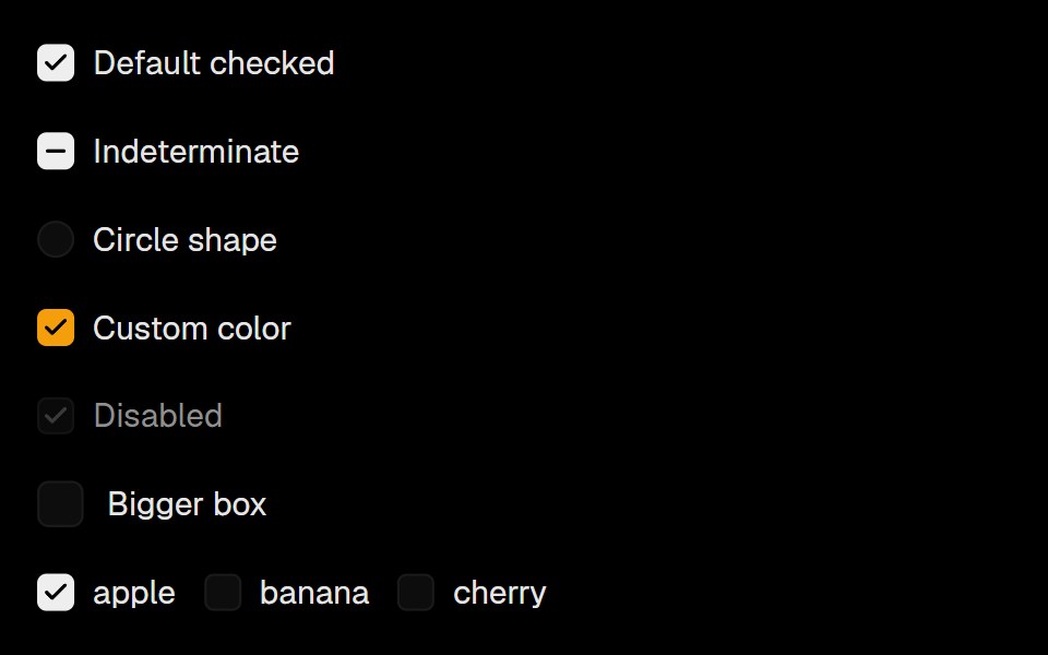 Base Ui CheckboxLobe UI · React
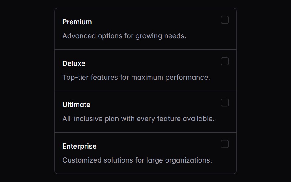 choice-boxIntent UI · Reactchoice-box
 Checkbox (Base UI)Fluid Functionalism · ReactA single checkbox: a hairline square that darkens on hover and a check that draws itself. Pairs with Field. Base UI…
 Checkbox ControlToolcraft · React
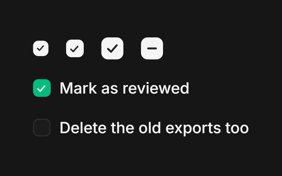 Web CheckboxPanel UI · React NativeCheckboxes with labels and helper text for forms and settings.
 Checkbox-02 - Checkbox with vertical groupShadcn Space · ReactCheckbox component
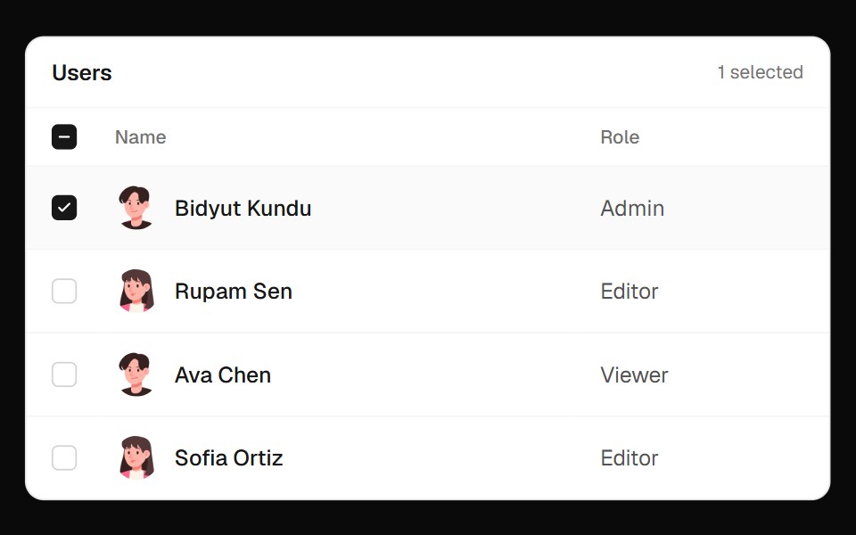 Users Select TableOpenSourceUI · React
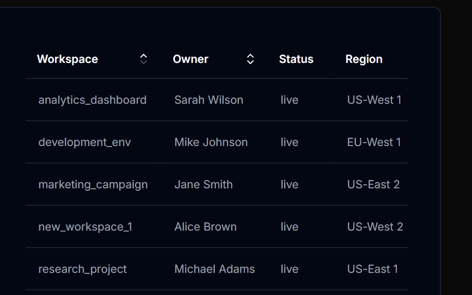 Table Action 01Tremor Blocks · React
 Checkbox 1Watermelon UI · React
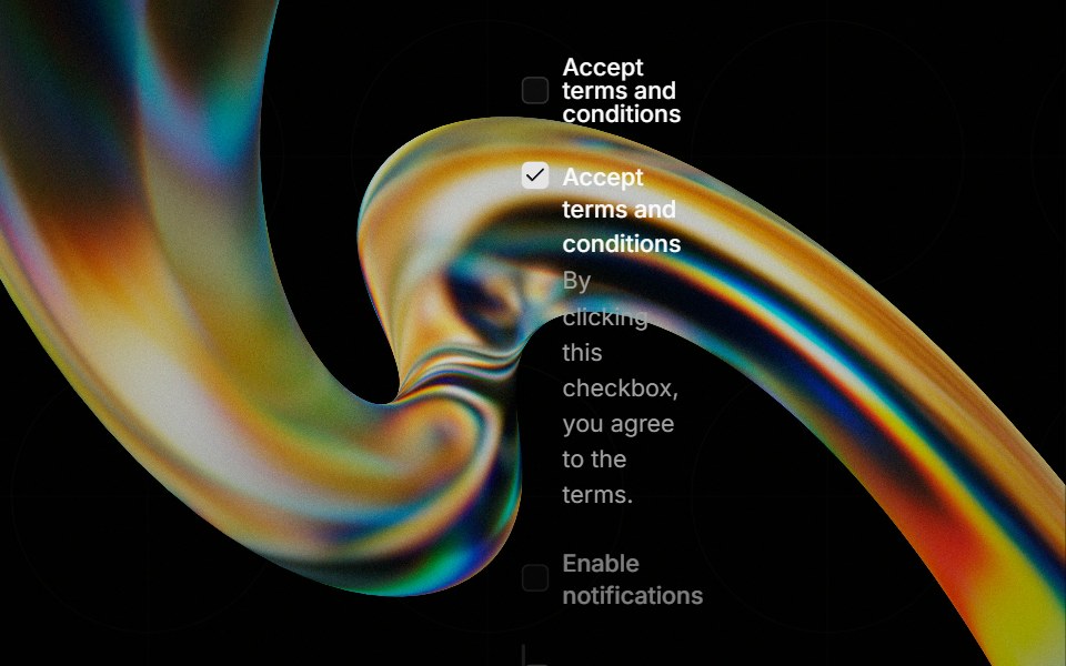 Checkboxglasscn · React
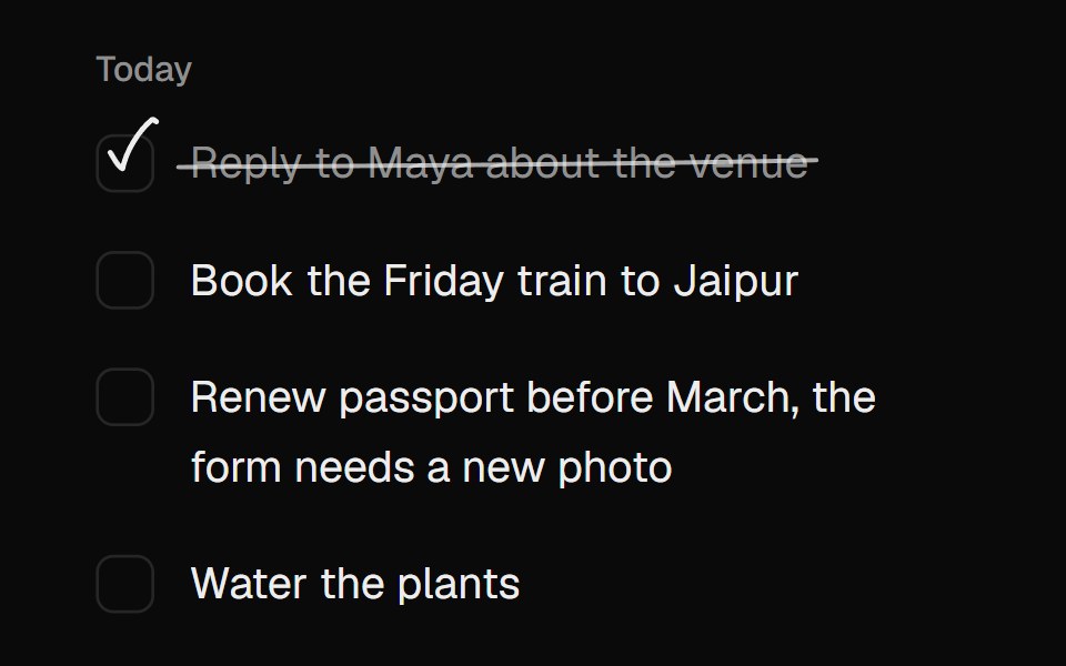 Scribble CheckboxUI Lab · ReactChecks itself off with a quick pen stroke and strikes the words through.
 Progress Ring CheckMicroKit · ReactA task status icon whose dashed ring closes into a spinning arc, fills to its progress, then draws a check or a cross…
 Checkbox GroupROI UI · ReactA set of checkboxes with shared state management for selecting multiple options.
 With descriptionFLX UI · ReactCheckbox with a label and helper description.
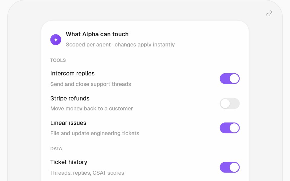 Permission Scope PatternHalaska UI · React
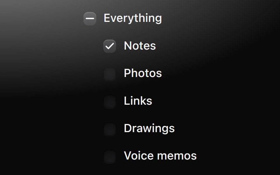 Checkbox groupMetal UI · React + SwiftUISeveral independent choices in a form: row-size checkboxes with labels and an optional parent; ticking the parent…
 Checkbox GroupSpaceUI · ReactGroups multiple related checkboxes together under a single control, making it easy for users to select one or several…
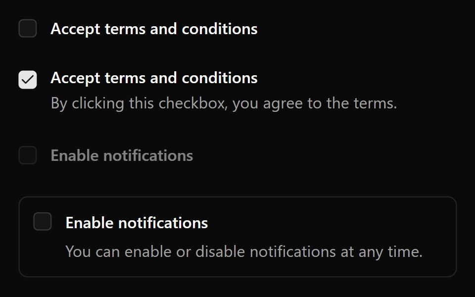 Base CheckboxReScript shadcn · ReScript
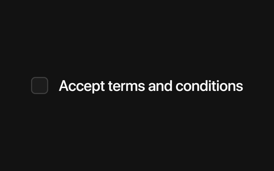 Radix CheckboxSora UI · ReactAn accessible, stylable checkbox built on Radix UI with a Motion-friendly animated indicator.
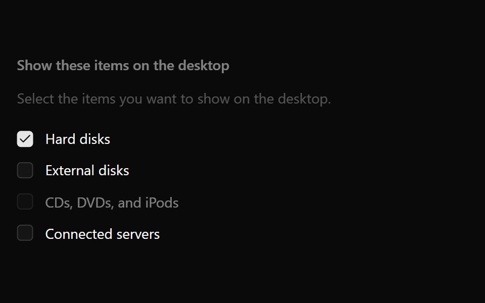 Checkbox GroupOUI · ReactReact aria components Checkbox Group with shadcn characteristics.
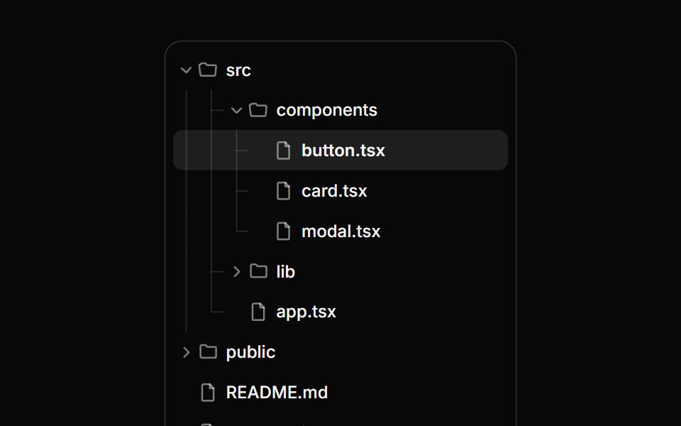 Tree ViewReactFrame · ReactA hierarchical tree with expand/collapse, tri-state checkboxes for multi-select, single-row selection, guide lines and…
 CheckmarkChakra UI · ReactA visual indicator used to show checked, unchecked, or indeterminate states
 Tailwind CheckboxReact Spectrum · React
 Comp 132Origin UI · React
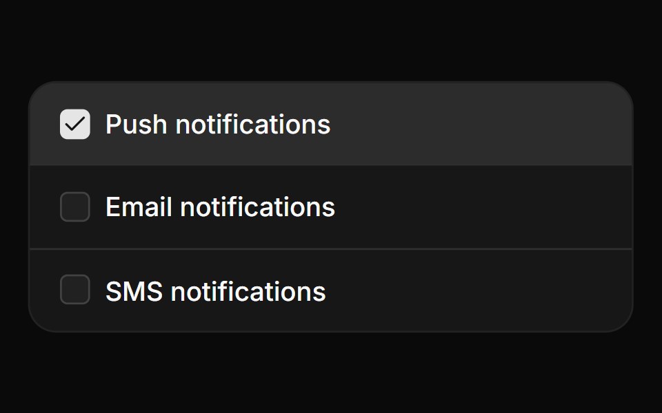 Card checkbox group with iconsReUI · ReactCard checkbox group with icons
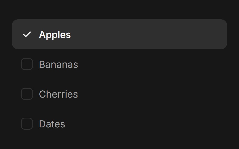 Checkbox GroupFluid Functionalism · ReactAnimated checkbox group with fluid hover, contiguous selection merging, and spring-animated check marks. Built on…
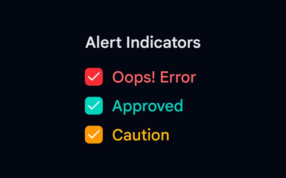 Checkbox-03 - Checkbox with colorsShadcn Space · ReactCheckbox component
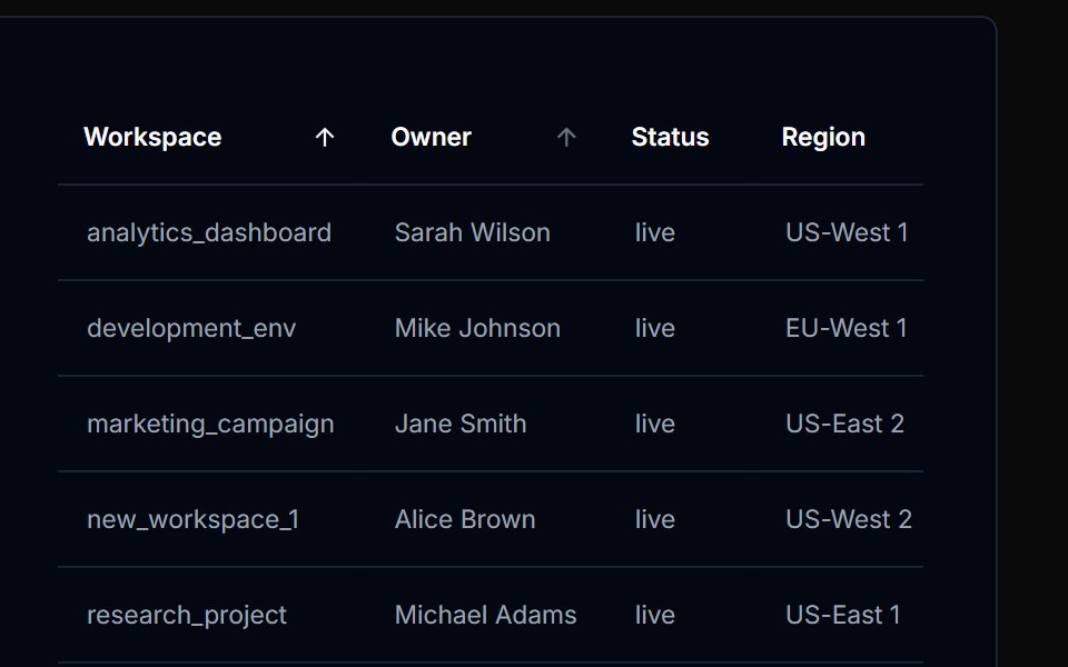 Table Action 02Tremor Blocks · React
 Checkbox 10Watermelon UI · React
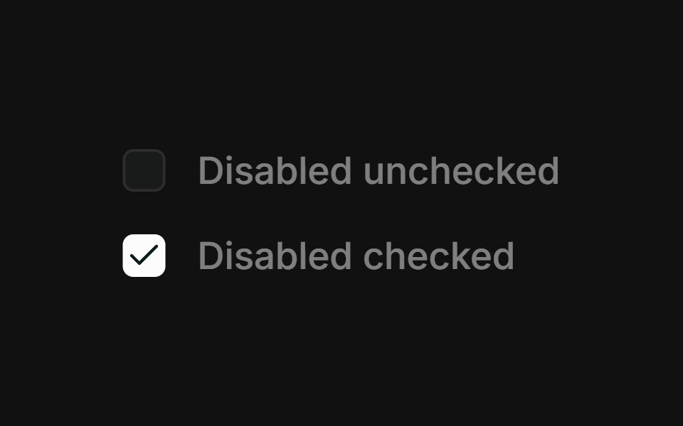 DisabledFLX UI · ReactDisabled unchecked and disabled checked states.
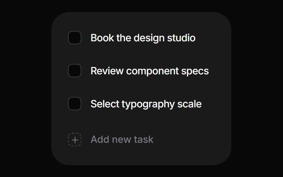 Interactive ChecklistSpaceUI · React
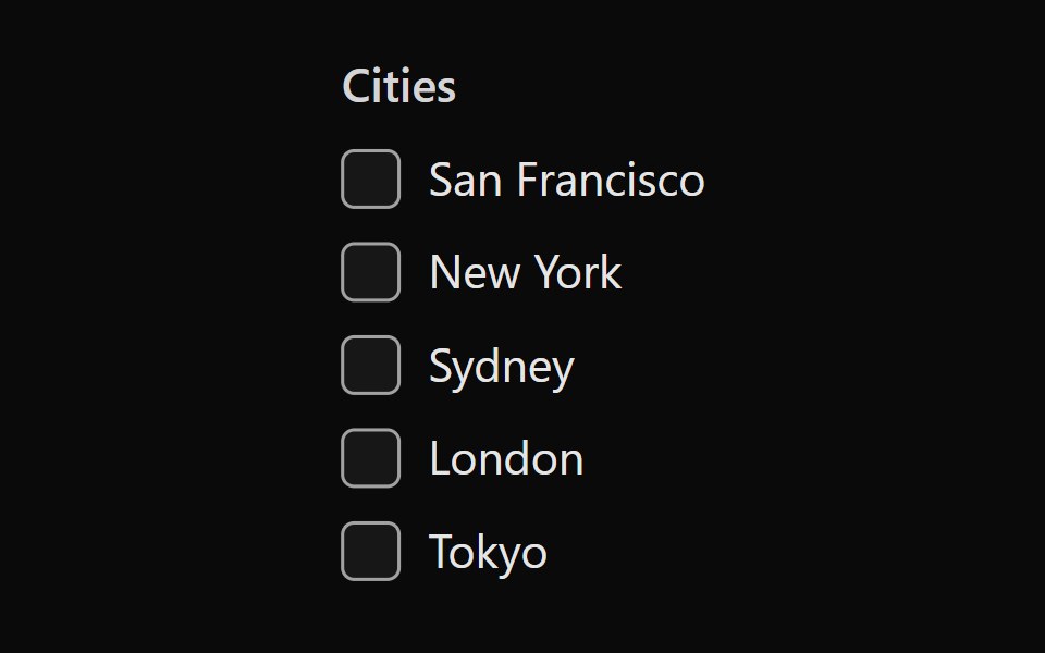 Tailwind Checkbox GroupReact Spectrum · React
 Comp 133Origin UI · React
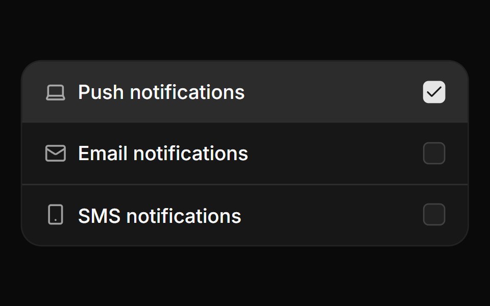 Card checkbox group with iconsReUI · ReactCard checkbox group with icons
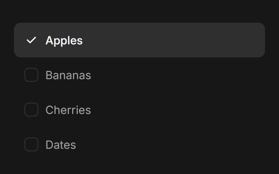 Checkbox Group (Base UI)Fluid Functionalism · ReactAnimated checkbox group with fluid hover, contiguous selection merging, and spring-animated check marks. Base UI flavor.
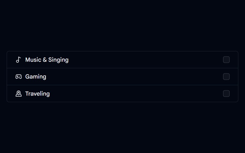 Checkbox-05 - Checkbox with list groupShadcn Space · ReactCheckbox component
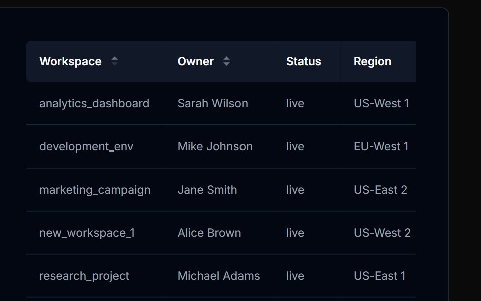 Table Action 03Tremor Blocks · React
 Checkbox 11Watermelon UI · React
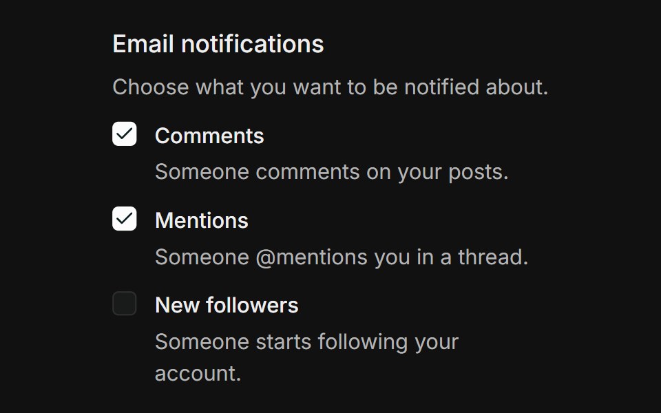 GroupFLX UI · ReactGrouped list of notification checkboxes, each with a label and helper description, inside a labelled fieldset.
 Vanilla CheckboxReact Spectrum · React
 Comp 134Origin UI · React
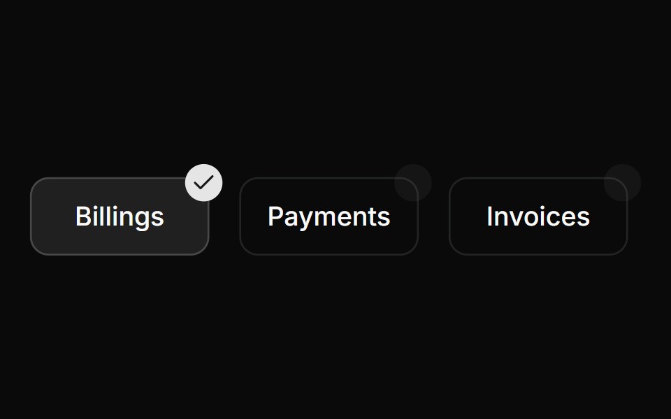 Custom positioned checkboxReUI · ReactCustom positioned checkbox
 Checkbox-08 - Checkbox with dashed borderShadcn Space · ReactCheckbox component
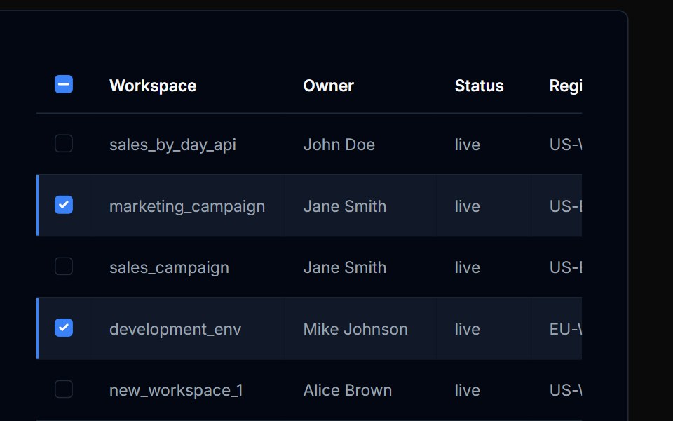 Table Action 04Tremor Blocks · React
 Checkbox 12Watermelon UI · React
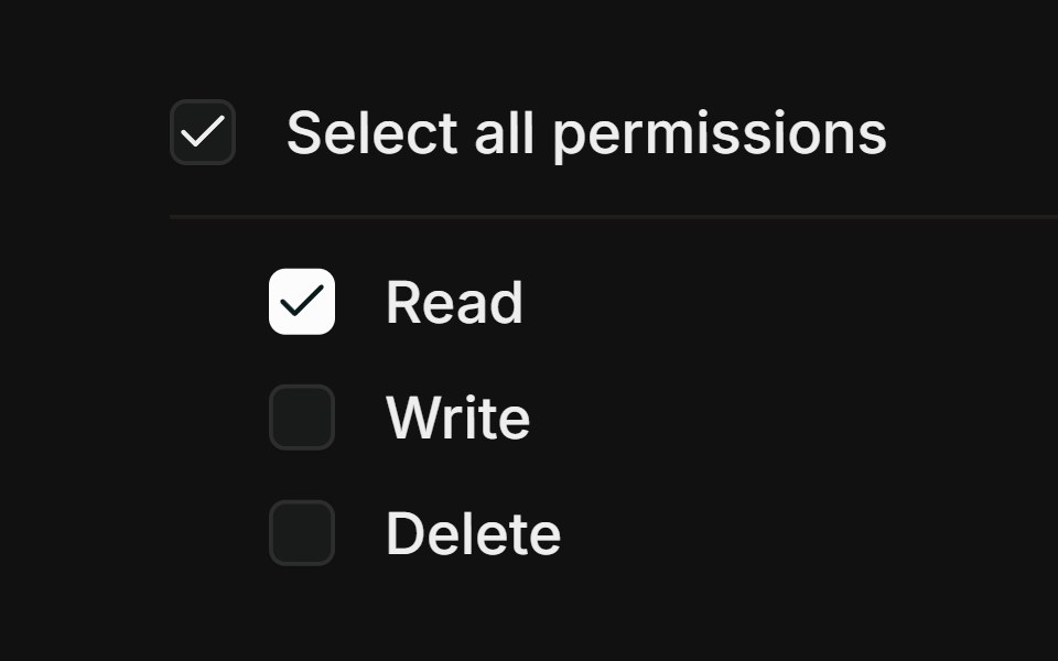 Select allFLX UI · ReactParent checkbox with an indeterminate mixed state.
 Vanilla Checkbox GroupReact Spectrum · React
 Comp 135Origin UI · React
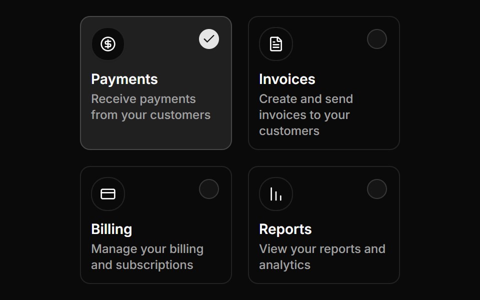 Custom positioned checkboxReUI · ReactCustom positioned checkbox
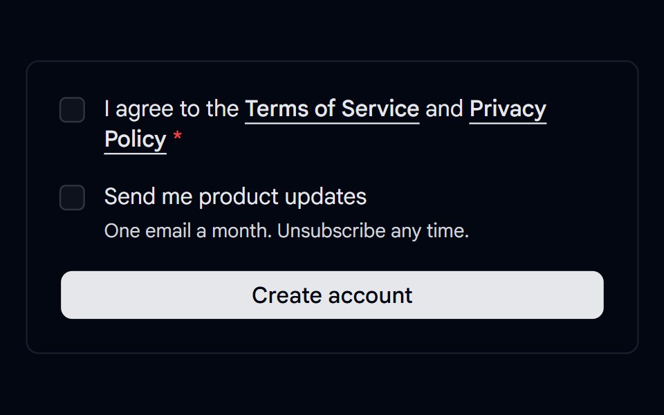 Checkbox 11 - Terms ConsentShadcn Space · ReactSign up consent with a required terms checkbox that shows an error on submit, linked policies, and an optional…
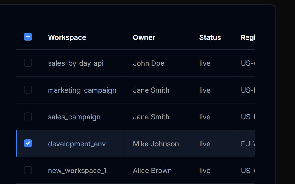 Table Action 05Tremor Blocks · React
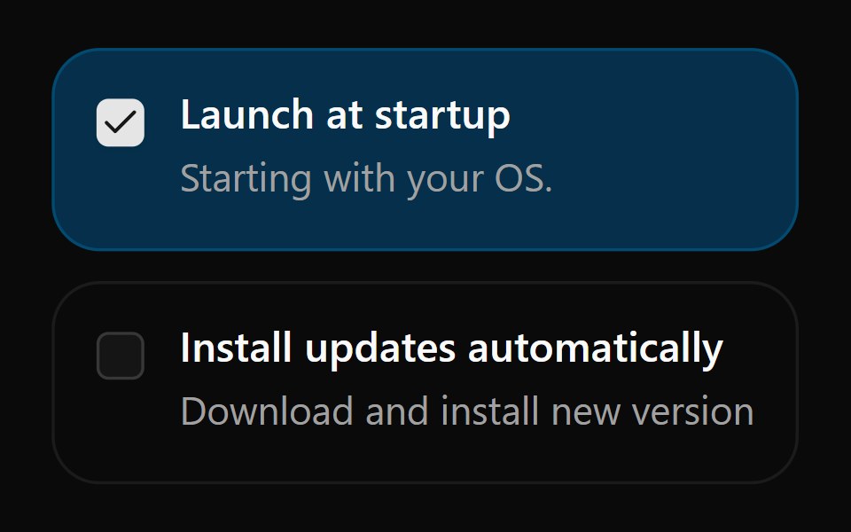 Checkbox 13Watermelon UI · React
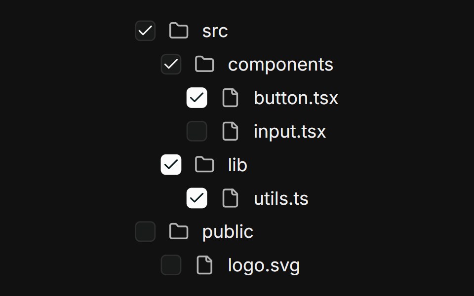 Nested treeFLX UI · ReactMulti-level file tree; parents derive checked / indeterminate from children.
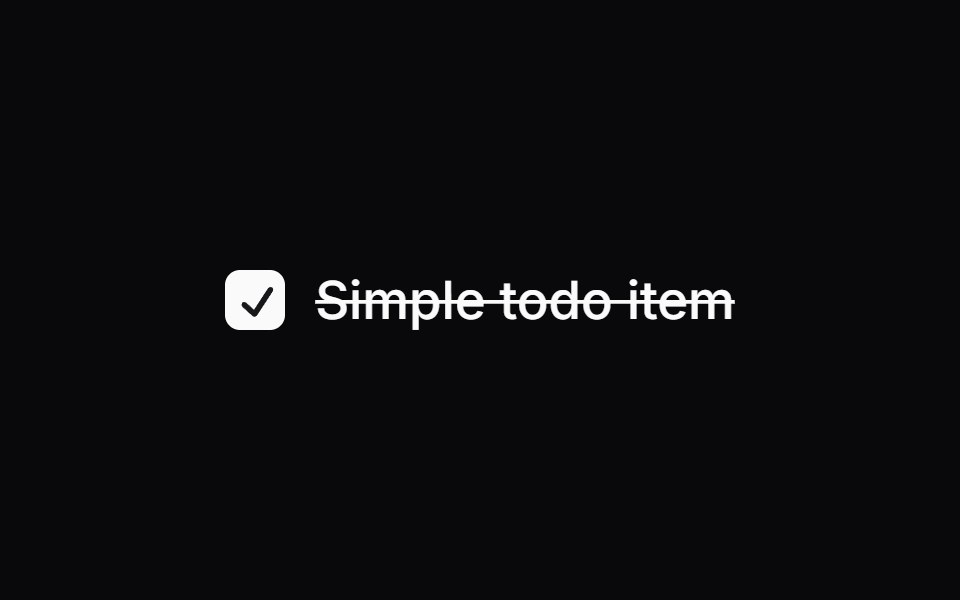 Comp 136Origin UI · React
 Avatar based card checkboxReUI · ReactAvatar based card checkbox
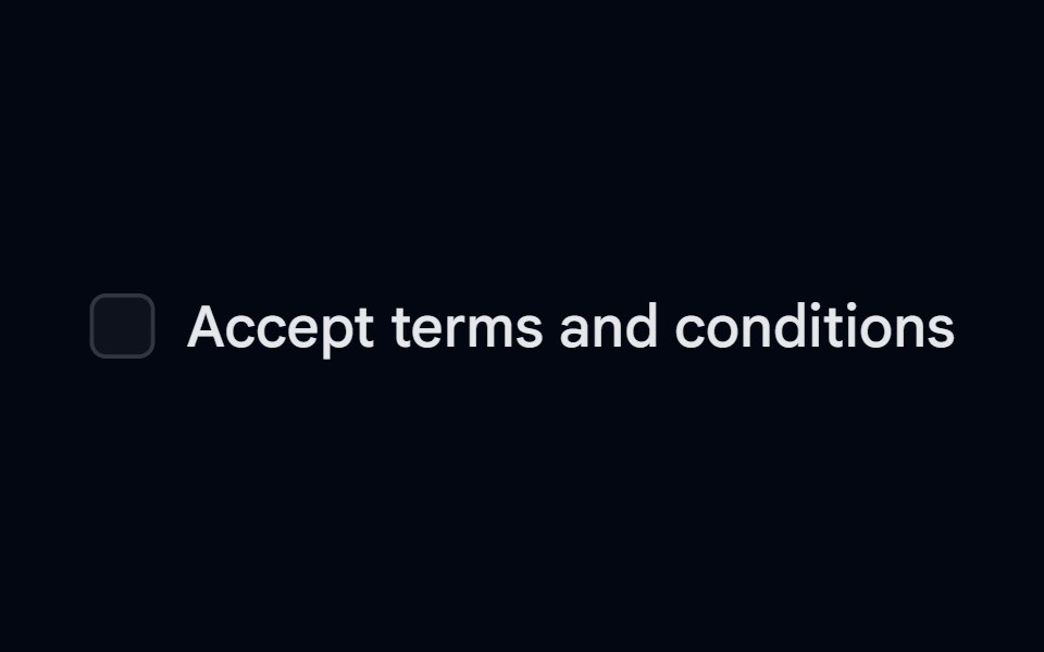 Label 01 - With CheckboxShadcn Space · ReactLabel component with checkbox
Libraries with React checkbox components
Related categories
- Checkbox Components
- Tailwind CSS Checkbox Components
- Svelte Checkbox Components
- Animated Checkbox Components
- shadcn/ui Checkbox Components
- React Input Components
- React Select Components
- React Text Input Components
- React Form Field Components
- React Form Components
- React Switch Components
- React Textarea Components
- React Slider Components
- React Radio Components
- React Combobox Components
- React File Upload Components
- React Date Picker Components
- React Search Input Components
- React Color Picker Components
- React Login Form Components
- React OTP Input Components