 Dev Design Library
shadcn/ui Checkbox Components
Dev Design Library indexes 44 shadcn/ui checkbox components from 9 open-source UI libraries, with the most coming from Watermelon UI, FLX UI, Shadcn Space, sv-table and sv-particles. Each one links to its page with the source code, a live preview where available, the library license and the install command. They follow the shadcn/ui conventions, so most install with the shadcn CLI and drop into a Tailwind project. Checkbox components belong to the Inputs group.
 checkboxIntent UI · Reactcheckbox
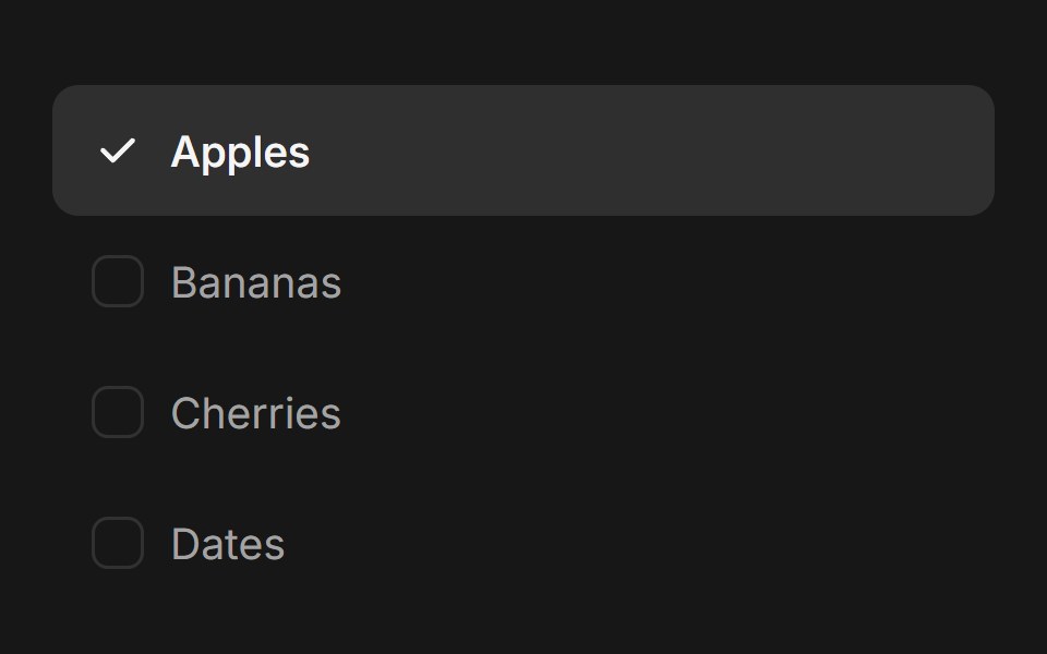 Checkbox GroupFluid Functionalism · ReactAnimated checkbox group with fluid hover, contiguous selection merging, and spring-animated check marks. Built on…
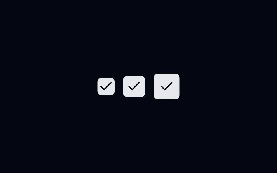 Checkbox-01 - Checkbox with sizesShadcn Space · ReactCheckbox component
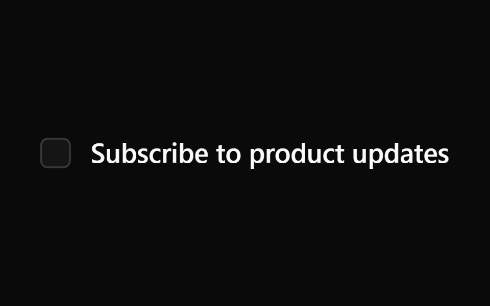 Checkbox 1Watermelon UI · React
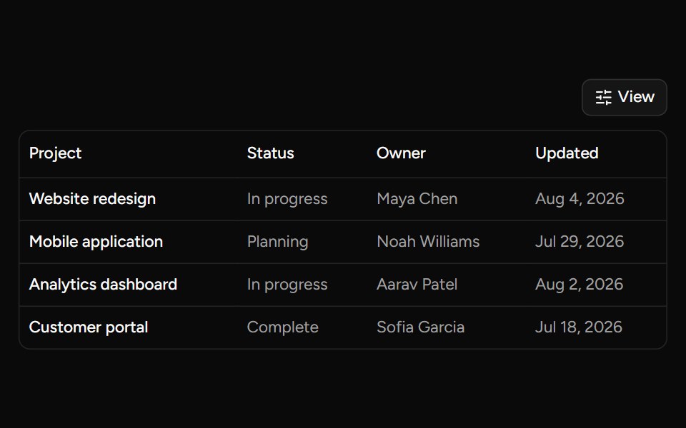 Data Table Viewsv-table · SvelteA checkbox dropdown for toggling table column visibility.
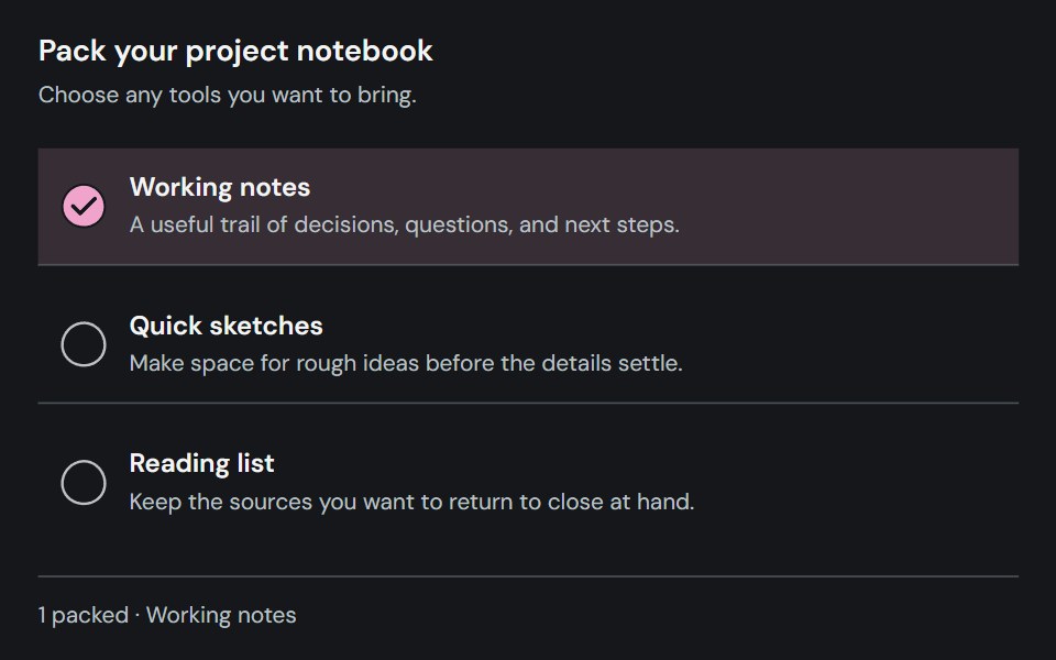 CheckboxCojeev UI · ReactCaptures an independent checked, unchecked, or indeterminate choice.
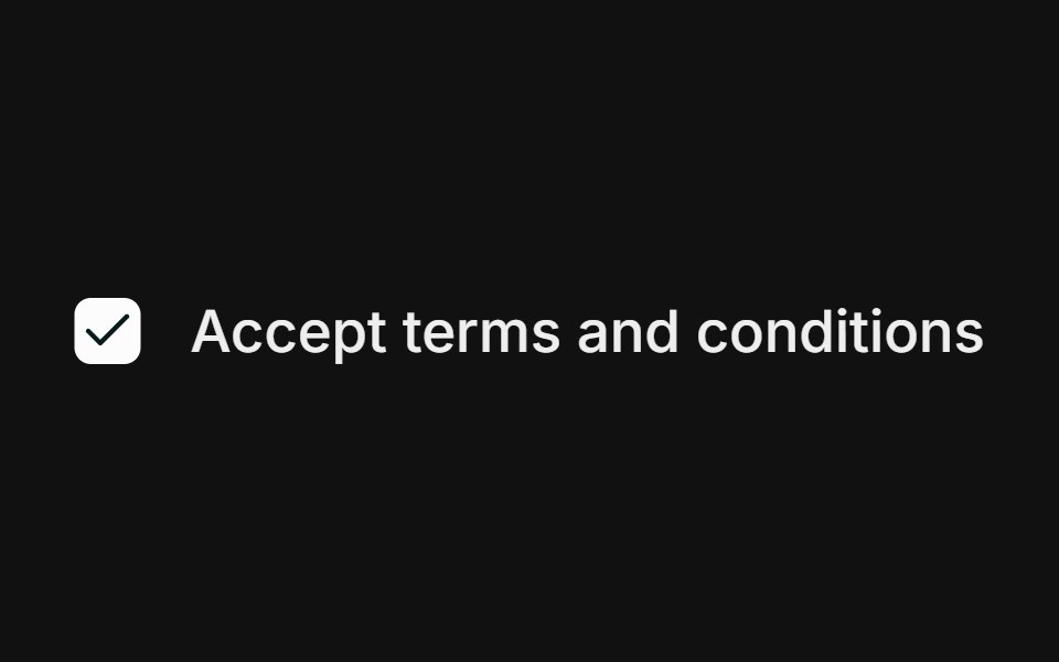 BasicFLX UI · ReactSingle checkbox with a label.
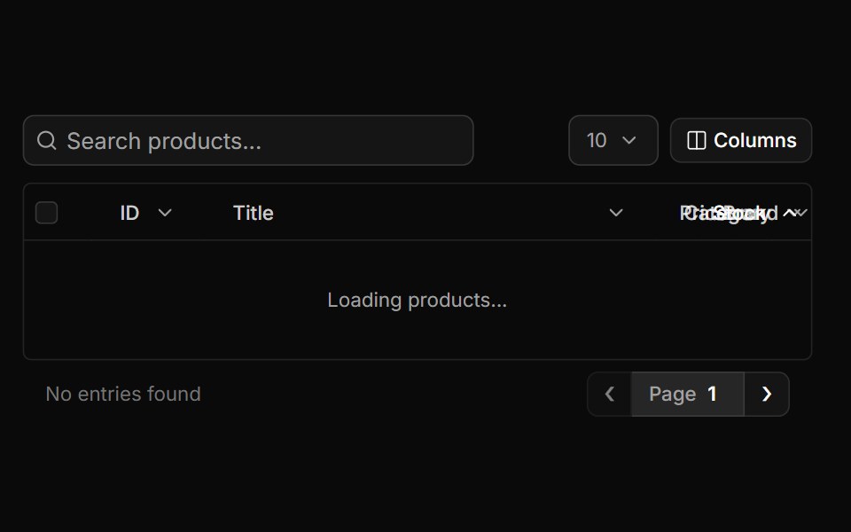 Full Tablesv-particles · Svelte
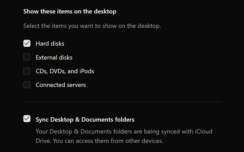 CheckboxOUI · ReactReact aria components Checkbox with shadcn characteristics.
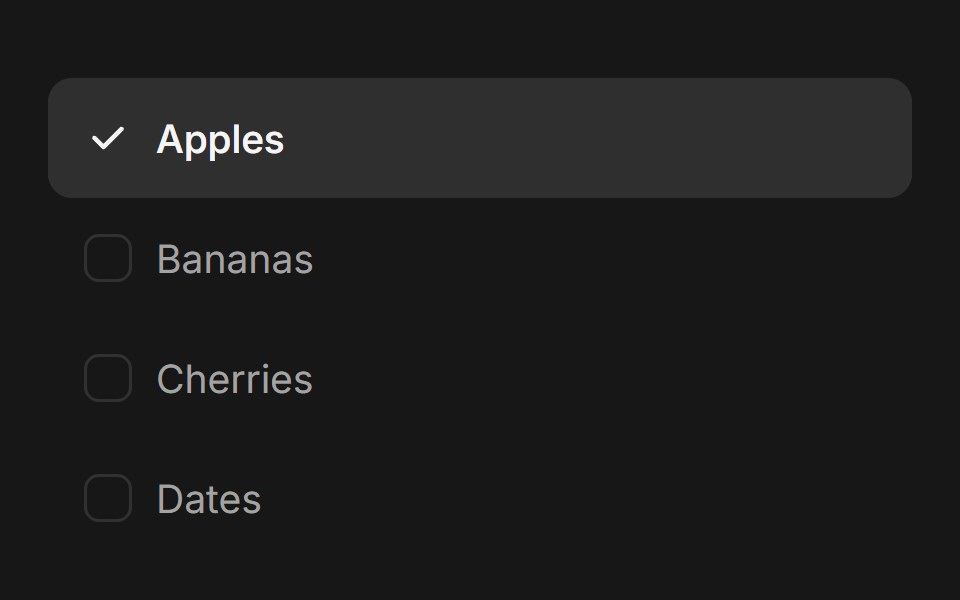 Checkbox Group (Base UI)Fluid Functionalism · ReactAnimated checkbox group with fluid hover, contiguous selection merging, and spring-animated check marks. Base UI flavor.
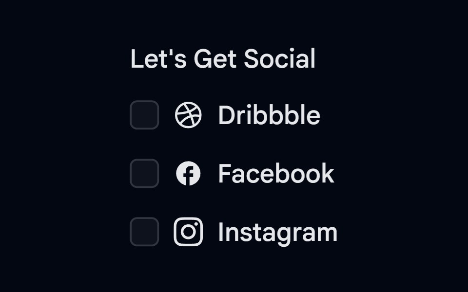 Checkbox-02 - Checkbox with vertical groupShadcn Space · ReactCheckbox component
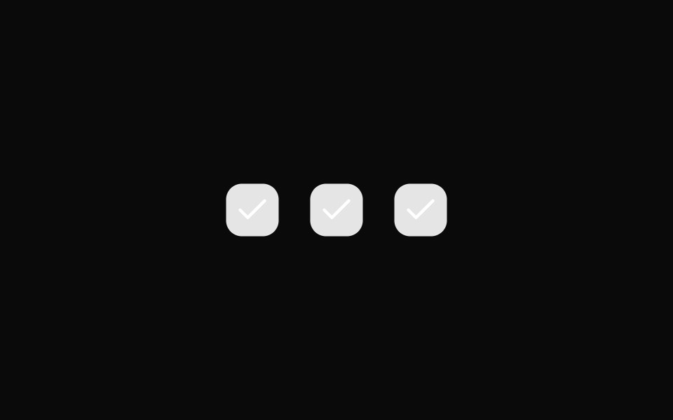 Checkbox 10Watermelon UI · React
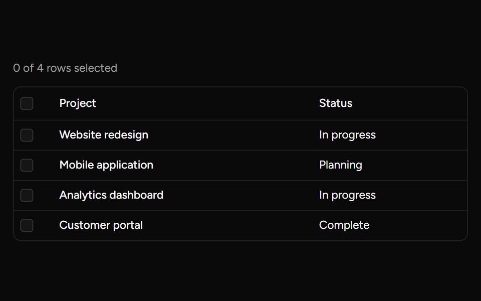 Header Checkboxsv-table · SvelteA select-all checkbox with support for an indeterminate state.
 With descriptionFLX UI · ReactCheckbox with a label and helper description.
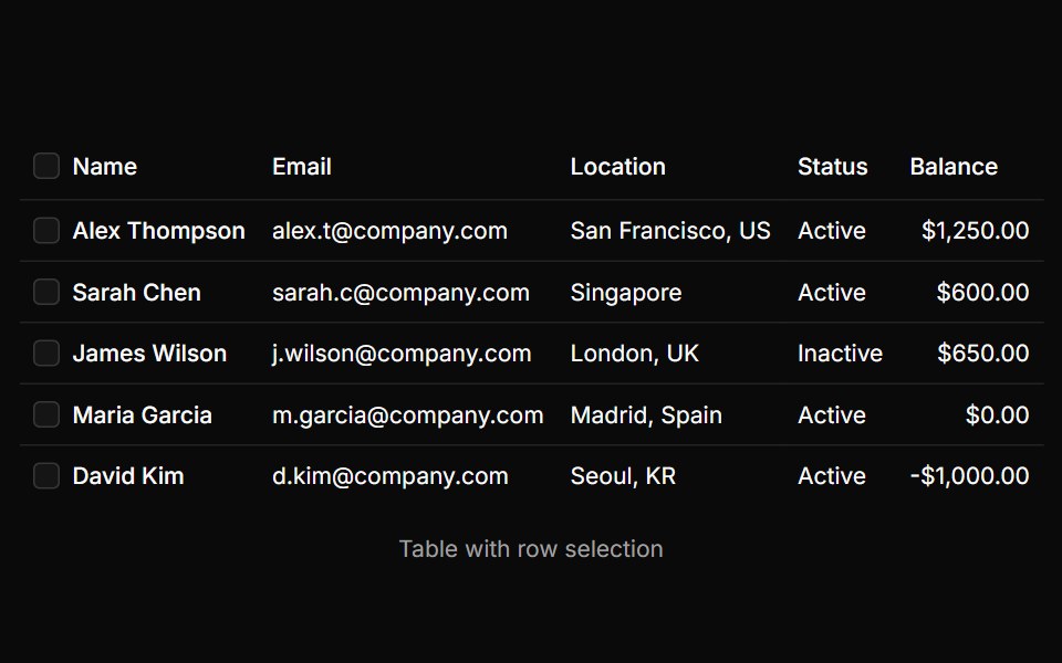 Table With Row Selectionsv-particles · Svelte
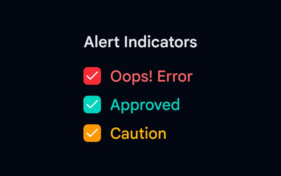 Checkbox-03 - Checkbox with colorsShadcn Space · ReactCheckbox component
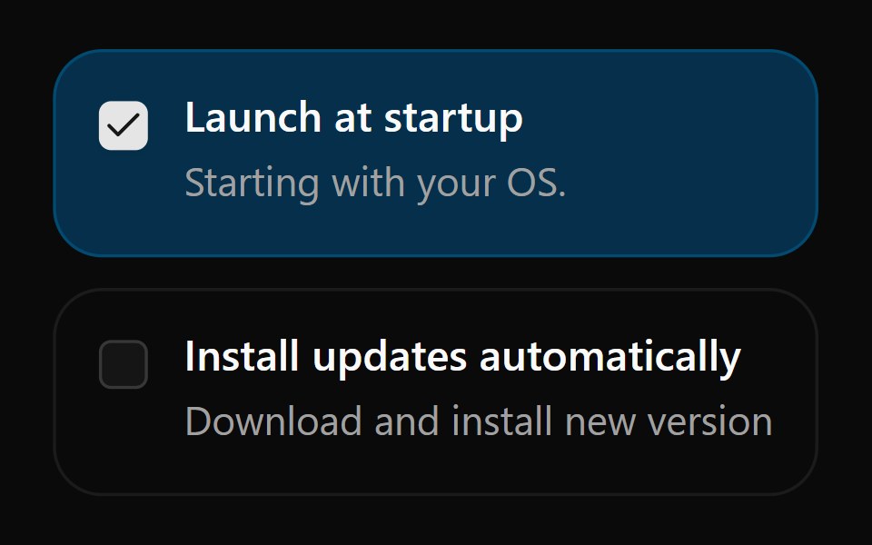 Checkbox 13Watermelon UI · React
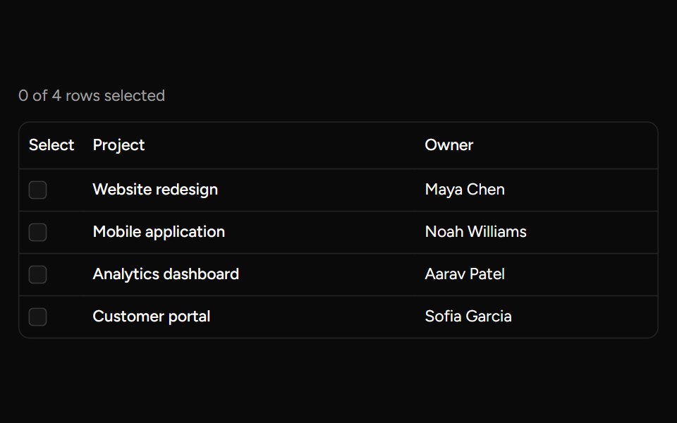 Row Checkboxsv-table · SvelteA controlled checkbox for selecting an individual table row.
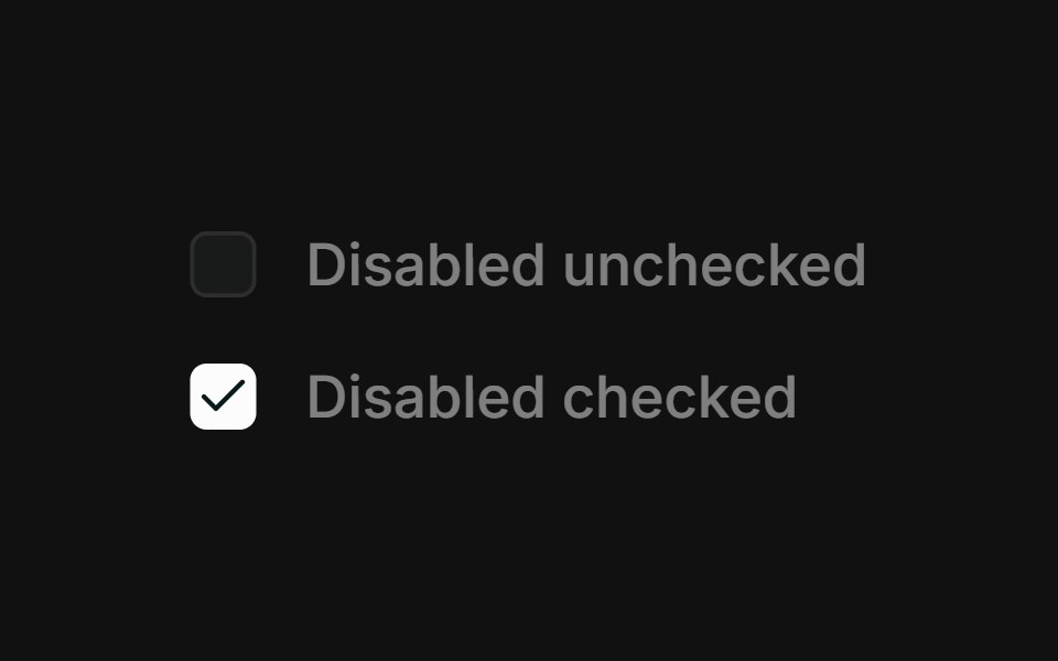 DisabledFLX UI · ReactDisabled unchecked and disabled checked states.
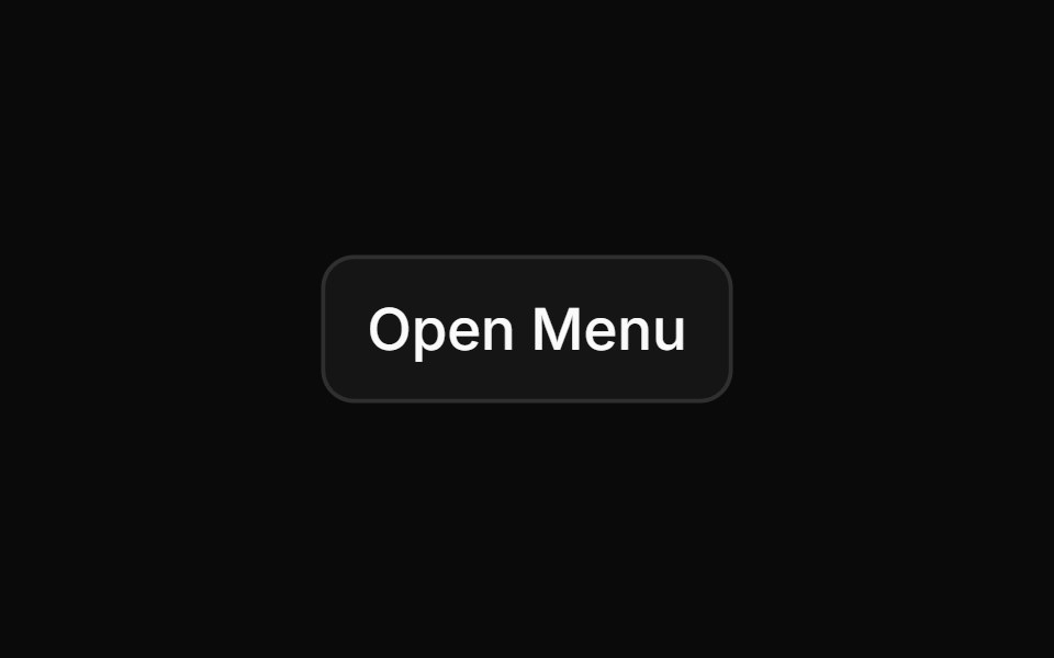 With Checkboxsv-particles · Svelte
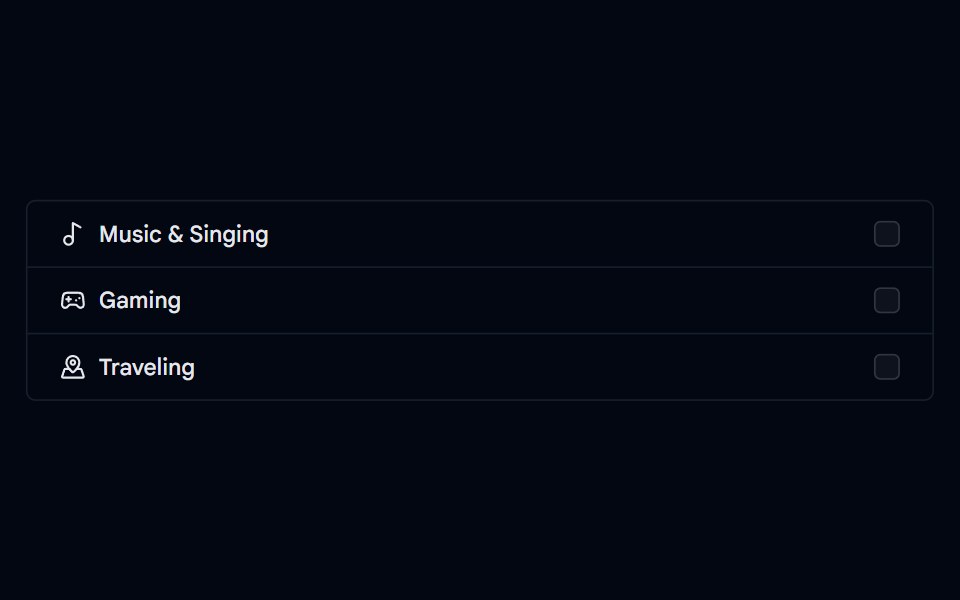 Checkbox-05 - Checkbox with list groupShadcn Space · ReactCheckbox component
 Checkbox 14Watermelon UI · React
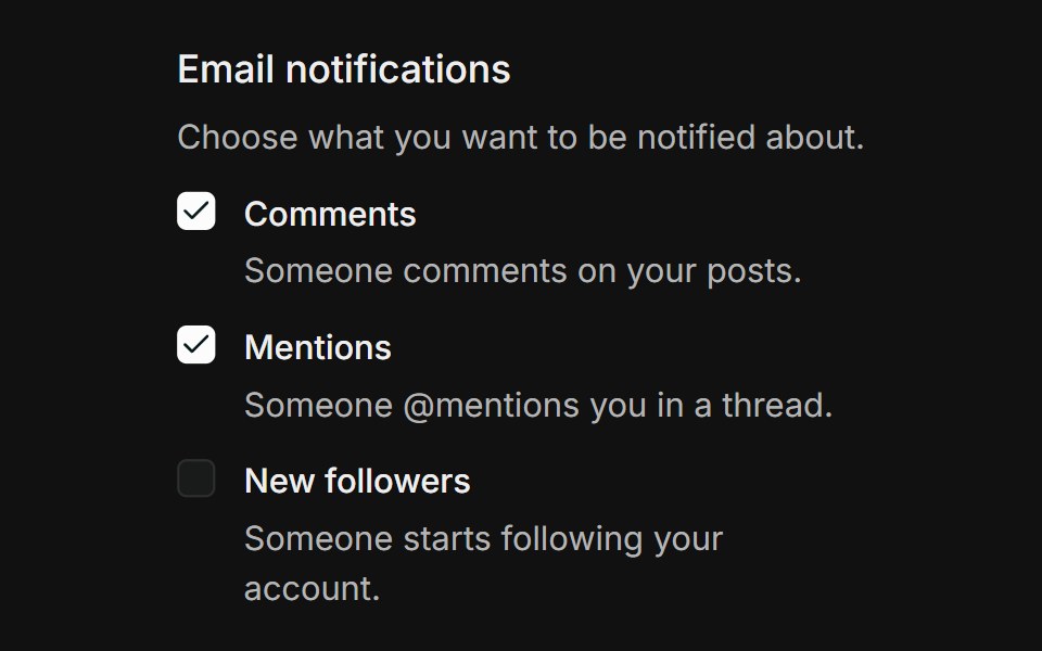 GroupFLX UI · ReactGrouped list of notification checkboxes, each with a label and helper description, inside a labelled fieldset.
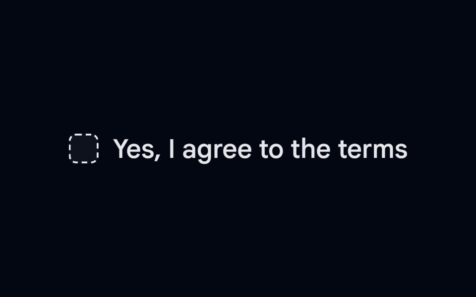 Checkbox-08 - Checkbox with dashed borderShadcn Space · ReactCheckbox component
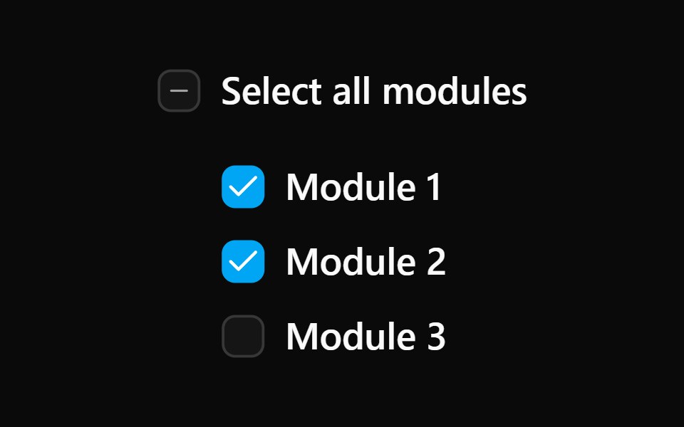 Checkbox 15Watermelon UI · React
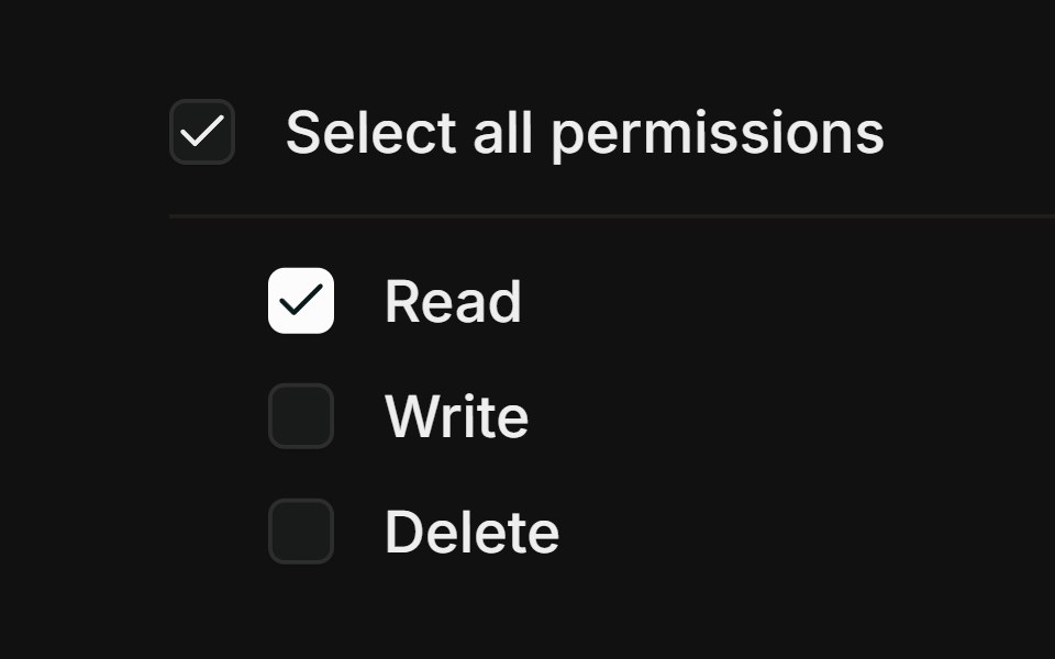 Select allFLX UI · ReactParent checkbox with an indeterminate mixed state.
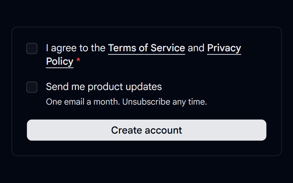 Checkbox 11 - Terms ConsentShadcn Space · ReactSign up consent with a required terms checkbox that shows an error on submit, linked policies, and an optional…
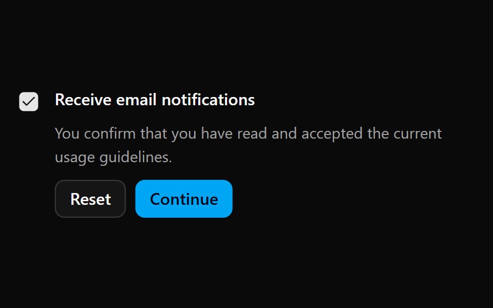 Checkbox 16Watermelon UI · React
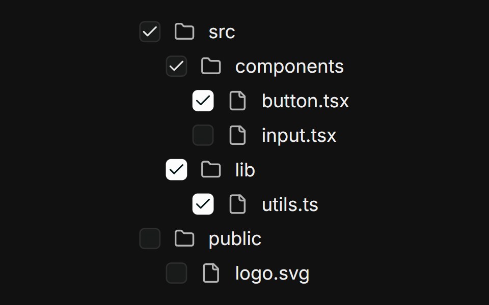 Nested treeFLX UI · ReactMulti-level file tree; parents derive checked / indeterminate from children.
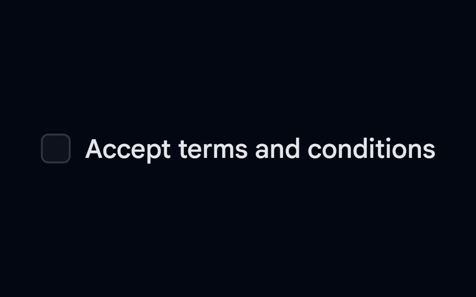 Label 01 - With CheckboxShadcn Space · ReactLabel component with checkbox
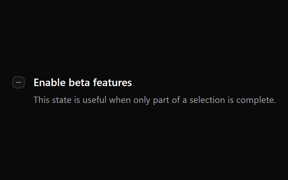 Checkbox 2Watermelon UI · React
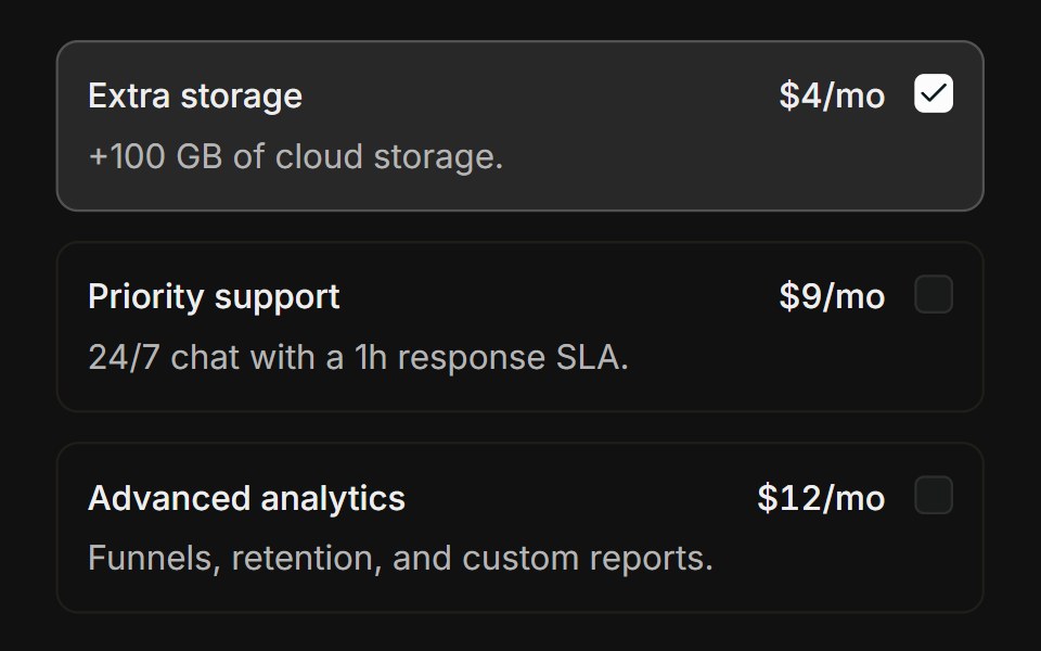 Choice cardsFLX UI · ReactBordered add-on cards that highlight when checked.
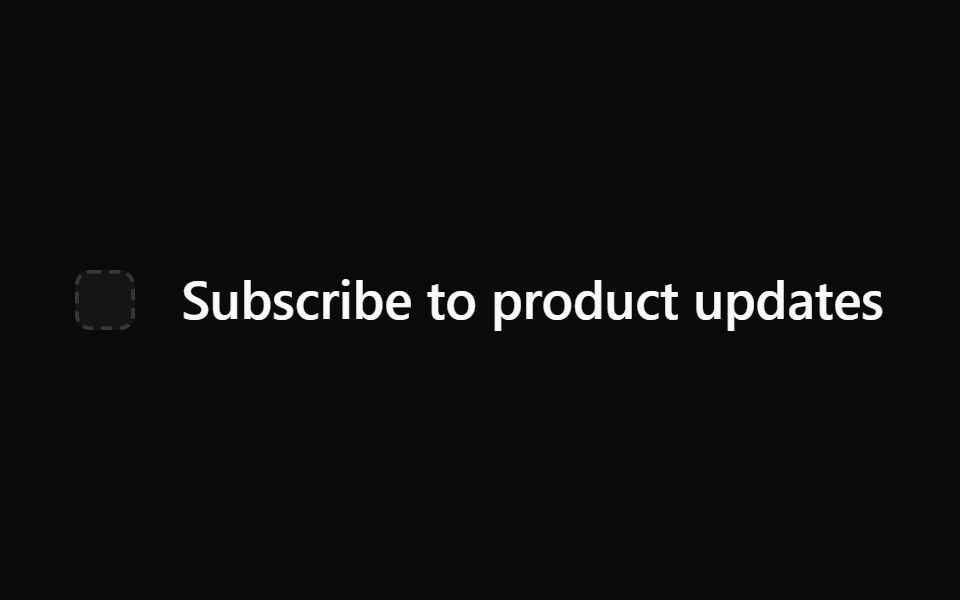 Checkbox 3Watermelon UI · React
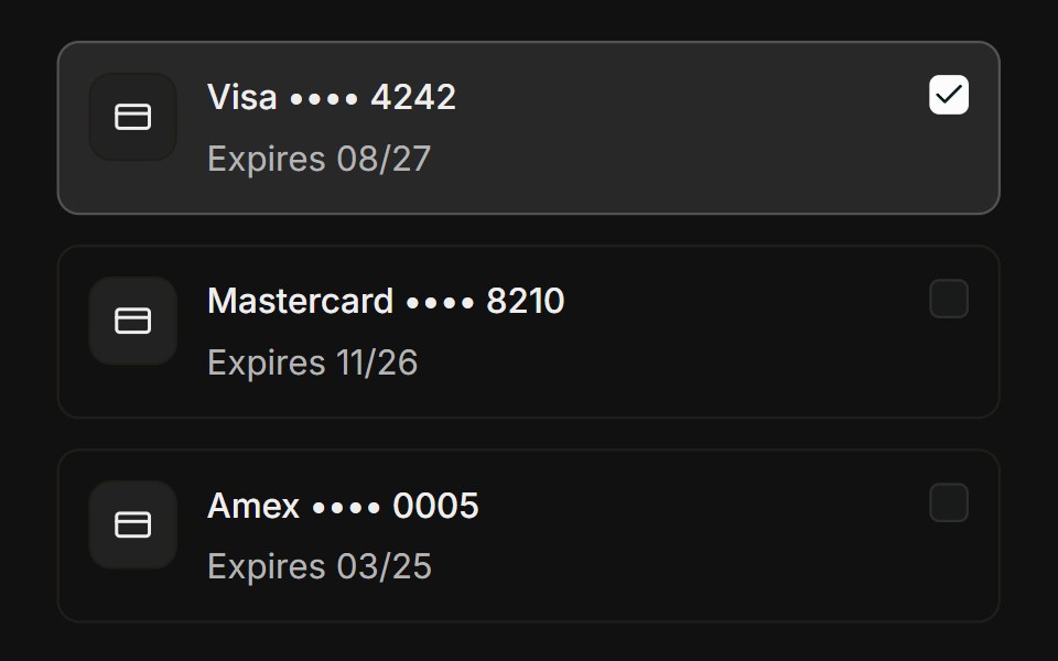 Payment methodsFLX UI · ReactSelectable saved credit cards with brand and last four.
 Checkbox 4Watermelon UI · React
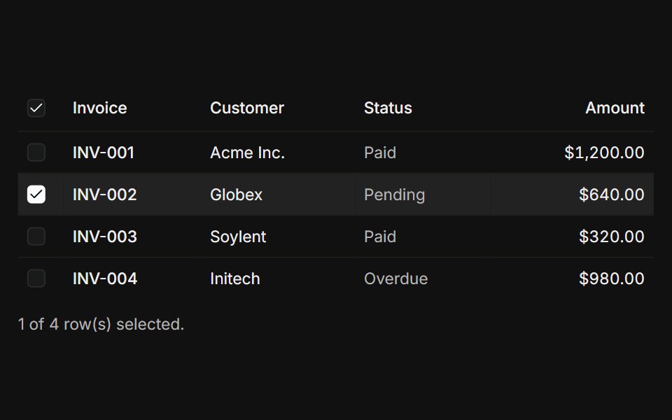 Table row selectionFLX UI · ReactData table with a select-all header, per-row checkboxes, and a count.
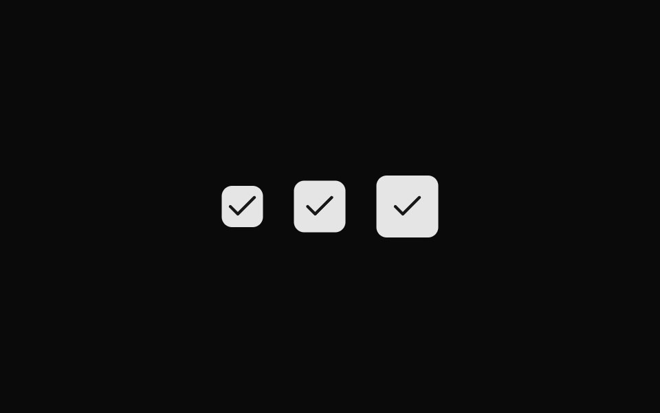 Checkbox 5Watermelon UI · React
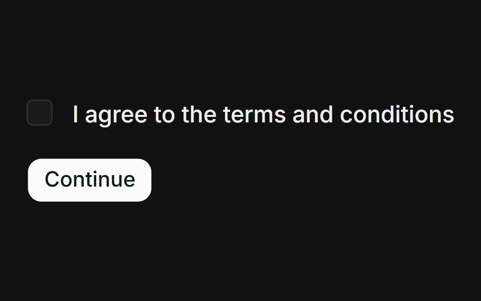 Invalid / requiredFLX UI · ReactCheckbox with an inline error message that appears when the form is submitted without checking it.
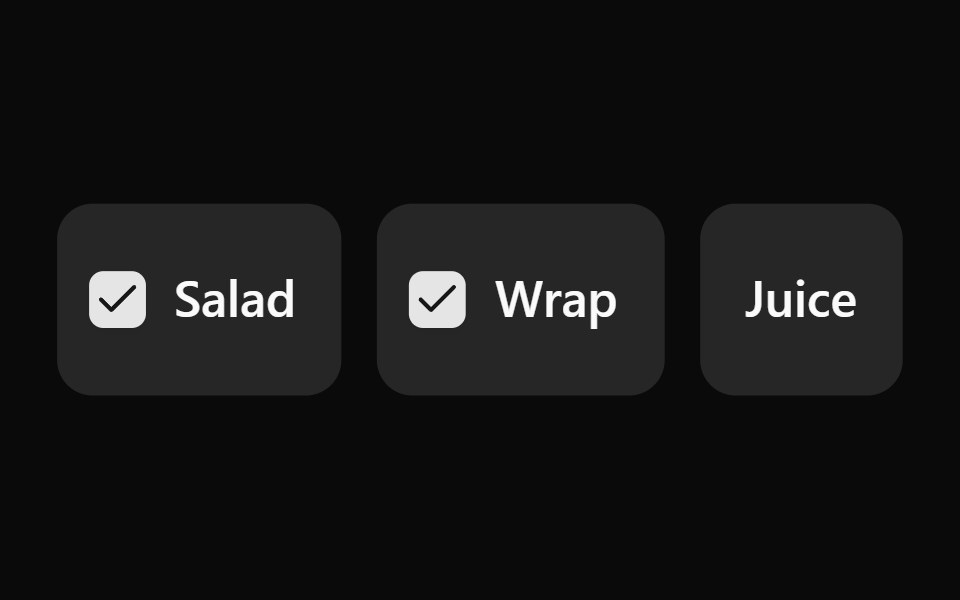 Checkbox 6Watermelon UI · React
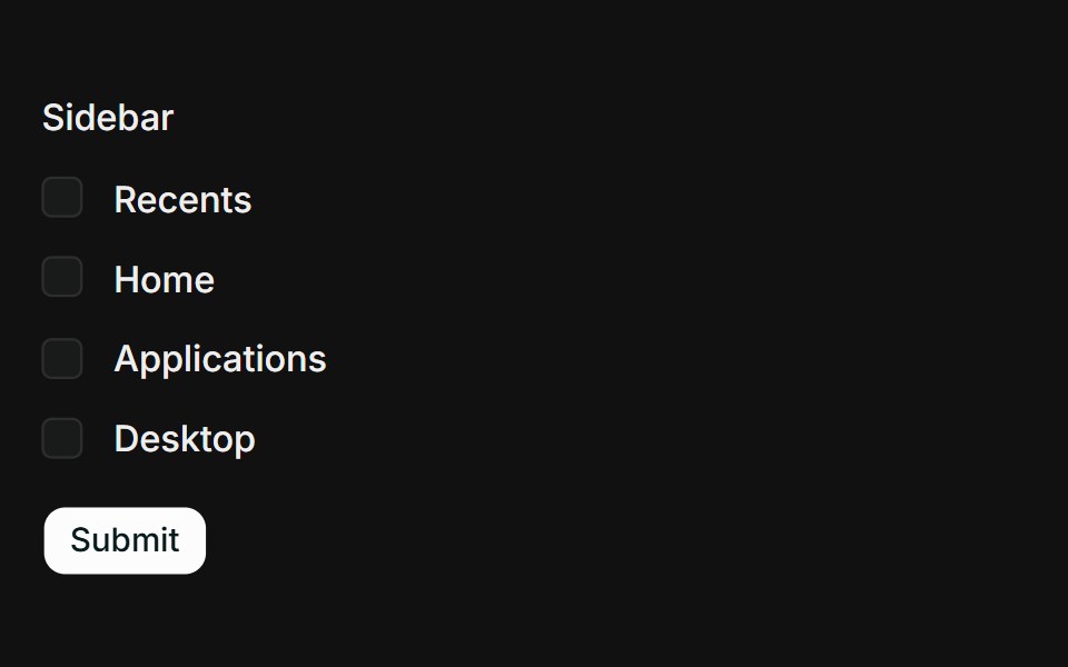 React Hook Form + ZodFLX UI · ReactController binds a checkbox group to React Hook Form; Zod requires at least one selection.
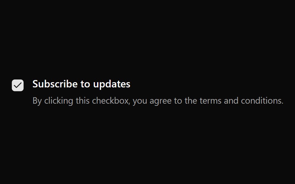 Checkbox 7Watermelon UI · React
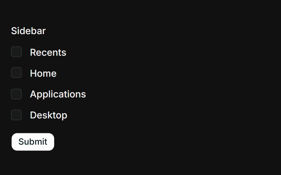 TanStack Form + ZodFLX UI · Reactform.Field wires a checkbox group to TanStack Form; Zod validates on submit and shows an error when none are selected.
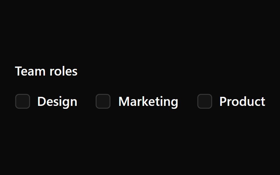 Checkbox 8Watermelon UI · React
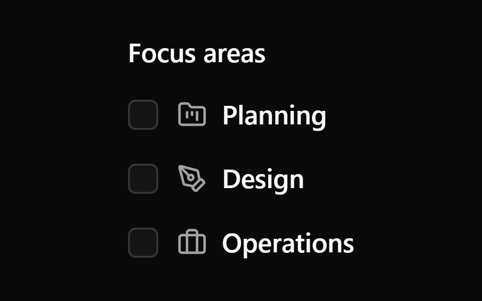 Checkbox 9Watermelon UI · React
Libraries with shadcn/ui checkbox components
Related categories
- Checkbox Components
- React Checkbox Components
- Tailwind CSS Checkbox Components
- Svelte Checkbox Components
- Animated Checkbox Components
- shadcn/ui Input Components
- shadcn/ui Form Components
- shadcn/ui Select Components
- shadcn/ui Text Input Components
- shadcn/ui Form Field Components
- shadcn/ui Switch Components
- shadcn/ui Textarea Components
- shadcn/ui OTP Input Components
- shadcn/ui Combobox Components
- shadcn/ui Date Picker Components
- shadcn/ui Radio Components
- shadcn/ui Login Form Components
- shadcn/ui Search Input Components
- shadcn/ui File Upload Components
- shadcn/ui Slider Components
- shadcn/ui Signup Form Components