 Dev Design Library
shadcn/ui Select Components
Dev Design Library indexes 134 shadcn/ui select components from 17 open-source UI libraries, with the most coming from Watermelon UI, Shadcn Space, FLX UI, Fluid Functionalism and Notra. Each one links to its page with the source code, a live preview where available, the library license and the install command. They follow the shadcn/ui conventions, so most install with the shadcn CLI and drop into a Tailwind project. Select components belong to the Inputs group.
Showing 120 of 134, a mix from every library. Open a library to see all of its components.
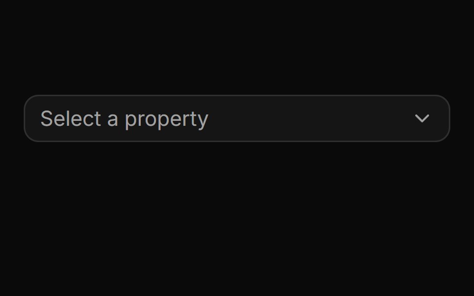 Pinned footer with a side-anchored import flyout.ReUI · ReactPinned footer with a side-anchored import flyout.
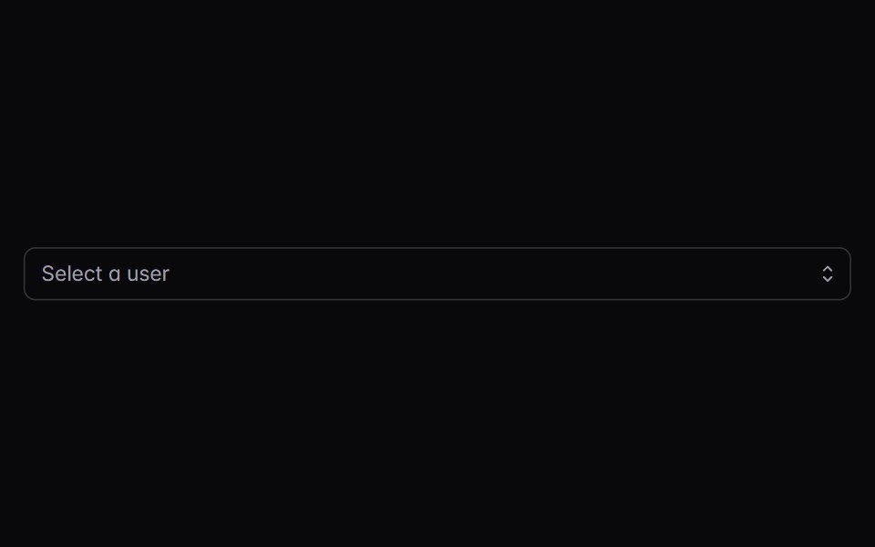 combo-boxIntent UI · Reactcombo-box
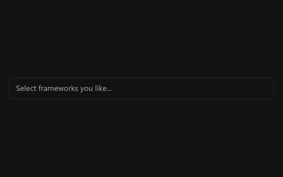 Multiple SelectorSpectrum UI · ReactA multi-select input with async search, grouping, and creatable options.
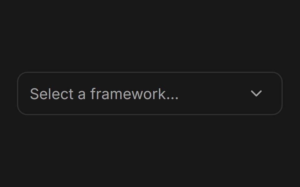 ComboboxFluid Functionalism · ReactType-to-filter combobox with single or multiple (chips, merged selection backgrounds) selection: a text field that…
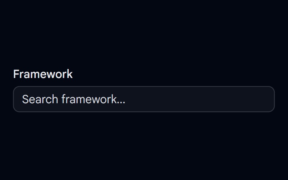 Autocomplete-01 - DefaultShadcn Space · ReactDefault autocomplete component
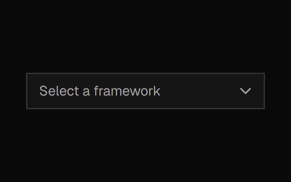 ComboboxShadcn Dashboard · React
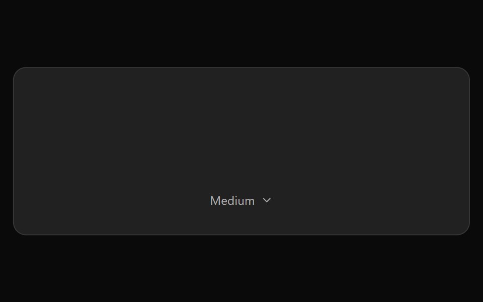 ChatGPT Model SelectorNotra · ReactThe hover-to-open effort chip with Model and Effort submenus, built on shadcn DropdownMenu.
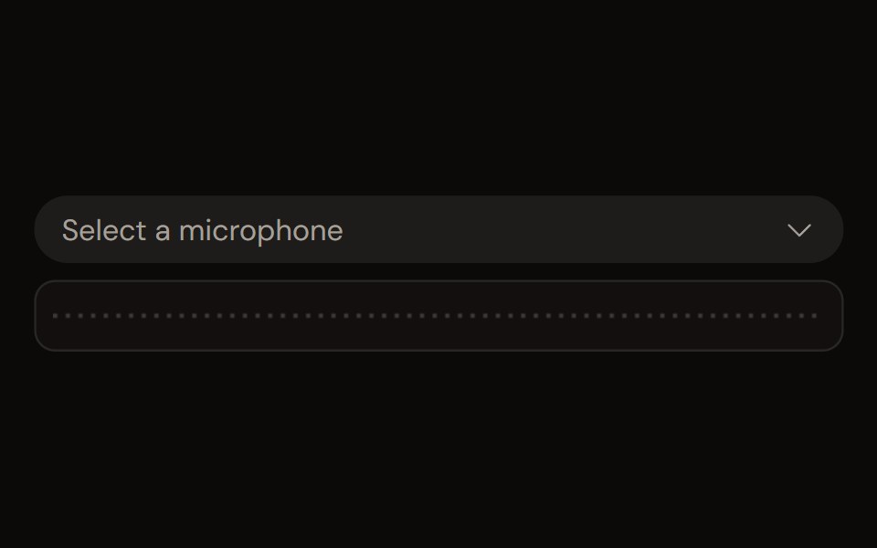 Audio Device Selectaudiocn · ReactA microphone, speaker or source picker with loading, permission, None and disconnected-device states, and a slot for a…
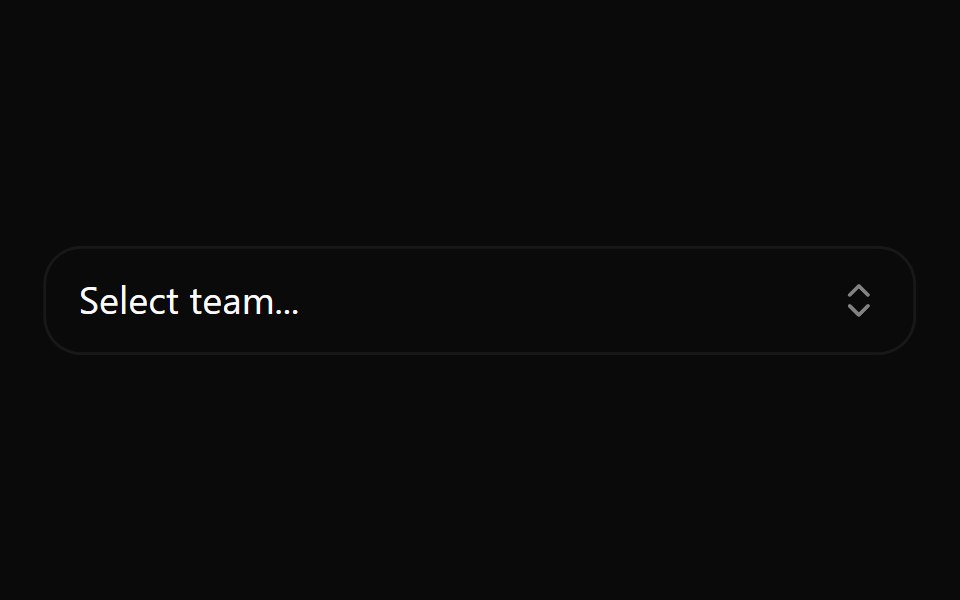 Combobox 1Watermelon UI · React
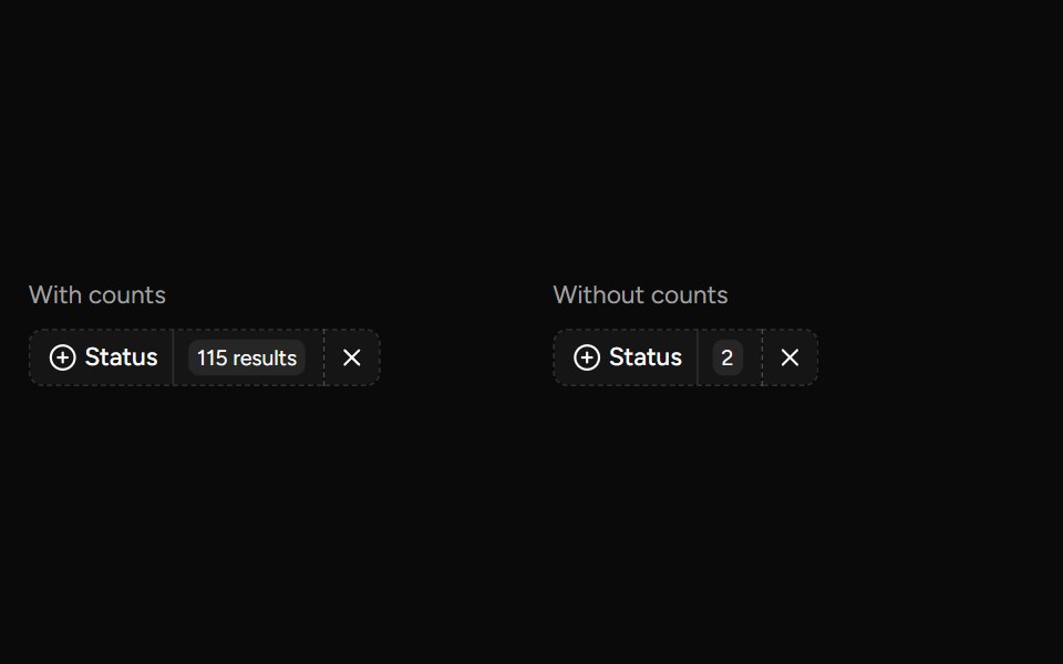 Data Table Faceted Filtersv-table · SvelteA searchable multi-select filter with live counts for categorical table columns.
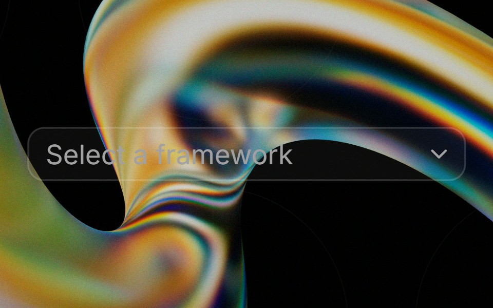 Comboboxglasscn · React
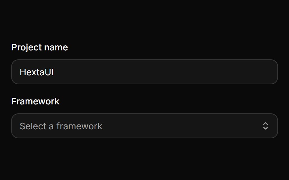 Native selectHextaUI · ReactThe browser's own select, styled to match Input, with a quiet placeholder, Field support and the OS picker on every…
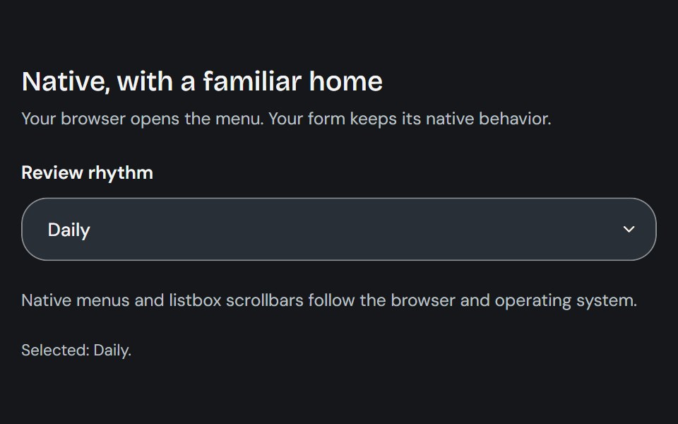 Native SelectCojeev UI · ReactUses the browser’s native select control to choose from a compact list of options.
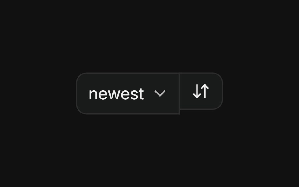 With selectFLX UI · ReactSort dropdown paired with a direction-toggle icon button in a merged-border row.
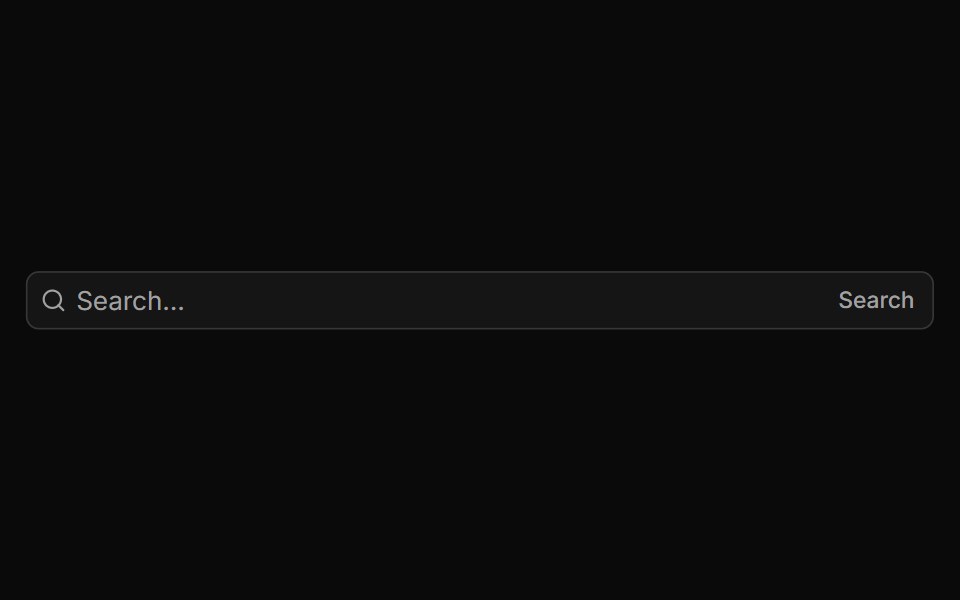 Code Snippet With Language Selectorsv-particles · Svelte
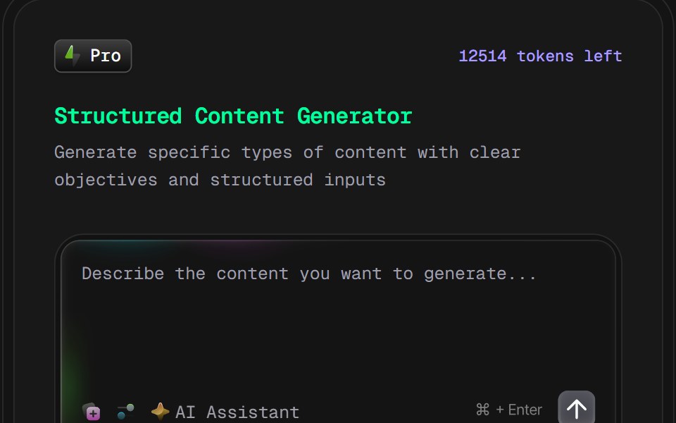 AI Content Creator Card v2D2Studio UI · ReactGlassmorphic AI content generator card with content type and tone pickers and a prompt field.
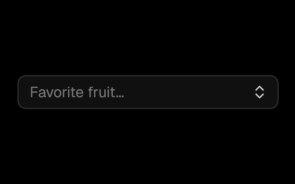 Comboboxark-cn · ReactA shadcn-style combobox component built with Ark UI primitives.
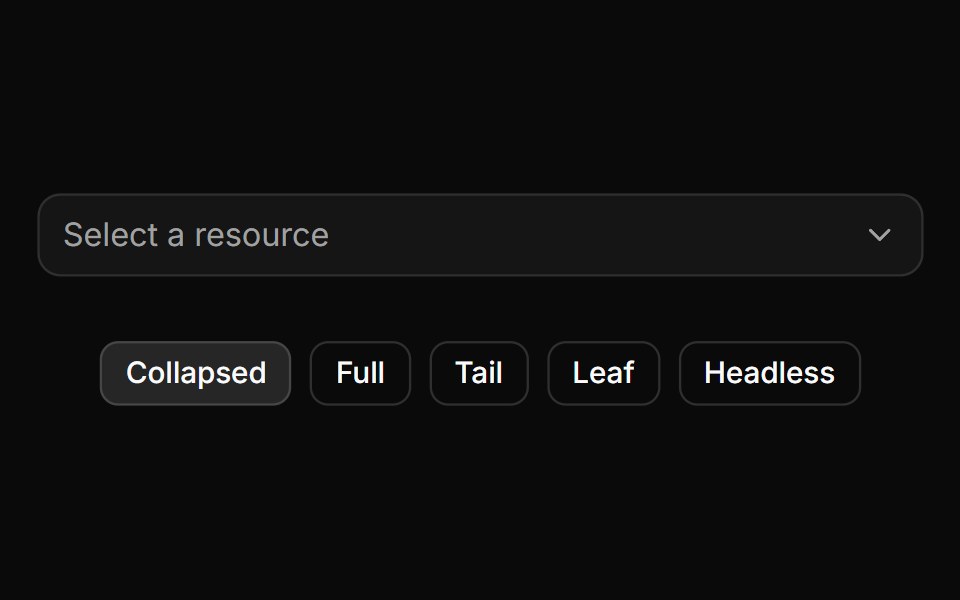 Trigger path formatting and collapsing.ReUI · ReactTrigger path formatting and collapsing.
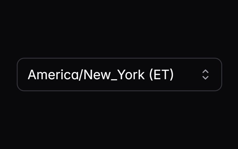 native-selectIntent UI · Reactnative-select
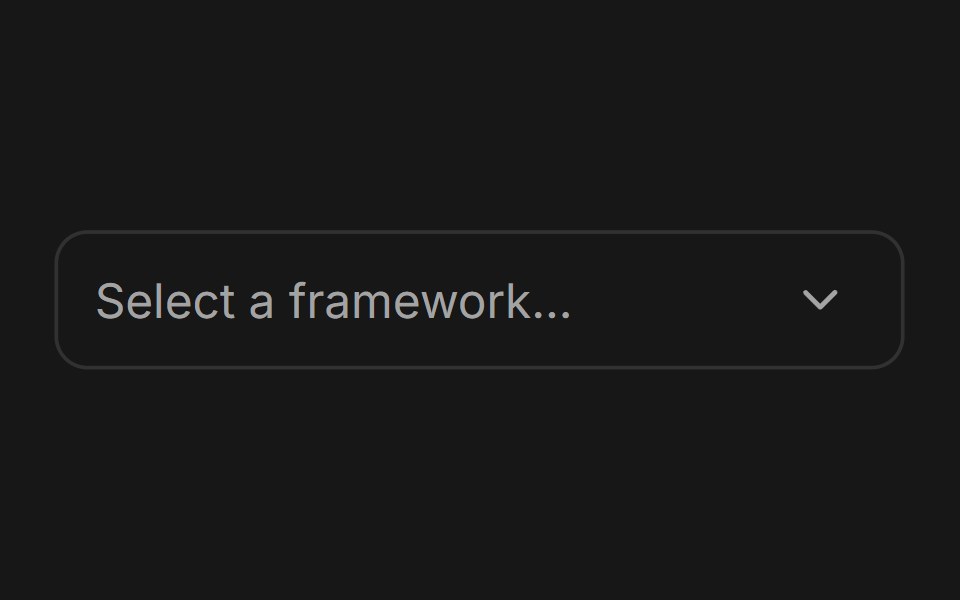 ComboboxFluid Functionalism · ReactType-to-filter combobox with single or multiple (chips, merged selection backgrounds) selection: a text field that…
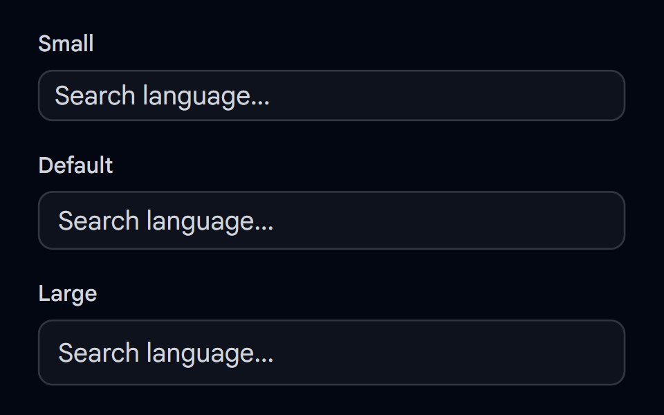 Autocomplete-02 - Size variantsShadcn Space · ReactAutocomplete component with different size variants
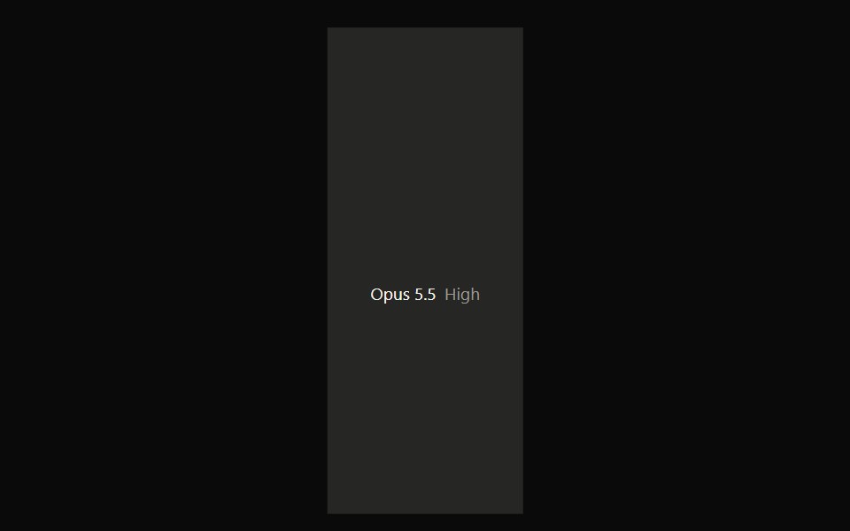 Claude Model SelectorNotra · ReactA hover-open model and effort picker built on shadcn DropdownMenu.
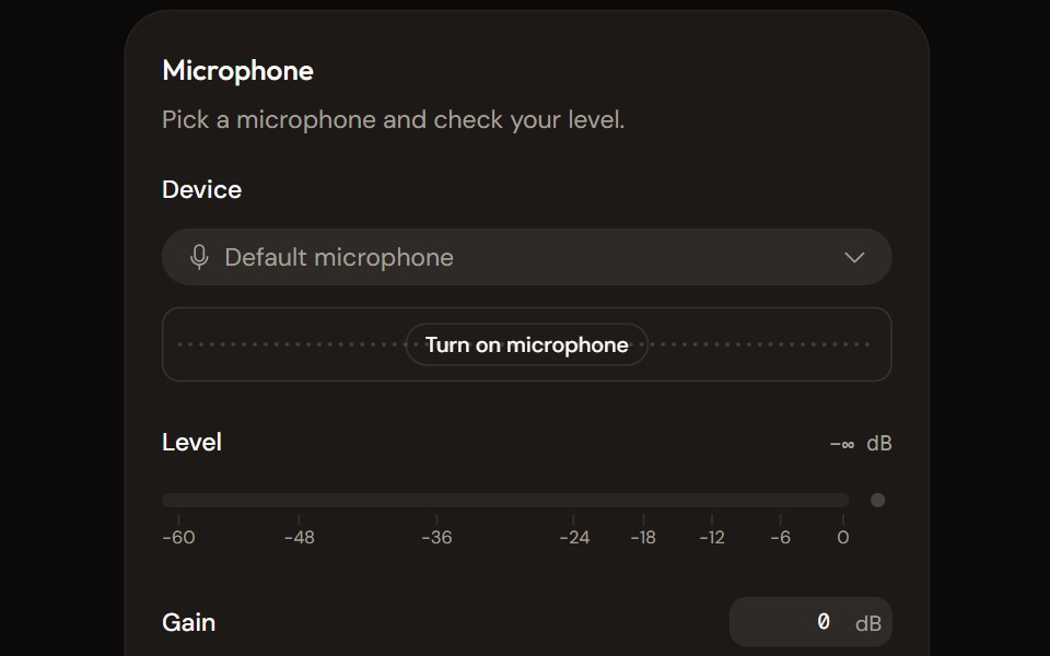 Microphone Setupaudiocn · ReactChoose and check a microphone: device select with a live preview, a level meter, gain, mute and a level check that…
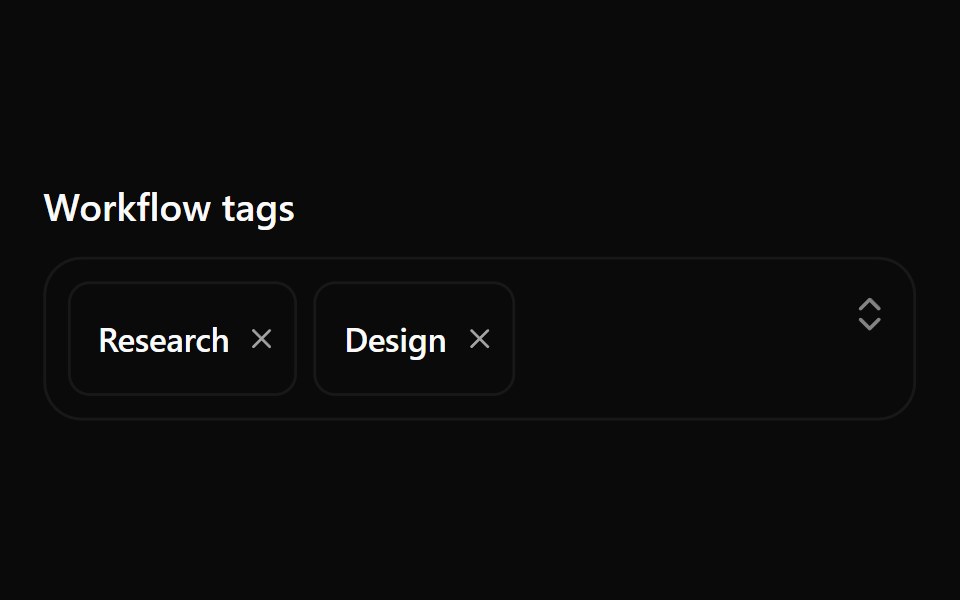 Combobox 10Watermelon UI · React
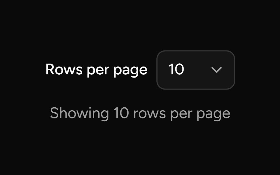 Page Size Selectorsv-table · SvelteSelect the number of rows shown on each table page.
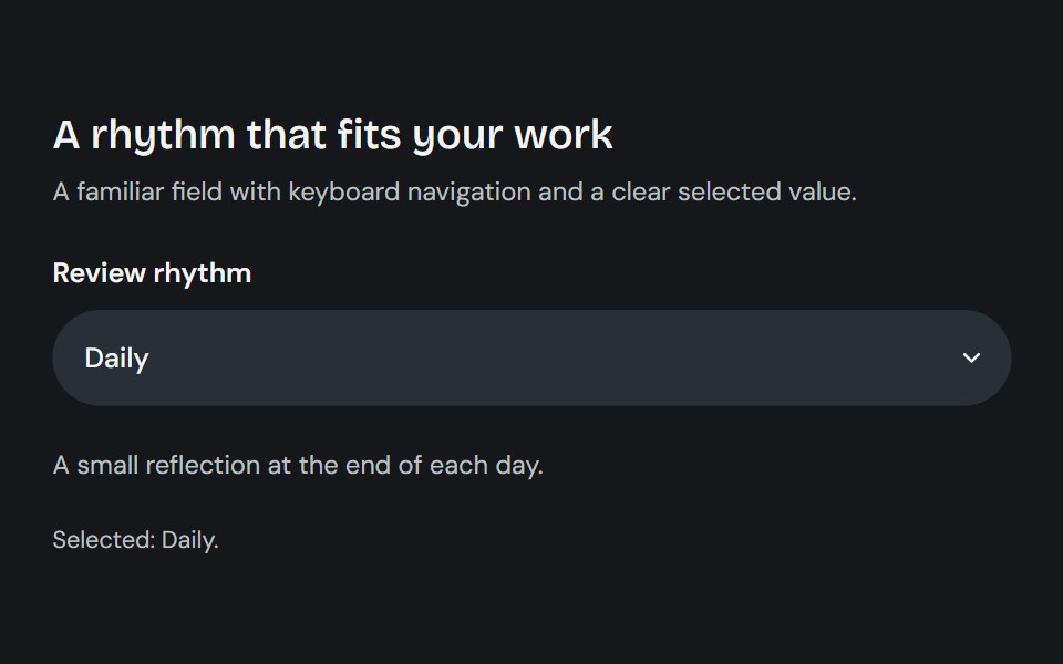 SelectCojeev UI · ReactOpens a list of options from a trigger and stores one selected value.
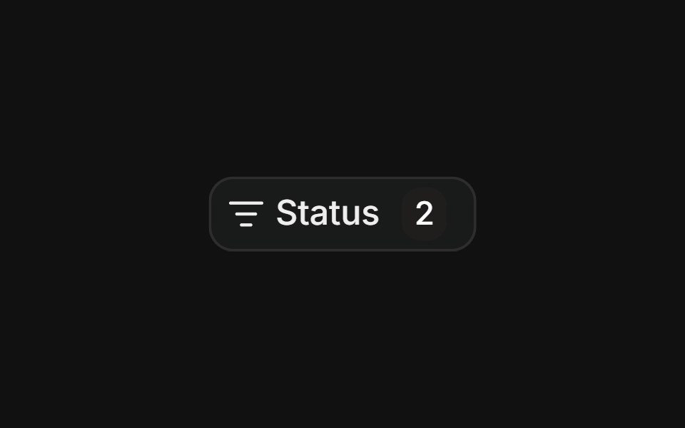 Multi-select filterFLX UI · ReactCheckbox items with a count badge and a clear action.
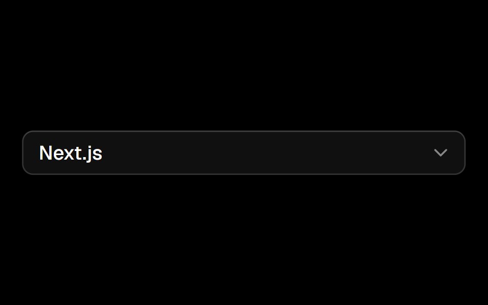 Selectark-cn · ReactA shadcn-style select component built with Ark UI primitives.
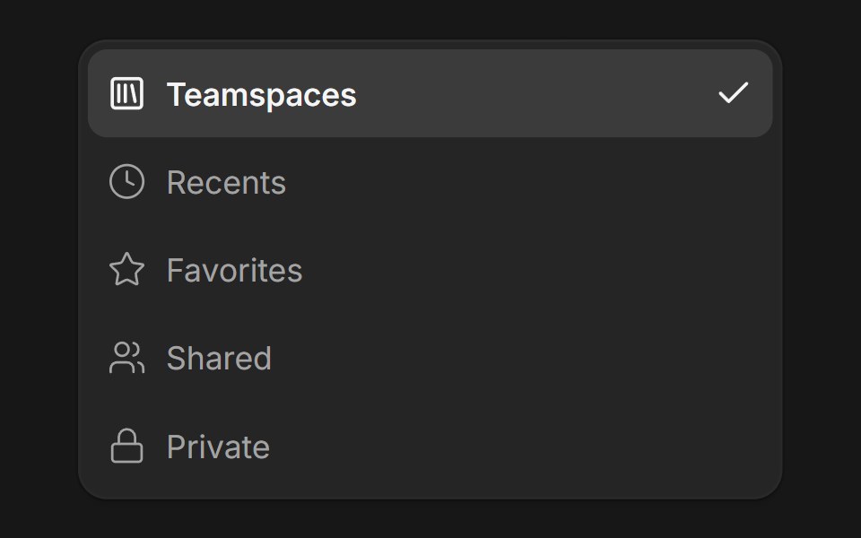 DropdownFluid Functionalism · ReactDropdown menu with fluid hover, animated selection indicator, inline panel or triggered popup with collision-aware…
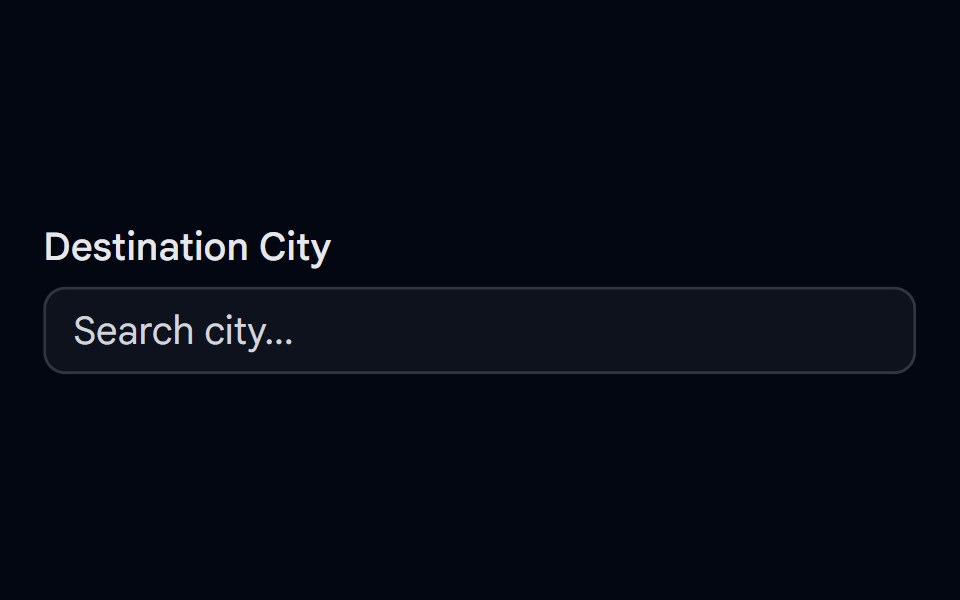 Autocomplete-03 - Vanish AnimationShadcn Space · ReactAutocomplete with vanish animation
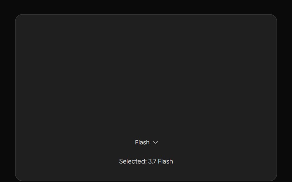 Gemini Model SelectorNotra · ReactThe Gemini model chip and menu built on shadcn DropdownMenu.
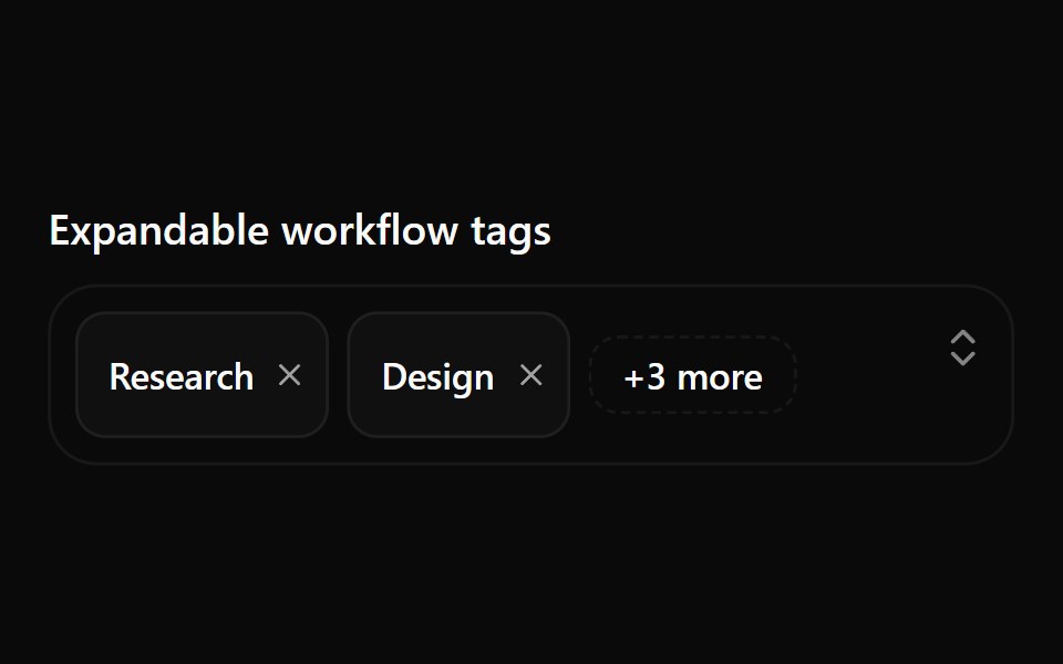 Combobox 11Watermelon UI · React
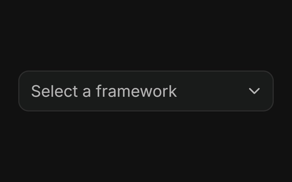 BasicFLX UI · ReactMinimal single-value dropdown with a placeholder and a flat list of options.
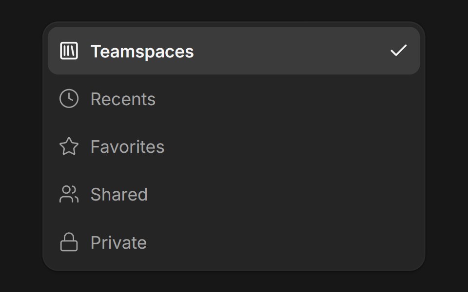 DropdownFluid Functionalism · ReactDropdown menu with fluid hover, animated selection indicator, inline panel or triggered popup with collision-aware…
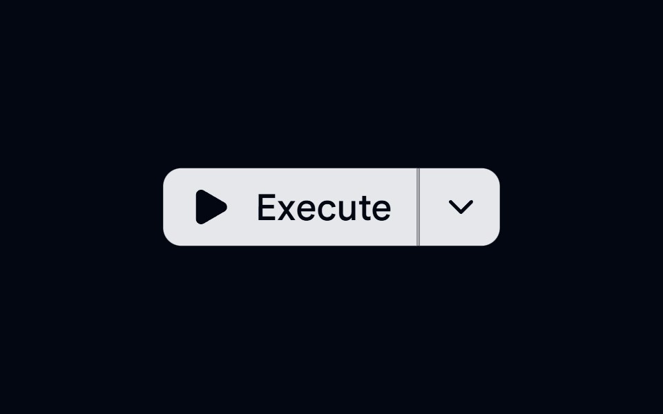 Button Group 12 - Action DropdownShadcn Space · ReactButton group with a split action dropdown menu, featuring micro-animations and smooth open transitions
 Perplexity Model SelectorNotra · ReactThe Model chip and its provider list with Max/New badges and locks, built on shadcn DropdownMenu.
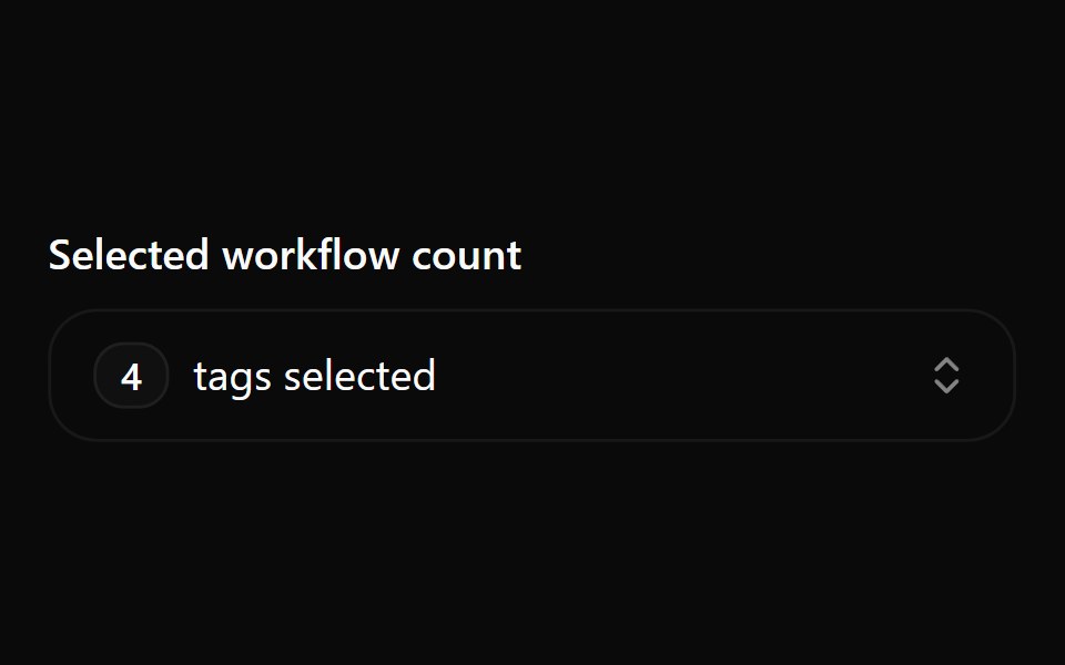 Combobox 12Watermelon UI · React
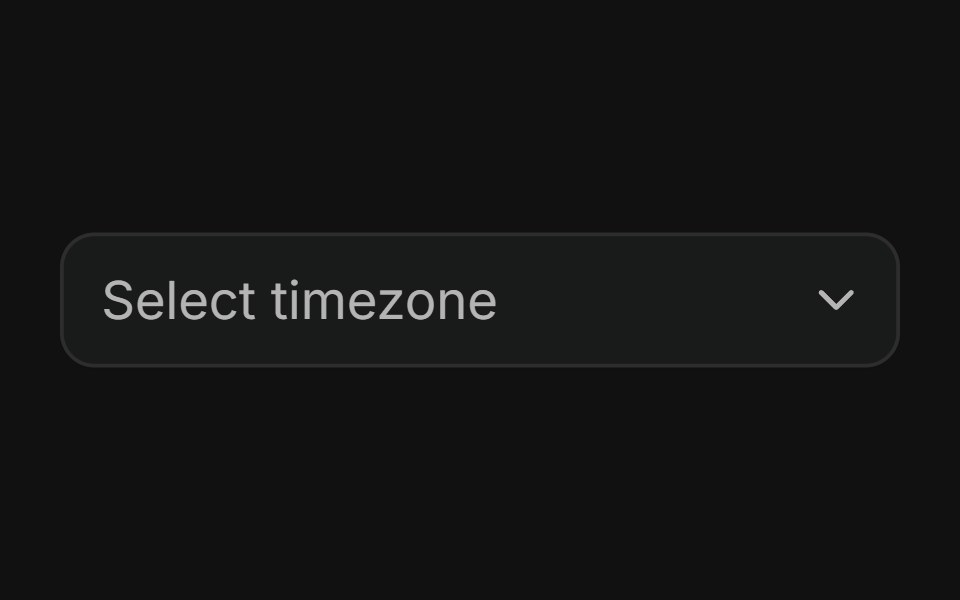 GroupedFLX UI · ReactOptions organized into labeled groups.
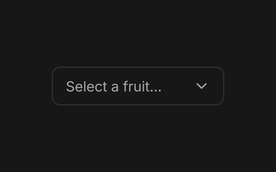 SelectFluid Functionalism · ReactAnimated select menu with collision-aware positioning, typeahead, fluid hover, spring-animated popover, and animated…
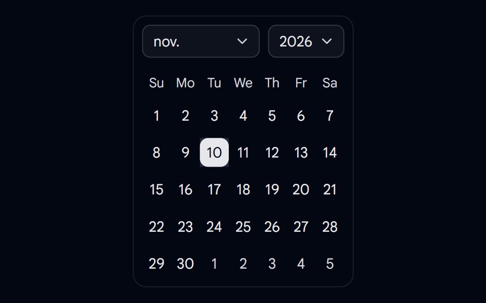 Calendar 05 - Month and Year SelectShadcn Space · ReactCalendar component
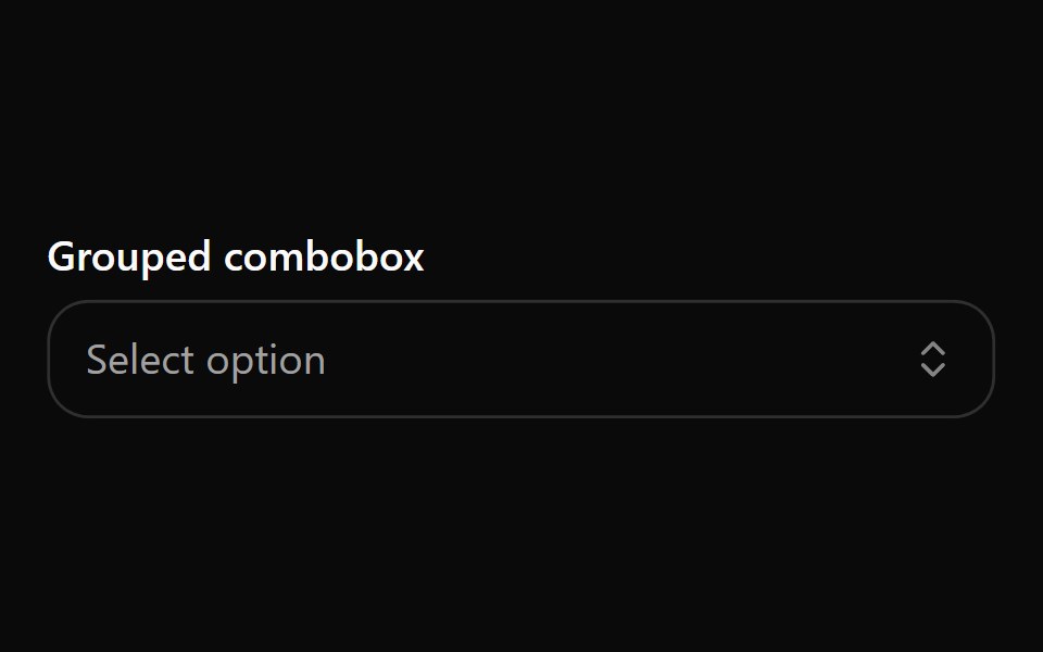 Combobox 2Watermelon UI · React
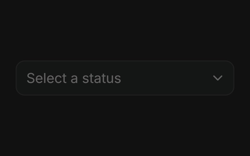 DisabledFLX UI · ReactNon-interactive select state.
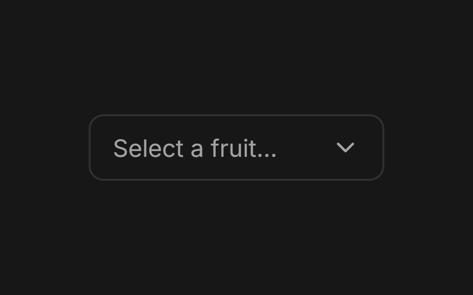 SelectFluid Functionalism · ReactAnimated select menu with collision-aware positioning, typeahead, fluid hover, spring-animated popover, and animated…
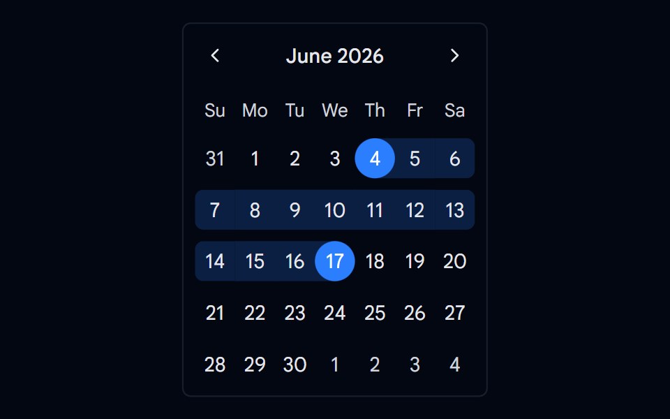 Calendar 09 - Custom Range SelectShadcn Space · ReactCalendar component
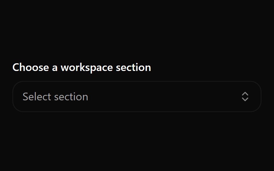 Combobox 3Watermelon UI · React
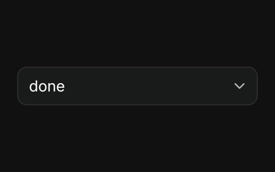 With IconsFLX UI · ReactOptions with leading icons.
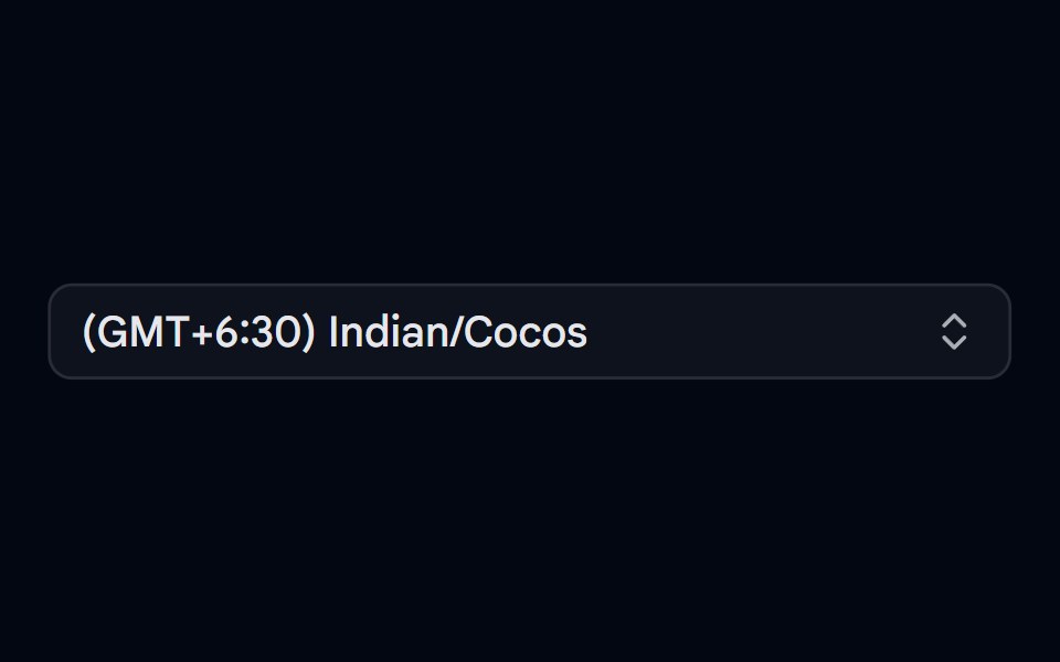 Combobox 04 - TimezoneShadcn Space · ReactCombobox component
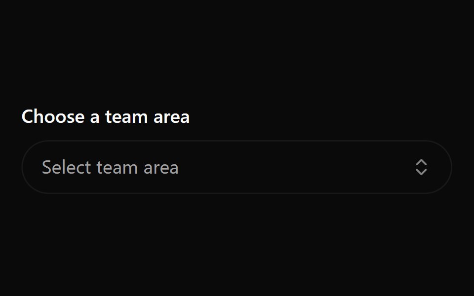 Combobox 4Watermelon UI · React
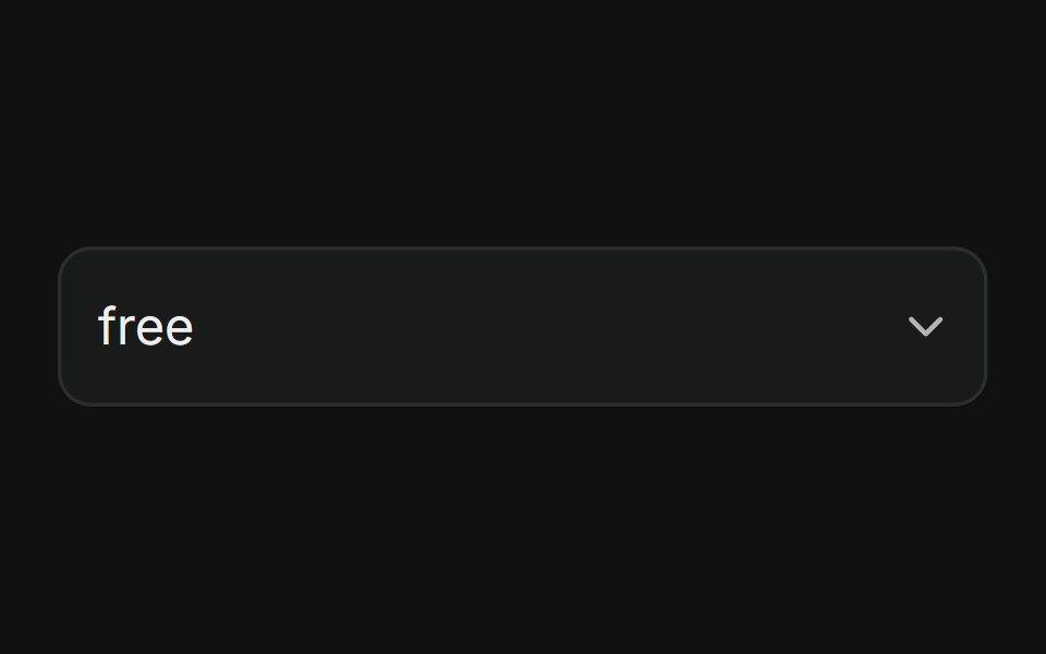 With ObjectFLX UI · ReactEach option shows a bold label and a muted description sub-line; the trigger displays the full two-line item when…
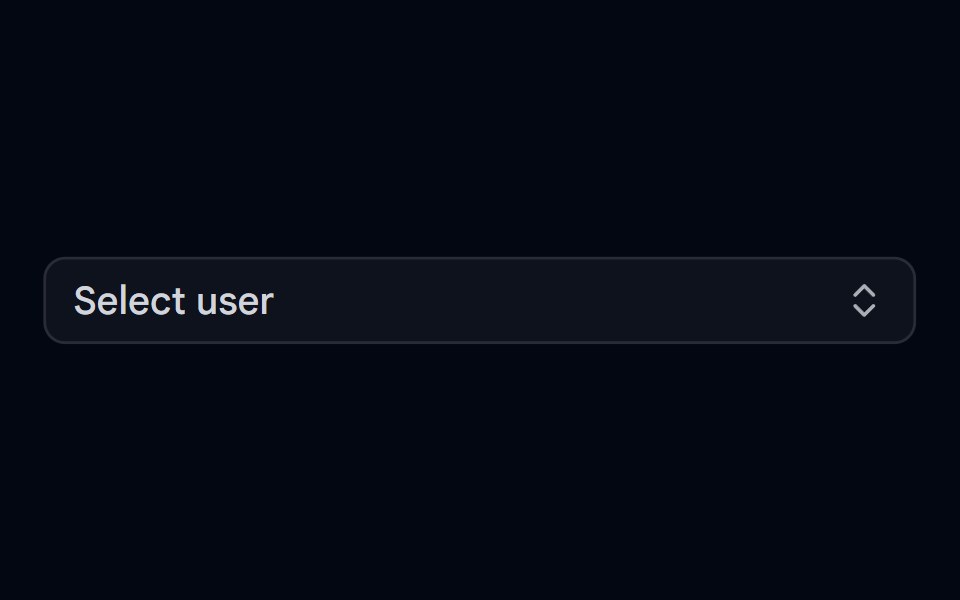 Combobox 05 - UsersShadcn Space · ReactCombobox component
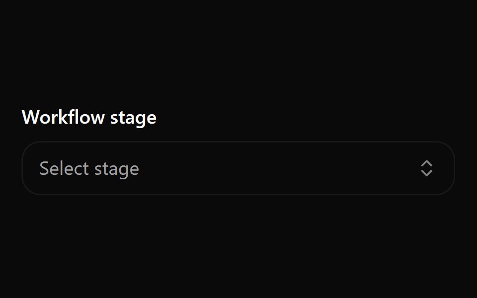 Combobox 5Watermelon UI · React
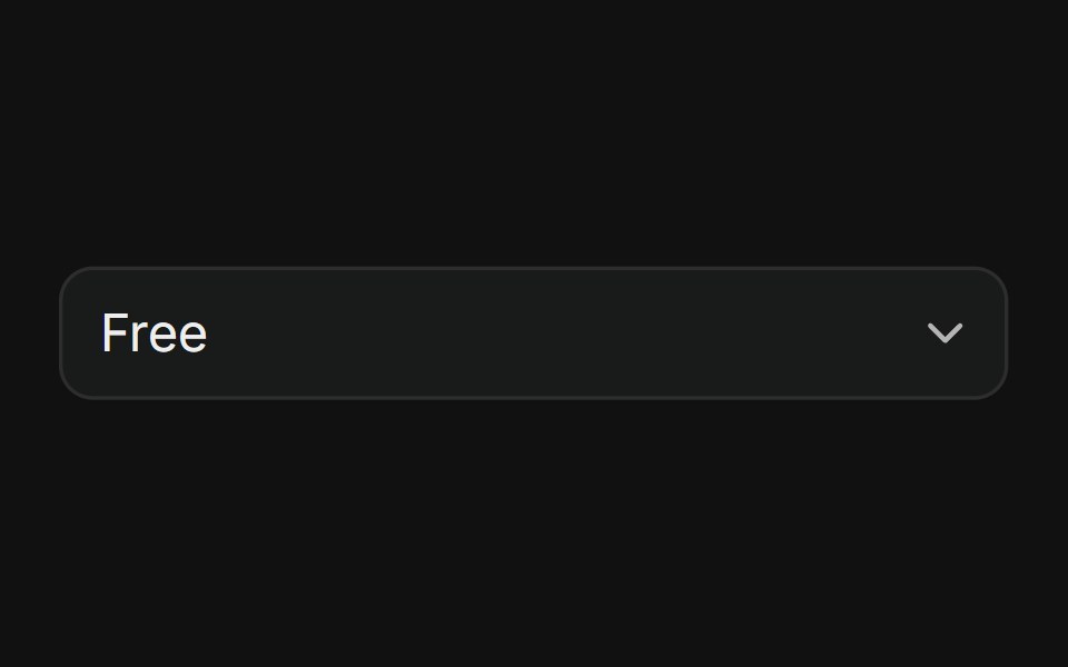 With description only itemsFLX UI · ReactOptions show a bold label and a muted description sub-line; the trigger shows only the label after selection.
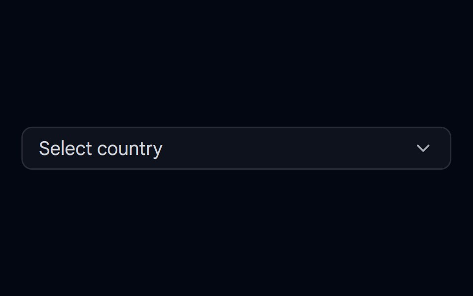 Combobox 06 - With FlagShadcn Space · ReactCombobox component
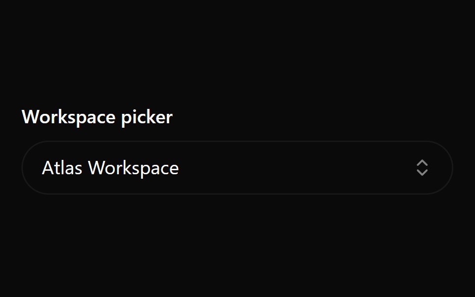 Combobox 6Watermelon UI · React
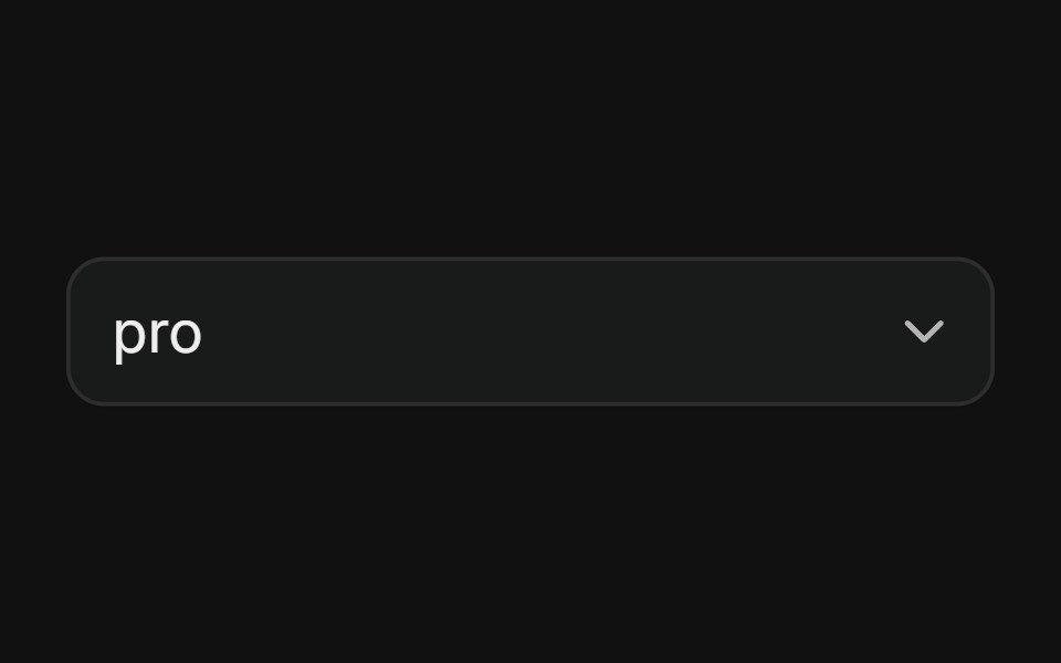 Disabled ItemsFLX UI · ReactSelect with individual disabled options.
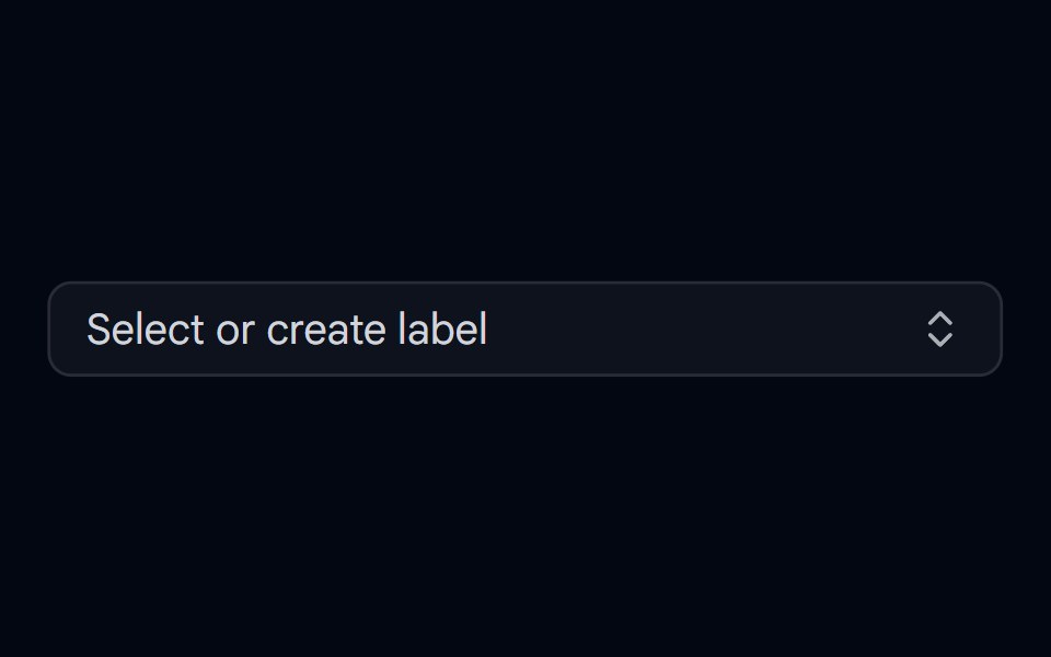 Combobox 07 - CreatableShadcn Space · ReactCombobox with inline item creation — type a new value and select 'Create' to add it on the fly
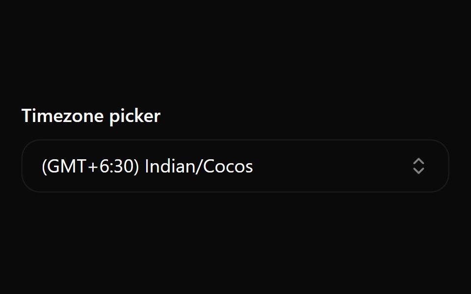 Combobox 7Watermelon UI · React
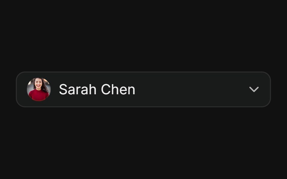 With AvatarFLX UI · ReactUser picker with avatars in trigger and options.
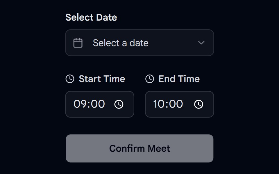 Date Picker 01 - Data & Time PickerShadcn Space · ReactA professional appointment booking card with date and time range selection.
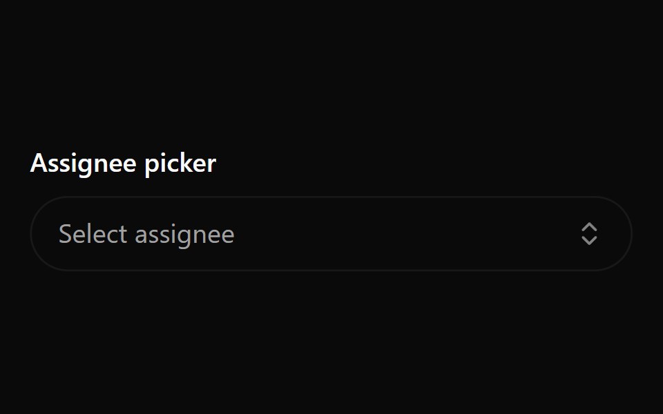 Combobox 8Watermelon UI · React
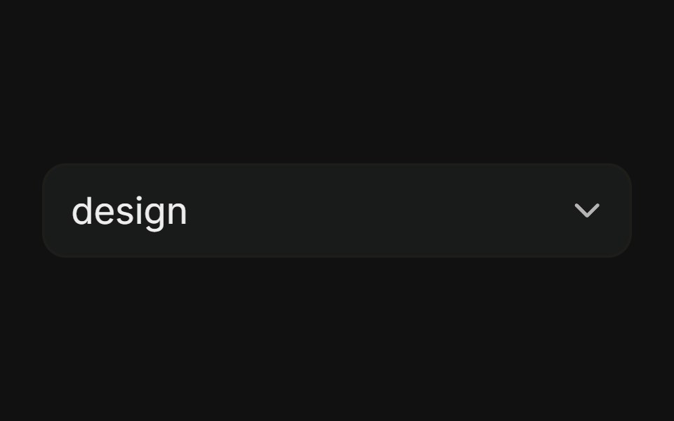 Custom Border & BackgroundFLX UI · ReactMuted background and custom border on the trigger.
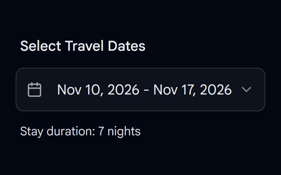 Date Picker 02 - Date RangeShadcn Space · ReactA professional appointment booking card with date and time range selection.
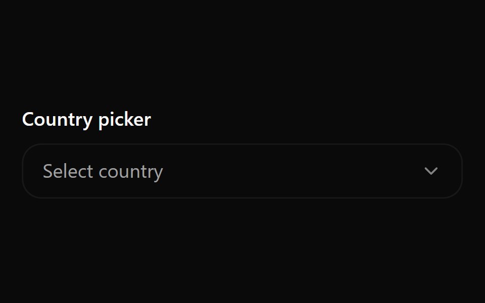 Combobox 9Watermelon UI · React
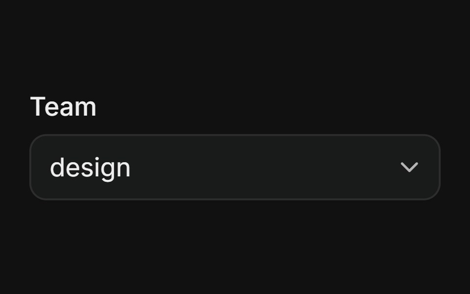 With LabelFLX UI · ReactAccessible field label linked to the select trigger.
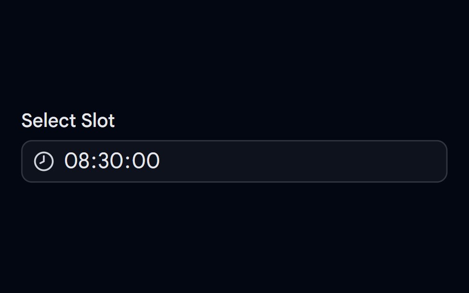 Date Picker 03 - Time PickerShadcn Space · ReactA professional time picker with time selection.
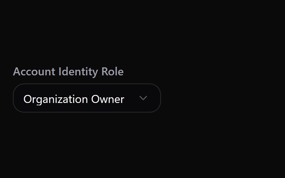 Select 1Watermelon UI · React
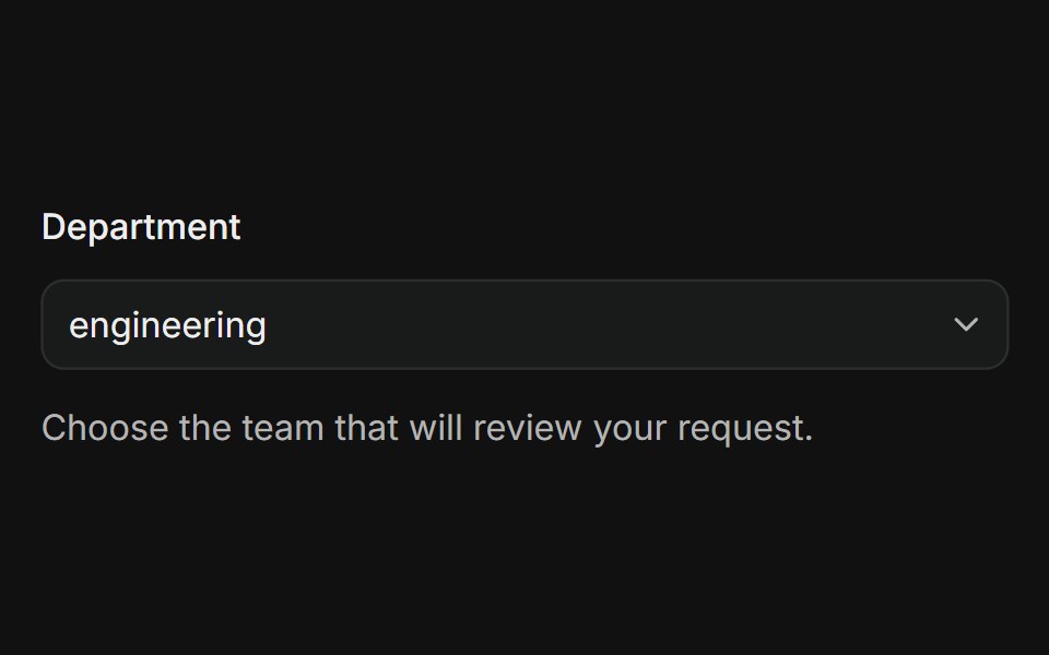 In FormFLX UI · ReactSelect composed with Field, FieldLabel, and description.
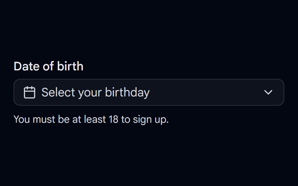 Date Picker 04 - Date of BirthShadcn Space · ReactBirthday picker with month and year dropdowns, future dates disabled, and a live age check with a minimum age message.
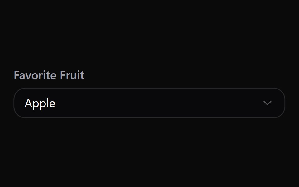 Select 10Watermelon UI · React
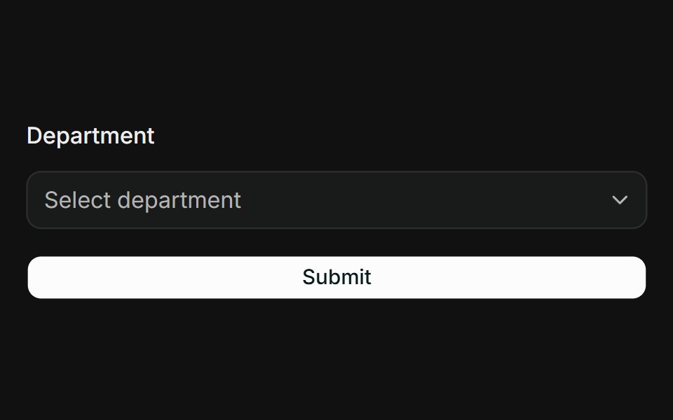 React Hook Form + ZodFLX UI · ReactController binds Select to RHF; Zod resolver drives FieldError on submit.
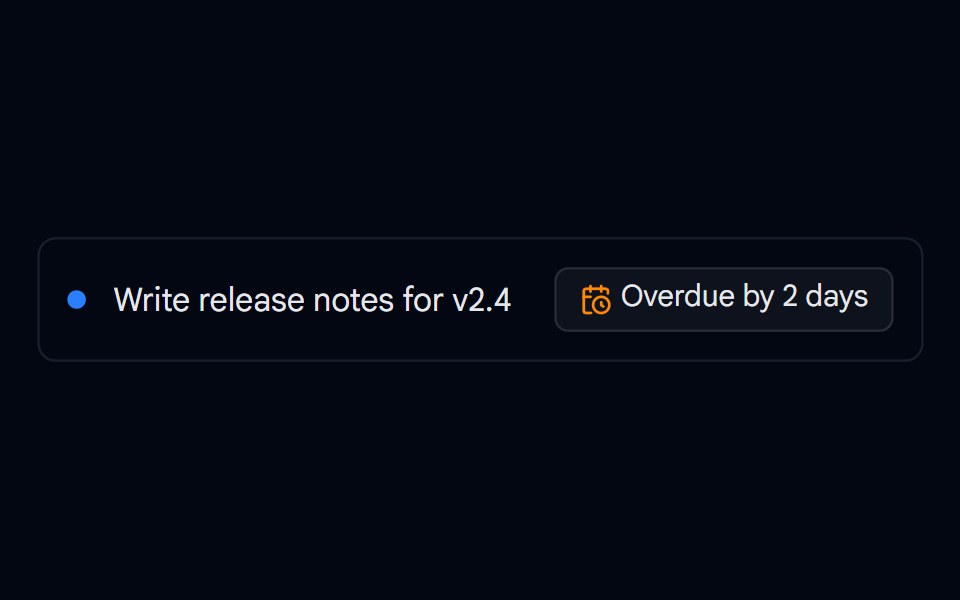 Date Picker 05 - Task Due DateShadcn Space · ReactTask due date picker with Today, Tomorrow, This weekend, and Next week shortcuts, overdue and due soon states, and a…
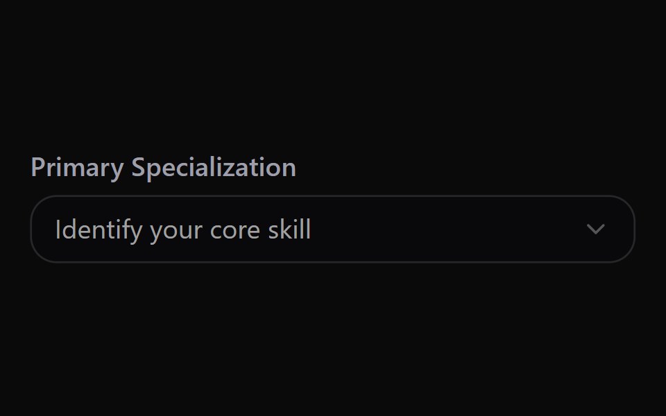 Select 11Watermelon UI · React
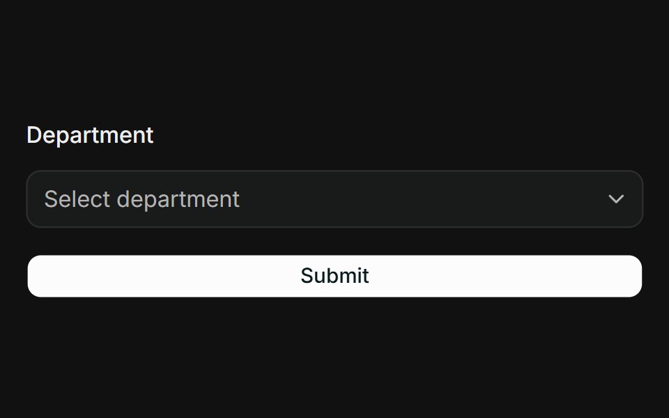 TanStack Form + ZodFLX UI · Reactform.Field wires Select; Zod onSubmit validator surfaces FieldError when touched.
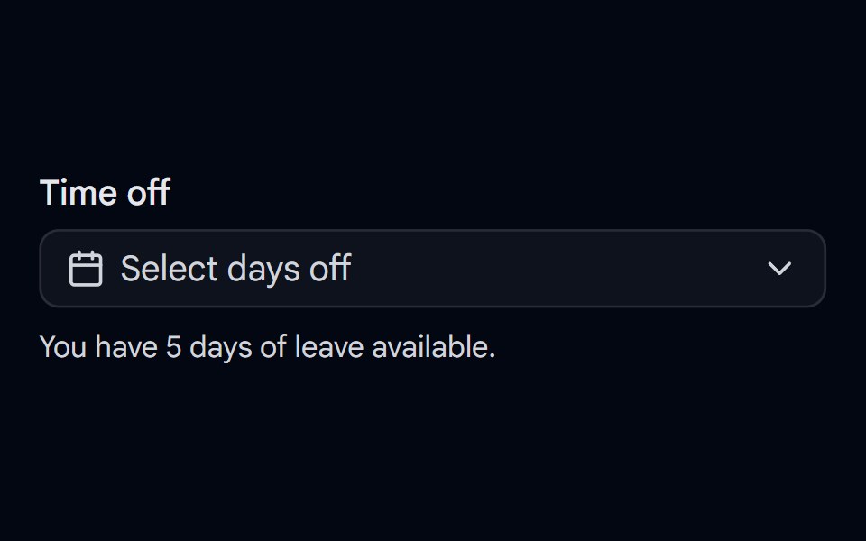 Date Picker 06 - Multiple DatesShadcn Space · ReactTime off picker for selecting multiple dates with weekends disabled, a day allowance limit, and removable date chips.
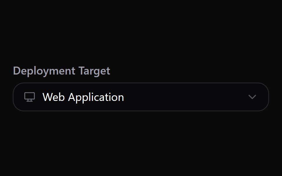 Select 12Watermelon UI · React
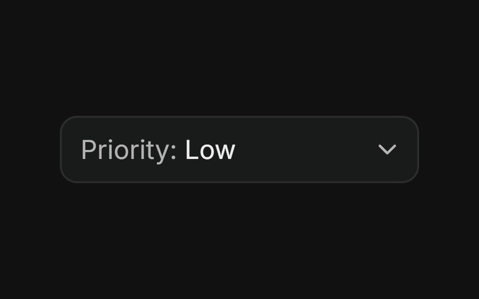 With inline labelFLX UI · ReactMuted prefix label inside the trigger, left of the selected value.
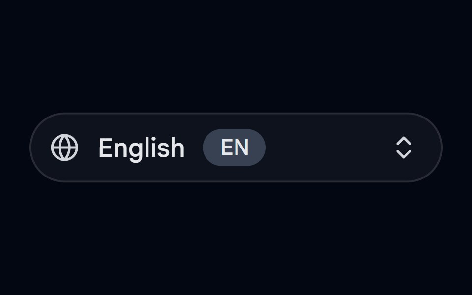 Dropdown Menu 08 - Language SelectorShadcn Space · ReactA language selector dropdown with an animated pill trigger, popular languages, region submenus, native names, RTL…
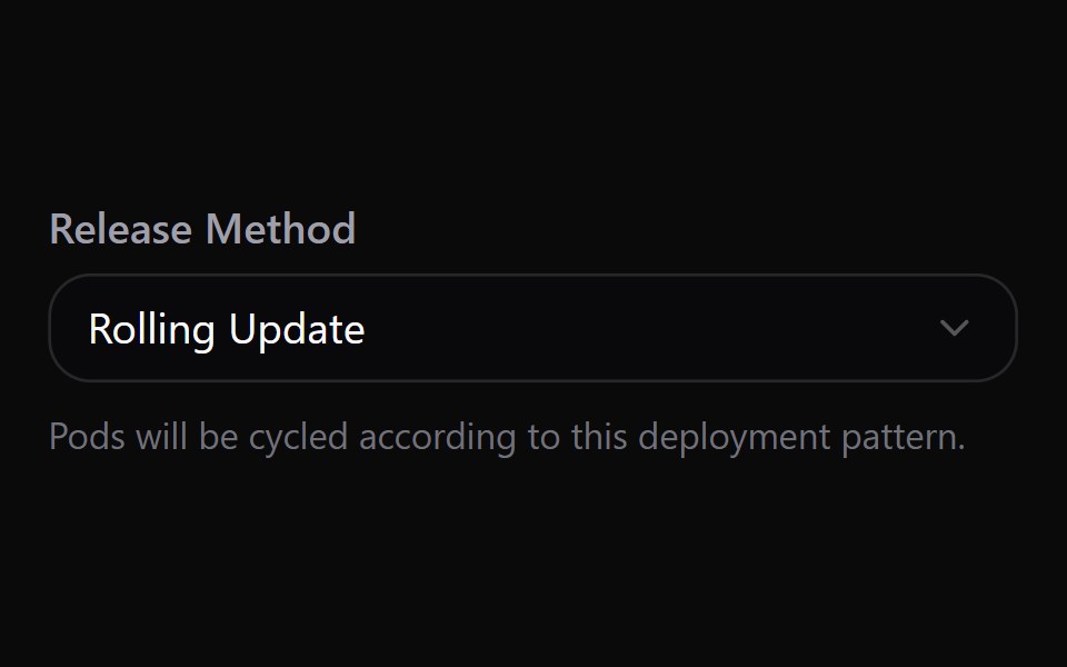 Select 13Watermelon UI · React
 Animated contentFLX UI · ReactDropdown opens in popper position anchored below the trigger with a small offset, giving a tooltip-style layout.
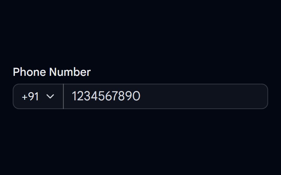 Input-05 - Input with start selectShadcn Space · ReactInput component
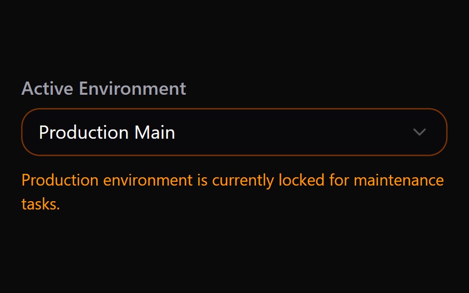 Select 14Watermelon UI · React
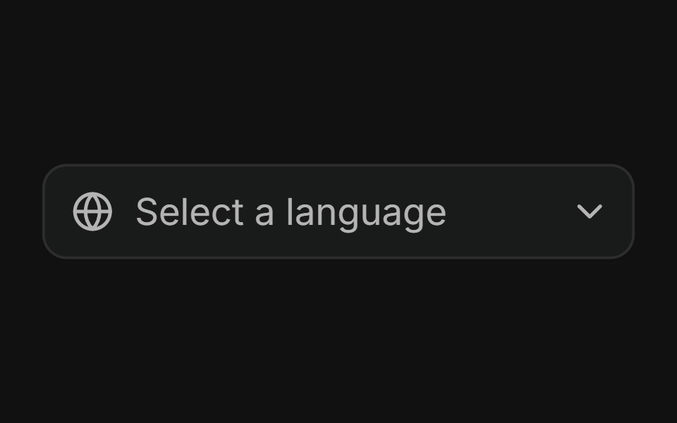 Icon in the triggerFLX UI · ReactFixed leading icon in the trigger alongside the selected value; dropdown options are text only.
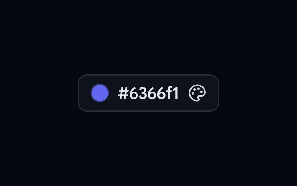 Popover 07 - Color PickerShadcn Space · ReactColor picker popover with preset swatches, a live hex input, and a copy-to-clipboard action.
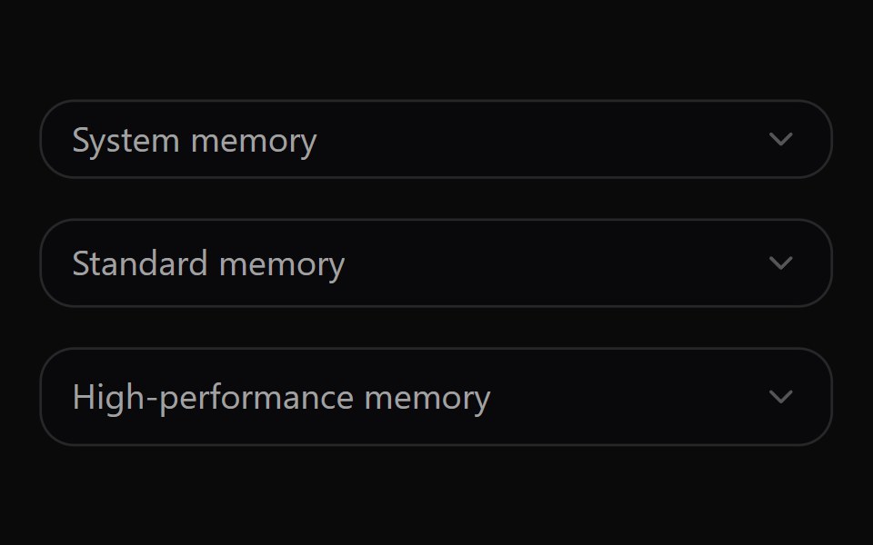 Select 15Watermelon UI · React
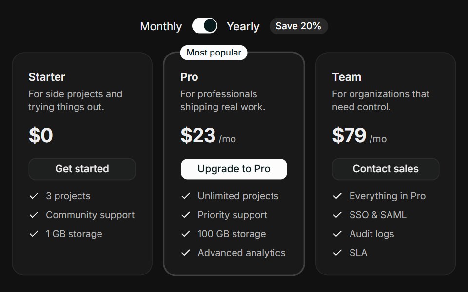 Tiered CardsFLX UI · ReactTiered Cards for Select a Plan.
 Popover 09 - Status PickerShadcn Space · ReactAvatar-triggered popover to set online/away/busy/offline status with a custom message.
 Select 16Watermelon UI · React
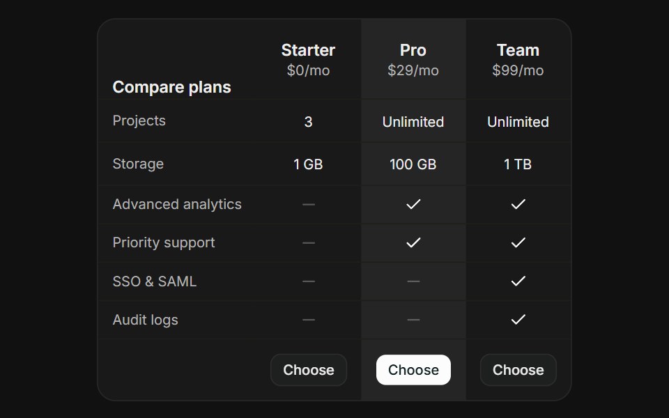 Comparison TableFLX UI · ReactComparison Table for Select a Plan.
 Select-01 - Required selectShadcn Space · ReactSelect component
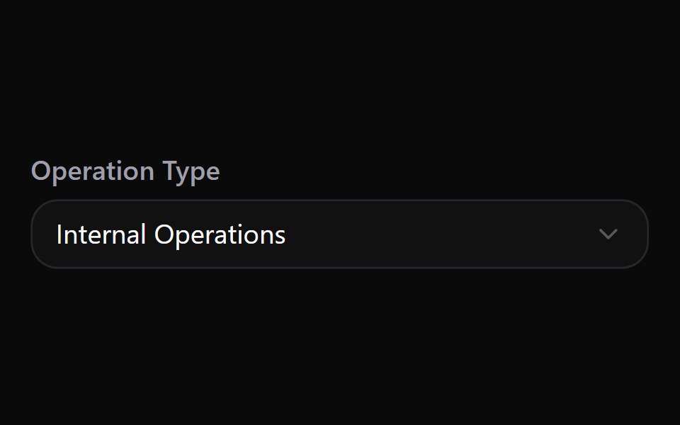 Select 17Watermelon UI · React
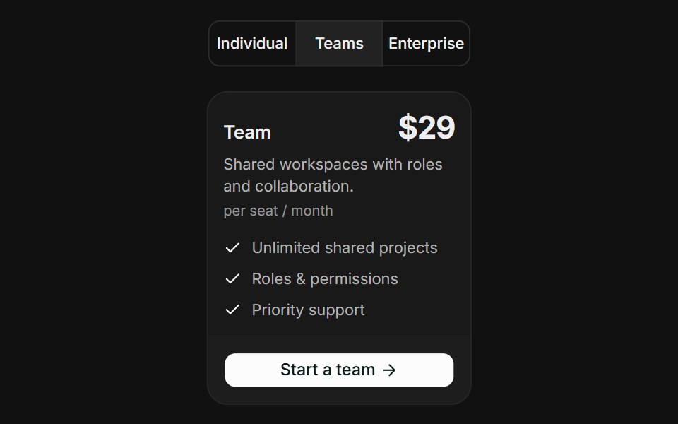 Audience SegmentsFLX UI · ReactAudience Segments for Select a Plan.
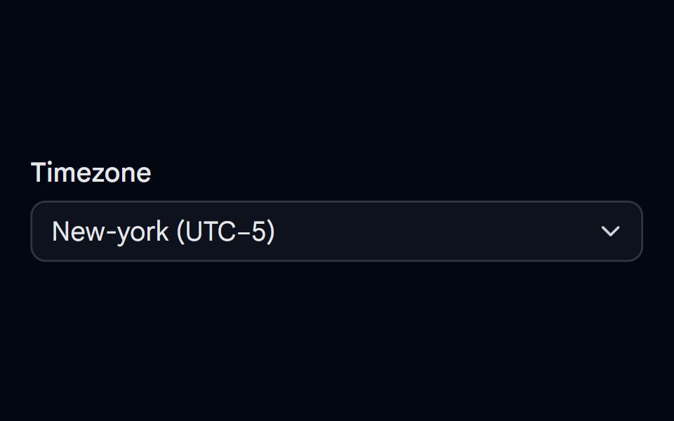 Select-04 - Select with timezoneShadcn Space · ReactSelect component
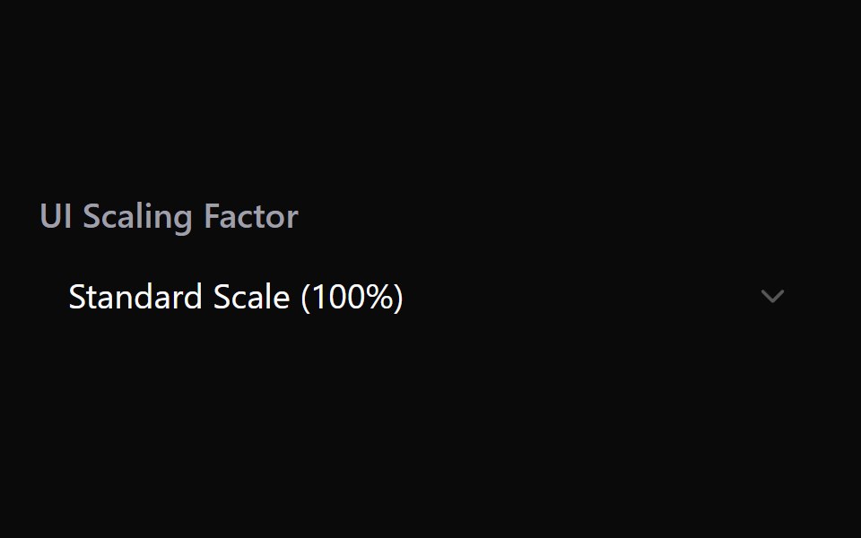 Select 18Watermelon UI · React
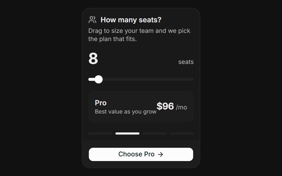 Usage SliderFLX UI · ReactUsage Slider for Select a Plan.
 Select-06 - Select with multiple optionsShadcn Space · ReactSelect component
 Select 19Watermelon UI · React
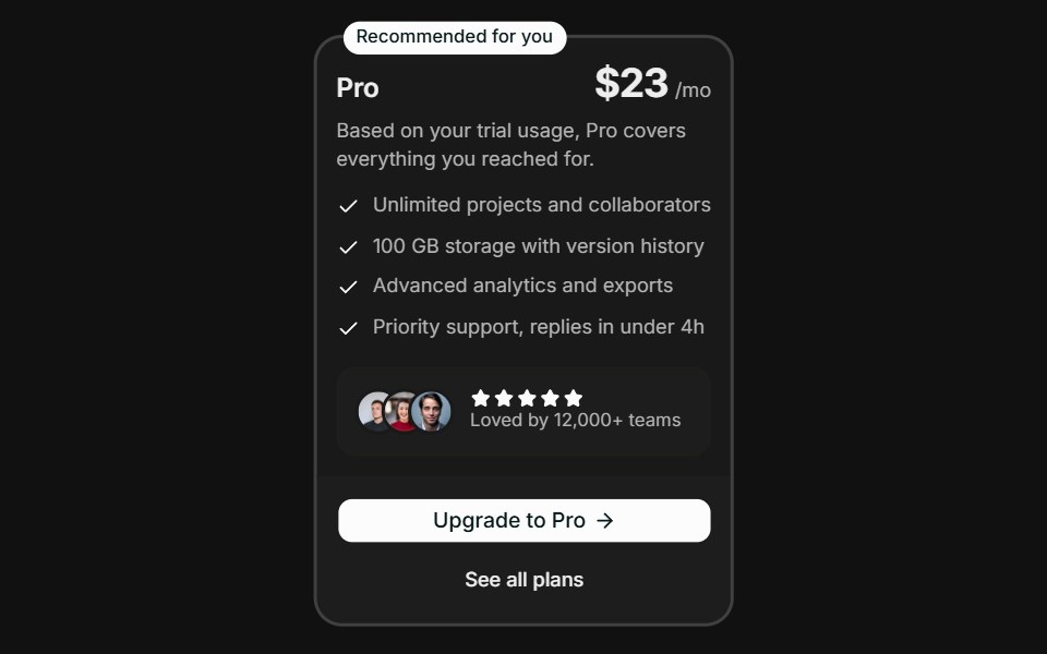 Spotlight RecommendationFLX UI · ReactSpotlight Recommendation for Select a Plan.
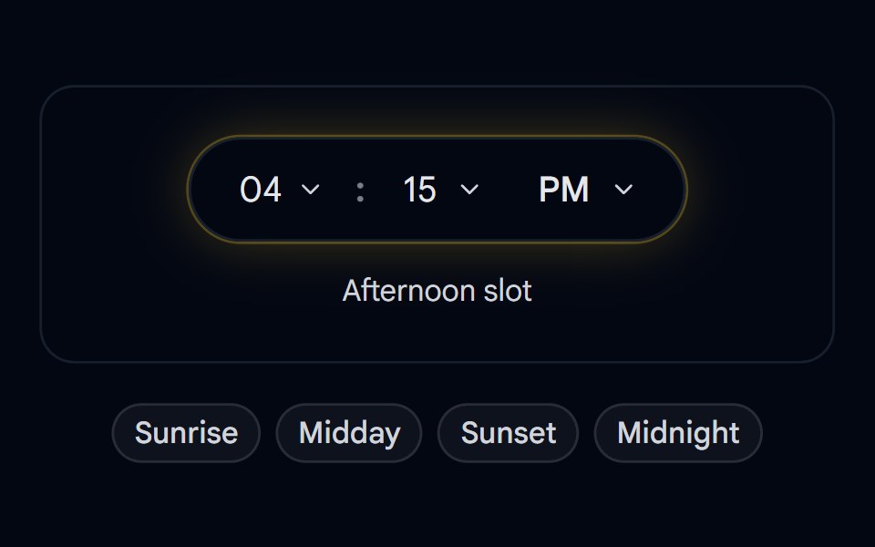 Select 10 - Flip Clock Daypart PickerShadcn Space · ReactPill-shaped hour/minute/period time picker with flip-digit transitions, a day/night glow ring, and quick daypart presets
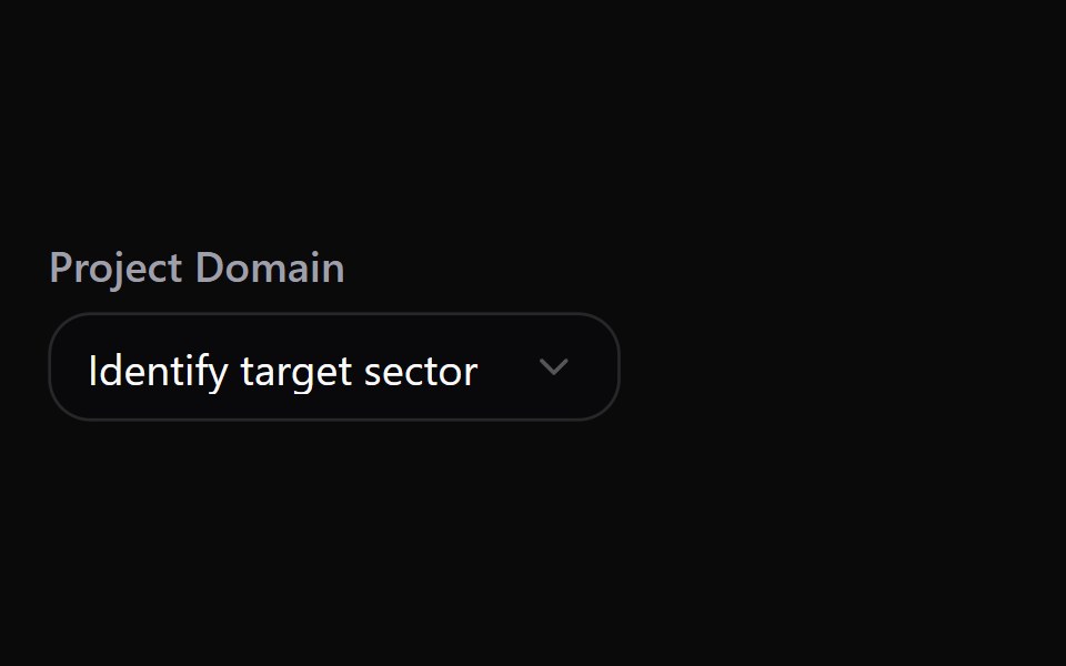 Select 2Watermelon UI · React
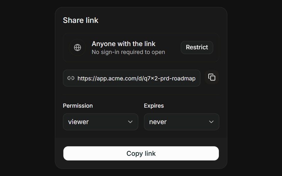 Link with ScopeFLX UI · ReactLink with Scope for Share Access.
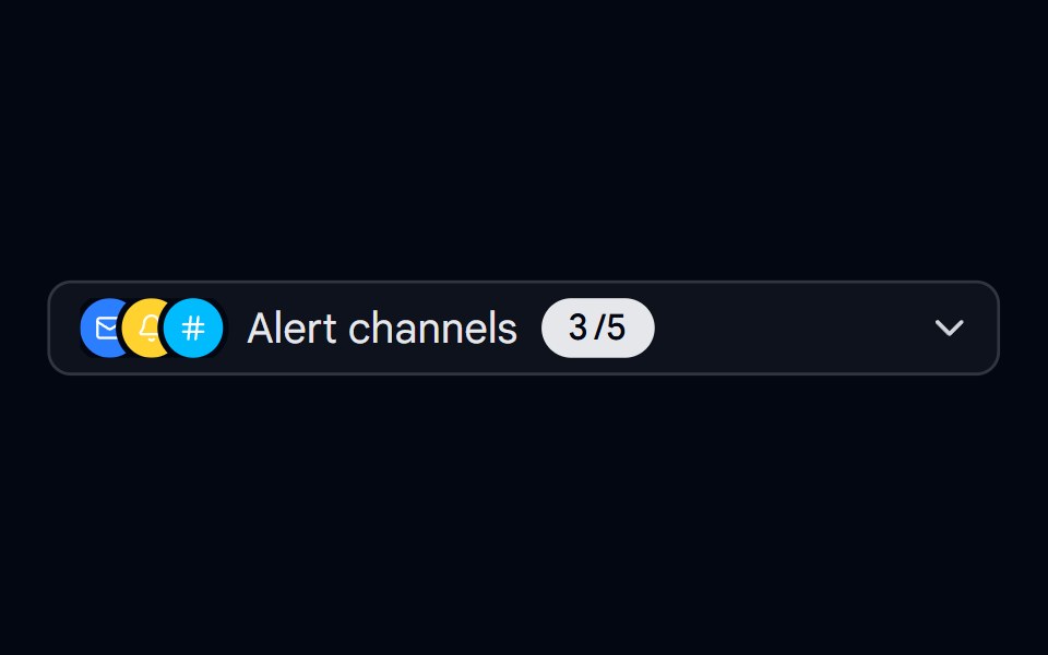 Select 11 - Alert Channels Multi-SelectShadcn Space · ReactMulti-select trigger that summarizes chosen alert channels as an animated overlapping icon stack with a spring-counted…
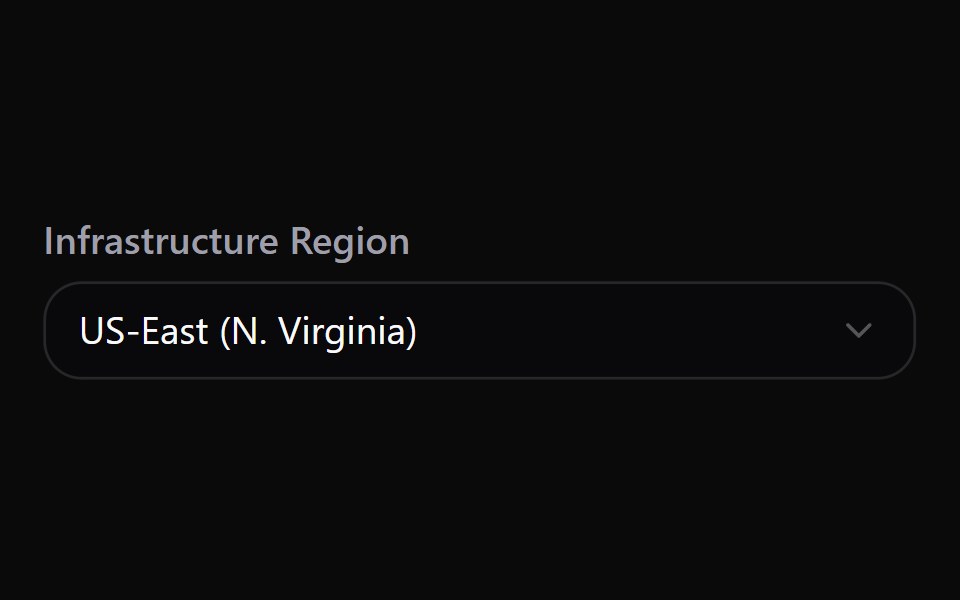 Select 20Watermelon UI · React
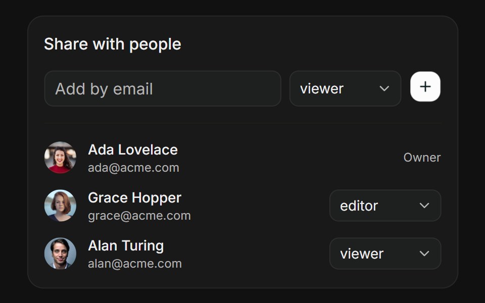 People PickerFLX UI · ReactPeople Picker for Share Access.
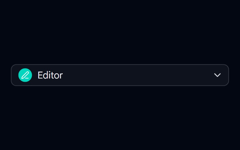 Select 12 - Workspace Role SelectShadcn Space · ReactSelect for workspace roles with colored icon badges and descriptive subtext per option
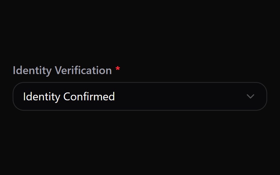 Select 21Watermelon UI · React
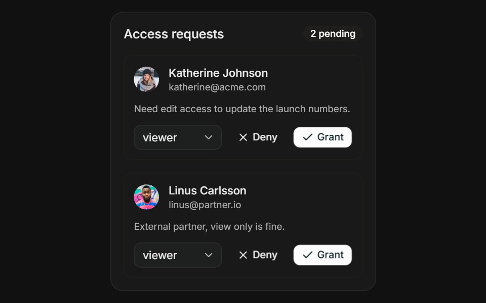 Request AccessFLX UI · ReactRequest Access for Share Access.
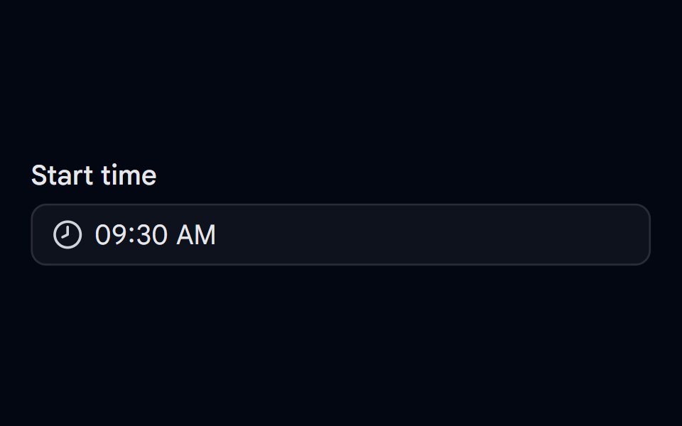 Time Picker 01 - Scroll ColumnsShadcn Space · ReactPopover time picker with scrollable hour, minute, and AM or PM columns
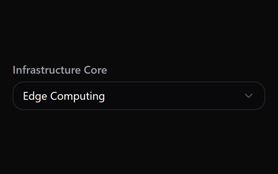 Select 22Watermelon UI · React
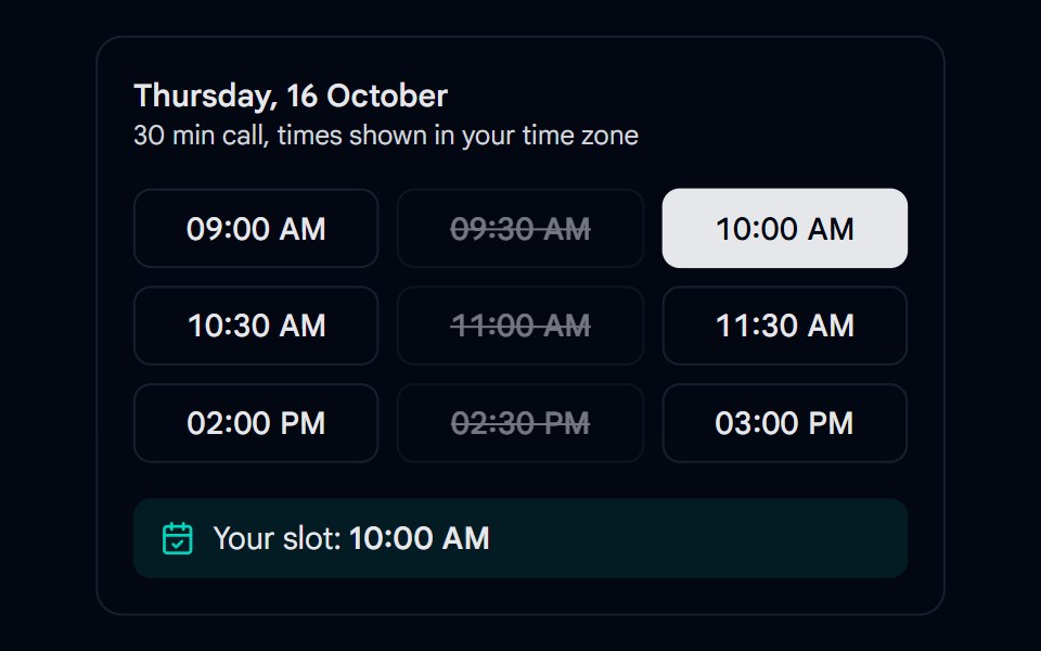 Time Picker 02 - Booking SlotsShadcn Space · ReactGrid of bookable time slots where taken slots are disabled and the chosen slot is confirmed below
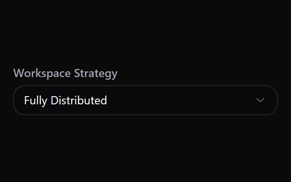 Select 23Watermelon UI · React
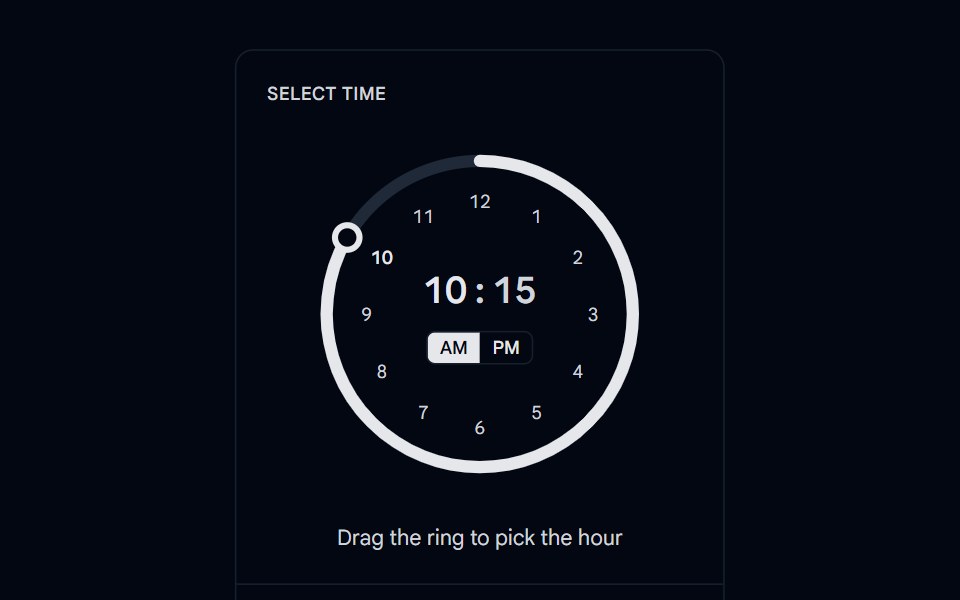 Time Picker 03 - Ring TrackShadcn Space · ReactCircular ring time picker where an arc fills as you drag the knob, with the time and AM or PM toggle in the center and…
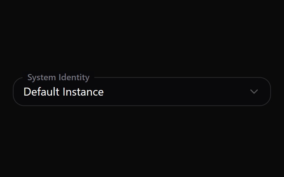 Select 24Watermelon UI · React
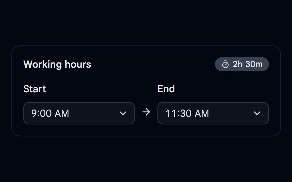 Time Picker 04 - Time RangeShadcn Space · ReactStart and end time selects with a live duration badge and validation when the end is before the start
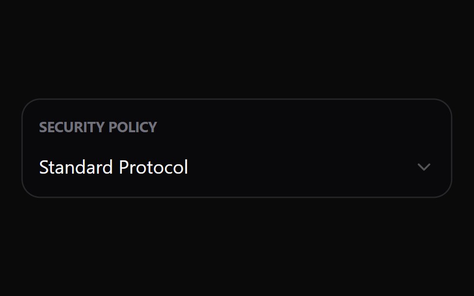 Select 25Watermelon UI · React
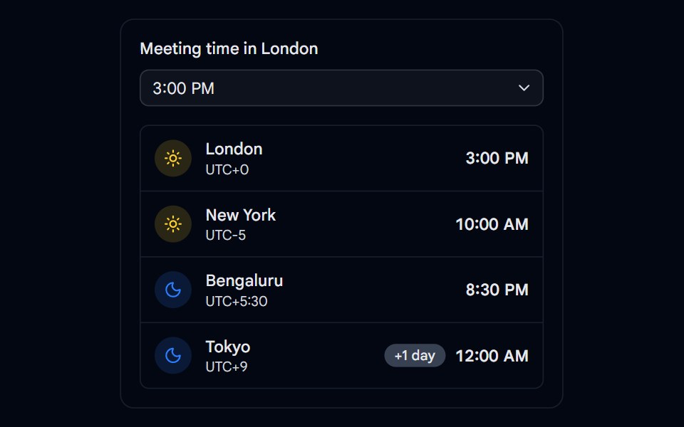 Time Picker 06 - Across Time ZonesShadcn Space · ReactMeeting time picker that converts the chosen time across cities with day and night icons and next day badges
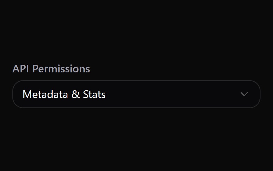 Select 26Watermelon UI · React
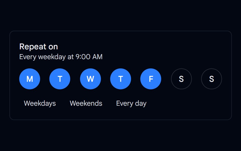 Toggle Group 05 - Weekday PickerShadcn Space · ReactMultiple selection weekday picker for recurring schedules with round day toggles, presets, and a readable summary like…
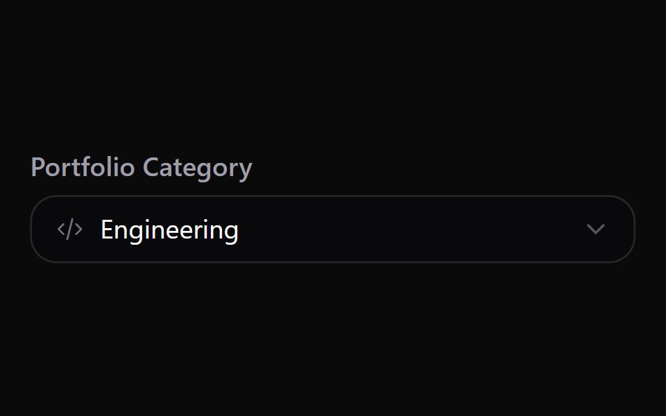 Select 27Watermelon UI · React
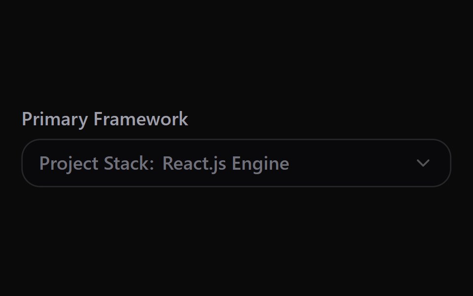 Select 28Watermelon UI · React
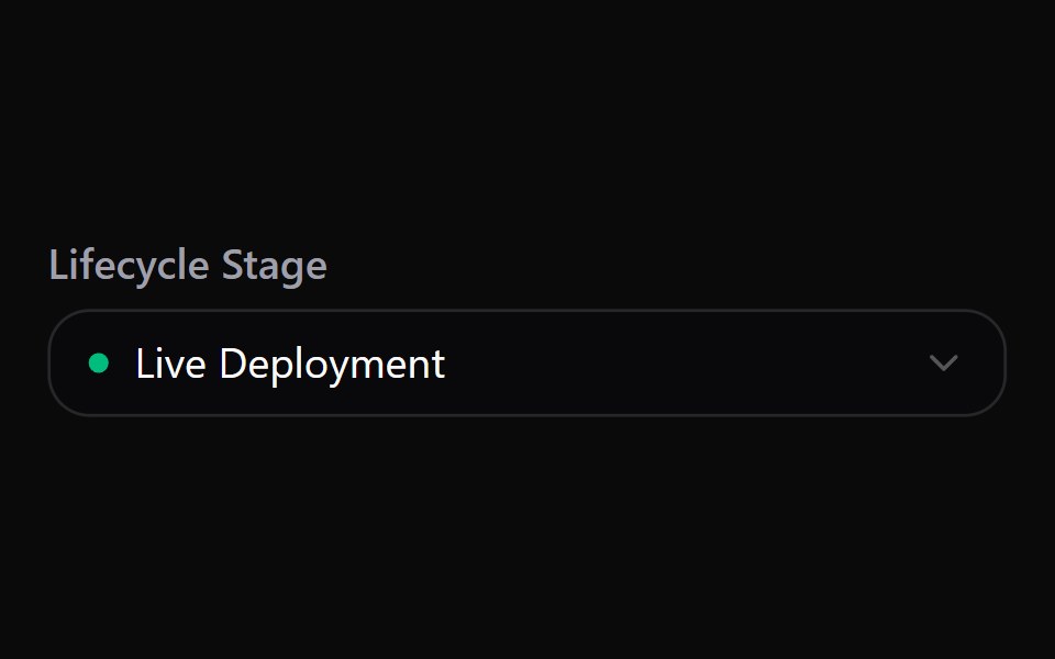 Select 29Watermelon UI · React
Libraries with shadcn/ui select components
Related categories
- Select Components
- React Select Components
- Tailwind CSS Select Components
- React Native Select Components
- Animated Select Components
- shadcn/ui Input Components
- shadcn/ui Form Components
- shadcn/ui Text Input Components
- shadcn/ui Form Field Components
- shadcn/ui Switch Components
- shadcn/ui Textarea Components
- shadcn/ui Checkbox Components
- shadcn/ui OTP Input Components
- shadcn/ui Combobox Components
- shadcn/ui Date Picker Components
- shadcn/ui Radio Components
- shadcn/ui Login Form Components
- shadcn/ui Search Input Components
- shadcn/ui File Upload Components
- shadcn/ui Slider Components
- shadcn/ui Signup Form Components