 Dev Design Library
Tailwind CSS Select Components
Dev Design Library indexes 476 Tailwind CSS select components from 56 open-source UI libraries, with the most coming from ReUI, Watermelon UI, Origin UI, Shadcn Space and FLX UI. Each one links to its page with the source code, a live preview where available, the library license and the install command. Every library in this list styles its components with Tailwind CSS utility classes. Select components belong to the Inputs group.
Showing 120 of 476, a mix from every library. Open a library to see all of its components.
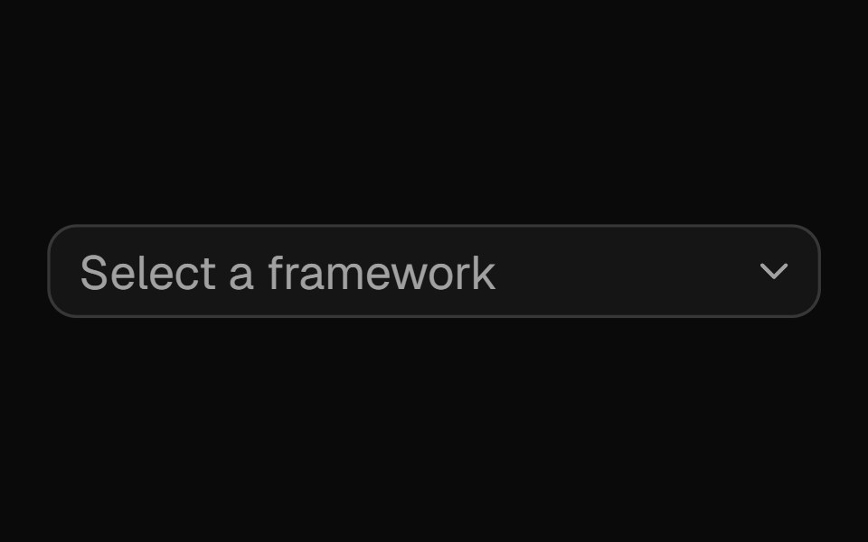 Comboboxshadcn/ui · ReactAutocomplete input with a list of suggestions.
 DropdowndaisyUI · CSS (Tailwind)
 AutocompleteHeroUI · ReactAn autocomplete combines a select with filtering, allowing users to search and select from a list of options
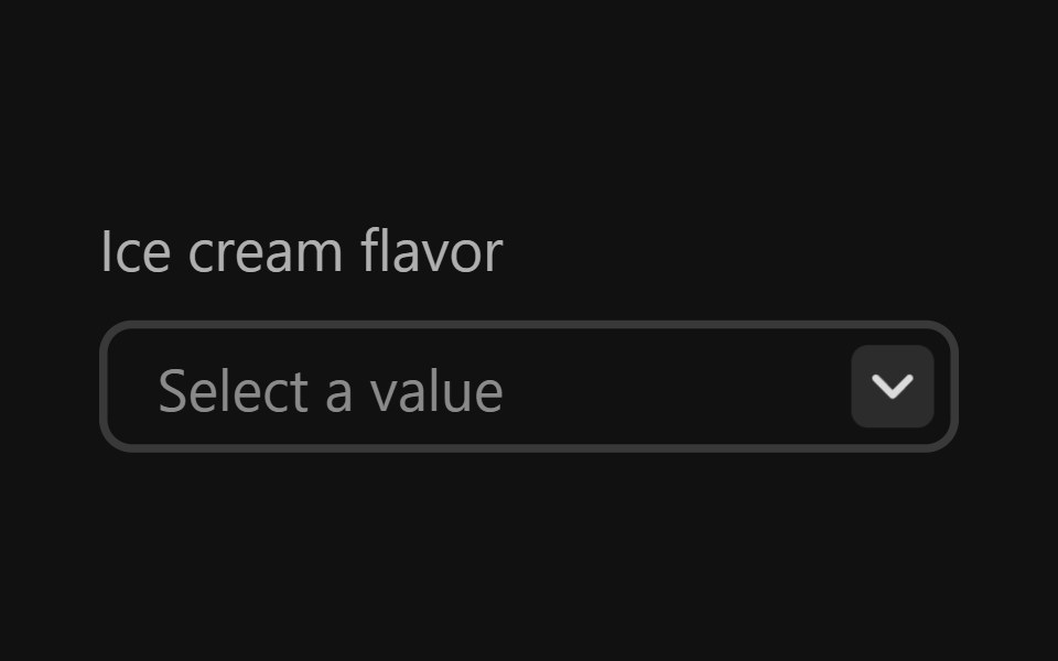 Combo BoxReact Spectrum · ReactComboBoxes combine a text entry with a picker menu, allowing users to filter longer lists to only the selections…
 Autocompletecoss ui · ReactAn input that suggests options as you type.
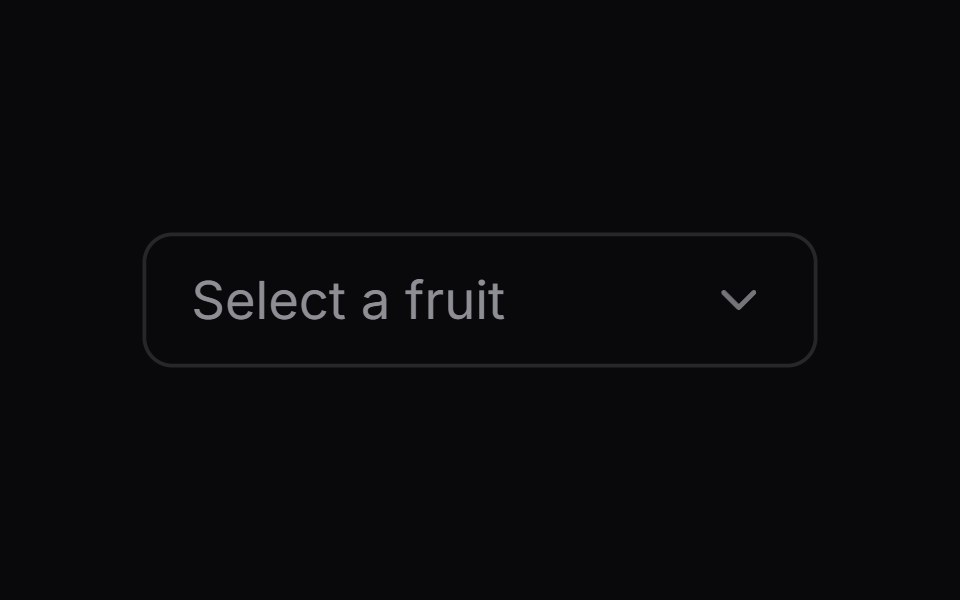 SelectOrigin UI · ReactA common form component for choosing a predefined value in a dropdown menu.
 DropdownPreline UI · JavaScript (HTML + Tailwind)
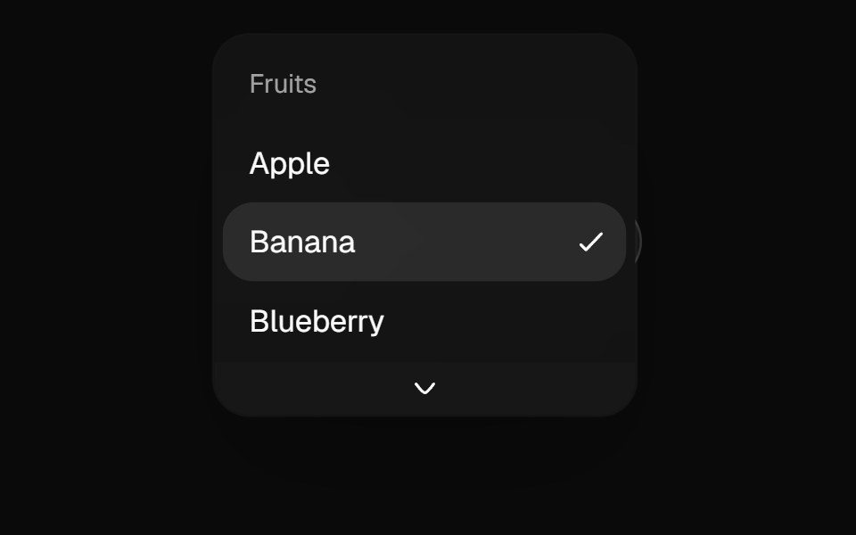 Base SelectCult UI · ReactBase UI select primitives used by Halo Select
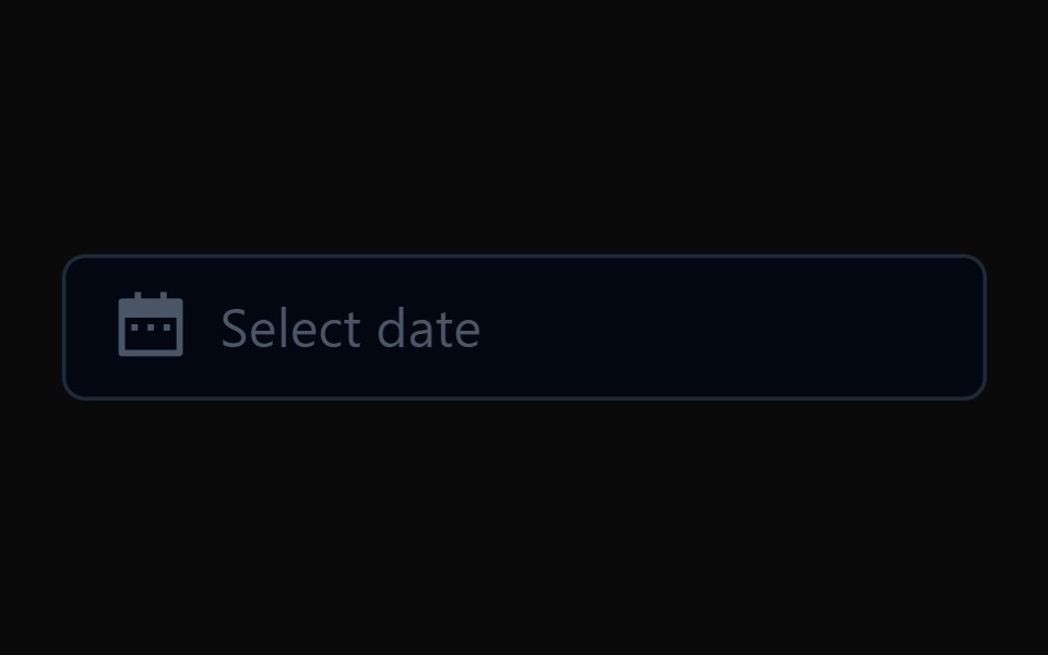 Date PickerTremor · React
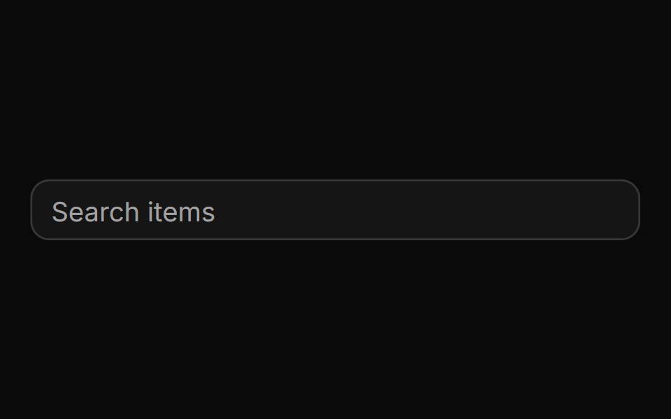 AutocompleteReUI · ReactAn input that suggests options as you type.
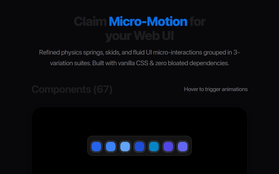 Elastic Tag SnapAmicro Micro Transitions · ReactMinimalist luggage tag with bungee spring snap and vertical recoil.
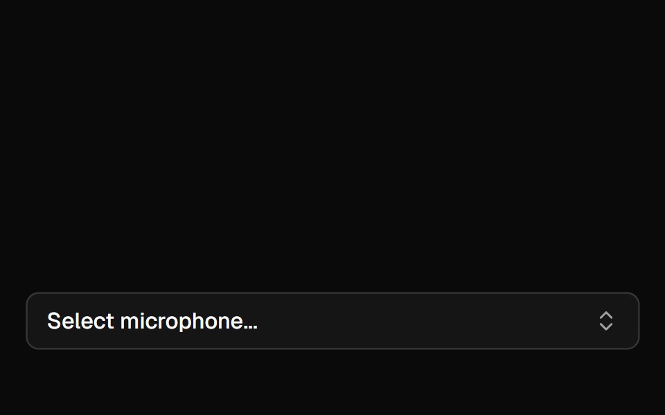 Mic SelectorAI Elements · ReactA composable dropdown component for selecting audio input devices with permission handling and device change detection.
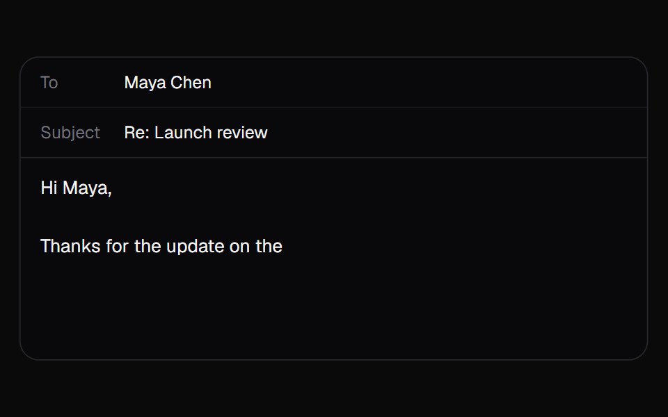 AI AutocompleteKokonut UI · ReactA text box that suggests how your sentence ends in grey after the caret. Tab takes it all, the right arrow takes one…
 combo-boxIntent UI · Reactcombo-box
 DropdownUntitled UI React · React
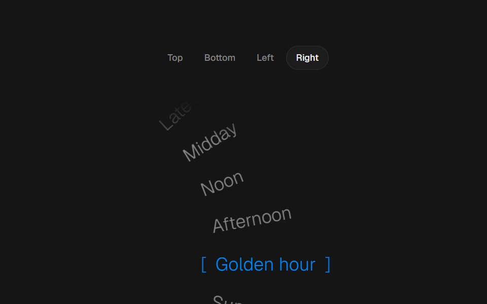 Arc PickerbeUI · ReactRadial text picker with top, bottom, left or right curves, smooth wheel movement and live selection on each scroll…
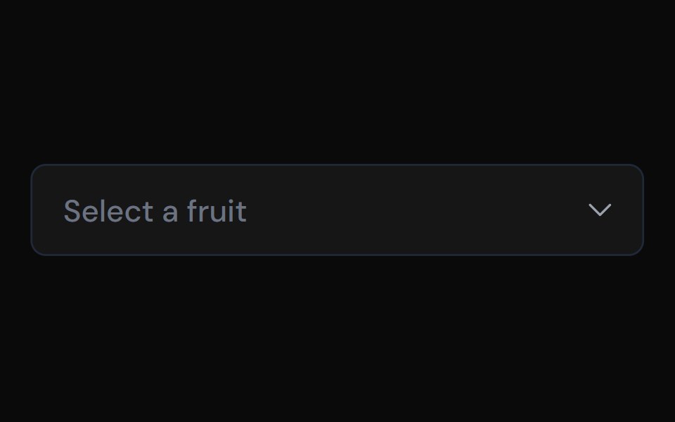 ComboboxTailGrids · ReactA combobox component with multiple variants.
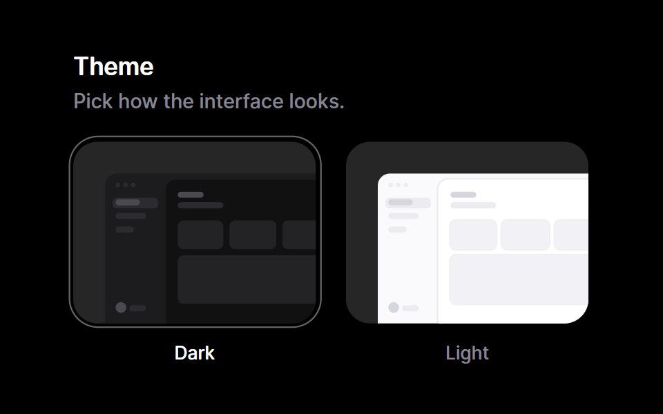 Theme SelectorRare UI · ReactA row of miniature app previews, one per theme, with a ring that marks the one you pick.
 Multiple SelectorSpectrum UI · ReactA multi-select input with async search, grouping, and creatable options.
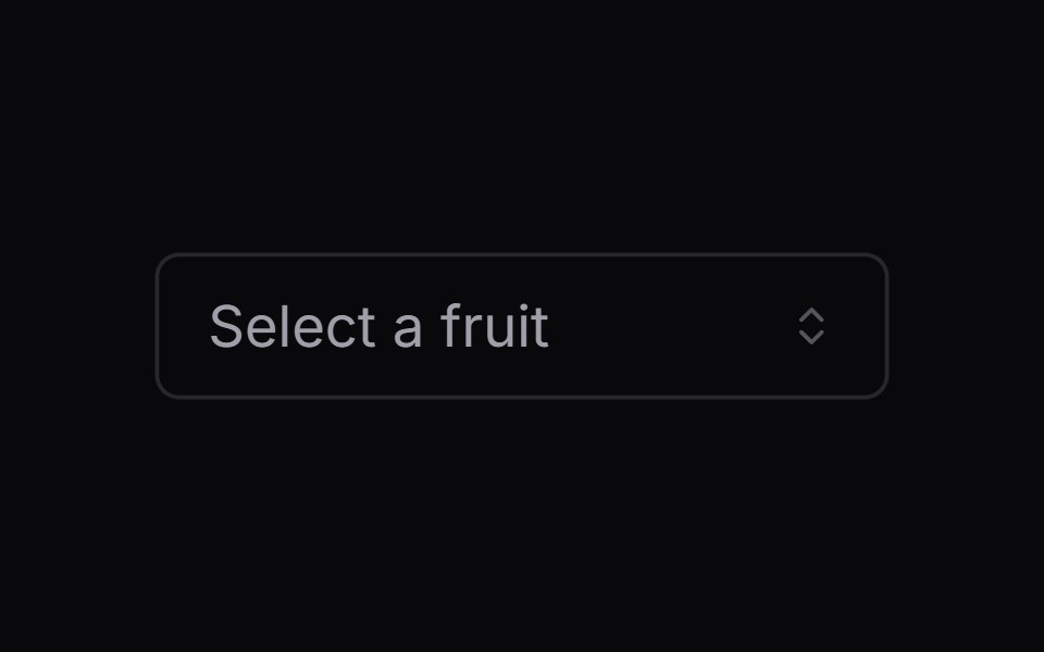 SelectVengeance UI · React
 ComboboxFluid Functionalism · ReactType-to-filter combobox with single or multiple (chips, merged selection backgrounds) selection: a text field that…
 ComboboxToolcraft · React
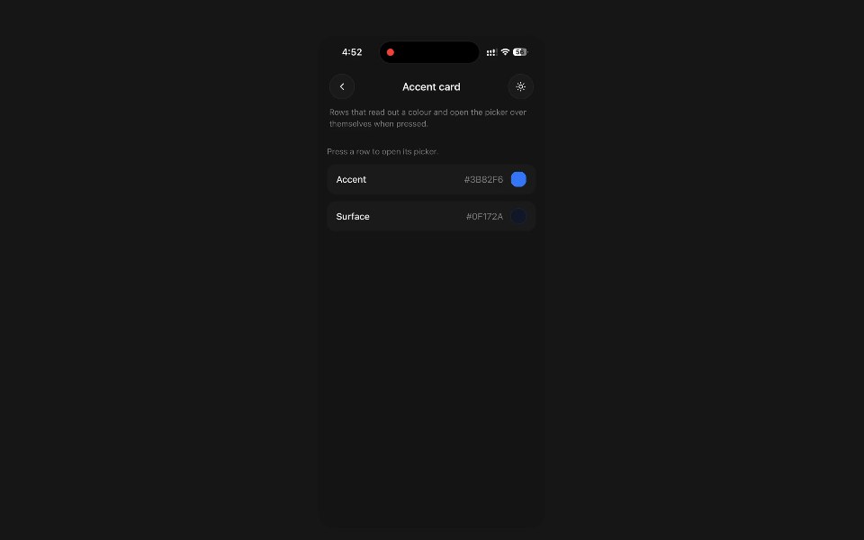 Color PickerPanel UI · React NativeA colour chosen by dragging — a saturation square or a wheel, a hue scale, and opacity.
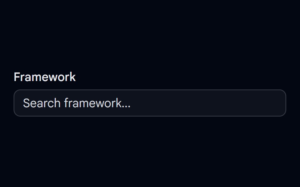 Autocomplete-01 - DefaultShadcn Space · ReactDefault autocomplete component
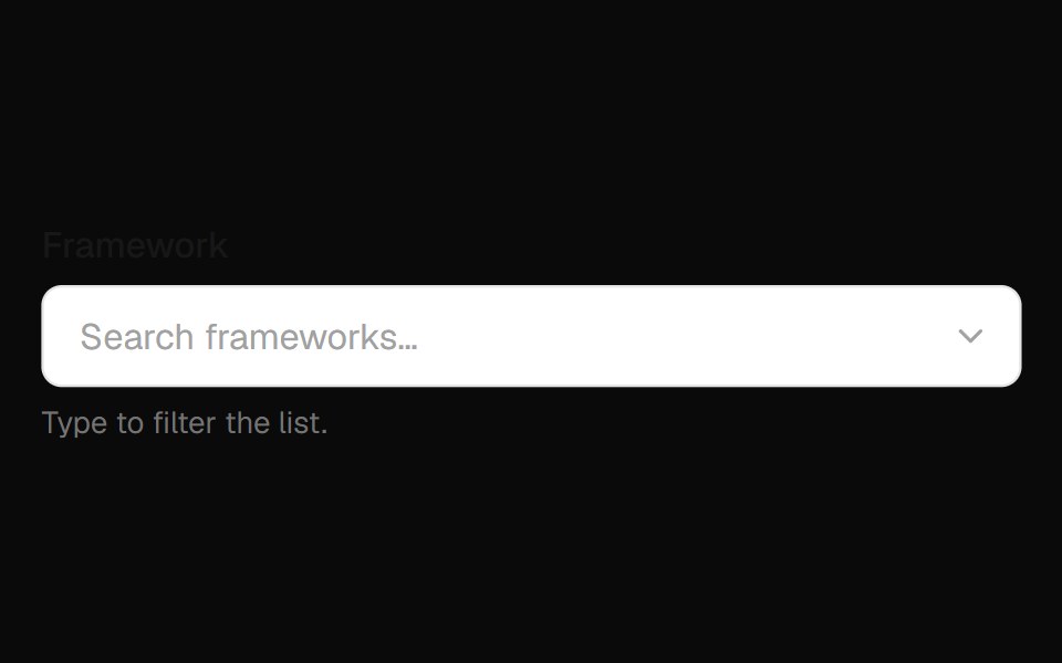 Combobox Field InputOpenSourceUI · React
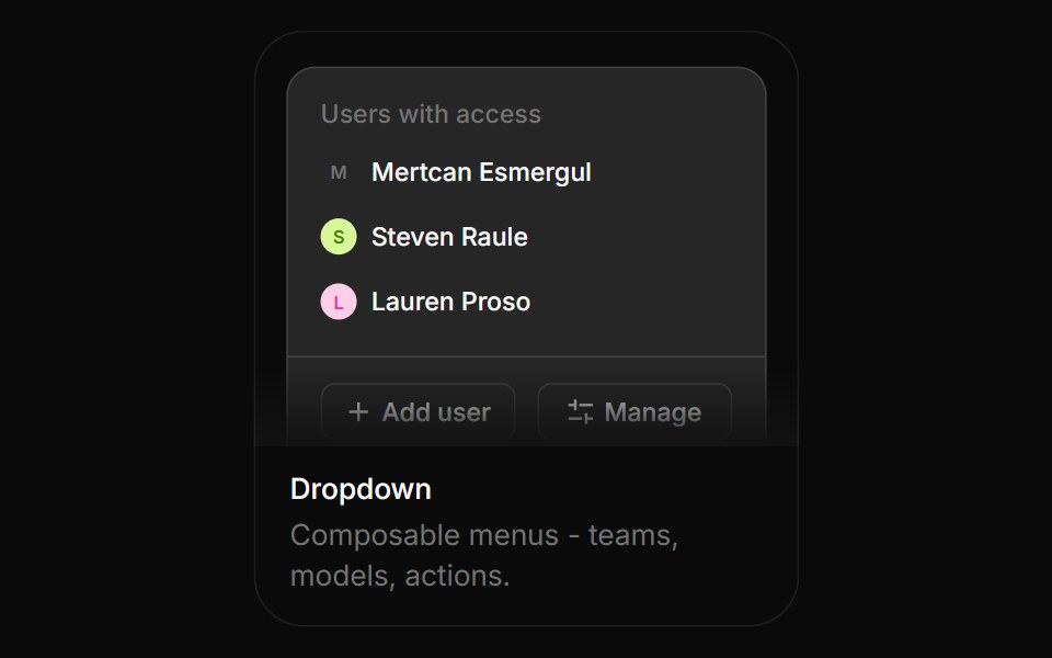 DropdownBoardUI · ReactComposable menus - teams, models, actions.
 AutocompleteComponentry · React
 SelectTremor Blocks · React
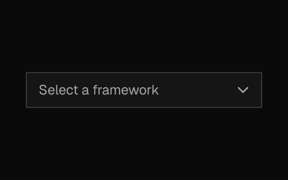 ComboboxShadcn Dashboard · React
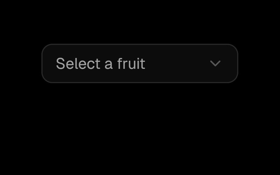 SelectObsidianUI · React
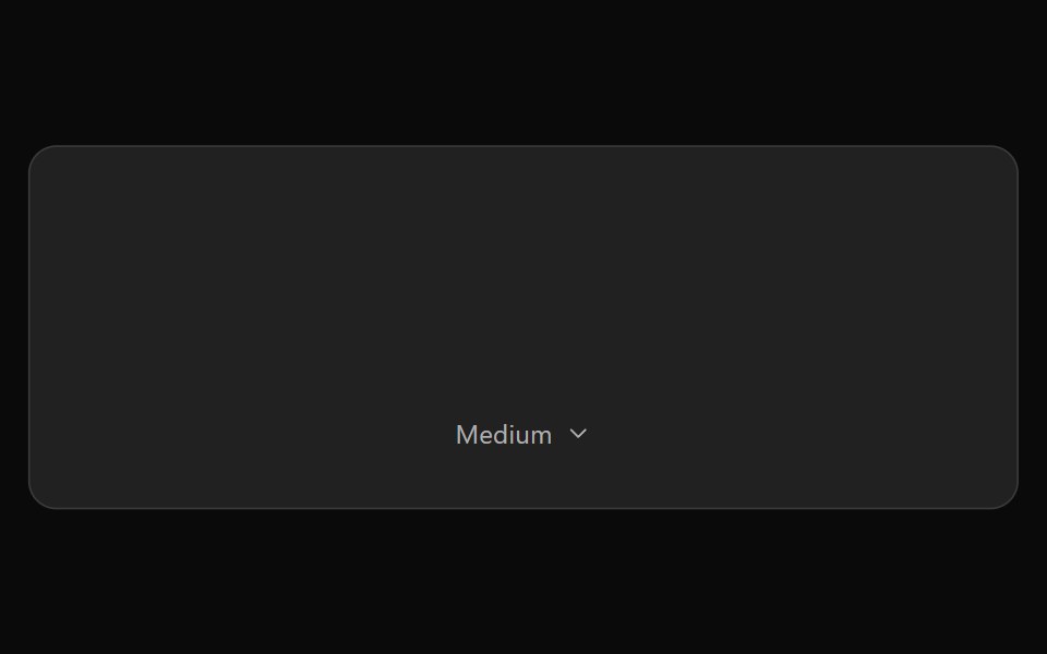 ChatGPT Model SelectorNotra · ReactThe hover-to-open effort chip with Model and Effort submenus, built on shadcn DropdownMenu.
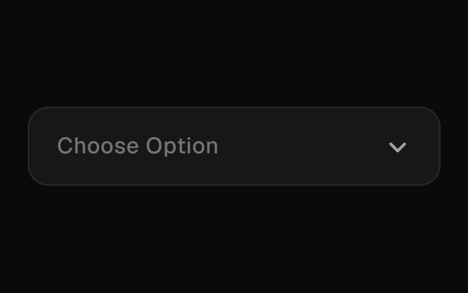 Animated SelectGreatUI · React
 Select 04Oxbow UI · AstroForm validation with error message
 Gooey DropdownNexvyn UI · ReactA dropdown menu with a gooey SVG filter effect that morphs a trigger pill into the panel using spring physics and CSS…
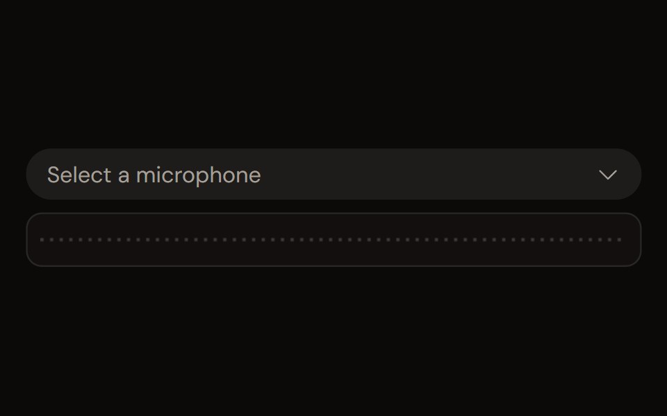 Audio Device Selectaudiocn · ReactA microphone, speaker or source picker with loading, permission, None and disconnected-device states, and a slot for a…
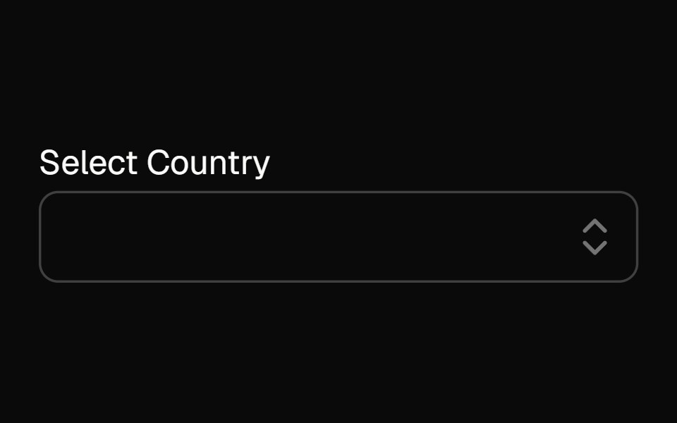 comboboxBaseLayer · ReactA combo box combines a text input with a listbox, allowing users to filter a list of options to items matching a query.
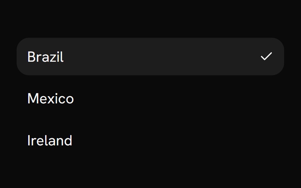 ListboxShark UI · ReactSelect a single or multiple items from a list.
 Assignment ClusterSona UI · React
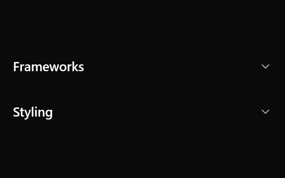 Accordion MultiselectWatermelon UI · React
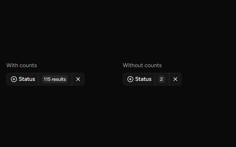 Data Table Faceted Filtersv-table · SvelteA searchable multi-select filter with live counts for categorical table columns.
 Glass Comboboxglasscn · ReactGlass Combobox with five variants: clear, frosted, subtle, liquid, and liquid-refract
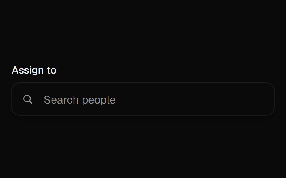 ComboboxUI Lab · ReactThe person you pick flies out of the list and into the field.
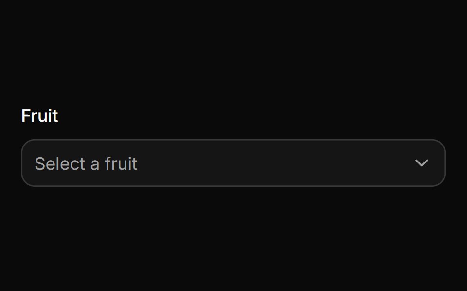 ComboboxHextaUI · ReactA filterable select with chips, groups and async results, in a popup that resizes as you type.
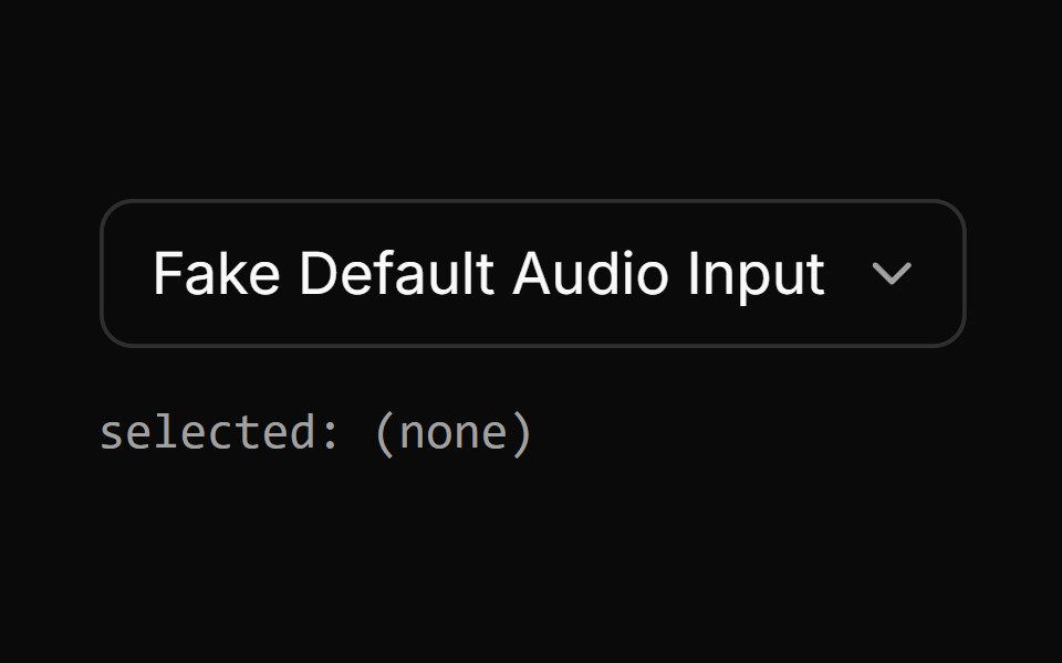 Mic SelectorLocalMode · ReactA microphone input-device picker with permission handling and live device enumeration — fully offline, using only…
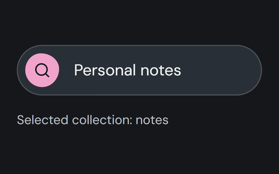 ComboboxCojeev UI · ReactFilters a list of options through text input and stores one selected value.
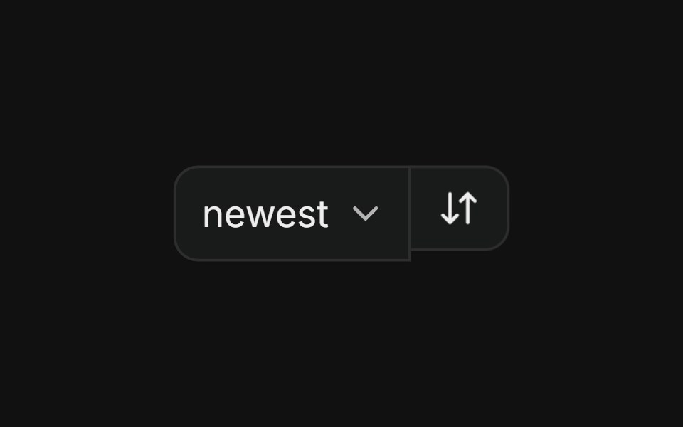 With selectFLX UI · ReactSort dropdown paired with a direction-toggle icon button in a merged-border row.
 Code Snippet With Language Selectorsv-particles · Svelte
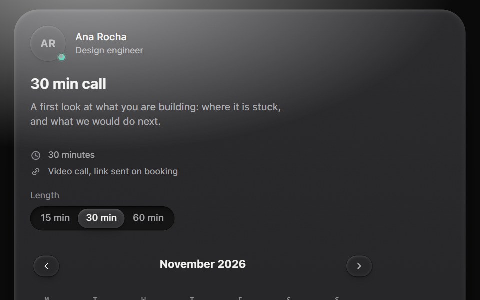 Availability pickerMetal UI · React + SwiftUIA booking block: a host, a call length, a calendar of the next six weeks, the day's free times re-labelled by time…
 AutocompleteSpaceUI · ReactDisplays matching suggestions as users type into an input field, helping them find items quickly and reducing typing…
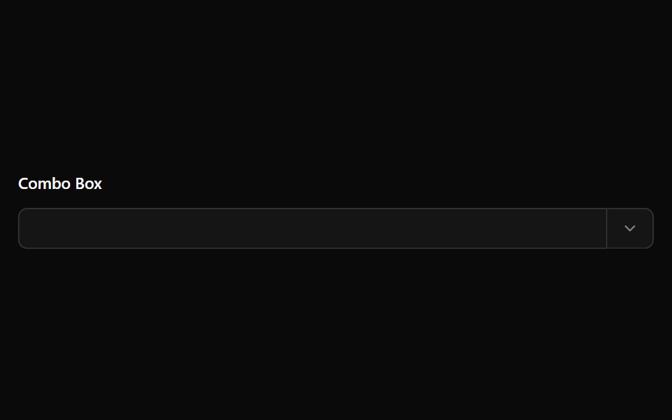 Combo BoxOUI · ReactReact aria components Combo Box with shadcn characteristics.
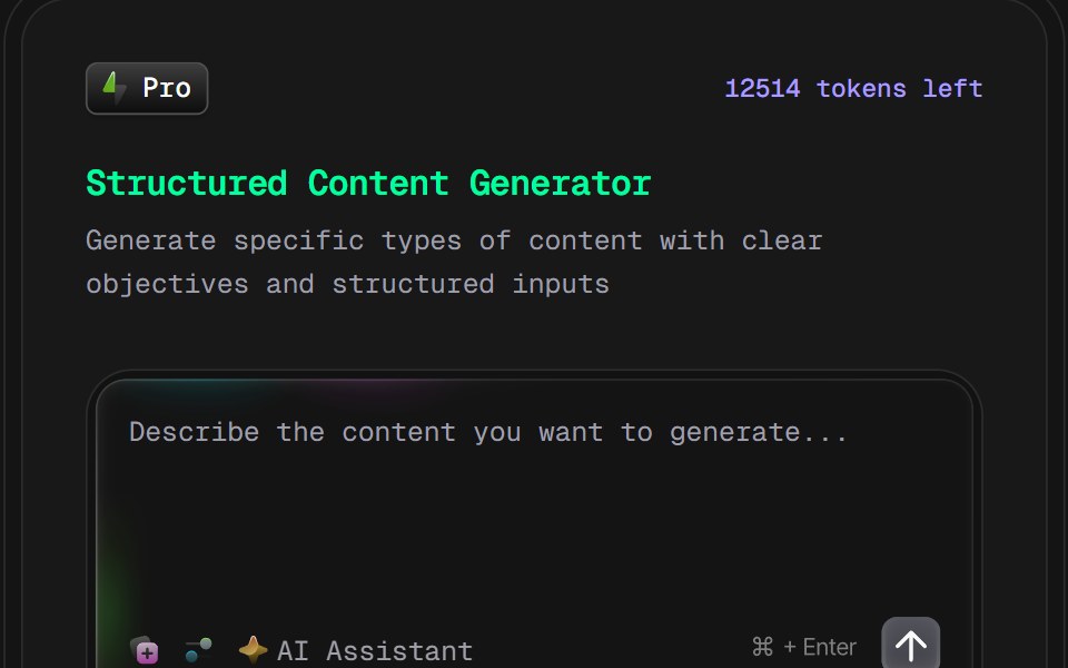 AI Content Creator Card v2D2Studio UI · ReactGlassmorphic AI content generator card with content type and tone pickers and a prompt field.
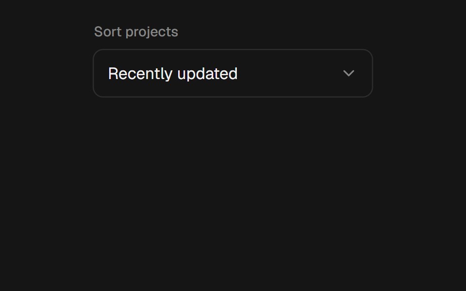 SelectEaseUI · ReactComposable select whose menu fades and scales out of the trigger, and opens upward when there is no room below.
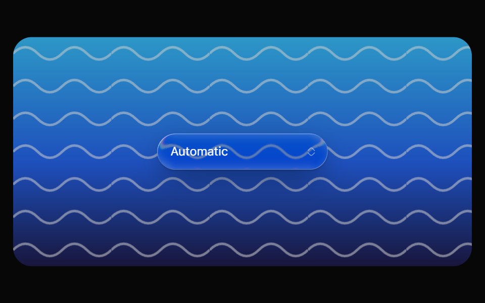 Glass SelectOpaline · ReactCapsule select with a frosted glass option list.
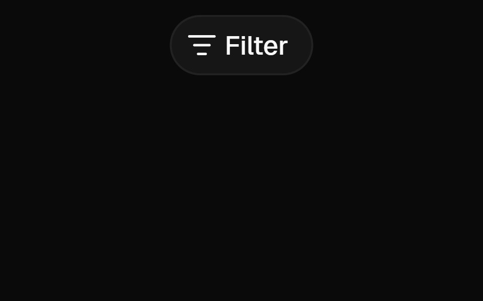 Filter MenuFibo · ReactA filter menu of fields and values that turns into a search as you type.
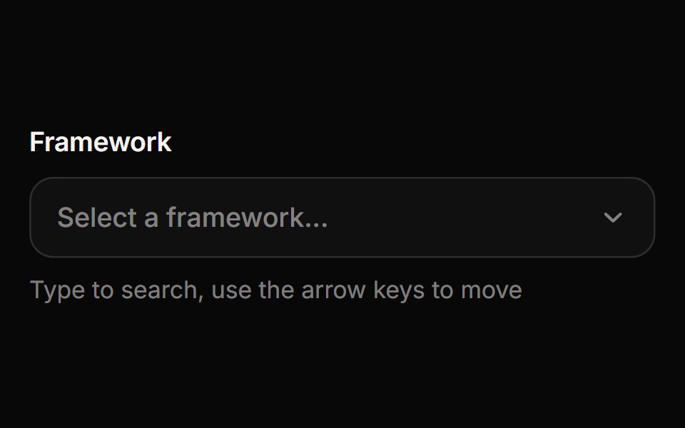 ComboboxReactFrame · ReactA searchable select where you type to filter options, with match highlighting, option descriptions, disabled options…
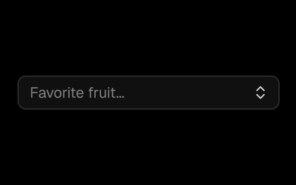 Comboboxark-cn · ReactA shadcn-style combobox component built with Ark UI primitives.
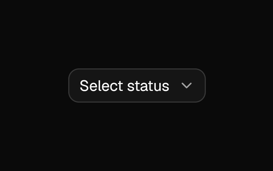 Native Selectshadcn/ui · ReactStyled native HTML select dropdown. Select nativo do HTML estilizado.
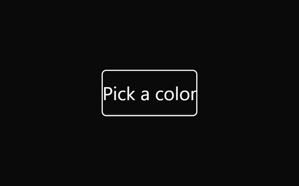 SelectdaisyUI · CSS (Tailwind)
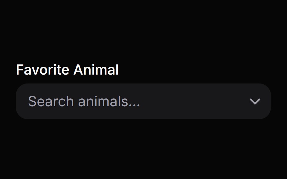 Combo BoxHeroUI · ReactA combo box combines a text input with a listbox, allowing users to filter a list of options to items matching a query
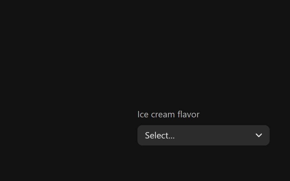 PickerReact Spectrum · ReactPickers allow users to choose a single option from a collapsible list of options when space is limited.
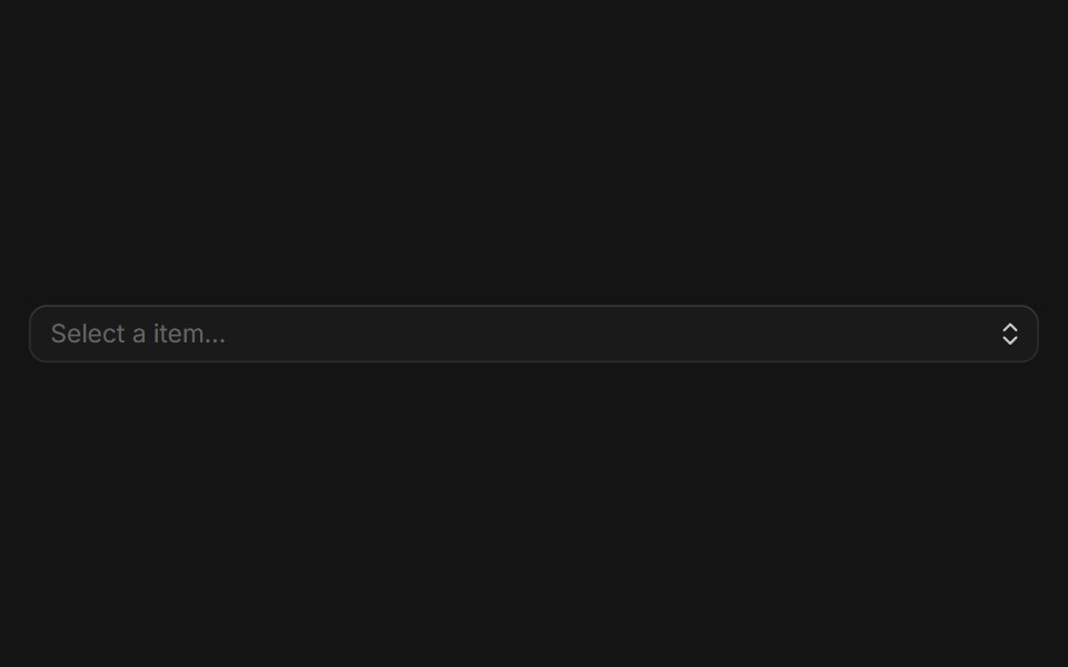 Comboboxcoss ui · ReactAn input combined with a list of predefined items to select.
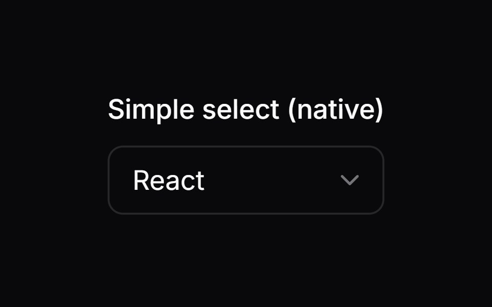 Comp 189Origin UI · React
 SelectPreline UI · JavaScript (HTML + Tailwind)
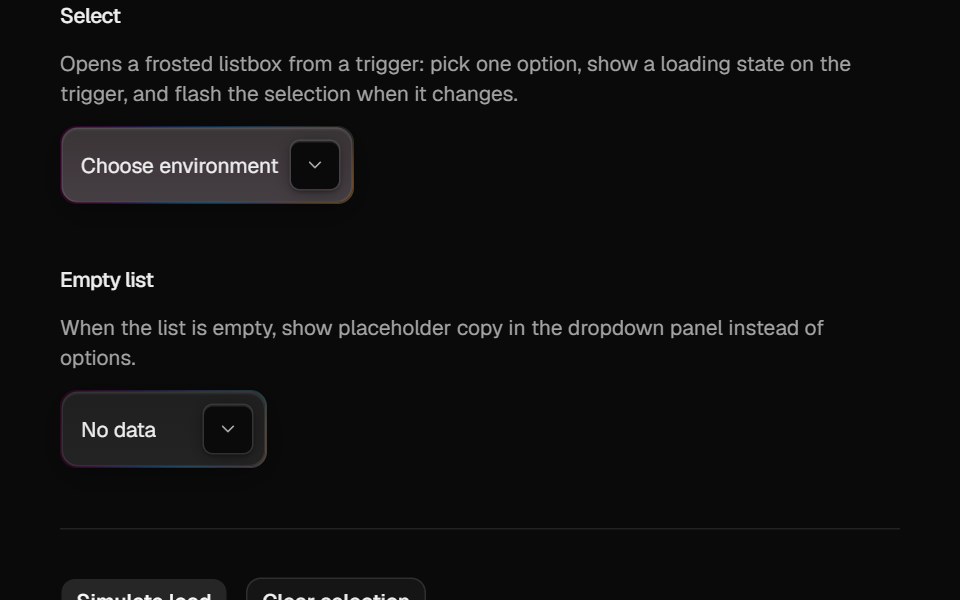 Halo SelectCult UI · ReactComposable animated select with gradient rim, frosted fill, and staggered label
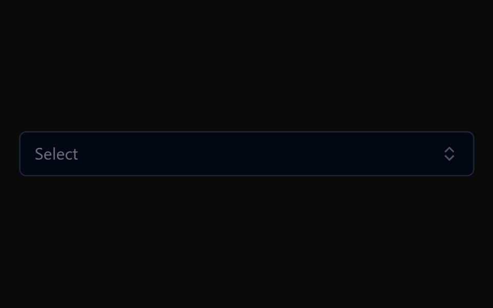 SelectTremor · React
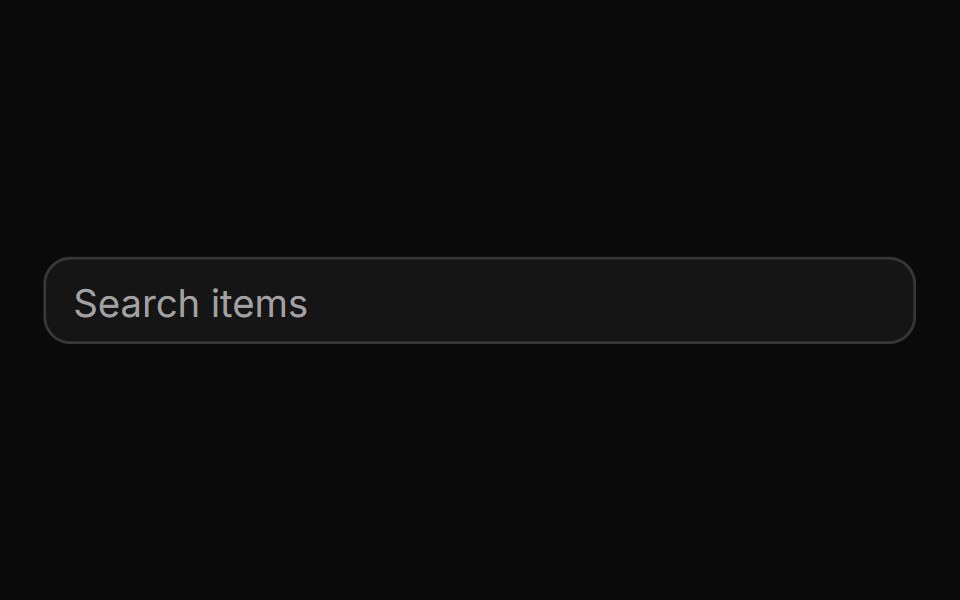 Basic autocomplete controlReUI · ReactBasic autocomplete control
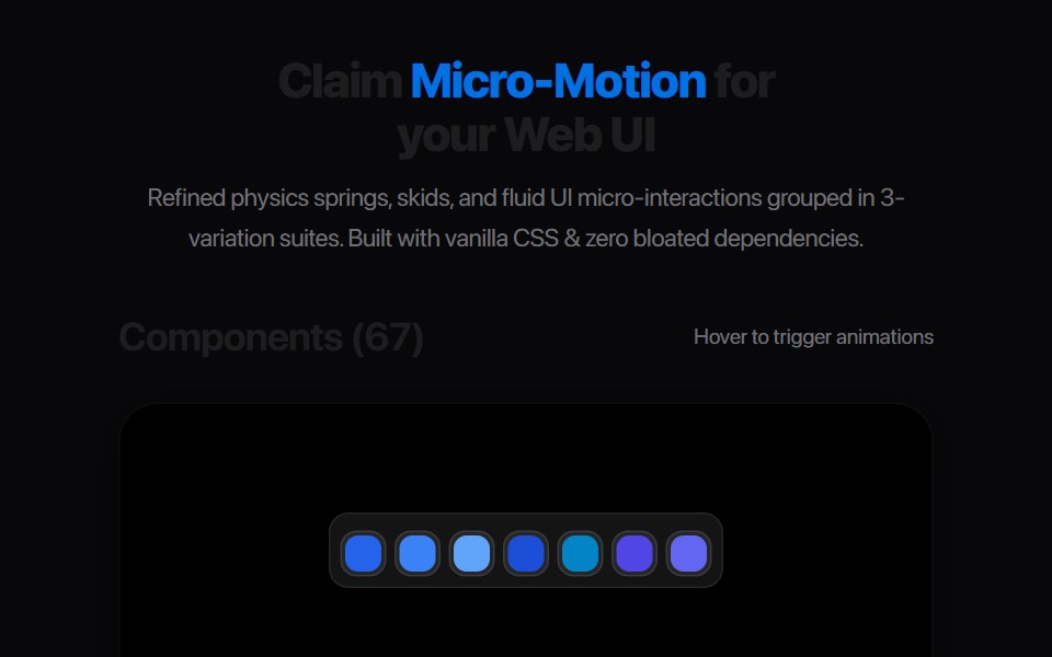 Category SelectAmicro Micro Transitions · React
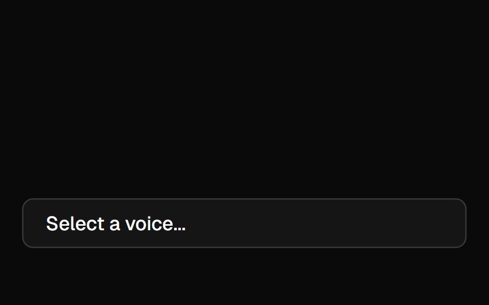 Voice SelectorAI Elements · ReactA composable dialog component for selecting AI voices with metadata display and search functionality.
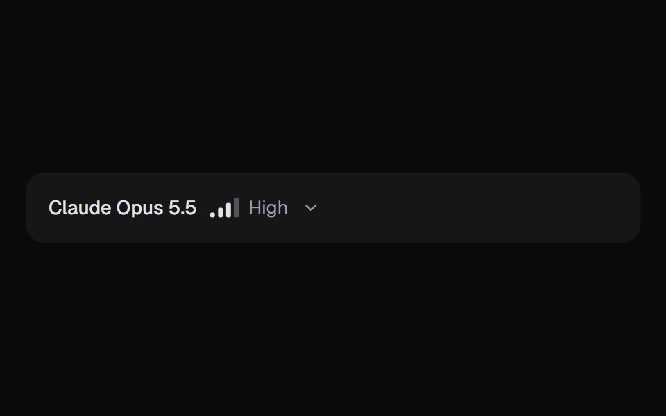 AI Model SelectorKokonut UI · ReactPick a model and how hard it thinks. Effort is a detent track that reshapes for each model and keeps your level when…
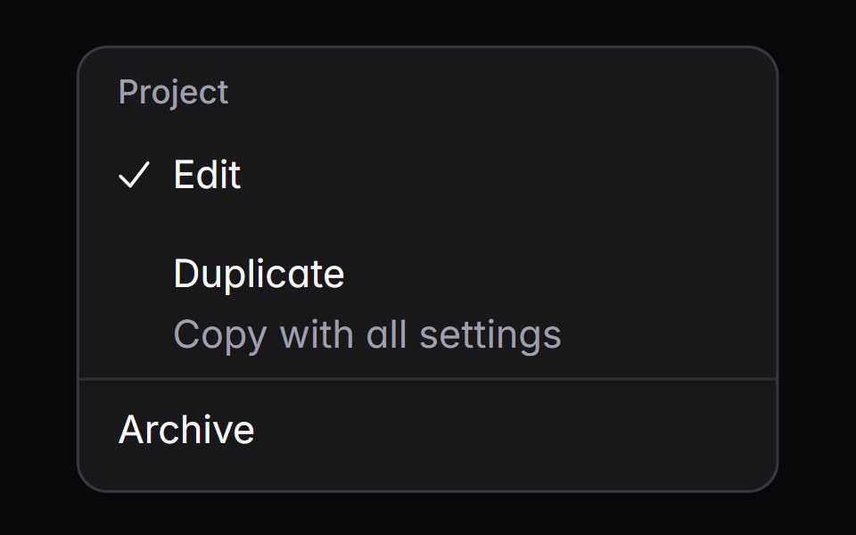 dropdownIntent UI · Reactdropdown
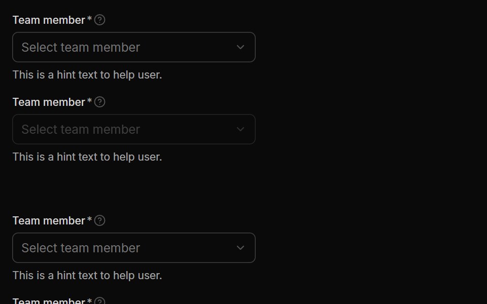 SelectUntitled UI React · React
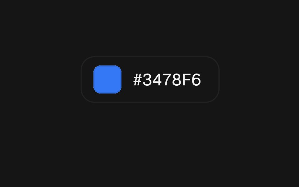 Color PickerbeUI · ReactA popover picker with a loupe under your finger.
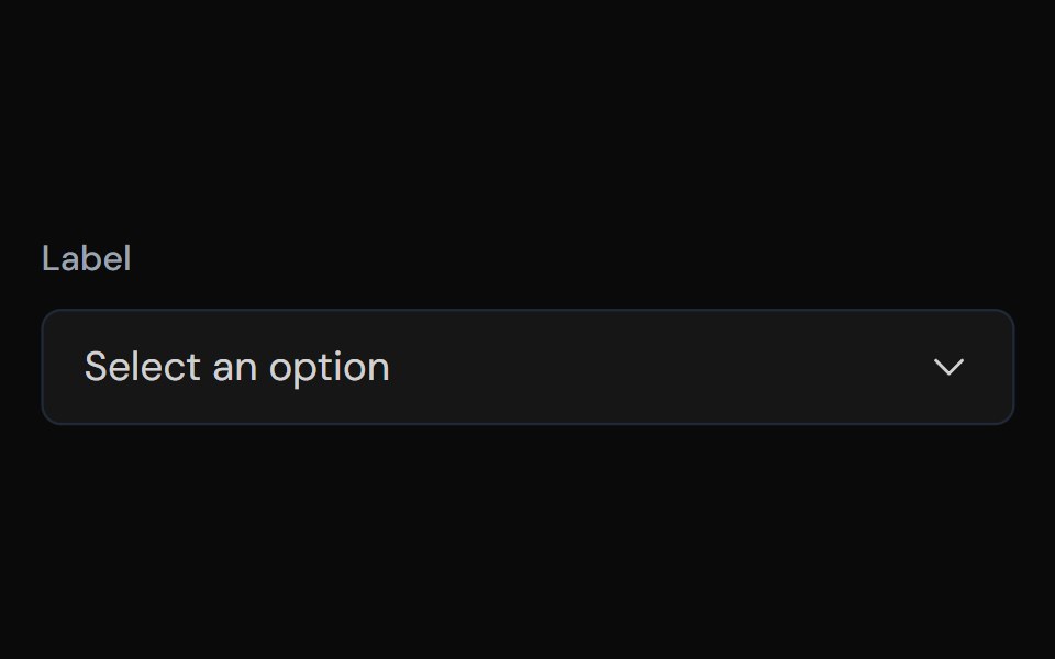 Native SelectTailGrids · ReactA native select component with multiple variants.
 ComboboxFluid Functionalism · ReactType-to-filter combobox with single or multiple (chips, merged selection backgrounds) selection: a text field that…
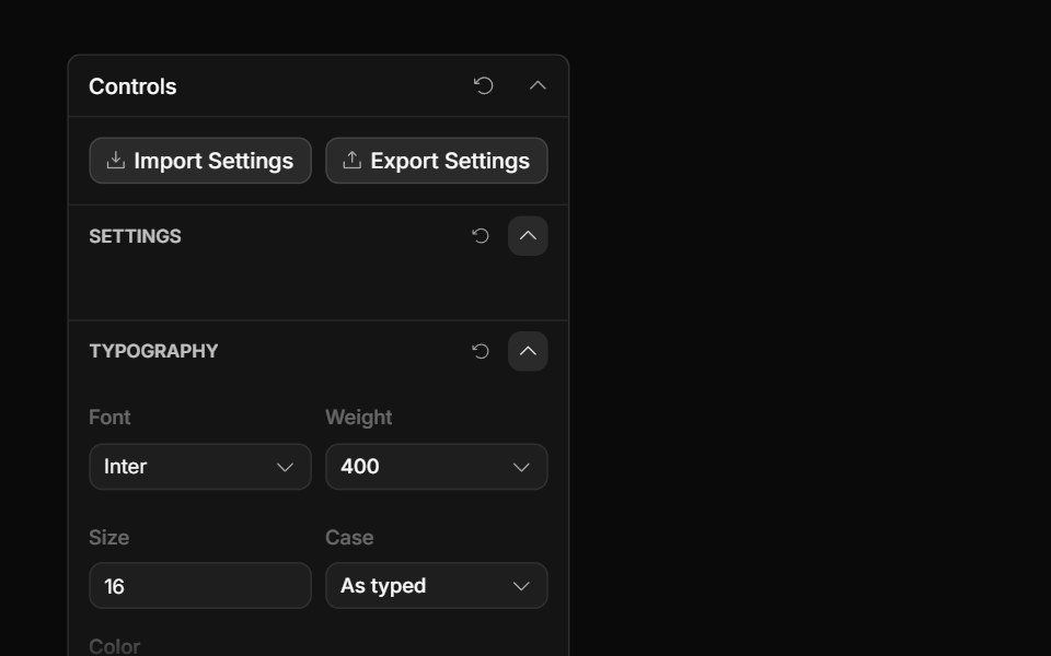 Font Picker ControlToolcraft · React
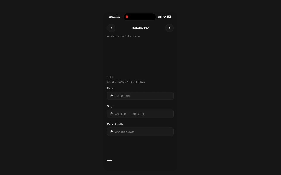 Date PickerPanel UI · React NativeA calendar behind a button.
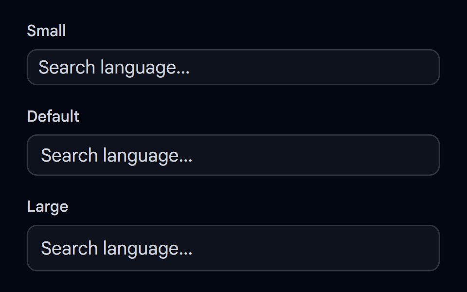 Autocomplete-02 - Size variantsShadcn Space · ReactAutocomplete component with different size variants
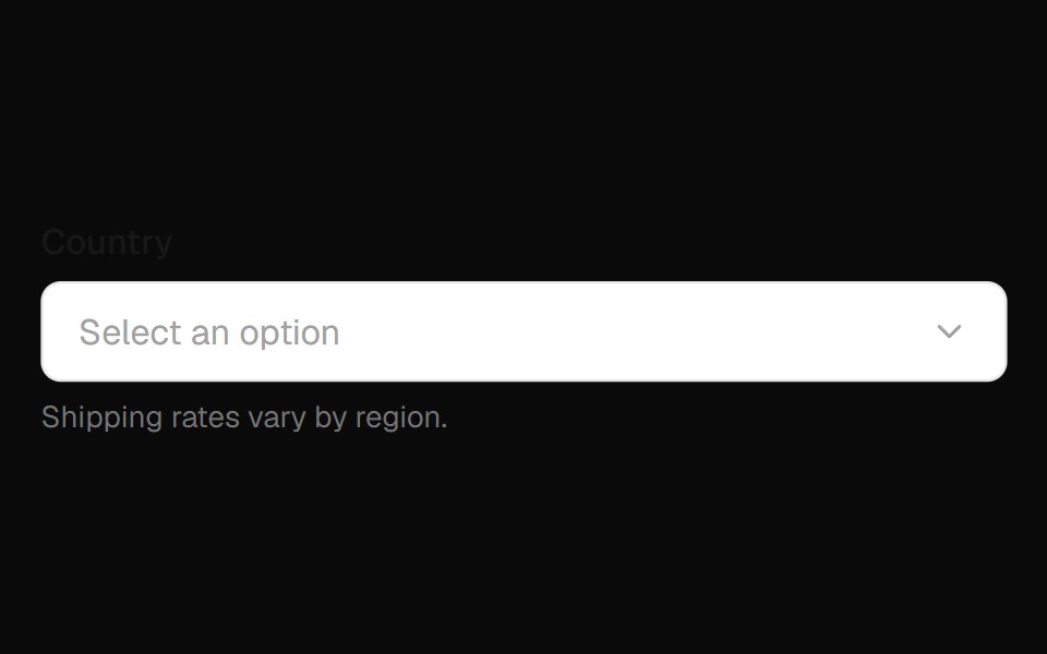 Select Field InputOpenSourceUI · React
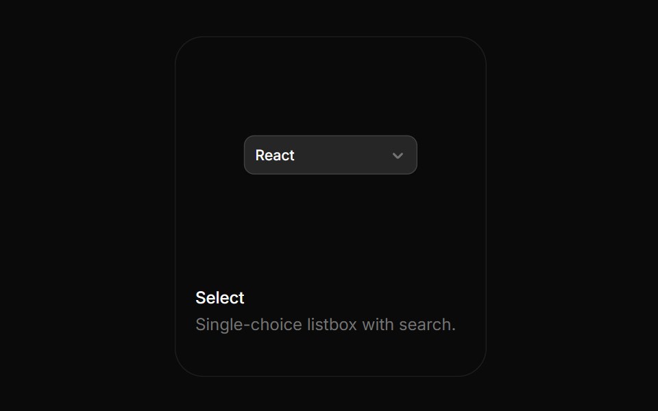 SelectBoardUI · ReactSingle-choice listbox with search.
 Select NativeTremor Blocks · React
 Native SelectShadcn Dashboard · React
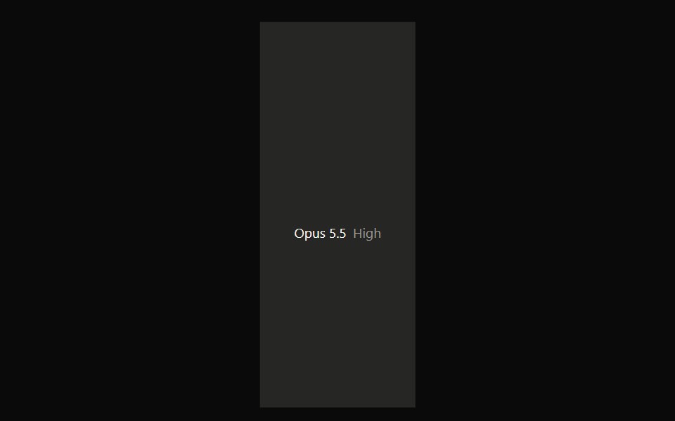 Claude Model SelectorNotra · ReactA hover-open model and effort picker built on shadcn DropdownMenu.
 Select 01Oxbow UI · Astro
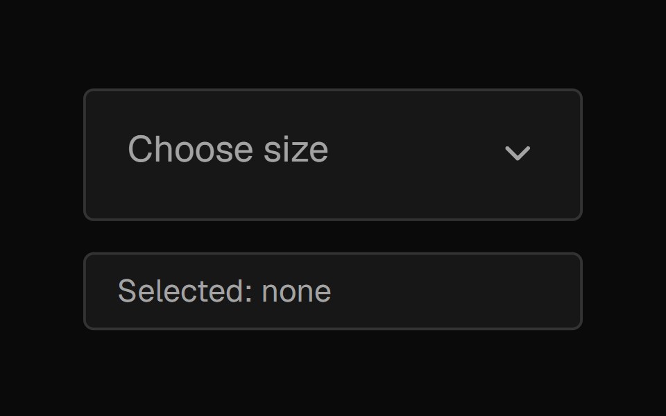 SelectNexvyn UI · ReactA form select with a two-layer proximity highlight (selected accent tint + muted hover), drawn check animation, and a…
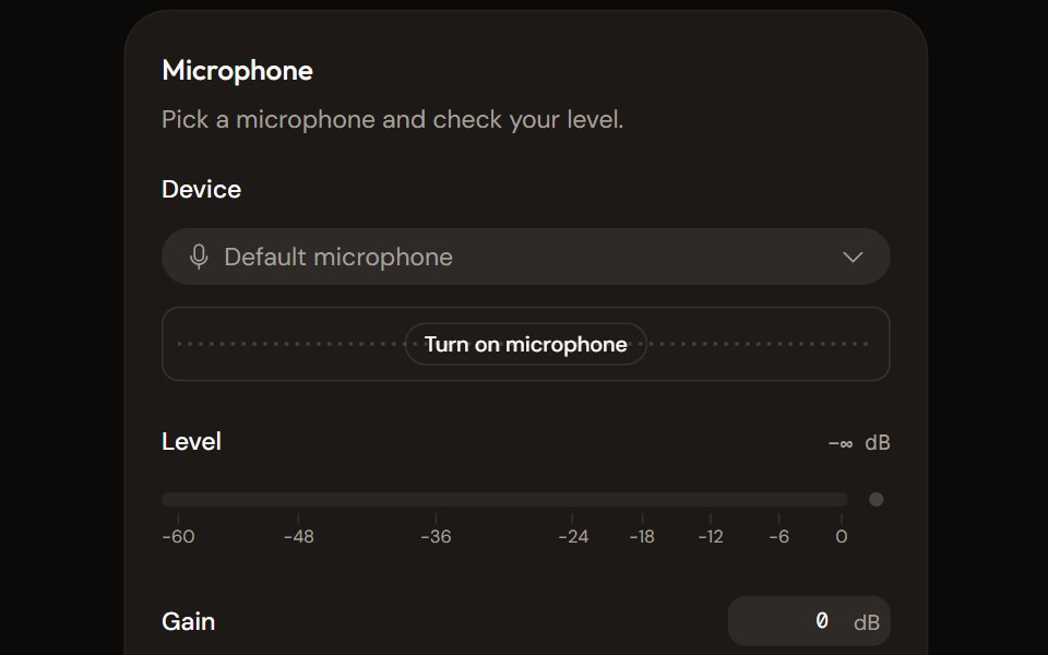 Microphone Setupaudiocn · ReactChoose and check a microphone: device select with a live preview, a level meter, gain, mute and a level check that…
 selectBaseLayer · ReactA select displays a collapsible list of options and allows a user to select one of them.
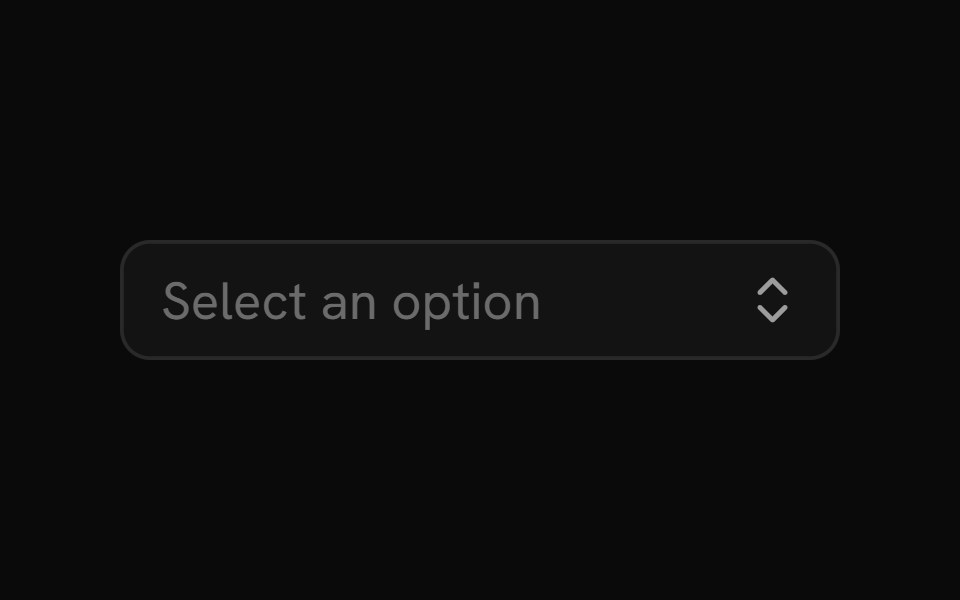 Native SelectShark UI · ReactStyled native HTML select element.
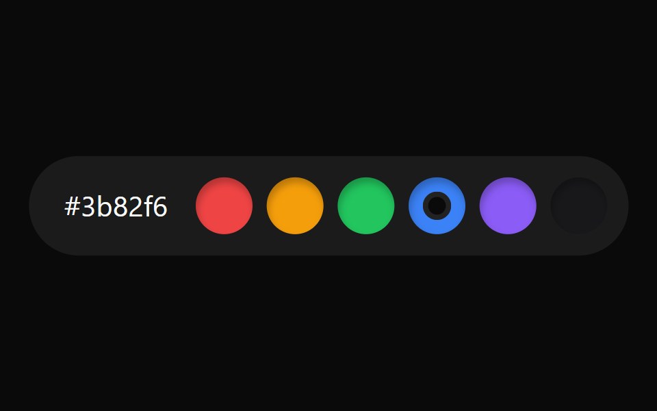 Color Watch SelectorWatermelon UI · React
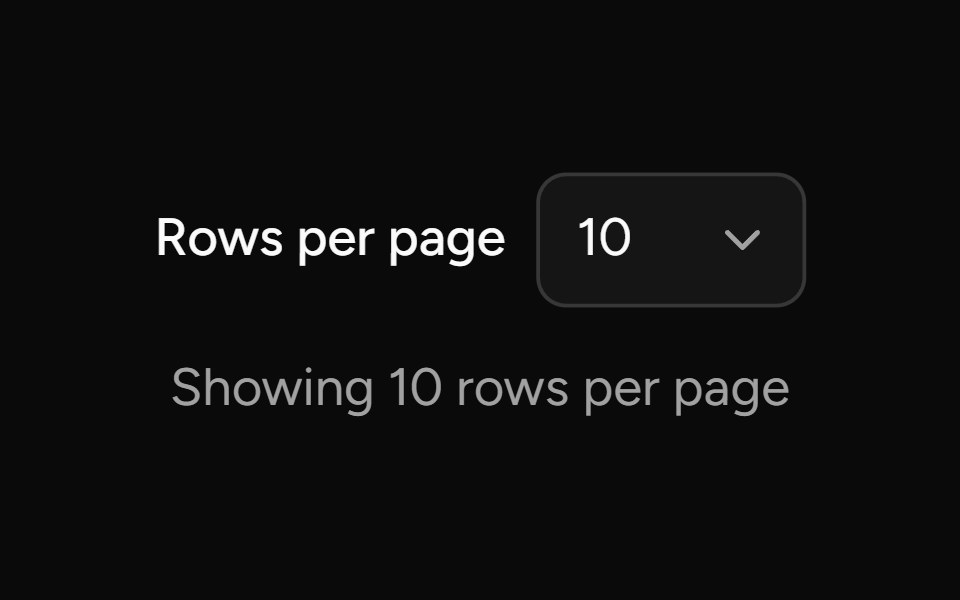 Page Size Selectorsv-table · SvelteSelect the number of rows shown on each table page.
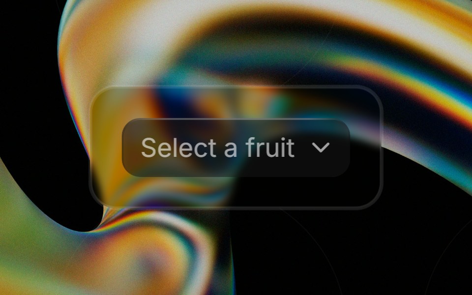 Glass Selectglasscn · ReactGlass Select with five variants: clear, frosted, subtle, liquid, and liquid-refract
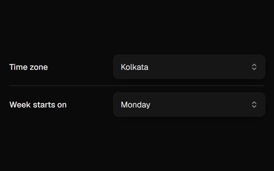 Select MenuUI Lab · ReactOpens with your current choice sitting exactly on the button, macOS style.
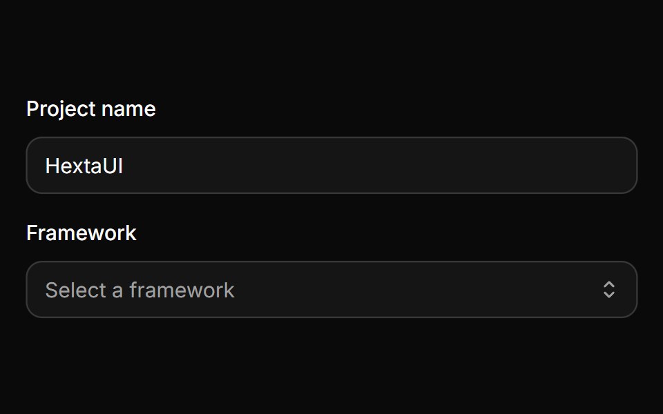 Native selectHextaUI · ReactThe browser's own select, styled to match Input, with a quiet placeholder, Field support and the OS picker on every…
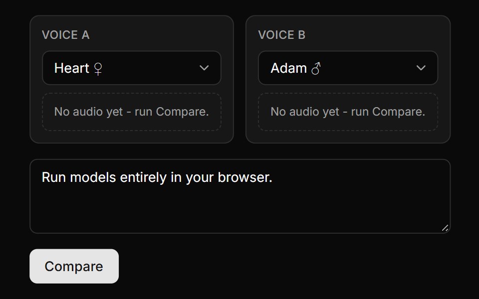 Voice Comparison PanelLocalMode · ReactA/B voice comparison — two labeled columns, each with a language-grouped voice select (VoicePicker) and a native…
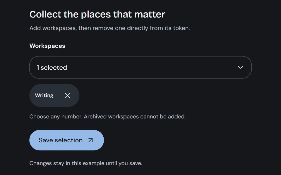 Multi-selectCojeev UI · ReactSearchable multiple choices with removable selections, form values and clear validation.
 Multi-select filterFLX UI · ReactCheckbox items with a count badge and a clear action.
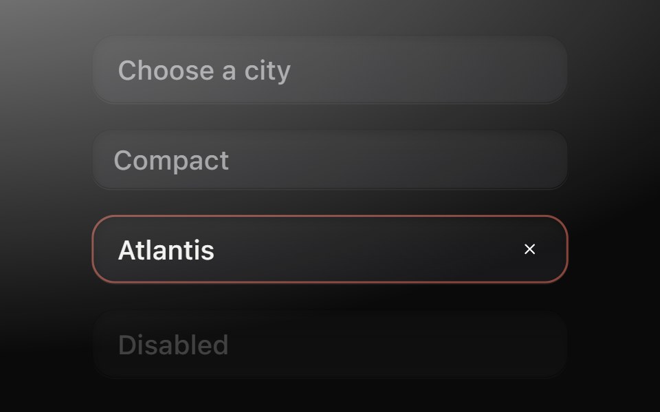 ComboboxMetal UI · React + SwiftUIType to find one of many: a field well that opens the menu's frosted plate; rows filter at once while the plate's…
 ComboboxSpaceUI · ReactCombines a text search input with a dropdown menu, allowing users to filter and select options from large lists easily.
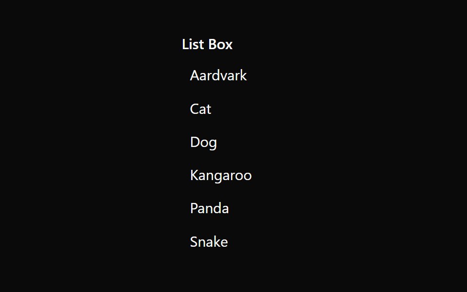 List BoxOUI · ReactReact aria components List Box with shadcn characteristics.
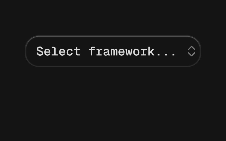 ComboboxD2Studio UI · ReactAutocomplete input and command palette with a list of suggestions.
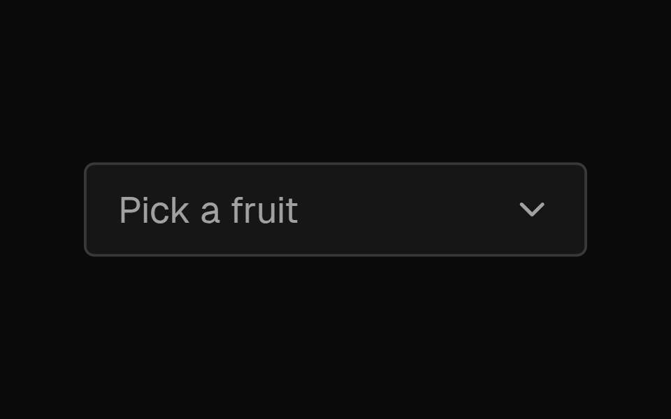 SelectFibo · ReactPicks one option from a list that opens on demand.
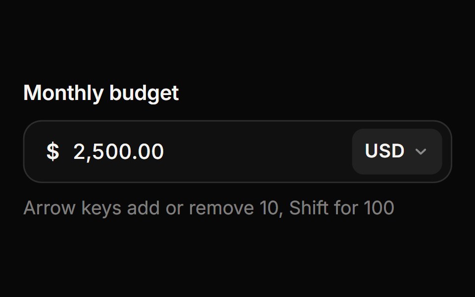 Currency InputReactFrame · ReactA money input with a currency picker: live thousands separators for any locale, the right number of decimals per…
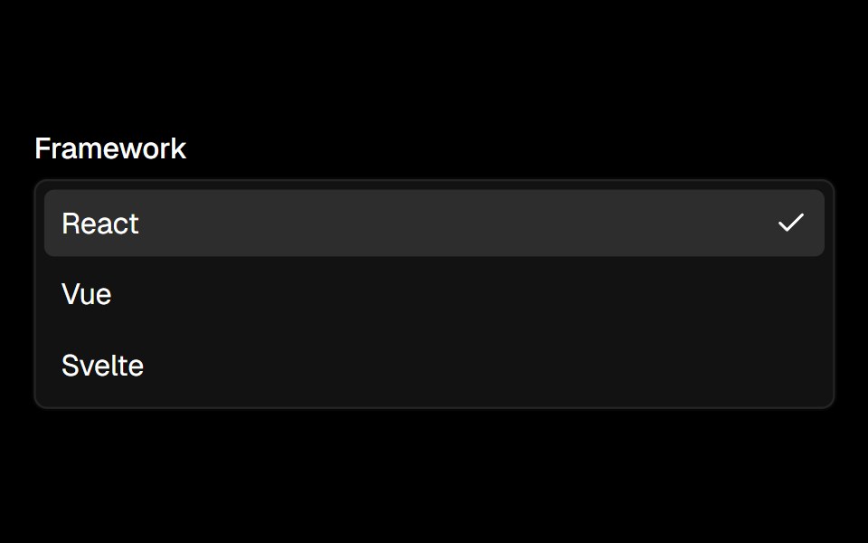 Listboxark-cn · ReactA shadcn-style listbox component built with Ark UI primitives.
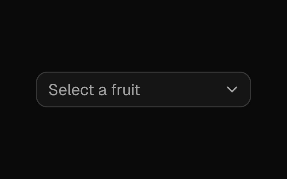 Selectshadcn/ui · ReactDisplays a list of options for the user to pick from—triggered by a button.
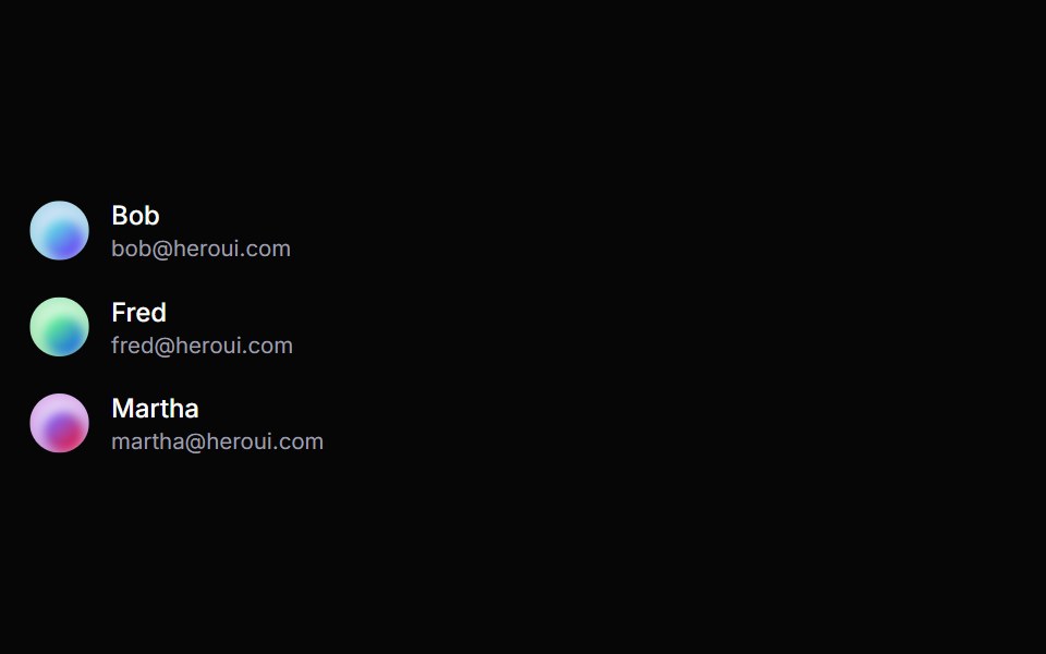 List BoxHeroUI · ReactA listbox displays a list of options and allows a user to select one or more of them
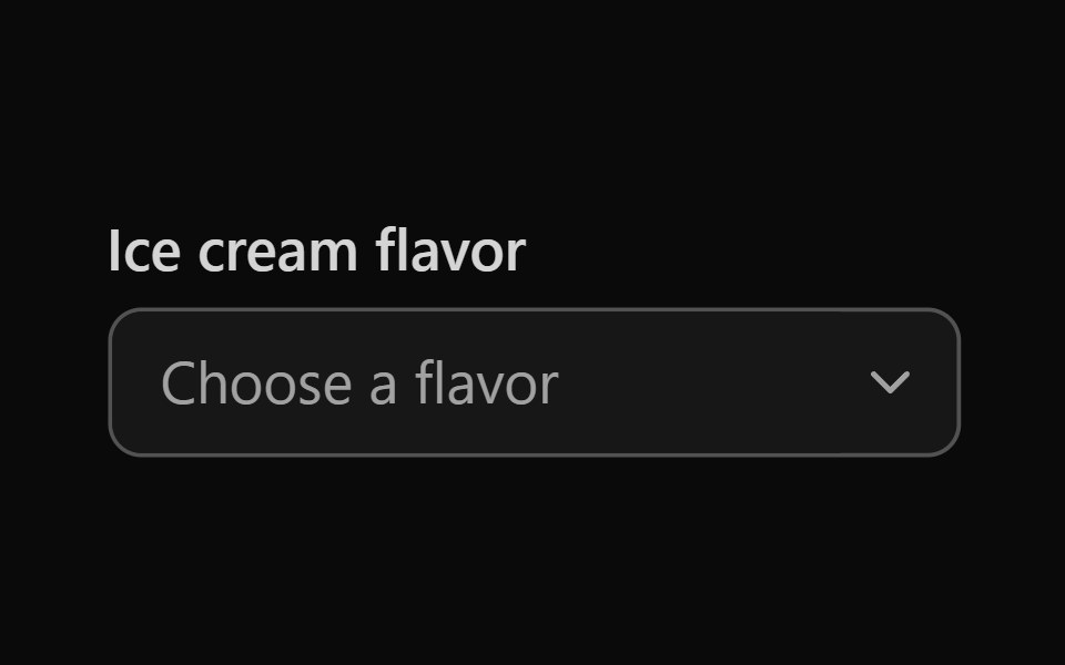 Tailwind Combo BoxReact Spectrum · React
 Selectcoss ui · ReactA common form component for choosing a predefined value in a dropdown menu.
 Comp 190Origin UI · React
- ComboboxPreline UI · JavaScript (HTML + Tailwind)
 Select NativeTremor · React
 Small autocompleteReUI · ReactSmall autocomplete
 Filter Tag PillAmicro Micro Transitions · React
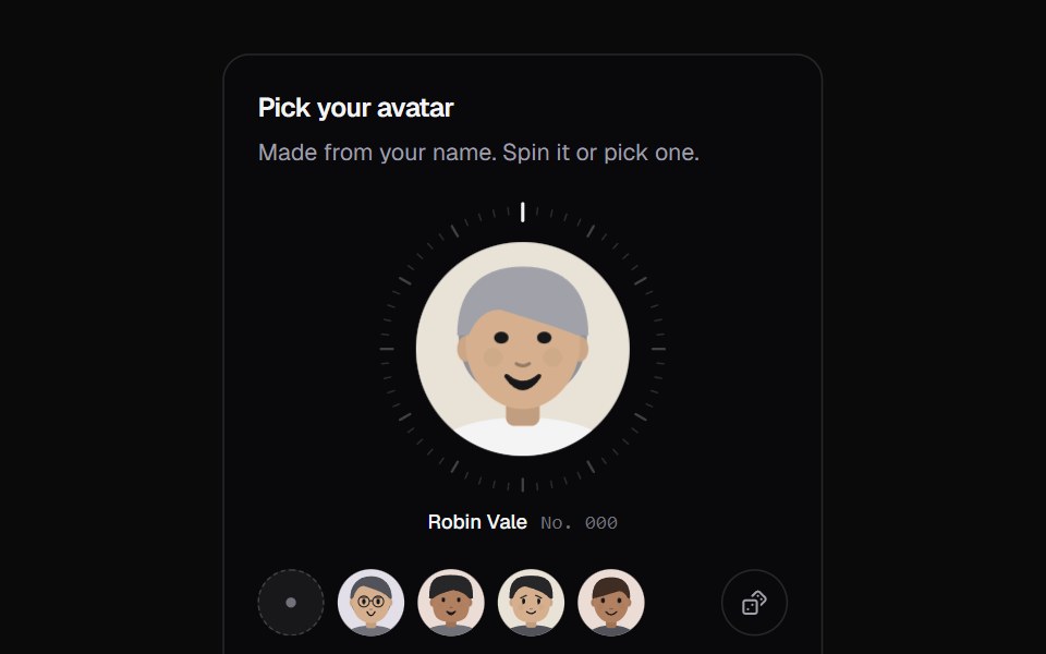 Avatar PickerKokonut UI · ReactGenerated avatars from a name, morphing as you type, on a 3D coin you can flick, tap or shuffle.
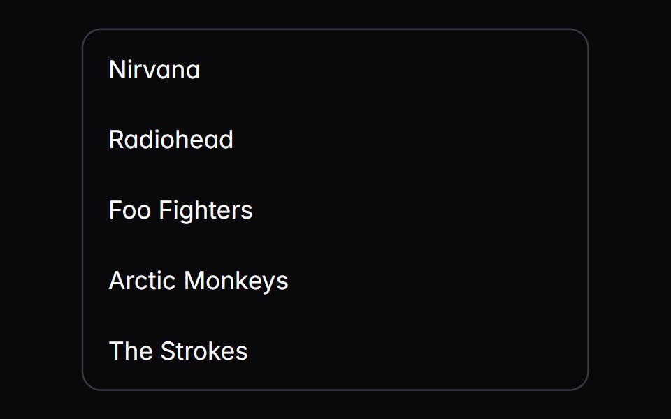 list-boxIntent UI · Reactlist-box
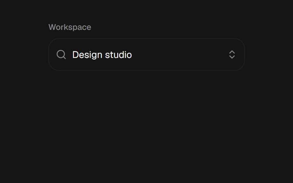 ComboboxbeUI · ReactSearchable combobox with a morphing portal, grouped filtering, keyboard navigation, and controlled or uncontrolled…
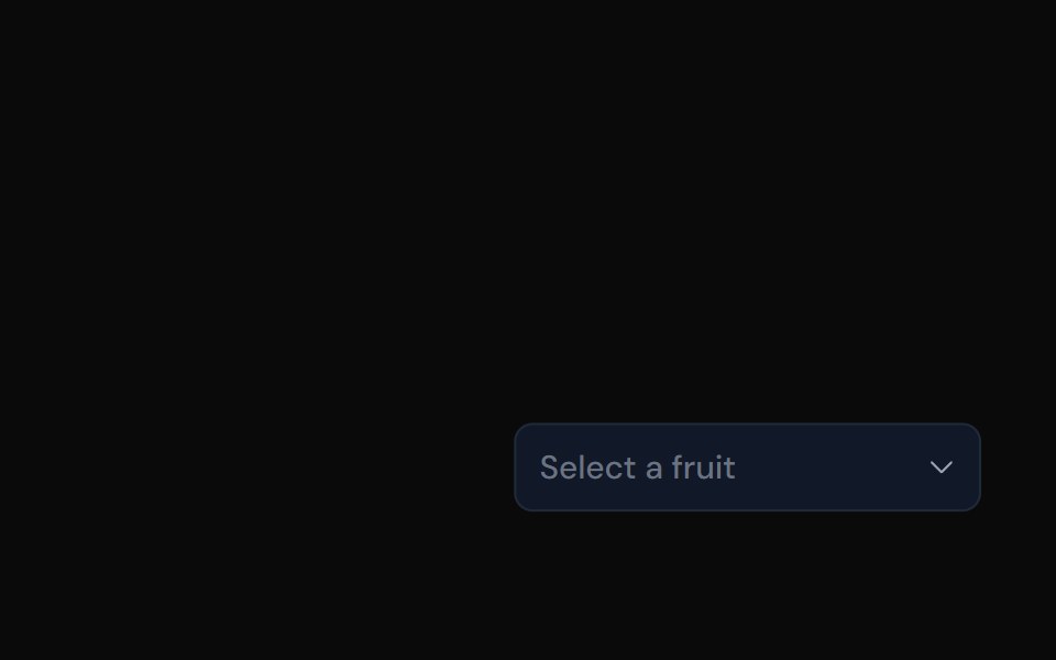 SelectTailGrids · ReactA select component with multiple variants.
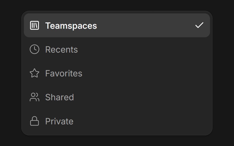 DropdownFluid Functionalism · ReactDropdown menu with fluid hover, animated selection indicator, inline panel or triggered popup with collision-aware…
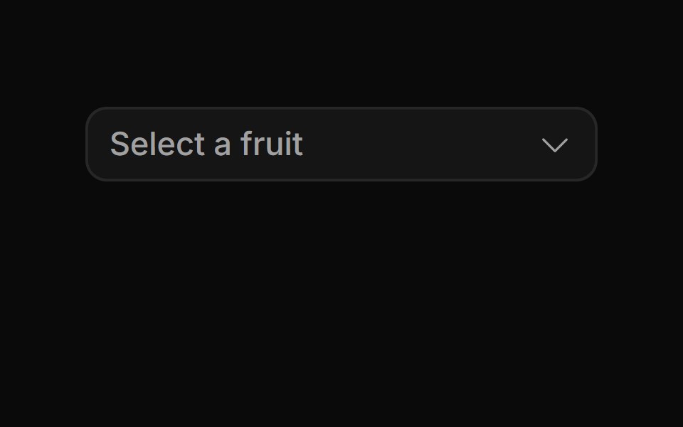 SelectToolcraft · React
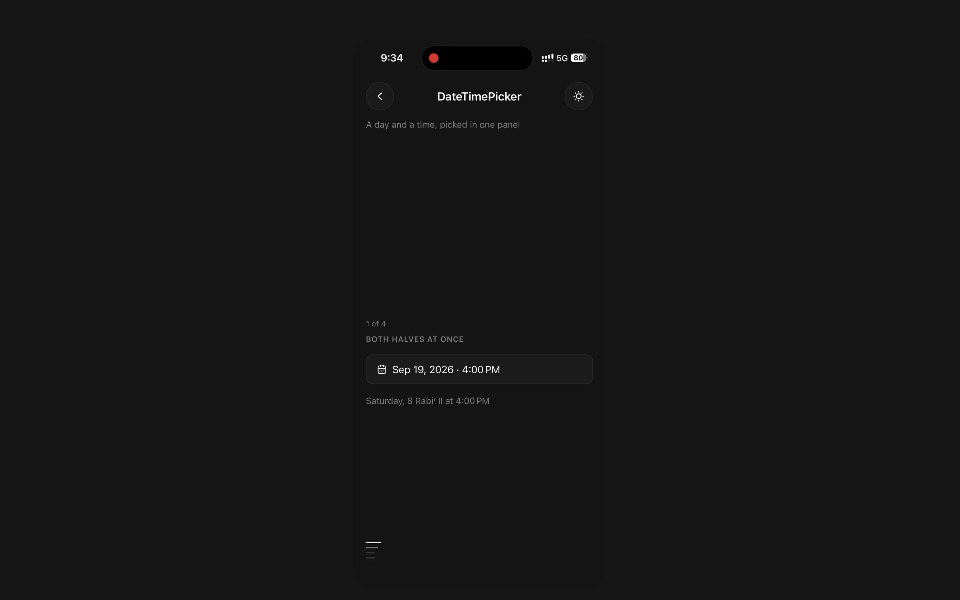 Date Time PickerPanel UI · React NativeA day and a time of day, picked in one panel.
 Autocomplete-03 - Vanish AnimationShadcn Space · ReactAutocomplete with vanish animation
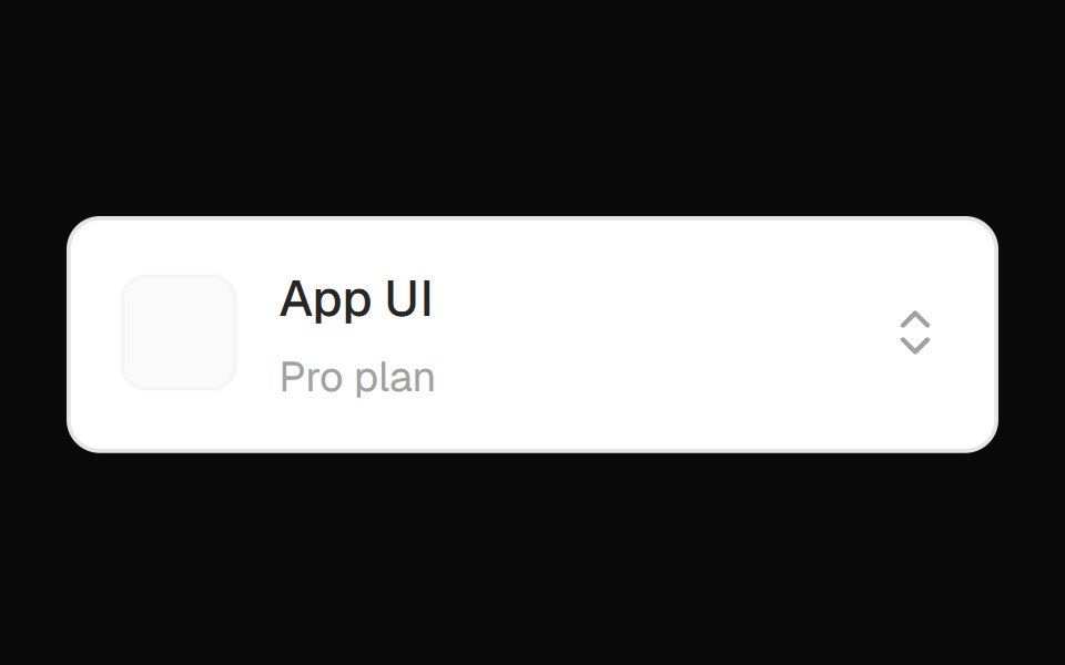 Workspace Switcher DropdownOpenSourceUI · React
Libraries with Tailwind CSS select components
Related categories
- Select Components
- React Select Components
- React Native Select Components
- Animated Select Components
- shadcn/ui Select Components
- Tailwind CSS Input Components
- Tailwind CSS Text Input Components
- Tailwind CSS Form Field Components
- Tailwind CSS Form Components
- Tailwind CSS Textarea Components
- Tailwind CSS Checkbox Components
- Tailwind CSS Switch Components
- Tailwind CSS Slider Components
- Tailwind CSS Radio Components
- Tailwind CSS Combobox Components
- Tailwind CSS File Upload Components
- Tailwind CSS Search Input Components
- Tailwind CSS Date Picker Components
- Tailwind CSS Login Form Components
- Tailwind CSS Color Picker Components
- Tailwind CSS OTP Input Components