 Dev Design Library
Tailwind CSS Color Picker Components
Dev Design Library indexes 64 Tailwind CSS color picker components from 20 open-source UI libraries, with the most coming from React Spectrum, ReUI, Intent UI, Toolcraft and HeroUI. Each one links to its page with the source code, a live preview where available, the library license and the install command. Every library in this list styles its components with Tailwind CSS utility classes. Color picker components belong to the Inputs group.
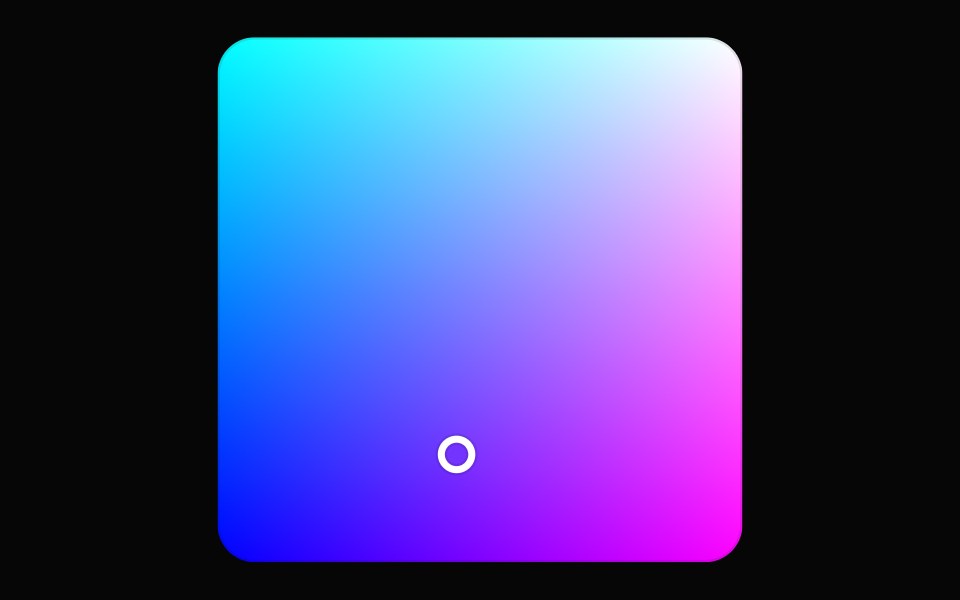 Color AreaHeroUI · ReactA 2D color picker that allows users to select colors from a gradient area
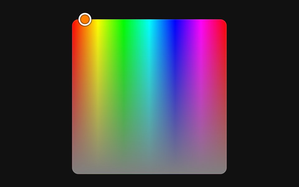 Color AreaReact Spectrum · ReactColorArea allows users to adjust two channels of an RGB, HSL or HSB color value against a two-dimensional gradient…
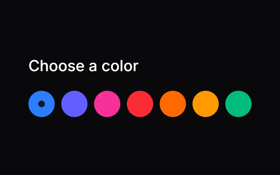 Comp 158Origin UI · React
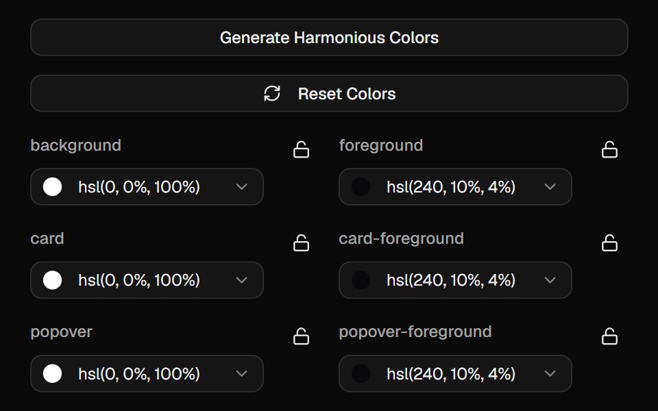 Color PickerCult UI · ReactInteractive color picker component with HSL support and preset colors
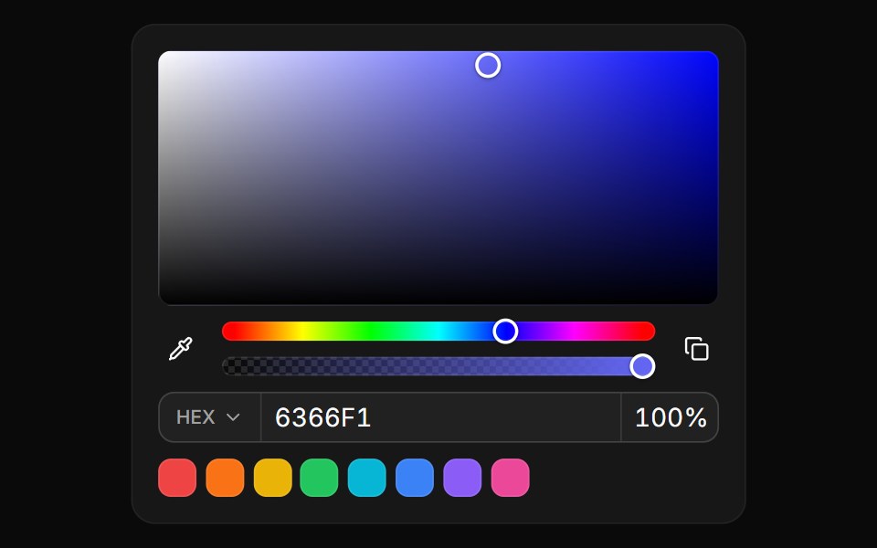 Inline color panelReUI · ReactSaturation area, hue and opacity sliders, format fields and preset swatches rendered in place.
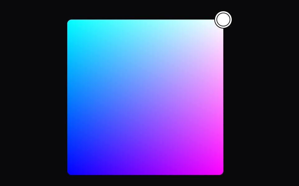 color-areaIntent UI · Reactcolor-area
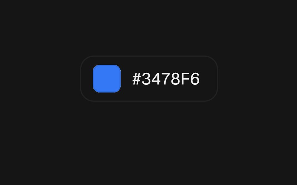 Color PickerbeUI · ReactA popover picker with a loupe under your finger.
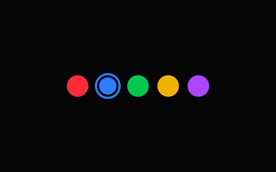 Color SelectorSpell UI · ReactInteractive color picker component.
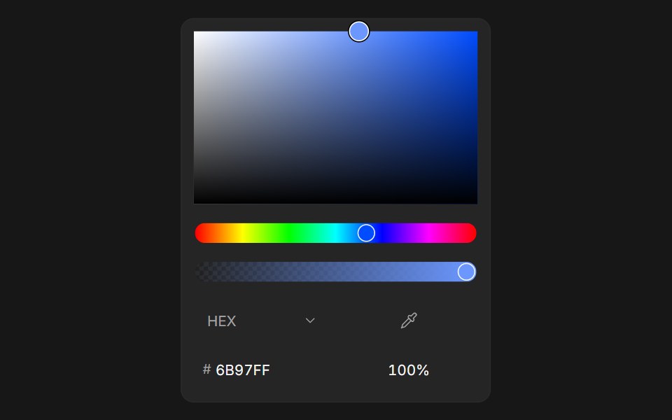 Color PickerFluid Functionalism · ReactColor picker with HEX, RGB, HSL, and OKLCH formats, alpha channel, optional swatches, and a popover trigger. Built on…
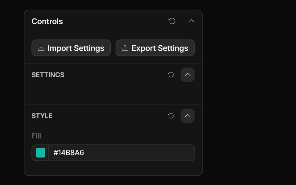 Color ControlToolcraft · React
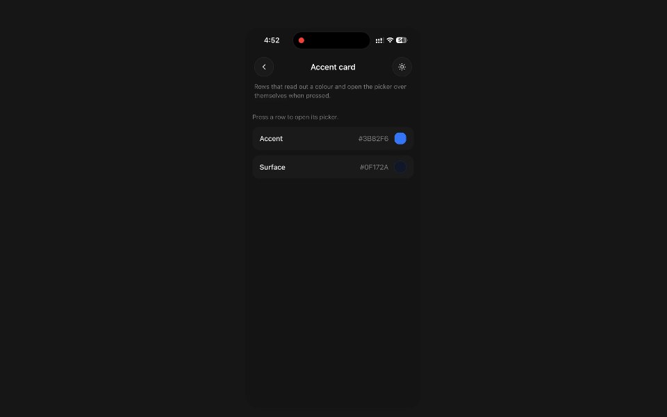 Color PickerPanel UI · React NativeA colour chosen by dragging — a saturation square or a wheel, a hue scale, and opacity.
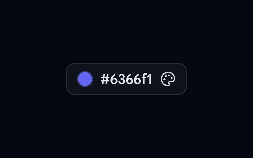 Popover 07 - Color PickerShadcn Space · ReactColor picker popover with preset swatches, a live hex input, and a copy-to-clipboard action.
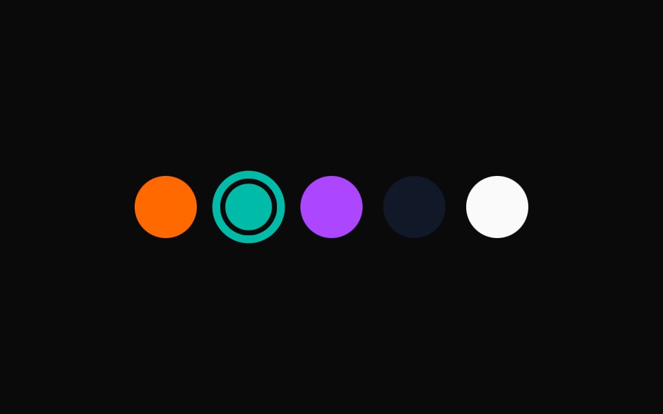 Spell Color SelectorAnimations (Svelte) · Svelte
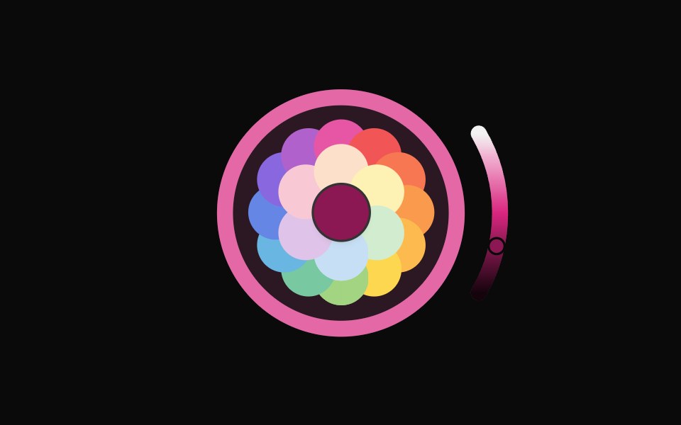 Color PickerNexvyn UI · ReactA blossom-style color picker with concentric petal layers, circular color bar, and arc slider for lightness control.
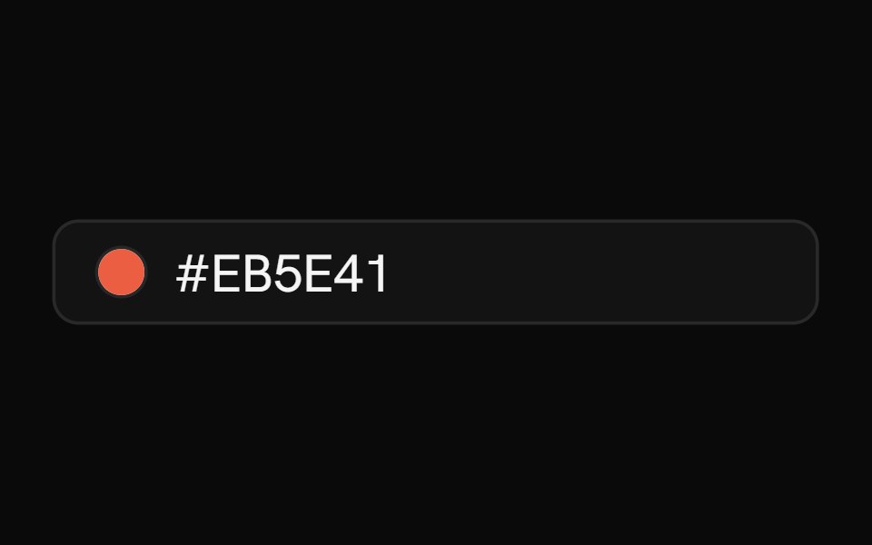 Color PickerShark UI · ReactPick colors with hue and alpha controls.
 Gooey Color Picker23rd.dev · ReactA floating color picker with a circular hue wheel, alpha slider, hex field, and motion-powered open/close.
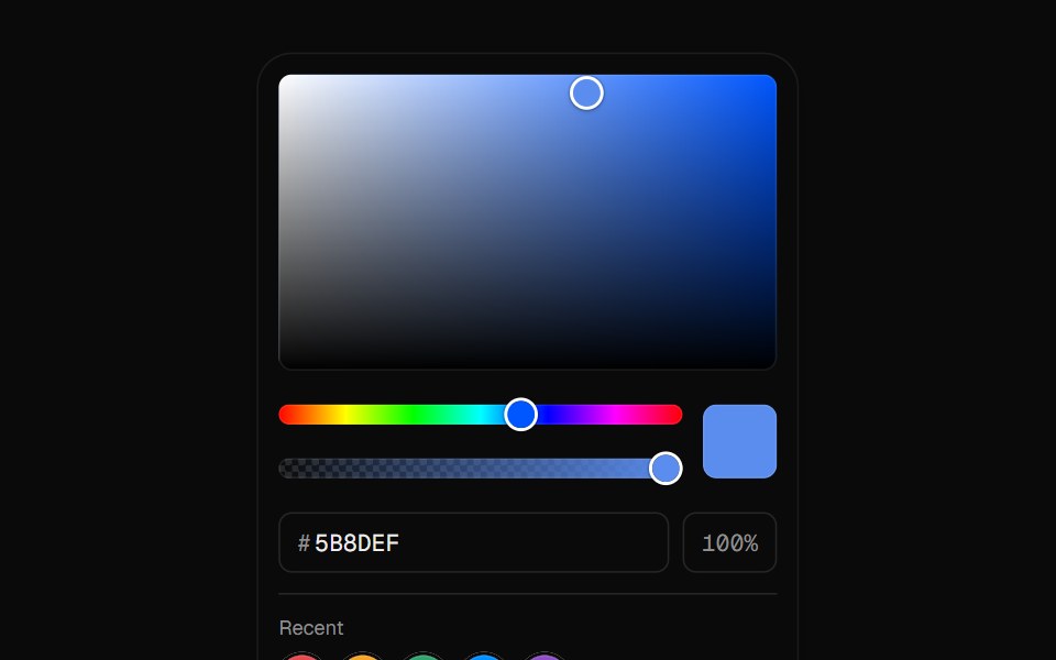 Color PickerUI Lab · ReactDrag a color out of the square, then fine-tune hue and opacity.
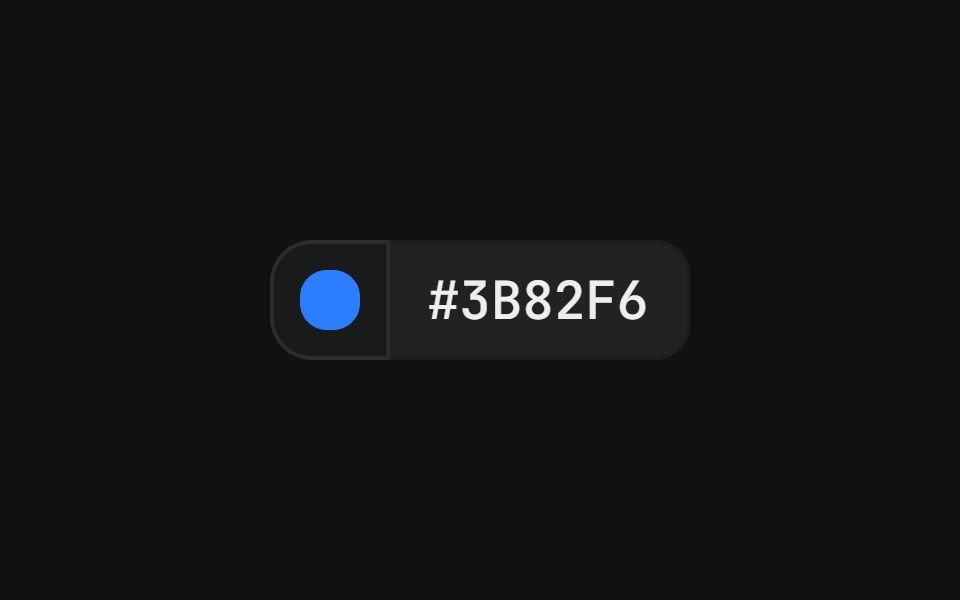 With popover swatchFLX UI · ReactColor swatch button that opens a grid of color swatches, paired with a hex value label in a merged-border row.
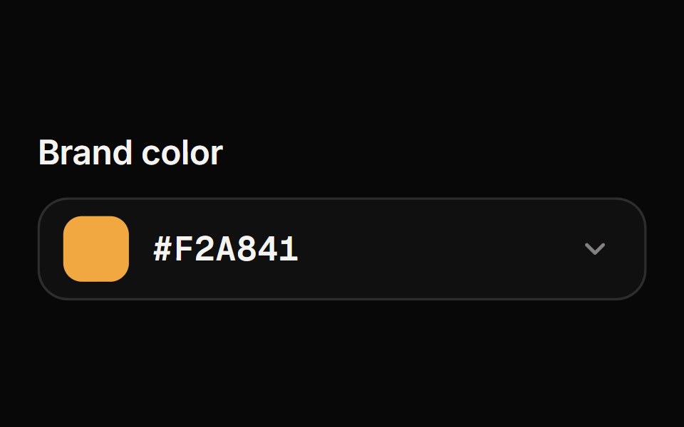 Color PickerReactFrame · ReactA color picker with a draggable saturation/brightness area, hue and opacity sliders, hex input, preset swatches and an…
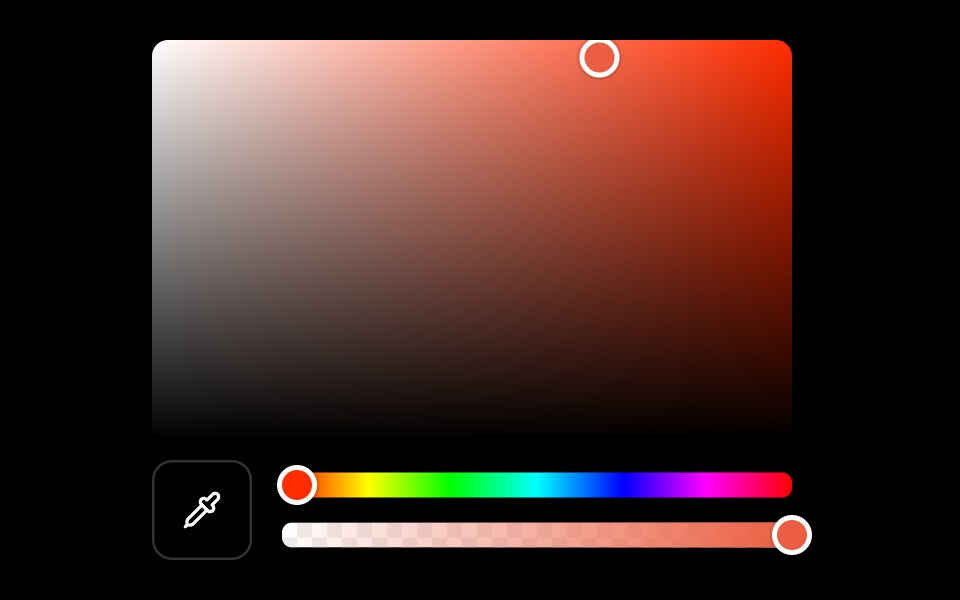 Color Pickerark-cn · ReactA shadcn-style color picker component built with Ark UI primitives.
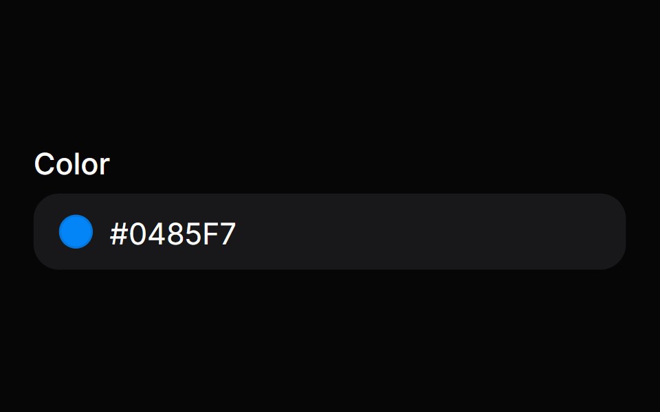 Color FieldHeroUI · ReactColor input field with labels, descriptions, and validation built on React Aria ColorField
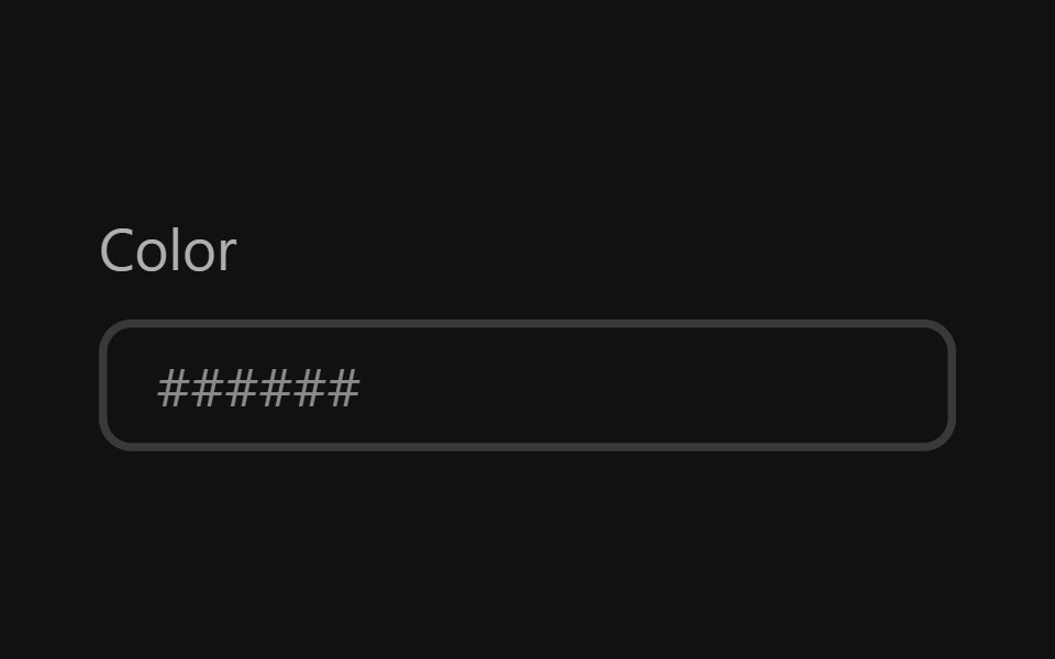 Color FieldReact Spectrum · ReactA color field allows users to edit a hex color or individual color channel value.
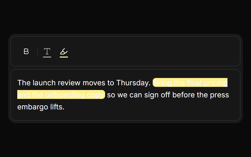 Text and highlight colorsReUI · ReactEditor toolbar buttons with preset palettes and a way back to the default color.
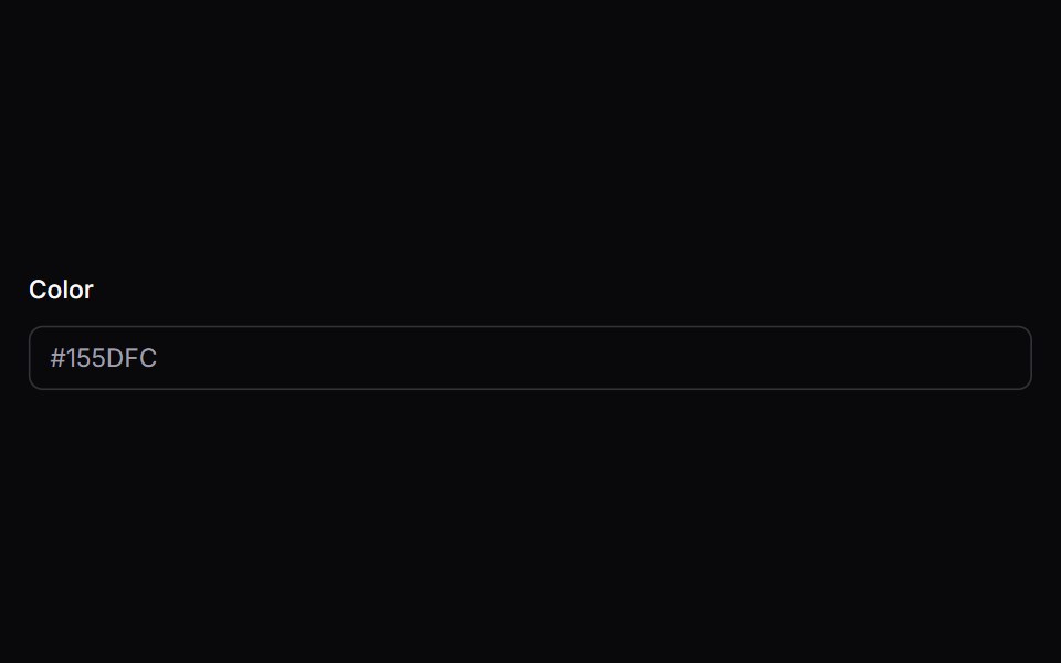 color-fieldIntent UI · Reactcolor-field
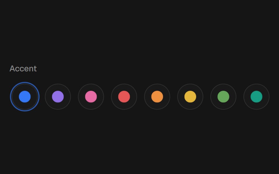 Color SelectorbeUI · ReactComposable color swatches with a spring-gliding selection ring, press feedback, native radio keyboard navigation, and…
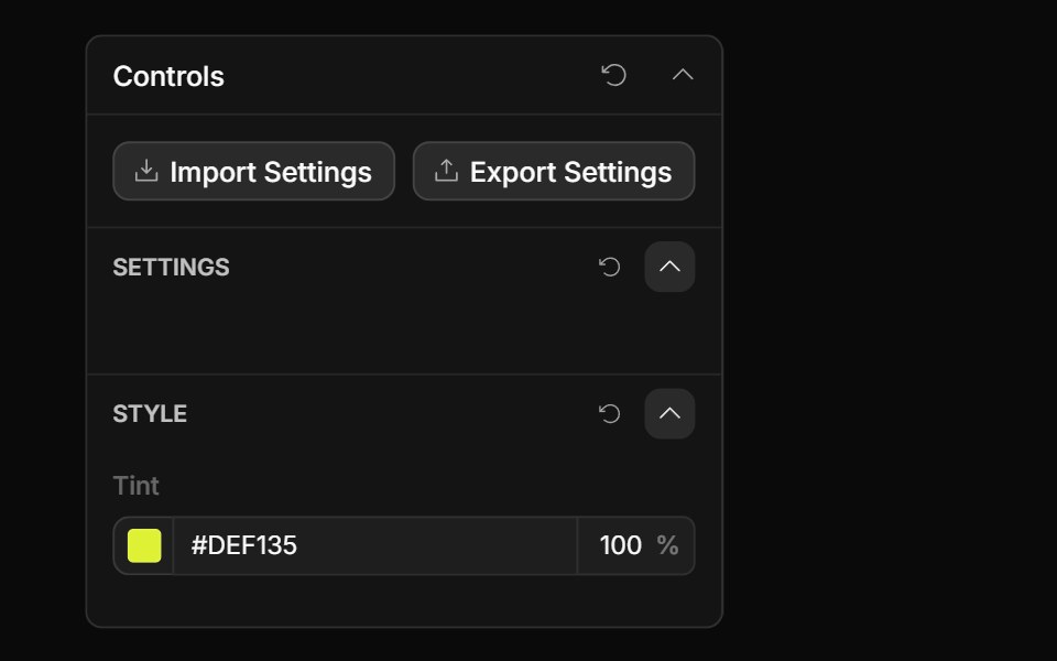 Color Opacity ControlToolcraft · React
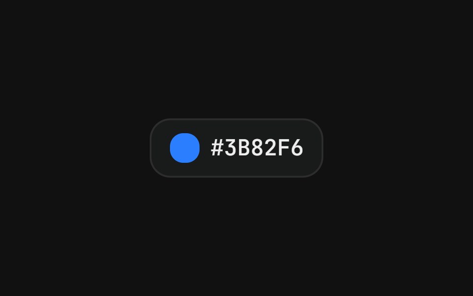 Color pickerFLX UI · ReactSwatch grid with a check icon on the active color.
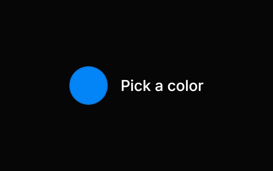 Color PickerHeroUI · ReactA composable color picker that synchronizes color value between multiple color components
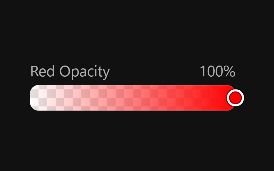 Color SliderReact Spectrum · ReactColorSliders allow users to adjust an individual channel of a color value.
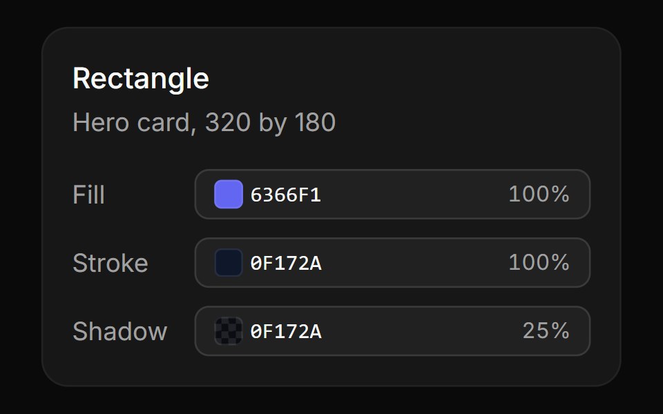 Design inspectorReUI · ReactFill, stroke and shadow rows that open a compact picker with vertical hue and opacity tracks.
 color-pickerIntent UI · Reactcolor-picker
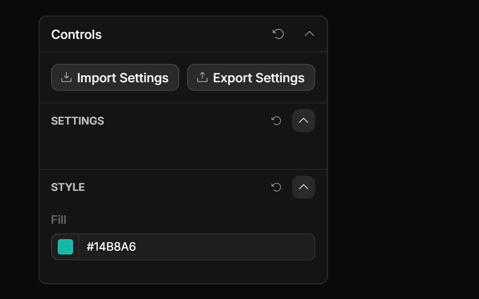 Color Value ControlToolcraft · React
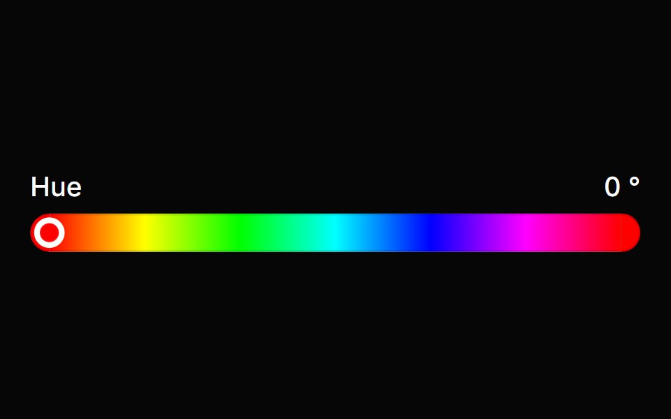 Color SliderHeroUI · ReactA color slider allows users to adjust an individual channel of a color value
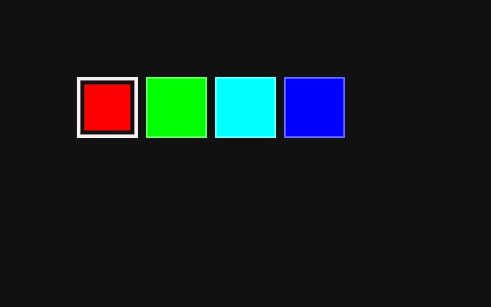 Color Swatch PickerReact Spectrum · ReactA ColorSwatchPicker displays a list of color swatches and allows a user to select one of them.
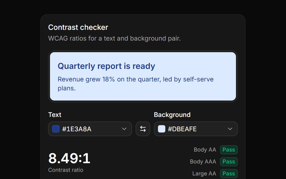 Contrast checkerReUI · ReactText and background pickers with a live preview, the WCAG ratio and AA and AAA results.
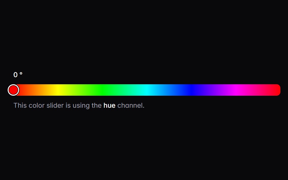 color-sliderIntent UI · Reactcolor-slider
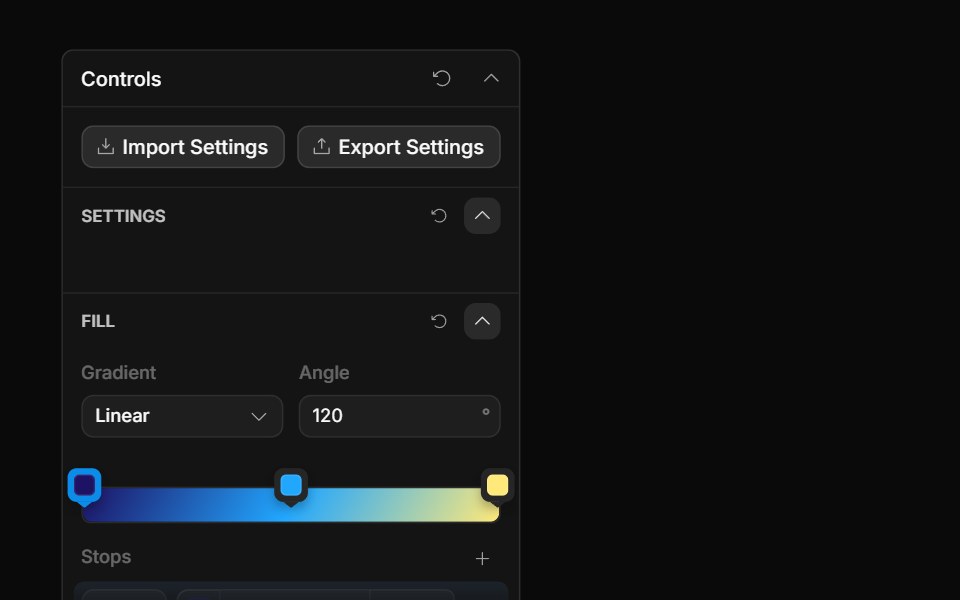 Gradient ControlToolcraft · React
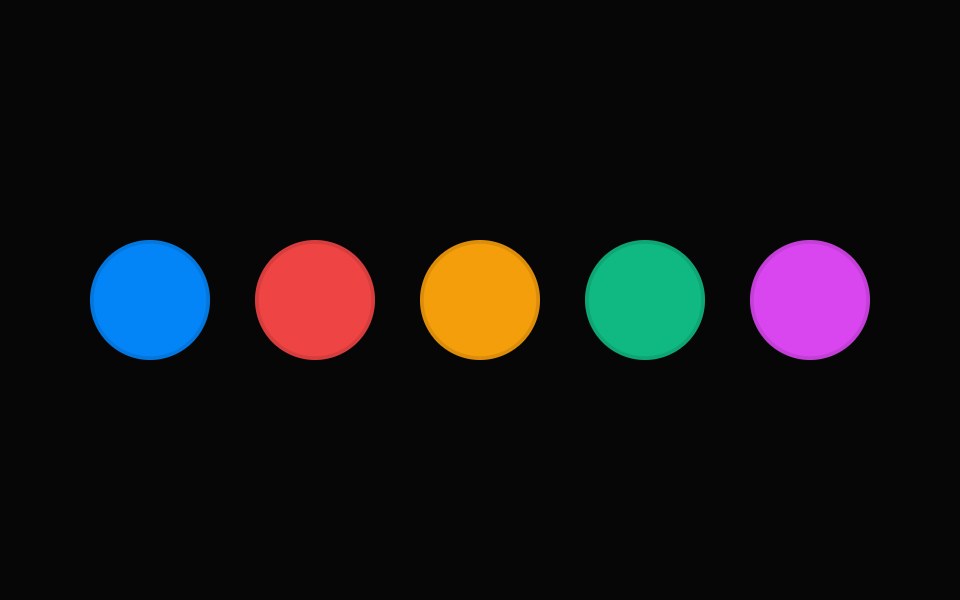 Color SwatchHeroUI · ReactA visual preview of a color value with accessibility support
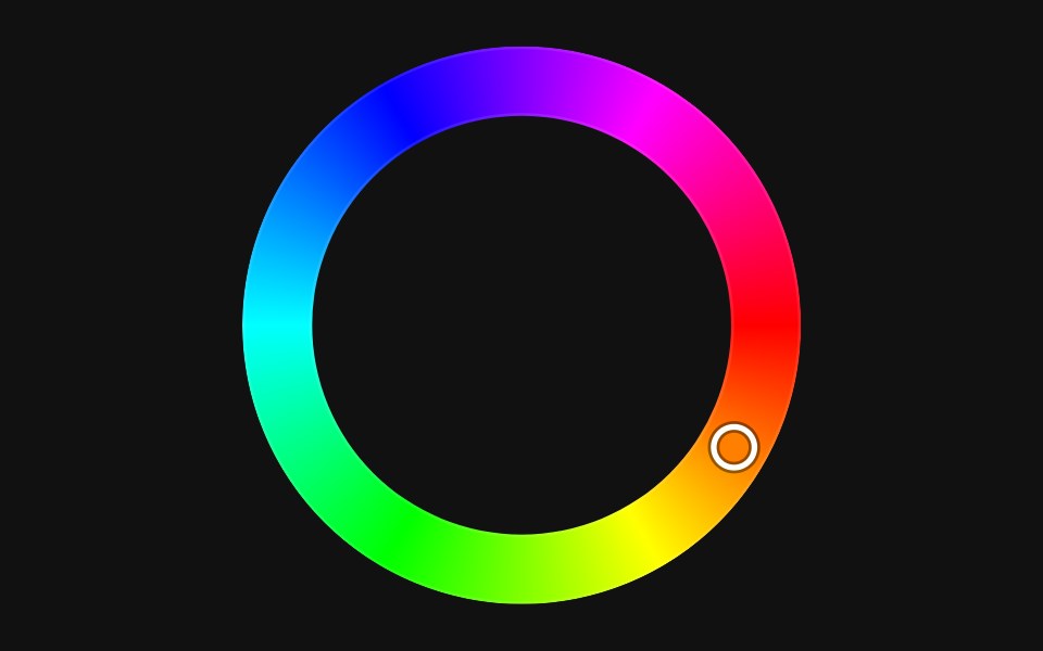 Color WheelReact Spectrum · ReactColorWheels allow users to adjust the hue of an HSL or HSB color value on a circular track.
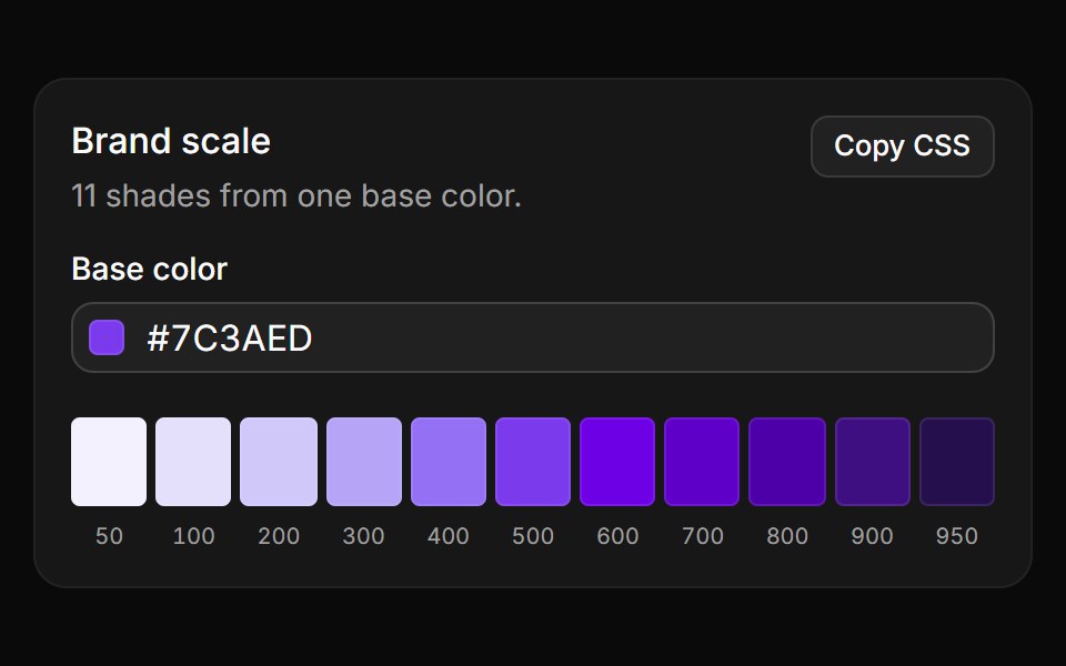 Brand scaleReUI · React11 shades from 50 to 950 generated in OKLCH from one base color, copied as CSS variables.
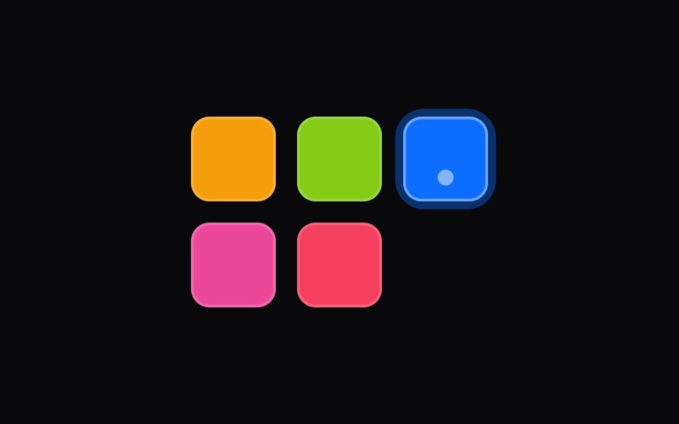 color-swatch-pickerIntent UI · Reactcolor-swatch-picker
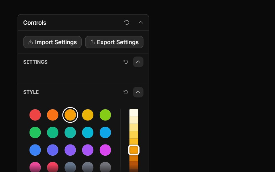 Palette ControlToolcraft · React
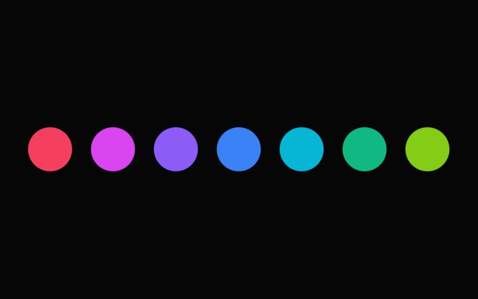 Color Swatch PickerHeroUI · ReactA list of color swatches that allows users to select a color from a predefined palette.
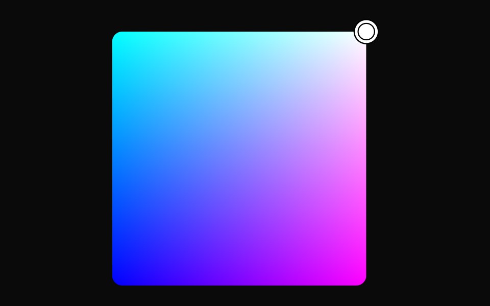 Tailwind Color AreaReact Spectrum · React
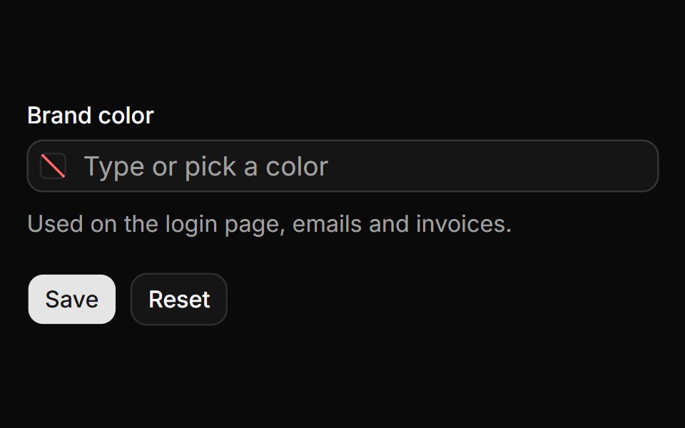 Form field with validationReUI · ReactNative form field with a required check, an error, reset and the submitted value.
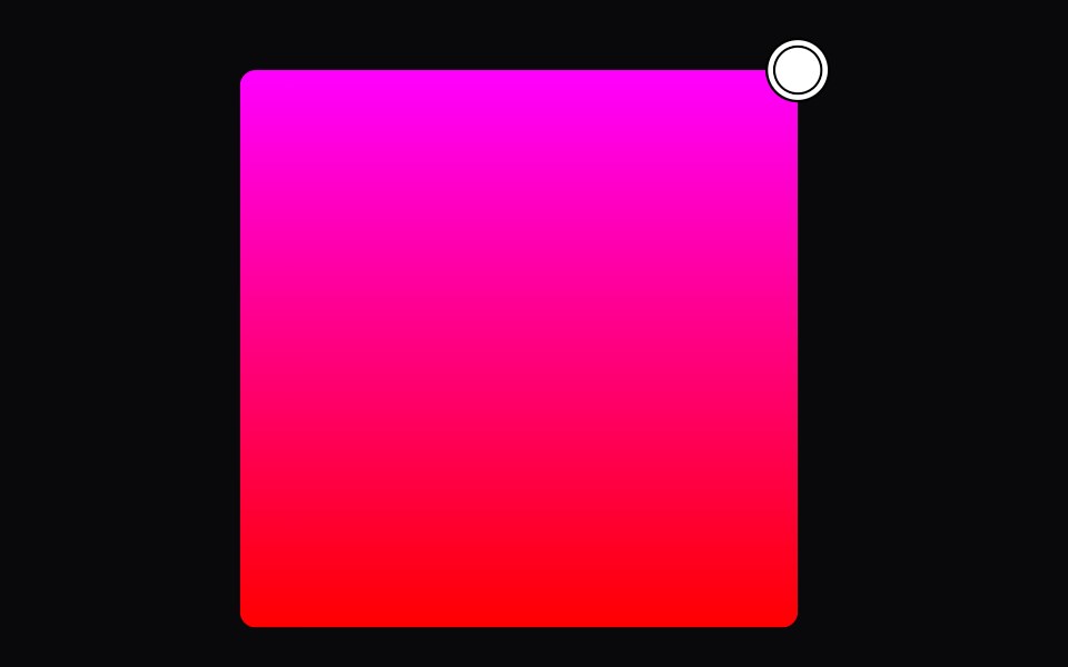 color-thumbIntent UI · Reactcolor-thumb
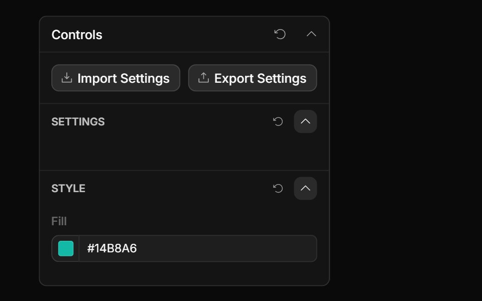 Style Guide Color PickerToolcraft · React
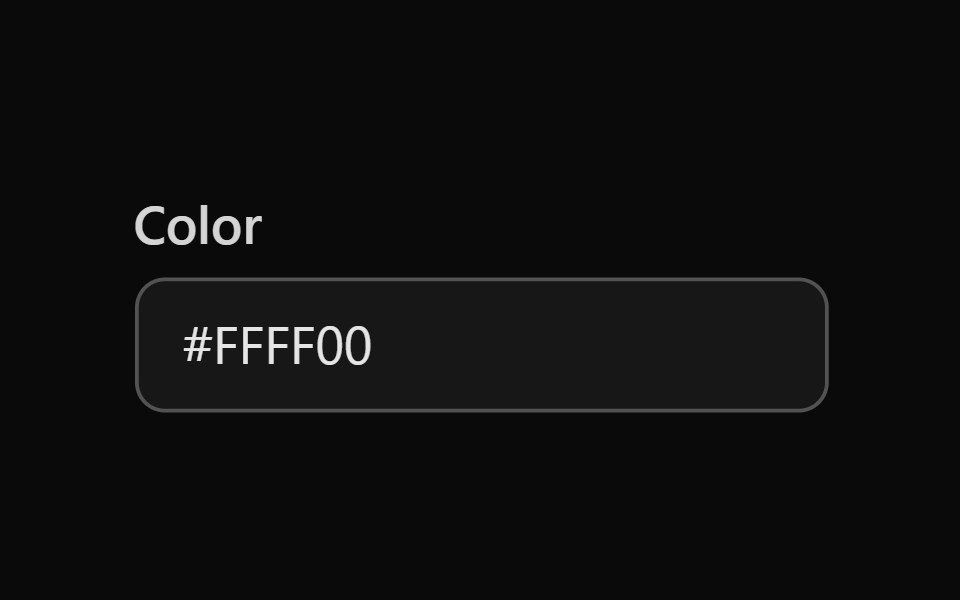 Tailwind Color FieldReact Spectrum · React
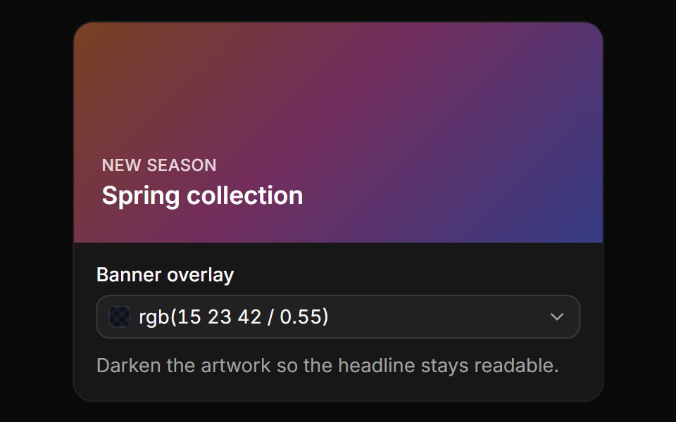 OpacityReUI · ReactA banner overlay with an opacity slider and field, written as rgb() with alpha.
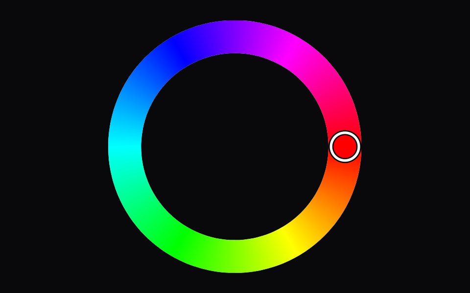 color-wheelIntent UI · Reactcolor-wheel
 Tailwind Color PickerReact Spectrum · React
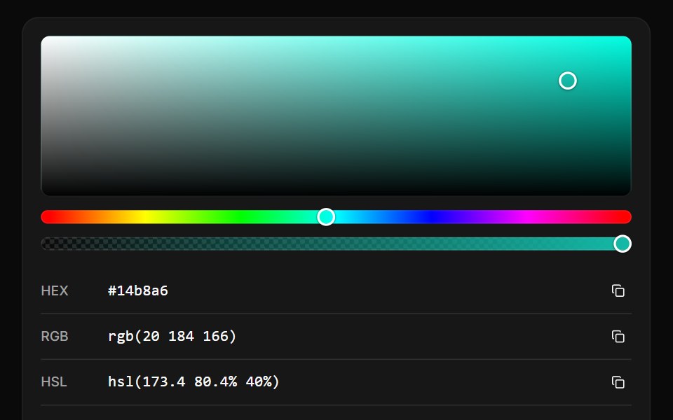 Format converterReUI · ReactOne color as HEX, RGB, HSL, HSB and OKLCH, each with a copy button.
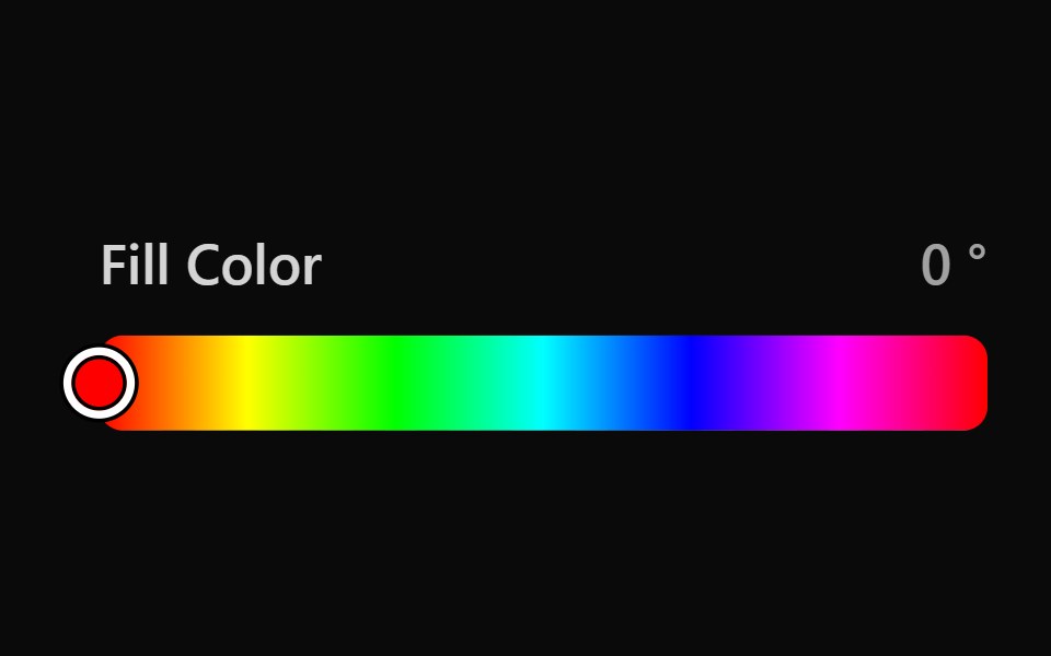 Tailwind Color SliderReact Spectrum · React
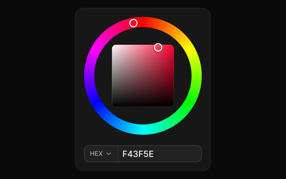 Hue wheelReUI · ReactA hue ring around a saturation and brightness square, with HEX, RGB and HSL fields.
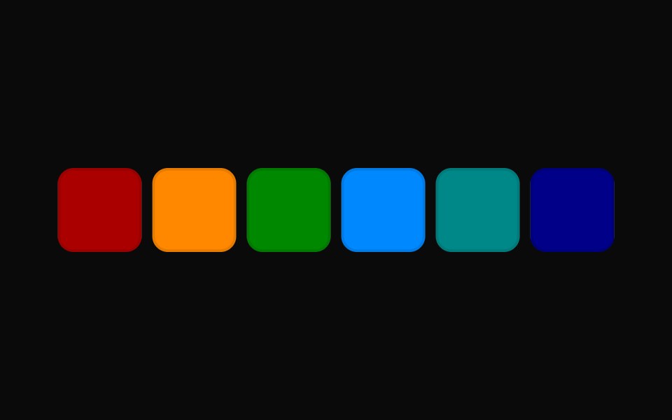 Tailwind Color Swatch PickerReact Spectrum · React
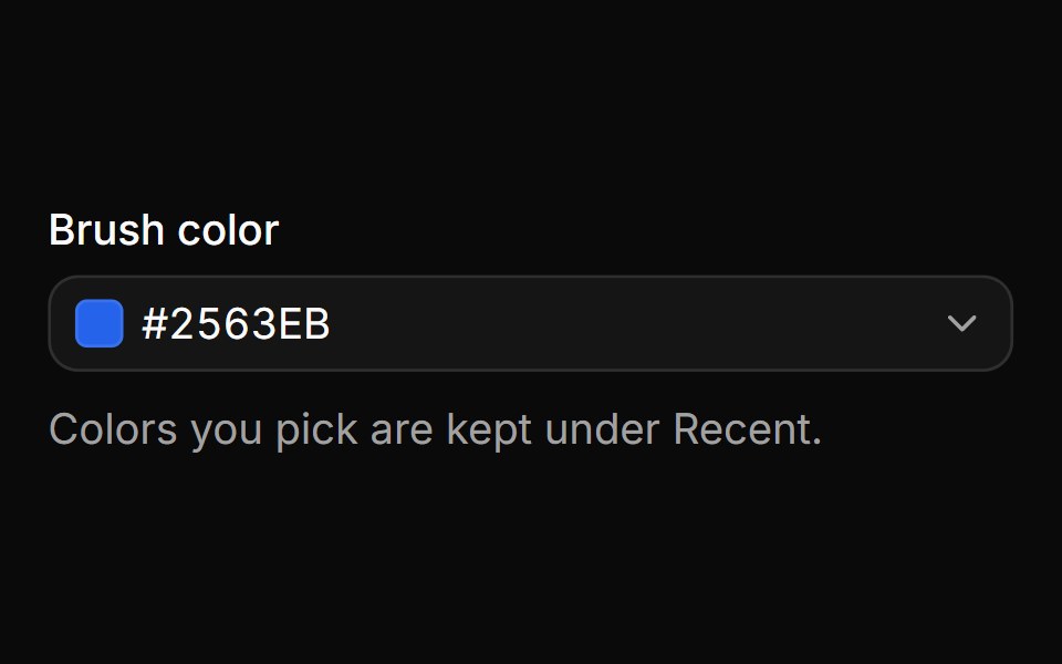 Recent colorsReUI · ReactEach pick is saved to a Recent row once a drag is released, not on every move.
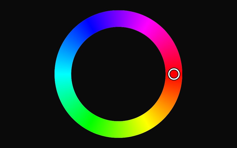 Tailwind Color WheelReact Spectrum · React
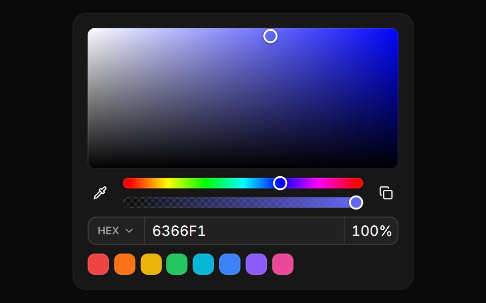 Color PickerReUI · React
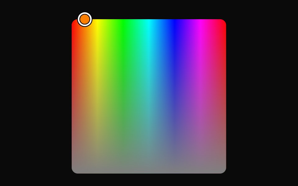 Vanilla Color AreaReact Spectrum · React
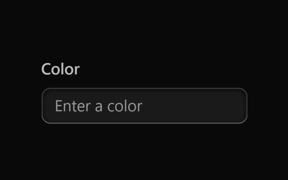 Vanilla Color FieldReact Spectrum · React
 Vanilla Color PickerReact Spectrum · React
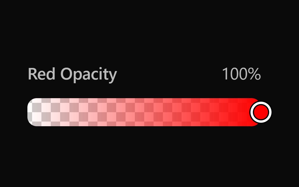 Vanilla Color SliderReact Spectrum · React
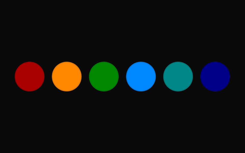 Vanilla Color Swatch PickerReact Spectrum · React
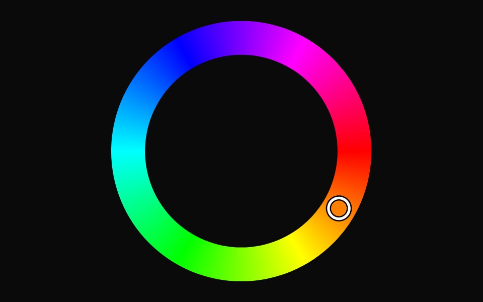 Vanilla Color WheelReact Spectrum · React
Libraries with Tailwind CSS color picker components
Related categories
- Color Picker Components
- React Color Picker Components
- Animated Color Picker Components
- shadcn/ui Color Picker Components
- Tailwind CSS Input Components
- Tailwind CSS Text Input Components
- Tailwind CSS Select Components
- Tailwind CSS Form Field Components
- Tailwind CSS Form Components
- Tailwind CSS Textarea Components
- Tailwind CSS Checkbox Components
- Tailwind CSS Switch Components
- Tailwind CSS Slider Components
- Tailwind CSS Radio Components
- Tailwind CSS Combobox Components
- Tailwind CSS File Upload Components
- Tailwind CSS Search Input Components
- Tailwind CSS Date Picker Components
- Tailwind CSS Login Form Components
- Tailwind CSS OTP Input Components