 Dev Design Library
Tailwind CSS Checkbox Components
Dev Design Library indexes 177 Tailwind CSS checkbox components from 49 open-source UI libraries, with the most coming from Origin UI, ReUI, Watermelon UI, Oxbow UI and Tremor Blocks. Each one links to its page with the source code, a live preview where available, the library license and the install command. Every library in this list styles its components with Tailwind CSS utility classes. Checkbox components belong to the Inputs group.
Showing 120 of 177, a mix from every library. Open a library to see all of its components.
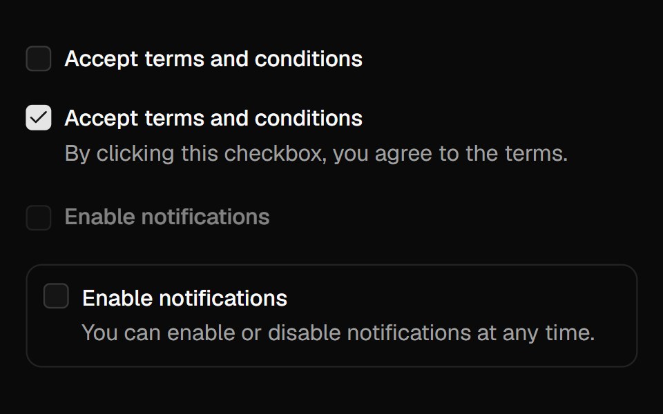 Checkboxshadcn/ui · React
 CheckboxdaisyUI · CSS (Tailwind)
 CheckboxHeroUI · ReactA selectable control that allows users to toggle between checked and unchecked states.
 CheckboxReact Spectrum · ReactCheckboxes allow users to select multiple items from a list of individual items, or to mark one individual item as…
 Checkboxcoss ui · ReactA control allowing the user to toggle between checked and not checked.
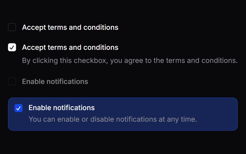 CheckboxOrigin UI · ReactA control allowing the user to toggle between checked and not checked.
 CheckboxTremor · React
 Basic checkbox with labelReUI · ReactBasic checkbox with label
 checkboxIntent UI · Reactcheckbox
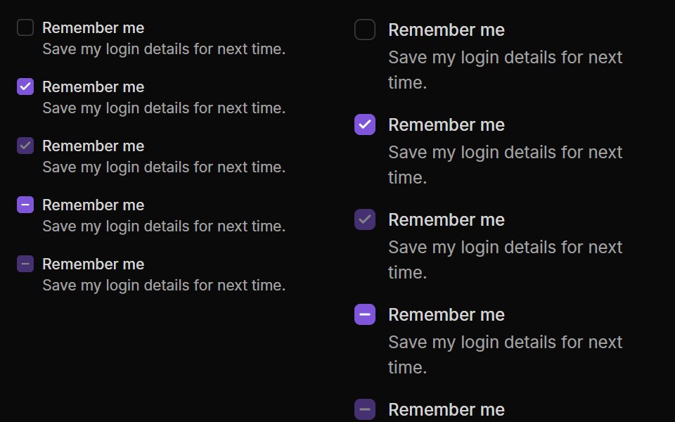 CheckboxUntitled UI React · React
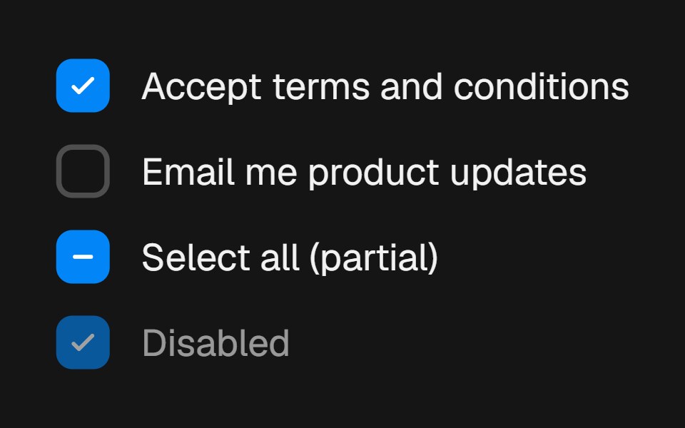 CheckboxbeUI · ReactForm choice control with a draw-on checkmark, spring press feedback and indeterminate state support.
 CheckboxTailGrids · ReactA checkbox component with label and multiple states.
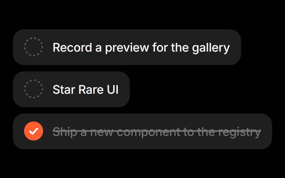 Task ListRare UI · ReactA checklist that strikes out completed tasks and moves them to the bottom of the list.
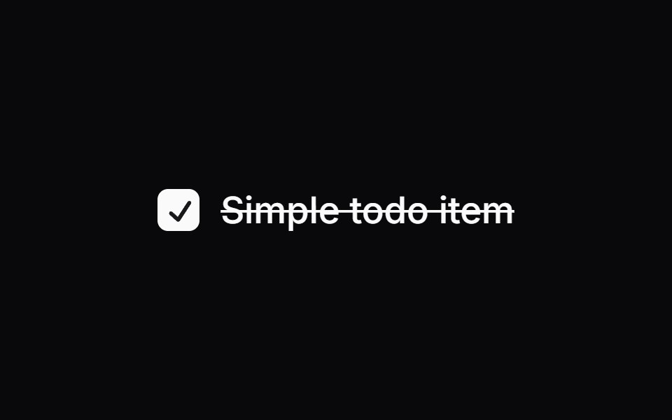
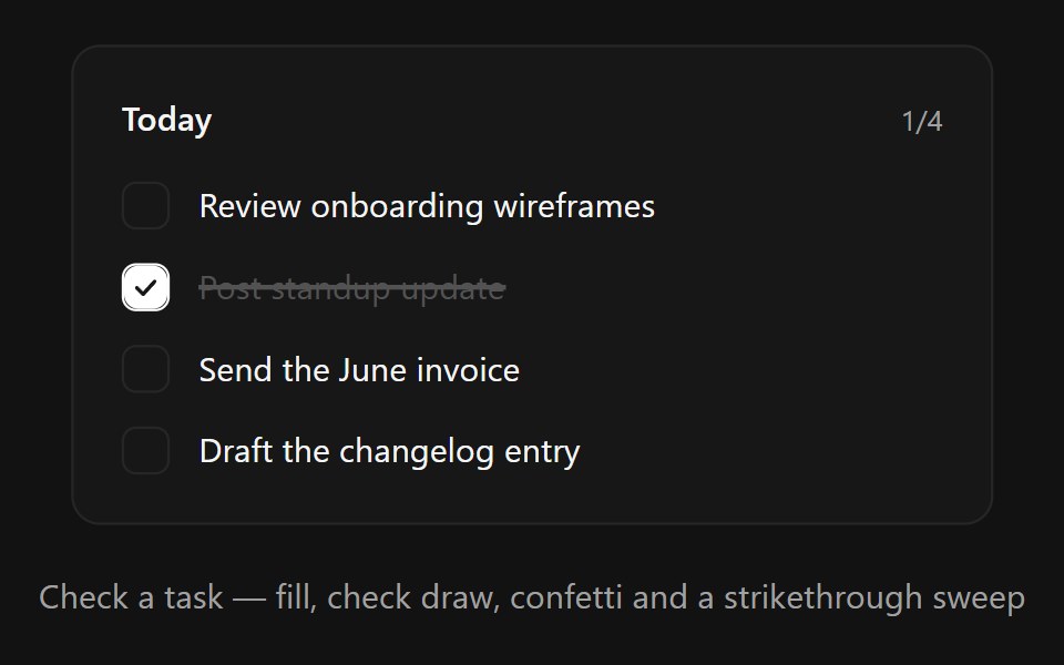 Task CheckboxSpectrum UI · ReactA satisfying todo checkbox row with spring fill, drawn-in check, confetti burst and animated strikethrough
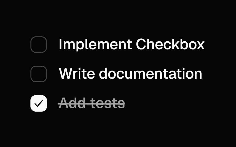 Animated CheckboxSpell UI · ReactAnimated checkbox with spring transitions and strike-through text effect.
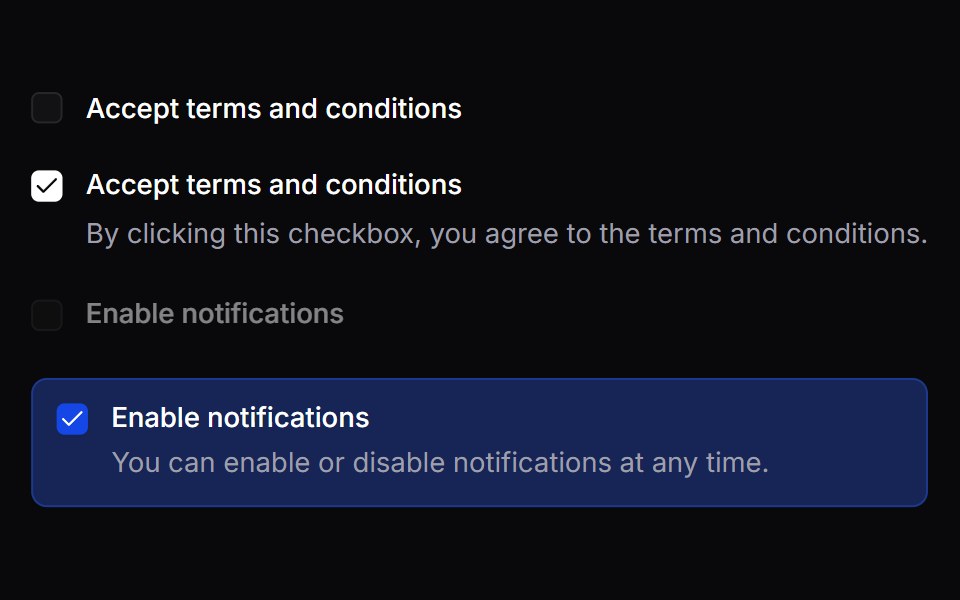 CheckboxVengeance UI · React
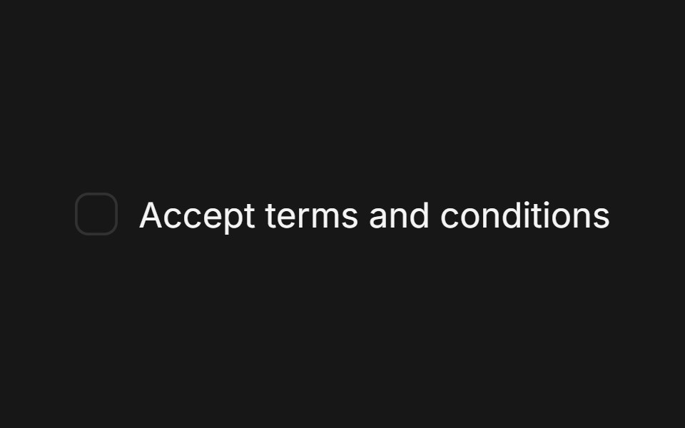 CheckboxFluid Functionalism · ReactA single checkbox: a hairline square that darkens on hover and a check that draws itself. Pairs with Field. Radix…
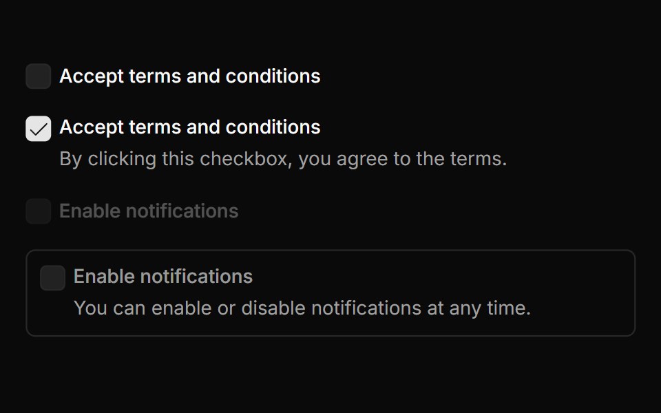 CheckboxToolcraft · React
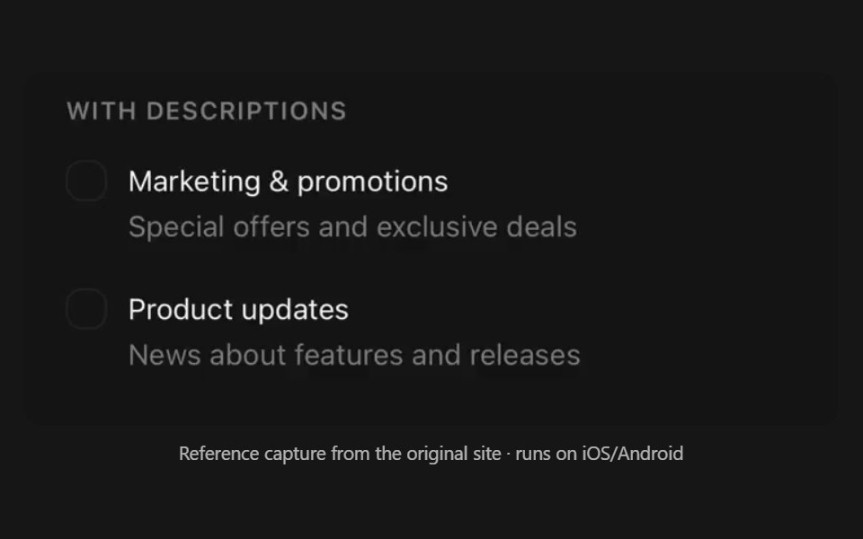 CheckboxPanel UI · React NativeAnimated checkbox, as a row or a selectable card.
 Checkbox-01 - Checkbox with sizesShadcn Space · ReactCheckbox component
 Checkbox Field InputOpenSourceUI · React
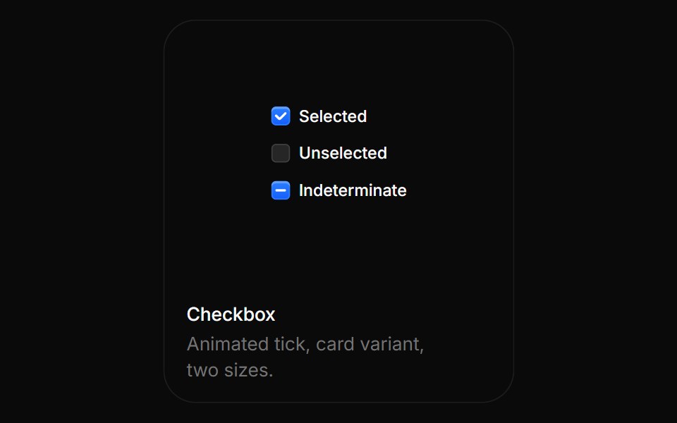 CheckboxBoardUI · ReactAnimated tick, card variant, two sizes.
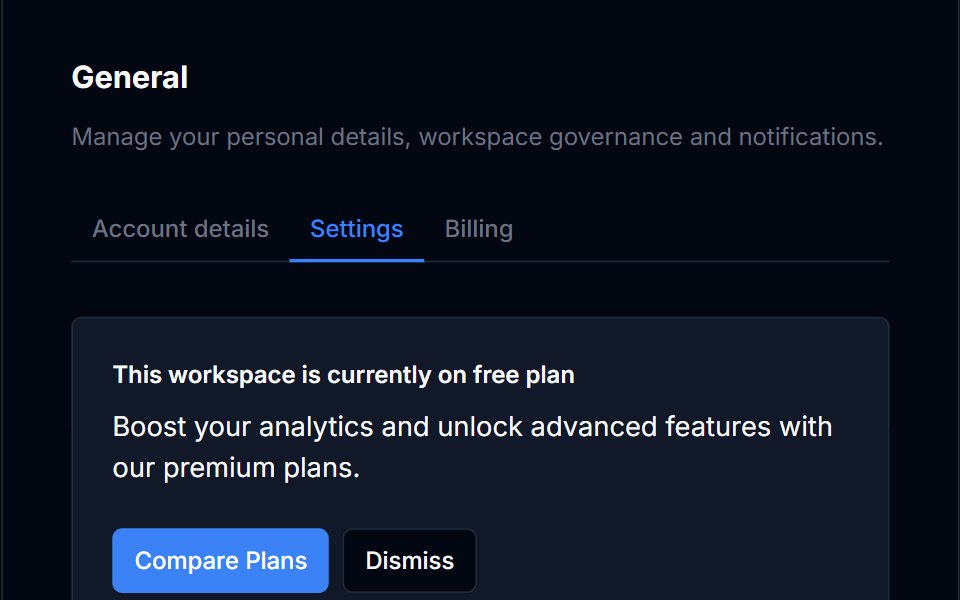 CheckboxTremor Blocks · React
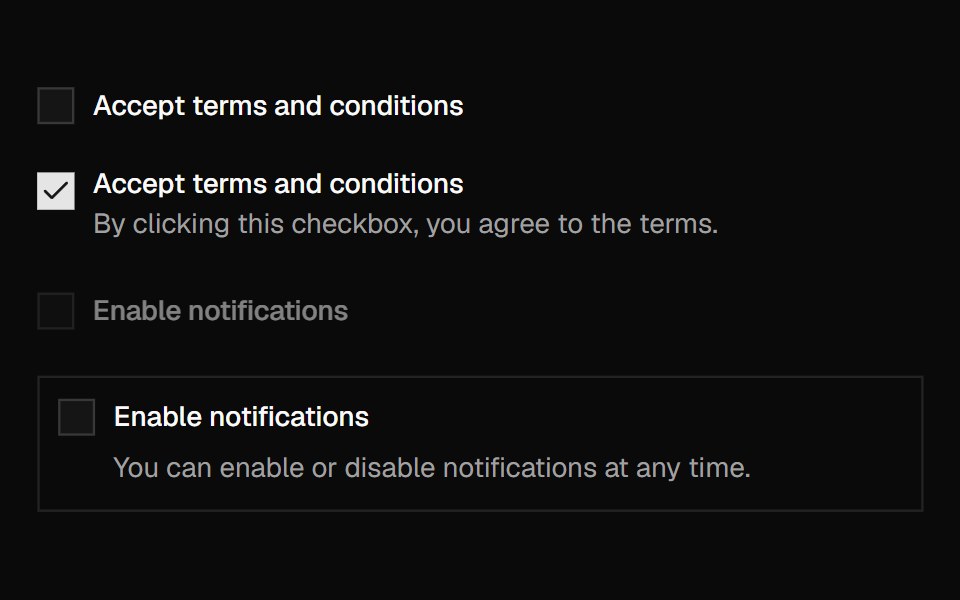 CheckboxShadcn Dashboard · React
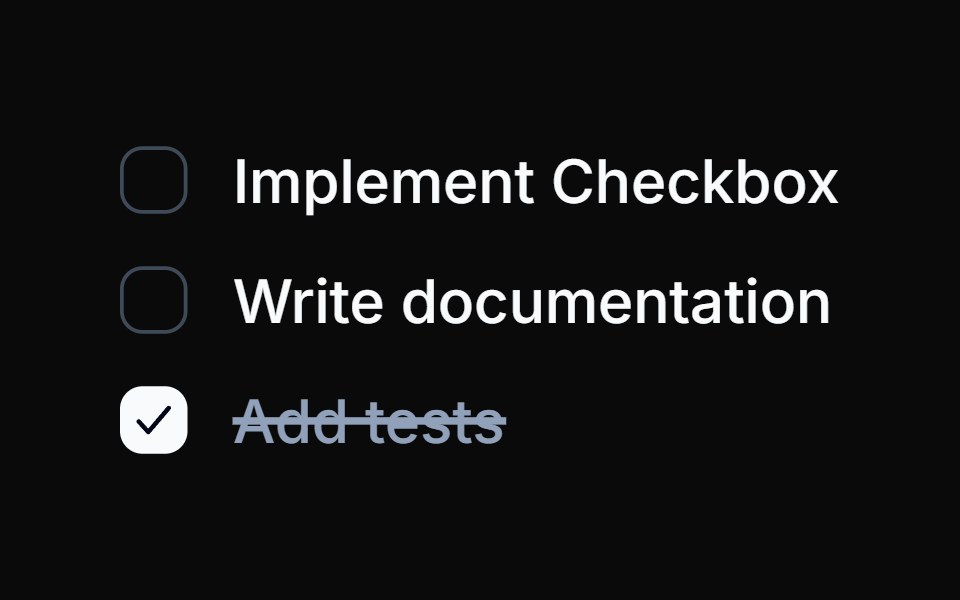 Spell Animated CheckboxAnimations (Svelte) · Svelte
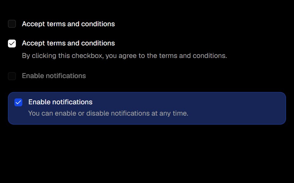 CheckboxObsidianUI · React
 Checkboxes 01Oxbow UI · AstroBasic Checkbox with State Tracking
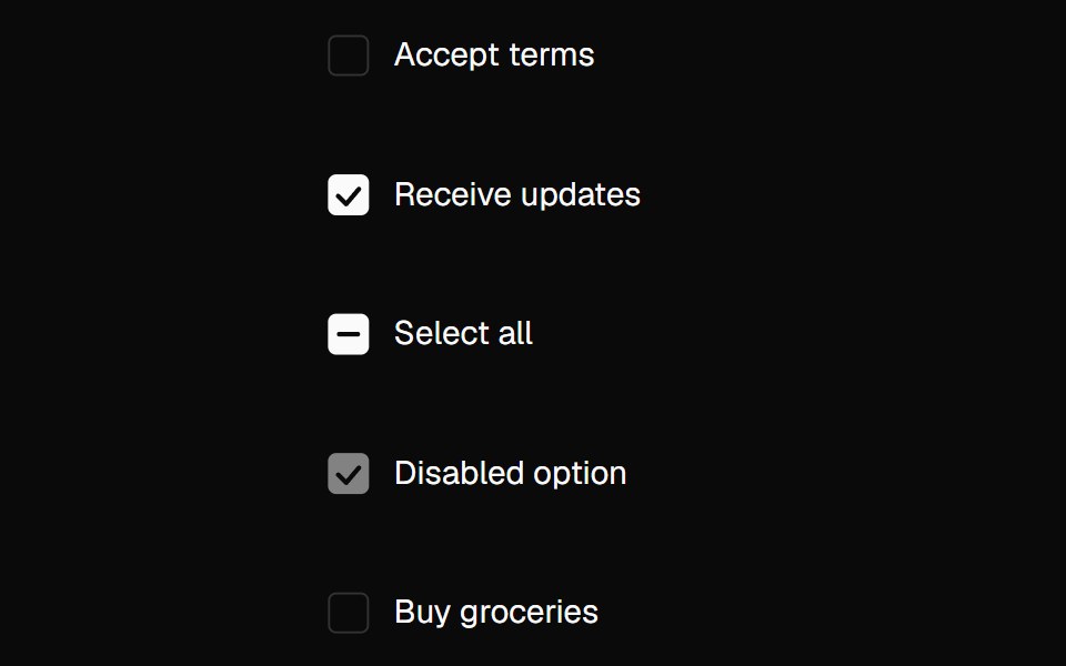 CheckboxNexvyn UI · ReactA checkbox with drawn check animation, indeterminate state, and hidden native input for forms.
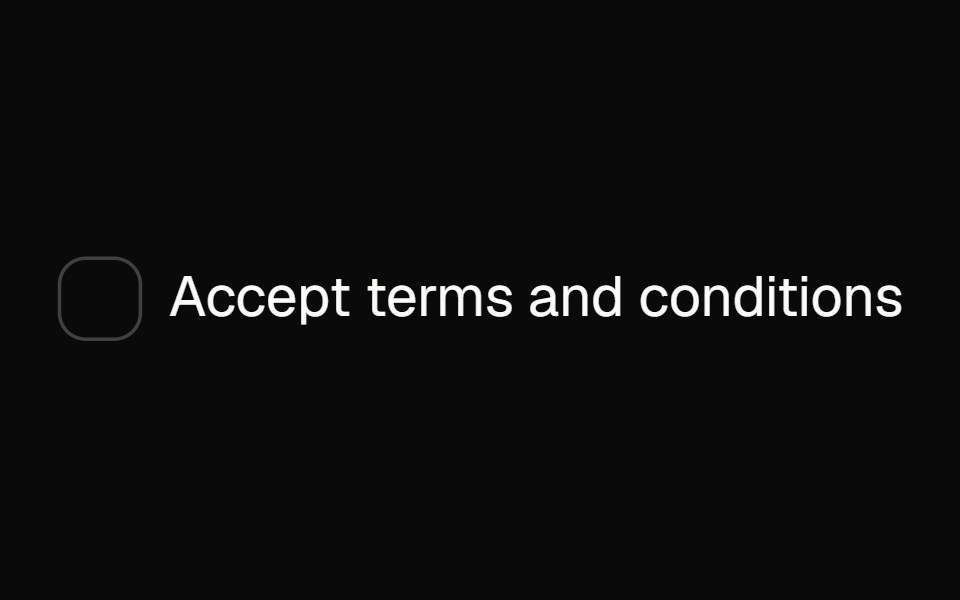 checkboxBaseLayer · ReactA checkbox allows a user to select multiple items from a list of individual items, or to mark one individual item as…
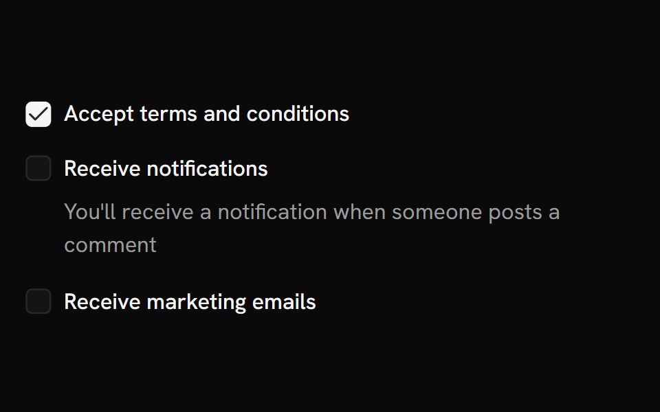 CheckboxShark UI · ReactControl for multiple selections in a set.
 Animated CheckboxSona UI · ReactAn accessible Base UI checkbox with a drawn checkmark and a restrained animated state change.
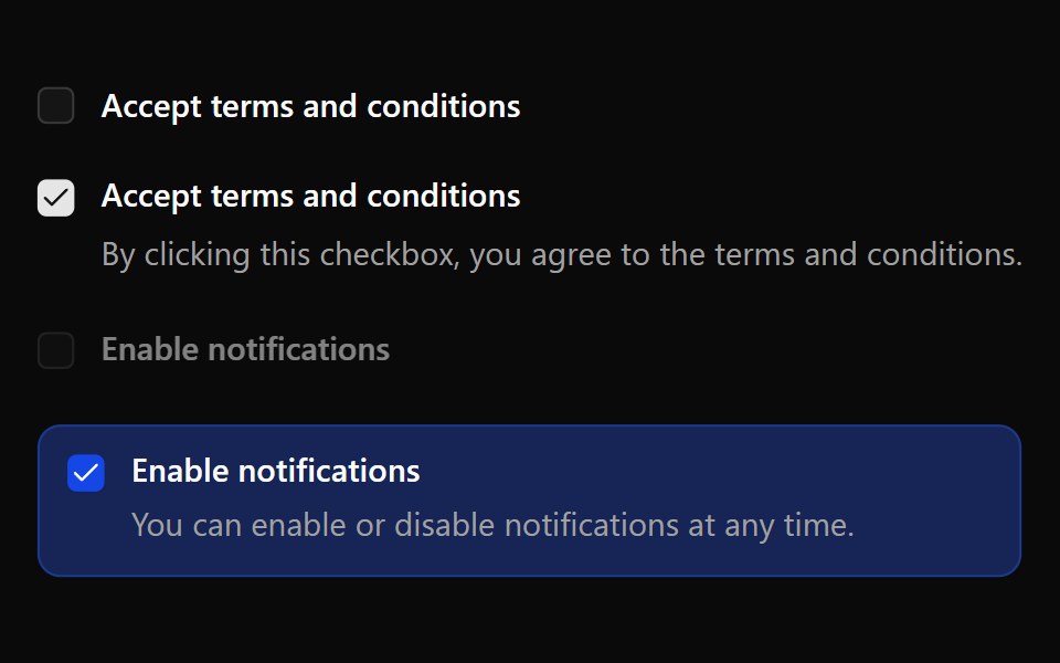 CheckboxWatermelon UI · React
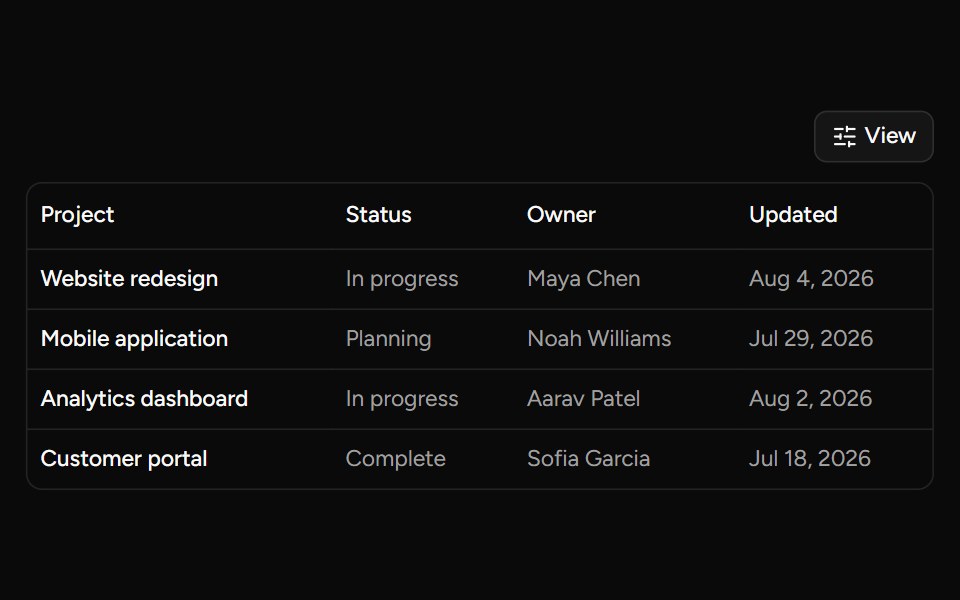 Data Table Viewsv-table · SvelteA checkbox dropdown for toggling table column visibility.
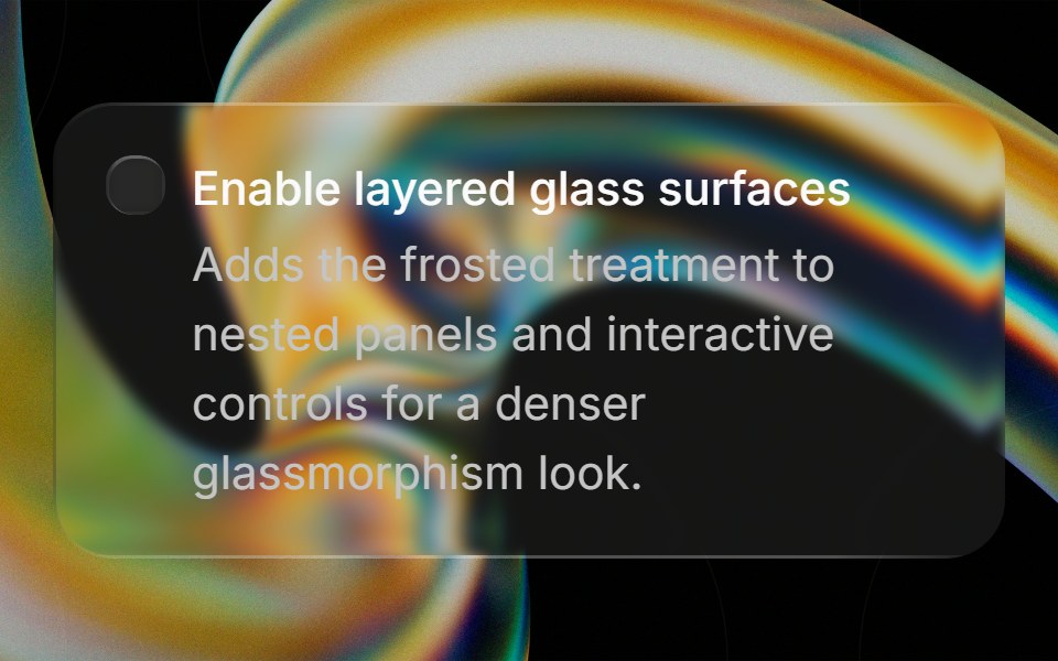 Glass Checkboxglasscn · ReactGlass Checkbox with five variants: clear, frosted, subtle, liquid, and liquid-refract
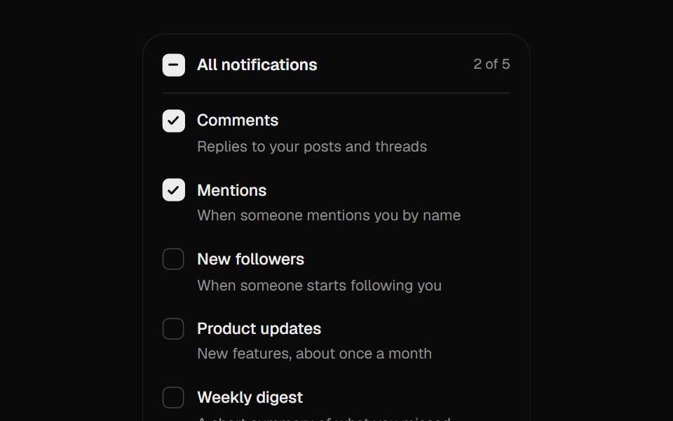 Checkbox GroupUI Lab · ReactCheck marks draw themselves in, and Shift-click fills a range.
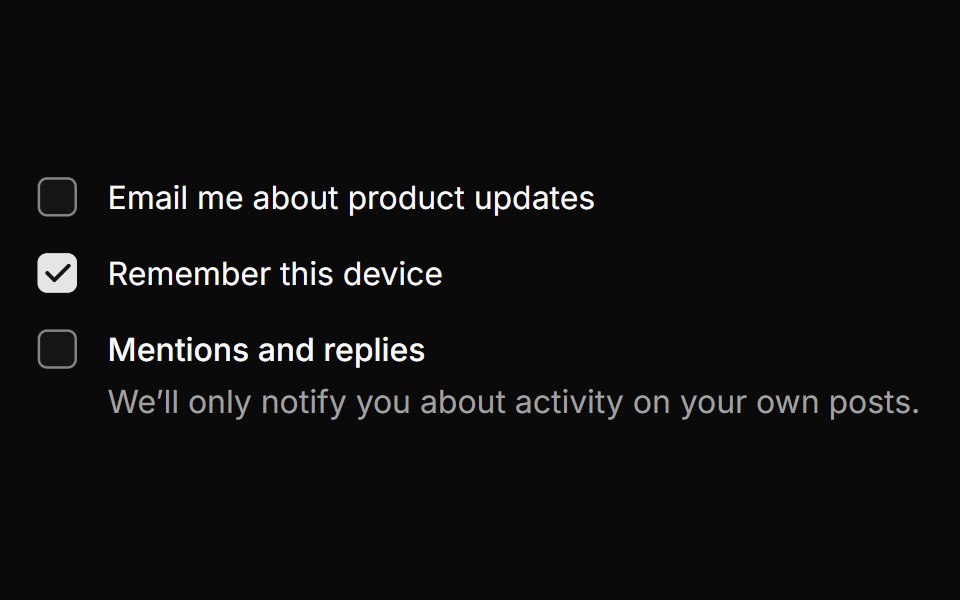 CheckboxHextaUI · ReactA checkbox whose check draws in, with indeterminate parents, groups and labels that share its hover.
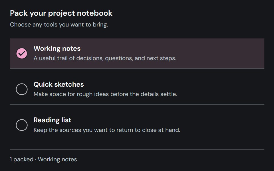 CheckboxCojeev UI · ReactCaptures an independent checked, unchecked, or indeterminate choice.
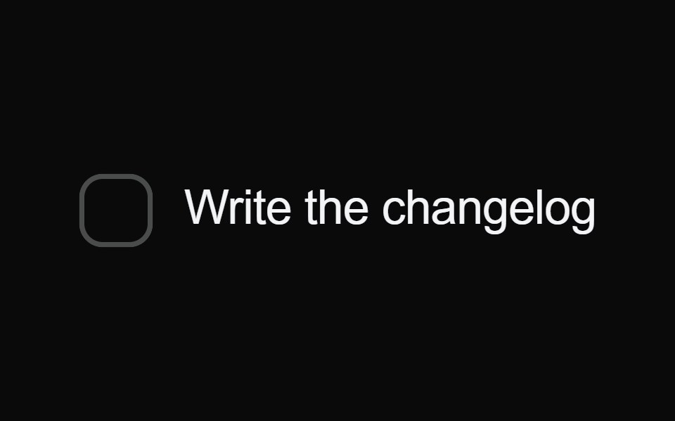 Bounce CheckboxMicroKit · ReactA checkbox whose fill springs out past the box with a little swell, draws its tick, then strikes the label through and…
 BasicFLX UI · ReactSingle checkbox with a label.
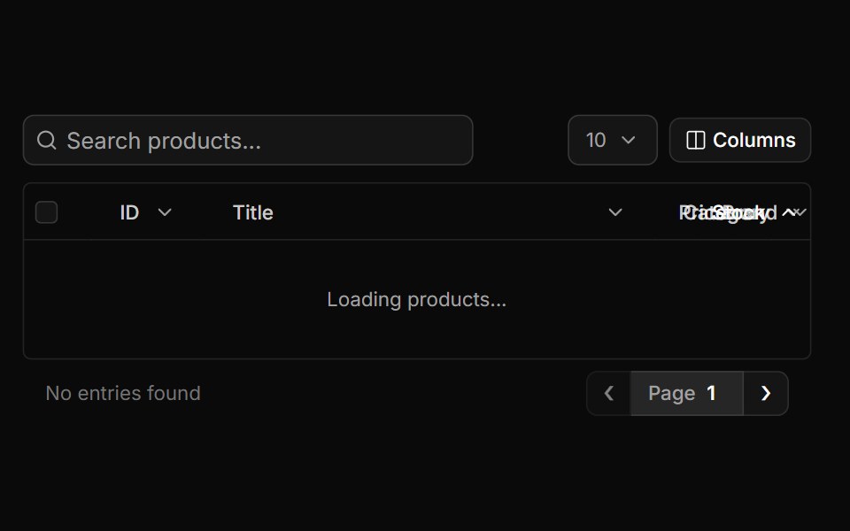 Full Tablesv-particles · Svelte
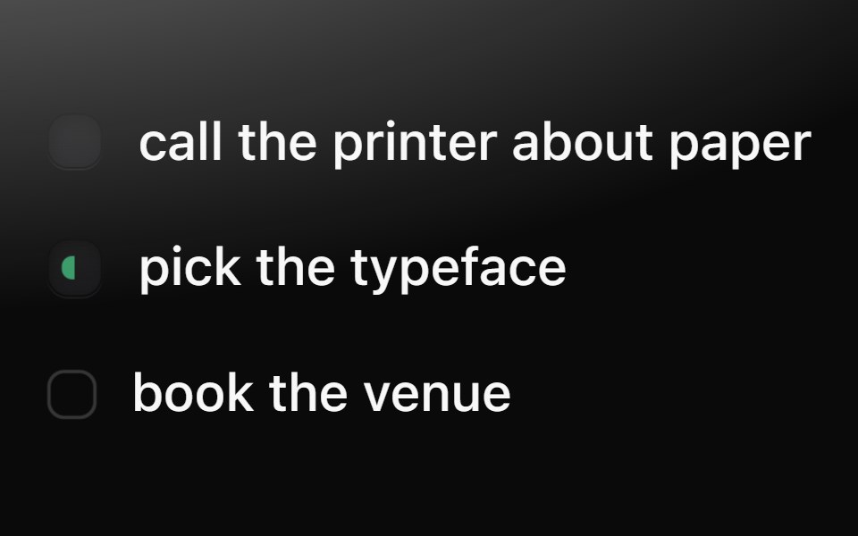 CheckboxMetal UI · React + SwiftUIThe dimple checkbox: a recessed well that turns into a dark pressed key with a drawn tick; doing (half green) and…
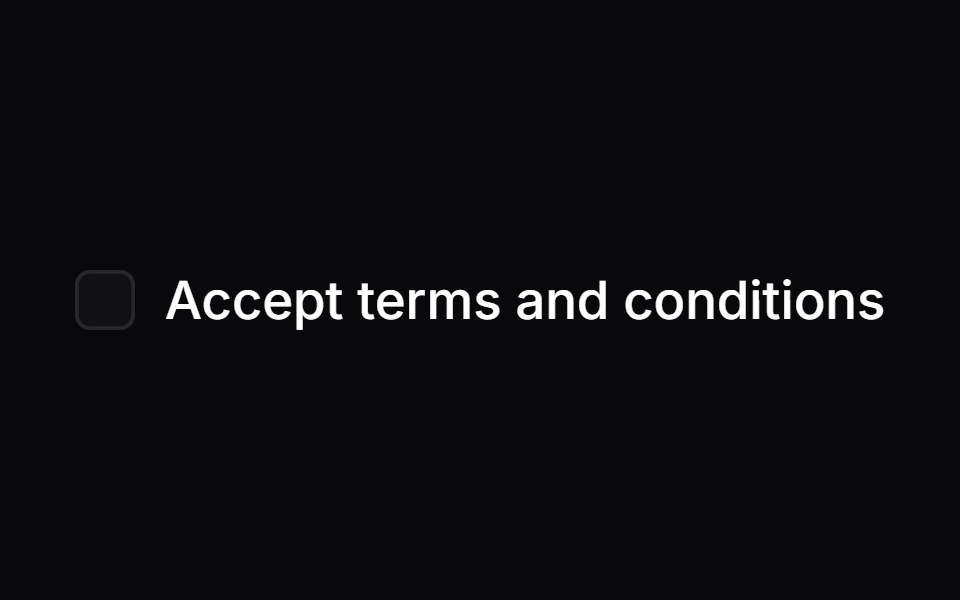 CheckboxSpaceUI · ReactAllows users to turn a single option on or off, or select multiple items from a list with clear checkmarks and partial…
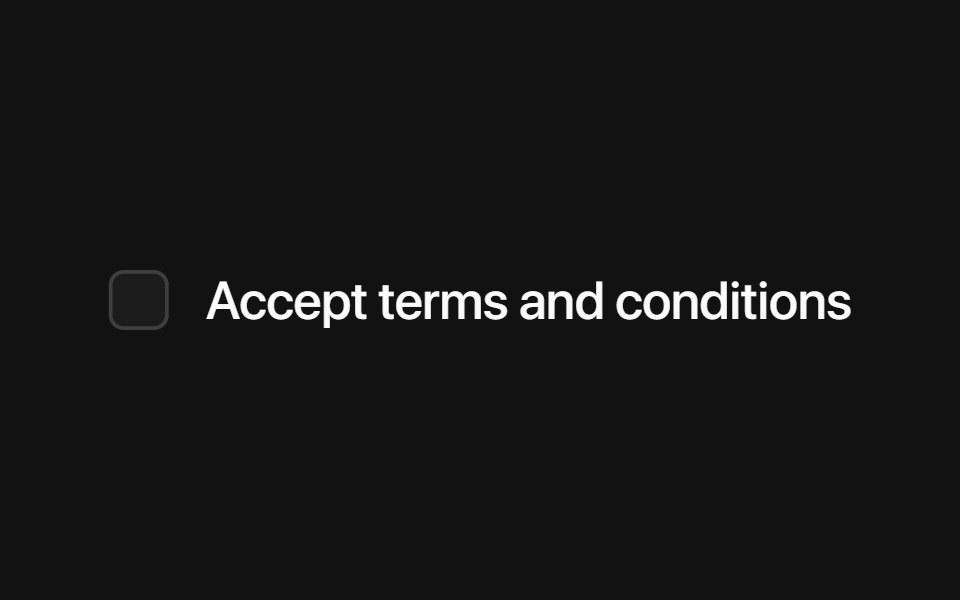 Base CheckboxSora UI · ReactAn accessible, stylable checkbox built on Base UI with a Motion-friendly animated indicator.
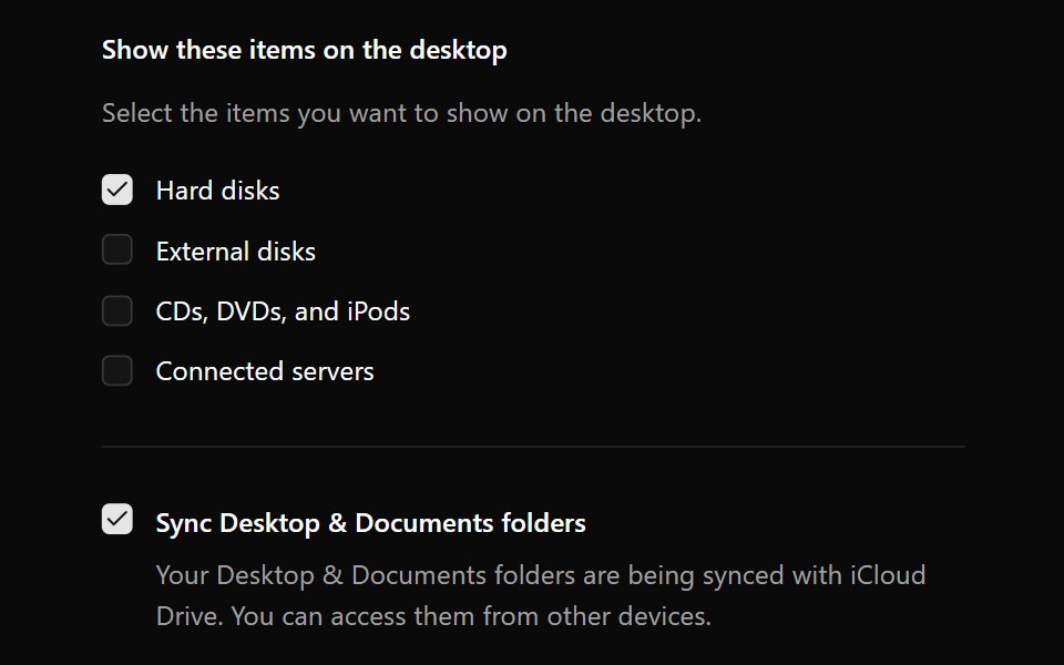 CheckboxOUI · ReactReact aria components Checkbox with shadcn characteristics.
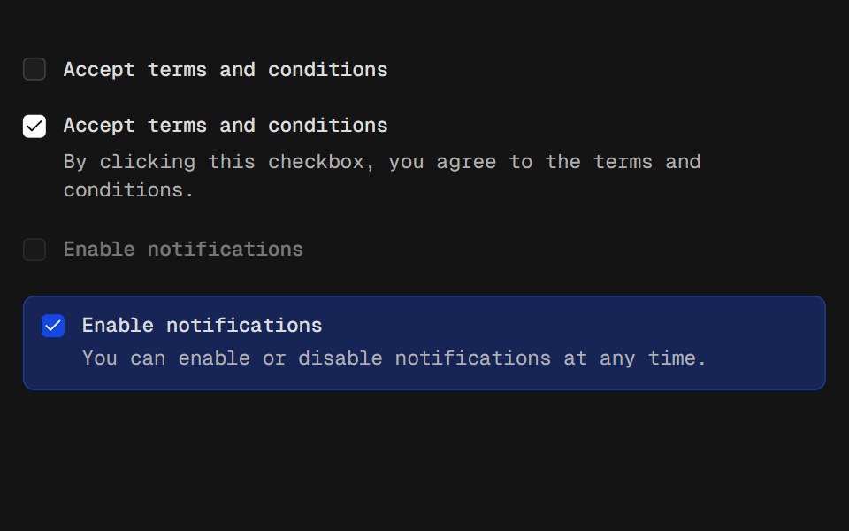 CheckboxD2Studio UI · ReactA control that allows the user to toggle between checked and not checked.
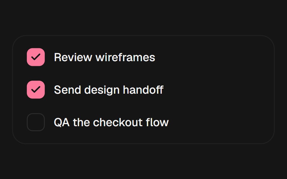 CheckboxEaseUI · ReactCheckbox on a real checkbox input, with a check mark that pops in rather than just appearing.
 CheckboxFibo · ReactTurns a single option on or off, or picks many from a list.
 Animated CheckboxReactFrame · ReactAn accessible checkbox with an animated draw-in checkmark, focus ring, and optional label, helper text, required…
 Checkboxark-cn · ReactA shadcn-style checkbox component built with Ark UI primitives.
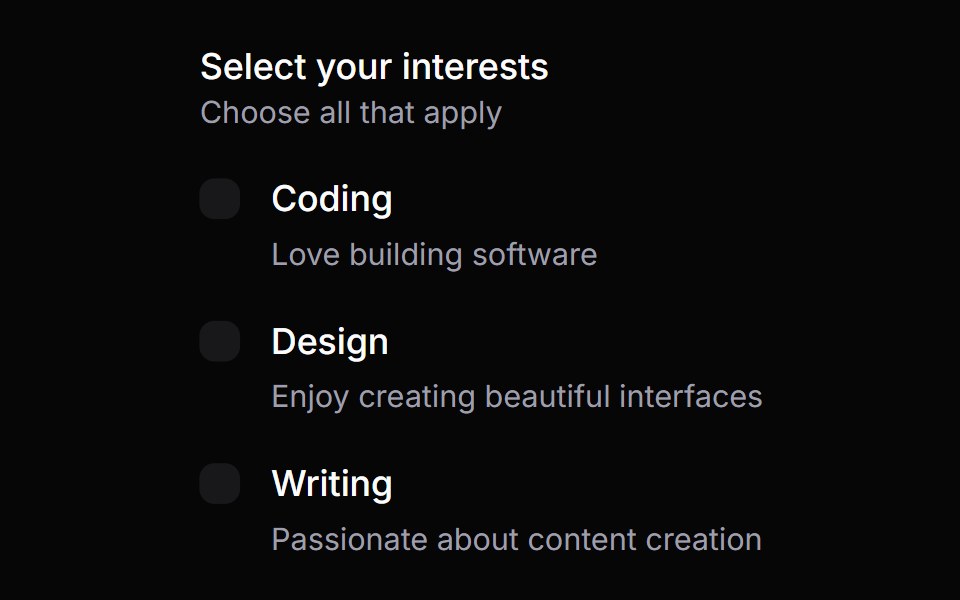 Checkbox GroupHeroUI · ReactA checkbox group component for managing multiple checkbox selections
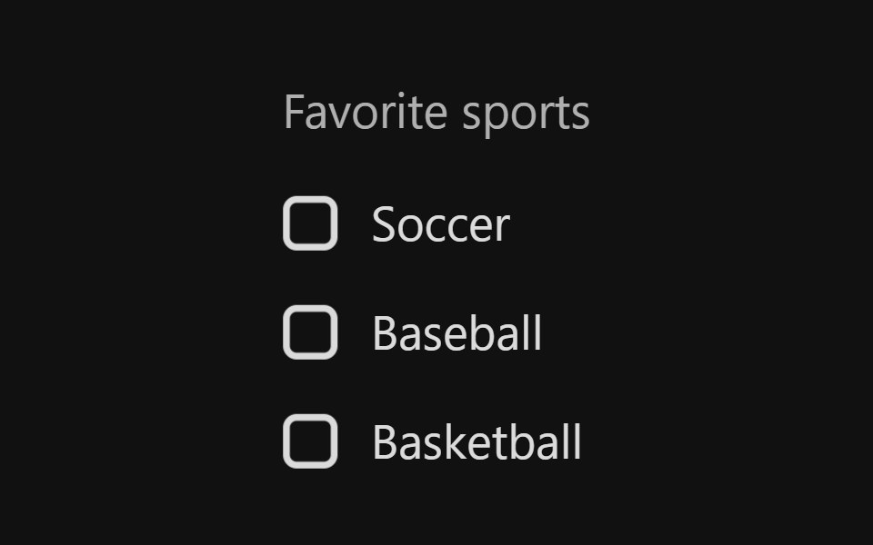 Checkbox GroupReact Spectrum · ReactA CheckboxGroup allows users to select one or more items from a list of choices.
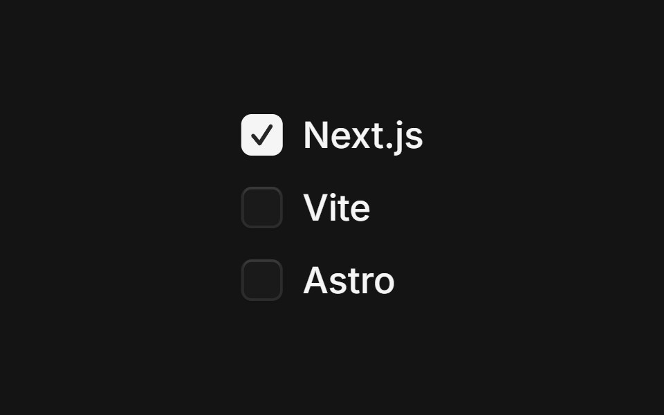 Checkbox Groupcoss ui · ReactProvides shared state to a series of checkboxes.
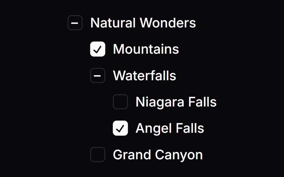 Checkbox TreeOrigin UI · React
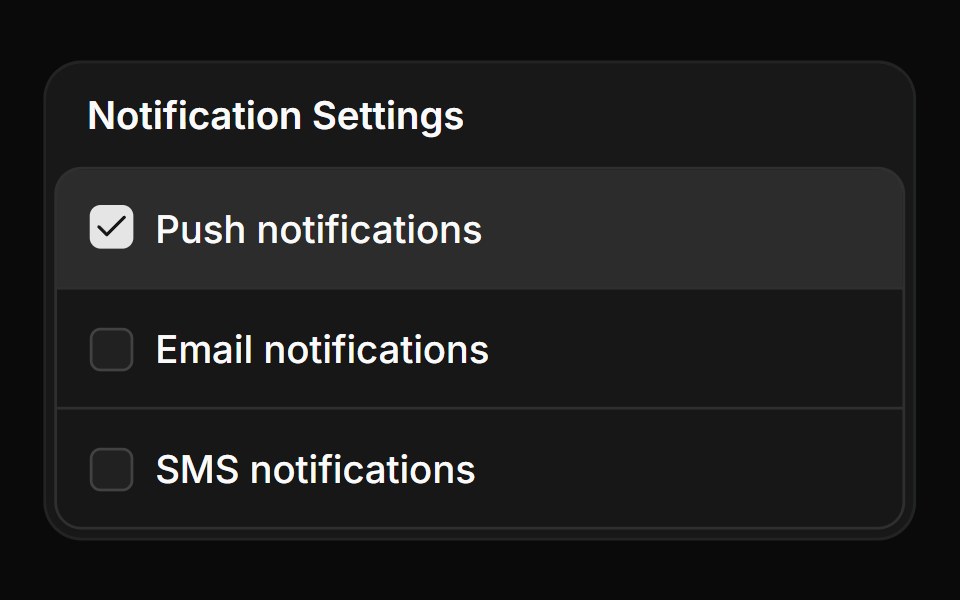 Checkbox group in a frameReUI · ReactCheckbox group in a frame
 choice-boxIntent UI · Reactchoice-box
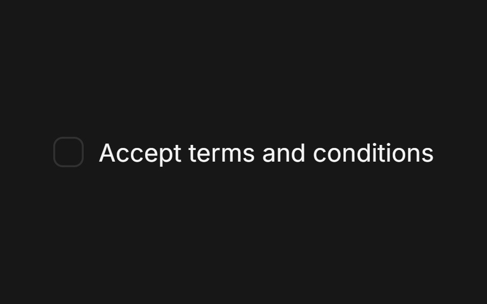 Checkbox (Base UI)Fluid Functionalism · ReactA single checkbox: a hairline square that darkens on hover and a check that draws itself. Pairs with Field. Base UI…
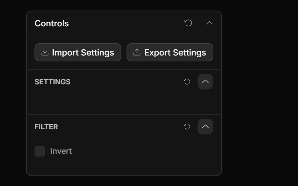 Checkbox ControlToolcraft · React
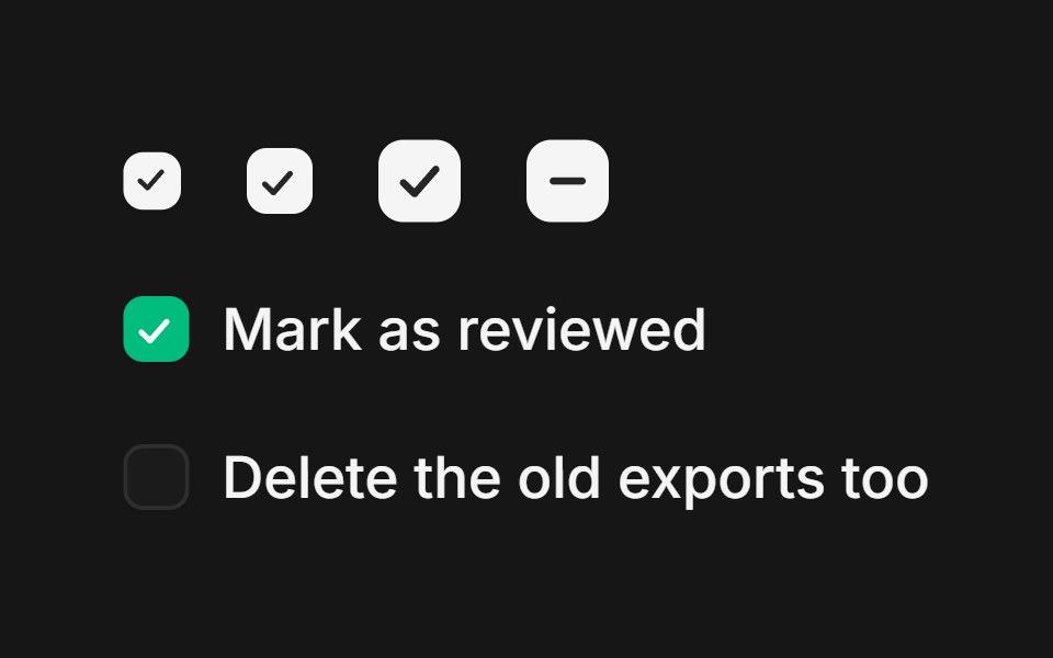 Web CheckboxPanel UI · React NativeCheckboxes with labels and helper text for forms and settings.
 Checkbox-02 - Checkbox with vertical groupShadcn Space · ReactCheckbox component
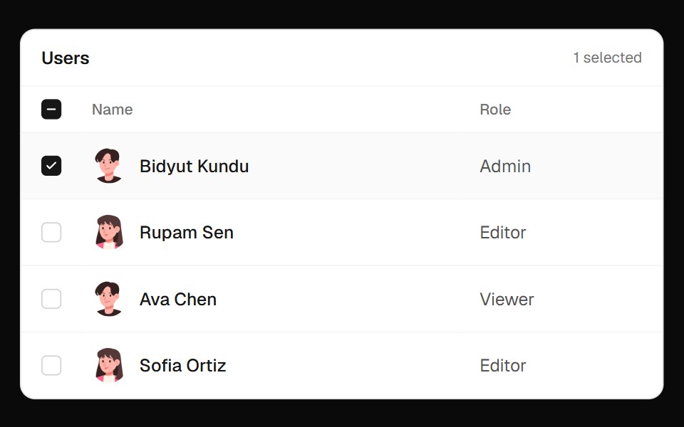 Users Select TableOpenSourceUI · React
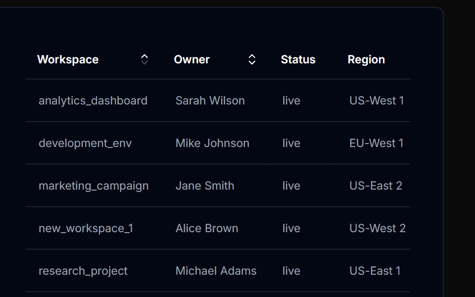 Table Action 01Tremor Blocks · React
 Checkboxes 02Oxbow UI · AstroCheckbox with Disabled State
 Checkbox 1Watermelon UI · React
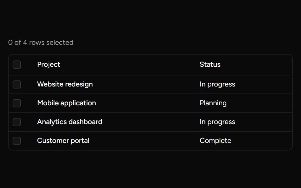 Header Checkboxsv-table · SvelteA select-all checkbox with support for an indeterminate state.
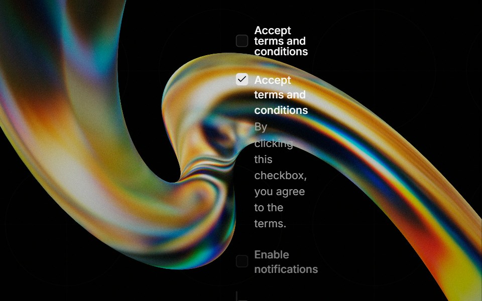 Checkboxglasscn · React
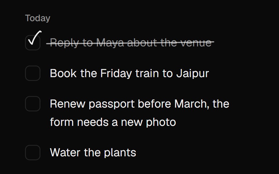 Scribble CheckboxUI Lab · ReactChecks itself off with a quick pen stroke and strikes the words through.
 Progress Ring CheckMicroKit · ReactA task status icon whose dashed ring closes into a spinning arc, fills to its progress, then draws a check or a cross…
 With descriptionFLX UI · ReactCheckbox with a label and helper description.
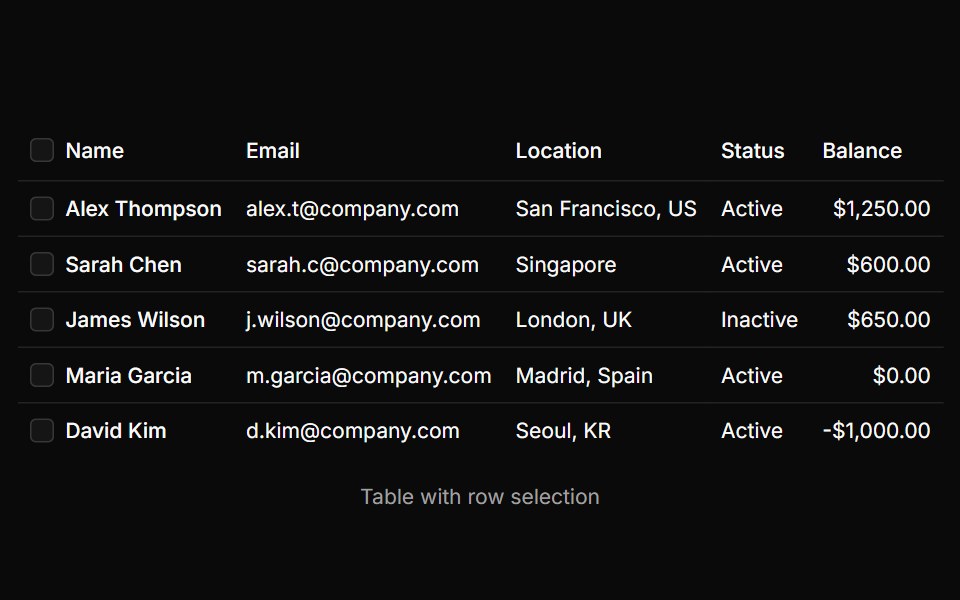 Table With Row Selectionsv-particles · Svelte
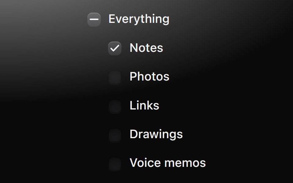 Checkbox groupMetal UI · React + SwiftUISeveral independent choices in a form: row-size checkboxes with labels and an optional parent; ticking the parent…
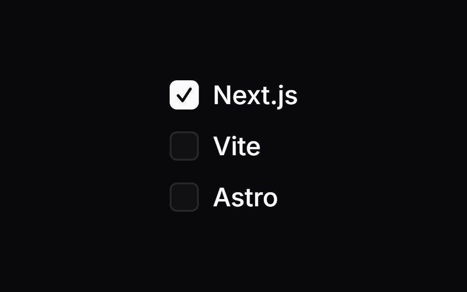 Checkbox GroupSpaceUI · ReactGroups multiple related checkboxes together under a single control, making it easy for users to select one or several…
 Radix CheckboxSora UI · ReactAn accessible, stylable checkbox built on Radix UI with a Motion-friendly animated indicator.
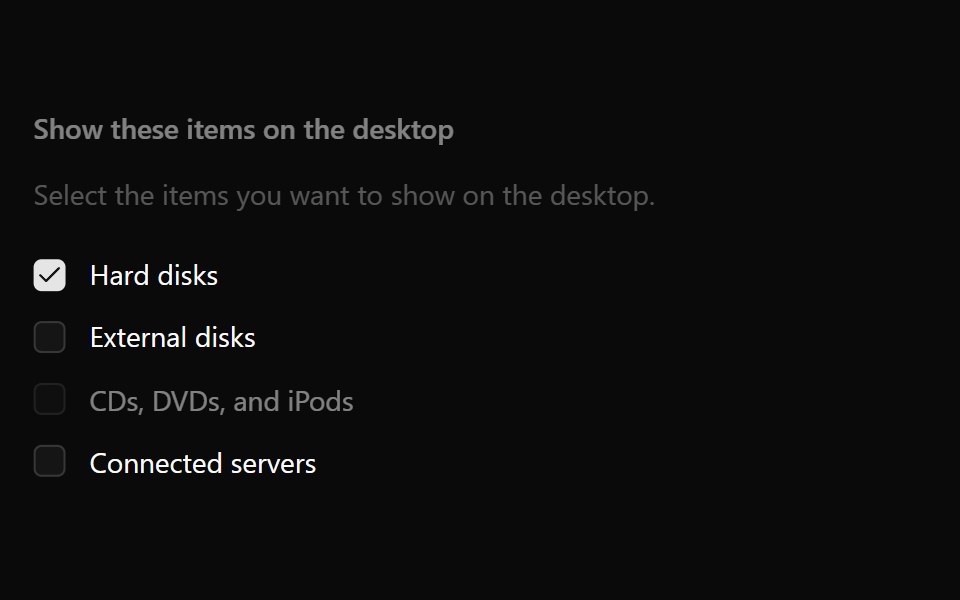 Checkbox GroupOUI · ReactReact aria components Checkbox Group with shadcn characteristics.
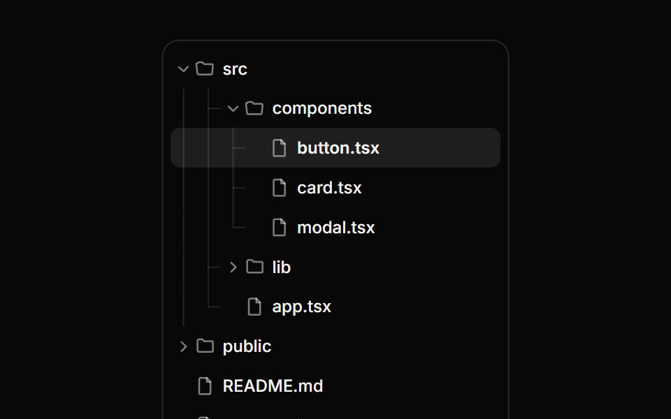 Tree ViewReactFrame · ReactA hierarchical tree with expand/collapse, tri-state checkboxes for multi-select, single-row selection, guide lines and…
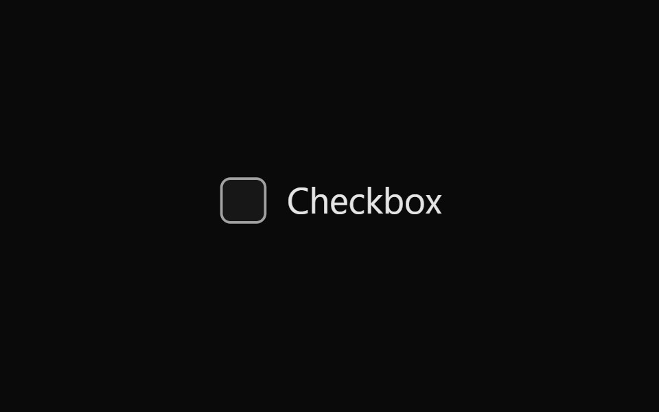 Tailwind CheckboxReact Spectrum · React
 Comp 132Origin UI · React
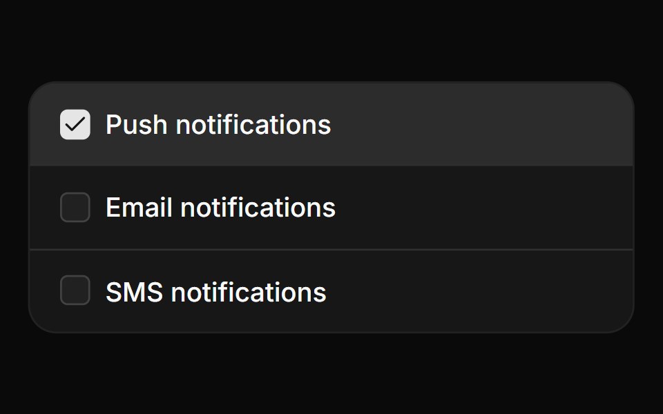 Card checkbox group with iconsReUI · ReactCard checkbox group with icons
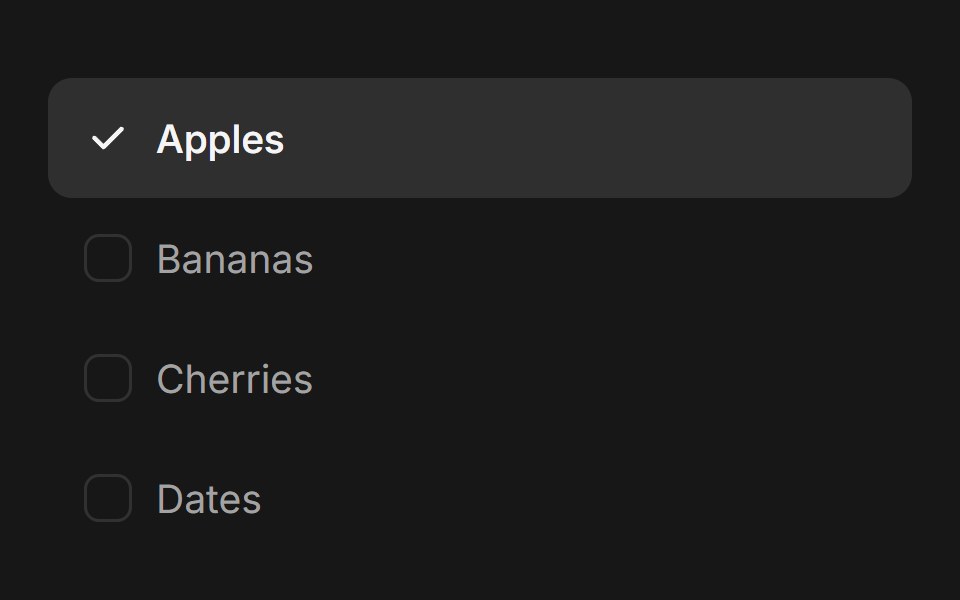 Checkbox GroupFluid Functionalism · ReactAnimated checkbox group with fluid hover, contiguous selection merging, and spring-animated check marks. Built on…
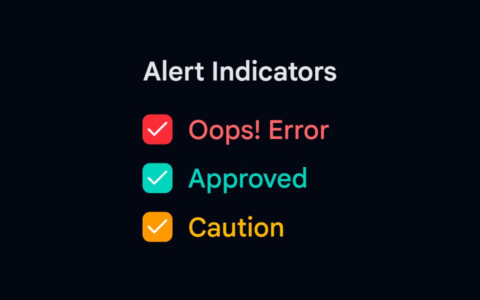 Checkbox-03 - Checkbox with colorsShadcn Space · ReactCheckbox component
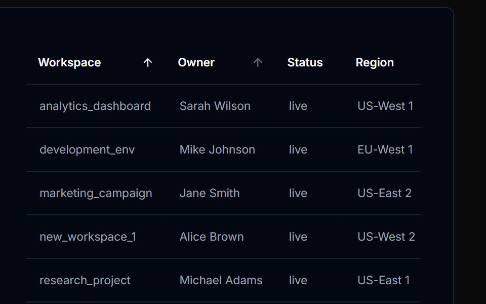 Table Action 02Tremor Blocks · React
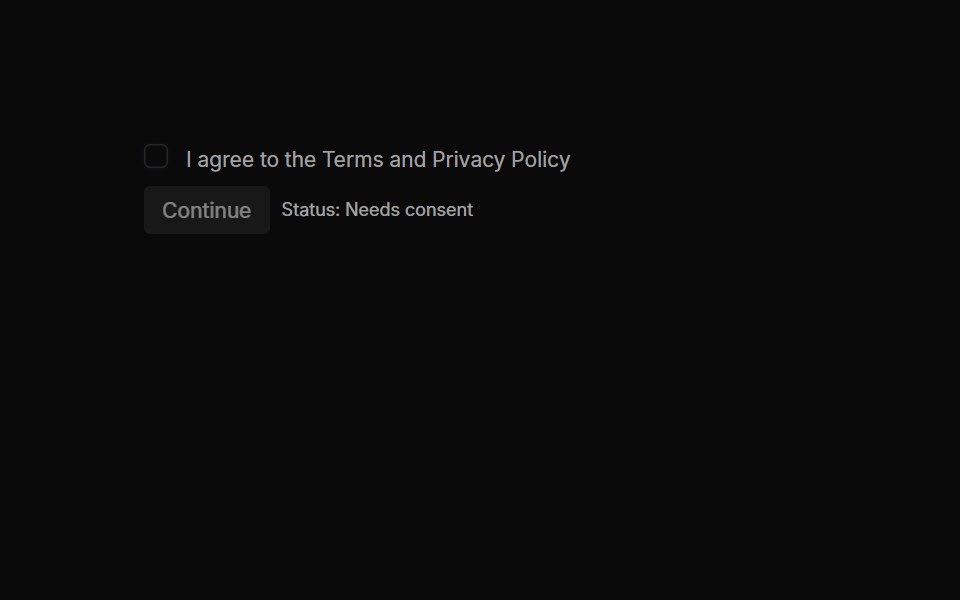 Checkboxes 03Oxbow UI · AstroRequired Consent with Validation
 Checkbox 10Watermelon UI · React
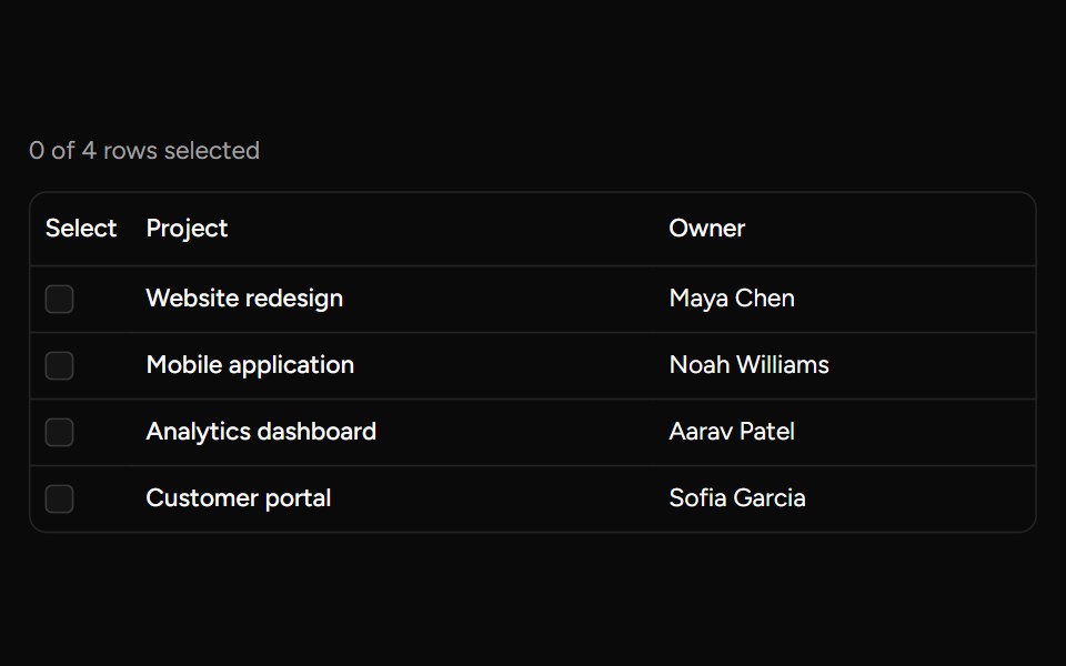 Row Checkboxsv-table · SvelteA controlled checkbox for selecting an individual table row.
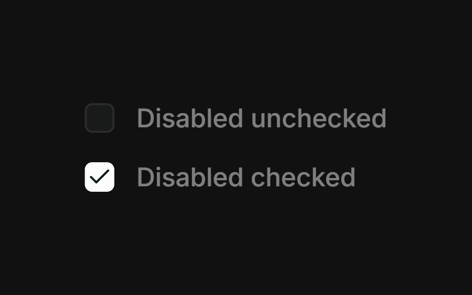 DisabledFLX UI · ReactDisabled unchecked and disabled checked states.
 With Checkboxsv-particles · Svelte
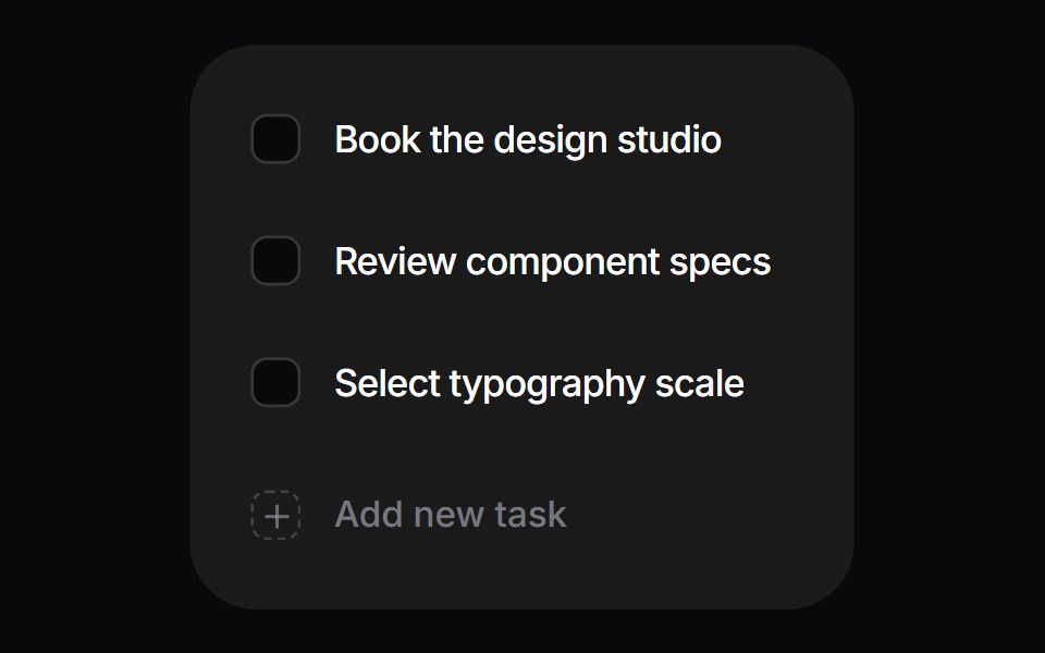 Interactive ChecklistSpaceUI · React
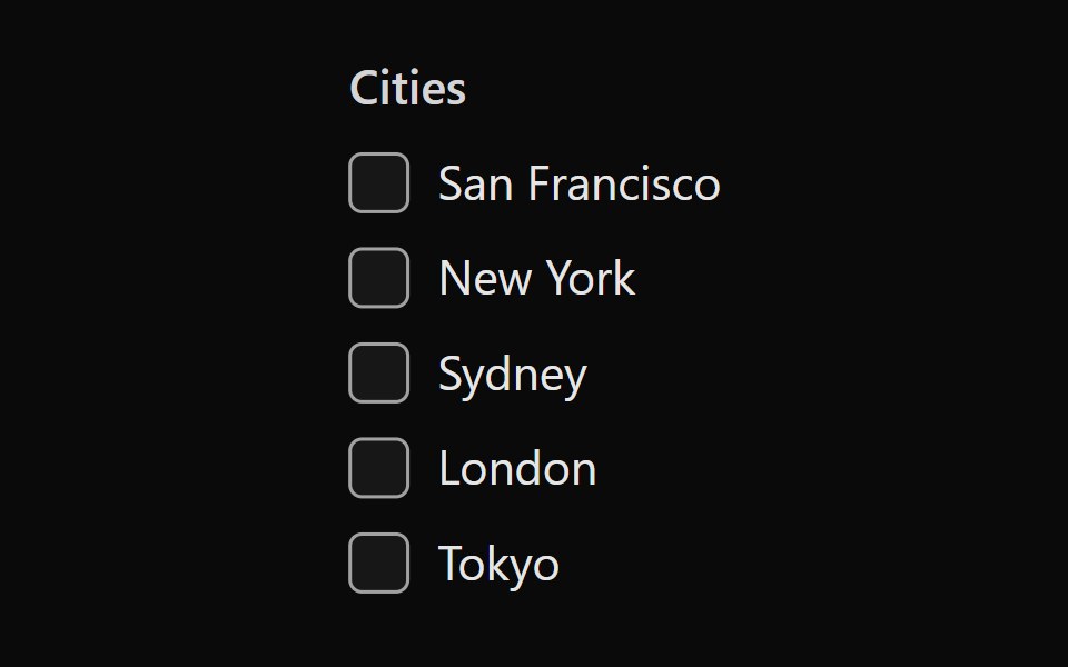 Tailwind Checkbox GroupReact Spectrum · React
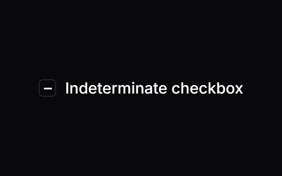 Comp 133Origin UI · React
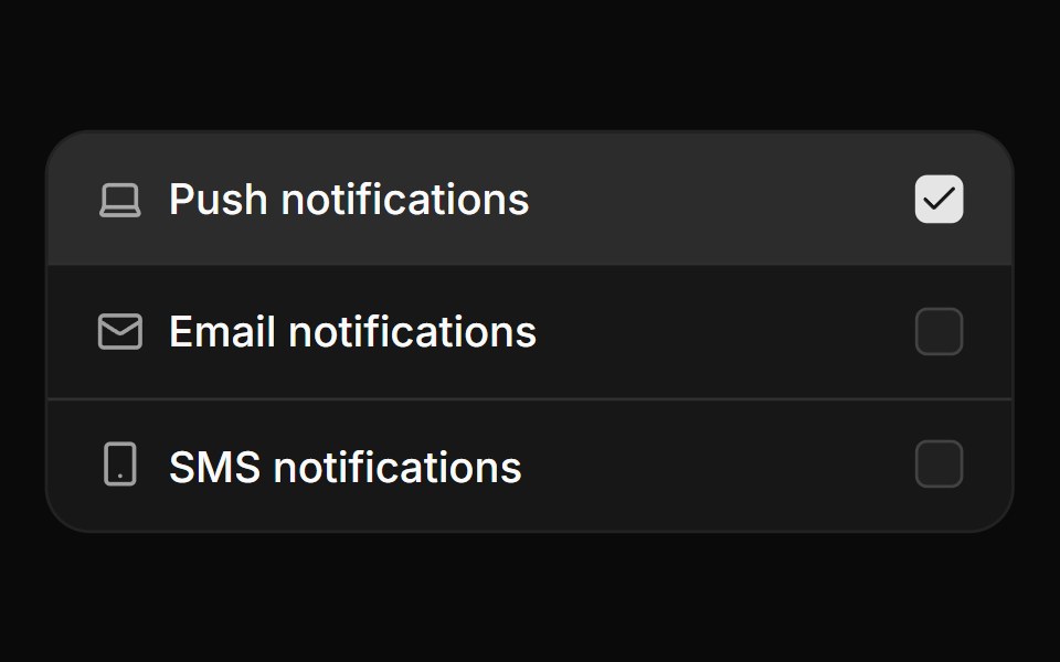 Card checkbox group with iconsReUI · ReactCard checkbox group with icons
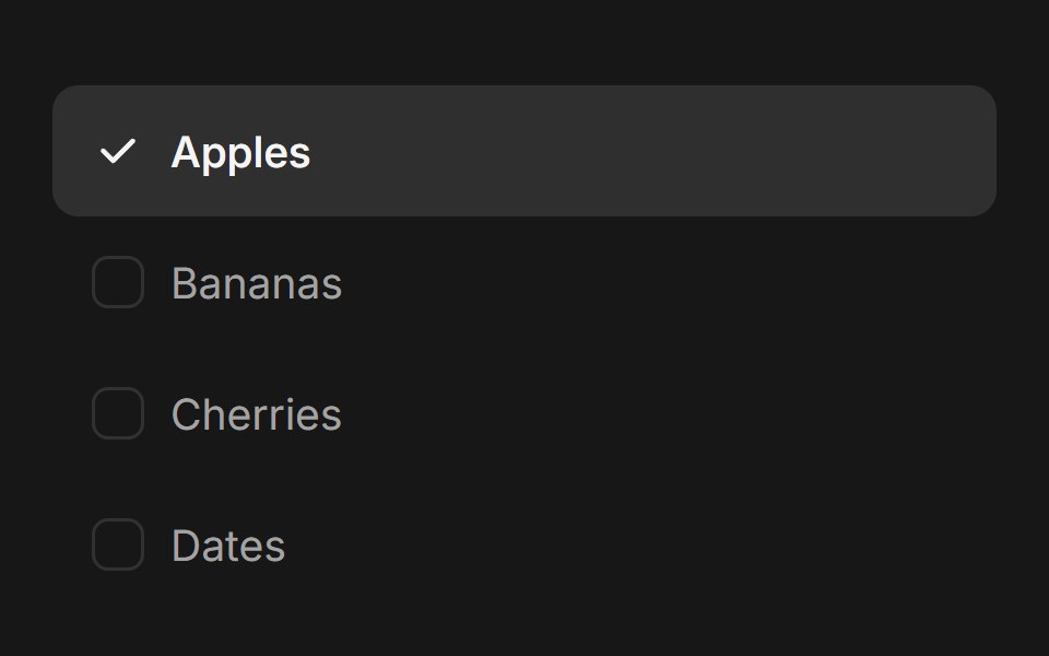 Checkbox Group (Base UI)Fluid Functionalism · ReactAnimated checkbox group with fluid hover, contiguous selection merging, and spring-animated check marks. Base UI flavor.
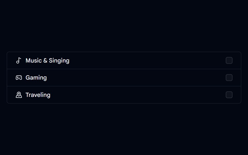 Checkbox-05 - Checkbox with list groupShadcn Space · ReactCheckbox component
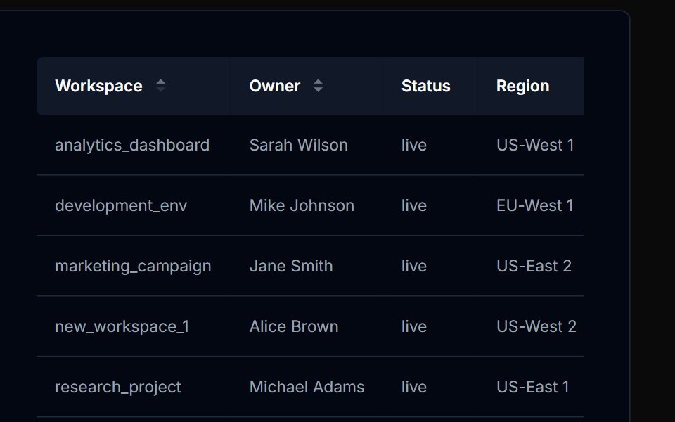 Table Action 03Tremor Blocks · React
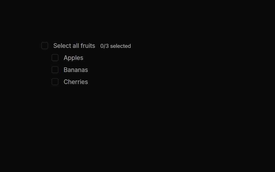 Checkboxes 04Oxbow UI · AstroParent Checkbox with Tri‑State
 Checkbox 11Watermelon UI · React
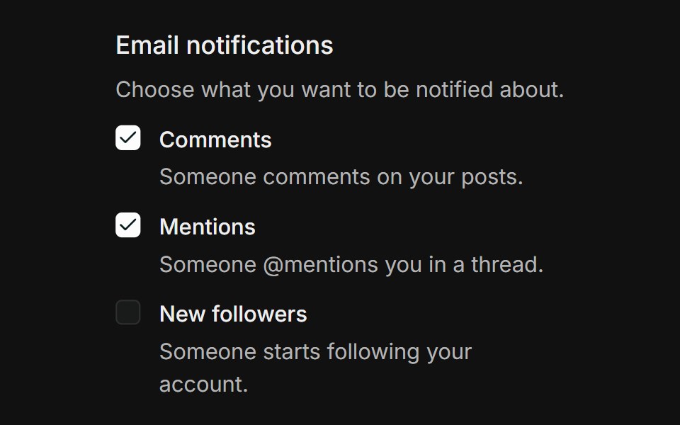 GroupFLX UI · ReactGrouped list of notification checkboxes, each with a label and helper description, inside a labelled fieldset.
 Vanilla CheckboxReact Spectrum · React
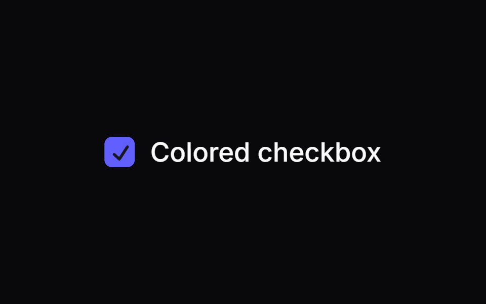 Comp 134Origin UI · React
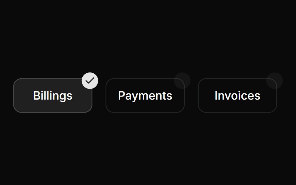 Custom positioned checkboxReUI · ReactCustom positioned checkbox
 Checkbox-08 - Checkbox with dashed borderShadcn Space · ReactCheckbox component
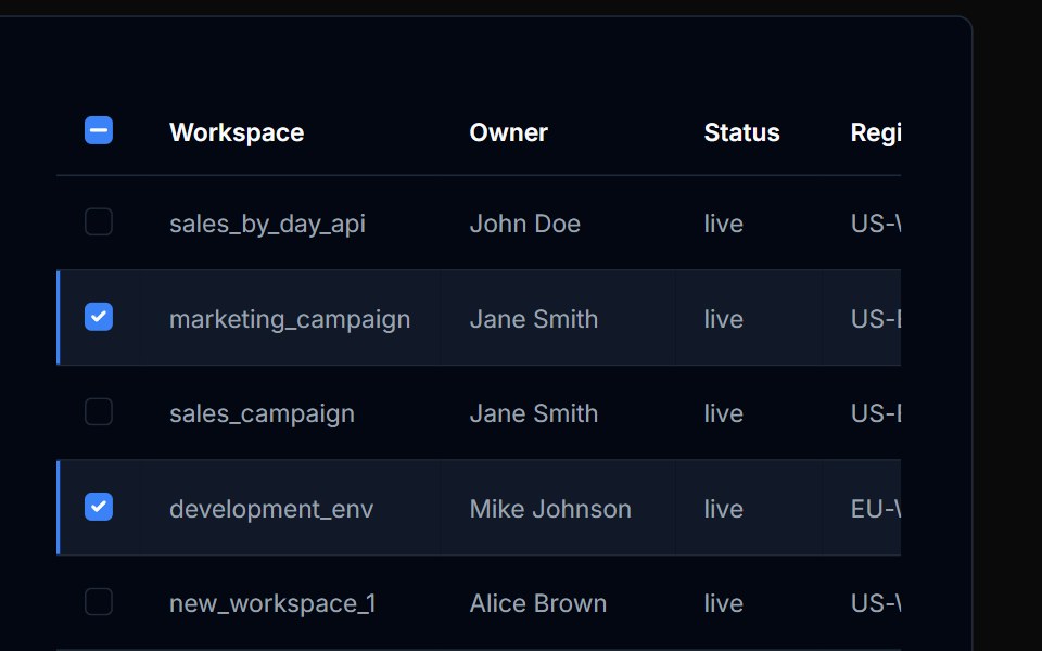 Table Action 04Tremor Blocks · React
 Checkboxes 06Oxbow UI · AstroCheckbox Group with Max Selection
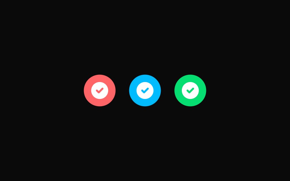 Checkbox 12Watermelon UI · React
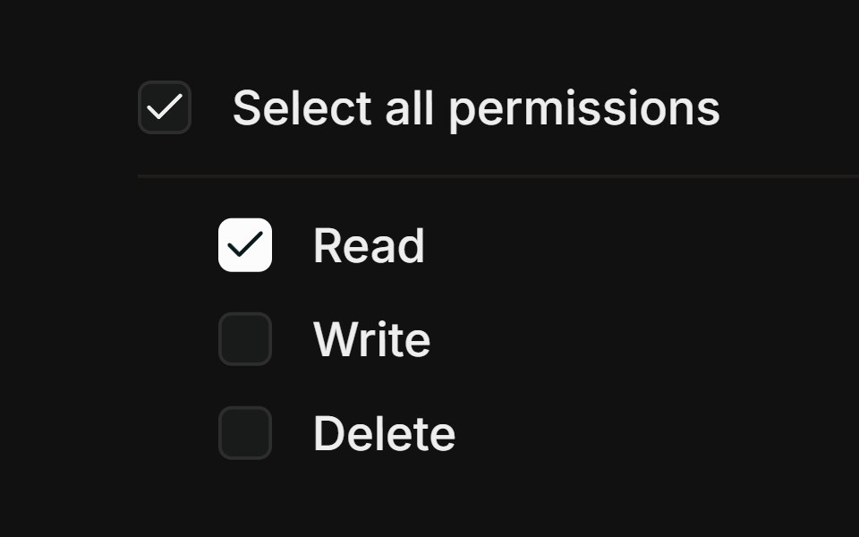 Select allFLX UI · ReactParent checkbox with an indeterminate mixed state.
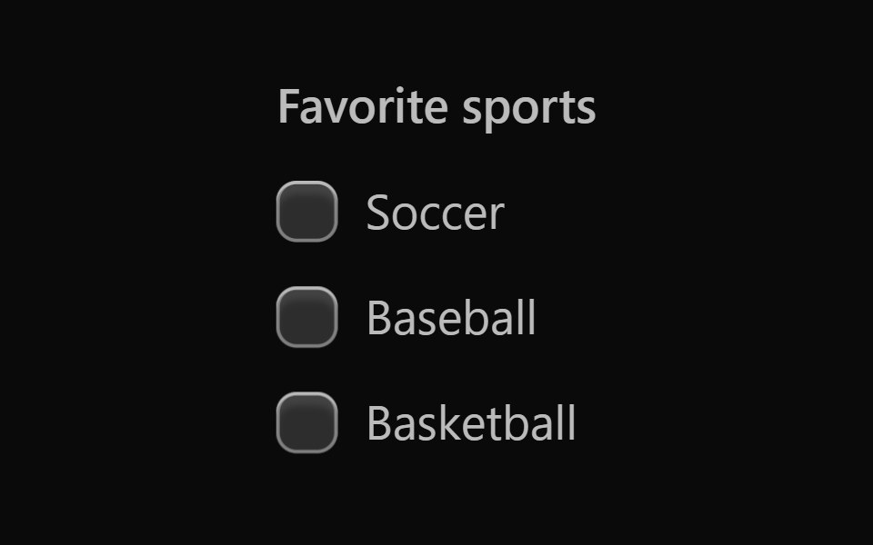 Vanilla Checkbox GroupReact Spectrum · React
 Comp 135Origin UI · React
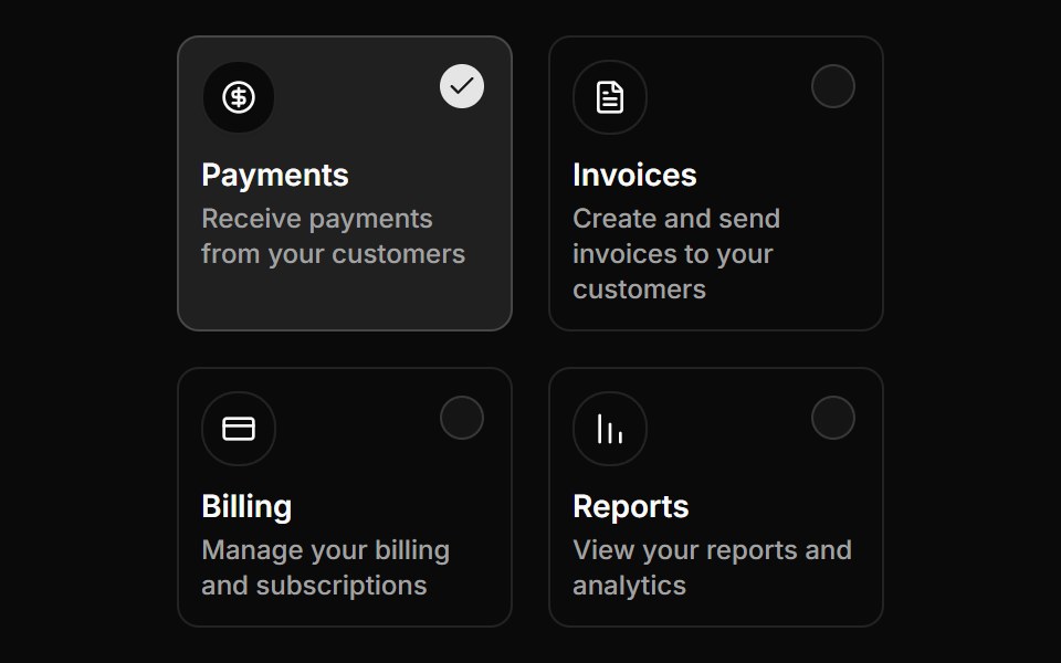 Custom positioned checkboxReUI · ReactCustom positioned checkbox
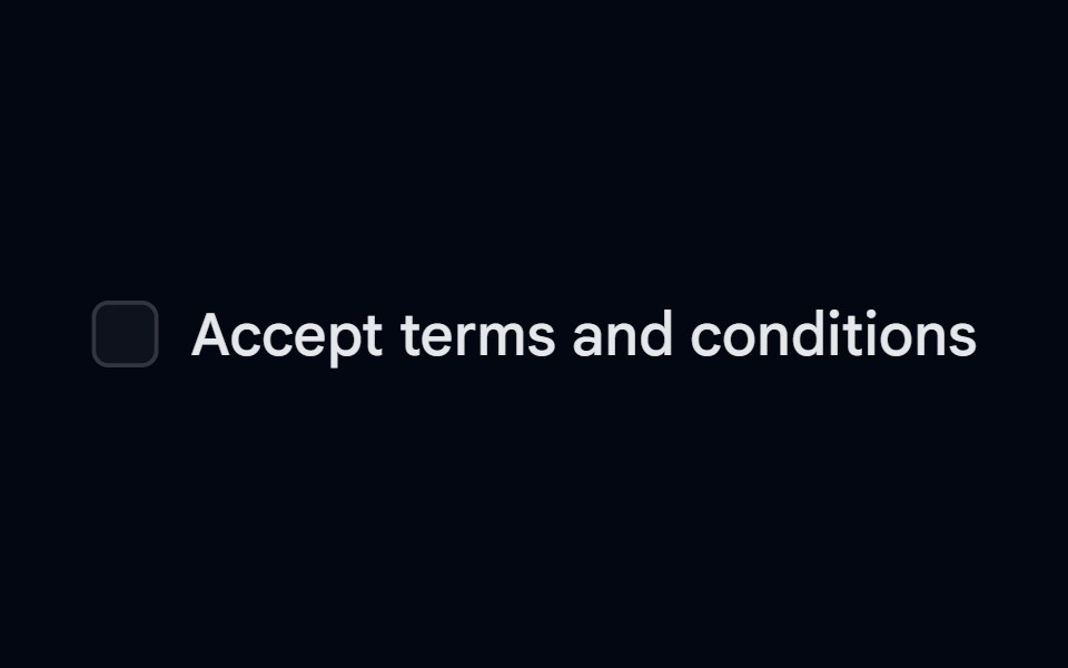
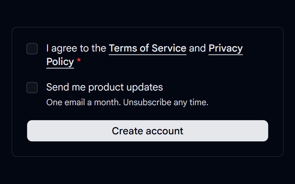 Checkbox 11 - Terms ConsentShadcn Space · ReactSign up consent with a required terms checkbox that shows an error on submit, linked policies, and an optional…
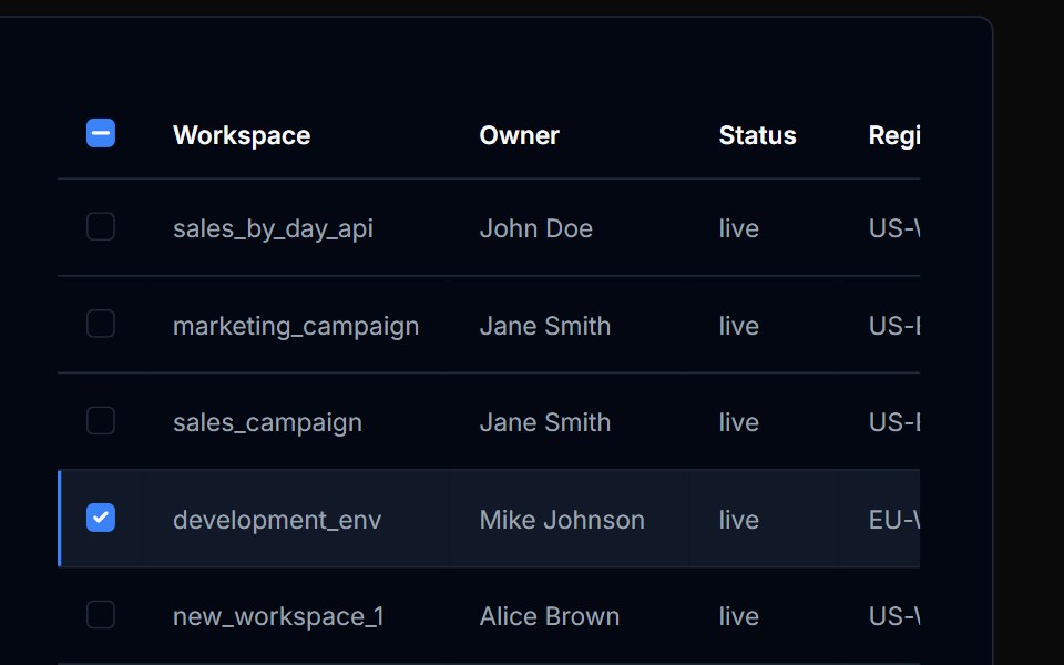 Table Action 05Tremor Blocks · React
 Checkboxes 09Oxbow UI · AstroList Item with Trailing Checkbox
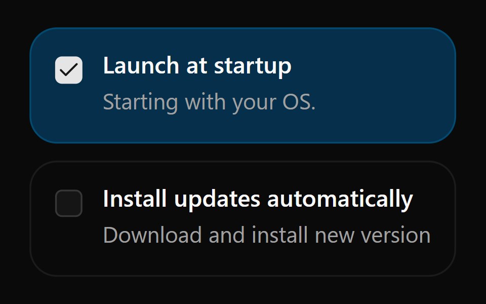 Checkbox 13Watermelon UI · React
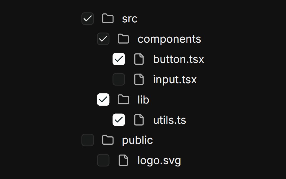 Nested treeFLX UI · ReactMulti-level file tree; parents derive checked / indeterminate from children.
 Comp 136Origin UI · React
 Avatar based card checkboxReUI · ReactAvatar based card checkbox
 Label 01 - With CheckboxShadcn Space · ReactLabel component with checkbox
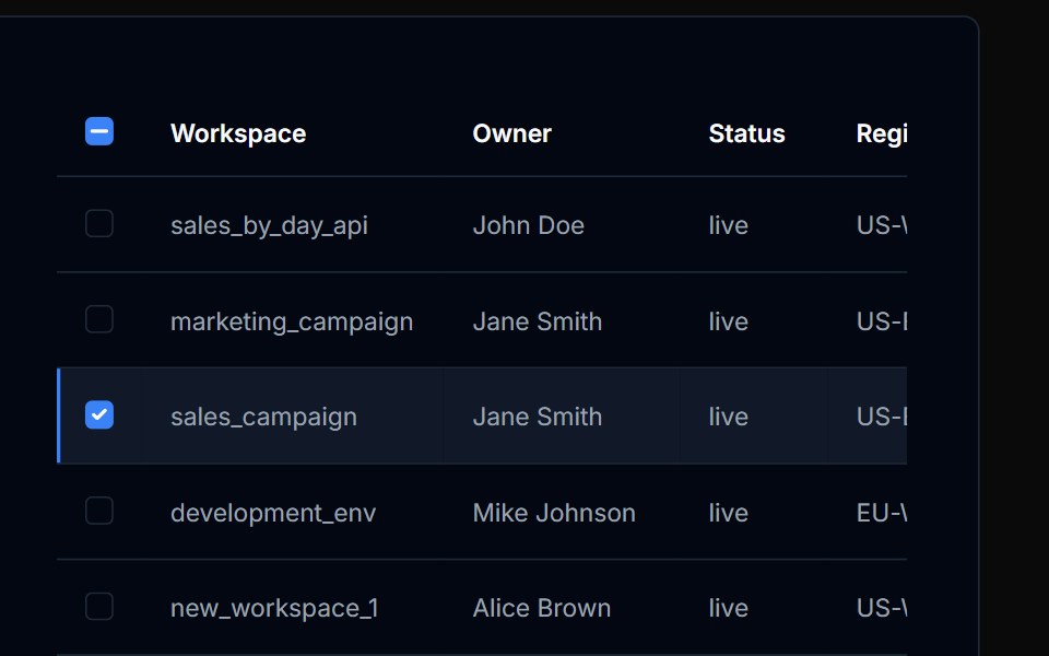 Table Action 06Tremor Blocks · React
 Checkboxes 11Oxbow UI · AstroCheckbox with Label and Description
 Checkbox 14Watermelon UI · React
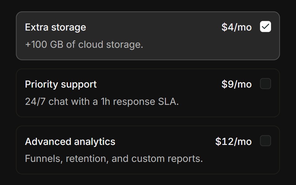 Choice cardsFLX UI · ReactBordered add-on cards that highlight when checked.
 Comp 137Origin UI · React
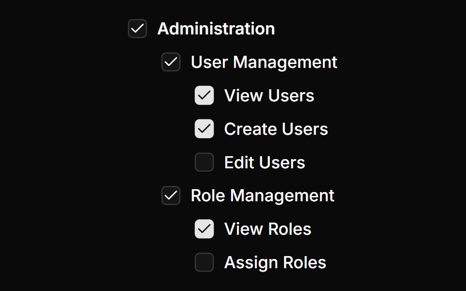 Nested checkbox groupReUI · ReactNested checkbox group
Libraries with Tailwind CSS checkbox components
Related categories
- Checkbox Components
- React Checkbox Components
- Svelte Checkbox Components
- Animated Checkbox Components
- shadcn/ui Checkbox Components
- Tailwind CSS Input Components
- Tailwind CSS Text Input Components
- Tailwind CSS Select Components
- Tailwind CSS Form Field Components
- Tailwind CSS Form Components
- Tailwind CSS Textarea Components
- Tailwind CSS Switch Components
- Tailwind CSS Slider Components
- Tailwind CSS Radio Components
- Tailwind CSS Combobox Components
- Tailwind CSS File Upload Components
- Tailwind CSS Search Input Components
- Tailwind CSS Date Picker Components
- Tailwind CSS Login Form Components
- Tailwind CSS Color Picker Components
- Tailwind CSS OTP Input Components