 Dev Design Library
Tailwind CSS Slider Components
Dev Design Library indexes 146 Tailwind CSS slider components from 51 open-source UI libraries, with the most coming from Origin UI, ReUI, audiocn, Toolcraft and Watermelon UI. Each one links to its page with the source code, a live preview where available, the library license and the install command. Every library in this list styles its components with Tailwind CSS utility classes. Slider components belong to the Inputs group.
Showing 120 of 146, a mix from every library. Open a library to see all of its components.
 Slidershadcn/ui · ReactAn input where the user selects a value from within a given range.
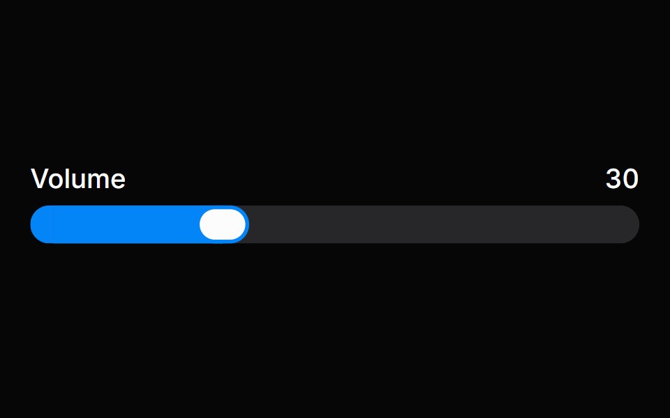 SliderHeroUI · ReactA draggable input for selecting a value or range within a bounded interval.
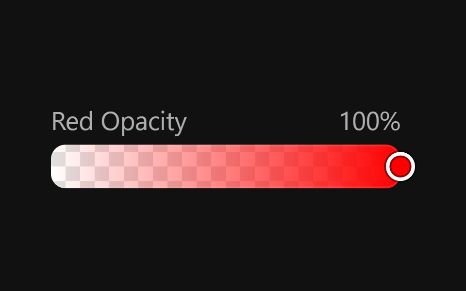 Color SliderReact Spectrum · ReactColorSliders allow users to adjust an individual channel of a color value.
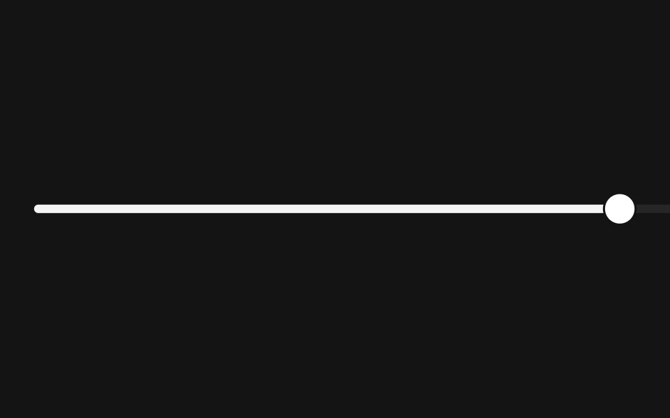 Slidercoss ui · ReactAn input where the user selects a value from within a given range.
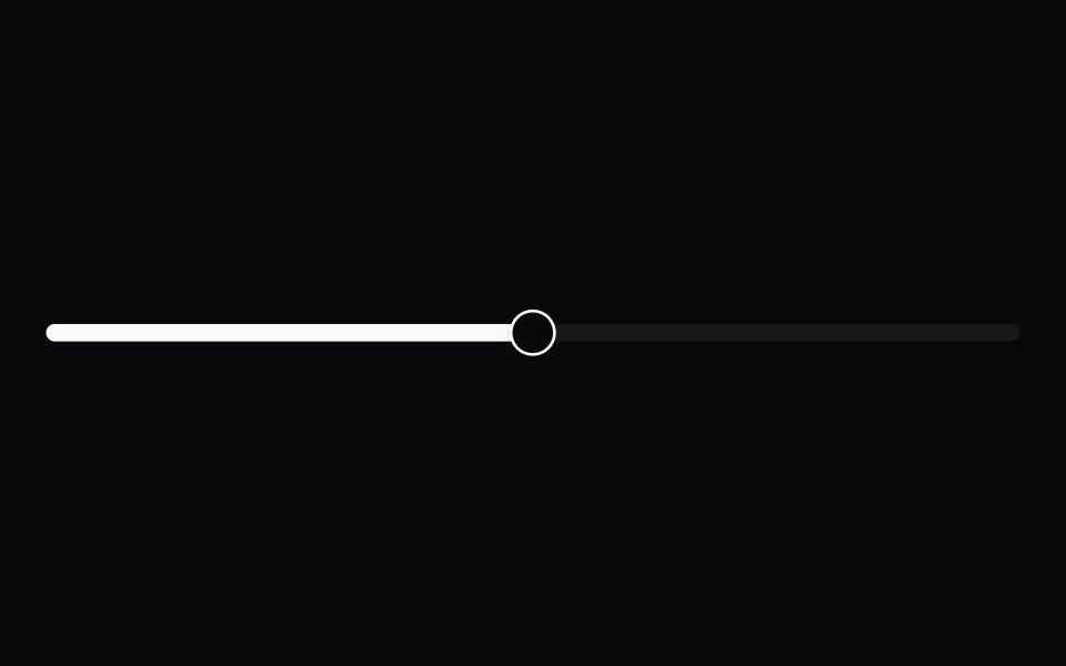 SliderOrigin UI · ReactAn input where the user selects a value from within a given range.
- Range SliderPreline UI · JavaScript (HTML + Tailwind)
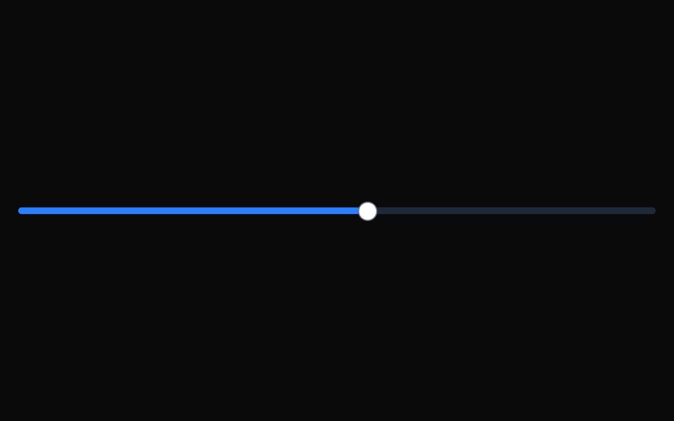 SliderTremor · React
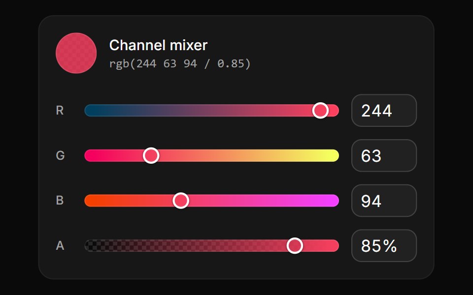 Channel slidersReUI · ReactRed, green, blue and opacity sliders with numeric fields, each track redrawn from the others.
 Button VolumeAmicro Micro Transitions · React
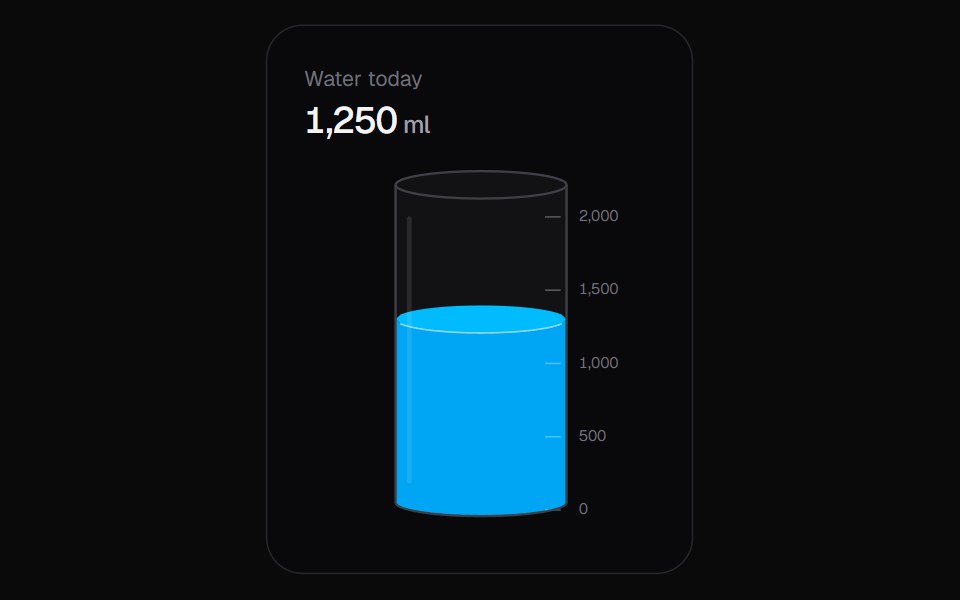 Liquid SliderKokonut UI · ReactA vertical slider you fill like a glass, with a sloshing surface and rising bubbles.
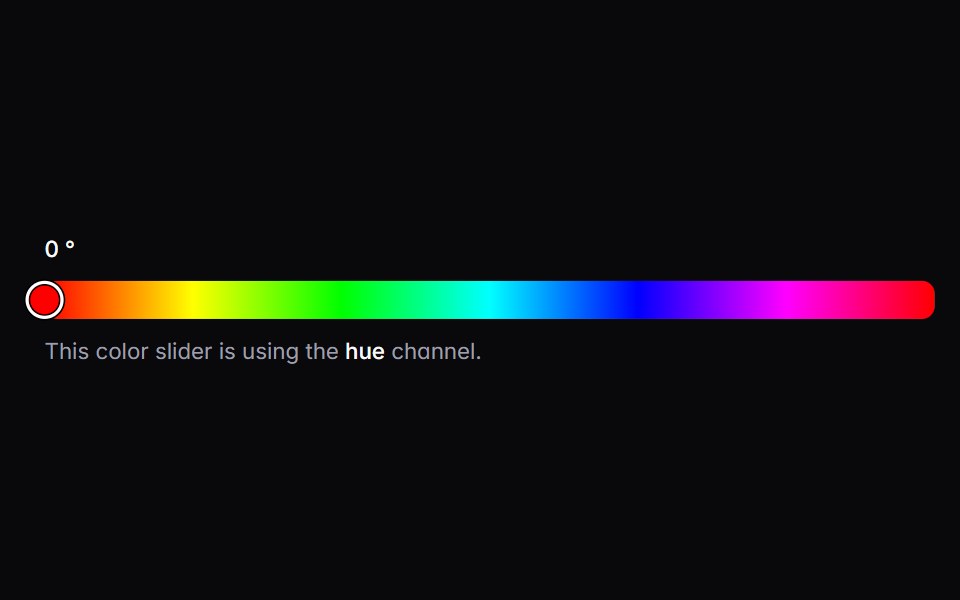 color-sliderIntent UI · Reactcolor-slider
 SliderUntitled UI React · React
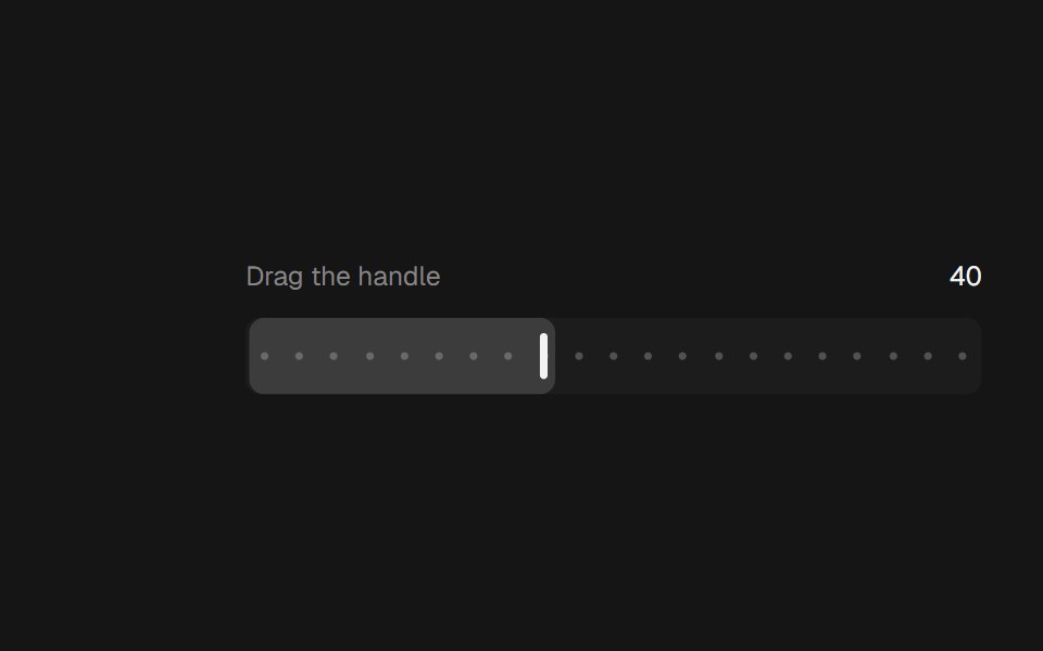 Range SliderbeUI · ReactA bar thumb that glides between steps.
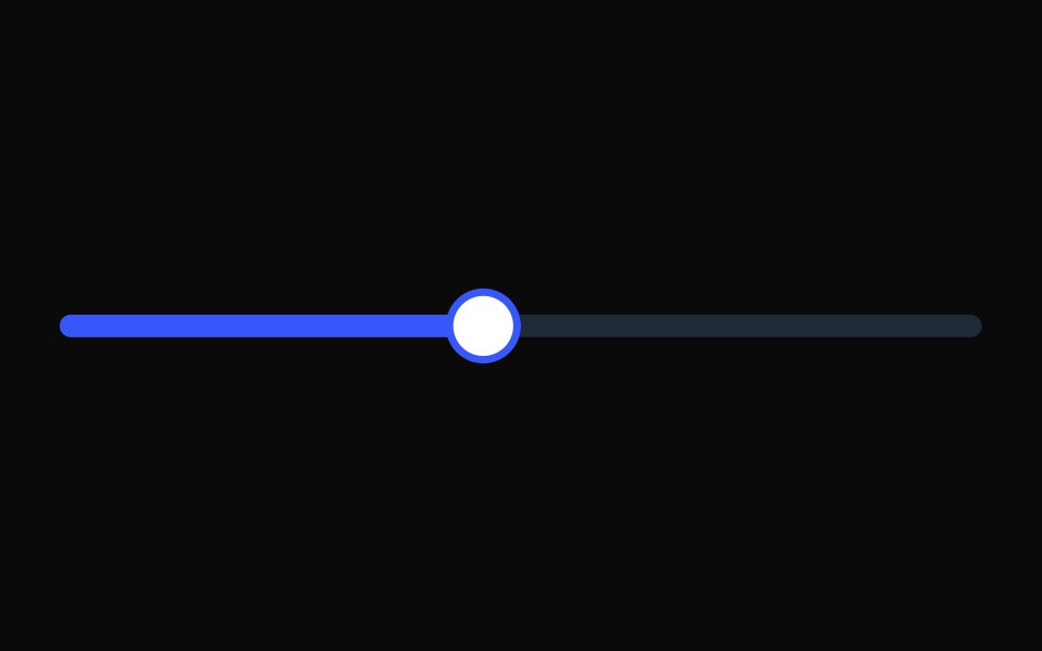 SliderTailGrids · ReactA slider component to select a value from a range.
 Dual Range Slider DependenciesSpectrum UI · Reactcomponent for the Dual Range Slider Dependencies
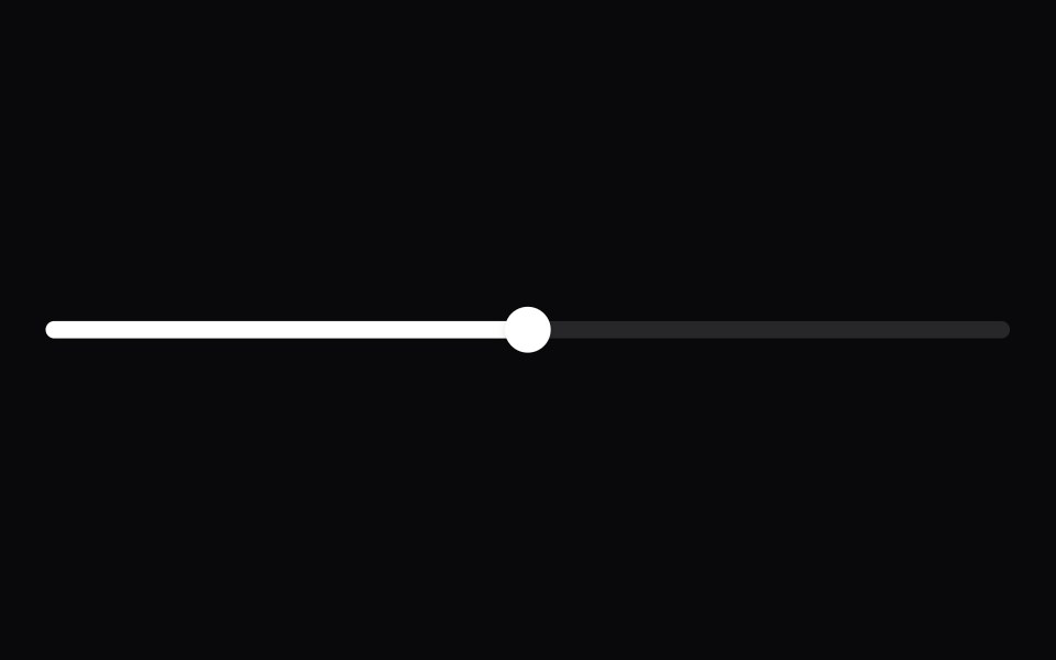 SliderVengeance UI · React
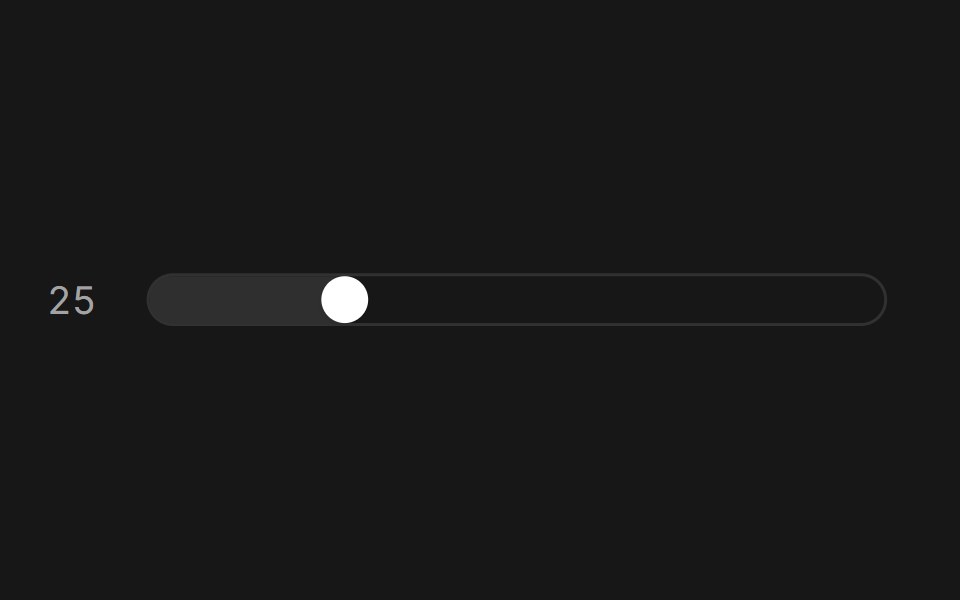 SliderFluid Functionalism · ReactAnimated slider with spring-snapped thumb, step dots, range mode, and click-to-edit value display. Built on Radix UI…
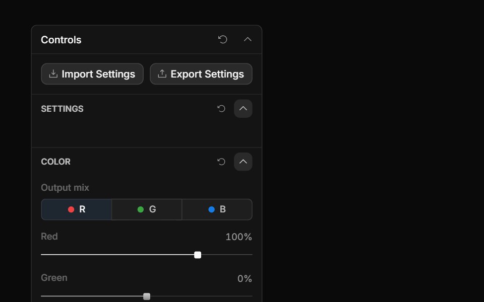 Channel Mixer ControlToolcraft · React
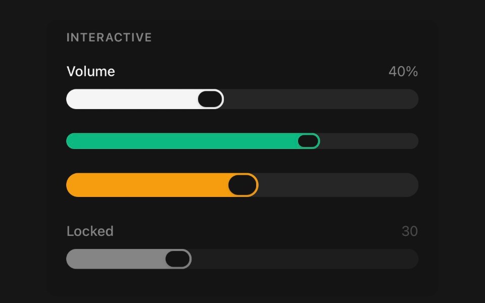 SliderPanel UI · React NativePick a value, or a span, by dragging a thumb along a track.
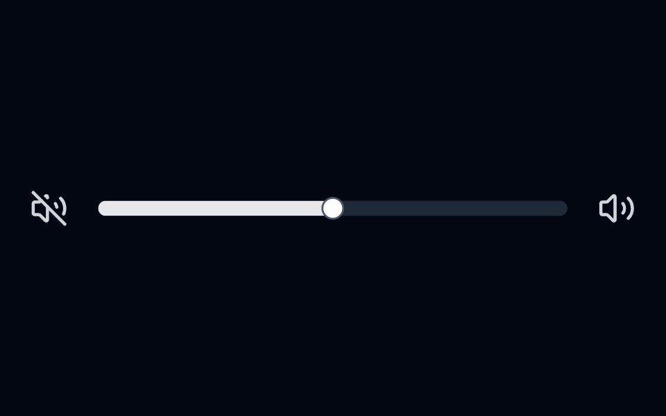 Slider 01 - Volume ControlShadcn Space · ReactVolume control slider with volume icons and smooth fill animation.
 Cards SliderPixel Perfect · ReactCards Slider — an infinite deck of product cards. The active card sits
 Paywalluselayouts · ReactA premium paywall component with a pick your price detent slider, animated numeric price transitions, and a segmented…
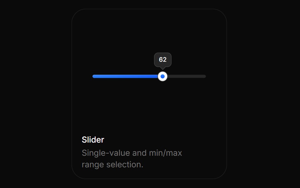 SliderBoardUI · ReactSingle-value and min/max range selection.
 SliderTremor Blocks · React
 SliderShadcn Dashboard · React
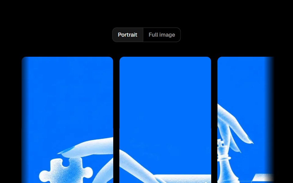 Parallax SliderObsidianUI · ReactA full-width image slider where each slide moves with a parallax offset, driven by drag, arrows or keys.
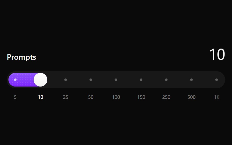 Step SliderNotra · ReactA slider that snaps to a fixed set of values, with a dotted fill that sweeps on every step. Built on the Base UI Slider.
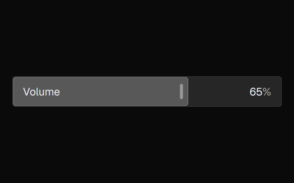 FaderNexvyn UI · ReactA mixing-console-style parameter fader where the control IS the display, with continuous and detent value grammars…
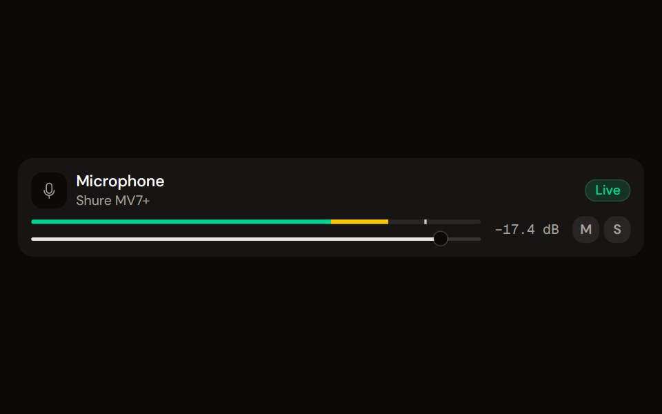 Channel Stripaudiocn · ReactOne channel of a mixer: header, status, meter, fader, value, controls and a notice, as a row or a console strip. The…
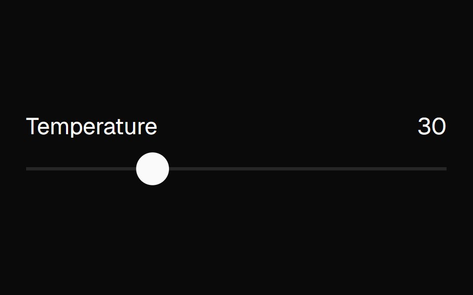 sliderBaseLayer · ReactA slider allows a user to select one or more values within a range.
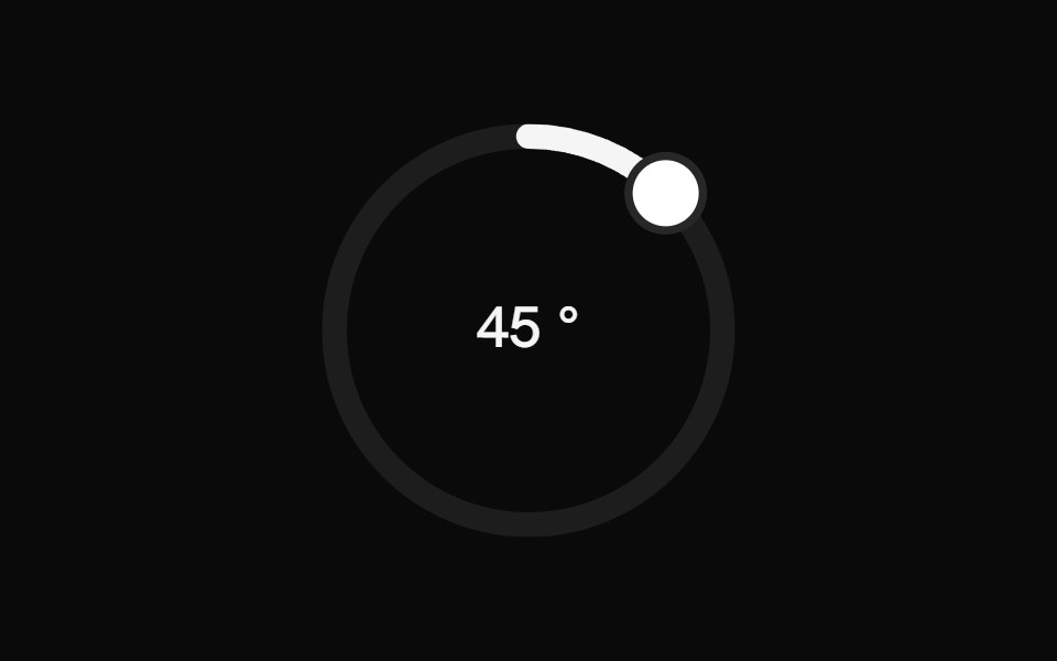 Circular SliderShark UI · ReactCircular slider for selecting values.
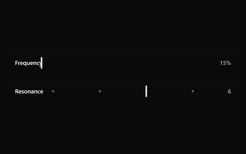 Fluid SliderSona UI · ReactA labeled Base UI range control with direct surface selection, a dedicated draggable indicator, and restrained…
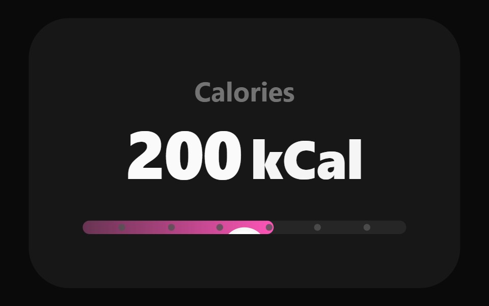 Adaptive SliderWatermelon UI · React
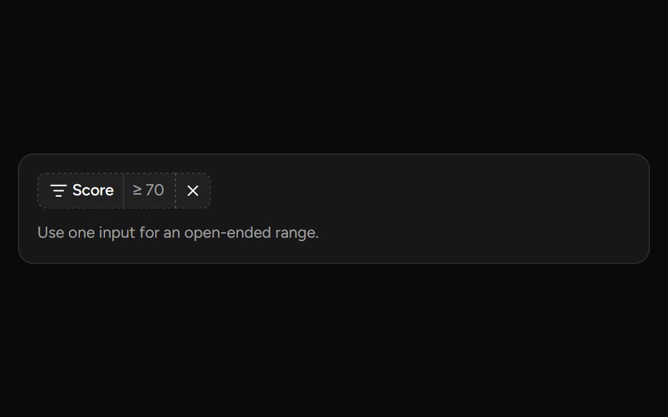 Number Range Filtersv-table · SvelteA number range picker with exact inputs, an optional slider, and explicit apply behavior.
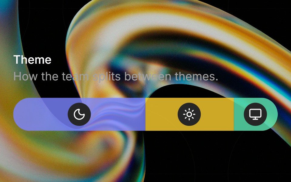 Preferenceglasscn · ReactA weighted preference bar with icon badges, hover tinting, and tooltip descriptions.
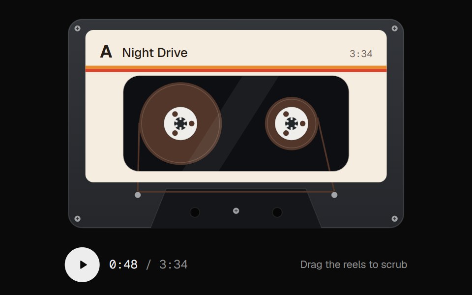 Cassette ScrubberUI Lab · ReactScrub audio by dragging the tape, with reels that spin like the real thing.
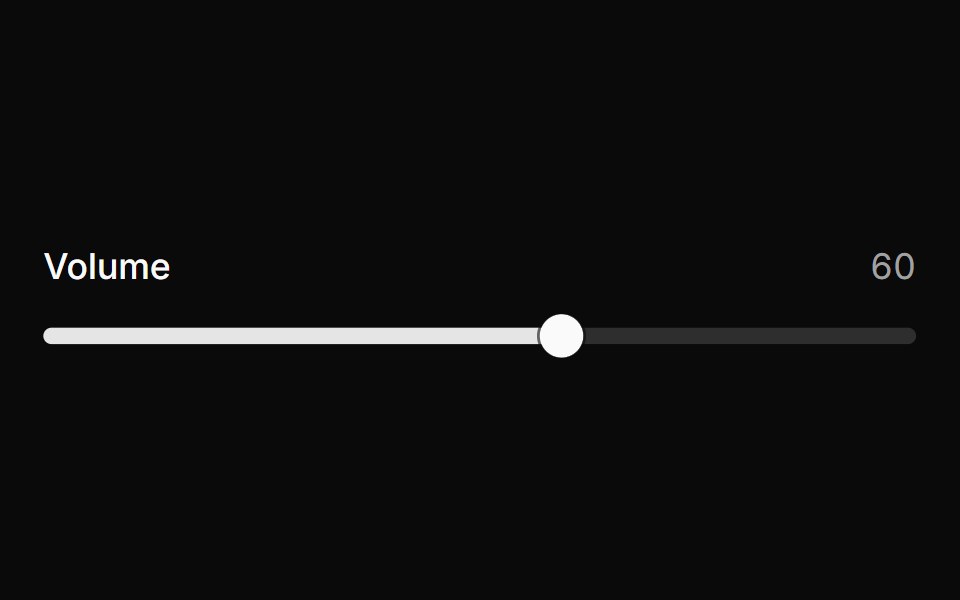 SliderHextaUI · ReactPick a value or a range by dragging, tapping the track or using the keys, with jumps that glide and an optional value…
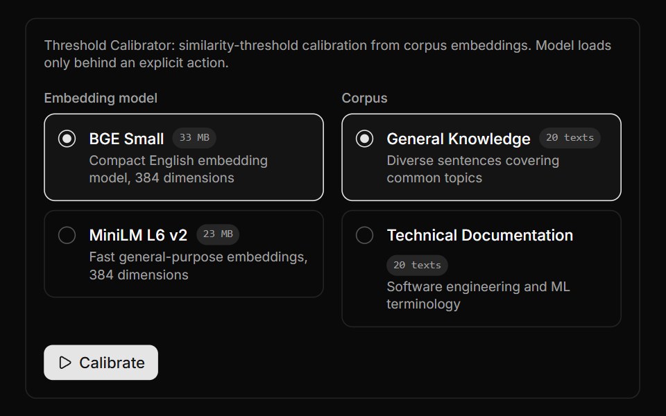 Threshold Calibrator BlockLocalMode · ReactCalibrate a similarity threshold from corpus embeddings via useCalibrateThreshold at percentile 90, over a selected…
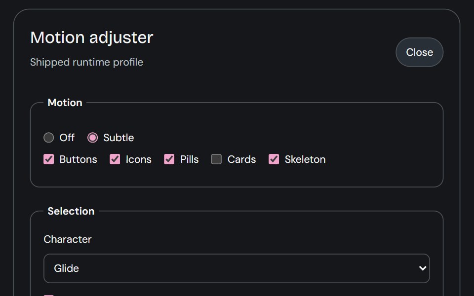 Motion AdjusterCojeev UI · ReactProvides live controls for the shared motion settings and editable body profiles used across the library.
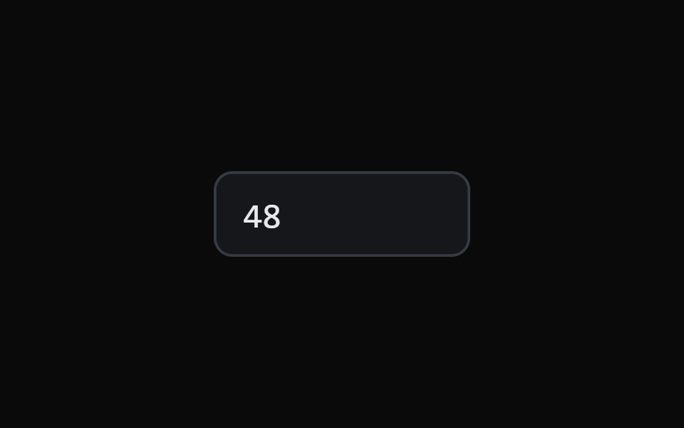 Scrub Number FieldMicroKit · ReactA number field you drag to scrub and click to type, with a ruler that tracks the gesture.
 Usage SliderFLX UI · ReactUsage Slider for Select a Plan.
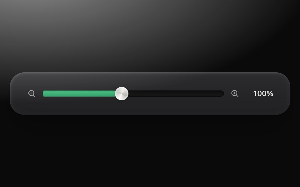 SliderMetal UI · React + SwiftUIScalar or range amounts on a clamped track: horizontal/vertical, centred or neutral fill, named independent knobs…
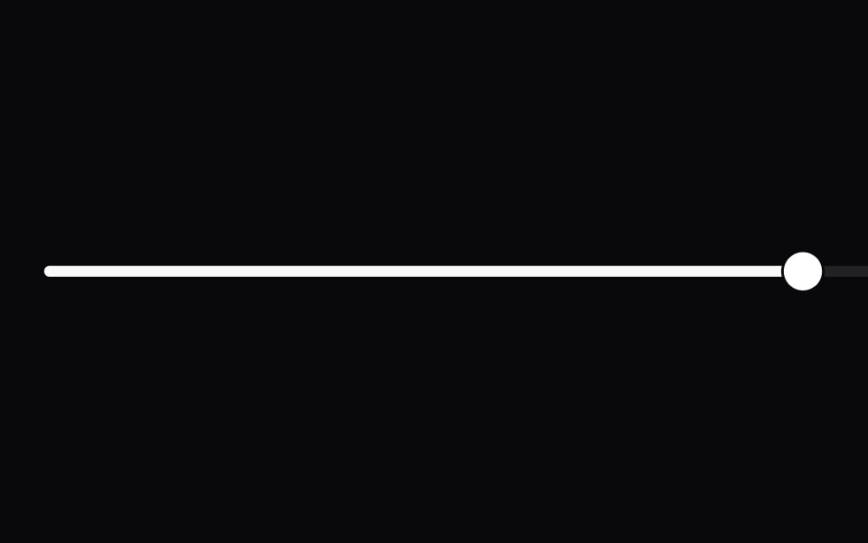 SliderSpaceUI · ReactAllows users to choose a numeric value or range smoothly by sliding a handle along a horizontal track with immediate…
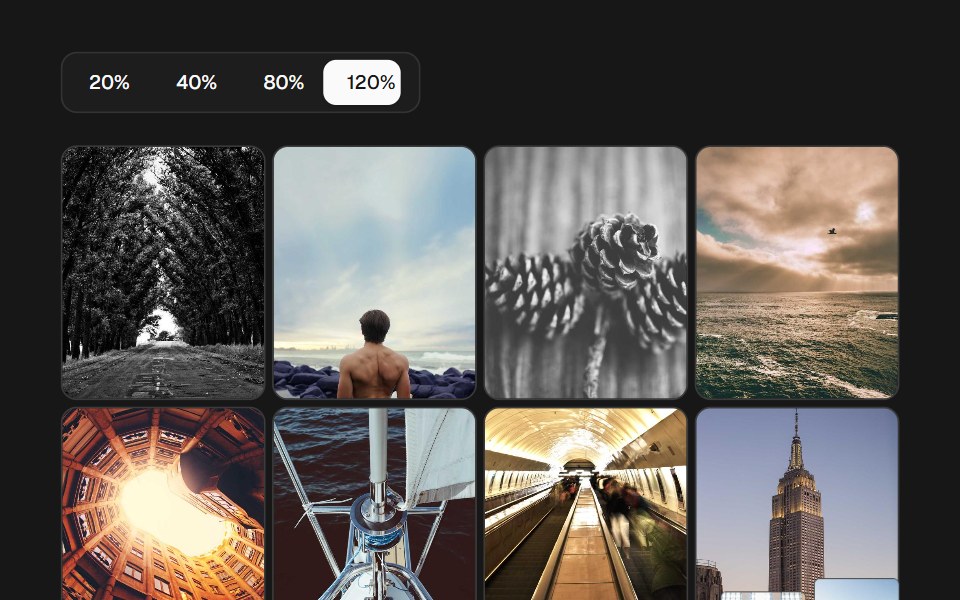 Image Density GridSkecher UI · ReactA percentage-controlled image grid with animated density changes, soft focus, and optional controls.
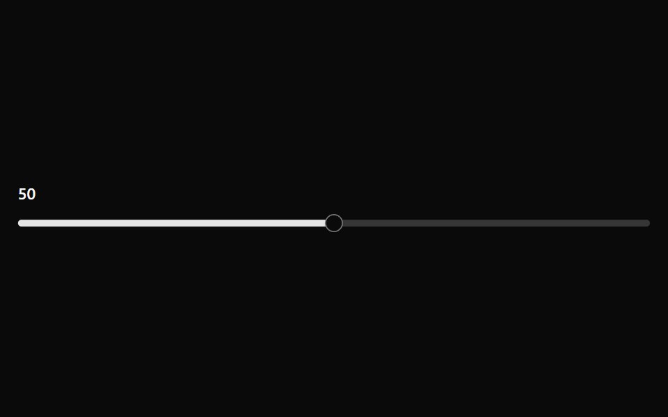 SliderOUI · ReactReact aria components Slider with shadcn characteristics.
 SliderD2Studio UI · ReactAn input where the user selects a value from within a given range.
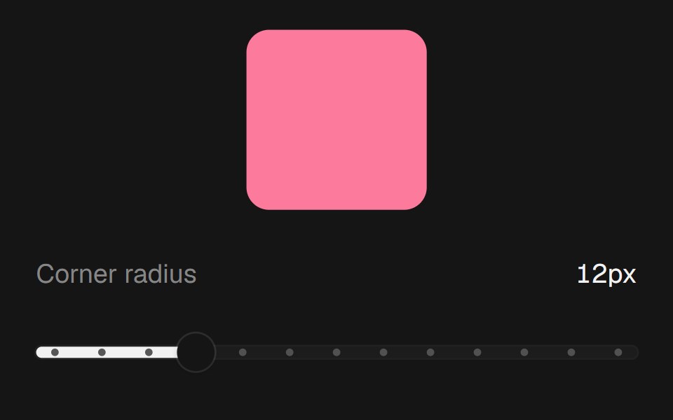 Range SliderEaseUI · ReactNative range input with a filled track and tick dots, so keyboard and screen reader support come built in.
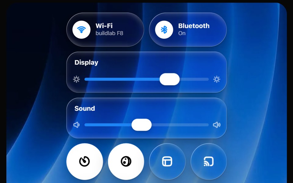 Glass Control CenterOpaline · ReactmacOS-style Control Center kit — glass modules, toggles, light-filled sliders and buttons.
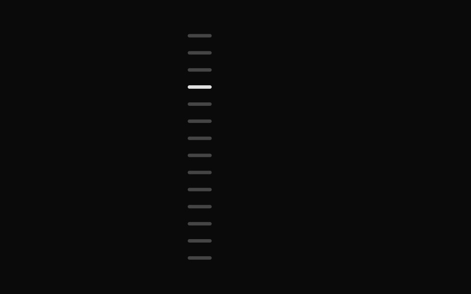 Chapter ScrubberFibo · ReactA rail of marks that swell under the pointer like the Dock, previewing the chapter at the crest.
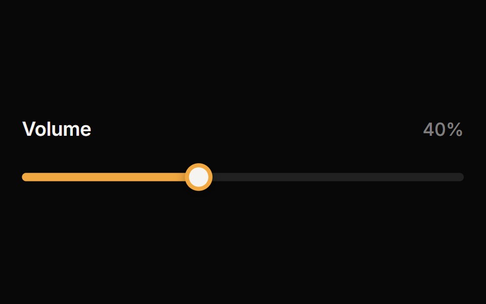 SliderReactFrame · ReactAn accessible single or range slider with a draggable thumb, a value tooltip, optional step marks, keyboard control…
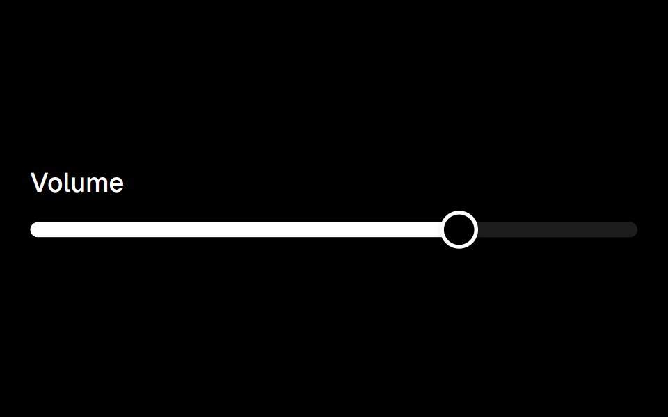 Sliderark-cn · ReactA shadcn-style slider component built with Ark UI primitives.
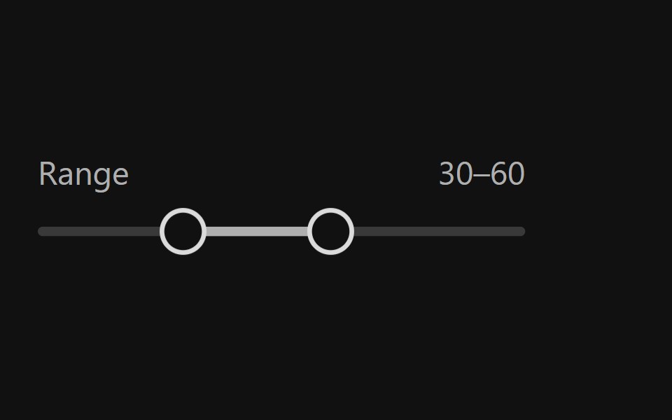 Range SliderReact Spectrum · ReactRangeSliders allow users to quickly select a subset range. They should be used when the upper and lower bounds to the…
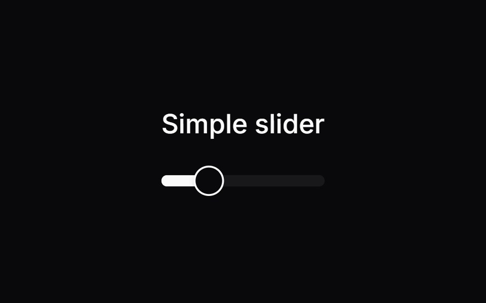 Comp 240Origin UI · React
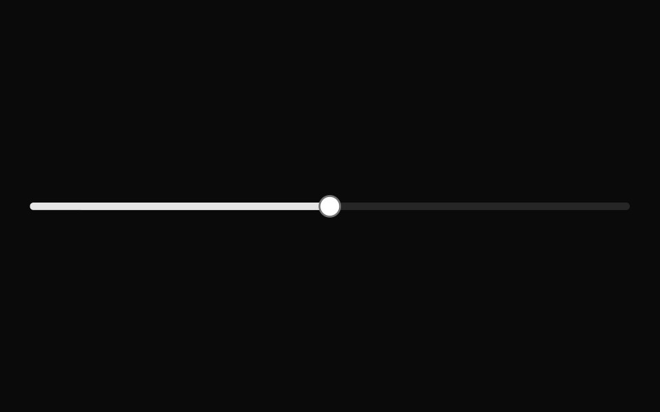 Basic slider.ReUI · ReactBasic slider.
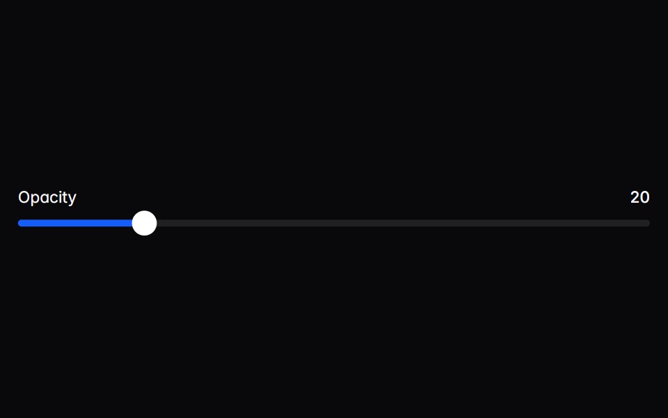 sliderIntent UI · Reactslider
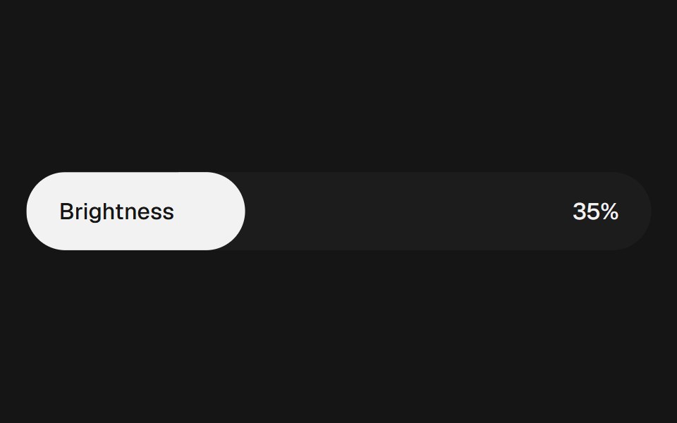 Range Slider FluidbeUI · ReactRange slider with two thumbs and a fluid, springy fill between them.
 Sales CTA FooterSpectrum UI · ReactA seat slider that prices a tier live, beside the link grid.
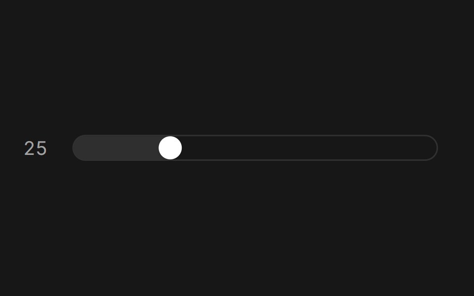 Slider (Base UI)Fluid Functionalism · ReactAnimated slider with spring-snapped thumb, step dots, range mode, and click-to-edit value display. Base UI flavor.
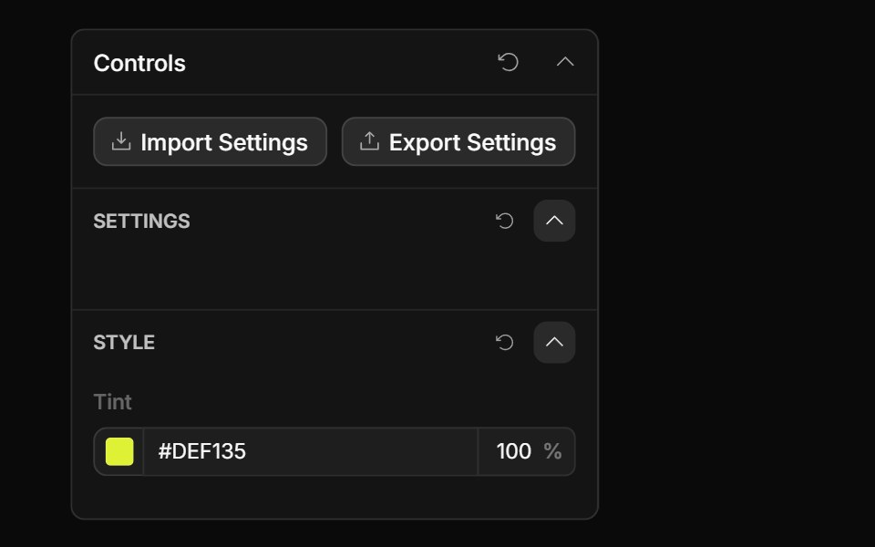 Color Opacity ControlToolcraft · React
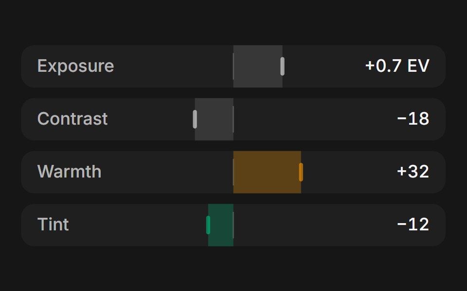 Web SliderPanel UI · React NativeSliders for photo adjustments and zoom, with step buttons.
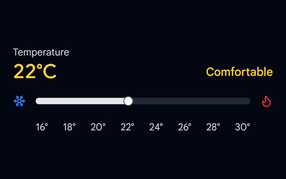 Slider 03 - Temperature ControlShadcn Space · ReactTemperature control slider with cool/comfortable/warm zones, color-coded display, and hover preview.
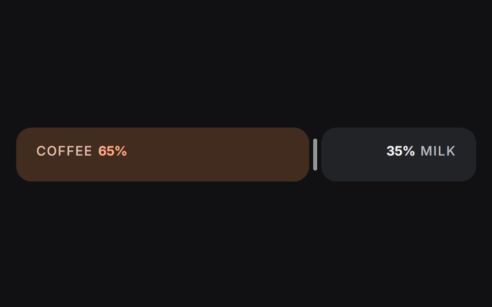 Slideruselayouts · ReactA dual-sided ratio slider animated with spring physics and drag interactions.
 SliderObsidianUI · React
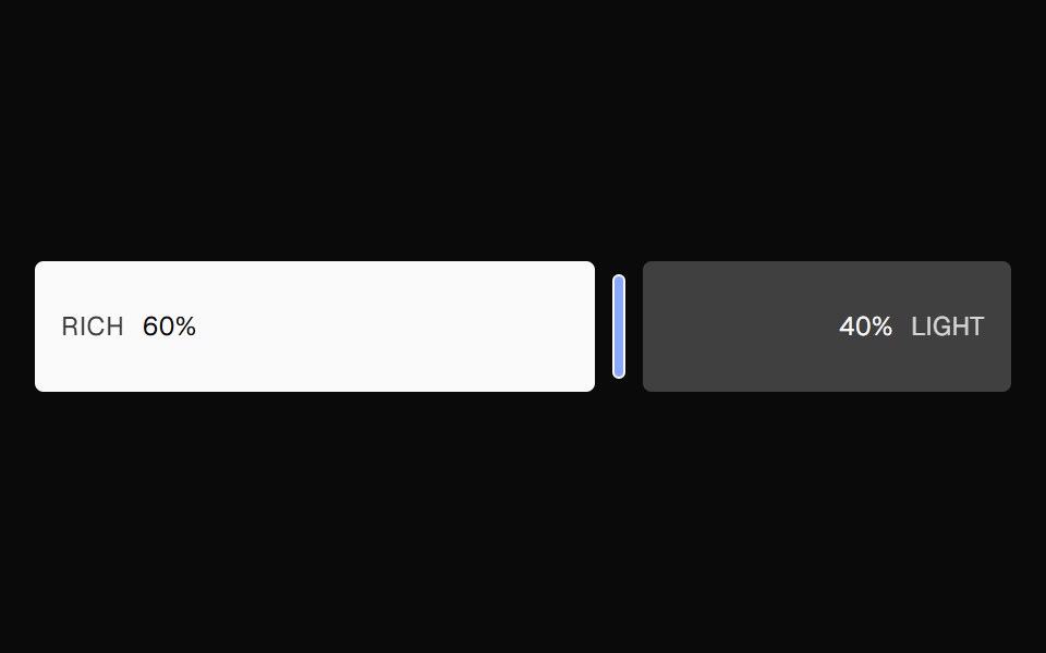 Ratio SliderNexvyn UI · ReactA split ratio slider with two color bars, a draggable divider, and responsive labels that collapse when space is tight.
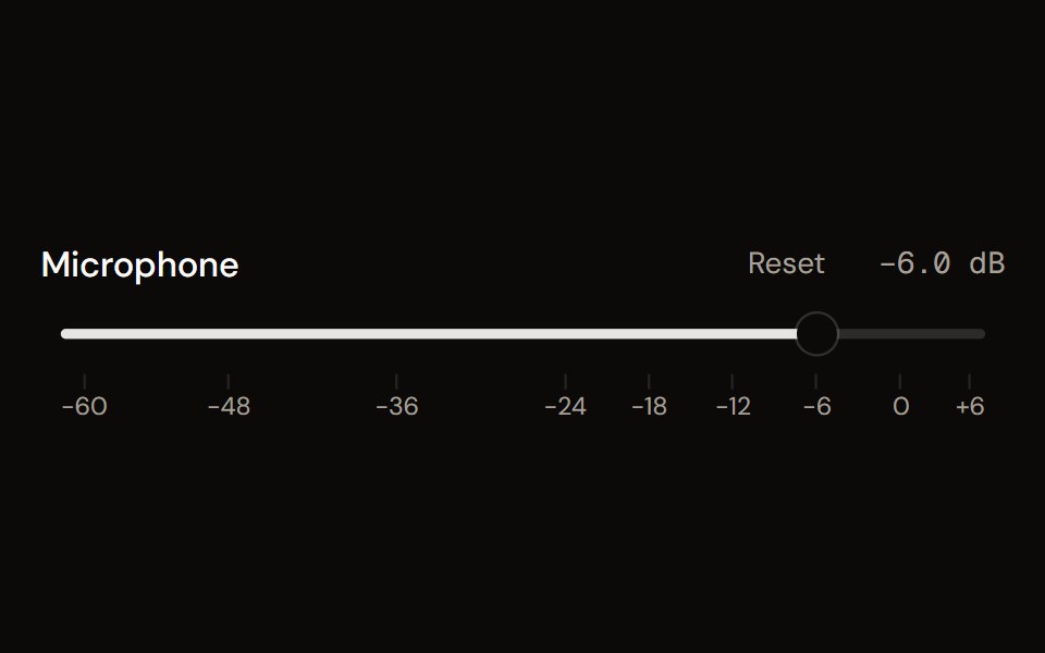 Faderaudiocn · ReactA volume fader in decibels: linear or console taper, detents, a scale, reset, an editable value, silence at the…
 SliderShark UI · ReactA slider for selecting a value from a range.
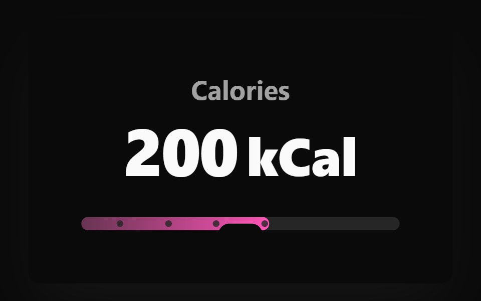 Adaptive Slider BaseWatermelon UI · React
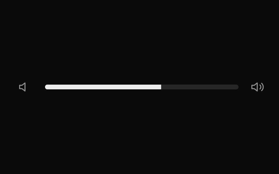 Elastic SliderUI Lab · ReactStretches like rubber when you drag past the end, then springs back.
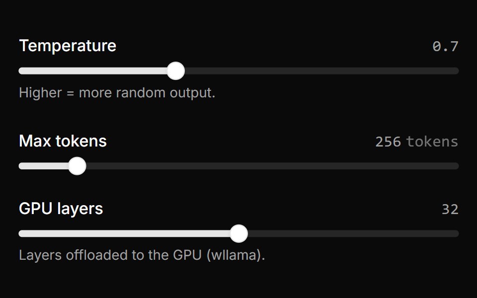 Parameter SliderLocalMode · ReactAn inline range slider with a live value readout for reversible adjustment of a local generation parameter…
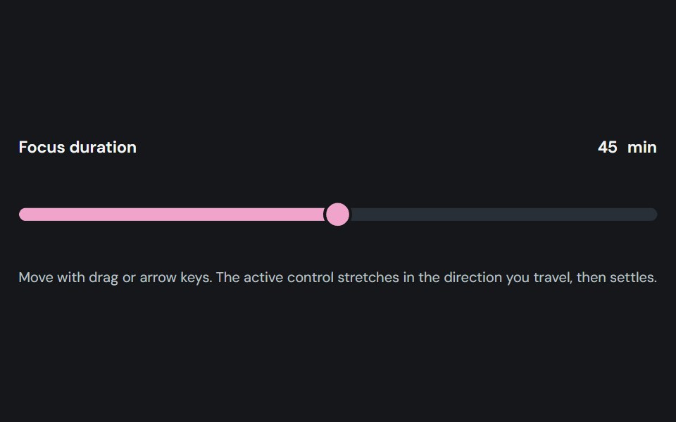 SliderCojeev UI · ReactAdjusts one or more numeric values by moving labeled thumbs along a track.
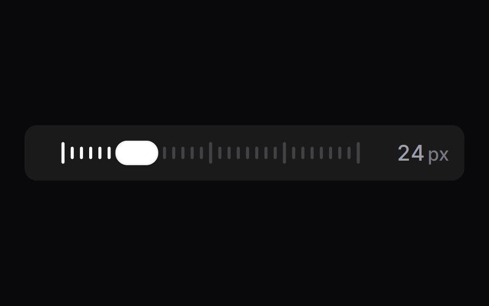 Tick SliderSpaceUI · ReactA scrubber drawn as a row of tick marks, backed by a real range input.
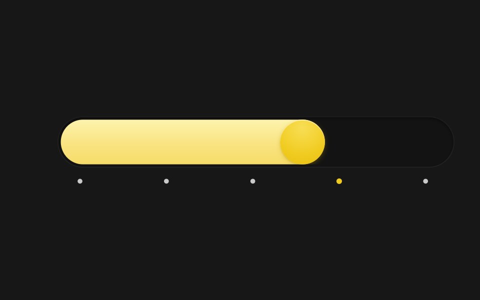 Spring SliderSkecher UI · ReactA pill-track slider with a spring-driven fill and thumb, tick markers, and a tooltip that blurs in and out.
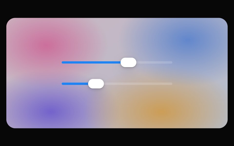 Glass SliderOpaline · ReactSlider whose thumb becomes a refracting lens while dragging.
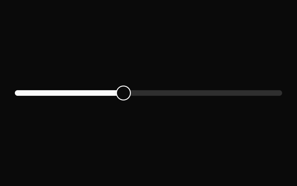 SliderFibo · ReactPicks a number, or a range, by dragging along a track.
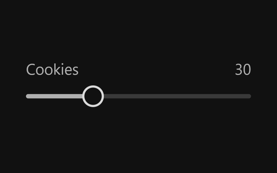 SliderReact Spectrum · ReactSliders allow users to quickly select a value within a range. They should be used when the upper and lower bounds to…
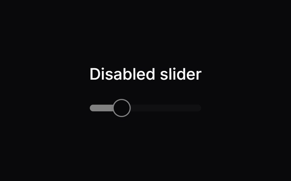 Comp 241Origin UI · React
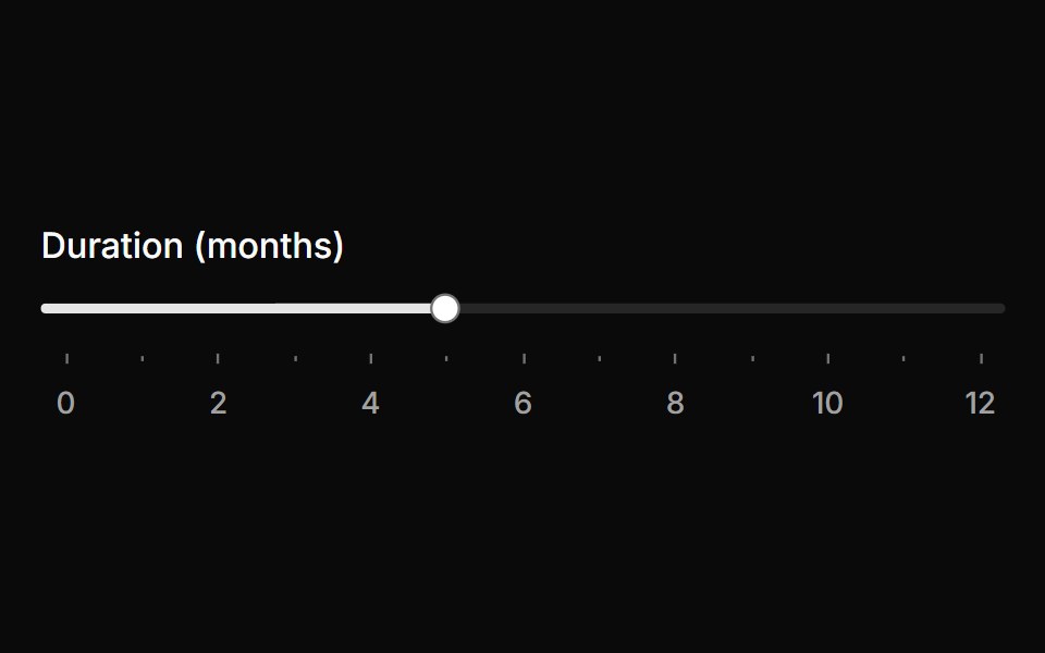 Slider with tick marksReUI · ReactSlider with tick marks
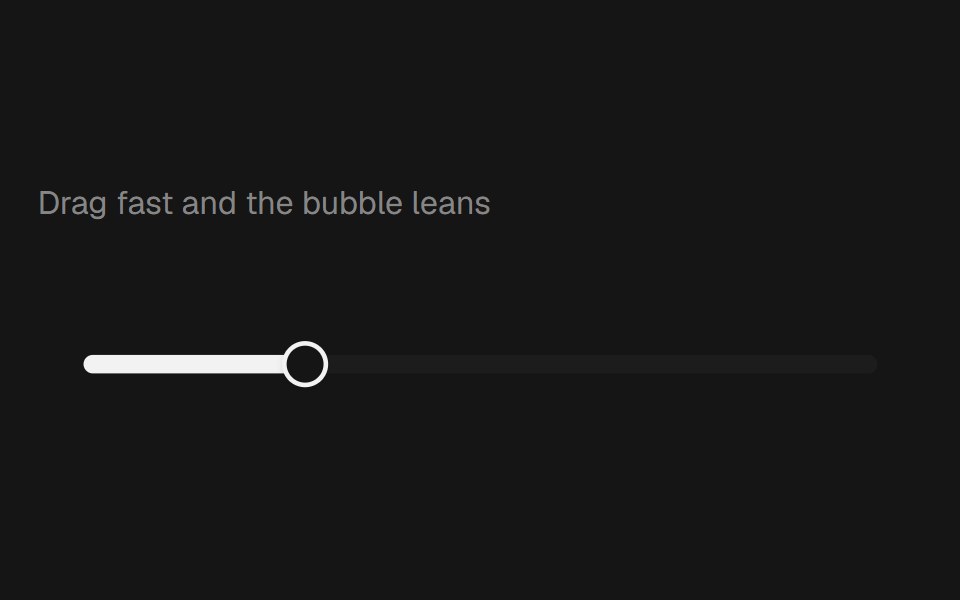 Range Slider BubblebeUI · React
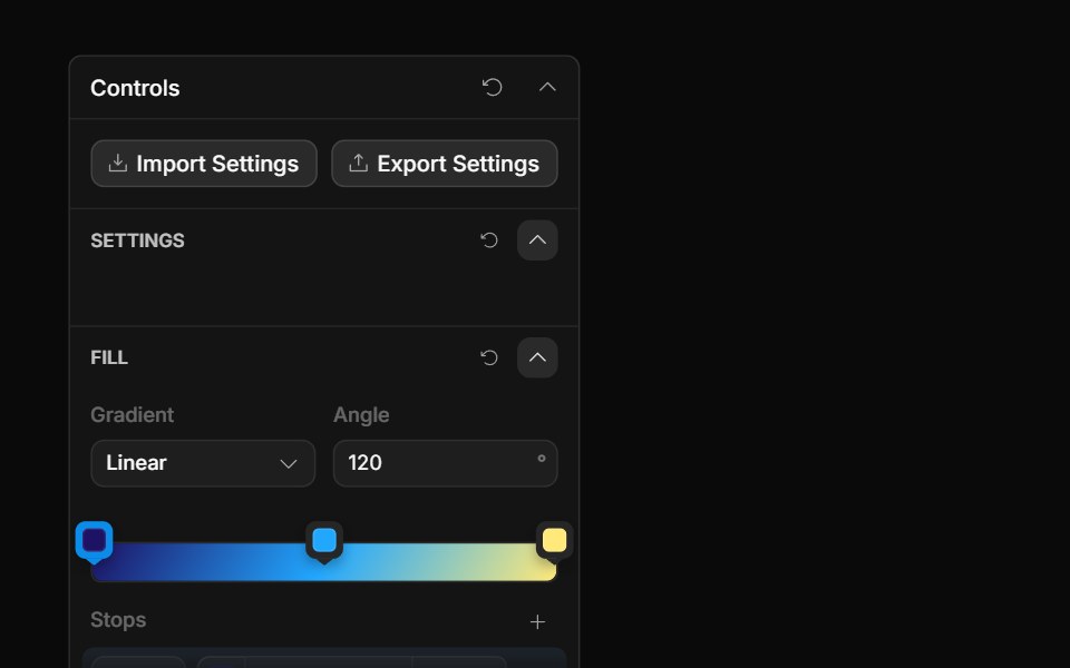 Gradient ControlToolcraft · React
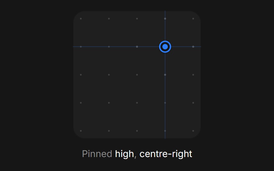 Web Xy PadPanel UI · React NativeA two-axis pad for setting a pair of values at once, such as light position.
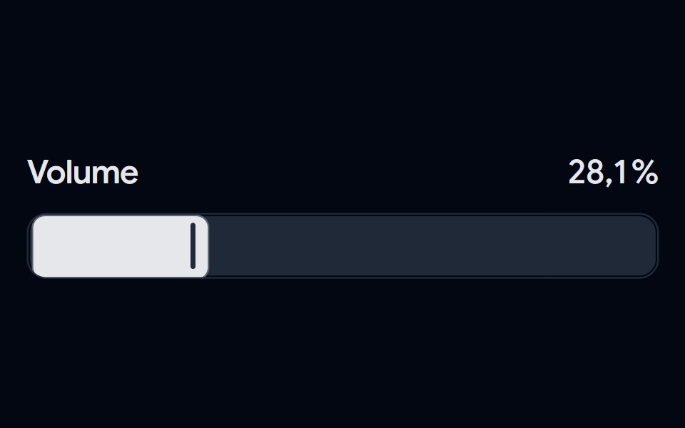 Slider 04 - Modern VolumeShadcn Space · ReactA sleek volume slider featuring a bold track design, custom vertical thumb, and smooth percentage transitions with…
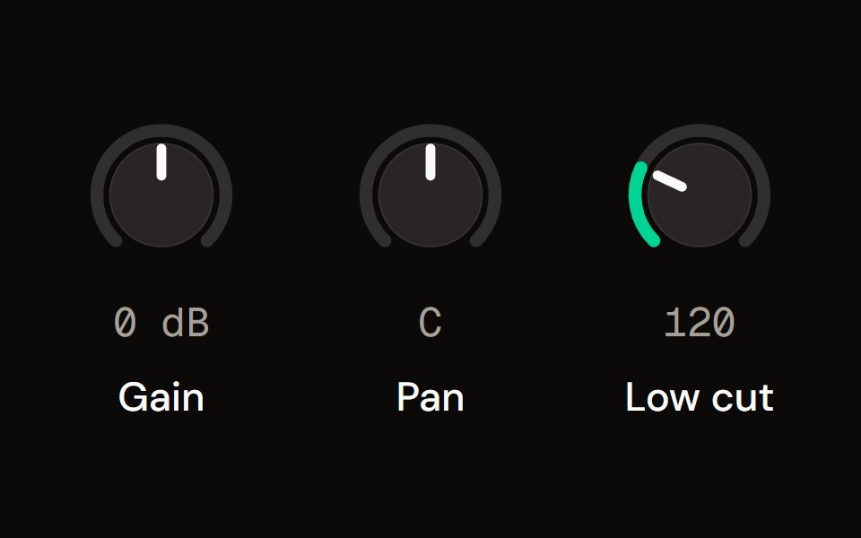 Knobaudiocn · ReactA rotary control drawn in SVG, with vertical, horizontal or circular dragging, fine adjustment, reset, a bipolar…
 Carousel SliderWatermelon UI · React
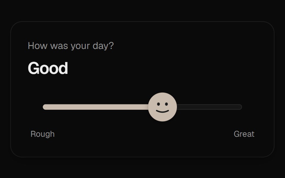 Mood SliderUI Lab · ReactThe thumb is a face that frowns, grins and leans into the drag as you rate your day.
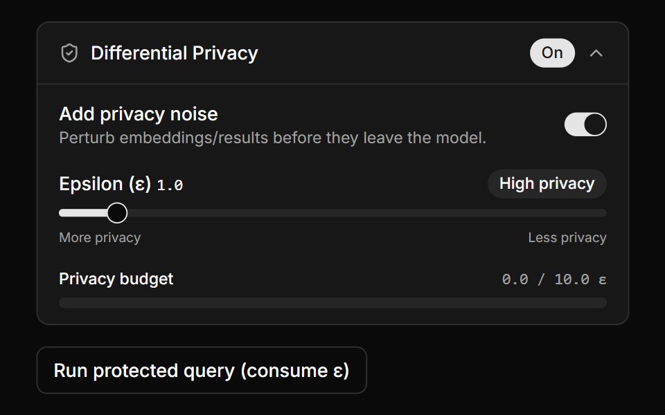 Differential Privacy ControlsLocalMode · ReactA collapsible DP settings panel (enable toggle, epsilon slider with derived High/Balanced/Low label, privacy-budget…
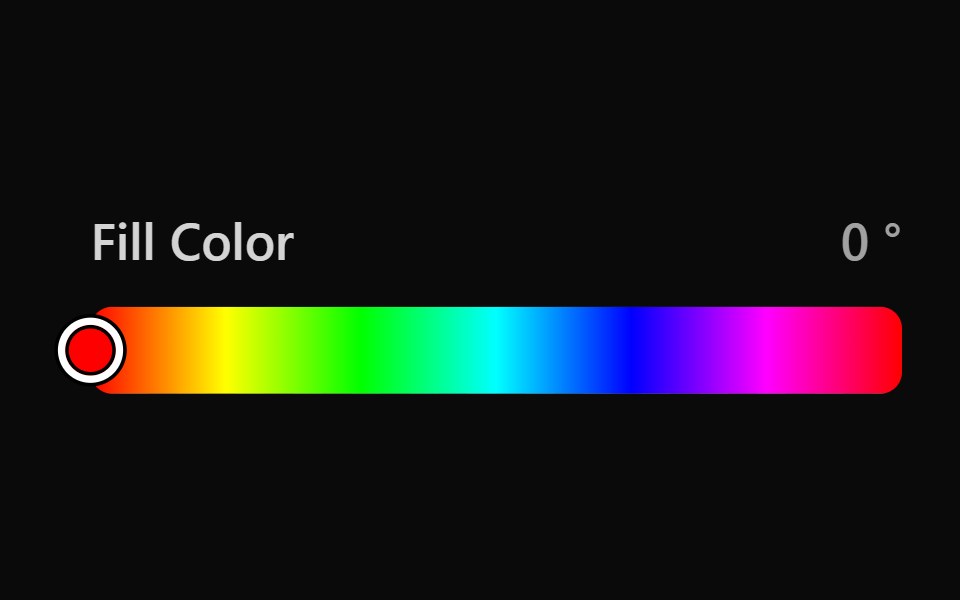 Tailwind Color SliderReact Spectrum · React
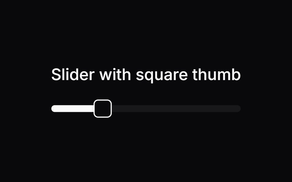 Comp 242Origin UI · React
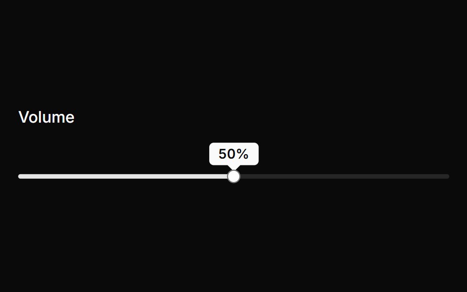 Slider with dynamic tooltip indicatorReUI · ReactSlider with dynamic tooltip indicator
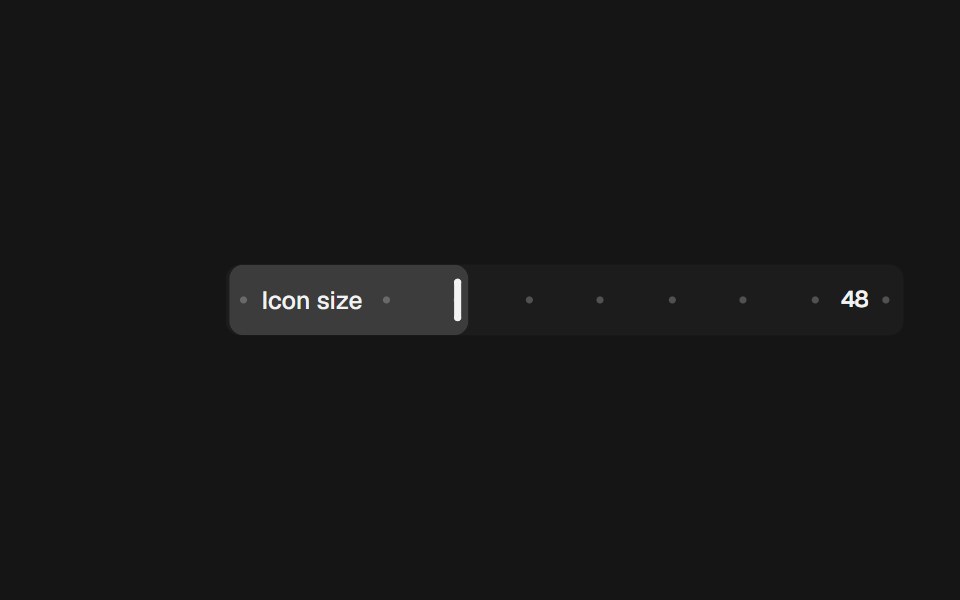 Range Slider InlinebeUI · React
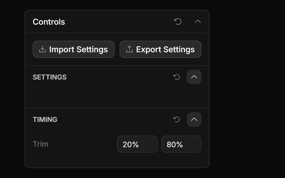 Range Input ControlToolcraft · React
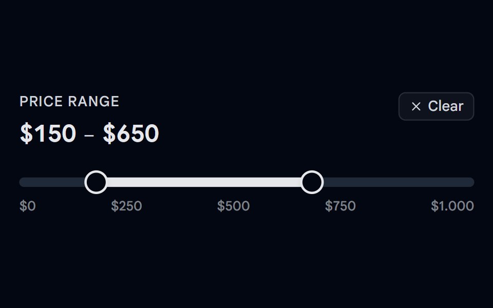 Slider 05 - Price Range FilterShadcn Space · ReactA dual-thumb price range filter slider with a hover ghost preview — hover outside the selected range to see a…
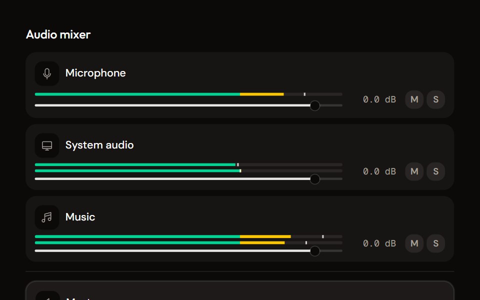 Mixeraudiocn · ReactThe container for channel strips: shared meter settings, keyboard navigation between strips, a master area and an…
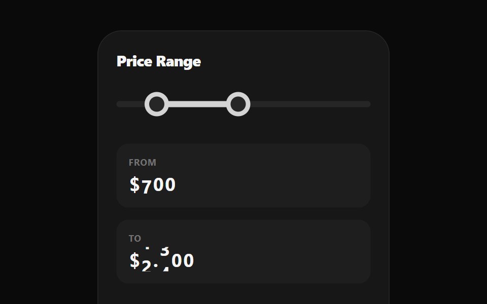 Range Selection SliderWatermelon UI · React
 Pricing CalculatorUI Lab · ReactItemizes your bill like an invoice and upgrades the plan the moment your team crosses a seat threshold.
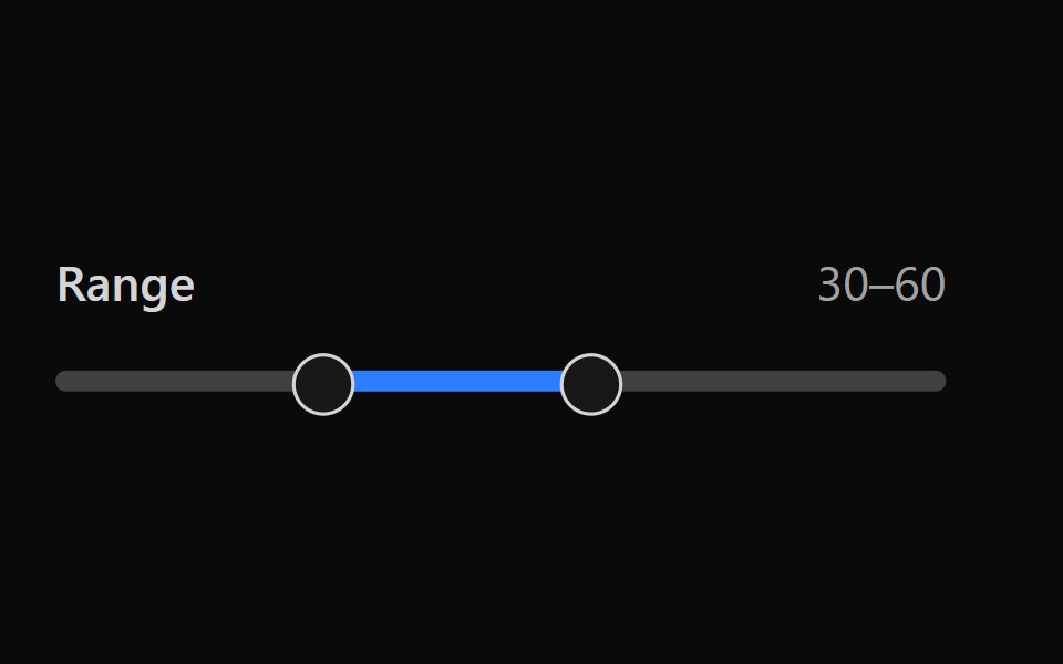 Tailwind SliderReact Spectrum · React
 Comp 243Origin UI · React
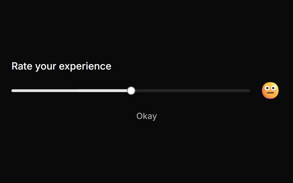 Rating slider with emoji feedbackReUI · ReactRating slider with emoji feedback
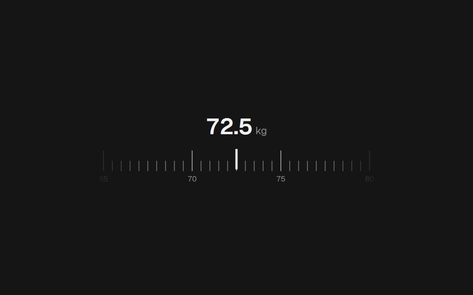 Range Slider RulerbeUI · React
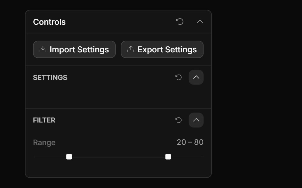 Range Slider ControlToolcraft · React
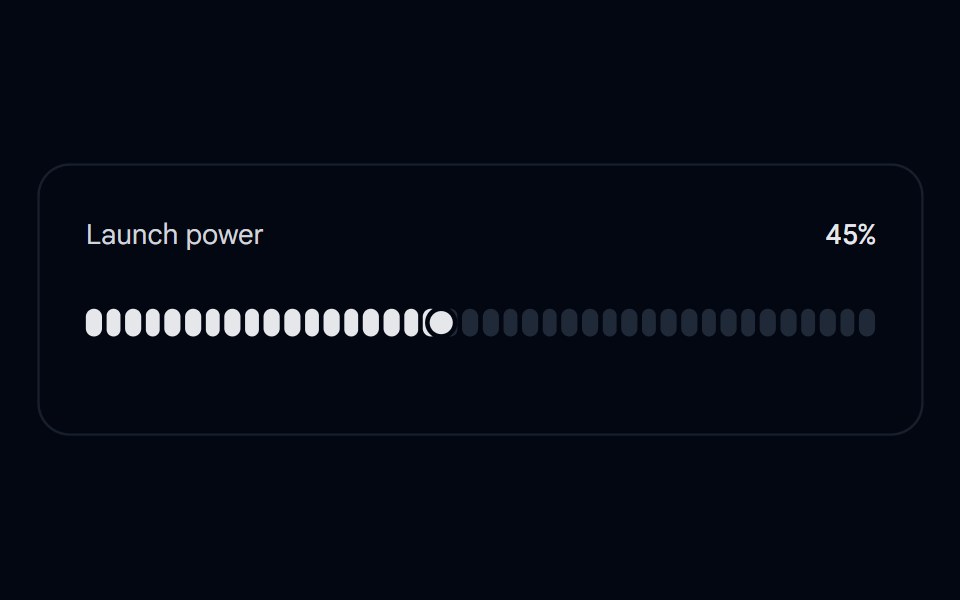 Slider 06 - Slingshot Launch PowerShadcn Space · ReactA slingshot-style slider: grab the thumb and pull it off the track like a catapult, see the mirrored target reticle…
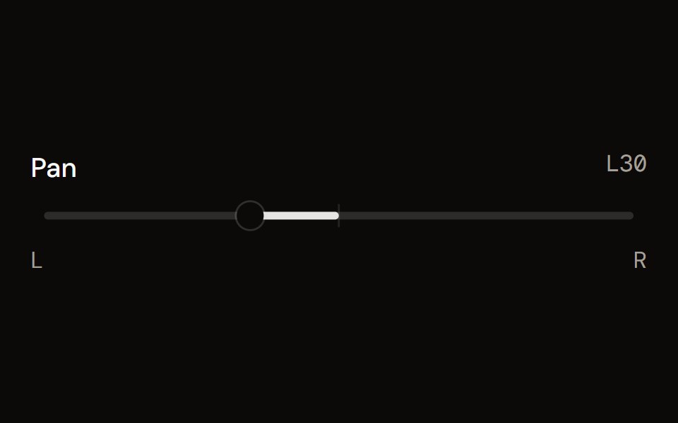 Pan Controlaudiocn · ReactLeft and right balance with a fill from the centre, a centre detent and reset.
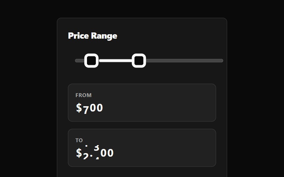 Range Selection Slider BaseWatermelon UI · React
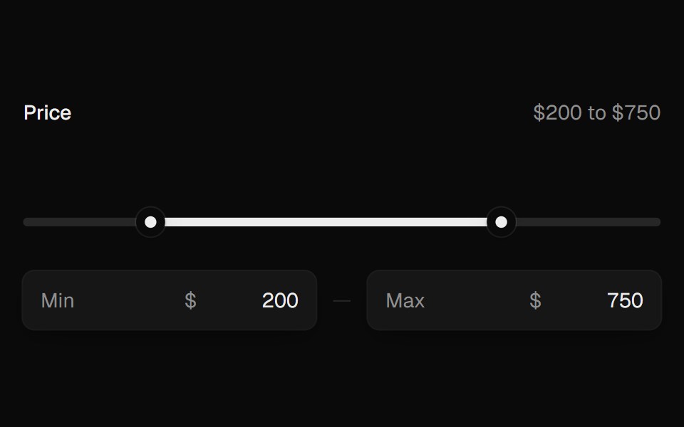 Range SliderUI Lab · ReactTwo thumbs that glide, stop at each other, and show their value as you drag.
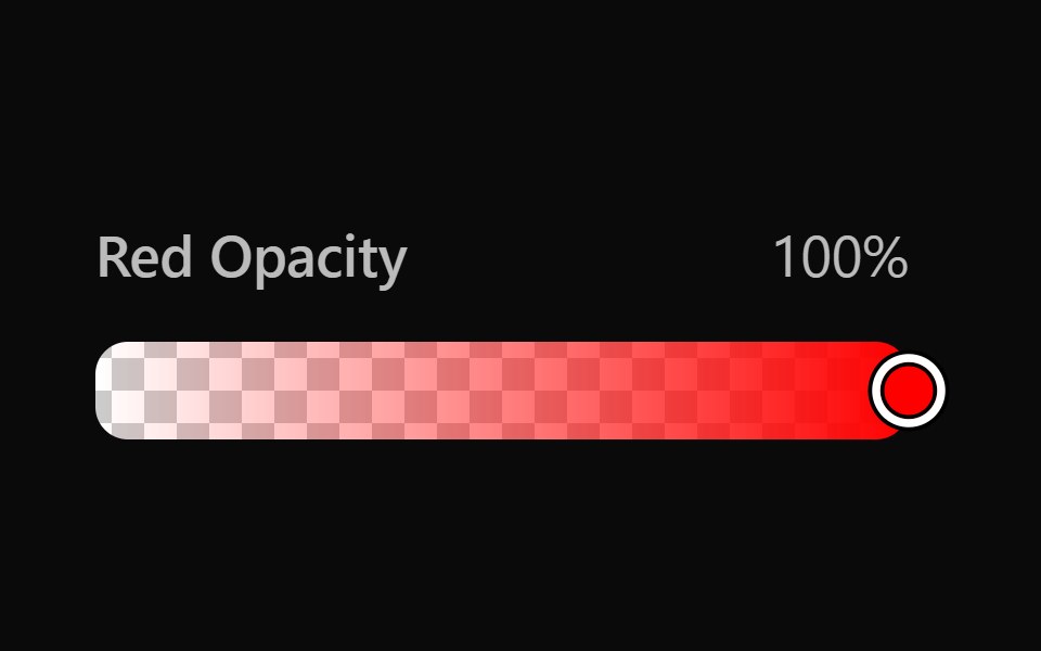 Vanilla Color SliderReact Spectrum · React
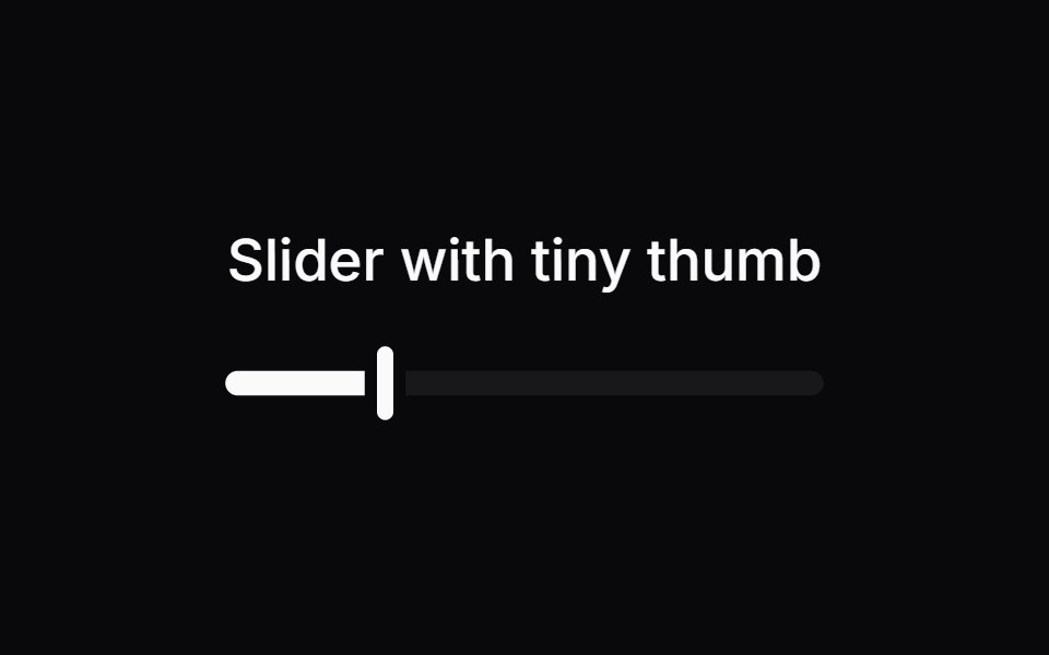 Comp 244Origin UI · React
 Disabled sliderReUI · ReactDisabled slider
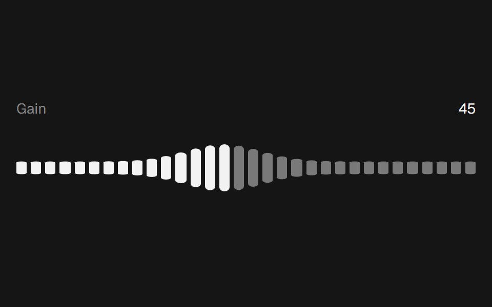 Range Slider WavebeUI · React
 SliderToolcraft · React
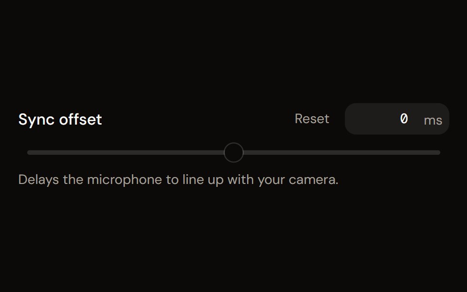 Parameter Slideraudiocn · ReactA labelled slider with a numeric input, unit, marks, reset and a linear or log scale, for gain trims, delays…
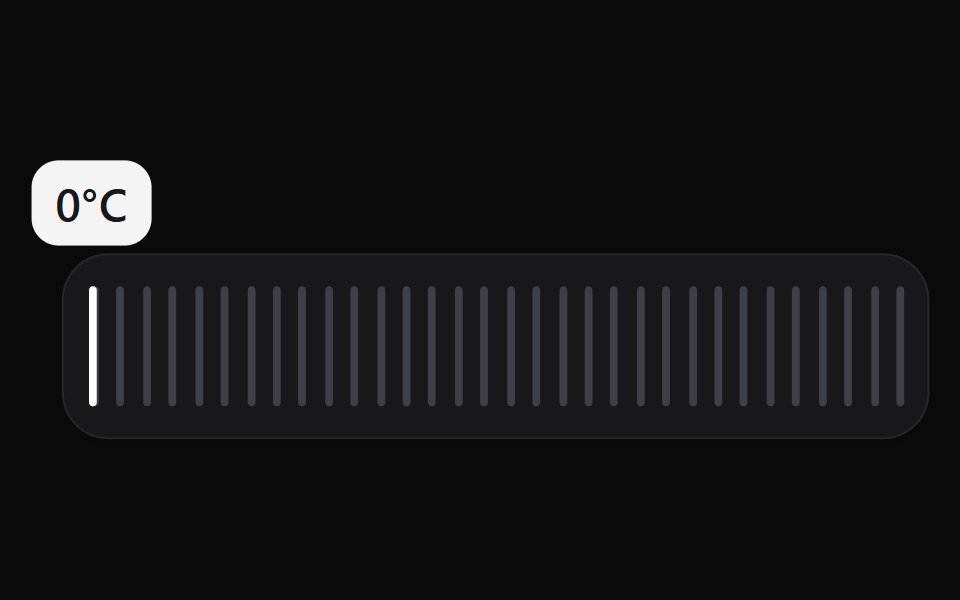 Scrub SliderWatermelon UI · React
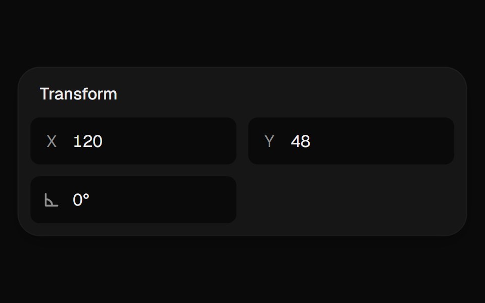 Scrub InputUI Lab · ReactDrag the label and a tape measure runs under the needle, or just type.
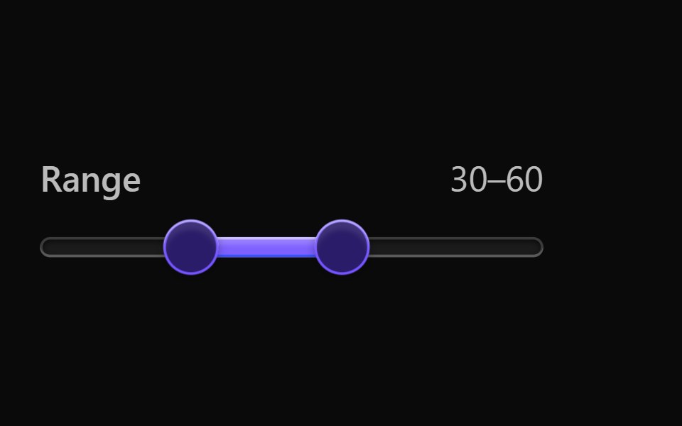 Vanilla SliderReact Spectrum · React
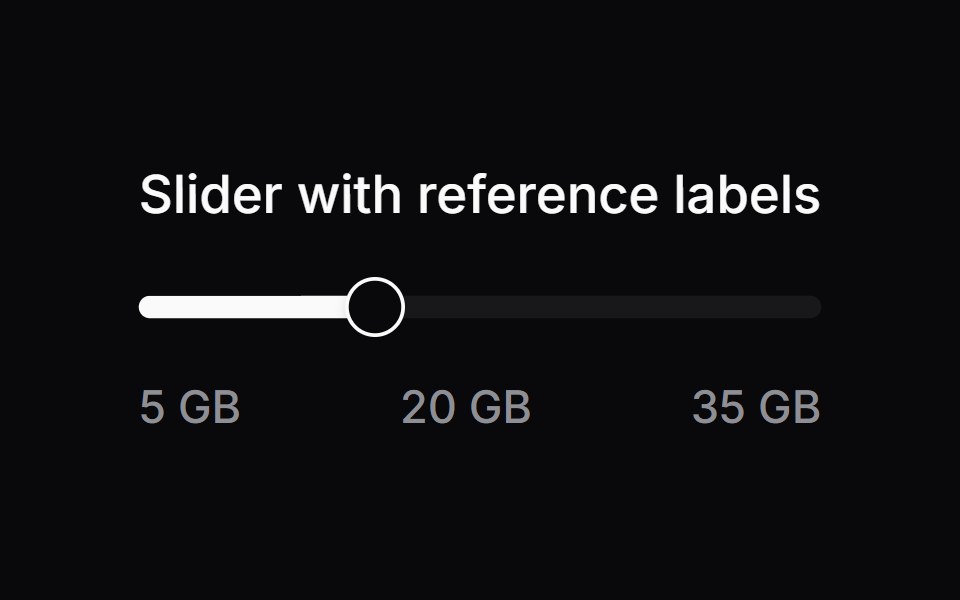 Comp 245Origin UI · React
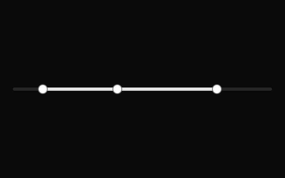 Slider with multiple discrete valuesReUI · ReactSlider with multiple discrete values
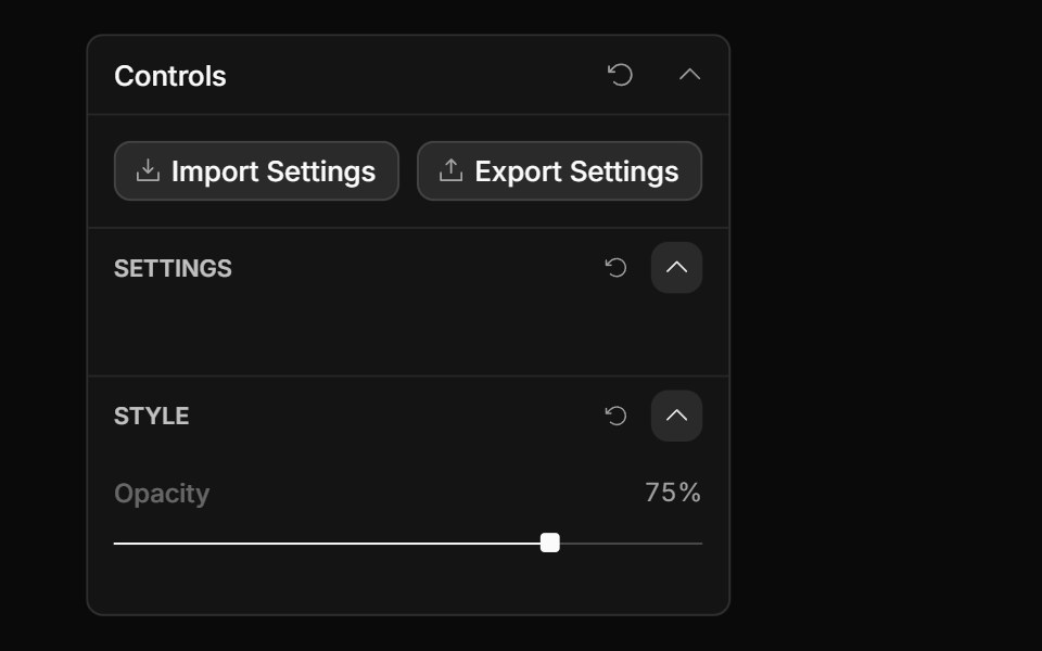 Slider ControlToolcraft · React
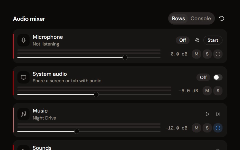 System Audio Mixeraudiocn · ReactThe complete mixer: microphone, system audio, music and sound pads with meters, faders, mute, solo, monitor and…
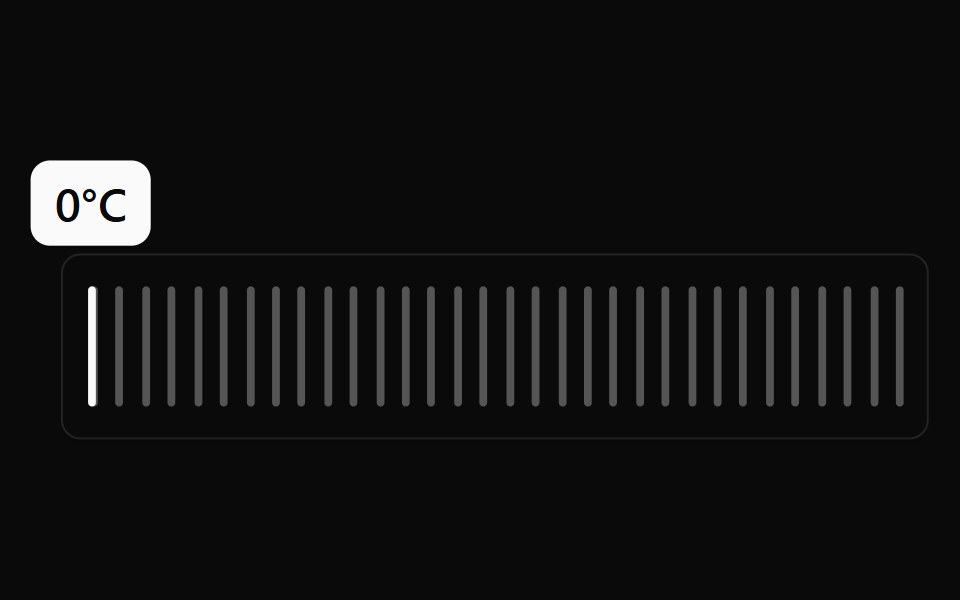 Scrub Slider BaseWatermelon UI · React
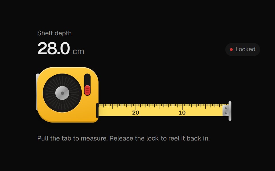 Tape MeasureUI Lab · ReactPull the blade out to measure; release the lock and it reels itself back in.
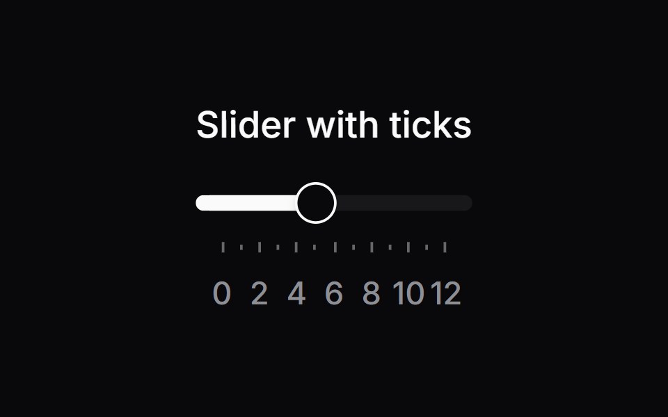 Comp 246Origin UI · React
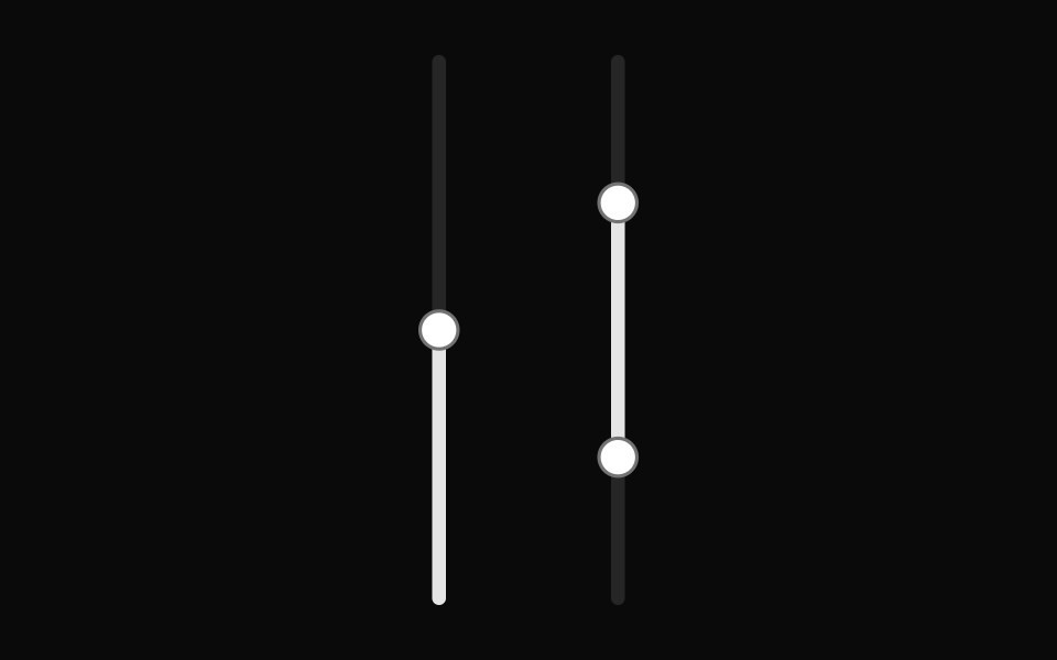 Vertical slider with range selectionReUI · ReactVertical slider with range selection
Libraries with Tailwind CSS slider components
Related categories
- Slider Components
- React Slider Components
- Animated Slider Components
- shadcn/ui Slider Components
- Tailwind CSS Input Components
- Tailwind CSS Text Input Components
- Tailwind CSS Select Components
- Tailwind CSS Form Field Components
- Tailwind CSS Form Components
- Tailwind CSS Textarea Components
- Tailwind CSS Checkbox Components
- Tailwind CSS Switch Components
- Tailwind CSS Radio Components
- Tailwind CSS Combobox Components
- Tailwind CSS File Upload Components
- Tailwind CSS Search Input Components
- Tailwind CSS Date Picker Components
- Tailwind CSS Login Form Components
- Tailwind CSS Color Picker Components
- Tailwind CSS OTP Input Components