 Dev Design Library
Tailwind CSS Form Field Components
Dev Design Library indexes 436 Tailwind CSS form field components from 42 open-source UI libraries, with the most coming from ReUI, Origin UI, FLX UI, sv-particles and Oxbow UI. Each one links to its page with the source code, a live preview where available, the library license and the install command. Every library in this list styles its components with Tailwind CSS utility classes. Form field components belong to the Inputs group.
Showing 120 of 436, a mix from every library. Open a library to see all of its components.
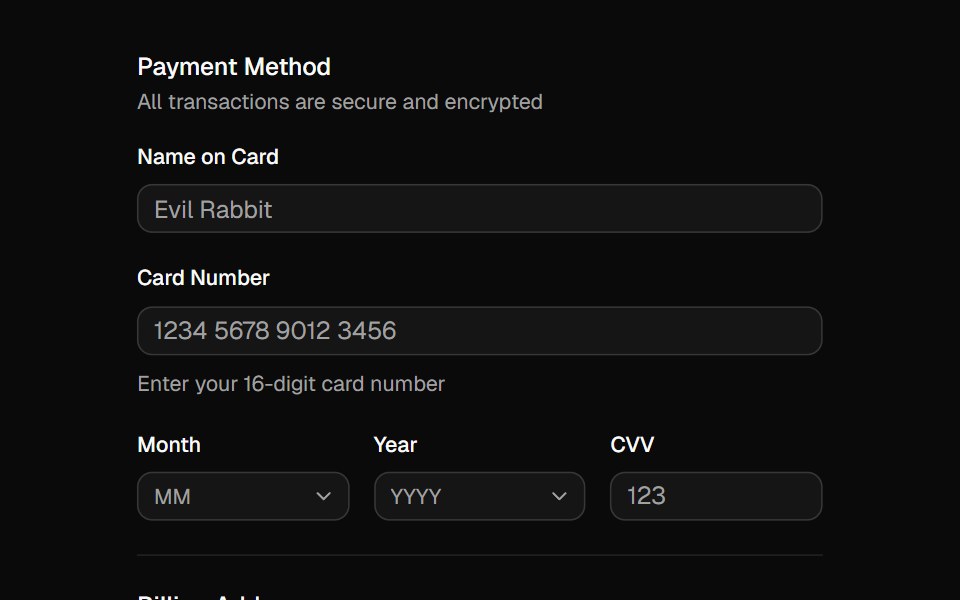 Fieldshadcn/ui · ReactCombine labels, controls, and help text to compose accessible form fields and grouped inputs.
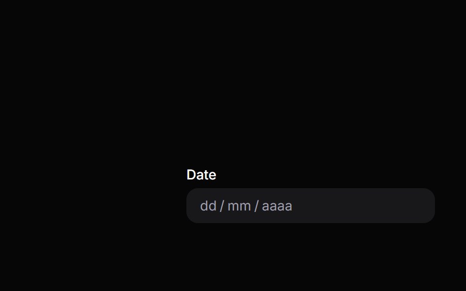 Date FieldHeroUI · ReactDate input field with labels, descriptions, and validation built on React Aria DateField
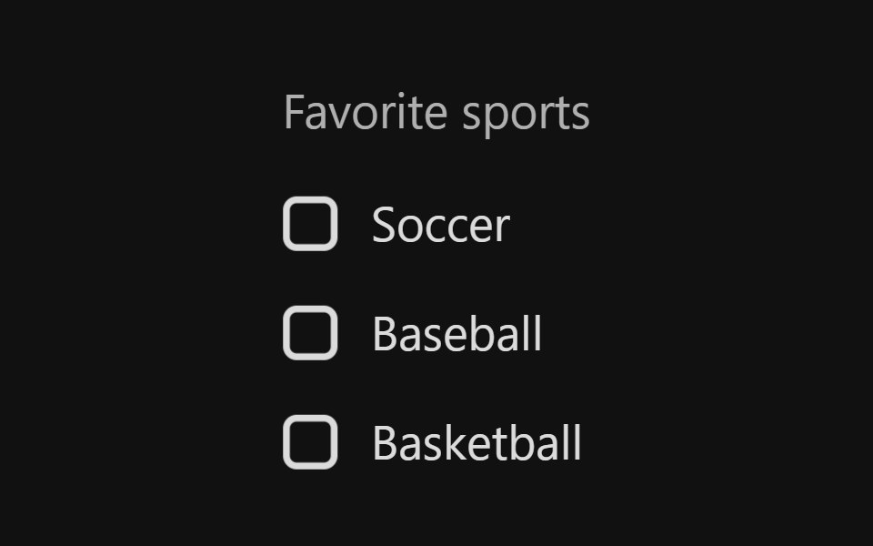 Checkbox GroupReact Spectrum · ReactA CheckboxGroup allows users to select one or more items from a list of choices.
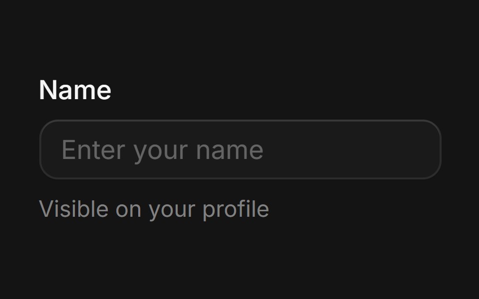 Fieldcoss ui · ReactA component that provides labelling and validation for form controls.
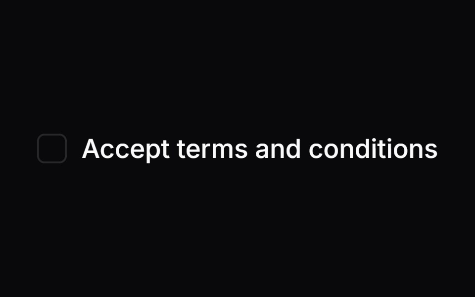 LabelOrigin UI · ReactRenders an accessible label associated with controls.
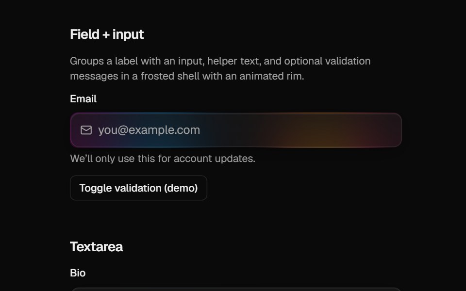 Halo FieldCult UI · ReactForm field layout (label, description, error) for HaloInput and HaloTextarea
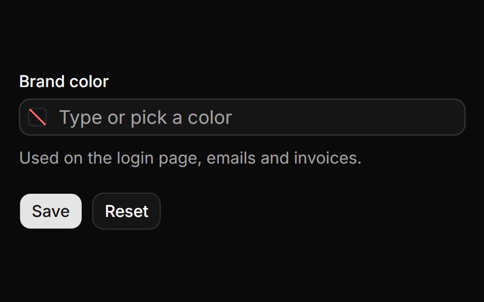 Form field with validationReUI · ReactNative form field with a required check, an error, reset and the submitted value.
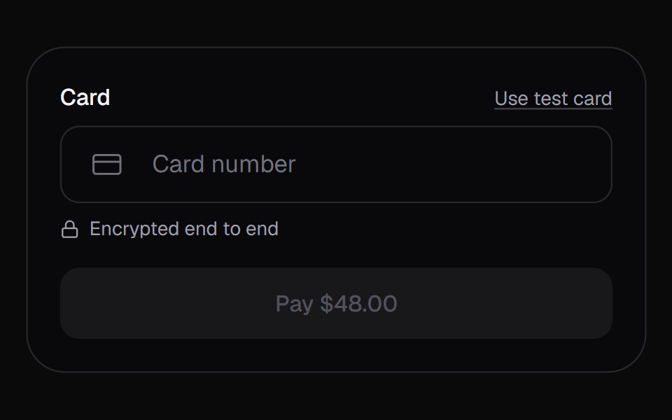 Card FieldKokonut UI · ReactA one-row card input for checkout. The number groups the way the brand prints it, then slides to its last four to make…
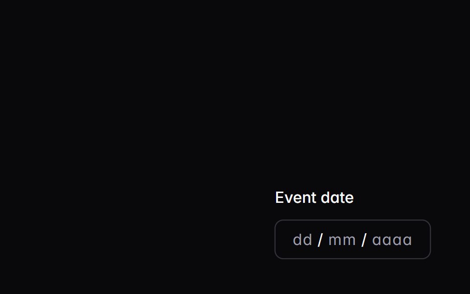 date-fieldIntent UI · Reactdate-field
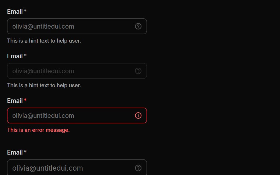 InputUntitled UI React · React
 Date FieldTailGrids · ReactA React date field component that lets users input a date.
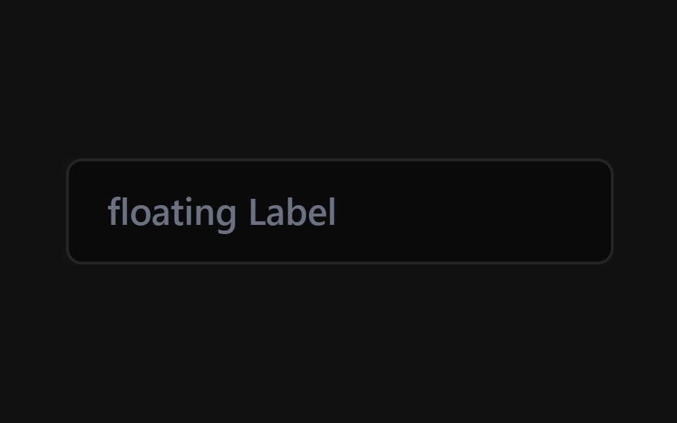 Floating Label InputSpectrum UI · Reactcomponent for the Floating Label Input
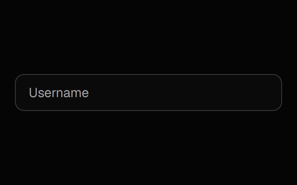 Label InputSpell UI · ReactInput field with floating label and password visibility toggle.
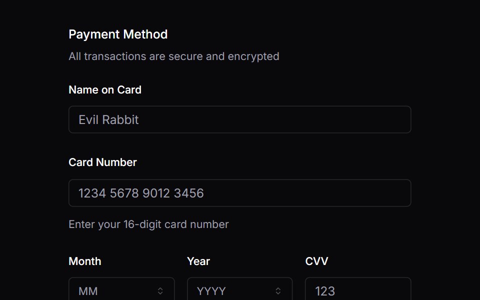 FieldVengeance UI · React
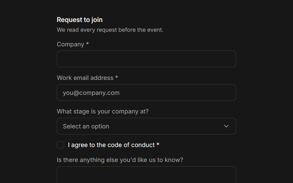 FieldFluid Functionalism · ReactCompose a label, a control, helper text, and a validation message into one accessible field: fieldsets, legends…
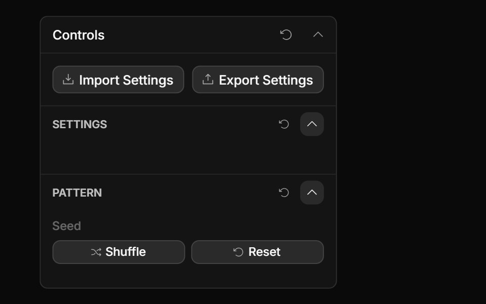 Actions ControlToolcraft · React
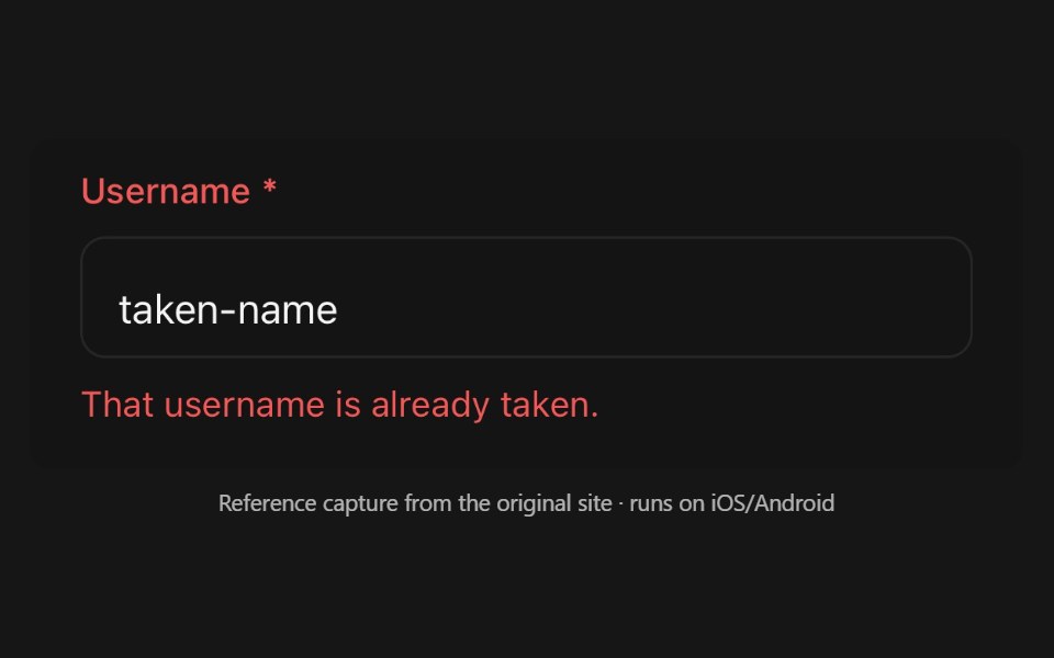 FieldPanel UI · React NativeLayout and validation-state kit a form control composes into.
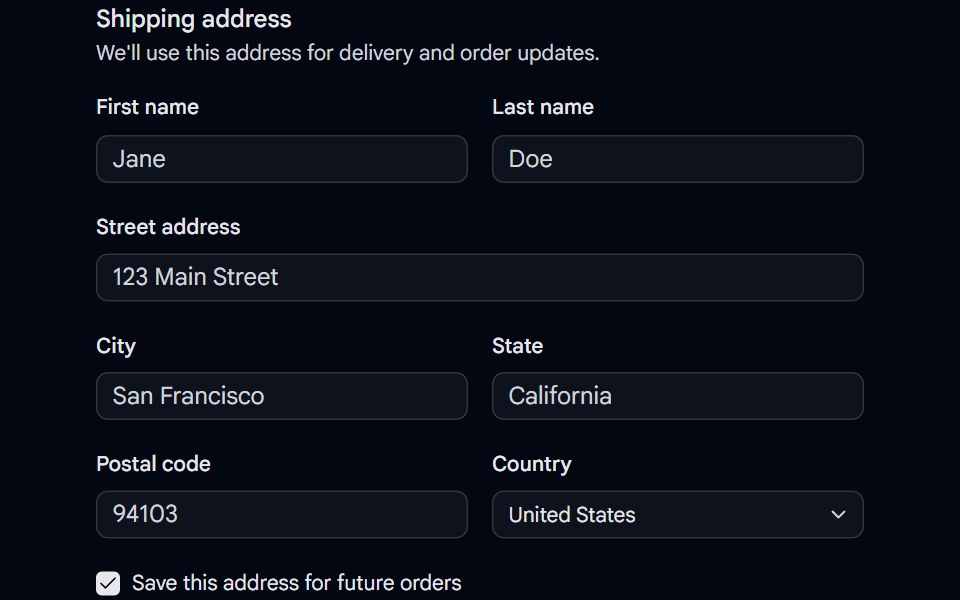 Field 04 - Shipping AddressShadcn Space · ReactA shipping address fieldset built with the Field primitive, combining responsive field orientation, inputs, a select…
 Flow FieldPixel Perfect · ReactParticles stream along curl-noise currents that reform the image.
 Checkbox Field InputOpenSourceUI · React
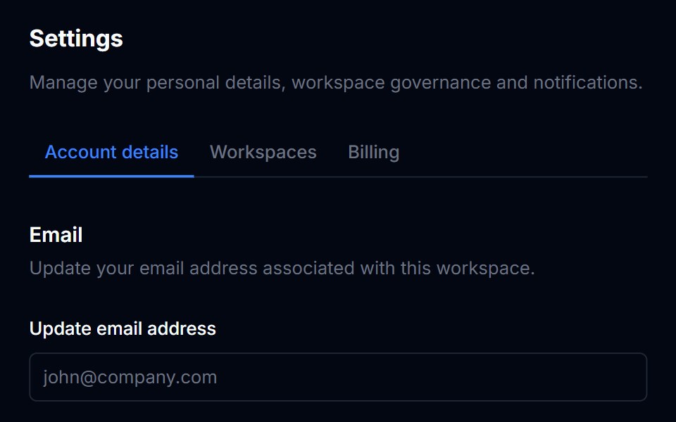 LabelTremor Blocks · React
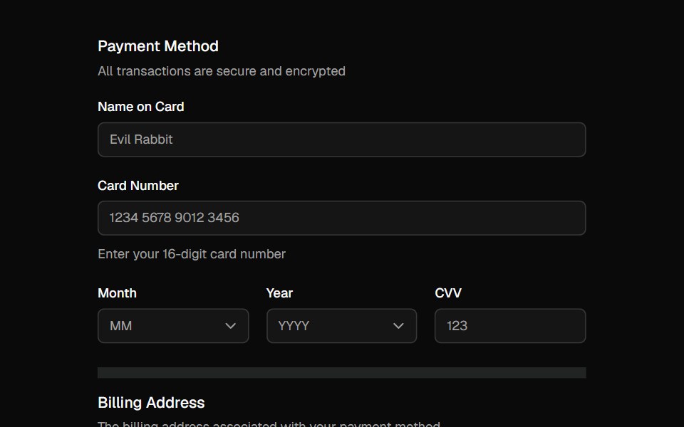 FieldShadcn Dashboard · React
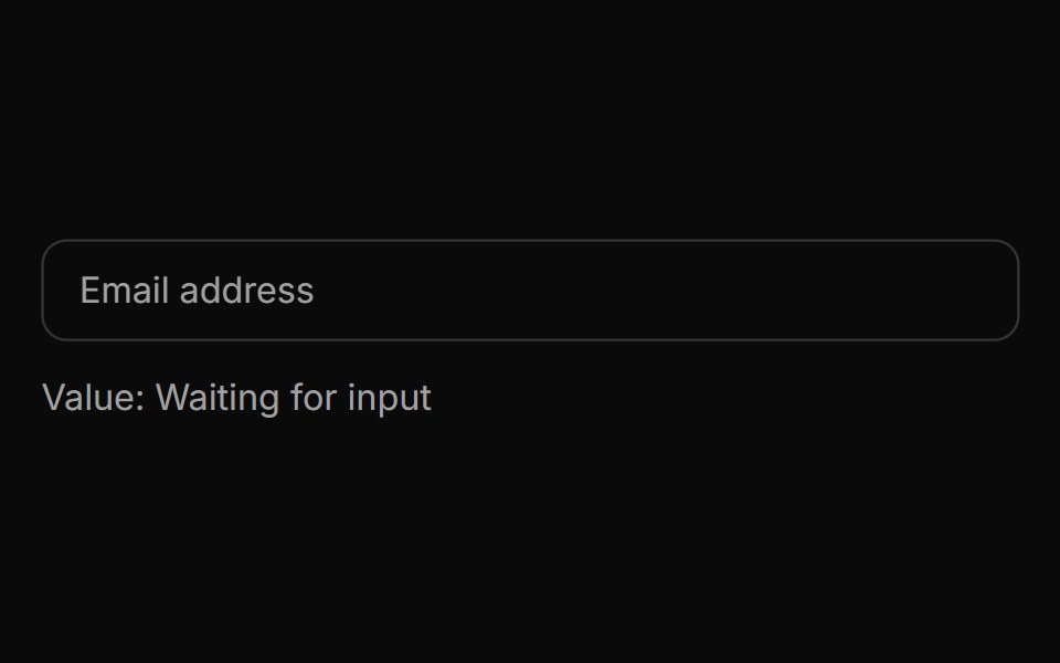 Spell Label InputAnimations (Svelte) · Svelte
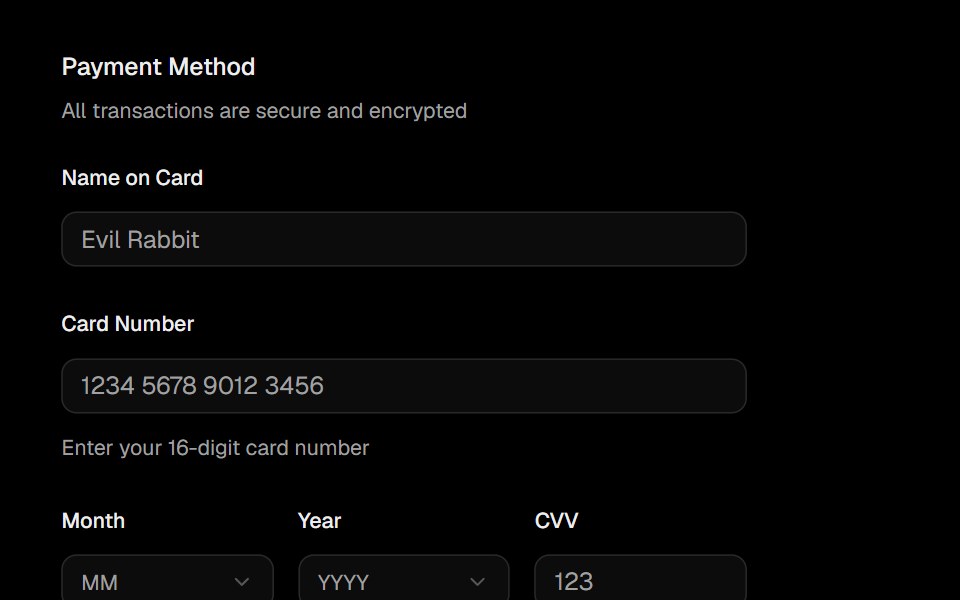 FieldObsidianUI · React
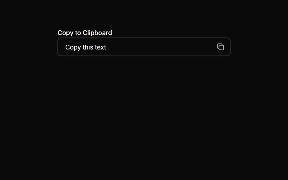 Inputs 20Oxbow UI · AstroCopy to clipboard input
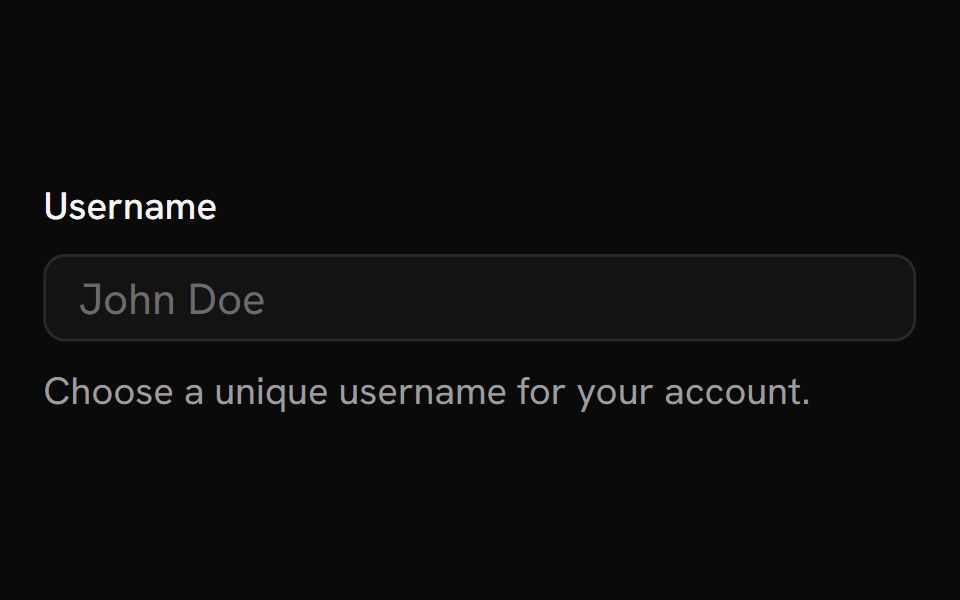 FieldShark UI · ReactContainer for inputs, labels, and helper text.
 Floating InputWatermelon UI · React
 Input Groupglasscn · React
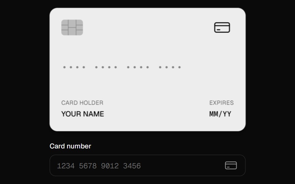 Card InputUI Lab · ReactFormats as you type, spots the card brand, and flips to show the CVC.
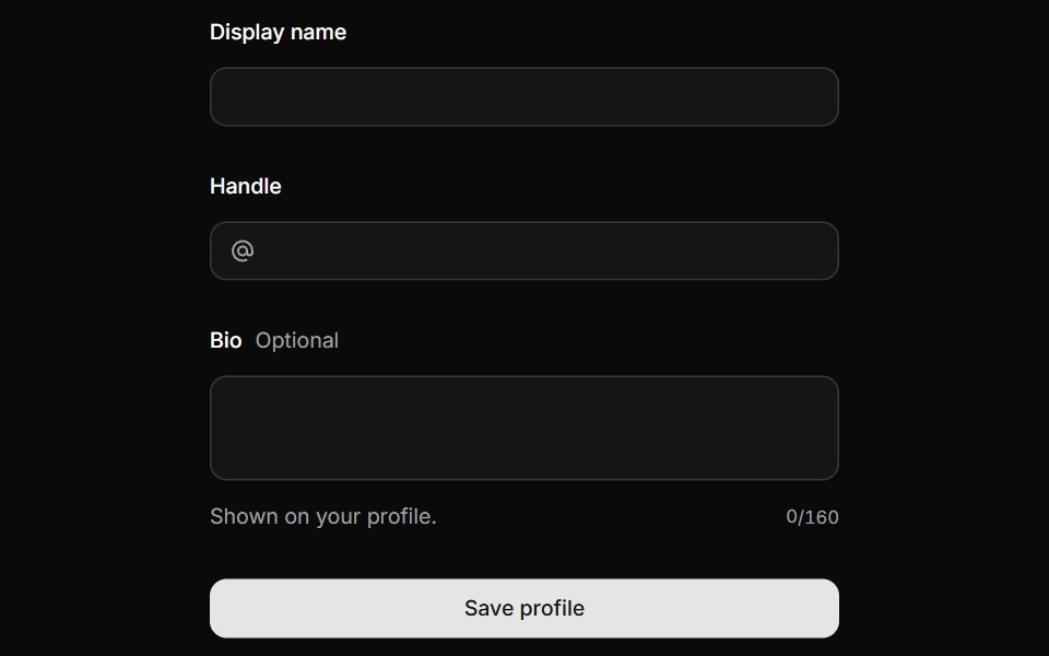 FieldHextaUI · ReactLabels, descriptions and errors wired to their control, with validation states and layouts for forms.
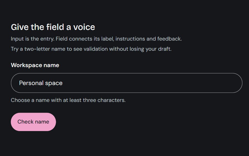 FieldCojeev UI · ReactConnects a form control with its label, description, and validation message.
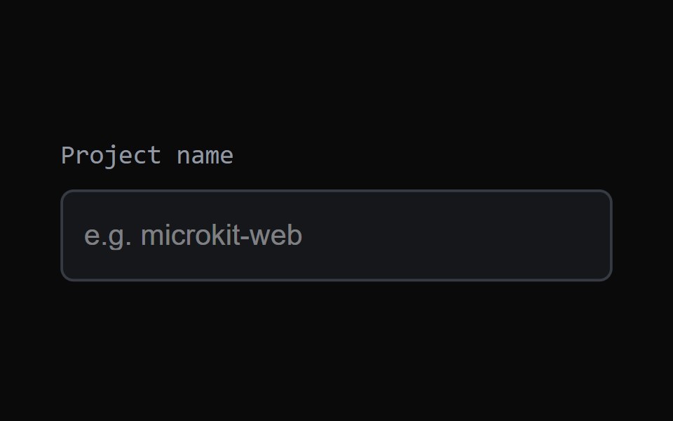 Focus FieldMicroKit · ReactAn input with a clean animated focus treatment.
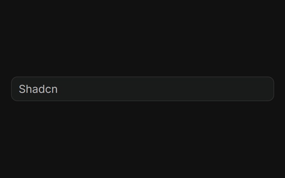 BasicFLX UI · ReactPlain text input with a placeholder, no addons.
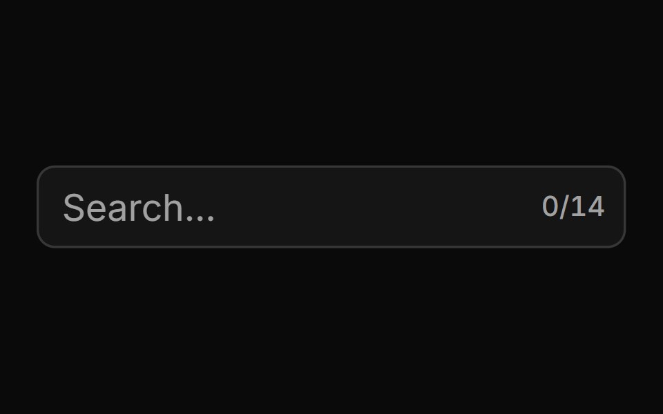 With Character Countsv-particles · SvelteForm field that shows the number of characters typed out of the maximum.
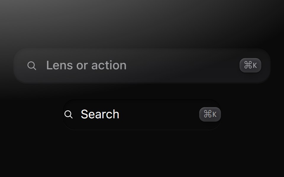 FieldMetal UI · React + SwiftUIText input in a well with a leading glyph and trailing keycaps; SearchField, a button in a well that opens search.
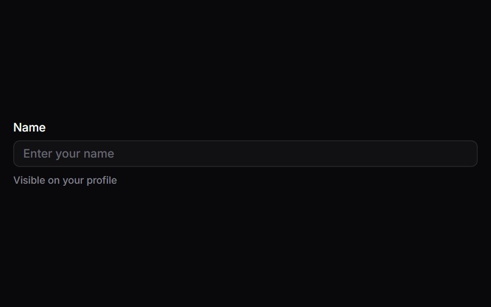 FieldSpaceUI · ReactWraps input fields with clear text labels, helpful hints, and error messages to make filling out forms straightforward…
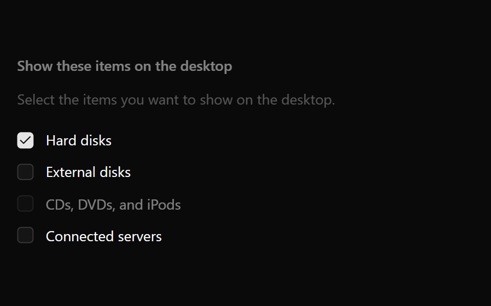 Checkbox GroupOUI · ReactReact aria components Checkbox Group with shadcn characteristics.
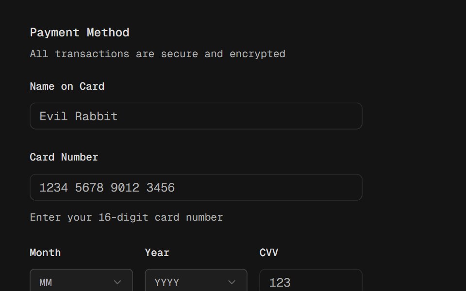 FieldD2Studio UI · ReactCombine labels, controls, and help text to compose accessible form fields and grouped inputs.
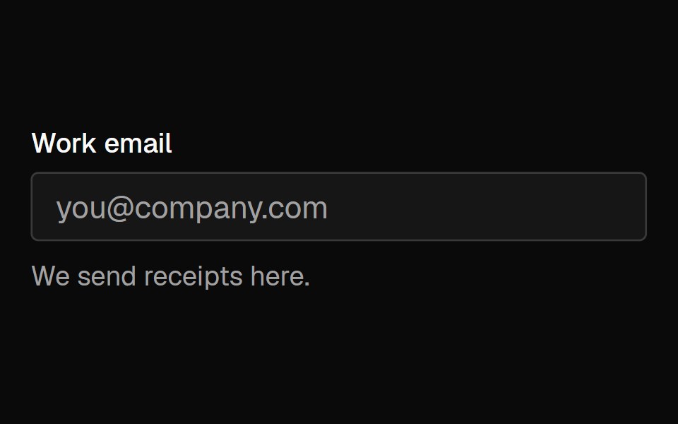 FieldFibo · ReactA label, description and error wired to one form control, with a group that sets the size of a whole form.
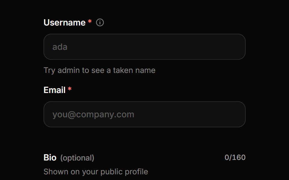 Form FieldReactFrame · ReactA form field wrapper with label, description, required or optional marker, info tooltip, character counter and…
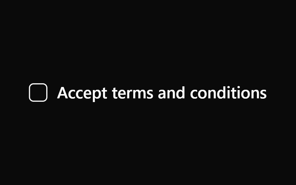 LabelAceternity UI · React
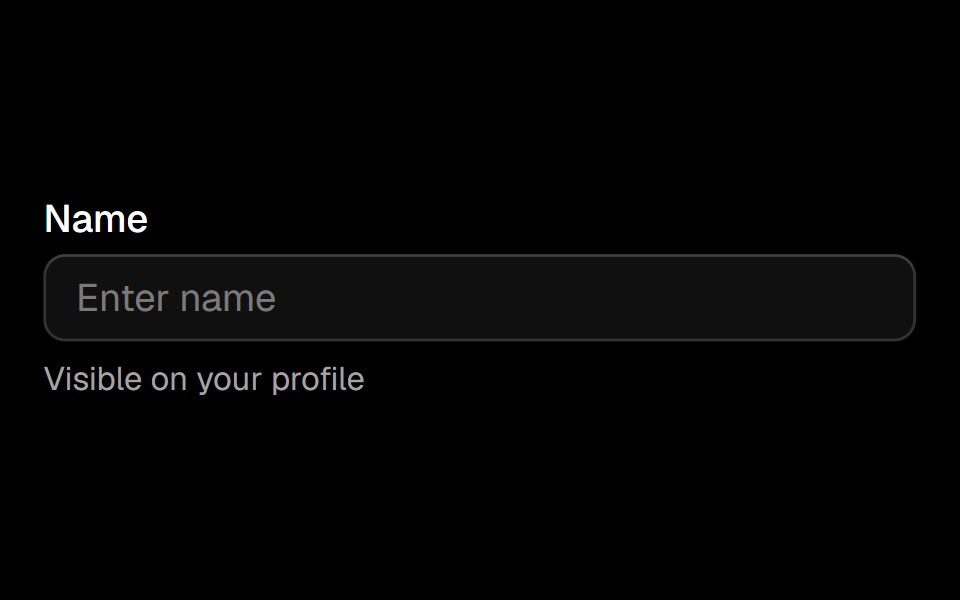 Fieldark-cn · ReactA shadcn-style field component built with Ark UI primitives.
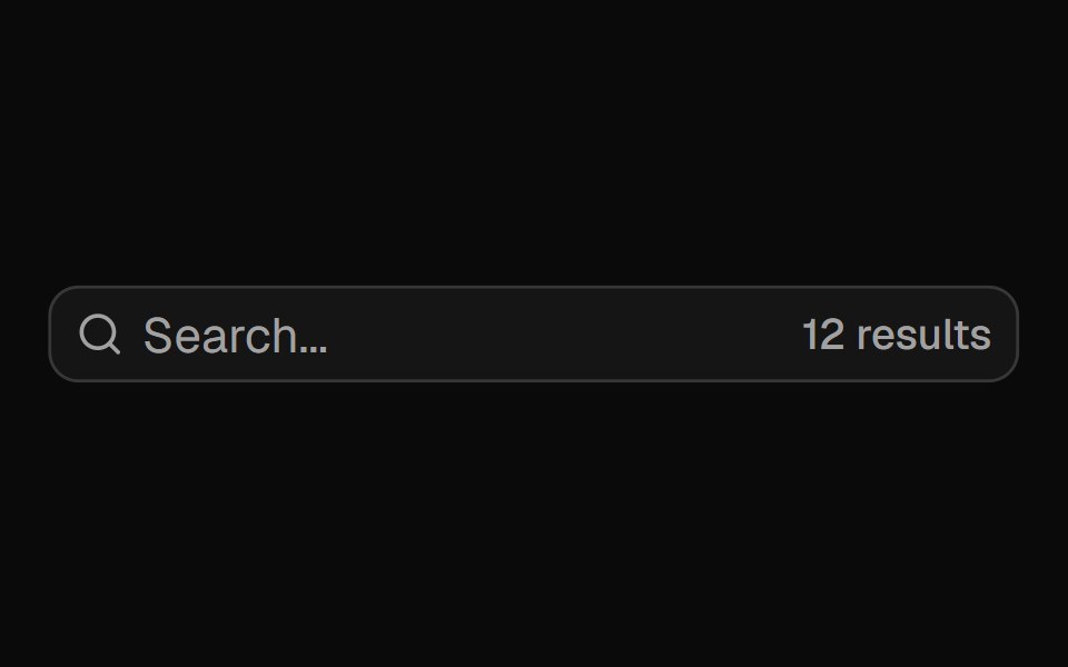 Input Groupshadcn/ui · ReactAdd addons, buttons, and helper content to inputs.
 DescriptionHeroUI · ReactText component for providing accessible descriptions and helper text for form fields and other UI elements.
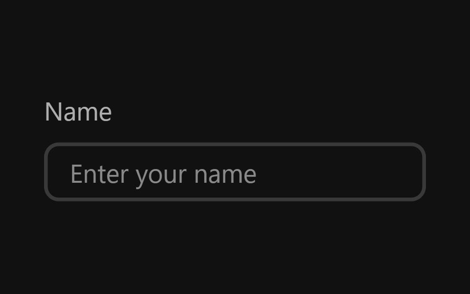 Text FieldReact Spectrum · ReactTextFields are text inputs that allow users to input custom text entries with a keyboard. Various decorations can be…
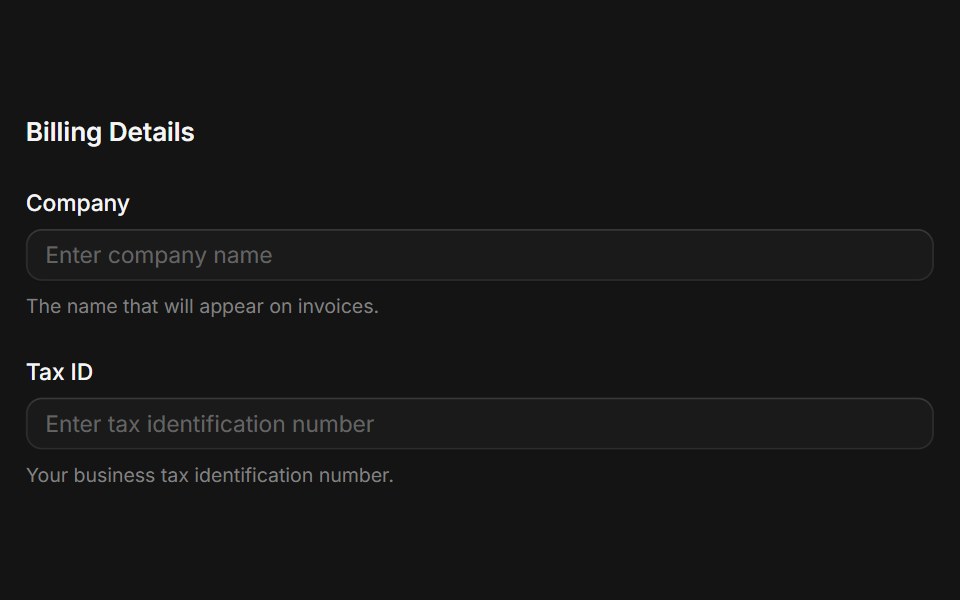 Fieldsetcoss ui · ReactA native fieldset element with a legend.
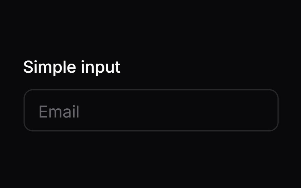 Comp 01Origin UI · React
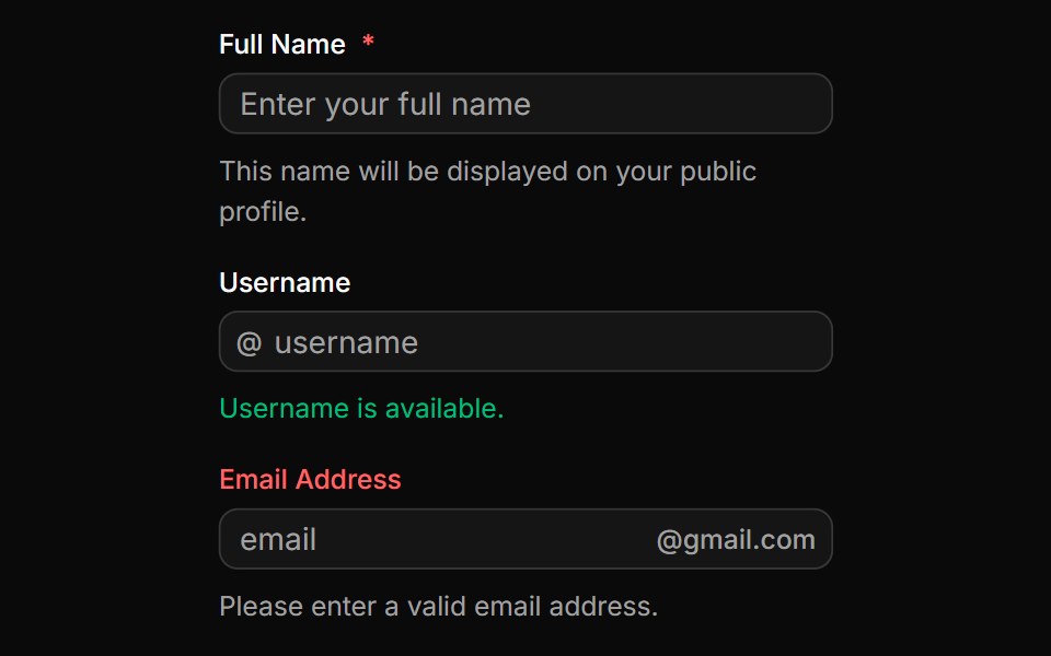 Fields with input groupsReUI · ReactFields with input groups
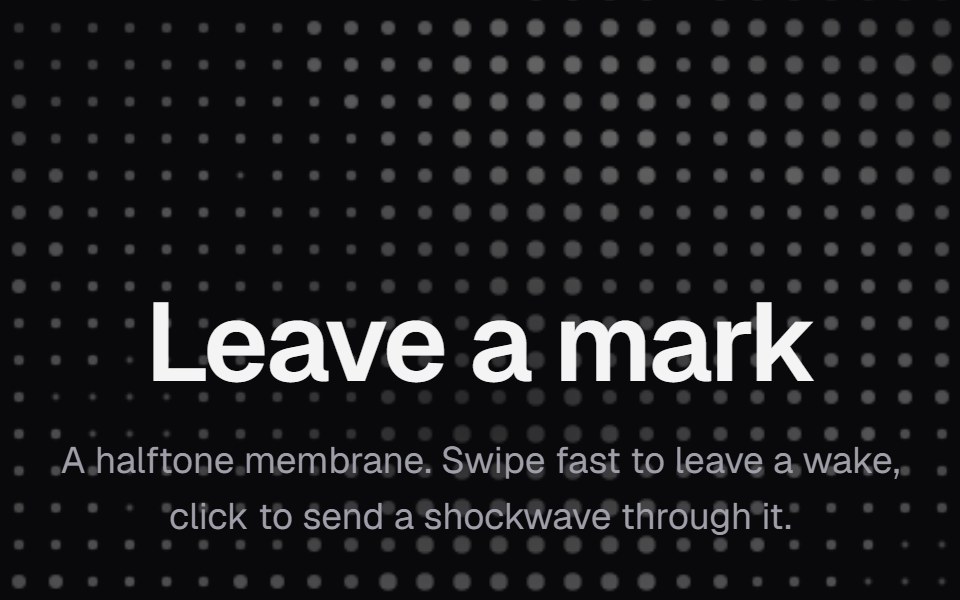 Dot FieldKokonut UI · ReactA halftone dot membrane that ripples behind a swipe and rings out from a click, built with React and Canvas.
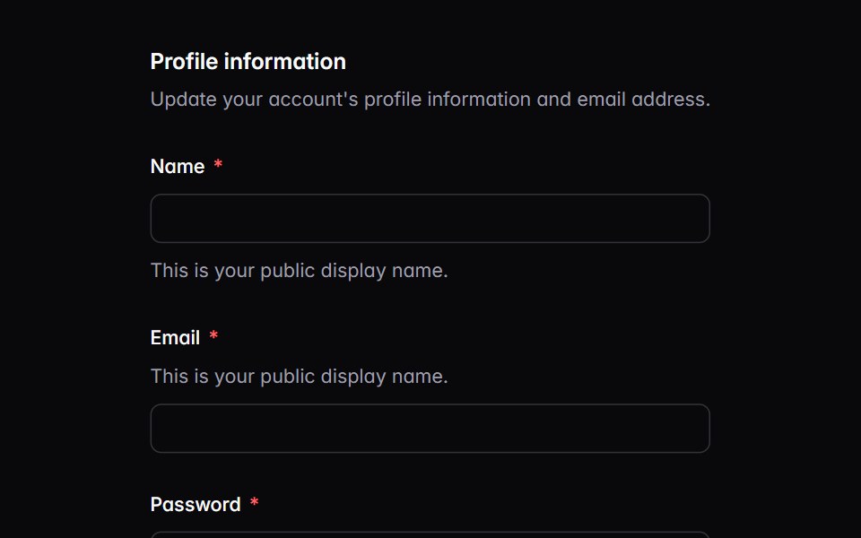 fieldIntent UI · Reactfield
 DescriptionTailGrids · ReactA description component that provides additional context or instructions for form fields.
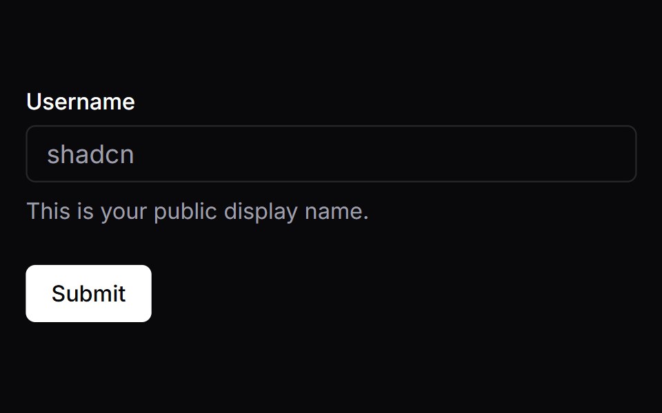 FormVengeance UI · React
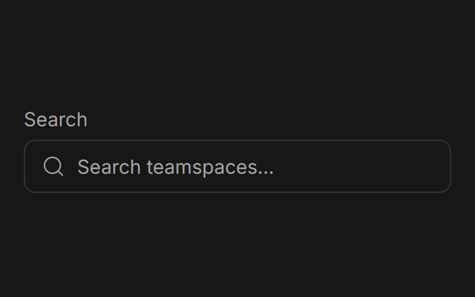 Input GroupFluid Functionalism · ReactGrouped input fields with fluid hover highlighting, animated label transitions, optional icons, and error states.
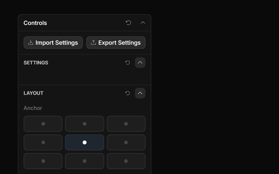 Anchor Grid ControlToolcraft · React
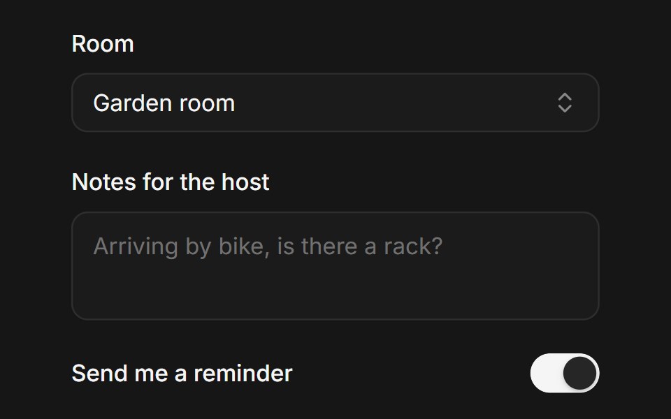 Web FieldPanel UI · React NativeForm fields with label, control, helper text and validation message.
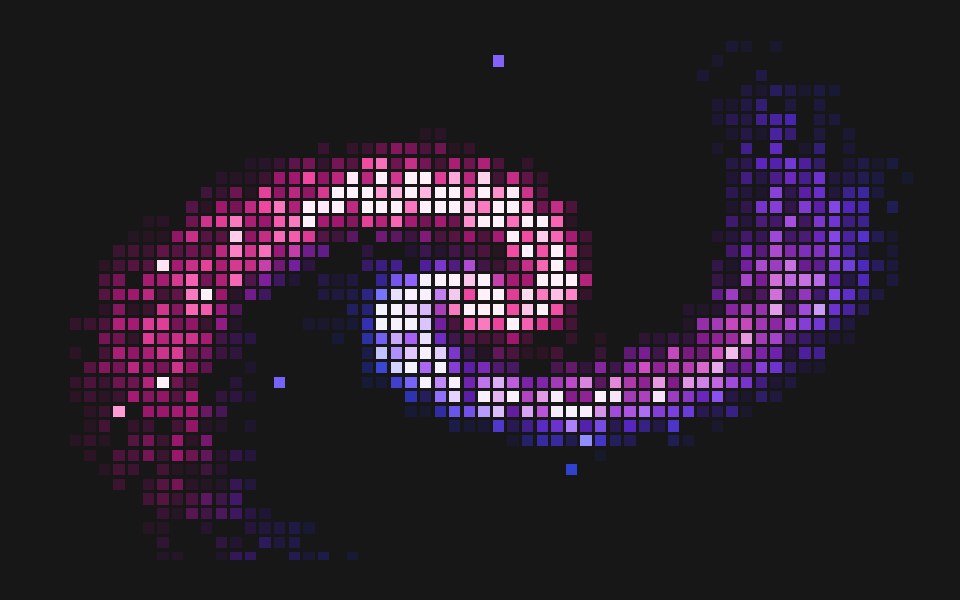 Pixel Displace FieldPixel Perfect · ReactA pixelated spiral of grid-locked squares that scatter away from the cursor and spring back.
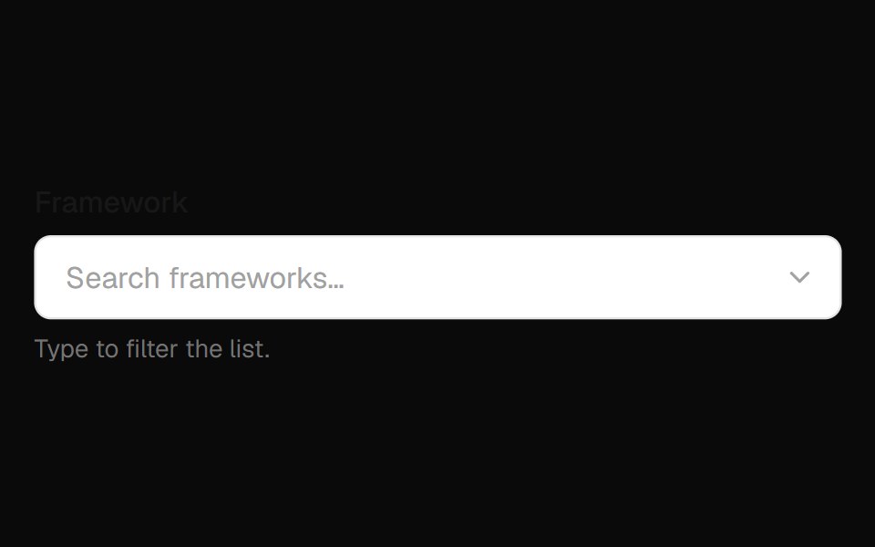 Combobox Field InputOpenSourceUI · React
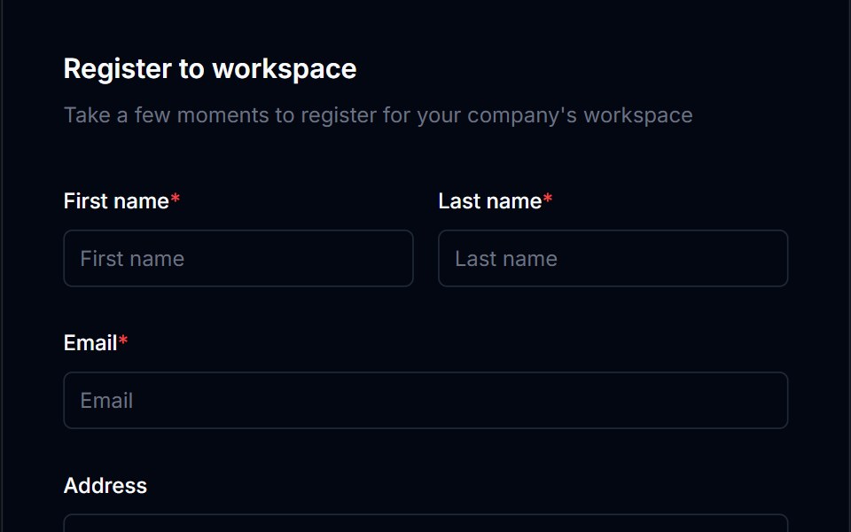 Form Layout 01Tremor Blocks · React
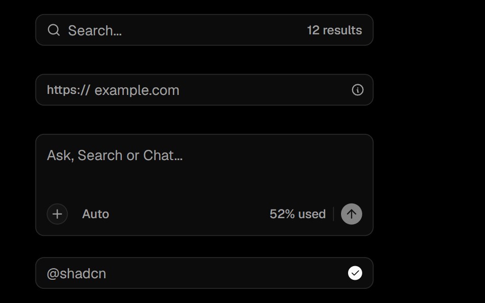 Input GroupObsidianUI · React
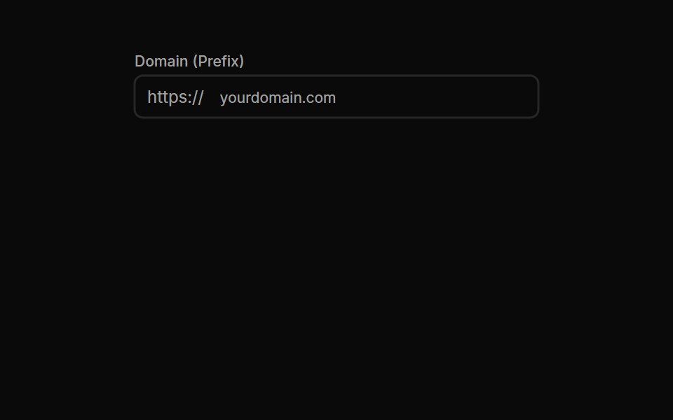 Input Groups 01Oxbow UI · Astro
 HintShark UI · ReactMinimal tooltip for showing information.
 Floating Input BaseWatermelon UI · React
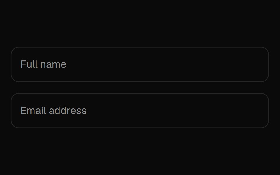 Floating LabelUI Lab · ReactThe label peels up letter by letter, and never covers what you wrote.
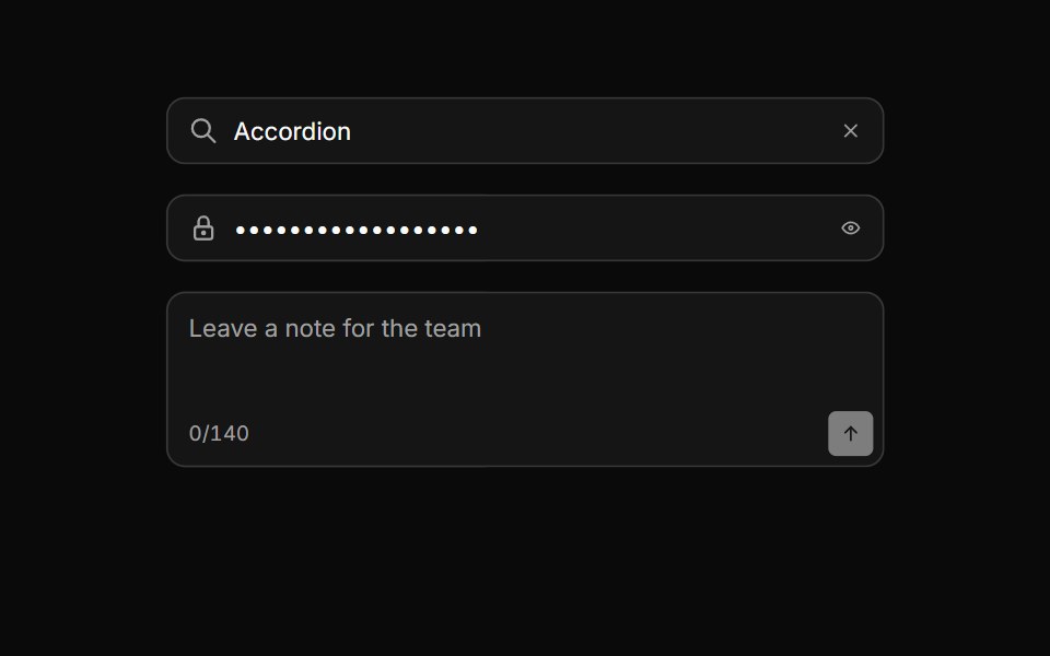 Input groupHextaUI · ReactAn input with icons, text, buttons or a keyboard hint attached, sharing one border and focus ring.
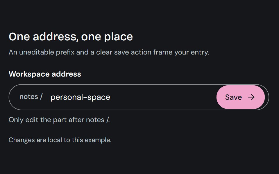 Input GroupCojeev UI · ReactCombines a text control with adjacent prefixes, suffixes, or actions in one input surface.
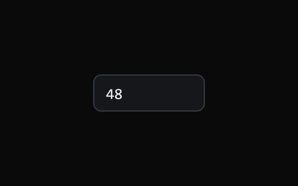 Scrub Number FieldMicroKit · ReactA number field you drag to scrub and click to type, with a ruler that tracks the gesture.
 With AddonFLX UI · ReactInput with trailing search icon addon.
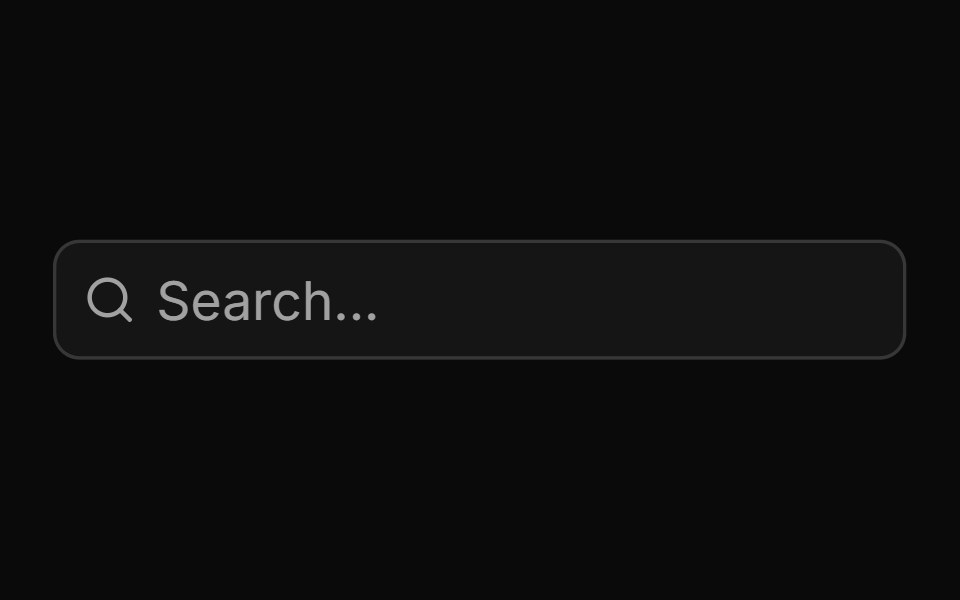 Basic Input Groupsv-particles · Svelte
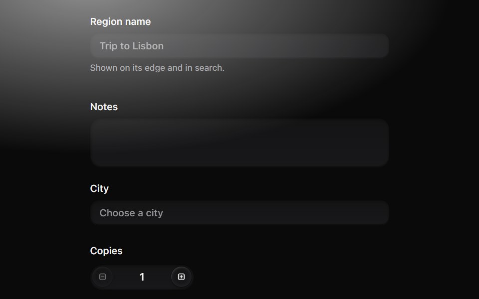 Form fieldMetal UI · React + SwiftUIA control with its words: label, description and an error that grows open from under the control on the settle spring…
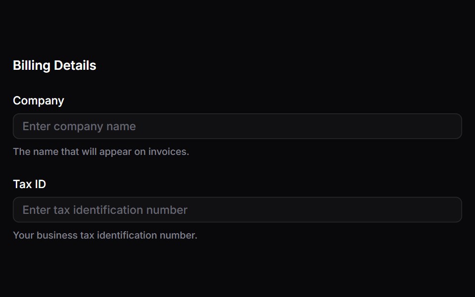 FieldsetSpaceUI · ReactGroups related form controls together under a descriptive header, making long or complex forms easier to read and…
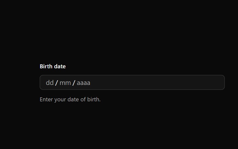 Date FieldOUI · ReactReact aria components DateField with shadcn characteristics.
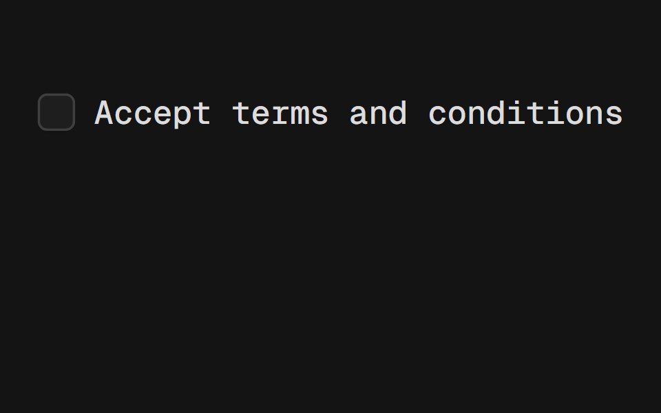 LabelD2Studio UI · ReactRenders an accessible label associated with controls.
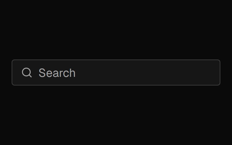 Input GroupFibo · ReactAn input with an icon, text or button beside it, drawn as one field.
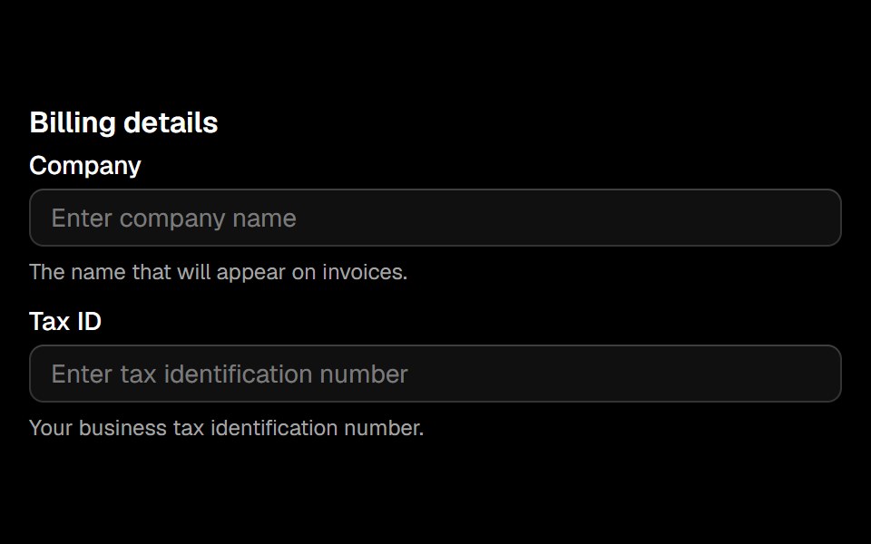 Fieldsetark-cn · ReactA shadcn-style fieldset component built with Ark UI primitives.
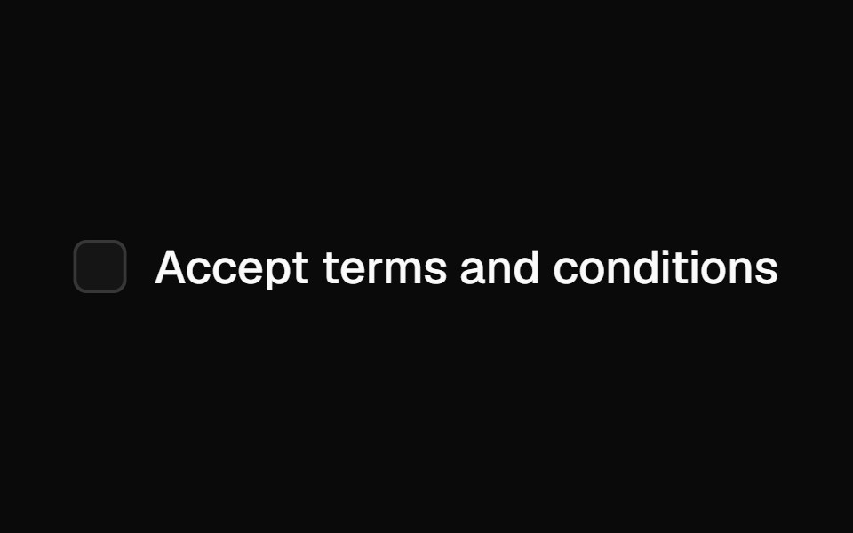 Labelshadcn/ui · ReactRenders an accessible label associated with controls.
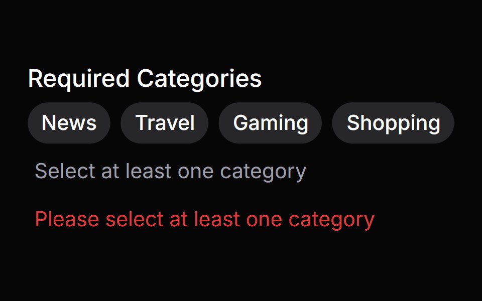 Error MessageHeroUI · ReactA low-level error message component for displaying errors
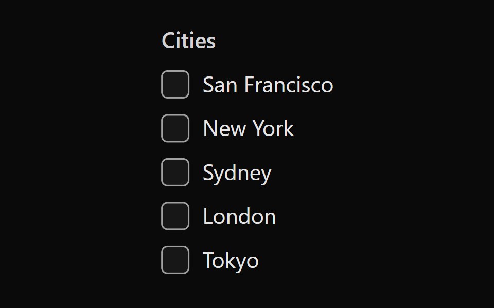 Tailwind Checkbox GroupReact Spectrum · React
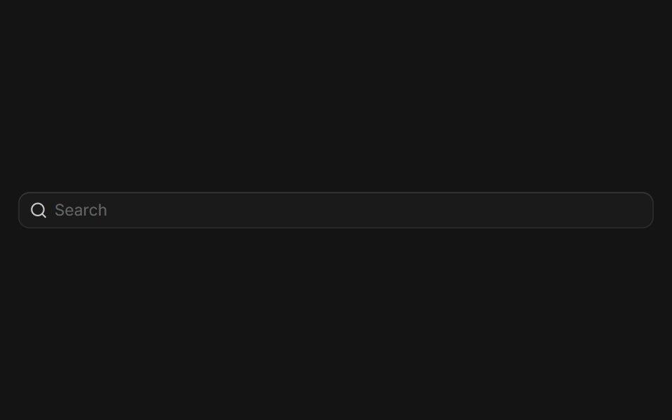 Input Groupcoss ui · ReactA flexible component for grouping inputs with addons, buttons, and other elements.
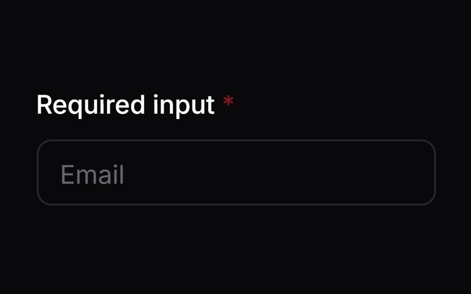 Comp 02Origin UI · React
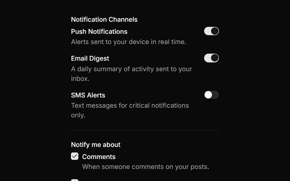 Notification preferences formReUI · ReactNotification preferences form
 tag-fieldIntent UI · Reacttag-field
 FieldTailGrids · ReactA collection of components for building accessible and flexible form fields.
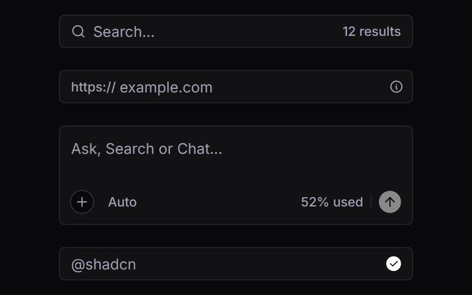 Input GroupVengeance UI · React
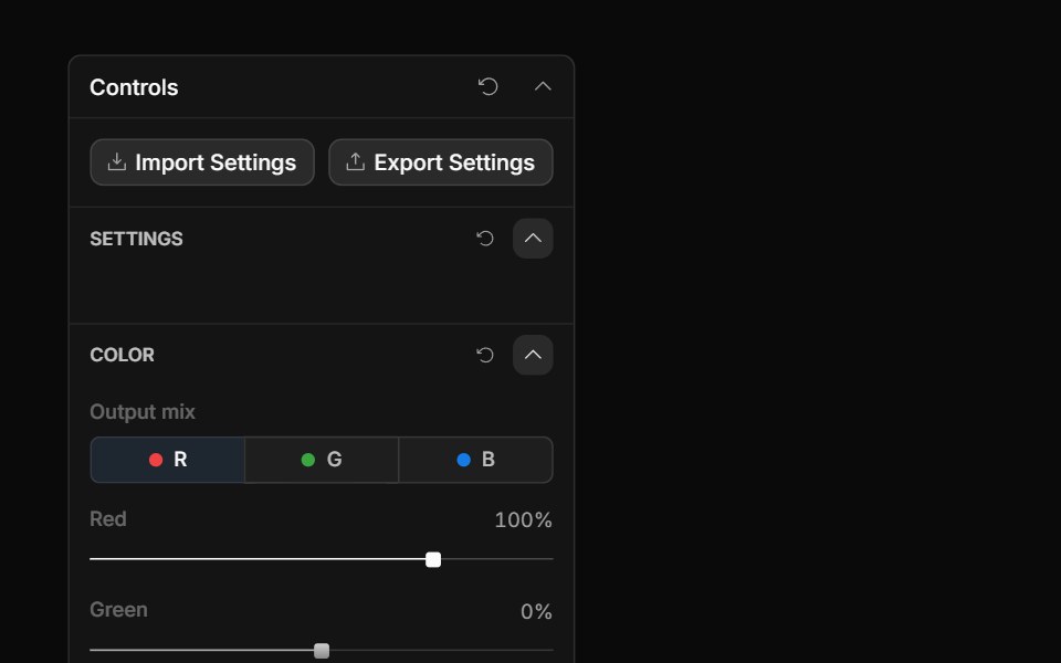 Channel Mixer ControlToolcraft · React
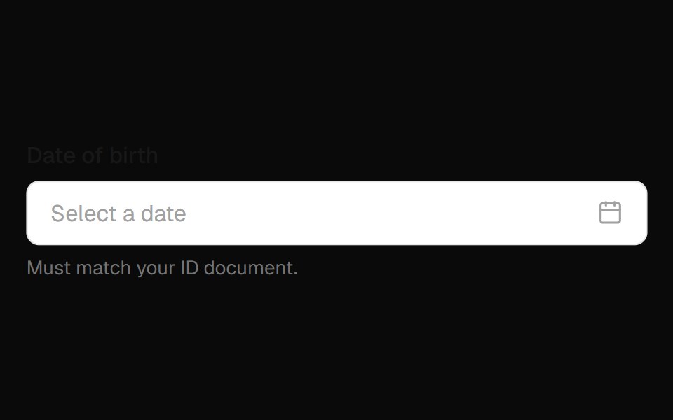 Date Field InputOpenSourceUI · React
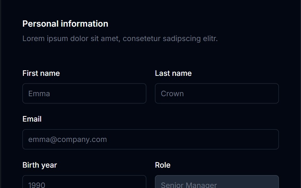 Form Layout 02Tremor Blocks · React
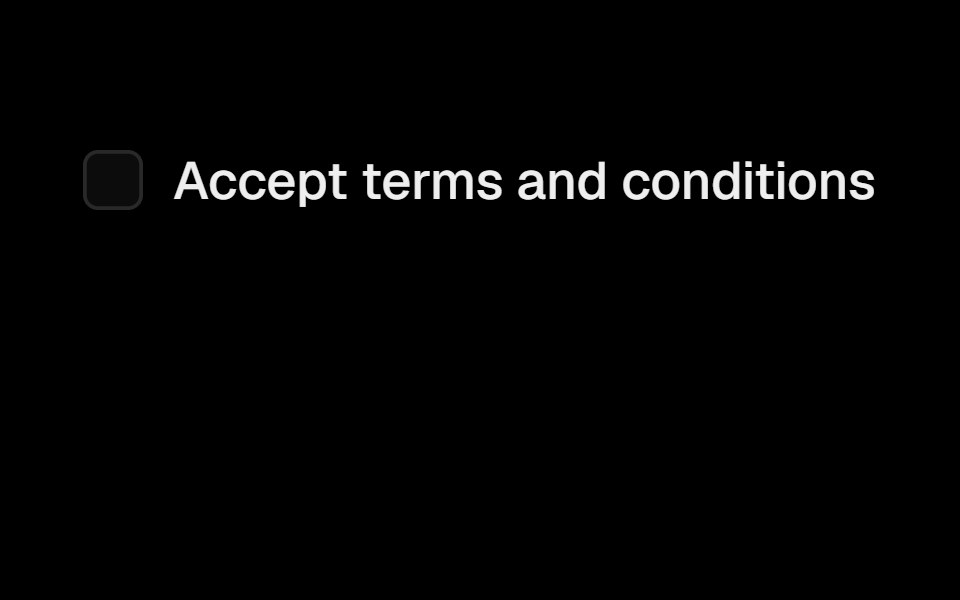 LabelObsidianUI · React
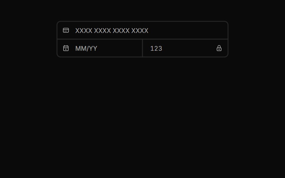 Input Groups 02Oxbow UI · Astro
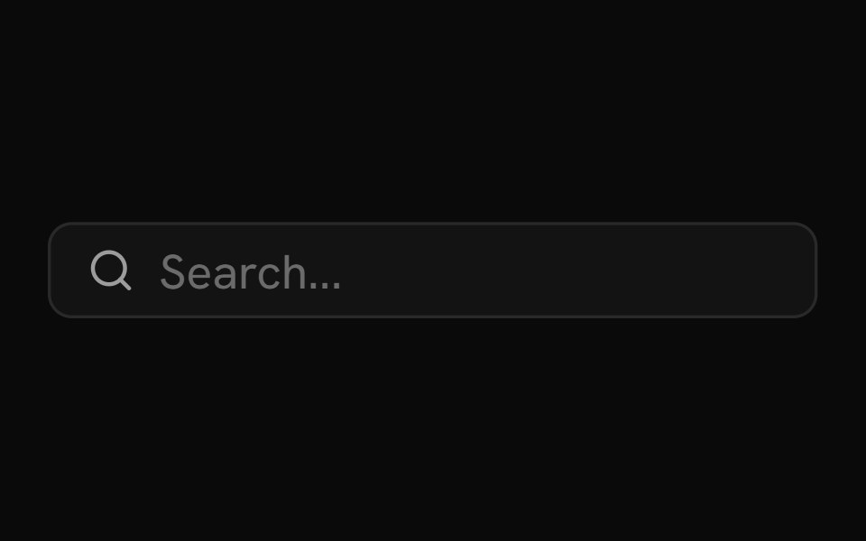 Input GroupShark UI · ReactGroup input elements together.
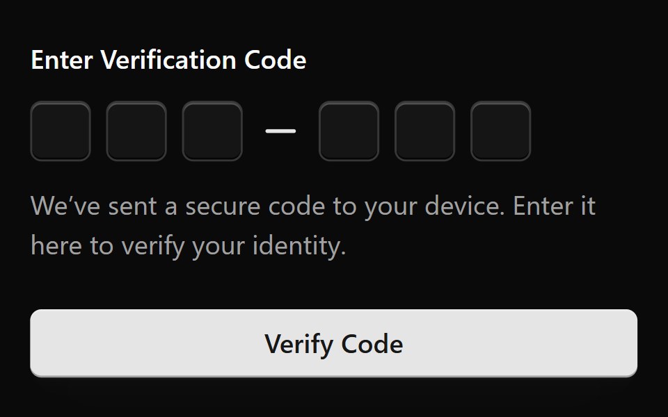 Form 1Watermelon UI · React
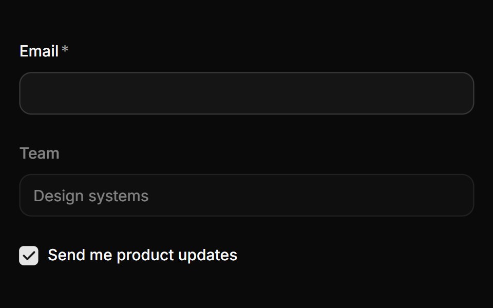 LabelHextaUI · ReactA label that follows its control, dimming when it's disabled and marking it required or optional on its own.
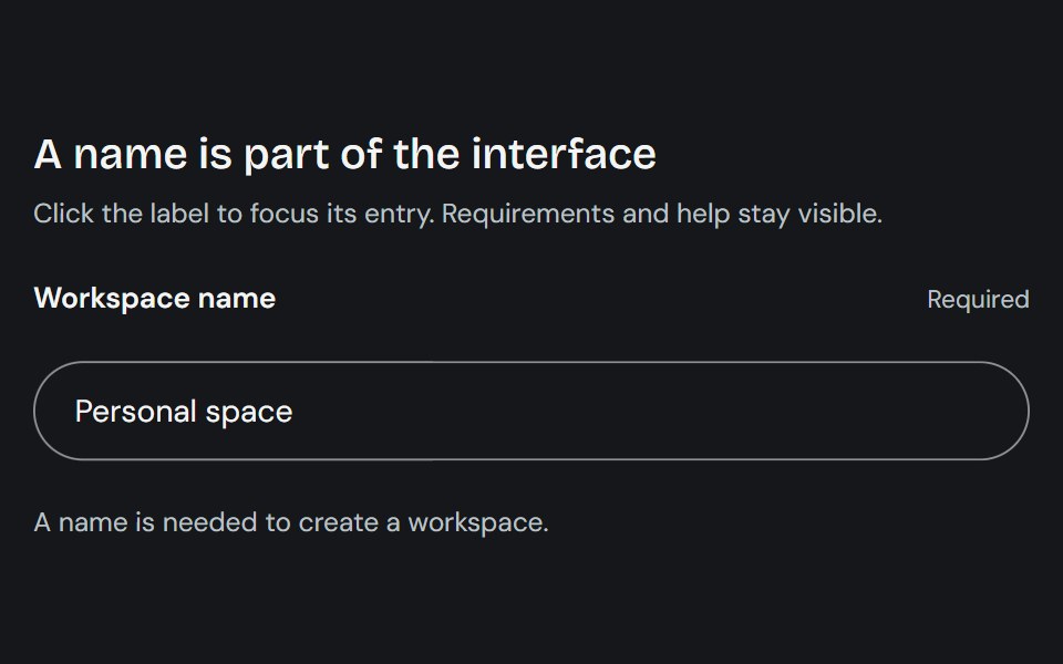 LabelCojeev UI · ReactProvides a native form label plus compact stat-label primitives for named values.
 DisabledFLX UI · ReactText input rendered in a disabled, non-interactive state.
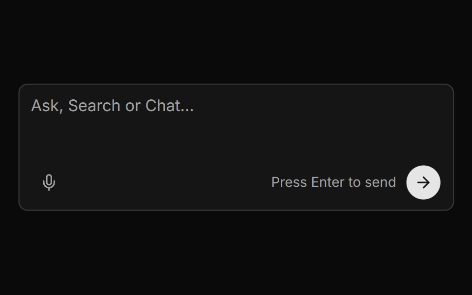 Chat Input With Voice And Send Buttonsv-particles · Svelte
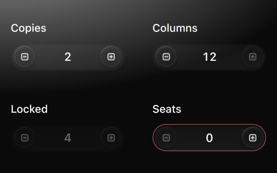 Number fieldMetal UI · React + SwiftUIA number you step, scrub or type: keycaps at each end of a pill well; each step turns the value one drum step (plus…
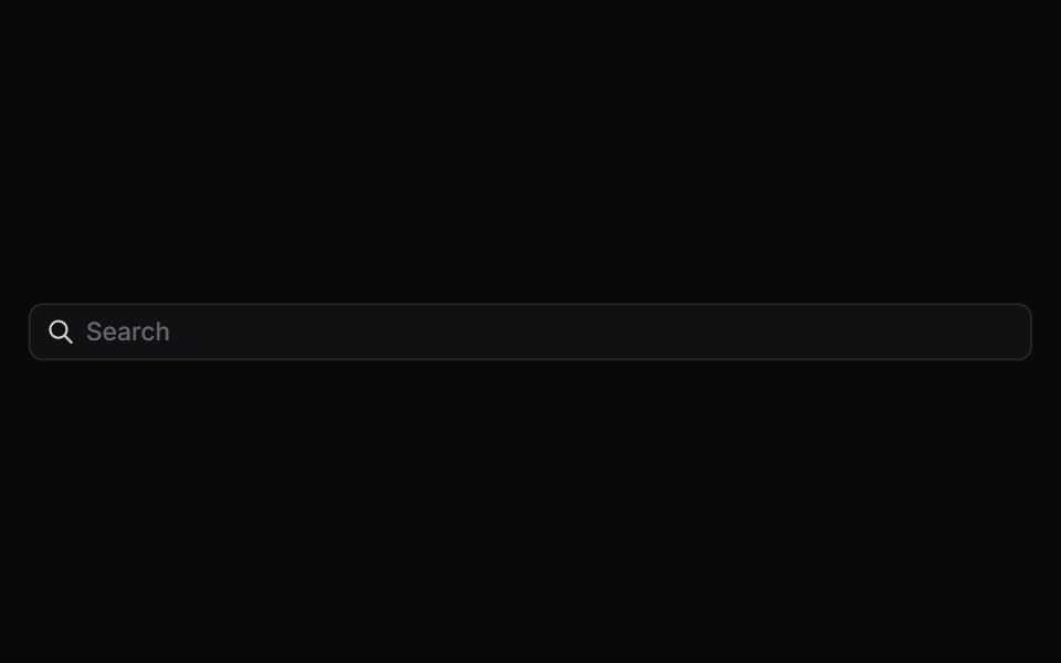 Input GroupSpaceUI · ReactAttaches icons, prefix text, buttons, or dropdowns directly to an input field, creating compact, all-in-one form…
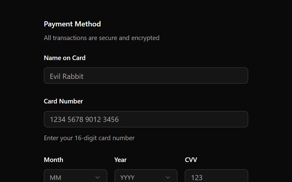 FieldOUI · ReactShadcn Field with react aria components characteristics.
 LabelFibo · ReactNames a form control and widens its hit area.
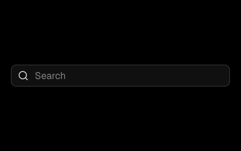 Input Groupark-cn · ReactA shadcn-style input group component built with Ark UI primitives.
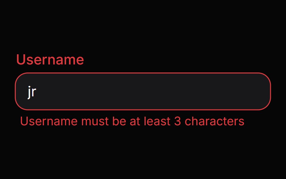 Field ErrorHeroUI · ReactDisplays validation error message content with smooth animations.
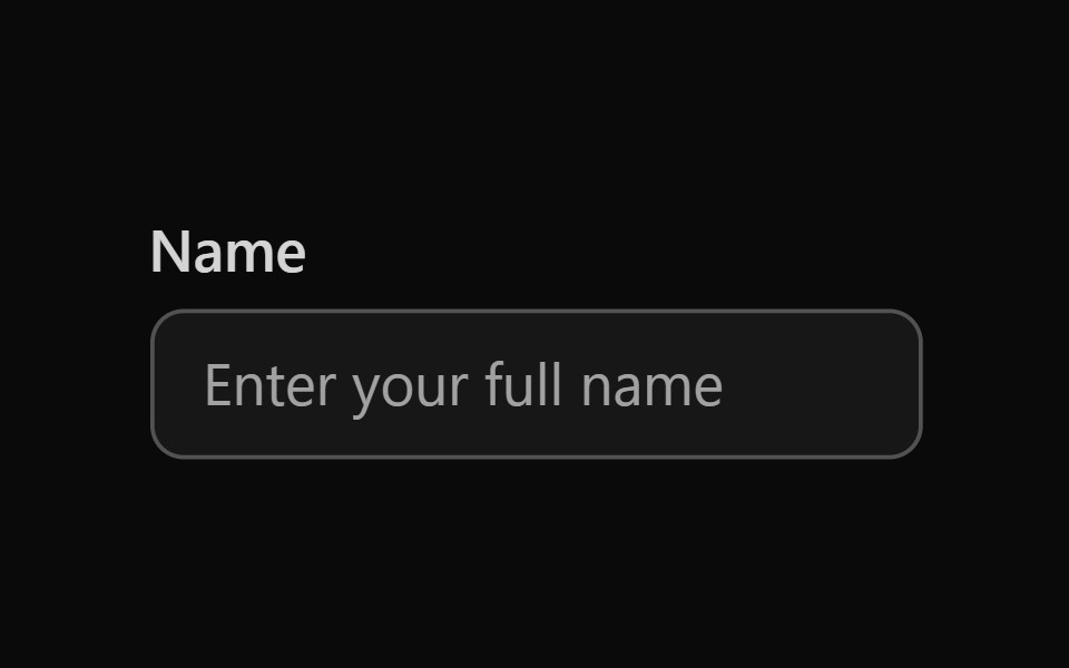 Tailwind Text FieldReact Spectrum · React
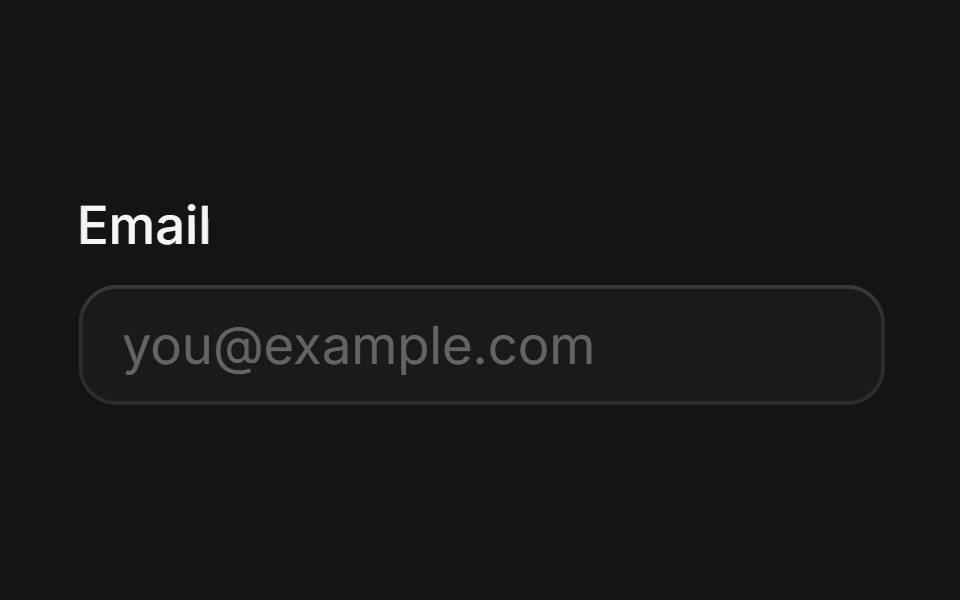 Labelcoss ui · ReactRenders an accessible label associated with controls.
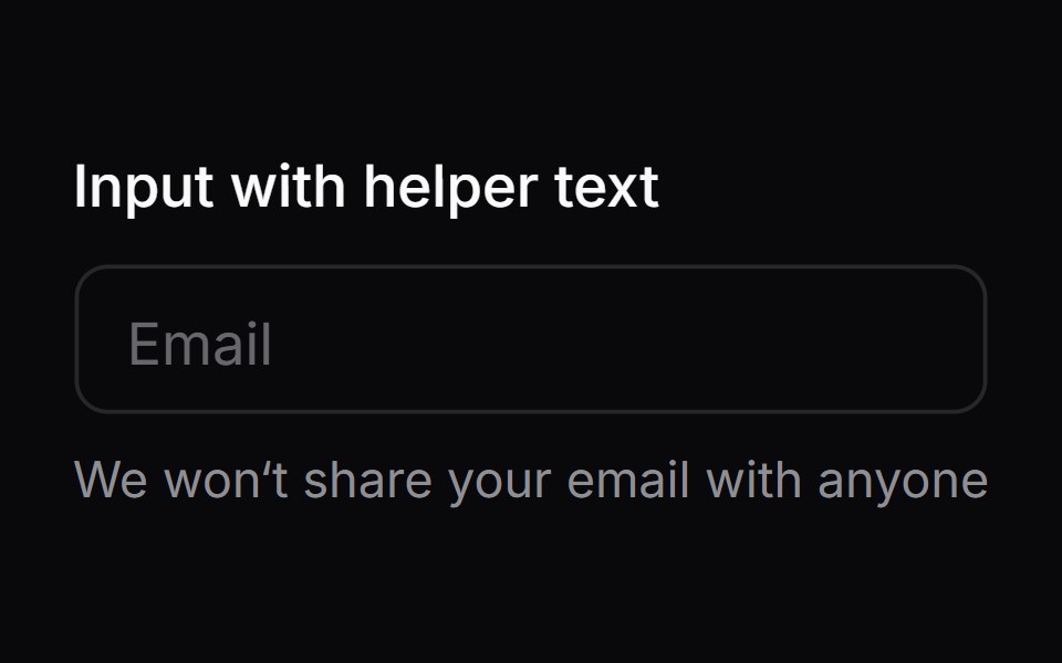 Comp 03Origin UI · React
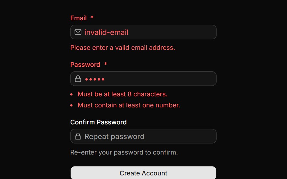 Form with validation errorsReUI · ReactForm with validation errors
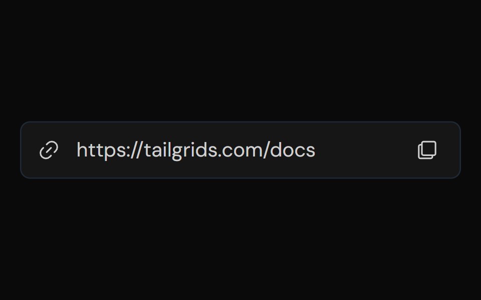 Input GroupTailGrids · ReactA flexible and accessible input group component that allows you to combine multiple input elements, such as text…
 LabelVengeance UI · React
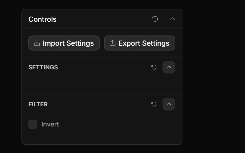 Checkbox ControlToolcraft · React
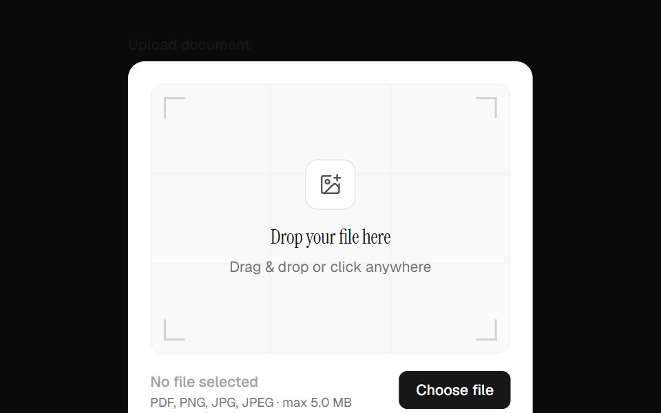 File Upload Field InputOpenSourceUI · React
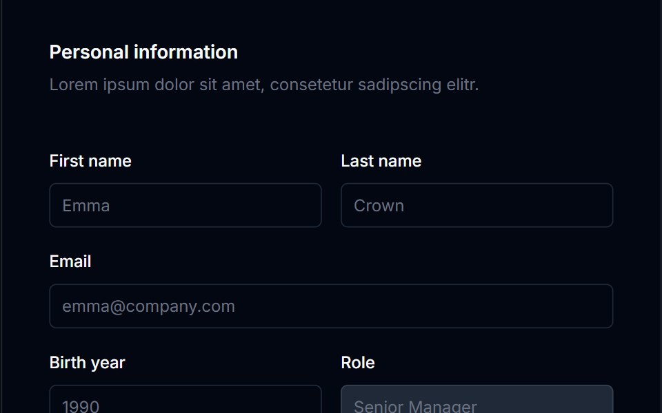 Form Layout 03Tremor Blocks · React
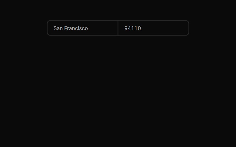 Input Groups 03Oxbow UI · Astro
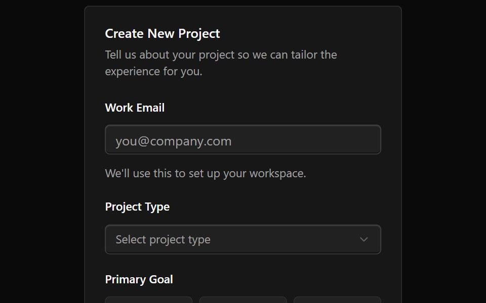 Form 10Watermelon UI · React
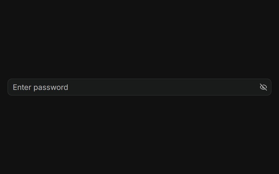 With Addon in the endFLX UI · ReactPassword input with a trailing eye-off icon to indicate visibility toggle.
 Code Snippet With Language Selectorsv-particles · Svelte
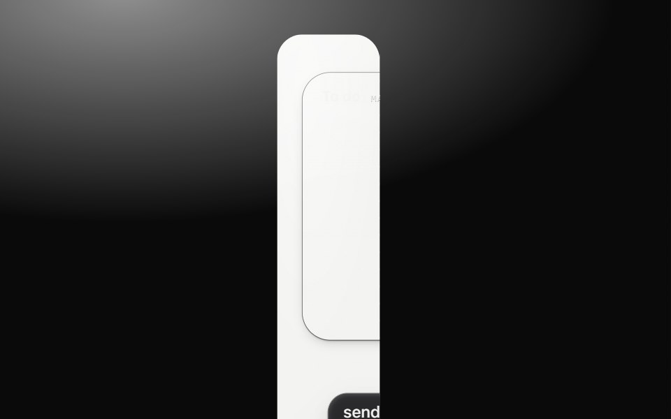 Spatial fieldMetal UI · React + SwiftUIOne quiet, content-aware dot field for a Place. It yields to object footprints and reinforces the host-selected Region…
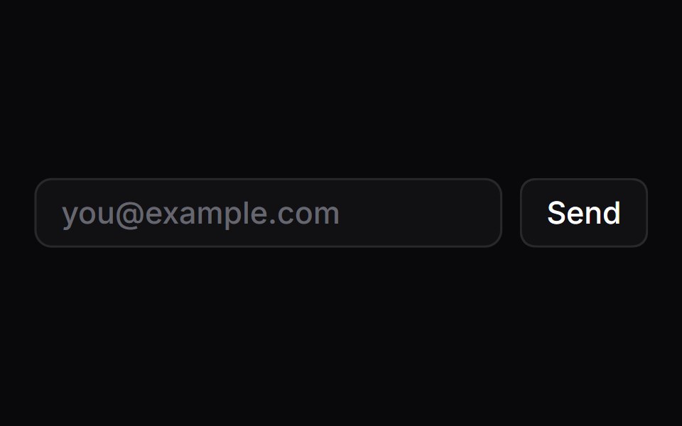 LabelSpaceUI · ReactProvides an accessible text caption for form controls that focuses the corresponding input when clicked.
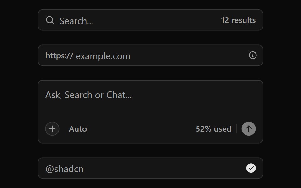 Input GroupOUI · ReactReact aria components Group with shadcn characteristics.
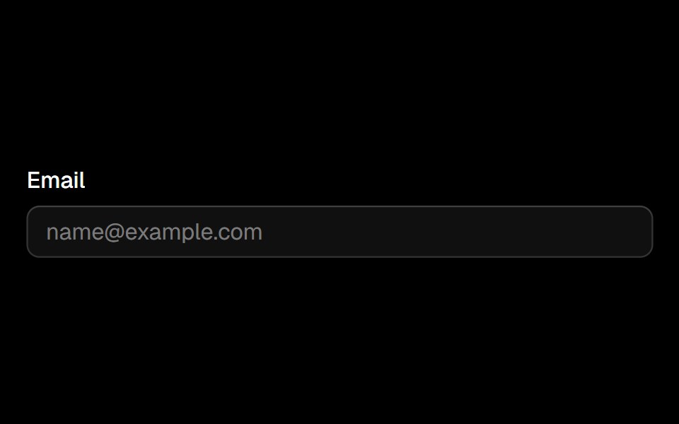 Labelark-cn · ReactA shadcn-style label component built with Ark UI primitives.
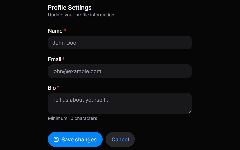 FieldsetHeroUI · ReactGroup related form controls with legends, descriptions, and actions
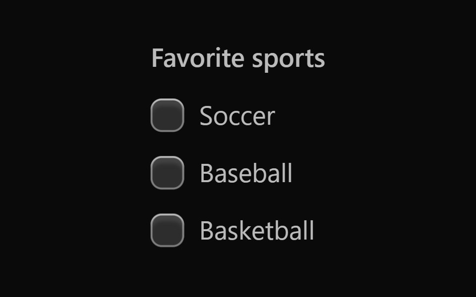 Vanilla Checkbox GroupReact Spectrum · React
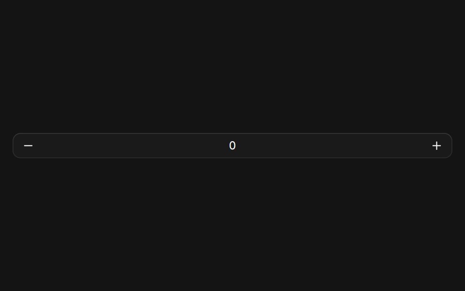 Number Fieldcoss ui · ReactA numeric input element with increment and decrement buttons, and a scrub area.
Libraries with Tailwind CSS form field components
Related categories
- Form Field Components
- React Form Field Components
- Svelte Form Field Components
- Animated Form Field Components
- shadcn/ui Form Field Components
- Tailwind CSS Input Components
- Tailwind CSS Text Input Components
- Tailwind CSS Select Components
- Tailwind CSS Form Components
- Tailwind CSS Textarea Components
- Tailwind CSS Checkbox Components
- Tailwind CSS Switch Components
- Tailwind CSS Slider Components
- Tailwind CSS Radio Components
- Tailwind CSS Combobox Components
- Tailwind CSS File Upload Components
- Tailwind CSS Search Input Components
- Tailwind CSS Date Picker Components
- Tailwind CSS Login Form Components
- Tailwind CSS Color Picker Components
- Tailwind CSS OTP Input Components