 Dev Design Library
shadcn/ui Form Field Components
Dev Design Library indexes 114 shadcn/ui form field components from 15 open-source UI libraries, with the most coming from FLX UI, sv-particles, Watermelon UI, Vengeance UI and ObsidianUI. Each one links to its page with the source code, a live preview where available, the library license and the install command. They follow the shadcn/ui conventions, so most install with the shadcn CLI and drop into a Tailwind project. Form field components belong to the Inputs group.
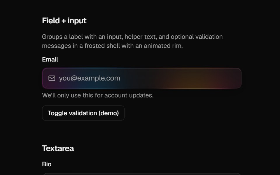 Halo FieldCult UI · ReactForm field layout (label, description, error) for HaloInput and HaloTextarea
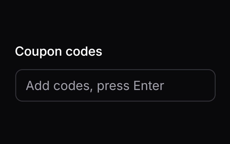 tag-fieldIntent UI · Reacttag-field
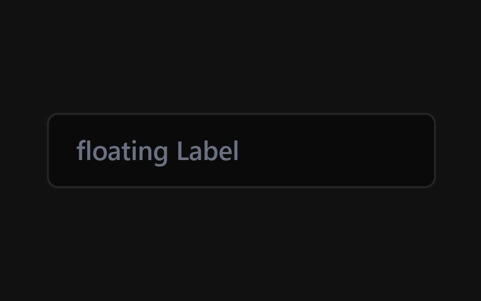 Floating Label InputSpectrum UI · Reactcomponent for the Floating Label Input
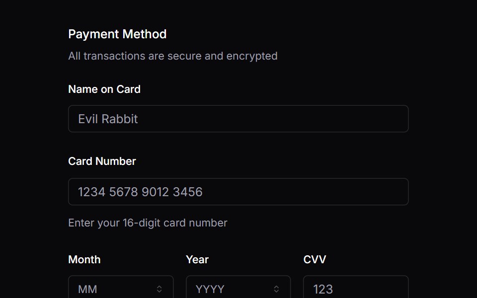 FieldVengeance UI · React
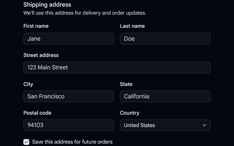 Field 04 - Shipping AddressShadcn Space · ReactA shipping address fieldset built with the Field primitive, combining responsive field orientation, inputs, a select…
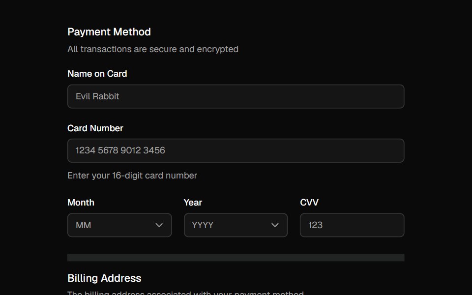 FieldShadcn Dashboard · React
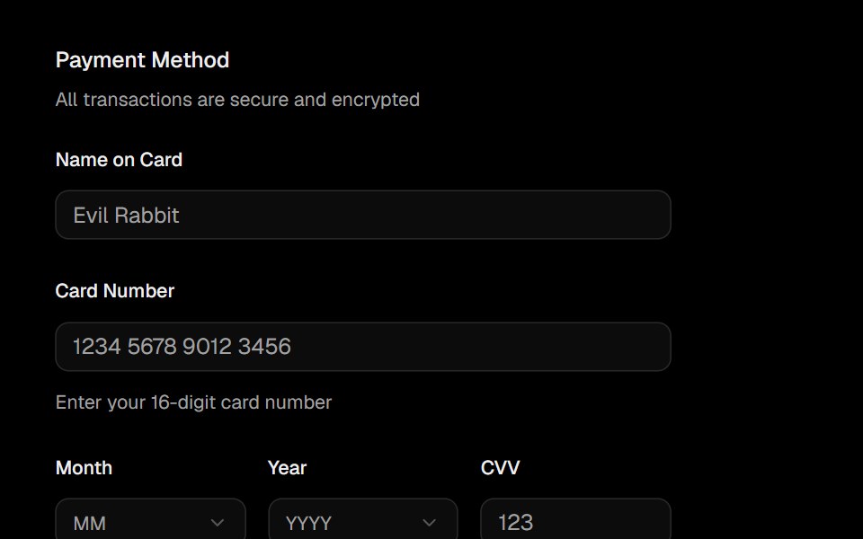 FieldObsidianUI · React
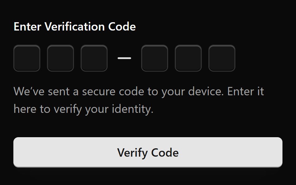 Form 1Watermelon UI · React
 Input Groupglasscn · React
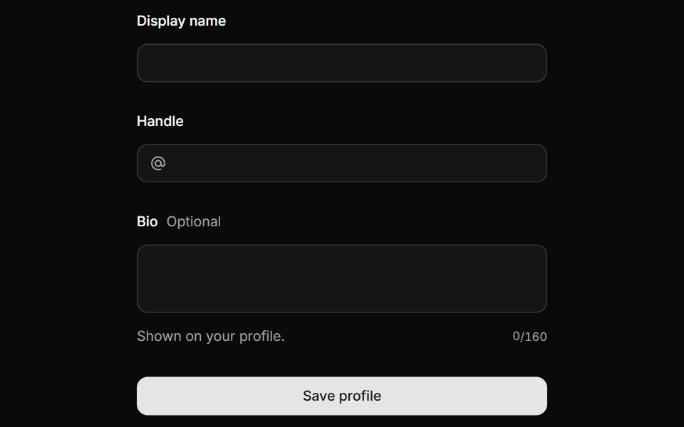 FieldHextaUI · ReactLabels, descriptions and errors wired to their control, with validation states and layouts for forms.
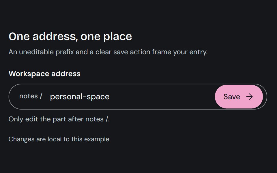 Input GroupCojeev UI · ReactCombines a text control with adjacent prefixes, suffixes, or actions in one input surface.
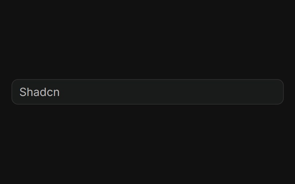 BasicFLX UI · ReactPlain text input with a placeholder, no addons.
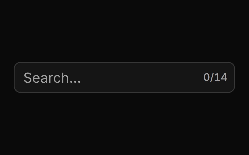 With Character Countsv-particles · SvelteForm field that shows the number of characters typed out of the maximum.
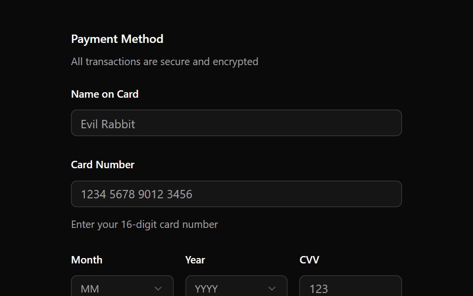 FieldOUI · ReactShadcn Field with react aria components characteristics.
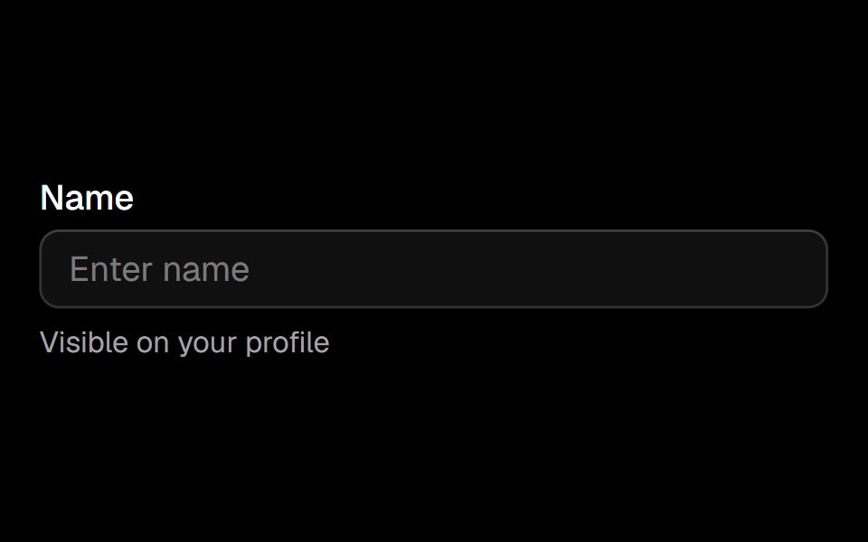 Fieldark-cn · ReactA shadcn-style field component built with Ark UI primitives.
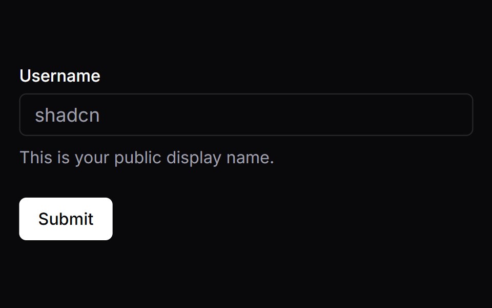 FormVengeance UI · React
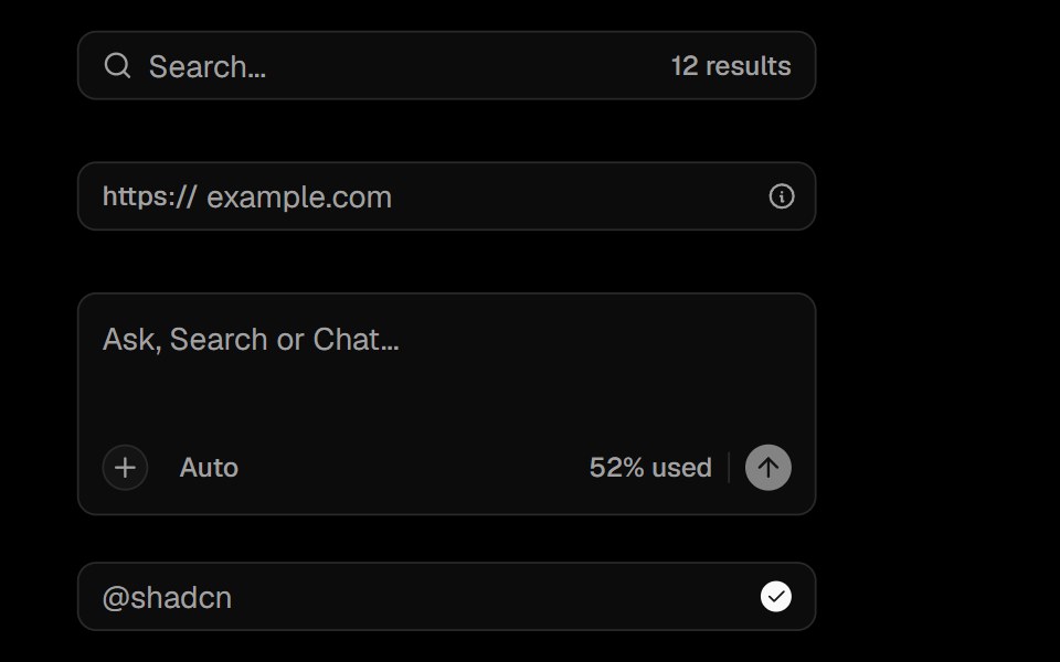 Input GroupObsidianUI · React
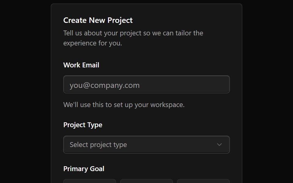 Form 10Watermelon UI · React
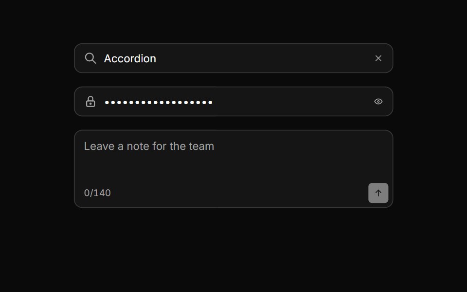 Input groupHextaUI · ReactAn input with icons, text, buttons or a keyboard hint attached, sharing one border and focus ring.
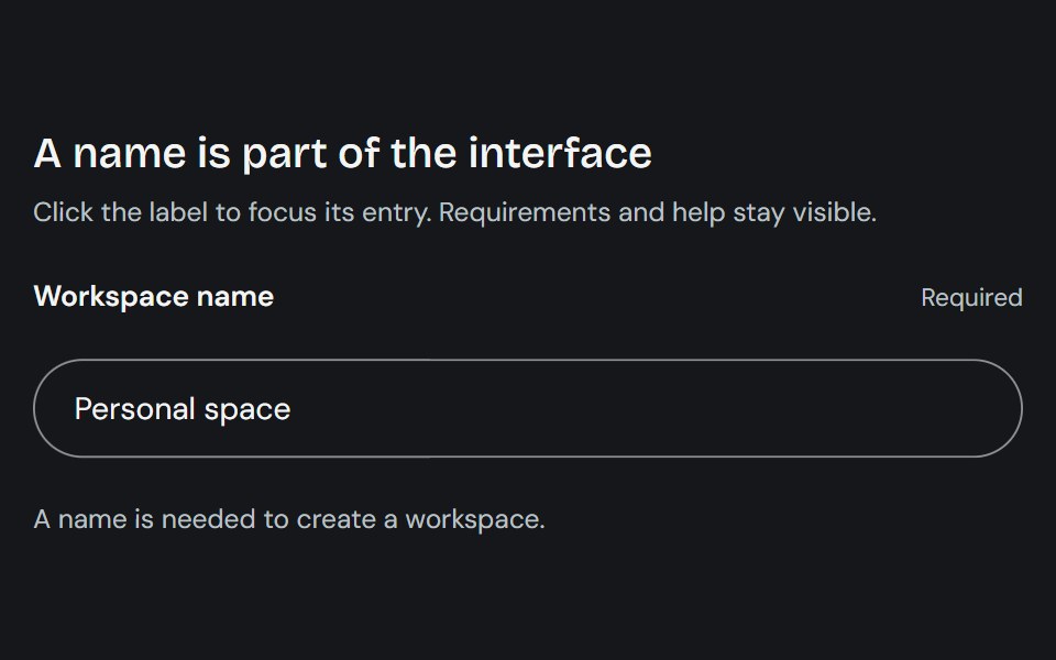 LabelCojeev UI · ReactProvides a native form label plus compact stat-label primitives for named values.
 With AddonFLX UI · ReactInput with trailing search icon addon.
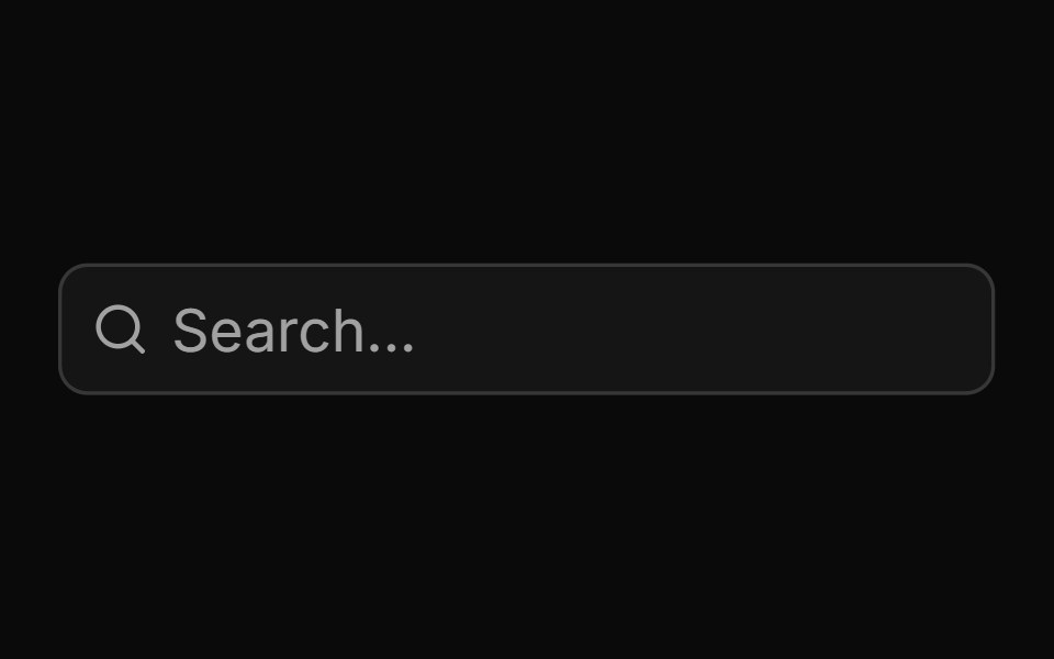 Basic Input Groupsv-particles · Svelte
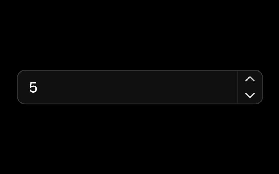 Number Fieldark-cn · ReactA shadcn-style number field component built with Ark UI primitives.
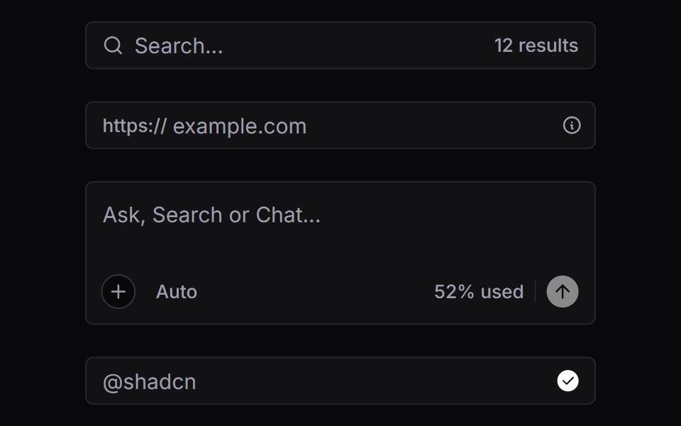 Input GroupVengeance UI · React
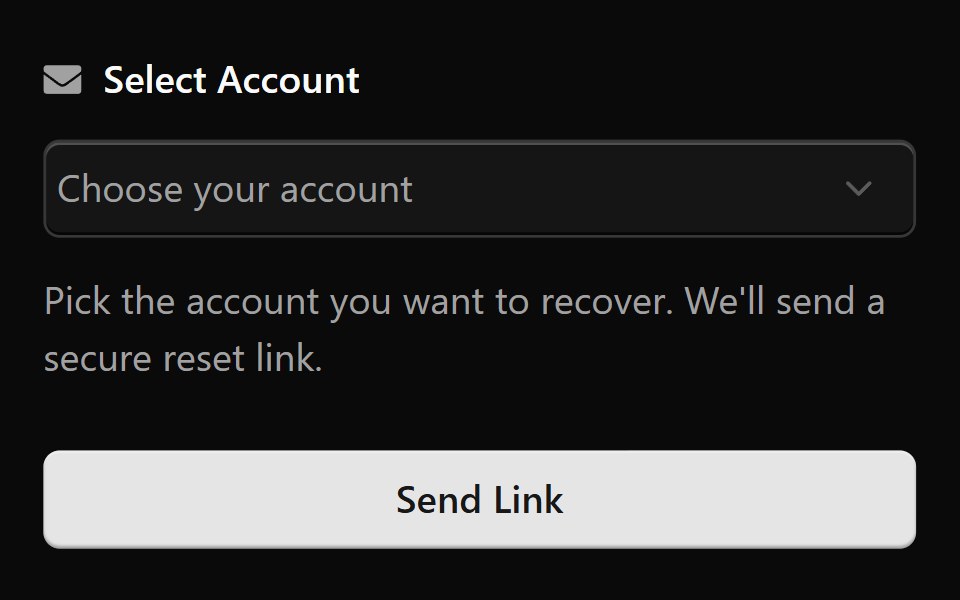 Form 2Watermelon UI · React
 DisabledFLX UI · ReactText input rendered in a disabled, non-interactive state.
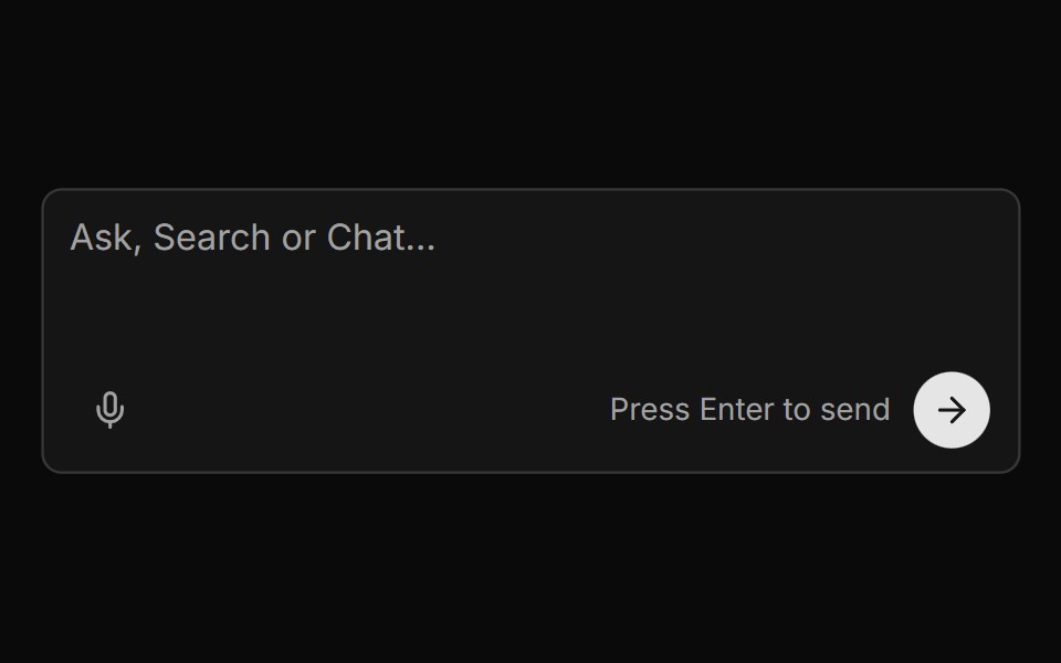 Chat Input With Voice And Send Buttonsv-particles · Svelte
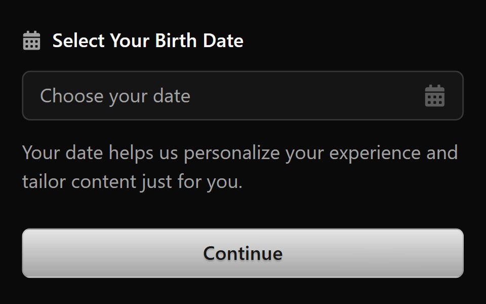 Form 3Watermelon UI · React
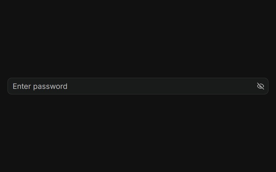 With Addon in the endFLX UI · ReactPassword input with a trailing eye-off icon to indicate visibility toggle.
 Code Snippet With Language Selectorsv-particles · Svelte
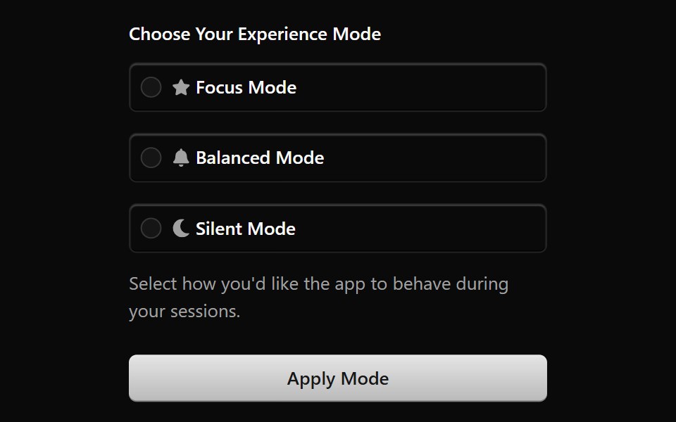 Form 4Watermelon UI · React
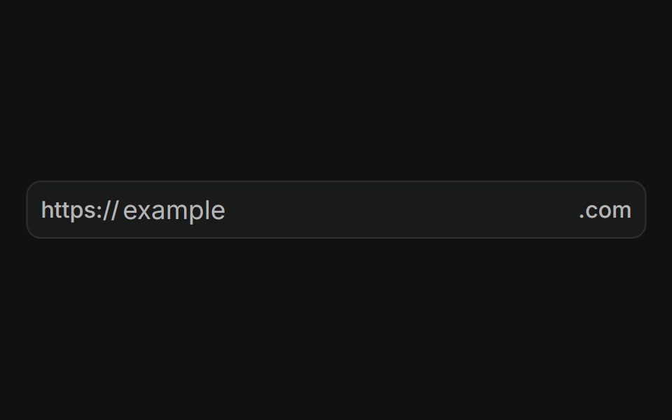 With prefix and suffixFLX UI · ReactURL input with a fixed "https://" prefix and ".com" suffix text addons.
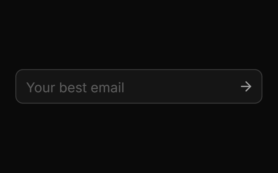 Disabledsv-particles · Svelte
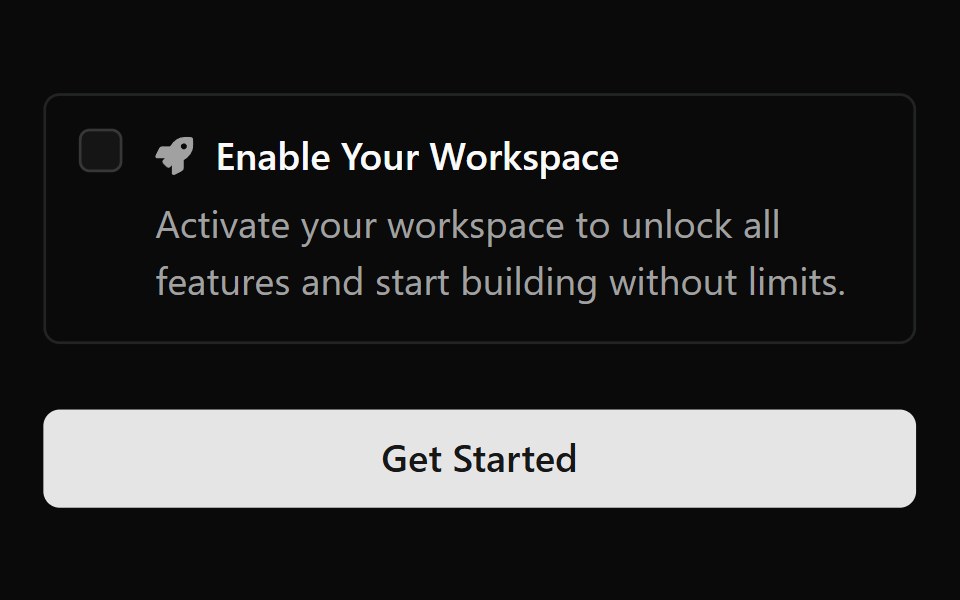 Form 5Watermelon UI · React
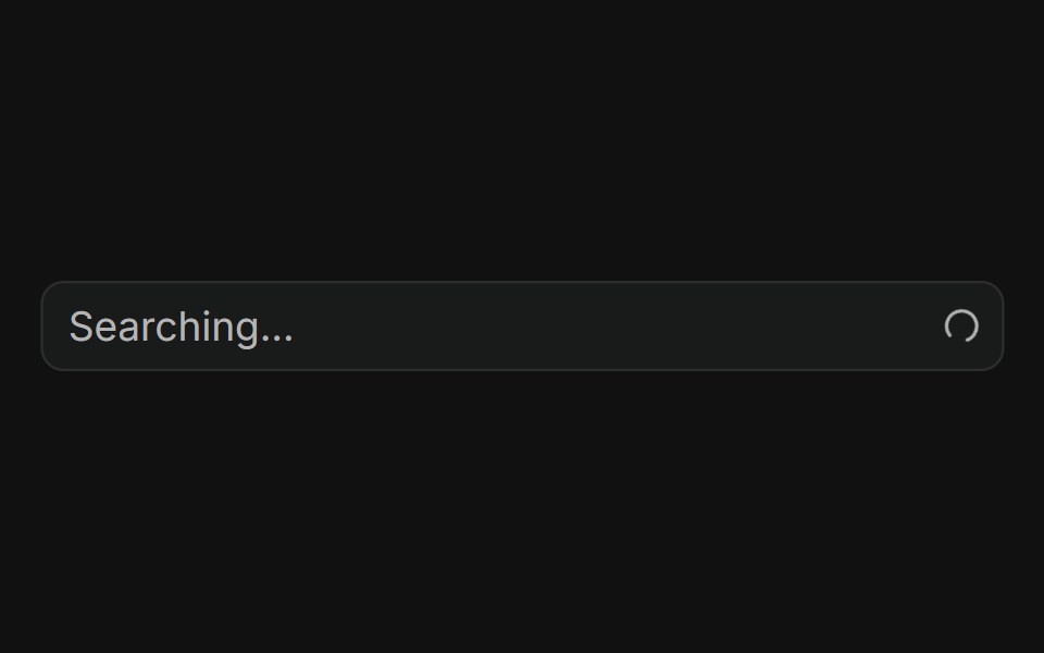 With loading spinnerFLX UI · ReactSpinning loader in the trailing addon while searching.
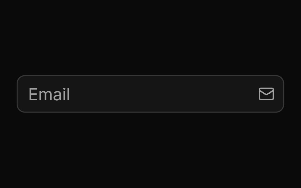 End Iconsv-particles · Svelte
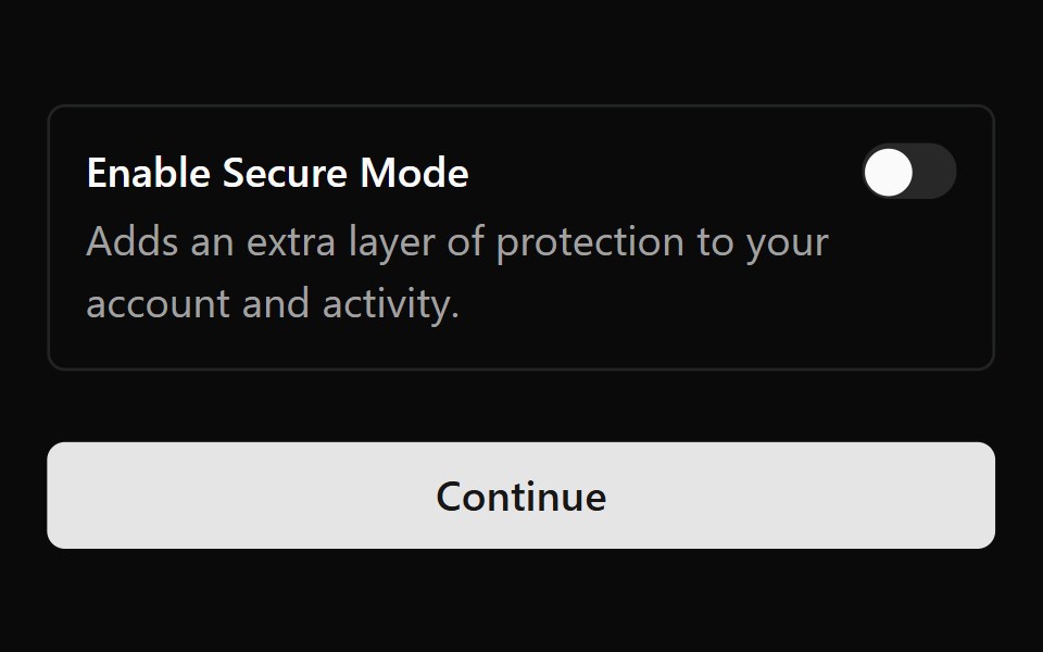 Form 6Watermelon UI · React
 With clear buttonFLX UI · ReactClear button appears in the trailing addon when the field has text.
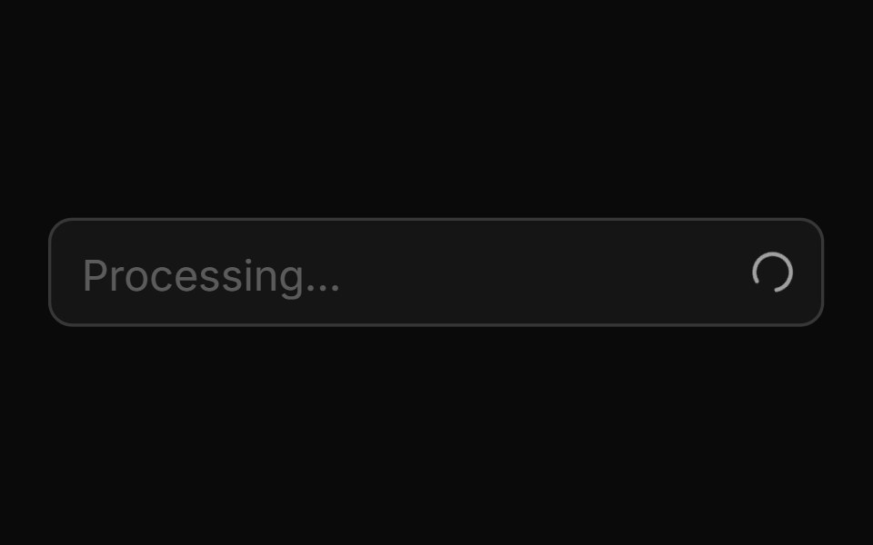 End Loading Spinnersv-particles · Svelte
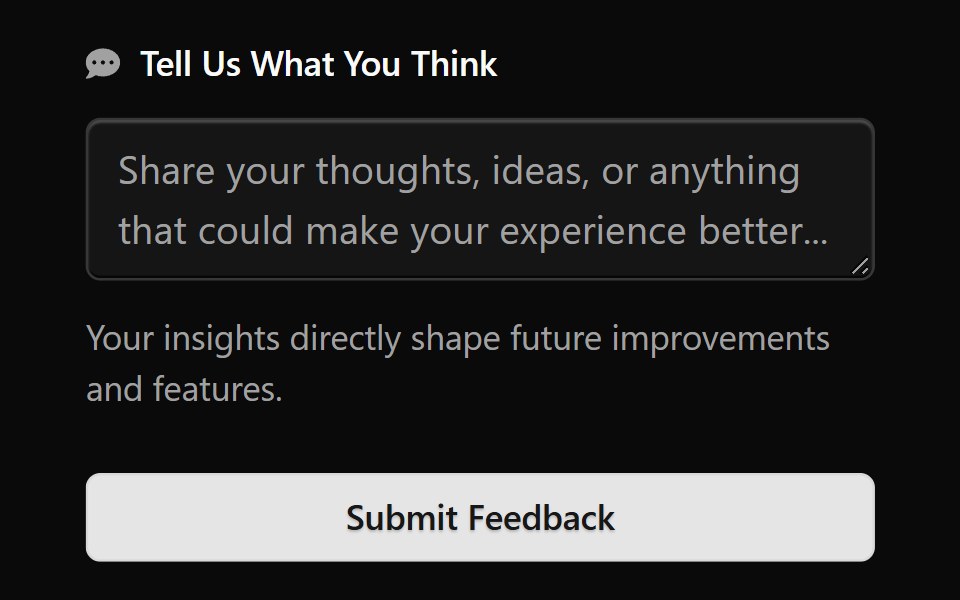 Form 7Watermelon UI · React
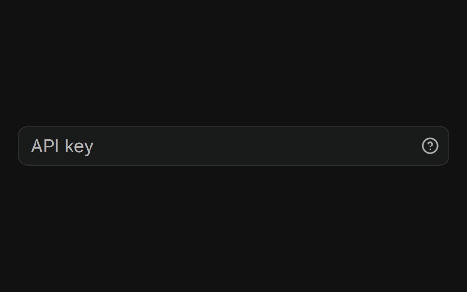 With tooltipFLX UI · ReactHelp icon in the trailing addon opens a tooltip on hover.
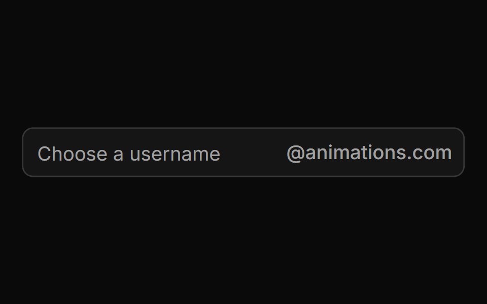 End Textsv-particles · Svelte
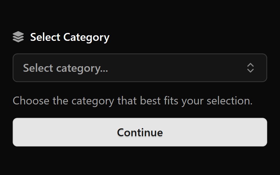 Form 8Watermelon UI · React
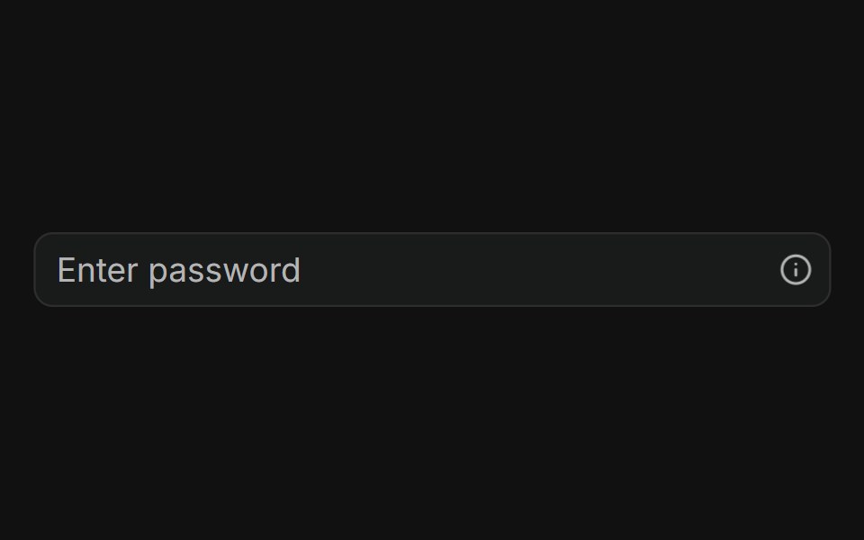 With popoverFLX UI · ReactInfo button in the trailing addon opens a popover with helper content.
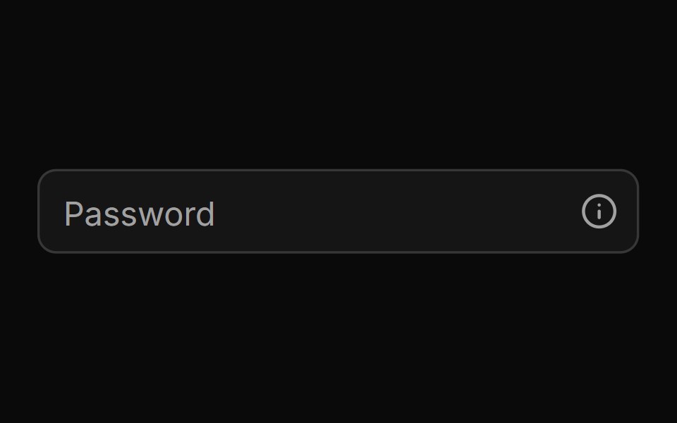 End Tooltipsv-particles · Svelte
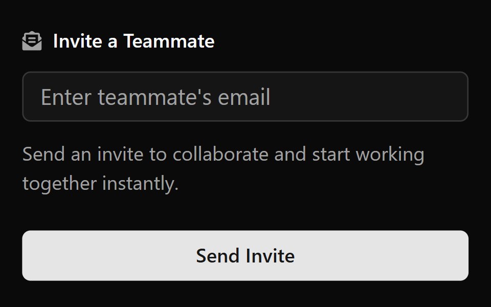 Form 9Watermelon UI · React
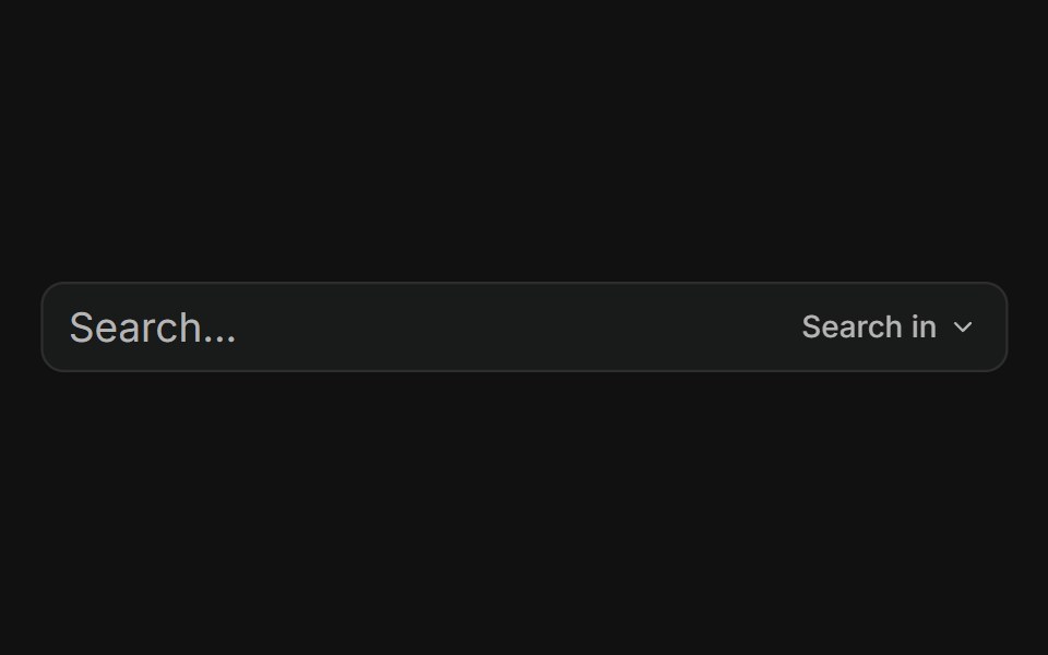 With dropdown menuFLX UI · ReactTrailing addon button opens a menu to choose search scope.
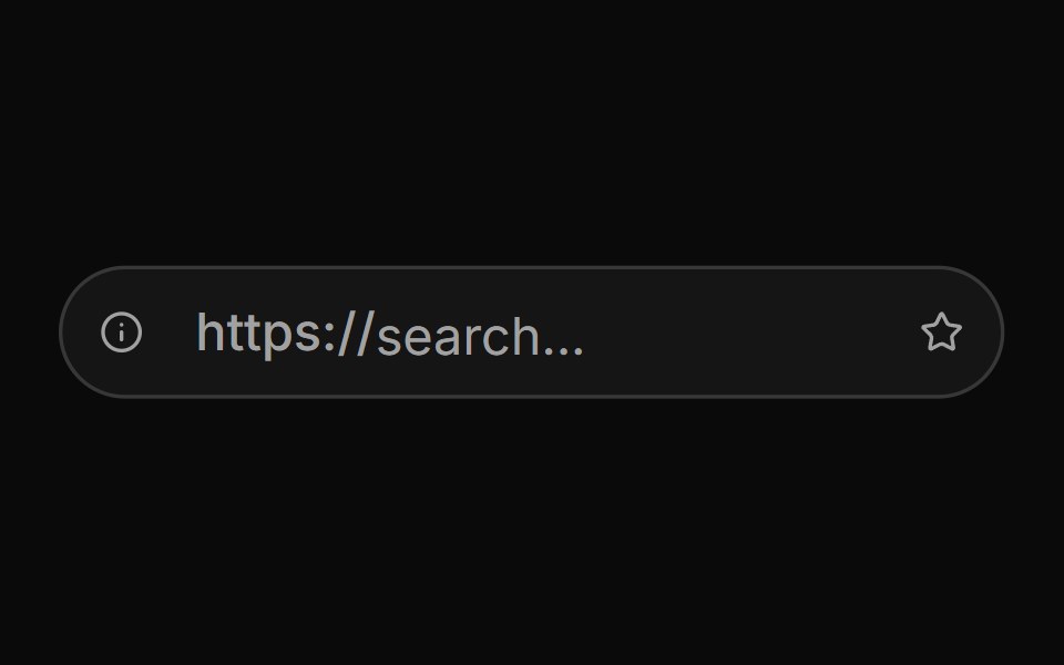 Input Group With Mimicking Url Barsv-particles · Svelte
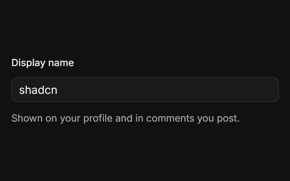 In FormFLX UI · ReactLabeled text input with a supporting description line below the field.
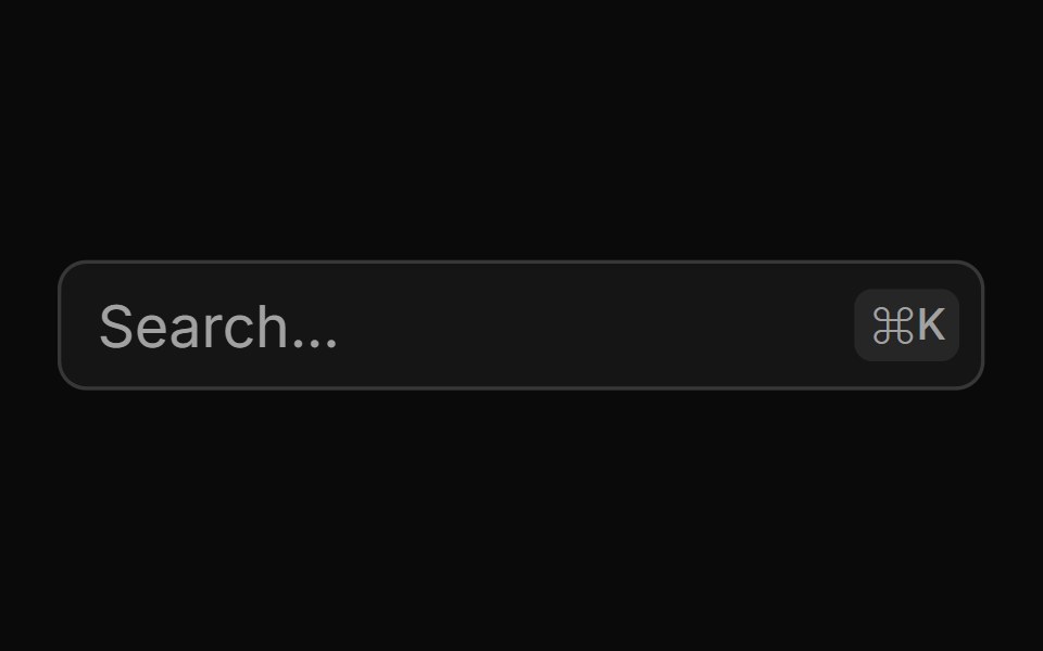 Keyboard Shortcutsv-particles · Svelte
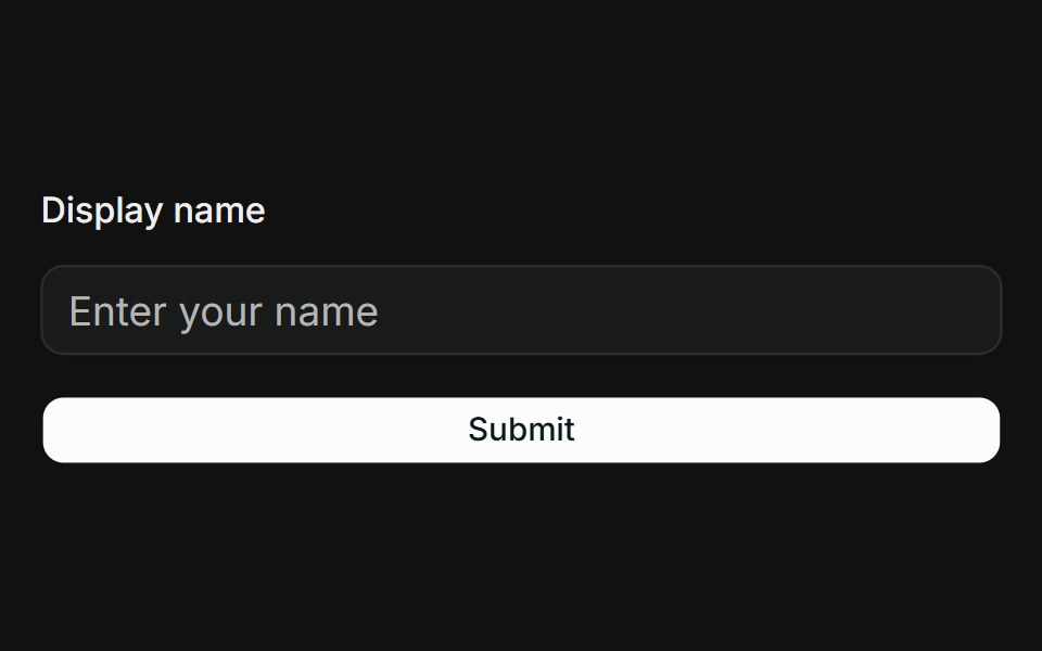 React Hook Form + ZodFLX UI · ReactController binds Input to RHF; Zod resolver drives FieldError on submit.
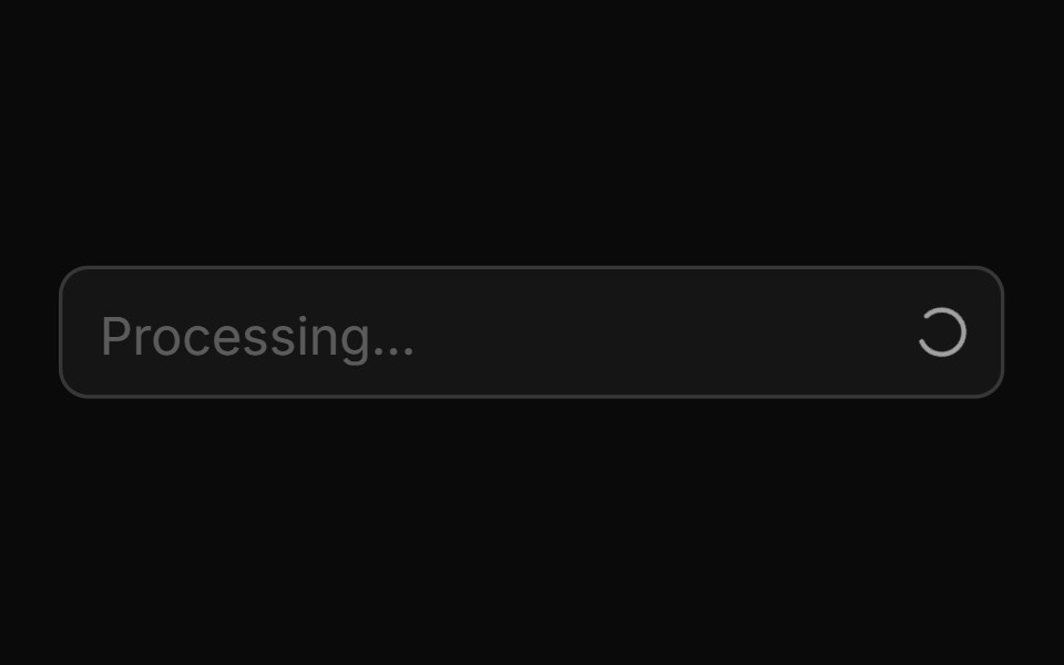 Loading Spinnersv-particles · Svelte
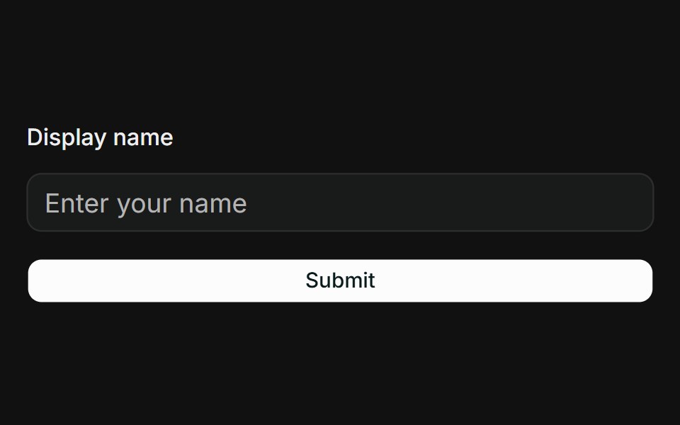 TanStack Form + ZodFLX UI · Reactform.Field wires Input; Zod onSubmit validator surfaces FieldError when touched.
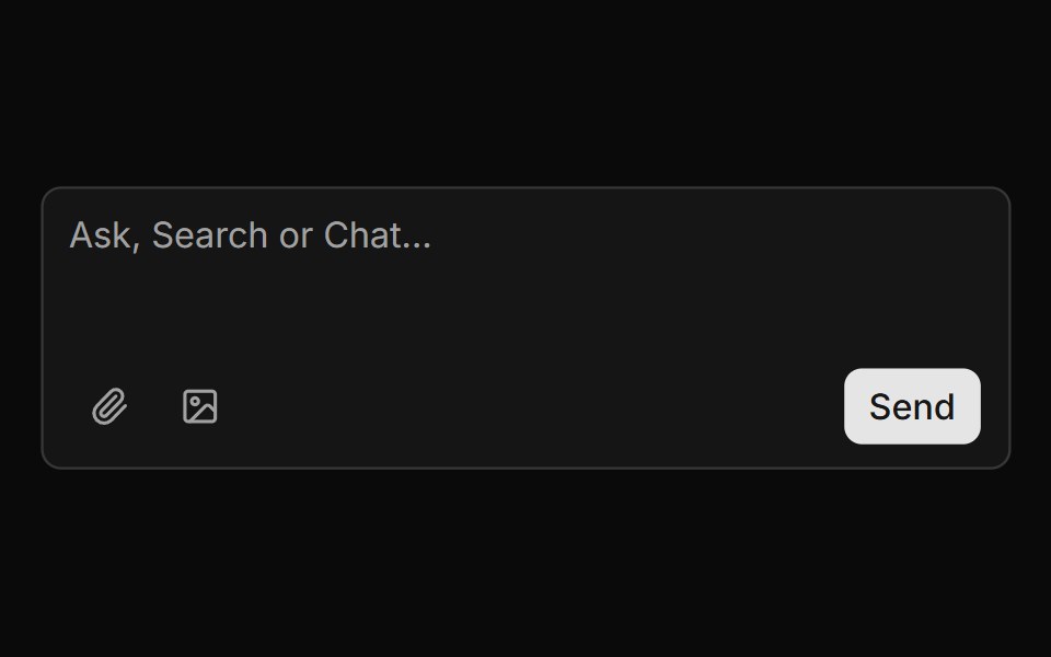 Message Composer With Attachmentssv-particles · Svelte
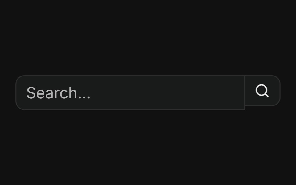 With search buttonFLX UI · ReactButtonGroup pairs a text input with a trailing search action button.
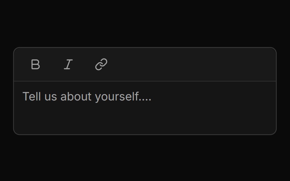 Mini Editor Group Togglesv-particles · Svelte
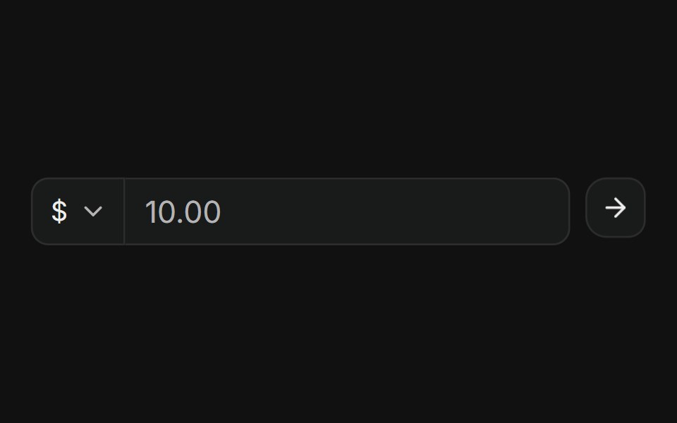 With currency selectFLX UI · ReactNested ButtonGroup: currency Select, amount input, and submit icon button.
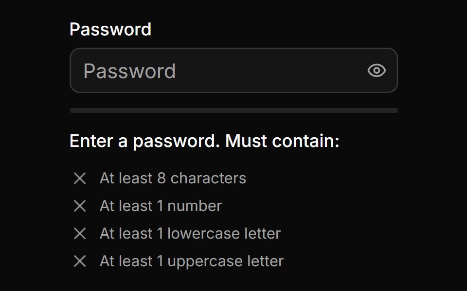 Password Input With Strength Inidicatorsv-particles · Svelte
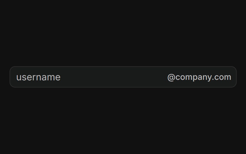 With email domainFLX UI · ReactUsername field with a fixed @company.com suffix addon, locking the email domain.
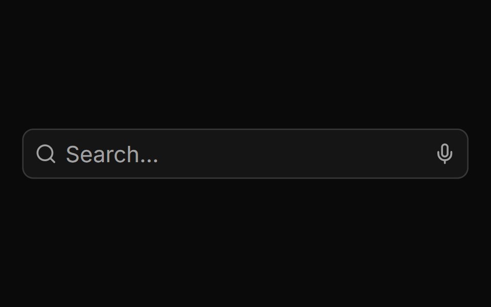 Search Input With Loader And Voicesv-particles · Svelte
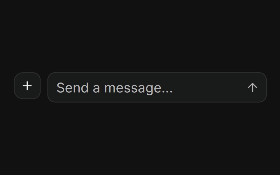 With nested input groupFLX UI · ReactAttach button plus InputGroup message field and send action in a ButtonGroup.
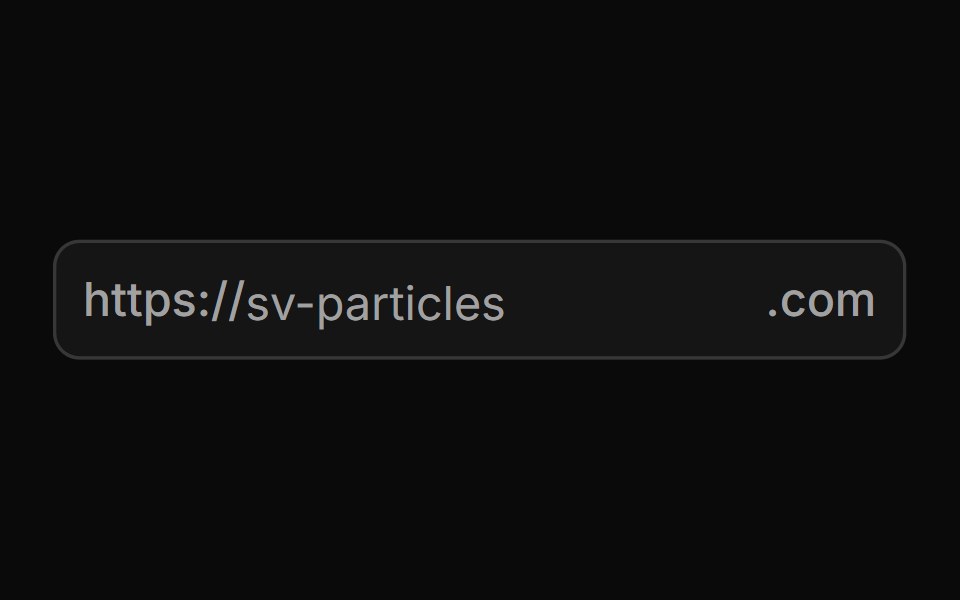 Start And End Textsv-particles · Svelte
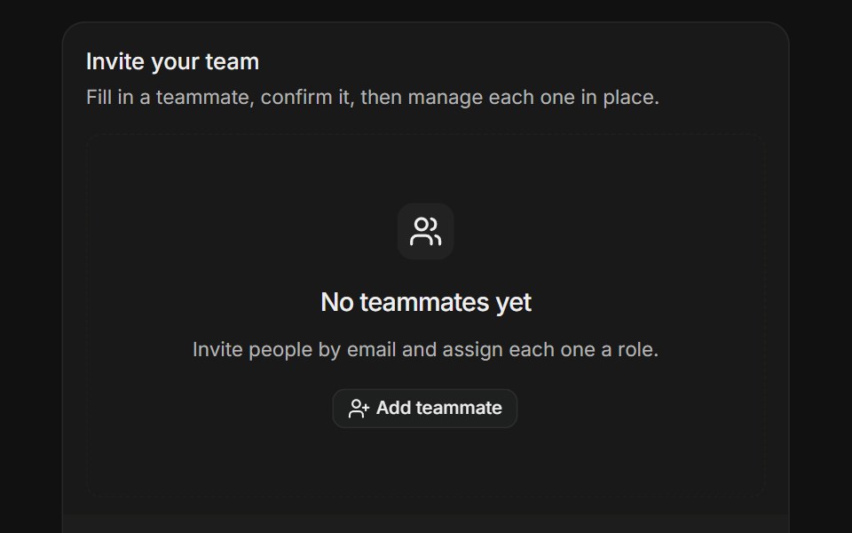 Dynamic Field ArrayFLX UI · ReactStart from an empty state, then add and remove teammate rows with per-item validation.
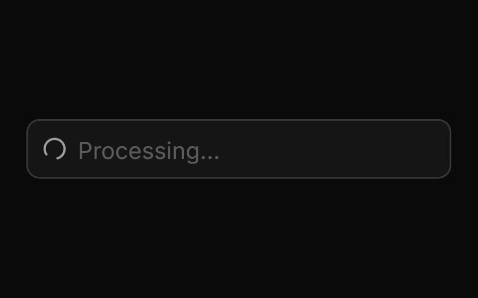 Start Loading Spinnersv-particles · Svelte
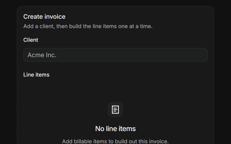 Form in a DialogFLX UI · ReactBuild an invoice while a dialog validates each line item against its own schema.
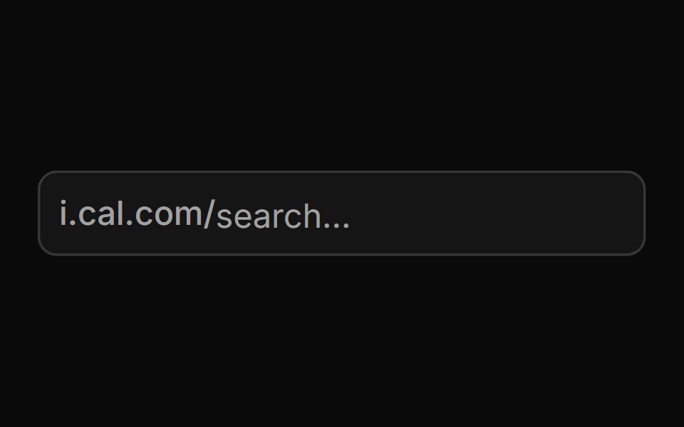 Start Textsv-particles · Svelte
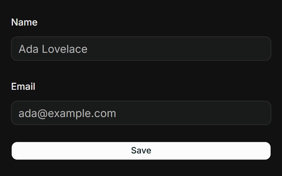 Text InputFLX UI · ReactNative text and email inputs bound with register and Zod validation.
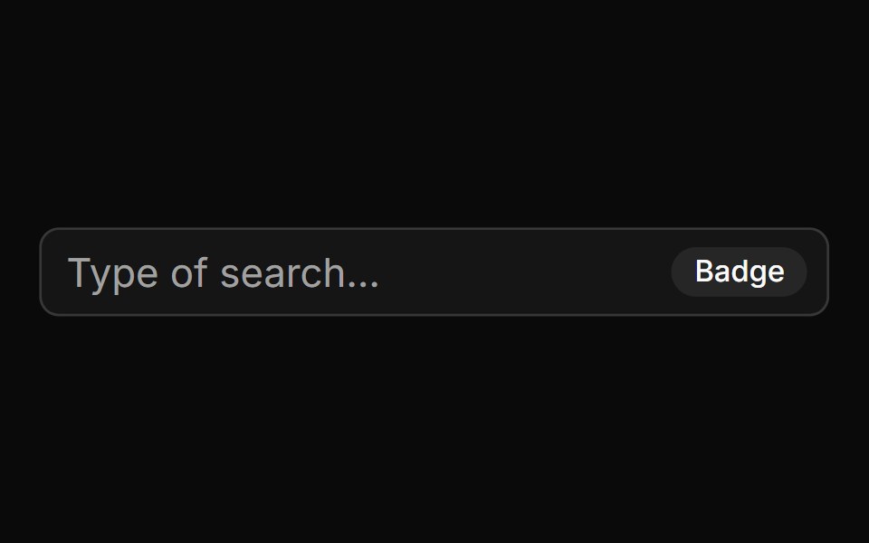 With Badgesv-particles · Svelte
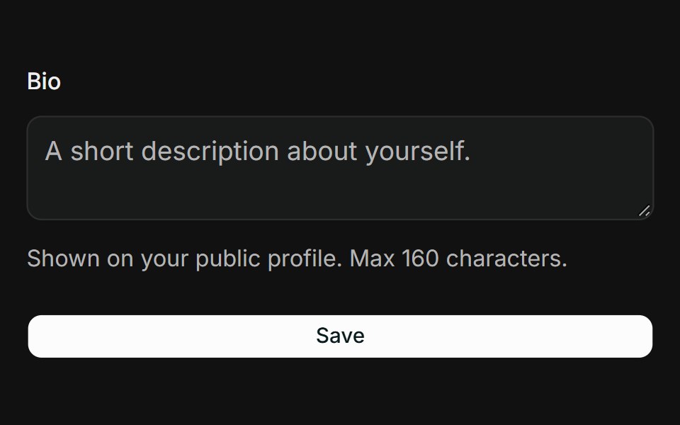 TextareaFLX UI · ReactMulti-line textarea with a description and length-constrained Zod rule.
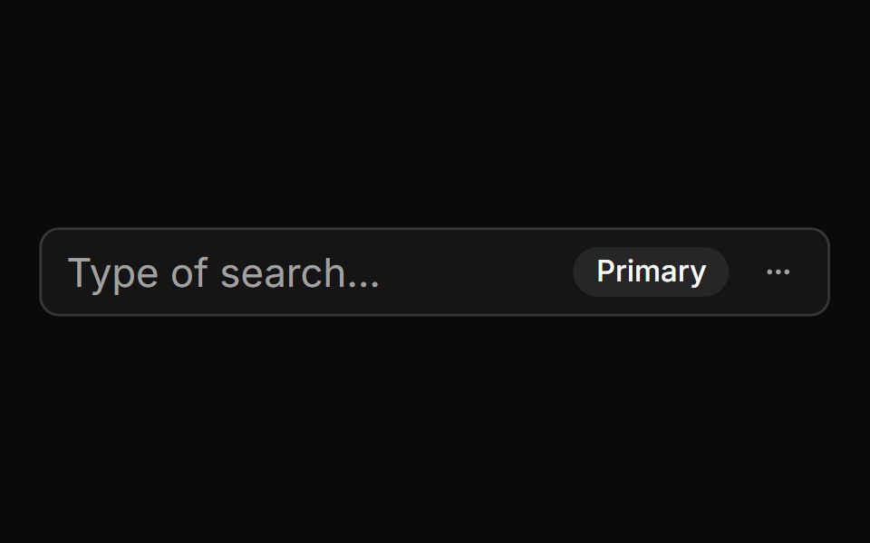 With Badge And Menusv-particles · Svelte
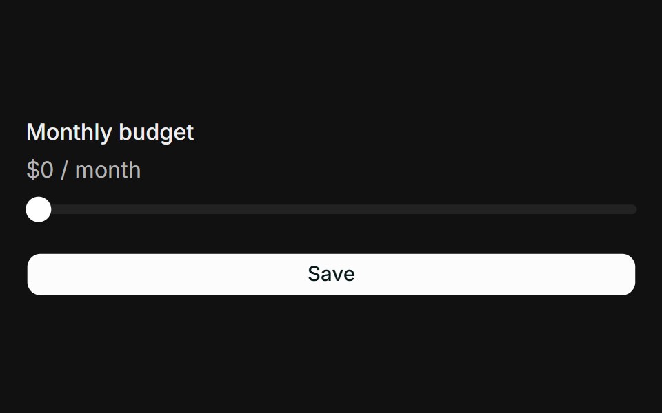 SliderFLX UI · ReactNumeric slider bound via Controller, validated against a Zod range.
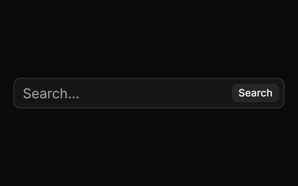 With Buttonsv-particles · Svelte
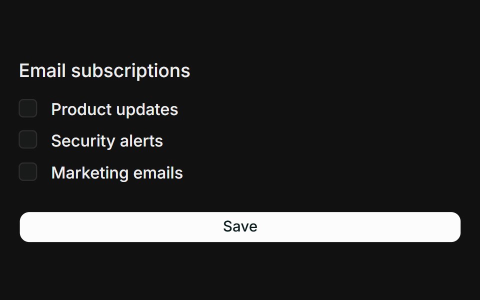 Checkbox GroupFLX UI · ReactMultiple checkboxes collected into a string array with a min-selection rule.
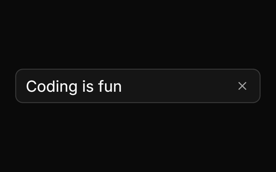 With Clear Buttonsv-particles · Svelte
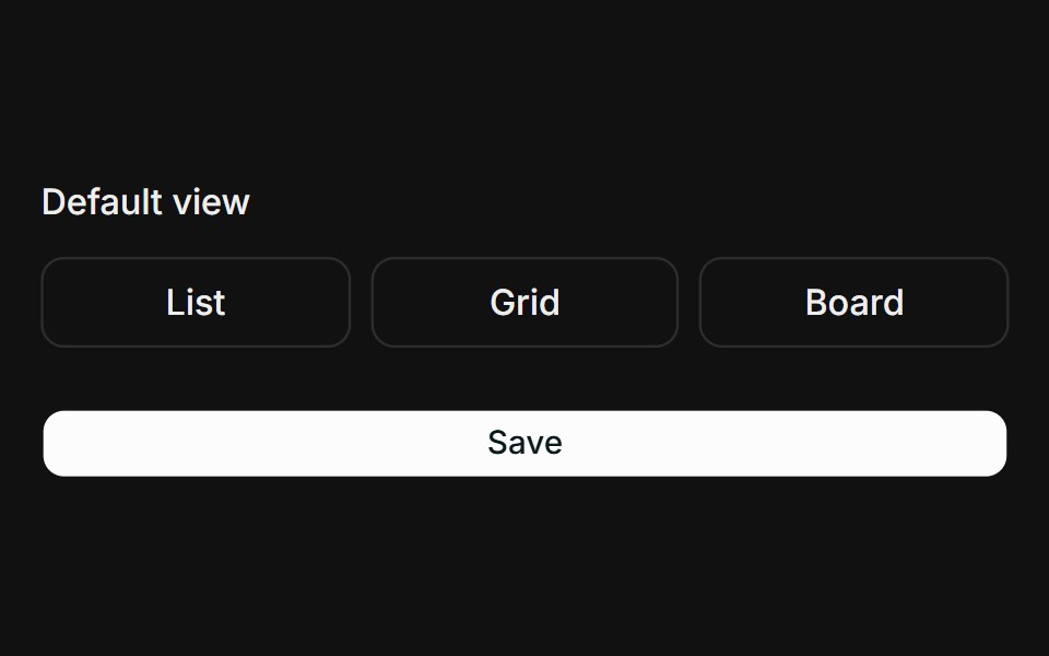 Toggle GroupFLX UI · ReactSingle-select toggle group bound via Controller with Zod validation.
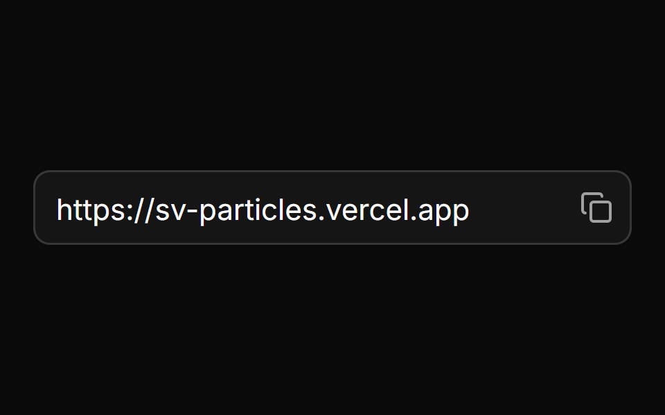 With Icon Buttonsv-particles · Svelte
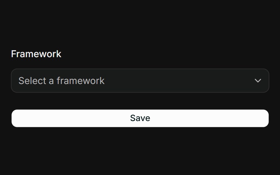 SelectFLX UI · ReactGrouped select with labelled option groups bound via Controller.
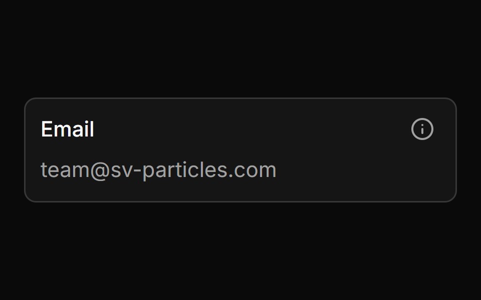 With Inner Labelsv-particles · Svelte
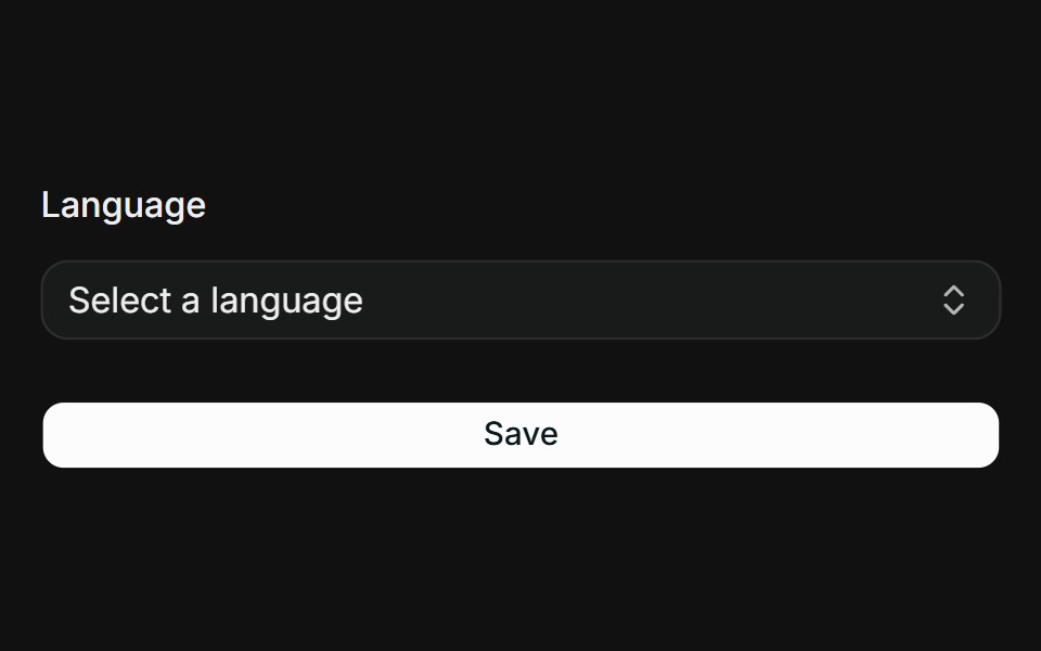 CommandFLX UI · ReactSearchable combobox using Command inside a Popover, bound via Controller.
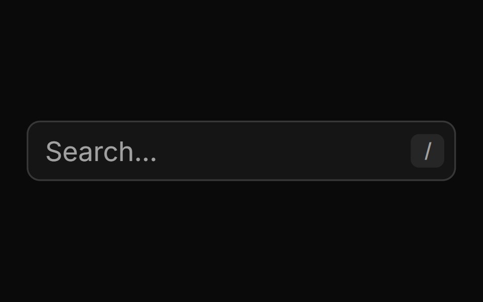 With Keyboard Shortcut Searchsv-particles · Svelte
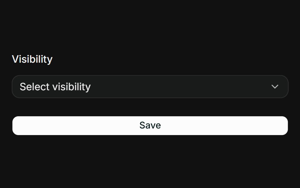 DropdownFLX UI · ReactSingle choice via a dropdown menu radio group bound through Controller.
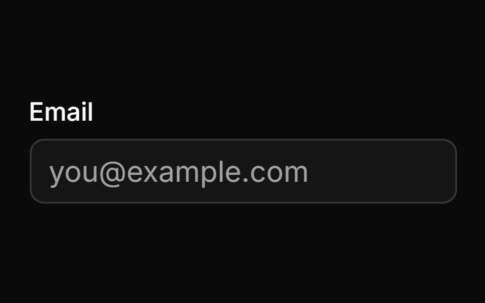 With Labelsv-particles · Svelte
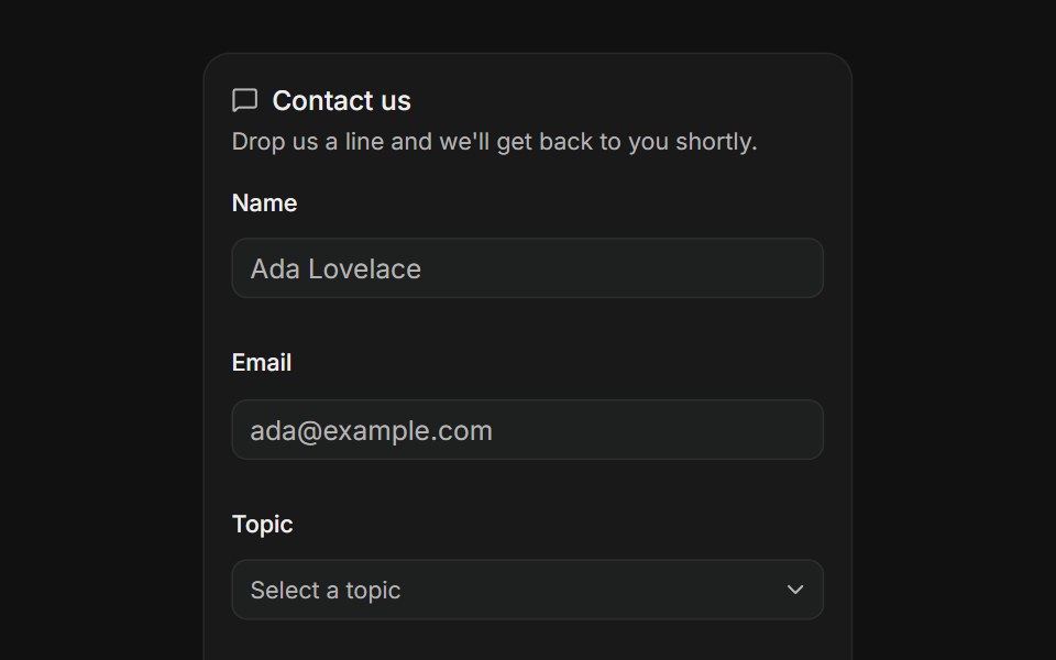 Contact FormFLX UI · ReactName, email, topic and message validated on submit.
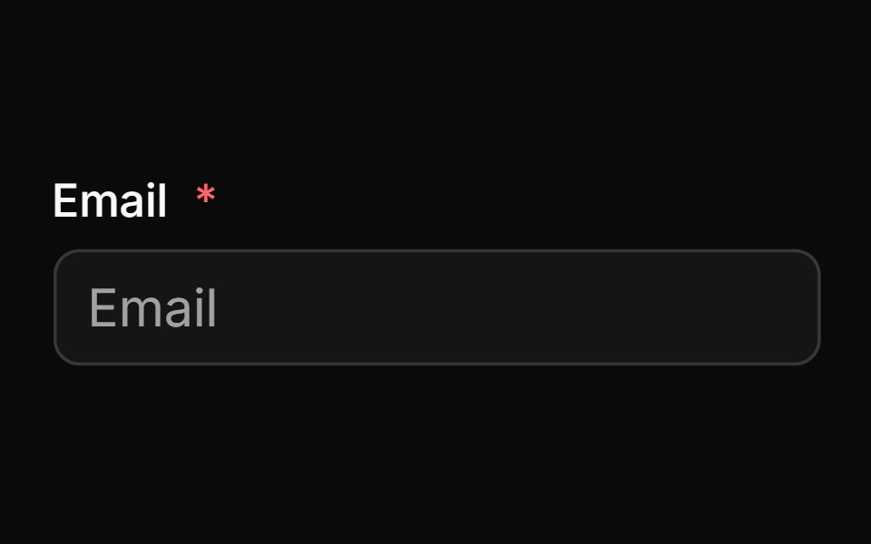 With Label And Required Indicatorsv-particles · Svelte
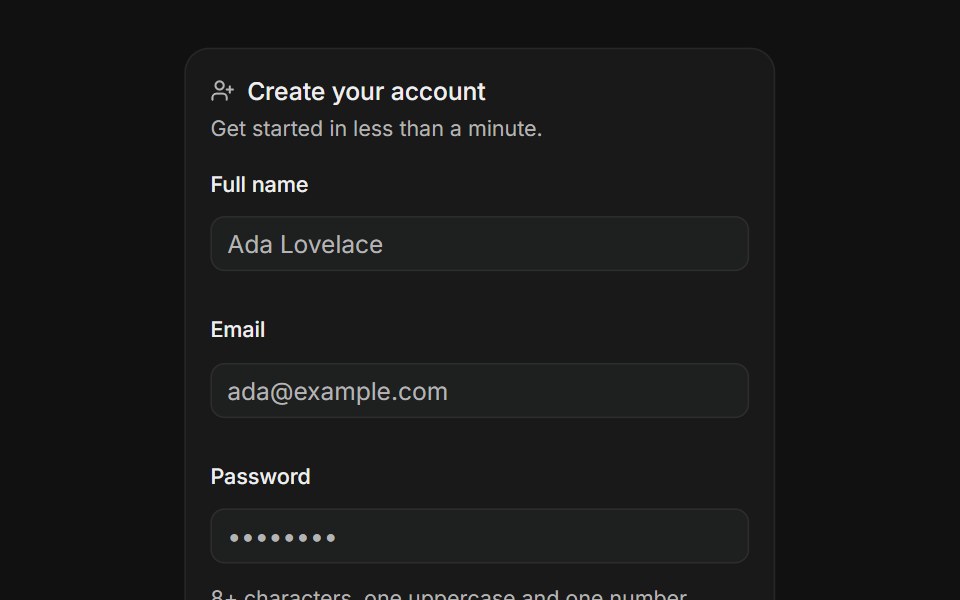 Create AccountFLX UI · ReactSign up with name, email, a strong password and terms.
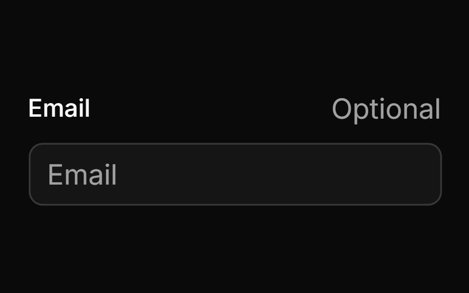 With Optional Labelsv-particles · Svelte
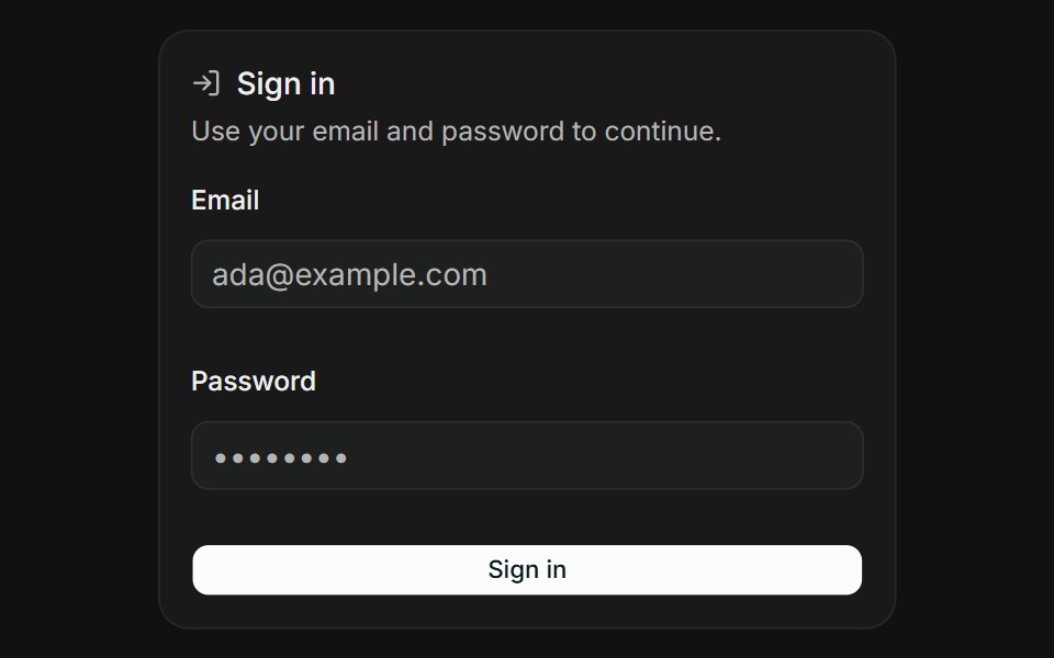 Sign InFLX UI · ReactEmail and password validated on submit.
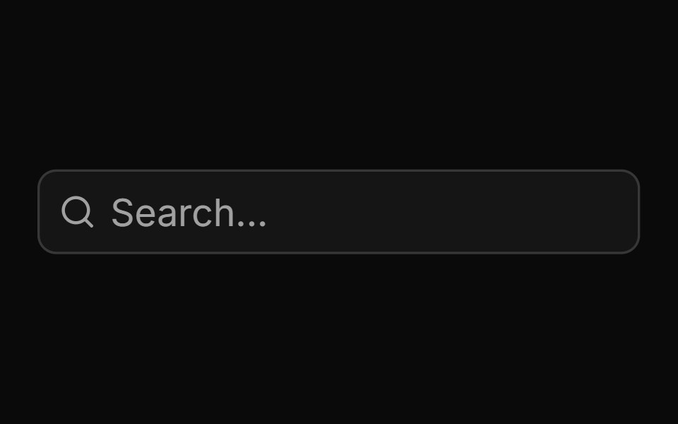 With Searchsv-particles · Svelte
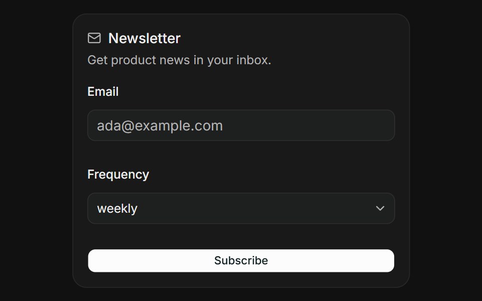 NewsletterFLX UI · ReactSubscribe with an email and a delivery frequency.
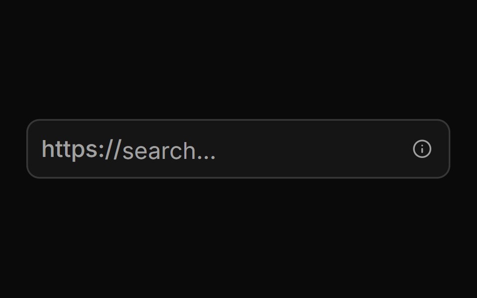 With Start Text End Tooltipsv-particles · Svelte
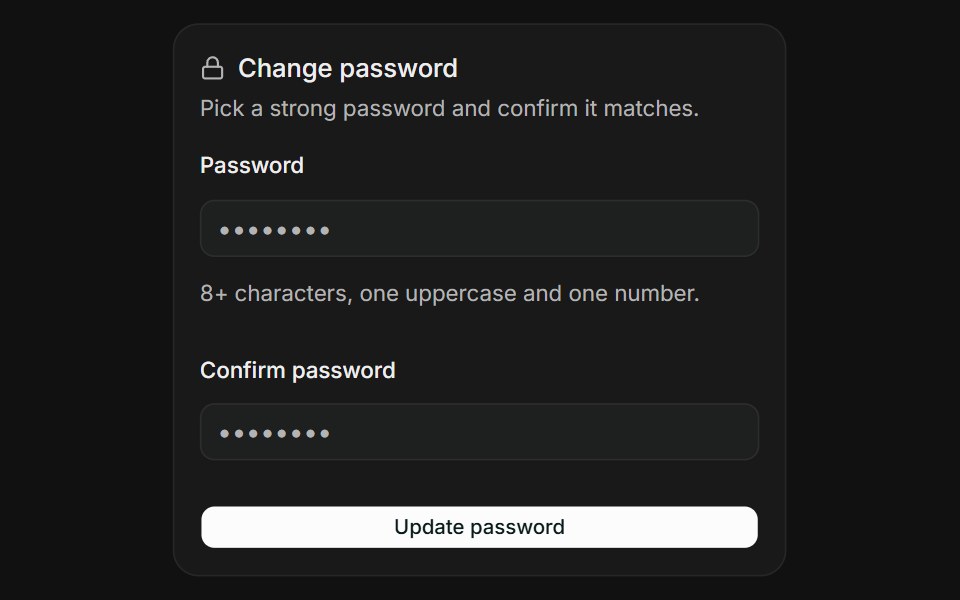 Password ConfirmationFLX UI · ReactPick a strong password and confirm it matches.
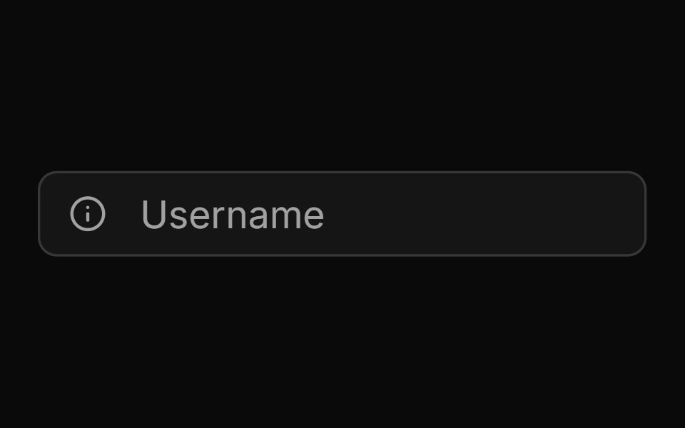 With Start Tooltipsv-particles · Svelte
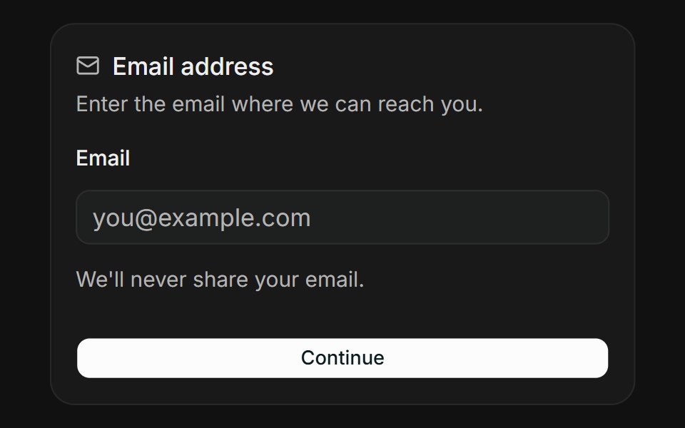 Email AddressFLX UI · ReactValidate an email address with instant feedback.
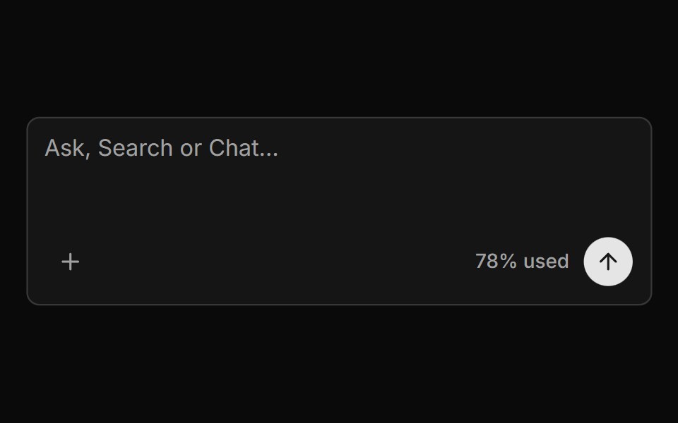 With Textareasv-particles · Svelte
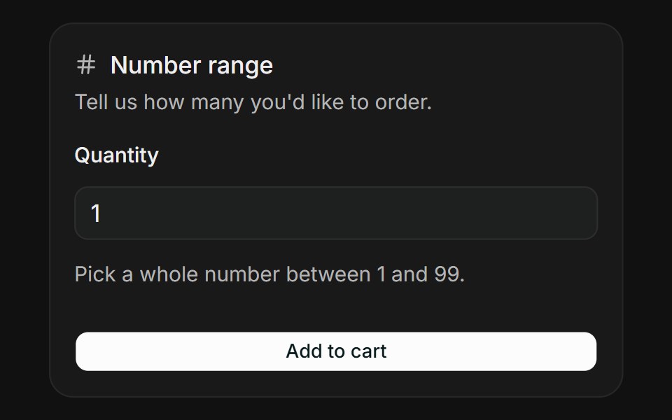 Number RangeFLX UI · ReactKeep a numeric input within a sensible range.
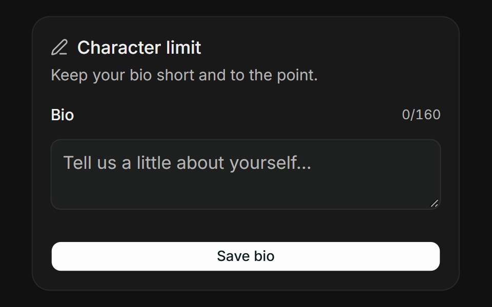 Character LimitFLX UI · ReactCap text length with a live character counter.
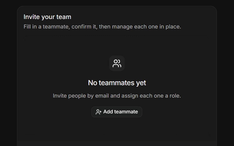 Dynamic Field ArrayFLX UI · ReactStart from an empty state, then add and remove teammate rows with per-item validation.
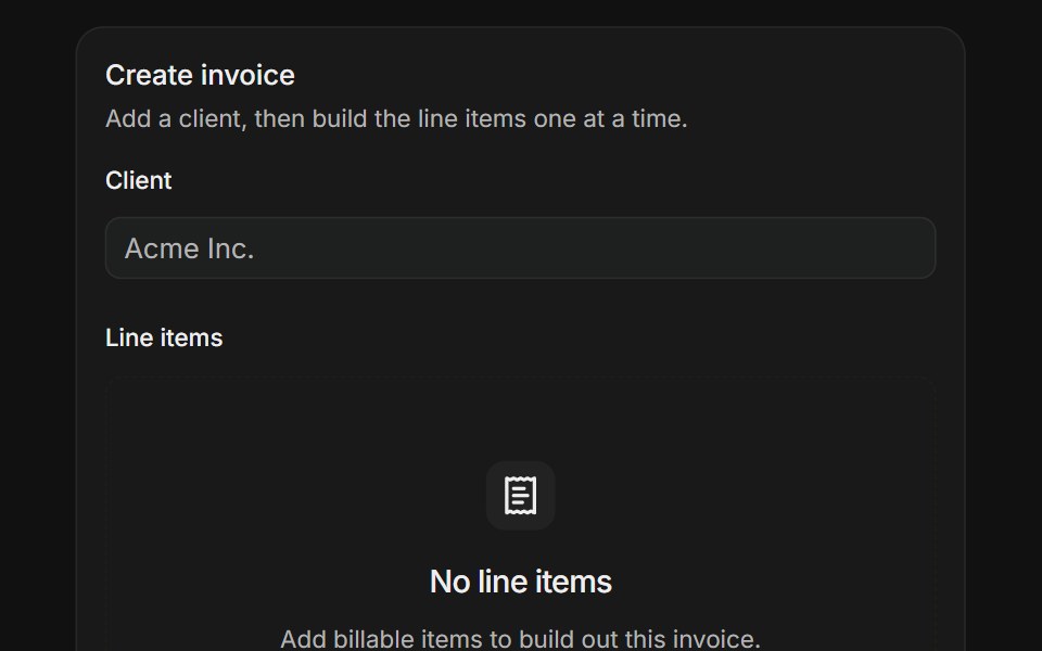 Form in a DialogFLX UI · ReactBuild an invoice while a dialog validates each line item against its own schema.
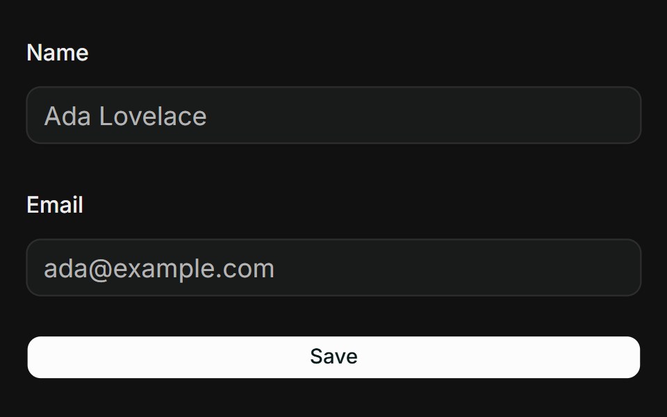 Text InputFLX UI · ReactNative text and email inputs wired with form.Field and Zod validation.
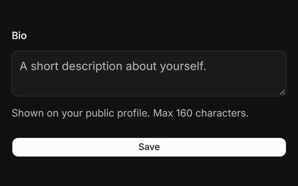 TextareaFLX UI · ReactMulti-line textarea with a description and length-constrained Zod rule.
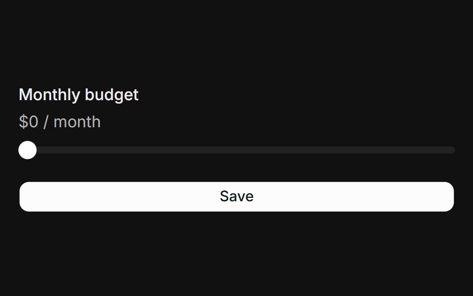 SliderFLX UI · ReactNumeric slider wired with form.Field, validated against a Zod range.
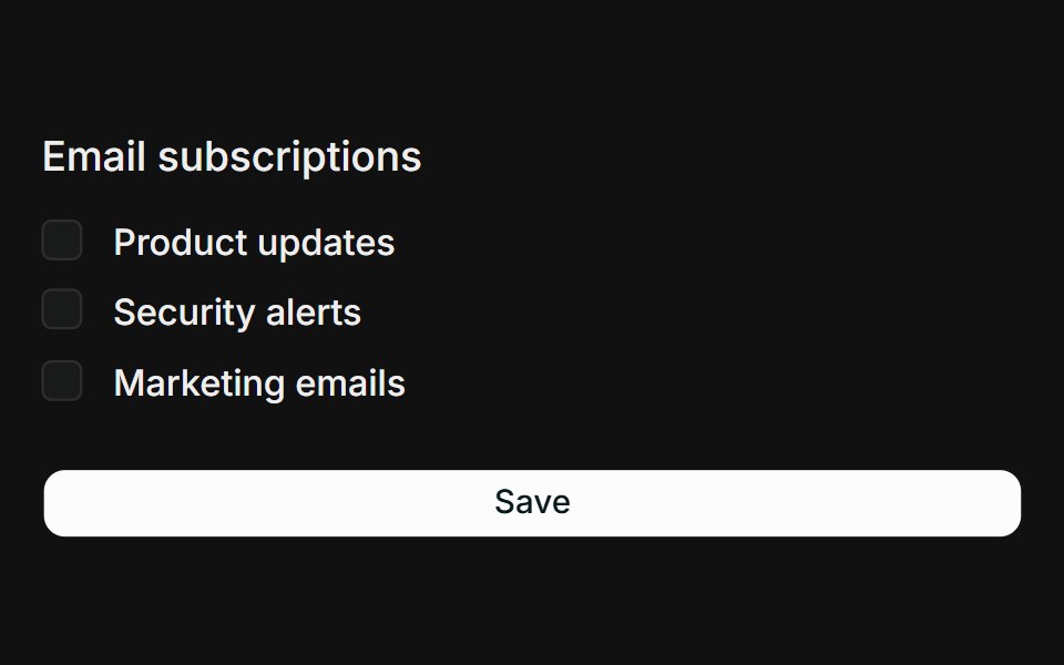 Checkbox GroupFLX UI · ReactMultiple checkboxes collected into a string array with a min-selection rule.
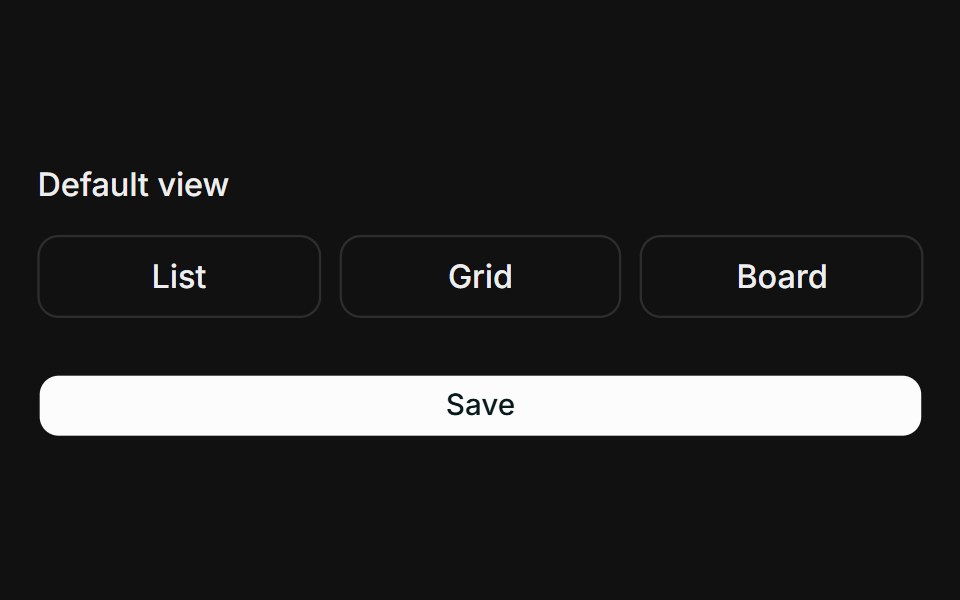 Toggle GroupFLX UI · ReactSingle-select toggle group wired with form.Field and Zod validation.
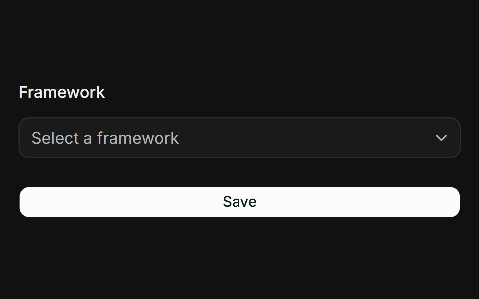 SelectFLX UI · ReactGrouped select with labelled option groups wired with form.Field.
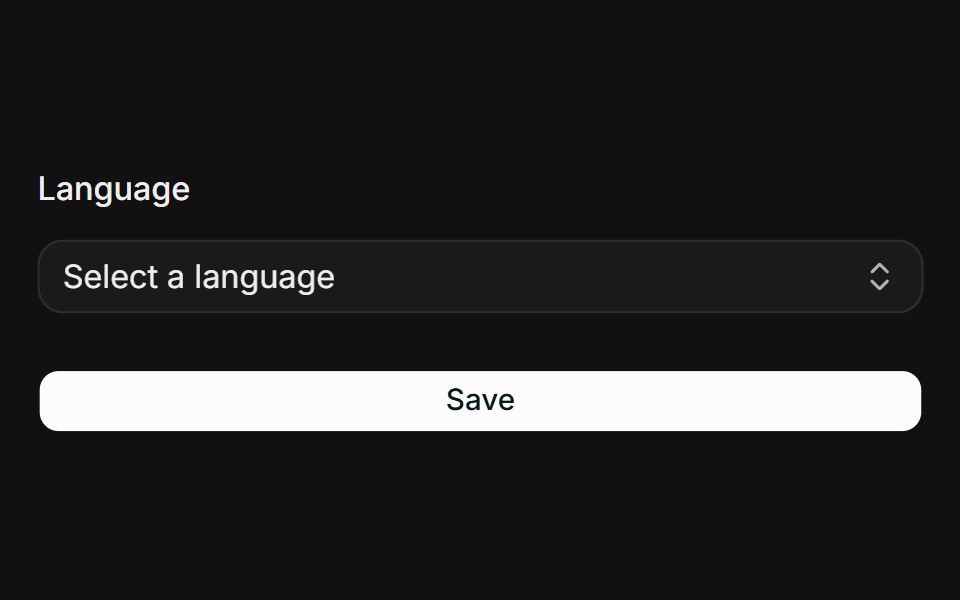 CommandFLX UI · ReactSearchable combobox using Command inside a Popover, wired with form.Field.
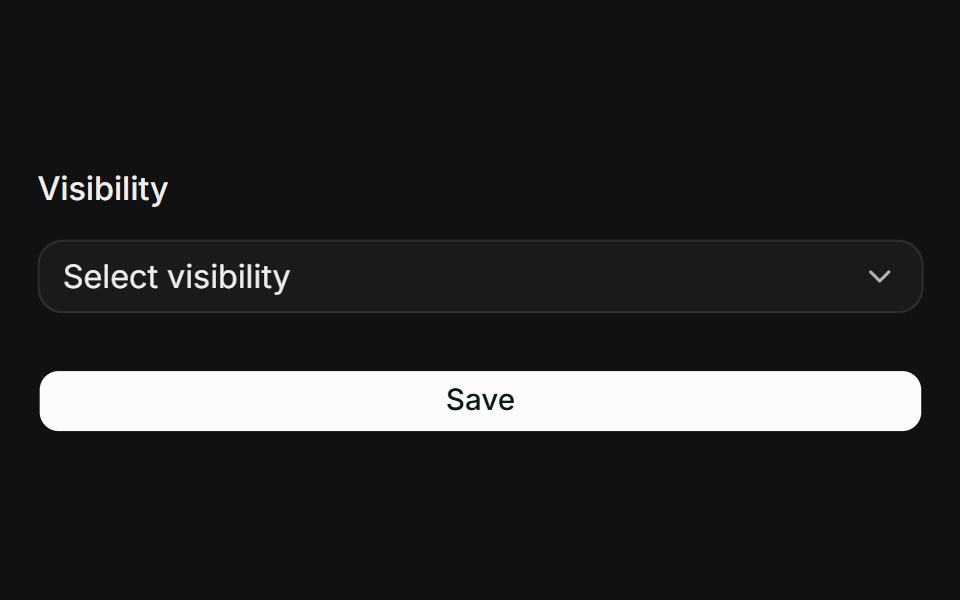 DropdownFLX UI · ReactSingle choice via a dropdown menu radio group wired with form.Field.
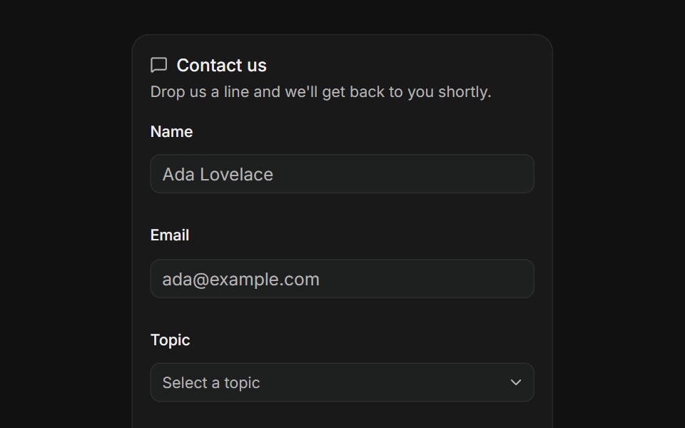 Contact FormFLX UI · ReactName, email, topic and message validated on submit.
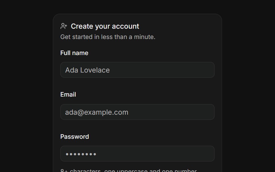 Create AccountFLX UI · ReactSign up with name, email, a strong password and terms.
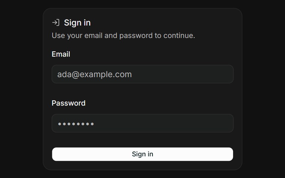 Sign InFLX UI · ReactEmail and password validated on submit.
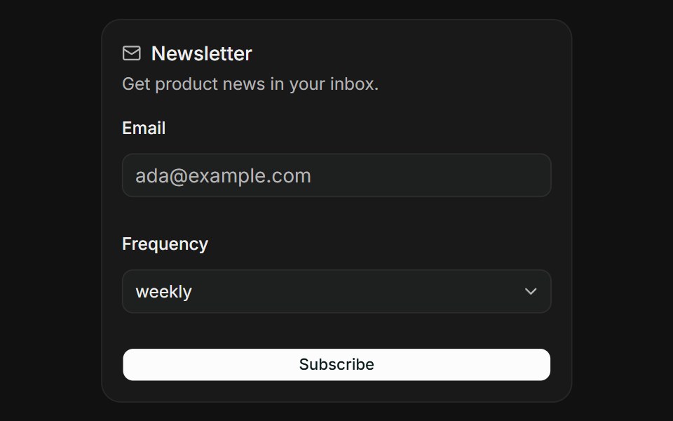 NewsletterFLX UI · ReactSubscribe with an email and a delivery frequency.
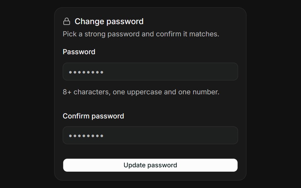 Password ConfirmationFLX UI · ReactPick a strong password and confirm it matches.
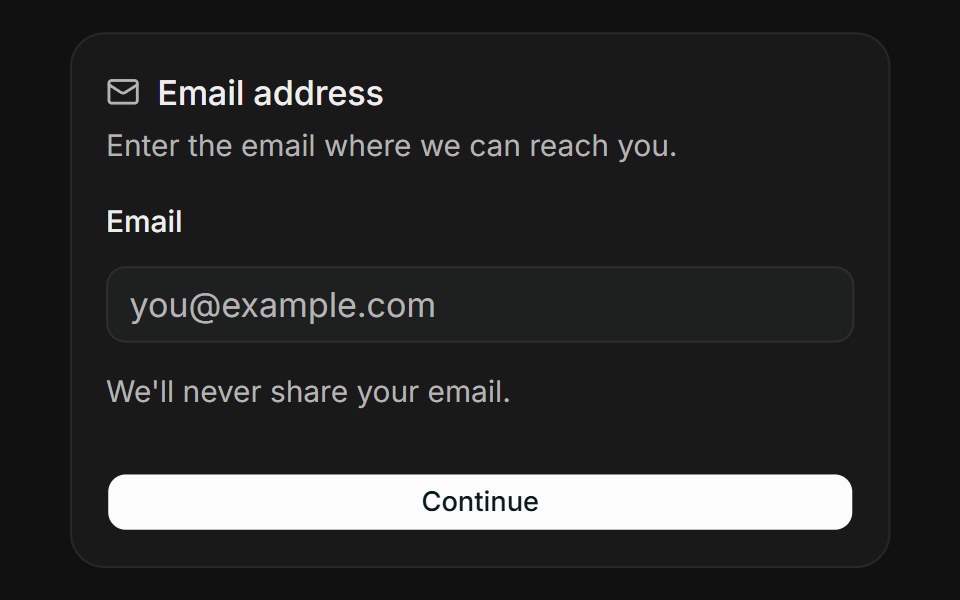 Email AddressFLX UI · ReactValidate an email address with instant feedback.
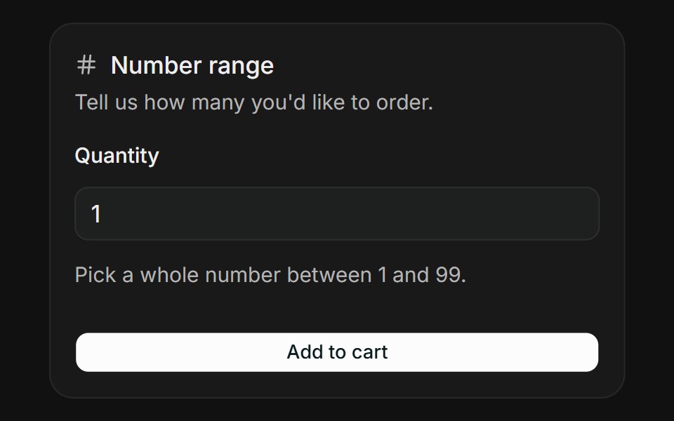 Number RangeFLX UI · ReactKeep a numeric input within a sensible range.
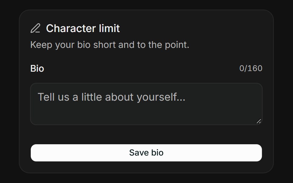 Character LimitFLX UI · ReactCap text length with a live character counter.
Libraries with shadcn/ui form field components
Related categories
- Form Field Components
- React Form Field Components
- Tailwind CSS Form Field Components
- Svelte Form Field Components
- Animated Form Field Components
- shadcn/ui Input Components
- shadcn/ui Form Components
- shadcn/ui Select Components
- shadcn/ui Text Input Components
- shadcn/ui Switch Components
- shadcn/ui Textarea Components
- shadcn/ui Checkbox Components
- shadcn/ui OTP Input Components
- shadcn/ui Combobox Components
- shadcn/ui Date Picker Components
- shadcn/ui Radio Components
- shadcn/ui Login Form Components
- shadcn/ui Search Input Components
- shadcn/ui File Upload Components
- shadcn/ui Slider Components
- shadcn/ui Signup Form Components