 Dev Design Library
shadcn/ui Switch Components
Dev Design Library indexes 56 shadcn/ui switch components from 10 open-source UI libraries, with the most coming from Watermelon UI, FLX UI, Shadcn Space, Spectrum UI and sv-particles. Each one links to its page with the source code, a live preview where available, the library license and the install command. They follow the shadcn/ui conventions, so most install with the shadcn CLI and drop into a Tailwind project. Switch components belong to the Inputs group.
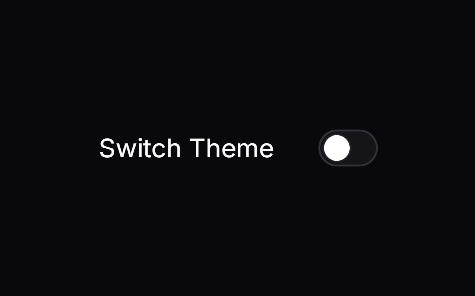 switchIntent UI · Reactswitch
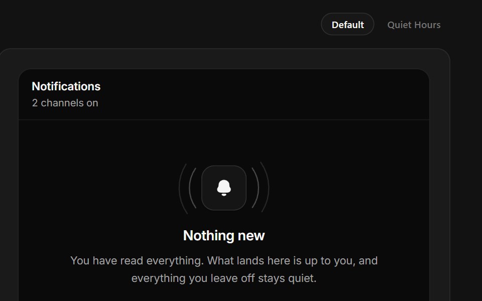 No NotificationsSpectrum UI · ReactAn empty notification tray with working channel switches and a quiet-hours state.
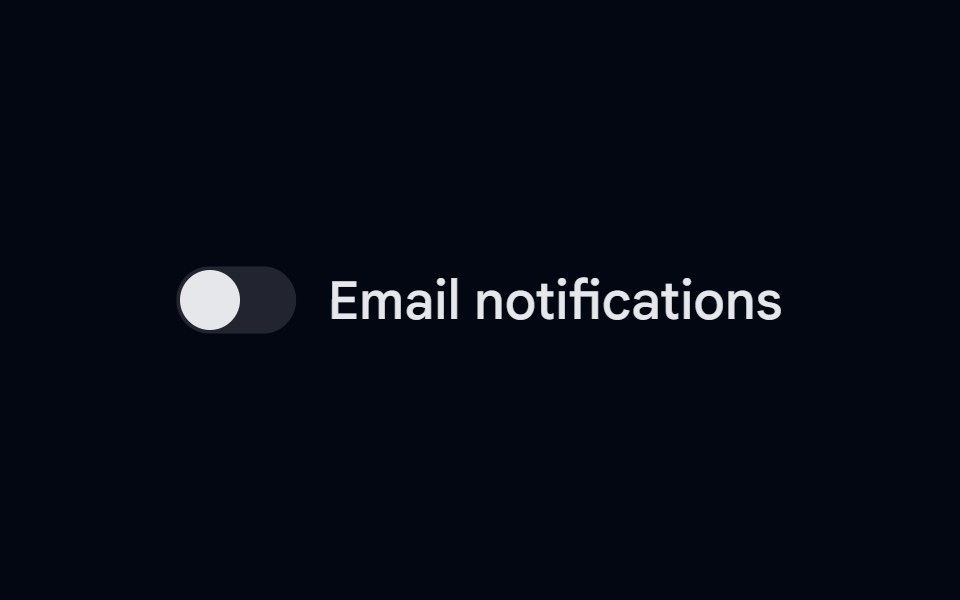 Label 05 - With SwitchShadcn Space · ReactLabel component with switch
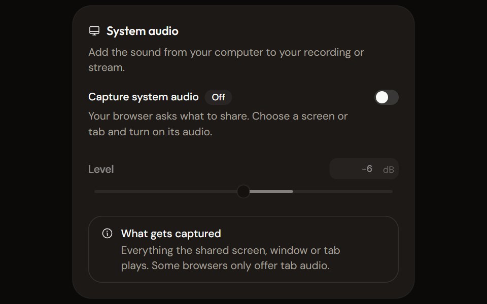 System Audio Settingsaudiocn · ReactTurn system audio capture on, set its level, watch its meter and explain what the browser will capture.
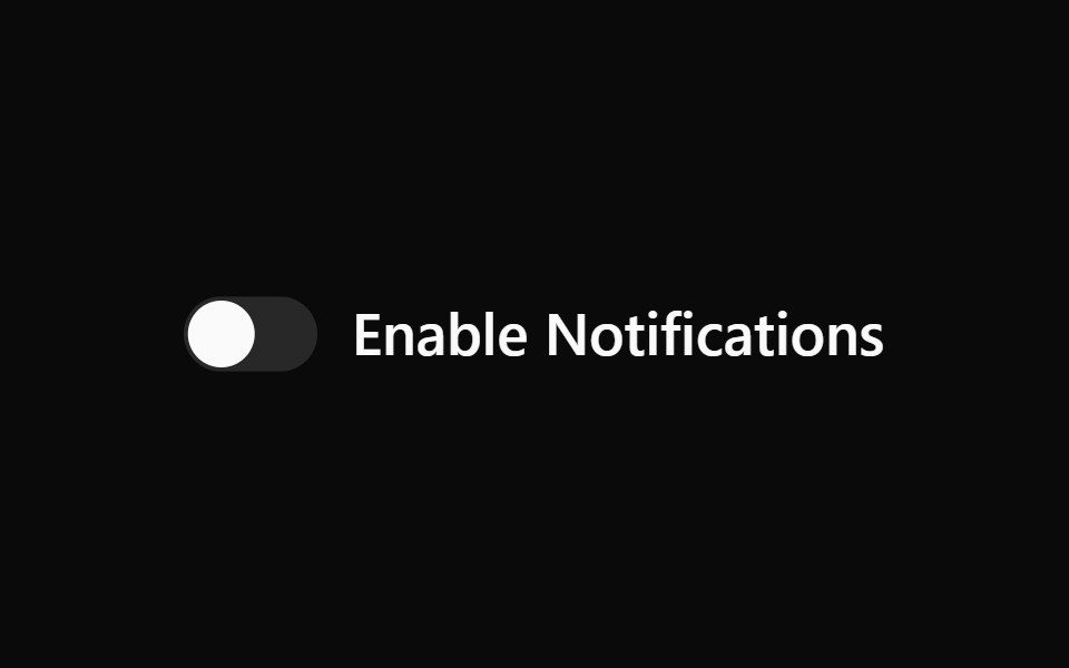 Switch 1Watermelon UI · React
 Liquid Switchglasscn · ReactA liquid-glass switch wrapper built on top of the default switch component.
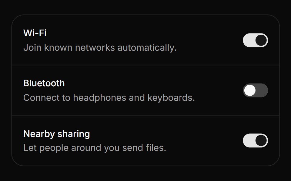 SwitchHextaUI · ReactAn on/off toggle you can tap, press or drag, with a thumb that stretches under your finger and an optional pending…
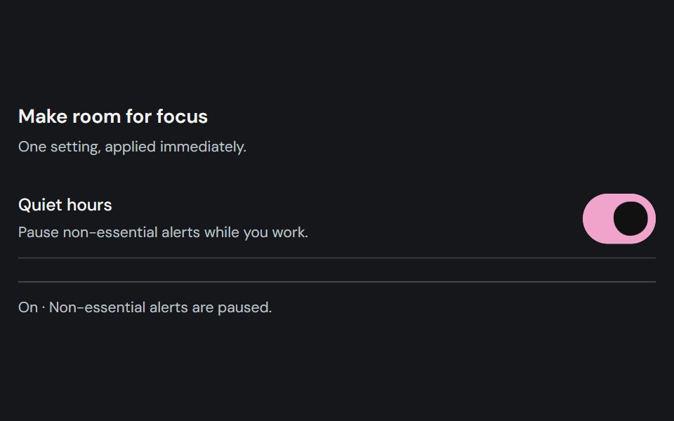 SwitchCojeev UI · ReactTurns a named binary setting on or off.
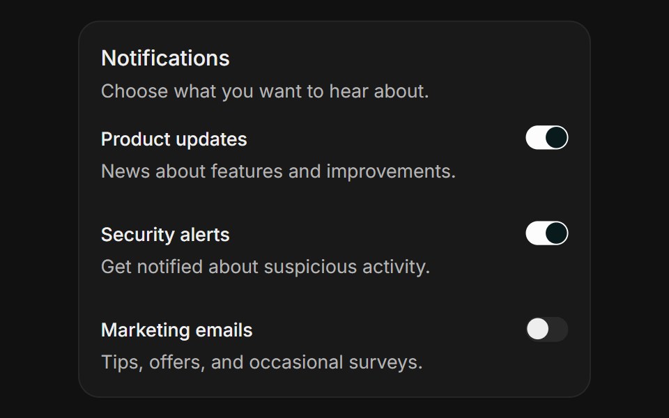 Notification settingsFLX UI · ReactHorizontal field rows each toggled with a switch.
 With Checkbox Items As Switchessv-particles · Svelte
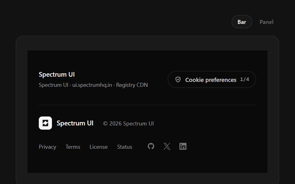 Policy FooterSpectrum UI · ReactCookie-category switches with a save state, over a layered legal row.
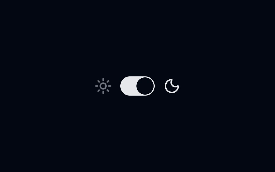 Switch-03 - Toggle themeShadcn Space · ReactSwitch toggle theme component
 Switch 10Watermelon UI · React
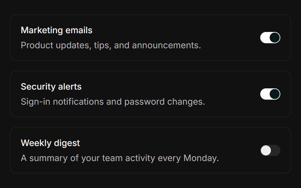 Settings rowFLX UI · ReactTitle and description with a trailing Switch.
 Switch-04 - With DescriptionShadcn Space · ReactSwitch component
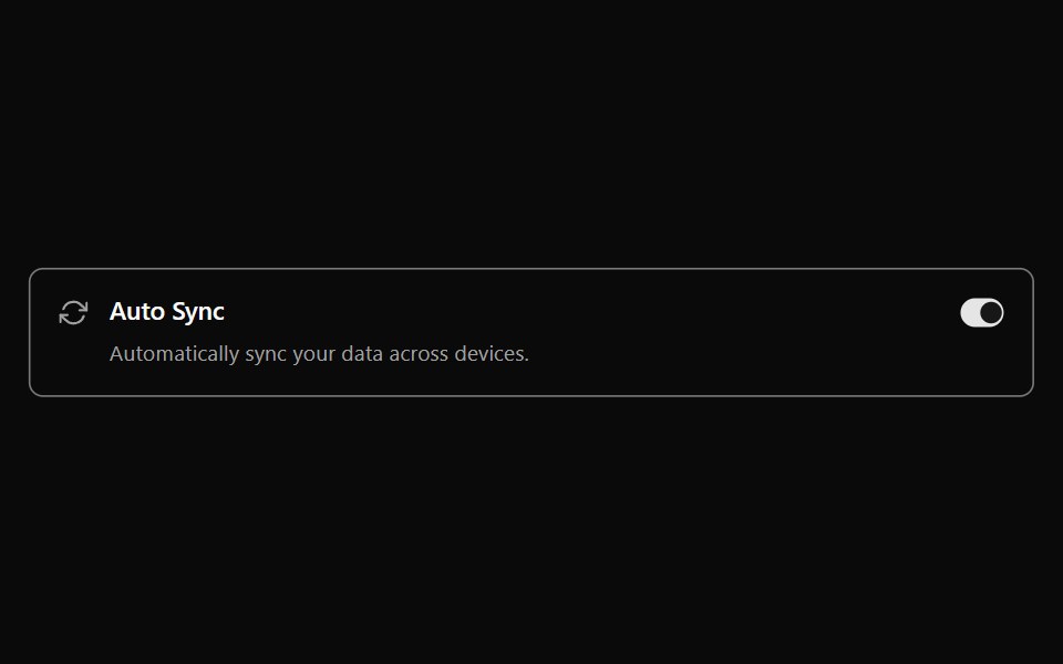 Switch 11Watermelon UI · React
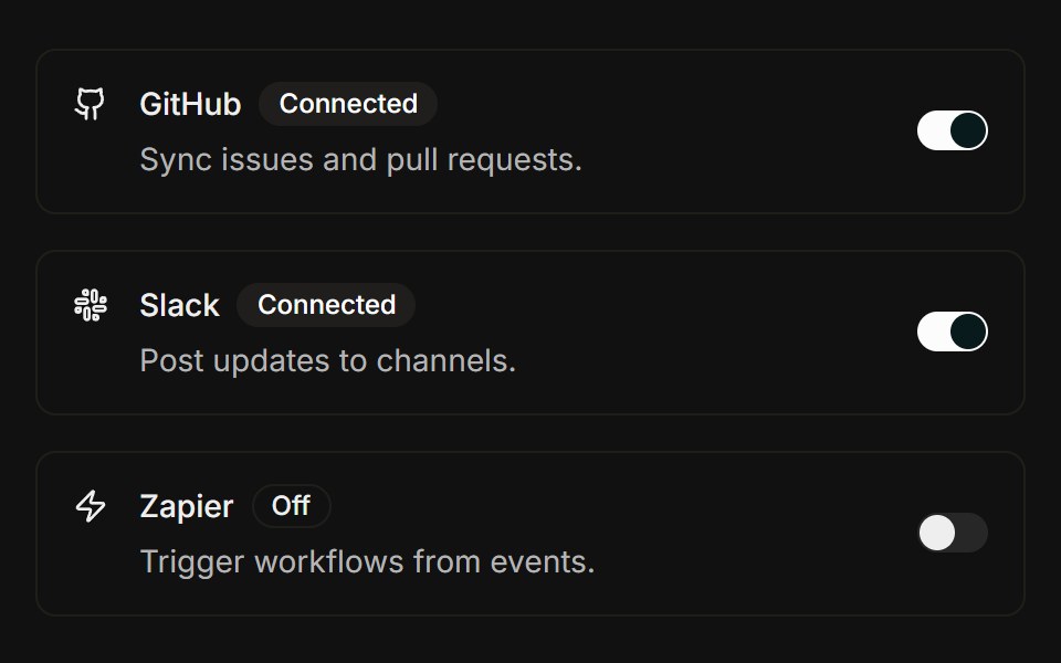 IntegrationsFLX UI · ReactBrand icon, status badge in title, connect Switch.
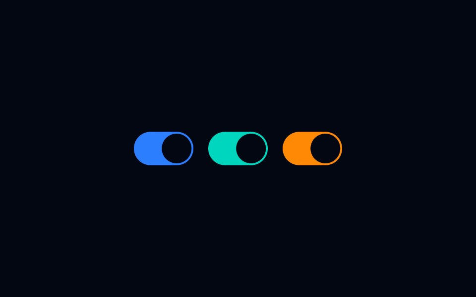 Switch-06 - Custom ColorsShadcn Space · ReactSwitch component
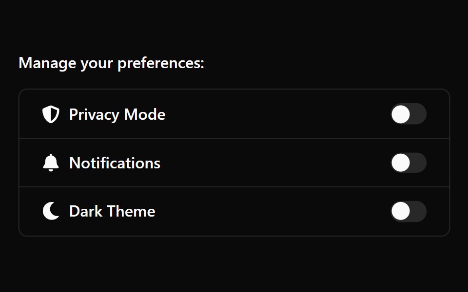 Switch 12Watermelon UI · React
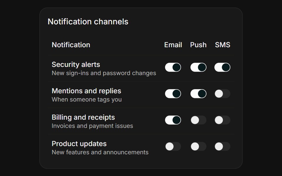 Channel MatrixFLX UI · ReactChannel Matrix for Notifications.
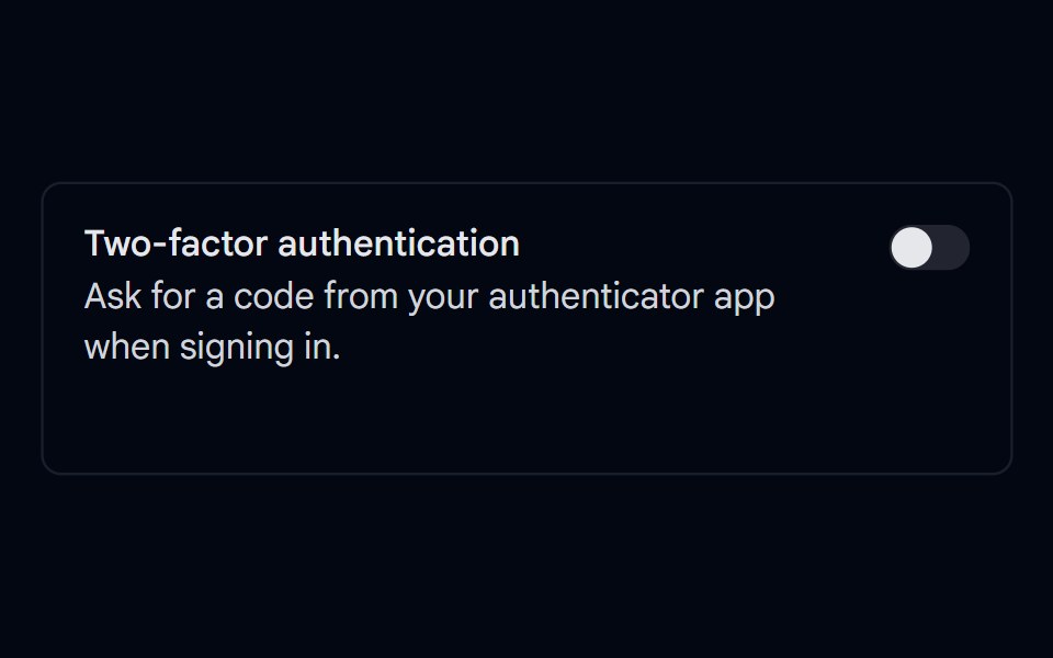 Switch 10 - Async SaveShadcn Space · ReactTwo-factor authentication switch that saves to the server with a saving state, a saved confirmation, and a revert with…
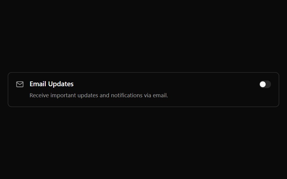 Switch 13Watermelon UI · React
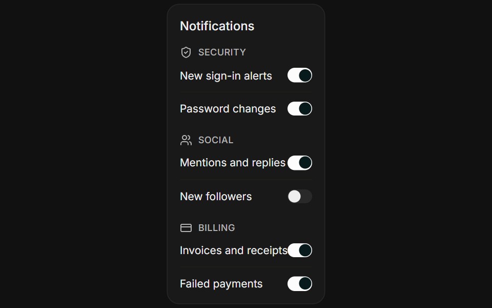 Grouped TogglesFLX UI · ReactGrouped Toggles for Notifications.
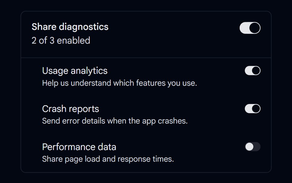 Switch 11 - Parent & Child SwitchesShadcn Space · ReactMaster switch that enables or disables a group of nested switches, with a live enabled count and automatic off when…
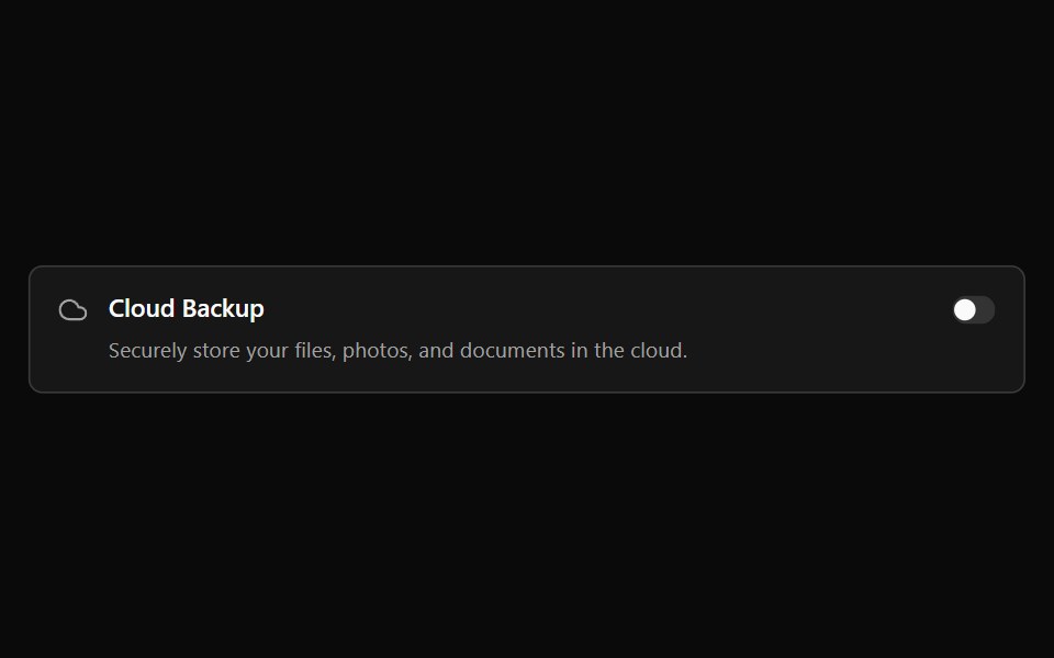 Switch 14Watermelon UI · React
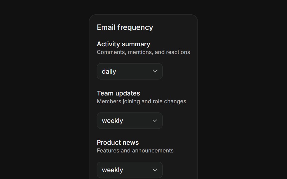 Digest FrequencyFLX UI · ReactDigest Frequency for Notifications.
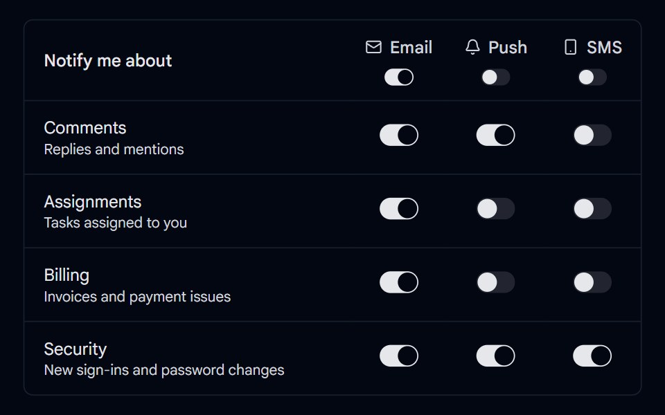 Switch 12 - Notification MatrixShadcn Space · ReactNotification preferences table with email, push, and SMS switches per event type and a column switch to toggle a whole…
 Switch 15Watermelon UI · React
 BasicFLX UI · ReactA single standalone switch.
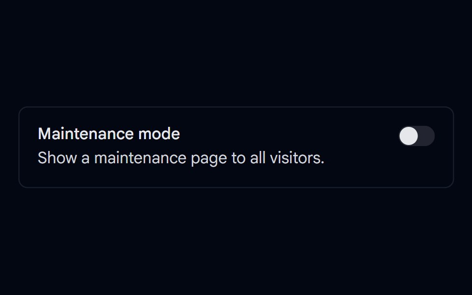 Switch 13 - Confirm Before EnablingShadcn Space · ReactMaintenance mode switch that asks for confirmation in an alert dialog before turning on, and shows an offline status…
 Switch 16Watermelon UI · React
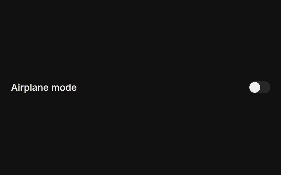 With labelFLX UI · ReactSwitch paired with an accessible field label.
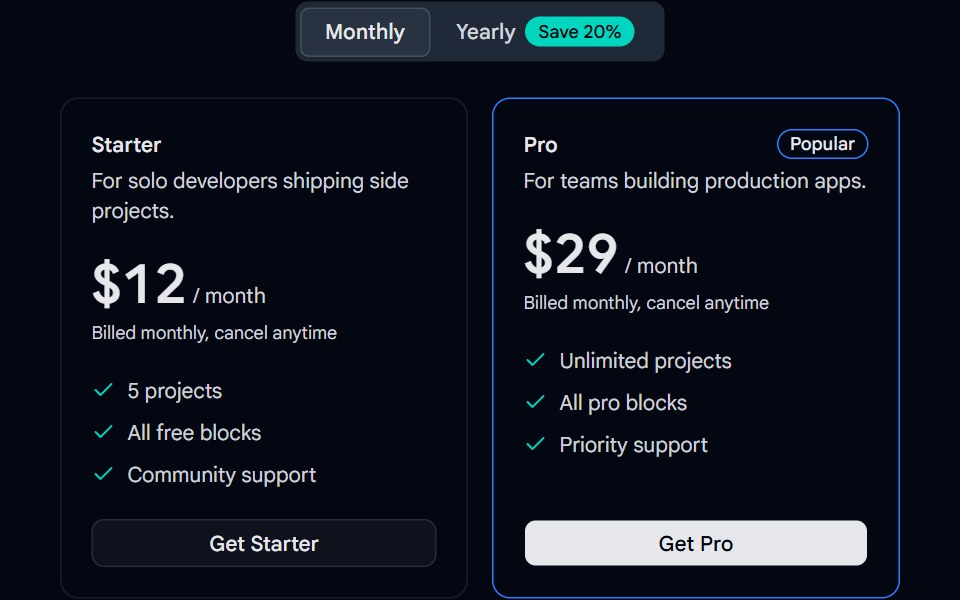 Tabs 13 - Billing ToggleShadcn Space · ReactMonthly and yearly billing tabs with a savings badge and animated pricing cards.
 Switch 17Watermelon UI · React
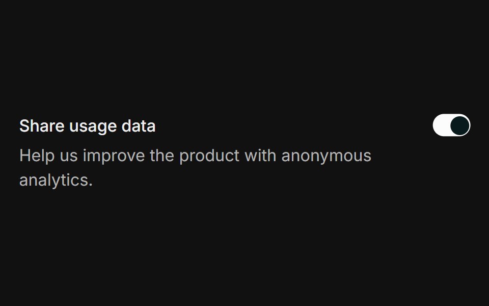 With descriptionFLX UI · ReactLabel and helper description beside the switch.
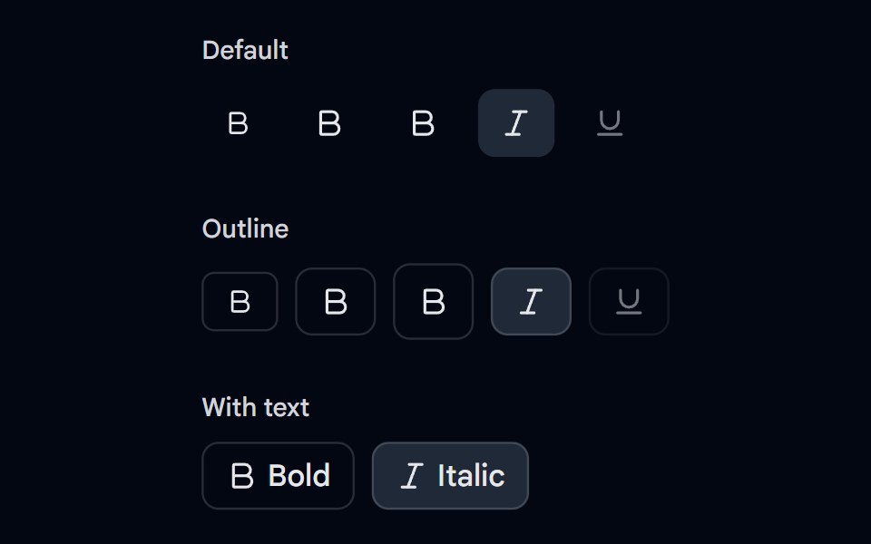 Toggle 04 - Variants & SizesShadcn Space · ReactDefault and outline toggles in small, default, and large sizes with pressed, disabled, and text states.
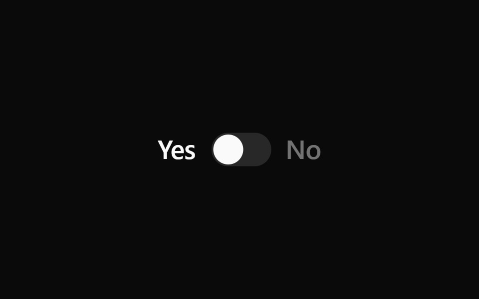 Switch 18Watermelon UI · React
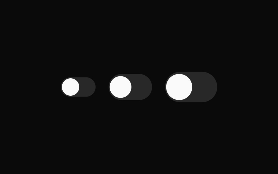
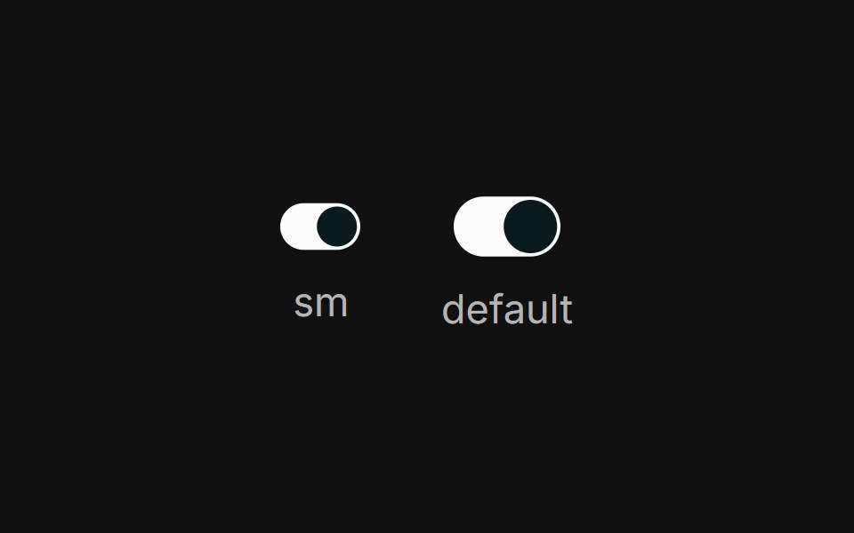 SizesFLX UI · ReactThe sm and default sizes side-by-side.
 Toggle 05 - BookmarkShadcn Space · ReactSave for later toggle with a filled bookmark icon, a spring pop on save, and a Save / Saved label.
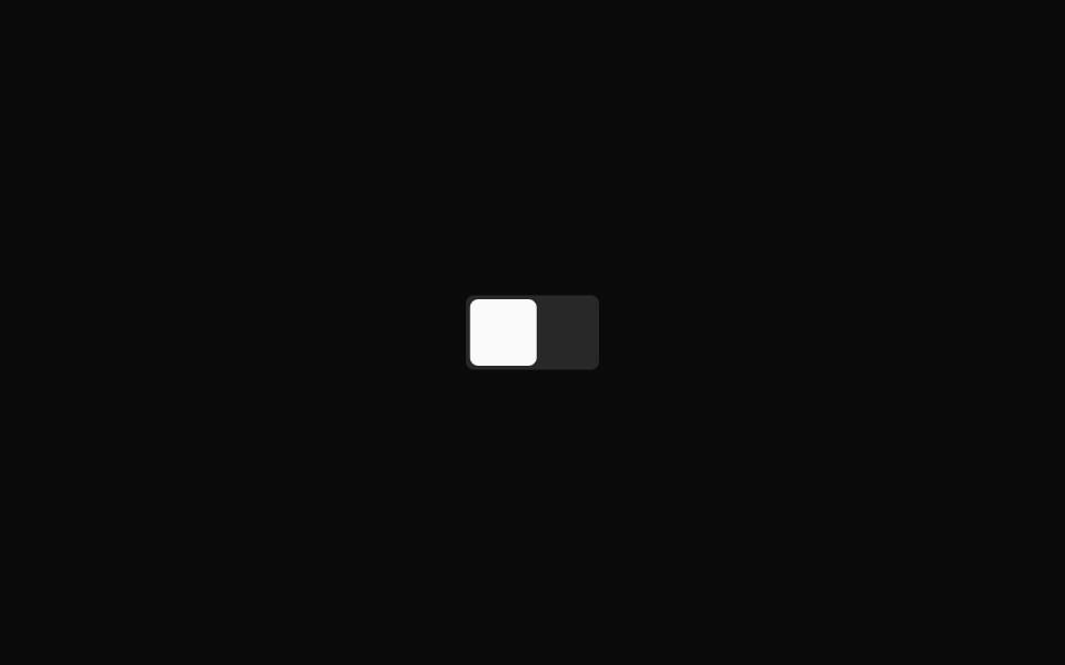 Switch 2Watermelon UI · React
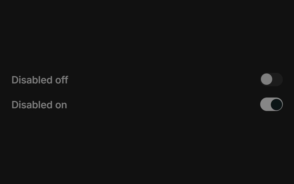 DisabledFLX UI · ReactDisabled off and disabled on states.
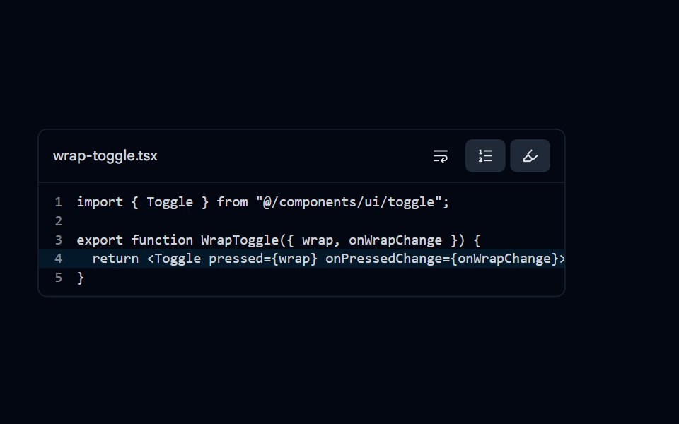 Toggle 08 - Editor View OptionsShadcn Space · ReactCode editor toolbar with word wrap, line numbers, and active line highlight toggles that update the code preview.
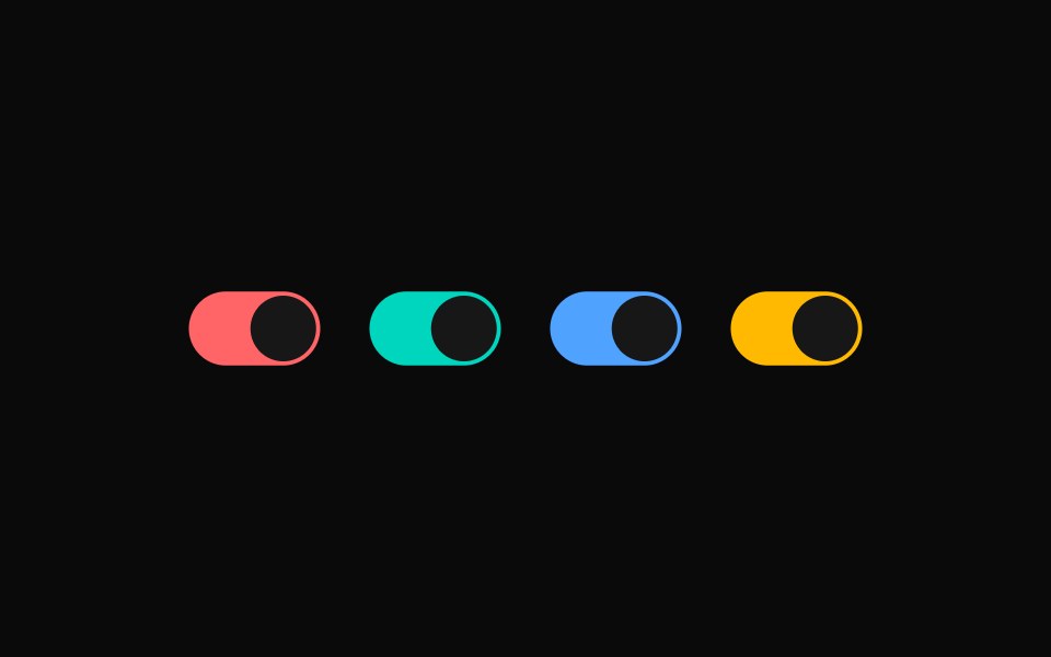 Switch 3Watermelon UI · React
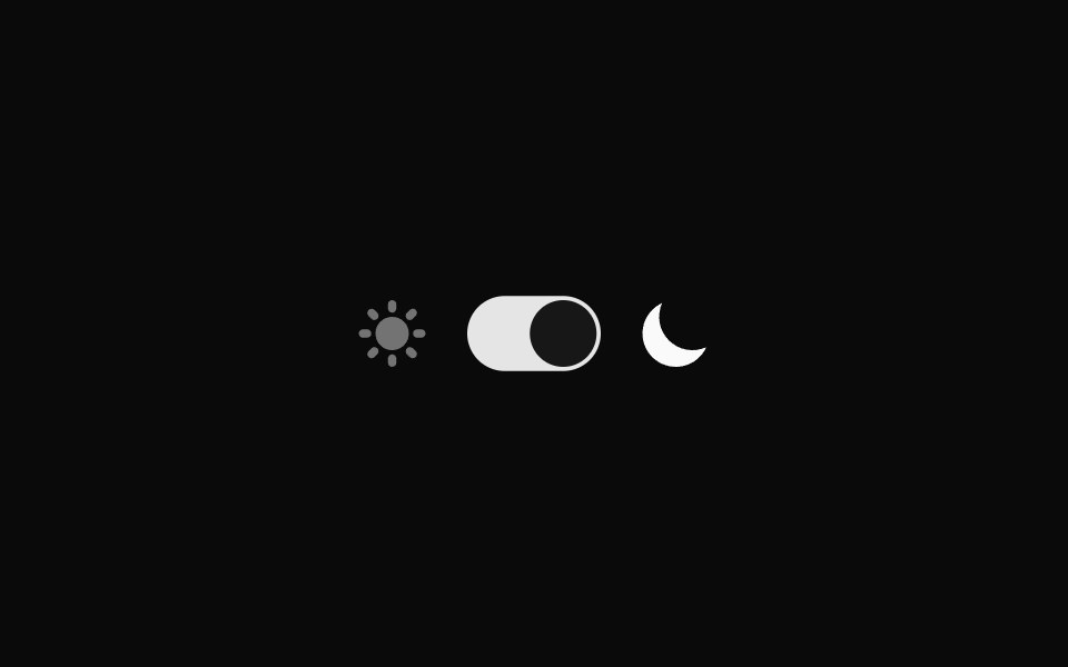
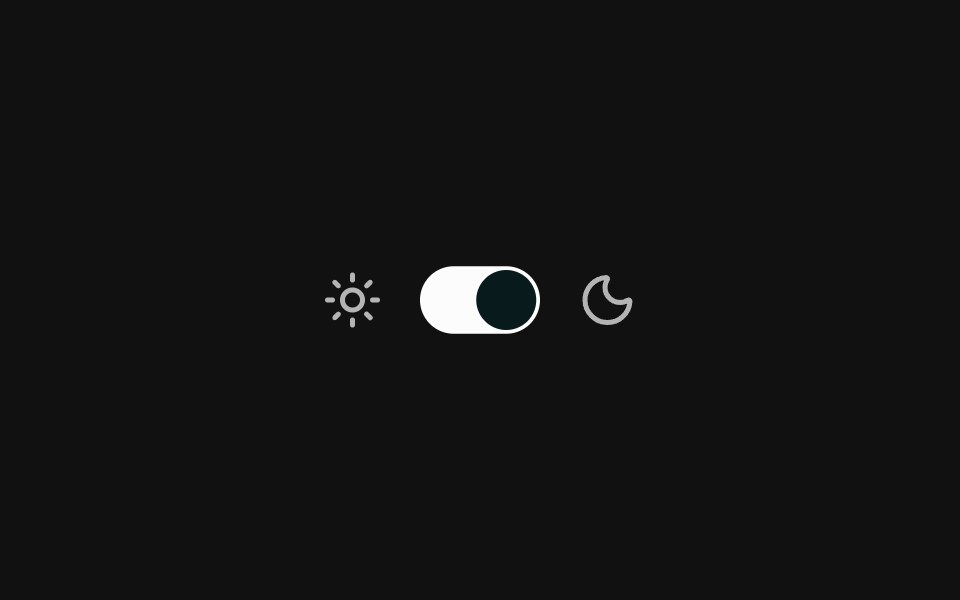 Theme toggleFLX UI · ReactSun and moon icons flank a light / dark toggle.
 Switch 4Watermelon UI · React
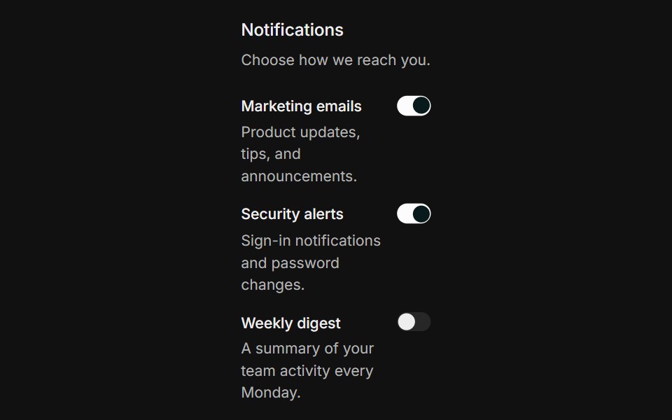 Settings groupFLX UI · ReactA grouped list of notification settings, each row with a label, helper text, and a switch.
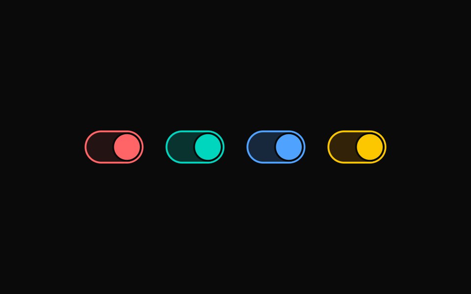 Switch 5Watermelon UI · React
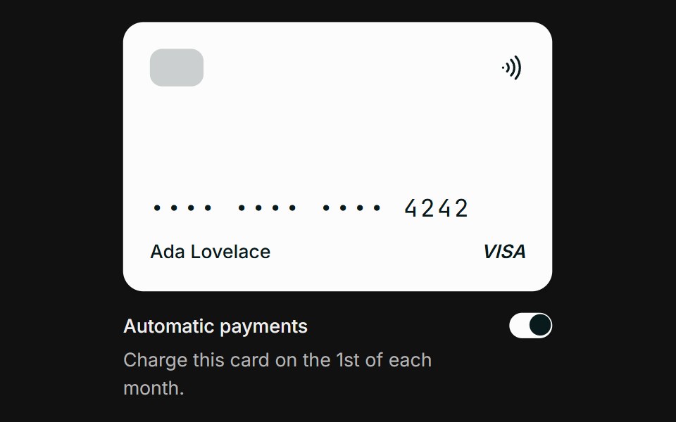 Credit card auto-payFLX UI · ReactA visual credit card mockup above a labeled switch for enabling automatic monthly payments.
 Switch 6Watermelon UI · React
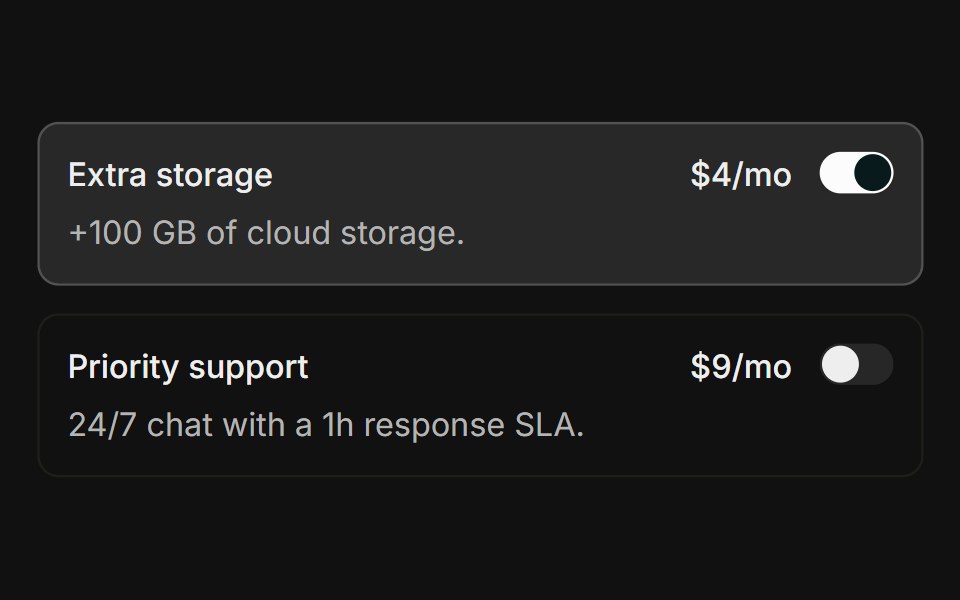 Choice cardsFLX UI · ReactClickable add-on rows showing a title, description, price, and a switch, each fully tappable via a wrapping label.
 Switch 7Watermelon UI · React
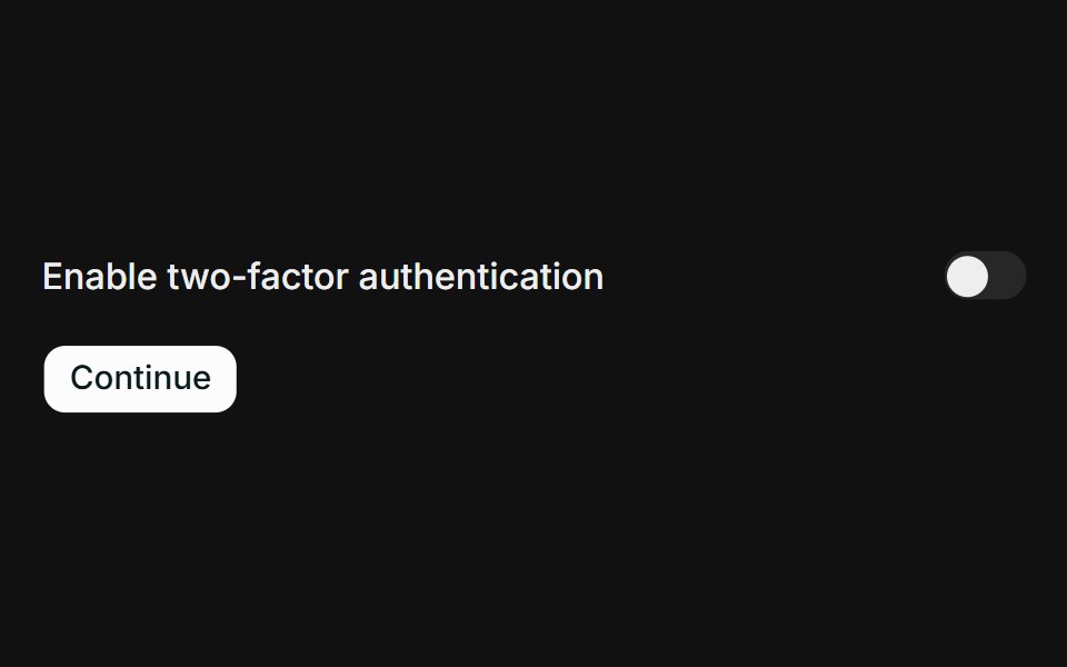 Invalid / requiredFLX UI · ReactA required switch in a form that shows an inline error message when submitted while off.
 Switch 8Watermelon UI · React
 React Hook Form + ZodFLX UI · ReactController binds the switch to RHF; Zod requires opt-in on submit.
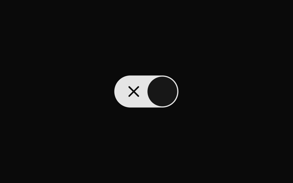 Switch 9Watermelon UI · React
 TanStack Form + ZodFLX UI · Reactform.Field wires the switch; Zod onSubmit validator surfaces FieldError.
Libraries with shadcn/ui switch components
Related categories
- Switch Components
- React Switch Components
- Tailwind CSS Switch Components
- Animated Switch Components
- shadcn/ui Input Components
- shadcn/ui Form Components
- shadcn/ui Select Components
- shadcn/ui Text Input Components
- shadcn/ui Form Field Components
- shadcn/ui Textarea Components
- shadcn/ui Checkbox Components
- shadcn/ui OTP Input Components
- shadcn/ui Combobox Components
- shadcn/ui Date Picker Components
- shadcn/ui Radio Components
- shadcn/ui Login Form Components
- shadcn/ui Search Input Components
- shadcn/ui File Upload Components
- shadcn/ui Slider Components
- shadcn/ui Signup Form Components