 Dev Design Library
shadcn/ui Text Input Components
Dev Design Library indexes 128 shadcn/ui text input components from 18 open-source UI libraries, with the most coming from sv-particles, FLX UI, Watermelon UI, Shadcn Space and ark-cn. Each one links to its page with the source code, a live preview where available, the library license and the install command. They follow the shadcn/ui conventions, so most install with the shadcn CLI and drop into a Tailwind project. Text input components belong to the Inputs group.
Showing 120 of 128, a mix from every library. Open a library to see all of its components.
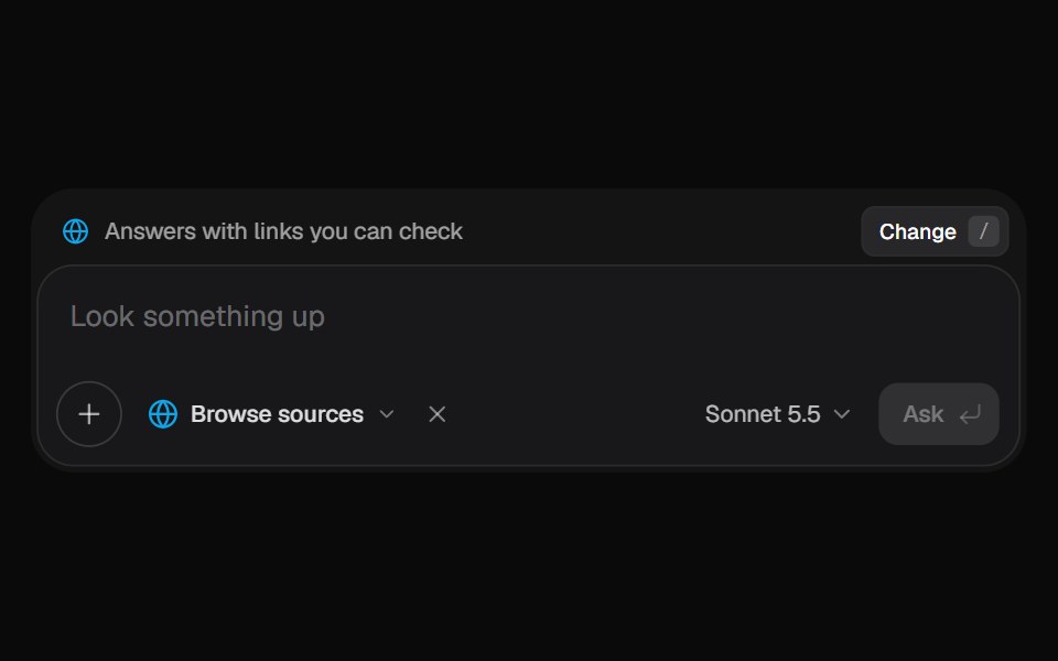 AI Input SearchKokonut UI · ReactAI composer with a Tools menu (browse, investigate, draft, run code, reason), a model picker and a live trace that…
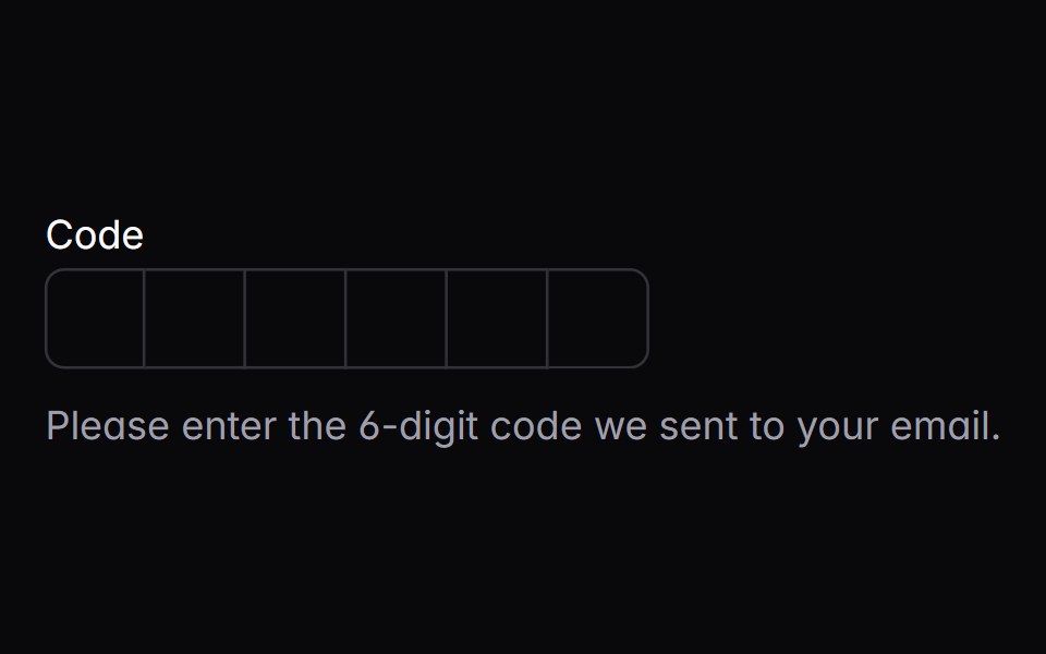 input-otpIntent UI · Reactinput-otp
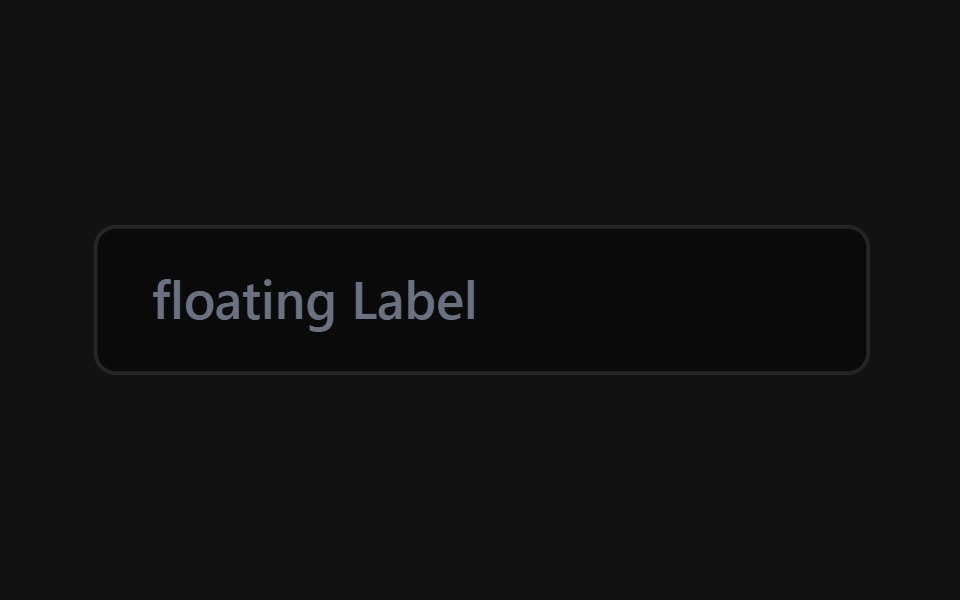 Floating Label InputSpectrum UI · Reactcomponent for the Floating Label Input
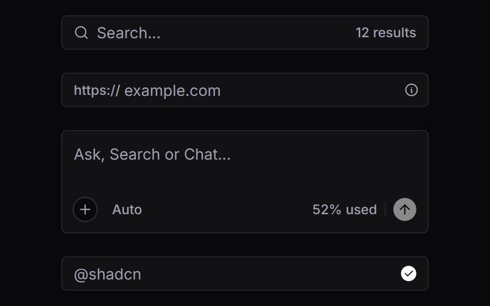 Input GroupVengeance UI · React
 Sidebar Search FieldFluid Functionalism · ReactHeader search on the menu rows' rhythm: leading icon on the rows' 16px axis, text on the 32px axis, and a…
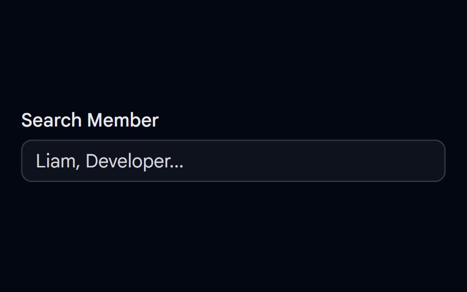 Autocomplete-04 - Team Member SearchShadcn Space · ReactAutocomplete with grouped team members, avatars, status dots, and spring-animated list items
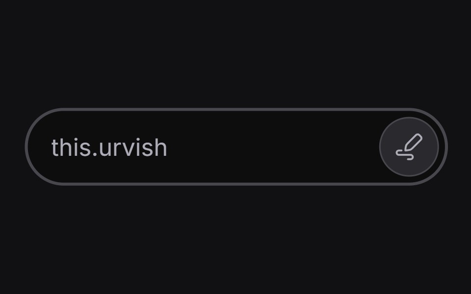 Inline Edituselayouts · ReactAn input that switches between read and edit modes.
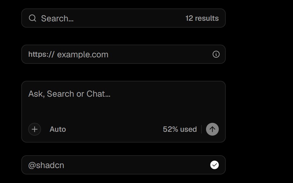 Input GroupObsidianUI · React
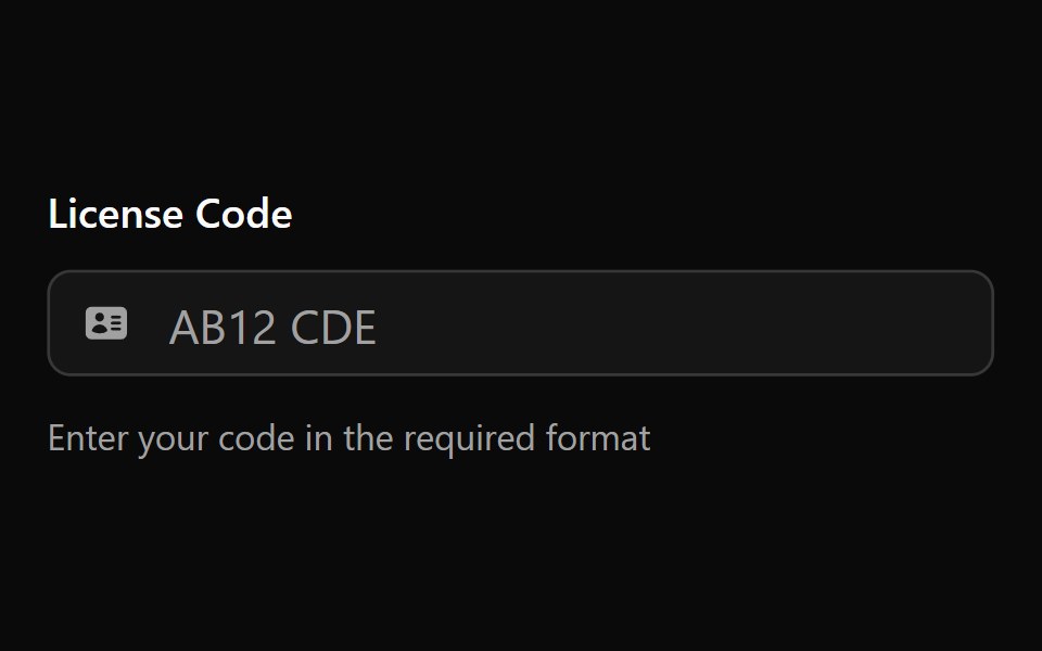 Input Mask 1Watermelon UI · React
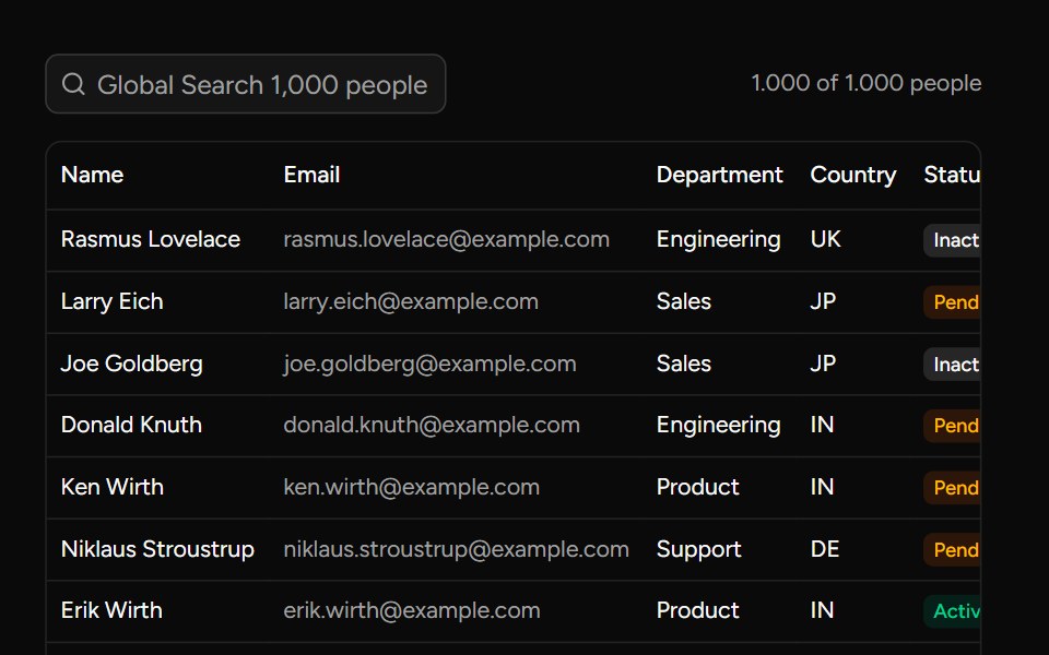 Debounce Inputsv-table · SvelteA search input with an optional delay for value changes.
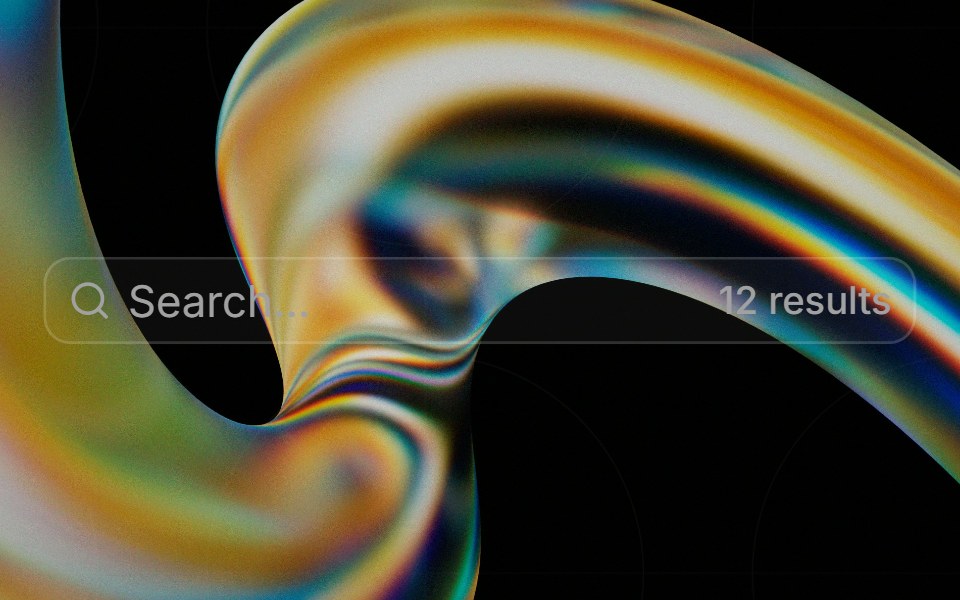 Input Groupglasscn · React
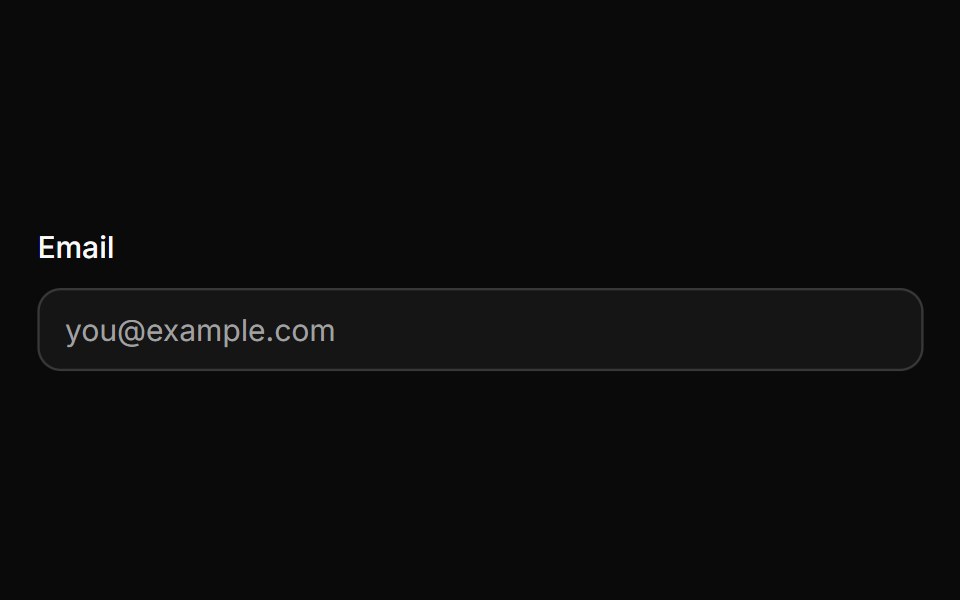 InputHextaUI · ReactA text input with three sizes, invalid and read-only states, native validation styling and a 16px touch font so phones…
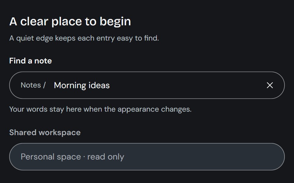 InputCojeev UI · ReactCollects a single-line value through a native input with optional composed affixes and clearing controls.
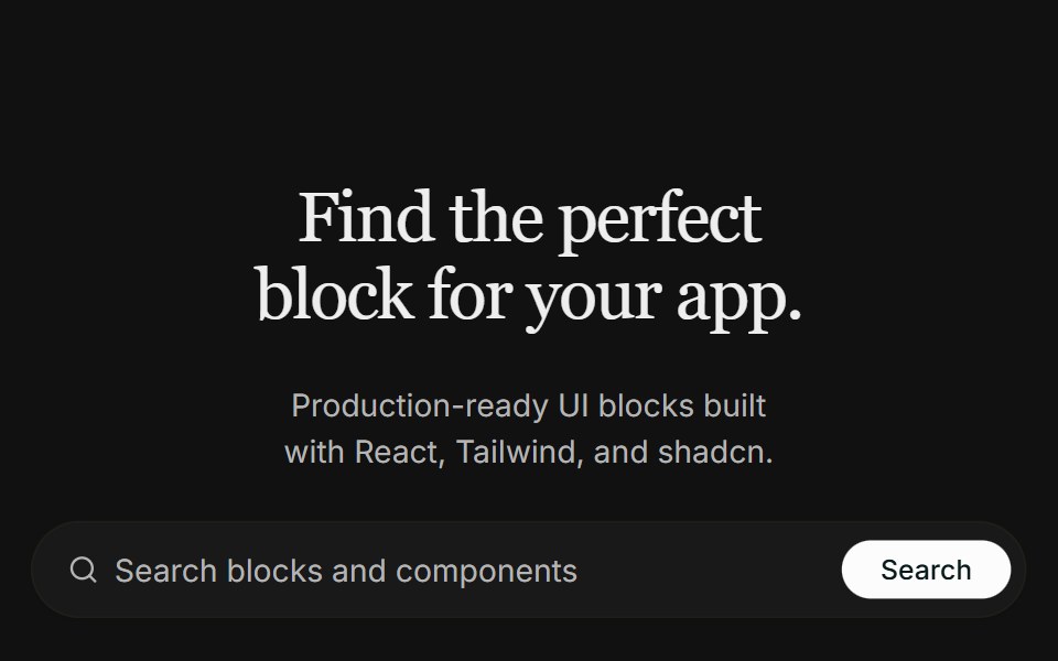 Hero 09FLX UI · ReactA centered real-estate hero with a search bar, a masked architecture image that fades into the page, and a split…
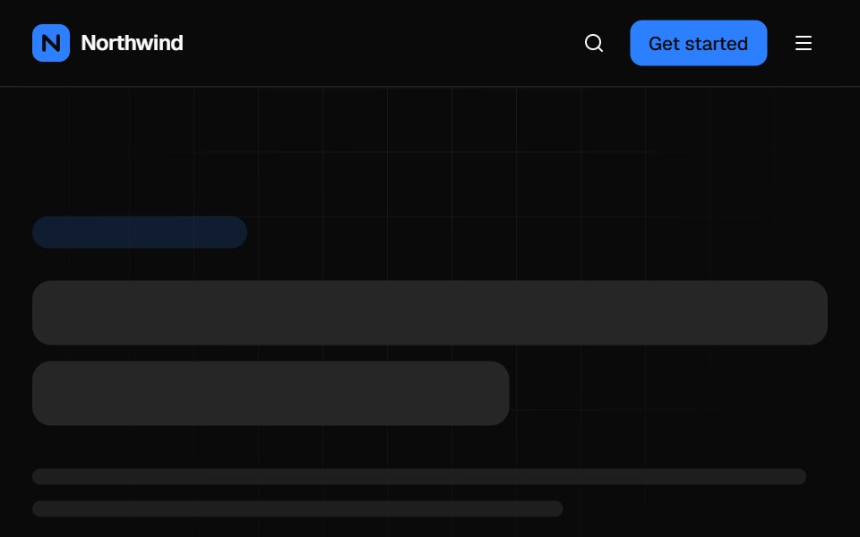 Mega menu navbarVelora UI · ReactTop bar with a keyboard-accessible Product mega menu, search, sign-in and a slide-over mobile menu.
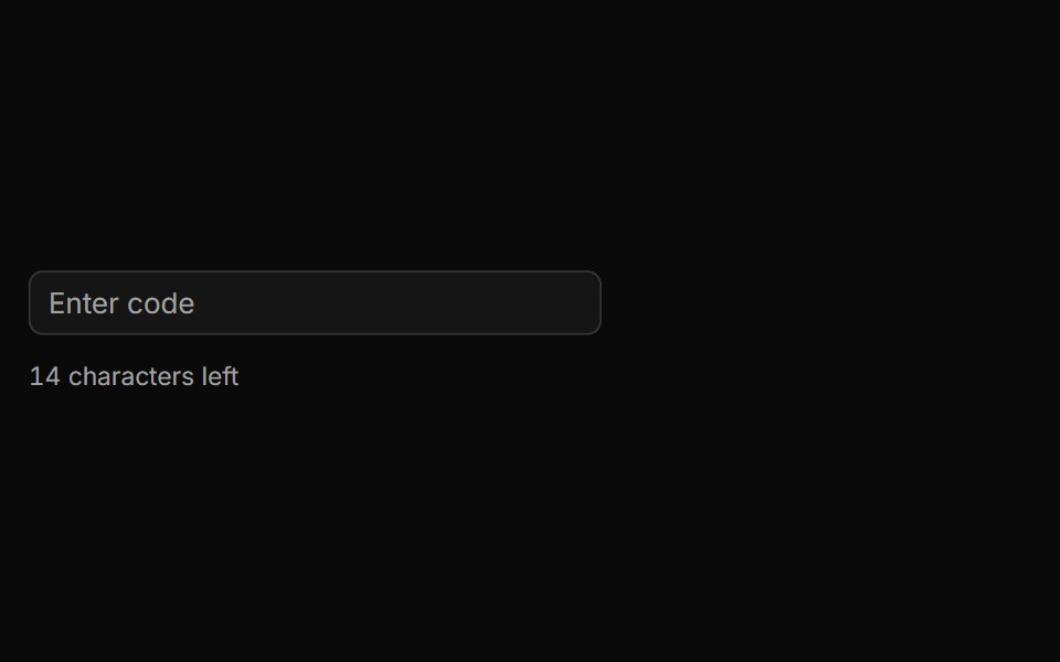 Characters Remaining Countsv-particles · SvelteText input that shows how many characters are still left before the limit.
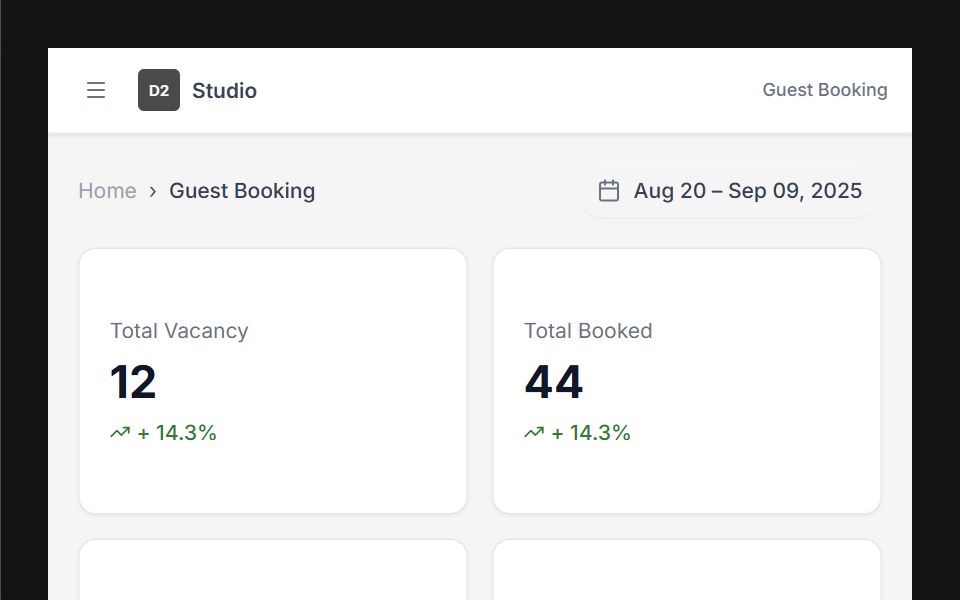 Dashboard 01D2Studio UI · ReactHotel booking dashboard with guest and vacancy stats, booking search and a check-in and check-out table.
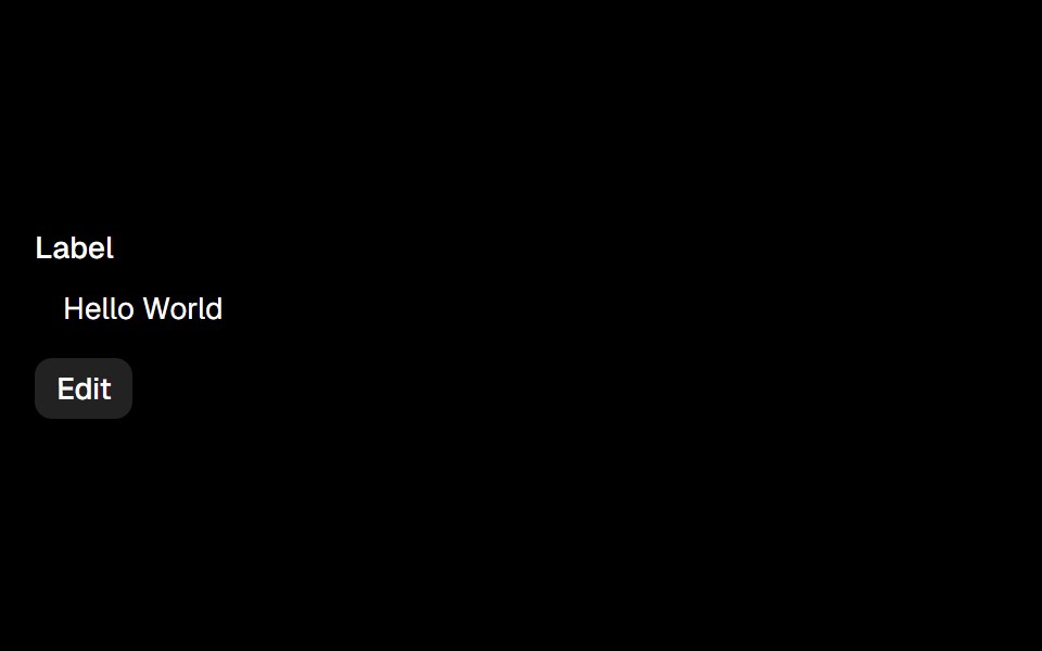 Editableark-cn · ReactA shadcn-style editable component built with Ark UI primitives.
 number-fieldIntent UI · Reactnumber-field
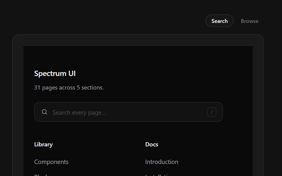 Link Search FooterSpectrum UI · ReactType-to-filter across every footer link, with arrow-key navigation.
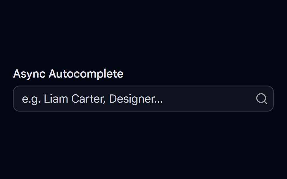 Autocomplete-05 - Async SearchShadcn Space · ReactAutocomplete with debounced async search, loading spinner, error handling, avatars, and spring-animated results
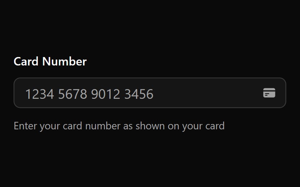 Input Mask 2Watermelon UI · React
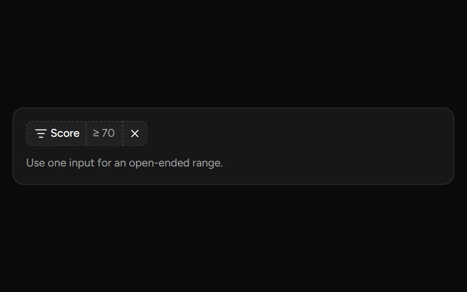 Number Range Filtersv-table · SvelteA number range picker with exact inputs, an optional slider, and explicit apply behavior.
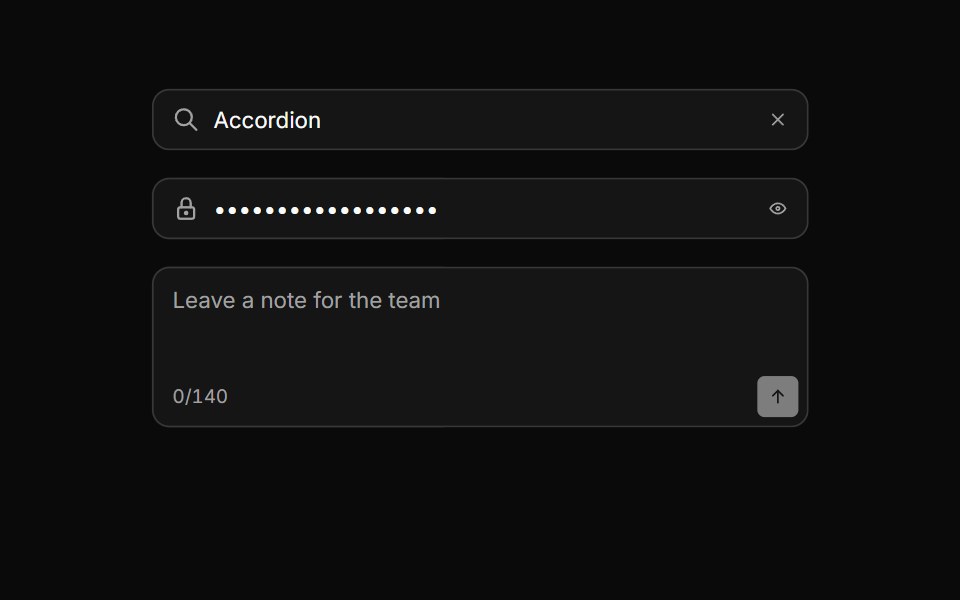 Input groupHextaUI · ReactAn input with icons, text, buttons or a keyboard hint attached, sharing one border and focus ring.
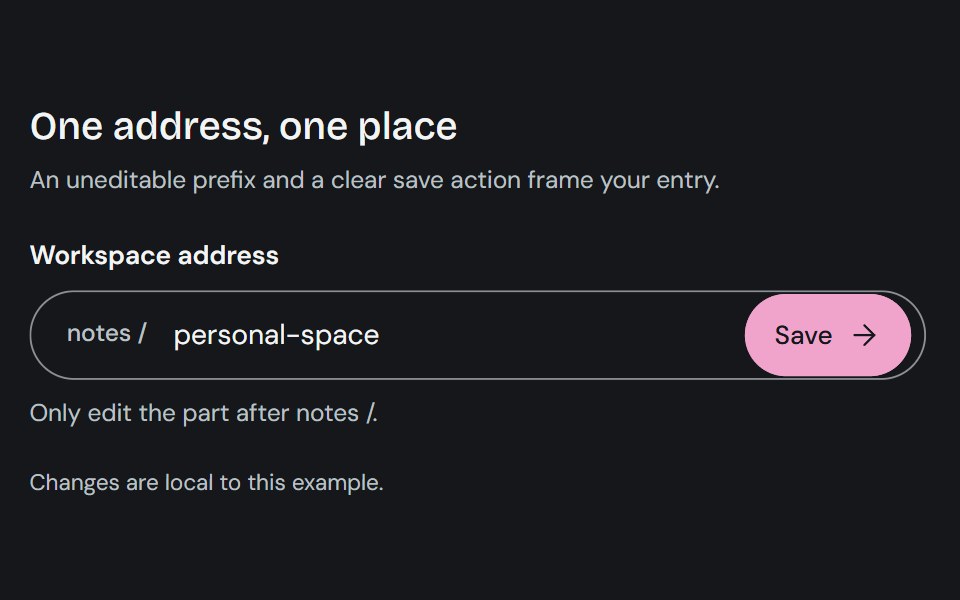 Input GroupCojeev UI · ReactCombines a text control with adjacent prefixes, suffixes, or actions in one input surface.
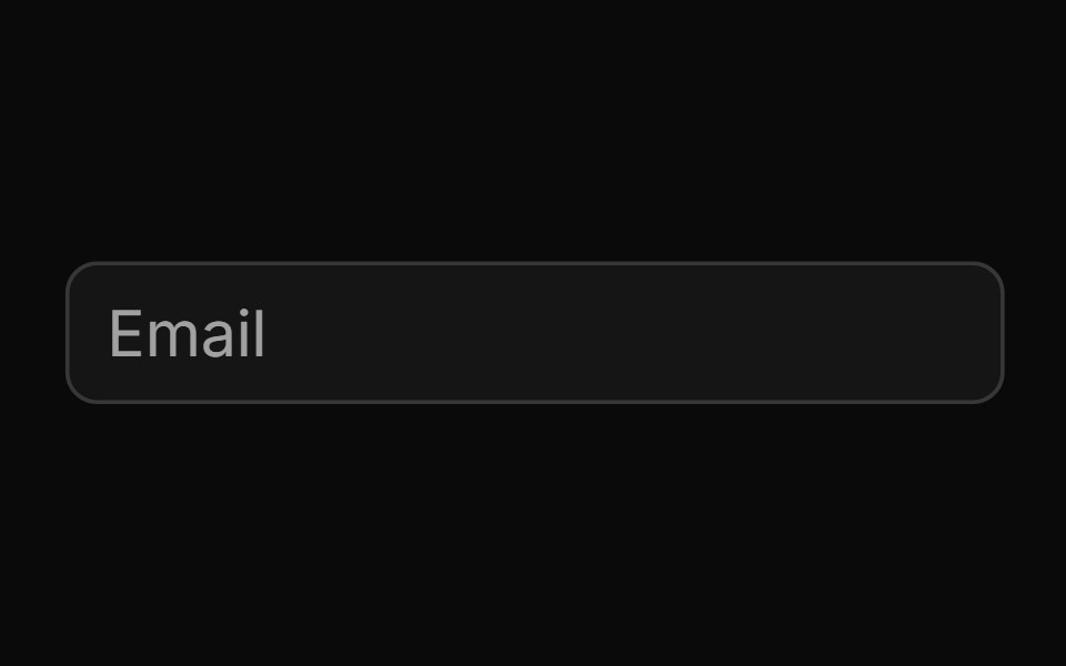
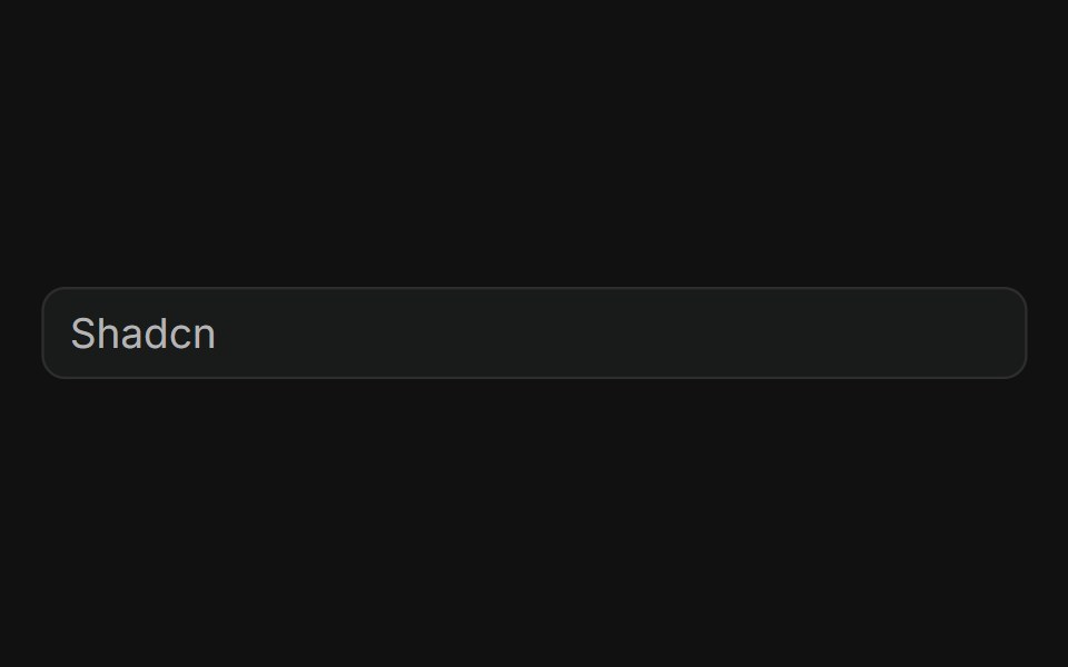 BasicFLX UI · ReactPlain text input with a placeholder, no addons.
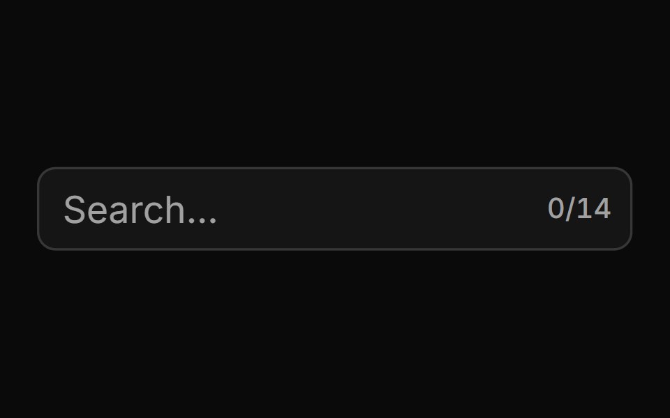 With Character Countsv-particles · SvelteForm field that shows the number of characters typed out of the maximum.
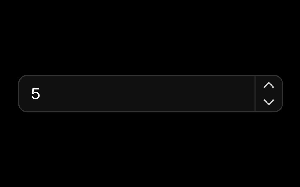 Number Fieldark-cn · ReactA shadcn-style number field component built with Ark UI primitives.
 search-fieldIntent UI · Reactsearch-field
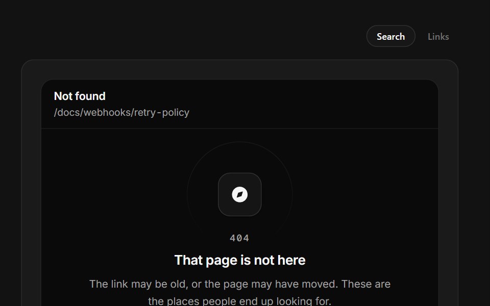 Page Not FoundSpectrum UI · ReactA 404 that prints the path it tried and filters real destinations as you type.
 Command-04 - Team Member SearchShadcn Space · ReactCommand component for searching and inviting team members
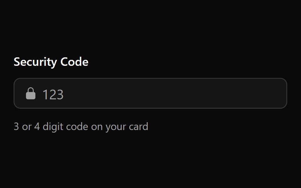 Input Mask 3Watermelon UI · React
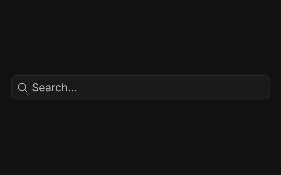 With AddonFLX UI · ReactInput with trailing search icon addon.
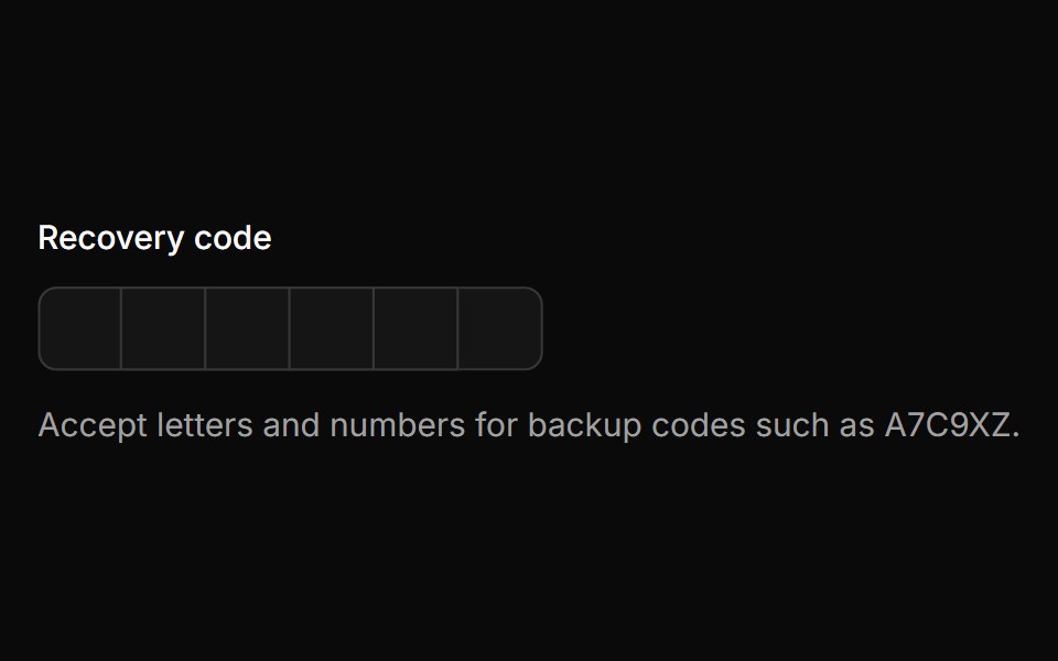 Alpha Numericsv-particles · Svelte
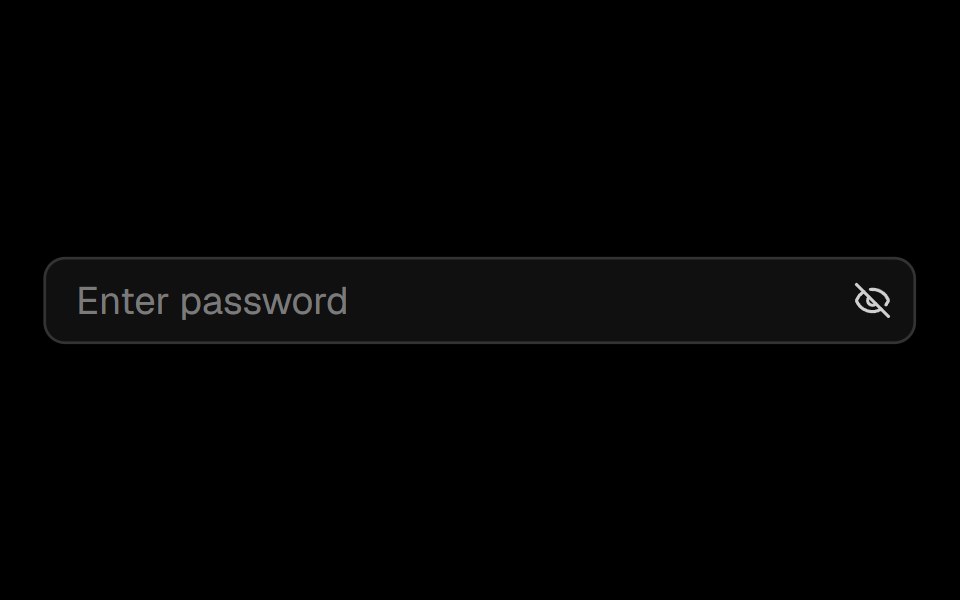 Password Inputark-cn · ReactA shadcn-style password input component built with Ark UI primitives.
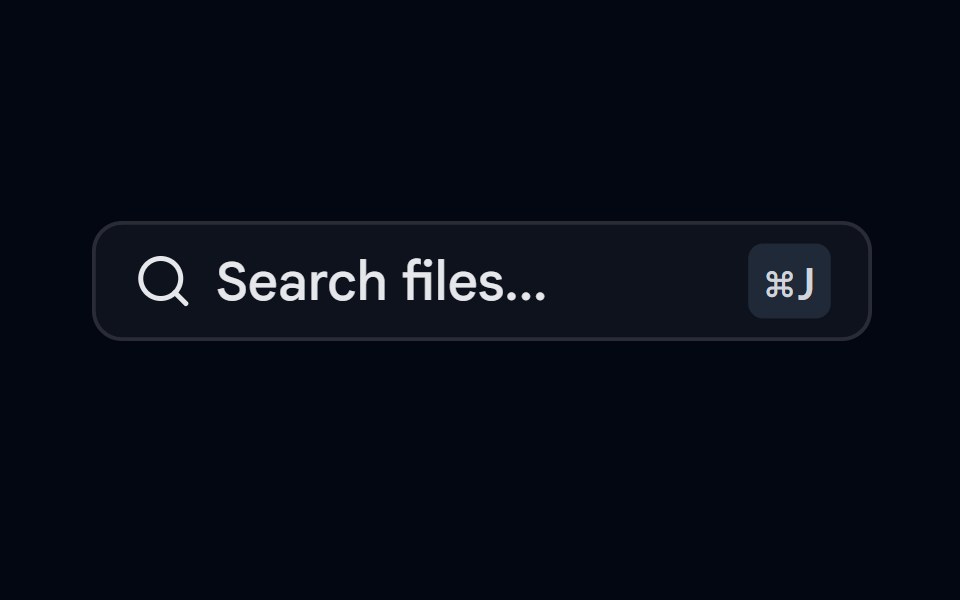 Command-06 - Search FilesShadcn Space · ReactCommand component for searching files
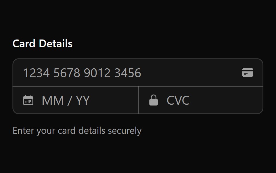 Input Mask 4Watermelon UI · React
 DisabledFLX UI · ReactText input rendered in a disabled, non-interactive state.
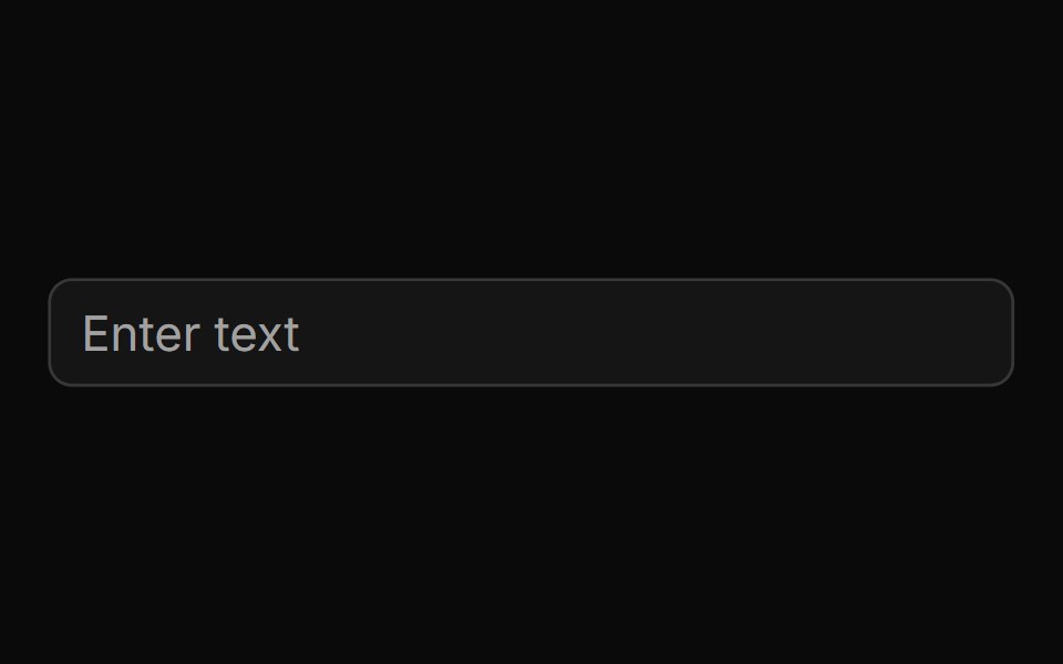 Basic Inputsv-particles · Svelte
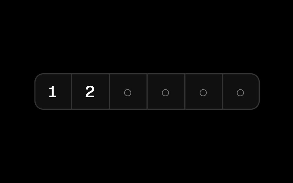 Pin Inputark-cn · ReactA shadcn-style pin input component built with Ark UI primitives.
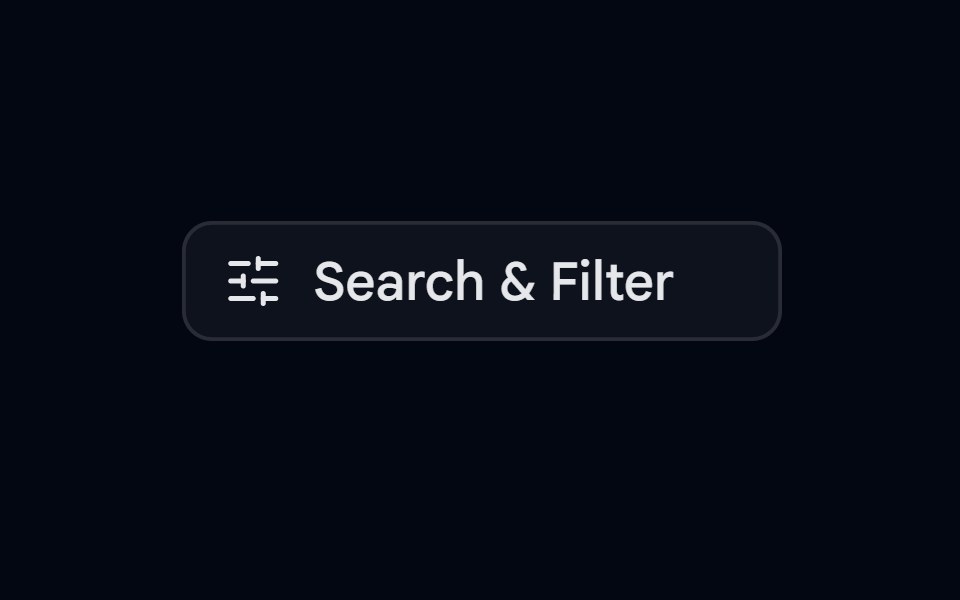 Command-07 - Filter SearchShadcn Space · ReactCommand component for filter search
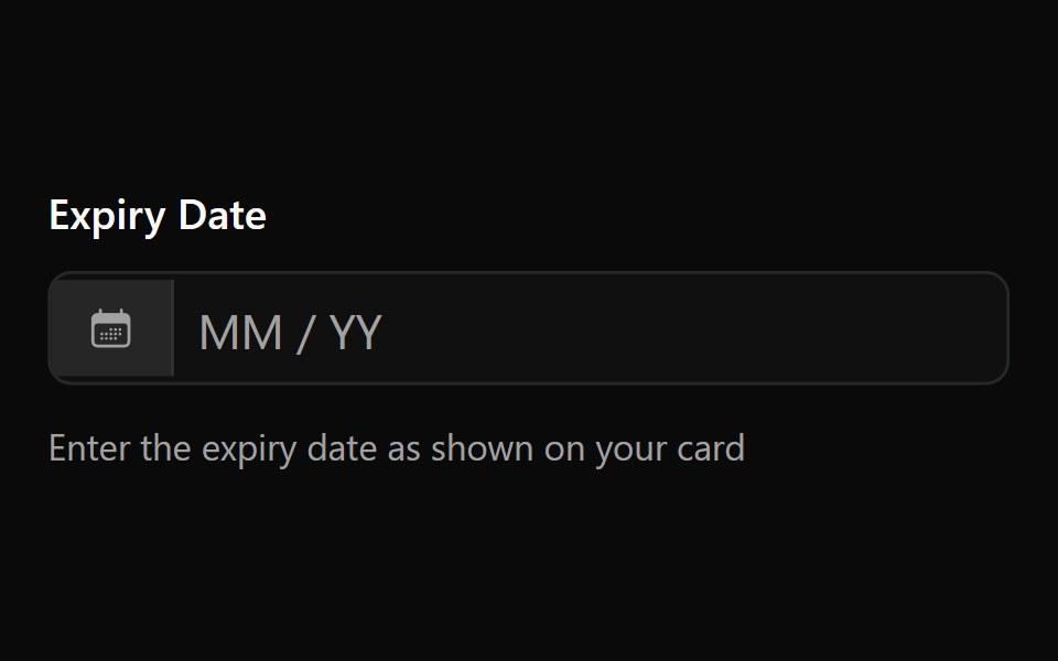 Input Mask 5Watermelon UI · React
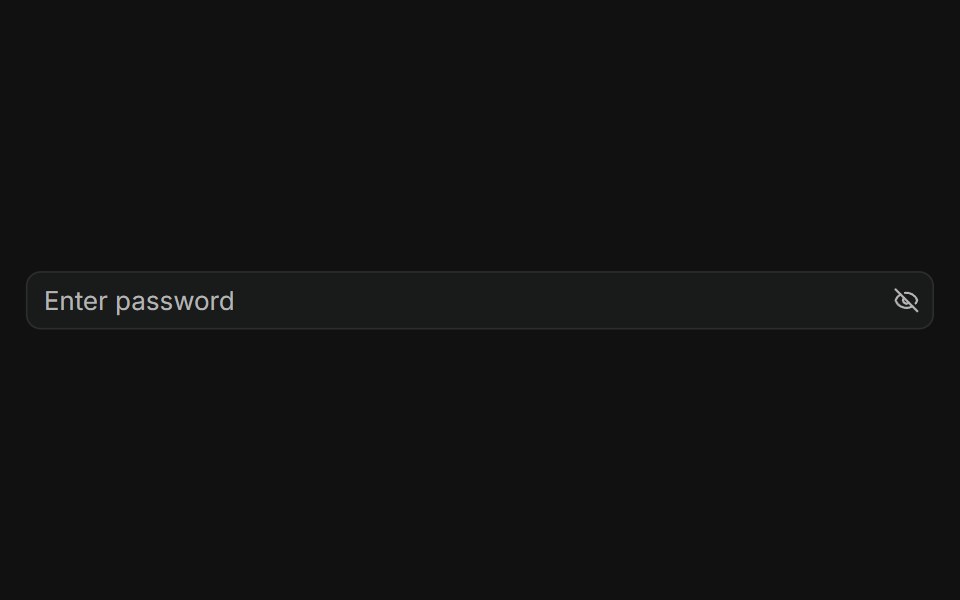 With Addon in the endFLX UI · ReactPassword input with a trailing eye-off icon to indicate visibility toggle.
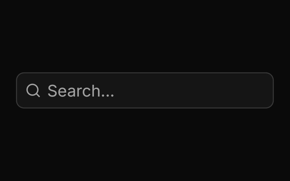 Basic Input Groupsv-particles · Svelte
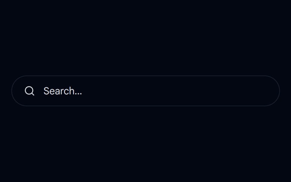 Dropdown Menu 05 - SearchShadcn Space · ReactA search dropdown that expands in place with live filtering, category chips, recent and trending searches, and…
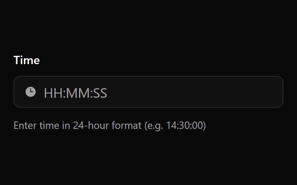 Input Mask 6Watermelon UI · React
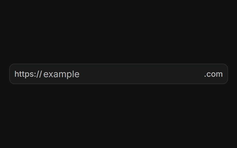 With prefix and suffixFLX UI · ReactURL input with a fixed "https://" prefix and ".com" suffix text addons.
 Basic Otpsv-particles · Svelte
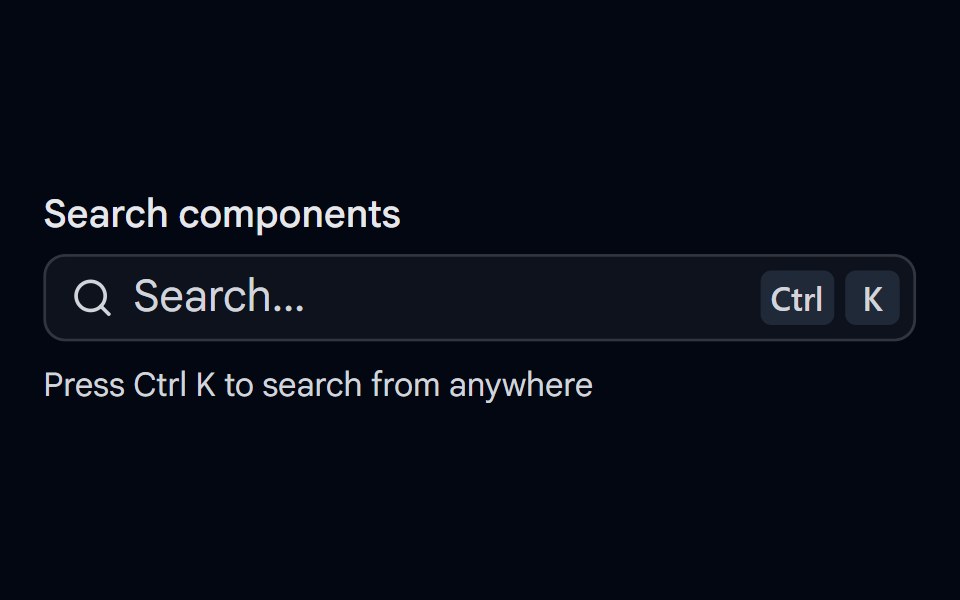 Input 22 - Search with ShortcutShadcn Space · ReactSearch input with a Cmd/Ctrl K shortcut hint, loading spinner, clear button, and live result status.
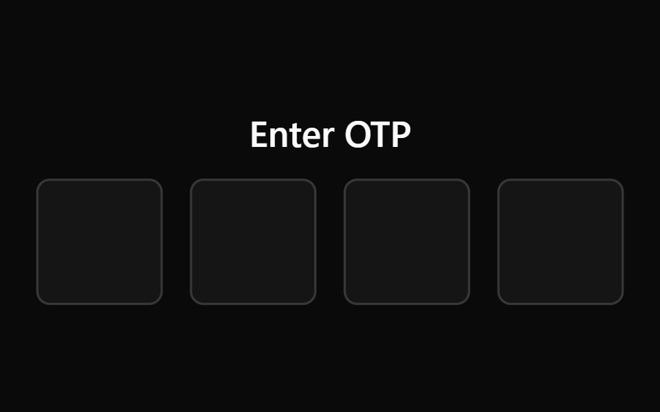 Input Otp 1Watermelon UI · React
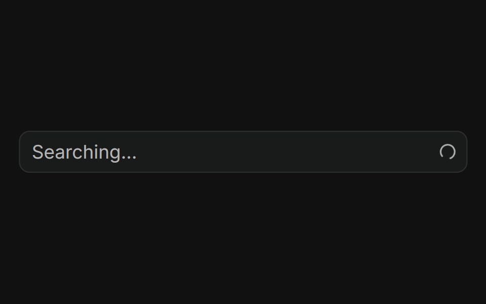 With loading spinnerFLX UI · ReactSpinning loader in the trailing addon while searching.
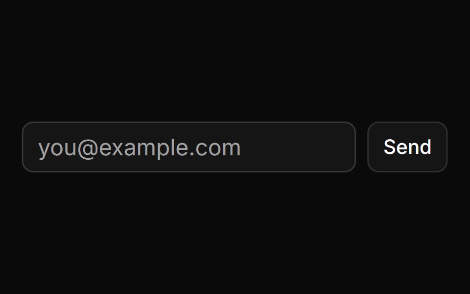 Button Using Groupsv-particles · Svelte
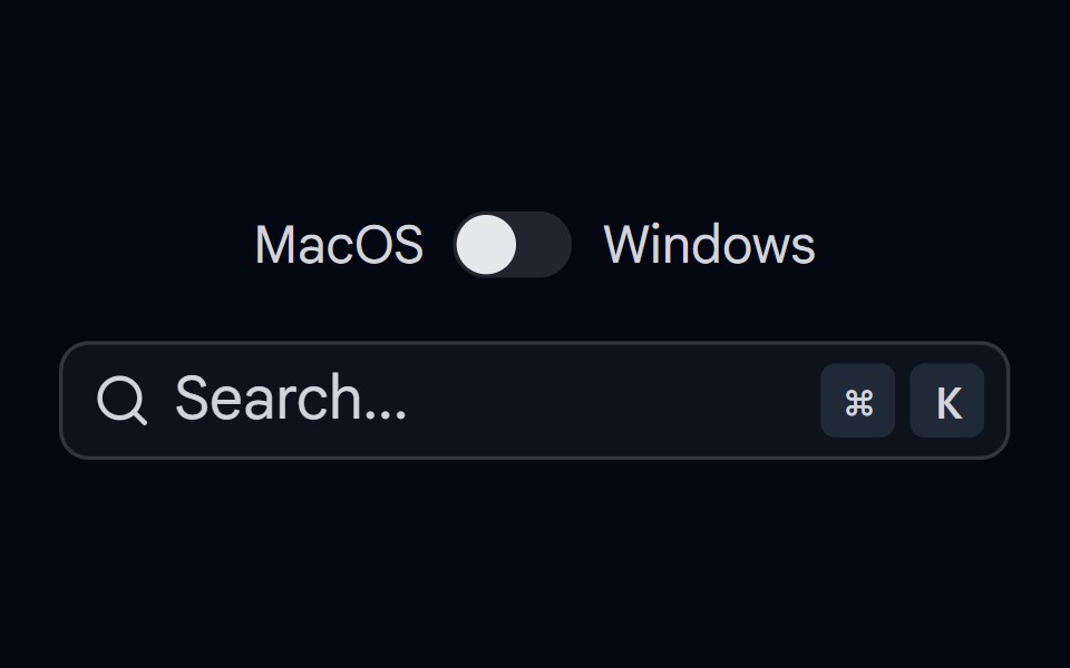 KBD 04 - KBD in Search InputShadcn Space · ReactSearch input with KBD shortcut in the input group addon, with Mac/Windows platform switch
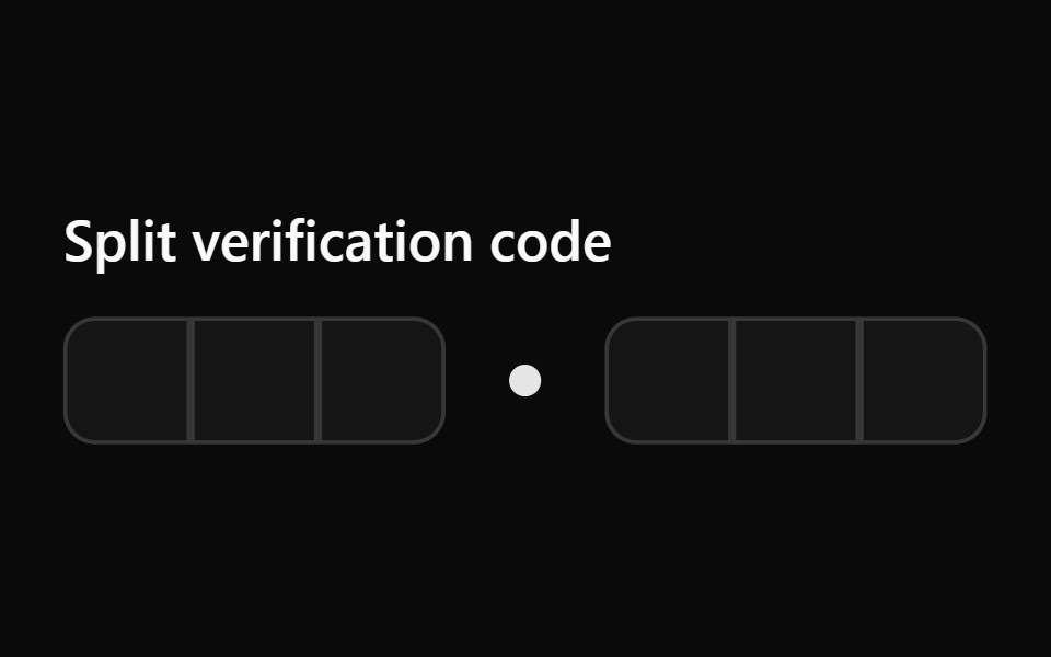 Input Otp 10Watermelon UI · React
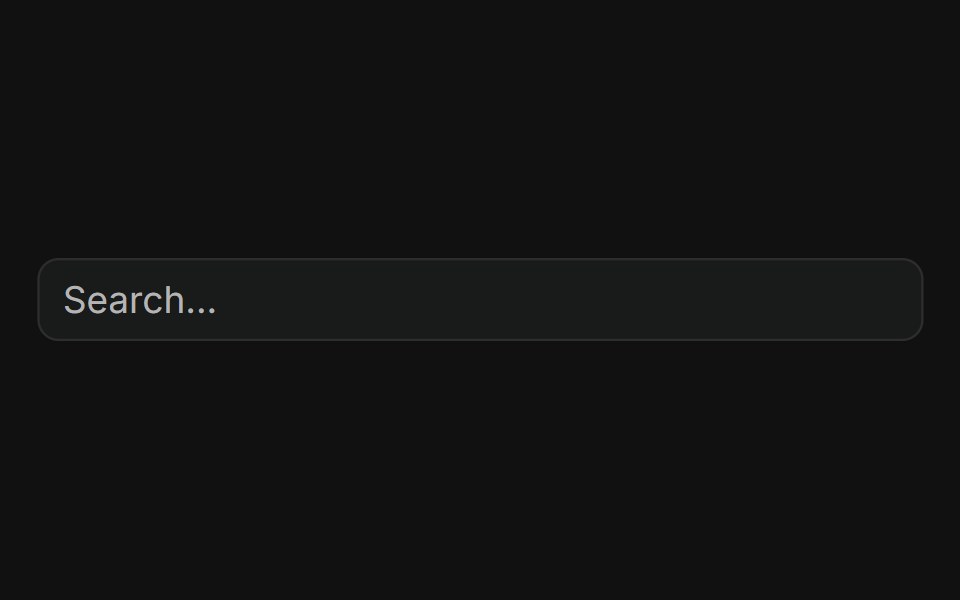 With clear buttonFLX UI · ReactClear button appears in the trailing addon when the field has text.
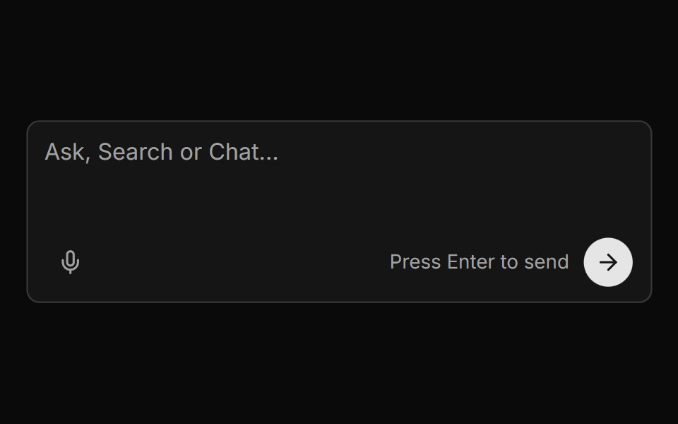 Chat Input With Voice And Send Buttonsv-particles · Svelte
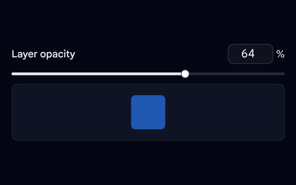 Slider 08 - With Number InputShadcn Space · ReactOpacity slider kept in sync with a number input that clamps and rounds typed values, plus a live preview swatch.
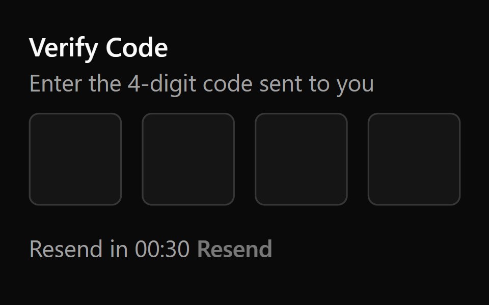 Input Otp 2Watermelon UI · React
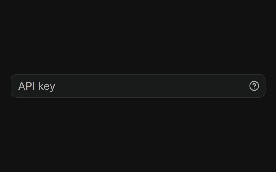 With tooltipFLX UI · ReactHelp icon in the trailing addon opens a tooltip on hover.
 Code Snippet With Language Selectorsv-particles · Svelte
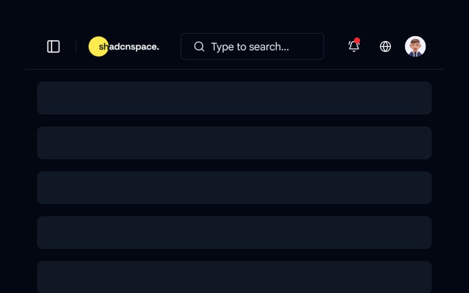 Topbar 06 - Search Focused TopbarShadcn Space · ReactClean topbar with a prominent search bar, sidebar toggle, notifications, and profile actions for faster navigation and…
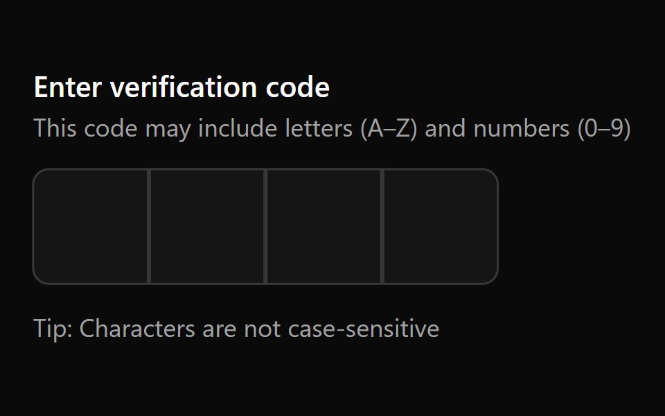 Input Otp 3Watermelon UI · React
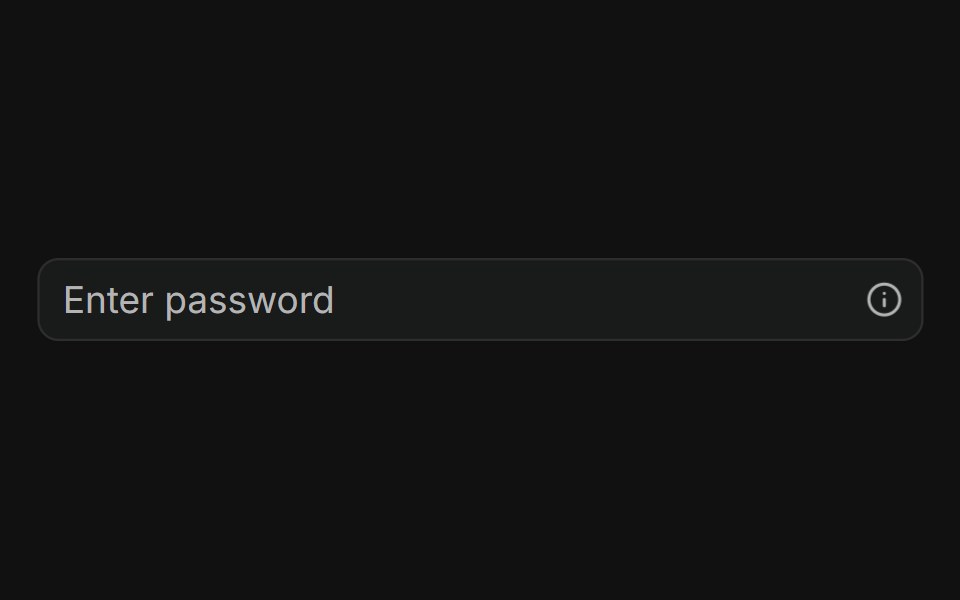 With popoverFLX UI · ReactInfo button in the trailing addon opens a popover with helper content.
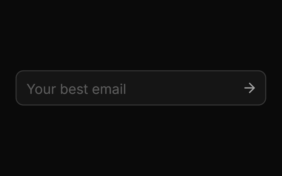 Disabledsv-particles · Svelte
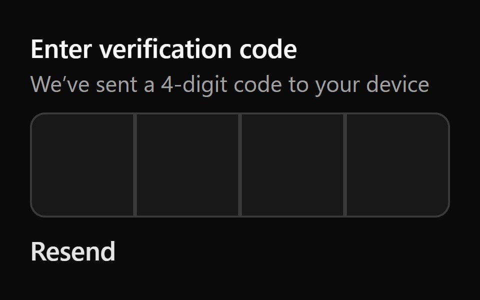 Input Otp 4Watermelon UI · React
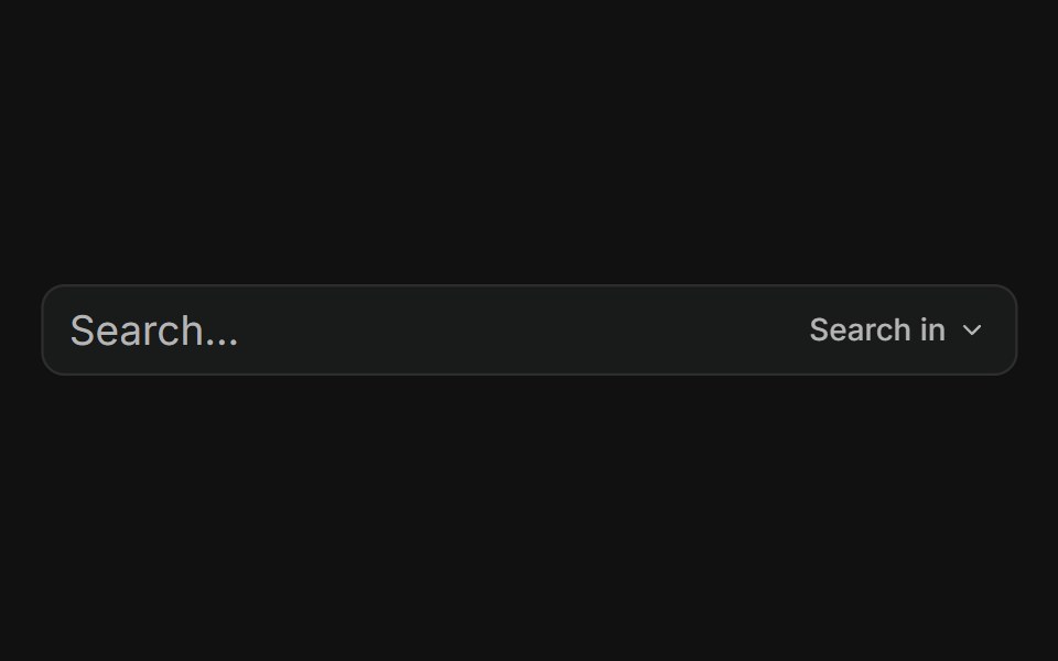 With dropdown menuFLX UI · ReactTrailing addon button opens a menu to choose search scope.
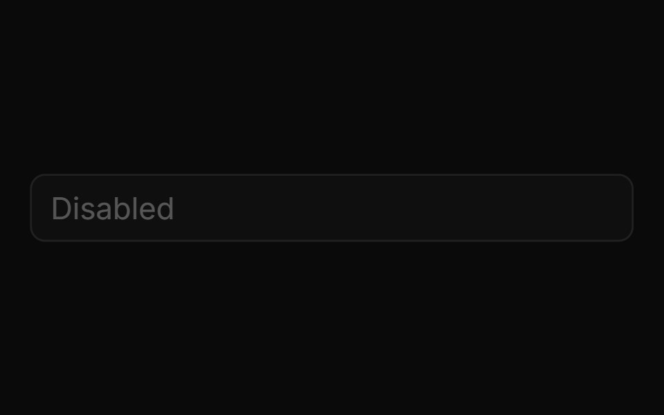 Disabled Inputsv-particles · Svelte
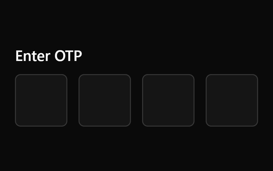 Input Otp 5Watermelon UI · React
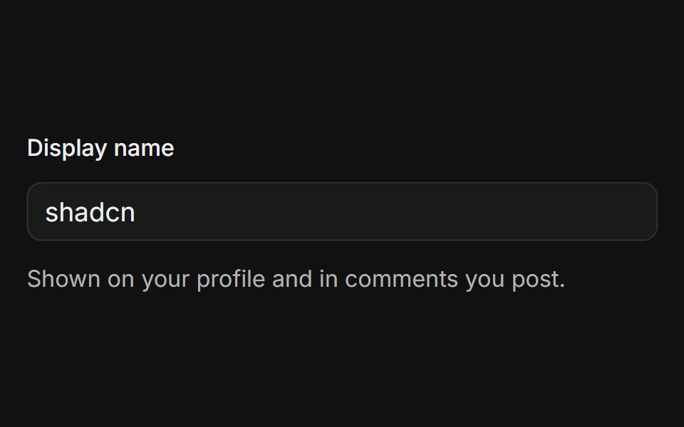 In FormFLX UI · ReactLabeled text input with a supporting description line below the field.
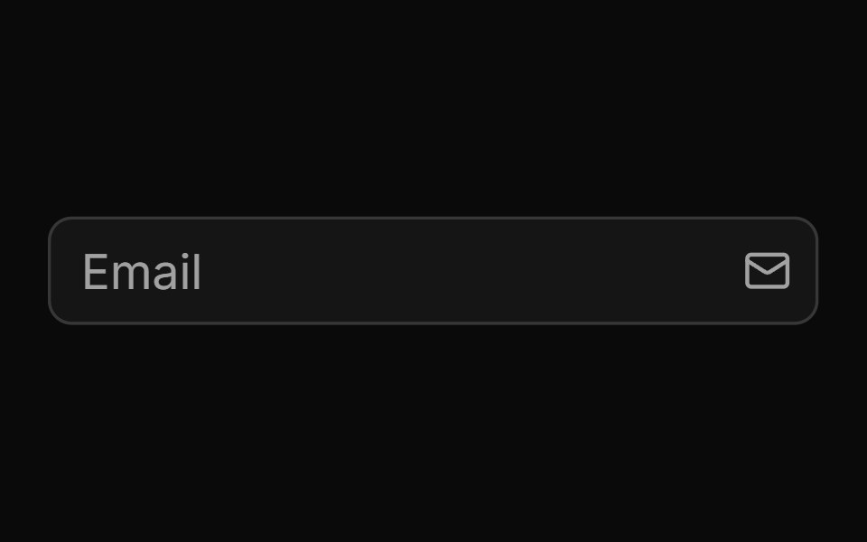 End Iconsv-particles · Svelte
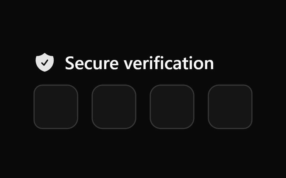 Input Otp 6Watermelon UI · React
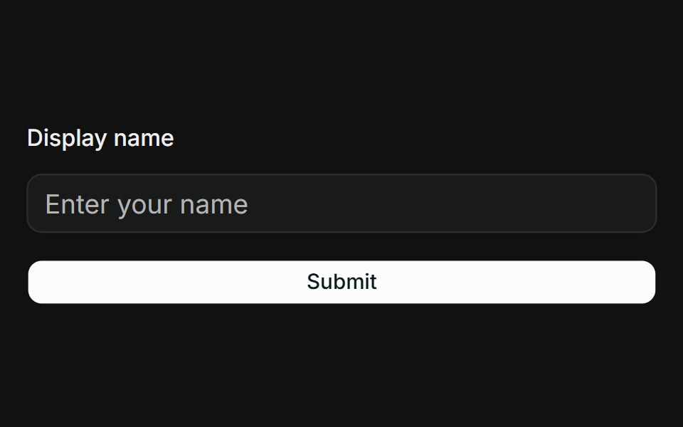 React Hook Form + ZodFLX UI · ReactController binds Input to RHF; Zod resolver drives FieldError on submit.
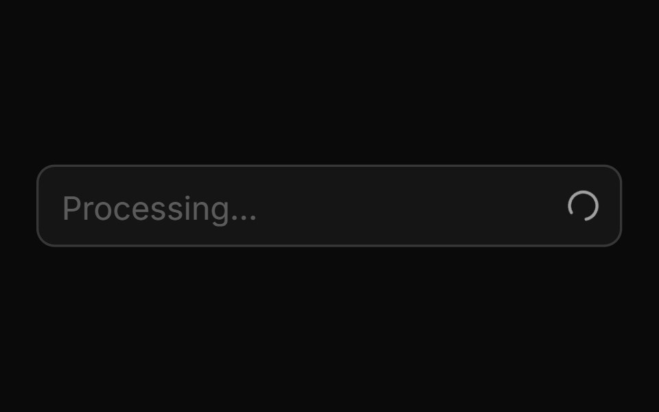 End Loading Spinnersv-particles · Svelte
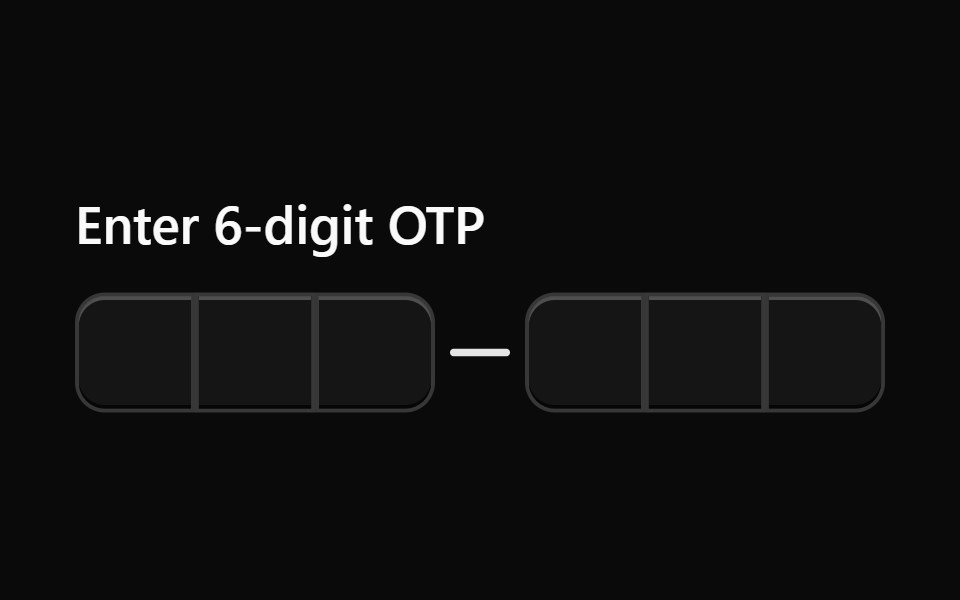 Input Otp 7Watermelon UI · React
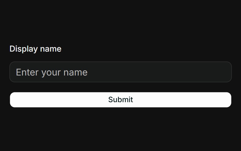 TanStack Form + ZodFLX UI · Reactform.Field wires Input; Zod onSubmit validator surfaces FieldError when touched.
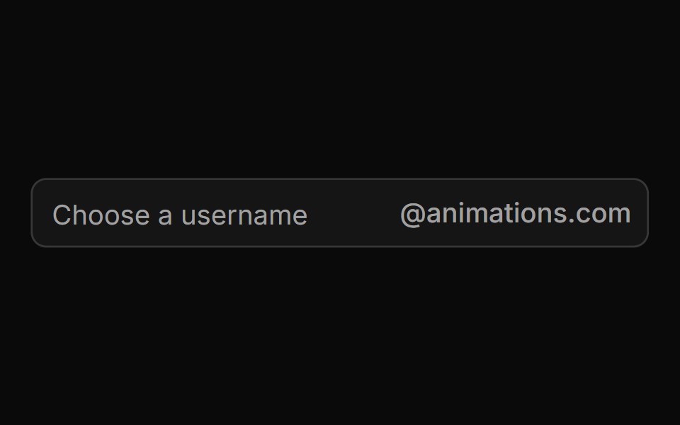 End Textsv-particles · Svelte
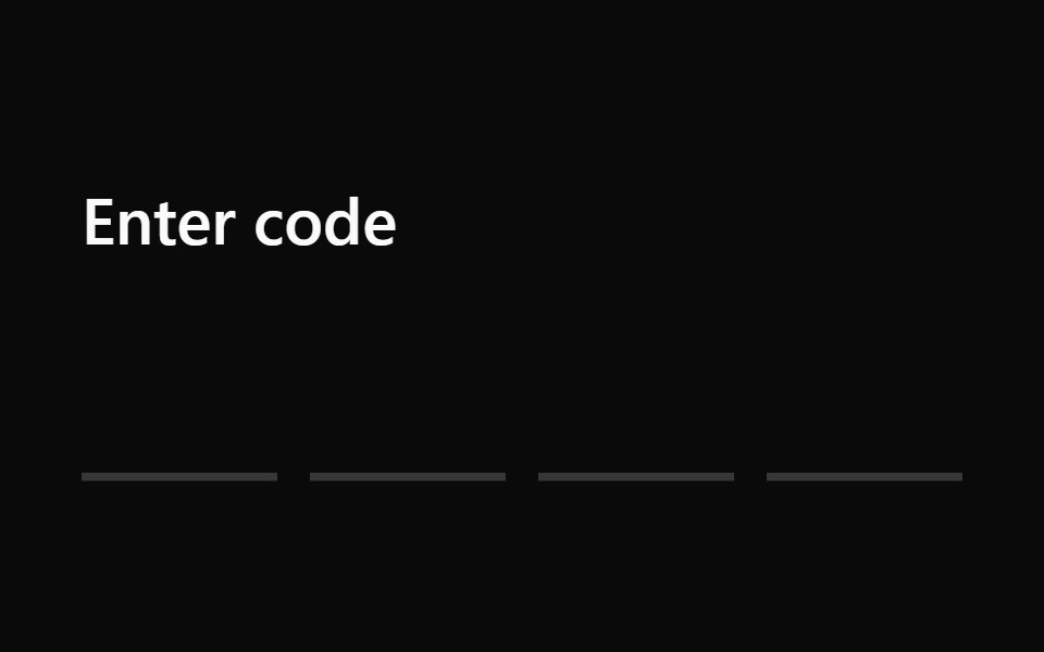 Input Otp 8Watermelon UI · React
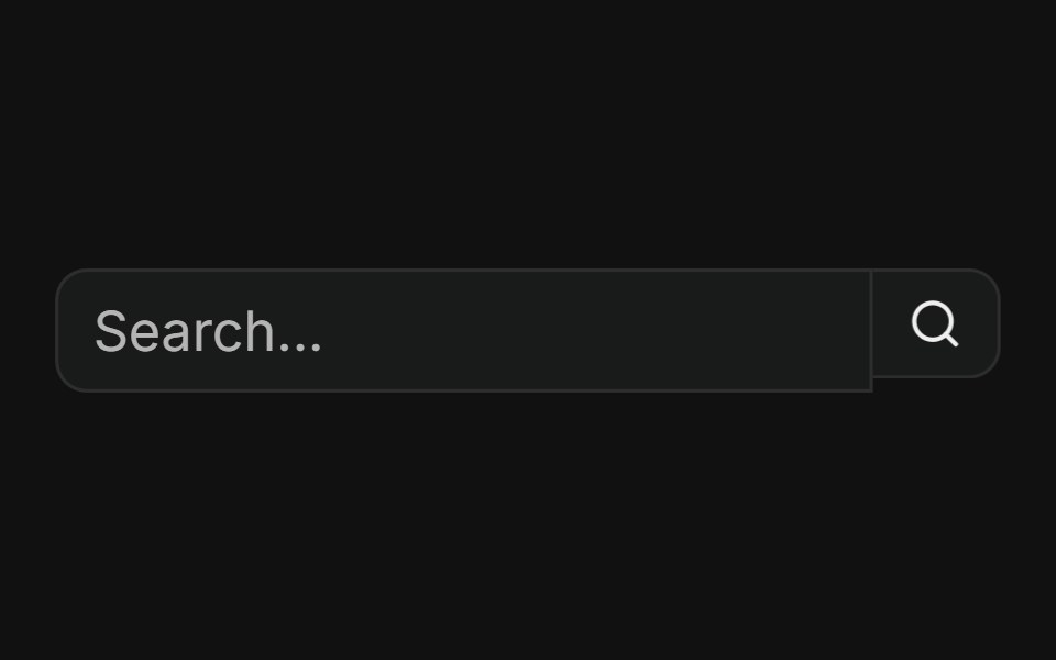 With search buttonFLX UI · ReactButtonGroup pairs a text input with a trailing search action button.
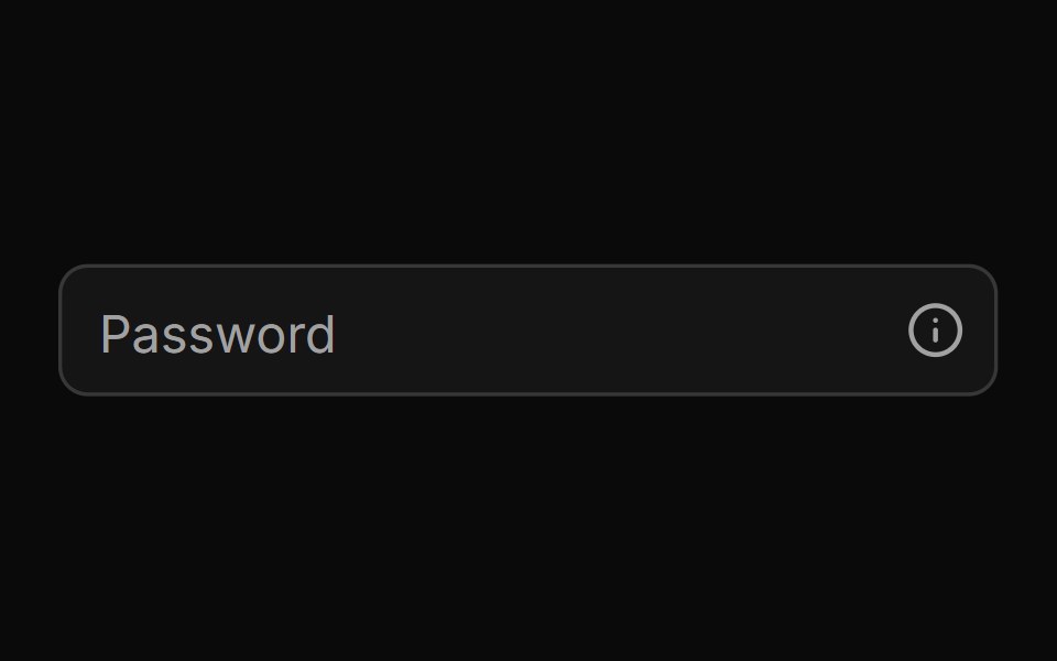 End Tooltipsv-particles · Svelte
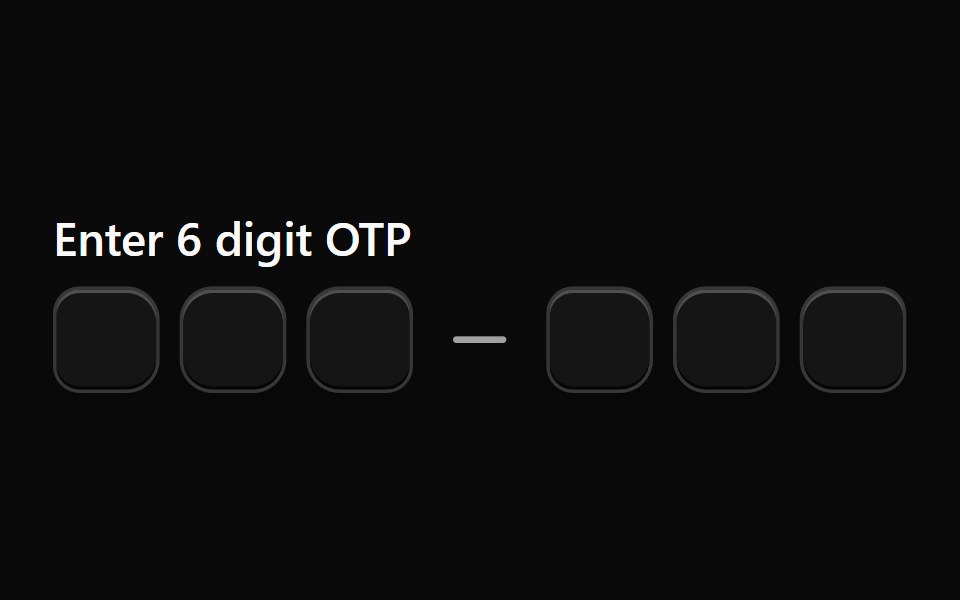 Input Otp 9Watermelon UI · React
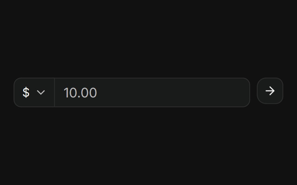 With currency selectFLX UI · ReactNested ButtonGroup: currency Select, amount input, and submit icon button.
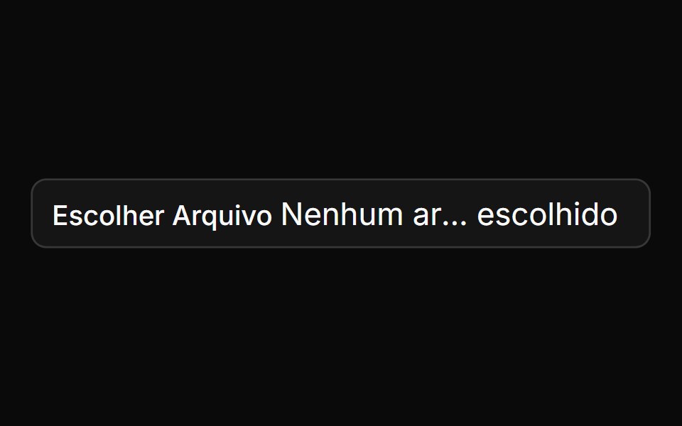 File Inputsv-particles · Svelte
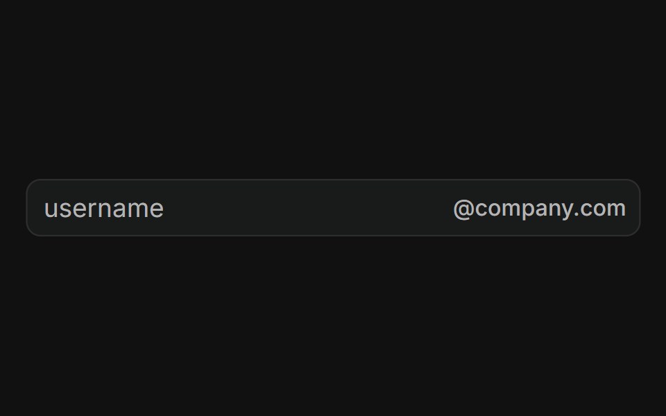 With email domainFLX UI · ReactUsername field with a fixed @company.com suffix addon, locking the email domain.
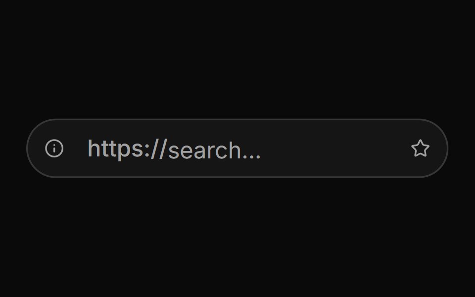 Input Group With Mimicking Url Barsv-particles · Svelte
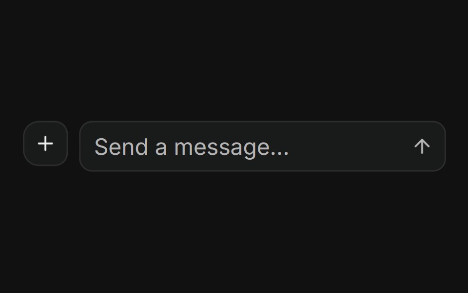 With nested input groupFLX UI · ReactAttach button plus InputGroup message field and send action in a ButtonGroup.
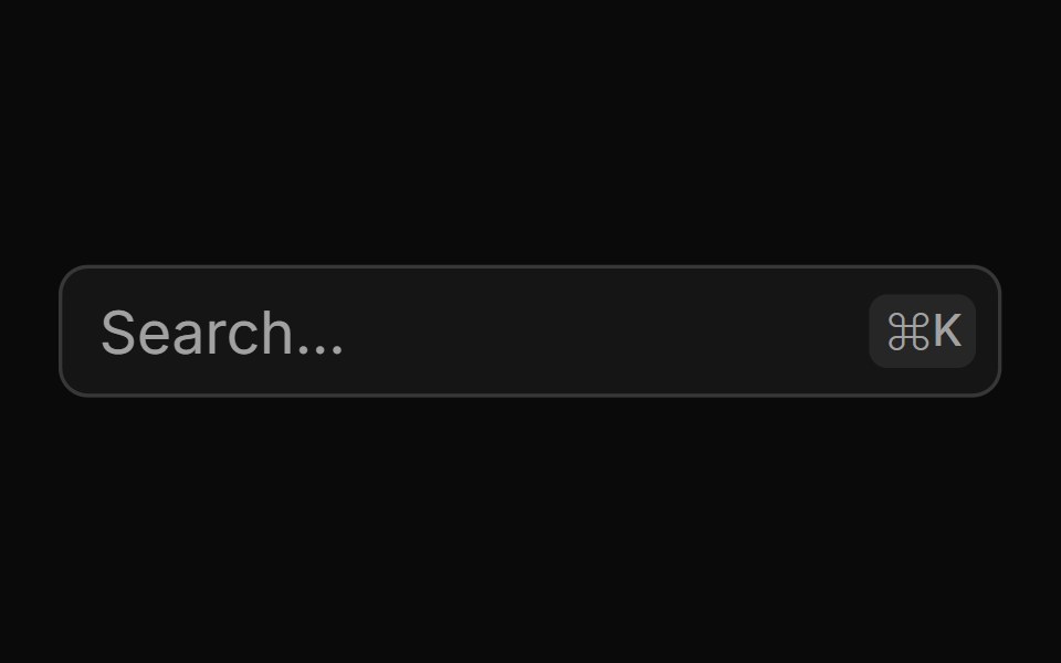 Keyboard Shortcutsv-particles · Svelte
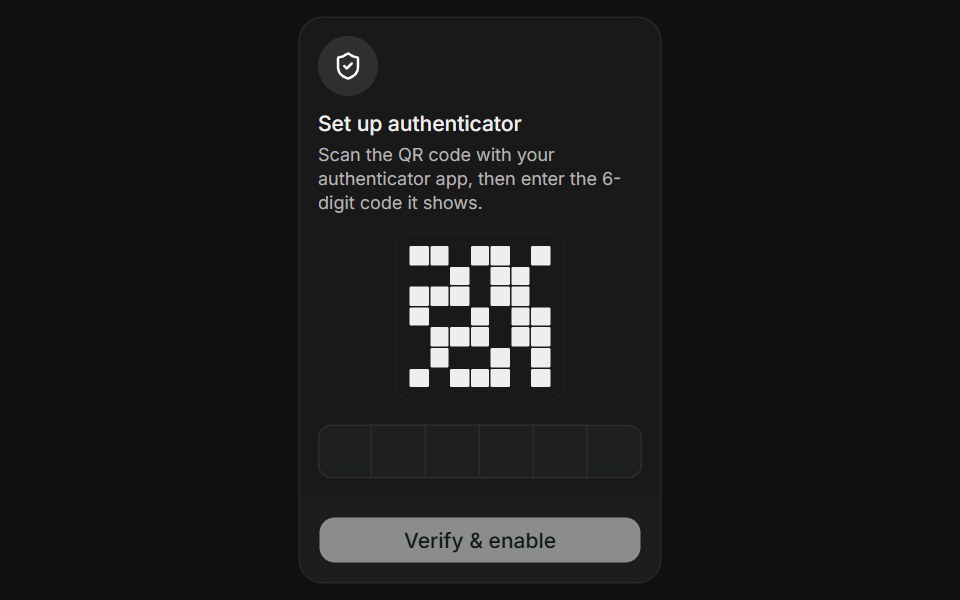 Authenticator AppFLX UI · ReactAuthenticator App for Two-Factor Setup.
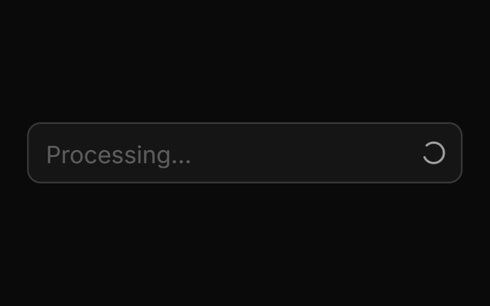 Loading Spinnersv-particles · Svelte
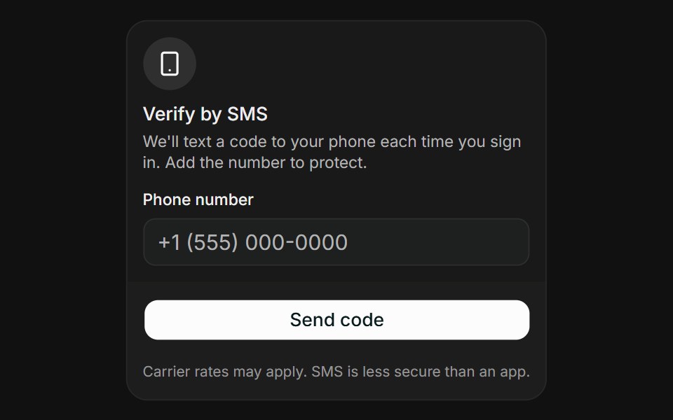 SMS CodeFLX UI · ReactSMS Code for Two-Factor Setup.
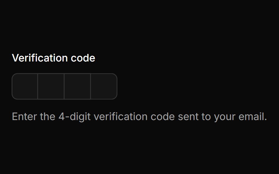 Masked Otp Fieldsv-particles · Svelte
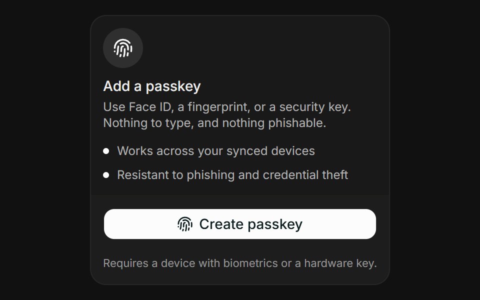 PasskeyFLX UI · ReactPasskey for Two-Factor Setup.
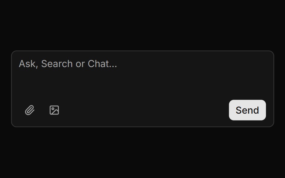 Message Composer With Attachmentssv-particles · Svelte
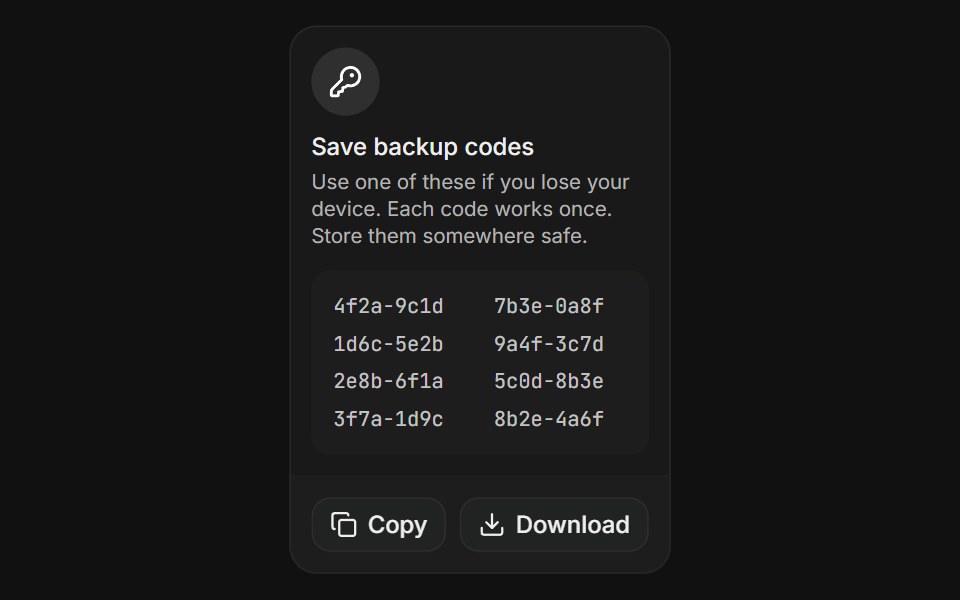 Backup CodesFLX UI · ReactBackup Codes for Two-Factor Setup.
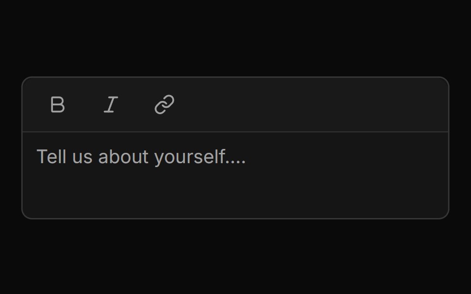 Mini Editor Group Togglesv-particles · Svelte
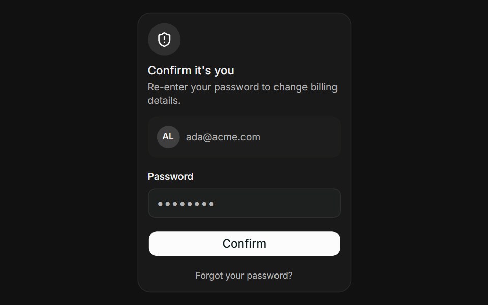 Password Re-authFLX UI · ReactPassword Re-auth for Verify Identity.
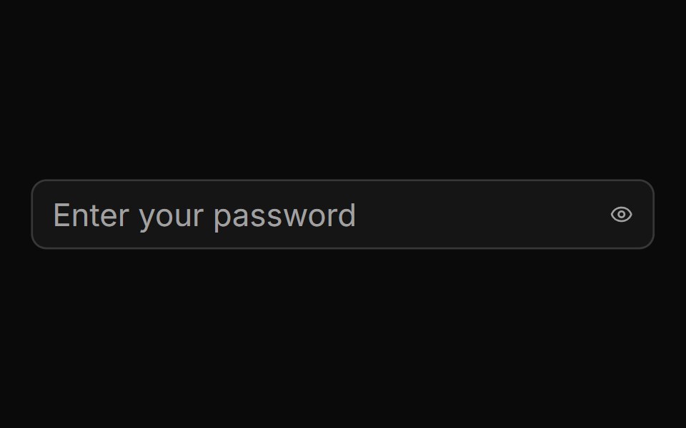 Password Input Togglesv-particles · Svelte
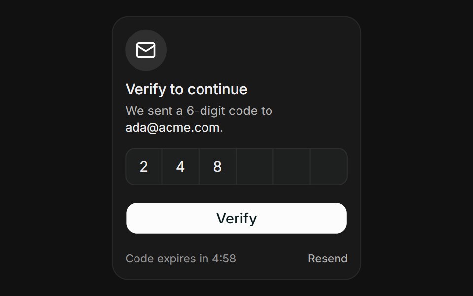 OTP ChallengeFLX UI · ReactOTP Challenge for Verify Identity.
 Password Input With Strength Indicatorsv-particles · Svelte
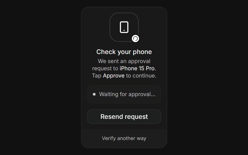 Push ApprovalFLX UI · ReactPush Approval for Verify Identity.
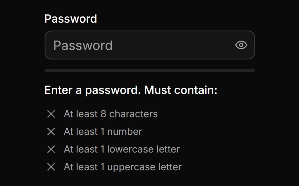 Password Input With Strength Inidicatorsv-particles · Svelte
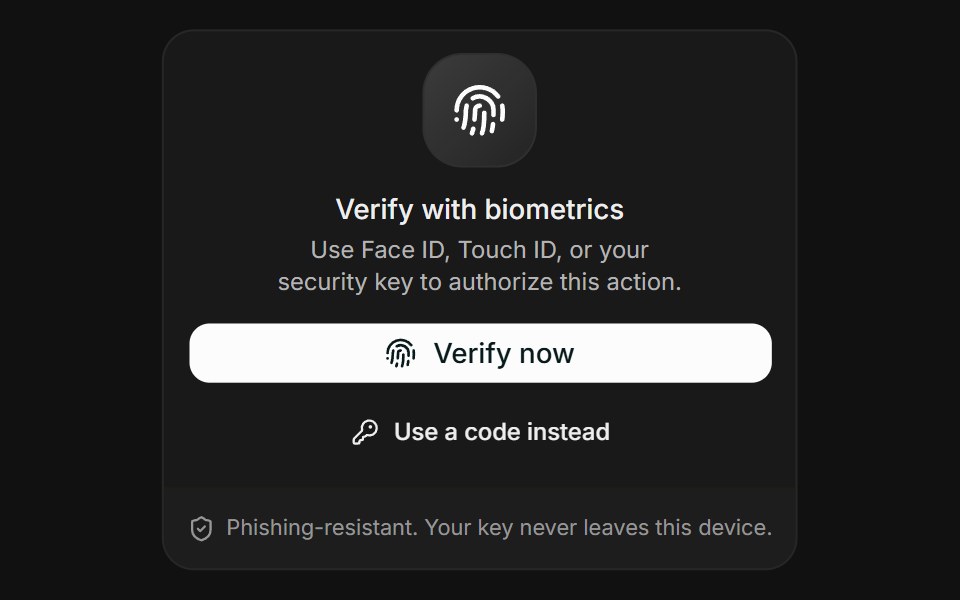 BiometricFLX UI · ReactBiometric for Verify Identity.
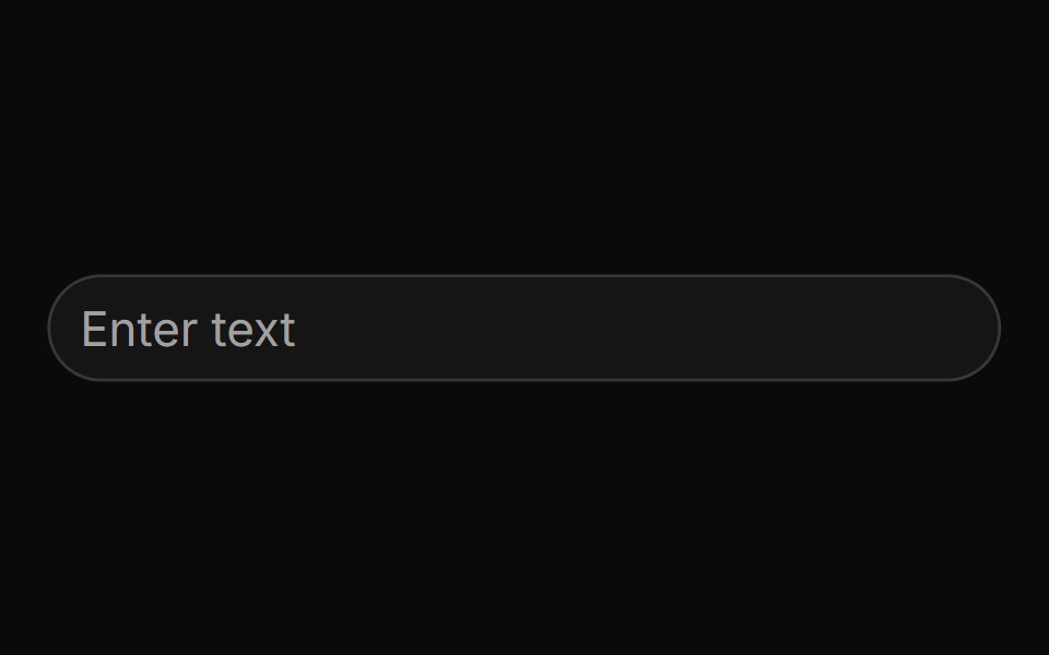 Pill Shapedsv-particles · Svelte
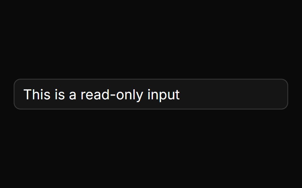 Readonly Inputsv-particles · Svelte
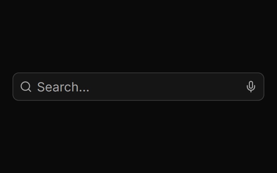 Search Input With Loader And Voicesv-particles · Svelte
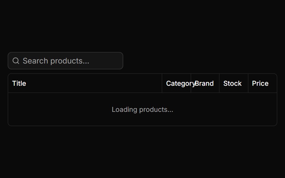 Search Tablesv-particles · Svelte
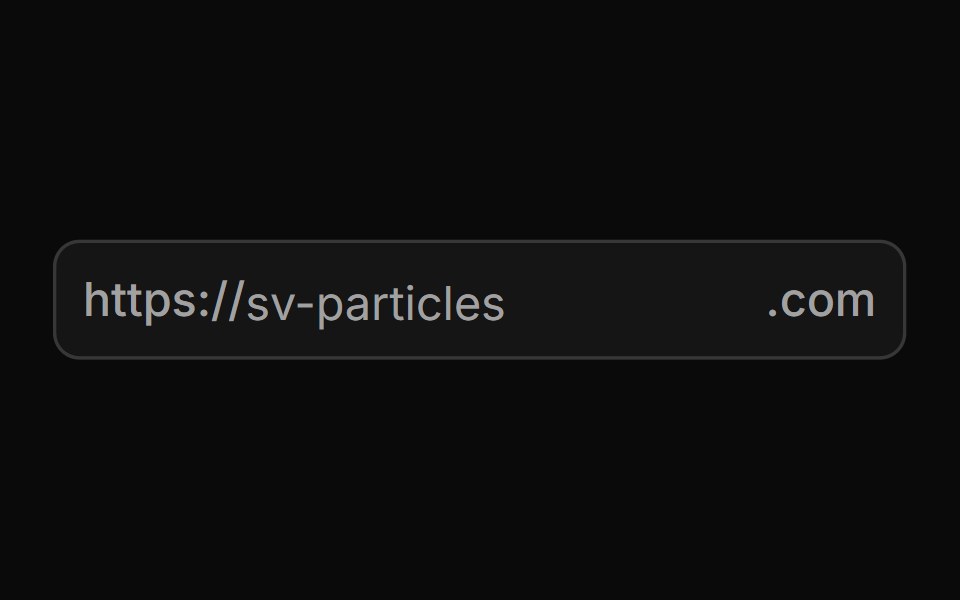 Start And End Textsv-particles · Svelte
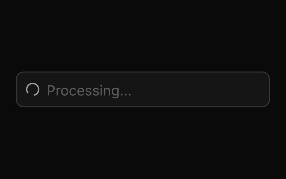 Start Loading Spinnersv-particles · Svelte
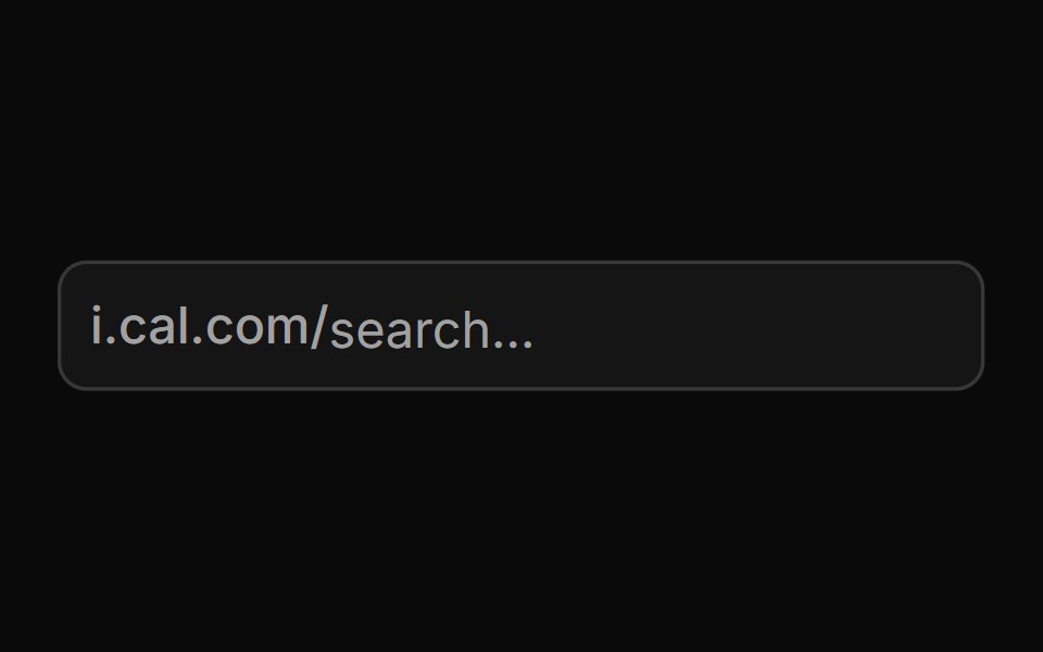 Start Textsv-particles · Svelte
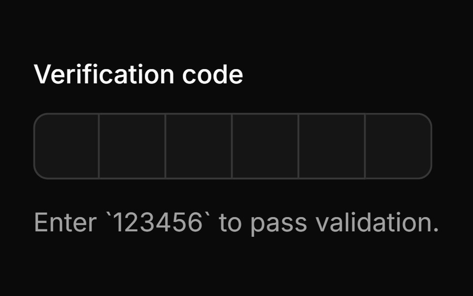 With Auto Validationsv-particles · Svelte
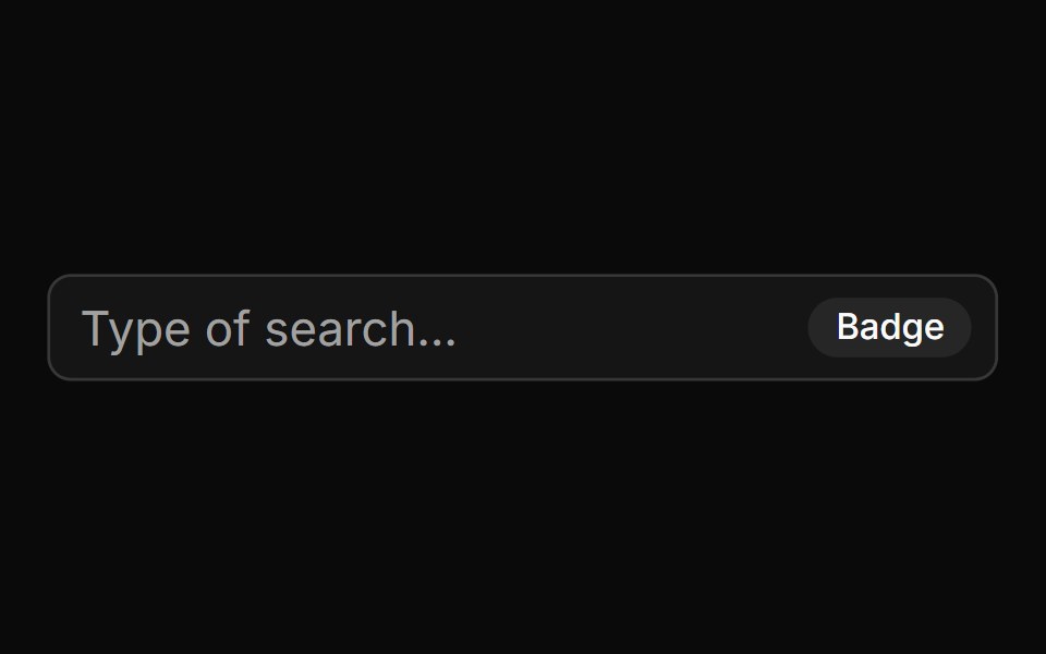 With Badgesv-particles · Svelte
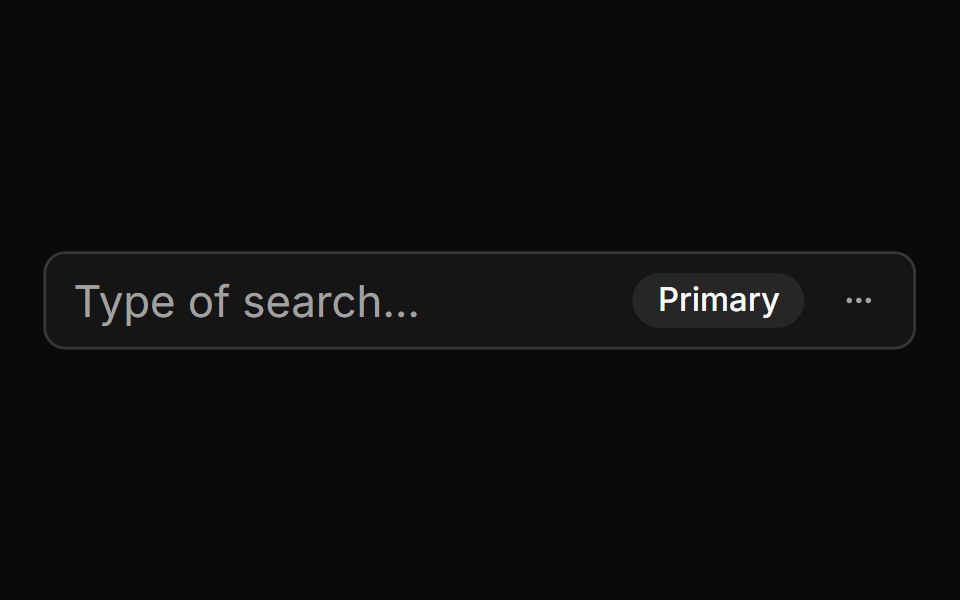 With Badge And Menusv-particles · Svelte
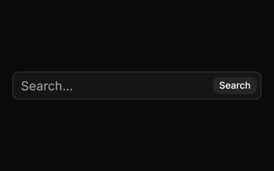 With Buttonsv-particles · Svelte
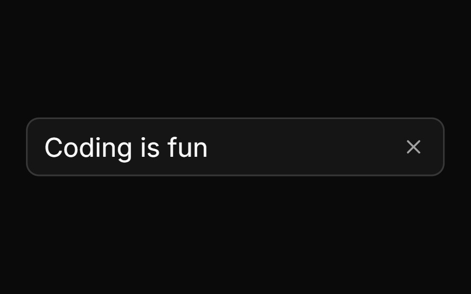 With Clear Buttonsv-particles · Svelte
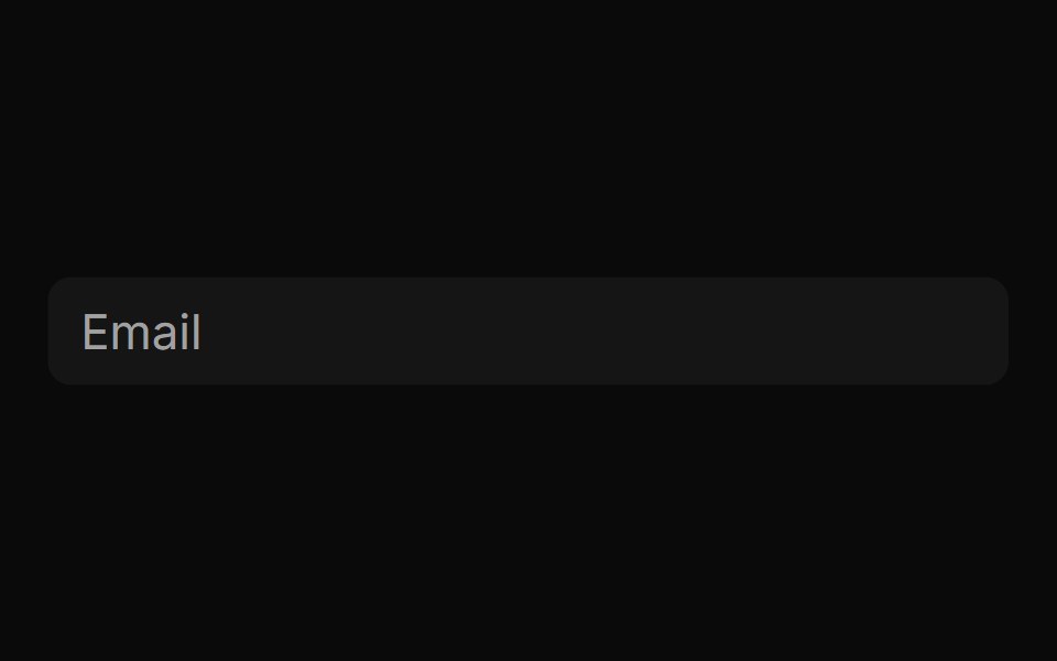 With Custom Border Backgroundsv-particles · Svelte
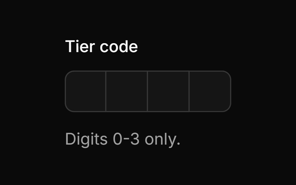 With Custom Sanitizationsv-particles · Svelte
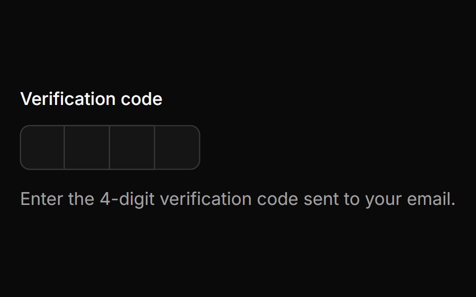 With Field Labelsv-particles · Svelte
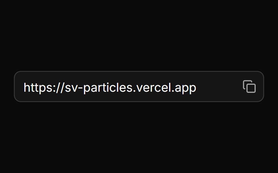 With Icon Buttonsv-particles · Svelte
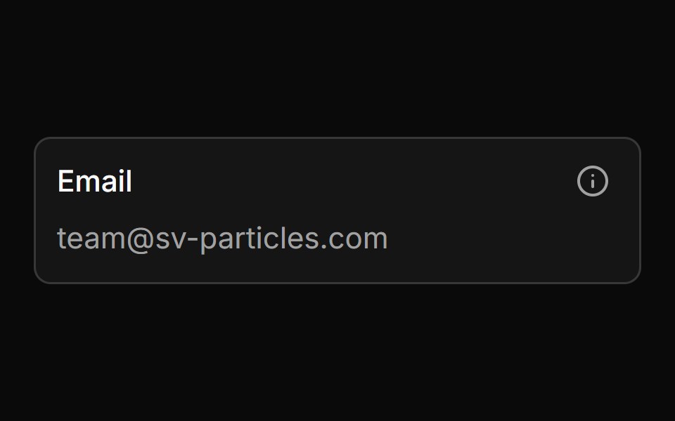 With Inner Labelsv-particles · Svelte
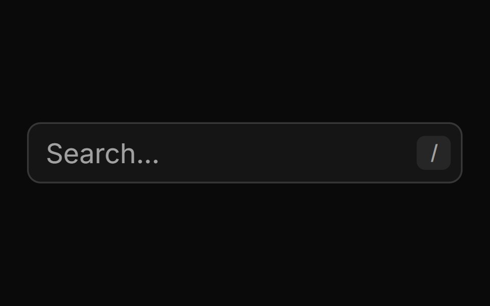 With Keyboard Shortcut Searchsv-particles · Svelte
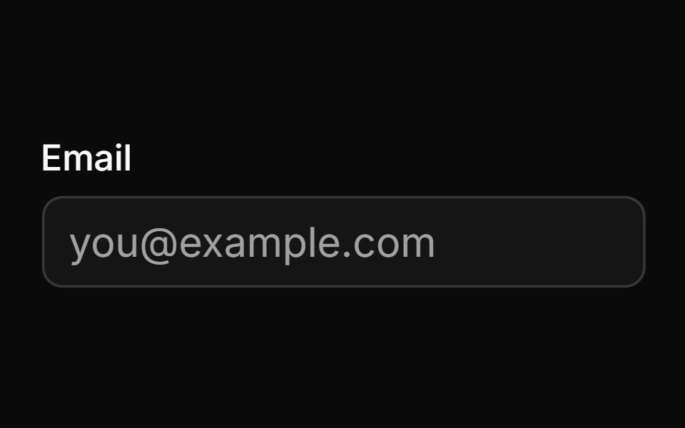 With Labelsv-particles · Svelte
Libraries with shadcn/ui text input components
Related categories
- Text Input Components
- React Text Input Components
- Tailwind CSS Text Input Components
- Svelte Text Input Components
- Animated Text Input Components
- shadcn/ui Input Components
- shadcn/ui Form Components
- shadcn/ui Select Components
- shadcn/ui Form Field Components
- shadcn/ui Switch Components
- shadcn/ui Textarea Components
- shadcn/ui Checkbox Components
- shadcn/ui OTP Input Components
- shadcn/ui Combobox Components
- shadcn/ui Date Picker Components
- shadcn/ui Radio Components
- shadcn/ui Login Form Components
- shadcn/ui Search Input Components
- shadcn/ui File Upload Components
- shadcn/ui Slider Components
- shadcn/ui Signup Form Components