Input
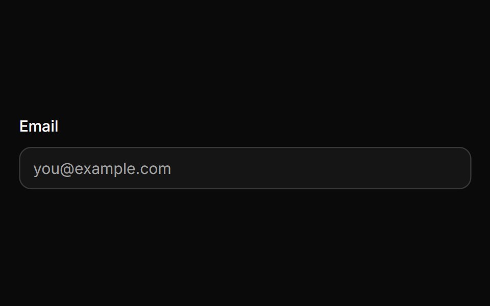
A text input with three sizes, invalid and read-only states, native validation styling and a 16px touch font so phones never zoom in.
- Library
- HextaUI
- Framework
- React
- Type
- ui
- License
- MIT
- Dependencies
- @base-ui/react@^1.8.0, class-variance-authority, cn
- Install
npx shadcn@latest add https://hextaui.com/r/input.json- Files
components/ui/input.tsxlib/motion.tscomponents/ui/number-flow.tsxhooks/use-autosize.tshooks/use-composed-ref.tshooks/use-invalid-shake.tshooks/use-merged-ref.ts
- Source
- https://github.com/preetsuthar17/hextaui
Categories
- Input Components
- React Input Components
- Tailwind CSS Input Components
- shadcn/ui Input Components
- Text Input Components
- React Text Input Components
- Tailwind CSS Text Input Components
- shadcn/ui Text Input Components