Alert
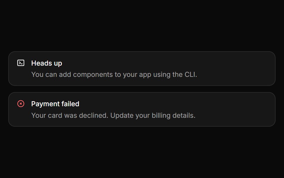
Inline messages for status and feedback, with a neutral surface, a colored icon and a dismiss that collapses smoothly.
- Library
- HextaUI
- Framework
- React
- Type
- ui
- License
- MIT
- Dependencies
- @base-ui/react@^1.8.0, @tabler/icons-react, class-variance-authority, cn
- Install
npx shadcn@latest add https://hextaui.com/r/alert.json- Files
components/ui/alert.tsxcomponents/ui/button.tsxlib/motion.tscomponents/ui/spinner.tsxhooks/use-button-feedback.tshooks/use-delayed-loading.ts
- Source
- https://github.com/preetsuthar17/hextaui
Categories
- Alert Components
- React Alert Components
- Tailwind CSS Alert Components
- Animated Alert Components
- shadcn/ui Alert Components
- Feedback Components
- React Feedback Components
- Tailwind CSS Feedback Components
- Animated Feedback Components
- shadcn/ui Feedback Components