 Dev Design Library
Tailwind CSS Alert Components
Dev Design Library indexes 153 Tailwind CSS alert components from 41 open-source UI libraries, with the most coming from Watermelon UI, ReUI, Shadcn Space, Origin UI and FLX UI. Each one links to its page with the source code, a live preview where available, the library license and the install command. Every library in this list styles its components with Tailwind CSS utility classes. Alert components belong to the Feedback group.
Showing 120 of 153, a mix from every library. Open a library to see all of its components.
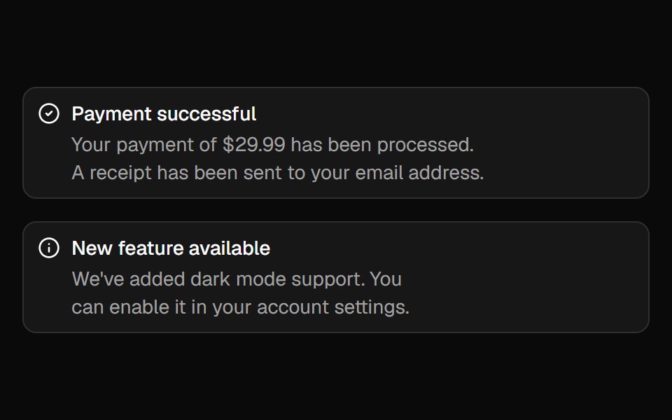 Alertshadcn/ui · ReactDisplays a callout for user attention.
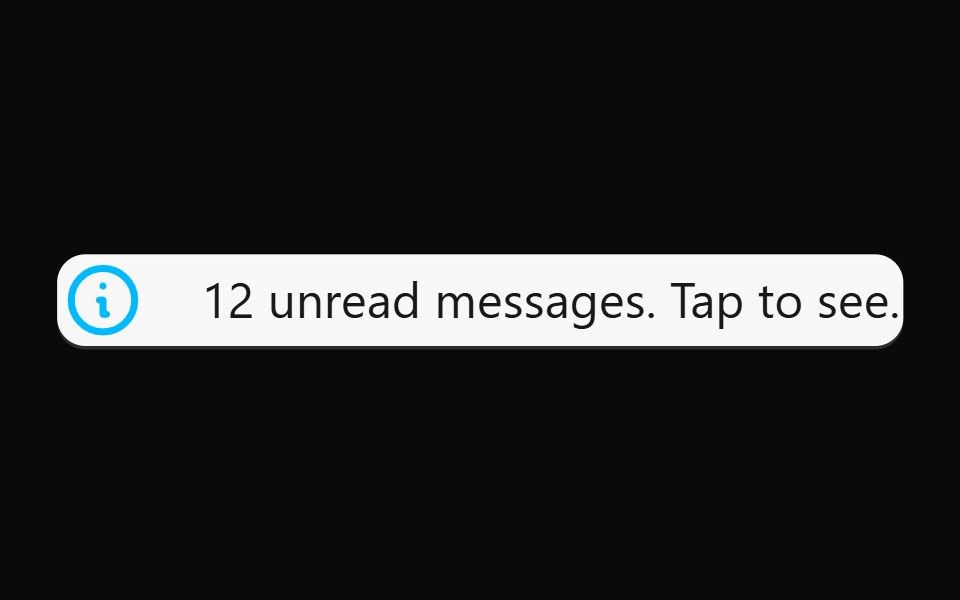 AlertdaisyUI · CSS (Tailwind)
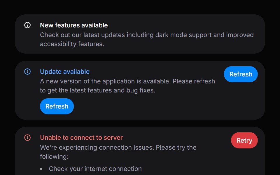 AlertHeroUI · ReactDisplays important messages and notifications to users with status indicators.
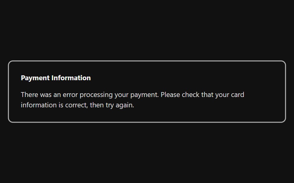 Inline AlertReact Spectrum · ReactInline alerts display a non-modal message associated with objects in a view. These are often used in form validation…
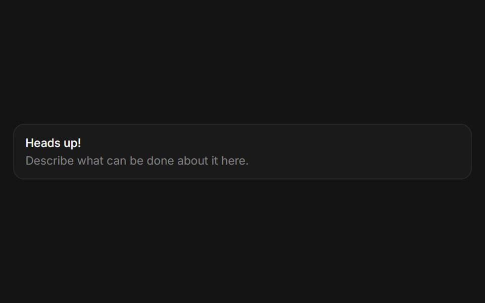 Alertcoss ui · ReactA callout for displaying important information.
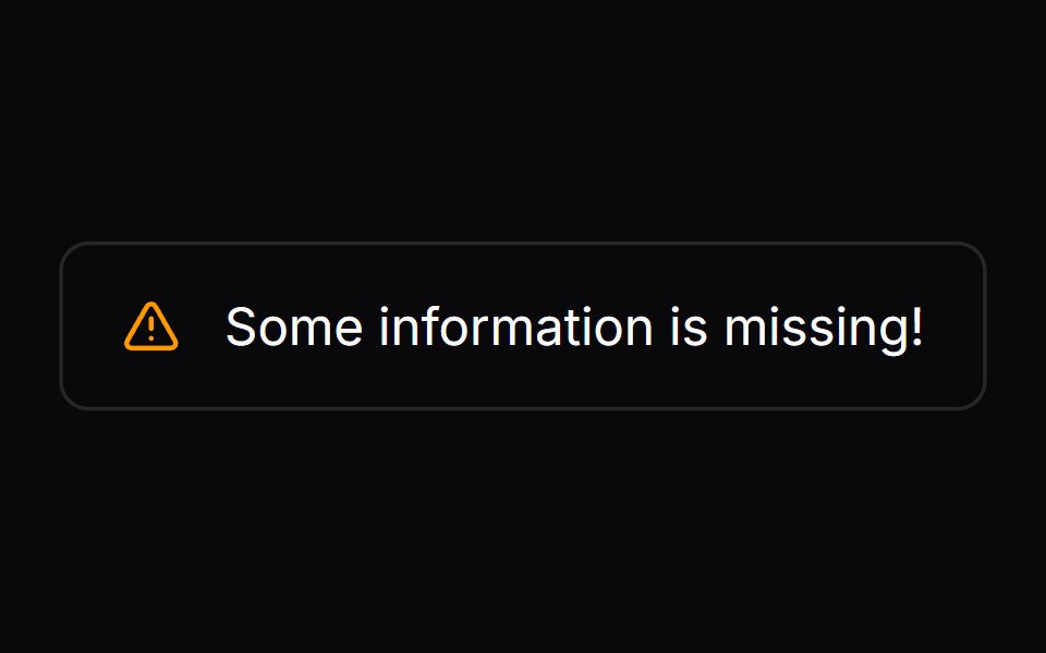 Comp 267Origin UI · React
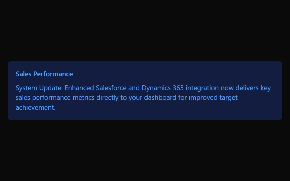 CalloutTremor · React
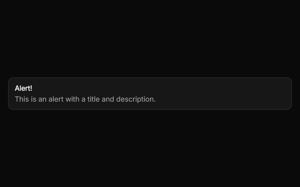 AlertReUI · ReactDisplays a callout for user attention, such as a success message, warning, or error.
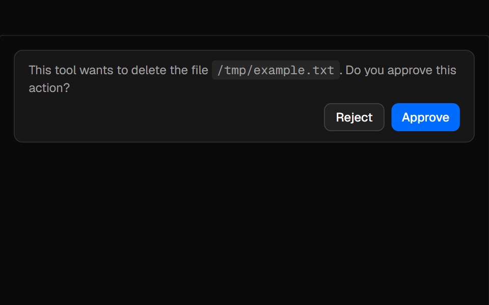 ConfirmationAI Elements · ReactAn alert-based component for managing tool execution approval workflows with request, accept, and reject states.
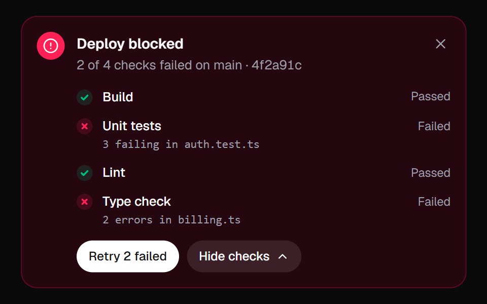 Inline AlertKokonut UI · React"An alert that does something about the problem: it lists the failed checks, re-runs them one by one, and turns from…
 noteIntent UI · Reactnote
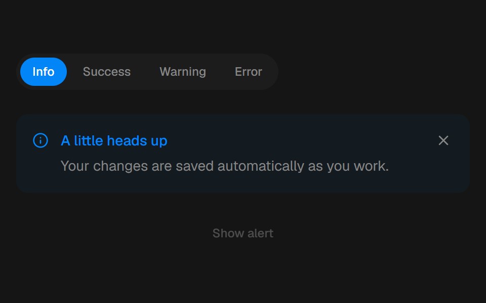 AlertbeUI · ReactFeedback that eases in and folds away.
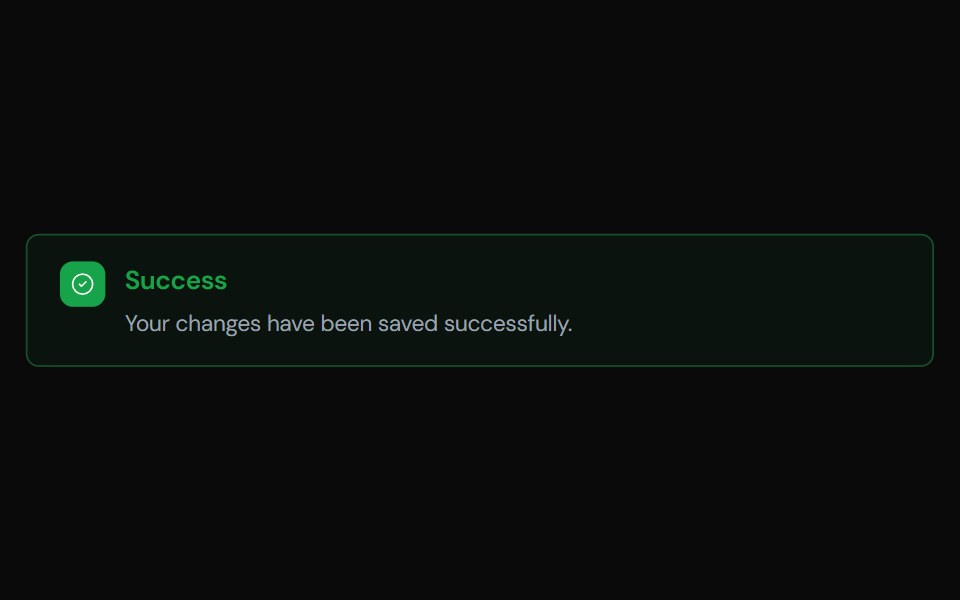 AlertTailGrids · ReactA component to display important messages to the user, with support for different variants.
 Alert demoSpectrum UI · Reactcomponent for the alert-demo
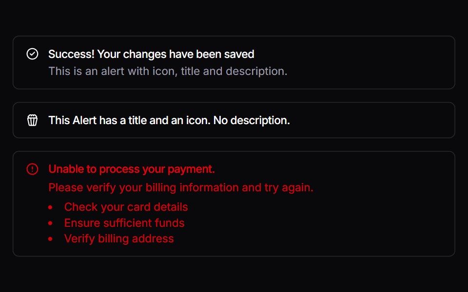 AlertVengeance UI · React
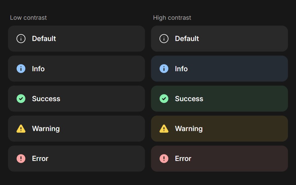 BannerFluid Functionalism · ReactStatus message built from parts (Banner, BannerTitle, BannerDescription, BannerActions, BannerAction): 5 statuses…
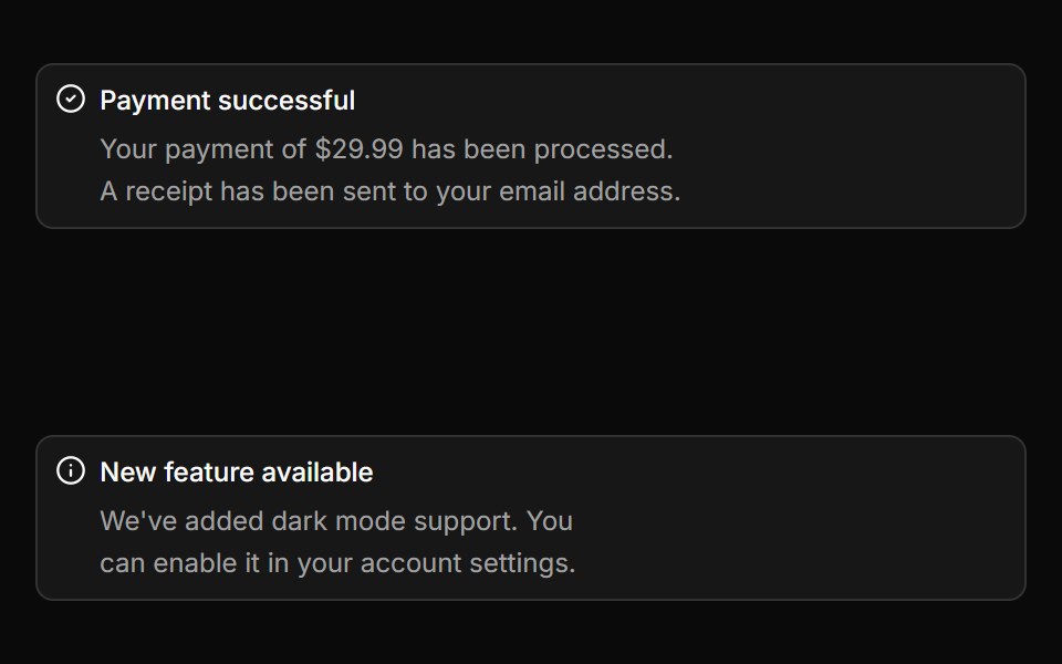 AlertToolcraft · React
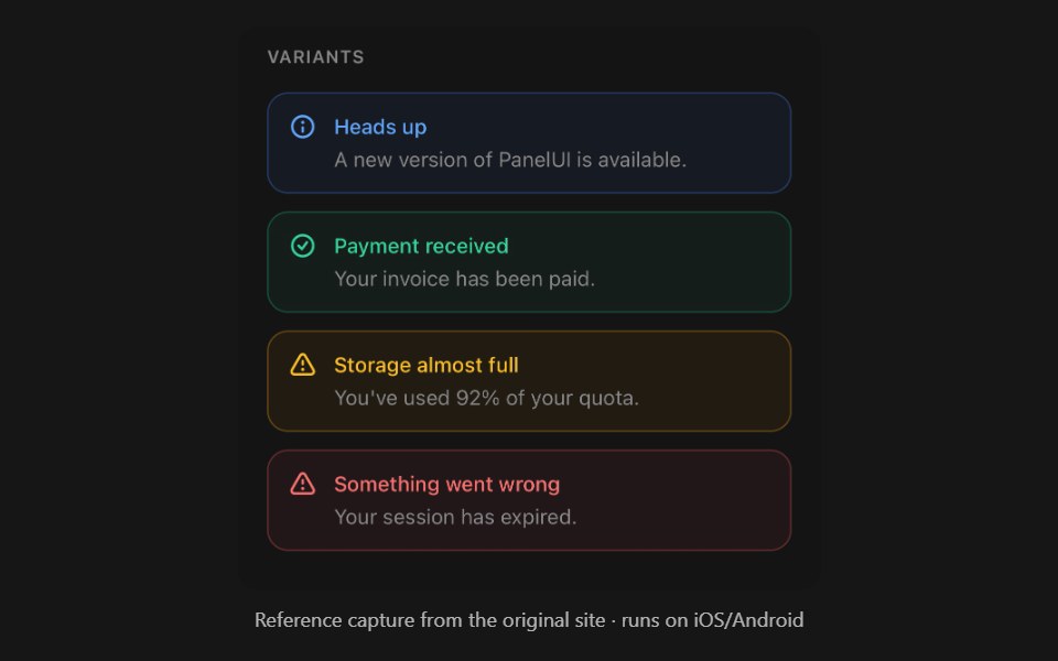 AlertPanel UI · React NativeStatus message with a built-in icon.
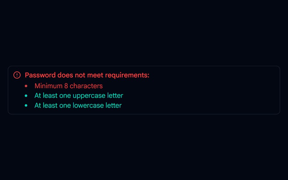 Alert-01 - Alert with Password DetailShadcn Space · ReactAlert component
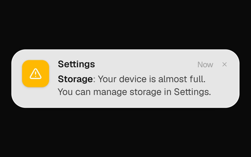 System Alert BannerOpenSourceUI · React
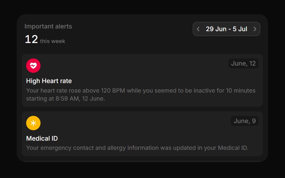 MedicalBoardUI · React
 CalloutTremor Blocks · React
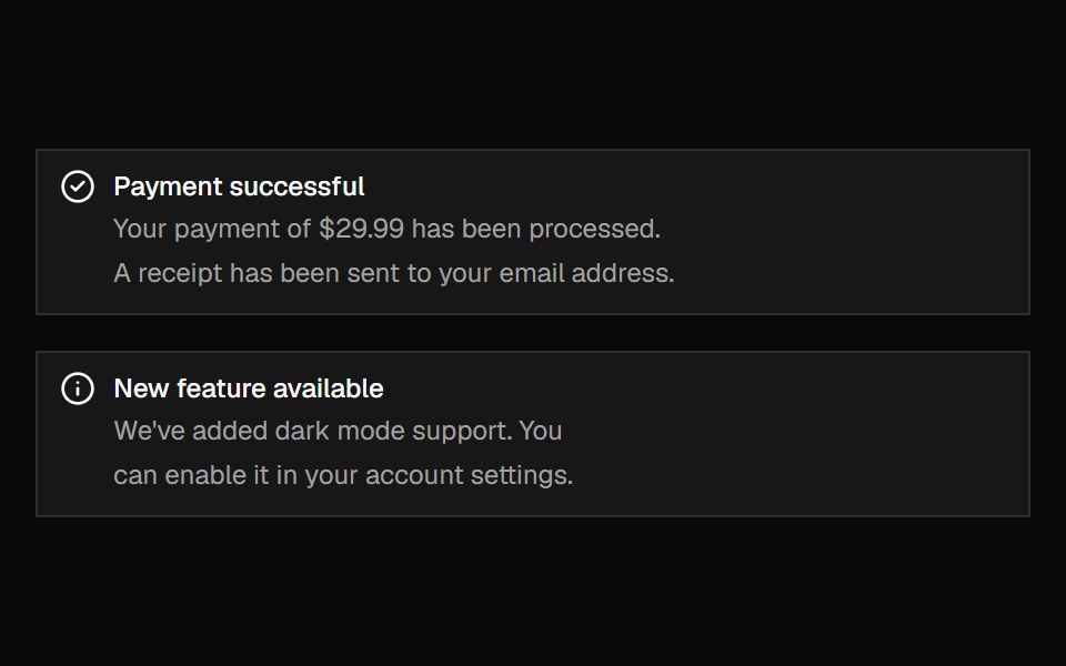 AlertShadcn Dashboard · React
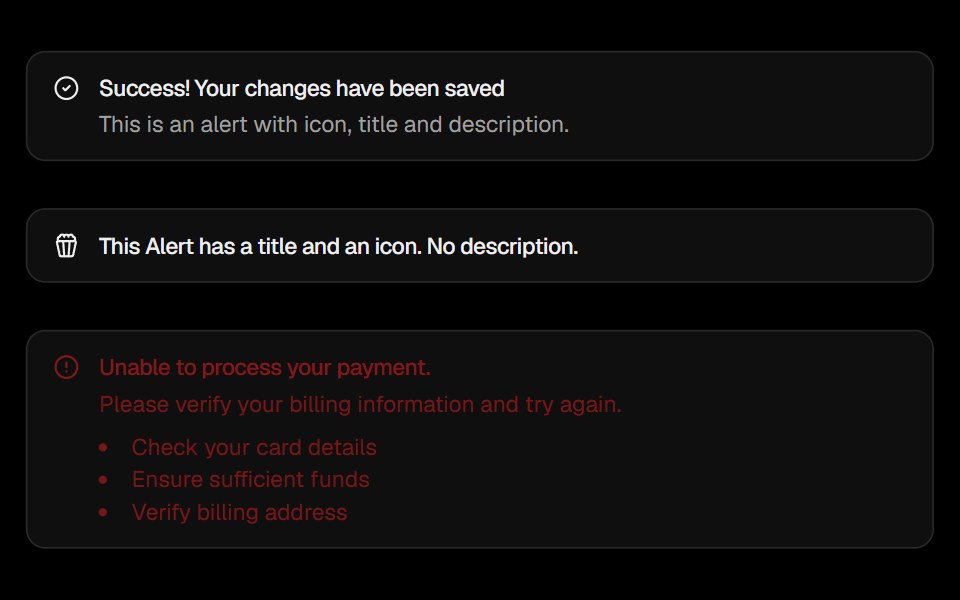 AlertObsidianUI · React
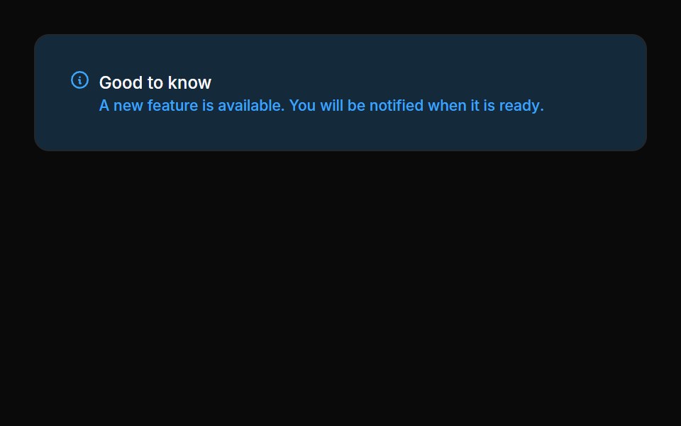 Alerts 01Oxbow UI · Astro
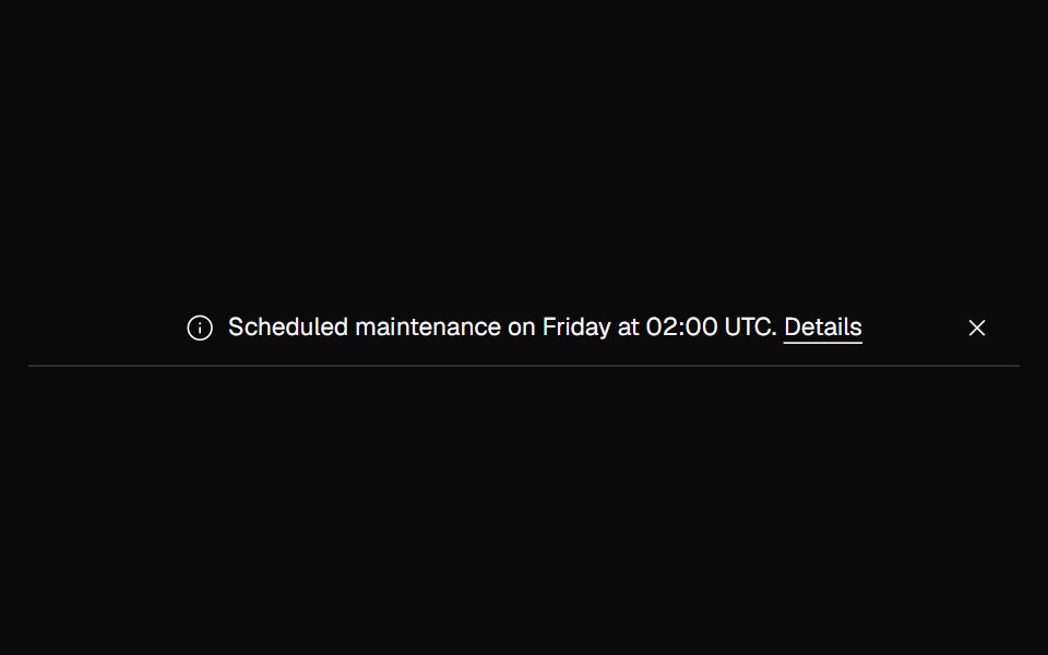 Banner NoticeNexvyn UI · ReactInfo and error status banners with icons and the right live-region roles.
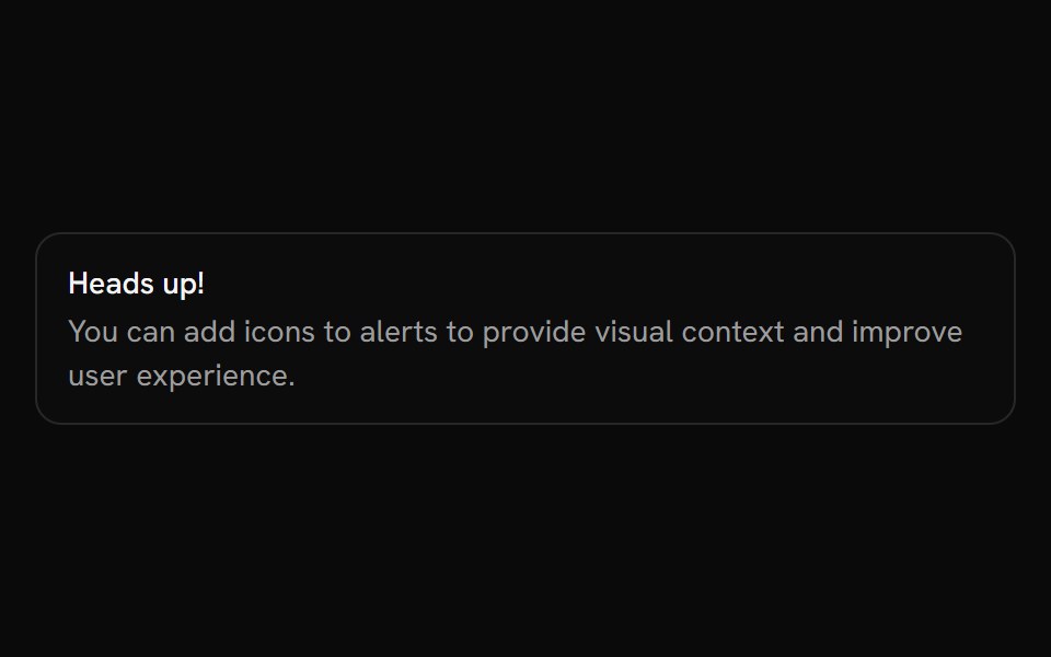 AlertShark UI · ReactDisplays an alert for user attention.
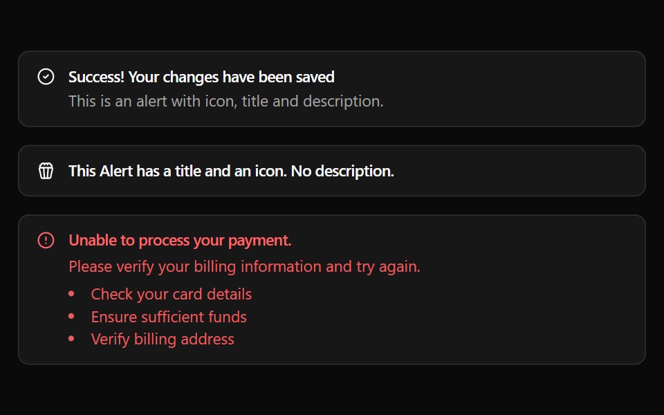 AlertWatermelon UI · React
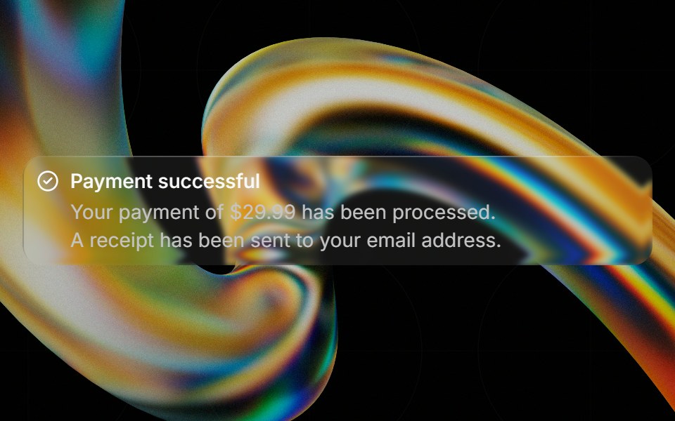 Glass Alertglasscn · ReactGlass Alert with five variants: clear, frosted, subtle, liquid, and liquid-refract
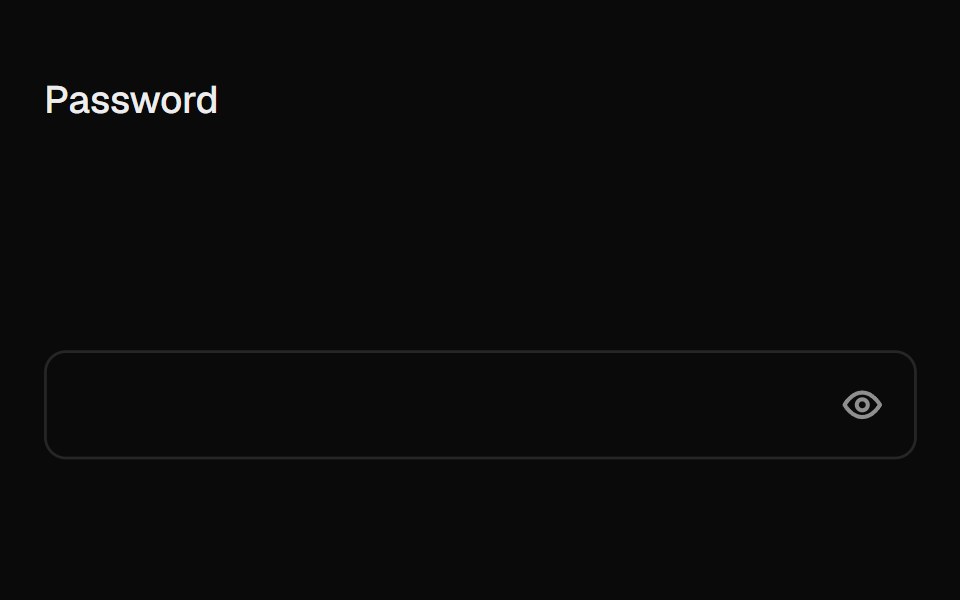 Caps Lock WarningUI Lab · ReactA small caps lock key with its light on slides into the field when caps is on.
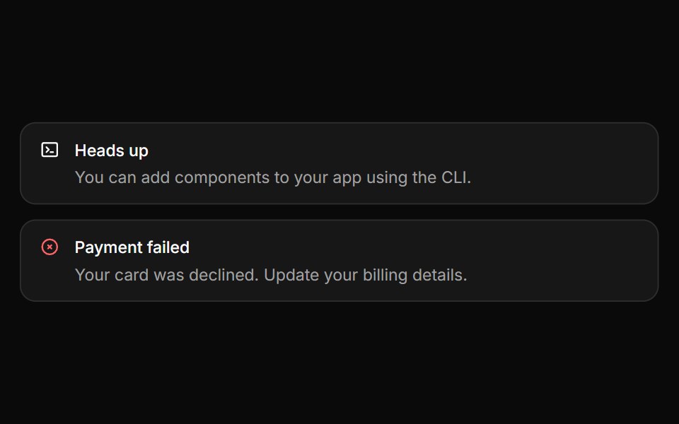 AlertHextaUI · ReactInline messages for status and feedback, with a neutral surface, a colored icon and a dismiss that collapses smoothly.
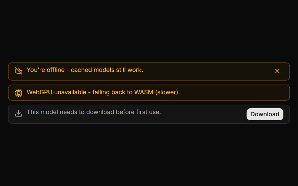 System Notice BannerLocalMode · ReactAn in-conversation info/warning banner (not a message bubble) for local-first state changes: offline/online, model…
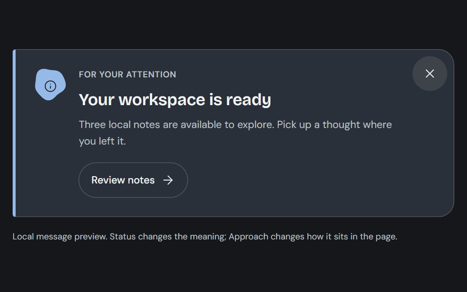 AlertCojeev UI · ReactAn authored note, attached-action banner or folded dispatch that makes the message and its next step clear.
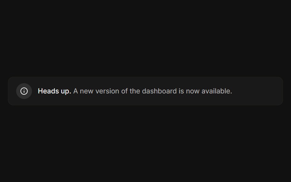 BasicFLX UI · ReactIcon, message, and a subtle bordered surface.
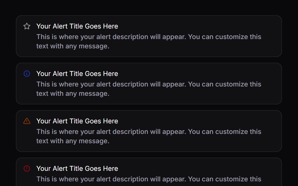 AlertSpaceUI · ReactDisplays a prominent message box for important notices, warnings, or success messages to keep users informed without…
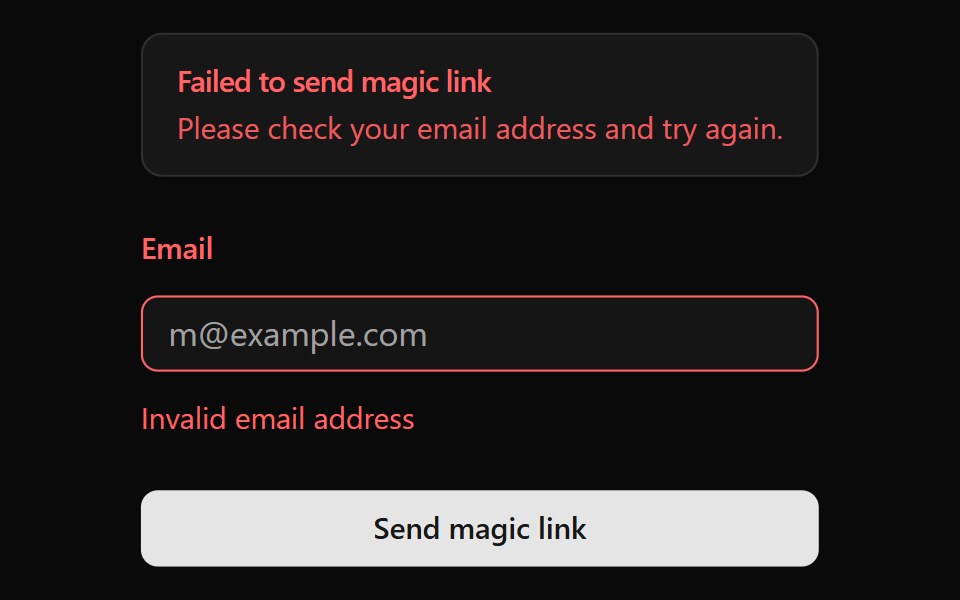 AlertOUI · ReactA shadcn Alert for a form displaying form action result.
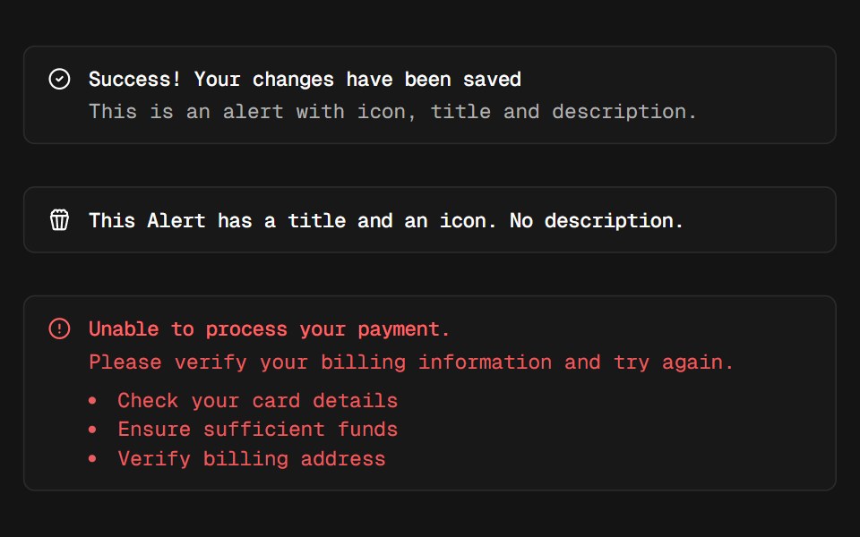 AlertD2Studio UI · ReactDisplays a callout for user attention.
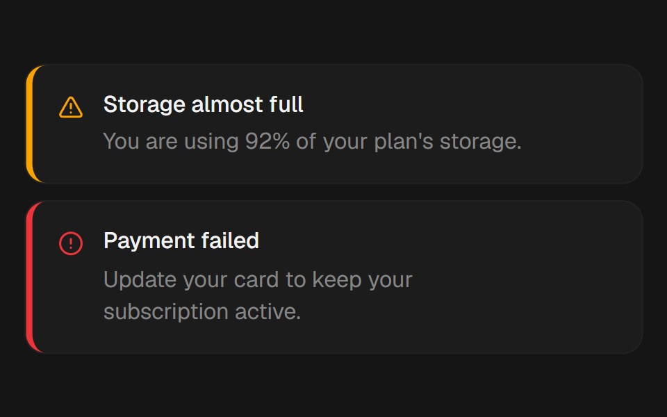 AlertEaseUI · ReactBanner with a colored accent stripe. Body text stays neutral so contrast never depends on the variant.
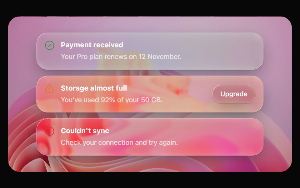 Glass AlertOpaline · ReactA callout on frosted glass, tinted by intent: info, success, warning or destructive.
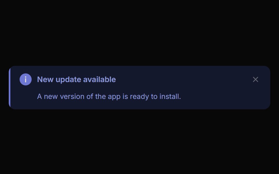 Alert ToastReactFrame · ReactA polished toast/alert notification, 5 tones, stacked or inline layout, icons, primary/secondary actions, dismiss and…
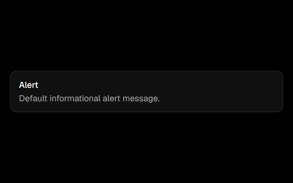 Alertark-cn · ReactA shadcn-style alert component built with Ark UI primitives.
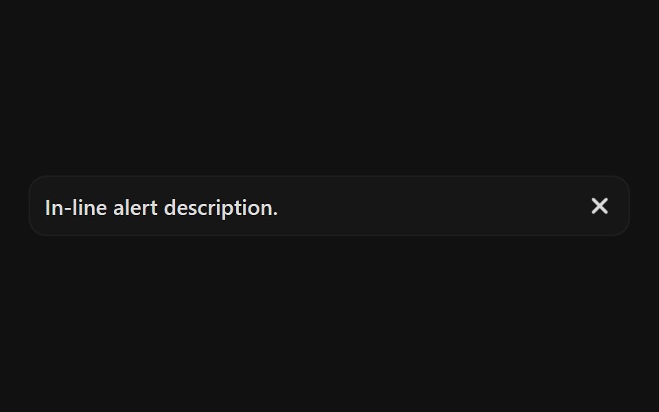 Ai AlertReact Spectrum · React
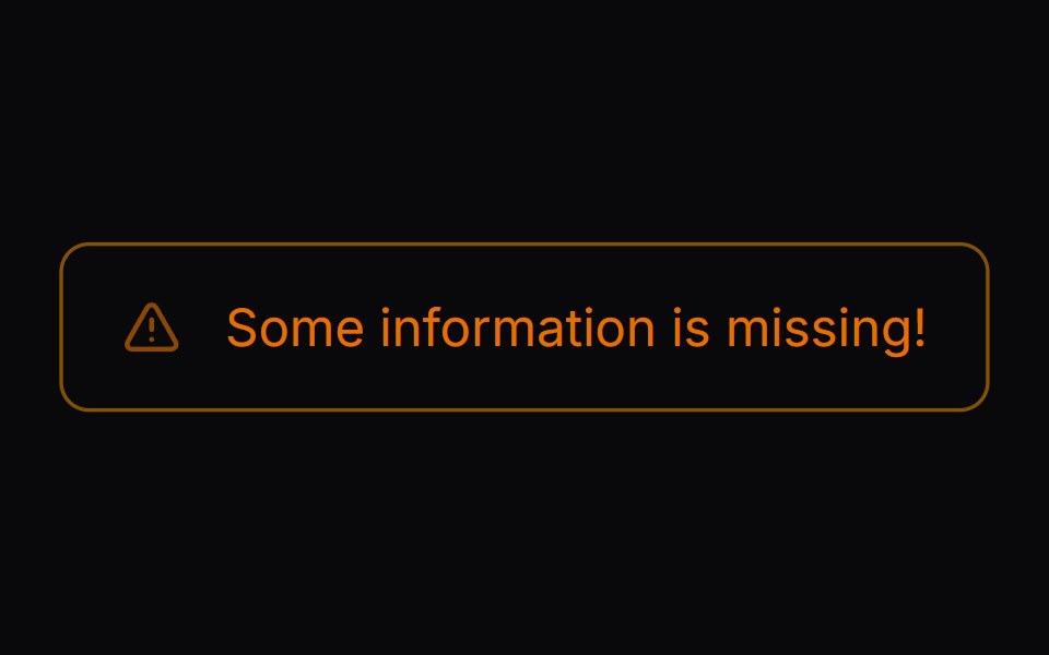 Comp 268Origin UI · React
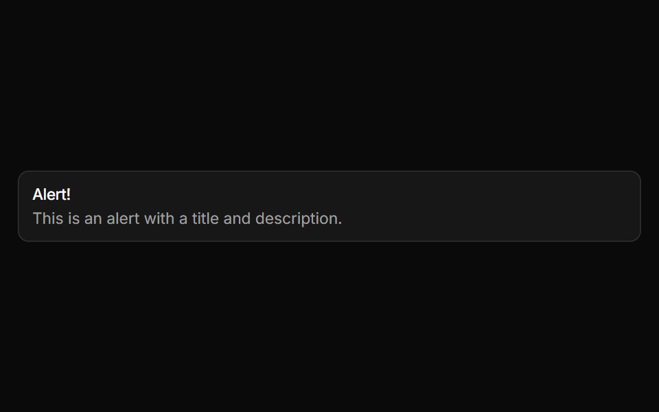 Basic alertReUI · ReactBasic alert
 Alert 2Spectrum UI · Reactcomponent for the alert-2
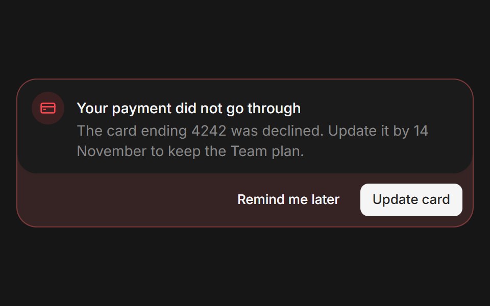 Web AlertPanel UI · React Native
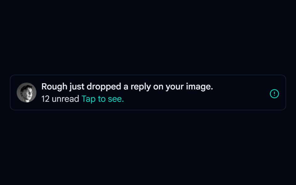 Alert-02 - Alert with User DetailShadcn Space · ReactAlert component
 Banner 01Tremor Blocks · React
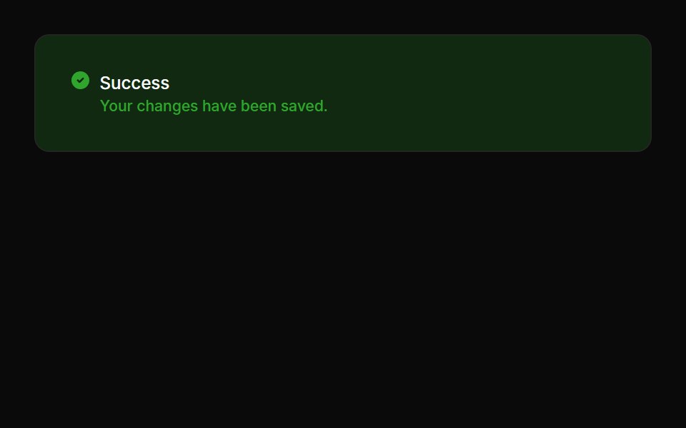 Alerts 02Oxbow UI · Astro
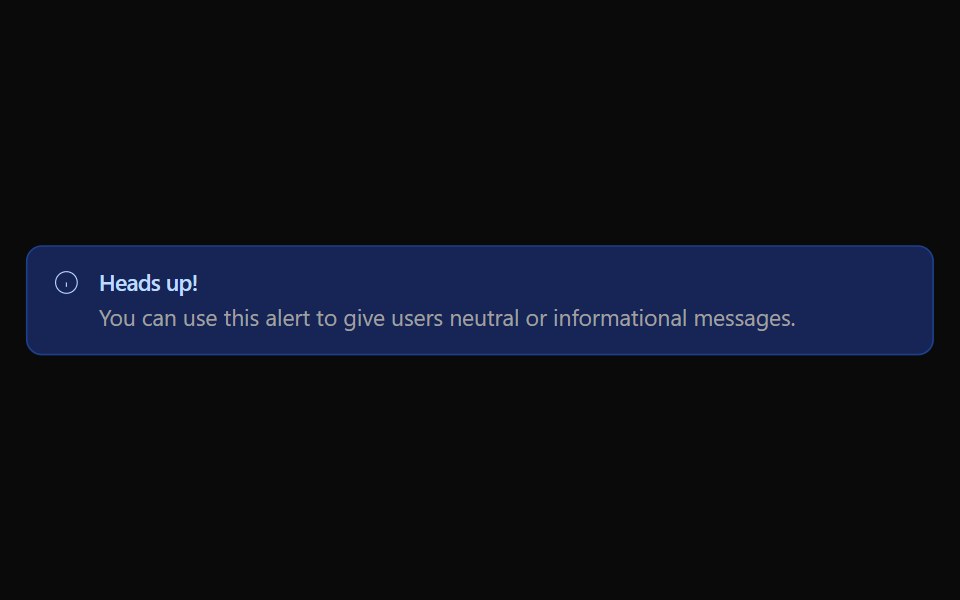 Alert 01Watermelon UI · React
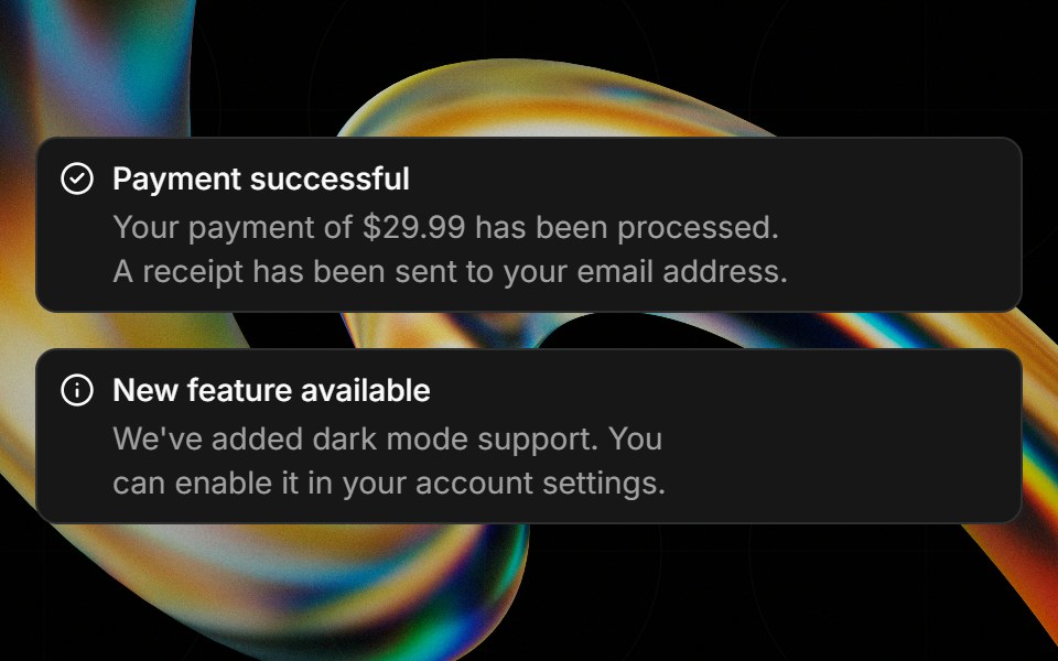 Alertglasscn · React
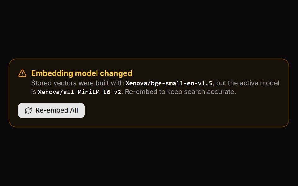 Embedding Drift BannerLocalMode · ReactA warning panel shown when the active embedding model is incompatible with vectors already stored (model changed or…
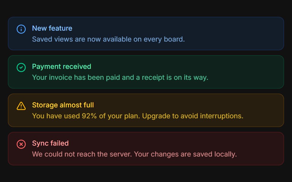 VariantsFLX UI · ReactInfo, success, warning, and error tones stacked.
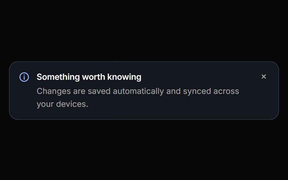 CalloutReactFrame · ReactAn inline message block with info, success, warning, danger and neutral variants, three appearances, self-drawing…
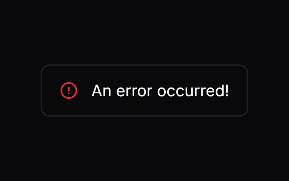 Comp 269Origin UI · React
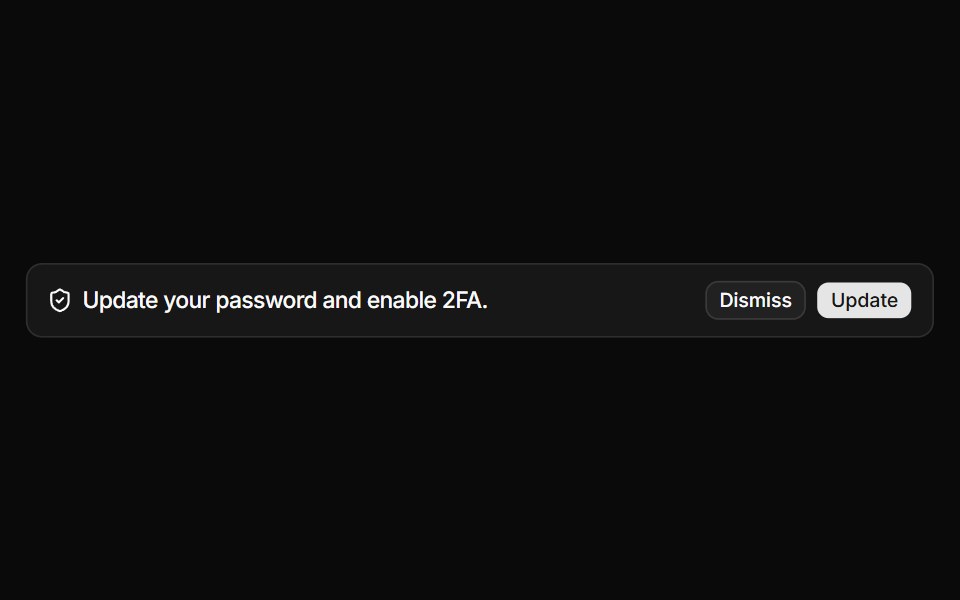 Alert with icon and action buttonsReUI · ReactAlert with icon and action buttons
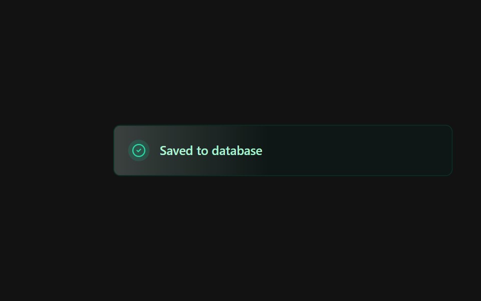 Alert 3Spectrum UI · Reactcomponent for the alert-3
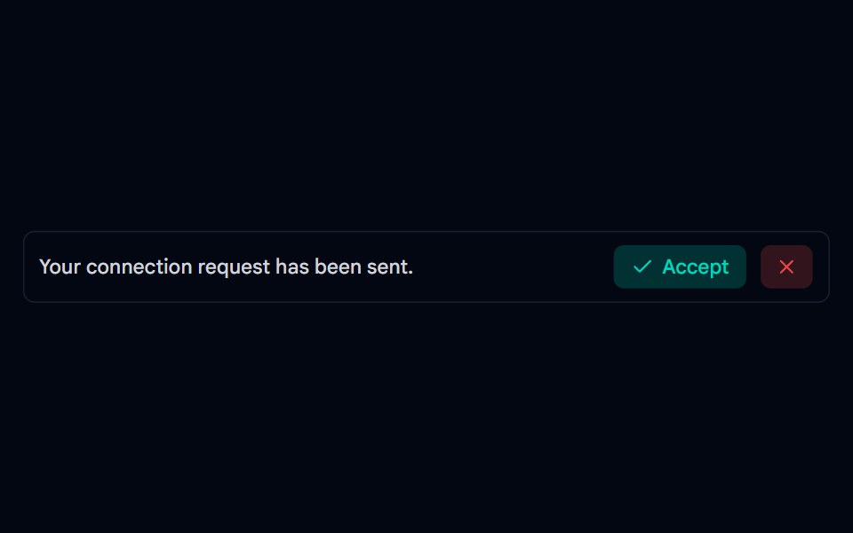 Alert-03 - Social AlertShadcn Space · ReactAlert component
 Banner 02Tremor Blocks · React
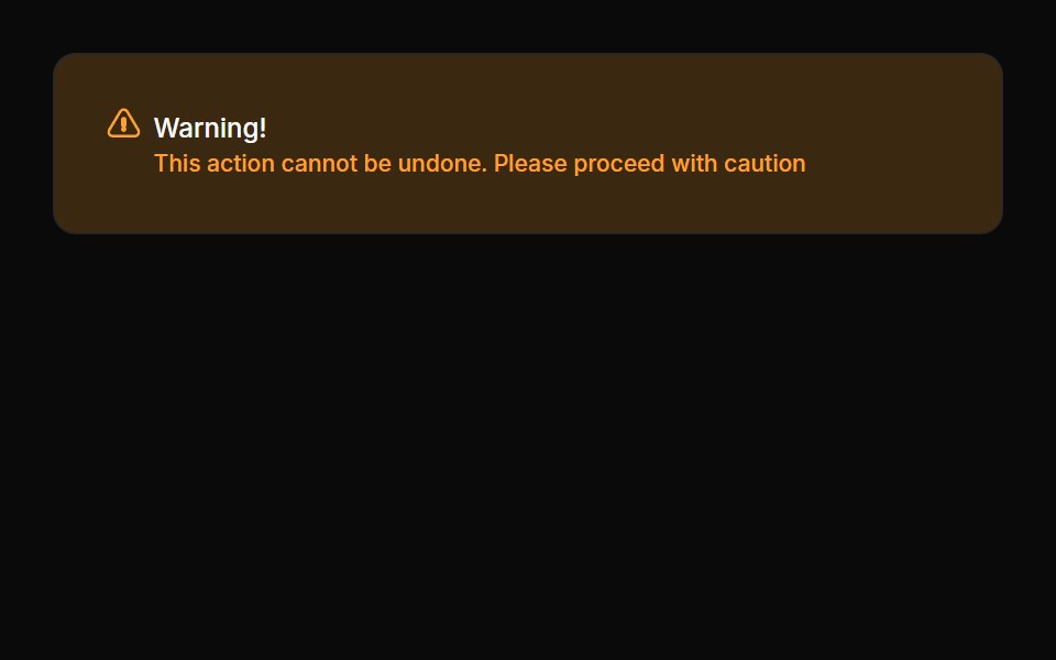 Alerts 03Oxbow UI · Astro
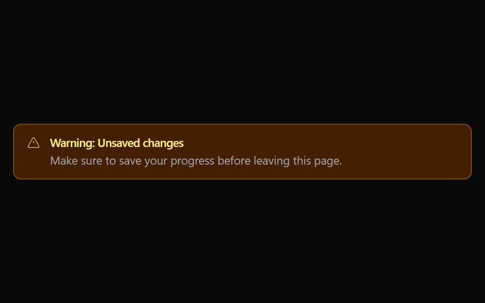 Alert 02Watermelon UI · React
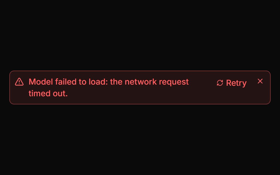 Error AlertLocalMode · ReactA compact, dismissible error surface with an optional retry action - a role=alert region showing the message, a Retry…
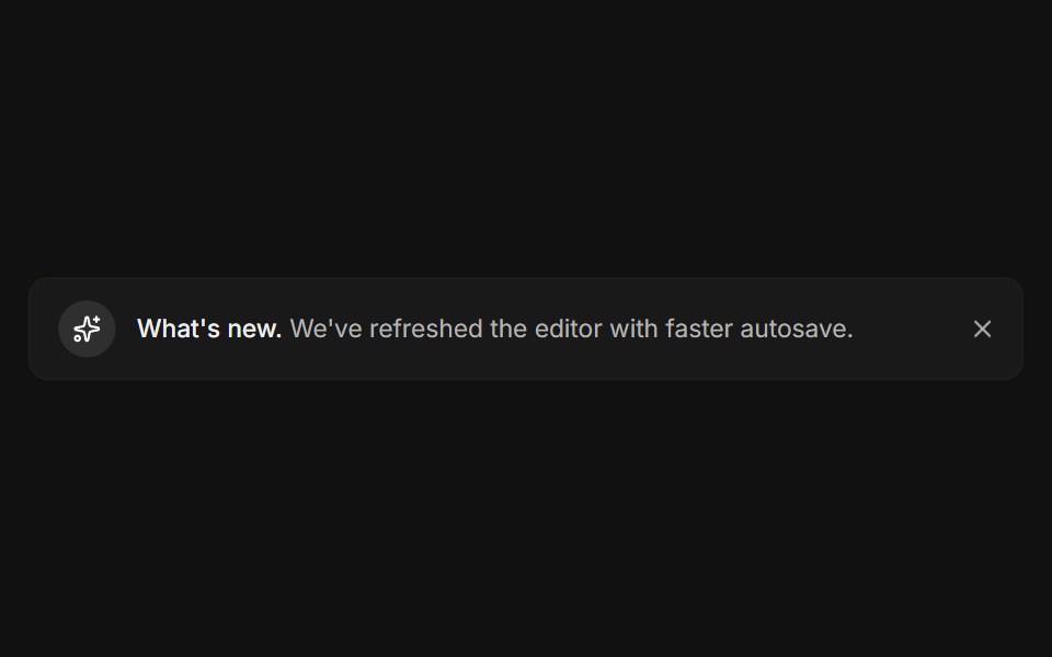 DismissibleFLX UI · ReactA close button hides the banner with a restore link.
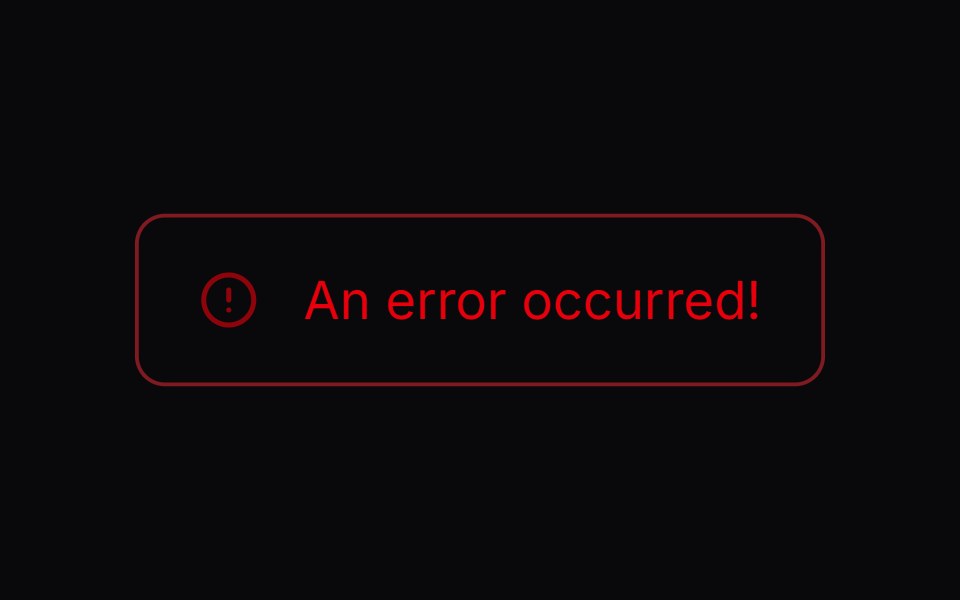 Comp 270Origin UI · React
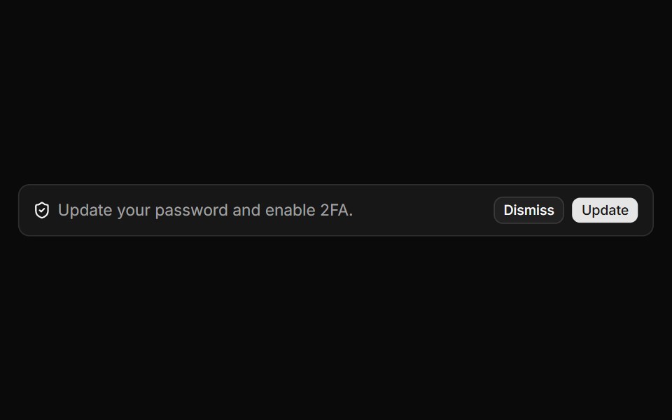 Alert with description and action buttonsReUI · ReactAlert with description and action buttons
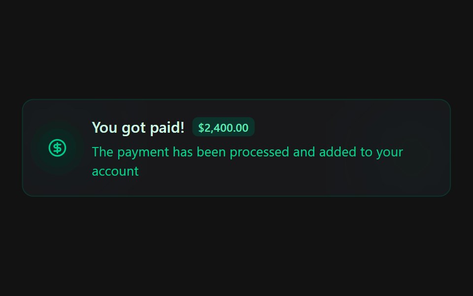 Alert 4Spectrum UI · Reactcomponent for the alert-4
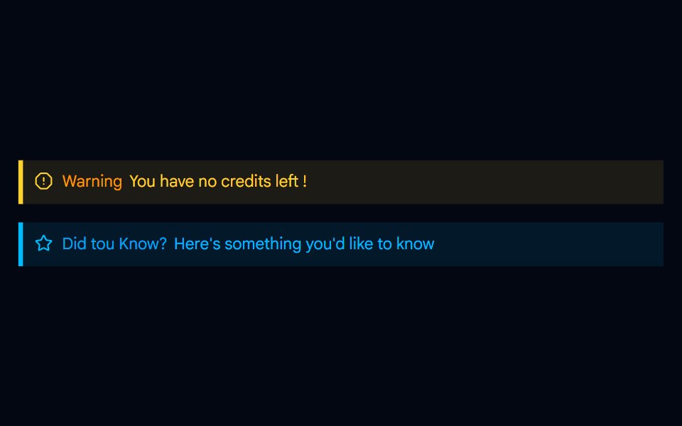 Alert-04 - Indicator Destructive AlertShadcn Space · ReactAlert component
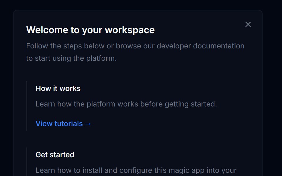 Banner 03Tremor Blocks · React
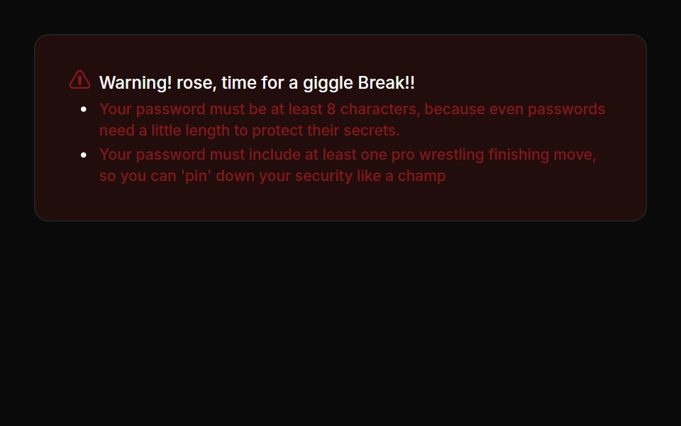 Alerts 04Oxbow UI · Astro
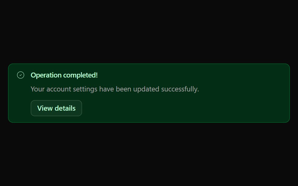 Alert 03Watermelon UI · React
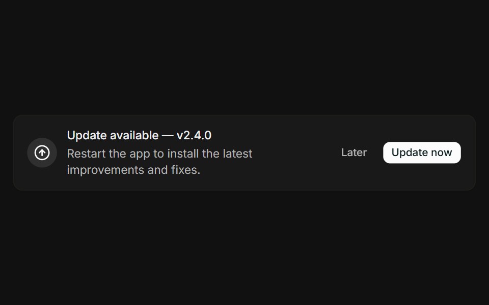 With actionsFLX UI · ReactMessage paired with Later and Update now buttons.
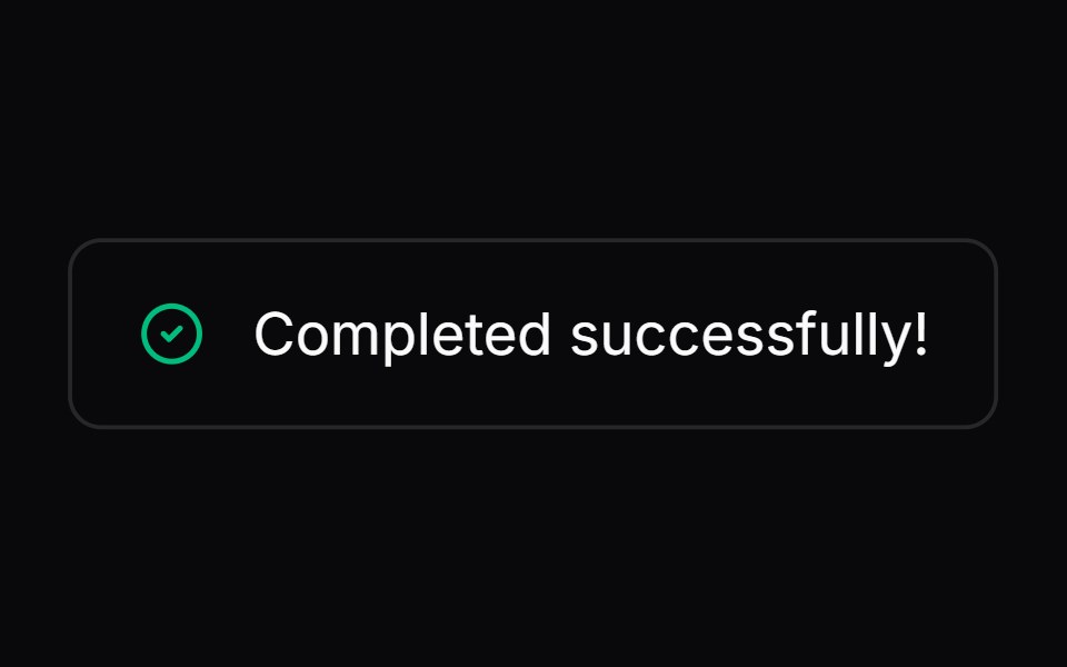 Comp 271Origin UI · React
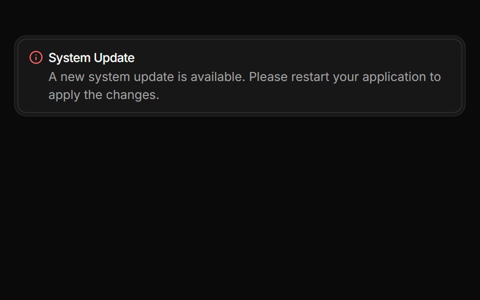 Alert integrated within a Frame with reset bordersReUI · ReactAlert integrated within a Frame with reset borders
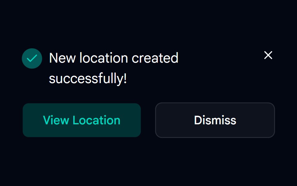 Alert-05 - Dark AlertShadcn Space · ReactAlert component
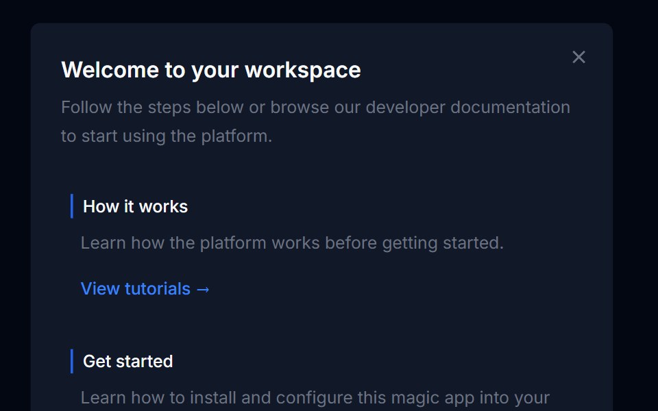 Banner 04Tremor Blocks · React
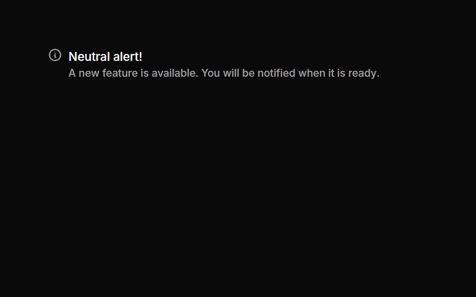 Alerts 05Oxbow UI · Astro
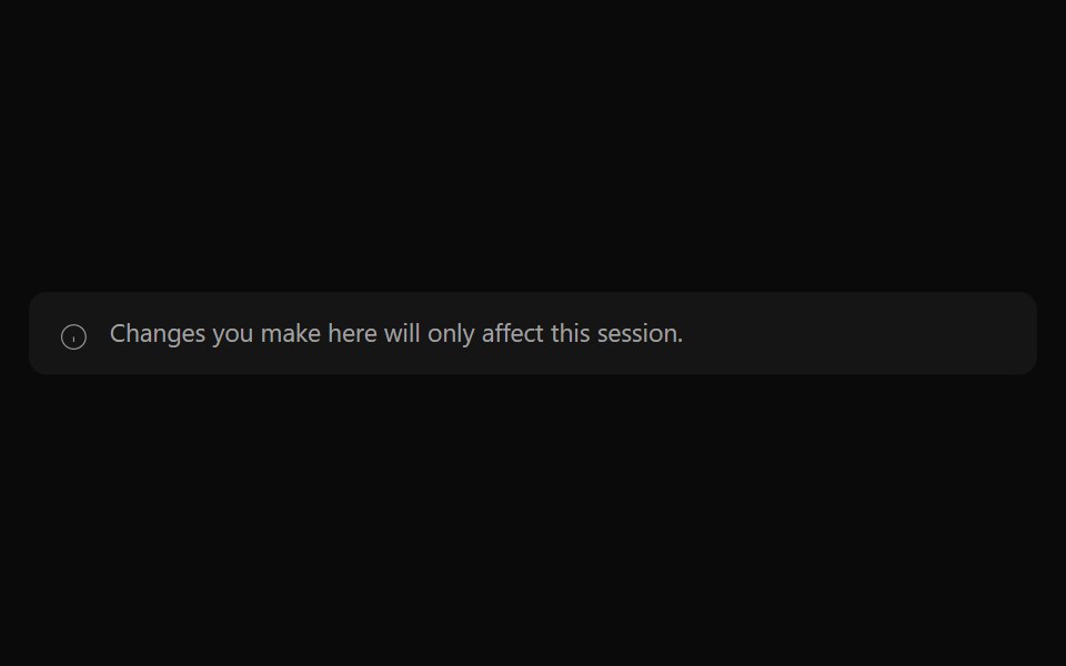 Alert 04Watermelon UI · React
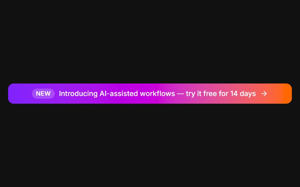 Announcement barFLX UI · ReactFull-width gradient promo with a New tag and arrow.
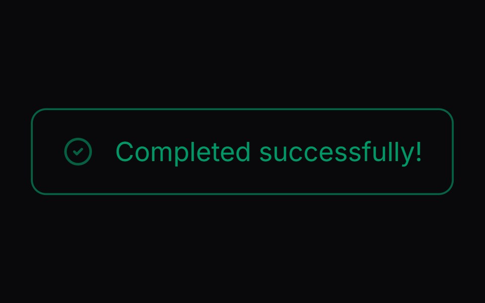 Comp 272Origin UI · React
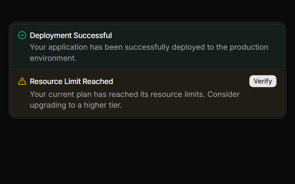 Stacked alerts within a FrameReUI · ReactStacked alerts within a Frame
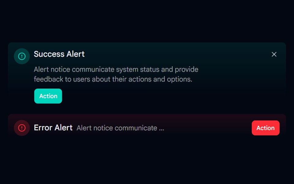 Alert-06 - Gradient AlertShadcn Space · ReactAlert component
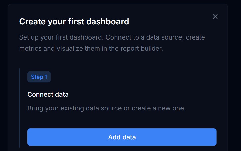 Banner 05Tremor Blocks · React
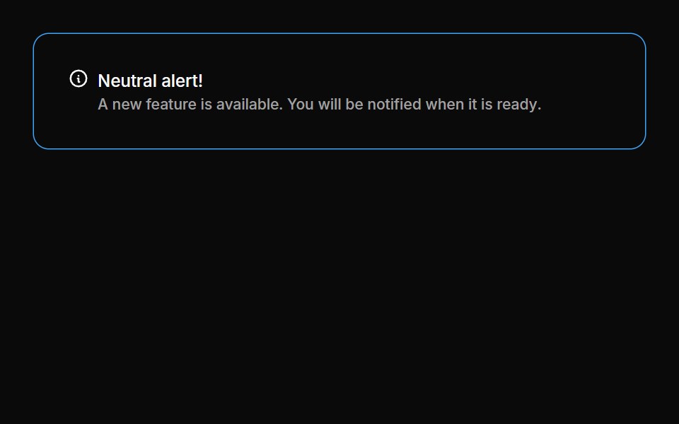 Alerts 06Oxbow UI · Astro
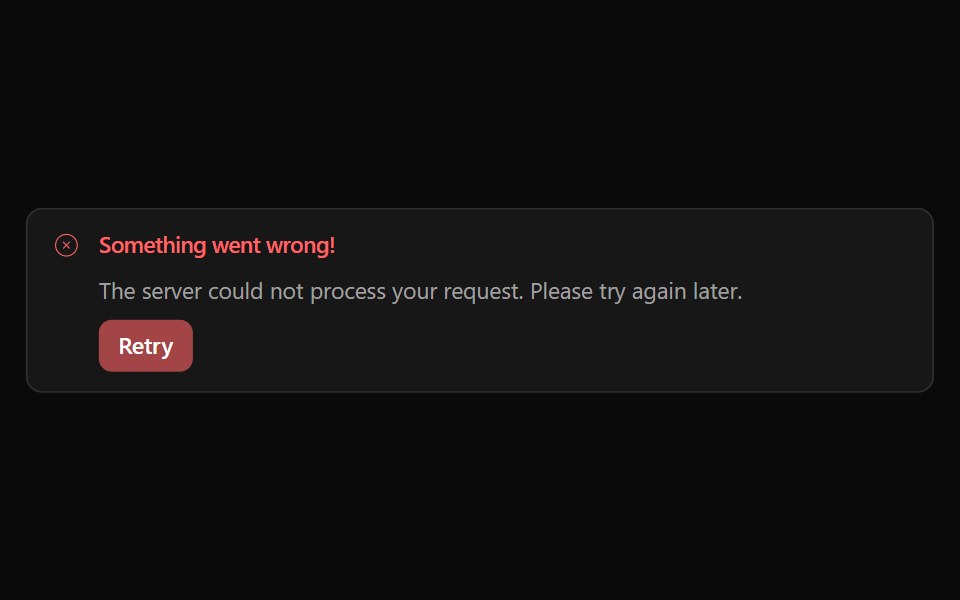 Alert 05Watermelon UI · React
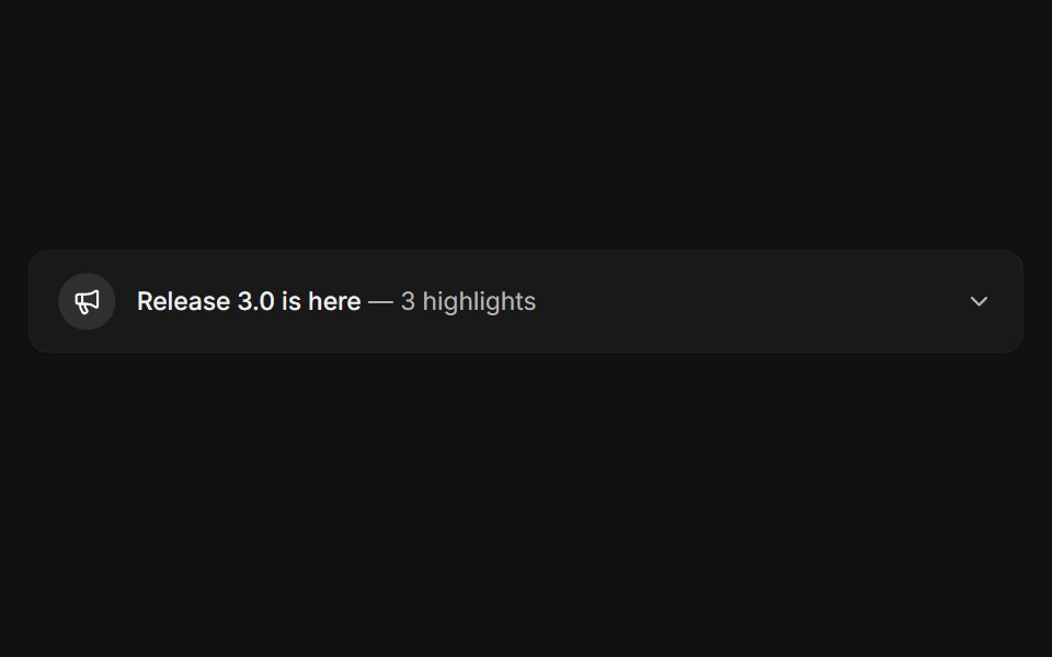 ExpandableFLX UI · ReactCollapsible release notes that reveal highlights.
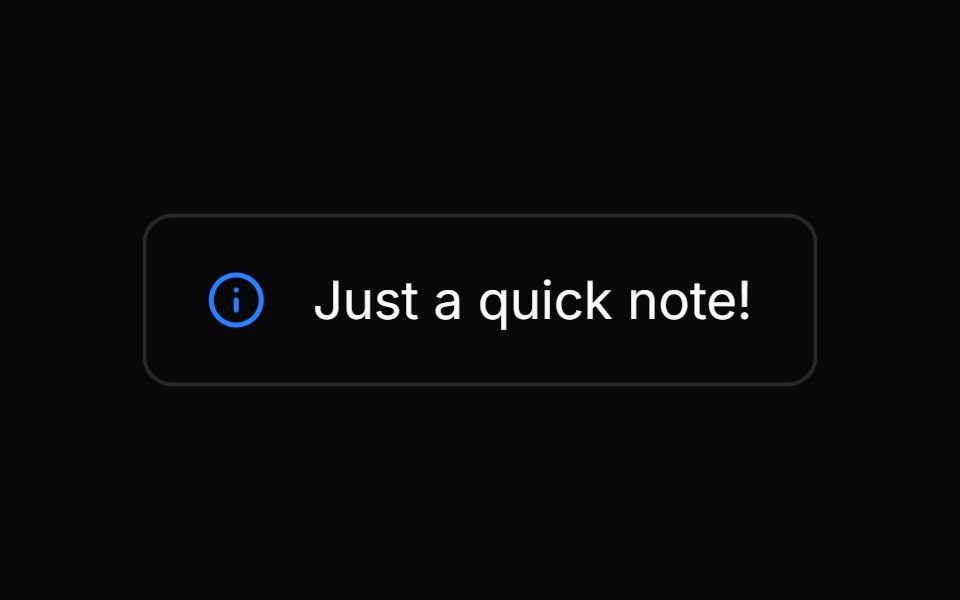 Comp 273Origin UI · React
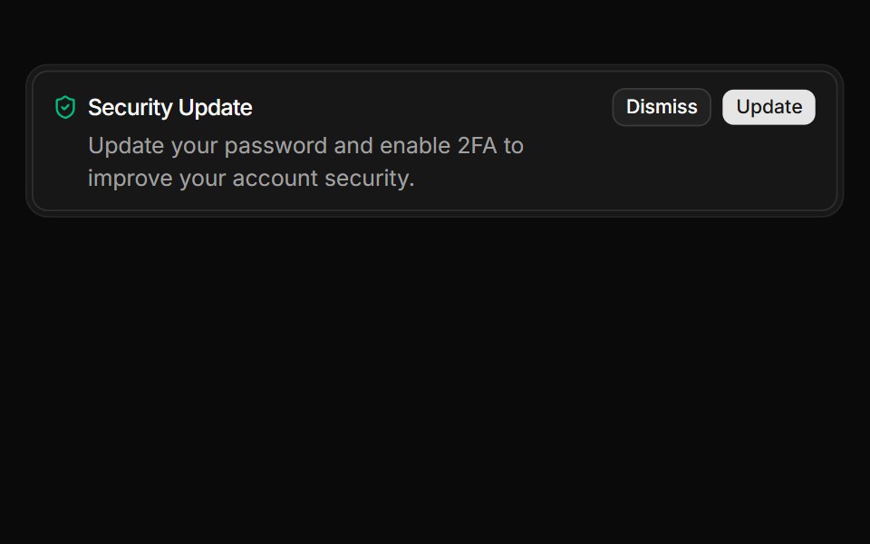 Alert with actions integrated within a FrameReUI · ReactAlert with actions integrated within a Frame
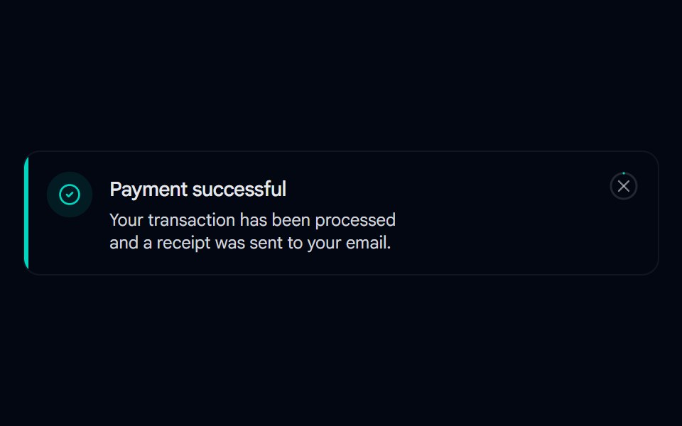 Alert 07 - With Hover-Fill DismissShadcn Space · ReactToast-style alert with a spring entrance, icon pop-in, and a close button whose ring fills in on hover, built with…
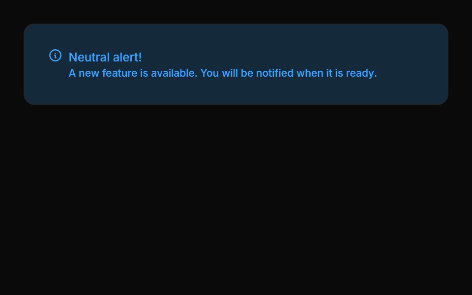 Alerts 07Oxbow UI · Astro
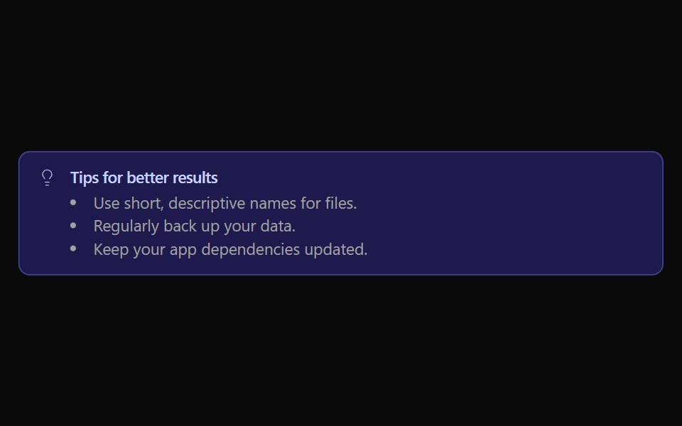 Alert 06Watermelon UI · React
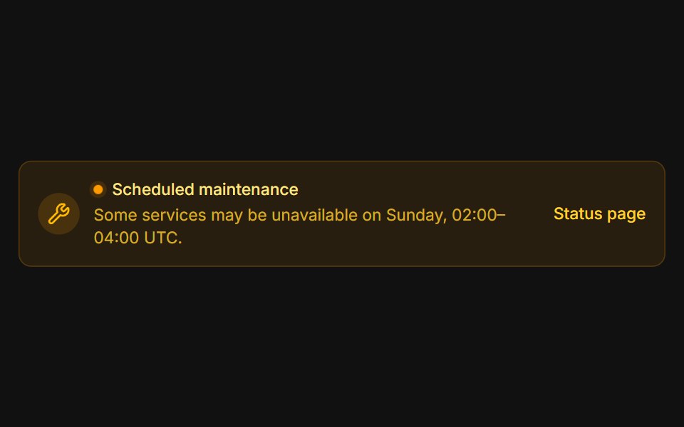 MaintenanceFLX UI · ReactAmber system notice with a pulsing status dot.
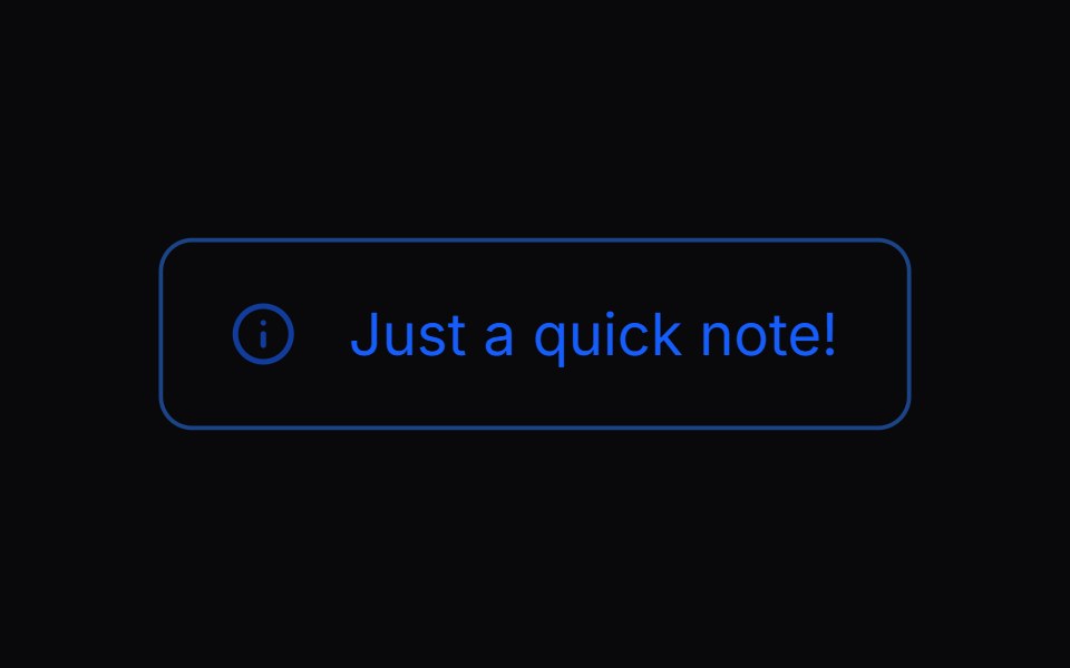 Comp 274Origin UI · React
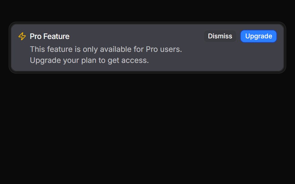 Inverted alert variantReUI · ReactInverted alert variant
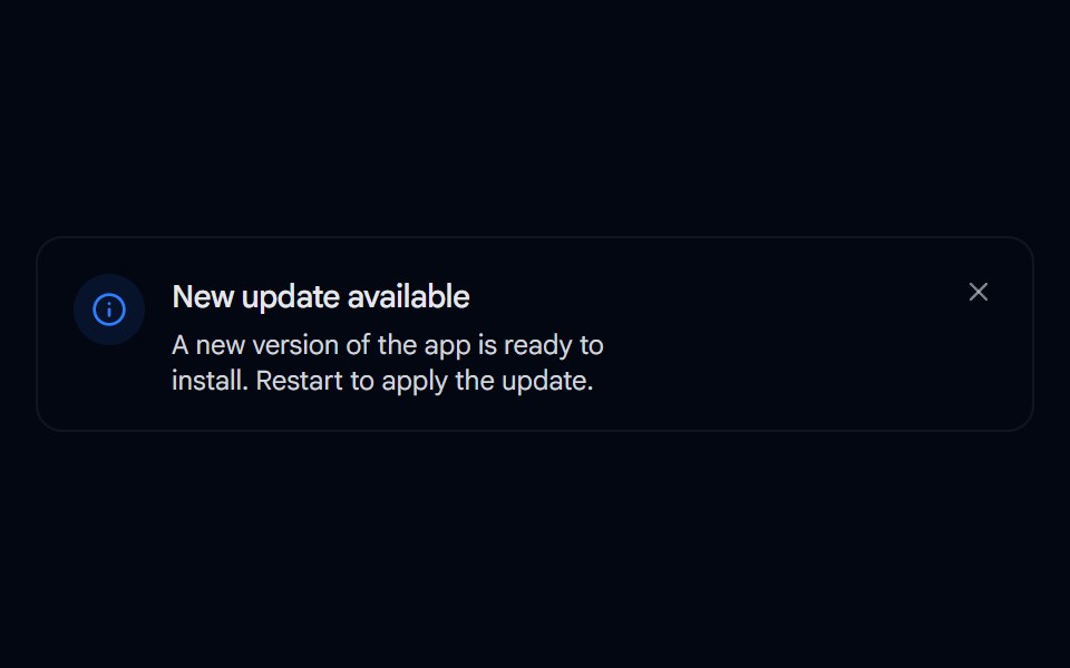 Alert 08 - Evaporate DismissShadcn Space · ReactAlert that dissolves away like evaporating water when dismissed, fading and blurring out with rising vapor wisps…
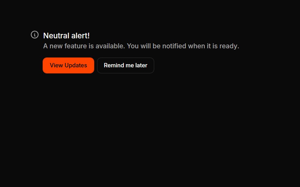 Alerts 08Oxbow UI · Astro
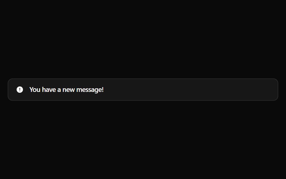 Alert 1Watermelon UI · React
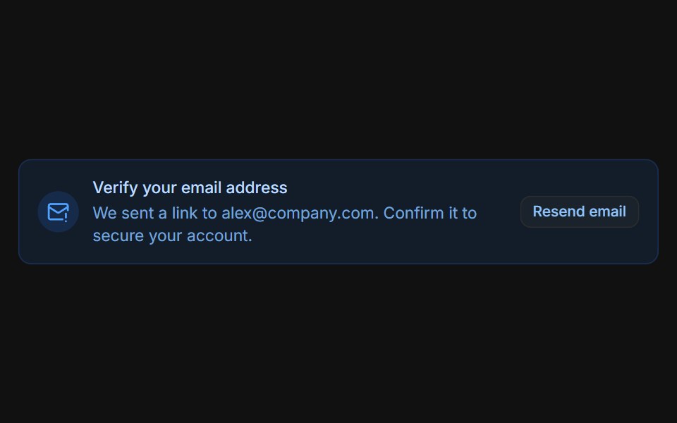 Email verificationFLX UI · ReactBlue prompt with a Resend email button that switches to a sent confirmation.
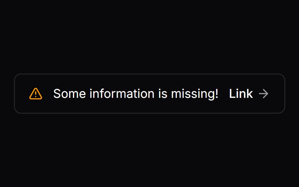 Comp 275Origin UI · React
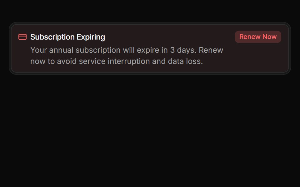 Urgent billing noticeReUI · ReactUrgent billing notice
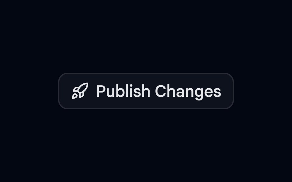 Alert 09 - Publish ConfirmationShadcn Space · ReactAlert dialog that slides up to confirm publishing, with a rocket icon, a change summary, and full width actions
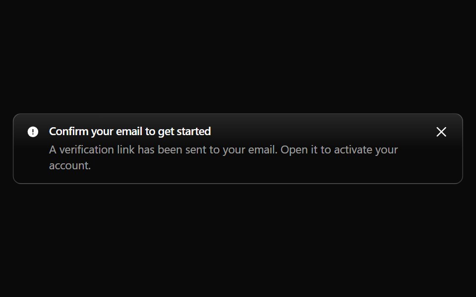 Alert 10Watermelon UI · React
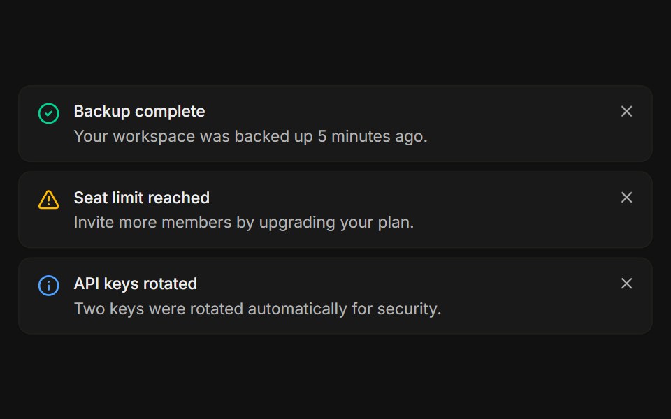 StackedFLX UI · ReactA list of dismissible notices, each removed on its own.
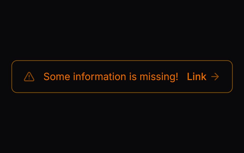 Comp 276Origin UI · React
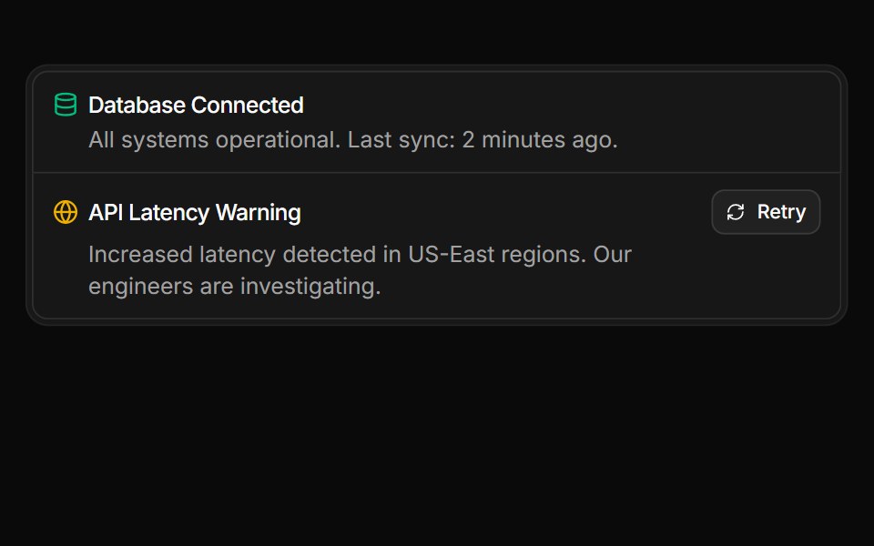 Service status summary stacked within a frameReUI · ReactService status summary stacked within a frame
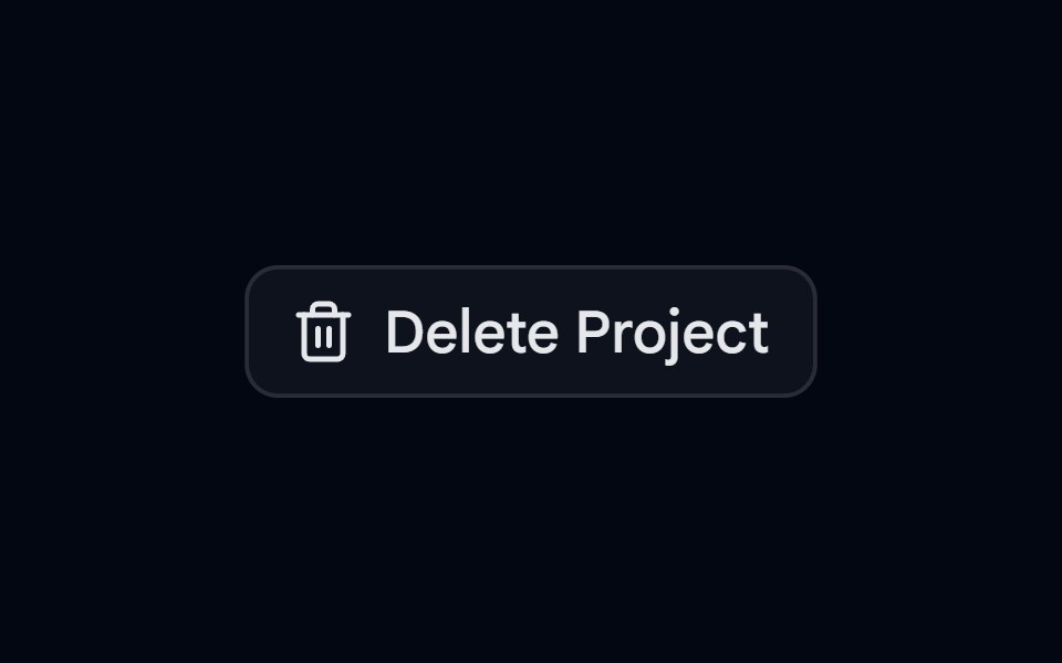 Alert 10 - Two Step DeleteShadcn Space · ReactDestructive alert dialog that lists what will be removed and needs a second click on delete to confirm
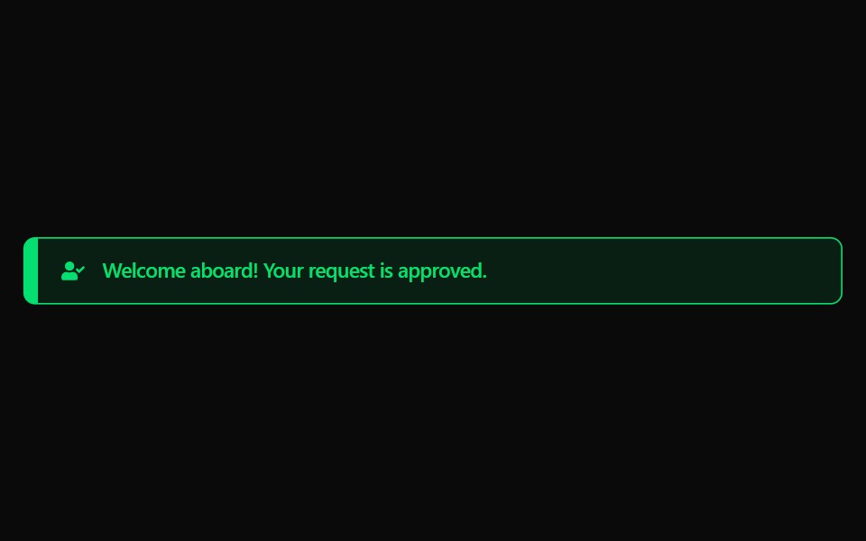 Alert 11Watermelon UI · React
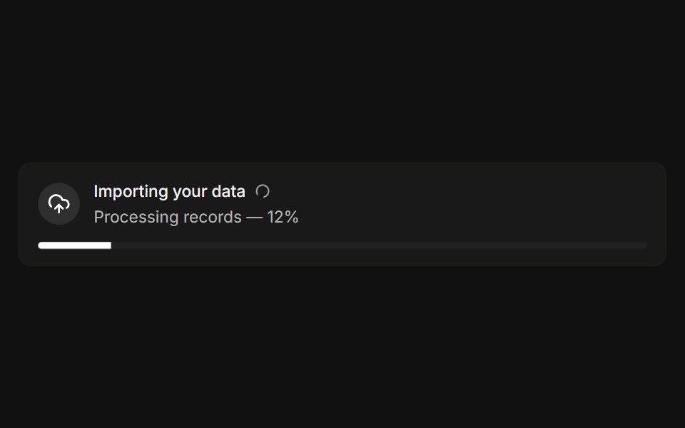 With progressFLX UI · ReactLive import banner with a spinner and a progress bar.
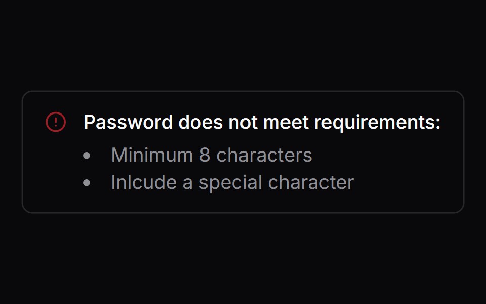 Comp 277Origin UI · React
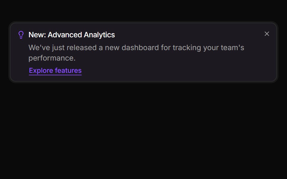 Feature discovery alertReUI · ReactFeature discovery alert
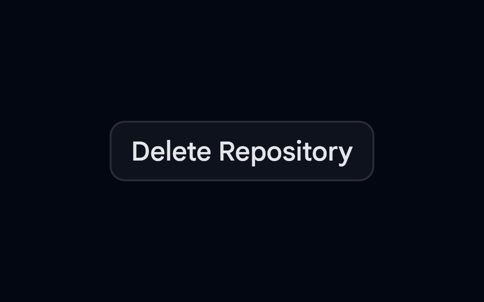 Alert 12 - Type to ConfirmShadcn Space · ReactDelete repository dialog with an impact callout that unlocks the delete action once the user types the repository name
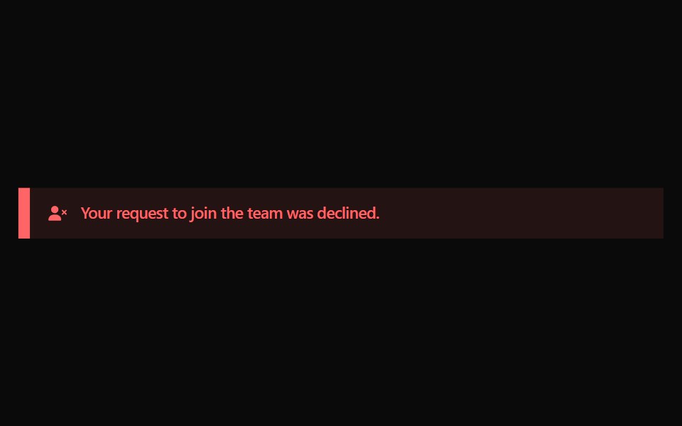 Alert 12Watermelon UI · React
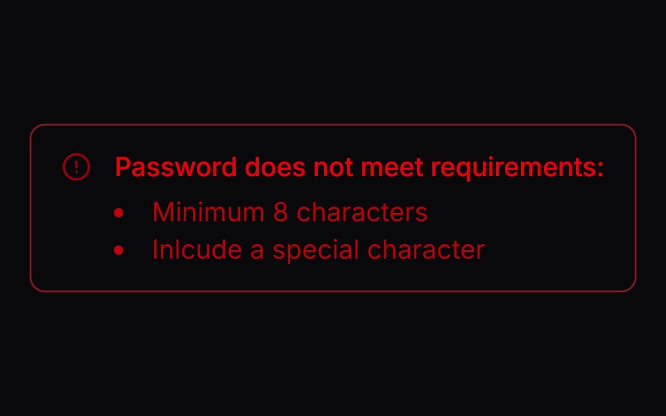 Comp 278Origin UI · React
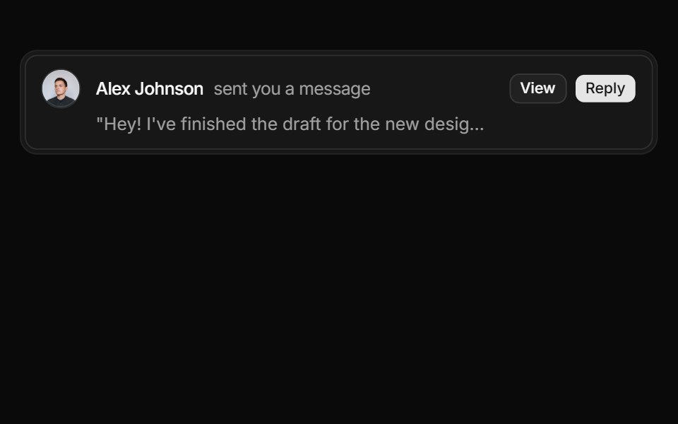 User message notification alertReUI · ReactUser message notification alert
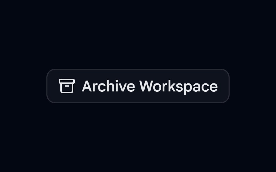 Alert 13 - Async with SuccessShadcn Space · ReactArchive dialog that moves from confirm to a loading spinner to a success state, and cannot be closed while the action…
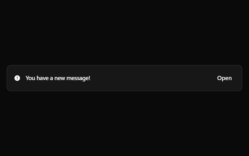 Alert 13Watermelon UI · React
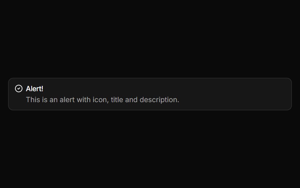 Alert with iconReUI · ReactAlert with icon
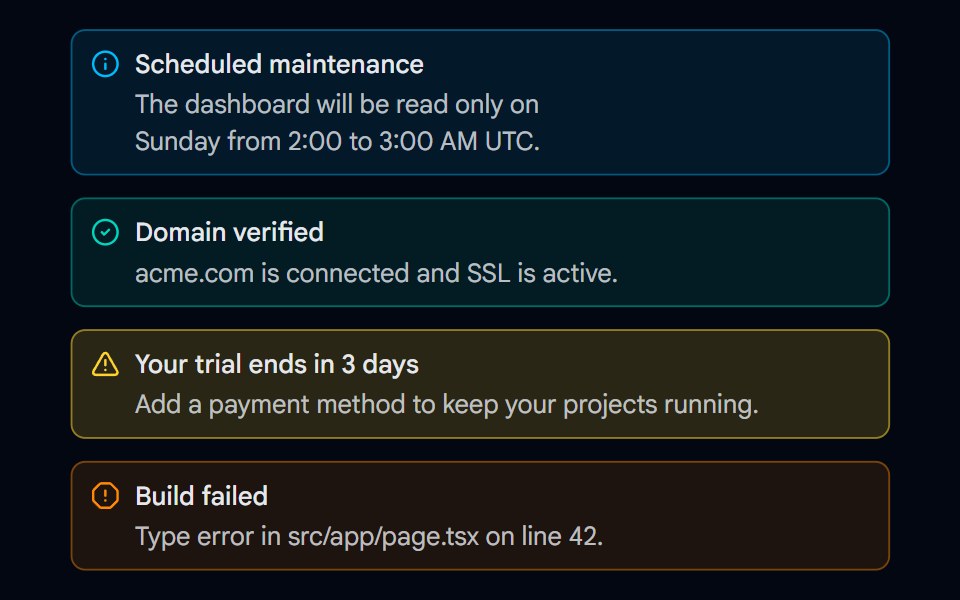 Alert 15 - Semantic VariantsShadcn Space · ReactInfo, success, warning, and error alerts with matching icons, tinted backgrounds, and borders that work in light and…
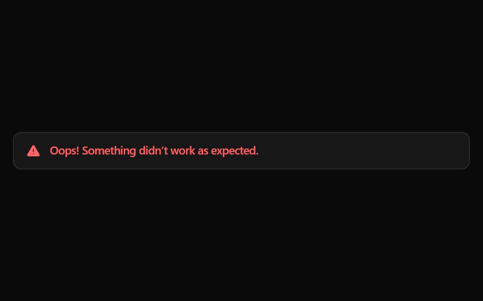 Alert 14Watermelon UI · React
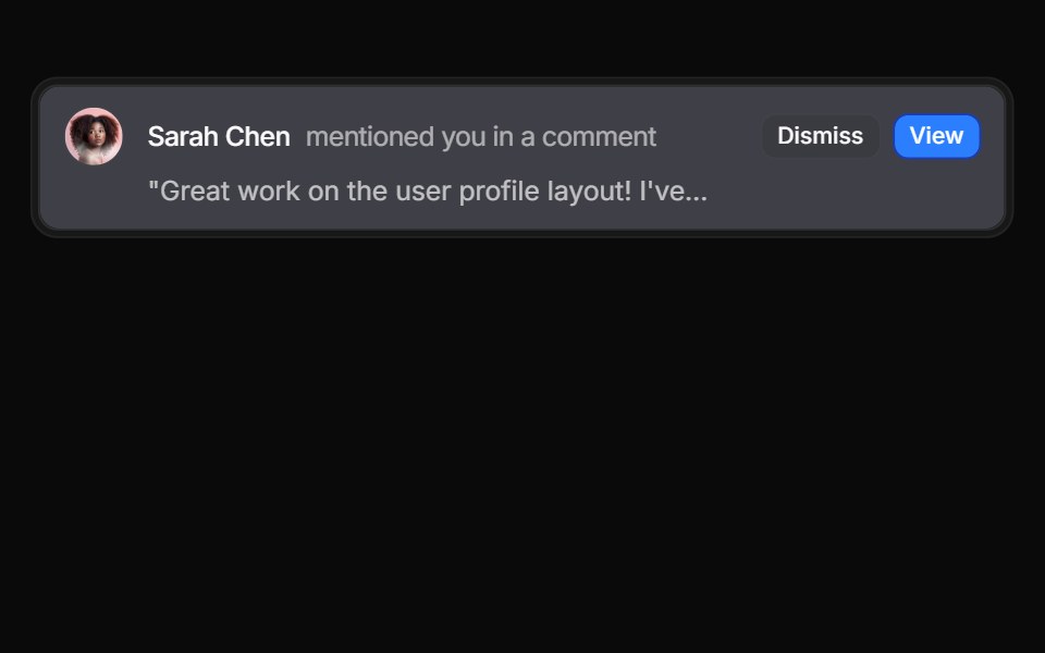 User message notification alertReUI · ReactUser message notification alert
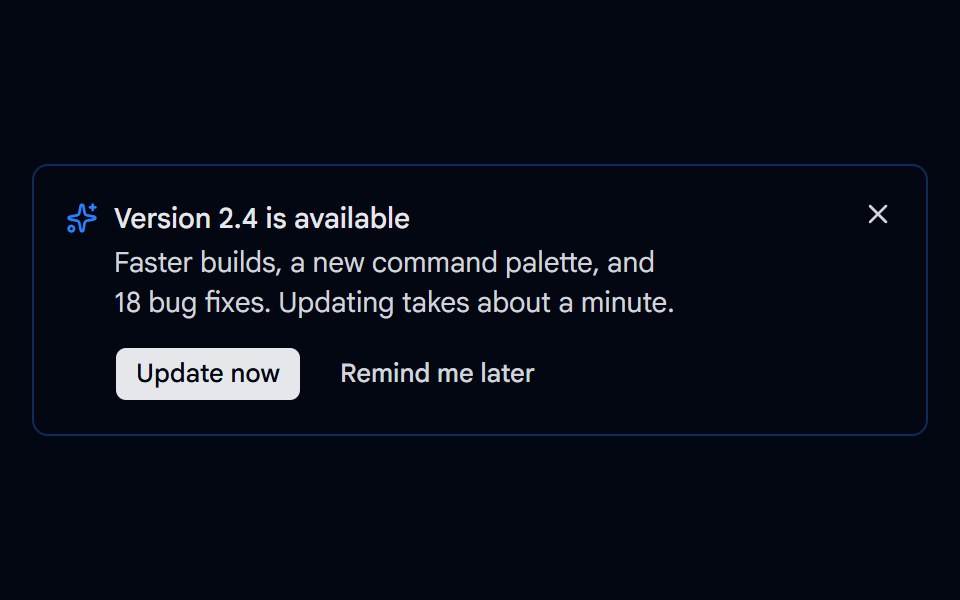 Alert 16 - Update AvailableShadcn Space · ReactDismissible update alert with Update now and Remind me later actions, a loading state while updating, and a way to…
Libraries with Tailwind CSS alert components
Related categories
- Alert Components
- React Alert Components
- Animated Alert Components
- shadcn/ui Alert Components
- Tailwind CSS Feedback Components
- Tailwind CSS Spinner Components
- Tailwind CSS Badge Components
- Tailwind CSS Progress Components
- Tailwind CSS Chip Components
- Tailwind CSS Progress Bar Components
- Tailwind CSS Empty State Components
- Tailwind CSS Notification Components
- Tailwind CSS Banner Components
- Tailwind CSS Status Indicator Components
- Tailwind CSS Skeleton Components
- Tailwind CSS Typing Indicator Components
- Tailwind CSS Progress Circle Components
- Tailwind CSS Error State Components
- Tailwind CSS Scroll Progress Components
- Tailwind CSS Success Animation Components