 Dev Design Library
Alert Components
Dev Design Library indexes 169 alert components from 52 open-source UI libraries, with the most coming from Watermelon UI, ReUI, Shadcn Space, Origin UI and FLX UI. Each one links to its page with the source code, a live preview where available, the library license and the install command. Alert components belong to the Feedback group.
Showing 120 of 169, a mix from every library. Open a library to see all of its components.
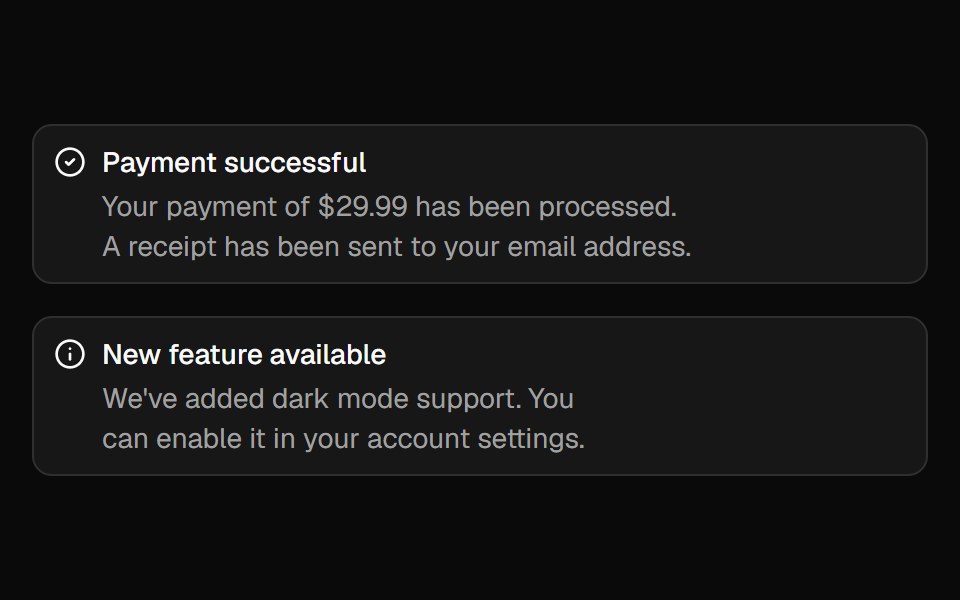 Alertshadcn/ui · ReactDisplays a callout for user attention.
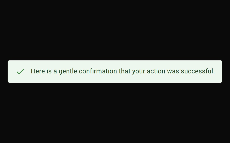 AlertMUI / Material UI · React
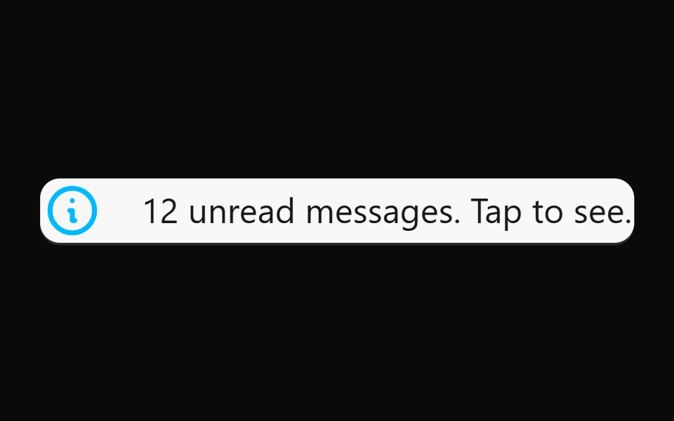 AlertdaisyUI · CSS (Tailwind)
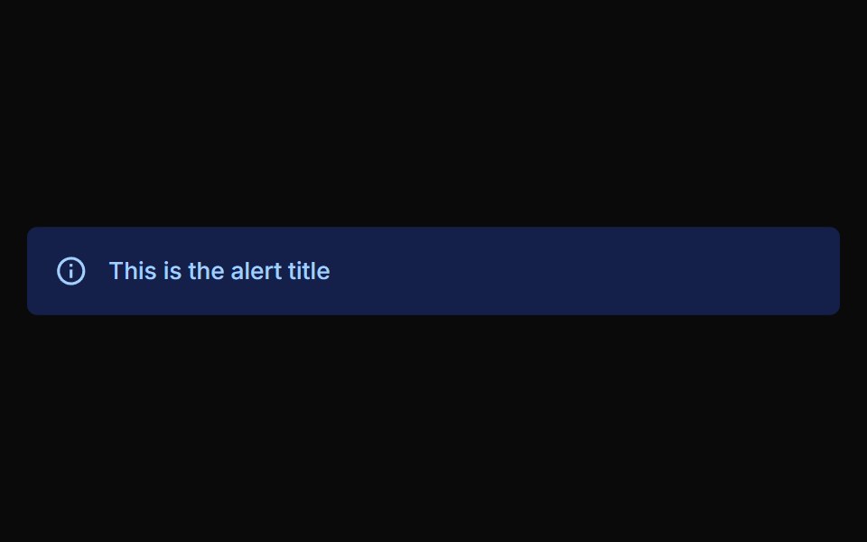 AlertChakra UI · ReactUsed to communicate a state that affects a system, feature or page.
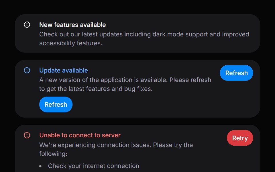 AlertHeroUI · ReactDisplays important messages and notifications to users with status indicators.
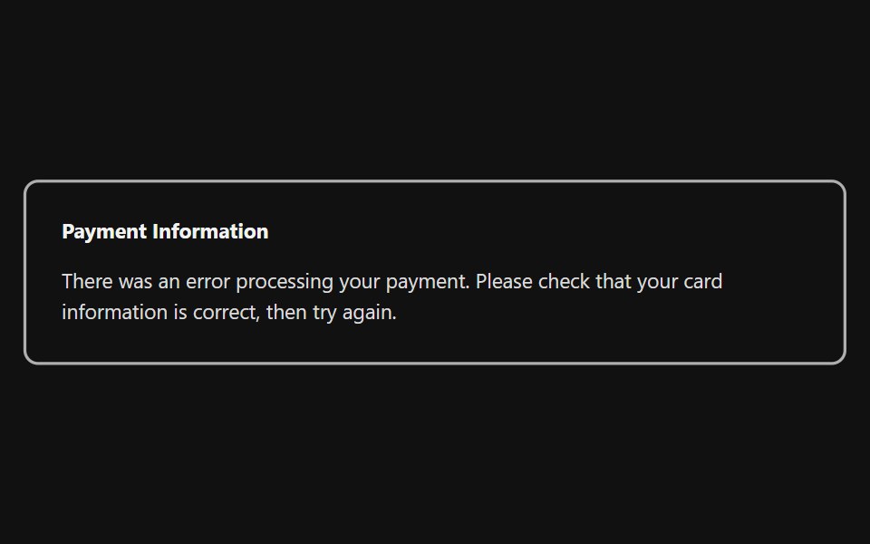 Inline AlertReact Spectrum · ReactInline alerts display a non-modal message associated with objects in a view. These are often used in form validation…
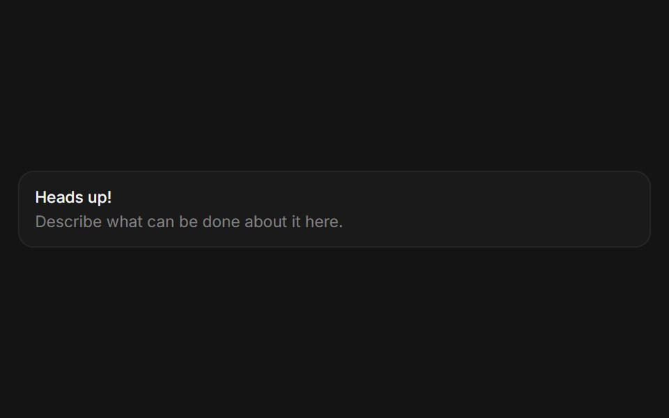 Alertcoss ui · ReactA callout for displaying important information.
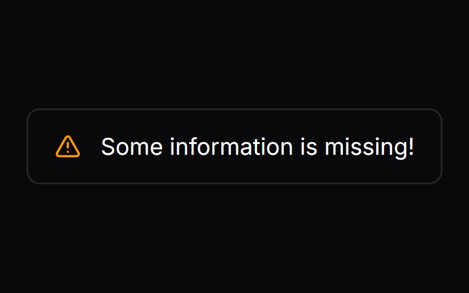 Comp 267Origin UI · React
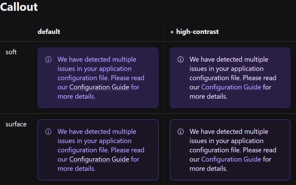 CalloutRadix Themes · React
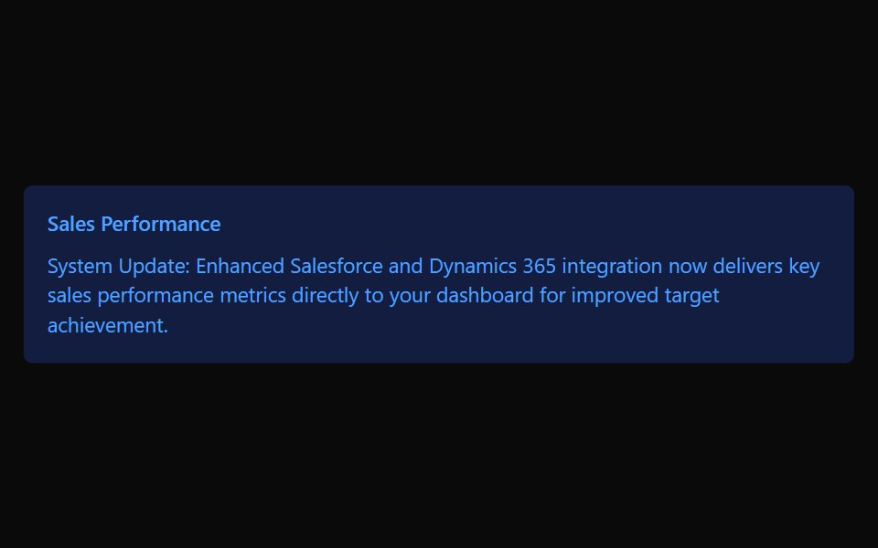 CalloutTremor · React
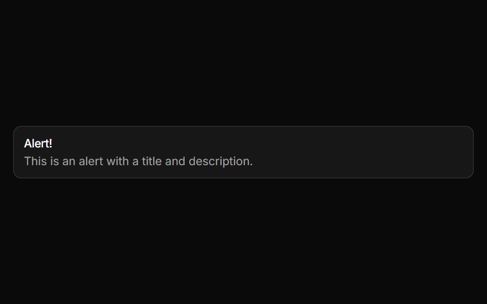 AlertReUI · ReactDisplays a callout for user attention, such as a success message, warning, or error.
 Alertpdfcn · ReactAlert PDF component (forme)
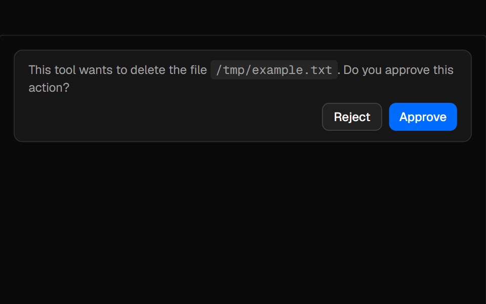 ConfirmationAI Elements · ReactAn alert-based component for managing tool execution approval workflows with request, accept, and reject states.
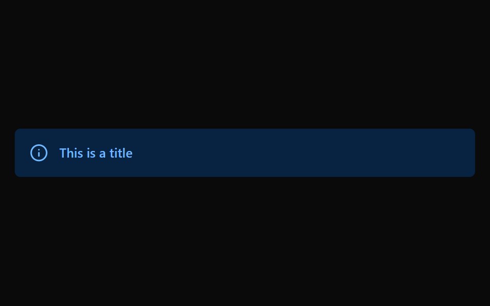 AlertPark UI · ReactA component for displaying important notifications and feedback messages.
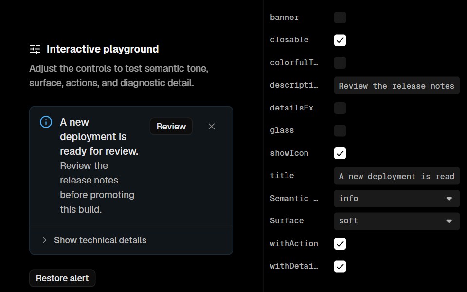 AlertLobe UI · ReactAlert is a component used to display important messages or notifications to the user. It can be customized with…
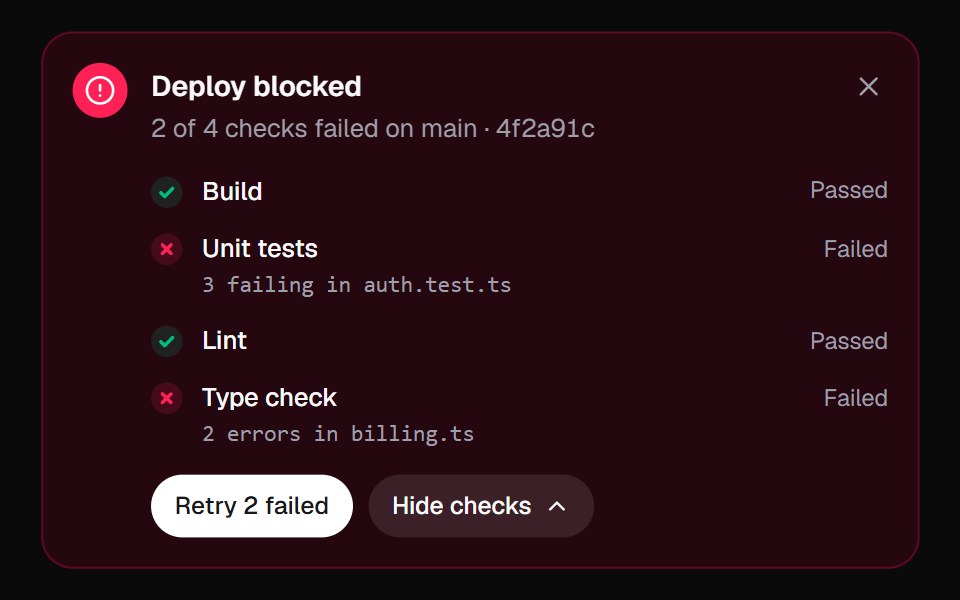 Inline AlertKokonut UI · React"An alert that does something about the problem: it lists the failed checks, re-runs them one by one, and turns from…
 noteIntent UI · Reactnote
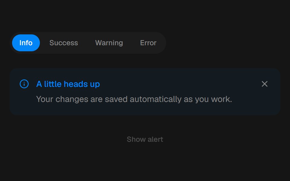 AlertbeUI · ReactFeedback that eases in and folds away.
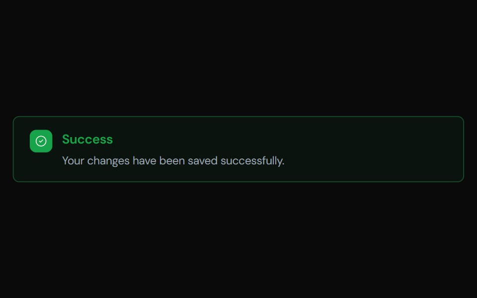 AlertTailGrids · ReactA component to display important messages to the user, with support for different variants.
 Alert demoSpectrum UI · Reactcomponent for the alert-demo
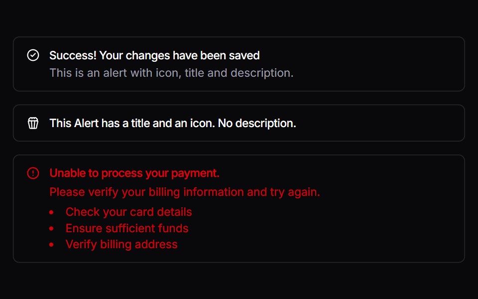 AlertVengeance UI · React
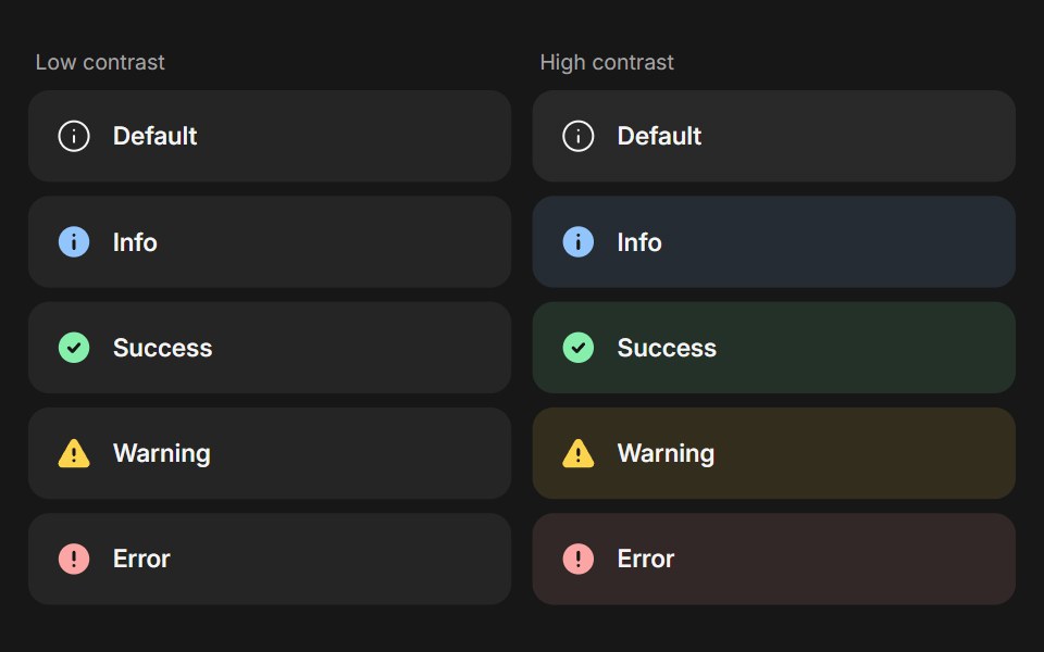 BannerFluid Functionalism · ReactStatus message built from parts (Banner, BannerTitle, BannerDescription, BannerActions, BannerAction): 5 statuses…
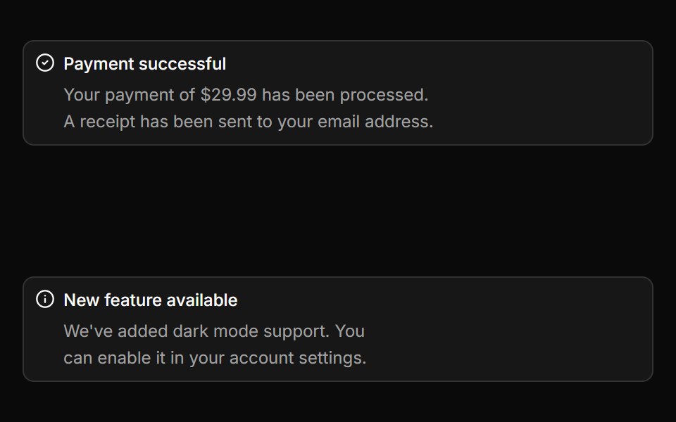 AlertToolcraft · React
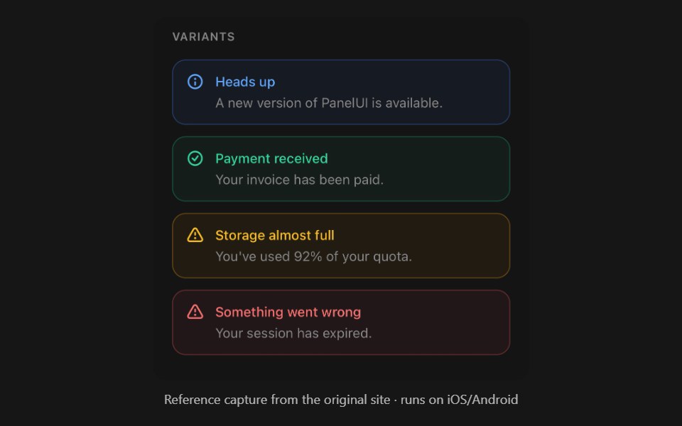 AlertPanel UI · React NativeStatus message with a built-in icon.
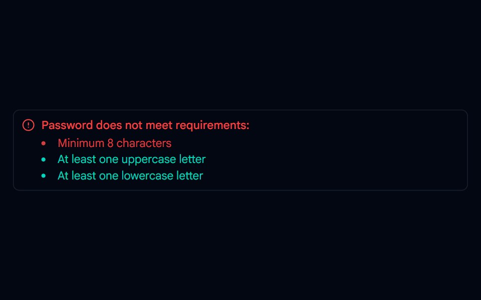 Alert-01 - Alert with Password DetailShadcn Space · ReactAlert component
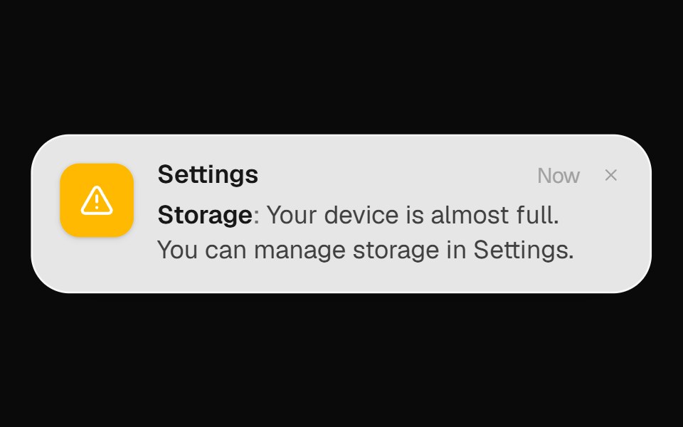 System Alert BannerOpenSourceUI · React
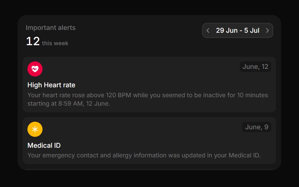 MedicalBoardUI · React
 CalloutTremor Blocks · React
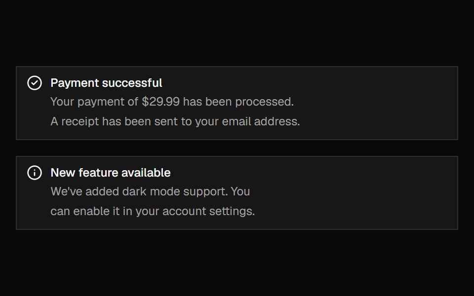 AlertShadcn Dashboard · React
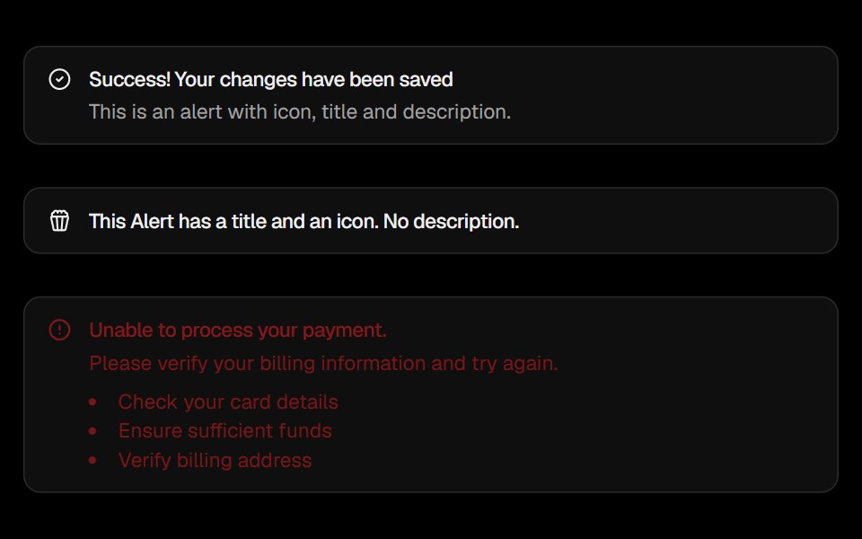 AlertObsidianUI · React
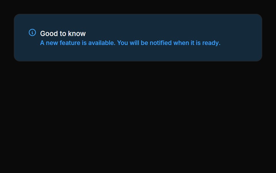 Alerts 01Oxbow UI · Astro
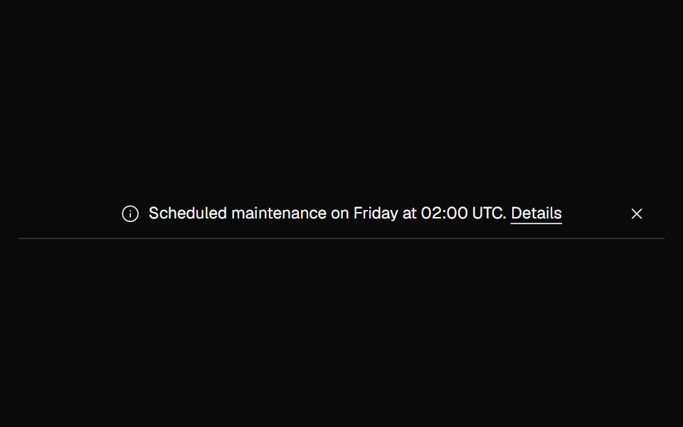 Banner NoticeNexvyn UI · ReactInfo and error status banners with icons and the right live-region roles.
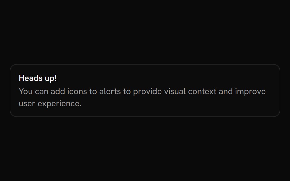 AlertShark UI · ReactDisplays an alert for user attention.
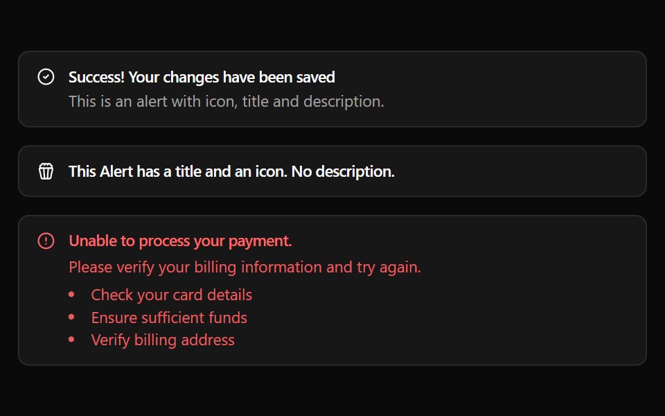 AlertWatermelon UI · React
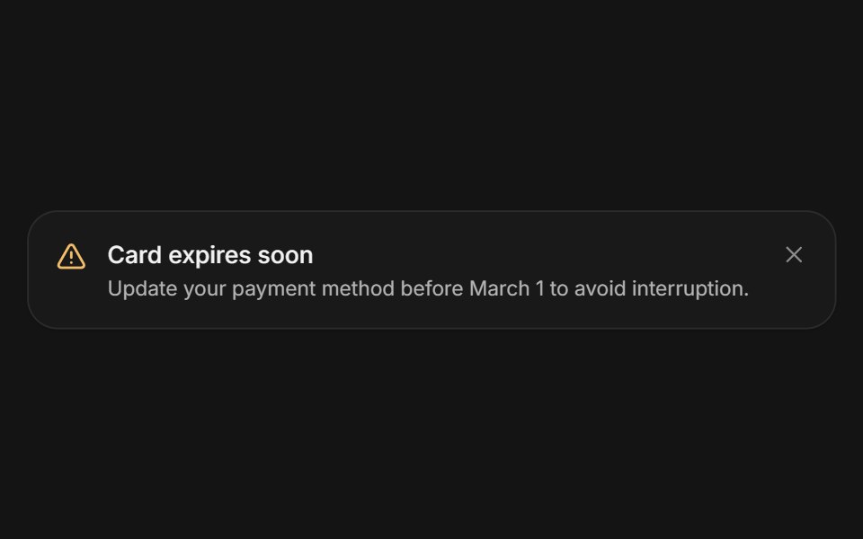 AlertArc Library · ReactA persistent message that helps people recover or continue.
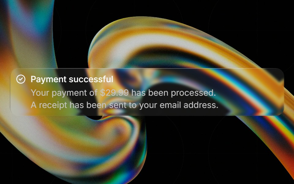 Glass Alertglasscn · ReactGlass Alert with five variants: clear, frosted, subtle, liquid, and liquid-refract
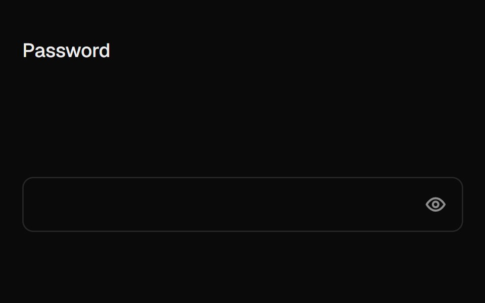 Caps Lock WarningUI Lab · ReactA small caps lock key with its light on slides into the field when caps is on.
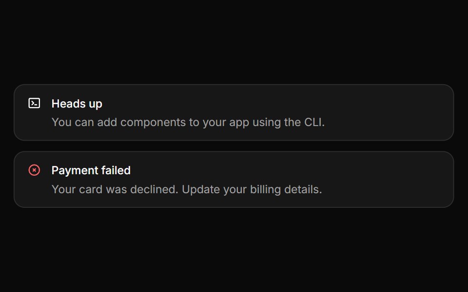 AlertHextaUI · ReactInline messages for status and feedback, with a neutral surface, a colored icon and a dismiss that collapses smoothly.
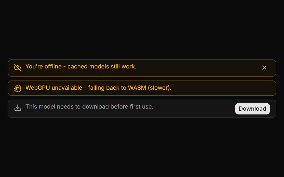 System Notice BannerLocalMode · ReactAn in-conversation info/warning banner (not a message bubble) for local-first state changes: offline/online, model…
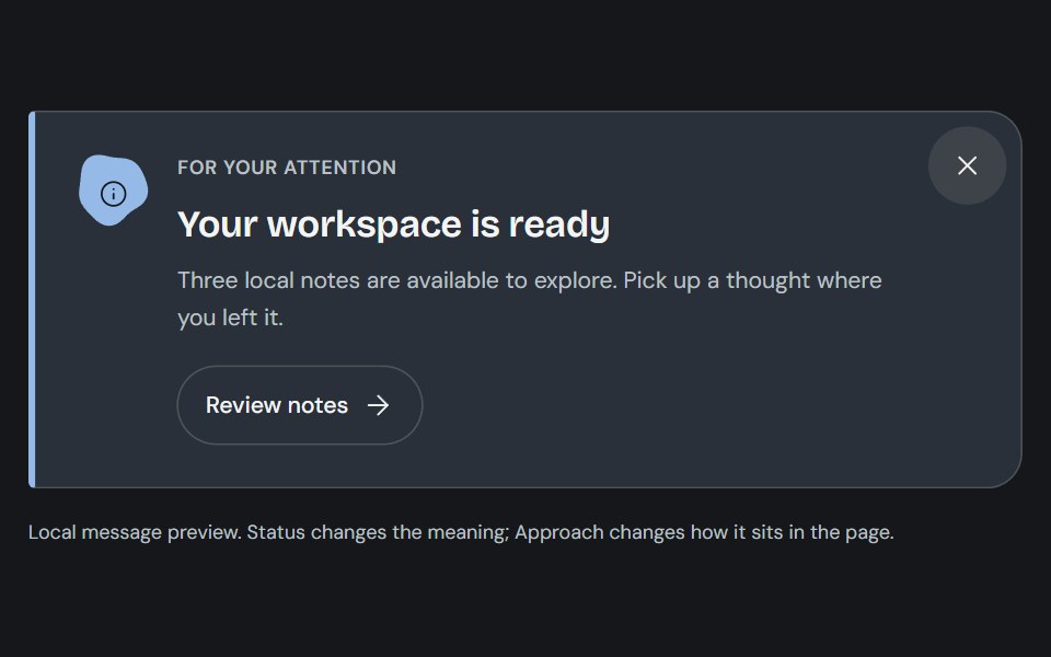 AlertCojeev UI · ReactAn authored note, attached-action banner or folded dispatch that makes the message and its next step clear.
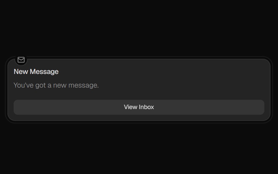 AlertROI UI · ReactA component for displaying important messages to users.
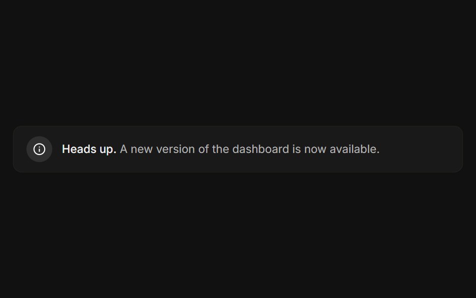 BasicFLX UI · ReactIcon, message, and a subtle bordered surface.
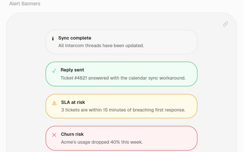 Alert BannerHalaska UI · React
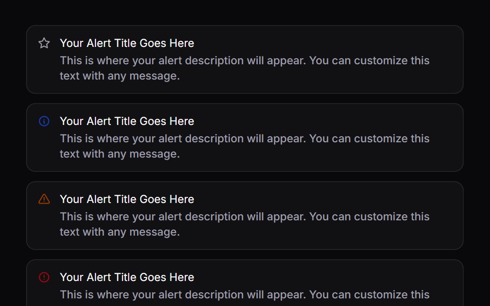 AlertSpaceUI · ReactDisplays a prominent message box for important notices, warnings, or success messages to keep users informed without…
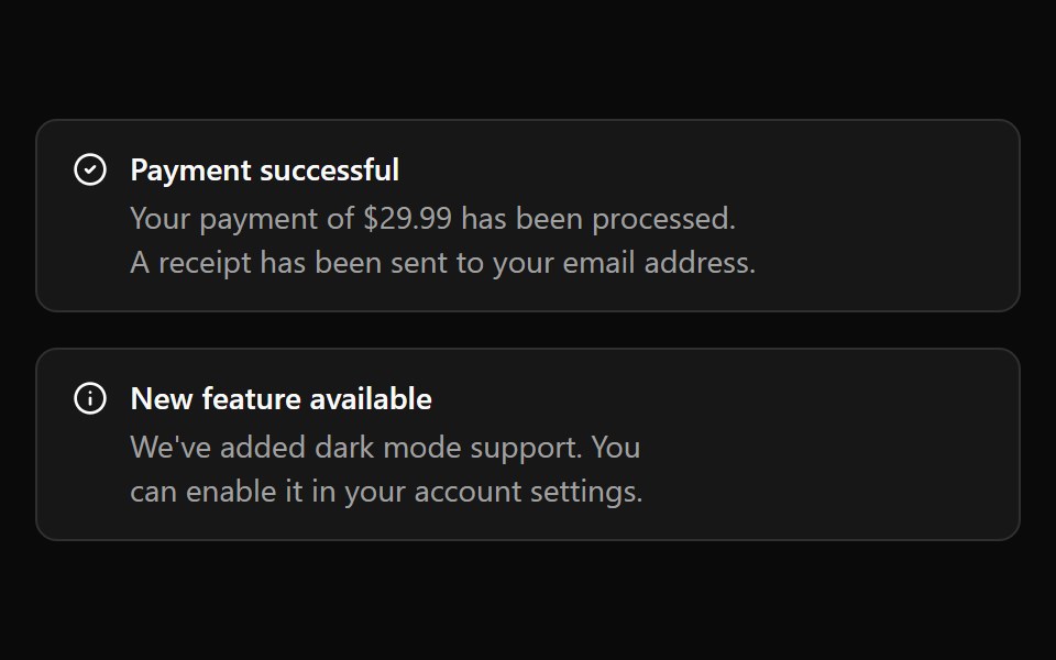 Aria AlertReScript shadcn · ReScript
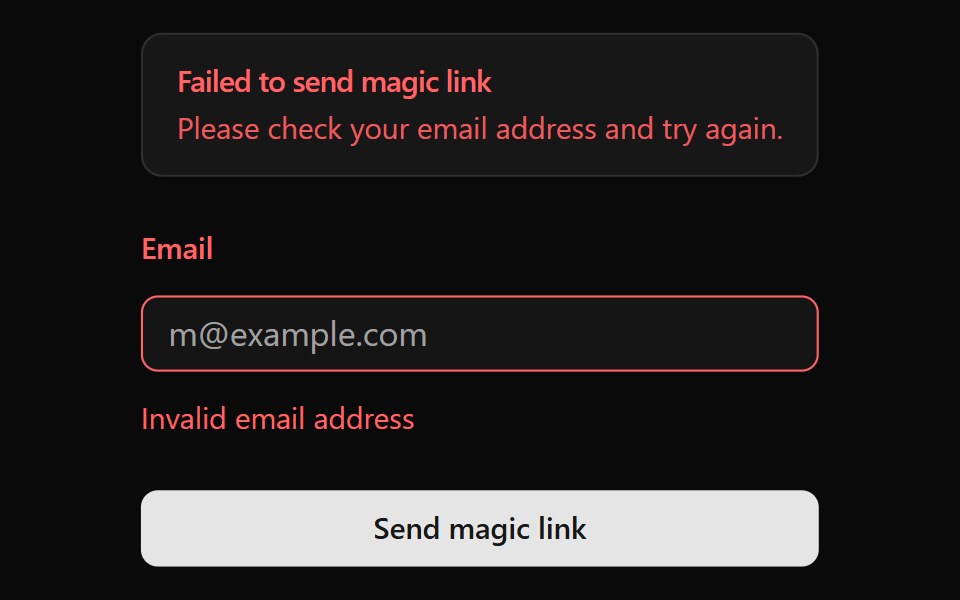 AlertOUI · ReactA shadcn Alert for a form displaying form action result.
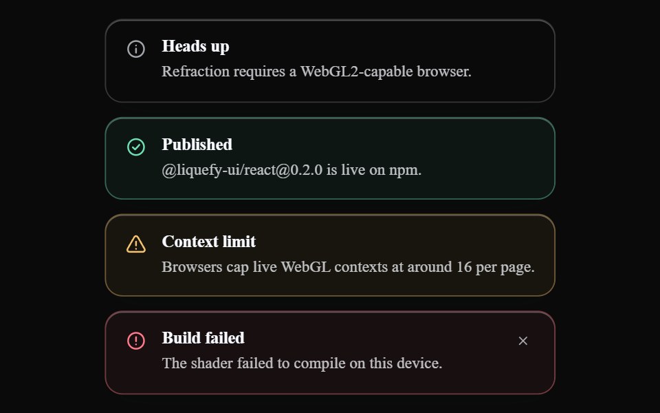 Liquid AlertLiquefy UI · ReactAlert message box in liquid glass style. Caixa de alerta em estilo vidro líquido.
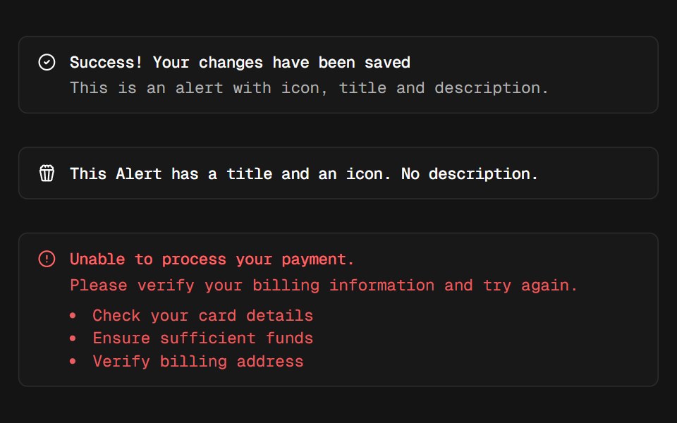 AlertD2Studio UI · ReactDisplays a callout for user attention.
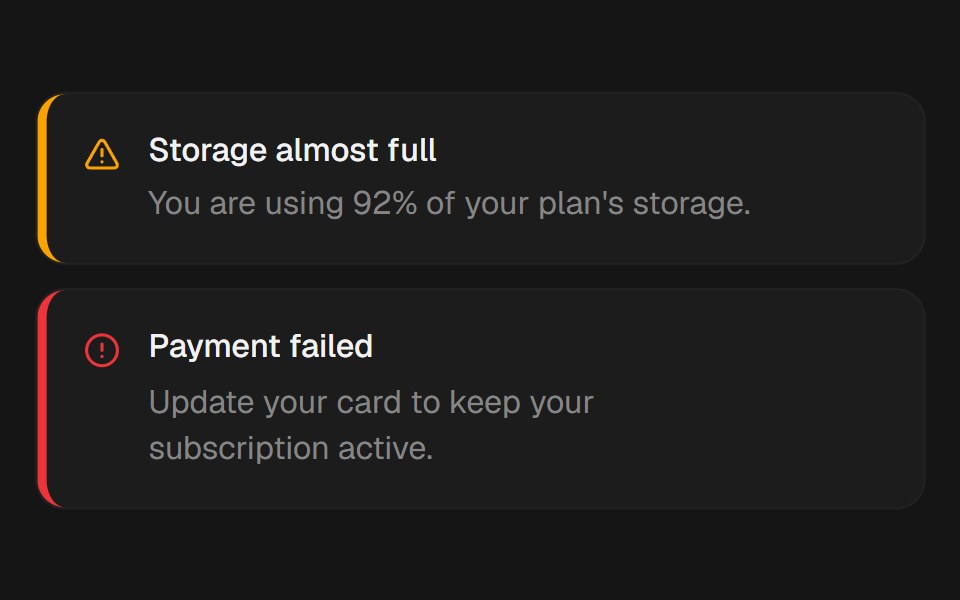 AlertEaseUI · ReactBanner with a colored accent stripe. Body text stays neutral so contrast never depends on the variant.
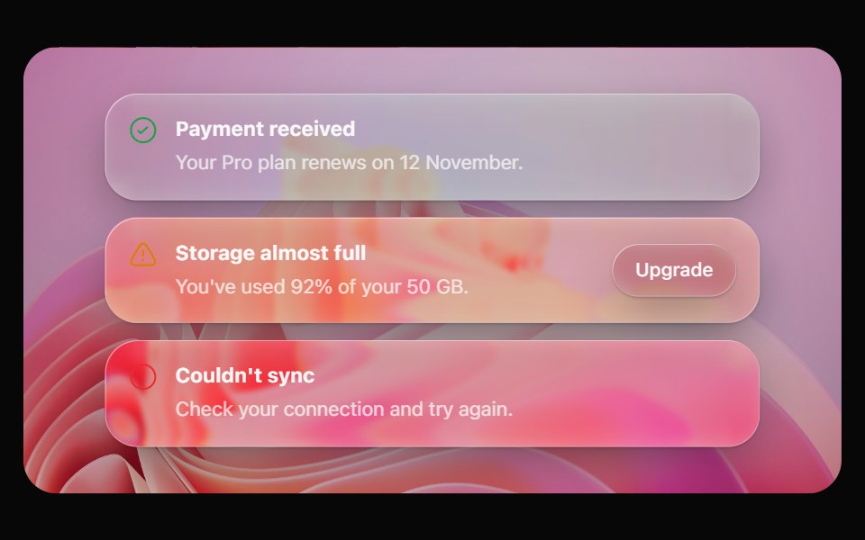 Glass AlertOpaline · ReactA callout on frosted glass, tinted by intent: info, success, warning or destructive.
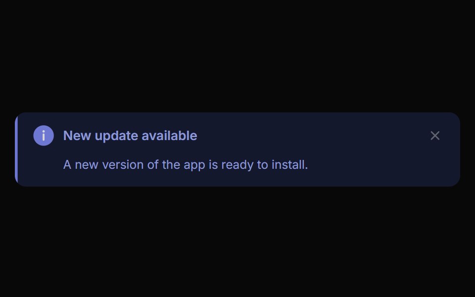 Alert ToastReactFrame · ReactA polished toast/alert notification, 5 tones, stacked or inline layout, icons, primary/secondary actions, dismiss and…
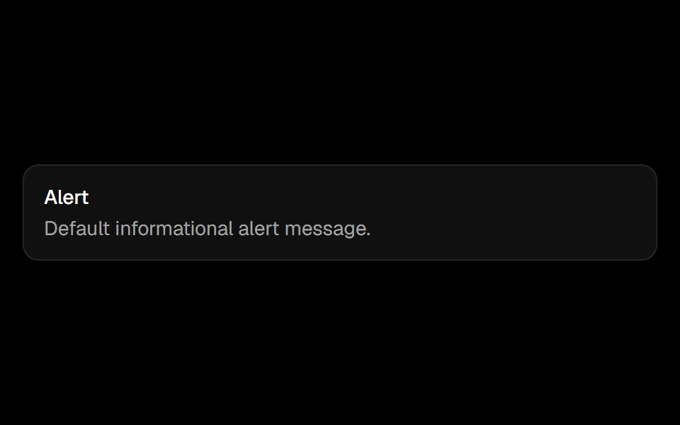 Alertark-cn · ReactA shadcn-style alert component built with Ark UI primitives.
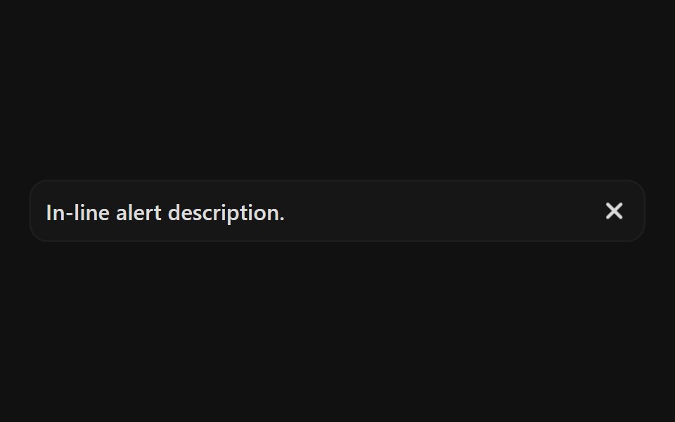 Ai AlertReact Spectrum · React
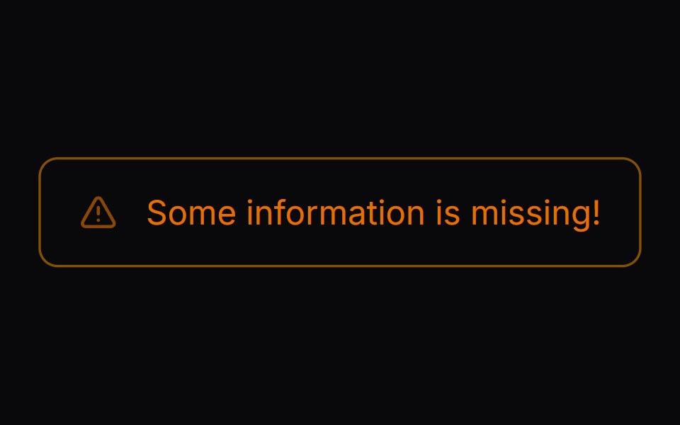 Comp 268Origin UI · React
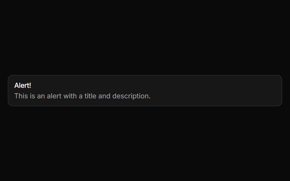 Basic alertReUI · ReactBasic alert
 Alertpdfcn · ReactAlert PDF component (takumi)
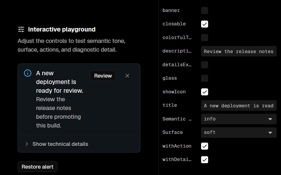 Base Ui AlertLobe UI · React
 Alert 2Spectrum UI · Reactcomponent for the alert-2
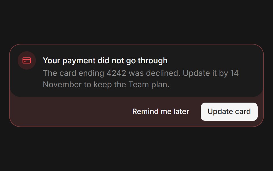 Web AlertPanel UI · React Native
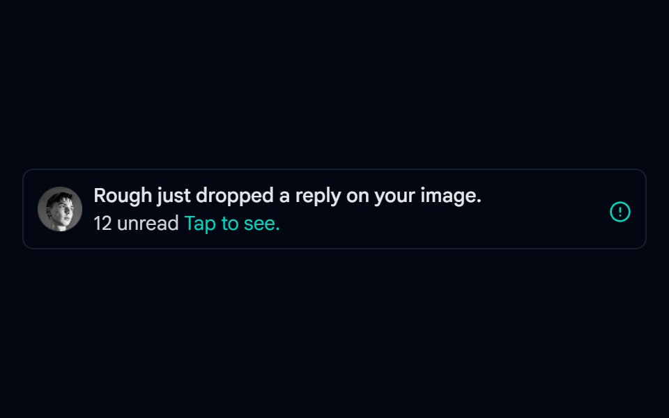 Alert-02 - Alert with User DetailShadcn Space · ReactAlert component
 Banner 01Tremor Blocks · React
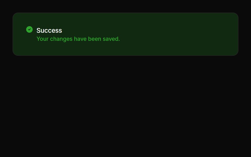 Alerts 02Oxbow UI · Astro
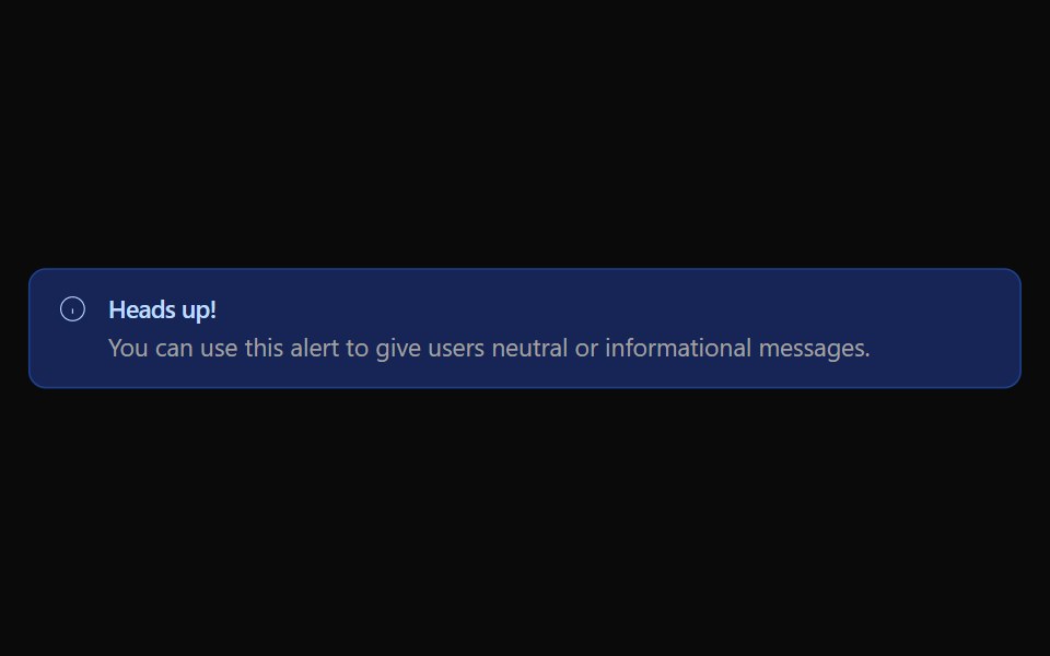 Alert 01Watermelon UI · React
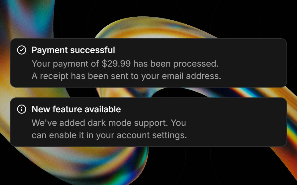 Alertglasscn · React
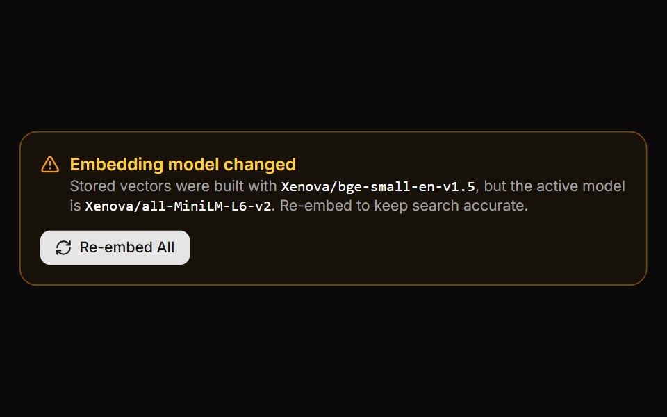 Embedding Drift BannerLocalMode · ReactA warning panel shown when the active embedding model is incompatible with vectors already stored (model changed or…
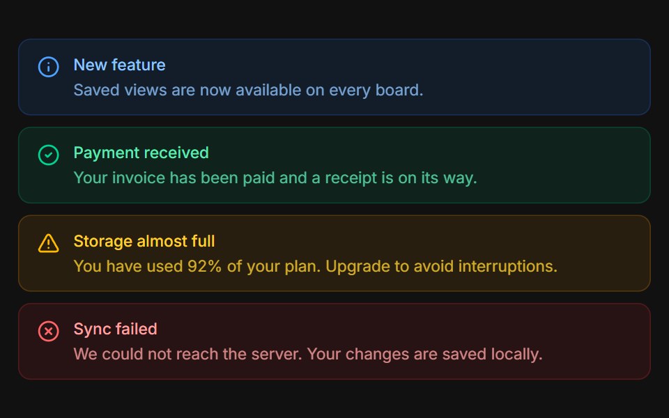 VariantsFLX UI · ReactInfo, success, warning, and error tones stacked.
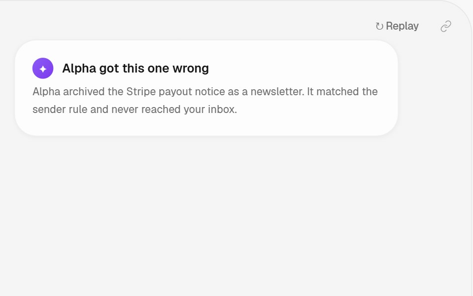 Error Repair PatternHalaska UI · React
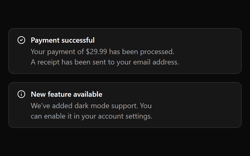 Base AlertReScript shadcn · ReScript
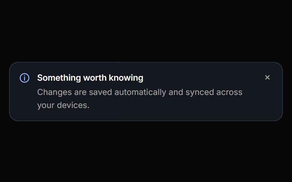 CalloutReactFrame · ReactAn inline message block with info, success, warning, danger and neutral variants, three appearances, self-drawing…
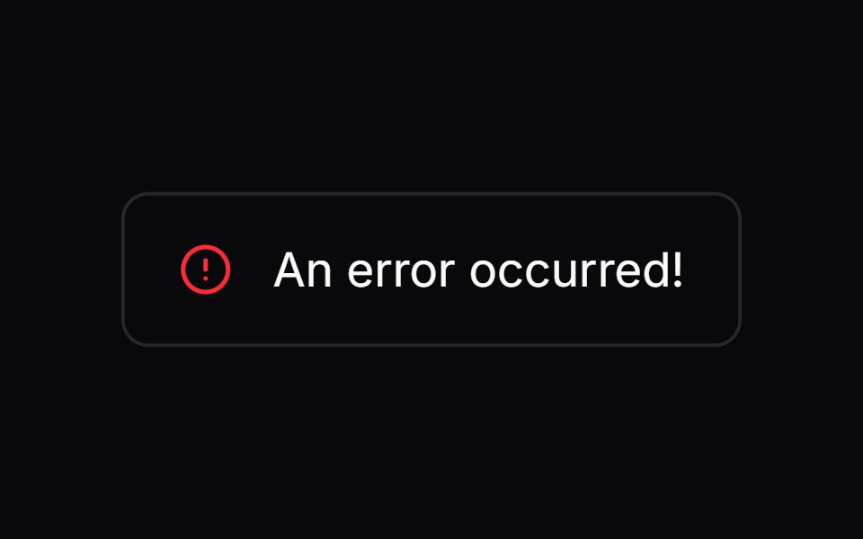 Comp 269Origin UI · React
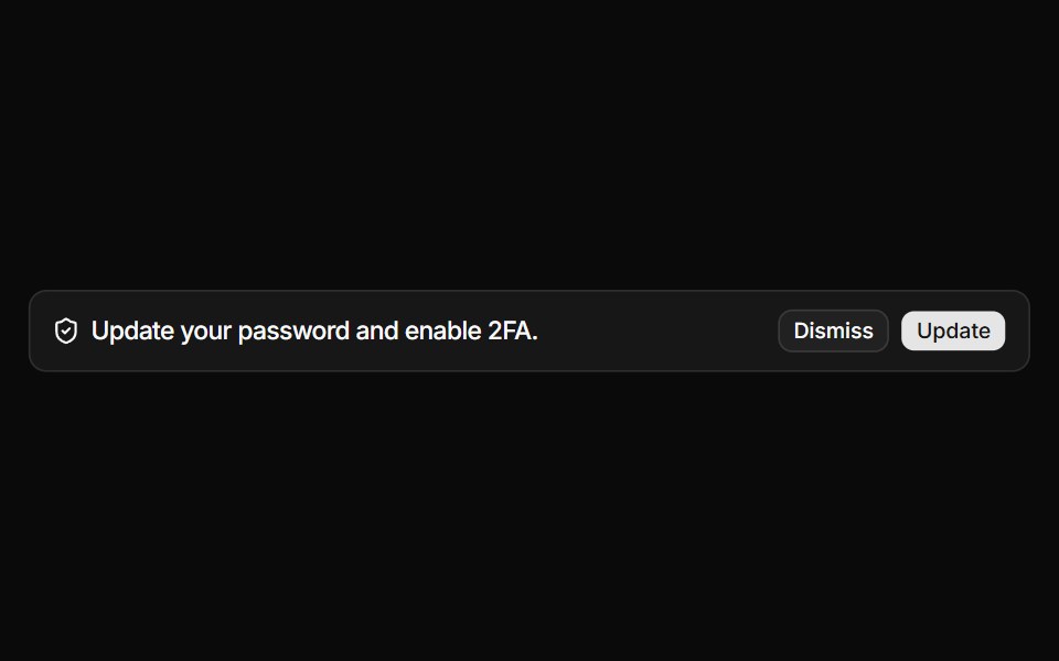 Alert with icon and action buttonsReUI · ReactAlert with icon and action buttons
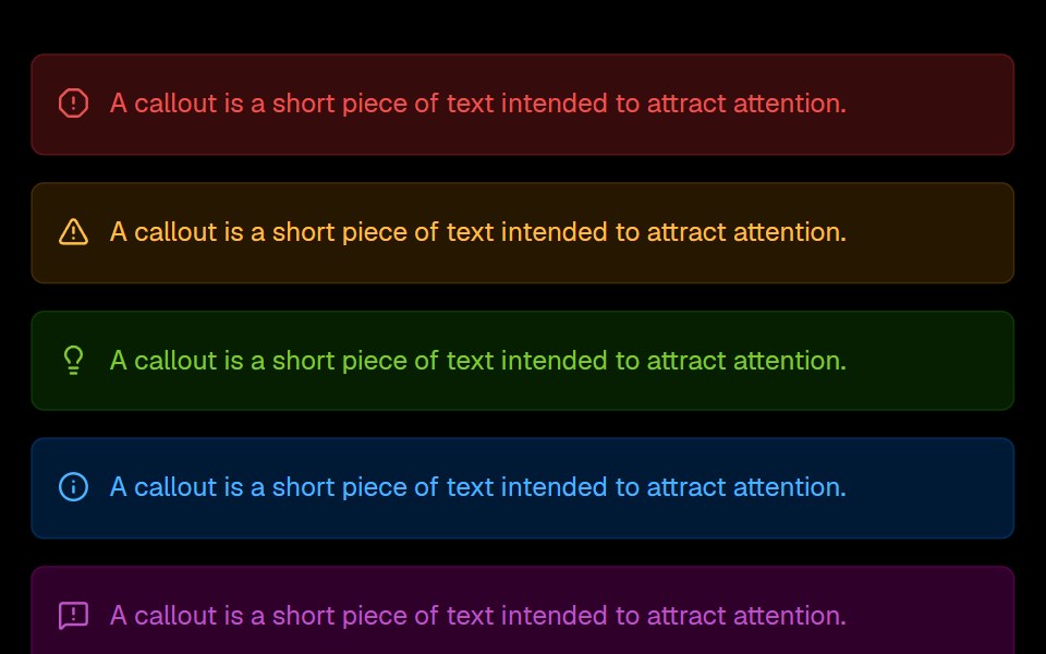 Mdx CalloutLobe UI · React
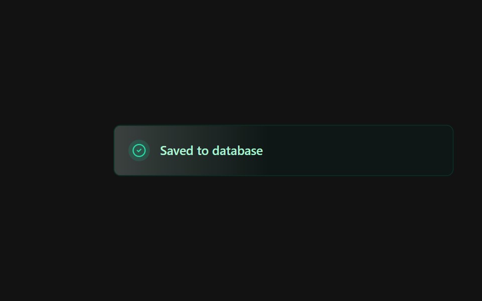 Alert 3Spectrum UI · Reactcomponent for the alert-3
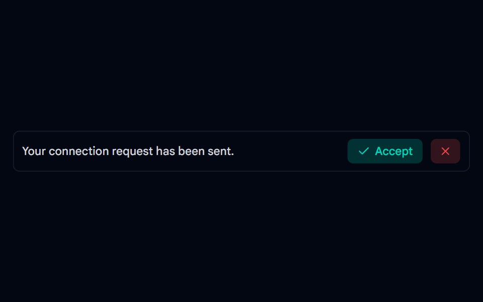 Alert-03 - Social AlertShadcn Space · ReactAlert component
 Banner 02Tremor Blocks · React
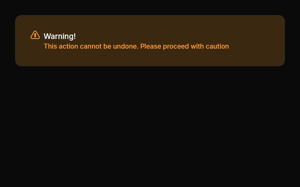 Alerts 03Oxbow UI · Astro
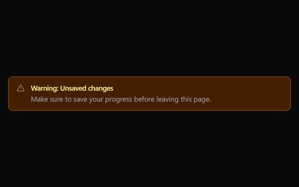 Alert 02Watermelon UI · React
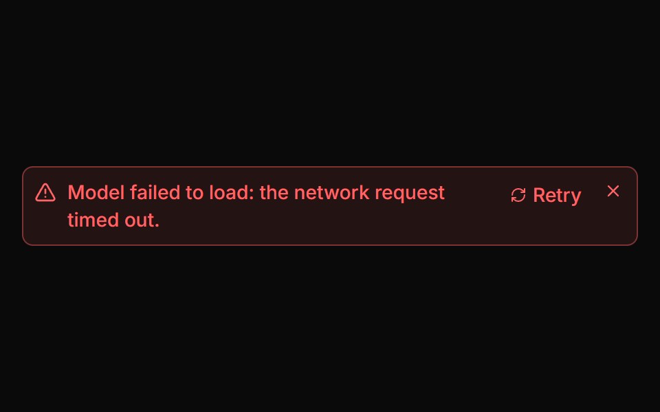 Error AlertLocalMode · ReactA compact, dismissible error surface with an optional retry action - a role=alert region showing the message, a Retry…
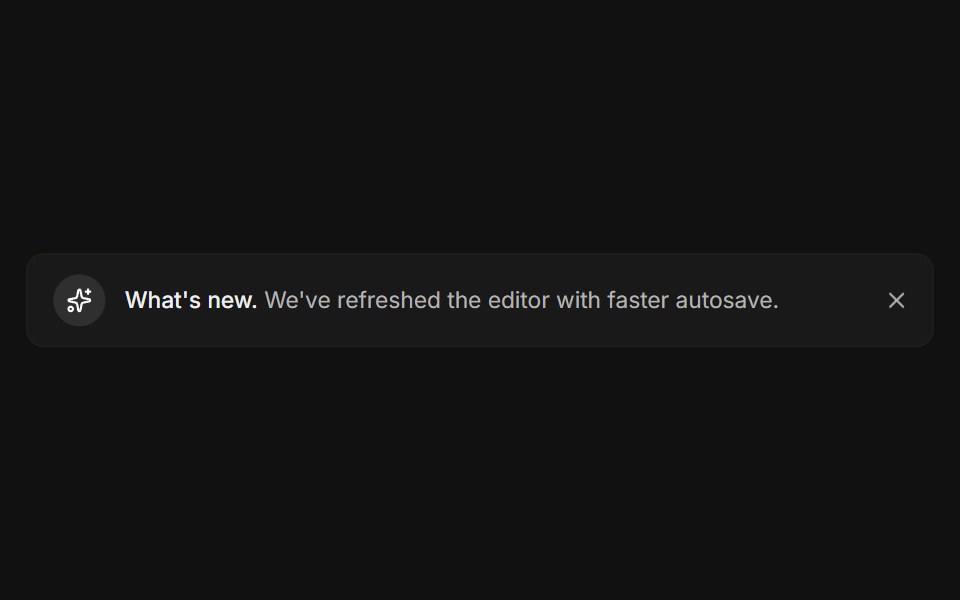 DismissibleFLX UI · ReactA close button hides the banner with a restore link.
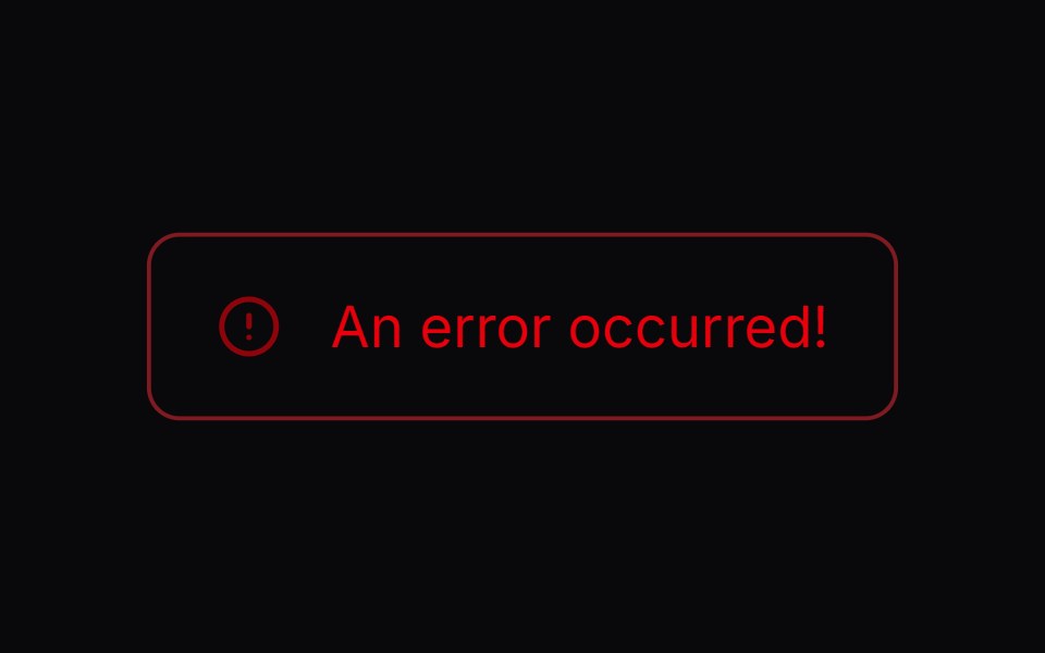 Comp 270Origin UI · React
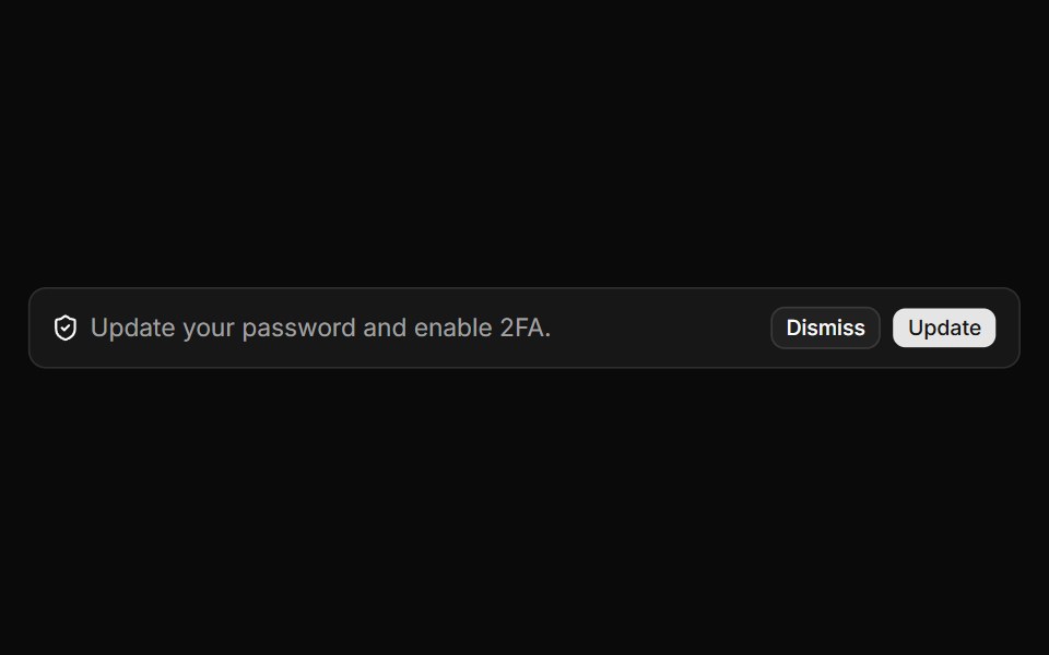 Alert with description and action buttonsReUI · ReactAlert with description and action buttons
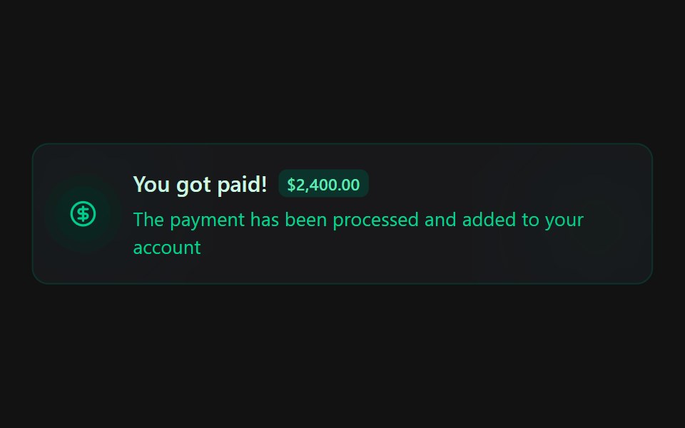 Alert 4Spectrum UI · Reactcomponent for the alert-4
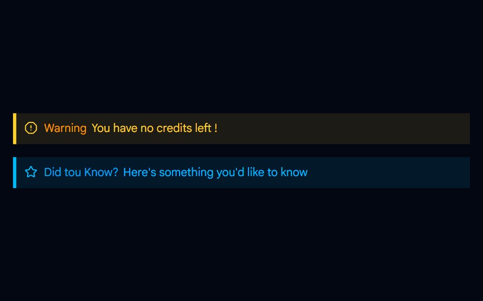 Alert-04 - Indicator Destructive AlertShadcn Space · ReactAlert component
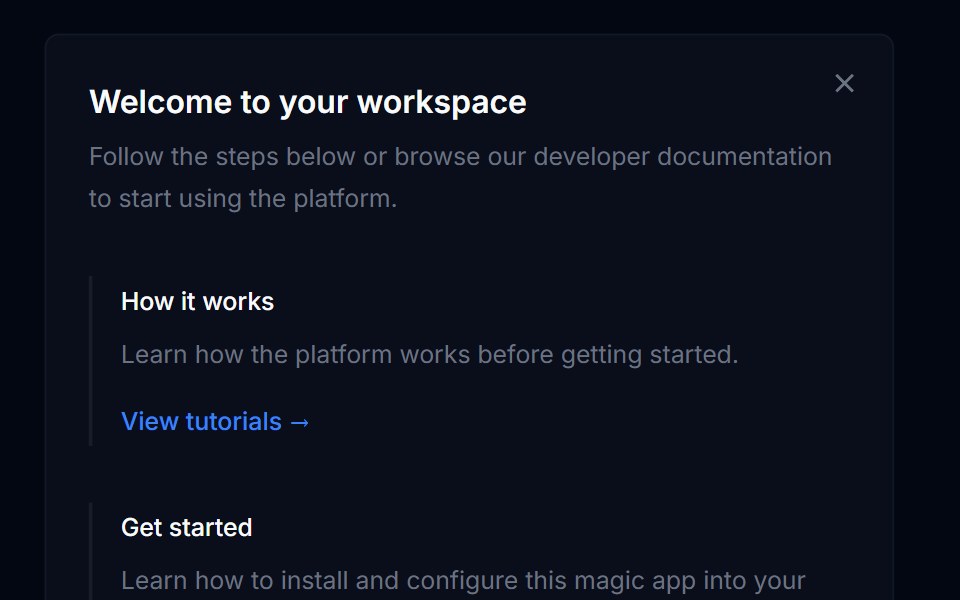 Banner 03Tremor Blocks · React
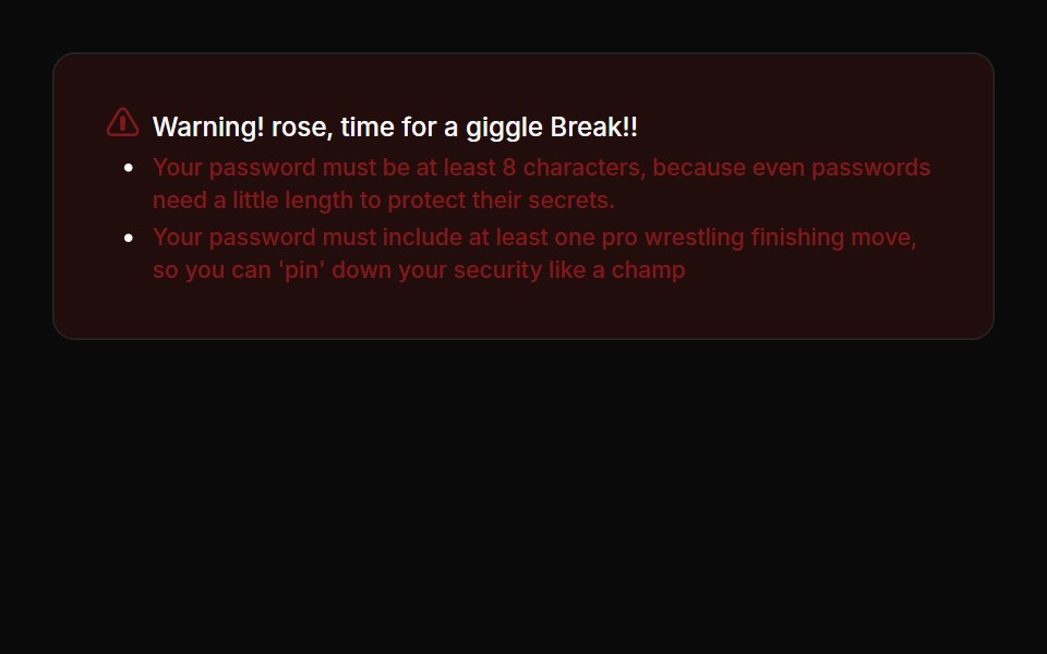 Alerts 04Oxbow UI · Astro
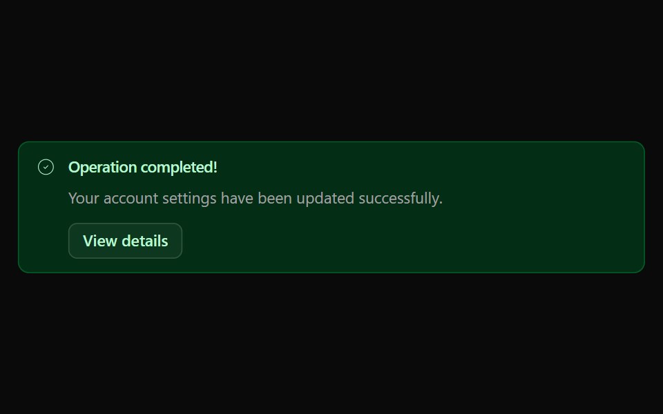 Alert 03Watermelon UI · React
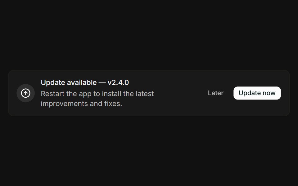 With actionsFLX UI · ReactMessage paired with Later and Update now buttons.
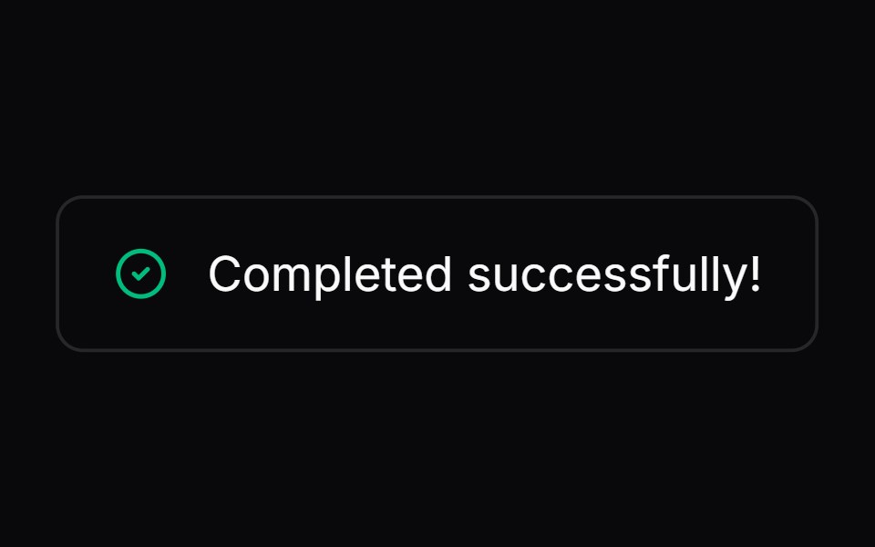 Comp 271Origin UI · React
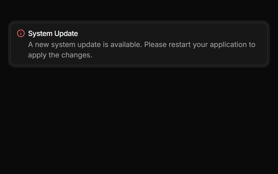 Alert integrated within a Frame with reset bordersReUI · ReactAlert integrated within a Frame with reset borders
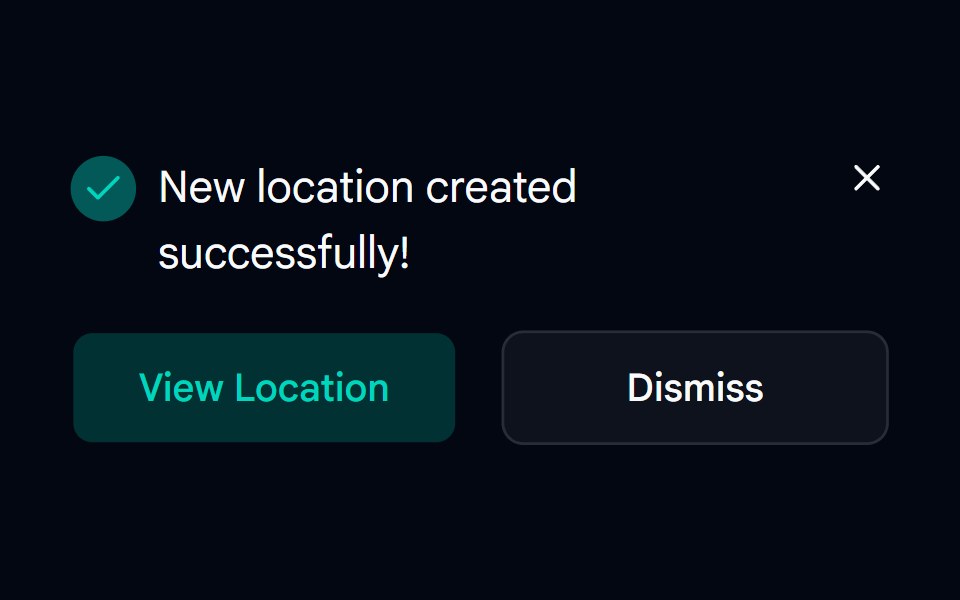 Alert-05 - Dark AlertShadcn Space · ReactAlert component
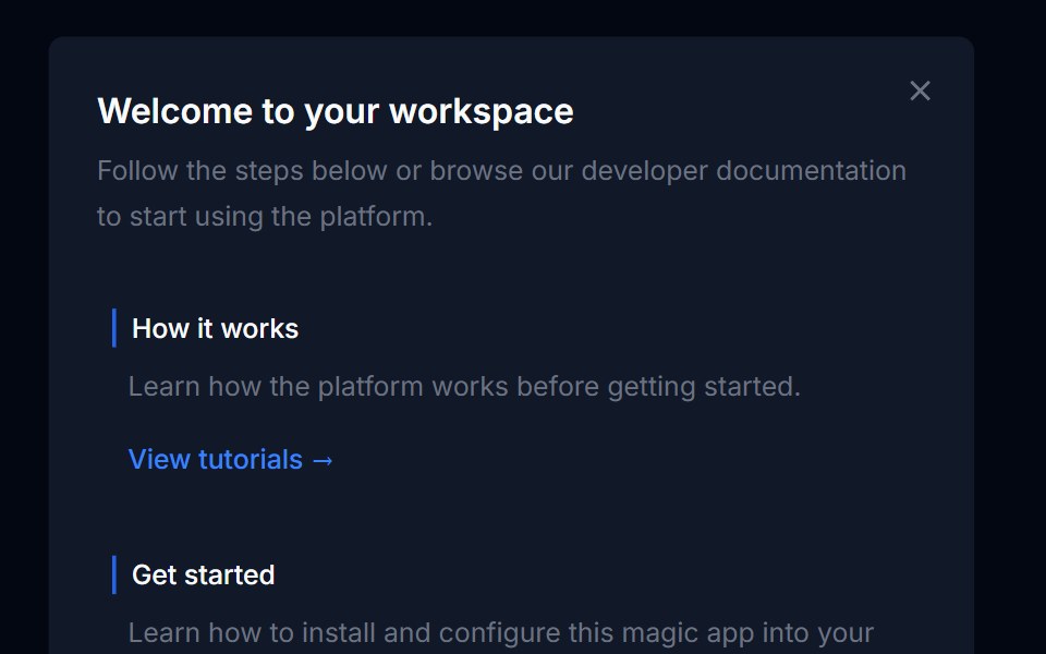 Banner 04Tremor Blocks · React
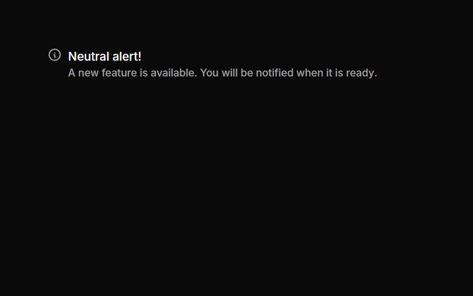 Alerts 05Oxbow UI · Astro
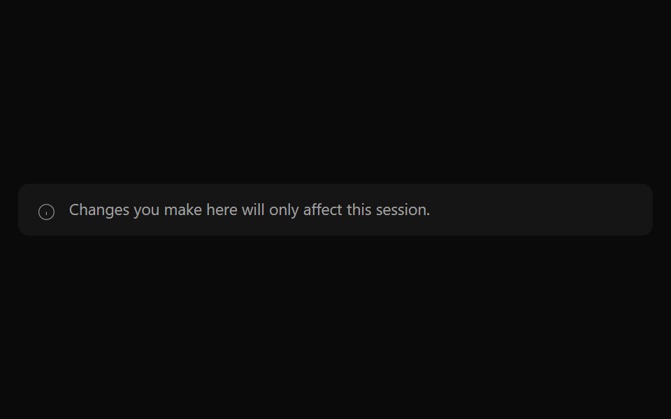 Alert 04Watermelon UI · React
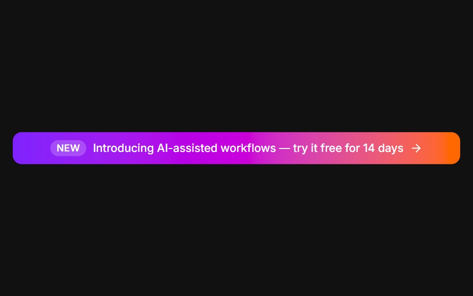 Announcement barFLX UI · ReactFull-width gradient promo with a New tag and arrow.
 Comp 272Origin UI · React
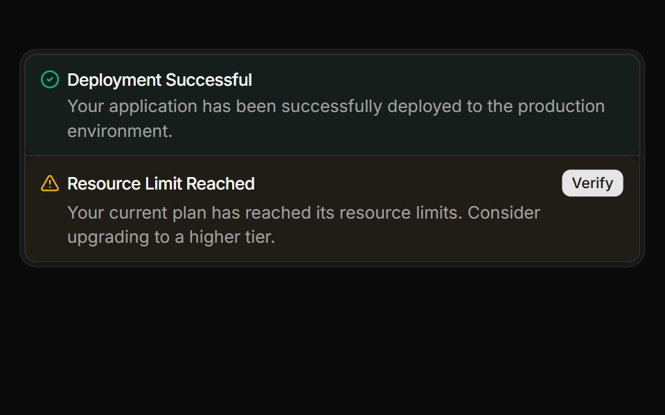 Stacked alerts within a FrameReUI · ReactStacked alerts within a Frame
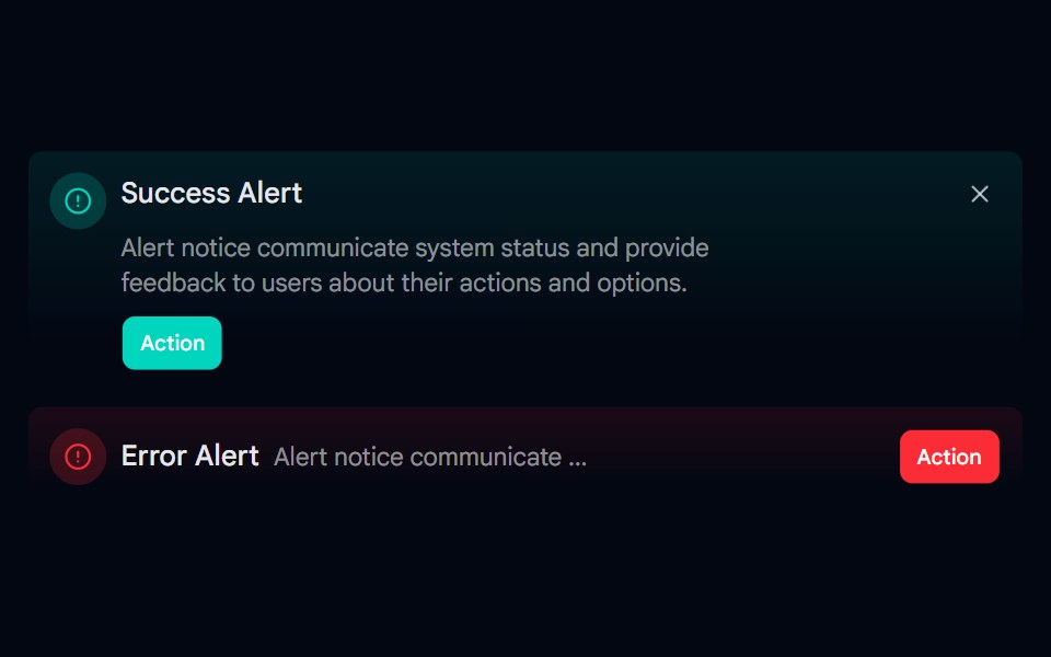 Alert-06 - Gradient AlertShadcn Space · ReactAlert component
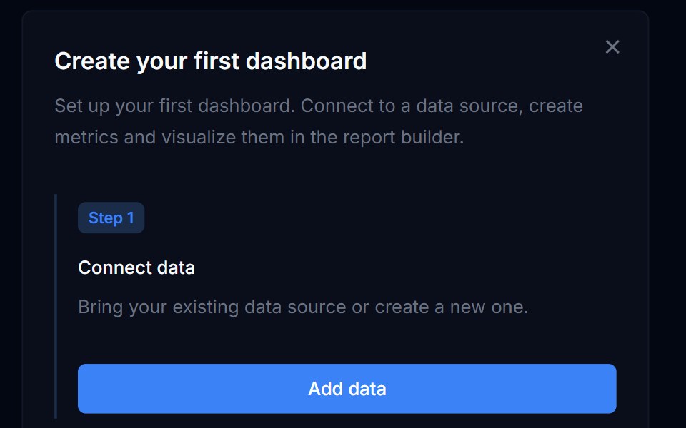 Banner 05Tremor Blocks · React
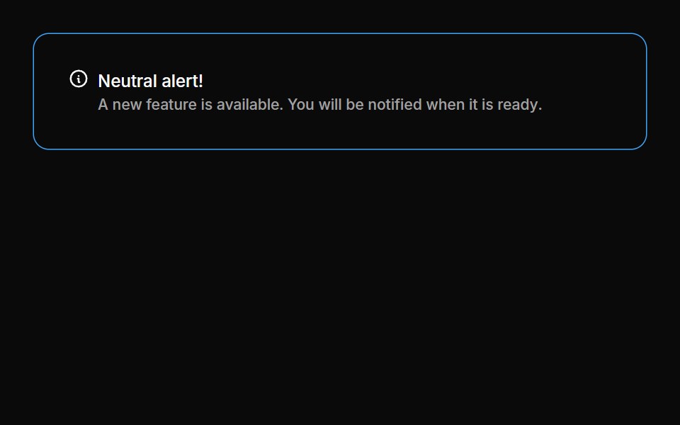 Alerts 06Oxbow UI · Astro
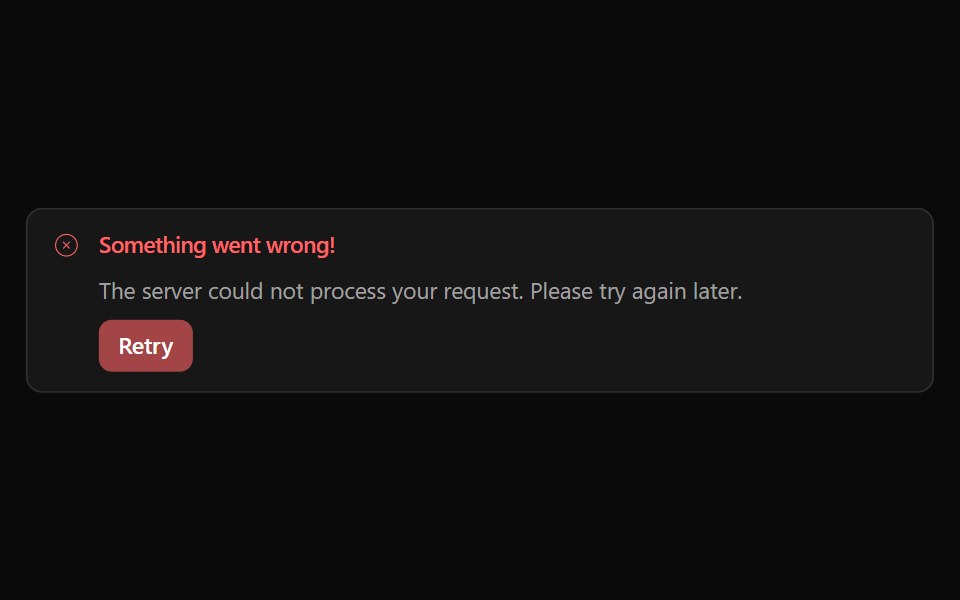 Alert 05Watermelon UI · React
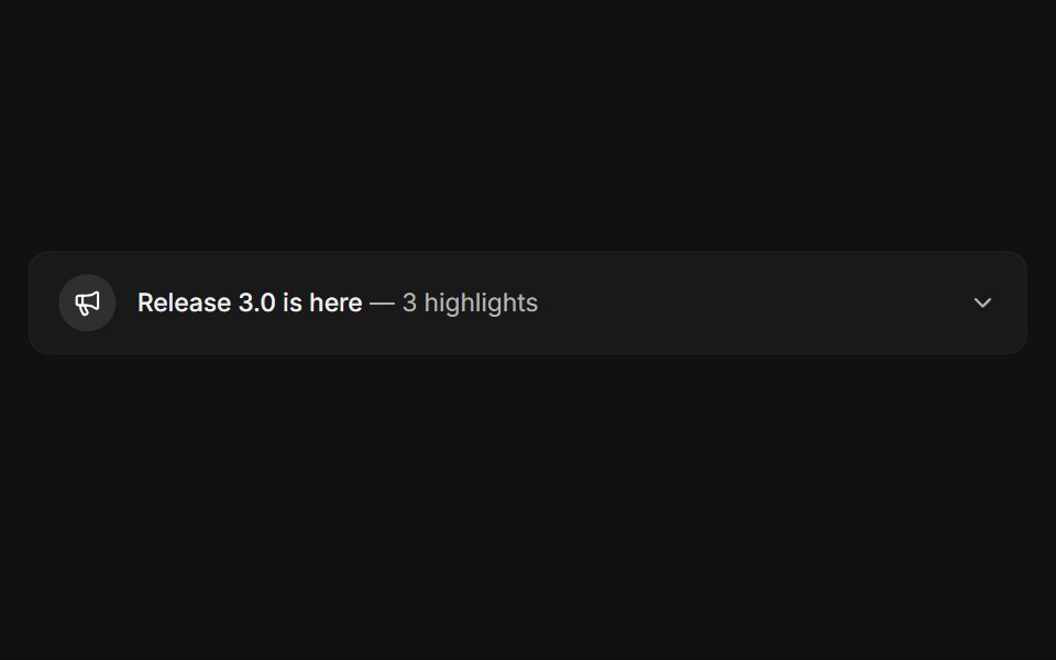 ExpandableFLX UI · ReactCollapsible release notes that reveal highlights.
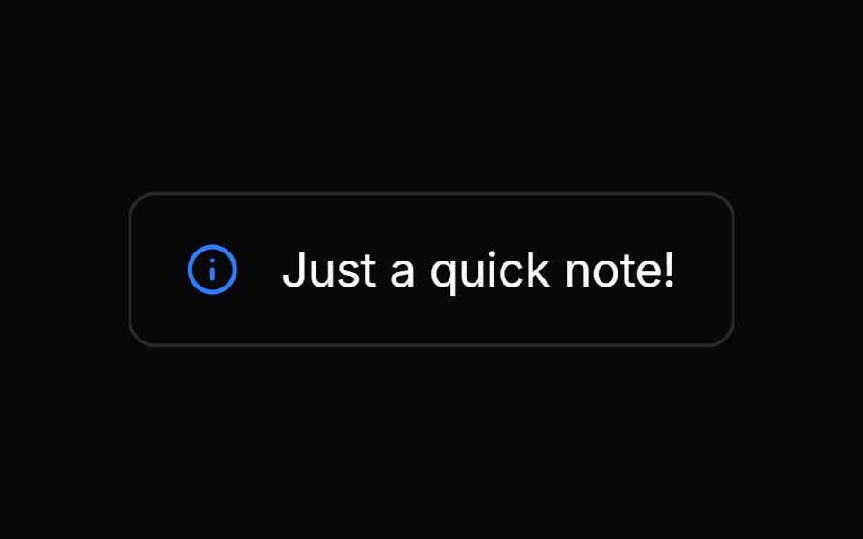 Comp 273Origin UI · React
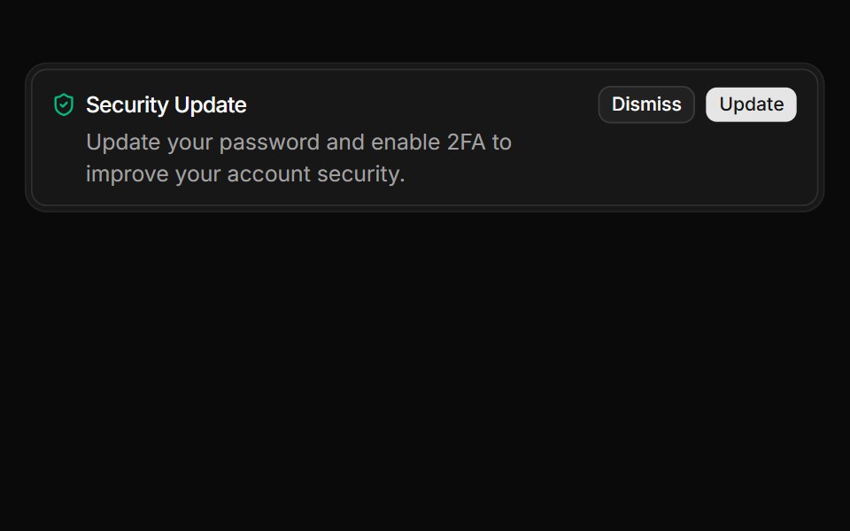 Alert with actions integrated within a FrameReUI · ReactAlert with actions integrated within a Frame
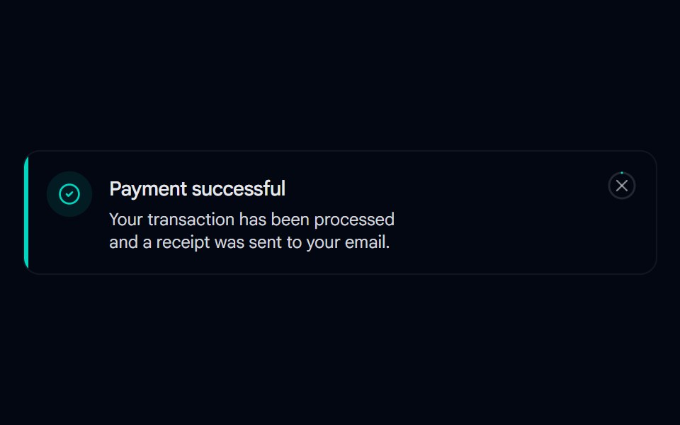 Alert 07 - With Hover-Fill DismissShadcn Space · ReactToast-style alert with a spring entrance, icon pop-in, and a close button whose ring fills in on hover, built with…
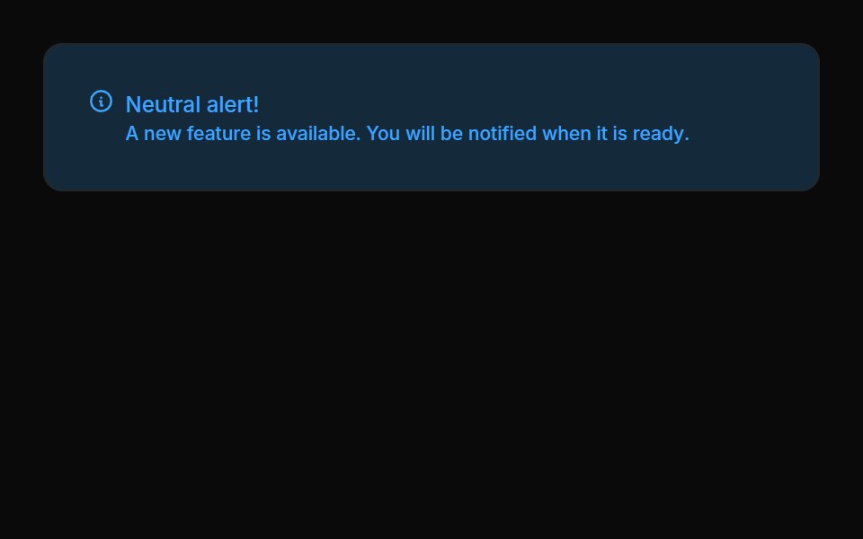 Alerts 07Oxbow UI · Astro
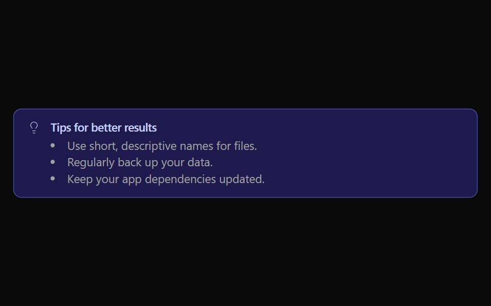 Alert 06Watermelon UI · React
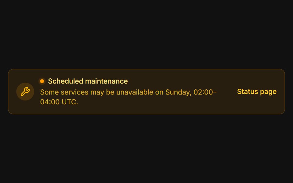 MaintenanceFLX UI · ReactAmber system notice with a pulsing status dot.
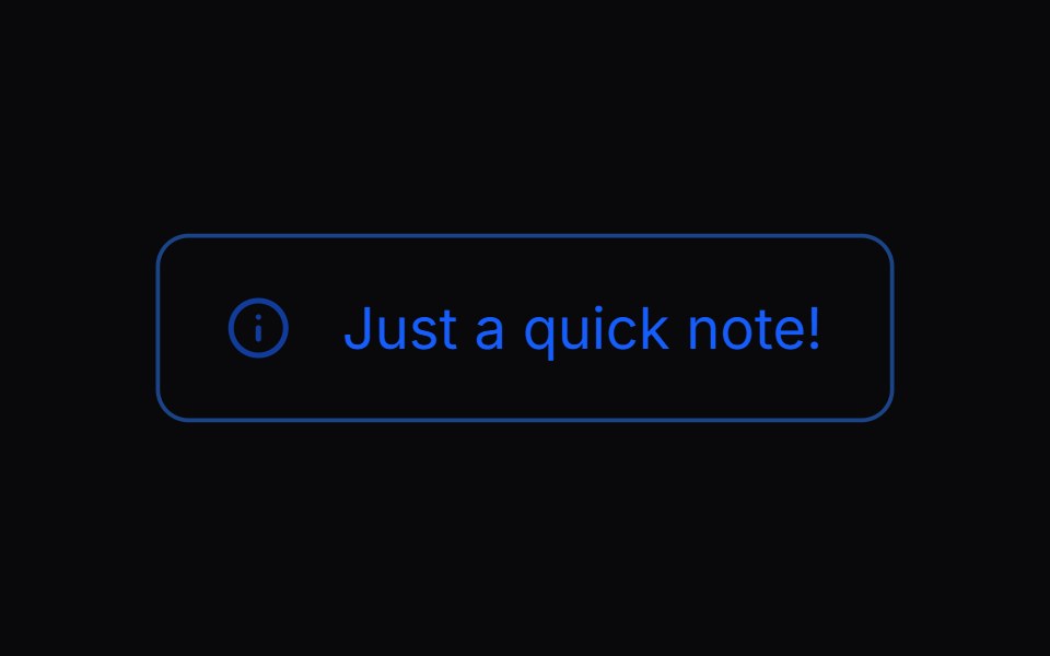 Comp 274Origin UI · React
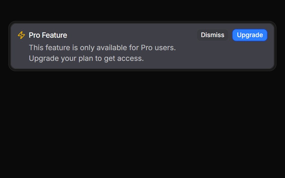 Inverted alert variantReUI · ReactInverted alert variant
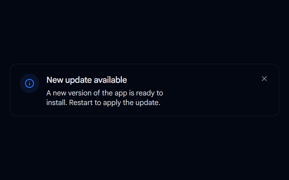 Alert 08 - Evaporate DismissShadcn Space · ReactAlert that dissolves away like evaporating water when dismissed, fading and blurring out with rising vapor wisps…
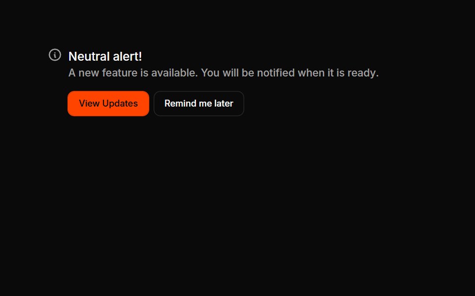 Alerts 08Oxbow UI · Astro
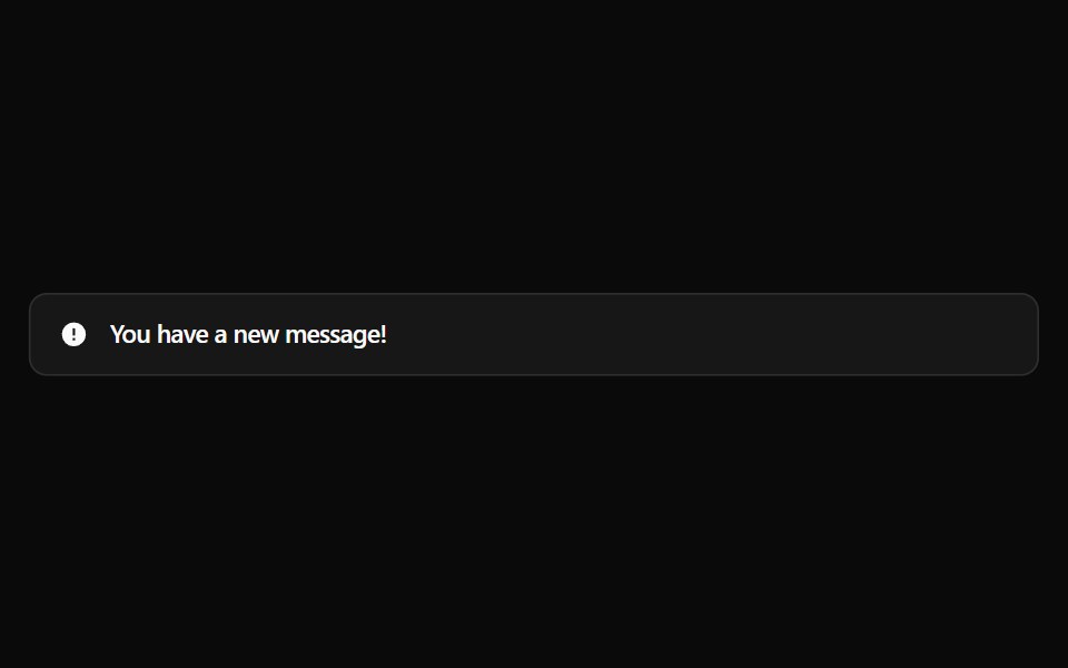 Alert 1Watermelon UI · React
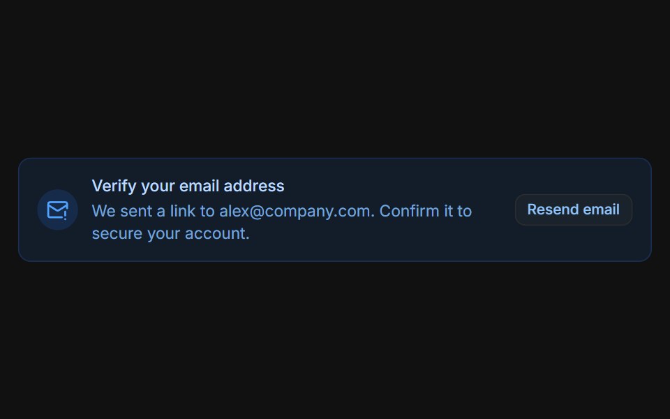 Email verificationFLX UI · ReactBlue prompt with a Resend email button that switches to a sent confirmation.
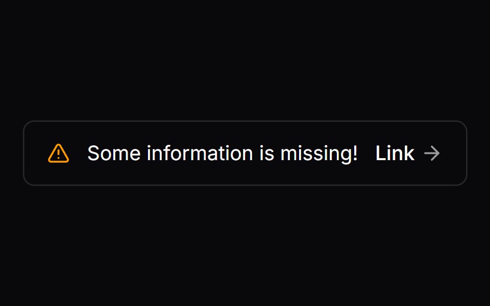 Comp 275Origin UI · React
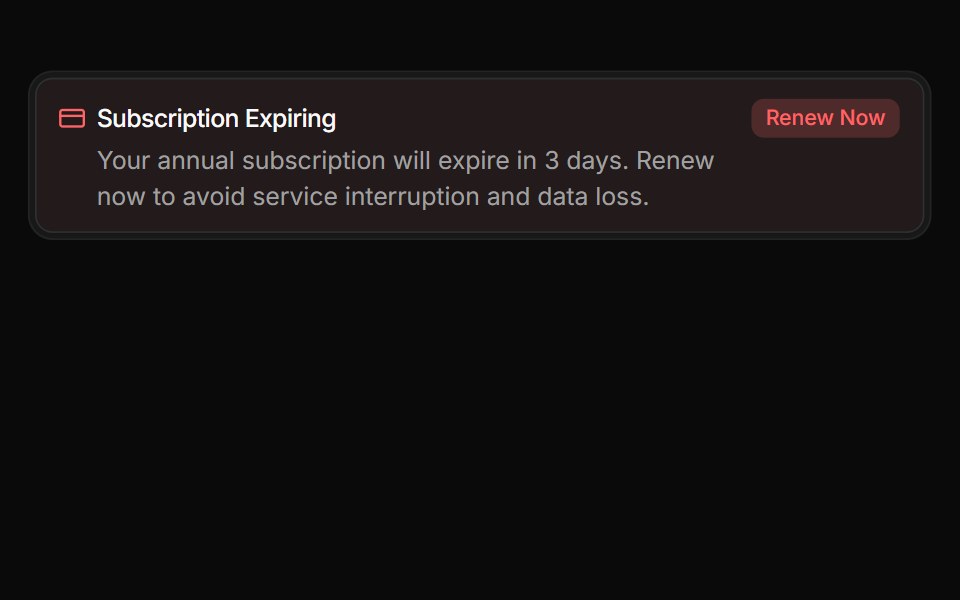 Urgent billing noticeReUI · ReactUrgent billing notice
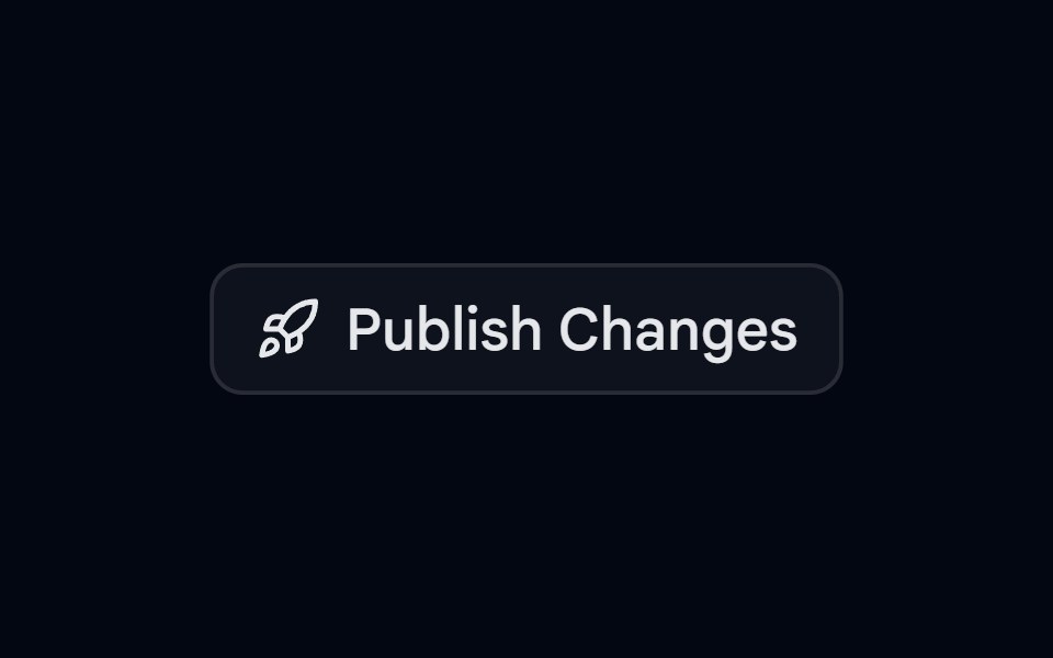 Alert 09 - Publish ConfirmationShadcn Space · ReactAlert dialog that slides up to confirm publishing, with a rocket icon, a change summary, and full width actions
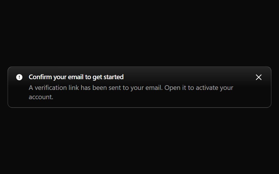 Alert 10Watermelon UI · React
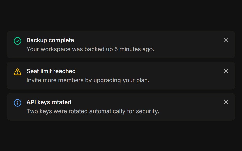 StackedFLX UI · ReactA list of dismissible notices, each removed on its own.
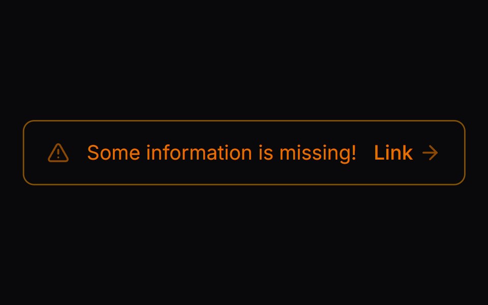 Comp 276Origin UI · React
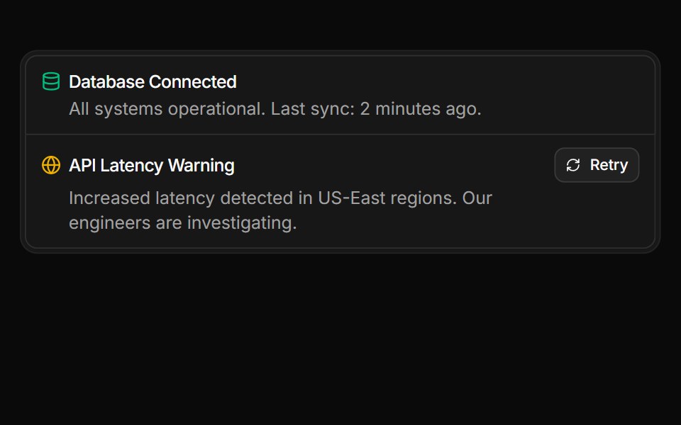 Service status summary stacked within a frameReUI · ReactService status summary stacked within a frame
Libraries with alert components
Related categories
- React Alert Components
- Tailwind CSS Alert Components
- Animated Alert Components
- shadcn/ui Alert Components
- Feedback Components
- Badge Components
- Spinner Components
- Progress Components
- Chip Components
- Progress Bar Components
- Empty State Components
- Notification Components
- Status Indicator Components
- Skeleton Components
- Banner Components
- Typing Indicator Components
- Progress Circle Components
- Error State Components
- Success Animation Components
- Scroll Progress Components