Alert 07 - With Hover-Fill Dismiss
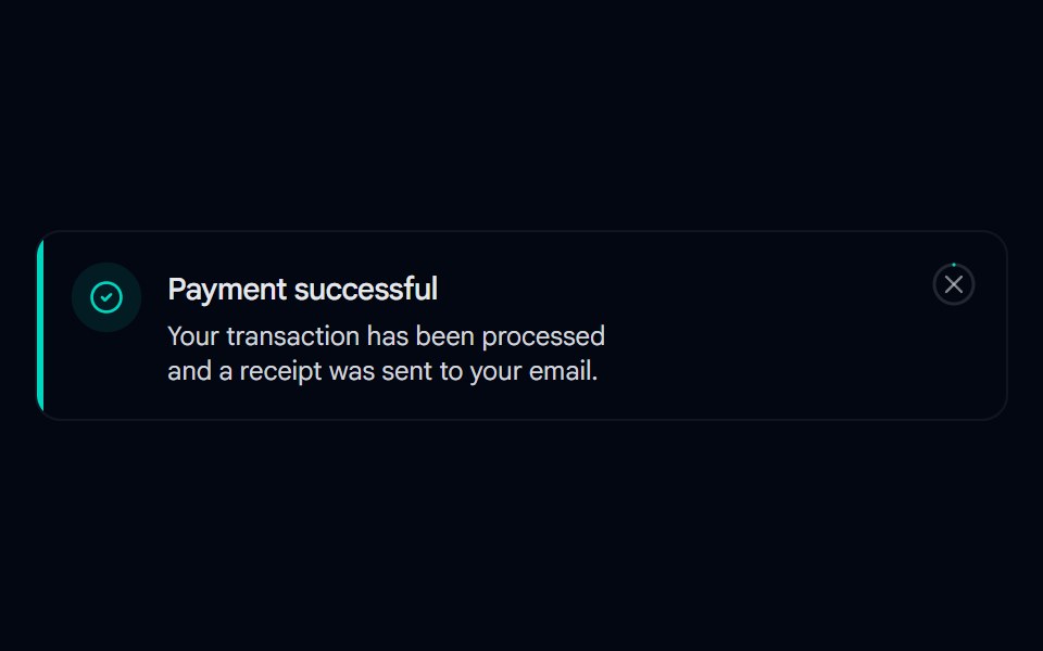
Toast-style alert with a spring entrance, icon pop-in, and a close button whose ring fills in on hover, built with motion/react.
- Library
- Shadcn Space
- Framework
- React
- Type
- component
- License
- MIT
- Dependencies
- lucide-react, motion
- Files
src/components/shadcn-space/alert/alert-07.tsxsrc/components/ui/alert.tsxsrc/components/ui/button.tsxsrc/lib/utils.tssrc/config.ts
- Source
- https://github.com/shadcnspace/shadcnspace
Categories
- Alert Components
- React Alert Components
- Tailwind CSS Alert Components
- Animated Alert Components
- shadcn/ui Alert Components
- Feedback Components
- React Feedback Components
- Tailwind CSS Feedback Components
- Animated Feedback Components
- shadcn/ui Feedback Components
More from Shadcn Space
- Alert-01 - Alert with Password Detail
- Alert-02 - Alert with User Detail
- Alert-03 - Social Alert
- Alert-04 - Indicator Destructive Alert
- Alert-05 - Dark Alert
- Alert-06 - Gradient Alert
- Alert 08 - Evaporate Dismiss
- Alert 09 - Publish Confirmation
- Alert 10 - Two Step Delete
- Alert 12 - Type to Confirm
- Alert 13 - Async with Success
- Alert 15 - Semantic Variants