 Dev Design Library
Animated Feedback Components
Dev Design Library indexes 591 Animated feedback components from 73 open-source UI libraries, with the most coming from Amicro Micro Transitions, Spectrum UI, Shadcn Space, Kinetics and UI Lab. Each one links to its page with the source code, a live preview where available, the library license and the install command. These are the feedback components tagged as animated: motion on hover, on scroll or on load, usually built with CSS transitions or Framer Motion.
Showing 120 of 591, a mix from every library. Open a library to see all of its components.
 Skeletonshadcn/ui · ReactUse to show a placeholder while content is loading.
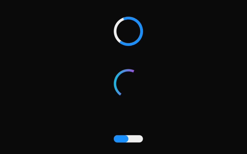 Linear ProgressMUI / Material UI · React
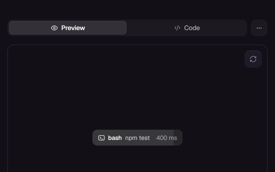 Call ChipReact Bits · ReactInline tool-call chip whose fill wipes across while a live ms counter ticks, completing with a green wash on success…
 LoadingdaisyUI · CSS (Tailwind)
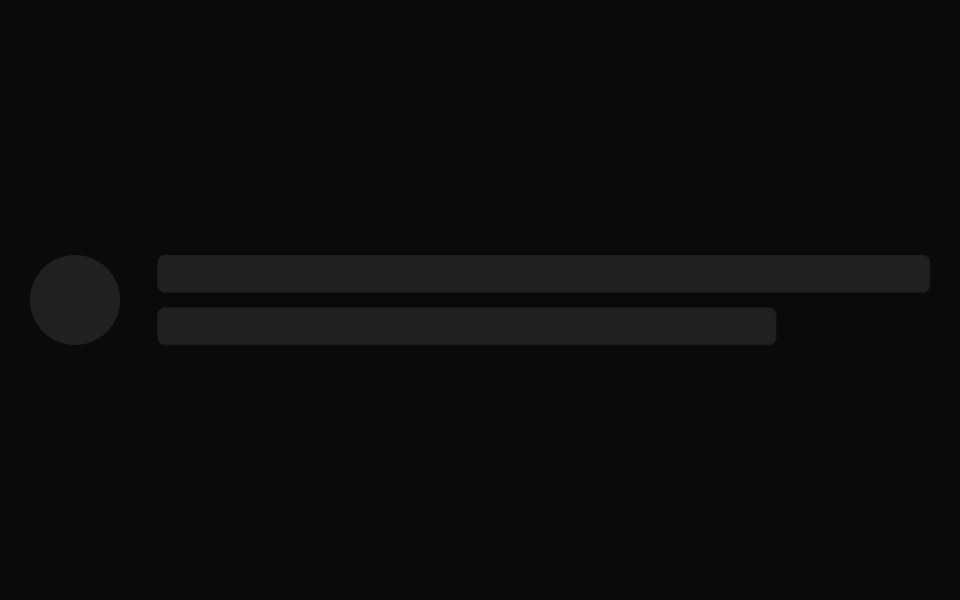 SkeletonChakra UI · ReactUsed to render a placeholder while the content is loading.
 SkeletonHeroUI · ReactDisplays a loading placeholder with shimmer or pulse animation effects.
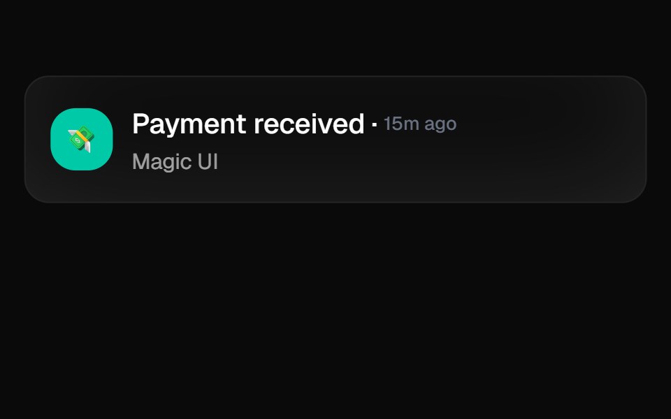 Animated ListMagic UI · ReactA list that animates each item in sequence with a delay. Used to showcase notifications or events on your landing page.
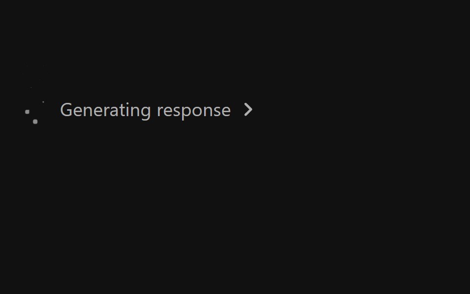 Ai Response StatusReact Spectrum · React
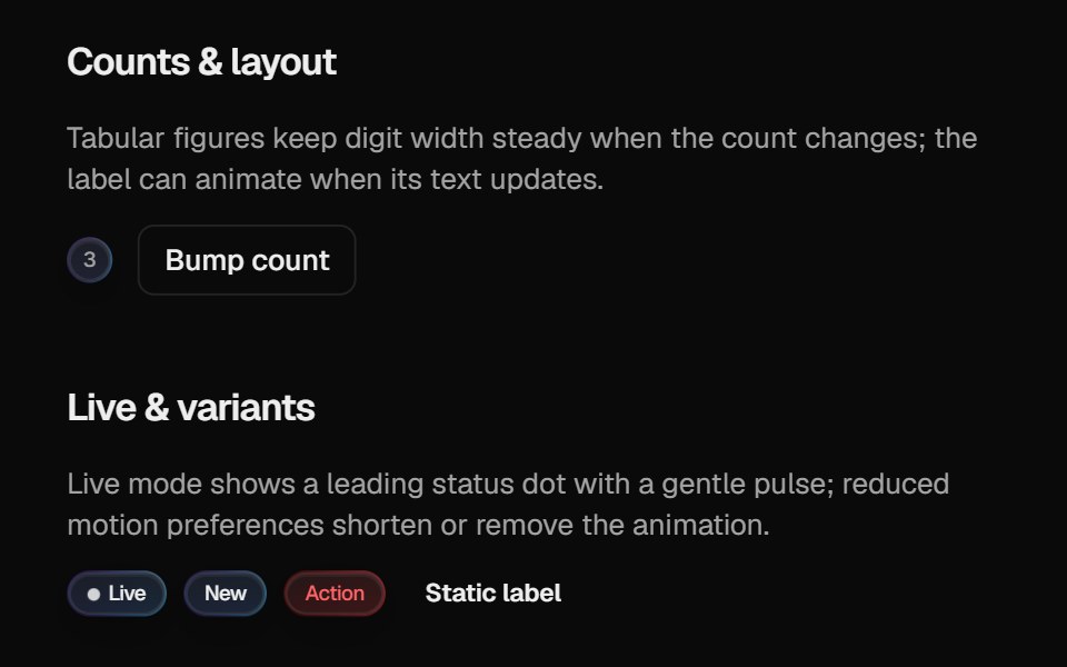 Halo BadgeCult UI · ReactBadge with optional layout animation, live status dot, and gradient rim aligned with Halo Button / Card
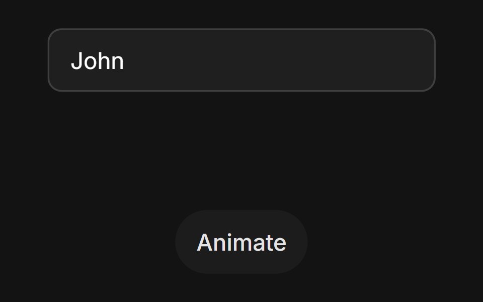 Error State Shaketransitions.dev · HTML/CSSInput that shakes sideways when the value is invalid.
- Thinking OrbsLibraries.dev · ReactDotted thought-orb loading indicators for AI & agent UIs — nine tuned states, two sizes, auto dark/light
 Progress CircleTremor · React
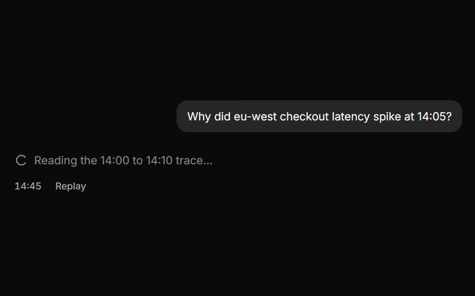 Streaming reply with a pending stateReUI · ReactOne assistant row moving from thinking, to typing, to settled.
 Accordion LoaderAmicro Micro Transitions · ReactAccordion Loader loading animation.
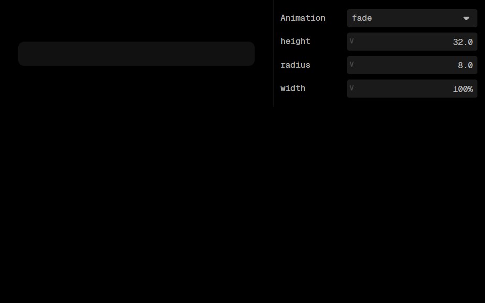 SkeletonLobe UI · ReactPlaceholder blocks that stand in for content while it loads. One primitive block, plus text-line and avatar helpers.
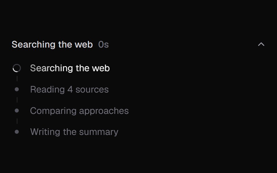 AI State LoadingKokonut UI · ReactAgent progress as a list of steps with a live log, elapsed time and a summary when done.
 loaderIntent UI · Reactloader
 Agent ActivitybeUI · ReactRenders progressive agent work as message content.
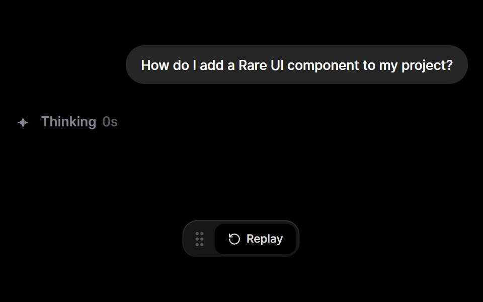 Inline AI StatusRare UI · ReactAn inline status that shows what an AI is doing, from thinking and researching to writing and done.
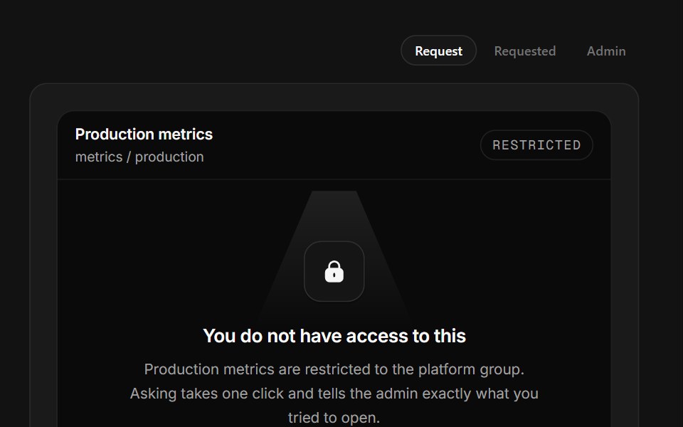 No AccessSpectrum UI · ReactA permission wall that names the owner and turns request into requested.
 Bars SpinnerSpell UI · ReactA loading spinner with rotating bars animation.
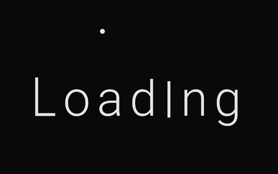 Kinetic Text LoaderVengeance UI · React
 Thinking IndicatorFluid Functionalism · ReactAnimated loading indicator with morphing SVG path (circle to infinity loop) and shimmer text rotation. Cycles through…
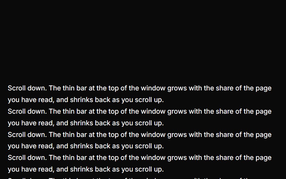 Reading ProgressUser Interface Wiki · React
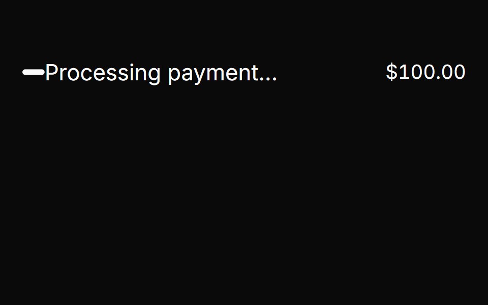 SpinnerToolcraft · React
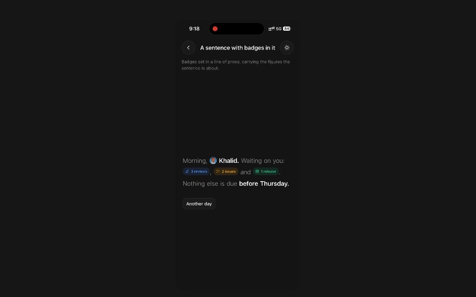 Animated BadgePanel UI · React NativeStatus pill whose icon and label roll over when the status changes.
 Alert-03 - Social AlertShadcn Space · ReactAlert component
 Helix SpinnerPixel Perfect · ReactA column of bars, each offset a few degrees on the Y axis, spinning together as a twisting 3D helix.
 Spin LoaderOpenSourceUI · ReactMinimal spinning loader built on a lucide icon — defaults to Loader, but pass any icon prop. Sizes: sm, md, lg.
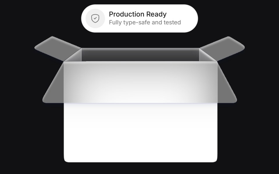 Bucketuselayouts · ReactAn interactive card component that simulates a bucket where chips are tossed and replaced with smooth physics-inspired…
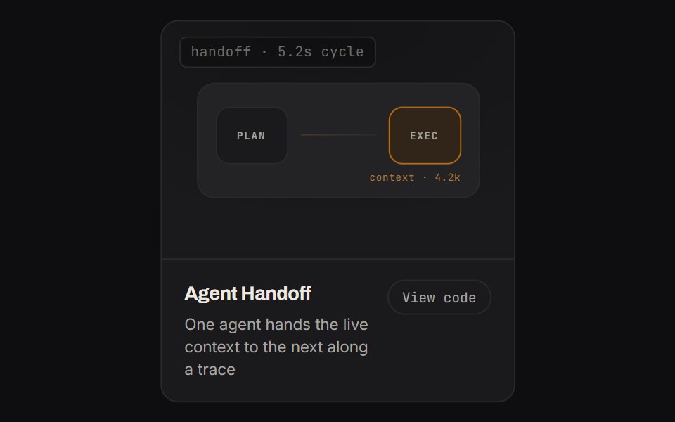 Agent HandoffKinetics · HTML/CSSOne agent hands the live context to the next along a trace
 SpinnerComponentry · React
 Animatedinput PlaceholderShadcn Dashboard · React
 Animated ListAnimations (Svelte) · SvelteA component that animates list items with smooth layout transitions, revealing items one by one from top to bottom.
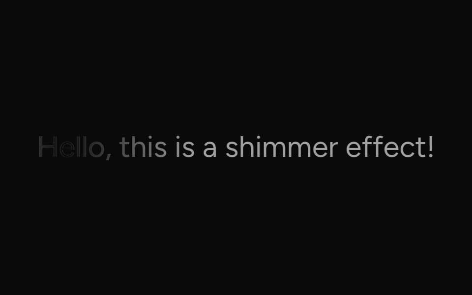 ShimmerAI Elements (Svelte) · SvelteA text shimmer utility component with configurable spread and duration.
 Status MorphSwiftPieces · SwiftUIOne stroke that spins while loading, then closes into a ring and draws a check on success or a cross on failure.
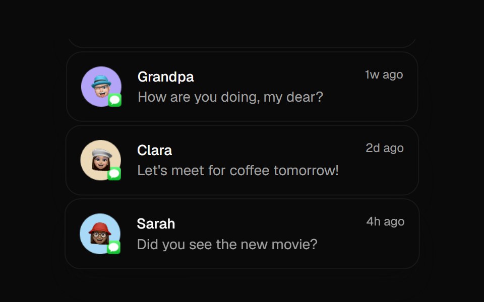 Animated ListBadtz UI · ReactA sophisticated animation component that creates dynamic column-based transitions with scaling effects. Perfect for…
 AI Overview SkeletonNotra · ReactA loading state built on shadcn Skeleton.
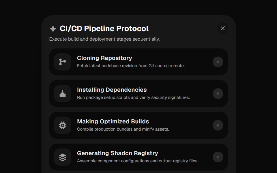 Deployment ChecklistGreatUI · React
 BadgeNexvyn UI · ReactA compact status label with solid, muted, and dot variants for tagging content inline.
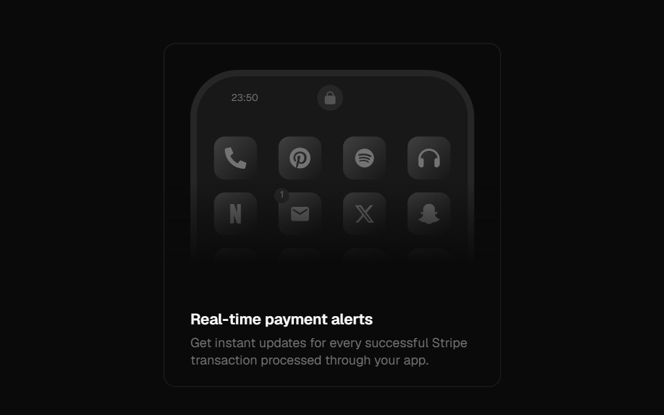 Notification CenterForge UI · ReactBeautifully animated mobile UI showcasing notifications with hover-triggered transitions and customizable content…
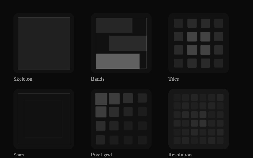 Image LoaderGenerative Loaders · React
 SkeletonShark UI · ReactDisplays a loading state.
 SkeletonRewamp UI · ReactShared Skeleton primitive Pulsing block styled with brand tokens and subtle lilac shimmer sweep…
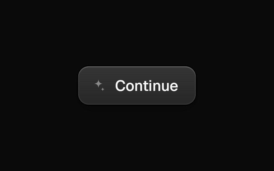 ConfettiButtonEvil Buttons · ReactA ringed dark button with a sparkle icon that fires a restrained confetti burst on click.
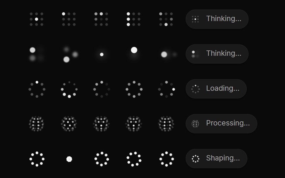 OrbAI CSS · React
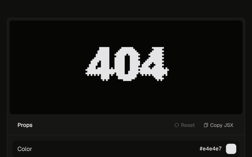 Dithered 40423rd.dev · ReactBayer-pixel 404 section: a fireball cursor scorches the glyph, burns it into embers and smoke, then reforms. Optional…
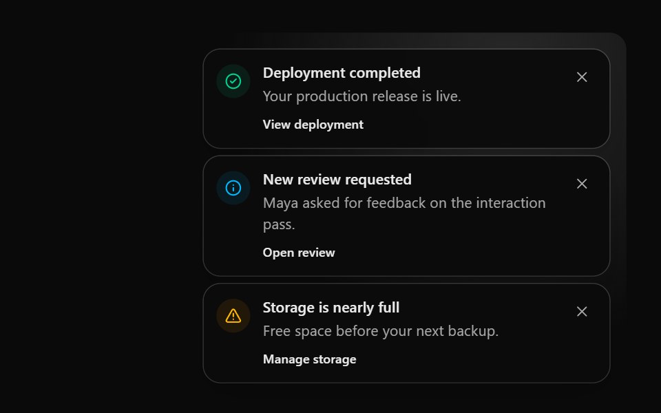 Notification StackSona UI · React
 SkeletonWatermelon UI · React
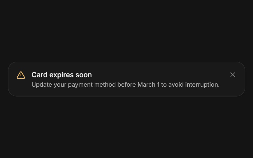 AlertArc Library · ReactA persistent message that helps people recover or continue.
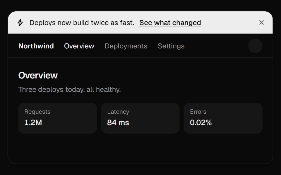 Announcement BannerUI Lab · ReactDismissing folds the bar away and the page slides up to fill the gap.
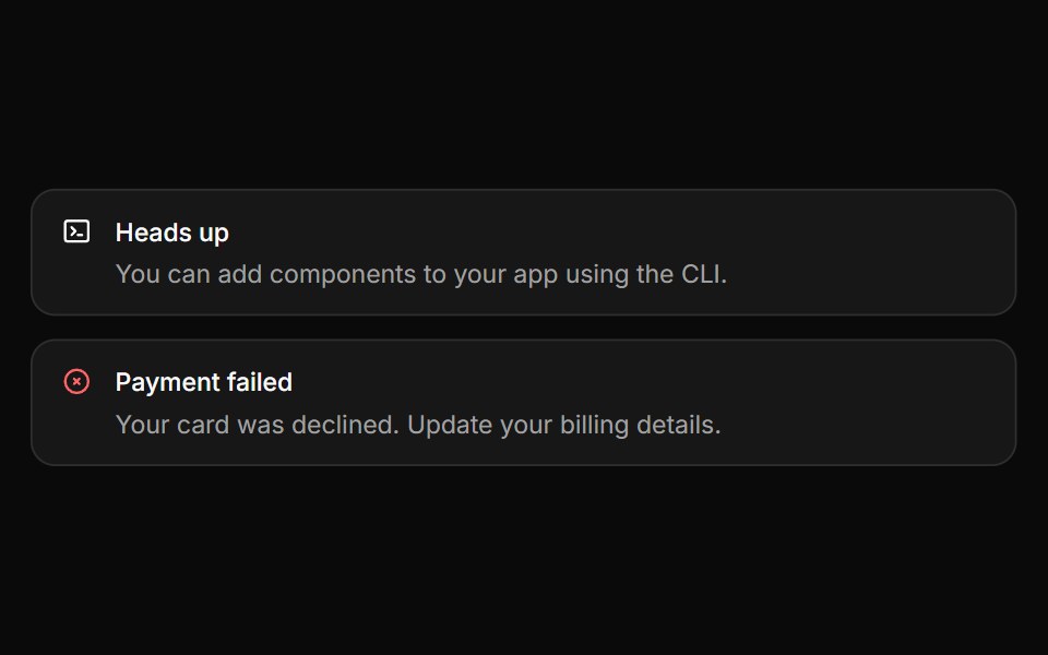 AlertHextaUI · ReactInline messages for status and feedback, with a neutral surface, a colored icon and a dismiss that collapses smoothly.
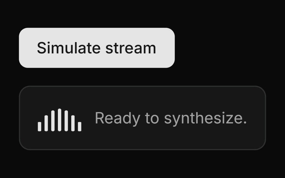 Streaming Speech PanelLocalMode · ReactA streaming-TTS status surface: active state (WaveformActivityBars + spinner, synthesizing/playing label…
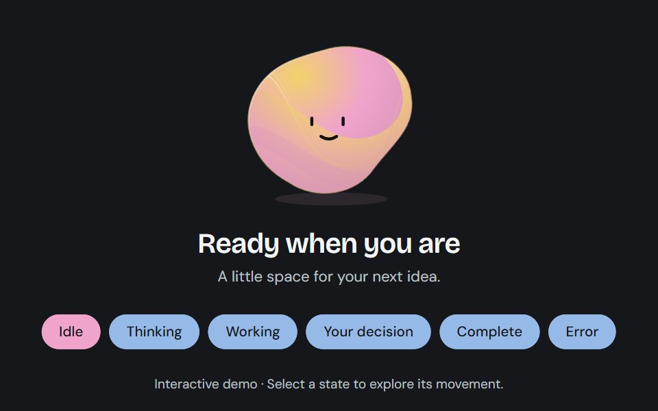 Agent stateCojeev UI · ReactA sculpted, living status field that changes contour and color as an agent thinks, works, asks for input, or finishes.
 Sliding Arrow LabelMicroKit · ReactA text label that gets a bright surface while an arrow slides in beside it.
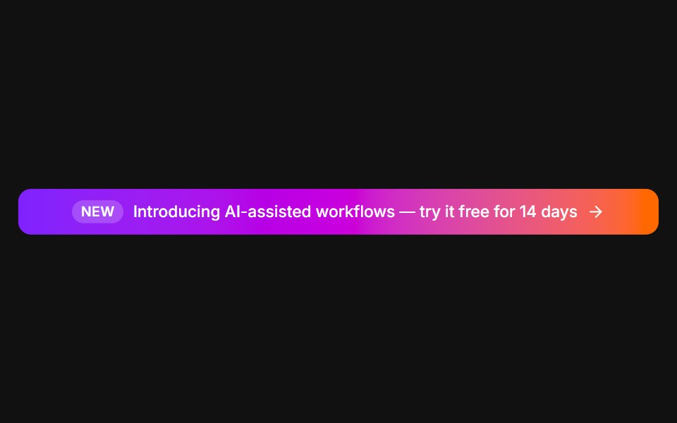 Announcement barFLX UI · ReactFull-width gradient promo with a New tag and arrow.
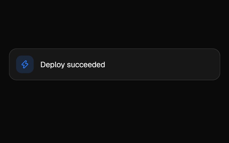 Animated ListVelora UI · ReactLooping feed that springs each item in, newest on top.
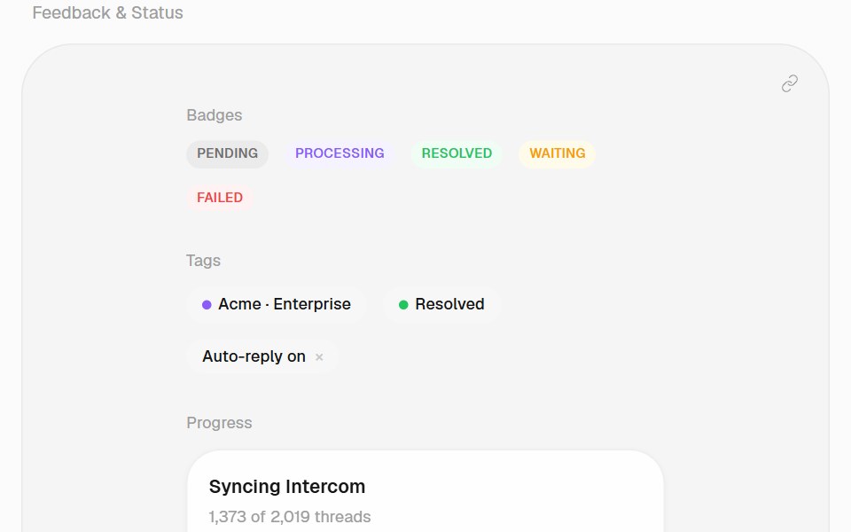 SkeletonHalaska UI · React
 End Loading Spinnersv-particles · Svelte
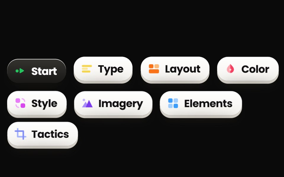 ChipsPin UI · React
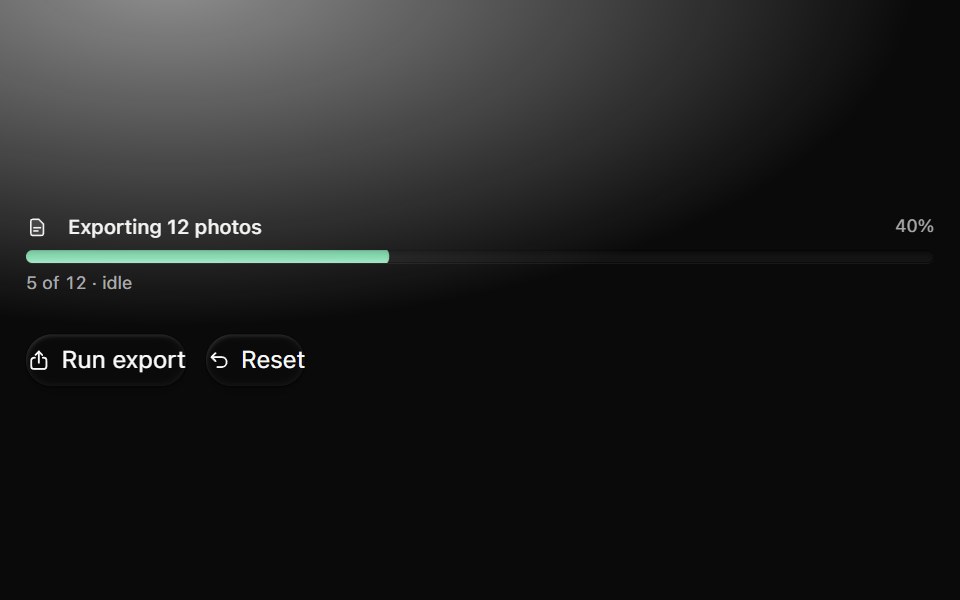 ProgressMetal UI · React + SwiftUITask amount and explicit idle, running, paused, failed, cancelled and complete states. Bars, slim bars, rings…
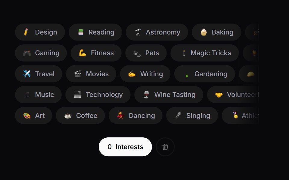 Interest PickerSpaceUI · ReactA draggable row-packed interest picker with an emoji burst on select and a shake-to-explode clear action.
 Aria SkeletonReScript shadcn · ReScript
 BellSora UI · ReactNotification bell that rattles from its hanger on trigger — a decaying rotation pivot.
 Notif MorphZAYX · React NativeA notification stack that morphs between rows like follows and likes, with springy row height changes.
 Dynamic Notch Activity IndicatorCue Foundations · React
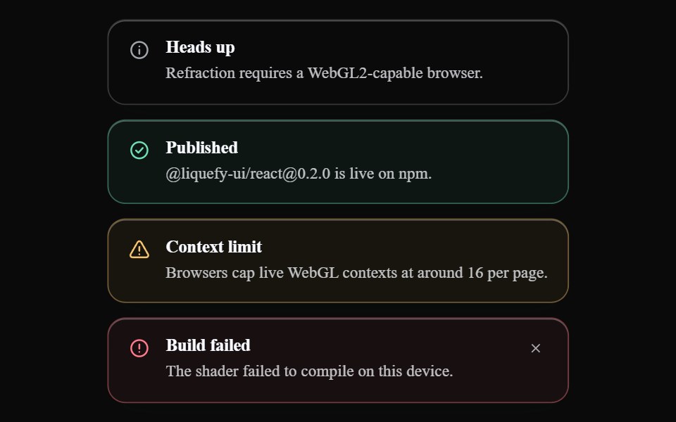 Liquid AlertLiquefy UI · ReactAlert message box in liquid glass style. Caixa de alerta em estilo vidro líquido.
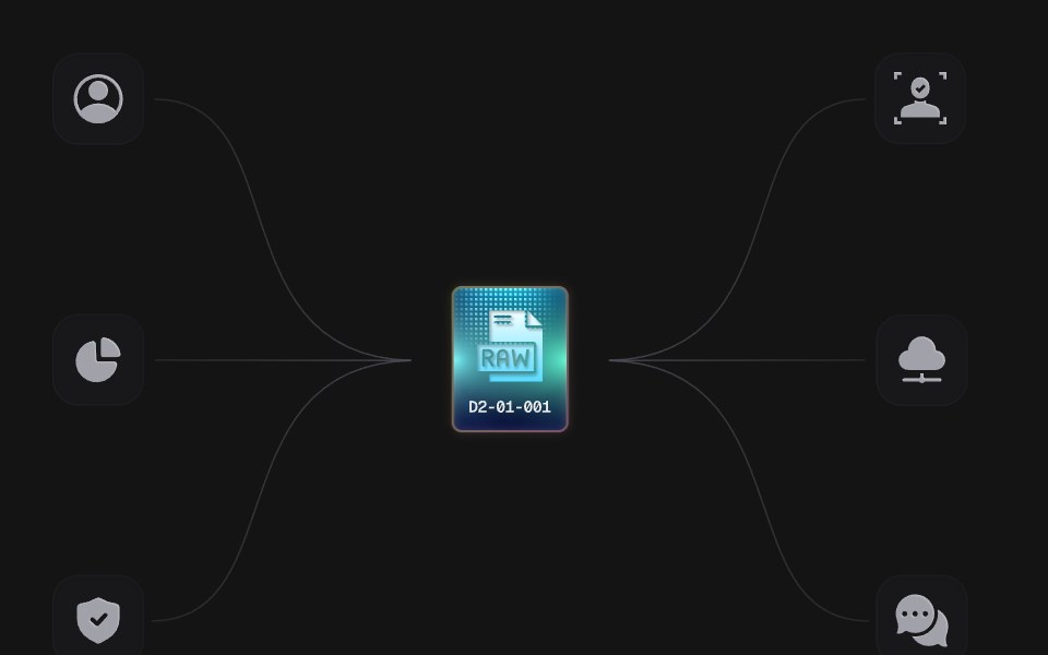 Power ChipD2Studio UI · ReactAn animated SVG illustration: a RAW chip charges and sends power along six wires to the tiles around it. Plain SVG and…
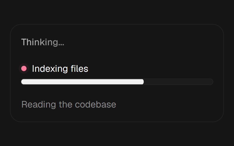 Agent Loading StatesEaseUI · ReactThree loading states for AI interfaces: shimmering status text, live agent progress, and cycling reasoning phrases.
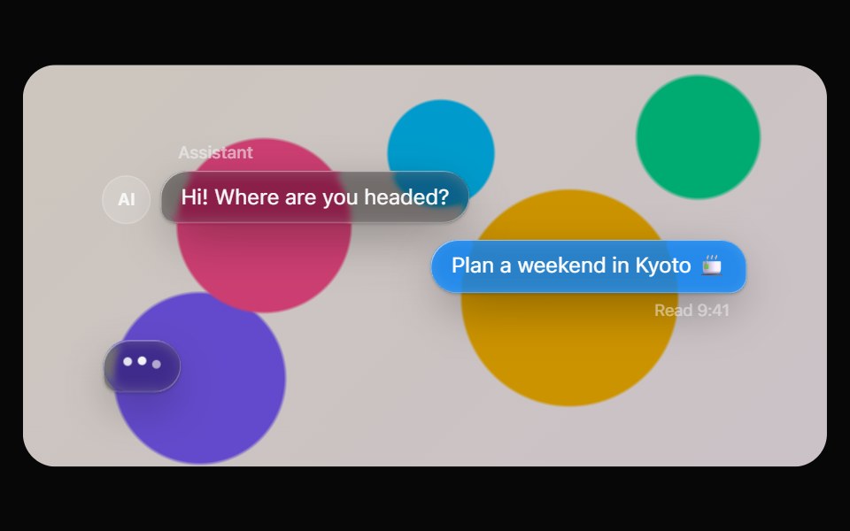 Glass MessageOpaline · ReactChat bubbles on glass: tinted for you, clear for them, with avatars, meta and a typing indicator.
 AI AsistantReactFrame · ReactA dotted status light with two layouts, Mesh grid and Halo rings, across three animated states (Waiting, Listening…
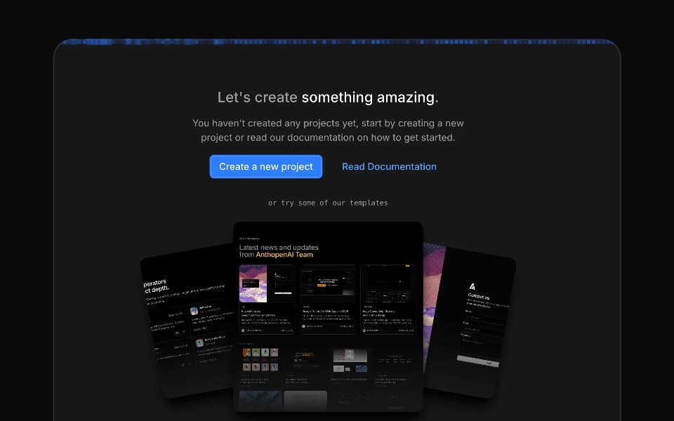 Image Generation LoaderAceternity UI · React
 Skeletonark-cn · ReactPlaceholder to show a loading state before content loads.
 Spinnershadcn/ui · ReactAn indicator that can be used to show a loading state.
 SkeletonMUI / Material UI · React
 Hold ButtonReact Bits · ReactHold-to-confirm button whose liquid fill rises while pressed, snaps back on an early release and swaps its label…
 ProgressdaisyUI · CSS (Tailwind)
 SpinnerChakra UI · ReactUsed to provide a visual cue that an action is processing
 SpinnerHeroUI · ReactDisplays an animated loading indicator.
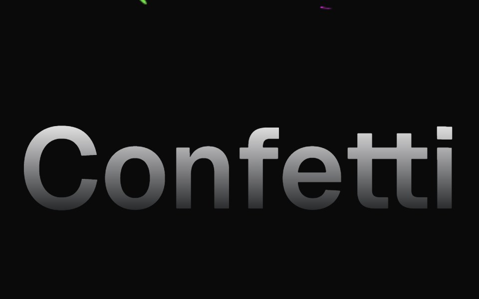 ConfettiMagic UI · ReactConfetti animations are best used to delight your users when something special happens
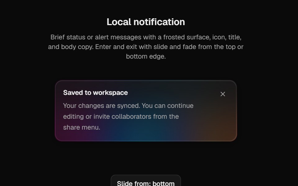 Halo NotificationCult UI · ReactPolished notification surface for local AnimatePresence use with rim variants and glyph stagger
 Organic Shimmertransitions.dev · HTML/CSSLoading placeholder with an irregular, organic sheen moving across it.
 Skeleton loader for avatars and user info.ReUI · ReactSkeleton loader for avatars and user info.
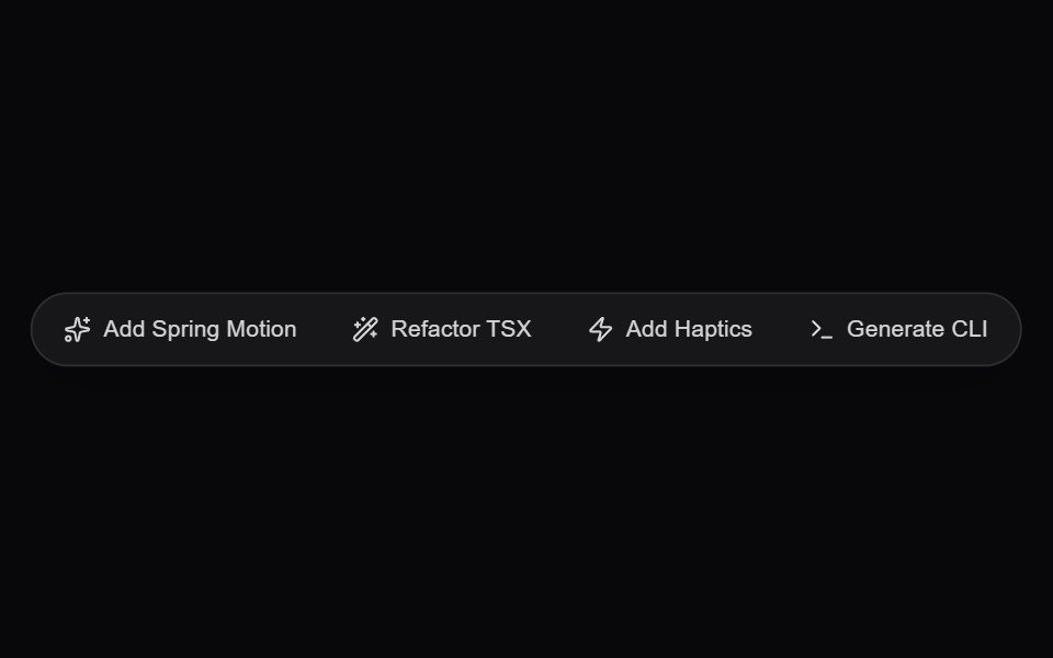 AI Floating Action PillAmicro Micro Transitions · ReactGlassmorphic floating quick-action pill dock for instant generative prompts and actions.
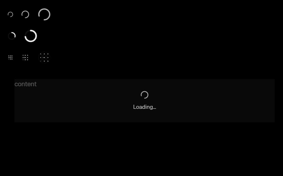 Base Ui SpinLobe UI · ReactSpinning loading indicator that can wrap content while it loads.
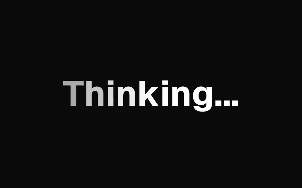 AI Text LoadingKokonut UI · ReactAI thinking text with a soft wave through the letters and words that swap letter by letter.
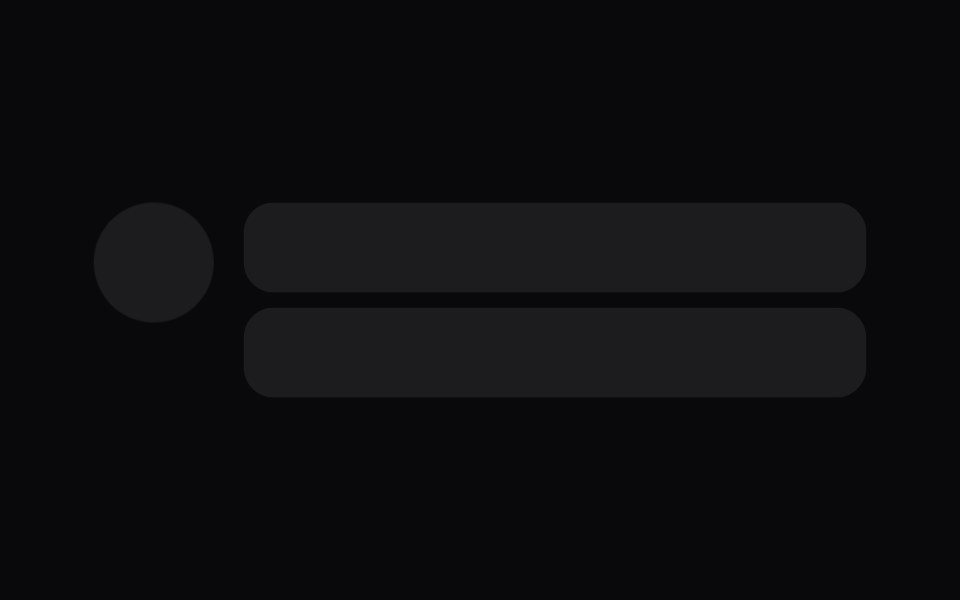 skeletonIntent UI · Reactskeleton
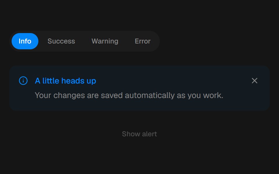 AlertbeUI · ReactFeedback that eases in and folds away.
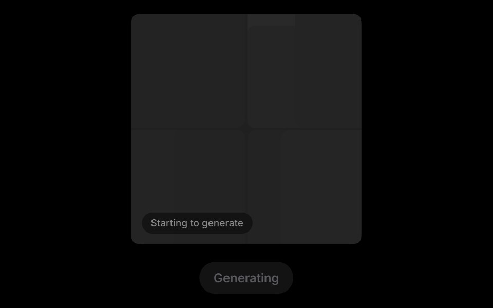 Grid RevealRare UI · ReactA loading state for AI images that turns into the real picture when it arrives.
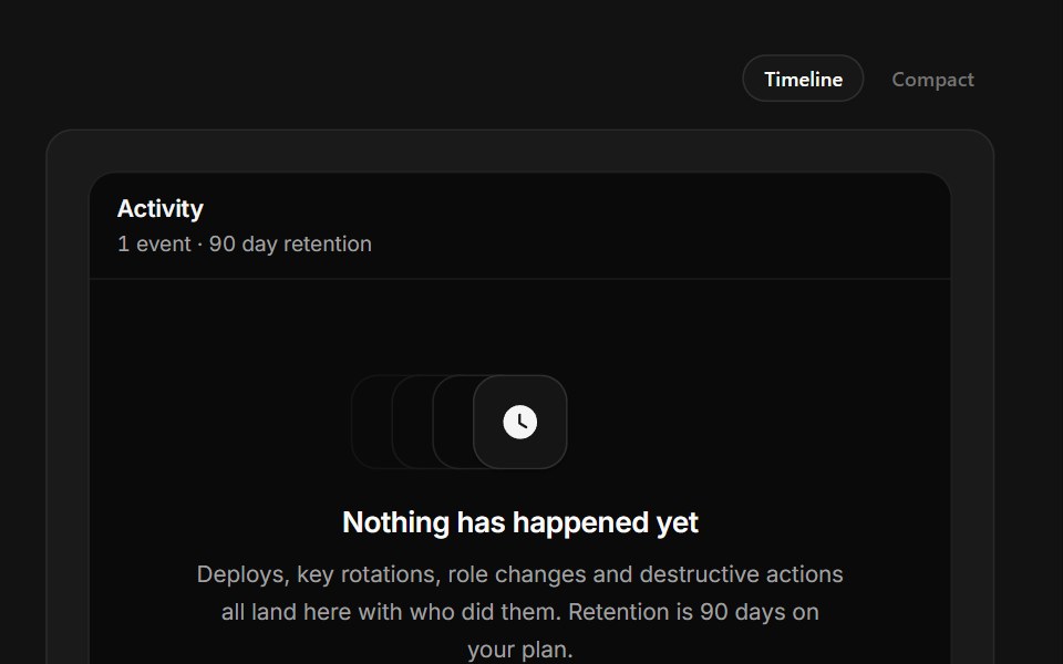 No Activity YetSpectrum UI · ReactAn audit timeline with a dashed rail above its one real event.
 SpinnerSpell UI · ReactA loading spinner component with customizable size and color.
 Reveal LoaderVengeance UI · React
 SpinnerUser Interface Wiki · React
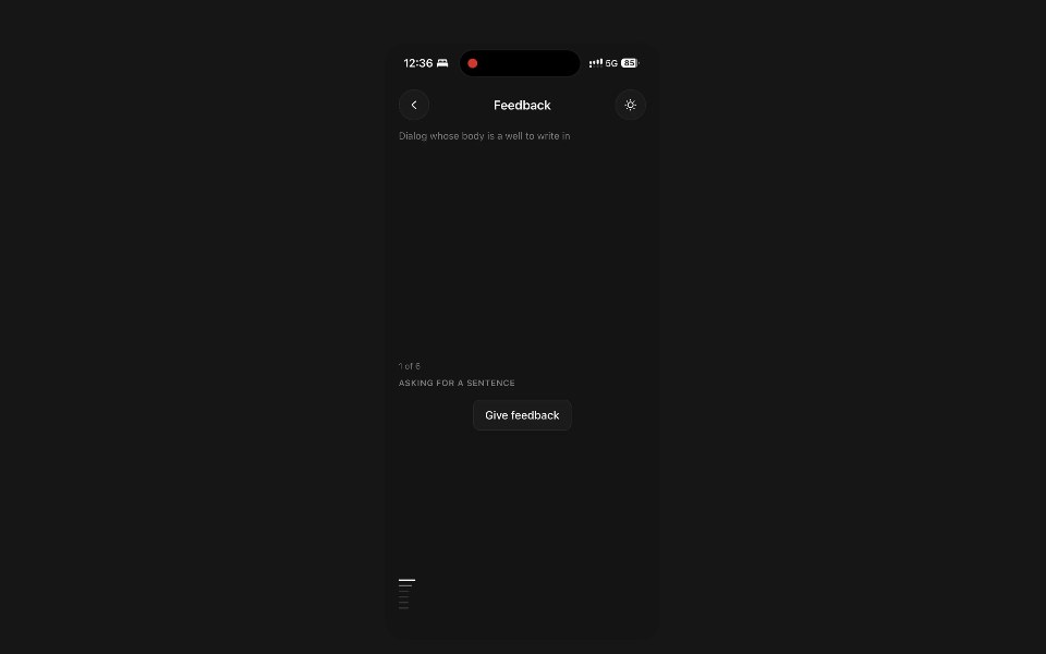 FeedbackPanel UI · React NativeDialog whose body is a well to write in, with the actions in the band around it.
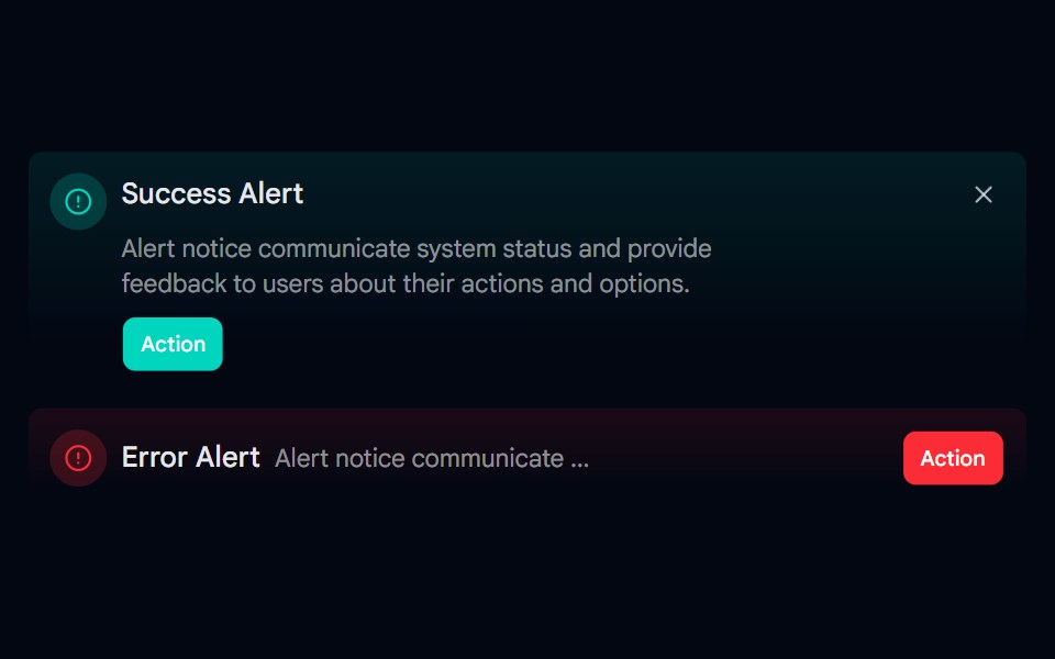 Alert-06 - Gradient AlertShadcn Space · ReactAlert component
 Text Inline Chip RevealPixel Perfect · ReactA headline whose words resolve from a hue-shifting glow into solid ink, around inline chips that sit in the text flow.
 Text LoaderOpenSourceUI · ReactAnimated text loader with a spinning color orb and staggered letter pulses. Pass text, variant, and textColor to match…
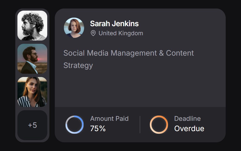 Client Carduselayouts · ReactA client CRM card with payment and deadline rings, plus a morphing avatar stack.
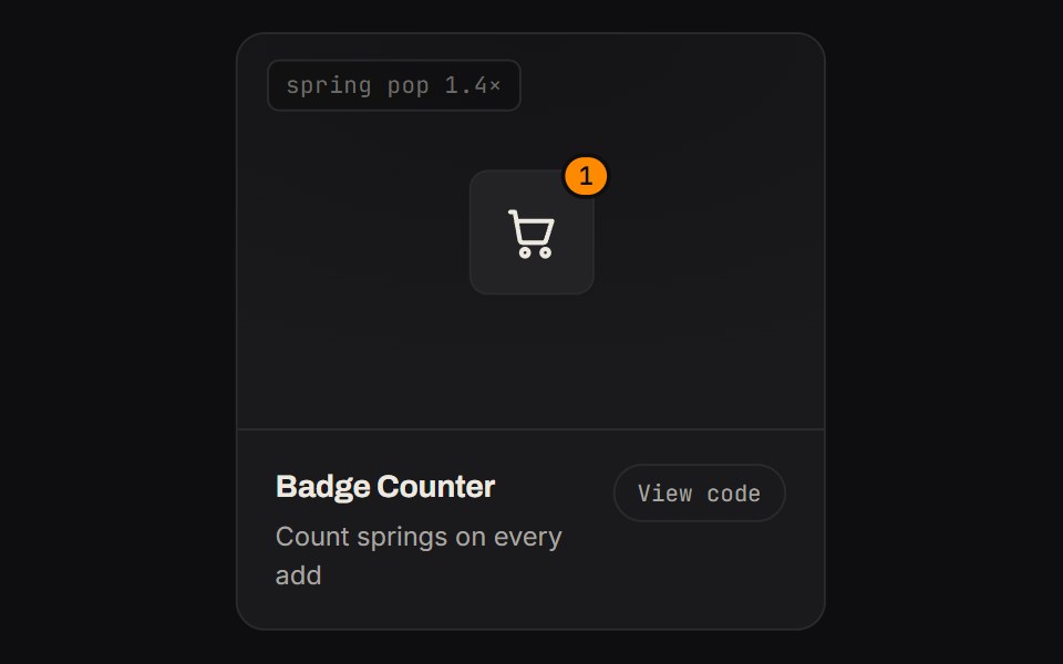 Badge CounterKinetics · HTML/CSSCount springs on every add
 SpinnerShadcn Dashboard · React
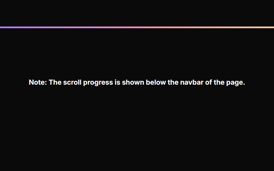 Scroll ProgressAnimations (Svelte) · SvelteA fixed progress bar component that indicates page scroll progress with a gradient color effect.
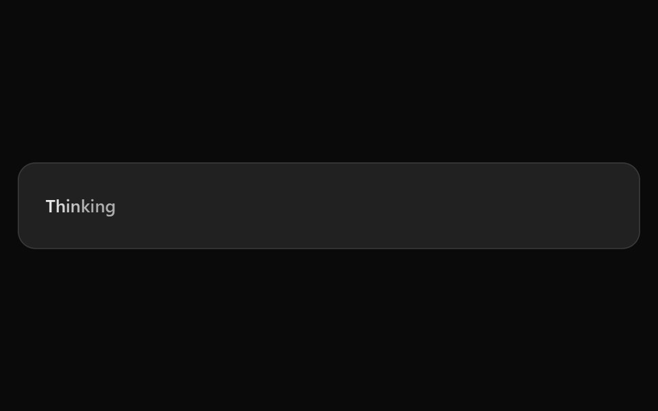 ChatGPT ThinkingNotra · ReactThe shimmering Thinking placeholder.
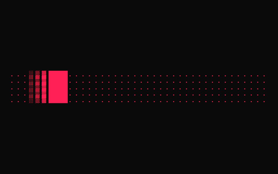 Terminal LoaderGreatUI · React
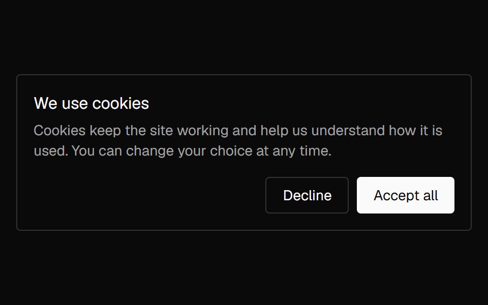 Banner CookieNexvyn UI · ReactA cookie consent card with accept and decline actions that lifts in once and lifts away on a choice.
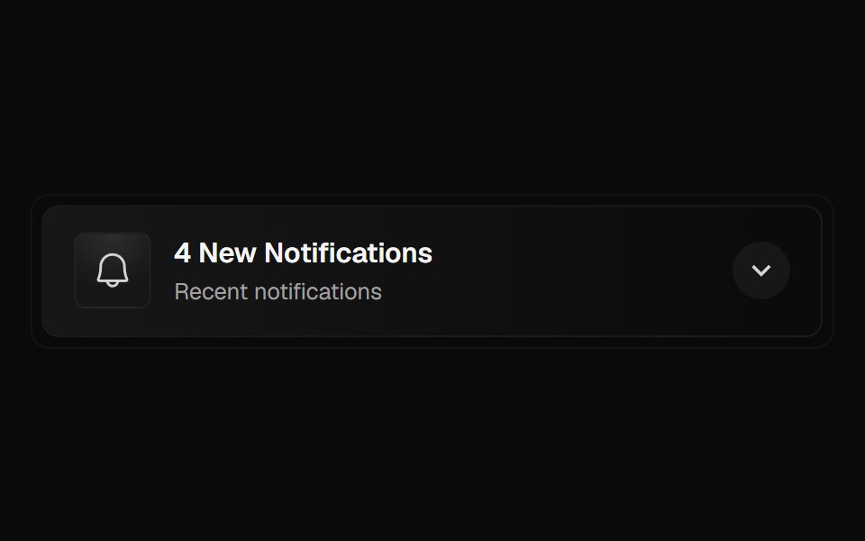 Notification PanelForge UI · ReactA collapsible notification panel displaying recent alerts with icons, timestamps, and smooth animated transitions.
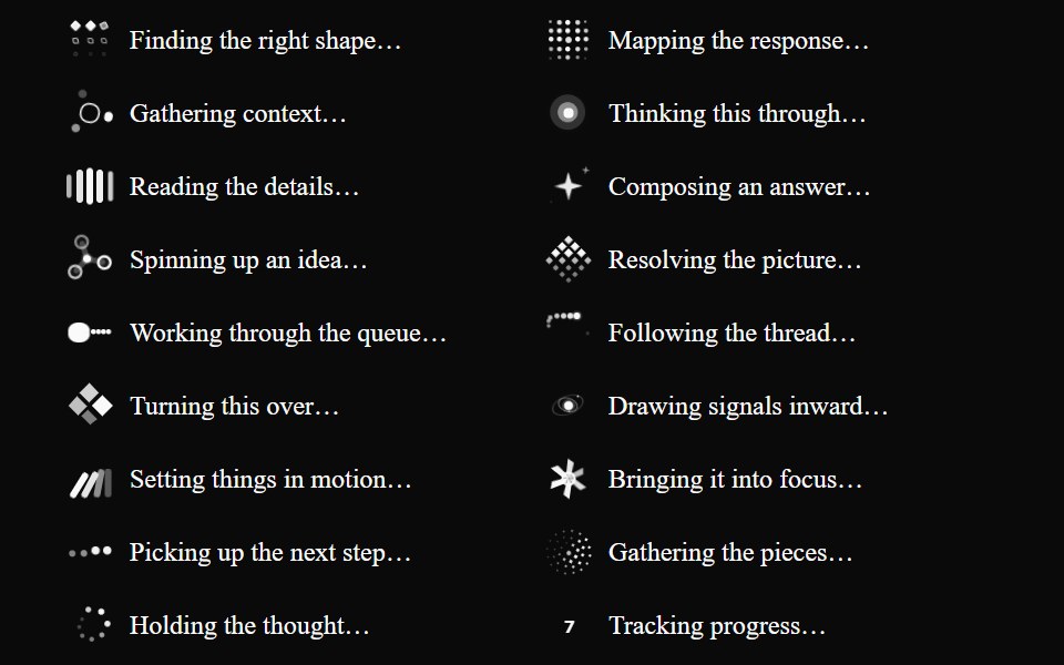 Inline LoaderGenerative Loaders · React
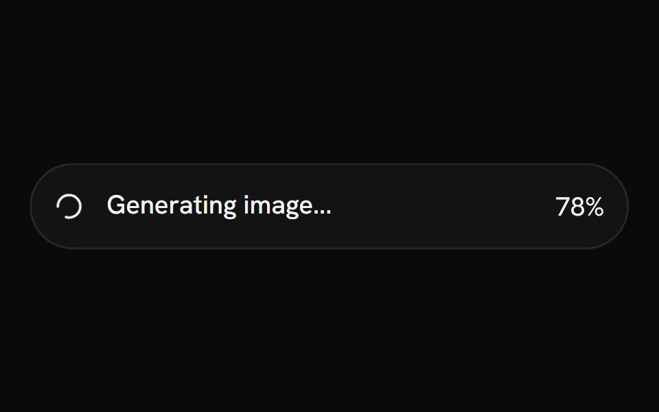 SpinnerShark UI · ReactA spinner for displaying a loading state.
 Thinking StateAI CSS · React
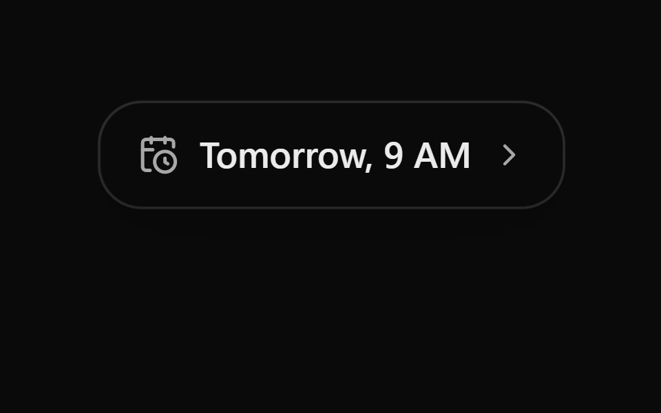 Schedule ChipSona UI · React
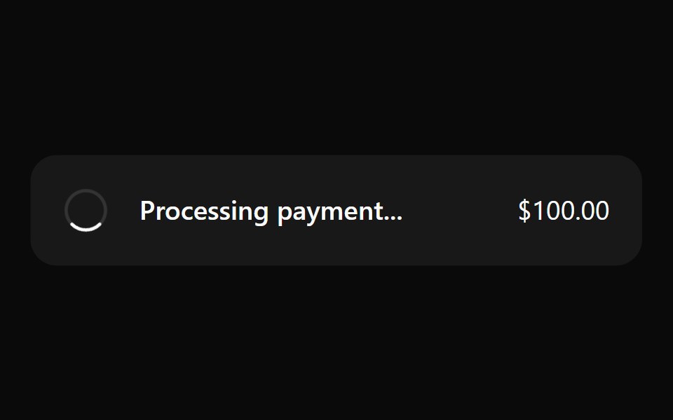 SpinnerWatermelon UI · React
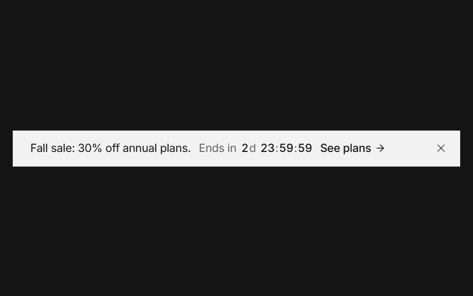 Announcement barArc Library · ReactA top banner that rotates messages, counts down, and collapses smoothly when dismissed.
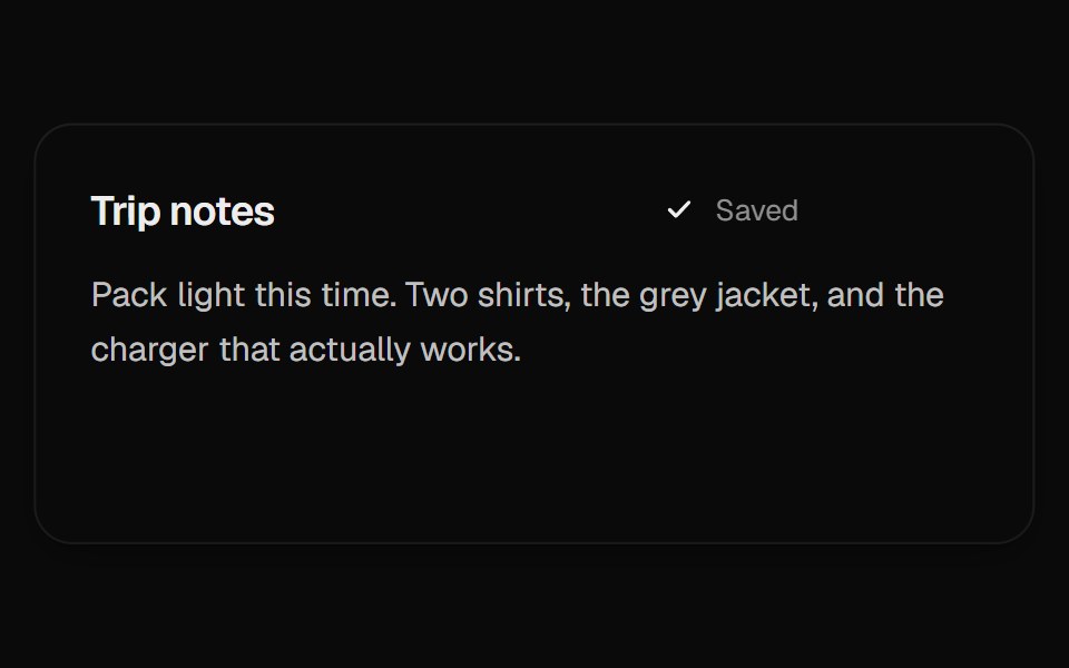 Autosave StatusUI Lab · ReactA dot for unsaved changes splits into three while saving, then gathers into a check.
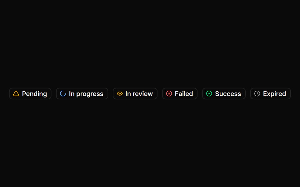 BadgeHextaUI · ReactStatus labels with colored dots, removable tags that slide closed and counts that roll to their new value.
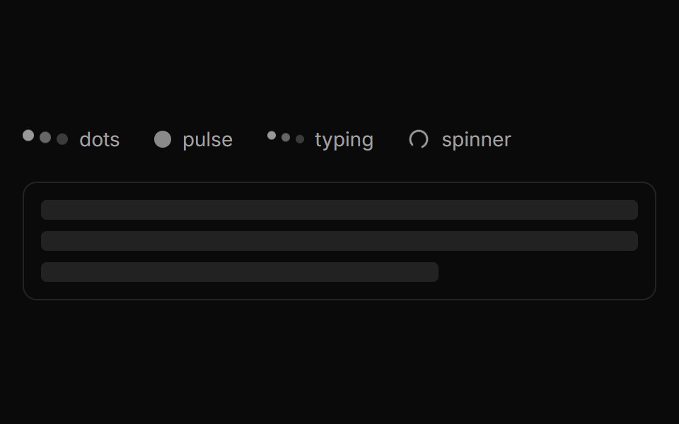 LoaderLocalMode · ReactA small family of busy indicators (dots / pulse / typing / spinner) plus a Shimmer skeleton-text variant, shown while…
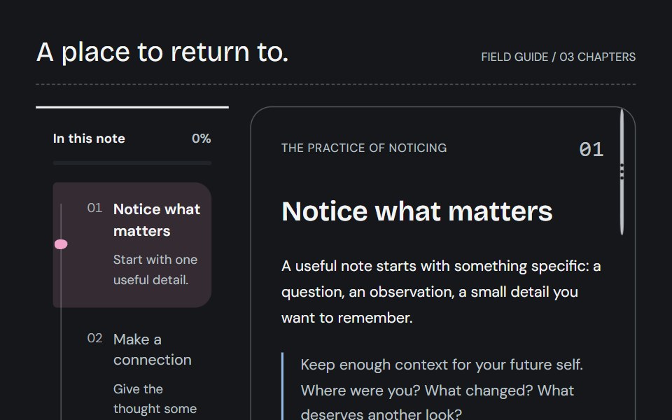 Reading trailCojeev UI · ReactKeep your place with a connected spine, an expandable bookmark or a descriptive chapter overview—all following actual…
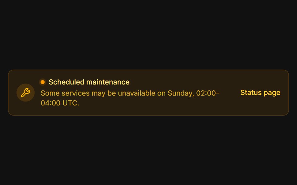 MaintenanceFLX UI · ReactAmber system notice with a pulsing status dot.
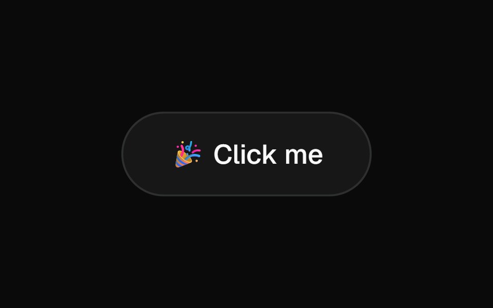 ConfettiVelora UI · ReactDependency-free confetti burst, fired from anywhere.
 SpinnerHalaska UI · React
 Loading Spinnersv-particles · Svelte
 LoadingSpaceUI · ReactMatrix pixel grid loader with Tailwind color support, spring motion presets, and assistant status cards.
Libraries with Animated feedback components
Related categories
- Feedback Components
- React Feedback Components
- Tailwind CSS Feedback Components
- Svelte Feedback Components
- React Native Feedback Components
- shadcn/ui Feedback Components
- Animated Spinner Components
- Animated Progress Components
- Animated Skeleton Components
- Animated Progress Bar Components
- Animated Status Indicator Components
- Animated Typing Indicator Components
- Animated Empty State Components
- Animated Badge Components
- Animated Chip Components
- Animated Notification Components
- Animated Alert Components
- Animated Progress Circle Components
- Animated Scroll Progress Components
- Animated Banner Components
- Animated Loading Screen Components
- Animated Error State Components